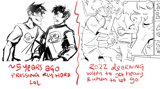
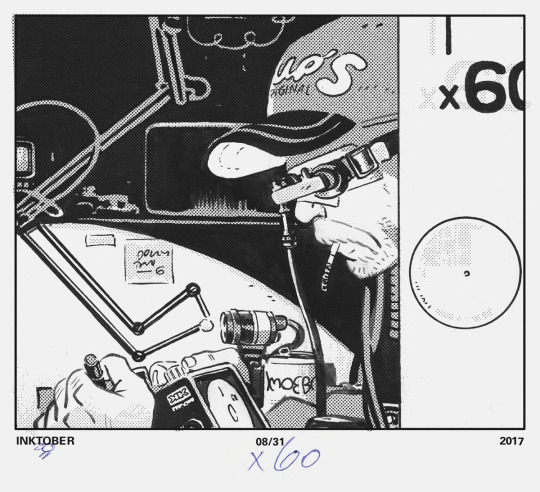
#i used to draw so much and make so many comics when i was absolute rock bottom mentally
Text
bleh
#hi all. lucy here#i have barely been drawing lately because ive just been unable to#like i feel like i lost my spark. i dunno#i used to draw so much and make so many comics when i was absolute rock bottom mentally#like the funnier i was the worse i was doing#ive been better lately but i truly feel like ive almost sacrificed my ability to draw or create stuff for some more mental stability#i just....i dont know. i feel like i can't do anything i used to do with art. like im not funny or have no ideas or just think stuff like#oh ill just draw this because people will wanna see it#but i gave that up because not even i wanna see it anymore#i hope that i can feel like drawing again one day i just dont know how to get it back. it really feels like ive lost a major part of myself#this is my rambling here just to let you know i am still around just kind of laying low because im drained
469 notes
·
View notes
Text
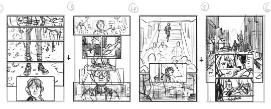
❄️✨❄️REMINDER THAT IDW SONIC WINTER JAM IS OUT!!! ❄️✨❄️
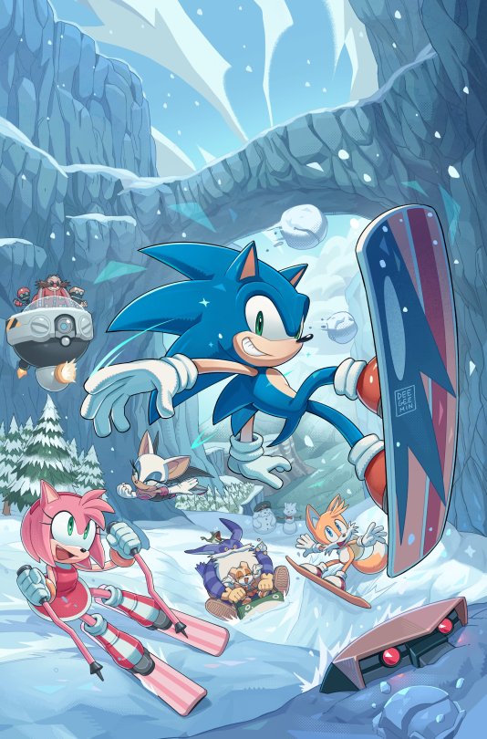
I'd love to talk about some neato things I got to draw in the comic! Spoiler warning for some contents below! If you haven't read anything yet, come back after reading the comic!
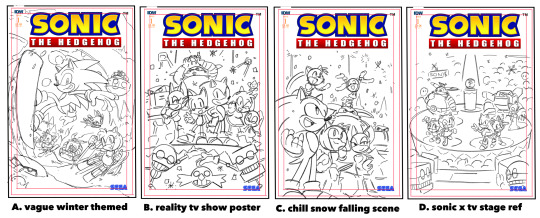
Let's start off with the cover thumbnails! I was more inclined to do A since it wouldn't spoil the big surprise Orbot and Cubot had in store! Otherwise I probably would've gone with B or D! It has that bombastic party sort of feel that I think would've been super fitting!
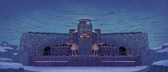

Here, Eggman is temporarily staying at one of his many bases throughout the world after the collapse of his Eggperial city! This base is inspired by Industria from Future Boy Conan and a bit of Eggmanland!
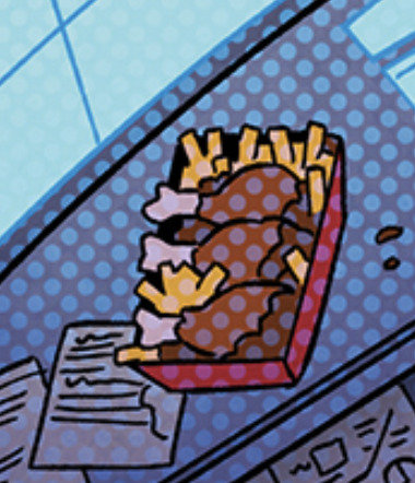
He also sure loves his chicken and fries!
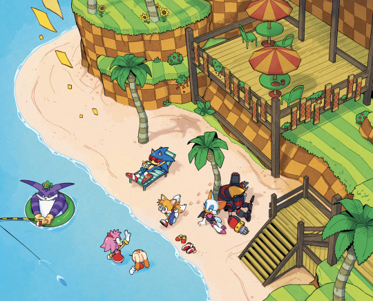
A little beachside balcony in Green hill! I felt like we generally don't get structures there as much so I thought it'd be a nice addition!

The design on the floor is the stage from the JP Sonic X intro! It gets covered up by snow after but still neat to include!
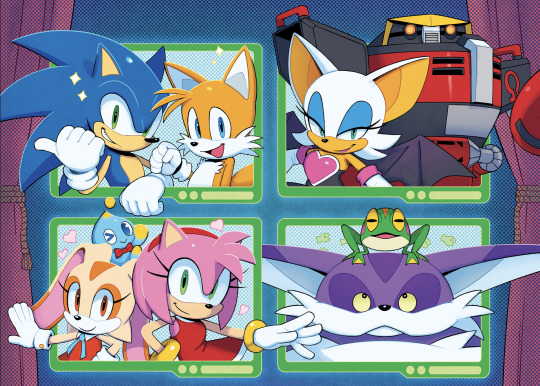


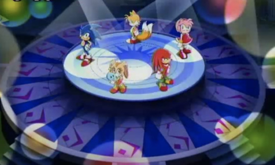
Look at this magnificent cast of characters! I wanted to use the poses that each pair had when they were first seen together! I'd considered giving Big his winning animation pose from SA1 but alas no space haha!
Cubot's taped on eye brow gag was one I suggested and it's a reference to the same gag from FLCL!
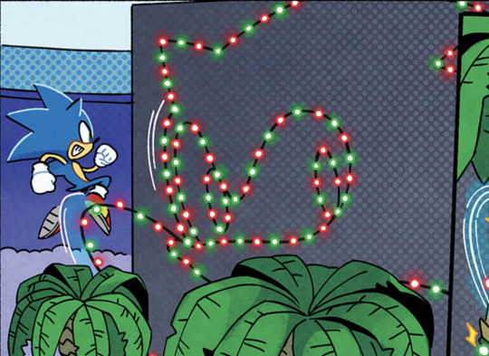

Lil sonic team logo Iasmin asked for! Sonic sure knows to appreciate himself! Good on him.
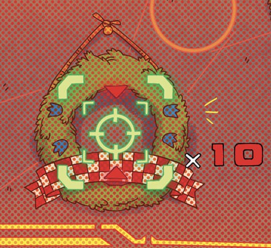

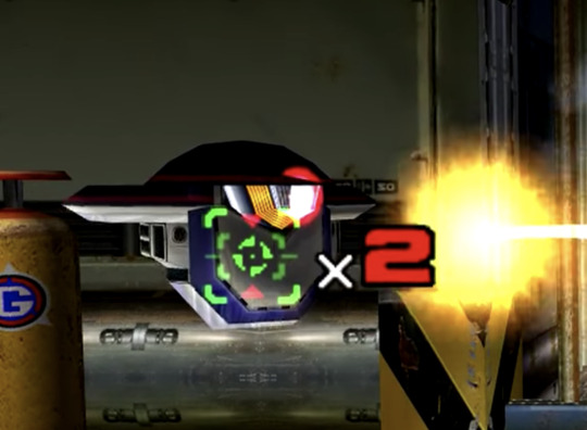
And here's a sonic 3 wreath and the SA2 lock on reticle from the mechs!
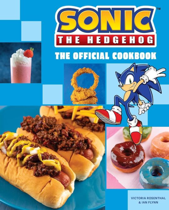
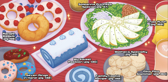
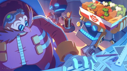
Amy and cream's spread of delicious looking food beautifully rendered by the coloring god Reggie! I wanted to include all their items from the Official Sonic the Hedgehog Cookbook! So if you want to make them yourself, YOU CAN! (except for uhh the experiment on another panel. you guys can figure out what's in that yourselves haha)
Also made sure to list all the pages you can find the recipes!
This is one of my fav gags that Iasmin wrote in!! Can you all guess what this is meant to vaguely resemble?
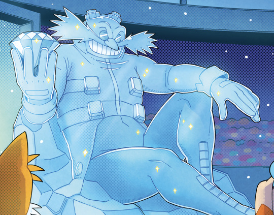
Quick round of character refs from Eggman's screen going in order from left to right! [Conductor's wife and Conductor, Barry and Gadget, Early Conductor design, Early Barry design (his outside eye markings are white tho), My uh Sonicsona lol]
Mecha Sonic mark 3? Yep Iasmin wanted him to be there and so there he shall be!! Hopefully we get to see him again!
I remember seeing the story Iasmin made and it really felt like it could be something you'd see in a sonic anime episode if it were made nowadays. I drew the comic with some influence from Sonic X because of that. I think the most telling detail fans might notice is the constant 3 spines for Sonic.
but YEAH another absolutely wonderful comic I got to work on! See ya'll on another issue!
1K notes
·
View notes
Text
why Aurora's art is genius
It's break for me, and I've been meaning to sit down and read the Aurora webcomic (https://comicaurora.com/, @comicaurora on Tumblr) for quite a bit. So I did that over the last few days.
And… y'know. I can't actually say "I should've read this earlier," because otherwise I would've been up at 2:30-3am when I had responsibilities in the morning and I couldn't have properly enjoyed it, but. Holy shit guys THIS COMIC.
I intended to just do a generalized "hello this is all the things I love about this story," and I wrote a paragraph or two about art style. …and then another. And another. And I realized I needed to actually reference things so I would stop being too vague. I was reading the comic on my tablet or phone, because I wanted to stay curled up in my chair, but I type at a big monitor and so I saw more details… aaaaaand it turned into its own giant-ass post.
SO. Enjoy a few thousand words of me nerding out about this insanely cool art style and how fucking gorgeous this comic is? (There are screenshots, I promise it isn't just a wall of text.) In my defense, I just spent two semesters in graphic design classes focusing on the Adobe Suite, so… I get to be a nerd about pretty things…???
All positive feedback btw! No downers here. <3
---
I cannot emphasize enough how much I love the beautiful, simple stylistic method of drawing characters and figures. It is absolutely stunning and effortless and utterly graceful—it is so hard to capture the sheer beauty and fluidity of the human form in such a fashion. Even a simple outline of a character feels dynamic! It's gorgeous!
Though I do have a love-hate relationship with this, because my artistic side looks at that lovely simplicity, goes "I CAN DO THAT!" and then I sit down and go to the paper and realize that no, in fact, I cannot do that yet, because that simplicity is born of a hell of a lot of practice and understanding of bodies and actually is really hard to do. It's a very developed style that only looks simple because the artist knows what they're doing. The human body is hard to pull off, and this comic does so beautifully and makes it look effortless.
Also: line weight line weight line weight. It's especially important in simplified shapes and figures like this, and hoo boy is it used excellently. It's especially apparent the newer the pages get—I love watching that improvement over time—but with simpler figures and lines, you get nice light lines to emphasize both smaller details, like in the draping of clothing and the curls of hair—which, hello, yes—and thicker lines to emphasize bigger and more important details and silhouettes. It's the sort of thing that's essential to most illustrations, but I wanted to make a note of it because it's so vital to this art style.
THE USE OF LAYER BLENDING MODES OH MY GODS. (...uhhh, apologies to the people who don't know what that means, it's a digital art program thing? This article explains it for beginners.)
Bear with me, I just finished my second Photoshop course, I spent months and months working on projects with this shit so I see the genius use of Screen and/or its siblings (of which there are many—if I say "Screen" here, assume I mean the entire umbrella of Screen blending modes and possibly Overlay) and go nuts, but seriously it's so clever and also fucking gorgeous:
Firstly: the use of screened-on sound effect words over an action? A "CRACK" written over a branch and then put on Screen in glowy green so that it's subtle enough that it doesn't disrupt the visual flow, but still sticks out enough to make itself heard? Little "scritches" that are transparent where they're laid on without outlines to emphasize the sound without disrupting the underlying image? FUCK YES. I haven't seen this done literally anywhere else—granted, I haven't read a massive amount of comics, but I've read enough—and it is so clever and I adore it. Examples:


Secondly: The beautiful lighting effects. The curling leaves, all the magic, the various glowing eyes, the fog, the way it's all so vividly colored but doesn't burn your eyeballs out—a balance that's way harder to achieve than you'd think—and the soft glows around them, eeeee it's so pretty so pretty SO PRETTY. Not sure if some of these are Outer/Inner Glow/Shadow layer effects or if it's entirely hand-drawn, but major kudos either way; I can see the beautiful use of blending modes and I SALUTE YOUR GENIUS.
I keep looking at some of this stuff and go "is that a layer effect or is it done by hand?" Because you can make some similar things with the Satin layer effect in Photoshop (I don't know if other programs have this? I'm gonna have to find out since I won't have access to PS for much longer ;-;) that resembles some of the swirly inner bits on some of the lit effects, but I'm not sure if it is that or not. Or you could mask over textures? There's... many ways to do it.
If done by hand: oh my gods the patience, how. If done with layer effects: really clever work that knows how to stop said effects from looking wonky, because ugh those things get temperamental. If done with a layer of texture that's been masked over: very, very good masking work. No matter the method, pretty shimmers and swirly bits inside the bigger pretty swirls!
Next: The way color contrast is used! I will never be over the glowy green-on-black Primordial Life vibes when Alinua gets dropped into that… unconscious space?? with Life, for example, and the sharp contrast of vines and crack and branches and leaves against pitch black is just visually stunning. The way the roots sink into the ground and the three-dimensional sensation of it is particularly badass here:

Friggin. How does this imply depth like that. HOW. IT'S SO FREAKING COOL.
A huge point here is also color language and use! Everybody has their own particular shade, generally matching their eyes, magic, and personality, and I adore how this is used to make it clear who's talking or who's doing an action. That was especially apparent to me with Dainix and Falst in the caves—their colors are both fairly warm, but quite distinct, and I love how this clarifies who's doing what in panels with a lot of action from both of them. There is a particular bit that stuck out to me, so I dug up the panels (see this page and the following one https://comicaurora.com/aurora/1-20-30/):

(Gods it looks even prettier now that I put it against a plain background. Also, appreciation to Falst for managing a bridal-carry midair, damn.)
The way that their colors MERGE here! And the immense attention to detail in doing so—Dainix is higher up than Falst is in the first panel, so Dainix's orange fades into Falst's orange at the base. The next panel has gold up top and orange on bottom; we can't really tell in that panel where each of them are, but that's carried over to the next panel—

—where we now see that Falst's position is raised above Dainix's due to the way he's carrying him. (Points for continuity!) And, of course, we see the little "huffs" flowing from orange to yellow over their heads (where Dainix's head is higher than Falst's) to merge the sound of their breathing, which is absurdly clever because it emphasizes to the viewer how we hear two sets of huffing overlaying each other, not one. Absolutely brilliant.
(A few other notes of appreciation to that panel: beautiful glows around them, the sparks, the jagged silhouette of the spider legs, the lovely colors that have no right to make the area around a spider corpse that pretty, the excellent texturing on the cave walls plus perspective, the way Falst's movements imply Dainix's hefty weight, the natural posing of the characters, their on-point expressions that convey exactly how fuckin terrifying everything is right now, the slight glows to their eyes, and also they're just handsome boys <3)
Next up: Rain!!!! So well done! It's subtle enough that it never ever disrupts the impact of the focal point, but evident enough you can tell! And more importantly: THE MIST OFF THE CHARACTERS. Rain does this irl, it has that little vapor that comes off you and makes that little misty effect that plays with lighting, it's so cool-looking and here it's used to such pretty effect!
One of the panel captions says something about it blurring out all the injuries on the characters but like THAT AIN'T TOO BIG OF A PROBLEM when it gets across the environmental vibes, and also that'd be how it would look in real life too so like… outside viewer's angle is the same as the characters', mostly? my point is: that's the environment!!! that's the vibes, that's the feel! It gets it across and it does so in the most pretty way possible!
And another thing re: rain, the use of it to establish perspective, particularly in panels like this—

—where we can tell we're looking down at Tynan due to the perspective on the rain and where it's pointing. Excellent. (Also, kudos for looking down and emphasizing how Tynan's losing his advantage—lovely use of visual storytelling.)
Additionally, the misting here:

We see it most heavily in the leftmost panel, where it's quite foggy as you would expect in a rainstorm, especially in an environment with a lot of heat, but it's also lightly powdered on in the following two panels and tends to follow light sources, which makes complete sense given how light bounces off particles in the air.
A major point of strength in these too is a thorough understanding of lighting, like rim lighting, the various hues and shades, and an intricate understanding of how light bounces off surfaces even when they're in shadow (we'll see a faint glow in spots where characters are half in shadow, but that's how it would work in real life, because of how light bounces around).
Bringing some of these points together: the fluidity of the lines in magic, and the way simple glowing lines are used to emphasize motion and the magic itself, is deeply clever. I'm basically pulling at random from panels and there's definitely even better examples, but here's one (see this page https://comicaurora.com/aurora/1-16-33/):

First panel, listed in numbers because these build on each other:
The tension of the lines in Tess's magic here. This works on a couple levels: first, the way she's holding her fists, as if she's pulling a rope taut.
The way there's one primary line, emphasizing the rope feeling, accompanied by smaller ones.
The additional lines starbursting around her hands, to indicate the energy crackling in her hands and how she's doing a good bit more than just holding it. (That combined with the fists suggests some tension to the magic, too.) Also the variations in brightness, a feature you'll find in actual lightning. :D Additional kudos for how the lightning sparks and breaks off the metal of the sword.
A handful of miscellaneous notes on the second panel:
The reflection of the flames in Erin's typically dark blue eyes (which bears a remarkable resemblance to Dainix, incidentally—almost a thematic sort of parallel given Erin's using the same magic Dainix specializes in?)
The flowing of fabric in the wind and associated variation in the lineart
The way Erin's tattoos interact with the fire he's pulling to his hand
The way the rain overlays some of the fainter areas of fire (attention! to! detail! hell yeah!)
I could go on. I won't because this is a lot of writing already.
Third panel gets paragraphs, not bullets:
Erin's giant-ass "FWOOM" of fire there, and the way the outline of the word is puffy-edged and gradated to feel almost three-dimensional, plus once again using Screen or a variation on it so that the stars show up in the background. All this against that stunning plume of fire, which ripples and sparks so gorgeously, and the ending "om" of the onomatopoeia is emphasized incredibly brightly against that, adding to the punch of it and making the plume feel even brighter.
Also, once again, rain helping establish perspective, especially in how it's very angular in the left side of the panel and then slowly becomes more like a point to the right to indicate it's falling directly down on the viewer. Add in the bright, beautiful glow effects, fainter but no less important black lines beneath them to emphasize the sky and smoke and the like, and the stunningly beautiful lighting and gradated glows surrounding Erin plus the lightning jagging up at him from below, and you get one hell of an impactful panel right there. (And there is definitely more in there I could break down, this is just a lot already.)
And in general: The colors in this? Incredible. The blues and purples and oranges and golds compliment so well, and it's all so rich.
Like, seriously, just throughout the whole comic, the use of gradients, blending modes, color balance and hues, all the things, all the things, it makes for the most beautiful effects and glows and such a rich environment. There's a very distinct style to this comic in its simplified backgrounds (which I recognize are done partly because it's way easier and also backgrounds are so time-consuming dear gods but lemme say this) and vivid, smoothly drawn characters; the simplicity lets them come to the front and gives room for those beautiful, richly saturated focal points, letting the stylized designs of the magic and characters shine. The use of distinct silhouettes is insanely good. Honestly, complex backgrounds might run the risk of making everything too visually busy in this case. It's just, augh, so GORGEOUS.
Another bit, take a look at this page (https://comicaurora.com/aurora/1-15-28/):

It's not quite as evident here as it is in the next page, but this one does some other fun things so I'm grabbing it. Points:
Once again, using different colors to represent different character actions. The "WHAM" of Kendal hitting the ground is caused by Dainix's force, so it's orange (and kudos for doubling the word over to add a shake effect). But we see blue layered underneath, which could be an environmental choice, but might also be because it's Kendal, whose color is blue.
And speaking off, take a look at the right-most panel on top, where Kendal grabs the spear: his motion is, again, illustrated in bright blue, versus the atmospheric screened-on orange lines that point toward him around the whole panel (I'm sure these have a name, I think they might be more of a manga thing though and the only experience I have in manga is reading a bit of Fullmetal Alchemist). Those lines emphasize the weight of the spear being shoved at him, and their color tells us Dainix is responsible for it.
One of my all-time favorite effects in this comic is the way cracks manifest across Dainix's body to represent when he starts to lose control; it is utterly gorgeous and wonderfully thematic. These are more evident in the page before and after this one, but you get a decent idea here. I love the way they glow softly, the way the fire juuuust flickers through at the start and then becomes more evident over time, and the cracks feel so realistic, like his skin is made of pottery. Additional points for how fire begins to creep into his hair.
A small detail that's generally consistent across the comic, but which I want to make note of here because you can see it pretty well: Kendal's eyes glow about the same as the jewel in his sword, mirroring his connection to said sword and calling back to how the jewel became Vash's eye temporarily and thus was once Kendal's eye. You can always see this connection (though there might be some spots where this also changes in a symbolic manner; I went through it quickly on the first time around, so I'll pay more attention when I inevitably reread this), where Kendal's always got that little shine of blue in his eyes the same as the jewel. It's a beautiful visual parallel that encourages the reader to subconsciously link them together, especially since the lines used to illustrate character movements typically mirror their eye color. It's an extension of Kendal.
Did I mention how ABSOLUTELY BEAUTIFUL the colors in this are?
Also, the mythological/legend-type scenes are illustrated in familiar style often used for that type of story, a simple and heavily symbolic two-dimensional cave-painting-like look. They are absolutely beautiful on many levels, employing simple, lovely gradients, slightly rougher and thicker lineart that is nonetheless smoothly beautiful, and working with clear silhouettes (a major strength of this art style, but also a strength in the comic overall). But in particular, I wanted to call attention to a particular thing (see this page https://comicaurora.com/aurora/1-12-4/):

The flowing symbolic lineart surrounding each character. This is actually quite consistent across characters—see also Life's typical lines and how they curl:

What's particularly interesting here is how these symbols are often similar, but not the same. Vash's lines are always smooth, clean curls, often playing off each other and echoing one another like ripples in a pond. You'd think they'd look too similar to Life's—but they don't. Life's curl like vines, and they remain connected; where one curve might echo another but exist entirely detached from each other in Vash's, Life's lines still remain wound together, because vines are continuous and don't float around. :P
Tahraim's are less continuous, often breaking up with significantly smaller bits and pieces floating around like—of course—sparks, and come to sharper points. These are also constants: we see the vines repeated over and over in Alinua's dreams of Life, and the echoing ripples of Vash are consistent wherever we encounter him. Kendal's dream of the ghost citizens of the city of Vash in the last few chapters is filled with these rippling, echoing patterns, to beautiful effect (https://comicaurora.com/aurora/1-20-14/):

They ripple and spiral, often in long, sinuous curves, with smooth elegance. It reminds me a great deal of images of space and sine waves and the like. This establishes a definite feel to these different characters and their magic. And the thing is, that's not something that had to be done—the colors are good at emphasizing who's who. But it was done, and it adds a whole other dimension to the story. Whenever you're in a deity's domain, you know whose it is no matter the color.
Regarding that shape language, I wanted to make another note, too—Vash is sometimes described as chaotic and doing what he likes, which is interesting to me, because smooth, elegant curves and the color blue aren't generally associated with chaos. So while Vash might behave like that on the surface, I'm guessing he's got a lot more going on underneath; he's probably much more intentional in his actions than you'd think at a glance, and he is certainly quite caring with his city. The other thing is that this suits Kendal perfectly. He's a paragon character; he is kind, virtuous, and self-sacrificing, and often we see him aiming to calm others and keep them safe. Blue is such a good color for him. There is… probably more to this, but I'm not deep enough in yet to say.
And here's the thing: I'm only scratching the surface. There is so much more here I'm not covering (color palettes! outfits! character design! environment! the deities! so much more!) and a lot more I can't cover, because I don't have the experience; this is me as a hobbyist artist who happened to take a couple design classes because I wanted to. The art style to this comic is so clever and creative and beautiful, though, I just had to go off about it. <3
...brownie points for getting all the way down here? Have a cookie.
#aurora comic#aurora webcomic#comicaurora#art analysis#...I hope those are the right tags???#new fandom new tagging practices to learn ig#much thanks for something to read while I try to rest my wrists. carpal tunnel BAD. (ignore that I wrote this I've got braces ok it's fine)#anyway! I HAVE. MANY MORE THOUGHTS. ON THE STORY ITSELF. THIS LOVELY STORY#also a collection of reactions to a chunk of the comic before I hit the point where I was too busy reading to write anything down#idk how to format those tho#...yeet them into one post...???#eh I usually don't go off this much these days but this seems like a smaller tight-knit fandom so... might as well help build it?#and I have a little more time thanks to break so#oh yes also shoutout to my insanely awesome professor for teaching me all the technical stuff from this he is LOVELY#made an incredibly complex program into something comprehensible <3#synapse talks
743 notes
·
View notes
Text
Johnshi HCs
I'm sorry most of these aren't explicitly romantic I just have so many HCs about the two of them it's driving me crazy.
Johnny holds Kenshi by the waist, Kenshi holds Johnny by the shoulder or the bicep. After some time Kenshi starts to go for his hand instead.
Johnny is on his phone all of the time. Kenshi will either avoid the internet for a week or plays chess on the computer at the kitchen table for a day straight without talking to anyone (secretly uses Sento for this).
Kenshi has good spirits (literally) when it comes to his blindness, but can get very defensive when others pity him for it. Johnny is the only other person he will let touch his blindfold, take it off, or wash it.
Kenshi doesn't love the name "Johnny Cage" and thinks that "John Carlton" suits him. Johnny thinks that it sounds like an "old man's name"
Kenshi would visit Johnny on set sometimes but not say or do anything but sit in the background and watch him in silence until he was done.
Speaking of that- Kenshi had a good time filming in Outworld for Johnny's movie (made him feel like an action hero), but absolutely refused to watch the parts he was in.
Kenshi thought Johnny's movies were mostly cheesy before and after meeting him. However, he ended up rewatching all of them and got excited when there was news he got cast for a new one (before they started to officially date).
Johnny was a pretty good student growing up who made A's and B's as per expectations of his parents but hated school because he got picked on. He got into a decent university where he ended up falling in love with physics. He accidentally became famous around the time he was 20 (maybe he got street casted and went viral?) and had to balance acting with school to get his pHD. He is that school's most famous alumni.
Kenshi was mostly homeschooled by his parents and did not show much attention in academics in his youth due to his intense upbringing in the yakuza. This is something that he regrets but accepts that it wasn't really his choice to begin with. However he is quite knowledgable, knows broadly about history and literature, and can speak multiple languages (Japanese, Chinese, Korean, English, Spanish). He also learns braille relatively fast after losing eyesight.
Kenshi thinks it's so hot that Johnny has a pHD but also thinks its so strange he doesn't do anything with it. (It's a backup plan so he can write textbooks if his career tanks)
Johnny is great at drawing due to it being a hobby growing up stemming from him being a major comic book fan. Kenshi isn't very artistic however used to be able to do mediocre calligraphy (a skill he learned from his parents) before he became blind.
Kenshi breaking into Cage Mansion the second Cris left was admittedly pretty awkward for him (but he was too distracted by Sento to rly care).
Kenshi tries to not let it get to him, but he is saddened by the fact he cannot read properly anymore. Johnny tries to support him by buying him every audiobook in every language he understands. Kenshi will sometimes ask Johnny to read to him mostly because he loves the sound of his voice.
At first, Kenshi tried to get Sento to help him with daily tasks (cooking, cleaning, etc.), but after talking to Kuai Liang he tries not to rely on Sento on anything non-kombat related.
Kenshi has a slight lisp (I'm sorryyyy this isn't rly a hc but you can hear it in his intro dialogues he still sounds like a badass tho i think it's super cute thank god for Vic Chao)
Johnny makes their home a "smart home" a.k.a 30 Alexas in every room of their place, and a Samsung fridge he can live tweet from while making green juice.
Kenshi sometimes used to drive with Sento in the back seat and got arrested for it one time. Now he gets told off by Johnny for it every time he tries it again.
Kenshi will only drink milky coffee (lattes, cappuccinos, etc.) and prefers tea. Johnny hates coffee and tea and pounds red bull in the morning.
Kenshi used to care a lot about his personal style and mostly only wore suits and dress attire. After losing his eyesight, he didn't care as much anymore and just focused on wearing things that were comfortable (sweatpants, sweaters)
Johnny buys Kenshi soft fluffy things to wear all the time. Kenshi always says it's unnecessary but ends up wearing it anyway.
In MK1 Johnny is 32, and Kenshi is 39 (I like the idea of Kenshi being old it just makes sense to me). It both amuses and horrifies Kenshi that he's dating a white man 7 yrs his junior.
Johnny calls him "old man Takahashi" and Kenshi just goes along with it and says "get off my lawn you punk" or something LOL
I think Kenshi was more of the brawny "tough guy" of the yakuza than the suave, seductive type. He has more of an awkward and stony personality. And the fact that he was desperate to get out makes me think he wouldn't entertain the "flirty" role of the job. (a.k.a Kenshi is BAD at flirting unlike a certain someone)
Johnny sometimes helps Kenshis clunky azz samurai gear on before he engages in kombat. Johnny is also the reason Kenshi sometimes gives up and just wears a suit.
Kenshi shops like an old Asian dad. LOVES Costco, will eat all of the samples. Will buy everything on sale even if he doesn't need it. Will not take Johnny with him because his megastardom ruins the peace of being unrecognized. Has taken Raiden with him though. Will use Johnny's credit card. Johnny is dismayed that he hasn't taken a liking to Erewhon and Whole Foods
When Johnny isn't there with him at night Kenshi will play his movies and fall asleep to the sound of his voice
Kenshi will have sex with the blindfold on. He will fall asleep next to Johnny with it off.
Kenshi doesn't like sleeping with the blindfold on, but was worried it would scare or disgust Johnny in some way. It doesn't and it never did. In fact, Johnny appreciates the intimacy that it creates.
#Johnshi#Johnshi hcs#Johnny cage#kenshi takahashi#johnny x kenshi#mk1#maybe i'll write more of these#johnshi isn't even my fave mk ship lol#these are so kenshi centric#now you know what character i have projected onto#mk brainrot
224 notes
·
View notes
Note
I really enjoyed seeing your last post!!! It reminded me of something else that I noticed when I was younger and not really seeing LO through the eyes I am now- even when I lived LO, I noticed that Minthe’s bust size.. Might’ve changed? (I could be remembering wrong, and I’m sorry if I am!) I didn’t think on it too much back then, but it felt a lot like the “she could never measure up to Persephone”, or the “she’s nothing to worry about when it comes to Persephone”!!
But then, when Minthe was supposed to be more of a “problem,” I noticed she’d get drawn with a larger bust- or at least larger than it had been back in the earliest episodes!
This could all make absolutely no sense, (and I apologize for just rambling in your askbox!), but I watching a character’s “worthiness” be portrayed through something as simple and neutral as their chest size stuck out to me then, and sticks out to me now!! 😓)
Oh don't apologize, you're literally pointing out exactly the things we've even talked about in the ULO community !
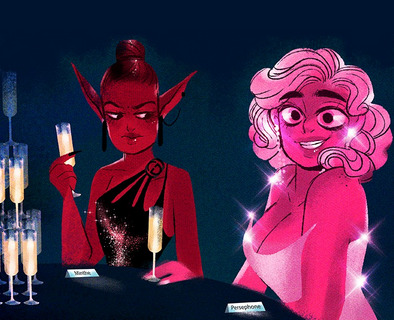
Literally here she is in S1:
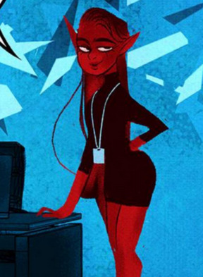
And we even get a scene of her smooshing her boobs together in Episode 35 in an effort to make them seem bigger because she legit feels like Hades is pursuing the "new hotness" in the office based around their physical appearances:


But then she conveniently goes up like 3 cup sizes when it's time for her to be cemented as the villain and suffer her fate by getting turned into a plant?
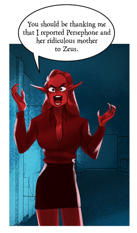
I've literally seen fans grasp at straws to explain that maybe she got a boob job but then they don't realize that the story at this point has only been going on for like, 3-4 weeks at most. At best you shouldn't have to make those massive leaps to explain the inconsistent character body types. If Minthe really did get a boob job, don't you think that's something that should have been explained in the comic?
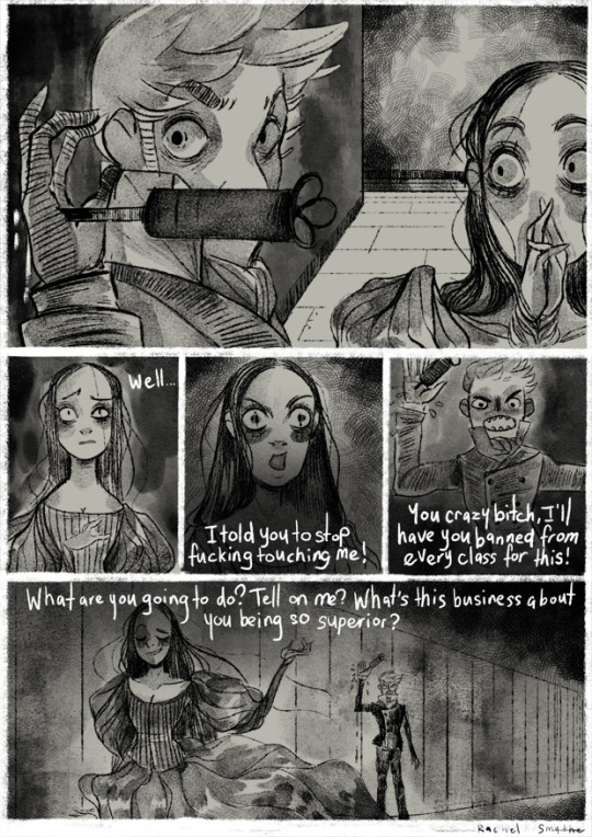
And let's be real, we all know what it's really about because it's just more of Rachel pitting women against women:
What's wild though is that Rachel is vastly misinterpreting a classic image here:

A lot of people look at that image of Jayne Mansfield and Sophia Loren and just immediately assume that Sophia is giving Jayne the stink eye over her outfit. And of course, we see this misinterpretation in Rachel's drawing that swaps Sophia and Jayne with Minthe and Persephone.
When in FACT what was actually going on was that Sophia spotted Jayne getting dangerously close to a wardrobe malfunction / nip slip and the camera just happened to catch her making a face that could be misinterpreted as slut-shaming.
"Yes, Paramount had organized a party for me. All of cinema was there, it was incredible. And then comes in Jayne Mansfield, the last one to come. For me, that was when it got amazing. She came right for my table. She knew everyone was watching. She sat down. And now, she was barely… Listen. Look at the picture. Where are my eyes? I'm staring at her nipples because I am afraid they are about to come onto my plate. In my face you can see the fear. I'm so frightened that everything in her dress is going to blow—BOOM!—and spill all over the table."
Ans Sophia has actually stated that she doesn't like those misinterpretations and is trying to actively distance herself from it.
"Actually, many, many times I am given this photo to autograph it. And I never do. I don't want to have anything to do with that. And also out of respect for Jayne Mansfield because she's not with us anymore."
Jayne died in 1967, only living for about 30 years, and Sophia herself is actually still around. I can imagine how disheartening it is to see people still misinterpreting a photo of two friends and colleagues especially when it's through the lens of slut-shaming an accomplished actress who is unfortunately no longer with us.
Sooo yeah all that said, I'm less inclined to believe it was Minthe getting a boob job and more inclined to believe it was more of Rachel's weird internalized misogyny picking and choosing which women are "sluts" and which ones are "victims" for dressing or being built a certain way. It's really gross when you start to notice it.
People have also pointed out how odd it is that every single character who gets into a relationship or is in a relationship by S3 seemingly morphs into copies of Hades and Persephone, which is really just more of a testament to how lazy Rachel is in her character designs. In her head she's just trying Hades and Persephone all the time but different colors, I imagine at this point the H x P relationship is the only thing that she's interested in writing/drawing about (and even that's arguably hanging on by a thread because she couldn't even let their long-awaited wedding scene have real room to breathe) so it's almost like she's defaulting to just zoning out and drawing nothing but H x P and then having her assistants color them differently based on who it's actually supposed to be.
But I digress. The body shaming and slut shaming is definitely hard-baked into LO and how it portrays its characters. Despite Rachel having written an actual comic portraying sexism in the past, she still can't seem to express her ideas around sexism, to the point of, again, saying she "didn't know sexism was that bad" until she worked on LO. Like, girl... you drew a comic about sexism before LO, what are you talking about? Is this more of you not wanting to acknowledge ANY of the work you did prior to LO, or are you telling me you didn't intend for those older works to be interpreted as sexism???


"I feel like female characters in general, people will be a little harsher on them and sometimes way harsher on them, and I used to be like.. before I started writing the story and like making a story I was like yeah, sexism is not that bad, and [now] I was like oh it's bad. It's quite bad [laughs], so like, I don't know, I feel like the female characters in the story don't get so much of a pass. But this isn't consistent across the board, it's not all the time." - Rachel Smythe, Girl Wonder Podcast circa 2022
#WHICH IS IT RACHEL#DO YOU THINK SEXISM WASN'T THAT BAD OR DO YOU BLAME THE PATRIARCHY FOR EVERYTHING#DO YOU THINK PEOPLE ARE TOO HARSH ON YOUR FEMALE CHARACTERS OR DO YOU MEAN JUST PERSEPHONE-#lore olympus critical#anti lore olympus#lo critical#ama#ask me anything#anon ama#anon ask me anything
195 notes
·
View notes
Note
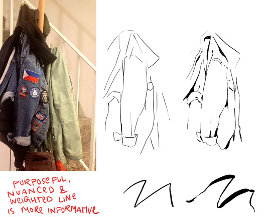
sorry if this has been asked before, but i wanted to ask about your lineart! the weight and line economy are just so nice, i get stars in my eyes looking at your lineart and doodles. could i ask what your approach to lineart is and what tips you might offer?

Wow I love these questions - Line is so interesting!!! It's a really big topic so I feel like any tips I give will be just barely scratching the surface. It's like deceptively simple...any given line drawing is essentially taking all the information we glean from seeing something irl ie light, shadow, dimension, texture, perspective, etc and boiling it down to the simplest possible visual information.
I think most commonly my line is informed by light source so like. thicker more continuous lines face away from the light and thinner more broken lines towards. and a lot of my spot blacks r simply cast shadows.

here's a more extreme example

BUT like everything to do with art there's no hard and fast rules. I use blacks when I think it'll be effective or interesting and I leave them out when I don't need em. umm couple things I find myself doing a lot... using spot blacks to make the separation between characters clearer. I like casting shadow in between characters so its easy to separate and read their silhouettes even when they're mashed together.

u can go even further to purposely create a silhouette like

to draw attention to a finger or tongue LOL. There's some comic book artists who are absolute masters at this type of stylization. Alex toth and his spiritual successor Chris samnee come to mind for me right away.
(toth)
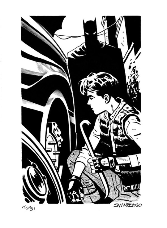
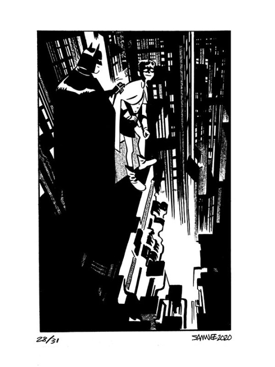
(samnee)
I feel like I'm also often using line weight to separate planes receding in space

im naturally a really heavy handed and scribbly drawer(...?) draftsman. and im nearsighted so when i see things i percieve and break it down into big shapes over thin contours. so stuff like spot blacks and shadows came easy to me, the tricky part was making the rest of the lines lighter when they needed to be so the blacks could actually have impact LOLL. a lot of effective visual communication is about balancing contrasts. like I had to really train myself to press less hard on the pen. I think this is actually really evident if u go back in my archive to older sketches LOL


I actually feel like a lot of how I trained my hand to tackle line weights was thru stuff like hand lettering where you rly have to focus on being sensitive to that kind of thing.. contrasting strokes etc.

also exercises like figure drawing will have you flexing those muscles constantly

I'm starting to just regurgitate lessons from freshman year of art school so I'll stop here with the demos but yeah...I hope this was helpful!? I love line!!! I want to get even better at line work so I can feel confident posting work that's only line no color or value... I'll leave you with a bunch of artists who I think have particularly expressive and beautiful linework (not including toth and samnee who I already mentioned and who's work I love so much). You can probably learn much more from them than you can from me...!

Charles dana gibson LOL


Matias bergara
tonci zonjic

naoki urasawa

Daniel warren johnson


shiyoon kim

michel breton
also yoji shinkawa, tomer hanuka, leo romero, I feel like I'm gonna post this and think of so many more. there's so many good artists...!
1K notes
·
View notes
Text
comics and animation have a lot in common, but one interesting difference is that arranging pictures in space rather than time means there's a tradeoff between the amount of drawings you use to show an action, the amount of space each drawing is given, and the amount of pages you cover which determines the 'pacing' of the comic.
if you slice the page up into a lot of tiny boxes to show many stages of a motion like an animation, then each panel has correspondingly less space for background details, and it may affect the aspect ratio of panels. if you give yourself space for a large splash panel, then the pace will slow.
one solution to this problem is to break the convention that a panel is a single 'frame' of action and show multiple images of a character in the same background. Kentaro Miura did this sometimes, and Tradd Moore (on here - @traddmoore) is an expert who uses it frequently (I'll reblog his spiderman comic in a minute). Kamome Shirahama, a genius at creative paneling, also uses it in a couple of places.

a similar trick will have a single background continuous across multiple panels, showing a static 'camera shot' at different times.
the limitation of these methods is that breaking convention makes the panel a little harder to process - you need to make absolutely sure you cue the reader clearly about where to enter the panel. and it requires action that involves a large movement so the drawings don't overlap. so most authors use it as a 'once in a while' thing.
an opposite approach, used in early parts of Superpose by Seosamh and Anka and Goodbye, Eri by Tatsuki Fujimoto, is to go even harder with the cinematic convention and give each panel the aspect ratio and detailed backgrounds of a film camera, taking all the space you need - Superpose opens with about two panels per page which may be very similar to each other, creating a very deliberate sense of pacing. to pull this off you need to be either extremely fast at drawing like Fujimoto, or accept your comic taking a long time to get anywhere - and you also need to be very good at placing the camera in space. you're basically drawing fully rendered storyboards at that point.
one of the interesting difficulties of comic-making is controlling pacing. if you draw many very similar panels it will convey a sense of high concentration and intensity, or a heavy atmosphere, like a long take in a film. much like in prose, if you spend a lot of pictures on something it draws attention to it. so you want to use the 'slow down' sparingly for effect.
as in animation, you're also limited by your own capacity to draw all those pictures, and moreover the space to put them. this is one reason why comics in magazines tend to be sharply limited in page count, and webcomics tend to be very slow compared to other forms of serial fiction. (perhaps manga can make heavier use of pacing tricks by virtue of cheaper printing and endemic overwork. i don't think that's the full story though.) meanwhile, when Transmetropolitan started to experiment with manga-style pacing, apparently it upset fans who felt the story progression was being diluted. when reading Transmet in one go, though, you don't even notice. what works well in an anthology of hundreds of pages may work poorly in a serial.
i think the pace of the reader is often controlled primarily by the text - at least for me I find I sometimes have a tendency to jump very quickly over panels to get to the next bit of the story and have to consciously slow myself down to make sure I don't fail to appreciate the art. so while a series of text-less panels is effective artistically, you might want some words to act as speed bumps. but too much text per picture and your comic becomes exhausting to read, like Subnormality. and you don't want to over-explain what's conveyed perfectly well by the pictures, as many older comics do.
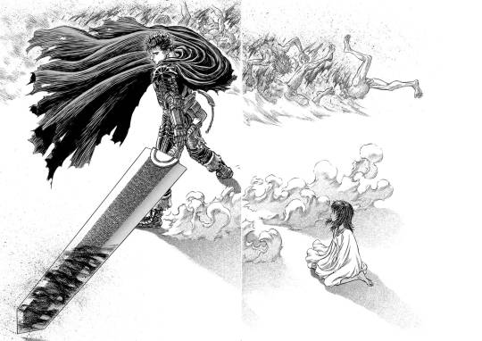
ideally, you use your text, small panels and large panels to create a sense of rhythm. a big splash panel can act as the full stop in a sentence, or a longer take after a series of rapid cuts. negative space is an especially powerful device in the right hands: when you hit a page of Chainsaw Man or Berserk that is almost entirely white after several pages of dense illustration, a character bursting into the void, there's an immediate 'wow' effect before you even process what's happening in the illustration. (i can't seem to find the chainsaw man example i had in mind, so here's one from berserk.)
and on that note, the other thing that comics have that animation doesn't is the impact of being confronted with the whole gestalt page. in the manga I was helping Fall translate when she died, We Are Magical Boys (Bokura wa Mahou Shounen), Fukushima Teppei frequently puts one panel much larger than the others so it dominates the page, usually a close-up or full length character portrait, allowing the cuteness of their unique art style to treasure centre stage. Sandman, which I'm currently rereading, is full of elaborate page compositions, where a drawing might not even be a panel per se, but a visual element. Witch Hat Atelier is full of elaborate borders and clever compositions. just look at this...

how did she come up with that! the absolute madwoman! the right side is relatively standard Atelier (establishing shots, the main cast eagerly stepping out of their panel) but on the left, we have a set of panels falling down from above onto a large splash panel. even though this image is concurrent, the panels invite us to appreciate it in chunks, and the page as a whole has this great visual of the pages of a book, continuing the image of the previous page. (more of this on upcoming post on Atelier)
a character emerging from their panel to overlap others, breaking up the monotony of the grid and adding a sense of depth to the page as a whole, is a reliably appealing motif. also, drawing one panel borderless, so it implicitly continues behind the other panels. large areas of black and white and choices of colour saturation can convey a mood to the page as a whole.
the danger you run is always the loss of clarity. the reader must be able to tell what panels to read in what order without thinking about it. Sandman will sometimes do a double page spread where you're supposed to read across both pages, and this consistently trips me up. Dresden Codak is by an adhd author and her drive to give every page an elaborate layout is very familiar to me, but especially in Hob, it messes with the flow of the comic overall.
so every comic page, every comic, is a fascinating balance of all these factors. how to create a strong, visually interesting composition, control the pacing appropriate to tone, create a thrilling sense of rhythm... all without sacrificing clarity.
not much more to say about this as yet, it's just something I'm thinking about while trying to lay out a page of Ghost Barrier. my tendency is to generally use larger panels, and try to be creative with layouts, but you have to consider not just each page in isolation but how they relate to other pages. so to make the splash panel land, I need to contrast with a denser page immediately beforehand.
the more I make comics the more of a feel I'll get. cool medium!
900 notes
·
View notes
Text
I need anyone who genuinely dislikes Usopp to take a long look in the mirror because yeah, he can be a bit annoying at times but he is honestly a good and interesting character!!
He is just as loyal as any other member of the crew and fights the strongest when he’s fighting on someone else’s behalf. (See: him fighting for Sanji in Skypeia, fighting for Robin at Eneis Lobby, fighting for Luffy in Dressrosa, fighting for Tama and Nami in Wano.) He is a major player in so many of the battles in the series that it baffles me that people can think of him as an unimportant member of the crew.
And Usopp is a fucking genius??? Hello???? He’s able to make weapons powerful enough to create storms and tornadoes. He is canonically a jack-of-all trades that supports the crew in their daily lives and in battle. The Going Merry only lasted as long as she did because Usopp was around to care for her. He was the only one to see her Klabauterman!! Usopp is not only creative and fun but is able to bring those creations to life, whether it be his drawings or his gadgets, and I think that’s so beautiful. I miss pre-TS because of all his inventions we got to see.
Let’s not forget that Usopp is so, so kind!! He made friends with the kids in his village and told stories to Kaya to help her feel better when she was ill. He fought to protect her and Syrup Village from Kuro. Personally, I will never get over filler ep on Fireworks Island (ep. 134) where he cheered up Kodoma and encouraged her to continue her pyrotechnics, assuring that her parents were proud of her. Knowing he also lost his parents at a young age makes the scene hit that much harder. (And again, he showed his genius by figuring out a way to launch the firework that killed Kodoma’s parents!!) It may not be canon to the manga but but I think that episode is super accurate to his character.
What I think makes him the most interesting is that we see his flaws and mistakes more than any of the other Straw Hats. We see his insecurities in Water 7 and his fear in Dressrosa. But we also see him growing and learning and being encouraged by his crewmates. Aside from Robin, I think Usopp has changed and grown the most out of the Straw Hats. With his goal to become a brave warrior of the sea he has so much potential for even more growth!!
Like I said earlier, some people think Usopp is annoying which he can be sometimes, but that’s also because he’s literally comic relief. And he does so well at it bc he’s actually so damn funny?? He makes me laugh out loud all the time. One Piece wouldn’t be even half as funny without Usopp.
I also appreciate that as an individual he has so many moments with the other Straw Hats. There are a lot of relationships that don’t get explored as much as we’d like, but I think we get to see Usopp’s friendships with the crew pretty often. He fights for Luffy, plays around with Chopper, teases Zoro, is teased by Robin, gossips with Nami, hangs around Sanji, and his whole relationship with Franky has so many layers to it.
Aaahh, I have so many hopes for Usopp in the series that I pray will be fulfilled!! I want him to have a badass arc in Elbaf full of character growth. I want to see him develop and continue to use his Haki (which he gained when trying to save Luffy are you KIDDING me). I want his reunion with Yasopp to be emotional and bittersweet. If he could personally beat Yasopp in a fight I would ascend to the heavens.
Usopp is such an important, complex, and interesting character and I absolutely hate to see him reduced to being a gag character or the weakest member of the Straw Hats. He may not be a monster but he is amazing and I love him.
TLDR; if you disrespect Usopp I wish you a very Die.
#usopp#god usopp#one piece usopp#op usopp#HE IS VERY IMPORTANT TO ME#anyone who disrespects usopp is a FOOL and BLIND and doesn’t deserve anything#he is so important to the series why won’t you guys get that#fellow usopp truthers hear my cries!! we will give our sniper the respect he deserves#one piece#strawhats#red’s ramblings#op meta
127 notes
·
View notes
Text
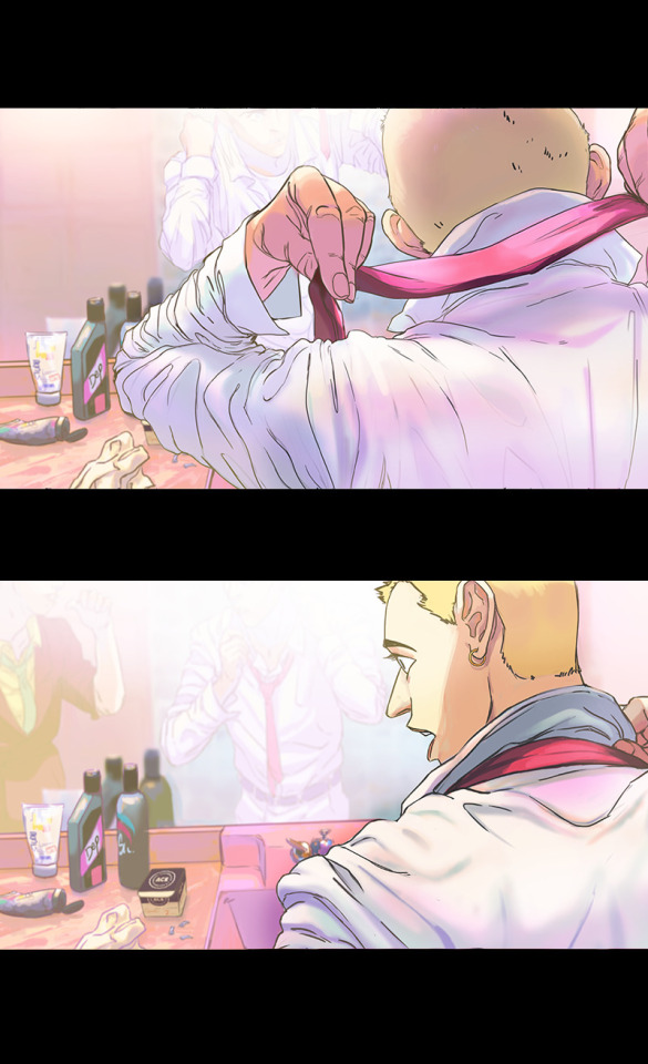
there's a lover in the story, but the story's still the same
Ahh, don’t you love it when fear motivates your drawing mood? (not really)
That’s what I felt reading the scene that is drawn below. It’s fear for Yuuji but also feeling excited picturing an emotionless teen!Gojou so here I am. Always down bad for Vox’s Goyuu fics, aren’t I? *sighs*
Welp, here we go.
Title: there’s a lover in the story, but the story’s still the same
Author: @voxofthevoid
Second fic of the series there’s a lover in the story, but the story’s still the same
Pairing YuuGo, NSFW, please read the tags carefully before giving it a read... the usual drill ∠( ᐛ 」∠)_
!!! SPOILER FOR THE FIC !!!
Highly recommend you guys to read them first. Or not, it’s up to you honestly :v


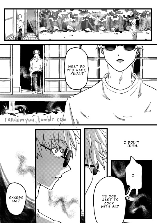
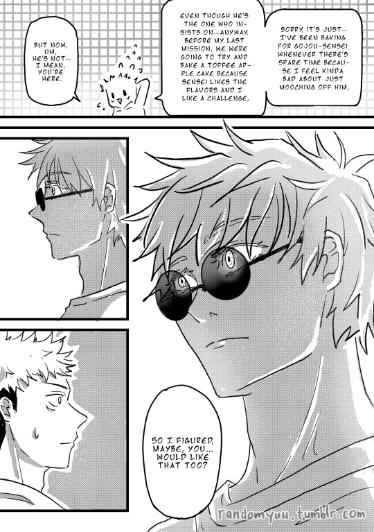
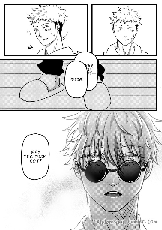
Usually I would gush about the fic but I’ve already done that under the fic itself so I just want you to know this comic is solely carried by me wanting to draw the ticking time bomb called teen!Gojou-post-discussion-with-adult!Ieiri. You could probably guess what they’re talking about :”)
The fear for Yuuji’s well-being started this, but Satoru’s cold eyes kept me going. I can’t get rid of it from my mind lmao
You can say drawing these kind of expressions is my jam ( ̄▽ ̄)
I hope I did Satoru’s emotions justice haha
A bit of my thoughts and doodle below. Unhinged maybe, it’s midnight, I got more work to do after this, and my brain cells are barely hanging on. Haha I'm living the life-
I AM STILL REELING FROM THE FACT I MANAGED TO GET THIS DONE.
There are so many things I want to talk about in the process of making this. But after I typed it out, most of them sounded so unnecessary so I rewrote it a few times. I tried to make this as short as possible lmao
Typesetting and sketching are the roughest parts of this project. During these stages, I kept feeling everything I did wasn’t doing the scene enough justice, and it was frustrating. As I planned this project, I read a few doujins and noticed the font types scanlation teams use. There are so many of them, and each helped convey the tone of each image. Felt like crying when I realised I’m not knowledgeable enough to apply good typesetting, ngl. And then the interior design. Fuck, the frustration is so real. I am absolutely clueless about this kind of thing. Tracing lots of references because I have no perception of space makes me feel even worse. I knew first times rarely create a masterpiece, but I was not satisfied with my accomplishment and the feeling of failing to fulfil my own expectations hurt.
BUT.
Thank goodness most of the things I need to draw are Shouko, Yuuji and Satoru. Because dear g o d drawing them healed me. I found so much comfort in drawing Shouko’s long hair and Satoru’s eyes and drowning Yuuji in an oversized hoodie. The comfort zone of character drawing never feels so real lmaooo
Drawing them was so effective that I can look back at the backgrounds with acceptance. Hey, I did it! Not perfect just yet, but I did it!
Haha I feel like I’m losing my mind. I don’t know if it’s in a good way or a bad way. Guess I do have one or two screws loose.
Only for Yuuji lmao
(nah I just need sleep, or cooling down from the rush of having finished this)
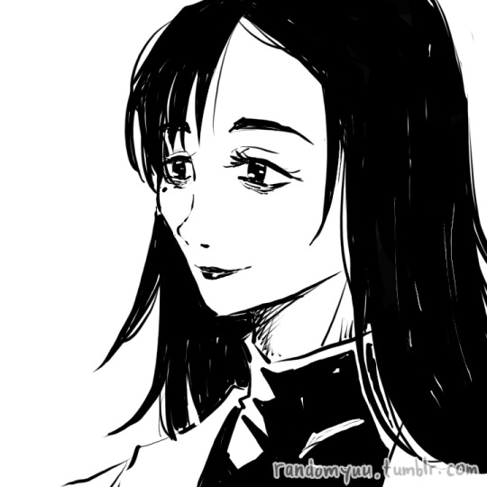
It might come off as a surprise if you’ve only seen my art on Tumblr, but I’ve always preferred to draw feminine-leaning ladies. I’ve always loved drawing their curves, whether it’s the figure, the clothes, or the (long) hair. But I’ve grown to like drawing masculine gentlemen as well with their sharp edges and straight lines, and now my ladies start to look more androgynous lmao
Anyway, I was pretty stoked to be able to draw adult!Ieiri! I… I kind of miss drawing long hair so here have some more before you go on your day ∠( ᐛ 」∠)_
#yuu's art#jjk-fic-fanart#jjk-ship#五悠#goyuu#goyu#5u#gojou x yuuji#I'll see you sometime later#if real life lets me haha#:")
158 notes
·
View notes
Note
I absolutely adore your work! What's your process been like for writing NewOldRare and developing Neil and Louis? Your art and character writing feel so genuine and realistic to me, so I'm really curious how you go about it!
Thank you! I've always been obsessed with character-driven stories and interaction, so I guess this is the result of years of practice and observation, and dismantling stories that do and don't work to see why.
Unfortunately, there isn't a clear way to explain it. It's one of those "you know when you get it right" things, requiring an eye developed over a long time. I will redraw things if I don't feel like I've captured the nuance I wanted to, and a few months later I'll look at it and see where I could have done better. Same with writing. I'm obsessed with pacing and page design, I had a moment of "that's how I think about it too" when Will Eisner described comic panels like music.
The technical approach is I make notes about stories I want to write, then I expand that into outlines, then scripts, then thumbnails, then I draw the comics and colour them and finalise the dialogue. At every stage I'm asking myself if it feels right, if I'm getting across what I want to. That's not to say there aren't surprises and things don't develop organically, but every stage is an attempt to solve as many problems as I can before the next stage. My thumbnails are quite detailed because it makes pencils easier, and I spend a while on them.
I have total aphantasia so I am operating off feeling rather than any mental images. I have no idea how it works and no idea why I pursue this when I'm missing what many visual artists describe as a crucial component. I just do it and I have better things to do (art) than wonder about something I can't change. I don't think it's made me a better or worse artist, though I think it has given me different ways of approaching/developing things. But also, literally everything about you makes your work different to everyone else's work.
You need to care. If your character is into music, listen to that music. If they have an old car that keeps breaking down, read up on common problems for that model. If they work as a film projectionist, watch a training film about using the machine. The characters care about things, have things in their lives that matter, have skills and interests and challenges. If I don't care enough to understand them, why should anyone reading it care, and also why am I writing it if I don't care?
So I do, and in caring I understand them better. This helps me develop characters/story but it also gives me so much more to write/draw. Understanding how things work and how they are done from a physical standpoint makes writing/drawing them easier too. The more you put into your head, the more you can get out later. I'll do way less for a 12 page short than for a 300 page graphic novel, obviously. Pick your battles, a little can go a long way.
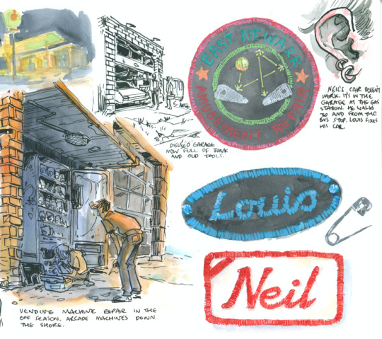
They tell artists to collect visual references - solid advice - but you should collect substance too. If you pay attention, you will hear and see things you could never in a million years make up.
I find online socialising difficult, so I go out regularly and talk to people, or just hang around and observe. Chatting with strangers mostly involves listening to them. No one in gay spaces is interested in flirting with me (I'm rather homely and queer men assume I'm straight) but I think an audience is just as appealing sometimes, and maybe even harder to find. You'd be amazed what people will tell you if you're genuinely interested and listening. I once spent forty minutes at a sci-fi con talking to a guy who'd recently gotten into fisting. While I have zero personal desire to partake in that activity (and he had no interest in being fisted by me), I'm engaged, I'm invested, I'm asking questions, spare no detail.
I collect behavior and movement and the ways people interact too. Reading stories on reddit or whatever is one thing, but the words might not be as interesting as the way they're standing, the way their hands move, the way they respond. A guy in a bar once literally humped my leg like a dog because he felt I wasn't paying enough attention to him. I would never think of that as a response to that situation, but he did, and he followed through. Fortunately my friend had just tried to drunkenly sit down and missed the chair, otherwise I would never hear the end of it.
I see the leghumper around sometimes, he's got a boyfriend and avoids making eye contact with me, thank god.
75 notes
·
View notes
Note
OKAY LIKE— YOUR SENSE OF BODY SHAPES??? AND LINES OF ACTION??? I’m so stunned, every single figure looks so natural! Do you have any recommendations of ways to study form? Love your work!!!!
Oh gosh thank you so much!!! You're so kind and reading this literally made my day <3 <3 <3
As for learning form, I'm gonna try my best to not be too vague or make it too overly complicated so stay with me lol These two videos were really what helped form start to make sense to me. They both focus on HOW to think about what you're drawing which may sound easy but deconstructing to the simplest forms are often difficult to do. The best way to practice this in my opinion is to deconstruct artworks you like down to the absolute basics (like cylinders, cubes, etc). Animation, manga, and comics are great ways to practice simple but effective figures.
Also a tip when breaking down others' work, know there are many ways than just one. Even if one artist breaks a head down like a box another might start with a circle instead and both are correct. Form and shape often means figuring out how the world makes sense to you and knowing when to use which shapes. I hope this helps, best of luck to you!! :D
youtube
youtube
113 notes
·
View notes
Text
What I've Learned About Teaching Art
I've had the privilege of teaching art in a variety of environments - from still life oil painting at the college level, to combining art with science and history in a museum setting, to guiding highschool students through creating a comics anthology. Through these very different settings, I've found a list of constants that, when I keep them in mind, help me deliver the most enjoyable and effective art education for my students.
One of my core beliefs is that art is, at the heart of it all, something a student must teach themself, and that a classroom, workshop, or camp that wants to teach art is actually responsible for creating an environment and offering projects that facilitate that self-driven learning.
With that on the table, here is the pantheon of truths that, if I can hold on to all of them, help me create that learning environment:
- Almost no one is inherently unable to draw. Additionally, everyone can improve at drawing. With the wealth of "traditional" media, digital tools, and thousands upon thousands of years of art history with which we can map the possibility space, it seems obvious that if someone wants to make art, then they absolutely can. If they want to draw, then no teacher should ever, EVER tell a student that they "can't." The teacher's role is usually to take a student who already secretly believes they can't draw and help them see both the breadth of possibilities and the potential within themselves to improve whatever skills they start with.
- Drawing is not always about making a beautiful image. The obsession with one kind of "good drawing" creates an artificial limit on who is allowed to draw. Sometimes being an art teacher is about expanding a student's definition of art as opposed to pushing their frustrated and dejected pencil along a path towards a narrow goal. The reality is that even within pop culture we see so many gorgeous kinds of art! Beyond that, aiming superficially as an artist for a particular surface result will almost always create lesser work than creating an understand of underlying processes and theories that helped the "good art" come into existence.
- Drawing can teach new ways of seeing. Observing with the intent of drawing can transform how a person perceives the world. So much of teaching art is teaching visual literacy, the literal act of reading meaning within visual input, whether that's a still image, a film, a building or a natural landscape. When you motivate students to read visuals by providing them with new ways to understand creating visuals, you jump start their investment in visual literacy.
- Drawing can help us think about things differently. Thinking can shift along with modes of seeing - what is a structural way of thought? What is a compositional way of thought? When you teach art, you must teach a student to look at things holistically and in granular elements - besides just enhancing thought processes moving between the two states, you can get much more discovery in the analytical and planning modes of appreciating and creating artwork.
- Drawing from reference is as educational as reading. Learning to examine visual reference closely creates a new kind of literacy - visual literacy. Drawing from reference, especially with guided or motivated questions to be answered, can create an opportunity for modes of analysis that students don't get to otherwise use. Developing visual observation and creating a practice of looking both closely and holistically can create a layered understanding of the subject. Even students resistant to traditional still life drawing processes can find benefit in using drawing to answer self-guided questions.
- Learning by making art is a valid mode of learning. Making art can be a mode of learning that both alternates between input and output and creates a sense of ownership/agency in both modes. The hands on creative process is a kind of guess and check system that can be designed carefully to allow students to make a wide variety of types of decisions, and teaches them to create goals and investigate what processes will best allow them to achieve said goals.
- Competition with each other or with some imagined ideal will deflate artistic potential. An art classroom cannot have winners and losers based on "quality" of final piece. Art education will benefit more students if it is process oriented. Quality, even in straightforward skills based art education, can still be subjective, and unless it's an aggressive battle Royale for some exclusive prize, the intent of any art programming is not to find the single best but to encourage each student to improve. So don't be a dick about it.
- Art is a product of restraints. Material, process, time, subject or conceptual restraints allow for a kind of focused play. Giving students free reign is in itself a huge challenge of self direction, goal setting and prioritization. Making some of those choices for them gives them a chance to focus their own learning.
- Materials change the kind of engagement. Diverse materials allow for diverse engagement. Just as subject matter can affect a student's personal investment in a project, the material or method of art making can change their engagement. Changing between drawing and painting, reductive or additive sculpting, stenciling or stamping, will not only change the tactile experience of art making but will affect the modes of thought used to make creative choices.
- Venue or audience transform art. Pressure to show, and to whom, can change students self imposed limitations. Defining an audience will change and add pressure to art creation. This can help students hold themselves to a higher standard, but can also frighten or overwhelm them. Audience needs can be a useful limit or influence on the direction of an art project, but audience pressure needs to be modulated to the response of each student.
- Art is most interesting when it leaves the comfort zone of its creator. This can only happen in a classroom where students feel safe to take risks. Art, even when the subject matter is utterly anonymous or benign, can be a hugely risky-feeling process. Even the act of making art in a classroom environment can feel frightening; if we want students to fully engage, and to take the artistic risks that allow them to learn, we have to spend class time making the classroom into a safe space for the students. This probably needs to be it's own post so I'll leave it there for now and come back and expand upon it in detail in future.
- Subject engagement transforms art. Students with something to say about their subject may push themselves farther. Caring about the subject can be a blessing or a curse for a student - deep subject investment can drive problem solving around how best to present it in the artwork, while deep subject investment can also overwhelm a student with self imposed pressure and even a large dose of imposter syndrome. Therefore it can always be useful to intersperse self selected subject matter with "boring" or at least not emotionally significant subjects, to relieve some of the pressure and allow students to instead respond to the process alone.
- Ownership of a process will empower students. Whether they've designed a process, built their own materials or set their own goals, agency gives students investment. One of the most exciting things about art is that students have a lot of potential control and thus ownership - they will always be making choices, and those choices are potentially exciting because they directly affect the outcome. You can increase this sense of ownership or investment in the class by facilitating student-made materials, like sketchbooks or mark-making tools; or by facilitating student-led exercises or challenges or projects.
- Demos will guide what others make and must be done carefully. Demoing can empower and at the same time overwhelm or impose limits on the viewers. Demoing must be designed to specific goals of each assignment. Eg: if you want students to use surgical techniques to explore value, or depth, or composition, whole you absolutely have to demo the technique didactically, you need to be careful not to be didactic about the results you want in relationship to the subject of exploration. Showing a wide range of potential approaches can help in classrooms where students can handle large info dumps, but often it's better to demo the technique, get them trying it out without further instruction, and then redirect then to the topic of exploration as stage 2.
- Material potential can power a room. Art supplies can be motivating all on their own. Getting excited about them can make it safe for the students to get excited as well. There are many different supplies available to teach art with, and trying different ones can add a lot of excitement to the room even if your topic of instruction is narrow. Getting excited about materials can change the mood of a classroom entirely.
- Criticism must engage with the student's goals or it will work against you. Setting goals, and then reflecting on them, is key to art education as so much of art is self directed. If you then ignore that setup and approach critique without listening to your students' internal direction and goals and at minimum acknowledging them, they will not find your critique constructive. This goes for young children all the way to adults - you need to be in dialogue with them.
- Open discussion and open ended questions will always help. Once you've found a way to make the classroom a safe space, group discussion powered by open ended questions can open everyone's mind up to broader possibilities. One on one conversation also benefits hugely from open ended questions and encouraging students to reflect and investigate their own process and practice.
- Letting students share their learning is important to help the class grow beyond your own limited experiences. Students will often still feel in competition with each other, so instituting non-competitive collaboration and sharing will be important to minimizing classroom tension. This can be demonstrated first with art games and developed into collaborative processes on more serious projects.
- You can never clarify the instructions enough. Always repeat yourself, be prepared to repeat demos, have a written list of instructions and delegate helpers. Breaking projects up into stages can help with detailed instructions, but always show an overview first. Art is overwhelming and there is no process so simple everyone is automatically good at it. Accurate following of a process will often help students who are unsure of themselves prove themselves to be competent and your job as the teacher is to make sure they have everything they need to do that.
- Techniques are best remembered when students use them to solve specific problems. Show how applicable to different problems a technique is during demos. Be prepared to reteach or to teach new techniques whenever students hit a wall. Encourage them to reflect over the techniques they have at hand to see if there's a new way to use one that could solve their problem.
- Art is mostly learned by doing. Material literacy is gained only through material exploration. If you spend too much time talking/demoing before they get to try the materials the enthusiasm can fade. If you have a student who is frightened of doing it wrong, the most important thing is to make a safe space for them to do it wrong, because that's the only way to eventually do it right.
These are all best case scenario tips - and while I've tested them all to know they work, it's still hard work to keep everything in play in every classroom. I'm hopeful that having this written list will help me, and maybe by sharing I can help others as well.
Art is a privilege to teach, but I believe it is incredibly important for everyone to get to learn it, in a safe environment where the effects of an art practice can be the most beneficial.
Are you teaching a creative subject? What are some techniques or core values you bring to your classroom?
Read the full article
116 notes
·
View notes
Note
Hey just wanted to throw some love, I absolutely love how you draw yourself. It's nice to see a variety in trans bodies and owning broad shoulders and some stuff is amazingly cool so thank you for showing it to people.
Heck I'm sure I'm not the only one with a similar shape and it just warms my lil heart seeing your comics!
That girl in the comics is actually not me!! She was originally made up in like 2018 when I wrote a cute story about imagination. She was meant to be this lighthouse keeper living in Northern Spain, but now I used her for something just completely different.
This is how I draw myself!! I actually have dark curly hair and hazel eyes, and crucially, I'm skinny as a stick.

I have broad shoulders, deep voice, I'm 6'5"/1'95cm, and a bunch of other unsavoury details. I can't pass for shit even though I would like to. I draw every trans lady I can like this because it seems like the only representation allowed is a thin tiny passing cutie, which tends to not be most of us. A lot of us don't look like that, and that's fine!! I love owning our more "masc" or "unpassing" features, as much as I'd like them away from my own body. I love depicting myself ugly!!
Thank you so much too. I always have taken pride in depicting bodies outside of the "pretty" label and I lately get so many girls telling me how they feel seen. It makes me feel so so so gushy! Much love!! <3<3<3
80 notes
·
View notes
Text
SoC Comic Adaptation and General FAQ
General
Who are you?
Hi, I'm Claire (she/they)! I'm currently studying to become a professional comic creator. I love drawing fashion, expressive characters, and anti-hero action.
Where else can I find your work?
You can find all my work on my website! I'm also on Instagram, Twitter, Tumblr, and Tiktok (sometimes...). You can find my fan art under the handle jccatstudios, and my original art under jcscottart (only on Instagram and Twitter).
How can I support your work?
Besides supporting my work through your lovely comments and reblogs, you can help monetarily support me on Ko-Fi. Your support helps fund my college education.
Six of Crows: A Comic Adaptation
Why are you doing this?
Ever since I read the duology, I always thought it would make a great graphic novel series. When my professor encouraged me to start a webcomic, I took the opportunity to make the comic I imagined into reality. I want to see the whole series illustrated through comics one day. If I got the chance to make the official adaptation, that would be one of my biggest dream projects. I'm also using this project as an opportunity to improve my skills before I graduate.
Will you post it on (insert webcomic platform)?
Probably not. Most online comic platforms are meant for scroll format, and I'm making a traditional format comic. Plus, I post on so many sites already, so I think adding another would take too much time out of actually creating the comic.
Will you draw the whole book/series?
I wish I could! Since I'm not doing this full-time or professionally, that's quite unlikely. It would take years to complete it full-time, who knows how long as a hobby. I'd love to add a six-volume SoC graphic novel series to my shelf, but that of course can't be done without some serious backing. I'm currently working on adapting Chapter 3.
Where's Chapter 1: Joost?
I never drew it! I started with Chapter 2: Inej because I wanted to draw the main characters first. The first chapter of the comic is the second chapter of the book. I name the comic chapters after the book chapters just to make it clear which part of the book they correspond to.
Can I repost your art, use your art for layouts/edits, etc?
Yes, you may with visible credit. If you use it for your profile layout, put my handle in your bio. If you're reposting it or using my art for edits/collages, put my handle in the description. As long as it's for personal use, you can use my art. Do not sell copies of my art, use it in merch, or use it for any sort of monetary gain. Do not use my art for prompting or generating images.
Can I use your character designs and headcanons in fanart, fanfic, etc?
Absolutely! Please tag me if you do. I don't need credit since I didn't create any of these characters, but I definitely want to see what you create. :D
How do you make the comic?
The comic is made with mostly traditional methods with some digital editing. I pencil and ink all of the pages on bristol board. I mainly use the G-pen nib for characters and technical pens for the backgrounds. Once I scan the pages, I do light adjustments to the line art and correct any mistakes. The gray tones come from a single sheet of ink wash adjusted to be lighter or darker. The bubbles and lettering are all digital.
If anything else comes up, I'll add it here! Feel free to send me an ask if you have a question that isn't on this post.
96 notes
·
View notes
Note
Dream Journal Rescue for the wip game, please
WHOO! Thank you for asking about this one, Nonny.
For the 2022 Dreamling Secret Santa I took a risk and wrote something that can be very divisive in fanfic and in fiction in general: first person narrative. I wrote the first half of i had a dream (i got everything i wanted) as a dream journal that Hob used to record his dreams after they came back when Dream got out of the fishbowl in 2021. It draws both from the early comics and from the TV show in terms of events/timeline. This fic got significantly less attention than the others I had written at the time, but it was also the one I was most proud of that year (and that's with Eros in Pragma and Hypnopompia turtur in there!). I am still extremely proud of it because it is, for me, I think very poetic writing.
However, the first version of i had a dream wasn't post-fishbowl, but actually started before the fishbowl. Hob still kept a dream journal, and it still started in first person, but the idea originally was that Hob would figure out that something had happened to his Stranger because of his dreams stopping. Which meant that they needed to have enough of a relationship/rapport by the 1910s that Hob would trust that Dream would not miss a dream "date" of theirs without very good reason. Hence, "dream journal rescue" as the name.
I only have pieces of the fic, but I keep them because I still viscerally love what I did with i had a dream SO FUCKING MUCH that I want to return to that style at some point. If you have read i had a dream you will see the bits I took from this and transferred to that.
This is totally G-rated and starts before 1889, as Hob is anticipating that next meeting, and then keeps going into 1914.
Here's what I have in that WIP file:
1:
21 October 1885
I think I need to write these down. Olive suggested I start writing these down. She is usually right about such things.
Maybe it will bring some clarity to this… mess.
I’m in the White Horse Inn. (It is always the White Horse.)
The year is not obvious from the decor, which is a riotous mix of 1389 and 1489 and 1789. Delicate teacups and straw-covered floor and fireplaces with chimneys. Of course chimneys. But I know, in the way of dreams, that it is the day of our annual appointment, the next one, in 1889.
I shake my coat and hat free of the London morning rain. I am many hours before the time of our appointment. This my usual - I always arrive early. To ready the table and, more importantly, myself for our meeting.
But in this dream I enter the White Horse to find the Stranger already there. He looks exactly as he did in 1789. Which must say something about my imagination since he has always been in impeccable fashion specific to the era of our meeting.
Or perhaps it is because he looks at me with the same burning intensity that made our last appointment so spectacular. His eyes devour me, just as they did when we parted last, and I am absolutely helpless to resist.
I am sitting then, across from him, cups of tea and venison pasties between us. His beautiful pale fingers trace around the gilded edge of the teacup. I am speaking, words tumbling forth, I can hear the droning vibrations in my ears and throat, but it is not where my attention lies.
My attention is riding the wave in his coalblack hair. My attention is wafting the bob of his throat above his high collar. My attention is tracing the sweet pout of his pink lips. My attention is flying through storm-sky eyes.
He reaches across and
Fuck. I can’t write this.
2:
[There are several attempts at starting entries after the previous one. None manage more than a sentence.]
[No attempts at entries are made after 1889.]
3:
1 November 1898
I woke up still drunk and still in very rural Wales (note: never ever always maybe return for Nos Calan Gaeaf in the future) and found this old journal in the bottom of my trunk, so I suppose I shall once again make a valiant attempt to take dear Olive’s advice to sort out the dreams of my Stranger that ever plague me.
(I have heard tell of work by a man named Freud who claims dreams can be used to better understand someone’s psychology and potentially even relieve psychosis. He'd have a field day with me. May I never come within 400 miles of him.)
My drunk mind lacks creativity for scenery and so when I sleep this night I find myself in the same village square I was in only hours prior… however, I am back in time about 400 years? Long before the industrialization of the region, before the extermination of these old traditions by the expansion of “civilization.”
I have just won the silly harvest mare from the clutches of the other young men bringing the last of the harvest in, a horse-shaped horror made from the final stalks of grain reaped. I am now expected to try to sneak this rustling beast into the home where the bulk of the feast is being prepared by the womenfolk without one of them dousing me with washwater. If I succeed in getting into the kitchen unscathed I will win their finest beer and an honored seat at the feast-table. I am always up for new games.
(This is all Iwan’s fault for convincing me to accompany him home for the holiday yesterday and for me getting drunk while they all told me stories of the Old Days. Let it never be said that I abandon a friend in their time of need.)
I easily weave through the crowds of women and children, in their dresses and aprons and smocks, clothing I haven’t seen in centuries but are still as real as yesterday, and cross the kitchen threshold only to find the room empty. An empty kitchen except for the crackle of the hearthfire and my Stranger sat on a barrel in front of it.
The large fire paints him in oranges and golds and he looks warm and inviting in a way that I have never experienced outside of my mind. It is the moment I know for certain that this is a dream.
When he looks up to me he appears confused, brows drawn, lips parted.
I am the first to speak, although words do not come easily to me. “What…?” After our parting in 1889 I can scarce understand why I am seeing him before me now. Although nightmares of the night plagued me in the months afterwards, I had been blessedly free of any night-time visits from my Stranger for almost a decade now. It has been an unexpected boon after so many years of dreaming of him more carnally. I know these facts within the dream. “Why are you here?”
He doesn’t stand, cranes his neck back to look up at me, and I realize he has a low collar this night, lower than it had been even in 1489. I can see flame-gold arcing around the shadowed hollow of his throat.
“It is a Ysbrydnos.” He explains in perfect Welsh, as if I am some child. I do not question why I can so easily understand him despite my mediocre grasp of the language. It is a dream, after all. “Many call on me such nights.”
I pinch the bridge of my nose. “Yes, ‘tis a Spirit Night and you a spirit.”
He tilts his head to the side, bird-like and distinctly not human. “Not as such. But I will attend the dreams of many who call me here this night.” The Stranger’s voice is just as rich and decadent as it is in person. This detail my memory - traitorous bastard it is - does not neglect.
“Of course. Even the version of you I make for my dreams gives non-answers and evasions.” I can feel my whole body hunch in defeat. I wrap my arms around myself, look to the floor. “Just why…” Even my dream cannot steady my voice. “Why does my mind show you to me now? Why this torment?”
“Ah.” Now his voice is choked and staccato. “You did not call me here yourself this night.” Perhaps he is surprised, or ashamed, I cannot tell.
Still, I want to scream. “After last time…” I grit my teeth and continue to stare at the floor.
I see the toes of his black shoes enter my field of view. His chest is perhaps a handspan from mine. “Do you truly wish to never dream of me?” This inquiry is a mocking echo of his usual question, but there is no mockery in his tone. “Given…" He shakes his head, unable to say the words. Say the words he should say: Given what I did to you… Instead he restarts the sentence, "It would be well within your right to request it.”
I sigh. He almost sounds remorseful. What a fantasy this is. How contrived. “No.” And if I ever doubted before that this was a dream the tiny bits of relief I see wash over my Stranger confirms it. His eyes soften minutely. His shoulders relax a hair's breadth. “This might be the only chance I have to ever see you again. And I would take the machinations of my mind, I would take delusions of your regard, over nothing.”
He hums, looking back to the fire as he takes a step away from me. I feel cold and bereft. “This dream is over.”
And then I woke up.
3:
1 Nov 1898 I have not dreamed of him in six months.
one year.
three years.
seven
ten
fifteen
4:
25 May 1914
After almost 17 years I found myself dreaming of the White Horse last night and when I focused upon it in my mind’s eye I almost burst into tears.
Wait, Olive always said that this was more effective if I narrated as if I was reliving the dream. That I would get more details back that way.
I begin the dream standing outside the White Horse Inn and knowing that I am dreaming. It is the first time I have begun a dream this aware and therefore it is noteworthy.
When I enter I feel his presence before I see it. Through the doors in the back, to the private room that had been set aside for us in 1789. He is once again in front of a fireplace, standing this time, hands clasped at the small of his back as he looks down into the flames.
(Note: Ponder this pattern more later, that I associate him in dreams with fire.)
The door to the room automatically closes behind me and he turns. Despite the venue, he is dressed, as always, in the pinnacle of fashion. All black - of course - but a suit with long jacket and waistcoat and tie nonetheless. The ever-present ruby sits heavy and dark just below his throat.
“I did not intend the delay, Hob.” And doesn’t that throw me for a loop. I did not know prior to that moment that one could get dizzy in their own dreams. “I sometimes forget that time flows… differently… for you humans. But I did think on our last conversation.”
Thirty questions stampede through my mind at once. Everything from ‘Did he just directly admit that he is not human?’ to ‘Which last time?’ I throw all of these aside and instead opt for a cautiously lilted “And?”
A magnanimous wave of his hand and we are sitting, the same tea and sweets that were present in 1789 grace the table between us. I hold my breath. “Perhaps we can pick up, as much as we can, where we were in 1789 before the Lady Constantine interrupted us.” I am so taken aback by the turn this dream has taken that I cannot for the life of me think of what to say next. Luckily, my mind does not require me to as he continues. “I believe you asked my name.”
I almost fall over myself to give him leave to avoid it. “Only if you wish it.” Just don't leave again.
He smiles, something brighter than usual, and it feels like looking into the Sun. “I have a list of titles, which we can get to later, but the simplest name is Dream.”
I clamp down on the anguish that’s in my throat, but it still comes out as a high-pitched wheeze from between my teeth. “Dream?! DREAM?!?” I let myself slump boneless into the chair, impropriety be damned, and splay my legs out in front of me, hands over my face. “Oh fuck my mind and these GAMES. Why can it not send me sweet dreams of you? Of COURSE you are named Dream… you are a dream! Has my subconscious no creativity? Christ in heaven…”
“Hob!” He shouts. He has never shouted at me before. I look to him through my fingers, meet twilight-blue eyes. “My name is Dream of the Endless and I am the King of Dreams and Nightmares.”
Shock, bright white and violent, runs through me and I quite literally fall out of my chair.
And then I wake up.
5:
26 May 1914
I do not think I have ever been more wrong about something in my long long life.
Fuck.
My Stranger is Dream. He lords over dreams and nightmares. They are his Domain, his Kingdom.
F U C K
I knew that he was something Other. But this. This.
We met again last night, in my dreams. I don’t need to work at this anymore (thanks for trying, Olive) because he asked me last night if I wanted to remember this, remember meeting him. Apparently he has some manner of control over such things.
I told him yes. Of course I said yes. But I think I want to continue to keep track of what has happened, what will happen, in my dreams, here in this journal. If only so that I have something to refer to later when I have absolutely zero confidence that this is real. Some proof that I haven’t gone completely barmy.
Last night we talked. Just talked. It was in a liminal space, barely distinct as containing a floor and walls and chairs. All monotone, in blacks and greys and faint whites. It still reminded me of the back room from 1789.
He - Dream - told me so much. More than he had ever said to me in one go ever before. He told me some of his other names: Lord Morpheus (or just Morpheus), Prince of Stories, Oneiros, Shaper of Forms. He has a kingdom, home to dreams and nightmares alike. They are not only his citizens, but he creates them. Creates!
I have so so many questions.
But I must parcel them out carefully. Each answer is a treasure I will hoard.
I returned his generosity with words of my own.
53 notes
·
View notes
Text
On this week's episode of "Webtoon Controversies That Could Have Been Avoided If Only They Had Some Damn Quality Control"-
Oh boy, prepare yourselves, there's some TEA on this one.
Quantum Entanglement, a new Webtoon Originals series from creator Arts Angel (aka Sarah Ellerton) is uh... a teeny weeny painfully obvious that it was made with AI.
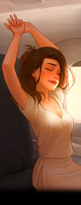
AI is getting better, but when it comes to comics, there are still a lot of "tells" you can pick up on once you know where to look. Hands are certainly one of them.

Not knowing how to draw hands efficiently and consistently is definitely an Artist Problem(tm) but it becomes a lot more obvious it was made by AI when you get weird little off-putting mistakes like a fingernail being just a little too long or missing joints (hot dog fingers, eyo) or the distinction between fingers not being clear.
But there's also hair and other detailed parts that are often lost in the translation process between prompt to final piece. Jewelry, text on a screen, phones, that sort of thing. The insinuation of a 'thing' is there, but it's like looking at it through a fishbowl.

And ultimately, a lot of AI art tends to just be a little too 'perfect'. Everything is just a little too smooth for it to look like it was naturally made by a person. Faces end up veering into the uncanny valley territory and there are inconsistencies between the eyes and the rest of the body. Backgrounds become lost in what I like to call "AI goop", becoming nothing more than weird blurred/filtered out insinuations of what's supposed to be behind the character.


Basically, at this point, it's undeniably clear that AI is being used to create this comic. While there are also plenty of signs in the handiwork that show a human was involved in some parts, there are other places that are undeniably filled in with the use of AI. So it's not necessarily a 100% made-by-AI comic, but it's absolutely AI assisted.
But what's REALLY absurd about this whole situation? The creator denies it. To the point of including a disclaimer in the first episode trying to "get ahead" of people who are assuming it's AI by saying, "No, it's not made with AI, here's the proof! Don't look at the blood on my hands or the body in the trunk of my car!"

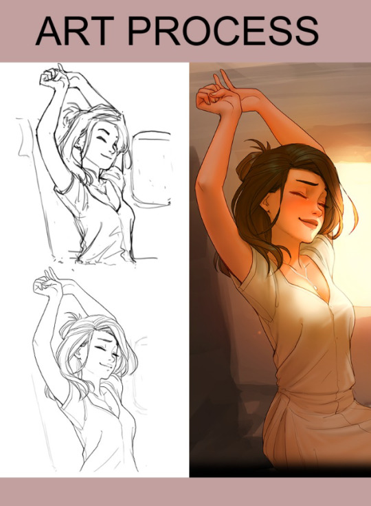
Now, first off, the absolute absurdity of making yourself look guiltier by trying to prove your innocence before people have even started to suspect you... I'd like to think that this was edited into the first episode after the initial accusations started rolling in but considering it's an Originals series, it's hard to know if it was, as creators typically don't get as much control over just editing their episodes on the fly like Canvas creators do. Typically it's their editors who do that sort of thing for them. And even if it was edited in afterwards, it's still there for people who have no idea going into the comic blind and might not automatically assume it was made with AI, so it just looks like you're bringing up the potential of AI being used completely unprovoked. By planting the idea in your audience's brain that AI is even a question, you're making them suspect everything.
It's kind of like when Dream was suspected of cheating in a way-too-lucky-to-be-real speedrun of Minecraft a couple years back, so he went to all these painstaking efforts of hiring a quantum physicist to "prove" his innocence with a straight up THESIS documenting all of the reasons he couldn't have cheated through math and figures and jargon. Ironically, this just made Dream look guiltier, and sure enough, he eventually admitted he had cheated.
That said, did you notice something in that "art process" pic?

That finished panel isn't even what showed up in the final comic.
So the absurdity of this all, again, just makes Arts Angel look a lot more guilty of actually using AI, especially when it's basically undeniable in so many of those panels above. People don't paint like that.
But that brings us to talking about Sarah Ellerton, aka "Arts Angel", the creator. Many long-time readers of her work are defending this, claiming that she has, in fact, "always drawn like this".
What's insane? She actually is who she says she is. This isn't like some kid who came out of the woodwork with AI and claiming that they had 20 years of experience, Sarah Ellerton's main site, The Seraph-Inn, has been live and crawled by Wayback Machine as far back as 2005.
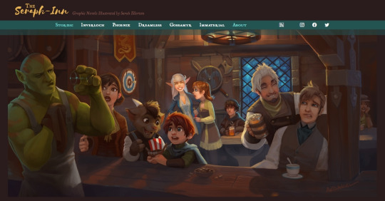

And you can see the art evolution over the years, starting with Inverloch-


-into Phoenix-


-and all the way to Immaterial-
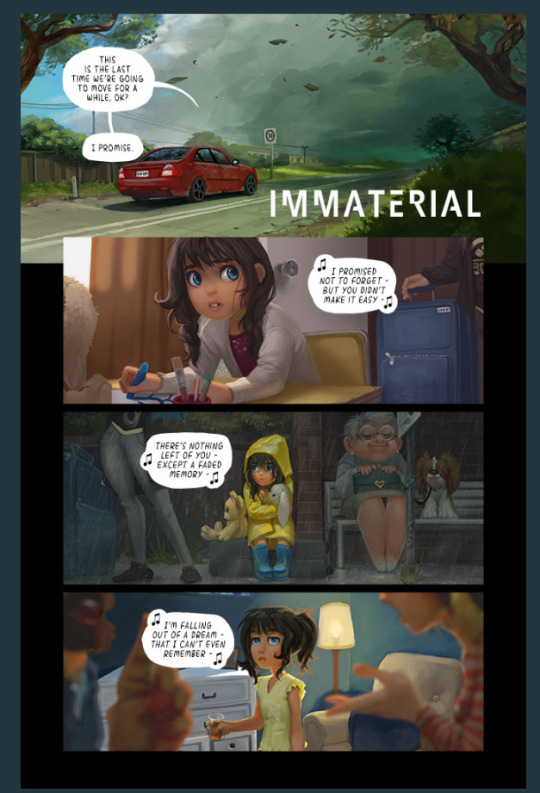
But here's the thing about that last comic. The main protagonist is, apparently, the same girl from Quantum Entanglement, the newest installment in this series where it becomes abundantly clear the creator has started using AI.
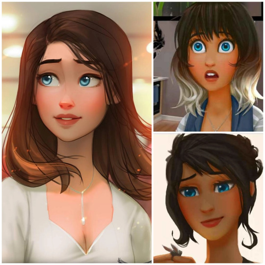
You can see the effects of this being parsed through AI, because she's gone from being a unique character with two-toned hair and darker skin, to being turned into a generic Instagram anime girl. And lemme tell you, AI used in comics has NOT gotten better at depicting darker-skinned characters (I actually tested an AI-coloring tool WT was planning on putting out a year or two ago, it was uh... not great.)
But the most damning thing about Sarah?
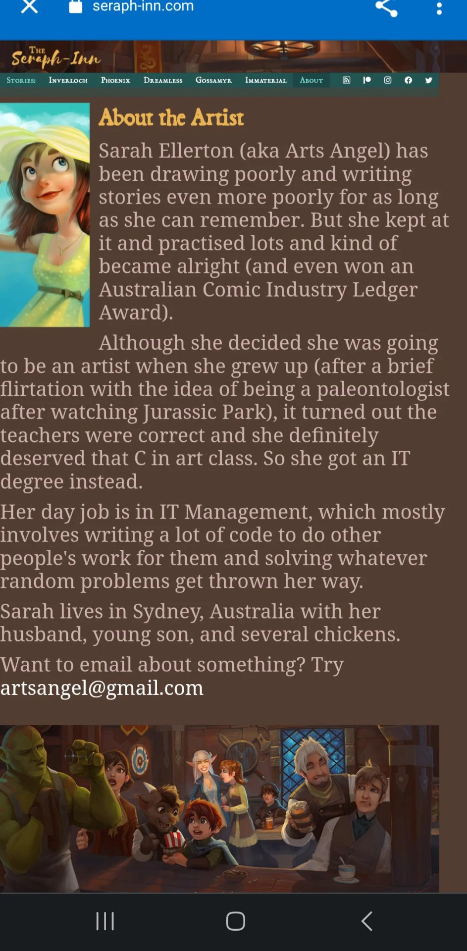
She works in IT.
That on its own wouldn't be so telling if it weren't for the 20 years she clearly spent actually honing her craft, only to suddenly switch to using AI as a crutch.
Quantum Entanglement was picked up for Originals in July 2023. It launched two days ago, with four free to read episodes and 6 more under the FastPass paywall. Three months after it got picked up. That turnaround speed is insane for an Originals series. Now, I'm more inclined to believe that maybe she's using the exact same pages she used in the Canvas version (there's unfortunately no way of checking through Wayback, it never crawled the Canvas version, so unless someone has backups of the Canvas pages they're willing to share, we'll never know) but that short turnaround time is insane for a comic that's this insanely detailed. It likely means they didn't need much pre-production time to get a strong buffer going, and that it doesn't take them as long to produce these episodes on a weekly basis so they could be under way less crunch than creators who do this by hand.
By comparison, the winners of the Call to Action contest from last year are STILL working on their pre-production. Many other greenlit Canvas series are known for getting picked up and stuck in pre-production for several months and even a year or more simply due to how the company operates with when it chooses to launch these series and how much pre-production is necessary. Some creators have literally said that their pre-production was done, but WT still kept them waiting to launch. So three months for a freshly greenlit Canvas series to launch is NOT the norm.
All that said, I feel for the people who are trying to defend her. But it's so undeniably AI with the creator herself providing fake proof that it makes it really sad to think that this person was honing their craft for 20 years just to wind up utilizing AI. Being a good artist does not make you immune to the temptation of using cheap methods or developing bad habits. Going through "the struggle" does not make you immune to taking shortcuts that wind up cheapening your work or taking advantage of the work of others.
Now, maybe Sarah trained AI around her art. If this didn't play out the way it did, I'd be willing to give her benefit of the doubt and assume that. Training AI off your own work, while still up for debate as to how ethical that is, at least doesn't hurt other artists, because it's your own work the AI is "stealing". There are definitely ways AI could be used to make life easier for artists without replacing the art process entirely, the same way artists have learned to use 3D assets and digital art filters to make their process more efficient and boost the quality of their art up to the next level.
But the fact that she's being so cagey over it, claiming she's not using AI period when she very clearly is, providing "proof" that actually proves she definitely used AI, while operating under a penname that's strangely similar to a name Grimes - former tech wife of Elon Musk and staunch supporter of AI - used for one of her studio albums-

- that's what makes it a lot more clear she's using it maliciously.
The AI is very likely trained off another artist's work. Maybe someone whose art style is similar enough to hers that she could integrate it into her own and pass it off as legitimate. Someone whose art style is cartoonish but still modern, like if Disney made anime. Someone who's so prolific and consistent in their stylization that training an AI off it would seem like a no brainer to those who want to replicate that style quickly and easily.
Damn. What a disappointment. Do better, Sarah.
And for god's sakes, Webtoons, pay more fucking attention. I've been steadily picking away at moving the entirety of my comics over to other platforms on a weekly schedule, but at this point I kinda just wanna dump the last 30 or so chapters onto ComicFury all at once so I can ditch this platform for good, especially if it turns out AI comics getting greenlit is a feature, not a bug. The ratings for Quantum Entanglement have dropped significantly overnight, now sitting around 5.09 and still dropping, but is Webtoons going to do anything about it? That remains to be seen.
287 notes
·
View notes
Last Seen Blogs

melovemetoo
powerbutt
isabelhasvibes
isabel
enchanted-moura
Miss Cordoba👑
graviconscientia
burn too bright, now the fire's gone
purplecritter
Robin