#i probably forgot some good lines to add but i feel like this is readable enough! if u have additions go off and add em
Text
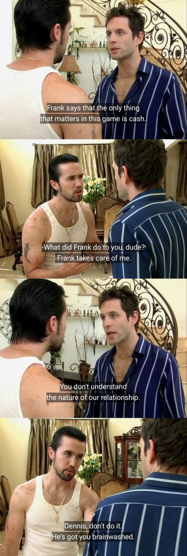
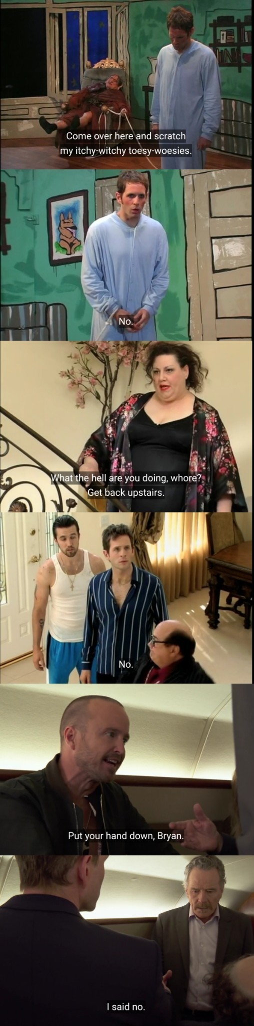
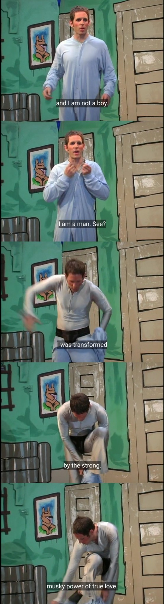
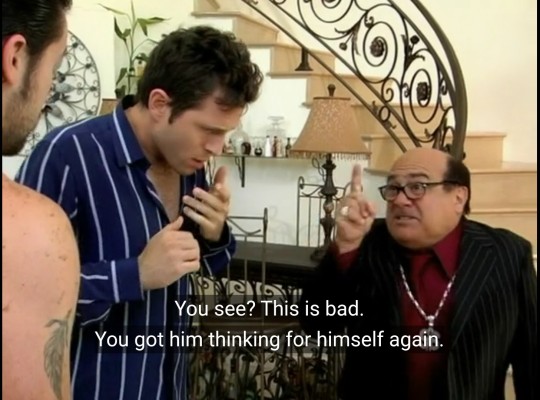
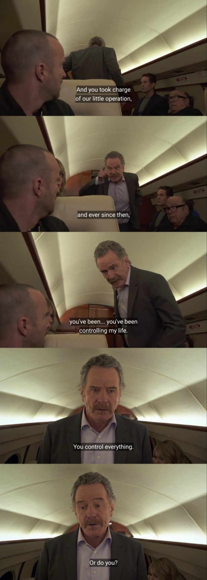
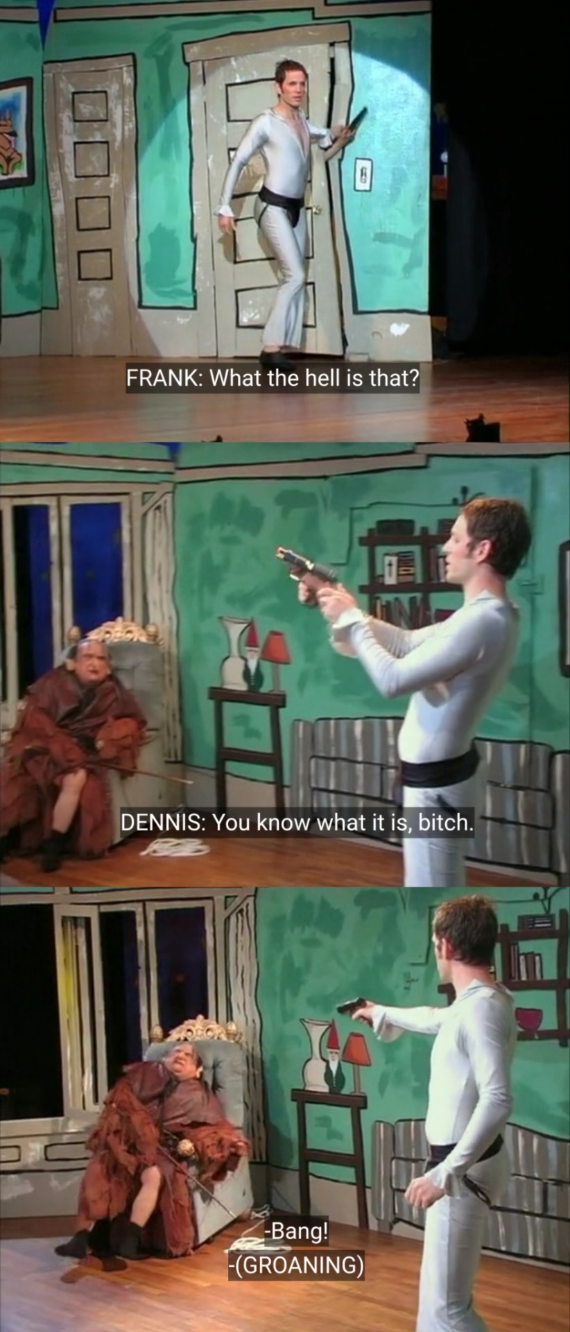
Charlie: "Hey, uh, Dennis, uh, get to Frank as fast as you can. I have Malcolm and his dad."
#iasip#s16 spoilers#it's always sunny in philadelphia#always sunny#macdennis#meta#analysis#s16#macden#AND BOOM‼️💥#i call this one ''the macdennis red herring''#tldr for people that dont get it. FRANK controls dennis. mac sets him free (gets him thinking for himself)#ALWAYS HAS BEEN.#i probably forgot some good lines to add but i feel like this is readable enough! if u have additions go off and add em#also im not claiming dennis is gonna literally shoot frank lol im SAYING he's taking back control#oh thats also why the plot in FVR was so important anyway. theres a reason dennis 'controls' mac then later controls frank#but that's more complicated i cant explain in tags also im not 100% set yet. but have this post for now#the real abusive relationship was frank and dennis all along ! 😊#father and son meta#idk how to tag this thread...#parallels
221 notes
·
View notes
Note
I feel like Bakugo has a love language but he isnt quite sure what it is even if it is evident to everyone else
His love language is kind gestures of doing things for others and his lover
Bakugo will not only go out of his way to do things not asked of him even so to ignore your "you don't have to" and correction of "I said it would be nice if somebody did that, i didnt mean you had to do it"
He does these things because he values the person hes doing this for lover or otherwise and hes like thw only one who does it the most besides Deku and thats probably who he gets it from and he doesnt even know he's like Deku in that aespect and it's kinda funny
He gave Kirishima that money, he made the class happy when they were sad by making Kaminari make a fool of himself which he knows that makes them laugh he pays attention to small details he may not have known Urarakas name in the sports festival but he made sure he gave her a good fight not just for him but for her too
Bakugo is too smart to let people manipulate him in the since of when his classmates tease him like "oooo that's probably too hard for Bakugo to do" knowing this will make him do it is him actually manipulating them into giving him a outer reason to help them his personality doesn't allow him to help just cause he wants to sometimes so he needs that "OH SO YOU THINK I CANT DO IT?" So he doesn't look like hes actually just doing it cause he wants to
Cause hes the one who voices his opinion first like if his classmates are having a conversation he'll add in a "oh, that's easy for me" hes included himself in the conversation causing them to ask him to help them and hes going to say no and they are going to tease him and he is going to change his answer
Bakugo makes life complex for no reason and I love him for that
Bakugo does a lot of things and that is his love language he doesnt see for some reason, hes like the absolute best guy in the most readable but jacked up looking font to ever exist
And with his lover he would she be aggressively kind saying "I bought you this cause the shampoo you use makes you stink" and the translation is "I saw you ran out of shampoo so I bought you some more"
Like fixtdyfugigigiyi why cant you just do it normally XD bless his strange heart
I don't even have an excuse for myself I just genuinely forgot to check my asks and this one's been sitting here for months, not sure if u still want a reply but let's go!!
"His love language is kind gestures of doing things for others and his lover"
I love that, for me i think it's a bit more like he is just a good listener, unlike what one might think even though he pretends to be annoyed he actually listens to everything his friends tell him, so he retain a lot of information and is able to just to things for his friends and partner because he gets what they might want or need
"Bakugo makes life complex for no reason and I love him for that"
This is my new favorite way to describe him thank you for this anon, because omg he definitely does!!! He can't let people think his nice cause god forbid someone would say that about him, so he just... aggressively does nice things to the point where the lines between nice and angry are very blurred
9 notes
·
View notes
Note
hi! I just want to ask on tips on how to make your writing flow better! I've been struggling a lot with this when many other writers have really good flow despite not having the most creative description of things (while in my case, it's quite the opposite). thanks!
Hello! Apologies for keeping this in my inbox for a few days. I felt like this needed more time and consideration than a quick answer :)
Firstly, I think there are many facets of "flow", including but probably not limited to line-level sentence structure, prose, rhythm, paragraph, how your paragraphs connect and move into and out of each other, etc. Because you mention descriptions, I'll focus on the smaller scale line-level sentence stuff for now, but I'm happy to talk more about my thoughts on the other facets later if anyone is curious.
👉 Making your writing flow better: Readability.
To me, "flow" relates to ease of reading. Writing that “flows” feels easy to both read and understand from the beginning of the sentence to the end. If I'm reading something that "flows", I don't need to re-read, double-check, or work super hard to find the connective tissue between ideas. (That being said, I do think that having to do a bit of mental work is super fun and doesn't automatically mean the writing doesn't "flow". It's complicated!)
Tip #1 - Make sure your sentences make sense.
Tip #2 - Make sure your descriptions feel clear and visualisable.
Tip #3 - Start by writing something in a more telly style, then go back and see if you can say the thing without saying the thing. Sometimes writing feels less flowy because it's over-complicating or abstracting an idea too much.
👉 Making your writing flow better: Connective tissue.
How are your sentences and the ideas within them connected? Writing that does not "flow" to me, often feels disconnected from line to line; I don't see how the narrator went from one thing to the other. You wouldn't go from describing a character happily eating a pastry to simply thinking about how their father used to abuse them without some sort of connecting idea. Perhaps the pastry tastes the same as her mother used to make. Maybe they were never allowed to eat pastries because their father controlled their diet. There needs to be some sort of relevance, some breadcrumb of a connection (explicit or implicit) between the two.
Tip #4 - Check that your sentences feel logically connected to each other.
Tip #5 - Consider: If they don't feel logically connected to each other, is there a reason for that, and does it enhance the story? (After all, there are no writing rules.)
👉 Making your writing flow better: Description.
Prose that "flows" doesn't need to be elegant or particularly original. I don't believe that those are qualities inherent to "flow", though I do think they are good qualities in their own right. I think it would be worth looking at the descriptions that feel flowy to you and breaking down what they do so you can hopefully see the craft at work. Kind of like taking apart a clock to see how it ticks.
Example: Shadowfell by Juliet Marillier. (My notes in orange)
Once play started in earnest, they all forgot me. I stood in the shadows at the back, watching as the games progressed. (Notices the play starting and watches it go on.) Father was watching too, working out other men’s strategies, their strengths and weaknesses. He would not join in until he had their measure. (Talks about how her father plays the game is relevant information to what she's witnessing, and what matters to her.) Most of the players had the look of seasoned travellers: reserved, cautious. (Relevant info to what she's seeing. Also adds tension and detail to the scene.) The ones standing behind them were making all the noise – local fishermen, perhaps, or smallholders. (Adds more info to the scene. They're all players, so looking from the ones playing to the ones standing up makes sense.)
👉 Making your writing flow better: Subjectivity.
Nothing is real and everything is made up. Writing "rules" are like pirate's law. They're more like guidelines. Tips. You can pick and choose and break and experiment and make Frankenstine-rules for yourself if you feel like they work and you like them. The example I showed above may not feel like a good example of prose that flows, and that's okay. There is no one way to make your writing flow. It's mostly about seeing what works for you and trying to do that consistently.
Tip #6 - Have someone read your work over and ask them for feedback relating to flow. This can include literally asking if it flows, or asking other questions like "Did this part make sense" etc. Consider the feedback with an open mind.
Tip #7 - Try listening to your writing instead of reading it. Or maybe read it out loud yourself. Changing up the medium can help you pick up on issues your brain skips over due to familiarity. You know that thing where your brain skips "the the" in a sentence? It's kind of like that.
You've now reached the end. I hope some of this helps you find your flow! 😁 If anyone else has any more ideas or suggestions, I encourage you to share 👀
4 notes
·
View notes
Note
One of my most favourite things about your writing is the depth to which you depict both the positive and the negative emotional consequences of your character’s experiences. Also, based on experience, your portrayal of mental illness has always been super realistic and nuanced and it’s pretty amazing. I was reading a Booker prize winning novel after this chapter and literally thought “this character is not having an appropriate emotional reaction to this event…I never have this problem with
2) Ficon”.That said, I thought I was ready for all that is going on with Will. But I was not. There were tears and I have a feeling this is just the beginning☹ Also, David and Beth broke my heart and for the first time in this story I was not on team Oliver. Oh, and a question I forgot to ask last week: do we find out what the real reason Amelia lost her job was? On reread Moria seems to have information that we don’t…or are we supposed to assume it was just politics being politics?
Thank you! Follow-through and consequences have always been important to show, to me. It adds layers, realism, and a point to the struggles the characters go through. When I don’t have direct experience (which is often), I look for people who have that are willing to talk to me. I’ve been very lucky in that regard, particularly with Will. I’ve had the chance to both interview several people with PTSD (including a firefighter) and run storylines and snippets past them. They’ve also pointed me toward resources for more information that I might not have found otherwise. I’m not thanking them by name here because I haven’t asked them if they’d prefer to be mentioned or not.
This is just the start of Will’s struggles with PTSD. He’s not good at accepting help. He hides from his own problems. He has a low sense of self-worth. And he’s undergone some serious trauma that impacts how he sees himself physically as well as his role in the world. So much of who is is is built on helping others. With that ability impacted, he really doesn’t feel like himself at all. There will be some readers for whom this is just too much to handle. As always, I’ll warn appropriately and send summaries or sanitized versions to anyone who DMs me asking for them (for instance, Will’s conversation with David in the middle of this chapter would probably be readable even to someone who needs to avoid PTSD references... particularly the bit about David and Oliver’s conversation).
It’s interesting to me where people fell with David and Oliver’s argument. Loyalty to Oliver is obviously strong, but personally I think David had an extremely valid point.
As for Amelia losing her job... you will get more on that but it’s probably going to require a little reading between the lines. I have no doubt everyone will figure out a bit more. If you still have questions by the end of Providence (and I don’t think you will), ask me again. ;-)
5 notes
·
View notes
Text
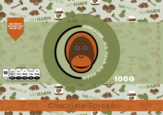
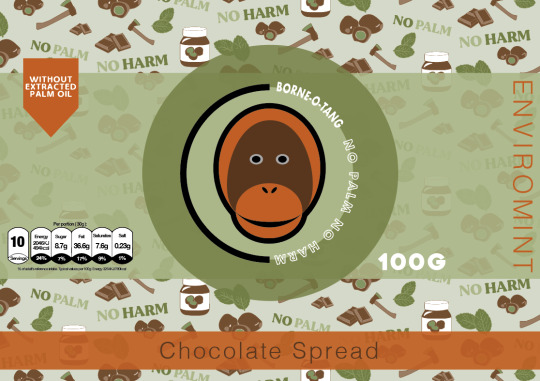
Designing Front Packaging
Here, I will now be coming up a final design for the front of the label. I think it might be a little easier to do no as I have come up with a back design, but also because I have already started coming up with the main structure, so it now means I just have to add in the smaller details to the piece.
Below is showing the current stage that I’m at, as I created this a few days ago juts to see what my initial ideas looked like when recreating them digitally. It is very simple at the moment, but I’m planning on finalising the design. So from looking at this, I have got the repeat pattern in the background with the colour of this being the same as the logo. Then there is the strip going around, where it will then stop around the back after the circles. I also have this front design where its showing the logo and then another slightly bugger circle around this.
Now that I have relooked at the current state of my work, I will start to add some more elements in.

Before I started, I wanted to see what chocolate spread normally has on their packaging, so I searched up some images of the front of chocolate spread packaging. After comparing mine to theirs, I could I needed to add quite a lot more to my design as I didn't ever realise that I hadn't added to say it was chocolate spread. I think this was because I got so used to just seeing this same design all the time, that I forgot that others wouldn't know what the product actually is. But before I added this, I wanted to find a calories chart that is shown on the front labels of packaging. This is normally very small but is very clear rand easy to read as well. So I Googled something around the idea of ‘PNG calorie chart’, where it took me quite a while to find a suitable one that I was looking for, but managed to find one in the end. I then went to download it, where it all seemed fine, until I went to ‘file’, ‘place embedded’ where it would paste it with the checked background still there, even though this should have disappeared.
So to solve this problem, I had to retrace around the image. Below is showing where I have done this. Although I only did the main section of it as I thought to just retype the information in, where it would actually be calories for chocolate spread. By this I mean that the chart in the image was just a random one as it was very difficult to find any harts at all that were PNG’s. I then chose a font and started typing out the information to fit in the boxes.

Below is now showing the completed chart where I have also placed it into position on my design. As you can see, another thing I have changed from the first screenshot was the colour of the background, to which it is no longer the same colour as the logo. Instead it matches the same light green colour as the back label. I was obviously going to do this as I couldn't have two different shades of background colour on the same label as this would look very odd. Also, I much prefer this lighter, more vibrant shade as helps to make everything pop out.
As well as this, I have decreased the circle and logo in the centre as I felt this was just slightly too big. I think this develops a much more eye catching effect even though it is smaller.
Another thing that has changed is the type in the logo. I have changed the colour of it to white instead of black. This did also show in the previous post as well where I added a smaller version of the logo. I chose to do this as I think it accomplishes a much more modern look, where it stands out more as well. I have kept everything else the same, although I was thing about changing the black stroke. However, this looked very weird as it was almost too bright then.
Next, I tried adding the flavour name and the words ‘chocolate spread’ to the piece. In my hand drawn sketches of my initial ideas I thought to have this information going around this outer circle. So I gathered a font and tried this idea out. At the time, I thought this font looked quite interesting as it had this fun element to it, although not long after I realised that it didn't really work. I felt that the font didn't match anything that I already have on the design.
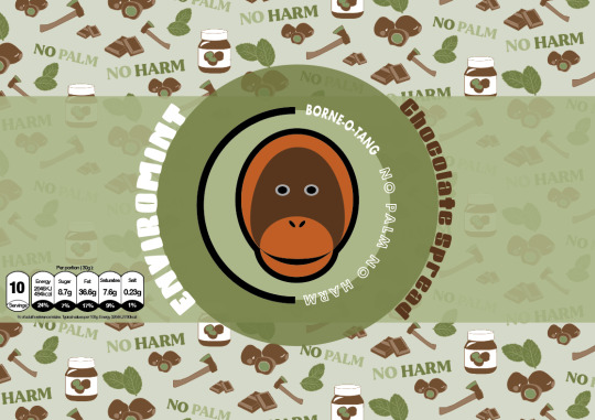
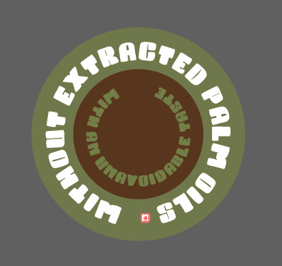
Then after looking at already existing chocolate spreads, I thought of having something to say that it doesn't contain palm oil just to clearly get the message across the viewers. I thought of placing this on the striped section through the centre.
As well as this, I thought of having it in the shape of a circle as I have this shape running through my packaging so it could work. So, I drew out a circle using the ‘ellipse tool’ and then copied and pasted this, where i then made it slightly smaller than the original. I chose for the outer circle to be the darker green from the outer circle near the logo and the smaller one to be the same colour as the dark brown from the logo. Next, I then got to the stage of typing something out, which I was going to wrap around these circles. I first thought of ‘without extracted palm oils’ as I was going to use this for my slogan at one point. I then thought of having another line saying how good the taste is, so I thought of ‘with an unavoidable taste’.
Although, when I got to the stage where I placed it onto my design, I found that it looked really ineffective, this was because of a few reason. One being that, I had to size it down meaning you couldn't really read it properly. But the other was just the shape as it didn't really fit in with the space that I placed it onto.
So overall, I got rid of this element and tried adding in other things instead.
As you can see below, a lot has changed since the last screenshot, where I managed to add in the important element in which was the words ‘chocolate spread’. I decided to move the whole strip and logo up a little bit so I could fit in another strip going around. I have chose to have this as the orange/light brown shade which is featured in the logo. I thought that having a colour that would brighten up the design but also compliment the green tones too, would work. I then chose for the type that has been placed on top of this colour to be the dark brown as I felt that this would contrast enough to be seen. As you can see the font that I have used for this is very thin, which I did choose on purpose. After getting rid of the previous font and type, I felt that a very thin one could achieve a really engaging look, where it should hopefully fit with the design as it isn't a fancy font.
This is now showing where I have rotated it around so that the whole word is on its side instead. I have wrote this in capitals as I feel it looks a little more tidier like this as otherwise the type is all different sizes and looks very messy.
Here, I am now going to experiment with the composition of how to arrange the chocolate spread phrase and the flavour name too as the two ideas that I have just tried really didn't go to plan at all. I’m hoping by playing around with these few elements, I can find an arrangement that works.
Below is presenting where I have thought to have both these two pieces of information together. I felt that instead of splitting them up around the design, it would be easier for the customer to read at first glance. Although, to make this look effective and show that these are two different pieces of information, I have changed the colour of the flavour name to white. I have also wrote this in capitols as well, although later on I did actually take this away so it was only capitals for the first letter of the word. This is because it doesn't need to be this bold and I would say it probably matches better being the same style as the words ‘chocolate spread’.
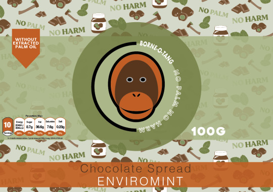
Next, I chose to try and separate them again just to see if I can make it look a little more effective than the first ones. So I have decided to make the extra strip smaller again so that its the same height as the type. I then drew another box using the ‘rectangle tool’ so that it fits around the flavour name ‘ENVIROMINT’. I didn't have it going the whole way around like the orange/light brown ones as I thought that there was no need to do so. This also just takes up more space, which is covering up the repeat pattern. As you can see this new box is in the darker colour as this then shows a contrast between the two concepts. After creating this, I could straight away see that the previous layout was a lot more tidier and visually pleasing, to which I felt having this random box placed above the main one, looks slightly odd. Also I don't really feel like there is any need to have it like this as the information was easily readable before and didn't need to be split up so much.

So I then went back to the idea of having both these pieces of information in the same rectangle shape. Although, I had the idea of switching around the colours so that instead of the box being the orange/light brown colour, I could try the dark brown instead. I felt that this colour could achieve an effect where this box doesn't standout as much as before as the colour isn't so bright. Doing this meant that I had to chnage the colour of the words ‘chocolate spread’ to the orange colour instead otherwise this wouldn't have shown up. From looking below, I think this colour blends in more with the other colours. When comparing the effects of both, I would say the white type standout more on this darker shade than the orange as there is more contrast between the two colours. However, I feel that on the orange rectangle, the whole shape is a lot more striking compared to the dark brown colour. To me, it makes more sense to go with the design that is going to make both of the concepts standout and not just one as the information is both important.

In the end, I chose to have this piece below as my final front label design as I think the orange rectangle and the orange icon in the top left corner match really well together, making the piece seem more connected. As well as this, the orange colour is more eye catching as there isn't as much of this colour compared to the dark brown. This is because this shade of colour has been shown all over the repeat pattern, meaning it could look really boring having even more of this colour.
I did say in my initial hand drawn designs that I would have some sections being where the label is transparent so you can see the brown chocolate spread in the jar. When it came to showing this, I wasn't sure how I was going to make this look effective as the mock ups I was be using are se through meaning they wont be the brown colour it should be for that product. Also, I don't know whether this would confuse the design as well. So in the end, I chose to not use this concept in my packaging although I was drawn to this idea as I thought it could look really engaging having a little section where it would juts be this. In my plan, I thought of having it where the circle and rectangle stop, so this would mean there would be a section on the top of the circle and bottom.

Overall, I’m really pleased with this outcome as I think its going to look really striking once I have designed all the chocolate spread flavours where the colours will match the flavour. This is what I will be doing next as once I have competed that task, I have done the labels for the jars, where I can then move onto my next step.
0 notes
Last Seen Blogs

leavemebetosleep
...zzzZZZzzz...
panpanst
パンスト
kifs1990
Keeping It Firme Since 1990

originalsaladgentlemen
Untitled