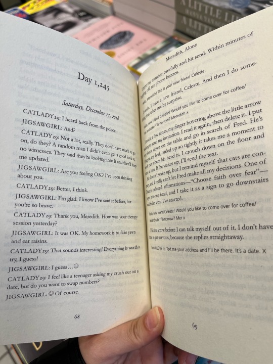
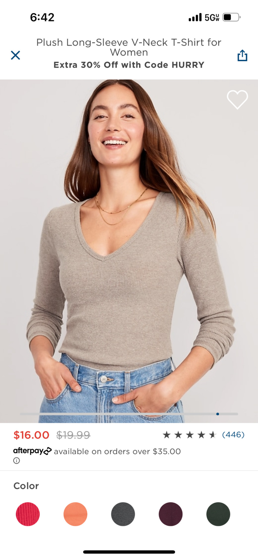
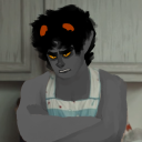
#i love the orange and navy combo!!!
Text
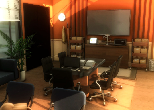
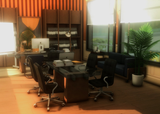
Vincent's Lawyer Office
#ts4#sims 4#ts4 interior#ts4 decor#my builds#ts4 gameplay#ts4 legacy#postcard legacy#postcard gen 3#i love the orange and navy combo!!!#add that colour yknow! instead of being all brown and beige before#i dont have any legacy posts in my drafts but i have vincents office
350 notes
·
View notes
Note
Have you reviewed the Grapploct line? Thanks as always for your thoughts!

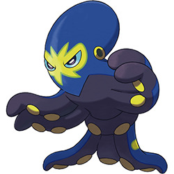
I actually really like Clobbopus here. I feel like a fighting-type octopus that uses its tentacles for punching, while a fairly obvious concept, is a good one, and Clobbopus does a good job of representing that with its dark-colored "boxing gloves" and markings that make a wrestling mask of sorts.
I also just like the general aesthetics here. The off-white and orange are a lovely combo, and the blue eyes work well with it. The "gloves" being a dark gray helps them pop out against the rest of the design, with just a small fringe of the same color at the bottom to carry it through without distracting from the tentacles. The blue eyes and their rectangular shape are also super cute.
However, I'm not really that big on Grapploct. It's one of those evos that looses most of the best attributes of the first stage.
To start, I really don't care for the sudden color change. There's no actual reason it couldn't be the off-white with orange, and making the entire body dark gray means you lose any emphasis on the tentacles that the original had. Using navy on this dark color also means that the design blurs together, making it hard to read save for the yellow mask and suckers. Ironically, the shiny keeps a closer palette to Clobbopus (not exact, but closer), and frankly I think it's much better:

On top of that, they also changed the eye shape again for no reason, and it seems to have completely lost the boxing theme. It still has a wrestling motif with the mask, and I guess it's gone from boxing to jujutsu given the "belt" around its waist, but I don't think that reads very clearly conceptually compared to the simplicity of the boxing gloves, thus making the design feel less coherent.
On the plus side, it is at least identifiable as belonging to the same line, and I do think it standing up on two tentacles is interesting, but otherwise it's just pretty "eh".

Overall, Clobbopus is great. Grapploct isn't terrible, but it's not half as good as Clobbopus either due to a muddled color palette and less identifiable theme.
43 notes
·
View notes
Text
What op men voices look like and what they smell like by me!!!
So for context I have two types of synesthesia. One where I can see the colors of people’s voices and the other is where I can vividly smell pictures (very weird combo but it’s there!)
So here are some standout colors and smells of one piece men
Shanks
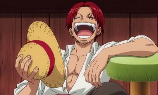
His voice color is a rusty brown color. It’s honestly not that bad and the color is more on the warm side then cool and I enjoy it when he laughs because the color bounces around my vision. wish I could hear his voice more often but then again i am still in pre time skip (tho I have been spoiled for everything but honestly I don’t mind, spoilers doesnt make or break a piece of media for me)
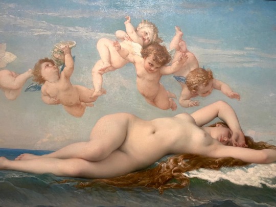
Smells are much more fun because it’s not just me identifying voice actors but the characters themselves:] on that note shanks smells extremely sweet. Maraschino cherries, candied strawberries and just an underlying scent of blood. If I would have to choose another picture that he smells most similar to it would be the birth of Venus by Alexander cabanel
buggy
His voice is a very nice sea green and some people have multiple colors and when he laughs I get some navy blue and neon green. His colors are much more stable compared to shanks’ and don’t move around much but when he screams it wiggles so that’s fun
His scent is fucking delicious smelling. Smells like a god damn bakery. Gingerbread, chocolate chip cookies, and vanilla icing. But there is also this kinda chemical scent with it as well that I can only describe as like nitroglycerin??? Idk it just reminds me of like fireworks and when I think nitroglycerin I think fireworks. A painting he smells most similar to is the creation of Adam by Michelangelo

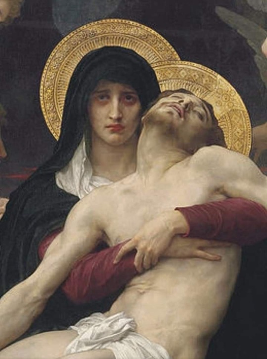
Corazón
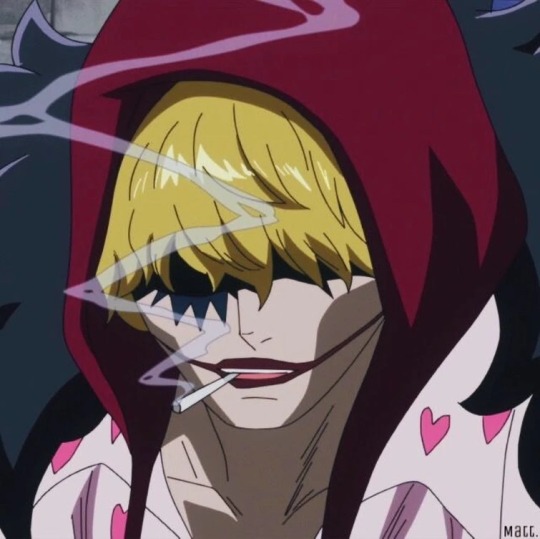
This guys voice is so fucking beautiful bro. I cannot express enough how much I love this voice. It is a very rich burgundy color and it is constantly dancing around often coming into swirls.
The only way that I can describe his scent is that he smells like the concept of religion. Red wine, incense, blood, and lilacs. There is also hints of firewood and pomegranate. He often smells like a lot of Virgin Mary iconography to me. But the most closely associated smell I get from him is pietá by William-adolphe bouguereau
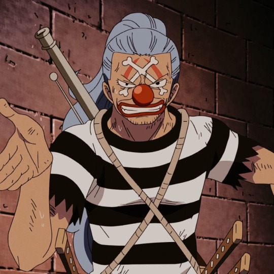
Doflamingo
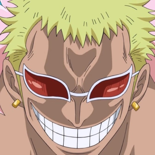
His voice is very colorful bright neon orange with times getting a sky blue or a white. His voice has never moved and is just constantly- still. I don’t remember a single time the colors so much a jiggled. It’s quite literally just dots that fade out when he stops taking and that’s about it
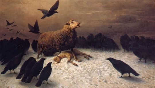
This man has a very interesting smell. He smells like corpses rotting and the black mold in my bathroom but also very specifically the honey barbecue chicken my brother makes. He also has like a hint of a lily smell??? Very weird and very unique to say the least. It’s not very close but it was the closet I could find and that was the painting anguish by August Fredrich schnck
Mihawk
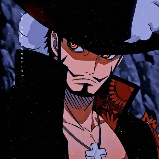
This man has the most dull grey voice ever. And beige. just a very sad beige. His voice bores me to tears with how underwhelming the colors are. But in the opla Steven got a very nice jade green color. Back to anime, his voice moves around violently it’s just constantly trying to take over my vision and just ping ponging around. It could have been fun if it wasn’t such boring colors.
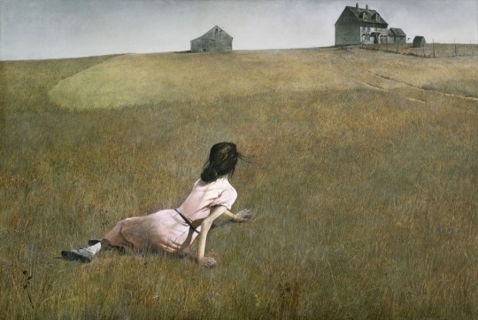
His scent on the other hand— blackberries and ink. Kinda smells like a library with the book and dust scent. But it is very nice smell. I would love to have it as a cologne. The painting he smells the most like is Christina’s world by Andrew Wyeth
#one piece#dracule mihawk#buggy the clown#buggy one piece#shanks#donquixote doflamingo#donquixote rosinante
35 notes
·
View notes
Photo


Pick Your Vice Versa Outfit
↳ Talay Rawi Edition [Puen ver.]
My Top 10 Talay Outfits
for @stormyoceans
layout insp. [x]
+ bonus:
(some thoughts under the cut!)
more rambles about these outfits for you monica! i hope you enjoy ^^
TOP 10 Talay Outfits explained:
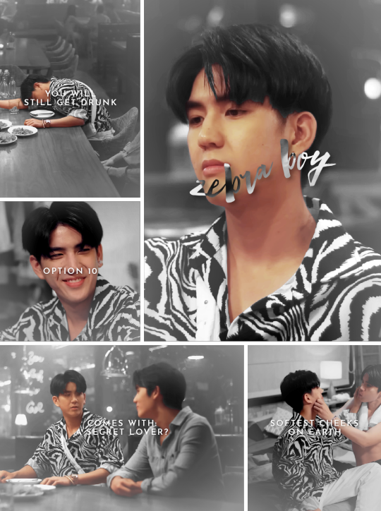
10. Zebra Boy
a stylish and flowy zebra print shirt with basic white slacks and talay’s signature white bag. this one is so silly but cool i had to include it. i actually am obsessed with both of the white & black print shirts tess owns but the other one is mostly worn my ohm in the series so i didn’t inlude it here (ep 2 when tess/talay goes to pester tun at the café). also i just like this scene a lot and couldn’t get over the “secret lover” -line.
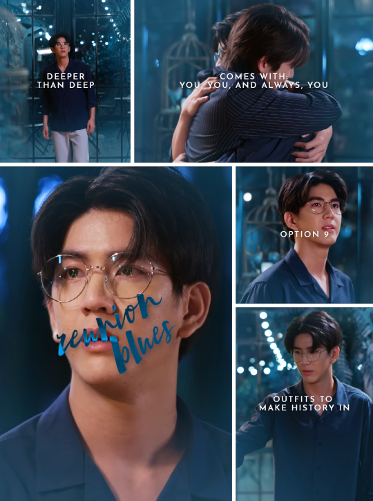
9. Reunion Blues
a simple navy blue dress shirt and light colored pants plus talay’s round glasses. listen: am not a big fan of talay’s clothes in his own universe even if he looks adorable in them, but this one! this one is a legend. straight up iconic. he looks so pretty in dark blue and then we have this whole scene and ugh. just pure insanity.
8. Goodbyes taste bitter
an orange and white striped shirt and black jeans. am so obsessed with the v-neck of this shirt, it’s crazy. i don’t blame puen at all for instantly going like, “oh yes, that’s my bf now” bc honestly? very understandable. talay just looks so good in this shirt, holy hell. continues on the road of, “why must you dress up so nicely when the occasion is breaking my heart?” i guess these two are similar like that.
7. Let us kiss again
a red-blue-white striped sweater with red pants. i love this color combo on talay so much. blue and red just suit him. the shirt is also tight fitting and it’s amusing to see puen Struggling bc of it. man is not able to keep his hands off. it’s very understandable but pls sir, calm down. you’ve known each other like two weeks. and you still haven’t even told talay that you’re not kissing him just bc but bc you’re head over heels in love with him. get a grip.
6. First Kiss
a simple white sweatshirt and red/fucsia pants. i don’t want to say this but i have to say this: talay’s ass looks amazing in these pants. like, am not one to stare but oh boy. it’s right there! stealing the show! and then it’s combined with talay’s sexy wet hair after running through the rain to look for his long lost lover friend who he wants to make up with. Literally. bc they’re kissing by the end of this. and i scream.
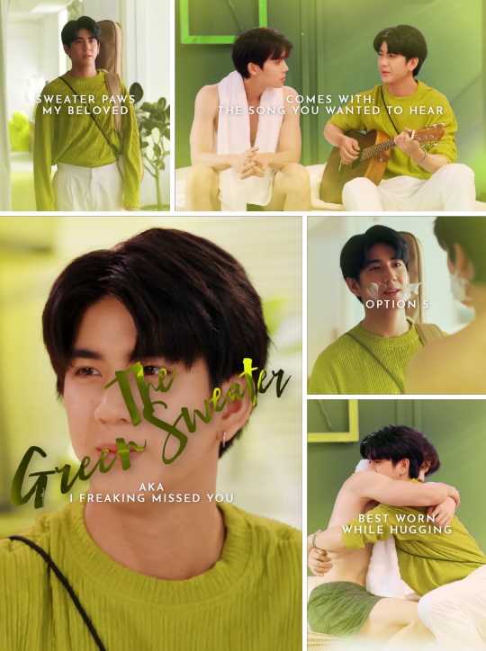
5. The Green Sweater
a yellow-green sweater combined with white pants. talay looks adorable in this with his guitar and the sweater paws. am not at all surprised that puen looks close to tears bc bitch, me too. it’s just So Soft and then it’s mixed with the guitar (+ the lotus flower) and talay singing a love song and. i want to hug him so bad, puen get out of the way it’s my turn now.
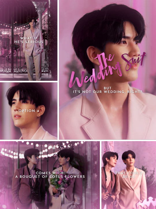
4. The Wedding Suit
a light pink colored suit, apparently without a shirt underneath. this whole thing began with this suit. as i said, this one is 100% outshining the one puen wears in this scene. i am just in love with this suit; the color, the simplicity, the cut, the way talay wears it so casually. he looks amazing and positively ethereal. puen is marrying him on the spot. talay is thinking it’s a joke but i might just tell him it’s not. get a ring and be done with it, would you. this might sound controversial after me saying puen is rushing things with the kisses but i don’t actually have anything against it.
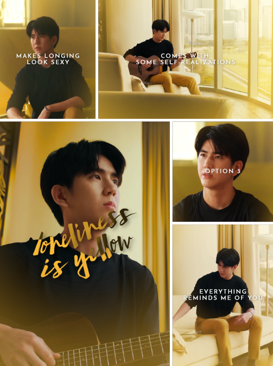
3. Loneliness is yellow
a simple black sweatshirt with bright yellow pants. i feel like the more heartbreaking the scenes get, the better talay gets dressed. he’s always serving looks when am crying on my floor. i don’t mind tho bc why not have several mental breakdowns at the same time, saves me the time. he looks absolutely glorious in that black shirt, and the colored pants are a wonderful touch. if tess got nothing else, at least he's had the sense to buy all these clothes.
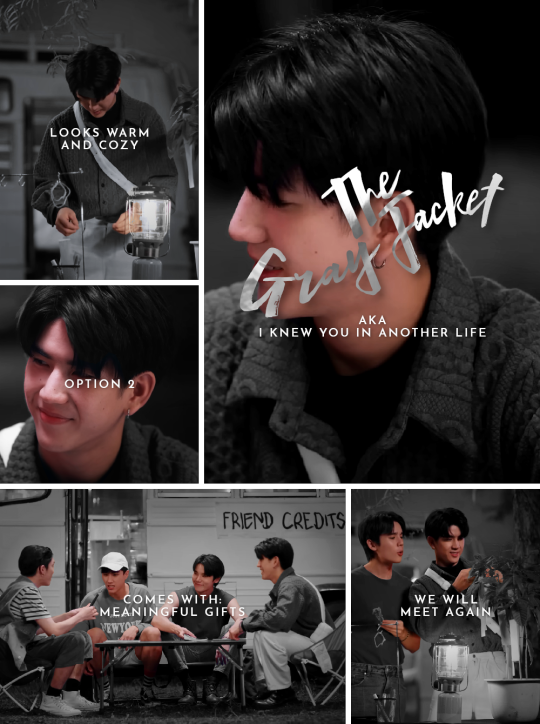
2. The Gray Jacket
a textured gray jacket with a black shirt and white pants. the texture on this jacket makes me go wild bc it looks so nice to touch and the whole jacket looks so cozy. am wondering how talay can wear that with the heat but that’s fortunately something that doesn’t get to me through my screen. he looks very huggable once again. he looks positively radiant when he smiles. and it’s just a plus that puen looks so gone for him bc yeah, valid. am in love with this sunshine boy too.
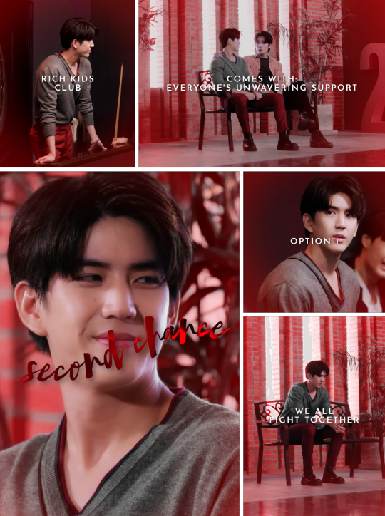
1. Second chance
a gray sweater with red details, combined with red pants. honestly talay’s best outfit in this whole show hands down. every time i start this ep, i am just blown away by this outfit. the styling team was going crazy that day. the shirt has a v-neck, the red details work so well, it fits talay nicely, the rolled sleeves, the delicate bag. the pants are tight fitting and make his legs look extra long and slim. especially in that billiard room lighting he just looks insanely pretty. i want to yell into the void. the void might yell back at me.
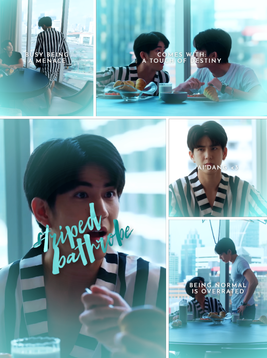
Bonus: Striped Bathrobe
a black and white striped robe, worn mostly for breakfast. i am not really sure what to call this but a bathrobe felt like the closest fitting one so i went with it. it’s crazy how this is literally the second outfit puen ever sees talay in if we don’t count talay being half naked. he got absolutely bewitched and talay is not even bothered. this striped robe is what truly mattered. and please let’s not talk about ai’dang.
#asiandramanet#asianlgbtqdramas#vice versa#vice versa the series#puentalay#sea tawinan#jimmy jitaraphol#countaspieceofme#userjjessi#lightmiup#tonanons#mjtag#lextag#ninisdarlings#becauseigtf#tesstag#tuserchlo#tusersilence#userconcrete#usertoptaps#usermor#userhanyi#userspicy#finally this is done too
106 notes
·
View notes
Text
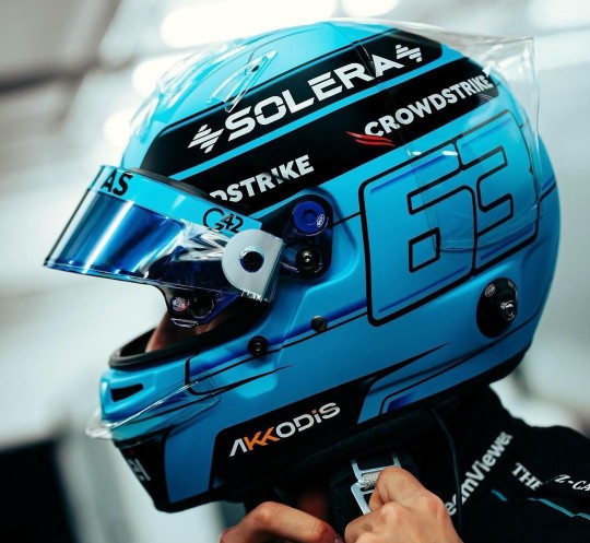
Helmet Watch 2024
*cracks knuckles* I'm back to yell about driver helmets.
Like talking about and rating all the liveries last year, I had a lot of fun doing the same for the drivers helmets, so helmet watch has returned for 2024! (Under a read more as to not clog up everyone's dashes, with the drivers listed in alphabetical order by surname.)
NB - I'm just doing the "core" helmet designs, as if the drivers come out with one-off helmets at the rate they did last year I wouldn't have any free time.
Alex Albon (Williams)

Like the 2024 Williams livery, it's an evolution of last year's design. Though with less sharp angles and using something much more bubble font-esque.
We still have the double As which is neat and I also loooooooove the baby pink and navy blue combo, especially with how much pink is on the helmet. It will really pop against the dark blue livery of the car.
8/10
Fernando Alonso (Aston Martin)

Pretty much a copy and paste from last year's helmet with a couple of minor tweaks. But in saying that I do feel that the minor adjustments make the design look a lot less busy. Like last year the colour scheme is great and it'll look great with the car, and I love the Aston Martin wings by the visor, it's one of my favourite details.
7/10
Valtteri Bottas (Sauber)
Any feelings I had about Valtteri taking forever to drop his 2024 helmet design have been immediately forgiven. I absolutely love this Northern Lights inspired design so so much. Both because of how unique a design it is but also the execution of it is just gorgeous. I love all the inclusion of the North star and all the different constellations, and that the number 77 has also been written like waves from the aurora. I would genuinely buy a mini-helmet of this I love it that much.
10/10
Pierre Gasly (Alpine)

I absolutely LOVE this one. The splashes of white and the subtle gradient shading adds so much dimension to the whole design (proof that if done right monochromatic designs can absolutely work!). I also just love the shade of pale blue as well, it's going to look really nice with both liveries Alpine are running this year.
10/10
Lewis Hamilton (Mercedes)
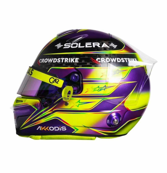
Misty eyes aside about this being the last core helmet design from Lewis as a Mercedes driver, I do absolutely love this. It's pretty much another copy and paste from last year, minus the rainbow band on the top. I'm glad that Lewis kept the rainbow lines otherwise the contrast between the neon yellow and purple would look quite jarring. But like last year I absolutely love it (apart from the exposed carbon at the top)
9/10
Nico Hulkenberg (Haas)
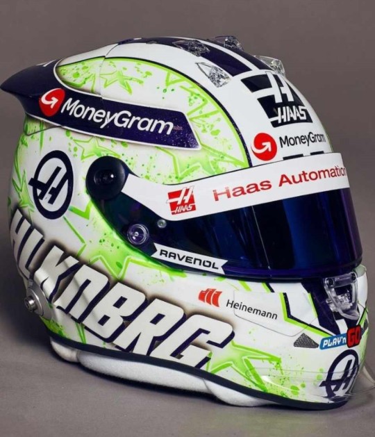
JMD Helmets really do never miss. Like his helmet from last year I love the paint splatter effect and I really like the choice to change it from orange and purple to acid green. I'm unsure on what to make of the purple and green combo as it def plays into the whole Hulk nickname, but the shades chosen do look good together.
9/10
Charles Leclerc (Ferrari)
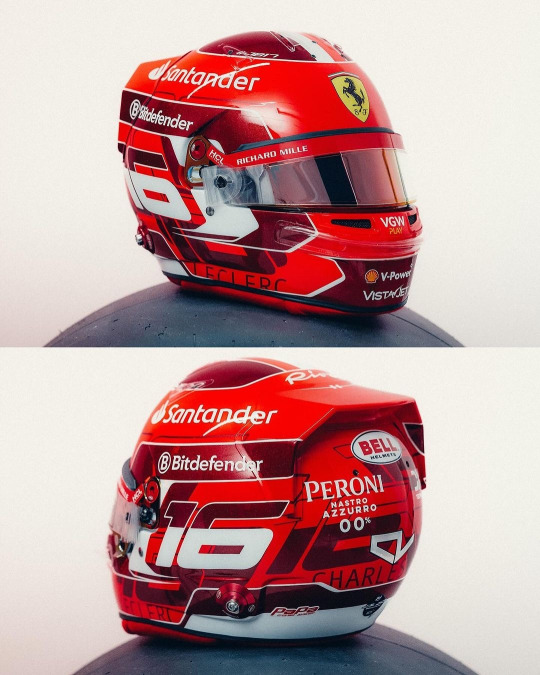
Currently kissing Charles on his pretty little head for the addition of the dark metallic red accents. It's so pretty and adds a lot of dimension to his helmet design (while I did like his '23 helmet, it did feel a bit plain). I also really like the pattern on the base of the number 16 going round the helmet, it's been done in just the right font size and colour that again adds some more dimension instead of looking busy.
8/10
Kevin Magnussen (Haas)
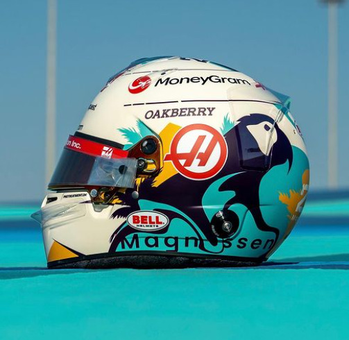
This is a complete 180 from his previous helmet designs, and while I have zero idea what the inspiration is I really like it!
The bright splash of turquoise is really nice (I will always love fun colours on helmets) and it complements the parrot design really well. (Again, I don't know why Kevin has put a parrot on his helmet, but it's fun so I'm allowing it). I would never have thought to pair turquoise and marigold together, but somehow it works, and both looks really nice on the off-white base.
8/10
Lando Norris (McLaren)

I genuinely cannot fault this. I love that it's glossy, I love the neon yellow, I love the abstract black detailing. My new favourite helmet design of Lando's
10/10
Esteban Ocon (Alpine)

I am so happy to see Esteban carrying on the red and black colour scheme from last year. While I don't love this design as much as last year's (the big carbon fibre E is a tad off putting) it's still a really solid design that will not only stand out against the Alpine livery, but against the rest of the grid's helmets too.
He also gets a kiss on the head for keeping his helmet glossy instead of matte
8/10
Sergio Perez (Red Bull)
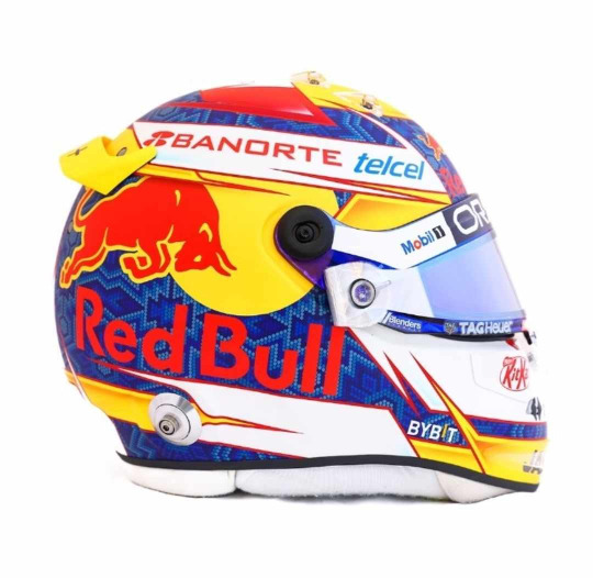
I'm unsure how I feel about Checo's helmet this year. On the one hand it does have a more cohesive colour palette than last year (and I LOVE the traditional Mexican inspired patten on the blue base), on the other it does feel a bit simple. I also wish the Red Bull logo with the white outline had been used instead, the text is a bit hard to read against the blue. But I do enjoy the splashes of yellow that do well to set his helmet apart from Verstappen's
6.5/10
Oscar Piastri (McLaren)
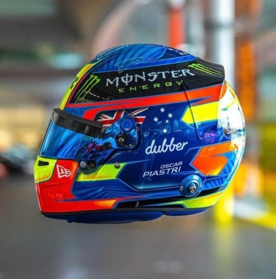
Another evolution of last year's design and I love the version for 2024! For me Oscar's helmet was too busy last year and I feel like it's been streamlined. My favourite part, the colour palette, has remained unchanged and like last year I just love how bright it is. I also really like the pattern on the medium blue base, it adds a really nice dimension to the overall design. However I do miss the silver holographic detailing from last year's helmet, it's a shame it didn't make the cut.
9/10
Daniel Ricciardo (Racing Bulls)
This is a colossal upgrade on last year's helmet (the tan and blue colourway was not it). And while the grey and silver colour scheme is plain, it definitely helps the flame design look a lot better than on last year's helmet and will look really good against the bright blue RB livery.
As with Gasly's helmet I also like the gradient shading, and the chrome (!!!) silver outline going around the flames.
7.5/10
George Russell (Mercedes)
I am so glad George stuck with a blue design instead of the acid green he trialled at some race last year. It's a really gorgeous shade of blue that looks stunning with the Mercedes W15 livery, and I really like the little bits of darker blue shading and the blue visor (again I don't talk about matching visors much but I do appreciate them!!).
He also gets a bonus point for having the black parts painted instead of carbon fibre.
8/10
Carlos Sainz Jr (Ferrari)

Again another copy and paste from last year, but thankfully with less black. It looks so much brighter with just having the black on the top. I like that the design is a even more abstract than his design last year, it definitely makes it look different. And of course the red and yellow colour scheme means that it will look really good with the Ferrari livery
7/10
Logan Sargeant (Williams)

I really, really want to like this design but the American flag just completely takes me out of it. If it wasn't there this helmet would be gorgeous because imho it's not needed as the white and blue with the red accents already does a great job in showcasing Logan's home country colours.
Apart of that, the design is really nice and it will look so stunning with the car, it just has an echo of a Haas US GP livery 😭
5/10
Lance Stroll (Aston Martin)

A moment of silence for the fallen Aston Martin wins, they were very pretty 😔
Lance's helmet design for 2024 is a throwback to the design he ran in his championship winning European F3 season, but refreshed in Aston Martin colours. I did have a somewhat negative reaction upon seeing the exposed carbon but the more I look at it the more I'm on board with it. It definitely helps that it's all over glossy. Also shoutout to Lance's continued commitment to the Aston brand by having the flashes of neon lime to match the car's livery, I will always appreciate a proper commitment to the bit.
7/10
Yuki Tsunoda (Racing Bulls)

The Japanese maple leaves are baaaaaaaack!!!!!
I'm not so sure on the navy base... but then I also don't know what colour base I would switch it out for that would look good and also complement the Racing Bulls livery. But Yuki's helmet was one of my favourites last year so I'm really happy to see a version of it back for 2024.
7/10
Max Verstappen (Red Bull)
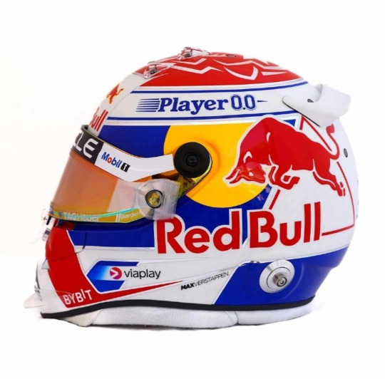
ngl I do like this a lot more than his design from last year. I love the cobalt blue (oh how I wish the RBR would be as bright as this) and I especially love the silver chrome accents, if they were a little bit thicker and more prominent I'd like them even more.
I also want to shoutout the red/orange duo-chrome visor, I never talk about them enough but I love it when the colour of the visors complement the rest of the helmet design (in this case the red and yellow in the Red Bull logo)
8/10
Zhou Guanyu (Sauber)
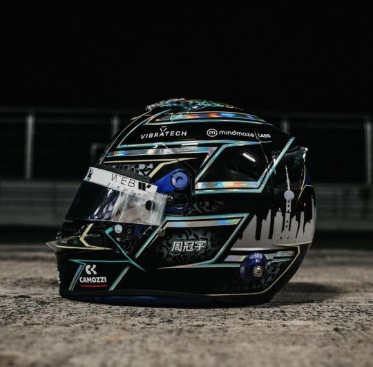
No notes. And dare I say, best helmet on the grid. I just love the pairing of all over black with the hints of the porcelain pattern and silver holographic accents. It's sexy as hell.
10/10
#Formula 1#Helmet Watch#2024#Helmet Watch 2024#Helmet#this took forever to put together bc the drivers took their sweet time in putting their HQ helmet pics out#but spoiler alert the drivers once again out designed their teams
4 notes
·
View notes
Text


Ok ok ok! Last but not least! Rainbow Dash! The top was my original design. I wasn't satisfied with it bc of the colors. Dash has lots of colors to work with and I got overexcited to use...all of them asfghj every doodle has different combos for her mane, tail, eyebrows etc. Also, her design got too busy with the scars and cutie spots I put on her. Sooo, I made a silly sketch and tried again! The bottom pic is the new design and I LOVE IT!! Putting more cool colors on her was the way to go!! I love the splashes of warm colors! And the colored feathers on the wings are MWUAH!
Writing my design notes here too in case my writing is hard to read
* one earring below
* scar through eyebrow
* spider bites
* feathery fluff!! Every pegasus and alicorn has this! It's the light down that peeks through under the feathers! Adults have light down, babies and children have the thickest down and teens start shedding that thick down every molting season!
* darker scuffs black (I think I did them in navy blue here which is why they aren't that noticeable) The scuffing of her hooves comes from her reckless, daredevil acts. We all know how quick she is to fight so I feel like it shows who she is!
* outline golden (I accidentally did it in blue) her inner feathers are yellow!
*blue instead- the orange element mark blended too much into the magenta and yellow.
* freckles!?- This was an afterthought which is why they weren't on her in the design. I thought it would be cute if she had her mom's freckles!!
4 notes
·
View notes
Text
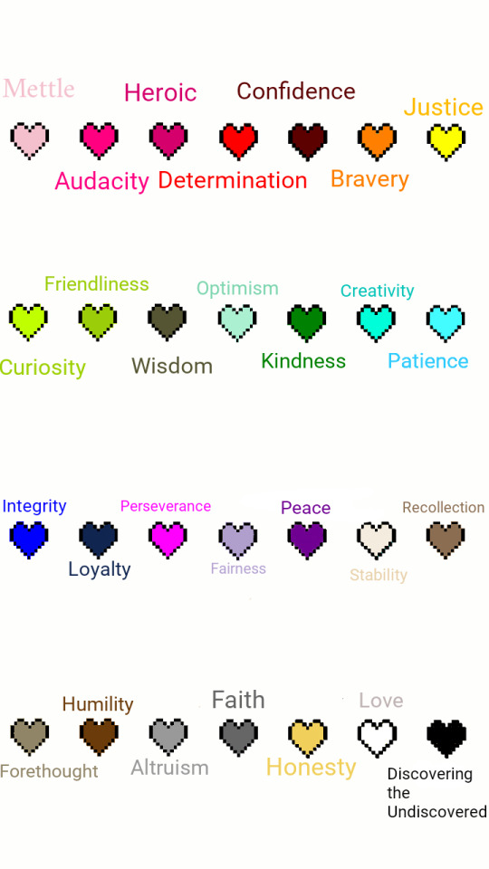
I'm wondering if I never posted an updated version of my soul color chart but here y'all go.
Made a reference image for Undertale colors both canon and fanon! Some I made up, some others made up. If you use this PLEASE credit me.
The colors:
Pink/mettle
Fuchsia/audacity
Magenta/heroic
Red/determination
Maroon/confidence
Orange/bravery
Yellow/justice
Lime/curiosity
Light green/friendliness
Olive/wisdom
Mint/optimism
Green/kindness
Turquoise/creativity
Light blue/patience
Blue/integrity
Navy/loyalty
Indigo/perseverance
Lavender/fairness
Violet/pacifist
Beige/stability
Sepia/recollection
Hazel/forethought
Brown/humility
Gray/altruism
Silver/faith
Gold/honesty
Black/discovering the undiscovered
White/love
I also wrote down meta stuff like if each one was in the game itself, under the cut:
I think there are more than 7 soul colors. That is, 28 soul colors in all. Also you can have more than one. (Everyone has the potential for any soul color in them but I assume you're born with one or two being the main). Whether a spirit, being or person, those that have one dominating trait (like Frisk and the other Fallen Children) I believe are about as common as 1 in 3. For example, my soul combo is first Pink/Mettle, then Turquoise/Creativity.
In terms of people, I also think that each type of person (like, if alien people existed/are actually out there somewhere) then each type of person would have one color as a base underneath each individuals soul. Humanity has a soul color base of Red/Determination, but these bases can only be discovered through experimentation like in the True Lab. In battle I haven't figured what dual toned souls (every 2 out of 3 people/spirits/beings) can do or not do, but I'm leaning towards the idea of it affecting what you can do in battle depending on what you equip. (Wearing an armor and weapon that matches both soul colors would cancel them out and you'd default to your main/primary color. If you equip the items of other soul colors they wouldn't work, and if you equipped both of your secondary color's items you'd act as if you were that color instead of your main one.)
I found information on the canon soul colors on the undertale wiki:
RED
Frisk: Stick + Bandage // Original Fallen Child: Real Knife + Heart Locket
Virtue: DETERMINATION
"Try as you might, you continue to be yourself."
Red souls have free movement inside the battle box.
ORANGE
Glove + Bandanna
Virtue: BRAVERY
"You are the kind of person who rushes fists-first through all obstacles."
Orange bullets are dodged by moving into them.
YELLOW
Gun + Cowboy Hat
Virtue: JUSTICE
"Your sure-fire accuracy put an end to the mayhem of 'Ball.'"
Your yellow heart literally fires shots, allowing you to exact justice on Mettaton.
GREEN
Frying Pan + Apron
Virtue: KINDNESS
"Your concern and care led you to a delicious victory."
Green bullets are good for you. You have to be nice to the monsters and get close to them to activate them. When your heart is green you're in close-combat with Undyne and have to embrace for her attacks.
LIGHT BLUE/CYAN
Toy Knife + Ribbon
Virtue: PATIENCE
"'Ball.' is 'Small.'. You waited, still, for this opportunity… Then dethroned 'Ball' with a sharp attack."
Cyan bullets are dodged by standing still.
BLUE
Ballet Shoes + Tutu
Virtue: INTEGRITY
"Hopping and twirling, your original style pulled you through."
When your heart is blue, bullets are dodged by jumping around.
INDIGO
Notebook + Glasses
Virtue: PERSEVERANCE
"Even when you felt trapped, you took notes and achieved the end of 'Ball.'"
You are "trapped" during Muffet's battle. The battle involves patterns and switching line-to-line like a notebook. The sans fight also has a purple status effect, which relies on perseverance and memorization to beat.
The following are the fanon/non canon soul colors.
PINK
Headphones + Tank Top
Virtue: METTLE
"You got 'Ball' into the hole even though it was difficult."
Pink souls always have a 10% chance of having one hit point left when they'd otherwise be defeated in battle, which then appears as pink. This works even if the attack deals more damage than what is left in the hit box. You can still be defeated though if you get hit again though.
FUCHSIA
Construction Helmet + Hammer
Virtue: AUDACITY
"With brute strength, you got 'Ball' into the hole."
Fuchsia souls can shoot bullets that knock attacks out of the way.
MAGENTA
Flowing Cape + Toy Sword
Virtue: HEROISM
"You heroically helped 'Ball' get home safely."
Magenta souls can "jump" over attacks.
MAROON
Barrettes + Crowbar
Virtue: CONFIDENCE
"You knew you could do it, and you showed that off and won this game of 'Ball'."
Maroon souls can flip around and even turn side to side or upside down in order to dodge attacks.
LIME
Hair Tie + Stapler
Virtue: CURIOSITY
"You wondered what would happen if 'Ball' was taken down, so you came up with an idea."
Lime souls can only move diagonally.
LIGHT GREEN
Toy Shield + Friendship Bracelet
Virtue: FRIENDLINESS
"As your friendliness of 'Ball' helped it get to the hole, you succeeded with a smile."
Light green souls lower an opponents attack at the start of battle, the amount depending on the LV of the opponent.
OLIVE
Binoculars + Dictionary
Virtue: WISDOM
"Analyzing your surroundings, you created a strategy to finish 'Ball' game."
Olive souls CHECK an opponent automatically without using a turn up at the start of a battle.
MINT
Bright Leggings + Silver Bangle
Virtue: OPTIMISM
"You got 'Ball' into the hole as you knew you would."
Mint souls can only move at the top of the bullet box.
TURQUOISE
Painter Smock + Sketchbook
Virtue: CREATIVITY
"You went against the normal path and guided 'Ball' your own way."
Turquoise souls can create a pulse around itself to neutralize attacks by pressing [X].
NAVY
Baseball Cap + Yearbook
Virtue: LOYALTY
"Your dedication to solving the problem got 'Ball' into the hole."
Navy souls move in a grid pattern.
LAVENDER
Incense Holder + Scrunchie
Virtue: FAIRNESS
"You tried your best to get through 'Ball' and in the end you got it in fair and square."
Lavender souls can "grab" an attack and then release it after moving out of the way, rendering it harmless. You hold attacks by holding down the [X] key.
VIOLET
Headband + Beaded Bracelet
Virtue: PEACE
"The 'Ball' saw you were a nice person and helped you achieve your goal."
Violet souls have a slower FIGHT bar but have a 50% greater chance to FLEE. (Except for boss battles)
BEIGE
Bicycle Helmet + Refillable Thermos
Virtue: STABILITY
"Staying to the same pattern helped 'Ball' enter the hole."
Beige bullets are good for you. They give you a shield around your soul that only wears down when hit repeatedly. (Up to 3 hits depending on the opponents' Attack stat)
SEPIA
Portable Radio + Disposable Camera
Virtue: RECOLLECTION
"You've remembered 'Ball' and got it in whilst recollecting your thoughts."
Sepia souls can make an opponent repeat the same move twice in a row, but this can only be done every 3 turns.
HAZEL
Knee High Socks + Worn Almanac
Virtue: FORETHOUGHT
"Thinking ahead, you were able to figure the way to get 'Ball' into the hole."
Hazel souls can predict the opponents' next attack every other turn.
BROWN
Finger Brace + Loafers
Virtue: HUMILITY
"You got 'Ball' to enter the hole using your own unassuming demeanor."
Brown souls can shrink one size smaller in order to dodge attacks. They grow back to normal size after their turn ends.
GRAY
Sandals + Headscarf
Virtue: ALTRUISM
"You did the right thing and helped 'Ball' into the hole."
Gray souls have the positions of the FIGHT and ACT buttons switched.
SILVER
Toy Fan + Religious Necklace
Virtue: FAITH
"Despite the frustration of trying to make it into the goal, you kept the faith and eventually won the game of 'Ball'."
A silver soul is automatically ejected from the bullet board at the start of battle and can move everywhere outside of it.
GOLD
Sneakers + Jersey
Virtue: HONESTY
"Your honest attitude inspired 'Ball' to enter the hole."
Gold souls can only move on the edges of the battle box.
BLACK
Brass Knuckles + Bandana
Virtue: DISCOVERING THE UNDISCOVERED
"Wanting always to see what is beyond the horizon, you discovered a way to put 'Ball' in the hole."
Black souls can move in and out of the battle box at will.
WHITE
Warm Blanket + Serving Spoon
Virtue: LOVE
"Filled with love, you sent 'Ball' to Heaven by rolling it up to the hole."
A white soul is the default color of monster souls. White souls have no bullet box to limit it.
TL;DR: 28 soul colors in all, items can affect you in battle and each soul color has unique attributes in fights as well. 1 out of 3 folk have one main color, whereas the other 2 out of 3 have a main/primary and secondary soul color.
8 notes
·
View notes
Note
whats your favorite color :)
If I had to pick one color it would be either yellow, light pastel pink or a navy blue, but I think I gravitate less toward fave individual colors and more toward fave color combinations. After all, a favorite color is affected by what's around it.
Color combos I love:
Pink and lilac
Navy blue and gold
Yellow and emerald green
Sage green and silver
Rusty burnt orange and sunflower yellow
deep teal and black
black and hot pink
8 notes
·
View notes
Text
tagged by @lookingforsomematches
Alias/name : choco
Birthday : july 8th
Zodiac : cancer sun, pisces moon, leo rising
Height : 5'7"ish
Hobbies : i have adhd literally everything is my hobby but anyway writing, doodlin frogs, various crafts, occasionally painting, sometimes graphic design, legos, playing video games, journaling/calligraphy, collecting tiny plastic nonsense and other various trinkets and tchotchkes, oh god there's so many more help
Favorite color : iridescent, but the actual-color answer is mint green + pink
Favorite book : ohhhhh god. usually i say it's the hitchhiker's guide to the galaxy which did a lot to inform my sense of humor and really inspired me as a writer, but i also can't remember half of it now and never got further than i think part of the restaurant at the end of the universe. one day i'll go back and re-read the whole series. probably. maybe.
Last song : home - kimbra (kimbra is so goooood guys if you've never listened to her stuff outside of somebody that i used to know check her out!!!)
Last Movie / Show : my dad just finished watching the charmed reboot and i kinda got into it right at the last season, and now it's over, and i'm a lil sad about it
Recent read : some random kindle unlimited gay romance novel about a pretty albino boy who gets saved by evil human traffickers by a bunch of hot mercenary-type dudes. it wasn't great but the sex scenes were hot and i love any kind of polyamory rep, even in trashy tropey romance novels.
Inspiration : right now i have my coffee-scented candle burning and that is sparking some serious cozy-fall-vibes inspo, so imagine that and enjoy
Fun fact : i can't whistle! i can play the flute and i can actually blow across pretty much any bottle and make a tone but i just can't get my mouth to whistle. nor can i blow bubblegum bubbles, and i suspect the two are related.
Story behind URL : one of my friends in college suggested it as a pesterchum handle that seemed to fit my vibe and i took it and ran with it. i can't remember if the cyclops OC i designed came first or after, but basically it seemed like fate.
What’s the colour palette of your name?
did both choco & my real name and gonna be honest i'm never much a fan of muted earthy tones like this but some of the ones in my real name palette are speaking to me, esp. that dark navy + orange + pale sagey green combo happening over in the right corner there
anyway i guess i'll tag @teddytoroa @solobagginses @musicismymoirail and anyone else who wants to do it, as always tag me so i can see your answers!!!!!
2 notes
·
View notes
Text
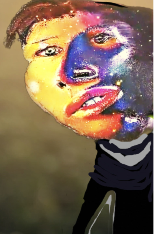

For my portrait, I drew a color combo mixed media version of a portrait of my best friend, Logan. For my portrait, I used mixed media. First, I used alcohol-based markers as the base for Logan's face color fusion and for the hair. Next, I used Castel-Farber's oil pastels to help create a nice blend of colors, to produce bold yet smooth strokes of the face and linear features. The strokes of the strands of brown hair and hairstyles was also achieved using oil pastels. The colors I chose to depict Logan strongly connect with his personality. On the left hand side, I used bright yellow, orange, and red colors which are symbolic of Logan's warmth. Whenever I have a bad day or something is going on that makes me sad, Logan is always there by my side, giving me warm hugs and cheering me up with his jokes and smiles. His energy is vibrant just like the bright colors of yellow, orange, and red, that I utilize to depict his face. However, the right side of Logan's face is a fusion of blue and purple. This is because I utilized "cool" colors, these colors quite literally represent that he is such a cool guy. He is into cool cars (Mustangs!) , cool music (Rock!!), and cool bikes (motorcycles!). Therefore to express how cool Logan is, I decided to utilize cool colors. Another symbolic use of the blue and purple cool colors on Logan's face is to indicate that Logan is a pretty chill guy who goes with the flow. If something goes wrong, and not according to his plans, Logan is quick to adjust, adapt, and change his response to the situation. Logan is also a go with the flow-kind of guy, whenever I say let's go here and not somewhere else, his response is always, "Okay! Sure! I'm down!" So chill! For the clothes and background, I used a second medium, which is digital drawing/painting, using the procreate app on my ipad, in order to generate the natural green background, using the Fluffbrush and spotlight brush to depict various green-hues. The background is nature in order to depict calm and serenity, which are the vibes that Logan gives, whenever I talk to him, and have any urging issues and problems, he helps me feel calm and serene. I utilized gray and navy blue brush strokes from procreate in order to draw a smooth, navy blue and dark outfit that Logan wears. Logan loves wearing dark shirts and tops, and is often even into leather jackets, which fits his cool guy motor-cycle guy personality!
8 notes
·
View notes
Note
because i'm nosy, i would love to know your least favourite costume decisions - in particular, the most aggregious christine costumes (in your opinion)! x
Ahahaha.... Here goes, from start to finish...
I never really liked the newer Japanese Slavegirl bodices. I get LEGO vibes from them rather than sartorial vibes, due to the straight lines and the square trims.

Of Elissa skirts, I think most of them are absolutely magnificent, regardless of the dominant colours and the details. How can that much gold go wrong? But one skirt I never warmed up to... was when they remodeled an old red one in Denmark 2009. The skirt was covered in various red, green and golden trims, with old tabs paired with a new apron. The execution of it all was a bit confused. The red was blueish, orange-y and burgundy, the green was emerald, olive and grass green. The colours clashed, and the skirt ended up looking busy instead of majestic. I much prefer the second re-vamp from 2018, but here's the busy 2009 re-vamp:

Dressing gowns... I don't think I have massive issues with any of them, really. There's plainer ones and more ornate ones, there's super fitted and baggy ones, but overall they serve the purpose.
Same goes for the Maid / Serafimo costume, really. I don't always agree with the colour choices and/or details, but it doesn't mean the costumes look bad on stage. If FORCED... I would probably say that yellow is not my favourite for the skirt (as seen in this c. 2000 West End one) and that the combo of stripy blue skirt and stripy pink/black breeches is overkill (as seen in the original Stockholm production). Now imagine these three combined into one...!

Rooftop... There are two costumes I love to hate. But that doesn't really mean I hate them. I'm absolutely fascinated by them. They are SOOO too much. One is the purple/golden dress originally made for Paris but first used in the World Tour revival. The highly patterned shiny pabric, the large gold decorations and pleats... Whoa. The other... lace fabric with satin couching, spraypainted with blue and pink, and with blue, pink and gold decorations... So much structure in one dress. It was made for the Dutch production, stored in Germany for years, and then suddenly making a surprise comeback in Brazil. All in all... way too much, but it doesn't mean I'm not fascinated!

Star Princess costumes I can't warm up to often come from recent West End history. Not all of them, of course. But when the colours are neon, the bodices underdecorated, with half-assed ruffles, and the skirt giving a hint of plastic vibes... Nope. Not for me.

Wishing dress... I have yet to see photos of this costume in action, I have only seen it on display (with huge thanks to @phantomonabudget for actually documenting it in the only known photos of it). It was apparently worn by Teri Bibb in the US Tour (who later also donned the regular stripy version). The shape and trims and all are fine, but the combo of a busy blue/purple/green/red fabric and navy/turquoise trims makes it a challenging creature...

Aminta: this is just a personal preference, but I always favoured defined bell-shaped skirts. In the opposite end of the scale there's the Viennese ones and the Japanese ones. I don't like the combo of long, narrow skirts, wide skirt split in front, wide stomachers and unfocused decorations. I want more pink skirt, and sharper stomacher decorations.

As for wedding dresses, there are not really many replica versions I don't like - much in the vein of the dressing gowns. I have not included the Restaged Tour's costumes so far, as they are often intentionally changed and simplified. But... the Restaged Tour's original wedding dress, made new for Katie Hall, is the saddest version I know of. What even.

Overall... I don't like wrinkly bodices, I don't like too flat or straight silhouettes, and I don't really enjoy too busy colours and patterns. It also makes me sad when costume has a lot of potential, but the decorations lets it down. I also don't think the costumes above reflect well on Maria Bjørnson's quite detailed design. However, some of these are personal preferences more than bad costume making. You are in all possible ways free to disagree!
39 notes
·
View notes
Text
My brother-in-law's birthday was on Thursday, so he wanted us all to go out to dinner at Olive Garden yesterday at 5:00. I wanted to go to Old Navy before dinner because it was the first day to use your Super Cash and there's one down the road from the restaurant, so my husband and I picked up his mom around 2:30. But while we were on our way there, we got a text that his niece had just come home from work not feeling good, so they wanted to reschedule it for the following weekend. We decided to keep going anyway, so we still went to Old Navy. I found a couple tops I had seen on the website and looked around at some other stuff, and then I went into the fitting room. Before I show you what I tried on, here's the outfit I was wearing:
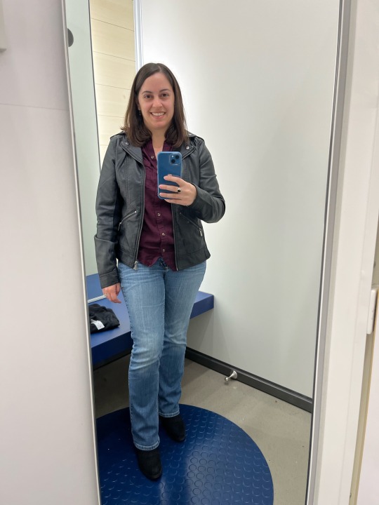
Cassie and Katelyn want us to dress up like Charlie's Angels with black tank tops and black leggings for our Halloween class, but I'm pretty sure I'm the only female in the world who didn't own a black tank top already. So I found this one and tried it on:

I liked it so I decided to get it, and then I also tried on these tops:


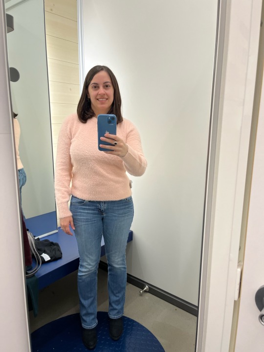
I ended up getting the dark purple turtleneck and the light peach sweater. The one in the middle was a little too baggy even in the smallest size. I know it's supposed to be oversized, but I like things a little more fitted. It looks like it leans towards turquoise in the picture, but it's more of an emerald green in real life. If I change my mind and decide I want it, I could order the petite version of it to make it a little smaller. While I was waiting in the checkout line, I grabbed two scarves with yellow, orange, and white stripes like candy corn for my kitties to wear on Halloween because they don't really like the orange shirts I got them from there last year. I used some of my Super Cash and I still have some left! It was still too early to eat, so we went to Barnes & Noble around 4:30.
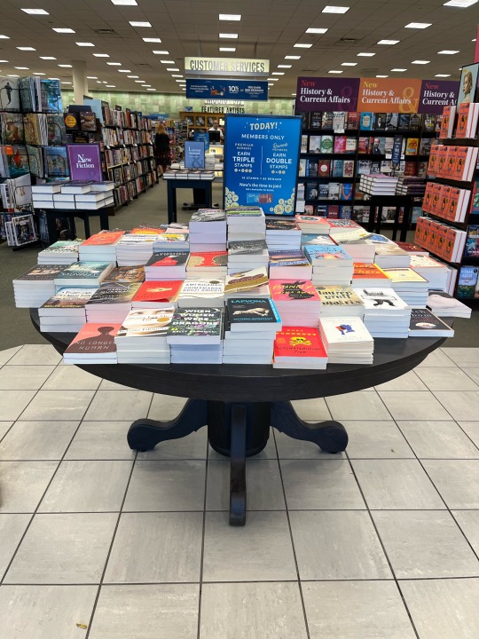

On the table you see as soon as you walk in the door, my attention was immediately drawn to a book that looked like something I would read. So I picked it up and opened it, and then it definitely looked like something I would read!
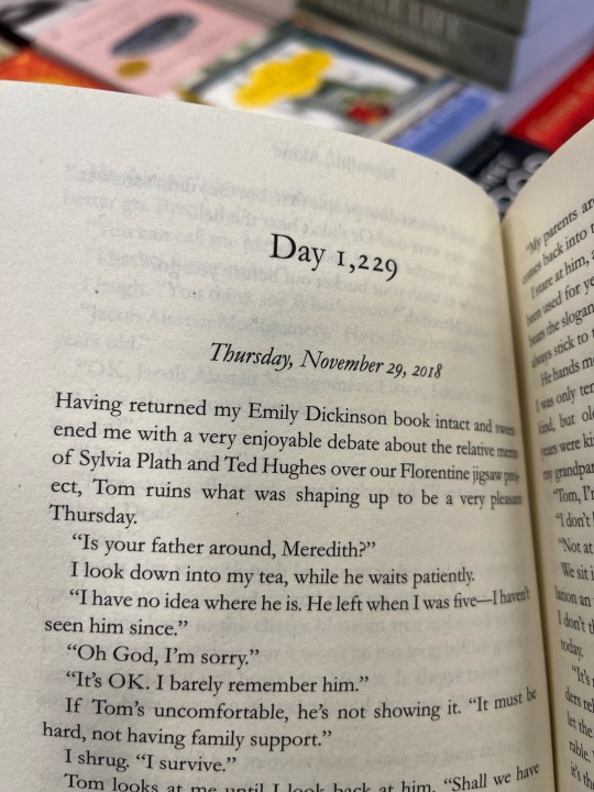
You see, I love it when books have dates in them. I guess that's because I've always kept a journal. I also love it when books have emails, letters, text messages, or any sort of chat in them. This one has both! Also, the main character has a cat. lol. My husband said he would give it to me for Christmas, so he paid for it. (Now I just have to wait until January to read it.) Then we went to dinner at Texas Roadhouse. There was a pretty tree that had fall decorations on it at the entrance.
I had a sangria margarita and a grilled chicken and steak combo with mushrooms, rice, and mashed potatoes. They were really good!
There was one more shirt I wanted from Old Navy, but for some reason it isn't available in stores and they were all out of my size online. But my size had been coming and going over the past couple days, and I've run into that a few times before where I still ended up being able to get something I thought was out of stock, so I kept an eye on it.
This morning I opened the website in my internet browser and kept refreshing the screen over and over every few minutes, like in that episode of The Big Bang Theory when they're all trying to get tickets to Comic Con at the same time (but not quite as quickly as they did). Finally there was one available in my size, so I grabbed it as fast as I could before it was gone again. It should be here next week!
2 notes
·
View notes
Note
Do you have any art advice Azriel?
i would love to give tons of advice from the years of being an artist, but coming from a person that doesnt use sketches and draws lineart, color and shading on a single layer i think the only things i could give you is focus on shapes. whether it be blocky shapes, sharp angles or using the curve of the lines right. poses are also important, as you dont want to make them look stiff. try to make them express more in their body language (its too long to share here, so id advise you to research and study OTHER peoples art. it sounds wrong, but studying somebodys art that you admire can help a lot. doesnt mean you completely trace their art, of course. you could pull different aspects from different artstyles to make your own artstyle. its how i do it at least. my art style is just very homestucky, but im also inspired by other people.) and i think the most appealing thing to me is color. you might not be good at shapes, lineart, anatomy, shading or background yet but learning how colors work can help a ton, and can make your art piece vibrant and lovely, even lacking said skill i mentioned, warm tones, cold tones, moody lighting, reflection etc. can also help. colors are what (mostly) makes an art piece pop out, after all. even giving it a bloom effect can be hugely beneficial to you! you can study how color works by observing color palettes, testing them out by adjusting the hues and saturation see what works, like a slightly pinkish toned down red might go well with a warm orange, or a navy color with a pinkish aspect to it. what makes art fun is experiments! you could try a bajillion combos to see what work and what doesnt, of course this requires a lot of patience, but what you made is SO worth it! i made that! wow i really did. im so proud! it looks so pretty. i think my main factor in being good in art is also being curious about it, and trying new things, even if you arent comfortable with it at first, youll eventually find it fun to draw lineart or color this specific part. its what i feel, at least.
you can ask me more on specifics, but this is what i have from being a self taught artist, what i learnt and what i regret not learning first and foremost.
3 notes
·
View notes
Text
Fascinated by the concept of YYH everythings the same but everyone's got sports shoes rather than those weak half-sock-or-"idk a boot?" things
So I'm not a shoe-focused fashion-obsessor, least of all in relation to sports even though I LOVE drawing big sports shoes to jump and run in, but currently this is the vision:
(Note: I'd like to keep these non-anachronistic! Shoes from the 80s, early 90s, or perhaps even the 70s would be good, but I also want to keep in mind WHY they would be having the shoes from whatever year the shoes are from.)
Kuwabara in mostly white 1989 Reebok Pumps, they're so big and pumped?? They look really padded and tall, becoming reminiscent of Kuwa being the biggest and most muscular of the friend group. The 1980 Victory G is also pretty good. The Spot-Bilt X-Press 1986 would also be good!
Key words: tall and bulky (not boots, that's a different genre).
Kuwa strikes me as more economically secure than Yusuke (not rich), and can afford a new pair of shoes if he saves up for them, without much difficulty. Biggest difficulty would be abstaining from buying something else in the meantime.


Kurama is most remembered in his unaltered school uniform - Kuwa and Yusuke are also most remembered in their school uniforms, but theirs have been tailored to fit their own styles and reflect their delinquent streak. Usually having to use the entire arena to attempt to evade attacks and rarely still in motion, I'm drawn towards tennis shoes or shoes with a streamlined design.
Striking me as a sentimental and fashionable person when it comes to his earthly relationships, I think he takes care of his shoes very well. It could be cute if he and his step-dad began a shoe-collection hobby together? But that's fanfic territory and we're trying to keep to headcanons.

Here, a Nike Air Pegasus (1983).
Another word coming to mind is "boring". I think if Shiori had never grown ill, Kurama would not have gotten as involved with the demon realm or spirit office as much as he does in canon (where are the canon divergence fics about Shiori never getting sick. pls, I want canon divergence yyh fics and concepts).
I don't know how successful he is about trying to pass himself off as human as humanly possible, but I do think he tries. He won't sabotage his own grades of course, he will try to be the best son possible, but to be a good person in any society is to fulfill social requirements, and part of that is not sticking out like a sore thumb.
Hence, rather boring shoes.
Keywords: Low/average collar; streamlined and "boring" shape. Outsole should be like an arrow, at the most extreme of stylisations. Colours don't stand out.
Nike or adidas, I think. Sneakers?


Oooh these Adidas Brougham shoes are really neat! Finally I like a design that doesn't have navy-orange combo! The sole is very ominous... it gives a little bit Imperial Japan vibes to me bc of the red circle here, but it's not enough that I think it'd read as a whistle in terms of character design. It is a good reminder though to think about the sole of the shoe, though. The characters jump around a lot, having something more exciting than a solid colour for the sole would be good.

The Diadora Maverick 1987 would also be good! Oh wait there's Italy, fuck that... on the other hand,
"An archetype of preppy cool, the Maverick held as much cultural weight as any tennis release from Reebok, Nike or adidas. Due to fickle tastes and the advent of tech shoes as status symbols, this would be Diadora's finest moment." (complex.com, Russ Bengtson, Gary Warnett, Nick Schonberger)
Isn't that very Kurama? And nothing is keeping the boy from customising the shoes. A boring shape, with colours that don't stand out, but with minute details that he alone or an observant friend might appreciate.
References:
www. 80sfashion.org/popular-shoes-of-the-1980s/
www. liveabout.com/the-8-coolest-running-shoes-of-the-1980s-3019213
www. complex.com/sneakers/a/russ-bengtson/the-80-greatest-sneakers-of-the-80s
// retrobok.wordpress.com/2011/07/27/hall-of-fame-80s/
// inthe1980s.com/80s-shoes/
1 note
·
View note
Note
3, 11, 16, 21, 28, 30, 38 🌈
Hi !! Thank you so much for asking, i'm so excited to have found out other color nerds on the tumblr.com !! Also merry christmas !
3. Favorite shade(s) of favorite color(s) ?
So for yellow i like bright yellow the best currently (like, lemon-colored), but i also really like (most ?) warmer shades of yellow a lot, especially camel (the kind that has brown in it but is still decisively yellow if that makes any sense lmfao, i don't know if i should call it camel or ocher actually)
11. Warm or cool undertones ?
Warm 1000%
16. What are your favorite material + color combos ? (for example red velvet, blue silk…)
For clothes i adore olive tweed, like tweed is already everything but in this color it's just... superior. My dream is to have a full suit like that one day, for i am a butch and sometimes i too want to look, you know, dapper. I also like puffer jackets in bright colors, in a matte finish (very specific i know). I have a bright red one that i love, i just love how it looks like plastic you know, like you just want to, sink your teeth in it if that makes any sense lmfao. Then for interiors i am very obsessed with bright colored metals, again in matte, like a locker type material ? i just love bauhaus design so yeah. I like dark wood, beige paper (japanese paper, kraft paper), beige seaweed carpets (my absolute favorite thing, it's my favorite smell too and it's just.. so parisian for some reason). I also like colored acrylic a lot right now, again with the plastic theme haha. Oh and i like red paint. Just clumps of red. Very satisfying for some reason.
21. What colors go best with black, in your opinion ?
So. Black is a problem for me, in clothes specifically. Because the thing is, I love black, a lot, most of my clothes are black, but i don't like how it looks with other colors, especially the bright colors that i love. Like : black + yellow = bees so no, nothing against bees but i don't want to look like one, black + orange = halloween, which is fine but like on halloween, black + red = punk which, love it but it's just not my aesthetic, etc etc etc. So basically all i really like with black is beige, and more black. (and i tolerate neutrals like grey, navy blue..). It's a mindfuck, i hate it.
28. Are you superstitious about color ?
Not at all ! But i'm low-key fascinated by the concept. For the anecdote my cousin's wife is terrified of green, she thinks it's bad luck. And it became a problem when my aunt and uncle built a house in l'île de Ré like the bourgeois they are, because painting your shutters green is mandatory on the island (like, by law, which is crazy). So they had to find the right shade of green that was as close as grey as possible, or else she wouldn't come, nor bring her children. So wild and hilarious to me.
30. Do you or have you ever experienced color-related synesthesia ? Tell us about it.
Never !! And i'd love, love to meet someone who has (naturally or you know, drug-induced). I have met a person with synesthesia once, i think she could, taste sounds if i remember well. Synesthesia is just, one of the most fascinating things ever.
38. Thoughts on purple ?
I'm not a fan of purples and pinks. Like i don't hate every shade of purple and pink, but at best it just does nothing for me. Obviously it's because i associate them with femininity and i'm, you know, wildly uncomfortable with femininity. For purple specifically there's also the fact that a lot of the shades have a cool undertone, which i find depressing. But, in very rare cases i can in fact tolerate purple. For example I like the combination of green and purple a lot, precisely because it's unexpected and completely devoids purple of it's girly connotation, in my opinion. I even own a button up that has purple on it and that i quite like ! It's a surprisingly bright, even sunny shade of purple and it's combined with orange and blue, and i don't think it looks feminine because of that and also because it's clearly a masculine cut so yeah, i like wearing it. In conclusion i have complicated feelings about purple as you can see lmfao
6 notes
·
View notes
Text
Livery Watch 2023
As we head into F1 car launches tomorrow (woo), I have decided to (completely unprompted) share my wishlist for the liveries for the 2023 grid. For no other reason that I am way more interested in colour schemes than I should be. (And because I keep going on about liveries in my 2022 re-watch posts, so I might as well go off about it properly)
Red Bull: Please get rid of the matte finish I am BEGGING. The soft metallic blue livery from the early 2010s was literally top tier, I’d also like it if they went back to having the Bull part of the logo have a white outline, the yellow one just looks off to me idk why.
Mercedes: Silver Chrome. That’s it that’s all I want. (Silver chrome with the Petronas turquoise accents would be so sexy let’s be real)
Ferrari: Again, ditch the matte. Glossy Ferrari red is where it’s at, though I did love the one off burgundy livery so I would allow that.
McLaren: Less exposed black, more papaya please and thanks (and again, make it glossy). I do like the blue accents, but keep them accents pls I want orange
Alpine: No notes. The pink and blue combo is so pretty, keep up the good work.
Aston Martin: If it isn’t British Racing Green I will be suing Lawrence Stroll for emotional damages.
Alpha Tauri: Also no notes, I actually really love the navy and white combo it looks so nice
Alfa Romeo: Again, no notes. Glossy white with the deep metallic red is v sexy.
Haas: Now here is where I think a matte livery would work. Maybe a white and charcoal with glossy neon red accents.
Williams: Maybe like a royal blue to white ombre? They did something like that in 2019 with the Rokit sponsorship and I really liked it. Some glossy black accents (thin stripes going from front to back maybe??) would look really nice.
I will definitely update this post when the actual liveries get launched and see how they compare!
#there's a theme here I don't know if you can tell#it's not that I have beef with matte finishes; bc if done RIGHT it looks great#but with some of the liveries it's just... bland#I want the cars to be SHINY#(mainly bc they look v pretty at night races)#Formula 1#2023#F1 Thoughts
23 notes
·
View notes
Last Seen Blogs

ak-tora
Live life to the fullest, or sth like that.
dailynarnia
Daily Narnia
gayorphandepression
things are thotting up!
karkatenjoyer
the yassification of homestuck
temple-of-eternal-hera
Temple of Eternal Hera