#i did play with the contrast/saturation on these a little bit but zero filters
Text

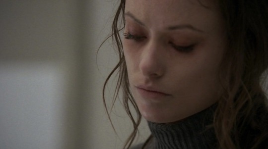
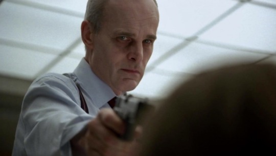
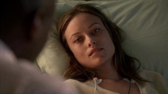

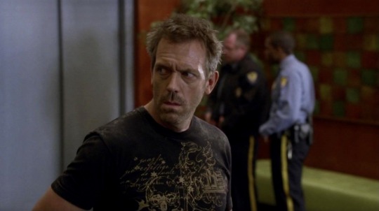
I sincerely hope that the person who did the lighting for Last Resort got a fat raise
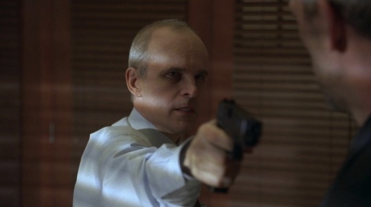
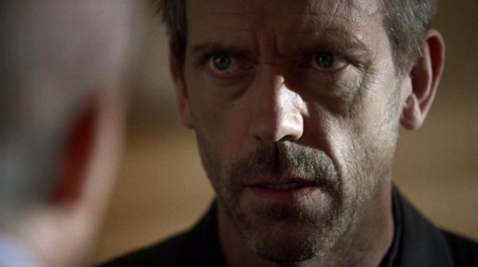
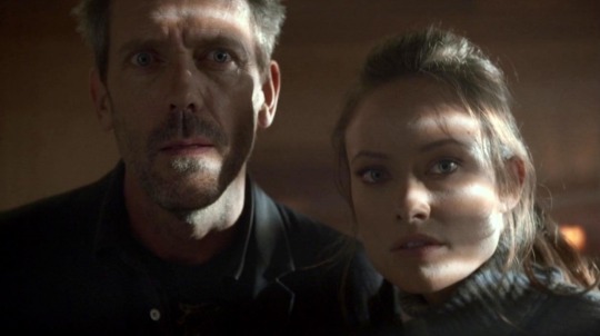
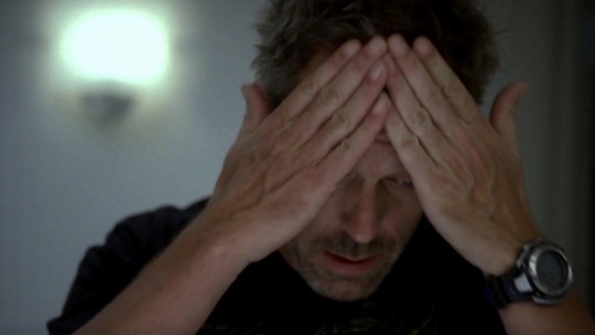
#i did play with the contrast/saturation on these a little bit but zero filters#the original shots are very dim at times#the contrast between the darkness in cuddy's office and the harsh white of the radiology room#and how they play with shadows at the end#like when house is watching the patient get arrested and realizes his diagnosis was correct#and during thirteen and foreman's conversation#and something about that bright light behind house's shoulder in the shot with his head on his hands... that is so good#i can't put it into words right now. maybe later. something something symbolism#greg house#eric foreman#remy thirteen hadley#5x09#screencaps
62 notes
·
View notes
Text
How to gif
Hey everybody! There has been some interest in me sharing a gif making tutorial with you all, so here it is! I hope you enjoy it! 💖
I use screen recordings for giffing, so in this tutorial we’re going to be working with a video, rather than screen caps or other methods. This tutorial is for Photoshop (version doesn’t matter, since all of these controls will be present). I happen to use CS5.1 though, and I work on a Mac. The experience should be similar on Windows, and equivalent processes/menus/etc should also be available in GIMP.
First, open your video from Photoshop.
Then from the menu choose Window -> Animation to get the animation panel open. Now we’re going to get this video ready to be giffed. I’m using a clip I took of an interview with Gwil that I used for a recent gif set, and hadn’t deleted yet so the file was handy. I have all of this video to gif conversion work saved as a Photoshop action, which I would recommend since this gets dull to repeat, but actions are beyond the scope here, so I’ll simply walk through the process step by step.
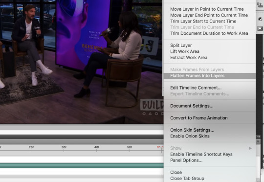
From the upper right corner of the animation panel, click the dropdown menu, then select “flatten frames into layers”.
Say yes if a dialogue box opens, then wait - it might take a moment depending on your computer. Notice that you now have lots of layers in the layer view.
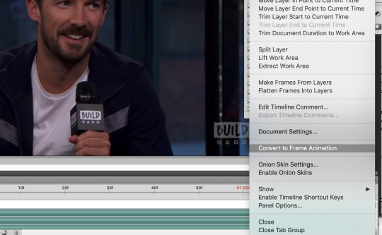
Next, go back to the same animation menu, and select “convert to frame animation”. The initial view for a video is a timeline, and you’ll need to work with frames right now.
Next, also in the same menu, select “make frames from layers”. This will take those layers we generated before from the video and use them to create frames for us to use instead.

Now delete the first frame - you’ll see it has a ridiculously long duration. That’s just left over from the video and we don’t need it. Select it in the frame view, then hit the little trash can icon.

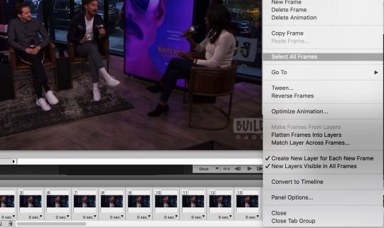
Bye-bye. It’s time to change the duration on the remaining frames. They all currently say zero and we don’t want that, we need some duration for them. Select all frames either from the animation menu, or by clicking the first frame, holding shift, then scrolling and clicking on the last frame.
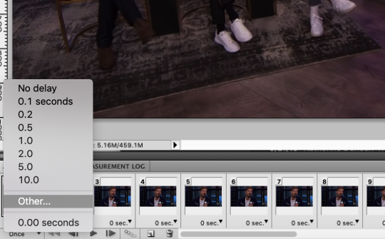
With all frames select, click the down arrow next to any frame and choose “other” for the duration. I use 0.04, so type that into the box that pops up and hit ok.
We’re almost there! All you need to do now is resize the image. Go to the menu and select Image -> Image Size. Make sure the height and width are linked (with the little chain showing the line connecting the two dimensions) and you have bicubic selected for the image resampling (other resampling settings can cause undesired results).
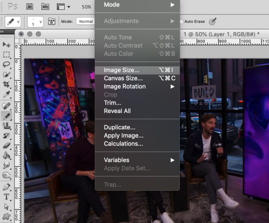
I use 540px for full width gifs, so that’s what I’ll be using here. If you want half-size widths, go for 270px.
Now you’re ready to get coloring! When it comes to this part, it’s really up to your preference. There are many ways to do it and nothing’s necessarily the best. Just do what looks good to you. I’ll walk through what I do, and then you can use your best judgement for where you’d like to go from there.
In the layers panel, scroll up and select the highest layer. We’ll be adding some adjustment layers (Window -> Adjustments) on top.
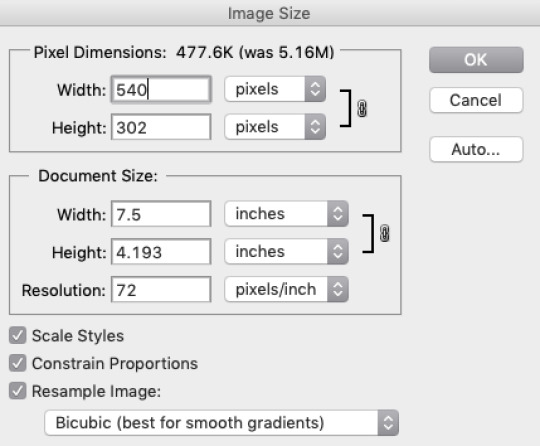
I always begin with curves. Select the curves item in the adjustments panel. Curves are a way to adjust the dark/light balance of an image in a fine-tuned manner. There are some presets you can use, or you can drag the curve however you like to get your desired result. Upper right represents white, and lower left represents black. Gray values fall in the middle. I want to brighten this image, so I will click in the middle of the straight diagonal line and pull upwards.
Before:
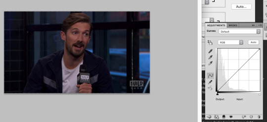
After:
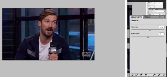
Now, I always up the vibrance. I like how it looks, and the result is less obvious than increasing saturation. Click the back button in the adjustments view and select vibrance.
I set it at +14, because that’s what seems to consistently produce a decent result. The colors pop a bit more now.
Now we’re going to tweak the color balance. Hit the back button in the adjustments menu again, and select the color balance item. This is where you can get into the nitty gritty of your image.
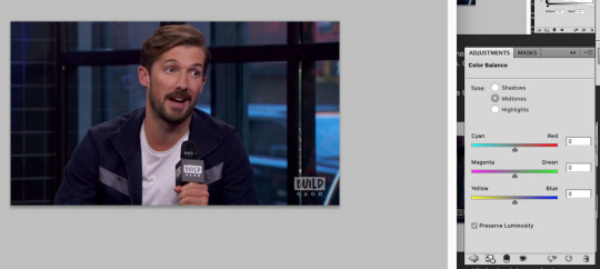
Color balance allows for not just overall color adjustment for the image, but separate color changes for shadows, highlights, and midtones. As you can see above, nothing has changed yet.
I always start by adjusting shadows first. This is less of a science and more of a ‘get it to look good by eyeballing it’ situation. Generally you want the items that are black to look black and the items that are white to look white, without a color cast on them, and peoples’ skin tones should look normal. In this image we have the black microphone, white shirt, and Gwil’s face, so we can adjust the shadows, highlights, and midtones based on those elements.
I like to start with shadows first - be sure to select the radio button for the one you want to work on.
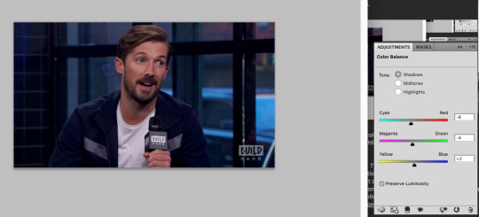
This did darken the image a bit, but no worries. Highlights next.
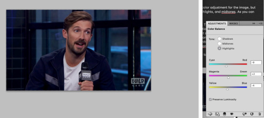
And then on the midtones to finish it up.
Feel free to go back in and tweak any of the values you chose if you’re not happy with how all of the adjustments look together. This looks alright for our purposes though, so let’s move on.
In the adjustments panel, let’s add one more thing. Hit the back button and then select brightness/contrast. This image is looking a little muddy still, so let’s up the brightness and tweak the contrast to be higher so it feels really alive.
Much better. It looks like maybe you could be sitting there across from Gwil. Now that we have this masterpiece, it’s time to chop the frames down to a suitable length. This gif has 87 frames, which I find from general experience to be too long. I aim for about 70, but if a gif has a lot of action or a lot of color variety those both can increase the size, so you may need to decrease the frame count to 60 or even down to 50 (especially with big gifs). I’m sticking with the 3MB size limit for gifs, because I don’t care for the compression that happens otherwise, so these frame counts are based on that.
Select some frames in the animation panel and delete them - be sure to delete only from the beginning or end, and not in the middle, or your gif is going to skip like a scratched CD. Or broken record. Or something. You don’t want missing frames in between. The same thing with accidentally dragging frames out of order (which I have done).
I’m taking 20 off of the beginning of the gif for starters.
Now, in the animation menu select “convert to timeline”. We want that timeline back now, because it helps us see what the gif will end up looking like far better than the frame view, which plays the gifs with a lag. It’s easier to preview with the timeline, and you don’t have to worry about which frame you’re currently on etc etc.
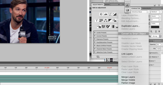
In the layers menu, you will now see that some layers have an eye next to them, meaning they are visible, and some don’t. Delete all of the invisible layers. We want them gone so they don’t increase our file size upon save, and they’re only taking up room anyhow.
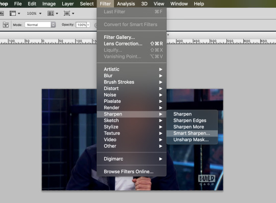
Next, select all of the layers of your gif except for the adjustment layers, then right click (option click) and select “convert to smart object”.
Now, with your new smart object selected, go on the menu to Filter -> Sharpen -> Smart Sharpen (you didn’t think I’d skip sharpening did you?).
This is what my smart sharpen settings look like, so feel free to copy them.
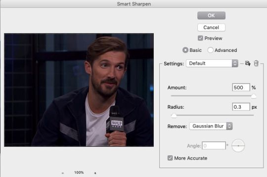
(Note the preview doesn’t show our adjustment layer work) Select ok - your image is now sharp!

I’m going to add a watermark at this point by using the text tool, typing my text, then moving it to the upper right and lowering its opacity. You can do that too if you like, or skip it if you don’t want to bother. 10pt size font is what I use.
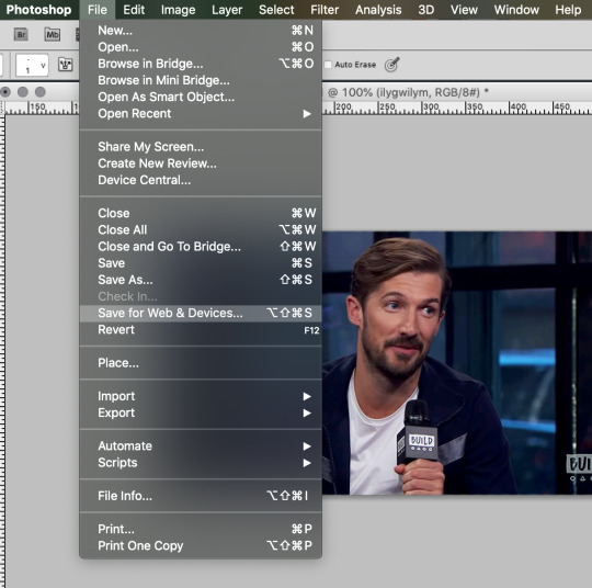
We’re ready to save!
From the menu, go File -> Save for Web & Devices.
If you have saved a gif before you might have some settings saved (at the very top with ‘presets’), or you might want to make a new setting. This is what my save settings look like. Note that I created this setting by editing a no-dither gif preset Photoshop has, so I don’t apply dither to gifs. It does save some on the file size and I haven’t noticed any difference in quality.
You’ll see in the lower left that my file size is still too big though - 3.6 won’t work if I want this to be an under 3MB gif. I’ll delete some frames and come back to this screen. The increase in brightness may be a culprit with this gif too, but I don’t want to change that, so I’ll simply remove frames.
This is small enough now. 2.6MB. Now select “forever” under looping options (otherwise your gif will stop after one go).
Now hit save if your gif is at the size you want, and choose a name for it, and viola! Gif complete!
If your gif is still too large, you can go back and delete some frames, as I did, or you can change your coloring to be less bright or have less contrast. Generally I think people don’t mind if your gif is shorter as long as it looks good, so I would prioritize appearance over duration. Gif making can be frustrating, especially when you’re fighting with file sizes, but in the end it’s all worth it to make something people will enjoy. 💖
I hope you found this tutorial informative and enjoyable! If it helped you out, perhaps spare a reblog to share the love!
56 notes
·
View notes
Photo
Epochal Territories Shoot #1 - 14/11/2020
Getting back into the swing of creating can be rather difficult when one doesn’t necessarily know where they are going. This is partly where I found myself when starting my MA, because I wasn’t all too sure where I was going to take my work and what would be appropriate for postgraduate study. Yet, there were a number of things that I knew for definite which was returning back to my older work of documenting urban landscapes and trying go evoke feelings of alienation, estrangement and the dichotomy of hypermodernity.
Epochal Territories is really a gestalt of our fast paced, instant gratifying and estranging society, which aims to deconstruct these notions and investigate how these banal and bleak landscapes can convey these feelings. This all goes back to researching Karl Marx and his theory of alienation, and its multifaceted aspects:
Product of Labour
Activity of Labour
One’s Own Self
Alienation from Others
Marx’s theory of alienation spans from these four aspects, which including being alienated from production, activity, oneself and others. For the purpose of my project, the final two are more centred around what I am conveying, which is the alienation from myself, as well as the people around me.
My own alienation stems from how I view the world: my weltanschauung. From my own personal views, I see the world through the lens with a certain causticity, where everything becomes rather estranging, whether that is how people use social media, using social media at all, the way we act, what we eat, how we travel, how we make money, what money is and how the world operates. What my photographs try to convey is this feeling of alienation. The way I can describe my work is the feeling of being stuck in traffic or seeing that the train is getting more and more delayed - the feeling of complete disappointment, malaise, listlessness and ennui.
Where we live is incredibly important. Our homes and where we live is where we spend a lot of time, building bonds, creating families and living our lives. Yet, looking inward towards the home is a different experience, especially when your home is on the brink of demolition to make way for brand new, upmarket houses in an attempt to gentrify a dilapidated and crime ridden low social class area.
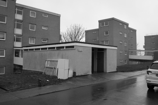
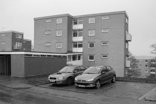
The Talbot Gardens estate is just that kind of place. Situated in Barne Barton, Plymouth, Talbot Gardens is home to a number of multi-storey flats and apartments. The estate was largely built to house the large number of Naval workers for Devonport in the 1960′s, but as the numbers of workers dwindled, the estate was handed over to Plymouth City Council, and the Devon and Cornwall Housing Association. These buildings - even for me - are rather ugly and completely dilapidated and certainly a reminder of another time. The concrete is extremely dull, covered in water marks and remnants of people’s homes lays in the street, such as the fridge and bed above. The area did feel rather unsafe, with some local occupants of the buildings glaring as I wandered around the ghostly estate.
There was a certain spectrality of the estate, knowing it was going to be demolished in coming years in addition to the lack of noise of people. The weather as abysmal, with rain beating down on the concrete paths and the wind whipping up a fine mist of rain. The only cover to be had was the entrance to the flats, which contained a number of wooden doors akin to what you would find on a shed or an outhouse. The entrance did however sometimes act as a wind tunnel, firing a jet of cold, wet wind through the walkway.
Shooting the Talbot Gardens estate was fairly straight forward, and oddly enough for me shot digitally. I am trying to keep costs down and shoot film as little as possible, if not at all purely because of the costs. I don’t want to not shoot it, so I am trying to keep film usage to a minimum. I shot entirely on my Canon 5D and the wonderfully cheap and cheerful Yongnuo 35mm F2, which I have had a love/hate relationship with because it has been idiosyncratic in the past. Yet, since wearing glasses, I have a newfound respect for the lens as I can see properly how it renders the image, and it does it rather well! It is also a way for me to get used to the 35mm focal length. I am a stickler for a 50mm only way of shooting, but 35mm just is that little bit wider to incorporate more of the surroundings, and features a wider depth of field when stopped down.
Something I have wanted to do is shoot a project entirely in black and white, which is sometimes easier said than done. I feel that B&W is a lot harder to shoot, as not everything can work. It has a way of rendering a space timeless, and focusing more on the form rather than the reality of the place. This was seamless to do, as I have the ability to create colour presets on the 5D, despite it being 13 years old. I wanted a very specific look to my B&W, as I am not a fan of heavy contrast and weak dynamic range. For this, I created a preset in the camera to have low contrast, slightly more sharpness and the addition of an internal replication of a green filter to bring out some more shadow detail.
The B&W preset was initially a fluke, because I set the parameters to what I thought would be correct. Low and behold, they were exactly what I was looking for. The only issue is that when shooting RAW, the image is automatically colour but has to be converted when post-processing. This is easy to do simply by reducing the saturation to zero which reverts it back to B&W.
I always know when a shoot is going well when I can feel a level of alienation within a space. I knew I didn’t belong in this area, and that it was, in it’s entirety, out of place. I felt as if I shouldn’t have been there, and time seemed out of joint. There was something askew about wandering around a housing estate which is going to be demolished to make way for brand new homes which would be entirely out of reach to the general population of the occupants of the current Talbot Gardens. I get the feeling that the people who live here are of a lower social and economic class compared to what would be coming in the next number of years, which seems to come across as an eradication of lower class workers and benefit claimants.
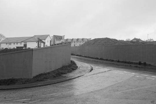
On the opposite side of the estate is a row of new houses, as well two boarded up areas where a building used to stand before an arson attack, and where a play park used to be. There was something odd about these barricaded areas hiding these anonymous areas, filled with dirt and tiles. The mountains of earth tower over the barricades, and are over shadowed by the new builds looming in the background. These in themselves are out of place, because they don’t fit with the surrounding run-down aesthetic, but offer an insight to what the area will eventually look like. The crest turning to the left acts as a compositional piece that flows from the bottom and leads to the middle of the scene, with the houses acting as the middle point. I am trying to compose the photographs in a similar fashion, with the point of focus being from a similar point and keeping the composition consistent across the board.
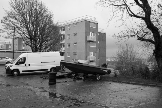
Something intrigued me about the boat on the trailer, and acted as a perfect model to be situated in the middle of the frame, with the surrounding ephemera encompassing the rest of the scene. The completely bare trees add to the spectrality of the estate, acting rather ghostly in the frame. I feel that with the trees in full bloom wouldn’t be the same compared to them being bare in the winter drawl.
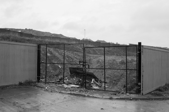
My favourite photograph from this shoot is an entrance to the previously mentioned barricaded anonymous spaces. The gates are badly put together, barely matching up and attached to the walls by threads. Behind the gate is a pile of interior tiles - many of which were fine - in addition to a number of other collective pieces of detritus. You can see the other mound of earth on the left of the image, which shows how much it towers of the walls. These mounds of earth are in fact made from the ground around where the building(s) were, which on closer inspection contain pieces of the property such as bricks, drywall and insulation. Once bundled together, they become mountains of earth and collective house bits.

A touch to the side of the previous image, looks towards the estate once again, but still includes the precarious gates and features an empty trailer which presumably would hold another motorboat. Something I like about this image is how the estate isn’t the main focus, but instead of the car park in the foreground, with the surrounding trees and the estate being slowly included in the background. I also like the tones of the B&W preset that I created, with the high dynamic range and a nice selection of greys and low contrast.

After the estate, I made my way down towards the River Tamar near the Tamar Bridge and the Royal Albert Bridge. I found this area rather odd, because only a stones throw away is Cornwall and you can walk underneath both of the famous bridges. Amongst the wealth of fishing vessels is a small play park which has a set of swings and a sit on digger which is operated by ones hands. I found the empty swings to be somewhat ominous, and rather out of place being only a few feet from the river bank, albeit protected by a wall and some fencing.
A coda. The first shoot of the newly named Epochal Territories was in my eyes a success. I have created some photographs that I thoroughly enjoy and gained some insight into what I want to create, and how I want to create it. Shooting digitally in a setting that wasn’t commercial was also odd to undertake, because I am used to shooting my personal project work on film. But saying that, I did enjoy using the 5D for something that isn’t for work, and with my glasses can appreciate more that this now ancient full frame DSLR can do - I am amazed at how good the 5D MKi can do now that I can see properly. It was also good to discover a new location, which is exactly what I need for this project. Something I tend to do is replicate shots and reuse locations which I don’t want to do, and with this project I would like to explore more places in Plymouth with either unknown places, or places that I haven’t visited in a long time.
Bibliography
Asher Horowitz (no date). [Online]. Available at http://www.yorku.ca/horowitz/courses/lectures/35_marx_alienation.html. [Accessed on 21/12/2020]
0 notes
Text
Creating a good lyric video for less than $10
How to make a lyric video for your song (without using Motion or After Effects)
Lyric video: a video that shows your song lyrics while the music plays. [Pretty self-explanatory.]
Not only are lyric videos a great and manageable way to keep your video content coming in between bigger projects that involve more complicated production, but I’ve found they can actually be a lot of fun to make.
Below I’m going to talk about how I created six different lyric videos along with info on some of the FREE tools I used.
A few things to keep in mind:
I’m not a video guy. Every time I make one of my own lyric videos it’s a process of trial and error. A pro could probably create something twice as good in half the time, but I enjoy playing around to find solutions on my own. Plus, video budget? (Pshaw).
You can make really cool lyric videos with programs like Motion and After Effects. I didn’t. For one, those programs cost money (see pshaw above). But diving into one of those programs would mean I have yet another learning curve to climb. I’m interested in exploring Motion at some point, but in between family, work, and everything else, I’d rather use what time is leftover to make music and bang out some videos, not hunker down in the lab for days on end. Maybe those programs are easier to use than I’m imagining, and I’m missing out (let me know in the comments), but for the sake of this article, let’s just refer back to the zero-budget appeal of making lyric videos WITHOUT Motion or After Effects.
That leaves you with free video editing software like iMovie or Windows Movie Maker. Pros might scoff at these intro-level video production tools, but when you combine them with a few other tricks, plus some creativity, I think you can create compelling lyric videos with little more than what comes loaded on most desktops, tablets, or smartphones. [Full disclosure: I used Final Cut Pro X on some of the videos below, but I’d worked in iMovie for long enough before that to know most of the things I’m doing in FCPX can be done in iMovie.]
Beginner tips for making lyric videos
Open your movie-making software and set your new project’s aspect ratio to 16:9.
Import your song and any other media (like video clips, still images, logos, etc.) that you plan to use.
Move your first clip or background image to the project pane. If you plan to use one static background image the whole time, you can click and drag to adjust the duration that it appears so it’s long enough to display during your whole song.
Place your song into the project pane. If you want it to start playing right away, drag it all the way to the left. If you have a title page or some other introductory elements, you can leave a little room before the song starts.
Use “titles” to place the lyrics on the video at the appropriate time during the song, matching with the vocals.
Use a font size and style that’s readable (or that looks cool at the very least).
Position your titles on the video (again, by dragging) so they appear in a place that’s legible. For instance, if you’re using a still image of a sandy beach below a light gray sky, you don’t want white font to appear over that sky. Better to drag it down so it appears with starker contrast over the dark sand.
Make adjustments to the length of the titles (you can do this by clicking and dragging) to smooth out the transition from line to line.
Watch your whole video a few times through and make any needed fixes.
Export your video file and upload it to YouTube, Facebook, Vimeo, etc.
Some tricks to spice up your lyric videos
youtube
This is the lyric video for my single “Collapsing Star” — a long fade-out kind of song about devotion in the face of aging — so I thought the visuals should do exactly what the music and lyrics do: fade, shrink, collapse.
The creation of this video involved some really basic elements:
Still images of space that slowly evolve — I wanted there to be a extraterrestrial time-lapse effect, so I used some super hi-res photos from Unsplash, applied a very long cross-fade between each transition, and also used just an imperceptible touch of “Ken Burns” (an effect that creates some motion using a still image).
A shrinking sun — Scientifically speaking, I know stars don’t collapse in this way; they usually get big and bright before dwindling into white dwarfs or black holes. But I thought a slowly shrinking star would paint the lyrics in a haunting way, so I used Canva to create dozens of colored circles, each one small than the next. I then placed them on the timeline with overlap so that each one could (like the space images) fade into the next and depict shrinking. With the addition of some blur and some “stencil” effects, I was able to hint at dark sun spots and the rippling surface of a star, as well as the halo around a star.
The twinkle of space — Because I was using static images, I needed to add some other light effects that made for a kind of twinkle or oscillation in the background stars. The main one I relied on was the “sketch” effect in FCPX.
youtube
This is the lyric video to my song “Irretrievable Beauty.” To create it I followed all the basic steps mentioned above, but here are a few of the bonus elements I added for (hopefully) extra impact:
Additional text — No one ever said a lyric video should contain ONLY your lyrics. So I wrote a bunch of other text (a letter from the 22nd-Century) and placed my lyrics within it. Check out the video and what I’m describing will make more sense.
Color contrast of text — The actual lyrics of the song needed to be easily readable, so they’re all in black against a lighter background. The rest of the words are white, and it’s fine if they roll by without anyone being able to read them all. I intended to create the feeling of being flooded by text, so lots of it is supposed to wash over you.
Public domain image — I found a super hi-res image from 1905 to use for the background of the video (and my cover artwork too), and slowly zoomed in throughout the whole video.
youtube
Above is the lyric video for my song “1+1+1=3.” Some of the things I did to make this video:
Slow fade between different versions of the same photo — The background image for this video is the same as the cover artwork, a photo I took of arithmetic on a chalkboard. I then applied different filters to the photo to create three separate versions. While editing the video, I started by laying the three images out in a repeating pattern and then cross fading them all so it looks like there’s some kind of slow transformation happening.
More extra text — The additional text in this video is nowhere near as crazy as in “Irretrievable Beauty,” but I wanted to add a few bits here and there. You’ll spot ’em.
Directly reference the subject matter — The song is called “1+1+1=3.” Yes, it’s about love, but the math element was a fun visual reference point. Arithmetic on a chalkboard. Strange equations in the text. Etc. What’s the visual reference in your song?
youtube
Above is the lyric video for my song “Silently.” Some things I did to create this one:
Hyperlapse sunset — One afternoon when I was visiting Oregon, I ran up to the top of Mt. Tabor (an extinct volcano in the heart of Southeast Portland) and found a good spot to film the changing sky as dusk fell. I made sure to be out of the way of anyone who might walk in front of the camera and ruin the looooooong time-lapse shot. Hyperlapse is a free app from Instagram, and it makes it easy to shoot long videos and then speed them up at various rates. I think my 4-minute music video required about 45 minutes of footage.
Intro titles from Word Swag — If you read this blog frequently, you probably know I love Word Swag, a free app that lets you add cool fonts to images. I used Word Swag to create both the circle logo at the beginning with my name in it, and also the “Silently” title. You could use this app to create text for every single lyric, but that’d get time consuming so I just ended up using it for those two elements at the beginning. For this purpose, within Word Swag you’ll usually want to lay the font over a transparent background so you can fly it into whatever video you’re creating without disrupting the moving footage. [Note: I used Word Swag to create the intro text for all the lyric videos below.]
Sketch effect — I then added some built-in effects, including a color saturation effect and two doses of a sketch illustration effect, to make the video look grainy and lo-fi. Like I said above, this wasn’t premeditated. Just playing around with effects to see what looked promising. On that note…
Earthquake wobble effect — I used the earthquake effect because I thought it kind of made the text look like it was on a transparent slide overlay that was out of focus for a second.
Alternating pacing of lyric appearances — Sometimes the lyrics appear and disappear with the vocal. Sometimes certain lines linger. I just went by feel, and payed more attention to how the titles looked laid out across the screen than anything particularly musical.
Alternating the color of the text — This is another obvious way to add some variation if you feel like your lyric video is too much of the same thing: change the colors of the lyrics!
youtube
Here’s a video for a song called “Morning Edition” which I posted right before the election in 2016. The recording is actually just a super lo-fi Garageband demo, but I only had two weeks until election day, and I figured if I’m going to make some kind of statement, there’s no time to wait to get my band into a proper studio. So, a few notes about this lyric video:
A lyric video can still have live action — I’ve never really liked the distinction between “music video” and “lyric video,” as if one is more legit and exciting than the other. As someone who listens to lyrics just as much as the music, I love good lyric videos, and I think there can be an interesting hybrid between these two approaches. For “Morning Edition” I lip-synced to my song, 10 seconds at a time, while using the Face-Swap tool in Snapchat to graft a certain someone’s mug onto mine. Then I edited all those takes together and applied a sharp contrast filter to blend the background of the Snapchat clips with the large black borders on both sides of the clips.
Did I say the lyrics have to be legible? — Well sure, it’s good to have legible lyrics, but I don’t think they need to be HUGE if that means you’re ruining the aesthetic of the video. For this one I figured I’d keep the text in a thin minimalist font at the top of the screen, out of the way of my face, and anyone who really wanted to read along could watch the video in full-screen mode.
youtube
Here’s the lyric video for my song “Veterans Day.” By complete accident — again, lots of playing around with built-in options — it ended up with a kind of Zen art aesthetic. Here’s how:
Stock video — I looked through tons of stock video sites to find an affordable, hi-res clip that could be used as the background for the whole video. I ended up buying (for less than $10) a short video of milk being poured into a clear glass of water with a black background. But 6 seconds of video wasn’t going to cut it for a 5 minute song, so I…
Slowed the clip WAY down — I stretched the clip as long as it could go and still only had about 2.5 minutes’ worth. So then I…
Reversed the clip — By duplicating the clip I had 2.5 minutes of forward motion, and 2.5 minutes of backwards motion. So the result is like a palindrome, or like that famous bass solo on “Call Me Al.” Halfway through, the whole thing turns around and the milk goes back into the bottle by the end. Another accident that I ended up enjoying.
Color inversion — I used the built-in tools to invert the colors so the white milk became like black ink, and the black background turned to a light gray.
B&W — I then took that video and turned it to black and white, which ended up darkening the whole thing in a nice way.
Scrolling text — One of the built-in title options on many video software programs allows you to scroll text vertically, like the end credits of a film. I used this effect separately for each verse and chorus of the song. Then I did another layer of scrolling text with just a bunch of randomly spaced letters and symbols, with a high transparency on the font so it appears as a graphic element, and I think it gives the whole video a kind a translucent papery feel.
youtube
Here’s a few things you might be able to learn from the lyric video to my song “Premiere:”
Still photos are your friend — Check out royalty-free photo sites such as Unsplash. I made the entire video for “Premiere” using photos I found on that site. The one risk you run is that other artists use the same photos in their work, but you can always tweak the images so they’re barely recognizable as I did with the milk video in “Veterans Day.”
Don’t be afraid of Ken Burns — He has a built-in video effect named after him for a reason; that technique of zooming in and out on still photos can be really effective for creating mood. Dynamics! Don’t go crazy or anything with the motion, but a little Ken Burns here and there can make flat photos come to life.
Mix and match fonts — I used a bunch of different kinds of fonts on “Premiere,” giving each section of the song its own feel.
Apply effects and transitions to the titles (text) too — Don’t forget that many of the same effects you can use on pictures and video will work to give your lyrics an interesting look as well.
Don’t publish your video until you’ve proofread it a dozen times! — If you watched my lyric video for “Premiere” you might’ve found a typo. Whoops. I didn’t catch it until it’d been posted for over a week, and by then… oh well. Staring at text while you’re editing gets tiring. Your brain tricks you. While you’re in the process of creating, you might not catch something that seems glaringly incorrect later on. So get some bandmates and friends to watch the video a few times to make sure you don’t have any spelling or grammar issues on your lyrics (I mean, besides the usual grammar or syntactical issues that ALL lyrics have). Another way to limit errors is to…
Write your lyrics out in Word and then paste them into your titles — When you type your lyrics in Word first, you get the benefit of the program’s spellcheck system. Some of the popular video editing software doesn’t have spellcheck, so paste those lyrics in after you’ve vetted them in the external doc.
Okay, those are some of the tricks I’ve used to make my lyric videos more interesting than just white font on a black background, all without paying for extra software or expensive stock footage and images. Hopefully they’re helpful as you create your next video.
Do you have any advice to add? I’d love to hear it. Holler in the comments below and be sure to post a link to your best lyric videos on YouTube!
The post Creating a good lyric video for less than $10 appeared first on DIY Musician Blog.
0 notes
Video
youtube
About 18 months after accepting I probably wouldn't be able to get PCSX2 working on my computer I decided it was time to have another look into it.
Initially there was this annoying little thing that would happen in the majority of games I played - The game would start fine and run fine but every now and then it would slow down to a third of the speed, and this would happen no matter how I changed the settings. After a lot of searching and digging around, although I didn't find the answer outright I came to the conclusion it was something to do with my cpu which led me to think about overclocking it which in turn seems to have led to the actual answer - Disabling Cool 'n' Quiet & Turbo Boosts in BIOS. Which I will go into later.
I don't know who this faux tutorial wrapped in a video description wrapped in an enigma is for but I'm assuming it's someone who's had at least some experience setting up an emulator before.
My Specs:
OS: Windows 7 Professional (64-bit)
CPU: AMD FX-8350 Eight-Core Processor
Motherboard: MSI 760GMA-P34 (FX)
Memory: 8GB (DDR3)
Graphics: NVIDIA GeForce GTX 960 (2GB)
PCSX2:
Version: v1.5.0-dev-2329-g2ad5db227
Emulation Settings:
[DISCAIMER 1:] *These settings work for me. I am in no way suggesting they will work for everybody else. I'm certainly not suggesting these are "The Perfect Settings For PCSX2" and I'm not even suggesting that I will stick with these settings.*
(ALL SETTINGS ARE THE SAME ONES USED FOR THIS VIDEO)
EE/IOP:
Emotion Engine: Recompiler | IOP: Recompiler
-----Round Mode: Chop/Zero | Clamping Mode: Normal
VUs:
---VU0: microVU Recompiler | VU1: microVU Recompiler
-----Round Mode: Chop/Zero | Clamping Mode: Normal
(Note: Previously VU0/VU1's Clamping Mode was set to None but I found out that was causing Burnout Revenge to freeze so I changed it back to normal)
GS:
Default settings
GS Window:
------------------Aspect Ratio: Standard (4:3) (Personal preference - I tried it in 16:9 (and stretched via inis) but I didn't like it #NotMyBurnout3 )
--------------Hide window when paused: -Check- (Personal preference)
--------Default to fullscreen on open: -Check- (Personal preference)
-Double-click toggles fullscreen mode: -Check- (Personal preference)
-----------Wait for Vsync on refresh: Disabled (Honestly I didn't see any difference whether in was on/off/adaptive)
Speedhacks:
-----------EE Cyclerate: 2 | VU Cycle Stealing: 2
(Note: There seems to be a slight speed increase with these settings compared to when EE Cyclerate & VU Cycle Stealing are set to 0. Also when they were both set to 0 there seemed to be more instances of brief pauses - For example when it cuts from gameplay to a crash it might get stuck for a few miliseconds.)
(Note: I tried EE Cyclerate & VU Cycle Stealing set to 2 with VU0/VU1's Clamping Mode set to None and the (internal) framerate seemed eratic.)
-----------Enable INTC Spin Detection: -Check-
-----------Enable Wait Loop Detection: -Check-
------------------------mVU Flag Hack: -Check-
-------MTVU (Multi-Threaded microVU1): -Check-
(Note: There seemed to be a noticable decrease in speed when MTVU was unchecked)
Game Fixes:
Default settings (Unchecked)
Plugins:
--GS: GSdx 20160105132032 (MSVC 19.00, AVX) 1.0.0 [gsdx32-avx]
-PAD: --------------------LilyPad (20180313185630) 0.1.2.1 [LilyPad]
SPU2: -----------------------SPU2-X 20180313185630 2.0.0 [Spu2-X]
CDVD: ----------------------cdvdGigaherz 20180313185630 [cdvdGigaherz]
-USB: ---------------USBnull Driver 20180313185630 0.7.0 [USBnull]
--FW: -----------------FWnull Driver 20180313185630 0.7.0 [FWnull]
DEV9: -------------DEV9null Driver 20180313185630 0.5.0 [DEV9null]
Video (GS) >> Plugin Settings:
-------------Adapter: Default Hardware Device
------------Renderer: Direct3D11 (Hardware)
---------Interlacing: Blend bff (slight blur, 1/2 fps)
-Internal Resolution: 3x Native
---Texture Filtering: Bilinear (PS2)
Anistropic Filtering: 16x
------CRC Hack Level: Full
-----Enable HW Hacks: ------------------Check-
-----Configure Hacks: Skipdraw: 1
Shader Configuration: >>
-----------Configure: >>
---------Enable FXAA: --------------------Check-
--Enable Shade Boost: ------------------Check-
----------Saturation: 65
----------Brightness: 55
------------Contrast: 50
Direct3D11 (Software):
(Note: It might be worth mentioning Software Mode because personally I have the Burnout games on Software Mode by default, then I switch to Hardware Mode (F9) as soon as a Race, Roadrage or whatever event begins. It fixes the sky texture bug present in all the games. I don't know about Revenge or Dominator, but in Takedown you only have to switch when you are loading a new/different event. Meaning if you retry the event you've just finished you don't need to switch to SW then back to HW.)
----------Mipmapping: ---------------------Check-
---Rendering Threads: 7
More about switching between Hardware & Software Mode:
(Note: I have [F9] bound to the guide/help button of my 360 controller using button_on_guide2, which can be found here
You also have to disable the help pop-up so it doesn't appear every time you press the button, but it's easy enough to do. Just find msconfig in the start menu, open it, go to the startup tab and untick Microsoft Xbox 360 Accessories (XboxStat.exe,) then restart. Or you could always just use Xpadder or Joy2Key to bind [F9] or whatever to another unused button (like R3.))
Audio (SPU2) >> Plugin Settings:
----Interpolation: 1 - Linear
-----------Module: XAudio 2.7 (XAudio seems noticably better quality than DirectSound, Especially when it comes to the sound of the car engines in BO3)
Sychronizing Mode: Async Mix (It comes with a warning that it "Breaks some games" but the majority of games I've used it for are fine. Plus using Async makes any potential slowdown barely noticable.)
Things that (may have) helped with performance:
Disabling Cool 'n' Quiet & Turbo Boosts in BIOS: (As mentioned here)
[DISCAIMER 2:] *I wouldn't recommend messing around in your BIOS Unless you know what you're doing. I do believe disabling the aforementioned features had a positive effect on PCSX2's performance so I'm going to tell you what I did and how I did it, but I would encourage anyone who's not sure what they're doing to do some research on the subject or at the very least don't change anything if you don't know what it does. When all's said and done you can do whatever you want with your own computer but if you fuck shit up - Thats on you.*
The initial plan was to turn these features off in preparation for overclocking. Once I'd turned them off I decided it was about time to actually play a game since I'd been messing around with stuff and reading threads all day. Imagine my shock (not even being sarcastic) when I played Burnout 3 and didn't get one of those annoying little slowdowns that I'd been getting. I was like "This must be what it feels like to get exactly what you want for Christmas." Anyway...
First I opened my BIOS by holding down [delete] at startup (It's sometimes a different key like [F8] or something. I think it depends on the manufacturer of your motherboard.)
When the BIOS screen came up I selected Cell Menu (I had to use the arrow keys and enter because my mouse doesn't work in BIOS.)
I found the two features and one by one pressed enter on each of them and a dropdown appeared allowing me to choose to disable them.
I then pressed escape to return to the main menu and selected "Save Settings & Exit."
Unparking Cores:
[DISCAIMER 3:] *I wouldn't recommend messing around with core parking. I'm not even convinced unparking my cores had any effect on PCSX2's performance. I'm still going to say a few words about it but I would encourage anyone who's not sure what they're doing to do some reading up on things before they even think of fucking around with shit. You can do whatever you want with your own computer but if you fuck shit up - Again, thats on you.*
To see if your cores are parked go to: Task Manager >> Performance >> Resource Monitor. If you don't see the graphical represensation of your core activity on the right of the window click the little circled arrow on the top right corner. If any of your cores are parked it will say so next to the CPU#.
There are utilities you can use to unpark cores but it's not recommended
The two utilities I know of are called unparkcpu and CoreParkingManager. I wouldn't necessarily recommend taking that route either, but if you want to they're easily Googled
I much prefer the regedit method which I found here.
If you decide to use the regedit method, Firstly (I probably don't need to say this, but) back shit up before you go changing it; Secondly, If you're having trouble finding the key mentioned in the thread, poster #14 writes out the location.
I'll also write some basic instructions: Go to Start menu, Type regedit, click on it when it appears.
When it opens go to HKEY_LOCAL_MACHINE >> SYSTEM >> CurrentControlSet >> Control >> Power >> PowerSettings >> 54533251-82be-4824-96c1-47b60b740d00...
then click on the folder icon of 0cc5b647-c1df-4637-891a-dec35c318583 and you should see ValueMin and ValueMax in the main window. If you doubleclick on the ValueMax text a little dialogue box should pop up and you can change the value. Changing the value from 64 to 0 will mean the potential percentage of cores that can be parked will be 0%. If the value is already at 0... well done you just wasted a load of time.
I'm probably oversimplifying this so I would suggest reading the thread so you can understand things for yourself.
*DON'T FORGET TO BACKUP EVERYTHING BEFORE YOU MAKE ANY CHANGES AND RESTART AFTER MAKING CHANGES OR YOU MAY NOT SEE THE CHANGES TAKE EFFECT, AND SERIOUSLY IF YOU'RE REALLY NOT SURE WHAT YOU'RE DOING... DON'T DO IT.*
[DISCAIMER 4:] *I have nothing to do with the threads I have linked, I just want the credit to go where it is due.*
#Burnout 3#Takedown#PC#Gaming#PCSX2#Playstation 2#PS2#Emulator#Road Rage#Artreyu#Right Side Of The Bed#Configuration#Settings#Tutorial
0 notes
Text
Creating a good lyric video for less than $10
How to make a lyric video for your song (without using Motion or After Effects)
Lyric video: a video that shows your song lyrics while the music plays. [Pretty self-explanatory.]
Not only are lyric videos a great and manageable way to keep your video content coming in between bigger projects that involve more complicated production, but I’ve found they can actually be a lot of fun to make.
Below I’m going to talk about how I created six different lyric videos along with info on some of the FREE tools I used.
A few things to keep in mind:
I’m not a video guy. Every time I make one of my own lyric videos it’s a process of trial and error. A pro could probably create something twice as good in half the time, but I enjoy playing around to find solutions on my own. Plus, video budget? (Pshaw).
You can make really cool lyric videos with programs like Motion and After Effects. I didn’t. For one, those programs cost money (see pshaw above). But diving into one of those programs would mean I have yet another learning curve to climb. I’m interested in exploring Motion at some point, but in between family, work, and everything else, I’d rather use what time is leftover to make music and bang out some videos, not hunker down in the lab for days on end. Maybe those programs are easier to use than I’m imagining, and I’m missing out (let me know in the comments), but for the sake of this article, let’s just refer back to the zero-budget appeal of making lyric videos WITHOUT Motion or After Effects.
That leaves you with free video editing software like iMovie or Windows Movie Maker. Pros might scoff at these intro-level video production tools, but when you combine them with a few other tricks, plus some creativity, I think you can create compelling lyric videos with little more than what comes loaded on most desktops, tablets, or smartphones. [Full disclosure: I used Final Cut Pro X on three out of the four videos below, but I’d worked in iMovie for long enough before that to know most of the things I’m doing in FCPX can be done in iMovie.]
Beginner tips for making lyric videos
Open your movie-making software and set your new project’s aspect ratio to 16:9.
Import your song and any other media (like video clips, still images, logos, etc.) that you plan to use.
Move your first clip or background image to the project pane. If you plan to use one static background image the whole time, you can click and drag to adjust the duration that it appears so it’s long enough to display during your whole song.
Place your song into the project pane. If you want it to start playing right away, drag it all the way to the left. If you have a title page or some other introductory elements, you can leave a little room before the song starts.
Use “titles” to place the lyrics on the video at the appropriate time during the song, matching with the vocals.
Use a font size and style that’s readable (or that looks cool at the very least).
Position your titles on the video (again, by dragging) so they appear in a place that’s legible. For instance, if you’re using a still image of a sandy beach below a light gray sky, you don’t want white font to appear over that sky. Better to drag it down so it appears with starker contrast over the dark sand.
Make adjustments to the length of the titles (you can do this by clicking and dragging) to smooth out the transition from line to line.
Watch your whole video a few times through and make any needed fixes.
Export your video file and upload it to YouTube, Facebook, Vimeo, etc.
Some tricks to spice up your lyric videos
youtube
This is the lyric video to my song “Irretrievable Beauty.” To create it I followed all the basic steps mentioned above, but here are a few of the bonus elements I added for (hopefully) extra impact:
Additional text — No one ever said a lyric video should contain ONLY your lyrics. So I wrote a bunch of other text (a letter from the 22nd-Century) and placed my lyrics within it. Check out the video and what I’m describing will make more sense.
Color contrast of text — The actual lyrics of the song needed to be easily readable, so they’re all in black against a lighter background. The rest of the words are white, and it’s fine if they roll by without anyone being able to read them all. I intended to create the feeling of being flooded by text, so lots of it is supposed to wash over you.
Public domain image — I found a super hi-res image from 1905 to use for the background of the video (and my cover artwork too), and slowly zoomed in throughout the whole video.
youtube
Above is the lyric video for my song “1+1+1=3.” Some of the things I did to make this video:
Slow fade between different versions of the same photo — The background image for this video is the same as the cover artwork, a photo I took of arithmetic on a chalkboard. I then applied different filters to the photo to create three separate versions. While editing the video, I started by laying the three images out in a repeating pattern and then cross fading them all so it looks like there’s some kind of slow transformation happening.
More extra text — The additional text in this video is nowhere near as crazy as in “Irretrievable Beauty,” but I wanted to add a few bits here and there. You’ll spot ’em.
Directly reference the subject matter — The song is called “1+1+1=3.” Yes, it’s about love, but the math element was a fun visual reference point. Arithmetic on a chalkboard. Strange equations in the text. Etc. What’s the visual reference in your song?
youtube
Above is the lyric video for my song “Silently.” Some things I did to create this one:
Hyperlapse sunset — One afternoon when I was visiting Oregon, I ran up to the top of Mt. Tabor (an extinct volcano in the heart of Southeast Portland) and found a good spot to film the changing sky as dusk fell. I made sure to be out of the way of anyone who might walk in front of the camera and ruin the looooooong time-lapse shot. Hyperlapse is a free app from Instagram, and it makes it easy to shoot long videos and then speed them up at various rates. I think my 4-minute music video required about 45 minutes of footage.
Intro titles from Word Swag — If you read this blog frequently, you probably know I love Word Swag, a free app that lets you add cool fonts to images. I used Word Swag to create both the circle logo at the beginning with my name in it, and also the “Silently” title. You could use this app to create text for every single lyric, but that’d get time consuming so I just ended up using it for those two elements at the beginning. For this purpose, within Word Swag you’ll usually want to lay the font over a transparent background so you can fly it into whatever video you’re creating without disrupting the moving footage. [Note: I used Word Swag to create the intro text for all the lyric videos below.]
Sketch effect — I then added some built-in effects, including a color saturation effect and two doses of a sketch illustration effect, to make the video look grainy and lo-fi. Like I said above, this wasn’t premeditated. Just playing around with effects to see what looked promising. On that note…
Earthquake wobble effect — I used the earthquake effect because I thought it kind of made the text look like it was on a transparent slide overlay that was out of focus for a second.
Alternating pacing of lyric appearances — Sometimes the lyrics appear and disappear with the vocal. Sometimes certain lines linger. I just went by feel, and payed more attention to how the titles looked laid out across the screen than anything particularly musical.
Alternating the color of the text — This is another obvious way to add some variation if you feel like your lyric video is too much of the same thing: change the colors of the lyrics!
youtube
Here’s a video for a song called “Morning Edition” which I posted right before the election in 2016. The recording is actually just a super lo-fi Garageband demo, but I only had two weeks until election day, and I figured if I’m going to make some kind of statement, there’s no time to wait to get my band into a proper studio. So, a few notes about this lyric video:
A lyric video can still have live action — I’ve never really liked the distinction between “music video” and “lyric video,” as if one is more legit and exciting than the other. As someone who listens to lyrics just as much as the music, I love good lyric videos, and I think there can be an interesting hybrid between these two approaches. For “Morning Edition” I lip-synced to my song, 10 seconds at a time, while using the Face-Swap tool in Snapchat to graft a certain someone’s mug onto mine. Then I edited all those takes together and applied a sharp contrast filter to blend the background of the Snapchat clips with the large black borders on both sides of the clips.
Did I say the lyrics have to be legible? — Well sure, it’s good to have legible lyrics, but I don’t think they need to be HUGE if that means you’re ruining the aesthetic of the video. For this one I figured I’d keep the text in a thin minimalist font at the top of the screen, out of the way of my face, and anyone who really wanted to read along could watch the video in full-screen mode.
youtube
Here’s the lyric video for my song “Veterans Day.” By complete accident — again, lots of playing around with built-in options — it ended up with a kind of Zen art aesthetic. Here’s how:
Stock video — I looked through tons of stock video sites to find an affordable, hi-res clip that could be used as the background for the whole video. I ended up buying (for less than $10) a short video of milk being poured into a clear glass of water with a black background. But 6 seconds of video wasn’t going to cut it for a 5 minute song, so I…
Slowed the clip WAY down — I stretched the clip as long as it could go and still only had about 2.5 minutes’ worth. So then I…
Reversed the clip — By duplicating the clip I had 2.5 minutes of forward motion, and 2.5 minutes of backwards motion. So the result is like a palindrome, or like that famous bass solo on “Call Me Al.” Halfway through, the whole thing turns around and the milk goes back into the bottle by the end. Another accident that I ended up enjoying.
Color inversion — I used the built-in tools to invert the colors so the white milk became like black ink, and the black background turned to a light gray.
B&W — I then took that video and turned it to black and white, which ended up darkening the whole thing in a nice way.
Scrolling text — One of the built-in title options on many video software programs allows you to scroll text vertically, like the end credits of a film. I used this effect separately for each verse and chorus of the song. Then I did another layer of scrolling text with just a bunch of randomly spaced letters and symbols, with a high transparency on the font so it appears as a graphic element, and I think it gives the whole video a kind a translucent papery feel.
youtube
Here’s a few things you might be able to learn from the lyric video to my song “Premiere:”
Still photos are your friend — Check out royalty-free photo sites such as Unsplash. I made the entire video for “Premiere” using photos I found on that site. The one risk you run is that other artists use the same photos in their work, but you can always tweak the images so they’re barely recognizable as I did with the milk video in “Veterans Day.”
Don’t be afraid of Ken Burns — He has a built-in video effect named after him for a reason; that technique of zooming in and out on still photos can be really effective for creating mood. Dynamics! Don’t go crazy or anything with the motion, but a little Ken Burns here and there can make flat photos come to life.
Mix and match fonts — I used a bunch of different kinds of fonts on “Premiere,” giving each section of the song its own feel.
Apply effects and transitions to the titles (text) too — Don’t forget that many of the same effects you can use on pictures and video will work to give your lyrics an interesting look as well.
Don’t publish your video until you’ve proofread it a dozen times! — If you watched my lyric video for “Premiere” you might’ve found a typo. Whoops. I didn’t catch it until it’d been posted for over a week, and by then… oh well. Staring at text while you’re editing gets tiring. Your brain tricks you. While you’re in the process of creating, you might not catch something that seems glaringly incorrect later on. So get some bandmates and friends to watch the video a few times to make sure you don’t have any spelling or grammar issues on your lyrics (I mean, besides the usual grammar or syntactical issues that ALL lyrics have). Another way to limit errors is to…
Write your lyrics out in Word and then paste them into your titles — When you type your lyrics in Word first, you get the benefit of the program’s spellcheck system. Some of the popular video editing software doesn’t have spellcheck, so paste those lyrics in after you’ve vetted them in the external doc.
Okay, those are some of the tricks I’ve used to make my lyric videos more interesting than just white font on a black background, all without paying for extra software or expensive stock footage and images. Hopefully they’re helpful as you create your next video.
Do you have any advice to add? I’d love to hear it. Holler in the comments below and be sure to post a link to your best lyric videos on YouTube!
The post Creating a good lyric video for less than $10 appeared first on DIY Musician Blog.
0 notes
Last Seen Blogs

e35js2uf272-blog
카지노긍정적영향\\ FV43.COM \
taylorrose82895-blog
Untitled

cementdebt22
The Life of Noble 447

lilerositta
Lile Rositta

squirmifyoulike
Squirm, if you'd like.