#frontcover
Text

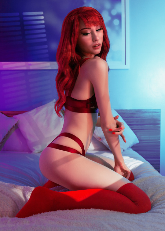
Where's your favourite place?
🕷️
Is it next to me? 😘
#marvel#maryjanewatson#maryjanecosplay#spiderman#spiderverse#mj#comic#comiccosplay#spidermancosplay#marvelcosplay#bedroominspo#redhair#redhead#kneehighsocks#cosplayshoot#portraitphotography#sunset#redlingerie#frontcover#Comicart#90s
21 notes
·
View notes
Text
Sarah Brightman in red

Pixel art about music theme. Miss Sarah Brightman. From a cover of album Symphony. So, it is now starting autumn. It is age of rains, gloomy weather. And colorful leaves. So, I think, this album is suit good for autumn. It has such songs as Running, Fleurs Du Mal. There is a song with a singer from Kiss Paul Stanley. Album it is pop music, and gothic and, as it is a rule, for miss Brightman in style of musicals and classic too.
And, I am, also, like a lot visual look for this tour, in red dress. So, it catches me a lot. It is very colorful and beautiful. Some kind, Alice in wonderland. But, I can also say the same about another albums. But this time with elements, of some gothic. Gargoyles there are a the cover.
And this is my picture the theme. So, I redraw cover, just like this. But in my style. In style of MS DOS, retro, 16 bits, 8 bits. So, I can say, it is first pictures of this kind. I start from this interesting artist.
So, this art can be a part of some text story. Text quest. But it requires to draw a lot and write a lot. And, also, I can remember someway intro to Prince of Persia 2 for system PC MS DOS. It has a very interesting intro at the start. Like a story. It I something like this, but style is another. Alice in Wonderland, of course, also. But, a little more gothic. It a world of big mushrooms. And dusty abandoned places. Maybe, a little of gothic architecture and surrealism someway. Or at some sci fi planet of a strange civilization. In a videogame Torment Tides Of Numenera there is something like this.
#Sarah Brightman#pixel art#frontcover#picture#ms dos#8 bit#16 bit#gothic#pop#rock#musical#classic#paul stanley#fleurs du mal#gamedev#indiedev#retro dev#2d#art#prince of persia 2#vga#cga#numenera#alice in wonderland#big mushroooms#strange planet#dust#sci fi#surealism#text quest
16 notes
·
View notes
Text
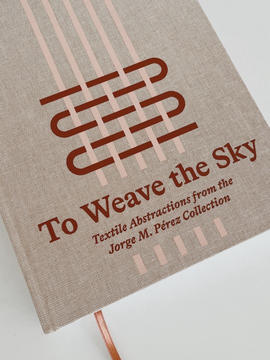
A book I did last year, finally arrived. The printing on the linen cover looks really great.
#frontcover#artbook#hardcover#linen#toweavethesky#jorgemperezcollection#perezcollection#exhibitioncatalogue
2 notes
·
View notes
Text
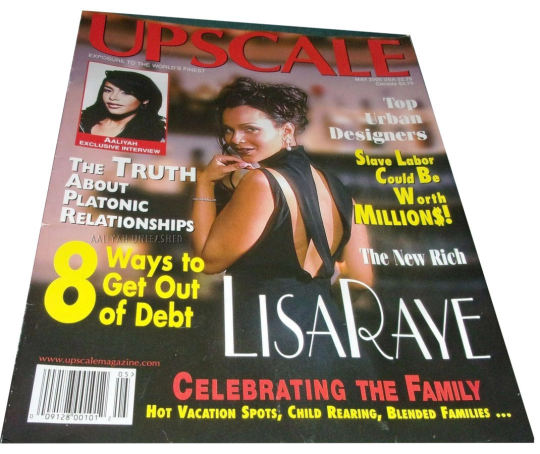

Aaliyah (Upper Left) with actress, Lisa Raye (as the main headliner) for the UPSCALE Magazine's MAY 2000 issue.
Aaliyah's portion was in promotion of her debut film "Romeo Must Die".
#aaliyah#aaliyahhaughton#ripaaliyah#LisaRaye#Upscalemagazine#Upscale#Mayissue#magazinecover#MayMagazineCover#frontcover#Romeomustdie#RMD#Moviestills#photography#photooftheday
6 notes
·
View notes

Link
THE INFORMANT... by AOGRAI
1 note
·
View note
Text
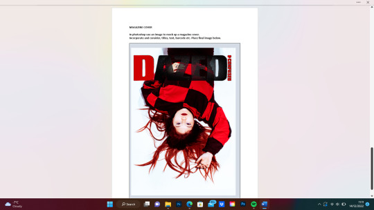
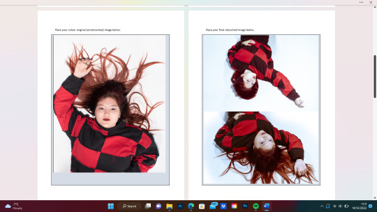
Front Cover
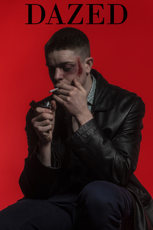

For this project the aim was to create an image that resembled a Film that would then be placed on the front cover of Dazed and Confused. I based my image off the film Fight Club. I used make-up to create the appearance of a black eye and blood and then gave the model a cigarette and a lighter which are both key to the film. Overall I am quite happy with how the image turned out, however I would have liked the model to wear a red leather jacket yet I was unable to obtain one.
0 notes
Video
youtube
The Instagram Model Who Faked Her Entire “Career”
https://newsinfitness.com/the-instagram-model-who-faked-her-entire-career/
0 notes
Text
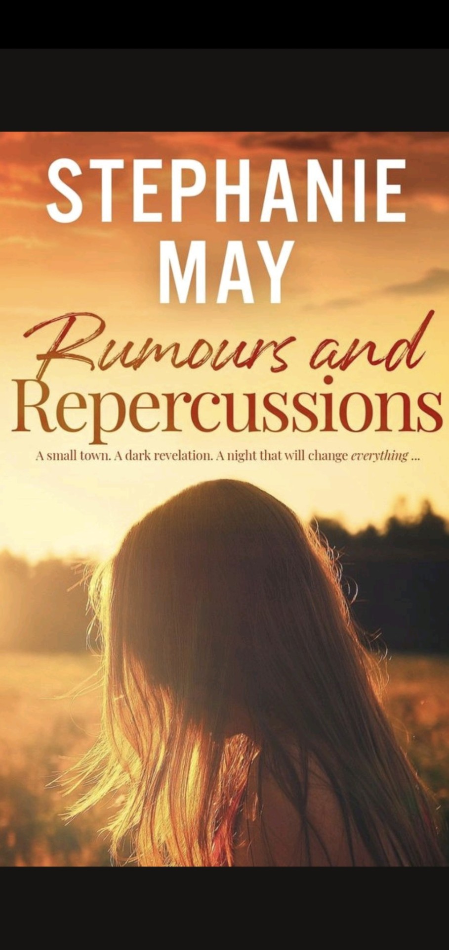
*** COVER REVEAL ***
I'm so excited to share the front cover of my fourth book.
A massive shout-out goes to the friendly team at @qamberdesigns for their patience and quick turnaround service. Highly recommend! I honestly could not picture a better front cover that captures the essence of Rumours and Repercussions.
I am super excited about this one. Set in the '70s in Orange, NSW. I've had a few people read over it so far, and the response has been phenomenal!
We're in the final stages of editing, then it's off for typesetting and then publication!!!
Blurb to follow later on.
Expected release date: June/July
As always, thanks so much for your support and encouragement over the years. Blessed to have the family and friends that I do.
Much love
X
#writerscommunity#writerblr#writers on tumblr#female writers#aussie author#author#indie author#authors#aussieauthor#cover reveal#coverdesign#frontcover#new books#coming soooooooon#cover art#coming of age#dramafilled#70s#australian author
0 notes
Photo
Light painting in the studio, featuring the beautiful @mistythebrandofficial wearing @nonathelabel from our editorial ‘Heavy Lies the Crown’ published in @moevir.paris as front cover feature. Production: @d2creativeproductions Photography: @samuelgeals Styling: @david.james.c @cheekaboooo @devour_the_divine Make Up Artist: @margheritafabbro_mua at @contact.creatives Hair Designer: @createdbyklein at @simonwebsterhair Photo Assist: @justynaszymanska_ Studio: @kimberstudio_ #fashionshoots #lightpaintingphotography #fashionportrait #londonphotographers #fashioneditorials #moevirmagazine #frontcover #magazinecovers #magazinefeature #fashiondesigner #samuelgealsphotography #editorialmodel #studioshoot #ocfportraits #agencymodels #advertisingphotographer #art8ambygram #modellingshoot #modelphotographyphotos #portfolioshoots #fashionphotographyappreciation #modelphotoshoots #studiophotography_model #editorialstyling #fashionphotographyexperience #fashionshoot #magazineeditorial #modelingshoots #slowshutter #flashphotography (at Silverspace Studios) https://www.instagram.com/p/CnWtHkoNr8e/?igshid=NGJjMDIxMWI=
#fashionshoots#lightpaintingphotography#fashionportrait#londonphotographers#fashioneditorials#moevirmagazine#frontcover#magazinecovers#magazinefeature#fashiondesigner#samuelgealsphotography#editorialmodel#studioshoot#ocfportraits#agencymodels#advertisingphotographer#art8ambygram#modellingshoot#modelphotographyphotos#portfolioshoots#fashionphotographyappreciation#modelphotoshoots#studiophotography_model#editorialstyling#fashionphotographyexperience#fashionshoot#magazineeditorial#modelingshoots#slowshutter#flashphotography
0 notes
Text
#marvel#maryjanewatson#maryjanecosplay#spiderman#spiderverse#mj#comic#comiccosplay#spidermancosplay#marvelcosplay#bedroominspo#redhair#redhead#kneehighsocks#cosplayshoot#portraitphotography#sunset#redlingerie#frontcover#Comicart#90s
6 notes
·
View notes


Text
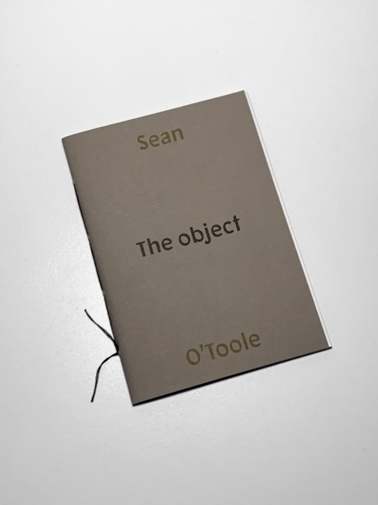
It’s here. And it’s really great.
#seanotoole#theobject#shortstory#chapbook#risoprint#riso#risograph#frontcover#softcover#bookdesign#handbound
0 notes
Text
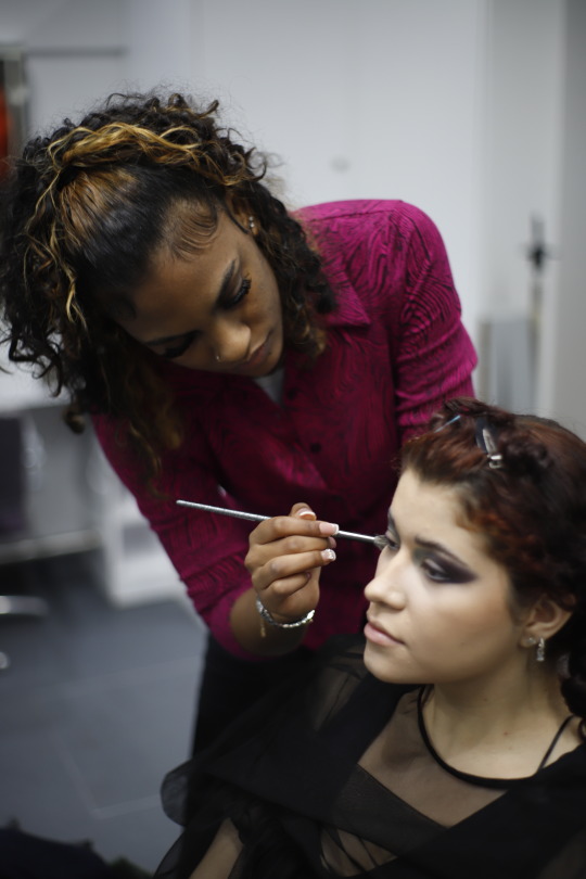
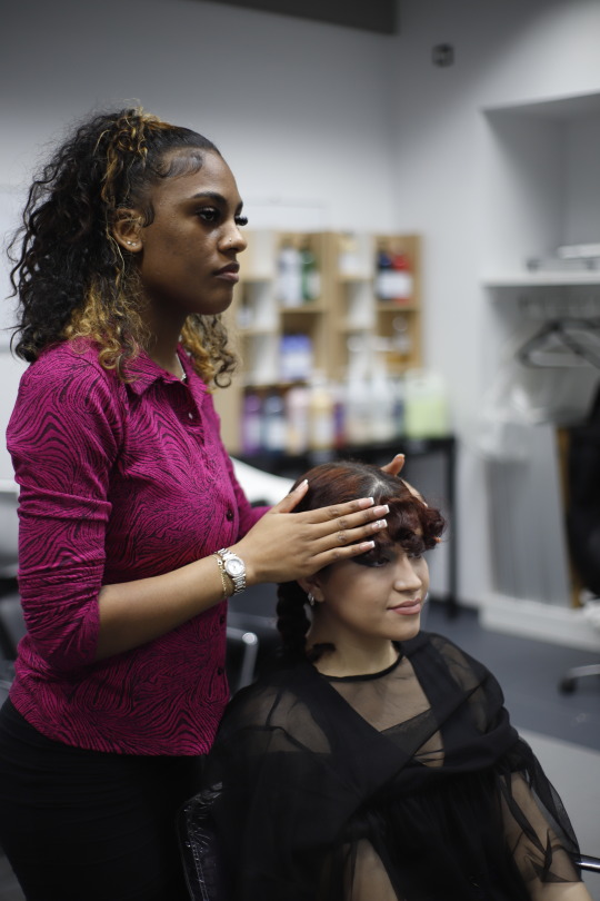
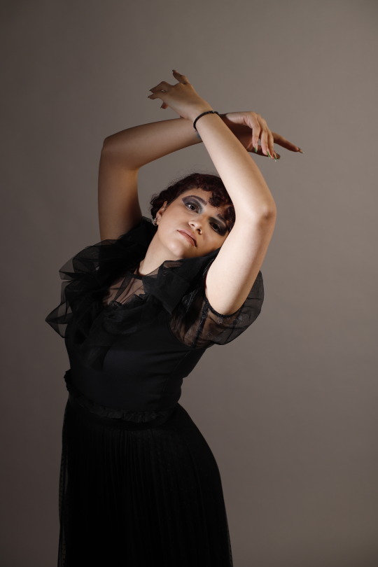
Front Cover - shooting day
I had some technical issues at the studio which took quite a lot of time, leaving me with less than an hour shooting time. The makeup and hair also took longer than I expected, but that how it is sometimes, and we need to learn how to deal with it.
The beauty student - Mariam Haqq is a HNC fashion hair and makeup student. She did makeup in one of the beauty studios on the floor 2.
We went for a black and blue eyes, pale skin with a little contouring and coldish pink tone of lips. the hair were tied up and we kept the model’s curls as it only have to be inspired not fully copied look.
Mariam did a great job and here are some pictures of her doing makeup.

I used my old clothes to create the similar look to the one from the series. The old see-thru tulle top were used as a tulle detail, and I had to tie it to get the shape I wanted.
The difference between lights with and without colour gel (blue)

1 note
·
View note
Photo
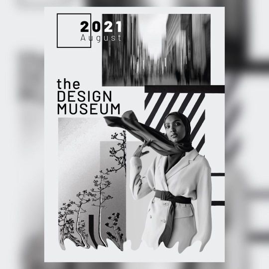
Front cover design for ‘The Design Museum’ - - - #adobe #photoshop #graphicdesign #graphicdesigner #art #creativeart #graphicart #graphicdesigners #graphicdesigncentral #creator #instagram #design #magazine #frontcover #advertising (at Lincoln, Lincolnshire) https://www.instagram.com/p/COglaQ7HiP3/?igshid=NGJjMDIxMWI=
#adobe#photoshop#graphicdesign#graphicdesigner#art#creativeart#graphicart#graphicdesigners#graphicdesigncentral#creator#instagram#design#magazine#frontcover#advertising
0 notes
Photo
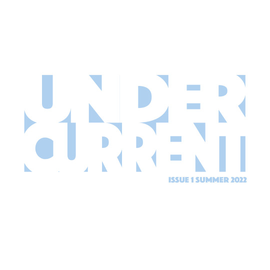

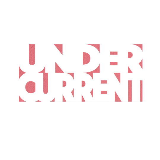
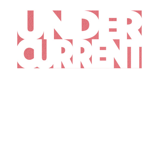
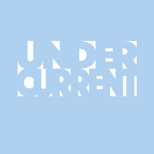
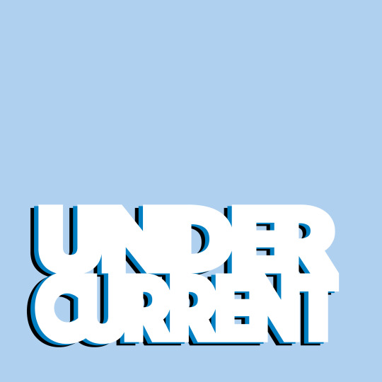
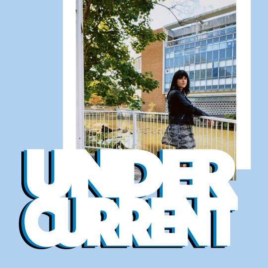

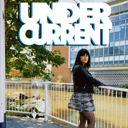
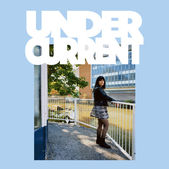
Front cover designs
For the front cover I am following the same format as the rest of my zine - a 198mm x 198mm square. I developed the typeface by reducing the paragraph space between two lines and then compressing and expanding each line of writing so that they line up perfectly. I think this worked really well, creating a bold and graphic logo.
I had originally been planning to create a front cover that features laser cut lettering in this format, but as I have not been able to be in college, this was no longer a possibility, so instead I have been coming up with different designs. The third and fourth designs reflect how I was imagining this could turn out, with red prelims showing through.
My favourite one and the one that I will be using is the first one. I think the white background matching the white writing looks really unique and compelling, and I much prefer the white background to the blue one, or indeed any other colour that I tried using. The hints of blue give a nice pop of colour to the cover and make it seem very striking. I changed the colour of the prelims of the book to this same blue, but added the grain texture, as I thought this looked a lot neater than the red ones. I also used this blue on the back cover. The back cover is plain.
The other images demonstrate some of my experimentation with placement of lettering and image. I couldn't find the right way to balance lettering with an image, however I am glad I didn't use an image on the final front cover as I feel that this makes the publication look more like a magazine as opposed to a zine.
1 note
·
View note
Last Seen Blogs
ask-byletheisner
I Must Lead Them Well

onii-shortie
Orojas

vivipoery
୨୧

ppteamkler
Sin título
anthonyamadeo
ANTHONY AMADEO PHOTO