#finally rendered the concept sketches i did months ago
Text
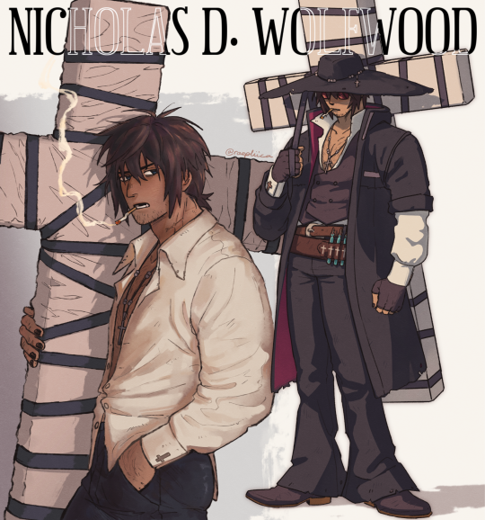


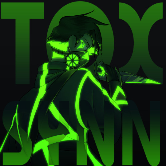
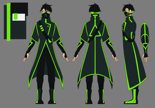
tristamp post-timeskip woowoo!! injecting him with cowboy swag baybiee

also, a little bit of a redraw
#trigun#trigun stampede#nicholas d. wolfwood#vash the stampede#meryl stryfe#eriks#my art#finally rendered the concept sketches i did months ago#eriks with his scary dog privileges#im ignoring the hair they gave eriks in tristamp. plz pretend he still has his precious airvents<3#whats more intimate than a man shaving another man's face#if you can tell what reference i used for that doodle then props to you#or im sorry idk#anyways overdressed bitch looking for missing boyfriend#wearing all those layers on a desert planet with 2 suns must cook him alive#woowoo design inspired by my favourite big hat man D <3#damn look at my priest!! gurl im not seeing the pearly white gates#raepliica_art
3K notes
·
View notes
Text
2023 art review!
Even if this year wasn't the biggest on art, due to my physical condition (especially in last couple of months), it would still be nice to look back on what i did as an artist throughout it!
This is gonna be a fun ride...
So, let's dive straight into it, shall we?
Continuation under the cut
January
2023 started on a high note, with me just having finished the King piece, and moving on to the next big thing, being an AvA3/5 double piece.


Sadly, during the process i messed up big time which led to me being unable to finish the piece the way i wanted to, rendering this project an eternal WIP. However, i still cherish the idea and do wish to either redraw, or complete it.
February
Doing 2 big projects one after another did end up affecting my overall drive, so i spent majority of that month just making sketches.

First one is a little redraw/redesign of my old character - Derek, whom i used for a roleplay with my friends like 3 or 4 years ago, and second one is Deach, a character from my fantasy setting.

Also, back then i joined a new fandom, people in which have reminded me of my admiration for SCP, after which me and my friends proceeded to make OCs for it. Was a fun time!
(Also this access card was sold by me as a YCH, sadly i couldn't really find buyers, so yikes)
March
By march is slowly started recovering from january's disappointement and was a bit more productive already. One of my friends really helped with it too.
A musician friend of mine reached out to me, asking to develop a design for a villain character in the plot he was working on. After listening to the theme song i couldn't resist.
This ended up being one of my favorite designs so far, and i adore its look in neon.


In the meantime, i kept working on my fantasy setting, refining more minor details of designs and stories, yet having to reserve only to making sketches as i was too busy with college and other projects.
Characters you see on screen are Ian and Lanfor respectfully. One is a strong yet troubled mage and other is a great Emperor, and even better person.
April
I'd say april was one of the most productive months of this year, mostly because i managed to snatch some time for myself and my setting, which allowed me to complete two full pieces and achieve some extreme progress with my story.

This piece is an illustration to a scene i wrote for two of the characters, Lanfor and Emile, called "Night Visitor". This was a scene of a reunion of two old friends. A bittersweet, yet a lovely work.
Love both the written one as well as the illustration.
This one was more of a... Proof of concept. Needed to test out the expresiveness of the design for one or a relatively new characters - Covlar. Was originally a simple sketch on paper, but i couldn't resist the urge of making it into a complete illustration.
I then proceeded to make a few notes for this scene. Both want to write it properly and avoid it at all cost... Best to avoid it, for my own sanity.
May
May was a bit of trainwreck, because i got a brand new laptop, which took me quite some time to get used to and even more time to reassure myself that it is in fact alright for me to draw on this suspicioiusly thin piece of tech.

Ironically enough, the only vomplete piece i drew that month was drawn on my old laptop.
This screenshot redraw was to made to honour the premiere of AvA6 ep.1. Sadly, i did it a bit late because fo technical issues, but i still had a ton of fun doing it.
June
June was... Chaotic, to say the least. Mostly because i finally got comfortable with the new laptop and could now draw a lot more freely due to it being a lot more compact than the original one, which worked almost like a PC. Besides, i got a ton more free time because semester finals ended up being a breeze.

Ended up making a ton sketches and doodles, that i didn't actually plan to finish, but still enjoyed a ton. Here are some of them


Then, ofc, the memes and the gand redesign, because AvA6 just had to break all of my portrayals. But, i mean, after AvM s3 my original designs did become a bit dated.
The biggest pride and saddest of failures was this picnic piece, however. I still plan on finishing it, but it is hard doing so, when i have changed quite a bit of my artstyle by now.
July
July was quite lazy. Semester ended and i spent that entire month out of the city. It was a great time, very peaceul indeed.
And again, that musician friend from before came into clutch, asking me to develop another design for his other project. And again a villain.
He said he really liked how i draw bastard type of characters.
August
Well this is where fun began. End of summer break means i have just this much time to actually draw something i would never have time to draw normally.
For me to draw something to commemorate a new episode is almost like a tradition at this point. And, given how long it's been since i made anything that would require effort, no wonder i have chosen arguably the most complex piece to pull off energy-wise.
Yet i did and now i simply adore this piece, even if it did render me disabled. (I crunched through all of this piece, pulling off 40+ hours of work in just 4 days, so naturaly it ended up worsening my condition by a lot)
Then i also proceeded to do all of these tiny side projects, like Victim ask, which i couldn't last long at due to my condition, and working on a design for my favourite streamer. (Which i cannot show as the work is not complete an it's best if i avoid spoilers)
September and October
These two months i spent being unable to draw at all via a doctor's advice. Arguably, these two were the hardest months for me to handle.
I assume you can imagine how hard it is to suddenly stop being able to do what you love, regardless of how much you wish to do it.
Novemer
*Nervous laughter* I... actually still wasn't allowed to use my hand, but that didn't stop me and i ended up making an entire series of sketches to celebrate AvA6 ep2.
"Small in big quantity will sure be less exhausting than a single big thing" - (C) Me, proably


I will admit, i still adore all of these sketches and each of them deserves to become a fully fledged piece in it's own right, but i really better keep them as they are. For my own safety.
December
As you way have expected, this month will stay without a single thing from me. It's not because i don't want to, but because i can't. And, given the circumstance, it better stay that way.
Afterword
I finally got my diagnosis and soon enough i will start active treatment for my condition. It would be a shame to make this worse than it already is with impulses like those that happened in november, so i am making this post as a way to draw a line for myself.
It is still kinda crazy to realize that there are quite a few people interested in what i make, so i will make sure to take my recovery as responcible as possible, and then come back to you with even more art in the upcoming year! Let's be positive about it.
#alan becker#animation vs animator#ava#illustration#ava fanart#animation vs minecraft#avm#artists on tumblr#2023 art#yearly art summary#oc art#original character#digital art#No character tags because there are too many of them
19 notes
·
View notes
Text
I ramble for too long about my art (The post)
(Drawings here)
Thanks again to Nunki and Nov so much for pulling me out of art block 😭💕 I had so much fun drawing all of this and experimenting with poses and colors, etc. that I wouldn't have tried before this!! i'm so sorry this took like 2 months to finish there was lots of stuff going on but I finally finished it and i'm very happy how it all turned out. I made this post just to go through my thought process LMAO
DAY 1: Early SMP Days
This one was inspired by the "he asked for no pickles" meme and how in an early dsmp stream c!dream (in full enchanted netherite armor) asks c!george (half iron/diamond armor) to protect him with a crossbow while they go to l'manburg
At first this one was gonna be a quick drawing but then i got too invested into drawing the armor that it got out of hand and suddenly i had spent 2 days on that 💀
Also all the other drawings were gonna be like this one, a bit simple than what i usually do, but i got too invested x2 and ended up rendering(?) more the rest of drawings
C!dream is c!george's baby, like the cc's dynamic 👍
DAY 2: Objects of Affection
THE SHIELD DEMONS GOT ME 👹👹👹👹 also c!gnf keeps the mask even though it's a bit broken :3
C!gnf is a bit dirty because he doesn't shower, also he sleeps on the grass sometimes, he doesn't get sunburnt because XD protects him from that, also c!sapnap is the one that finds him like that and brings him back to kinoko
I think this is the drawing with most layers only because it was for setting the lighting
This one set the bar of how many details can i put on the next drawings haha got too silly and flew too close to the sun
DAY 3: Worship/Devotion
Inspired by religious imagery in renaissance paintings, they're very pretty and detailed and ohgggg i thought that aesthetic fit XDNF's dynamic ^_^
When I finished the drawing i added a canvas texture so it looked like the mentioned paintings' texture
The pose was so complicated but thankfully i hid all the weird anatomy under capes and hair(?) 🤭 and I have a mirror right next to my computer so i used myself as reference for the hands
The halo around c!gnf's head could be a reference to the headcanon of georgeeeHD existing and being another dsmp deity or also hinting at george's "destroying the smp" stream and how powerful and crazy insane he is!!! also the reflection of XD's halos on his eyes, they worship each other i think, xdnf makes my tummy hurt /pos
DAY 4: Visions/Dreams
Inspired by my weirdcore demons :3 i love that aesthetic so much
I did the error pop up on this custom generator!!
Saved a lot of time by making c!dream faceless since it would be covered by the pop up anyway, but it can also be symbolism for c!gnf not remembering his face or something crazy
I again used myself as reference for the hands i'm so cool and epic
Also I used a tutorial on how to make the vhs effect/chromatic aberration on paint tool sai and added grainy texture on the background for more spice :3
DAY 5: Reunion/Post-Nuke
I reused an old sketch of c!dnf side profile for this one, hashtag work smart not hard 😎 except i polished it and changed some stuff and now it looks way better than the old version
The concept was happy reunion, they're happy to see each other!! c!dnf good ending, i say in tears.
c!gnf touching the c!dritties :3 jk he's feeling his heartbeat, he can't believe he's real!!!
I had so much fun drawing the blood on the bandages and c!dream's scars, please zoom and admire them, it took so long,,,,
DAY 6: Roleswap
My demons..... my beloved rs au..... the posts i made some while ago were based on this drawing, i have a tag on my blog now for that au
RS!dnf wear matching chains!! also the concept for this drawing was that someone interrupted their make out session :3
Symbolism moment!! I like to draw characters with nail polish of the color it represents them, in this case green for dream and blue for george, but for this au, their colors are swapped: green for george and blue for dream, it symbolizes how their roles (king/knight) on that story are different and don't match with the canon. storywise, they're so in love they wanted to keep each other on themselves somehow so they exchanged nail polish colors
DAY 7: CC Roleplay/Cosplay
Sisyphus would be proud of me (<- almost gave up before drawing this), unironically i got demotivated when i finished day 6 so i took a break and then i went insane with this one
The concept was c!dnfies wearing cc!dnf outfits, dream specifically has so many outfit options but I ended up choosing the famous "dteam in madrid" outfit plus a cat beanie, and I couldn't find a fortnite jesus poster for george's shirt so i just found a silly cat pic and yeah ^_^
Thank you random twt user for the idea 👍
And that's it! I probably forgot to say some stuff more but i started to get anxious this post would be too long. Again thank you so much guys for being supportive over the wips i showed you and also being insane about c!dnf too 😭 <3
5 notes
·
View notes
Text


FA222 ,principles of graphic design:
Instructor: mr.munwar mukhtar
@uob-funoon @mnwrzmn
Project 1 : interviews
What is your given name, and user name on ZBrush Central?
My name is Khalid Abdulla Al-Muharraqi, my ZBrush Central user name is "Khalid72".
Tell us about your company, how did you start?
I set up Muharraqi-Studios to continue my family's history in the creative world and I am trying to continue to build on what my father started. The company was set up about two years ago after I left the commercial world of advertising with my partner Rashad who decided to leave a career in banking. We wanted to get together to make a place that allows us to be more creative. Since then we have been fortunate enough to work on some of the biggest projects in the middle east, and also continue working on our ideas and concepts, like our movie project. The most important thing for me is the work I do and that's what we are all about.
What is the size of your company?
The company is me and my partner, oh and our secretary... Keesha, a German Shepard! I am a hand's on guy and I do all the creative work myself. At first, I thought it was normal to carry that load because of the speed I work in, but later found out that I am actually very fast compared with bigger teams of artists in other studios. Finally I understood what people were telling me when they said I was 'unusual'. That’s why some of the CG magazines in Europe were amazed that a lot of our work is done by a one man team that puts all the 3D components together into a visualization. I work about 13 to 18 hours a day, I love 3D work, so my hobby and my work has joined into one, so … yes, very little time for a normal life.
What type of projects do you work on?
Well, I have been working on Architectural Visualizations since we started a couple of years ago, but I try to satisfy my urge to do what I really like, art!
You're located in Bahrain, somewhere most of us don't know about. Can you tell us how you learned your trade?
I love this question, Yes Bahrain is a small Island in the Persian gulf, we speak Arabic as our main language and English for the second, I will answer the second part in two parts, If you mean The art... I would say that I come from an artistic family, my father is one of the most well known artists in this part of the world, you can say that he is a household name in these parts. If you are asking were did I learn the 3D or CG art, I would say that I learned it by practicing for 8 hours a day after my official day of work, so I guess you can say I have been my own teacher in the industry.
Tell us a bit about your client base, mostly local, or do you have clients in Europe, Asia, America?
We serve clients from the Middle East, Europe and the Americas, I would say that I have been fortunate enough to have worked with some of the top people in the architectural industry, most of our clients are attracted to the type of work that we produce.
ow long have you been an artist?
Since I was six...I think! Well, the first painting I have sold when I was eleven. I was always painting and trying to find new techniques that will help create the concept in my mind.
Tell us about your background, your education, your mentors...
I studied art in Houston Texas for over seven years between interior decoration, photography, Visual communication, and digital enhancement or photo retouching, from there I have continued my working career in the commercial world. My first mentor would have to be my father, learned everything I know from him. He gave me the push start into the art world and made me feel it. There are also the books and artwork he has exposed me too with some of the top art in the world. A lot of names come to mind but I would say Frank Farazeta, Boris, The Creepy magazine and of course all the original Mad magazines and books that were very hot in the early 80's.
When you became an artist, did you first use traditional media?
For sure, I started with Pencil then got into crosshatching with ink, then I started painting with water colors and gouaches. I finally got into air brush art before I tried CG art.
What was your first CG package? What is your first 3D Package?
Nice question... first CG software was PSD, version 2, it was like magic... It felt strange especially that I was a traditional artist at the time. My first 3D package would be Alias Sketch for the Mac since I was a Mac user for a long time and did not have much 3D developers for Mac at the time. It was a new world for me and I think I still have a dusty copy of it today even after the software was canceled back in the early 90's, it just reminds me of my past.
How long have you been using ZBrush?
It has only been about six months, but I was up and running almost a few hours after I purchased it.
What made you try ZBrush?
I was watching some of the tutorial videos on how to paint details on the Gnomon training DVD's, and that's when I was shocked to see that it is art on the computer! I did not believe it at first, but It was one of the happiest moments when I first installed my first copy of ZBrush and started painting geometry for the first time, it reminded me with the days when I was pushing and pulling real clay to make a small creature of my imagination when I was a kid.
What's your favorite ZBrush feature?
The ability to paint geometry like it is physically in my hands.
How has ZBrush enabled you to express yourself in ways other packages couldn't?
Well you cant really compare it with any other software, it's simply too different! It changes how a CG artist works, it changes how he looks at things, has changed the industry to the next future leap, and who would want to go back to the past....? I would simply say that the concept of the software is very smart and impressive, my only wish to add on it is to have a bigger view port :)
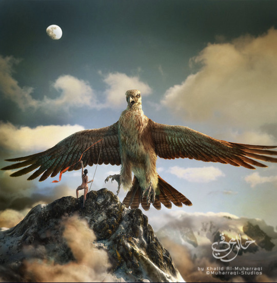
Now onto "Floating Islands"Tell us about your creative process, how did this concept emerge?
One evening when I was stuck in the studio waiting for clients approval on a project that I was preparing for the kingdom of Bahrain, I was trying to get free again and relax my mind from all boundaries, I started to sketch a concept that has bean in my mind since I was a kid, the island that was then discovered to be on the back of a whale, these were some of the old middle eastern stories about Sinbad's magical voyages.
Do ideas just come to you out of nowhere, or are there particular artists or work you are inspired by?
I am always inspired by everything that is beautiful, whether it is an artist or a design or just Gods creation, I would also say that I have always had my own style in my work and almost never try to follow a certain style that I have seen.
I love this piece, can you tell me about the process of creating it? Have you explored this style before? Or was this created for something specific?
The process was, a sketch or the map as I would call it, and that would be the basis of my creation, I almost never start without it, once I crack the direction then I would start thinking about the execution and the path to take. About the style, well I don't think of my work as style, I think it is more towards I do what I feel, it is only when I am finished with it that I say "Yes! That's what I was tying to do". I almost never tried to repeat a style that I have seen elsewhere on my work. I feel that It is like a code of respect between artists.
In your image "Floating Islands" where was ZBrush used?
ZBrush helped me sculpt the geometry and take it to the next level in a short time. Modeling, UVs, Painting and scenes setups was between Lightwave and Modo. With ZBrush I was able to put the final touches that would make it come to life. ZBrush helped me start painting the UV map textures and setting up the foundation of the look and feel. I also generated some of the whales textures by the amazing ZMapper ;)
Tell us about your pipeline.
I start with Modo, then go to ZBrush, then finally render with Lightwave. The thing with software today is that they work hand in hand to complete each other, for instance ZBrush is very specialized in what it does, it focuses on the need of the artist and helps the creator to complete his task sufficiently with a smooth flow, artists have never had it this good.
What projects are you working on now?
We have just completed the visualization for the Master Plan for the Kingdom of Bahrain with one of the leading Architectural firms in the world, we have helped restructure and rebuild old and new cities for the country. Now I will be working more onto the movie project that we have been trying to get the time to start, hopefully I will be able to focus more on creating more Characters and environments for the movie.
Any last comments for us?
I would like to say Thank you to Manuel at Pixologic and Pixologic for appreciating the work I do. I would also like to thank all the development team and staff at Pixologic for there dedication to work together to help create some of the best tools ever created for the CG industry, I always expect the ideas to be fresh and most importantly designed for the end user, the artist, allowing the artist to continue being an artist without the restrictions and boundaries of a computer.
4 notes
·
View notes
Text
Plan(ed) to Have Something Ready, By The Ball Drop &/or Tomorrow!!! If Everything Works out...
Hey Everyone,
HAPPY NEW YEARS EVE!!!
Wow, this is the second message without any art added or anything... LOL... Seems odd really to do this without having something up by now... By the way, yes the current avatar pic is related to the comic as you’ll come see soon. It’s and early sketch so some kinks aren’t worked out in the current image. But it was the one I was ready to have when I made this blog so there was at least something...
So as you probably can see by this title, I do plan on having something posted... I just don’t know to what extent. Due to some family drama, and continually piling on work I wasn’t able to get my Christmas Pic out to you guys, which was just a static scene with a few of the characters to get us started here. But... well family got in the way, continually decorating till Christmas day... a lot of things going on, bickering (though we all love each other) it’s just... you know life. I fully expected this as well, which is why I promised something before New Years, but didn’t specify as to what.
I postponed that idea to be released today or tomorrow, after seeing how I was completely unable to get to the work by Christmas Eve. But, by the looks of the progress I made on it and my families continually need of me till we get some things done in this house (that always has something to be done in it... LOL, at least things are coming fairly together).
So lets just say, I may not have anything out by tomorrow. But with hopes I want to have something out. So We’ll see. I could release early the character sketches. But I want to keep this blog clean as possible, so I feel releasing the character profiles, cards and blogs together prior to the Prologue, would fit better and keep this page having a cleaner look to it at the start.
Maybe even by midnight tomorrow PST I could have something... But that again depends. I need to clean stuff for the internet/cable guy and I’m seriously allergic to dust... So the next few days I may be in an almost sickly comatose state regardless of the precautions I take. If dust gets kicked into the air at all and isn’t properly vacuumed up, than I’m often sick for days... I feel like all I’ve been doing the whole month is cleaning or working story wise on this comic... Mostly cleaning if you ask me, but at least after Saturday things should be more relaxed and I can have a better work schedule planned out. So yeah, that’s my life...
But DIDNT’ WAN TO LEAVE YOU HANGING with this Negative Nancy Talk ;D ;P ;D lol....
I want to tell you what I have so far:
I have the Christmas Image at least with the basic building blocks to complete it. Like I’ve drawn where I want things, but not detailed anything... So that’s why it may be a day or so... Technically its a Happy Holidays and New Years piece, but with the Christmas Tree in it I have the habit of calling it such...
I may have plans to detail it a bit more then I plan on having the comic, but that also depends on things. I may just leave it in the same style and not fully decked out to make it easier to finish...
~Several Characters for the beginning have their final forms created. These are major characters that will be scene in the prologue. I’m just having to figure out out little things with background characters in some instances.
~The prologue is almost completely written out. I had a change of heart a week ago on some things and had to change it around, which is why the written format for the prologue isn’t complete as it initially was. I just felt some things didn’t fit, so I added and took away some things so it flows better and also works both fanfiction wise for the story, but easily mixes for the Ask AU... I also have at least the beginning portion of the Intro script written, the parts unaffected by the changes. However, parts of the intro will be written out, depending on the questions you ask the characters in this prologue so these portions I’m leaving open on purpose. It’s the plot driven portions I’m mentioning that I’ve changed slightly. ;) I have fun plans for the prologue. Remember this story has a clear direction I’m taking it with plot. But the Ask portion will be a part of it, I have such a fun way of Ask’s being tied into the plot driven story, and it will change depending on the context, person and setting which makes this really fun to plan out.
-With that said, here’s an early heads up, that for Ask Questions, I will allow any sort of asks, but if it has potential to spoil a part of the story, then I won’t answer it. Alongside this, I’ll allow Anon magic to a small degree. I won’t include Asks that like spoil something for a character, or tell the character where someone is, give away what someone else is doing to another character, etc... Unless it may fit the context, but generally I won’t use these types of asks. I will allow Anons to appear occasionally rather then just be unseen voices, as I have fun ways of incorporating Anons into the story that also works with different points in the plot. I will accept things like... say a dog or cat to appear for ex. amount of asks. I already know who they’ll be and have been planning out their designs, but I may draw the line at other animals (e.g. horses, fish, racoons, squirrels, lizards, etc.) Although, I do really love rabbits, I chose to make it concise to just two animals that if asked could appear. It’s not because I can’t draw them but I don’t want things getting out of hand. Types of anon magic I’m not going to use if put in the Ask portion, are things like giving people certain powers or items that may completely effect the tone or plot of the story, accept maybe if I did a non-canon AU to this au for fun one day. I will go more in depth in the general rules later. In no way is this to discourage anyone from asking such things. I may set reminders at times if I get to much of something. But, in general I’ll do what I can to make this a fun Ask blog all the same.
~The Larger Summary, I promised like a trailer would be in the comic form I have rendered the Script for, and have two slides so far drawn out, just not completed. (for the time I didn’t have around the Holidays compared to normally I actually surprised myself with this)
~The story itself is really coming together, I already have a starting and stopping point (which I had prior to this blog) as it will have several Acts and Arcs, some which have greatly changed and take on new depth since the point I started this blog. The themes and story in general are drawn out pretty well. I don’t have all the chapters I’d want fully written. As I have my plan, but I also want to get the prologue in first, just to see if there’s anything I should change with my concept. It’s just a precaution, something I’ve learned well when taking on something new. So I don’t have things that are written in stone and hard to change if the form I’m hoping to take doesn’t work out and needs to be retooled or something. But these are minor and shouldn’t change the overall scope and plot I’m taking this story on either.
~I’ve created several of the character bios, many in fact are already written in true Henry Stickmin fashion. But as I took inspiration to make this into a AU as well, I will possibly make both the bio cards and show a static shot of the characters alongside it or something... It’s an idea, but I want this to also be the easier comic. But, considering that I’ll always have a static shot I use as reference for any character I make, this is what makes this more realistic to occur as well.
~I’ve nearly drawn out all the characters for the intro portion. And already know how I’ll handle Anon’s in the story. In the Prologue itself, I’ll actually have you Anon’s being referenced as audience members in a conference of sorts. Think of it like those conferences when a new Apple or Microsoft product is first advertised as something new to the news conference, those big rotunda’s where someone's being interviewed and presenting the hot new item. Think of the opening to the prologue being something like this scenario. So the questions directed at the character in there, who... *cough* I will introduce later after I fully render both their character profile and have their character bio(s) fully done. Which considering how fun and easy it’s been to do this so far shouldn’t be to long now... Although to keep from getting questions to soon on them, I may hold off on posting the Characters and Bio’s till I have that Intro/Trailer completed... I’m still considering which to do first actually. But top on my list out of all of these is having my cover art for the top completed. That’s something I admit though I have the layout I have hardly started on and should focus on first.
~I’m also taking close looks at how to properly make the rules for this group. When I posts either the Character Bios, Holiday Pic, OR the Trailer Comic... Maye even just the cover art... Then I will try to have out an official Rules list. The one I have on the group posts is just general stuff... But I’m reconsidering some rules I already wrote... Basically keep things family friendly, be kind an courteous, nothing vulgar or disturbing.
I may change this from a PG-13 comic to maybe PG-15. I’ve realized recently, there are some points that some characters do swear... sometimes more then once. I’m not someone who talks with vulgarity myself, but I sure can write characters with it.... Let’s just say I’m going to see if in those scenes I might just bleep out words and see if the dialogue still comes through. But, I dunno... LUCKILY, we don’t have to worry about many of those scenes till way further into this comic. So lucky for either of us, this isn’t a major concern at the moment. And on the plus side it’s not the crudest words I could have chosen so... it may still work as a PG-13 work... I’ll make this decision soon as possible.
Another reason for the sudden change, came as I realized as the story goes, and even in early chapters there will be scenes where blood is shown and physical mortal danger and peril is experienced by the characters. I do have heavy theming sometimes, later on it may seem constantly about. As this story is heavily Drama/Mystery and some suspense based. As the story progresses it will become less Drama/Mystery and more based around the drama/suspense itself. This will obviously be some more intense scenes that showing less blood would allow me to make PG-13, however I also don’t want to undercut the certain tones using representations of a mortal wound would bring. I also want to look at things like these future scenes realistically. Which is why I’m mostly considering changing this story to a PG-15 or at least more certain I am. I just don’t want people shocked that I’m doing this. I don’t feel this story will be R, there was a time where I heavily considered it. But for once I decided no, I didn’t want that. I just didn’t want to open the door for scenes I didn’t intend to have in this story. There will be heavy themes that my have TW for some people. But I didn’t want some TW’s that having a R rated story could potentially have. I mean certain themes people are free to write fanfictions for, and depending on the content can make art for. But again this will be family friendly group...
As You can see I’m considering more then a little here when it comes to the official rules. These details will be followed up on the official rules post.
~~~~~~
Now I apologize for the length.
The structure of this and the previous Authors Notes will probably fall under their own category for length. I’ll work to make sure posts in the future won’t be so long and hard to read. It is early morning for me when I woke to write this, and I found once much of the day passed that I still wanted to include the stuff I did into this update.
I have more to tell you, but I think this post has spurned the energy in me out. Anything that I missed in this post, I’ll try to remember to update in the next post (hopefully after I get some art on here).
What I can’t do at the moment is promise dates right now till I’m more certain of schedule to work on this or can promise that my general allergies won’t cause me to delay this at all. But I can confirm that I should have several things coming out this next month, including the comic Prologue I hope. Depending on the traction the comic and fanfic gets, I may try to work on it quickly, or take my time with it. I may do a mix of both as my perfectionist self won’t let me just shoot something out without giving it my all first. I’m shushing that side slightly so this comic will be easier on me then the more detailed one I have planned. All the same, I’m planning to work on this one more at the moment till I can get an idea of my work flow. Sometimes the easiest route of work is better for planning, rather then diving head first into the deep end right away. You don’t learn to swim by jumping head first into the ocean. Piece of advice that it took years for me to learn myself ;).
Anyways, I figured since I did promise something hopefully by today or tomorrow, I’d give you a formal update... Also... Well I can’t promise that updates won’t be like this in the future. I’ll try to keep them concise. But as people who know me, well have learned when it comes to personally talking I tend to write or talk out epistle. So... When I give updates, I may have lengthy ones... I’ll try my best to keep this side of me out of updates, if I can help it.
Anyways Happy New Years Everyone!!! I hope everyone's Christmas and Holidays were extra special, despite the state of the world!!!
HAPPY NEW YEARS EVE AND DAY!!!
Sincerely,
<3
(Mod)
Sweet Heart Blaze
#Lenna Peppermint S[REDACTED]#Agent Lenna#henry stickmin charles#Henry Stickmin#henry stickmin au#henry stickmin ask blog#Henry Stickmin Ask Comic#ellie rose#charles calvin#ccc#gov't#the wall#toppat#toppats#reginald copperbottom#rhm#right hand man#general hubert galeforce#dave panpa#rupert price#konrad bukowski#calvin bukowski#sven svensson#burt curtis#Sarge#Beanie#Flapjacks
6 notes
·
View notes
Text
Tagged by the lovely @samirant <3
rules: it’s time to love yourselves! choose your 5 favourite works you created in the past year (fics, art, edits, etc) and link them below to reflect on the amazing things you’ve brought into the world. tag as many writers/artists/etc as you want (fan or original) so we can spread the love and link each other to awesome works!
a.k.a in which i try to write stuff that i haven’t already ranted about in the tags of the original post

1.it’s always summer in the songs ☀️ | AH YES. this one. the one that i will always bring up whenever i get asked these sort of things. i think i’ve talked about it in the tags but i like this piece even more because all the characters here (brienne, jaime, honor) were actually drawn in detail--as in--i drew everyone separately then joined them altogether--AS IN--the parts that are covered up by another character is actually drawn with its own detailing and all that jazz. this is specifically towards honor who a.) i’ve never drawn before and i had never been confident to draw animals so i actually had to draw a FULL HORSE this time which was daunting and had to size him appropriately b.) the outfit he wears, straps for the saddle, his belts, etc. they all have their own detailing! jaime’s sitting on it, but there’s actually a sash that loops around his back with the symbols of the seven pointed star. i was going to continue over on the front with the same symbols but it got cut out because of the crop. the little tree on the side/foreground originally had more branches and leaves but i just pushed it to the side else wise it would’ve looked awkward. i also designed j/b’s armor while i was working on this, and jaime’s detailing took me a lil while to figure out because i was referencing loosely off like, 5 images lol. brienne’s face angle was hard to get right and it looked awkward in my sketches but i got lucky with it in the end aaand this was also the first time i drew oathkeeper in detail. overall, i put a LOT of details in this one but it just took me a good three days to finish it. i loved it even more because i never felt like i was slogging through it when i was working on it, which is the most important thing haha.

2. might i have this dance, my lady? | this one is particularly special for me since this is when i finalized their overall design i think. i used to always bring up this drawing as a reference when i draw my j/b (but now i use another one hehe.) anyway, this one was actually the starting point for the one i drew above because of the detailing on jaime’s armor--which i just drew freely and doesn’t have any symbolic meaning behind it whatsoever. this was the start of me adding more and more details into my art because i realized that they weren’t too hard to add and i do enjoye drawing them. i also like this one because i drew brienne’s body in detail and i spent the time drawing up silhouettes over it to find the most flattering dress i can fit her in, and i’m happy i struck with this one! oh and it’s subtle but i tried to make their outfits match with the gold detailing on jaime’s armor/the light yellow accents on brienne’s blue dress hehe.

3. i’ve known the warmth of your doorways | my quiet isle riighhhtsssss. i screeched while i was thinking up of the concept of this tbh it hit me good. i particularly LOVE oathkeeper in this one because he looks like an expensive sword here and not like one of those pens with an animal topper. anyway, i love post adwd / post lsh fics so i tried to do a rendition of my own uvu i also love hand kisses---and honessstlyyyyy-- this one is just a mashup of my favorite tropes tbh LOL

4. ICHOR | oh my god a non jb art. i did this one a couple of years ago, and it’s a digital painting of my oc amara !!! i like this one because of how I rendered the hair. some of it reminds me of marble and i love it even to this day--which is particularly rare because i always end up hating my shit a couple on months after. this was the art style i had before, but i just changed it when i started to draw jb because this one was complicated to do + it took too much time, and i wanted to draw a LOT of jb lol (and i don’t think the style fits them as well to be honest)
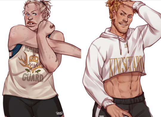
5. that gym scene in modern aus | back to jb arts!! and AH yes from brienne’s physique, jaime’s slutty crop top, the man bun, mesh leggings, and their dumb rainbow guard and kingsguard designs, this one was incredibly self indulgent and i love everything it implies and represents. fun fact i had to go through so many thirst traps in ig just to draw jaime’s body properly LOL i do my research ok
tagging: @ayofandomthings / @fawnilu / @darcydash 🥰🥰
#long post.#thank you so much for the tag <3 this was fun#and also very sorry for the length LOL i talk too much#i would've added my jb renaissance art series majig but i think ya'll know i already like that one#i just realized i've been drawing AUs these days. do ya'll prefer if i draw canon based jb art or my dumb aus???#or like scenes from the book sort of things#but anyway WHEW someone doesn't ship jb. clearly !!
45 notes
·
View notes
Text
Blood Letters
Writing letters which are not meant to be sent can be therapeutic, at least that is what people claim. Logan thinks it is to an extent, but he finds the subject matter of the letters to be of far more consequence.
Or, Logan dreams about murder.
Taglist: @hells-missing-a-goat @angels-and-dreams @ollyollyoxinfree @gattonero17 @chumo-cookie @dreaming-always @anxiety-ismy-name @mrbubbajones @janustheliar @hogwarts-my-love
Ao3 - Masterlist
Note: Lots of blood and death mention things of all sorts
~~~~
Blood Letters
Dear Janus,
I am writing this letter which is addressed to you in order to sort out my own thoughts. Patton recommended this method to me in order to “get out my feelings in a positive way”. He claims that writing a letter addressed to myself or no one at all with all my thoughts is nearly on par with saying them aloud. Roman agreed and then recommended burning the letters upon completion to get rid of any trace of my problems. However, Patton suggests I keep them. I am still not sure which I will do (I had also asked Remus who only suggested I set myself ablaze), so I will decide upon finishing. Oh, and before I go further, I do apologize for how disjointed this letter will be. I am told that the less structured and closer to a stream of consciousness I am, the better. This has yet to be proven.
Now, I have chosen to address this letter to your Janus rather than myself, given part of my issues seem to stem from you. I assure you, that I am not blaming you in any regard. I am entirely to blame for my own compulsions, and I accept that. But I hope that by addressing the concerns between us that lie solely in my mind I can expel them entirely. Quite frankly I do not expect much from this, intrusive thoughts are not such a simple concept after all- but I have not told my friends the ongoings of my mind. I do not wish to concern them, nor do I wish to seek professional help for multiple reasons. For one I do not have the time nor money, I spend much of time working to pay for my grandmother’s nursing home bills, also I-
It occurs to me that I have been prattling on about my reasons for writing the letter as opposed to writing how I feel about you, so I shall commence doing so.
Given this letter is not intended to be read I have no need to sugar coat my words.
I am in love with you Janus, and more than that- I want to see you die.
I am not partial to the method of your death. I have had dreams where you suffocate, drown, bleed out, and more- all of which were as spectacular as the last. In the first dream you and I had been walking down the street with our friends. The group hadn’t been talking about anything of true value to my knowledge, but I do recall the way it ended. You and I had fallen to the back of the group, walking in silence. And I did not see why it was that you lingered when we crossed the street- but I did turn to see you take flight once the car struck you. For a moment I was filled with nothing but fear. My heart was racing, and despite being a dream I was struggling to breathe. Upon waking I assumed my reaction was because I saw someone die. But after the second dream where I watched you bleed out and suffocate after your throat was slit, I understood that my heart racing wasn’t due to fear, it was something closer to intrigue. And from there my feelings have only grown more intense.
Whenever I see you Janus- or dream of you- I fall for you even more.
I am not sure what else I can say in this letter, so I suppose I shall end it here. I am still unsure what I will do with this short letter, but I suppose it is not that important.
Yours,
Logan
~~~~
#2
Dear Janus,
I hadn’t intended to write you a letter again.
After I wrote (and kept) the first, I found the dreams and urges decreased greatly. And I was happy to feel a “normal” love for you, but now weeks later I found they have returned in full force and I am not entirely sure why they have. Perhaps it was on account of me spending more time with you. I greatly enjoyed our trip to the mall. I am not one to believe in fate, but I think it is a wonderful coincidence that we both happened to run into each other. And I think it speaks yards that you suggested we shop together. As we did, I found myself staring at your face so often when you weren’t looking. I think I stared so much that if I held any artistic talent I think I could sketch every ridge of your face and its scars with accuracy, and still not hold a candle to your general beauty.
I wish I had artistic talent, if I did I’d render the versions of you I see only in my mind.
Your eyes wide and terrified. Maybe with burst blood vessels. I can’t help but wonder what you’d look like with your scars open. So many times I have wanted to ask you how you got them- I want you to explain to me every detail. Well enough that I can picture it myself and savor every moment. But I know if I ask I would push you away. And that’s the one thing I can’t do. I won’t jeopardize my chance at seeing you. Because at this point I’m not sure how well I’ll fair without you.
Yours,
Logan
~~~~
#3
Dear Janus,
The dreams are back.
This time you fell from a building. Your limbs bent at strange angles with a vacant yet shocked looked in your eyes. It was beautiful Janus. More so than your face alive.
I can’t explain the beauty I see that no one else ever can. But I wish I could.
Yours,
Logan.
~~~~
#4
Janus,
It’s the middle of the night. 3:41 am according to the clock on my nightstand.
You were dead again. That’s nothing new. What was new however, is that this time I was the one who killed you.
I’m not even sure how- or why.
I’m still tired yet running on adrenaline, I can’t make sense of my own thoughts. All I know is that I saw you lying in a pool of your own blood, and I was holding the knife.
I need to get some air.
Logan
~~~~
#5
Janus,
It’s only been a week. And I killed you again.
I used a baseball bat. I watched your body lurch with each strike.
I continued even after I knew you were dead, because each time I hit you it seemed the blood sprayed about you like a frame of red. With your beauty pictured in its center.
I wonder what it will be next time.
Logan
~~~~
#6
Janus,
I’ve never told you that I’ve been to prison, have I?
It was years ago, not long after I came out, my father had kicked me out and my grandmother took me in. She had been waiting for me outside of my job, and when I exited the building I saw two men look at me before they ran off. They stole her purse. She was injured and she told me not to go after them, so I didn’t at the time. But I tracked them down. I only did eighteen months for two counts of assault. I probably would have done more had I not caught them they were attacking some other old woman. It was only eighteen months, plus time in jail awaiting sentencing, but it’s not something I wish to repeat. I don't want to lose my freedom.
Just as I don’t want to lose you.
So why do I dream of your death- of your murder?
Why is it that killing you is both what I want and what I fear most?
Logan
~~~~
#7
Janus,
You gave me a hug today when the group all said goodbye.
And when walking back to my car, Virgil teased me for liking you. I wasn’t aware that anyone knew that I cared for you. He told me to ask you out, but I’m not sure I deserve that much. But when I told him so he didn’t understand. I made no effort to explain because I can’t expect him to.
I can’t expect anyone to understand the fact that when you hugged me, I had to ensure my hands went around your torso and not your neck.
Logan
~~~~
#8
Janus,
In my dreams your blood has texture.
It is thicker than water, but I can’t quite identify what it’s viscosity reminds me of. But there are also small bits to it. Bits is the wrong phrasing. I am not sure what the proper word is, perhaps chunks? No that seems wrong as well. Whatever the word, I believe it is a result of your tissue mixing with the blood. This is only conjecture though, the dreams never last long enough for me to figure it out.
One thing I do I know however, is how white your bones look in contrast with the blood. They appear like porcelain- no like beautiful white pearls. They’re luxurious, and priceless.
Logan
~~~~
#9
Janus,
I should leave.
I should go elsewhere. Somewhere far away where you are not within my reach.
But I shouldn’t leave my grandmother. I go visit her every other week. She looks forward to those visits.
Do I have to pick between the two I love?
How does a person do that? No. That’s not the right question. The right question is why am I leaning towards you?
Logan
~~~~
#10
Janus,
I don’t know how far I should go. Where is far enough that I don’t see you when I close my eyes? Because no matter what you’d always be a distance away. And if I travel somewhere there is always the risk that I will take the journey back here.
Where is far enough?
Right now I can only think of one place where I cannot hurt you, but while I know I could take your life, I am too much of a coward to take my own.
Logan
~~~~
#11
Janus,
You seemed annoyed when I cancelled our plans leaving you to see the movie with Remus alone. But I don’t know if I could sit for two hours beside you, without wanting the light in your eyes to dim. I couldn’t go. Not when I’ve already found a new job and a new place to stay.
I’m going to leave for your safety. So I can’t jeopardize it now.
I hope you enjoyed the film.
Logan.
~~~~
#12
Janus,
I leave today. I have not told anyone where I am going. And I’m sure my sudden disappearance will come as a shock to our friends, but that is the least of all evils.
It took months, and it took me till today- the day I am leaving- but I have finally decided what to do with all these letters. I can only hope it is the right choice.
I am sorry Janus.
I am sure those are words you do not wish to hear- or read. But they are true. I am sorry, who I am and whom I’ve become. And at this point it might sound strange, but even so I wish you happiness and life. I wish you life.
Perhaps more than I wish for you death.
Logan.
~~~~
“You have a package.”
“Who from?”
“I dunno.”
He gave a frown as he took the package. It was a small box, a bit smaller than a shoe box and in neat handwriting on top was his name and address but the name on the return address had been rendered unreadable. Maybe something had spilled and scratched it in transport. He stood from his seat, and moved to the kitchen setting the box on the table before retrieving a knife to open the box. When he had, he found envelopes inside- each one bearing his name and a number on the front.
“Did someone send you a box of letters?”
“I’m as confused as you are, Virgil.” He dumped them out, his eyes scanning until he found the envelope marked number one. The letter inside thankfully didn’t seem long, but it held the same neat scrawl. “Dear Janus, I am writing this letter which is addressed to you in order to sort out my own thoughts...” he trailed off his eyes scanning the lines in confusion- before he froze. He read it once. Twice. Three times, before Virgil had snatched it from his hands.
Janus could hear his heartbeat drumming in his ears, and he felt bile rise in his throat- but even so he reached for number two.
“It’s sick,” Virgil said finally, throwing the last one down the table.
Janus didn’t reply as he reached for the closest one- number seven- but Virgil put a hand on it stopping him.
“Don't. Reading them once was bad enough.”
Janus moved his hand away as his eyes drifted to the ceiling above him- but on the whiteness of it he could only see the words he had read. He closed his eyes, squeezing them tight. But now he could almost hear Logan’s voice.
“I used a baseball bat... Your blood has texture... A frame of red.”
“I know we joked that Logan left without a word because he got into trouble but...” Janus trailed off as he took a deep shuddering breath, and when he spoke again his voice was barely above a whisper. “He’s going to come back, isn’t he?”
Virgil didn’t reply, but Janus could hear as he moved about the room before he finally spoke. “...I’m calling the police.”
“And tell them what?” He demanded, looking back to Virgil. “Tell then that someone I thought was my friend actually dreams of killing me? To tell them that he’s now vanished into thin air? He could be anywhere Vee. Anywhere!”
Virgil didn’t reply but he turned so Janus couldn’t see his face. “I’m calling.” He didn’t bother to say anything more, he only took a step out of the room as he dialed, leaving Janus alone.
Alone with the letters.
Alone with his thoughts.
Alone with his fears.
And alone with the hope that Logan would never come back.
#jaz's oneshots#blood#gore#tw blood#tw gore#murder#death#character death#tw death#tw character death#love letters#pining#loceit#one sided attraction#unrequited romance#unrequited pining#unrequited crush#tw suicide#suicide mentions
13 notes
·
View notes
Text
Updates on Art!
Did one for my writing, and so here is the one for art! Just to let people know where I’m at/why I haven’t been posting things as fast!
Mock Cover Project.....75%
This is a thing I started months ago and its been gathering dust...I plan on getting it done so I can have one “me project” fanart I got done c: So far, four more characters need render and it will be done.
Commission art Little Dragons.... 25%
Also working on these to get them out as they are the ones sitting the longest on my commission list. currently only got 5 left to do, just need to sit down and focus!
Commission art: Big Commissions ....25%
Working on the large commissions as well, just got two on my list to handle but trying to get myself to get em done faster c: They are priority one and I try to work a little on them each night
DnD art: 100+ concept Arts....45%
I am running a DnD campaign on Friday and part of it is doing a ton of custom art for the homebrew! Working on a lot of NPCs to fill up a city and give a feel for it being large and filled with people, just requires a lot of design work 8I Also on a timetable with this one so have to devote more time to it.
Giftart Render.....50%
On the render phase for a gift for a dear friend c: once the mock cover clears out, can focus on this 100%!
Darksider Cover....4%
I have been looking up reference images and compiling them for the file...but still going to be a while until I tackle it.
Jojo Ask Art .... 25%
I actually got a TON of it sketched out! I just need to clear out some of the other things on this list so I can do these more for fun on the side of commission art c: I DO PLAN ON ANSWERING THEM WHEN THE TIME FREES UP! I was answering them quickly before as I was on Holiday and had time off to spend more on art and no big commissions in c:
Leader Art Render....50%
A huge set of three art pieces featuring leaders created for a group I’m in where we created a fan-city of sorts within the drowtales setting. Just sort of a thank you for the participation! I am planning on livestreaming the progress with the group on Sunday, if all goes as planned.
Periodic Table of Elementals.....20%
I want to get back to working on this project! I got the next row ready to go and color, just a matter of finding time. I feel once some of the larger things above clear out, I’ll be able to bump this one back up!
Webcomic Concept Art....4%
Mostly just rough doodles and writing, but it is a sci-fi story based on a recent dream I had that I’m making into a webcomic story to come! I wanted to always try my hand again at doing a webcomic....for now it is a pipe dream and I just doodle for now and try to find my groove and finalize a few concepts behind the scenes c:
Protoss Child art ....50%
Just a cute little thing for a friend I want to get done c: All it needs is the render
Fanart Pieces ....30%
Got a lot of started fanart pieces, just a lot of unfinished work 8I Hoping to start finishing some of these WIPs and posting more this year!
So....I am split a lot of ways for art and just need to clear a few things out so I can focus on other projects c: I’m pacing myself, so don’t worry on burnout! These are all things I look forward to doing! I just like to let people where I’m at in things so can give a reason for when I seem quiet for long periods of time. Art is being made, just working on larger pieces = w =
Quality over quantity!
8 notes
·
View notes
Text
COMP1785: Portfolio
Introduction
This report further analyses the additional work I have made on my final major project. It contains all my research (some of which are taken from the first research portfolio from December 2018), any changes that I have made, sketches, experimentation/prototypes, feedback, rendered model(s), how the final product will be displayed and the reflective writing/evaluation.
Although the project is still currently in production, the final version of it will be a wearable, 3D printed exoskeleton for your arm that is based on human anatomy and follows the skeletal system, but with a mix of some of my own ideas for variation.
Changes
In the previous research portfolio that I wrote, I wasn’t sure on which design or style to go for and had three options: Steampunk or make an arm with the shape of muscle fibres or bones. I finalised the style I want my product to look like and decided that I am combined human anatomy (mainly the skeletal system) with a Steampunk look.
It’s aesthetics would look mostly Steampunk and would be following the shape and anatomical structure of your skeleton, specifically the hands and arms. But for the Steampunk design, I didn’t want to follow that design as it exists right now as I wanted to make it my own style of Steampunk. To elaborate, I will not be following the current Steampunk look of filling the model with gears and screws and such, but instead go for something slightly more minimalist.
Another change that I have made is with the materials; I said that I’d be using a combination of Worbla thermoplastics and high density foam to make my arm in the previous post, but have changed my mind and will be going back to 3D modelling/printing the parts like I originally intended to do. I did the swap in material because 3D printing was more applicable to my course than making something out of foam as making something out of foam doesn’t really require any skills in 3D modelling/animation that I have learnt these past three years, whereas 3D printing this product directly uses any skills and techniques that I have learnt both online and during lectures in university.
Despite these changes in the design and make of the product, its purpose stays the same; it is meant to be a concept product design piece of a possible accessory/fashion item that people will wear in the future.
With these changes in mind, I have changed the name of my project from ‘The Implication of 3D Modelling in Fashion’ to ‘Accessorising Human Anatomy’.
Backup Plan
Due to time constraints and the deadline for this project fast, I may go for my backup plan which I thought of a few months ago when making prototypes and that plan is to create and print two hands instead of arms. I will still be aiming to make a single, whole arm in time for the deadline but realistically may not be possible, so printing a second hand for my left is to try compensate the lack of the rest of the arm as I originally intended.
Research
Human Anatomy


(Simblet and Davis, 2001, pg 110)
Steampunk Design

Finishing
Once all the parts have been printed, I still have a few things to do before the product is ready and they have four steps - preparation, paint application, polishing and finally, the assembly.
I have watched and read a couple of tutorials and videos that teach beginners how to apply paint to plastic model kits such as Airfix, Gundam and Zoids in the past because I used their advice on my own plastic model kits (HMM Zoids) to try improve the looks of the models. I only have two model kits so I only have a basic understanding of the finishing process, so I watched a few more tutorials, mostly ones that apply more to me now (so painting 3D printed models) and came across these two tutorials that explain how to sand and paint models well:
youtube
(juresnip, 2017)
youtube
(CF Props, 2017)
Preparation:
- Sanding (P180, P240, P400, P800)
- Humbrol Grey Primer Matt Acrylic Spray Paint
The first thing that you need to do after 3D printing a model is to cut any nibs from the support structure by using a side cutter (like the ones used in model kits) to remove them as much as possible.
Once most of them have been removed, the pieces then need to be sanded to smooth out the surface and remove any nibs left from the previous step. A low/rough grit (P180) is required in the first stage of sanding as you want to remove all the imperfections quickly (but not too rough that it would cause damage to the parts you want to keep) and then moving up to smoother sandpaper (higher grit) until you are happy with the smoothness of the surface.
youtube
(Humbrol, 2013)
After sanding, the parts are ready for the first stage of painting, the application of the primer - I watched the tutorial above to know the proper method in how to do this because I haven’t used spray paint before when making my model kits in the past (I only have experience in hand painting models). Even though you are already starting to paint in this step, it is still part of the preparation process because applying primer is a common step that model kit painters do to ensure that the top coat of paint (the ones that actually have interesting colours) stick to the surface of the parts properly and ensures that they come out nicely as some types of paint aren’t compatible to certain surfaces when directly applied unless primer has been applied to that surface beforehand. Primer isn’t always a required step to do before applying the final paint and in some cases e.g. the paint is universal and works with any type of surface (wood/metal/plastic/etc), you can skip this part and go straight to applying the top coat paint, but I am still going to do this because it serves another purpose aside from allowing the next set of paint to stick - for 3D printed parts, the primer also covers any topology/lines that can be seen in your models, which makes the surface appear nice and smooth. Once the primer has been applied in even coats (2-3 layers of it), sanding can still be done if there are still some imperfections present using a high/smooth grit (P800) until you are happy with the result and will be ready for the next step.
Preparing the pieces for painting is the longest step when finishing and should take a few hours (~4 hours) to complete - the sanding will be taking a big portion of the time needed in this process.
Top Coat Paint:
- Humbrol Gun Metal Metallic Acrylic Spray Paint
- Humbrol Gold Metallic Acrylic Spray Paint
- Humbrol Silver Metallic Acrylic Spray Paint
After the primer has fully dried, the pieces are ready to be painted their respective colours. I will be going for the same brand, Humbrol, for the top coat paints as I did with the primer. I chose Humbrol paints because they are a known brand in the model kit community and is used by many to finish off their plastic model kits, which ensures that their paint will be compatible with the material I will be using for my prints, which is ABS plastic. I will be using acrylic paints because it is the same type of paint that juresnip (3D paint tutorial above) has used with his models. Spray paint was chosen because it is easier and quicker to use than hand painting, provides more area coverage (spray) and also provides a more even coat to all your pieces that isn’t always easy to achieve when painting with a brush as when hand painting, applying too many coats of paint can happen, which would increase the overall thickness of my prints if not careful and therefore possibly make the rings too tight and prevent me from wearing them.
I have chosen to use this colour scheme because I wanted to follow the colours of the Steampunk design and will be assigning different colours to different pieces, which will be shown in the “Current Progress” section further down this report. Most of the parts will be sprayed with the Gun Metal colour, the Gold spray will be applied to the outer/bigger part of the hydraulic cylinders and finally, the Silver spray will be sprayed unto the inner/smaller section of the hydraulic cylinders to provide contrast between them.
Polishing
Once everything has been painted, the next step is to polish the parts using a piece of cloth to buff out the surface and give the metallic paint their shine and make the parts look more aesthetically pleasing.
This will be the quickest step in the finishing process and should only take a few minutes.
Assembly
After everything has been painted and polished, I will be assembling everything piece by piece and adding all the screws into their slots and sliding/attaching any pieces to their joints and ensure proper mobility is present in the pieces i.e. the movable parts can be fully rotated as intended.
Depending on the amount of parts, I estimate that this will take around an hour to complete.
Experimentation
Wooden Prototype
Reference
“After gathering data on measurements for the arms and settling on the exact measurements and scale that I would be using, I am planning to create an initial prototype made of mostly wood or cardboard since its a cheaper material and even though cardboard would be a lot less durable that wood, it would be okay to be used as it would only be a prototype.

(Manick Yoj, 2012)
I came across this DIY wooden, mechanical hand on Instructables.com and it really interested me because it had working finger joints that is controlled by springs that are attached to your own hand, which is similar to what I would like to do and would be a great project to create for a prototype because I want to learn how to best create the joints and what options I have for that, so again, more research would be required on what material would best be used for joints. In this case, Yoj used door hinges which help gives it the “mechanical” look he was going for - that combined with the springs and gear in the palm of the wooden hand achieved the steampunk look he wanted, which is another reason why his project captured my interest, because I too am (possibly) going to use steampunk as one of the design choices for my final piece.
I am planning to follow his instructions on how he created this and create my own arm as a prototype and bring it into the studio sessions to present and get feedback both from the lecturers and fellow students to see how it looks and feels and whether or not the joints work properly. Since it is a prototype I want to mainly focus on making the joints work and focus less on the aesthetics of it, but if I have extra time, I may add some kind of plastic covering on top of the hand to help improve its visual appeal. Another reason why creating a prototype is essential because it would improve my knowledge in the actual creation process as well as give me insight into the measurements, mainly the length and weight, and is crucial information to know so that I’d be able to get that balance correctly.”
In my previous research portfolio post, I said that I would create a wooden prototype, so I did. I went to a local DIY shop to buy the supplies required to make the arm (the author, Manick Yoj, listed all of them on the website, so I bought all the parts needed, but made a few small changes to the measurements of some of them to fit my hand better).
The materials that this project required were:
Wood:
- 3/4" thick x 5" x 5" board for palm
- 3/8" thick x 3" x 2' board for wrist
- 3/4" thick dowel - 2' long gives plenty of spare, but most are sold in longer lengths
Hardware:
- 5 keyrings
- 5 wires of 1 foot each
- Small eyehooks (40 minimum)
- Springs with a collective length of 1' unstretched - keep in mind that you are pulling against these so get an appropriately low strength
- 14 small (<3/4" wide) hinges and their screws (often included) (hereafter referred to as "small screws")
- Flat top screws (25 minimum) of short (3/4" max) length (hereafter referred to as "large screws")
- 6 Round top screws
- 6 Washers to fit onto round top screws
Misc:
- 1 unloved glove
- Canvas or leather for wrist strap
- Buckle or fastener of your choice for wrist strap
- Thread and needle
- Decorative pieces as you like
- Wood stain of your choice or, if you want to preserve the color of the wood, linseed oil gives beautiful results
Creation Process
While I was making the wooden prototype, I took a few pictures while building the hand/arm for documentation and will be making comments on each stage of it to describe my thought process.
I assembled and finished the arm in time for our Friday ‘crit’ session back in February and it took me an estimated amount of 20-30 hours to get the parts, plan out the build and to actually put the pieces together to finish this prototype.

I started this prototype with the palm of the hand; the shape I used for reference was my own palm and I drew an outline on the rectangular piece of wood using a pencil to get this shape in the end.
The wood I used for this and for the arm support was MDF wood; MDF stands for medium density fibreboard and it is essentially man-made wood that is made of a mix of hardwood/softwood fibres and wax/resin. I chose MDF because MDF is cheaper and also easier to cut/shape than its alternatives. I also have experience using MDF for a project that needed wood since it was the main type of wood that we worked with back in Year 10/11 for Design and Technology classes in school.
But it does have drawbacks, which I experienced during the making of it and made me slightly regret choosing this wood. But since its purpose was to be used for a prototype, these drawbacks were acceptable (if I were to use this for a final version of a product, I would not be using MDF and instead use a stronger type of wood).
One of the forementioned drawbacks of using MDF wood was the amount of sawdust it produced while cutting. MDF produces a large amount of sawdust when cutting it and since I knew about this beforehand from using it in school, I took it and the saw outside to the backyard before cutting them to prevent making a mess inside the house. The sawdust that MDF produces after being cut can also be harmful for your lungs when inhaled (they are really small and fine, so it can be inhaled very easily when not careful), so even though the risk of inhaling the sawdust was small outside due to it being open-air and the day not being windy, I still wore a dust mask for precaution.
Another drawback with using MDF is that it can damage easily when screwing, especially the areas close to the corner/edges, which I did not realise till later on in the project and it was too late to go back and start over and use a new type of wood, so I continued with the project since the damage was minor and didn’t prevent the arm mechanics from operating.
Next up are the wooden dowels, which will be used to make the fingers. I needed three dowels of equal length for each phalange in each finger, so I had fourteen separate dowels in total (only two for the thumb since thumbs only have two phalanges).
I bought a metre long cylinder stick to be cut up into multiple pieces for the fingers (they were sold by the metre) - this wasn’t easy since I only had a large hand saw available (far too big for the purpose of cutting the dowels) and it strains your hand after only cutting up two or three pieces, so I had to take short breaks in between to prevent this.
There were short dowels that fit the length I needed for my prototype that was being sold in the DIY shop, but they were far too small in diameter to be of use for this project - even the ones with the largest diameter in shorts lengths were still too small for my liking.
Unlike the MDF wood, these dowels didn’t produce much waste after being cut up and only produced small amounts of splinters that could be cleaned up easily with a quick sweep. They were fairly mess-free, so I just cut them up in my room since I didn’t need to go to my backyard to prevent mess, along with my other supplies.
After all the pieces were cut, I had to smooth out the splinters and sharp edges using very coarse sandpaper (60 grit) so that it won’t stab anyone’s fingers during use.

Once I had enough dowels for a finger, I would screw the hinges to them to serve as the finger joint along with the screws on top (which will be added in the next step). I encountered a problem straight away, which is easily noticeable in the photo above - splinters; the hinges’ width was larger than the diameter of the dowels, so the hinge screws were screwed closer to the edge of the dowel and caused splinters to form as you were screwing. I had no real way to avoid this as these were the smallest hinges they offered in the DIY shop. An obvious way that I could’ve avoided this was to buy dowels with a larger diameter, but the next size up seemed a bit too big for fingers and didn’t look like it was in proportion with the rest of the parts, so I stuck with this decision because at the time, I thought that they would fit together fine as they were roughly the same size but didn’t foresee this result.

There wasn’t much I could do with the problem at hand, so I had to be resourceful and come up with a way to improve this somehow and eventually came up with a way to fix the splinter problem after searching around the kitchen cupboards/toolbox for parts. I found some blue electrical tape and thought that it would be a great way to protect the wearer from getting any cuts by coming into contact with them. The tape was surprisingly nice and soft to the touch and I also liked the way it looked and the shade of blue that it had, so aesthetically, it worked with my project. I carefully wrapped the tape around the dowels, ensuring that there are no exposed splinters and that I get maximum coverage.
After applying the tape to the dowels, I screwed in the eye hooks on both the top and bottom side of the fingers; the top side were slots for the springs to provide tension when the wires are pulled while the bottom were slots for the wires which allow you to pull the fingers downwards and bend them.
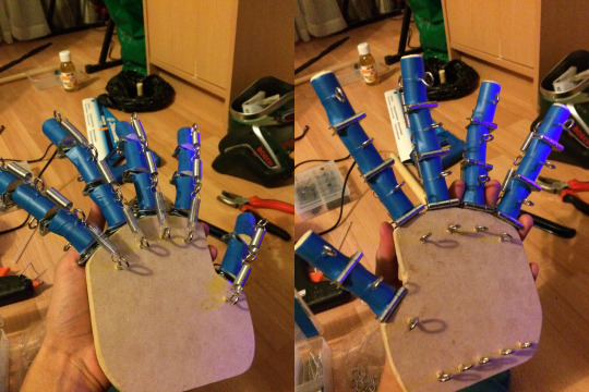
After each finger had their springs added, I attached each finger to their designated positions and screwed their hinges and added the spring for the knuckle joints and added the rest of the eye hooks on the palm for the wires and knuckles for the springs. When adding the springs, I tested the tension they provided and swapped out springs with other lengths from the box of springs that I bought to see which spring fits better because I didn’t want a finger joint that was too loose (would be too easy to pull and provide no tension) or a spring that was too short and tight (would be harder to pull and provide extra tension, risking the wire snapping), so this part was a trial and error stage.

Once the hand was finished, I prepared the plank of MDF wood that serves as the forearm by neatly wrapping electrical tape around it to match the aesthetic of the fingers and also to provide a smoother feel on the main part where skin contact would occur. I then proceeded to attach the two big parts together by screwing them together using two 25 mm screws on the left and right side (vertical) of the back side of the arm and a single 25 mm screw (horizontal) on the arm side on the silver piece of metal you see in the middle of the back of the hand, as well as two more 6 mm screws on the hand side to help secure both pieces in place.

A glove was screwed in place (with washers to add more area coverage for the screws) and the fingertips were cut off and had a key ring in glued/stapled in place around a finger hole (all key rings had the same diameter) and each key ring had a wire wrapped around them and connected to its corresponding eye hook slot on the fingertip. The coiled wires on the key rings had a few layers of electrical tape wrapped around them as they are very sharp and can cause cuts when putting on the glove.
The final piece added to the arm was the wrist strap at the base of the largest piece. I looked around the house for an old belt since that made the most sense to me at the time for a fastener and was fairly easy to find. A normal belt’s length would be far too long for my prototype, so I had to cut most of it (around 3/4) to leave me with a small section of the belt and most importantly, the belt buckle/frame. There weren’t enough belt holes left after I cut the belt, so I had to add my own using a leather punch tool and carefully aligning it with the rest of the holes and ensuring that the distance between them was the same as the original, pre-punched holes.
Testing
Once the arm was built and finished, I tested it to see if it was working as it was intended and it mostly worked fine, but had to make a few, small adjustments to improve it.

Yoj wrote in his post that he encouraged everyone to make modifications/substitutions on the measurements/materials to fit your needs more, so I did just that. The problem is that there were changes I made that had negative effects - the main problem was the palm, I chose to use a thinner board of MDF instead of the 3/4″ thick (0.75 inches) wood that the author used, I went for a 0.5 inch thick wood and when screwing the hinge screws to connect the palm to the fingers, there were small cracks that formed and made it structurally weak and therefore making the hinge screws unsecured. The hinge screws were slightly wobbly due to this, but they were still holding on and at the end of the build, I tested the arm to check the wires, springs, etc. and it worked mostly fine, but I did notice some of them becoming looser the more you used the arm, so I fixed this by using a glue gun to secure the hinges into place. It fixed the problem but the problem with it was that the glue made it look ugly, but I thought that it worked for the purpose of it being a prototype and was fine with it since it wasn’t too noticeable due to it blending well with the colour of the MDF and was only seen when examined up close and I’d rather have unnoticeable glue that secured it than loose hinges that may come off during use.
The wire that is used to pull the fingers downwards were constantly revised during the testing phase as different wire lengths offered different levels of tensions when being pulled and wire replacement/length adjustments were needed in order to get that sweet spot when being pulled to make a clenched fist. Adjustments were made using pliers to shorten wires that were too long and to twist them into place around the eye hooks on the fingertip. Yoj also wrote on his post that he had to test different types of wire to get the correct one since different wires have different ‘lifespans’ and broke at different points (some more often than others), but the wire I bought (picture wire) looks and feels durable and hasn’t shown signs of breaking despite stress-testing it by pulling the key ring in my arm. The only way I was able to break the wire was to twist it multiple times (around 5 twists) with pliers, but didn’t break from simply using the arm and stretching them so I am confident that they won’t break any time soon.
End Result
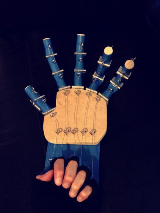
youtube
Changes/Updates
After our crit session, the lecturers gave feedback on my wooden prototype and one of the main things that stood out was Jim’s suggestion for my exhibition piece; Jim suggested that I should display this prototype along with the final version of my arm.
I really liked this idea, so a few days after the crit session, I worked on this arm some more since I will now be including this along with the final version of my arm in the exhibition. I made some improvements (both for aesthetic and functional purposes) to make this piece more durable and slightly more visually appealing.

The first update to my arm was just a minor one; during the crit session, Manos commented on the arm and said that it would look nice if there was something more on the rectangle connected to the palm as the back looked empty and adding something to it would make it more interesting, which I agreed with so I added the metal piece with two screws/washers on top of the blue, rectangular piece in the middle of the screen. I found that piece next to our toolbox at home and thought that it looked nice and would fit well with the rest of the arm since I was going for a Steampunk-ish look with all the exposed springs/wires/screws/etc.
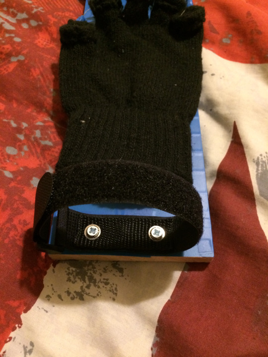
The next upgrade I made was a much more important change; I removed the makeshift fastener on the arm’s base, which was an old, shortened belt. The old belt was quite fragile and weak and wasn’t very secure/tight when being worn and fastened to your wrist. It even had tears halfway across it after the crit session, so the change was necessary. I replaced the old belt with a cheap velcro strap bought online and it was surprisingly stable, durable and well made considering its price. I did some quick stress testing when the straps arrived such as stretching, flailing, scratching and more to see if any damage or wear would be apparent, but didn’t notice any so I thought that it would be the perfect replacement. I noticed its durability even more once I was screwing it into place on the base of the arm since even the screws took a while to pierce through the straps.
The change was a big upgrade and this was a really important one because it made the base of the arm piece more secure to your wrist, which then made the whole arm feel a lot more durable. With the old belt as a fastener, it didn’t close tight enough on my wrist since there was a limited number of holes on it.
I also added a strap in the middle of the glove by cutting slots on the side of the gloves to fit the straps through them and this also made the glove feel more durable now as the old one was only held/supported by screws and felt like they were going to tear through the gloves while wearing it. This one on the other hand, doesn’t go around the wearer’s hand as it was too short to stretch that far and go around your palm, although this would’ve been beneficial as that would’ve further improved the durability of the arm.

Since the old belt fastener didn’t feel secure around my wrist, I wasn’t too confident wearing the arm without supporting the back of the arm board with my other hand because I was afraid that the belt/glove would rip off and cause it to fall to the ground. Once I replaced the belt with the new straps, I felt much more confident wearing the arm and wasn’t worried about it falling at any point and I could easily wave it around without it being knocked loose due to the wrist straps allowing tight fastening.
Final Version
youtube
3D Printed Prototypes
Since I’ve never 3D printed anything before, I needed to do practice prints for this project before printing the final piece - mainly to check to see if the scale and the fit of the rings for each phalange are correct. These test prints proved to be very beneficial because they allowed me to determine if I used the correct measurements and make adjustments after if those measurements were incorrect. They made me more critical and accurate when it comes to the size and scale of every single piece of my prints.
Looking at a printed part is also different than looking at a 3D model because it provides you with a different, fresh, new perspective on your project as printed parts are tangible. Aside from the scale, they also proved to be useful while modelling as I sometimes wear the rings on my fingers while I model if I’m struggling with a design choice or how a certain part worked because actually seeing the product in front of me helped me imagine what the final piece would look like and they gave me a clearer vision on what that would be.
Printing parts for tests doesn’t really come with cons, except for minor ones, one of which is cost; each print costs money and if you are printing multiple parts repeatedly, the price to print does add up, so it may not always be possible if money is tight. Another possible drawback is the waiting time; 3D prints take a few hours to print (depending on the size and thickness of your models), so it won’t be readily available to you quickly. Before you can even print, you have to check with the technicians for the printing schedules because there are queues when printing as there are multiple other students who require prints for their projects too and the wait can take a few days in some cases. Printing is slow and cannot be rushed, so all these have to be taken into consideration when 3D printing.
First Version

My first 3D print was just a basic finger joint test to see if the scales were correct and to see firsthand what my models would look like when printed and how accurate the printers are when it comes to detail (although the one above was a bad example for this as this didn’t have any detail).
To measure my fingers, I used a flexible tape measure and wrapped it around my finger to check its size and inputted all those values into 3ds Max to be ready for printing, which was quick and cheap since the thickness is very low and it is only a small part.
The ring around the proximal phalange (section of your finger closest to your knuckles) was too tight and got stuck on my finger when I tried to remove it and took me 5 minutes of twisting to get it out, so an adjustment in scale was needed for this one but the other ring was almost a perfect fit, so the size stayed pretty much the same in the next iteration.
Second Version

I learned a few things from that first print and applied it to my second prints and I added a bit more detail as this was where I was starting to explore different designs whereas the previous one focused on scale. I kept the springs from my wooden prototype and incorporated that into both my practice prints as the exposed mechanisms (wires, screws, springs, etc) caught the attention of the audience because they can see them working and moving as I move/rotate my joints and also because it is one of the common elements used in Steampunk design.
I learned from my previous mistake of making the measurements too exact and gave my fingers a bit more allowance when it comes to the fit so that I can easily put them on and take them off after. I only took into account the ‘swelling’ that takes place after wearing the rings for a while (5+ minutes) as seen in the tight part of my proximal phalange in the second image of the first prototype as it probably contributed to it being stuck when trying to take it off as I was easily able to put it on. To get a much more accurate measurements, I also bought a digital micrometer to help measure my fingers in millimetres (same unit that the 3D printer uses) before printing this prototype.
I printed rings for all five fingers this time because I will be showcasing them in our next crit session.
Feedback
The main feedback I was given by lecturers was that they expected more made by that time and also asked me questions about the intended purpose of my product. The purpose of this product and its updated version is for fashion; these are part of a concept product design that looks into a possible accessory worn in the future over your clothes out in the streets as you normally do with other accessories like bracelets, watches (both an accessory and for function), gloves, etc.
Since it was supposed to be used for fashion, I would need to make it more visually appealing and this will be done mainly by applying metallic paint unto all the 3D printed parts (varying colours).
Current Progress

I had time constraints due to the amount of workload I had in Games Incubator (which I will be going more into detail below in the ‘Reflective Writing’), so I wasn’t able to model much and was only able to make the parts that you see above and is still a work in progress.
I included an image of the skeleton of a hand on the right because the structure of my model is directly taken from human anatomy while also following the mechanisms and aesthetics of Steampunk design; the metacarpals (bones that connect your wrist to your knuckles) were substituted with hydraulic cylinders due to its shape and movement ease/adjustment when rotating your wrist. This of course, isn’t a fully functioning hydraulic cylinder as the flow ports are absent - this was just a design choice and was chosen because hydraulic cylinders appear on some Steampunk items and also because of the functionality they can provide, despite being “fake” cylinders. Once printed, the pistons of the cylinder can move and adjust by sliding back and forth, depending on the position of their end caps - one side (thinner side) would be the knuckle and the other (thicker side) are spherical shaped and will be attached to a band around your wrists.
I will be using screws (either M2 or M3) to connect the silver piston end caps to each knuckle, which allows them to rotate vertically while the spherically shaped end of the golden cylinder bore would be attached to a slot in the wrist that is similar to a ball-and-socket joint, which allows free movement of the wrist in almost all directions (more freedom to move/rotate vertically due to the nature of our joints as you can rotate your wrists more downwards and upwards than you can sideways, which is very limited).
Display
My exhibition will have two tables and a wall mounted, vertical TV/monitor (the image above on the left was from the previous report, so the position of the monitor wasn’t established yet), which I have mentioned in my previous report:
“I wanted to create both a digital and physical product because a digital product on its own might not be as interesting and might lose attention quickly after being looked at for 5 seconds. By creating a physical product on top of that, my product then becomes an interactive one which means that the audience’s attention would be captured for a longer period of time. My original idea was to only showcase a physical product but I decided to add a 3D turntable to go along with that to show the different angles and details of my model, which everyone can look at while wearing the arm brace or even while waiting for their turn to put on the arm brace. Another benefit of having something digital on display is that if by any chance my physical product is not quite up to par on what I envisioned it to be, I would at least have something that shows what it is supposed to be.
I got the idea of creating and presenting an interactive project for the third year exhibition while reading “Technology and Touch: The Biopolitics of Emerging Technologies” by Anne Cranny-Francis, mainly “The Art of Touch” chapter on pages 5-7 because it was an interesting read overall and it talked about an exhibition that the author was in as well as the reactions of the audience while going through the exhibition and there were two interesting quotes that stood out, which are listed below.
As Anne Cranny-Francis observes:
Artworks included paintings that simulated the silken feel of textiles so seductively that viewers could sense the textures on their skin, as well as paintings that used the tactility of paint and the surface texture of the painting to create an embodied experience and understanding of landscape and their place in it. There were sculptural works of stone and also of beadwork that could be touched and which not only engaged viewers through this handling, but also provoked them to think about the way they use their senses to understand and position themselves in the world. And it was interesting, too , to note the reluctance of visitors to touch the works, given our acculturated taboos against handling artworks. (Cranny-Francis, 2013, pp. 5-6)
Cranny-Francis’ text is significant because this provided insight on how people’s attention was captured more once they could interact with the artwork they are looking at because by both looking and touching art, more senses are being used and is likely to make them more interested in the piece because they can appreciate it in more than one way compared to if they were only allowed to look at pieces. I observed this when we went to Manchester last month to attend the Manchester Animation Festival and while going around the city, we decided to visit the Manchester Art Gallery and after an hour or so of going through the building and looking at the paintings, I sat down on one of the benches in the big room filled with paintings which also had a TV that was playing videos on loop and while sitting on the bench, I observed the people going around the room; I noticed that people roughly spent more time sat down in front of the TV watching and listening to the video with attached headphones than looking at the paintings so I started to ask myself if I could apply this to my own piece, but instead of sound and the sense of hearing, use the sense of touch. I thought that what if my piece used two senses instead of just one, would it help capture the attention of the audience more just like it did in that room in the art gallery.
“The exhibition included some examples of wearable technology that engage the viewer in an imaginative reconstruction of what it would be like to wear these garments.”
(Cranny-Francis, 2013, p. 6)
The main quote in this chapter that interested me was the quote above because it relates to my final idea immensely; I too want to create wearable technology that engages the viewer and want to make them think and feel what it is like to wear this arm brace and if it would be a possible piece that people would possibly wear in the future.”
So an update to this is that on the first table, my wooden prototype would be placed on it and it will ideally be an interactive piece where the audience can pick it up (only if I’m present to help them demo the product as if unattended, could cause damage to it if used incorrectly) and wear it and see first hand how the mechanisms work. If I am not present to demo my project, then they should be displayed inside a glass enclosure to prevent anyone from just taking it without permission - similar to that of a museum exhibit piece. The table next to it would be displaying my 3D printed arm and if I go for the backup plan, then it will instead be displaying my 3D printed hands, which would be perched on those wooden hands shown in the image above; all the rings would be placed in the corresponding slots and the hand will be moved after to give it a more interesting pose to hopefully capture the attention of the audience.
Finally, there will be a wall-mounted, vertical TV or monitor behind the tables which will be displaying a turntable of my 3D modelled hands/arm on a loop and if I have the time, will be animated to show basic movements such as clenching fists/thumbs up/wave hello/etc.
Reflective Writing
The reflective writing is based on the structure of ‘Gibb’s Reflective Cycle’ by Graham Gibbs and the University of Birmingham. (https://intranet.birmingham.ac.uk/as/libraryservices/library/skills/asc/documents/public/Short-Guide-Reflective-Writing.pdf)
Although I have already somewhat did an evaluation on some parts of the previous headers (mainly the wooden prototype), I will be discussing the one that I haven’t mentioned yet below.
Description
My output in this project has been limited due to a few factors and was not able to make something to my fullest potential and make something ‘bigger’.
Feelings
I had trouble working on my FMP during the last stretch (April/May) of the term due to being overloaded with assignments to do for other course, mainly Games Incubator; I had a really big workload to do for Games and had to make a large amount of assets for that course to meet the deadline, which was May 7th and it took all my time and it didn’t allow me to work on anything else as I was working on it almost non-stop. This caused a burnout after the Games submission date and stopped me from modelling for a few days (~4 days) as I was very exhausted from staying up late and even doing a few all-nighters to finish assets, so it drained me both physically and mentally. I had to take a few days off too to allow myself to recover because I was starting to neglect my health to finish that project on time (mainly sleep deprivation, also started to have frequent headaches/back aches from being in front of the computer for too long).
Because of this, I felt like I wasn’t able to do work to my best potential in this project as I will likely end up needing to go for my backup plan and that is to model only two hands instead of a whole arm, which despite being undesirable and unhappy that I have to cut my project, it is a probable route that I have to take in order to produce something that I would at least be satisfied with.
Evaluation
“Monthly Progression Plan
1. January-February: Follow the Instructables process on creating a wooden arm to create my initial prototype, but use cardboard instead of wood. The goal is to get the scale correctly and get working joints to be able to make changes for future prototypes based on the measurements or perhaps find better alternatives to joints/materials/paint/etc.
2. March: Find a local cosplayer and talk to them about the materials that can be used (mainly Worbla) and ask their opinion/guidance on the different design choices in the project.
3. March-April: Apply any changes/feedback received from the initial prototype and start creating a new prototype, this time practising using the materials that will be used in the final product (mainly high density foam).
Continue bringing in prototypes to studios/lectures and ask for feedback on new prototypes. Add the Worbla thermoplastics to the foam arm brace shortly after and repeat process of bringing products and asking for feedback from peers.
4. April-June: Start creating the final product and ensure that measurements are precise and that all the cuts on the materials and placement of joints are done properly. Also ensure that everything is put together properly and perform a durability test on the product by perhaps wearing it and walking around/running/lifting objects and see if it stays together in one piece. If successful, start painting the piece and perform light tests on it once more after paint has dried. If unsuccessful, carefully check the way the pieces were put together to see if there was any oversight in the size of each piece/cuts/placement and try to correct the problem and test again after.
5. July June: Apply any finishing touches using the paint and apply final, minor details using a permanent pen designed to be used on plastics to make it pop out and look more visually appealing. Once everything is completed, bring it to university and display it in time for the final year show.”
I wrote this monthly progression plan in the previous report and have successfully completed most of my set tasks.
What went well:
1. The good points have been included in the ‘Wooden Prototype’ section.
2. I was able to contact a cosplayer from another country on Instagram who makes 3D printing as a technique to make her costumes and asked her what her process was and it provided me some insight on one of the methods on creating wearable prints.
3-4. By doing practice prints, I was able to determine the accuracy in size and scale of my initial models and apply any fixes for measurements that are too small or too big.
They also helped me visualise and imagine what the future/better versions would look like as well as how the mechanisms would work.
I performed stress tests on all my prototypes and they have all held up (mostly) in terms of durability (especially the 3D printed ones)
5. N/A
What went badly:
1. The bad points have been included in the ‘Wooden Prototype’ section.
2. She has quite a large following on Instagram, so presumably, she gets a lot of messages from followers, so her reply took as few days and despite being helpful, I didn’t follow up after her giving me the initial advice as she seemed busy and didn’t want to bother her too much about it.
I should’ve asked more advice from both beginners and experts on this technique as it would give me more perspective on how its done and would increase my knowledge on the matter.
3-4. The ring from the first prototype was too tight and was stuck in my finger for ~5 minutes until I managed to get it out.
Progress was slow (which I went into depth with in the ‘Feelings’ section above) , so I don’t have much to show and I haven’t started painting yet as I haven’t printed the final versions yet.
5. N/A
Analysis
I underestimated the amount of work I had to do for it so I am not assigning blame on that project because despite having a huge amount of workload to do, I was happy to work on it and learned a lot of new things about 3ds Max and the game development pipeline which has expanded my knowledge and will be useful for future projects. I didn’t expect it to take that long for me to model them - I even wrote a much earlier predicted finishing point where I thought I would have everything modelled in my first draft of the ILP for that course.
Conclusion
My workflow during the beginning of the project was good and was outputting work quite well (started by focusing purely on research and doing large amounts of it and moved on to experimenting in the year after), but as I got busier with other projects, the amount of work I had to do was stacking up fast and I was struggling to balance all of them, so it halted my production in this project.
In order to finish my FMP, I needed to sacrifice some of my ideas for the final product by following my backup plan of creating two hands instead of one arm and create everything quickly (but not to the point that the quality ends up being low) over the next week or so.
Action Plan
If this scenario where I had close deadlines for projects in e.g. a VFX studio within each other was to happen again, I need to expect the worst and prepare myself for a large workload and not underestimate it like I did with the Games project. I would need to set a schedule and set a clear plan to help avoid this in the future.
References
Cranny-Francis, A. (2013). Technology and Touch: The Biopolitics of Emerging Technologies. New York, NY: Palgrave Macmillan, pp.5-6.
CF Props (2017). Smoothing 3D Printed Parts Fast. [video] Available at: https://www.youtube.com/watch?v=tKWlHhwI7BA [Accessed 13 May 2019].
Drawing Art Academy (2015). Anatomy Reference. [image] Available at: https://www.youtube.com/watch?v=SpywTqdjD94 [Accessed 10 May 2019].
Hensley, M. (n.d.). Anatomy Reference. [image] Available at: http://artistanatomy.com/michael_hensley_artistic_anatomy_human_hands_and_feet.html [Accessed 10 May 2019].
Hogarth, B. (2013). Anatomy Reference. [image] Available at: https://www.8bitmickey.com/post/39639264984/soullesshusk-the-hands-from-dynamic-figure [Accessed 10 May 2019].
Humbrol (2013). Humbrol - How To Use - Spray Primer. [video] Available at: https://www.youtube.com/watch?v=OlQVysICaxE [Accessed 13 May 2019].
juresnip (2017). Make your 3D printed part (surface) look awesome! TUTORIAL. [video] Available at: https://www.youtube.com/watch?v=0vgynnYzo08 [Accessed 13 May 2019].
Maung, G. (n.d.). Anatomy Reference. [image] Available at: https://i.pinimg.com/originals/f8/9e/10/f89e1099bea4d0317d7b5e52ff40ac58.jpg [Accessed 10 May 2019].
Prokopenko, S. (2017). Anatomy Reference. [image] Available at: https://www.proko.com/how-to-draw-hands-muscle-anatomy-of-the-hand/ [Accessed 10 May 2019].
Peck, S. (1951). Atlas of Human Anatomy for the Artist. Oxford: Oxford University Press
Simblet, S. and Davis, J. (2001). Anatomy for the Artist. London: Dorling Kindersley
Yoj, M. (2012). Mechanical Hand. [online] Instructables.com. Available at: https://www.instructables.com/id/Mechanical-Hand-2/ [Accessed 10 May 2019].
0 notes
Text
Taking This Fine Jewelry–Making Class Taught Me More Than How to Paint a Diamond Necklace

I’ve never had a steady hand. Whenever I hold a pen, a fork, or a delicate glass cup, I tend to shake a bit. It’s been this way ever since I can remember putting my first crayon to my first coloring book and pushing nervously on the paper. I have always been an anxious person. So, when I found out that the class I would be attending at L’École School of Jewelry Arts would involve creating our own detailed rendering, I was, in a word, shook. I thought I would be playing with emeralds or learning how to lacquer, maybe setting stones, too. Making a painting isn’t exactly the jewelry-crafting lesson I’d signed up for when I heard that the school, which is supported by Van Cleef & Arpels, would have a residency and exhibition on New York’s Upper East Side from October 25 through November 9. In hindsight, though, I learned much more than I anticipated, not only about how fine jewelry is first conceived, but also about the value in putting down my phone, softening my grip, and making something from scratch.
After walking into the school at 9:15 a.m. on Monday (slightly tardy due to early-morning work emails and being rushed, as always), I was ushered upstairs and handed a clean white jeweler’s coat to wear over my clothes. Entering the quiet, intimate classroom, I took my seat at the work table along with five others. They were all women, most of whom worked in the jewelry business with the exception of one aspiring designer. Our teachers, a visual artist and a designer for Van Cleef & Arpels, would be lecturing us about gouache, which is a type of watercolor paint used to create highly intricate renderings of high jewelry for the craftspeople of a jewelry house to work off. Outside of the initial process of choosing gemstones, the gouache is the very first step in the process of creating a one-of-a-kind piece of jewelry. It is a craft that has been done since these high jewelry houses were founded, some as long ago as the late 1800s, like Van Cleef & Arpels.
Gouache is still used today, only in the couture jewelry realm, and even as new technologies have been utilized in the workshops, these paintings remain true to their origins. The process begins with a sketch of the brass mock-up from the designer, after which the artist shades in the drawing with a pencil and later, paints a separate sketch, mimicking the lines and shading of the first, with the gouache so that the jewelry appears in an almost 3-D form. It may sound quite simple, but the technique requires training and years of practice to perfect. There is no school for gouache and as such, it’s a profession that often attracts those outside of the jewelry-making realm, like architects and illustrators.
We started our class by studying gouaches of necklaces, rings, and brooches, some that were from Van Cleef & Arpels and others from houses like Cartier and Boucheron. Currently, Van Cleef & Arpels has three in-house artists who specialize in gouache. The teachers asked us to identify the subtle differences in each image. Some were printed on light gray paper as opposed to black or white, both of which were used in the 1940s and ’50s but were later discovered to drown out the color of the stones, whereas the neutral gray lifted everything.
Next, we were prompted to explain where the light was coming from in each picture—the correct answer was the top left corner, which is always the case and is indicated by the small white line detailing on the stone. If there is too much white on the painting, the depth of light cannot be deciphered, and the actual piece won’t be finished with the correct amount of shine. In essence, the beauty of the final necklace, brooch, earring, ring, or bracelet is dependent on this artwork. Also, the table is the main facet of a stone and a jeweler in the workshop will know how to cut it based on the angles and clarity of the one featured in the gouache.
None of these images are altered digitally, save for the copying of gouaches that are now used for marketing purposes. This point the instructors made very clear: Absolutely no computers are used. It takes about a week or more for a gouache artist to sketch and paint a single piece depending on the size and detailing involved. One gouache we observed had an entire forest scene carved into the main diamond pendant, with similar motifs on a few other stones, and probably took close to a month to interpret. Our class was going to make a gouache in a little over an hour, and I, the cynic with the shaky hands, was perplexed as to how.
I took my seat again and we practiced, mixing the correct amount of water and paint (it’s tricky to find the perfect consistency) and with a thin brush, using it to trace minuscule black lines on a page. My straight line was a tad squiggly. I went on to the L-shape and still, not so smooth. I had a tough time at first and one of the instructors could tell. She leaned over my stiff shoulder, which was hunched down almost on top of the table, and whispered: “Remember to breathe.” I laughed, took a second to sigh some out air out of my lungs, and went on to the S-shape. That turned out much better, as did the square, and I realized that in this line of work, patience really is a virtue.
After the tracing, we were given a tiny brass bow, which was placed under our main light source. There was an outline of the bow on our gray paper and we were to shade it in using a pencil. Again, it was about studying exactly where the light was hitting from the top left corner, which dips and curls of that small twisty bow were visible to the light and which weren’t. Then, we went on to paint a smaller outline of the bow just next to the sketch. It required one layer of white watered-down gouache paint first, followed by a mixture of black and white for the shaded edges and later, a stark white for the surface lines. In between each step, the gouache artist must wait for the different layers to dry. We didn’t get into color, but applying the exact pigments of whatever stone or metal is to be used for the final piece would be the final task in the laborious process.
In the end, my bow didn’t look half-bad. A soft bell rang just outside the door and class was over. I was proud of myself for calming my nerves and actually taking three hours to finish something with my hands. Because who has time for that anymore? The art of craft, especially in fashion couture and high jewelry, is about making something pure out of nothing in a world where we depend so heavily on technology to guide us through our overstimulated and overworked lives. I may not ever become a gouache artist for a historic Parisian house, but learning about what goes into this underappreciated art form and how these painters are responsible for the initial concepts of some of the most exquisite pieces of jewelry in the world, I now understand why they do it.
I have never been crafty. I love art and design and fashion, but I’ve never taken up ceramics, knitting, or the like. Maybe it’s because I’m in tune with my shaky nerves, or maybe it’s because I too often refuse to slow down and turn everything else off. The L’École class gave me a chance to use my hands to create something unique, something that didn’t require an iPhone or algorithm or YouTube video. Craft is as prevalent a trend in fashion now as it ever was, and after painting that little bow shape, I realized its value.
If you are in search of necklaces for teen girl then please contact us and send your queries.
1 note
·
View note
Text
ITALIC AND ELEGANCE INSPIRED DESIGN STORYLINE!!!
“Bring a part a product that is initiated with an aim to give a new perspectives. It’s open ups an area that is yet to be explored by introducing a new set of challenges. Opportunities for growth and development.”
Oh hello there… I’m about to tell you a story about “A Girl with a Retail Project Mission.” So get a bag of popcorn and sit back and relax… also don’t forget to have fun.
This project is like you are in a spy movie called a retail project. Your task is to design a showroom for a chosen brand and produce a number of deliverables as required and your outcome for this task would be bringing the stack of development research papers, the million-dollar diamond called the concept model, the rubies architectural model of the showroom, A2 presentation boards of the journey of the showroom, and last but not least the material board of the showroom.
First of all, I refer this story as spy movie because the movie brings out the adventurous moments, the curiosity and the tension mounts as you have the end of the movie. Likewise, I could list many similarities I found through this period of time.
Chapter 1
The mission brief was introduced on 13th of May, as I was reading this I remember how confusing I was to read about this mysterious showroom design. As I followed the brief with my captain Kike Macias though the mission deliverable, I understood the mission. This mission led me so many ups and downs. I planed my days to make sure I had my entire work ready before the mission’s deadline.
Firstly, I started the mission off by researching about this mysterious brand called “Dolce and Gabbana.” The first impression was how popular this brand is. This brand is an Italian brand. The brand brings the elegance, luxury and italic style looks. Something different, unique style and also rock the traditional elements.
I opened the development book; I was traveled back in time to an elegance italic movie. The book contents Research about the brand Dolce and Gabanna, development of research, brand logo, concept ideas, the final concept, the final million-dollar diamond called the concept model, the rubies architectural model of the showroom including proposed scheme/blueprint of the layout, A2 presentation boards of the journey of the showroom and the materials board. The development book has always included the short-listing process to make a clear connection of my development mission.
The book contents the most incredible best sources of information. Such as marketing mix, forces of theory, primary and secondary research data. Sketchbook also covers the showroom plans and sketches to derive the final renders and plans, putting in attractive way to read the book. I can tell by the look, it was challenging to filter the most incredible and best sources of information to this book.
Chapter 2
These renders has spent hours to come up with, because the book carried the main elements to the project. That was the moment I realize, that everything recorded as it helps the final outcome. This part of the mission tested my attention to the project more and more. The book clearly shows how hard and how much time has taken to do the book. it took lots of mistakes and reverse, redo the renders.
Meanwhile, I had to concentrate on looking the materials board. Luckily, I had some idea where to look because I have already had certain contact for materials. Therefore I had few less time to spend on searching for the materials board. The interesting aspect of the development book and the material board got me thinking like a real designer of this project. Like the carpets which made me question the size, durability, aesthetic, ability to maintain many objects etc.
This assignment has led me to talk to people, and find out about the project. Understanding the variety of products available out there and be able to get the project done quickly, is an incredible journey.
Chapter 3
Thirdly, I started working on the model. The model is pure white, all the work that this project has been an Italian style, to grab the eyes.
Thorough out my reviews with my captain kike, I had a lot of positive and negative comments that I received which influenced for the better job of my work. I have committed many mistakes due to the time span and the pressure of finishing the assessment.
I leant that research is one of the main component in any design as it allows you to generate more realistic and more suitable design ideas. Further, arriving at renders needs to be faster as many deliverables do depend on it. Example as the model and presentation boards.
I must say, in my upcoming projects, I will be able to perform better as I have experienced as to what component carries the highest importance and how each deliverable is dependent on each other.
I was able to exercise a number of lessons that I learnt in my previous assessments. Each assessment had an influence on me to reach better outcome on this project.
Chapter 4
In conclusion, this ride had its own obstacles, ups and downs that mad it more fascinating. The driving force of living your passion takes over all the negativity in me that kept me strongly on track. It wasn’t an easy journey for me to start on this degree so, I consider every project as a platform to express my best. This mission was an amazing experience that I have been through this year.
This mission got me thinking, “Have I ever been through this kind of roller costar”. That’s the time I realise that this is a dream.
This spy mission movie wasn’t really a movie, it was a reality project that I did couple of months ago. I believe this is what happens when you are an Interior Designer ;) ;) you imagine your interesting career and add something much more interested to make it juicier.
So this is my experience of my project with a little bit of movie style. So experience your life with a little twist.
2 notes
·
View notes
Text

This final month and course in my Media Design MFA Road to Mastery has been yet another valuable experience for both learning and self-reflection.
During the first week, I offered my own personal reflections based on the committee review and evaluation of my thesis presentation submitted during the week and drafted an expository essay covering morality and ethics in the advertising world. Though I’d researched many different ethical cases in design some years ago, it was interesting to revisit some of the concepts and moral codes present in the industry today. Especially interesting to me – and my first main takeaway from the course, was learning about the updated notions of advertisers utilizing independent bloggers and social media users to promote specific businesses. The ethical boundaries recommended make total sense, but I’d imagine they would be difficult to enforce – and sometimes the consequences of obvious violations only amount to slight dips in readers and/or viewers before a story is spun designed to mitigate any damages. Anyway, it is a difficult aspect to police or monitor, in the end.
The primary project for this month was to draft and design an Experience Map as a personal reflection of the full year spent progressing through the MFA program at Full Sail. The project required drafting our own ideas regarding Thinking, Feeling, and Doing broken up in columns of our three semesters. Initially, I thought I could picture my own map as being a smooth “easy street” sort of curve (or even a straight line!), but after actually sitting down and really reflecting on my experience, I quickly found that I did indeed suffer some minor pitfalls in motivation, self confidence, and frustrations – as well as many successes and positive attitudes – throughout the year. It was very interesting to actually see my progression illustrated as a graphed scale. My second takeaway from the course was realizing that sometimes reflecting back on an experience – especially one as challenging as this year long adventure – can yield different results if I just give it a passing thought rather than actually sitting down, charting my progress and experiences, and documenting the results after thinking especially hard about the journey as a whole.

Experience Map Draft highlighting key phrases referencing Thinking, Feeling, and Doing.


Rough sketches that illustrate my personal interpretation of my Thinking, Feeling, and Doing throughout the year.
Once I felt comfortable with the simple drafted line graphs, I went to work in Illustrator to try and render a design based on traditional wood, nail, and thread string art.

The slow work in Illustrator laying out the primary Feeling graph utilizing hundreds (possibly thousands) of .5pt lines and an ample use of the Blend Tool!
After the tedious Illustrator work, I imported the vector art into Photoshop and set to creating a realistically rendered background image to ultimately be imported into InDesign for the final typographical treatment(s).
Photoshop treatment of the background and graphs representing (from top to bottom), Thinking, Feeling, and Doing. Overlays, masks, color corrections, shadows, and a variety of other techniques were used in order to help the image look slightly three-dimensional and realistically rendered.
The final piece was finished in InDesign and exported as a full resolution, 300dpi PDF. An earlier draft had some slight color and several element differences, but based on instructor and peer feedback, some adjustments were made in order to clarify some of the slightly confusing elements and aspects to the design.

Final, submitted Experience Map reflecting both written and implied line graph scales of my highlighted experience throughout the year long program.
Rounding out the month, a further discussion on AIGA’s guidelines and standards in the book, Design Business + Ethics was ultimately very informative and interesting. My third takeaway from the course as a whole, came in the form of a pointed reminder that AIGA’s guidelines and standards are there for a reason and should always be thought about and followed. I intend to remind myself of the standards a bit more often in the future.
It has been a very, very busy year, but ultimately, I expect to graduate with a 4.0 here in just a couple of weeks and honestly I feel very lucky. I couldn’t have asked for a better peer group to have joined me on this Road to Mastery!
1 note
·
View note
Last Seen Blogs

scmaraa
don't start now

skinsnails-blog
April Hooligan


sethsummers
chivalry's dead, sugar.

zainab1
Untitled