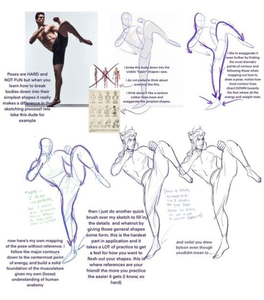
#and doing some base colors to see how cohesive it all looks together
Text
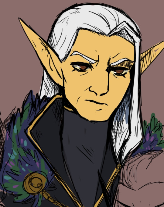
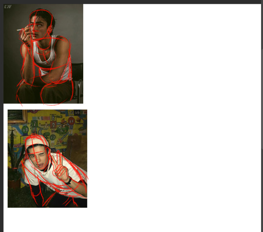
doing some experimenting with Ari's dad's colors for a family portrait type thing .... still unsure but I wanted to share him bc he's so ... Altmer
#Vaelcelmo#his feathered / furred capelet is made of. indrik hide#I'll detail it when i fully paint it eventually#it's part of a bigger thing im doing for ari so it's going to take. ages. but i was just scribbling#on my lunch break#but yeah aris dad looks the Most Typical altmer out of the family#ari and fae both look like their mother#who I'm excited to paint eventually bc shes going to challenge me with all the sparkly accessories she has#mostly using this whole piece to push myself to improve certain things#and doing some base colors to see how cohesive it all looks together#im not good at color theory but i want this to look good so it's going to Force me to pay attention
5 notes
·
View notes
Note
have u ever talked anywhere about your coloring or composition processes? u are honestly one of my favorite artists and i would love to hear any insight on how you make pieces 💓
wahh thank you TTT !!! I did sorta give a very simplistic answer here but it was more of my simpler sketchy style so lemme redo that, ill try to be consise and make this understandable ?? its a bit hard cuz it honest to god depends on what Kind of piece im even drawing, cuz for some i go the whole length of doing lineart flats and all that, others i just just fuck around untill it looks right?
i do usually start with a rough sketch or colour draft, especially with more compley pieces this helps with figuring out the feel, honestly i should spend more time drafting properly, figuring out poses and such but im so lazy i just go w the first thing that looks good
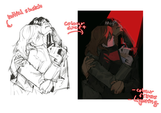
then just lines over the colour draft, fixing lots of anatomy and proportion stuff, and depending on how i wanna do the colours ill either keep the colour layers or merge them together and have the edited colours as the base colour (this might not even make sense help)
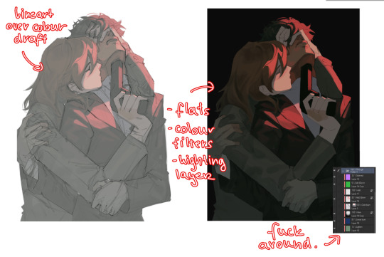
see this piece at the time gave me an insane ammount of trouble with lighting and colours, so after trying to render i ended up merging everything together....which i dont USUALLY do but the rendering is pretty similar except usually i have colours be seperated by layer,
ANYWAYS sadly i dont have a process on how it got from flats to this specific render for this piece...but i still followed my initial drafts/plans with vibe and colours and just painted over it, its why i make it after all!
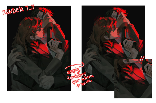
but honestly a lot of times its just very simple colours and just trying to mainting good contrast and values !!!! and THEN fucking around with colours and rextures, for other pieces i kinda just paint as i go? i have this timelapse of my justice piece that may be a bit more help!
it includes the initial colour draft, the cleanup/lining process, flats, rendering, and all that so its probs the most accurate timelapse of my morecomplex work processes, with stuff that doesnt include heavier backgrounds, which is a whole OTHER topic honestly
im sorry if i cant explain it more cohesively, i genuinely barely know what im doing most times and go by muscle memory and stuff i Know but cant. Explain? like i know how light and folds work since i observed and studied them but i cannot put it into words at all )--)0
my brushes also contribute a lot to how i render and colour, depending on what i use, you can find the swatches for them here !
136 notes
·
View notes
Note
Can I ask how you pick your colors[in shading or otherwise]? I've been looking at artist I admire recently for ways to improve my own coloring, and your pieces have such variety. I can look at shadows and see so many different colors in them, blues and purples and greens all shifting into a cohesive mass and it's all so fascinating!

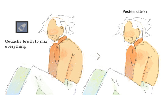
I usually cheat a little bit with picking colors b/c it's very easy to do so with the use of color jitter + gouache brush :] ^first part is laying down the basic flats from whatever colors I think would be fun to use --> decide how strong and what temp (warm/cool) the shadows should b and lay down the shading layer based off of that --> add some slight color variation in the shadows (keeping in mind the general idea of light bouncing off of different surfaces) --> use the gouache brush to mix everything together and add the rough texture I like getting :]
#mailbox#<-in making this i spent a good 10 minutes trying to figure out the ID for the palette brush#but couldn't figure it out or track down where i downloaded the brush from so .#ig i cant recommend that specific one but you can probably download a similar brush or replicate it fairly easy by messing with color jitte
375 notes
·
View notes
Text
Coloring Tutorial Part 2
Part 1
As promised, here's the 2nd part of my color ramblings. This time I'll go a bit into how I pick colors for cohesive and atmospheric looks in my illustrations.
Usually, when working on a piece, I'll think about what kind of mood I'm going for and then choose one color as a base.
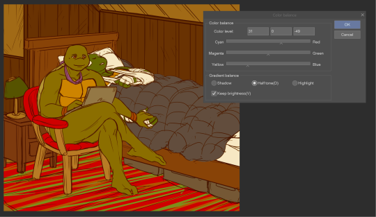
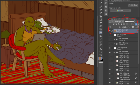
Let's use this pic as an example:
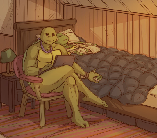
I wanted something warm and cozy, and the feel of an old house. For the base color, I chose brown.
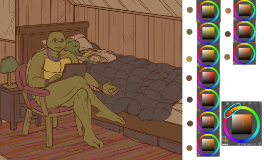
The funny thing about colors is, that they can look veeeery different depending on which shades you put next to each other. For example, you can make a shade that's not actually red, look like it's red by putting greenish tones around it.
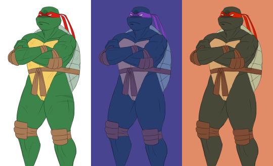
Let's look at the shades I picked for this piece. When you look at the color spectrum, you can see that all the colors can be found somewhere within the range of red and yellow. Don and Leo look like their normal shades of green, even though there's not any real green in this picture.
For comparison, I colored this picture as if it was in a neutral light and all the objects showed up in their true colors.
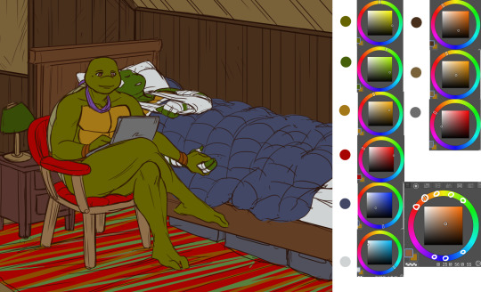
Looks rather jarring, doesn't it? The colors are picked from all around the spectrum and there's no consideration of whether they match or complement each other.
When you pick colors from a more condensed 'area' within the hue spectrum, it's easier to harmonize them. Also, in general, it's wise to stick to a limited palette. It doesn't have to be in the same hue range either. You could pick something like blue and orange as your base colors and then use shades that are close to those two.
Another trick is to repeat your chosen colors in different areas, instead of picking a new tone for everything. This will make the overall look more cohesive. And if you want something to stand out, pick a more unique color for it. (This same rule can apply to character design too.)
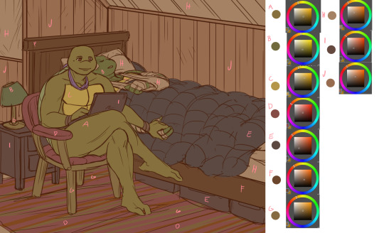
A demonstration of how almost all the colors appear in several spots within the picture. Note, how most of the BG is non-obtrusive browns and reds, while Don and Leo become a focal point with their greens and the blue duvet.
So, how do I actually pick out these colors? I'll show you.
Here's Raph in neutral light aka in his true colors. And two different versions where I've used indigo and orange as the base colors.
Now, I'm not sure how comprehensible this is, but I tried to explain my method with this visual guide.
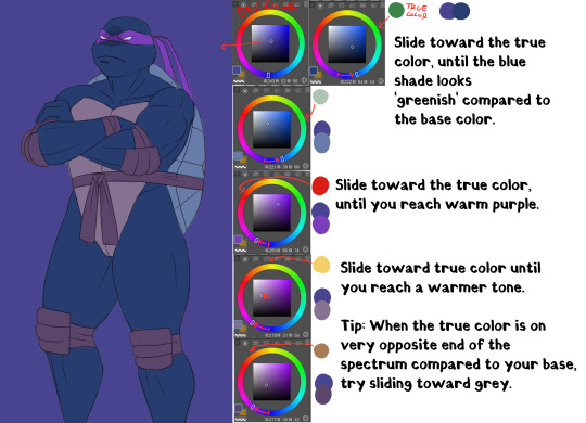
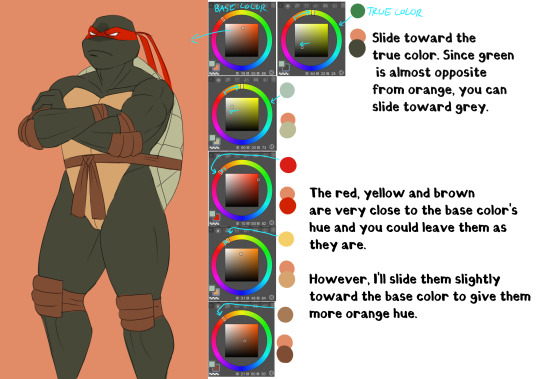
Basically, I'll try to remain close to the base color in the hue range and then fiddle around with how the different shades look together. It does take some practice and using various color adjustments or blending layers is very helpful if picking the colors manually is too hard!
I hope someone got something useful out of this, thanks for reading and sending the ask!
109 notes
·
View notes
Text
sumeru boys redesigns + notes
as you may know, i redesigned the sumeru boys a few weeks ago because, as much as i love them to bits, their designs are well. not that great in some areas. also because i wanted to draw them more often without the roadblock of their designs being so complicated. i've mainly been drawing my cyno and tighnari redesigns, but i did also do alhaitham and kaveh, so i thought that i'd show off these redesigns in one post, along with some notes on why i made certain decisions. hope you enjoy!
(pre-note: just so no one gets confused, i also renamed everyone when i did my redesigns, giving tighnari and alhaitham first names and cyno and kaveh last names.)
tighnari ❀

(renamed abdullah al-tighnari; tighnari was made his surname because that was the case for the real guy he was based on)
i went into this thinking "how can i make this design more appealing to me while still retaining what the original design meant?". since tighnari is one of my favorites in the game overall, i put a lot of pressure on myself to make a decent design.
a lot of tighnari's design inspiration comes from moroccan (specifically amazigh) culture, which i kept in my mind through most of the drawing. this inspiration shows in his bead necklace (i forget the name), his belt, and his earring, which i remade to mirror the shape of moroccan headpieces.
gave him some muscles because there's no way a guy with his job wouldn't have them. also a bottom-heavy fat distribution for self-indulgent purposes.
the design has less layers and lighter/flowier clothes because of tighnari's canon sensitivity to heat. if you're living in the rainforest (a famously humid biome), you probably wouldn't be wearing what canon tighnari does, heat sensitivity or not.
gave him some traits that are popular headcanons, such as the flower thigh tattoo, the sharp teeth, the scars, the claw-like nails (with the middle and ring nails filed down for No Reason), and the lichtenberg figure. also gave him tan skin and wavy hair because i Cannot deal with canon nari looking like that.
sturdy shoes! archery gloves! his vision on his belt! quality of life features that an actual forest ranger would have!
i will admit that the slit pants, the shorts, and the tights were all for self-indulgence reasons, but i think they go together well with the rest of the outfit too.
a braid in his hair for cynari marriage purposes. (i hc that in sumeru, marriages are consummated by braiding each other's hair)
kaveh ❂
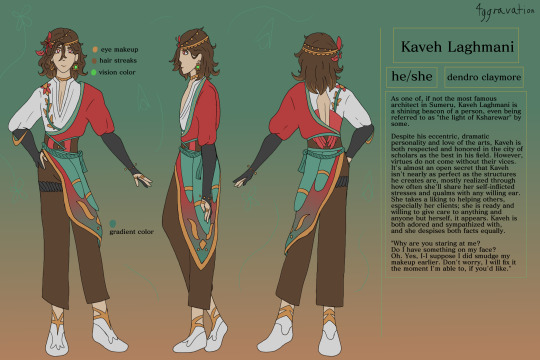
(renamed kaveh laghmani; surname is of iranian origin, but i forgot the meaning)
another real quick note: if i change a character's pronouns in their rewrite, i'll be using those pronouns in their notes. here, kaveh goes by he/she pronouns (she just like me fr).
his canon design is actually my favorite of the sumeru boys, so this redesign was more of a simplification while still keeping the original color scheme and such.
from my research, kaveh's mainly inspired by persian/iranian culture. this is what i had in mind with her shirt and her jacket... shawl... thing. idk what to call it.
kept him a skinny twink; imo, her being a twink in canon fits pretty well.
emphasized the bird of paradise motif with the thing on her side looking like feathers. you will see this again with alhaitham.
made him brunet for more cohesion with the color palette, also because i don't like the whole blonde-fading-to-brown situation he has going on in his canon design.
flowers!!! also giving him a pretty headpiece bc this guy is flashy. also also keeping the feather, it's cunty and fun.
i wanted to make kaveh obviously gnc/genderqueer without going into full-on feminine outfit territory. you can tell she's not quite cis but it's not super in your face yk?
made his vision one of his earrings like yae miko because i forgot to give it a proper place in my concept drawings lmao
quality of life feature: actual artist gloves that aren't cut off. seriously, them being fingerless in the canon design completely negates the point of artist gloves.
removed his braids because of the aforementioned marriage headcanon.
alhaitham ⚘
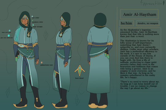
(renamed amir al-haytham; i wanted to give him the most basic name possible, though i fought with myself a lot on whether to write it as al-haitham or al-haytham)
my god i despise his canon design. it's so... not him. my goal with a redesign was just to give him an outfit that made sense for his character because jesus his canon design is an atrocity.
alhaitham is mainly inspired by either saudi arabian or general west asian culture (like what's constant and such). i was mainly inspired by casual saudi arabian menswear when i was designing him.
hot take but i don't like alhaitham being buff in canon. i made him chubby/fat in my redesign mainly for self-indulgent reasons, but also because it makes more sense to me. also gave him facial hair because yes
kept his color scheme mostly the same, along with the eye motif. emphasized the eagle motif slightly with the feather hip piece (see: kaveh's redesign).
gave him a headscarf (not a hijab or anything like that, just a regular headscarf) because he felt like the type, plus i got the design idea for it and went "well i can't not include it now".
wanted to give him the vibes of an npc who was forced to be a main character
no he isn't wearing his vision anywhere, he doesn't carry it around in my rewrite.
quality of life features: more sensible, looser clothes that are easier to live in- really the whole design is meant to be a quality of life improvement first and foremost
cyno ⚡︎

(renamed cyno al-sahrawi; surname meaning is "of the sahara" or more generally, "of the desert")
like kaveh, i'm gonna be using he/they pronouns for cyno here because that's what i put in my rewrite.
in my opinion, cyno's design is relatively solid, but with a few glaring flaws that kinda ruin everything for me. i'll bring them up as these notes go on.
they're very obviously inspired by ancient egyptian culture, specifically anubis. like, it's very blatant. with my redesign, i wanted to keep those inspirations in mind while making the outfit less stereotypical and make more sense.
why does this man, who's said to fight a lot, not wear a shirt? why are you letting the place where most of your vital organs reside breathe freely? also, why does this guy not have scars?
simplified a bunch of patterns, especially below the belt and with his headpiece. also made their helmet(?) a darker, more saturated purple to attract your eyes' attention to it.
gave him eye of horus makeup for a little cultural nod
the black piece in the back was made to look like a tail to further the jackal thing.
curly hair that resembles lightning bolts <3
the shoes were inspired by traditional egyptian footwear, because if this guy is out in the desert all the time, i'm not letting him go without some kind of foot protection.
quality of life features: a bit of armor on his arm (partially for aesthetic purposes), less flowy bits on his helmet and hips to prevent distraction or getting caught on things, the aforementioned shoes
added braids for cynari purposes, because i'm me.
hope you enjoyed reading this! please keep in mind that this is all off the top of my head and doesn't even go into color theory, how the designs mirror each other, and other smaller things like that. i might make a part 2 someday going into those things, but who knows with my memory lmao
reblogs are heavily appreciated!
#long post#tighnari#cyno#alhaitham#kaveh#cynari#cynonari#tighcyno#tighno#tighnari genshin impact#cyno genshin impact#alhaitham genshin impact#kaveh genshin impact#tighnari genshin#cyno genshin#alhaitham genshin#kaveh genshin#genshin kaveh#genshin tighnari#genshin cyno#genshin alhaitham#genshin impact kaveh#genshin impact cyno#genshin impact tighnari#genshin impact alhaitham#4ggravate#genshin redesign#genshin impact redesign#4ggravated#<- jesus christ thats so many tags
22 notes
·
View notes
Text
♠ Knight of Spades - Mari ♠
〈 Protector of Innocence 〉
━━━━━━━━━━━━━━━━━━━━━━━━━━━━━━━

━━━━━━━━━━━━━━━━━━━━━━━━━━━━━━━
Ahhh I finally get to post this :D It was an honor to be able to contribute to the amazing project that is Yuri!!! On Cards from the Yuri!!! On The Web Discord server!
You can see the entire project via this masterpost!
If you'd like more context for this gigantic YOI AU, head over to this blog post for an explanation of everything.
I'd like to give a massive shoutout to @arom-antix and @lines-on-ice for basically putting this all together and making this amazing idea a reality. I know Arrow credits me as one of the admins of this project, but I really only made a Google Drive and did a little research for the artists on how to format their cards haha
I had a ton of fun coming up with Mari's design as the Knight of Spades. I knew right away that I wanted Mari's design to reflect her Japanese heritage since the suit of Spades is a fully Japanese cast.
I've cut me talking about the art itself and my thought process while working on it so I don't nuke your dash, but if you'd like to read my ramblings feel free to
Making Mari a samurai was an easy choice since, one, that's basically what a knight was in Japan (albeit there was no legal binding between a daimyo and his samurai), and, two, I've always HC'd Mari as a protective older sister in the sense she'd be fairly hands off until someone made the mistake of bullying her little Yuuri.
I wanted her armor to be blue since that was the overarching color scheme for Spades, but choosing what blues to use was.. Difficult. There needed to be enough contrast between the different pieces of her armor to show that the armor is made of multiple parts while keeping the hues and brightness values close enough to still look cohesive. I also wanted to keep the blues relatively low saturated to bring our Mari's blonde highlights.
(As I was coloring her armor I realized half way through that I basically drew a Samurott ginjinka oops ( ̄▽ ̄*)ゞ)
I had originally intended for the sarashi (the belt) to be pure white, however when I put all the base colors down I realized the white was too much and pulled your eyes away from Mari's overall form. I knew having the belt be pure blue would make the belt blend in too much with the rest of the armor, so I ended up making the belt mostly blue with white accents as a compromise. I still wish the belt could have been white, but oh well.
As for the katana.. That was originally going to be pure blue, but like the belt problem, I had issues keeping the katana from looking muddied. I ended up trying five different variations of black/dark gray until I settled on what you see above lol. It was really difficult making the hilt of the katana look nice because if I went too dark with the blacks I would lose detail on the hilt, but if I went too light I would lose the contrast with the hilt's blues. As for the saya (scabbard/sheathe) I wanted it to be black, but I ended up matching it to Mari's armor instead because a black saya with a mostly black hilt somehow made the entire katana look flat.
The color palates I used for everything else was just me eyeballing her fleshtone and hair color through various screenshots I ripped directly from the show.
The background gave the the most trouble out of everything though because I'm not particularly great at making interesting, minimalistic backgrounds for my art. The card looked to plain without some sort of variation of color behind Mari, but since her armor was already so complex I needed a background that didn't take away from those complexities and didn't muddy the entire piece. I had originally planned to do a sumi-e type background, however I found that no matter what I did the sumi-e designs took away focus from Mari. Eventually I settled on a default abstract Procreate brush and drew lines until something stuck.
Overall I had a blast making this and also the borders for the rest of the cards! I learned a lot about how to format and prep digital canvases for making a card deck, too lol
#eeeeee im so happy about how this whole project turned out#i hope you all enjoy :>#yoi#yuri on ice#yuri!!! on ice#mari katsuki#katsuki mari#yoi fanart#yuri on ice fanart#yuri on ice!!! fanart#katsuki#digital art#art#my art
79 notes
·
View notes
Note
Just wanted to ask (and feel free to not answer), but how do you draw so much so quickly? I'm always impressed by how fast you doodle or paint. Also, wanted to say that I appreciate your Barok and DGS art as a whole.
and with this ask i have finally reached an artist milestone 😭
Well theres a short answer and a REALLY long answer (which ill put under cut when i get there).
short answer: practice + refs
which.....can be an annoying thing to hear. And as someone who studies art and has bought a LOT of online courses trying to figure out how industry people can just churn out work like nothing. it feels like a let down every time i find out their big secret. just practice and photo refs. Every. Single. Time.
LONG ANSWER:
its how you studying your refs. heres how i do mine
sorry if this is rambly. but ill try my best to at least be clear. BUT THIS is the EXACT way i taught myself how to be quicker.
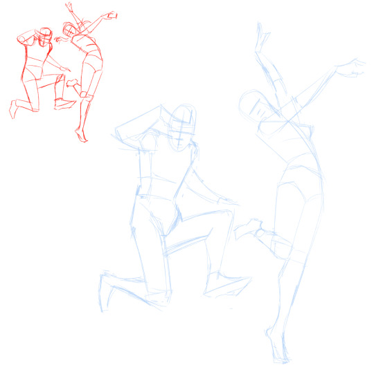
I do not know if youve taken any art classes but essentially one of the ways to study gesture drawing is by first tracing ur photo ref to get a sense of the flow/proportions of the body. youve probably seen a billion of these tutorials floating around:
So last year around hmmmm june/july? i was NOT looking to get better at my anatomy or gesture. i was actually trying to get better at clothes. but my problem was it took me so long to draw out a figure (which i was fine with cause i liked how my people looked at the time) that i could never really just focus clothing part.
So i told myself look. ur not looking to draw in this style like this forever. so for now SIMPLIFY SIMPLIFY SIMPLIFY!!!! I WANT THE BAREBONES OF A HUMAN HERE TO MAKE A MANIQUIEN FOR CLOTHES OK
but how do i do that....
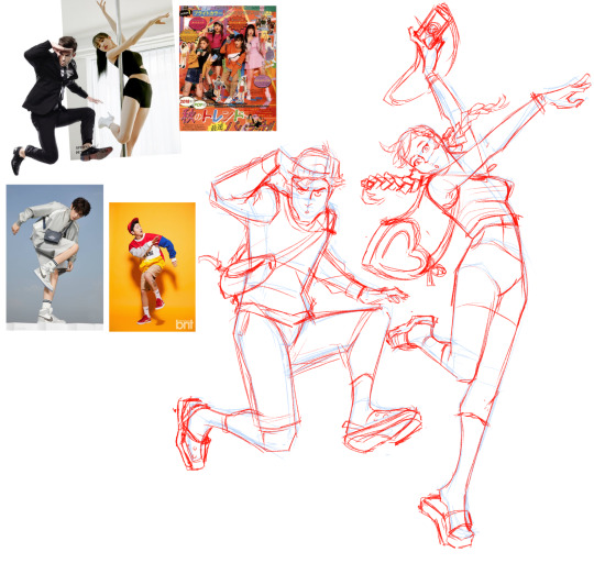
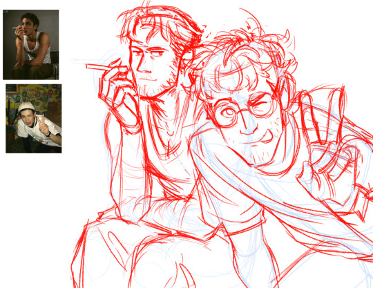
Im gonna use this piece as an example from my rise and yosuke fashion palooza month. FIRST u see i got all my photo refs together. i like those poses on the right and i want to switch out the clothes for the other ones i picked out. i trace out my poses. kind of like the tutorial up top but since this is about draping i was focused the exact places their waist/arms/legs/etc would bend.
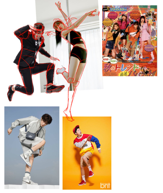
and like the tutorial u turn off the photo ref and do a drawing based off that traced piece.
then i would turn on my refs and add on my clothes
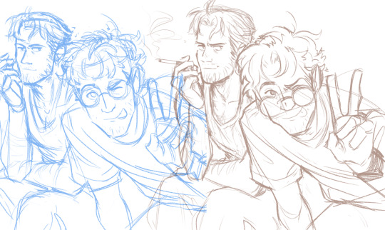
And after a month of just doing that over and over and over. i was surprised to find that figures and poses were so much easier to understand when i would break them down like this. and once u get familiar with them the faster and more confidently you'll draw them.
I and still do this btw. heres my otasune from the last week

i used photo refs for all my sketches. if i cant find anything online to match what i want i just take photos of myself. and some might say well arent u just relying on reference TOO much?
AND AGAIN take it from someone who has spend a lot of money buying classes from their fav artists in the industry. The Secret of how they churn out so much cool work so fast always turns out to be this. practice and photo refs.
Every. Single. Time.(tho this is omitting a lot. im not getting into like they way they stylize their art work. that actually the fastest and funnest thing to do once u have ur base down)
Now PAINTING
The thing is, i dont actually post up all my work on this blog. So theres a ton of stuff you havent seen me do. These are some paintings i did 2 years ago for a class.
I already know how to pick my values and set up lighting. When you see me painting my figures now. i am not focused on learning these basics im actually just honing a technique.
you might see me post readmores with these kinds of wips. I lay in all my colors and lighting with the lasso tool. ALL THE MAJOR DECSIONS ARE DONE HERE
(the little miniature i add on the side basically tells me what the overall feeling is going to be when i blend in the lineart to be cohesive with my colors) ( also if you had any questions on my prepainting process tho. feel free to ask!!!)
and if you compare this wip to my finished piece youll actually find that i dont stray that far from what i've laid in.
everything happening at THIS stage is about feeling out how i want the textures to blend with one another and getting funky with some brush strokes.
and thats it? im not sure if any of this is helpful but if anything. i hope you come away from this feeling like what ive been doing here is nothing special. "THATS IT???? THATS ALL THERE IS??? well i could have done that :T"
exactly man. you can do ALL OF THIS aND MORE!!! I BELIEVE IN U :D
but ill let this be the last thing i leave u with my friend: my barok sketch and the refs i used for his boobies
76 notes
·
View notes
Note
I SAW YOUR POST ABOUT THE PSYCHOPOMP HELMET AND I HAVE TO ASK HOW’D YOU MAKE IT??
i wanted to cosplay her at some point in the future but i’ve never tried my hand at prop making or anything of that matter really so i can’t wrap my head around any like basic concepts to make the psychopomp itself 😭😭
sorry for taking abit to answer, wanted to make sure I was at my PC to answer so I can give Exact Images n stuff of what I got/used
warning: you're gonna need some serious power tools for this. alotta bits I had to get help from my dad bc he has SO MANY hobbies that involve power tools lol
SO
For the base:
you need a good helmet. n finding one of those ain't easy, so you're probs gonna haveta Make Do with something you can cut parts off of.
I used something like this, but cut off the parts that jut out at the ears and the lip at the front. The internal bit that keeps your Actual Head from touching the Actual Helmet is VERY helpful bc (atleast w/ mine) it wasnt a layer of foam or anything that'd be finnicky, it was just straps.
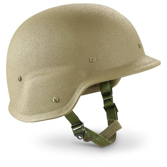
theoretically could also use a cheap-y baseball helmet though obvi you still gotta Mutilate it

For the accessories™:
The antannae are actual extendable radio antannae I harvested from an old boombox n another thing, but you can buy JUST the antannae online

the megaphone/satellite dish bit my dad helped me cut n gut a car alarm type thing and attatch it w/ this silicone stuff he had on hand

And the headphone pieces on the sides are a set of vintage radio headphones I found at a thrift store. these to be exact (they're not v rare n go for 10-30 bucks on ebay)
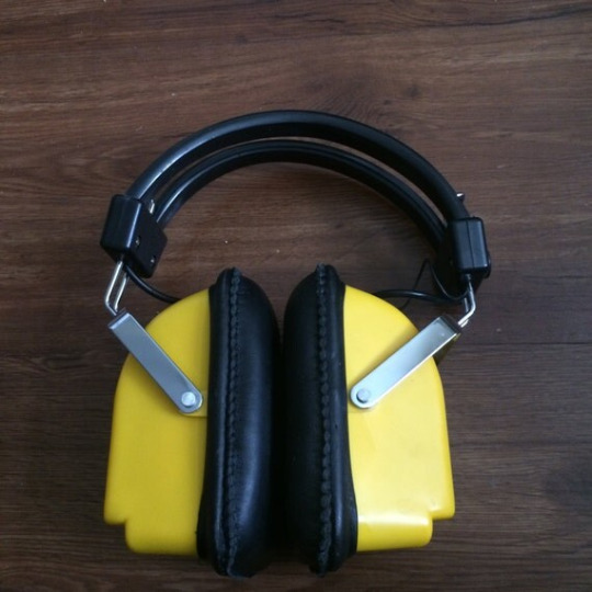
Though any old, chunky headphones could easily work. These were just what I had on hand. And, as a useful thing, the metal prongs connecting to the headband were perfect to easily bolt in place on the helmet and keep them flexible for easy putting on and taking off. The little radio speaker-y bits on the outside I added my dad had laying around though obvi not 1000% Necessary
And that's all really for the easily bought supplies
The front plate is Literally just a chunk of sheet metal he happened to have on hand, and added the bolts to. The fifth bolt in the middle is the only Functional one that actually attatches to the helmet
And the bit keeping the wires in place is a piece of plastic we melted to shape, painted accordingly, then hot glued in place. Added the screws to make it look abit more Cohesive with the rest of it.
The staples specifically on mine are holes drilled then w/ v thin wire fed through and twisted and trimmed.
Some smaller seams n details I added with super glue since it gave a v subtle raised effect, and bc it cracked in shipping I had to super glue some of the cracks back together Anyways lmao
also had to do alot of spraypainting to get it the right color. Make sure to paint the "accessories" seperate before assembly bc trying to tape off everything could end up Annoying and that way the metal bolts and the plate can retain their orig metal color to add contrast.
Also make sure you get Matte paint, bc it'll look goofy shiny. Preferably something meant for outdoor use bc those will have the more gritty textures you're looking for n its easy to find.
For any extra scuffing n details I did some dry brushing w/ grey and black acrylic to add depth. Best way to do it imo is add some drybrush with a scrappy old paintbrush then wipe away some with a paper towel
or just use a paper towel with a v tiny, thinly spread bit of paint
Hopefully this helps atleast some!! If you need more detailed shots of my helmet for better reference just lemme know, I just dont feel like going to grab her rn for a photo shoot lmao
Good luck w/ your helmet!! n be sure to post it lots when you're done!!
It'll be sick as hell to see how your interpretation turns out!
just be careful bout wearing it too long
start seeing things you're not supposed to
knowing things you're not supposed to
14 notes
·
View notes
Note
I feel sooo compelled to ask you how you choose your color palettes. I've always wondered this but after that last crows gifset, I can't take it anymore 😂 do you just pick them on a whim, or do you use color palette generators? they always look so beautiful and I know you get told this on the daily but I envy your ability to make any color combination look good and I need to know your secret for coloring picking.
firstly, beck thank you for being so kind and complimentary ❤️ i'm not sure it's so much a secret though as me just messing around and seeing what comes together! a lot of the time when i'm thinking of what colours to use for a set i will just look at the scene i'm using and see what colours pop out for me. usually i'll do my base colouring and something will stand out, and that will create the basis for my colour palette. let's take this crows outfit set i did this week as an example, these palettes just sort of formed from what colours i felt stood out in their costumes, and so i adjusted the backgrounds around that. so the palettes i ended up using were very personal to them, but i also think there was a lot of work in costuming to get cohesion between the characters (e.g. they all have quite earthy tones somewhere in their outfits) that i could accentuate myself for the gifset.
with that said, sometimes i do use colour palettes to get ideas, but i usually use them once i have an idea of at least one colour i want to use rather than going in blind. so let's just take this nina/inej set for example, i knew i wanted to use purple because as i was working on the first gif, there were a lot of blue accents that could easily be manipulated to purple (and i would always recommend trying to look for colours that stand out in your og scene, because it just makes colouring so much easier too if you can manipulate what's already there). but i didn't really know what i wanted my overall vibe to be, so i just put 'purple colour combos' into my good old search engine and i got a lot of palettes and pictures with purple as a main focus that i could chose from. ultimately i found this one which had a lot of sunset vibes which i really liked and so i decided to roll with using the first three shades in the gifset:
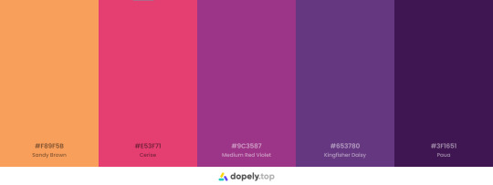
also sometimes i just get inspired by random things in day-to-day life. like absolutely years ago i remember seeing a picture of meghan markle wearing red and purple and i was like 'daaaamn i wanna use that colour combo in a gifset so bad'. which is so random but i think we're surrounded by colour combos day in day out via fashion and advertising and media, so sometimes i just get inspired by other outlets! it probably does help that i love colour matching, but there's also a lot of outlets that can help you think about how to pair colours together to create something special. anyway, i really hope that provides some helpful tips! good luck color picking!
8 notes
·
View notes
Text
Blog 10: Mermaids

A common artist tradition held in May is Mermay. It’s nothing official, but the pun sounds nice and it lets people have an excuse to draw as many mermaids as they please, whether they be original characters or favorites turned into mermaids! So, this months post is going to be a bit more lighthearted in nature by giving some observations I’ve seen in mermaid designs that could help you in the future, and in the future Mermays to come!
There’s not a single right way to draw mermaids, as long as part of them is a human and part of them is a fish (although the human part is preferably the torso and up). In fact, it doesn’t even need to be a fish. Lots of mermaids have been created with other aquatic wildlife, but let’s start simple before we reach that point.
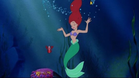
Talking about mermaids will almost always bring up Ariel in people’s minds, her red hair and contrasting green-blue tail are just too iconic. However, her kind of mermaid is the simplest out of the ones to be mentioned here. Her fish side has tail fins, scales, and nothing more, and she wears a purple seashell bra. Other than these two aspects of her, there is nothing separating her from a normal human being, making her design feel like two beings stitched together rather than a whole.
The point of a mermaid may be that contrasting feel, and if Ariel is the ideal design you want in a mermaid, feel free! However, when considering mermaids as an actual singular creature, and bypassing the friendly vibes needed for a children’s’ film, you can get really creative with what you put into a mermaid.
When I think of an interesting depiction of mermaids, what comes to mind is the popular web comic Castle Swimmer. Not only that, but a variety of animals are referenced when creating the people of this world, from octopi, to sharks, to hermit crabs. So how do they do it?
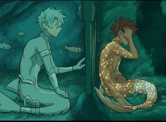
The first thing to note here is that, unlike the Little Mermaid, this rendition decides to include more features of the fish. Not only are the tail fins included, but there can also be other parts of fish anatomy. In these designs, the dorsal fin is logically placed on their backs. The variety of fins on a fish are essential for proper movement, so including them in these mermaid designs makes it feel more believable. Not all aquatic animals have fins, but it’s good to acknowledge this even when designing other mermaids. Including additional legs, spikes, or whatnot to create a more cohesive design rather than putting a torso and tail together could be what brings it together.
Not only that, but the animal a mermaid is based off of can influence the physical appearance and clothes worn by the human side. Remember how Ariel looked like any old human without her tail? That isn’t the case here, as you can see their skins share the same scales and colors as their fish sides. Not only that, but features such as gills, sharp teeth, and webbed hands can make your human side look like it belongs underwater. You may need to go out of your comfort zone and mess around with physical features in order to find what fits. Some characters in Castle Swimmer have elongated noses or funny mustaches to go with their creature, and you might have to make the same cartoonish choices too!
Clothes are highly influenced by a mermaid species and their culture, so up to this point it really depends on whether you want the mermaid design to be lighthearted or have a deeper meaning, whichever makes it fun! That being said, a big part of clothes is just getting experimental. Some mermaid designs implement trash into their designs because of rampant water pollution, and how actual aquatic life can get stuck and choke on littered plastic! When considering culture, think about what your animal may represent or, if you’re an animal nerd/willing to research, find out what the animals can actually do and what their lives are like. More feisty animals can have battle armor, while intelligent species can make use of complex tools alongside their outfits, the list goes on.
I hope this shed some light on how the designs of mermaids can work, and how diverse you can get with them. I hadn’t even gotten into the trend of turning mermaids into cryptic creatures due to how scary deep sea wildlife can be! There’s truly a lot to be done. Mermay is an opportunity to have fun and draw mermaids for the sake of mermaids, but it can also help exercise your creativity and go beyond your comfort zone! Even while the month comes to a close, there’s nothing stopping you from designing a mermaid any time of the year, so why not try it out now? Use some suggestions from this post, pick an animal you like, or maybe one that’s more uncommon in the mermaid community, and have fun drawing! That’s all for today, see ya around!
9 notes
·
View notes
Note
Piggybacking off of your costumes comment: I loved a lot of them, but I wish there was a bit more of a cohesive silhouette. Especially so you could tell the passage of time a bit easier. ALMOST every era in history has a cohesive silhouette. Like the 1860s are known for the slim waists and the big circle crinolines, the 1520s known for the big sleeves and the head coverings (among other things)
It’s fantasy but there should be some cohesion.
Yeah that's my big thing, there should definitely be some sort of link in the costumes rather than everything just seeming very much like they all got dumped out of a bin and rifled through. It's one of the things that earlier seasons of GOT actually did fairly well, the fashion of King's Landing was defined with a specific kind of hairstyle and those wrap kimono style gowns with long hanging sleeves, men in the cities of Slaver's Bay wore those specific robes with knotted cloths that differed in types of colorings for the different cities specifically (white and green in Astapor, white and blue in Yunkai, blue and yellow in Meereen). Not only was there cohesion in the silhouettes overall, but there was also cohesion based on location, and key differences based on location as well, the same way that the silhouettes for fashion in our world have varied based on location and culture (the silhouettes of the Mughals during the reigns of Shah Jahan and Aurangzeb looked very different to the silhouettes of the English in that time period, for example). Alicent and Otto are from Oldtown, which is actually pretty far removed from King's Landing, it's further south and on the Western end of the continent where King's Landing is on the east, so why not see some differences in the clothing that they tend to gravitate towards vs the kind that people who've lived in the Crownlands might wear. The Targaryens are also still clearly trying to keep in touch with their Valyrian roots at this point, what with all The Tapestries and everything, so why not have their own sense of fashion have a flair of Valyrian to it, to mark them as distinct even beyond the pale hair whenever they walk into a room, rather than just a simple red color scheme. Another issue for me was also just that the clothes never seem to convey passage of time? HOTD season 1 alone is meant to take place over a period of twenty years, and even in twenty years silhouettes change a lot. The costume designer I think said they were modeling a lot of the clothing on the Renaissance for instance, which is why we see a lot of men with chains of office on fancy occasions, and the silhouettes of the Renaissance also went through changes. For example, the 1550s tends to hew closely to the fashions we expect from Tudor dramas, wide and triangular skirts and hoods and hanging sleeves, whereas the 1570s was seeing the emergence of the types of fashions you think of when you think of Elizabeth I or Mary Queen of Scots, the beginnings of farthingales and puffed sleeves that were close fitted at the wrist and a lot of ruffs. It would have been cool to see how Rhaenyra and Alicent and Daemon's fashion choices all evolved not just due to personal decisions, but also to the simple passage of time and the change in styles that would come with it even if the changes are only slight, and it would have helped with the overall timeline better.
Yeah, there are costumes that I do think look good, and barring some nerdiness about why certain people aren't wearing chemises or other stuff (I know it's not real but like why isn't Alicent wearing anything under the green dress if she's just got straight brocade damask on her skin that's just gonna be uncomfortable, that's why people liked chemises back in the day!), but I do wish they looked more put together than they do.
#personal#answered#anonymous#yeah the lack of cohesion was also a huge thing for me too#tho sorry that i went all nerdy on y'all with this response
10 notes
·
View notes
Text
Rating: General Audiences
Word count: 1.3k
Warnings: mention of incest
Written for: day four of the @vikingsevents Vernal Equinox event, which featured the picture prompt that I used in the above banner. The seiðkona also features in my completed multichapter The Juniper Tree, and as such this piece can be read as a very small continuation of that. (You need not have read that fic to be able to enjoy this one, though!)
It is not yet dawn when he first sets foot on the path. He is there before the birds even begin to welcome the sun once more, though he did hear a rustling sound that may as well have been wings overhead while he moved through the forest. He is here so early that the night has barely moved from its darkest pitch of color to a lighter, bluer tone.
At this hour, the air is still cold enough for Ubbe to draw his furs a little tighter around himself. He has grown accustomed to the chill after having spent a whole winter in Uppsala, but there is good sense in keeping warm enough to be able to think clearly. Too often has he seen grown men make poor decisions based on the wind's icy breath. Upon the water, such calls mean certain death. Upon land, as now, it is harder to foretell the outcome.
Ubbe supposes it is a very poor decision to go barefoot now that the chill still lies heavier on this land than the promise of spring does. Yet here he treads, freshly-formed dew clinging to the soles of his feet until he almost shivers with cold, choosing to ignore the remnants of winter to the best of his ability.
This one path demands him to feel everything that occurs underfoot. How the grass sways before his toes meet it, how some twigs are crushed by his heel with barely a sound, how uneven the ground is in the places where the path is less well-trodden. There are ridges on either side of the path that he knows he should not cross, though the sides of his feet often meet their edges.
There is only this one path. One foot in front of the other and pause. The next step, and pause.
He has learned such paths over the course of this past year. Has walked them on very new moon’s turn since leaving Uppsala, as though he can summon the feeling of the juniper tree back into his life this way. There are times he can still see it standing here. When he stumbles, even falls, he looks up and finds the hollow beneath the tree where he survived a worse winter than the one that has just passed.
Ubbe shakes his head as a howling sound loops into his hearing. This, too, is a remnant born of memory. He turns the corner of the path a little faster for it. Turns his back against the first peeks of a clearer, lighter sky. The howling flurries up around his face once he increases his pace and sends the dewdrops flying.
Wolf-time is nigh.
He has seen it, of course, in the visitors to Kattegat’s halls. Has heard the stories, the pleas, the desperation lurking in some voices. There is no cohesion to the tales just yet – too many things unknown, he had griped to Hvitserk only last night before they’d fallen into bed together – but there is a common thread of woe in them that Ubbe does not like the sound of.
He spots the pebbles far too late.
Some rather undignified curses escape him as he sprawls out there, on the third turn of the path, hands splayed out on either ridge and the end of his braid dangling in the mud.
“What did I say about bringing your troubles with you?”
Ubbe groans. “Leave them at the opening,” he recites, juniper tree’s hollow flitting in and out of his mind, “and do not dwell on them when you walk the path.”
“Just so,” replies the seiðkona. He hears her shift position to his right, near the centre where his path leads. “Your mind is full of such things, Ubbe. Do you think they will forget how important they are if you do not hold them in your thoughts all the time to remind them they are present in this life?”
“It has been a long moon’s turn.”
“And you will see longer turns yet.”
Ubbe sighs. Pushes himself up. Wobbles a little atop the pebbles as he moves to stand. He takes one step further, then another. Steadies himself on the grass, on the not-yet-muddy parts of the ground, on pebble and rock that peek out from beneath the earth.
“Eyes on your path,” she instructs, as deep-voiced as if she were working a trance, “and mind on your feet. Every moon’s turn I need remind you.” She allows him to hear her slightly exasperated sigh. “You are not seated on your throne, so why carry the weight of its crown?”
Why indeed?
Ubbe smiles to himself as the question supplants any other thought of battle and crisis. You are here, he reminds himself upon his next inhale, and nowhere else. He holds his breath as he glides over the pebbles, smooth and jagged, easy and hurtful, then exhales upon the next turn in the path. Here and nowhere else.
The thought is with him when he moves along the next line, more sure-footed now than before. The sky is slowly turning a red-toned purple that speaks of bloodshed in the past night, but whichever fight it carries is not one he drew axe or shield in. Here, he thinks archly, clenching and unclenching his fists as he breathes in again, and nowhere else. No place but here.
“There is always the next,” she hums, “and if you lose your feet it does not matter. The stone is still a stone. The root is still a root that binds you as tethers do.” Her garments are telltale rustles on the wind, so much like feathers that it is as though a flock of birds is rising beside him, and even in this new spring her movements carry the rattle of bones. “If you miss a day, or a season, you will still return to where you are. There is always the next.”
“And I am here,” he responds, again turning away from the sky at the new curve on his path, again facing the looming forest instead. “Here where the next is only one step of many, and there is only one path before me and behind me.”
“Just so.”
There is a game in their words, which he knows as well as he knows the steady beat of Hvitserk’s heart beneath his head and the feeling of his brother’s hand idly resting on the nape of his neck. He knows the play of this game like he does every sound his daughter makes, every speck of light in his daughter’s eyes, every piece of his daughter’s scent that carries a hint of pine and berries. The seiðkona is as familiar to him as the ones he loves best on this earth.
Her hands wrap around his wrists once he turns the last corner.
“You are dwelling on us, now,” she admonishes, sending the beads and bones she carries in her hair into a cacophony of noise with her motions. “Hvitserk, Hlédís, me.”
Ubbe scoffs out a soft laugh. “Do you begrudge me this full heart, hm?” He asks this even when he knows she does not, for the answering sound of her laugh is a richness to his ears. Brushes a kiss against her cheek, as reverent a gesture as it is familiar. “You, who opened me to knowing its wealth at all?”
Her answering smile is illuminated by the first true light of day. “What cause have I to complain, save for the fact that you are blocking a very fine sunrise?”
“The sun also rises”– he laughs fully now, though he steps aside to allow her access to its ascent –“with or without me standing in this pathwalk with you.”
Her hand briefly tangles with his before letting go.
“Better with,” judges the seiðkona.
Here, at the heart of all things, Ubbe does not feel the need to argue.
11 notes
·
View notes
Note
Can’t everything that suggests Mike loves Will romantically also just mean he is super close to his best friend in seasons 1 and 2? I’m struggling to see how his actions are definitively romantic. I’m not looking to discount the potential of it being romantic, because I think Byler is a cool idea. I just feel like everything has a strong degree of plausible deniability and his actions in season 3 and 4 could just be him becoming a jerk and/or being in his head about different things, not necessarily being gay. It’s only gay if you read it that way, but I feel like the duffers are reading a different book. Some people really are unusually close to their best friend, especially in 80s media like stand by me
Of course there's always room for deniability when a character has yet to be confirmed queer, I mean Noah had to literally release a statement to the press that Will was gay and in love with Mike for some people to catch on and believe it. While I think Mike's queerness, at least as we see it, is less overt to the audience, there are still key contextual clues that you can pick up on to point you towards this conclusion. Of course close friendships do exist, and I don't think that every close friendship, even if it includes a certain amount of physicality on screen, denotes romantic involvement or attraction, but it's rather the way that this story is highlighted in the context of the rest of the show that implies these scenes romantically. I would agree with you in that season 1 and season 2 certainly display a narrative that could have easily just fallen under close friendship, and I think had that been all we'd been shown, I wouldn't have read anything more into it, but when we then begin to see this relationship heavily parallel and contrast other established romantic relationships in the show, it makes you consider the development of Will and Mike's relationship differently, where it starts crossing into a territory that looks like something more than friendship. Some of the best examples of this are how the fight in the rain in season 3 is framed in this dramatic and romantic way, directly paralleling the imagery from the 2016 TV series Eyewitness, which is about a closeted gay kid (who has a girlfriend) developing a romantic relationship with another guy. This scene also narratively parallels the dramatic fight scene from Brokeback Mountain, but even if the audience were not to be aware of these allusions while watching the scene, it stands in stark contrast to Mike and El's breakup that occurs earlier in the same episode. While El's breaking up with Mike is played off as funny and light-hearted, Mike's fight with Will looks like something more out of the Notebook, and the dramatic framing of this scene makes you really set it apart from Mike's other friendships. We also see more internal parallels within the show that code Mike and Will's scenes together as romantic through their association with other relationships, such as the parallel between the season 4 love confession and the season 2 memory recall that break's Will's connection to the Mind Flayer. We've also seen a lot of music and color theory being used to tie together romantic relationships throughout the show, most notably in season 4, we see the use of [tender, emotional music] being played during scenes only between already established couples, and then Mike and Will. These are just a few of the examples from off the top of my head, but I guess the point here is that we can establish how we, the audience, are meant to interpret these scenes based on the rules the show sets up for itself. If there is consistently positioning, music, imagery, or tone that suggests that is used when establishing romantic couples, if the same structure is used here, I think it tells us a lot about how these scenes are supposed to be read. You could argue that they might use these anyway to show Will's feelings, but we generally don't see this sort of cohesion within the pairings where one side is unrequited. I'll link an additional few analyses down below that I think illustrate this really well, but I hope this helps to answer how subtext is important in these cases.
#byler#byler nation#byler endgame#ask#will byers#mike wheeler#st#stranger things#will byers is gay#mike wheeler i know what you are
32 notes
·
View notes
Text
Beauty Tips And Secrets You Don't Want To Miss
Beauty is a well sought after goal! There is a lot of information and products available to achieve an ideal look. Unfortunately, not all have the same resources to get the assistance they want. This article has some handy tips and tricks to help you enhance your beauty, read on!
If you are struggling with frizzy hair you can try putting a small amount of hand cream in your hands then running it through your hair. This will help the stray strands stick together and ultimately hold your hair together more as a cohesive whole making you look much more beautiful.
Your follicles will be open and this can cause problems. If you do it anyway, you take the risk of severe irritation. Make sure you avoid products that contain fragrance after you have waxed because these types of products can cause irritation on your skin that is difficult to soothe.
If you have a squared face, soften its angles by using a coral or creamy rose blush. With comprar maquiagem barata , gently smooth the cream blush over the apples of your cheeks and outward toward the temples.
Add volume to your hair. You can easily do this by blow drying your hair upside-down for at least 10 minutes. When your hair is dry, give it a cool blast of air to set the volume in. loja de maquiagem can make your hair have more bounce and volume just by doing this.
Even the most skilled makeup artist sometimes has difficulty applying lipstick neatly. After you have applied it, use a cleanup brush that has been dipped in powder to place the powder all along the lip outline. Next, use a disposable wedge sponge to blot away any excess powder that may be left.
To reduce red tones in your skin, use a green based concealer. Because green and red are opposite from each other on the color wheel, the green tones in the concealer will cancel out any red tones in your skin. However, keep in mind that you only need to use a very small amount of concealer to counteract the red. If you use too much you can wind up looking green instead.
To get super shiny hair, try giving your hair some deep conditioning! After washing your hair, squeeze out all excess water and apply a healthy dollop of conditioner to your hair, focusing on your hairline, the nape of the hair, and the ends. Apply a shower cap and let the conditioner soak in 10 minutes before you rinse it out. You'll have gorgeous silky hair when it dries!
Hand lotion can be a great fix for a bad hair day! In the cold of winter when static has you looking electric, rub a small amount of lotion on your hands and gently pat your hair down. In the humid summer, do the same on the ends of your hair to tame frizz!
You can save a lot of money by trimming your own bangs at home. First, make sure you have the proper scissors. Spend the money for a small pair of good haircutting scissors. Trim your bangs dry. How to trim them will depend on your hair type, but most people do best by dividing the bangs into three sections, holding the hair up in a twist, and taking small diagonal snips so that the cuts aren't straight. Drop the twist, see how you look, and repeat until it's short enough for your liking.
A proven solution to dead skin buildup is to use a pumice stone in the shower. The skin is much softer when it absorbs moisture from the shower so it will come off easier. Do not use a razor to remove dead skin, this causes more skin to grow back in the areas which it was removed.
No doubt, you appreciate some of the beauty tips and tricks found in this article! Unfortunately, everyone does not have the resources to get all of the beauty products available. However, beauty is definitely on the minds of most people today. Apply the information above that best fits you individually. Remember, 'beauty is only skin deep!' Looks are not the only reason why people are attracted to others. Improve what you can, but don't forget who you are!
0 notes
Text
The Art of Choosing the Perfect Colors for Your Home
Decorating and redesigning your home can be an exciting endeavor. But when it comes to choosing a color palette, many homeowners get overwhelmed. What tone works best for a bedroom? How do you create a cohesive feel throughout various rooms? What colors should you avoid?
As a passionate interior designer, color selection is both an art and science for me. The right hues can lift your mood, make spaces appear larger or smaller, and reflect what’s uniquely “you.”
In this blog post, we’ll explore some tips for choosing that flawless color scheme. Follow this advice so your paint and decor can transform the look and soul of every room.
Consider the Purpose and Size First
Before falling in love with a stand-out paint chip, consider the functional purposes of each room. Is it a private retreat, a family hub, or dedicated space for rest? Lighter, airy colors tend to open up small rooms while deeper shades provide a cocooning effect.
You’ll also want colors to be cohesive across open floor plans. For separated rooms like bedrooms, you have more freedom to get creative. Just ensure tones harmonize whenever spaces meet.
Embrace Neutrals as a Base
While color is the focal point here, don’t underestimate the power of neutral walls or foundation shades. Creamy whites and beiges do wonders for creating flow throughout a home. You can always layer in pops of colors with changeable accent decor and furniture pieces afterwards.
I suggest keeping bigger investments like sofa sets and carpets neutral. Save the color for artwork, throws, vases and other items you may update seasonally. This provides flexibility if you ever go through a “color fatigue” phase!
Test, Test, Test Paint Samples
This is one of the biggest mistakes I see DIYers commit. A quick paint chip from the hardware store never tells the whole story! Before slathering a tone across four walls, buy a sample can to swatch out larger sections. Colors look incredibly different in natural daylight versus lamp lighting at night.
You’ll also spot differences between the paint chip, wet sample, and dried tone. Test sections on various walls and note how the shade impacts opened and closed spaces, too. This gives you a preview before pulling the full paint trigger.
Make it Personal and Purposeful
While neutral foundations and complementary schemes create a polished look, don’t overlook injecting personality too. Our environments reflect who we are, how we gather together, and what provokes inspiration. The colors of your home deserve the same thoughtful attention.
Chat with all home occupants and consider what tones ignite joy, calmness or energy. Create a mood board with meaningful imagery and samples. Does a nautical blue conjure beach vacations? Does a sunflower yellow lift spirits? Find hues that serve a purpose for your lifestyle.
Let Color Help You Fall in Love With Your Home Again
With some pre-planning and these insider decorating tips, selecting a color palette doesn’t have to be scary. View the process as an artistic adventure instead of blind guesswork. Testing,neutrals and personalization allow you to remain coordinated yet inject style.
Remember that color trends and tastes will change over the years. By keeping neutrals as fundamentals and accent colors flexible, you can easily shift the mood and style of your home as life evolves.
So embrace color selection as the joyful, creative outlet it’s meant to be! Determine what color story you want your home to tell today. Consider Yeskay Designs- the best interior designers in kochi,to know about interior designing.
0 notes
Text
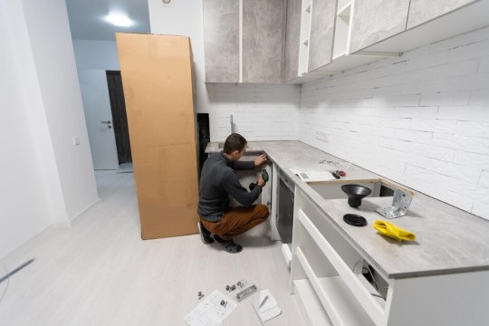
Designing Your Dream Kitchen: Tips For Working With Kitchen Installers
If you've ever remodeled your kitchen, you know that it's not just about the cabinets and countertops. It's also about how well all of those elements work together.
Designing your dream kitchen is a process that involves working with designers and contractors to bring together all of these elements into one cohesive whole. But there are certain things you can do to make sure the kitchen installers project goes smoothly, including creating a list of must-haves, looking at the big picture first and being realistic about your budget.
Create a list of must-haves.
After you've done your research and identified what you're looking for, it's time to make a list of must-haves. This list should include all the features and amenities you want in your kitchen--from appliances and cabinets to lighting and ventilation. Also add anything else that may be important to you, such as your dream kitchen design or countertops/flooring materials.
Look at the big picture first.
Before you start looking at cabinets and appliances, take a minute to consider the big picture. You want to design a kitchen that meets your needs and fits into your home. Here are some questions to ask yourself:
How many people will be cooking in the kitchen? If it's just you or two people, then having an island might not be as important as having space for multiple cooks working together. On the other hand, if there are more than four people using this space daily (including kids), then an island could be ideal because it provides extra countertop space without taking up too much room in the middle of everything else going on in your home.
How often do I use my kitchen? Is it more like an office where I spend most of my time sitting down at my computer desk typing away emails while eating lunch; or do I actually spend hours every day cooking meals from scratch while entertaining guests over dinner parties every weeknight after work? If so then perhaps having extra storage space would be useful since most kitchens aren't built with enough cabinets installed by default these days due to limited budgets - but if all those cabinets mean sacrificing valuable floor space then maybe getting rid of them altogether would save money too!
Research kitchen designs that fit with your space, lifestyle and budget.
Look at pictures of kitchens you like. If you have a favorite kitchen design, look at it closely and think about what makes it so appealing. Is it the color scheme or materials used? Could you incorporate those elements into your own space?
Search for kitchen design ideas that fit your space. Once you've identified some potential styles, search online for other examples of each style in different sizes and layouts so that you can see how they might work in your home before meeting with an installer.
Research what types of appliances and features are available in the market today--and which ones are most cost-effective--so that when meeting with installers, they can offer suggestions based on these facts rather than just their opinions (which may not align with yours). This will also help determine whether there's anything missing from current models that would make them more desirable for future useage purposes (e.g. if someone doesn't like keeping pots on countertops).
Conclusion
When it comes to designing your dream kitchen, there are many kitchen installers things to consider. You can save yourself a lot of time and stress by taking the time upfront to plan out exactly what you want. Once you have this list in hand, it will be much easier for your kitchen installer to help make those dreams come true!
#kitchen installers gold coast#Best Kitchen Renovations & Installations#Gold Coast Kitchen Installers#kitchen company gold coast
1 note
·
View note
Last Seen Blogs
yruxullust
suddenly raptors

sasakieri
ささきえり

pharmd2017
My Pharmacy Practice Experience

ramram8
NaughtyStoner69

lyanatasha
Awekmelayu