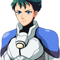
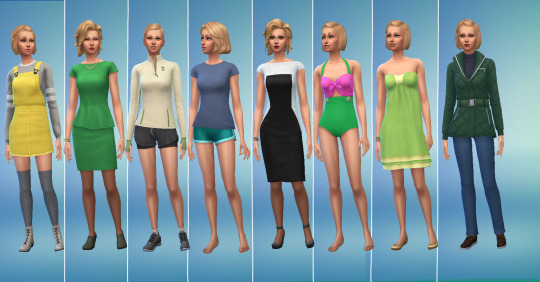
#also i tried doing this in the og color palette first
Text

quick little young garrett redraw/painting practice
i never paint or color any of my pieces so i thought i'd just do it cuz i kinda suck and need the practice also i just like drawing garrett
#garrett thief#fanart#thief gold#thief series#digital art#my art#thief game#thief the dark project#forgive me for not drawing his hand#i simply didnt feel like doing that#also i tried doing this in the og color palette first#instead of doing it in grayscale#and it made me sob and rip my hair out#anyway baby garrett#he has been yassified#sorry shrug emoji
104 notes
·
View notes
Text
jellicle lineups; part 3/4
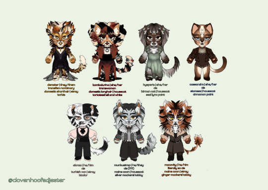
LETS GO PEOPLE!! LETS GO !! sorry for taking so long to get around to this one !
demeter | 🔒 🍰 🌇
DEETER
ive seen a lot of complaints about demeters design being toned down over the years so i decided to bring some of the bolder design choices back for mine. mullet demeter is REAL now ! honestly i couldve done more w/ their makeup but shhh its ok....
i tried to push the gold in their design by making the eyeshadow really obvious and giving them gold lips. enjoy their lacy dress too... i tried to design something which they could dance comfortably in
demeters newer 3 words (nervous, sensual, secretive) mean everything to me. love them so much. i think theyd be 29 in human years
bombalurina | 🌹 🍓 🛼
so i totally based her hair on that concept art for drag queen bomba. the bob is too cute ! i had a blast doing her design for the most part. i struggled w that makeup and the color of her dress but its ok.
i also tried to give her something she could dance in—just like. imagine the length of the dress a little shorter. im not going back and fixing it
i based her color palette/patterns directly on her concept art because tbh, i dont love blond/ginger bomba ! so black/white/red hair bomba it is
i think she would be 27 in human years
hysperia | 🪴 ⌚ 🍡
this is my version of exotica, renamed hysperia, because i do not love her og name. its not fun. the name hysperia is taken from an ensemble kitten character from the og london production
i also based her design on a multitude of things, asides from her 2 costumes in 98—like some nbq/greycat designs since i feel like that design not becoming a common ensemble character was a waste. A WASTE I TELL YOU! ive also based her fur length on warsaw victoria because oh my godddd that design is so good. peak
her neck bow is a nod to the 2019 movie... the macavity girls w/ those bow collars. they were onto something there
she would have a much more prominent role than the few times she cameo'd in 98, still retaining the elegant/shy personality she shows in the film. shed be 29 in human years
cassandra | 🪐 ♠️ 🥯
i originally made her makeup a lot closer to her replica designs but decided to go for something a little different based on a makeup look i saw on pinterest LOL. so like. enjoy her slight earthy gothic vibes. i also didnt struggled too much on her outfit since i came into this knowing that i wanted her to be wearing something formfitting and bejeweled. a little circus-y too
more people have got to play up her disdainfulness. she'd be 26 in human years
alonzo | 🎹 🍢 🎳
once again, another design pretty similar to his standard replica one. i just tried to make the black patch on his face a little greyer and with some white detailing. because tbh every alonzo with white mascara makes me go crazy its so cute
i also tried to make his head fur/bangs a little distinctive—inspired by a random pic from a production i dont know the name of
enjoy his little cute fit too. pinklonzo. pastelonzo
that one gif of him pantomiming eating a playing card IS canon to me. he'd be 28 in human years
munkustrap | 📼 🥧🎙
verrrry similar to standard replica munks makeup-wise ! however, fur wise.... say hi to mulletstrap. to manestrap. 2 me he is tuggers brother so he gets that. i have no justification for the mullet other than idk, looks good, is funny, and the oslo 1985 production was right to give him one. also he and demeter can match now
i do like when theyre seen as something of a prince... so say hi to the gothenburg and opera populaire-esque epaulettes. theyre cayoot. they also get warsaw munks Big Pant Vibes
give this man a break. hed be 30 in human years
macavity | 🔥 🥂 🎯
he was actually one of the first cats i made design notes for when i started hyperfixating on this musical like.... two months ago. i really tried to mix elements from a bunch of different designs 4 him.... and sorry yall hes a deut brother too. im predictable
the manginess, mane, more ginger-y head fur, tugger-ness and the mouth markings from the 2016 revival... the big big hair, white fur and general makeup from his replica design... and the stylings of il sistina mac with the fitted coat. he also gets unique eyelashes like tugger—this time white instead of gold. he also gets that ominous magic cat eye shading
i think he would act a lot like 2019 mac... suave. but also not as dorky and desperate as he is in that movie LOL. he'd be 33 in human years
ONLY ONE MORE LEFT..... THE OLDIES........ MAYBE... I MIGHT MAKE DESIGNS FOR SOME OF THE SWINGS TOO LOL
#cats the musical#cats musical#sfw furry#character design#chibi#my art#demeter#bombalurina#hysperia#exotica#cassandra#alonzo#munkustrap#macavity
69 notes
·
View notes
Text
Very stupid getter thing I’m thinking about as it’s such a minor detail but my brain is circling around how color is used in the series, more specifically for the robot.
Color palettes for your badass giant robot mean everything but the color choices in Getter are *very* important as it was the first-and few-robots to have multiple different forms in one, and are all compromised of jets to make the robot.
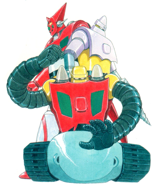
The designs needed to be consistent with this aspect, having the Getters color palette use all three individual colors of the jets. What’s noteworthy about the colors used is the robots almost follow using the primary colors of red, blue and yellow, but the blue is swapped out for white. This was likely due to a better color balance, as while the primary colors would work if the robots weren’t individually joined but still a group, keeping in mind the concept of how they form from jets the blue would likely clash too much with red and yellow, where as white makes it all smoothly come together.
Nearly every Getter set since tries to follow this tradition of using red, white and yellow in there palettes, but aside from a few obvious exceptions for Getters that were meant to stick out-like Neo/Go, as that robot doesn't run on getter rays so the palette was changed drastically to reflect its nature-the most obvious example of a traditional Getter breaking this tradition and going for blue over white is Getter Robo G.
While each and every Getter has its own factors to stand out and differentiate itself, the G line for simply having one small color change really sets it apart. Especially with its OG design above, it’s hard to not notice its version of Getter Two (Liger) had a color change that affects the whole palette. So people either love or hate G for this, even if later takes of its design like Armageddon, try to tweak the colors to be more visually appealing by keeping it strictly to the main color of the respective jet. (This also carrying over for Shin Getter in the show)
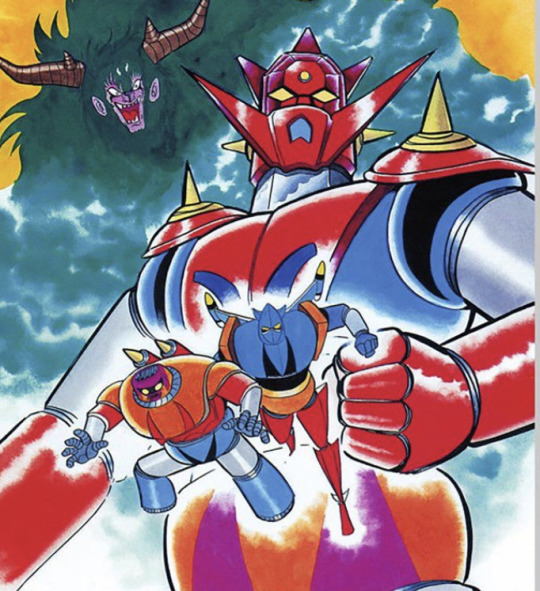
But why do I mention any of this? Well I was in fact thinking about this regarding Arma and Getter 2, but less on the actual designs itself and more so a rather small yet likely intentional detail: How Kei is associated with the color blue before it’s even shown that she pilots Shin Liger. From her own promo art with Shin 2 having her being colored in blue despite Go and Gais colors being their respective robot, to her pilot suits having blue shoulder pads to match with Liger, which we see before the robot even appears. (Yes I’m using a SRW art instead of a show shot, just deal with it lol)
This is such a small detail but the team likely had probably a rough idea of what to do with Shin Dragon, so seeing them giving small hints to the viewer-albeit one has to see a art of this prior to know lol-before it even happens is pretty cool. Just goes to show how much insane detail Getter has across its series.
#meg text#getter robo armageddon#getter robo g#my first ramble of the year and it’s a fucking mess LOL#(I was tempted to delete it after until I looked at the time and went “I don’t wanna waste time like this”)#I do wanna make a more in depth post about the build up to go team piloting shin dragon but need my thoughts organized#by which I need to make a whole google doc for it (which I tried and deleted for some fucking reason bc I’m dumb)#hopefully it still in my deleted drafts but probably not (but I didn’t finish so eh)#rants aside my autistic brain was just thinking so hard about this because arma really like it’s pilot suit colors#I think about how ryomas team also has their scarves be the corresponding colors to their robots… love that#the go teams shoulder pads is a nice parallel to that but I like how between all pilots hayato and kei are the ones not to match#simply because liger stands out but that fits with kei so well because she’s the one pilot on the team who’s a girl#yet her suit is also white so it’s not like she doesn’t entirely not match with hayato lol
9 notes
·
View notes
Note
That Vritra drawing looks really good tbh!! I just wanna tell you that (oh I love women...)
Also, I'm curious as well about how you would do greyscale painting. Do you have any tips/advises about it? As I'm thinking I want to practice painting with that method, too
so idk if im the BEST person to ask given this is the first time i've used greyscale in like...idk 5 years? but basically the gist of it is to paint the image in monochrome black and white so your values stay clear. the program i used is krita so i'll explain how to do it there but theres actually more guides for procreate, clip studio, photo shop etc
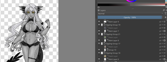
for this, in order to make sure coloring later was easier, i made each color group (skin, hair, tail+bra, tie and underskirt, gold) a different layer. i dont usually label mine because i hate myself but you may fine doing so more useful. once you've colored each layer in the correct grey value just shade it normally.
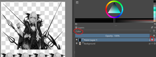
i also wanted to make sure i got the values for her skin right so i tried this trick i saw the other day on a reference image i have of her, which is to make a second layer, alpha lock it and switch the layer setting to color instead of normal. this sets the image to monochrome with very little fuss so you can easily color pick values without much issue (although you'll notice i actually lightened her hair a bit bc og vritra's is pretty close in value to her skin)
once you've colored in the values you're bascially done. just make a clipping group and set the clipping layer to 'color' and it will fill in the layer to the color you picked. you may need to adjust the layer below a bit-i ended up having to darken the tie because the green wasnt coming out the right color. the other thing is that i actually set the gold to color dodge on a dark brown because i felt that made a better gold color. realistically, you would also further tweak the image but it was pretty late last night so i called it a day
this also gives you the ability to play with the color palettes a bit although you wont be able to go beyond the base values- like in this case, i cant really make her hair or skin darker than how i already set it, so keep that in mind unless you're good with other filter settings
7 notes
·
View notes
Note
Do 1010 end up transing their gender after everything is settled in the FRAU?
Yes! They do! Not only do they trans their genders, they also get total makeovers to try and look as human as possible! Like with full silicone skin and other stuff that has been invented/developed in the cybernetic world. Actually that first drawing I made of a bunch of Blues had his later "human" design, or at least a first draft of the design.
They don't just change their looks and gender but also their names! I'll use their preferred pronouns to talk about them from this point on in the post, but otherwise I will keep using he/him when talking about them while employed in NSR since they identify as that during that time.
But when talking about their future selves/"human" selves I will use their preferred pronouns. (I will be interchanging their names depending on if I am talking about their past selves or future selves)
White chose the name Silver, as a way to connect to his color (they all did the color thing) and as a sort of reference to Neon (both elements). He kept using the pronouns he/him (unlike all other versions of him that use it/its or it/he). For the longest time he didn't really "believe" that someone could change their gender.
Yes, unfortunately, White was kinda transphobic because he had no idea what any of that stuff meant, was confused and angry, and even followed Eve's lead on how she treated Remi at times when she was angry. Thankfully he was taught more about how things are and learned to not be judgemental and a dick. He is AroAce and is unlabelled in the gender department.
Blue chose the name Sky and uses She/They pronouns, mainly She/Her. She started wearing sunglasses again for her eyes and chose to have very long hair. She also added purples to her color palette (because technically Blue put Purple's code into his own trying to save him but just ended up fusing their codes together. Blue has done a lot to fuck around with his code without Neon's knowledge).
They've been learning to embrace themself more and trying to make amends with everyone around them for all the mistakes they think they've made. They identify as nonbinary and pansexual.
Red went with Rosa and uses exclusively She/Her pronouns. She is probably the most like her OG counterpart except just a bit more shy/nervous. Her hair is also much longer and a bit wavier. She became the shortest out of the group and loves it because it allows her to hide away a bit more when she is overwhelmed.
She's a lesbian, like Zimelu and all other versions of her, and has tried dating other girls only for a lot of them to fall flat. She's been looking for a steady relationship but either gets rejected or dumped because of her awkwardness a lot (unfortunately she doesn't get with Celine because they moved away from her).
Yellow's full name is Sunshine but usually goes by Sunny. He goes by he/they pronouns and I think he is the tallest (Sky would have been the tallest but I doubt she'd actually have chosen that, most other verions of Blue/Purl end up the tallest though). He has stopped making AS MUCH trouble, still makes some though, and is bisexual.
They aren't looking for anything serious in a relationship, just messing around and experimenting. Identifies as a man, but still like using they/them pronouns a bunch and will wear feminine clothes at times (most versions of Yellow/Haym do not wear any fem clothes).
And finally Green chose the name Fern and sticks with he/him pronouns. Honestly he probably would even be okay with it/its pronouns if White hadn't made a huge bitchfit about them a few times. He doesn't really know what he is, or care to change that much. His hair is much shorter, kinda think it was shaved short and is about a month into growth. He also doesn't know his sexuality but it's most likely asexual and aromantic.
Honestly Fern still has a lot of healing to do before he is really going to be able to explore himself. Years of constant abuse, belittling, and forced shutdowns made him very depressed and inactive. So he is the least developed out of the group. The only thing that really gives him any joy is a small garden he keeps up with and sometimes takes naps in if it's nice out.
#nsr#no straight roads#nsr au#failed revolution#eritalks#eriau#noart#i change pronouns a lot#for different AUs#some characters stay the same#like most R/ins and all Z/imelus keep the same or similar pronouns#but the others change a bit#same with names!#i need to name my fantasy beast 1010 soon#i want names for them before i design them#i know what species they are#but want to make names#maybe i'll use my names from my old magick au i abandoned#yeah#might steal some of those#:3
7 notes
·
View notes
Text
So I started to do a WHOOOOLLLEEEE lot more work for me on redesigning the 2012 turtles, at this rate it might just be considered a whole AU ig.
LEO was the first one I started re-re-re-re-multiple re's-redesign and I decided each turtle will be a certain species. For Leo I decided he was going to be a Diamondback Terrapin, if by chance you don't know those turtles are white as paper so yes he is the lightest skined tone of the rest. I still need to figure out the color palette and if it's anything of a struggle like April's, I'm going to have a blast lmao.


Next up is Raph, he was based off the Barbour Map Turtle. I wanted his design to be a lot more buff, but I still wanted to try and portray his shortness of 2012 Raph, these sketches don't really show that. Reason being as to why I want him to be short is because I think that both Leo and him would be twins, despite the major difference in species they were pretty much born at similar times (Leo is considered the oldest twin lol)


Onto Donnie I based him of the Scorpion Mud turtle. It's a simple turtle pretty much, a lot of browns and such. My redesign of Donnie is definitely doesn't really match OG 2012 Donnie's facial design as he does have a different mask than him. Other than that, body structure is pretty much similar although he will be more evidently taller than the rest of his sibilings


So far my favorite design is Mikey he is based off the Spotted Turtle. As the name suggests, that turtle species has a lot of spots, and therefore I tried to incorporate a lot of spots in a way that if it were to be 2D animated, it wouldn't be a pain on the animators. His front shell did change on the full body sketch because I felt like the previous one would be a fucking hassel to deal with if he would be drawn often. You will also notice some other small changes from the previous one but other than that it's pretty much the same.
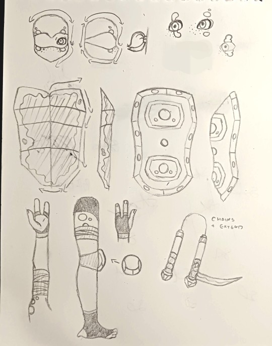
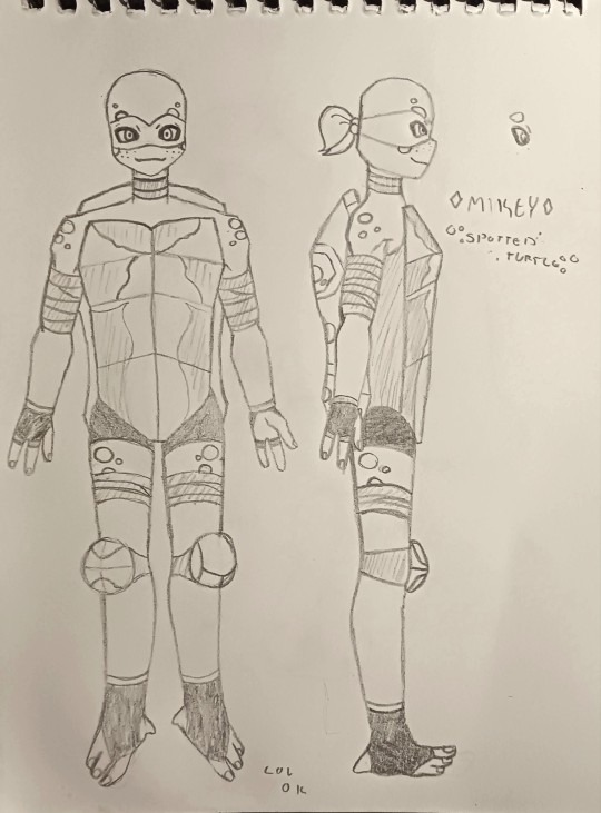
I do wish I had the tools to try and create these in a 3D format as 2012 is in 3D, maybe then I can get a better idea on how these guys will look in a 3D space. I do hope you like my redesigns, I felt like Leo was my biggest challenge when it came to redesigning, idk why he was hard to do but I eventually figured him out a bit.
Next update on these guys would be some color pallete references. While I work on those, do give some criticism on my sketches and I might incorporate them in the digital versions.
#tmnt#teenage mutant ninja turtles#tmnt donnie#tmnt michelangelo#tmnt leonardo#tmnt donatello#tmnt raphael#tmnt 2012#tmnt 2012 redesign#teenage mutant ninja turtles leo#teenage mutant ninja turtles donnie#teenage mutant ninja turtles raph#teenage mutant ninja turtles mikey#raei art#raei talk#tmnt art
6 notes
·
View notes
Text
#showyourprocess
From planning to posting, share your process for making creative content!
To continue supporting content makers, this tag game is meant to show the entire process of making creative content: this can be for any creation.
RULES — When your work is tagged, show the process of its creation from planning to posting, then tag up to 5 people with a specific link to one of their creative works you’d like to see the process of. Use the tag #showyourprocess so we can find yours!
sabrina @lanwangiji, my love, tagged me to share my process of making this typography edit! check out her explanation of her the untamed edit and her edit tag.
1. PLANNING
i once opened lyrics edit requests so i can learn and practice typography. this edit was a request as well. i asked them which lyrics they wanted to have and the colors they’d like. since i got several requests and it was hard to keep tabs on them, i made a trello board so i could organize everything. i’m still using the trello board for every edit idea i have, the board makes my life easier.
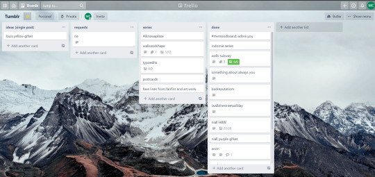

above is what i filled the card in the board with. basically just information of the requests.
1.1 INSPIRATION
once i got the request, my first thought was to find the vibe the song/lyrics exude. “it’s an old curse” screamed witchy vibes to me, so i went to pinterest to find some inspirations. at first i was looking for witchy poster designs and i came across this. i liked how it has smoke-ish graphic and i thought the smoke suited the “old curse” lyrics. and tbh pinterest is a rabbit hole, they gave me suggestions after suggestions, like this and this which became my inspiration for the color palette (i added the gold from those pics) and the sun moon design gave me the idea to incorporate space stuffs too. i somehow landed on this too, and because i wanted to include space theme, i made a simple phases of the moon. ultimately the hero of this edit was the lyrics, i didnt want the graphics took the center stage. i was inspired to make a crystal ball and do this kind of typography but after several trials i couldnt get the the typography right, so i scratched that idea and went with the space theme instead.
1.2 PICKING COLORS
after i was feeling inspired enough, i went looking for the right colors. i usually just type “color name” and “palette” on pinterest. example “dark grey color palette” and i chose the one i liked best. when the request only asked for 1 color, i always searched for either a complimentary or contrasting color to give it a jushz, to add sprinkles. that’s why i added gold on top of the dark grey.
1.3 FINDING FONTS
this is the hardest part. the fonts play important role to the design. they need to convey the vibes of the lyrics, in this case witchy/magic vibe. i needed to find fonts or font just as magical and a bit whimsical. tho i hoard fonts... i like to use new font for every typography edit lmao sue me.
i highly recommend going to creativemarket free goods site, pixelsurplus font freebies and behance to search for fonts. i always use 100% free fonts, that means i can use it personally as well as commercially. creativemarket gives me desktop license for the fonts, which means i can use it for commercial as well. the reason i do this because i want to open an etsy shop someday, and i want to have the right license when i sell my stuffs. i almost never buy fonts bc they are expensive lmao.
the fonts in used are “Vintage” for the main typograpy (i think i was a freebie from creativemarket) and “Morganite” for the title of the lyrics and the name of artist.
2. CREATING
once i have my materials and ideas, i open my illustrator and hope it doesnt crash every 5 min.
for this kind of typography edits, i use 600x700 px. tbh i dont like using 540px, the suggested tumblr size, as the width bc to me it doesn’t look as good in quality, so i up the px. but more on this sizing later. i utilize the artboards function in illustrator, and i use 2 artboards.
i use illustrator (ai) bc i’m working with vectors. when i work with vectors, the graphics/texts or whatever im making in ai wont become blurry or lose its quality when i enlarge or shrink it. in compare to photoshop, i need to make for example the moon graphic very big, so i wont lose the quality when i reduce and enlarge it again. with vector, i can start small and when i expand it, it’s still as good as when it’s tiny.
2.1 GRADIENTS
i started with the gradients first. i created a rectangle as big as 600x700px and with the “freeform gradient” tool in ai, i played with the colors. below is the color palettes i used
2.2 LYRICS AND GRAPHICS
once the gradients are done, i worked with the lyrics and graphics right away. when i first doing this edits, i made typos a lot lmaooooooo. so i copy and pasted the lyrics on top of my artboard, so i wouldnt have any typos.
i had 3 layers in my ai. one for the inspo pics and the OG lyrics. the rest for the edits themselves. i broke up “It's an old curse/dreamers diving headfirst” into to parts, hence the 2 more layers
i almost always started with the lyrics first then the graphics. but for this edit, i made the smoke first so i can layout where my text would be.
tbh the process of making the lyrics is a trial and error. i tried bunch of different stuffs and i chose whatever the best. but i worked like methodically, i made sure i finished the first part of the lyrics first then i could move on.
i was lucky with this font “vintage”. the font offers me several glyphs like these
and i chose the one at the bottom. you’re very lucky if you find a font and they have glyphs.
excursion: glyphs vs fonts
glyph is an individual character. It might be a letter, an accented letter, a ligature, a punctuation mark, a dingbat, etc.
A font is a digital file which is used to display a typeface, which contains the entire upper- and lowercase alphabet as well as punctuation, numbers, and other special characters.
after i was finished with all the lyrics i added some graphics to make the edit pretty like small stars or dots. i added the song title and the artist too, sometimes at the bottom sometimes at the top. and i added my watermark put it as small as i could and made it a bit invisible but still can be seen.
2.3 EXPORTING
exporting! this is where i’m going to go deeper with the dimension of my work. in ai, i always choose to save with “export as screens” function. it automatically divides the artboards i have and save them separately. i always save as png, bc the size is smaller than jpg but can maintain the quality.
now the export tab looks like this
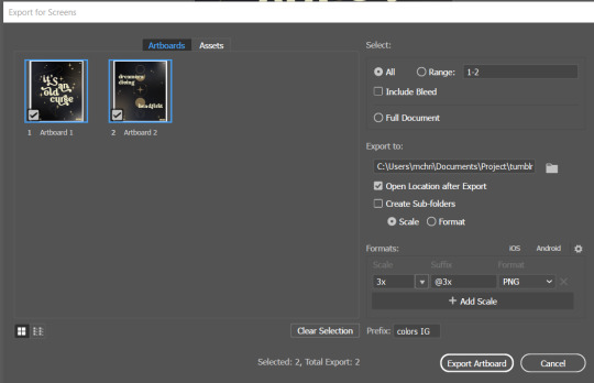
see the formats? i always scale up my edits, 2-3 times the original artboard size. reason is, to maintain the quality. i have tried to save it as original, 600x700 px, but it turned out a bit blurry. bc everything in ai is vector, when i scale up it doesnt lose the quality. BUT once i save it as png, it’s not a vector anymore, and when you zoom in until a certain degree it’ll be pixelated. that’s why i always scale up, to avoid it becoming pixelated when it’s just zoomed 1 or 2 times.
2.4 FINAL TOUCH
i opened my photoshop and also pray it won’t crash. import the png of my edits, add some grains/noise. the reason i use photoshop is, the noise filter is way better than in ai. it’s smoother somehow. and then i export my edits.
(i have a timelapse of how i made one of my edits, it’s not this one, but it’ll give you a better visualization. find it HERE
3. POSTING
now the hardest parts are done, we go to posting!
i uploaded the 2 posters on tumblr as photos then i wrote the captions. for this typography edit, i always chose another lyrics that i like from the same song for the caption. i bolded the lyrics, add link to all of my typography gradient edits.
i always use this link to color my caption. i usually choose 3-4 colors, and i took the colors from my edit. but this was not until recently lmao. before i just took a guess and looked for similar colors that match the edit, but then i thought “why didnt i just use the color in the posters lmao”
ok after i have my html code for the caption, i go to this site to replace the “;” with “ “ so tumblr can read the code.
i’m not one who puts their edits in draft, bc i just cant wait to post it. i have to option here, either i post it immediately when the time is right (i usually post between 4-8) or i schedule it, if im finished before 4.
i put all the necessary tags and click post! i am done finally!
i’m tagging:
@thetriangletattoo for this amazing series
@deludedandlostcause for this impressive gif
@half-lightl for this spectacular edit
@gayndrew for this stunning drawing
@thechampagnelovers for this cool collage
@cloudslou for this incredible edit
@heyangels for this incredible edit
35 notes
·
View notes
Text
Rainbow High Dolls/Shows Ramble pt. 2
As promised here is my list and opinions on both the dolls and characters. I didn't include any dolls that haven't been reviewed/come out yet.
Must have doll faves (not in a particular order):
Bella: When I first saw her doll way before I fell down the rainbow, I just absolutely fell in love with her design. She's the one if I only have one she's it. I like her character on the show. I hope they explain more about her return and show her interaction with her roommates and team members. I think while fans love her, I don't think she's MGA's fave (I'll say who I think it is later).
Georgia: Another, when I saw her doll I thought she was so cute. I like her second outfit the most with her. I loved they gave her a Southern accent and I hope we will see more of her. I think we will because in an Vi Life ep it said she went on a date with Emerald.
Poppy: I love Poppy's first version the best. Her overall aesthetic makes up for the fact that the first wave have shiny faces. I think her cheer look is too plain and the winter break line doesn't wow me. If they make a runway look, I'd want that doll over her og doll especially if the face was matte. I like her character for the most part. I was disappointed that she sided with Violet on the whole viral video thing.
Gabriella: Her design didn't really grab me when I saw her in the background on the show, but as a doll I really like her. I do think she's unnecessarily bitchy, but in a way her icy veneer might melt a little. She's kind like a tsundre character.
Daria: I think her doll is gorgeous and if I get her I want her to wear her second outfit, but maybe not with the heels (though I do think they are gorgeous). We don't know much about her, but I'm liking what I'm seeing. Since she's a singer, I really want to hear her.
Emi: Her face is so beautiful and I love the blends of different purples. I do wish they had put her hair to frame her face more, really utilize the Farah Fawcett hairdo better. It would make her forehead not look as large. Though, that's something a little restyling could fix. I want to see more of her in the show.
Not faves, but wouldn't mind owning them (no order):
Sheryl: I love her Clueless inspired look, but her doll didn't blow me away. If I did get her I would prefer it if she didn't have the dark lip liner. I do think she would look cute standing next to a Bella doll with their similar taste in clothes. I haven't seen enough of her yet in the show. Honestly, the girls should have washed their own clothes and Stella should have made sure to empty out her pockets.
Daphne: When I saw her in the background I got so excited about her possibly being a doll. Then I saw her doll and I wasn't blown. I do like her design, she's just not a must. She seems like she might be an interesting character in the show.
Laurel & Holly: I like their dolls, but they are very expensive as a duo set (RH in general is very expensive and I understand why). They are bitchy, but in a fascinating for onlookers kind of way.
Krystal: I like her, but I'm not loving her. I wish there was more variation in her color palette. I don't have much opinion about her character yet.
Sunny: I like her dolls better than her character. If I got her it would either be her og look or her winter break look. I did like the baby hairs they added in the runway show, but I wasn't in love with her look enough to want a possible doll version. Her personality is one I'm bad with, like she's nice but I could only take in small doses all the overly cutsey perky. I feel like her and Violet went and got bangs together. I also feel that MGA really like blunt bangs because they have at least four characters with them: Sunny, Violet, Ms. Wright, and purple background girl that has Ms. Wright's haircut. I think she needs to call Violet out more on her bs.
Jade: I think her and Bella are really cute together. Honestly, I would want her doll just so I could have Bella and Jade side by side. If I got her it would be as of now her cheerleader version, because I like the brighter lip color on her than the nude. BUT! If they come out with her runway look (or at least with black lipstick), then hands down it'd be that version and I'd move her up to my faves list. I love how she's the sweatpants and t-shirt girl, but her makeup is going to be on point.
Skyler: I like her character and I'm happy they are making her more confident in herself. If her og doll had a matte face, I'd like it better. So, if I got her it might be the cheerleader unless they come out with something better. I don't like her winter break look enough, except for those curls.
Jett Dawson: She's my favorite upperclassmen character. I hope we see more of her. If I got her doll, it'd be on clearance or something. I'd probably keep her in her box because she's got a lot to display and she cost a lot.
Amaya: I feel MGA loves her the most, because she's got the most merchandise and storylines. I wouldn't mind either one or both of her looks. If I got the white version, it'd have to be second hand because I don't care for the hair makeup. Unless, they made her runway look then I'd get that one. I loved her runway makeup on her more than the makeup-less face (don't take this as people look better with makeup) that she has with the white version. I didn't like her white hair in the show at first, but in the runway ep it looked really good. At first I wasn't crazy about the blue in show, but I liked it for her doll look. Now I like it in show and as a doll. I'm glad they didn't make her a complete replacement of Bella by having her dye her hair pink and be in set design. It's best that they went with blue and fashion, because if anyone was going to be the most forgiving of having their feet stepped on (after Sunny) it would be Skyler.
On the fence about or probably won't get
Ruby: I like Ruby as a character and I so badly want to like her dolls. While I love the color red, I just find her looks too intense. I really hope they come out with another alternative look with her in mostly black and a matte face. If I could I'd want her a black biker jacket, black pants, her flame boots, and either a white or black t-shirt. Her outfit would have a flames motif to go with her boots. Despite what Violet may think in her Vi Life, I think don't think Ruby and her are all that close. I think Ruby is closer to Jade and Skyler (mostly Jade).
Violet: I love the color of her hair. Her personality needs work and I hope they keep working on it. Unfortunately, her color palette is a bit boring. I don't love any of her doll versions. Her dress from her og look is my favorite of her clothes. I can take or leave her bangs. Part of me wants her as a doll so as not to exclude her from the rest, but the other part is do I really have to. I think MGA was originally more of a main character than what she is (because she was used a lot for promos and ep 1 starts with her and Sunny), but people find her too unlikable. If the winter break line wasn't so shiny face and I could get her in just the figure skating outfit, then that would be the version I consider of her so far.
Kia: I question her matchmaking skills with her trying to pair up Bella and Colin. First, I was like "gross, she's gay and she's already got Jade." Then, I realized that Kia obviously doesn't know the full story about Colin and Skyler or at least doesn't know that Skyler and Bella are friends. Because no way would someone date their friend's cheating ex. I wish her name wasn't spelled that way, because I keep pronouncing it the same as the car instead of as Ky-ah. I like her doll design, but I just wasn't feeling it in part due to the show and her price tag. I would like to see more of her character.
Karma: Curious about her character. Don't care for her fashion. Love her face and it makes me wish more her color wasn't so intense. I'm not sure, but it seems like her doll is taller or at least thinner than the other doll. Honestly, I'd dress her doll in a white t-shirt and jeans and most likely put her hair in a ponytail. Since she's a cheerleader, I am curious as to what her cheer look would be.
Avery (and the other As): I don't care for the As as a whole. I wouldn't really want Avery's doll in part because I don't care for the As and because I don't want all the stuff that comes with her. Though, her doll does make me wonder if in the show her hair is a wig and she actually has a pixie cut under it. I do like the As better in season 2 than in season 1 (I thought they were very suspicious). I liked that Avery took Bella out for a drive to help her feel better. I thought was funny that Aiden covered Ainsley's mouth during the play so she couldn't say something that obviously wouldn't have been G-rated to Violet. I do think they should make Ainsley and Aiden dolls so that people, who want to, can collect the As. I'd be tempted to have Ainsley or at least her clothes, because I'm really digging her look. I know Aiden is a backup QB, but his doll most definitely shouldn't have abs. He doesn't seem like the guy who works out enough or play sports enough to get abs.
Stella: I don't see myself getting her. Her color palette is really harsh to my eyes. Which is funny to me because I love my 60th anniversary Barbie (the one with the pink hair), who has a similar color palette. I think it's because of all the textures in Stella's wardrobe that makes it too much. If they gave her another color like black or white to balance the hot pink, it might be better. From what we've seen of her I don't care for her personality. I'm glad they had Bella brush her hand away when she tried to see if Bella was wearing a wig. I do think her personality adds spice to the show, but it would take a lot for me to like her.
River: Like his character so far, but not crazy for his doll. The big eyes are just a bit much and cutsey in his doll more so than in the show. From what I've seen MGA is not good at designing male dolls (doll makers in general struggle with this, but they are the worst I've seen). I do think River looks better than male OMG/LOLs and NaNaNa Surprise male dolls. To be honest it's hard to please me with male dolls. I have/had three male dolls (non-action figures and figurines) in my entire life so far. I do like his second doll outfit and can't wait to see it in the show. I do like him and Amaya together. I think they make a cute couple and I like how in awe of her he was during the fashion show.
11 notes
·
View notes
Text
#KizunaCountdown day6

Hello.
Day 6 - Favorite Adventure Series
The most obvious answer is... Yes, it is 02 because of reasons.
As I previously said, 02 is the one I watched the most and was the “door to the franchise” so I have a big emotional attachment to it, to the BR dub, to the characters and plot.
I really really think when you start with 02, the OG anime series feels “missing something” which are definitely the 02 cast. I know this is odd and stupid, because none of the four or their partners were been envisioned/created for the first series. Though my attachment to them made me feel like... Not enjoying that much of it.
I know 02 is claimed to be “full of plot holes” and “worse series” but to me it’s a good series. It’s not “the best” or “the worst” it’s simply a series where they tried new takes, new narratives and new elements to expand Adventure’s lore. So, if you hate 02 it’s OK but let’s admit -- if weren’t for its existence, there wouldn’t exist Tamers, Frontier, Savers, Xros Wars, Appmon and even tri. and Last Evolution Kizuna.
I do love all three, mind you. I have my own complaints for all three (and all in general series as well) but I’ve mused and vented a lot about those, so let’s skip that part.

I still think this series is the most lovely, the idea of the children having to deal with two lifes at the same time might be pretty cliche but quite of made 02 my favorite series from all of them all -- They got more outfits than OG series, for spring, summer and winter. Not to mention the goofy and groovy “Digital World outfits” which some might be weird imo but they match each kid’s personality.
The 02 cast digimon design is so cool and soothing. I love the colors of V-mon, Hawkmon, Armadimon and Wormmon’s palette. And All those details like face marks, different shapes. My only complaint is like we had four digimon with blue eyes while only V-mon and Armadimon had red and green eyes. But okay, the color palettes of them are so delightful to me.
The digimon forms are also funny, and this time most of them follow some “pattern” unlike the OG series. I’m not very fan of it -- I like wild combinations, like Tailmon’s line -- but they’re cute and cool at the same time.
As a kid, I didn’t care that much of most of the cast, except for Miyako, Takeru and V-mon lol, but growing up and rewatching the series made me love all of them (also the Older kids/Taichi’s mini team) -- Daisuke’s optimistic and goofy personality taught me how to keep fighting for my dreams, Miyako’s arcs taught me I can be a girl and like “non-girly” things (also be sincere & lovely too) , Iori taught me about morality spectrum, Ken taught me about redemption. Takeru and Hikari also taught you something -- to never lose the hope in your heart, which means having a light inside of you.
02′s plot may be hella confusing, but on another point of view, it talks about the duality of people, about complexity as they show the villains are more than “evil enemies trying to conquer the world” (Except for BelialVamdemon LMAO) so it’s a series where they definitely tried a solid plot instead something more “weaker” as OG was (mind you, I love the first series but what I TRULY LOVE in the first one is the Eight kids, their partners and their arcs)
Also soundtrack!!
While it still uses the previous series Soundtrack... I love all the new songs and BGM for it. Too bad they never played most of them, or played like just a few seconds on an episode.
But let’s talk about the songs right.
Wada Kouji’s Target is somehow nostalgic to me because it indeed played on the BR dub, as you must know wasn’t changed in the episodes -- only the OP & ED were changed alas -- so this means this song, one of my most favorites from my childhood, were present in the preview of an episode in the dub. But also!! Was present as Imperialdramon’s insert, just like in the original JP version.
Also Wada Kouji’s Boku Wa Boku Datte was present in the ep 8. I had a strange attachment to this song as a child. Since the day I’ve read the translation of it, I’ve realized this song fits Daisuke pretty well and his struggles to show himself, to be the star -- since this song plays during the soccer match and fits the scene. Especially when you know he feels threatened by the cool guy Takeru.
Also Butter-Fly -- which wasn’t present in the end of the OG BR dub, IS present in 02′s Epilogue scene!!

AiM’s 1st 02 ED song only played ONCE in the BR dub. And it was as preview of one of the episodes as well (I believe it’s the preview for Mimi’s debut episode??) and I really liked that song. When I found out what was that song AND it was actually 02′s original first ED... Of course I ended up very attached to it xD Also pardon I couldn’t type its name since it’s very long... orz
Also, AiM’s Now It’s The Time was present as well.
Sadly, Itsumo Itsudemo wasn’t present :/
As for Miyazaki Ayumi’s songs... Since I watched the first episode of 02 as a child, the BR dub, I felt very attached with Break Up! and episode 26 is so ultra nostalgic to me thanks to Beat Hit! , making me hear the dub dialogue in my head in the first times I’ve played the song after finding it complete on the ‘net.
Bokura no Digital World was there if I’m not wrong, as for Sun Goes Down if I’m not wrong. The Christmas songs were there too!!
So, basically... A lot of these 02 songs were part of my childhood. And my teen days, because it was when I found Positron Cannon’s subs. And I’m still so so thankful for its existence and for being complete.

So here it is, My Chosen Children (& digimon)
My fave Adv series will always be 02.
7 notes
·
View notes
Text
Alrighty!
So a few days back, I did a CAS makeover of various families in Oasis Springs, and I didn't want to repeat what I did last time. And thus, picture splicing. Through Ibis Paint. It's fine, it worked. I first did Katrina Caliente as a bit of an experiment:

With Katrina's outfits, I wasn't really sure what I was going for. I don't have much of a connection to Katrina, but I tried to use her traits as somewhat of a guide. Her partywear is a dress from Perfect Patio that I'd never used, so I figured I could use it for her, and I think she looks nice in it.
By the way, in my game I saw that MC gave Katrina a bit of a story! She went off and got married to a grand master vampire named Colby Wynn (so now she’s Katrina Wynn), but before that she had a kid with Don named Samuel. Scandalous? Maybe not. Very interesting though. Now she lives across the road from the freakin Landgraabs. She’s living the high life now.
Nina:

One thing I thought was odd about Nina is that the chick got abs, even though if you have her clean a kitchen counter she's complaining due to her lazy trait. How and when did she get these abs?
At any rate, I decided with her athletic outfit that she would be dragged to the gym by Don or Dina (bc they're athletic or whatever) but all she would do is take pictures of herself in her leggings. Maybe make fun of someone falling on their face because she's like that. I do really like how she came out, though.
MC tried to make Nina a freelancer, but I didn’t think that suited her lifestyle, so I gave her a part time job in retail, which is probably perfect for her hot-headed and lazy traits.
Dina:
I also struggled with Dina a bit, but it was mainly because of her hair. I kept it short, but that meant that there weren't really a lot of options for her. I like to think about whether you could realistically have a hairstyle with a certain hair length, and since I very recently used to have hair that length, I knew that a bunch of hairstyles would be too long for how her hair is.
It would've been fine if I wasn't such a stickler for these kinds of things.
MC didn’t do anything with her, which was fine. I’m currently trying to have her pursue and complete her mixology aspiration. Right now she just needs to get a few more promotions and she’ll be fine. Except for that ‘make three drinks during a social event’ which I’m not so keen on. I rarely throw parties in The Sims (or at all really) because they’re so stressful and I’m too occupied with too many things. It’s not optimal. But I guess I’m gonna be doing that sometime soon.
Don:

I'll admit that I do not generally like Don Lothario as a character. The fact that, in The Sims 2, he would pee in the shower and leave puddles that he would never clean up was like a personal insult. How dare he.
In The Sims 4 though, Don just comes off as a bit more... Chad? I'm not sure if that's quite right, but his og hair reminds me of when I was in 5th grade and all the boys had their hair like that and they thought they were the fucking shit. They were not.
I dressed him with the main thought of "Yeah, he would dress like that," and it was fine. I'm not 100% sure about his everyday though. I might end up changing that later, but for now I'll keep it.
Part of me wanted to give Don the athletic career, but then I remembered how I filled the house with toddlers, so someone had to be at home. I had already given Dina and Nina jobs, and I still have the ‘Don Lothario does medicine’ idea stuck in my head from the Sims 2, so I put him in the freelance programming career, because I’ve never done that before.
I really haven’t dabbled with many of the careers, if I’m being honest. It’s probably because I keep jumping from save to save, so I don’t get around to finishing things. Oh well.
After that I just had to do the Landgraabs. I didn't include Nancy's athletic wear because it was basically the same as before- it was a white tracksuit, except now it doesn't have any orange on it. It's completely white except for her shoes.
Nancy:
My thought process for dressing Nancy was really vague. I wanted to keep that bright, crisp color palette that she has, but still incorporate that “I am not fucking around here” energy that I get from her. Don’t ask about the hair though. I really don’t know what I was going with there. Sometimes I select hairs thinking ‘lol I never use these’ and then I end up having the Sim use it, and that’s what happened with Nancy. I’m not sure she really deserved it, but it’s gonna have to be fine.
I also kept out a picture of Geoffrey, but it was his sleepwear. I didn't have a problem with it, so I kept it.
Geoffrey:
As far as Geoffrey's new outfits go, I feel like I was going for a very "grandpa" look for him, and it made me think about the dynamic that Geoffrey and Nancy would have. I used to think that Nancy was this powerhouse that would stop at nothing to get what she wants, including the law, and that Geoffrey would just be quietly standing by trying to raise Malcolm to be a respectable Sim (which he is not), but from looking at other people's stories, I feel like Geoffrey would be 100% aware of Nancy's criminal aspirations, and would mostly (with his experience as a Secret Agent) make sure that anything going on in his family would be kept on the down-low.
Because he married into the Landgraab family. It's not like he held the Landgraab legacy and Nancy's ambition and drive won him over and she married into it. He knowingly married into the family, for whatever reason. Did he want the financial stability? I mean, that always helps. I still think that he would want Malcolm to be successful, earn a degree in something (knowing Malcolm it'd probably be Villainy) and raise a family of his own, but Geoffrey isn't stupid.
I imagine that he would like it if him and Nancy had a better relationship with Johnny, seeing as he's their son too, but you can't have everything.
Malcolm:

Finally, at the end of everything, we have Malcolm Landgraab. If his outfits don't scream "prep rich boy", then I did something wrong, because that was 100% what I was going for. He doesn't have enough muscle to be like a "frat boy" or something, but if you caught him in his athletic wear, you would just know that it's worth more money than you'll make in a year, and he has at least three of them that all look the same.
With his everyday, I was keeping in mind that story from Geoffrey wanting Malcolm to be successful and pursue uni. Clearly he would be in Foxbury, because to be in Britechester would be a deeper disgrace than Johnny straying from the Landgraab path. Do you really think Nancy can make another heir now? There's some pressure on Malcolm for sure.
#so now that's all finished#took longer than the other cas posts#but it's more condensed#it's better this way#this will be followed up by more content from the ivey family#but i wanted to at least share#because i really like validation#it feels nice in my tummy or something#idk#ts4#the sims 4#simblr#the sims 4 screenshots#the sims 4 cas#oasis springs#ts4 oasis springs#ts4 caliente family#ts4 landgraab family
3 notes
·
View notes
Text
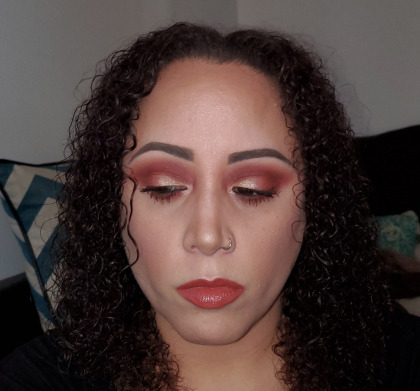
Hey doll hey!!!! How you doing today? Good I hope. I woke up a bit later than I had planned to but I am feeling pretty good today. It’s a bit cold so I’ve got myself bundled up to help keep from getting extra pain. I woke up wanting to do a Valentine’s Day makeup look so this is what I came up with. Today I still am testing 5 items to see whether or not I will be keeping them as well. The products I chose are…. ELF Illuminating Palette, Anastasia Beverly Hills Modern Renaissance Palette, Bobbi Brown Skin Foundation, MAC Pro Longwear Concealer, and Kat Von D Everlasting Liquid Lipstick (in the shade Lolita II). I will review these products and tell whether or not I decided to keep them in Final Thoughts but for now …. let’s jump into the Face of the Day….
Base: I primed my face using NYX Pore Filler ($14 at Ulta and on the NYX website). I color corrected using Tarte CC Undereye Corrector ($25 at Ulta and Sephora) in the shade Light-Medium. For foundation I chose Bobbi Brown Skin Foundation ($50 at Sephora) in the shade Beige 3. I concealed my under eyes using MAC Pro Longwear Concealer ($25 at Ulta and MAC) in the shade NC 30. I set my face using Rimmel London Stay Matte Powder ($3.97 at Walmart) in the shade 011 Creamy Natural. I warmed up the face using Physicians Formula Butter Bronzer ($5.99 at Target) in the shade Bronzer. I set my under eyes and baked my jaw line, bridge of the nose, and center of the forehead using RCMA No Color Powder ($15 on the Beautylish website).
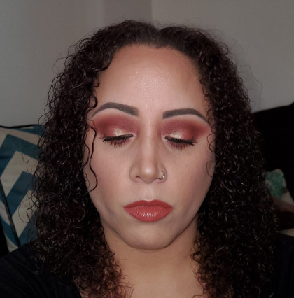
Eyes: I primed my lids using NARS Soft Matte Complete Concealer ($30 at Sephora) in the shade Medium 1 Custard and set that with Laura Mercier Loose Setting Powder ($39 at Ulta and Sephora) in the shade Translucent. For today’s eye look I used the Anastasia Beverly Hills Modern Renaissance Palette ($42 at Ulta). As my 1st transition color I used the shade Burnt Orange (a tan based orange matte). My 2nd transition color is the shade Venetian Red (a dusty mid-toned blue based red satin). On my mobile lid I used the color Vermeer (a pale champagne shimmer) on the full lid. I then deepened the outer 1/3 of the mobile lid and the outer v and low down on the crease using the shade Red Ochre (a deep maroon red matte). I then took the shade Primavera (a golden champagne shimmer) on the inner 2/3 of my mobile lid. I then took more of the shade Venetian Red and patted that in the middle 1/3 of the mobile lid to mesh the inner and outer 1/3 together. For my drop shadow on the lower lash line I used more of Burnt Orange followed by Venetian Red. I highlighted the inner corners using more of the shade Vermeer. I then deepened the lower lash line with more of the shade Red Ochre. I lined both the upper and lower waterlines using Iglot Eyeliner Gel ($17 on the Beautylish website) in the shade 90 Brown. I set my brows using Pixi by Petra Brow Tamer ($10 at Target) in the shade clear and then filled in the brows using ELF Ultra Precise Brow Pencil ($5 at Target and on the ELF website) in the shade Dark Brown. I carved out my brow line using BH Studio Pro Brow Highlighter ($5 on their website) on the matte side and set that using the shade Tempera (a pale peach based vanilla matte). For mascara I chose NYX On the Rise Volume Liftscara ($11 at Ulta and on the NYX website) in the shade Black.
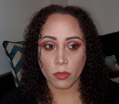
Cheeks and Lips: For blush today I used Flower Beauty Flower Pot Powder Blush ($8.98 at Walmart, Ulta, and on the Flower Beauty website) in the shade Warm Hibiscus (a rosey pink with a gold sheen). I highlighted the tops of my cheeks, bridge of my nose, Cupid’s bow, and center of the forehead using ELF Illuminating Palette ($8 on their website) and mixing all 4 shades together. I then lined and filled in my lips using Kat Von D Everlasting Lip Liner (normally $19 some shades on sale for $8 at Sephora and the shade I used was a limited edition shade no longer available) in the shade OG Lolita (a pinkish terra cotta nude). I first tried to top the lips using Kat Von D Everlasting Liquid Lipstick ($21 at Sephora) in the shade Lolita II (a deep terra cotta nude matte) but it felt so dry and so tight that I promptly took it off and re-lined and re-filled my lips with OG Lolita. I then topped my lips off with NARS Lip Gloss ($24 at Sephora and on their website) in the shade Stripe Tease (a pale beige nude).
Final Thoughts:
ELF Illuminating Palette: This palette isn’t that old but I hardly ever reach for it. It’s a very powdery and dusty formula that is a subtle highlight. I have tried it several different ways and nothing really seems to wow me. I have so many highlighters that I just don’t want to keep one around that doesn’t make me happy to use it. I have decluttered this one from my collection.
Anastasia Beverly Hills Modern Renaissance Palette: When this palette first came out I could not put it down. I wore it almost every day. But I haven’t really reached for it much in the past year and 1/2. I used it today because I had never tried the red shades. The reds blended out so wonderfully but there was tons of kick back in the pans and fallout on the face. I have most of the neutral colors in other palettes and I did just order the new ColourPop Valentine’s Day palette which is chalk full of reds. The shimmer shades don’t wow me as much as most of the shimmers I have in other palettes so I have decided, reluctantly to declutter this palette from my collection.
Bobbi Brown Skin Foundation: The shade I have is a spot on skin match. This foundation is a bit weird. Sometimes it is glowy and sometimes it goes on matte. I think this is do to the primer I am using. For instance I used a pore filler primer and today this foundation went on matte… it also didn’t need to be set down, it wasn’t tacky at all, but if I use let’s say the BECCA Backlight Priming Filter… this foundation is dewy and stays tacky. I do love the way this foundation looks on my skin and I enjoy the coverage it gives (a sort of high medium coverage). I will not be decluttering this foundation from my collection.
MAC Pro Longwear Concealer: This was the 1st MAC product I ever purchased. I do love the way this concealer looks under my eyes, I just wish it was lighter in shade. NC 30 is my exact shade match I think NC 20 would have been better from my under eyes. I haven’t used this concealer a ton because I just have so much concealer, but I do really enjoy this one. I think I will use it up and then purchase it in the shade NC 20. I will not be decluttering it from my collection.
Kat Von D Everlasting Liquid Lipstick (in the shade Lolita II): This is the last of my KVD liquid lipsticks I have left in my collection. I had decluttered the rest of my stash. I kept it because the shade has sentimental value to me. I used it on my niece for her prom and I just couldn’t part with it. It’s just so stiff on the lips that I don’t enjoy wearing it. I have decided to declutter it from my collection.
*** as a side note, most of the products I have decluttered from my collection I have gifted to either my niece or to a friend… there are a few products I have just tossed in the bun but mostly these products have been given a new home ***

Well that’s all for now dolls. I will be receiving my ColourPop All That Palette on Monday so I will be doing another Valentine’s Day look on Tuesday. I will still be testing out other products that I’m on the fence about to see whether or not to declutter them, so stay tunes… in the mean time I hope you are in good spirits and that you have a good rest of your day/night. Until tomorrow dolls… remember save a spoon for a bit of lipstick.
XOXO
Valentine’s Day Inspired Face of the Day Hey doll hey!!!! How you doing today? Good I hope. I woke up a bit later than I had planned to but I am feeling pretty good today.
#Anastasia Beverly Hills#Beauty#Bobbi Brown#ELF Cosmetics#Kat Von D#MAC#Makeup#makeup review#Product Review
1 note
·
View note
Note
Hey Lilium! Thanks for your answer, it was really informative! I’ve got myself a litte tablet atm which is really working for me. I meant to ask about character design too- what advice could you give on that?
I’m glad it was helpful!
Here’s my experience with chara des then, bearing in mind that I’ve yet to finalize a single original charades and all I’ve done till now are redesigns, which -for me, at least?- are a lot easier since they give you a guideline, even if just to say “I’m doing the opposite”.
1. Find a main theme for the project/piece
2. Research-research-research
3. Bear in mind that you’re creating/altering something for you to like
4, bonus. once you’re done, consider the audience you’ll show -or not- your work to.
1. the main theme/idea for all my redesigns is “I love Fate, but I also love history and die a little every time a Fate design has nothing to do with the character period/culture/history. I wonder what they’ll look like with accurate clothes?”. I’m still running with it, but it needed some adjustments along the way.
The very first attempt, Martha, was as historically accurate I could manage, which… wasn’t a lot. “low class jewish woman of the 1st century aC” was a little too specific and google gave me little to work on and I had to resort to religious depictions. I’m still happy with her, but now I can see that in my wish to make her as historically plausible as possible I ended up with a design too accurate, to the point of being, well, bland. Bland and sticking out like a sore thumb if put next to any other Fate character. If and when I’ll revamp her, I’ll add details and be careful to include something to convey her personality.
So, 1:1 with history was out, next best thing I had was mixing history and the “Fate”/anime aesthetic. Not for every character, mind (Nitocris looks quite fine in clothes taken straight out of a Egyptian parietal painting), but now that I’ve tried, I’ve settled down for “how they’ll look like with evident historical and cultural inspirations?”, which is what I’ve done for Boudica, Jeanne and Bradamante, what I’ll keep doing for the next pieces and also for the original Servants I’m planning.
Speaking of originals Servants, since I’m having troubles explaining things in general, I’ll use one of them as an example for the next point.
*under the cut for length*
2. Let’s say I want to design another lady from the Orlando Innamorato/Furioso, Marfisa, as a potential Servant.
As a first step I collect info from the source material.
She’s of noble origins, mixed race, “pagan”/muslim (it’s complicated), possibly either north African or Arabian, queen of 7 countries by the time she’s 18, devout, proud, brave, honourable and incredibly skilled as a warrior, has no magic aids or objects but win on sheer ability alone. Twin of Ruggiero (Brad’s fiancee), friend of Astolfo and Bradamante. Had an armor she cared a lot for and went to great lengths to get back when it got stolen.
(me being me, I also went to academia.edu, found articles/PhD on her and read them to better understand the character, but there’s few chara I’m willing to research to this length for a redesign).
Considering Servants are summoned at their peaks, physically I’ll have her look in her late teens/early twenties, brown skin and with a hijab (which will require some research by itself).
Onto deciding the clothes/armor now:
- the “official” time period of her life should be that of historical Charlemagne rule and life, but the works in which she features have no claims of historicity whatsoever and were published in 1483 and 1516.
- comes from the same material as the Paladins and thus should -imo- looks like she somehow belongs with them even if she’s in their enemy camp and from a different culture.
- as they are now, the Paladins common (?) aesthetic seems to be, sorry can’t contain the snark, “random fantasy isekai reject”, with Astolfo being the best designed by miles and Charles looking fine in his alt armored skin, the rest being a disaster. This point has the highest chance not to get contemplated in the final design bc I loathe it. Being less snarky, the few positive design details point to their inspiration being rooted more in 1500 than 800 AC fashion, so I’ll keep that in mind.
So, she’s got no reason to being accurate with a single period (or culture) but could should instead integrate bits from many places and eras. Influences from easily accessible media is welcome, both to mirror the Paladins LN influences and bc the og poems were incredibly successful and printed in spades and read in courts and less noble houses alike.
Now that I have my guidelines it’s finally time to hunt for visual references.
Looking for historical islamic countries armor is a obligatory step bc I personally have no idea how they looked like and if I find how they were assembled and what colors were used it will be helpful to build my own ver and know how things attach. The period and place doesn’t count, I simply go for what I like more and think this particular chara would wear. Your mileage my vary, but for me history is always the first step to start from, bc if you use only popular media or artistic depictions there’s the chance to make mistakes easily corrected when looking at how the real stuff worked and also to get more… repetitive?
Then I look for how the character’s being depicted before in art of all periods. In this case all I found was a white lady in european armor, completely useless, but usually there’s a lot more and for other characters this “spot” is where I spend most of my researching time after the historical one.
Then I look for… video games with historical settings that fit my criteria (remember, popular media). Find something I like and keep digging into a particular game and -if lucky enough- in the deviantart pages of the artists responsible for that or that other design.
After I’ve collected a lot of different refs I go here on tumblr or on DA or in dedicated sites to find nice palettes and after I’ve got different options for these as well, rejoice!, research time is finally over!
Now’s time to mix all the influences and draw :D
3. Not a lot to say here, just that if you’re not working under commission then you’re doing this for fun and mostly for yourself, so put in the things you like. You like implausible fantasy/jrpg/videogame/cartoon aesthetic more than IRL/ historical aesthetic? Dang, go for it.
My mindset got a lot better when I embraced the fact I wasn’t redesigning these characters to “make them objectively better”, there was no “mission”: I was doing this to please myself and my own tastes, and that was enough.
4. For example, I know I could cover all the Fate ladies in armor for no other reason than I like ladies in armor and find at least neutral reactions on this blog or my DA page, but you’ll never see me post my works in the fgo reddit, even those I’m more proud of, because I know that subreddit and I have no intention to submit myself to a river of mocking, accuses of puritanism and muh censorship!!.
I suppose this suggestion’s useless if you want to always widen your audience and/or are looking for employment in the field and need all the recognition you can get, but as I have no intention of doing either I get to decide where to show my stuff and to avoid places where it’s likely the reactions will make me feel miserable. No one needs that noise in their life for a hobby, fuck that.
Last but not for relevance, as a cautionary tale? Spite/anger at something can be one hell of a motivation to start working, but it’s not enough to let you finish a project unless you start enjoy what you’re creating down the road.
In case of og chara it shouldn’t be any spite, but as soon as you get tired of your work, stop, put it on hiatus and go concentrate on something else. We’re doing this because it makes us happy, it’s no good to let it drag and become a chore.
#paragon-arthur#answer#drawing tips#???#i guess??#man i've never taken classes on this take with massive grain of salt bc it's only how i work
5 notes
·
View notes
Text
My expedition into the Link's Awakening DX ROM (trying to get palette data)
I had joined another pixel art collab to redraw the game's overworld, but we were struggling a bit figuring out one cohesive color palette to use. The map we had turned up a lot of weird, seemingly out of place colors that didn't seem like they were supposed to be there.
To get to the bottom of it, I took it upon myself to perform a deep dive into a ROM of the game and find all of the palette indexes used by the overworld.
At first I tried paring down the palette thinking it was just a result of the person who ripped it originally some years ago, but things were still not adding up--the palette seemed fine on its own but felt off.
I then tried using an emulator to pull palette indexes straight from the game, but it got a bit tedious. I later came across a tool used primarily for level editing the ROM, but could also edit palettes and made it a lot easier to rip them. I pulled all 31 indexes used by the overworld and found even MORE colors that didn't seem to be correct, or simply just filler.
For context, one index is composed of 8 palettes of 4 colors each, and one palette is applied to 8x8px tiles where needed--each screen uses one full index, though some are shared between screens.
I finally just decided to use the editor to re-rip the map into Aseprite, *screen by screen,* to ensure we had the correct palette. For reference the overworld map has 256 individual screens (160x112px each), *and* I took a deeper dive into a blog documenting a disassembly of the ROM to figure out how the game applies its palette data.
For starters, the game actually has TWO sets of GFX. One is taken from the original monochrome release of the game and is loaded when the game is played on the OG Game Boy or a Game Boy Pocket. The other is used when playing on a Game Boy Color or Advance. Both are stored in monochrome, and external palette data is applied to the latter at runtime.
Back in Aseprite, I specifically sectioned off major areas on the map to their own separate layers to decipher this. There's so many completely arbitrary colors used only for one specific tile or screen and never again elsewhere. To point out some examples:
- Yarna Desert uses several close shades of yellow and orange to comprise the quicksand pit, as well as a unique green on the skulls seen in the sand.
- The dead trees in Tabahl Wasteland use a somewhat lighter off-white than the one used on the rest of the map. This is also used in some sections of water tiles. I have no idea why this is.
- The Mysterious Woods uses several colors exclusive to that area.
- Mamamu Yan's house in Mabe Village uses unique purples for its roof. A similar house in Animal Village uses unique pinks for its roof.
- Both Face Shrines use a unique, near-black purple on the pillars and some Armos Statues.
- Trees in the Rapids Ride use unique greens.
- Kanalet Castle uses unique reddish-brown tones to compose the castle walls.
- Gopanga Swamp uses a unique orange.
- The Signpost Maze uses a unique red and an orange for the flower tiles.
- The exterior of Eagle's Tower uses unique greenish stone colors.
- The spots on the Wind Fish's egg use a unique pink.
- The entrance to Key Cavern has a unique light purple for one very specific tile.
I did accomplish what I set out to do, and got every color that is actually used in the overworld directly from the ROM. But god DAMN Nintendo was smoking something fierce back then.
I know way more about how this game works than I ever expected to, so it was an educational experience if nothing else. I do not know if any other black-cartridge GBC games do this, but I imagine so now.
0 notes
Text
Live-blogging my reaction to Spiral: from the book of saw
Spoilers under the cut
TL;DR: my overall review is that it was good but I’m going to go watch DPS to cleanse me
- ok so that woman got robbed and for what
- I had to pause to find out who this detective’s actor was Bc it was driving me nuts and it’s MCMURRAY FROM LETTERKENNY???
- love that they’re gonna fuck up this train conductors day lmao
- LOVE genuinely that we’re back to looking gritty and having an old tv play the video and having some rapid cut camera work early 2000’s vibes I embrace you
- why does the voice sound like that,, I wasn’t expecting John but why is it so non threatening now it’s literally just Some Guy™️
- I am glad I paid $15 to listen to Chris Rock talk about Forrest Gump. Worth my money and I mean it genuinely I love Chris Rock he’s great. Stream Everybody Hates Chris on Hulu
- “Z?” Zeke who just had his cover blown: this MF
- “do I look like a fucking Jamaican nanny?!” I- 😀🤚🏽
- ayo Max Minghella
- Chris Rock falling just short of being convincingly aggressively cynical Bc he is Chris Rock with the voice of Chris Rock
- it sounds like he’s setting up jokes that don’t have punchlines and instead they’re just like,, mediocre cynic cop dialogue
- while looking at some pretty fucking intact teeth: this bum is gonna be pretty hard to ID
- I mean I guess the homeless don’t have dental records but were you not even gonna try?
- I’m very pleased Chris Rock put on gloves before handling the strange package I love actually smart character choices that would make sense for them to make
- I.e. the cop knows how to properly handle unexpected unmarked packages delivered to the precinct
- “I thought the jigsaw killer was dead” “well if it’s another copy cat…” another wait is that referring to Logan (which Logan pinned on the other coincidentally crooked cop whose name I’ve forgotten) does that imply Logan only did like? The one trap? And hasn’t been active? Just waited ten years after John died recreates the one trap he was in and then stops?? I mean don’t get me wrong if movie wants to ignore Jigsaw (2017)’s existence I’m game but like what
- also why do the packages look like they’re wrapped in Tiffany boxes lmao
- oh yay they did run dental
- Chris Rock is an asshole but they should go with protocol if that’s what they’re doing
- ordering a man mid piss out of the men’s room to yell at Zeke
- does conflict of interest matter when the whole precinct knows the victim?
- uncomfortable stand-offs with your ex while at the home of a grieving friend
- Samuel L Jackson!
- “I could’ve killed you!” “What are you talking about, I have the gun!” *SLJ pulls a gun out* “I could’ve killed you”
- daddy issues
- “you think this is linked to John Kramer?” Bruh you think it’s NOT??
- ik this is SO far fetched but I rlly hope this movie tells us wtf happened to Dr Gordon. I’m sure it won’t but a girl can dream
- “should we tell Zeke?” “Fuck him” I get you guys don’t like to work w him Bc he’s an ass but like. You’re just not doing your jobs now you’re just proving he’s right that you’re untrustworthy
- splitting up and not telling ppl where you’re going is the number one way to get kidnapped or murdered but way to go cop instincts
- what is this Chinese finger trap ass shit
- love the blue tones tho very Saw
- all it needs is to become uncomfortably green
- fun fact I actually watched the first saw w my friend who is red green color blind and he said it looked AWFUL and I was like oh yeah everything is blue tinted like twilight blue tint and later it’s green just FYI (he thought that made significantly more sense than whatever shit ass color palette he was perceiving)
- being mad at your son for turning in a dirty cop Bc now you’ll have to mess with internal affairs
- and then assaulting someone??? SLJ is an even worse asshole lmao
- another Tiffany box bound in twine maybe it’ll be one of those cheesy diamond heart necklaces
- HELLO what is that ugly ass pig puppet
- also the voice is so stilted did the killer use fuckin text to speech so they couldn’t unscramble the voice like they did to Hoffman?
- cops finding dead pigs, a little on the nose
- oh so this dude has a history of “fuck it” ok well screw that guy then
- SLJ deserves to be pissed at that cop for letting Zeke get shot but like what an unhinged man he threatened to kill him and then actually assaulted him HOW did he EVER get in charge to begin with
- ok wait is Zeke actually the only decent cop (inc his dad but maybe excluding the newbie)
- that is a truly gruesome way to lose fingers tho I must say but he deserves that shit
- wait did the trap not go fast enough or was there a way for him to do that faster and I missed it
- like should he not have hesitated Bc there was a time limit or was it just rigged
- cuz the machine had to pull them off he couldn’t just cut them quickly
- so are they just gonna leave broken leg Dude there or
- also just now I tried to talk abt this movie (so far) vs Jigsaw (2017) to my mom and I got too excited and referenced some character names she didn’t know and she shut me down and said she didn’t care 😀
- live-blogging to my, like, five followers that compromise one one (1) person that knows me IRL, one (1) Sawtual, and a handful of ppl only here for my main DPS content to fill the void of emotional parental neglect. What a great website
- oh no did the rookie die :( he was actually sweet
- I feel like he was too important to kill offscreen tho
- like they’re TELLING us he .. was skinned.. but was he REALLY
- Chris Rock having a revelation: AH FUCK
- everyone else at the crime scene: ….
- favorite thing abt movies that were already gonna be rated R is when they’re like “well if we’re already at R we might as well say fuck”
- she has to SEVER HER SPINAL CORD? Why was she deemed the biggest asshole
- also how on earth was this trap portable it IS in their basement right
- transporting the hot wax is just what gets me
- Chris Rock rn: are you tired of being nice? Don’t you just wanna go apeshit?
- was this abt his dad the whole time???
- does it count as live blogging when I do one big post instead of several small ones lol I just want it to be avoidable for ppl who are just here for Dead Poets Society
- man’s fully abt to cut his arm off like barely even hesitated long enough to notice the bobby pin he could pick the lock with
- there’s a body here suspended
- not hanging mind you
- but covered and suspended
- and I bet it’s the newbie
- ah damn it’s Pete that’s disappointing
- it’s possible the trailers just made him seem more important than he was
- why are they punishing Zeke for reporting a dirty cop and having his career accordingly ruined like he did the right thing and already suffered for it? This killer doesn’t like crooked cops?? Why does Zeke have to be tortured by hearing this dude die like that’s what they want isn’t it?
- I think it’s too late pal
- the glass trap was pretty fucking cool though
- I KNEW HE WAS ALIVE
- I didn’t think he was a MURDERER but I KNEW he was alive
- OH SHIT THE DIRTY COP ZEKE TURNED IN KILLED NEWBIE’S DAD??
- I’m terrible at guessing endings but it makes viewing more fun
- honestly,, do it Chris Rock ACAB
- “you want me to kill cops?” “No, fuck no, just the bad ones”
- what a fun villain though
- I have no idea what the Ultimate Game Plan™️ is here though is he gonna make him kill his dad? I mean his dad does suck but making a dude KILL his DAD? That is a tall order Max Minghella
- ok but literally why wouldn’t you listen to him here shoot the target??
- ANGIE! It WaS aNgIe
- killing this man is not correct justice anyway Zeke
- shot the target! Good man
- groovy of them to play the Hello Zepp soundtrack rn
- oh shit what’s going on SLJ knows what it is
- oh.. w o w. Brutal way to go. Very heavy handed imagery
- and that’s all I guess who the fuck knows what’s up w Doctor Gordon
- and I guess Max Minghella is just gonna get away now but tbh Chris Rock only seemed truly mad at him for involving his dad
- nice rap remix to the OG Hello Zepp score very cool credits music
1 note
·
View note
Photo


ROSE TYLER + WARDROBE / SERIES ONE . in the first episodes of the show , we see rose dress as she did at home . loose fitting , cheap clothes . anything that can be bought from a thrift store or with an employee discount . jackie stole a tag gun from work once , so on the rare occasion anything more expensive or glitzy is worn pre . doctor , it’s very likely about to be returned the next day . we see rose in mostly monogamous color palettes . in the first episode , rose wears a plain pink hoodie over a plain pink tank top , loose fitting jeans , and a strappy purse that’s a bright blue color . it’s clearly thrown together . picked from piles of clothes in her bedroom . pink goes with pink ! and . . . i guess this bag goes ? generally , on days where she’s doing nothing special , minimal effort goes into rose’s clothing . we don’t see a lot of glitzy jewelry from rose , aside from rings . in her first few days traveling with the doctor , rose wears mostly the same sort of clothes she’d wear at home . ( see : the end of the world , fathers day . ) we see a lot of hoodies over tank tops , denim jackets , loose - fitting 2000′s era jeans , and t - shirts with loud prints . rose very rarely wears skirts or dresses unless there’s a real fancy party going on and she has to . we can see by the parting of ways , that rose starts to experiment more with fashions . she still stays true to punky fish , her og brand , but she tries on more asymmetrical / futuristic outfits with stronger lines and bolder silhouettes . she’s trying more , not as little kid plucking whatever clean clothes off the floor anymore . even in the empty child , rose states she’s “ trying it out ” and thinking about different clothes , creating a more definitive look for herself , when she wears her union jack top . ( this can also be applied to her hair , which will be a whole different post . ) this progresses through series two .
5 notes
·
View notes
Text
The Best of Clean Beauty 2019
New Post has been published on https://healingawerness.com/news/the-best-of-clean-beauty-2019/
The Best of Clean Beauty 2019
What a year it has been! Earlier on the in year I launched the Clean Beauty 5 x 5 where I reviewed 5 products (sometimes more!) from the same product category (i.e. foundation, mascara, concealer etc…) to see if they could last all day…kind of! Lipstick and eyeshadow never lasts on me so I just talked about the products I loved.
In the end I tired over 10 different tests, 50+ products and many holy grail and total flop products along the way. 2019 has proven to be an incredible year for clean beauty and I have discovered some products that I’m pretty sure I will use for the rest of my life.
To close out the year and the clean beauty 5 x 5 I’m sharing a full face makeup look with all my favorite products from each category and highlighting the best of clean beauty 2019. I should add that this does not mean these products were released in 2019 (though some were), they are simply discoveries of mine this year. 2020 will be full of new product releases and experiments so I hope this can stand as a time capsule of sorts showing what I loved in clean beauty this year. Let’s jump in…
My Favorite Foundation
Vapour Soft Focus Foundation
If you love a glowy look for your foundation and are looking for medium coverage, this is your girl. In my experience, you should really use primer with this. The formula feels very slippery so a primer gives it something to grip to on your face (this is my favorite natural primer). The ingredients are stellar in this foundation too. For those of you looking for a more full coverage foundation, I cannot recommend Gressa enough!
READ MORE: The Best All-Natural Foundations for Every Skin Type
My Favorite Concealer
W3ll People Bio Correct Concealer
This is my go-to full coverage concealer. It’s super long lasting, de-puffs my under eyes and color corrects. It’s my holy grail concealer for when I put on a full face of makeup that needs to last all day. It comes in a little tube which I love because of the portability and the application. It has really great ingredients, held up really well throughout the day and is just an overall winner. My only complaint is that they really need to expand their shade range.
READ MORE: The Best Clean Concealers That Actually Work!
My Favorite Bronzer
HAN Bronzer
The quality, price and ingredients are all amazing. A triple threat. I have the color Malibu and love that a little goes a long way. I prefer a powder bronzer with a warm glow and this took the cake. It works really well with my skin tones and leaves me with a sun kissed look. I can’t say enough good things about this product.
READ MORE: The Best Natural Bronzer (Powder + Cream Options)
My Favorite Blush
Bite Beauty Multistick
Again, really long lasting! I was so impressed with this product. It’s super natural and available at Sephora which is amazing! I have the color praline which is described as spicy peach…. so good! The perfect pop of color on my cheeks.
READ MORE: The Best Natural Blushes
My Favorite Highlighter
Vapour Highlight Stick
This is my go-to highlighter. It is a pretty rose gold color and looks really natural on the skin. It gives a natural glow and dewy look without looking like you’re trying too hard. Totally normal… right?
READ MORE: The Best Natural Highlighters
My Favorite Brow Product
Ecobrow Defining Wax + Ere Perez Brow Gel
I’ve used the EcoBrow Defining Wax for years! It gives an effortless yet put together look. You’ll need an angled brush to apply but application is super easy. The end result is a natural, feathered brow that looks polished but not too perfect. Option 2? Grab their brow pencil so no need for an angled brush!
Do you have unruly brows? Feel like your brow hairs go every which way? Let me introduce you to your new BFF: the Ere Perez Brow Gel. I personally like to fill my eyebrows in with one of the first two products and then finish with a clear brow gel on my full makeup days. When I am going for a super natural look, I’ll just use the clear eye gel to make sure my eyebrow hairs are set in place. You can also use color brow gel to lightly fill in your brows and set them… double whammy.
READ MORE: The Best Clean Beauty Brow Products
My Favorite Eyeshadow
Aether Beauty Rose Quartz Crystal Gemstone Eyeshadow Palette
I love this palette! The colors are all highly pigmented and there is a huge range of colors. I have found that there is a bit of fall out so I recommend tapping off excess color from the brush before applying to the eyelids but the versatility of this palette and its eco-friendly packaging make it a winner in my book!
READ MORE: The Best Natural Eyeshadows
My Favorite Eyeliner
W3ll People Hypnotist Eye Pencil
I tested four different natural eyeliner pencils and the W3ll Hypnotist Eye Pencil was a definite winner. It’s super high performing, long lasting and comes in a wide variety of colors. I currently only have it in plum but will be investing in other colors!
READ MORE: The Best Natural and Non-Toxic Eyeliners
My Favorite Mascara
ILIA Limitless Lash Mascara
If you happened to try the old ILIA mascara and swore off trying any mascaras from them in the future, so did I. I’m so glad someone convinced me to give their new mascara a shot because it’s my holy grail! There is a dual fiber wand – one side is for lengthening and one side is for thickening. It adds definite va-va-voom to my lashes and wears super well. At the end of they day there was not a single flake of fall out under my eyes. ILIA, you made a great comeback.
READ MORE: The Best Natural Mascaras
My Favorite Lipstick
ILIA Tinted Lip Conditioner
This is the OG non-toxic lipstick on the market and it’s one of my tried and true favs! If you’re just getting started in the clean beauty lipstick world, you can’t go wrong with this lipstick! It’s as close to conventional as you’re going to get but with good ingredients.
READ MORE: The Best Non-Toxic Lipsticks
Curious the see the full look put together? I’m sharing a full face look with the best clean beauty 2019!
[embedded content]
[embedded content]
LOVE THESE NATURAL BEAUTY TIPS? Join the THM Community!
Join 10,000+ members of the THM Community to get access to exclusive info about natural beauty, products I’m loving and how to transition to a more natural lifestyle.
Source: http://feedproxy.google.com/~r/TheHealthyMaven/~3/ZOagJjJoM3w/
0 notes
Last Seen Blogs
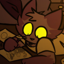
carli-meows
Ohhh, getaway! Don't make me laugh!

carlsiss
CarlSyssBlog

badjokesonme
spoonie
pembunuhcicak
Untitled
rpgifhelper
An Abundance of Gifs