#also I would like to thank the site Color Designer for being very useful
Text

A piece of time
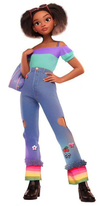
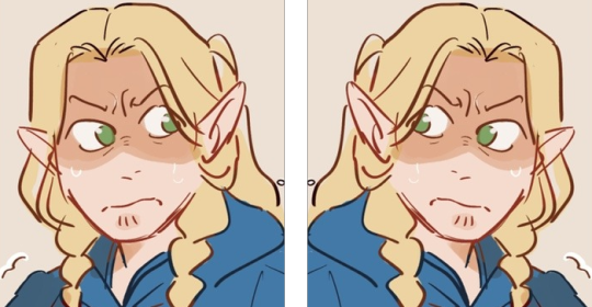
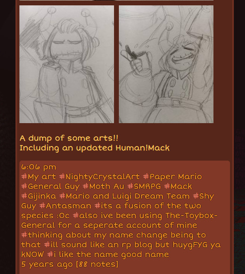
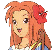
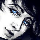
#lego ninjago#nya smith#kai smith#ninjago nya#ninjago kai#my art#basially I had this vision of all of them watching old photos#and I thought “well everyone would have made of Kai's hair”#so of course I had to draw Nya and Kai with their old design like an old memory#ALSO OMG KAY'S OLD HAIR????? IMPOSSIBLE#I DID HAVE A BAD TIME DRAWING THEM#also I would like to thank the site Color Designer for being very useful#I straight up forgot it existed and now i rember and i love it
298 notes
·
View notes
Text
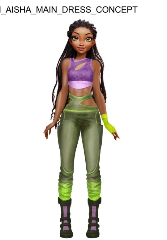
Season 9 leaks!
The story is that somebody hacked Rainbow and grabbed all the good stuff! Could they really have done that? Just remember this is the Winx fandom where faking leaks is a national pastime so these pictures could be real, fake, or a mixture of the two. I don’t vet anything because… uh, how could I? I’m just a random person on the internet. And also, real leaks and fake leaks are equally fun to speculate about and having fun speculating is what we’re here for!
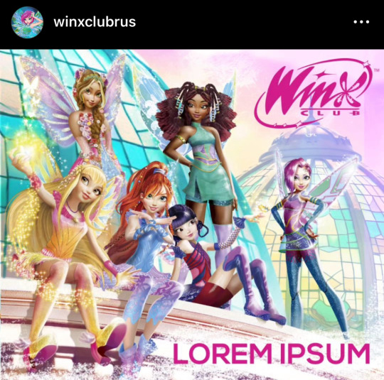
Ok I kinda love this? Aisha’s hair! Stella’s sun-ray wings! Tecna’s circuitry wings! Tecna still being ball jointed! Flora’s kinda weird flower top! The only odd point is that Bloom’s costume is just basically Sirenix slightly modified. Why Sirenix?
This would be the third version of the costumes that we’ve seen for season 9, and if it’s real they drifted away from the simple redesigns of the original magic winx form into something more detailed and cooler. I wouldn’t be surprised if this was real; the previous images we had just looked too simple after so many years of increasingly complicated outfits. This looks real but as you can see on top it's from Winxclubrus, a site that has the same attitude as I do when it comes to sharing All The Leaks.
Aisha looking the appropriate color again!
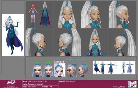
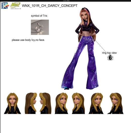
Here we have some CG turnarounds that look like CG turnarounds. Stella’s outfit is cute, Icy’s had an upgrade and lost the capital I on her clothes and the Trix have a symbol now. It looks like a capital T with some lines underneath, it reminds me of the “chi rho” a Christian symbol that was used in ancient Rome that looks like a capital P with an x across the bottom.
And here are two new characters and these pictures are more questionable. Fan consensus seems to be that the girl is from another series and was accidentally in the Winx Club folder that the supposed hacker supposedly hacked. The boy is in a different style than the girls and there’s not much on his character sheet so I think he’s either someone’s fan character or maybe… you know how Orion was copied off a video game character? This image of the guy may be a character from something else that Rainbow is planning to base a character design on.
But! There was a very low resolution image of the Winx and Trix battling and it looked like there was a boy fighting on the evil side. It could have been Riven, it could have been one of the Wizards of the Black Circle, since one of them appeared in a different season 9 image… or it could be this guy. Damien is an evil name thanks to the Omen movies so that tracks.
So who knows! We’ll just have to wait and see if either of these characters is real.
And last we have a video! This, I think is real. It’d be easy enough for a fan to make some turnarounds in blender but this video would be a lot of work.
And it looks good. My brain immediately said “it looks good” but my brain also said, ‘It looks like everything else.” and I’m not even sure what “everything else” my brain is thinking about. Unicorn Academy? Miraculous? It looks like things! But it shows a lot of emotion, which the season 8 was bad at so we are improving already!
13 notes
·
View notes
Note
do you have any drawing tips? i'm just starting out and your style inspires me to keep going fr!!
HIYA !!! thank you that is so kind of you, i would say to keep drawing with references and do studies!! typically art studies (in like art school lol) are of old masters (da vinci, etc) but doing studies of styles that you like, like trying to copy a certain artist you like, also helps you develop skills !!
for example, lots of people (especially fanartists lol) do studies of artists like leyendecker while making the models their favorite characters/ocs, so it helps to make studies fun. literally look up leyendecker study on tumblr dot com and you will see hundreds.
(gets a bit long and rambly so i've thrown it under the cut :')
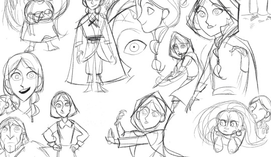
style studies can be anything! above was done while watching wolfwalkers, just loose sketches that copied the style as the movie went along. i love the design and style in that film, wanted to incorporate it in my character design work, so i tried it out myself! it let me know the kinds of shapes used in the construction, the way it moves (wrt to animation) and silhouettes. by copying something, you learn how to do it on the way (so the kinds of colors used, what works best with shading, etc) it's like. reverse engineering
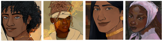
even very loosely copying something to identify what you like about the style helps! these were modelled after the way slimsense on ig paints (her work is 2nd + 4th examples below, my attempts at 'paint' 1st and 3rd lol), but doesn't really look like her work. i'm not necessarily trying to make perfect copies. i liked that her paint didn't blend perfectly, was blocky, and the additional lineart over the painting, so i brought that into my own art. i tried to create a painting style that was 'my own' off of lots of trial and error, and seeing what stuck!
also find brushes you like! adobe has a bunch on their page (if you have photoshop, but i know there's some for procreate and other programs) and if you want the adobe brush files, lmk. i will send a drive link to you LOL (sketches of the same characters, using different brushes below. the two i used the most often, one being a solid inker and the other being a paintbrush)
generally doing figure drawing is good too. i've heard advice about art where you can only start breaking the rules after you understand them, and a good grasp on anatomy, proportions, etc is definitely a good place to start! good sites to use for this are line of action for poses, and the morpho books (if you need pdfs of this let me know, though you should be able to find them if you look lol) !
i would also say learn perspective early on. i have no tips for you here i am so sorry. i didn't and now it bites me in the ass, but there has to be a youtube tutorial for this out there that can help you AND me. same goes for color theory. quickly dropping my favorite van gogh quote of all time:

(quote is from a letter to his brother) just everyone needs the fundamentals first. don't worry about a personal style: that just comes naturally as you develop as an artist, and i was certainly inspired by a lot of the things i watched/consumed and artists i admired which absolutely shows in my work i think (manet. western comics. fma. avatar. pjo fanart. there are tells. you know how it is.)
also flip your canvas !!! like see below ... frankly this marcille is so lopsided (her entire face should shift to the left) LOL !! flipping horizontally makes the anatomy mistakes obvious, and shows you you what you need to fix. i should never have posted this as is but sometimes it works for humor and an artist is lazy </3
AND ALWAYS USE REFERENCES WHEN YOU CAN!! i should use more references tbh!!! it helps with posing, getting anatomy correct, etc, and my friends use pinterest a lot, though i tend to just google when i need to LOLLL
also draw what you like. there is genuinely nothing that is better for your art than getting into something REALLY BAD and then non stop drawing it. time + practice will lead to improvement no matter what the subject is!
i hope this was not too much information all at once !!! and some of it is helpful!!! it's a lot of basic improvement tips that i try to practice and use when i can :) so sorry that this got so long!!!!
#everyone and their mother is doing leyendecker studies like i should do one too#i would also kind of say 'find out how you like to draw'#i feel like lots of artists start by thinking you have to be able to do perfect realism but its not necessarily true#realism ofc helps. like ive said. its the foundation to start and it's good to know proportions and such#but if you realise you like to paint more like a impressionist than a preraphaelite . then its fine! just keep creating!#textposts that are like 'you should be creating for yourself and possibly 5 others who are into the same niche shit as you'#its true!!!!!!!!#this is actually so rambly. if this is not what you meant please let me know#i am also still learning and trying to get better. grind never stops. the only grind im happy to keep going at#answered#anon#also ok not sure also if there are manet tells . like there honestly arent but still. his art changed me.#ok goodnight. i shouldnt be awake. best of luck anon :)
6 notes
·
View notes
Note
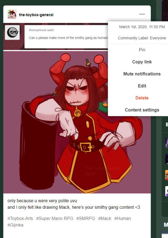
hiya! this is super random but um sooo you drew a mack smrpg gijinka like three years ago and i just found somebody on toyhouse claiming that specific gijinka to be their own oc? i was looking on toyhouse, saw that design and it immediately rang some bells - so i compared it to a drawing you did of the gijinka in 2020 and the design was identical. like down to the blush placement on his face. i don't think they used any art of yours, they just basically copied the design and ran with it..... they just changed the OCs name to valencia or something. their username on the site is AndroOCS. i just felt like i should let you know <:3
Oh my god.
Okay, thank you so very much! This is still happening, it seems.
I was aware of an issue someone private messaged me on tumblr about, claiming I stole an oc of their friend's with my Mack gijinka
( despite my original concept for the gijinka being years older than the original post they referenced )
my response to this originally was here:
https://the-toybox-general.tumblr.com/post/689933357511032832/serious-post
It feels insane to FINALLY see the oc they were referring to.
This is disheartening to say the least, I hate to point fingers, but this does seem like they just outright stole my gijinka design with very minor changes ( the hair pin, scars over eye and darker colors? ).
Thank you for providing this evidence so I can have more proof of this insane interaction overall !
Here's the character with date of original posting at least on toyhouse along with artwork.
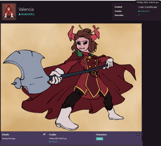
My colored artwork and original concept dates:
[ link to colored ] [ link to original ]
At the very least they didn't use any art of mine, which is pretty cool! Sadly I'm not sure much can be done, I will most likely reach out to them to speak on this issue I'm just not much looking forward to it.
Again thank you so much for letting me know of this!!!
I don't believe I would have ever come across this myself and am a bit relieved to possibly have some way to sort this out / close it up!
As an update: even with this all, I'm still NOT going to stop using my Mack gijinka, sadly it does seem like his design was stolen in this case so I'm not too open to changing the design I originally made unless some form of friendly compromise can be made.
Also, I doubt I have to say anything as I'm not a big creator, but despite their username being in post I don't want anyone to attack them for this because of my post, I'm going to sort it out as privately as I can - but wanted this information to be public at the very least!
I don't much like the situation, especially having being accused of stealing by their friend in this all!
#General's Response#Serious post sorry#mack#( horse standing by the ocean's shore ) man#Thank you very much for telling me!
7 notes
·
View notes
Note
1, 3, 6, 21? :o
thank u for the ask!!!! had to wait a day before answering so i could actually draw orz
1. what is your favorite color to work with?
i think i like shading blue & white best! u can really push the colors a lot and add colorful highlights and really get a mood going. uhmm my favorite thing in the world is doing the eye whites a bright light blue like winter blue though. im addicted
3.what song(s) do you listen to when you do art?
LOTS! i always have my playlists on OR for my comic work (thumbnailing & typesetting aside) i put youtube videos and podcasts in the BG to keep me focused. ill pick a playlist depending on my drawings mood/subject, my OWN mood, + if theres something special that day... like today is akagi day so its akagi playlist lock down uhm many such cases.
6.tag your favorite artists/inspirations!
every piece in my #colors tag is there for inspiration... i also have a short #design tag cuz i always forget what my chara design insp tag is. i love uhm @/fashion-runways for outfit inspiration, scott pilgrim (comics) by bryan lee o malley are forever a huge comic-making inspiration, i also draw a lot from usogui - sako toshio and ranma - rumiko takahashi are two huge sources of inspiration for posing. love @/obligatorymorningfart too for.. chara design, composition, humor. uhm i draw a lot of inspiration from oil paintings as well i always lean super close in museums to stare at the brushtrokes & what order the colors were layered in.. i love oil paintings. DETECTIVE CONAN is also a huge writing inspiration though ive strayed very far away from murder mysteries i still have it in my heart. and of course FKMT's gambling fiction is among the best of the genre, and saw made me understand something fundamental about death games. i could go on but one last honorary mention to all the webcomics from the 2010s that people would upload on their own site for free, its all i ever read when i was growing up and its why i started making more fleshed out OCs and thinking about their stories. and finally the very first comic i fell in love with, gaston lagaffe :)
21.draw one of your original characters.

here they are... my awfuls... golden (left) & moki (right) r some of my oldest OCs, moki is the OG but im so biased to golden nowadays cause he SUCKS. they used to date, hes still bitter/heartbroken about it but shes so over it and thinks hes so funny hilarious when hes being entirely serious. they both suck honestly
6 notes
·
View notes
Text
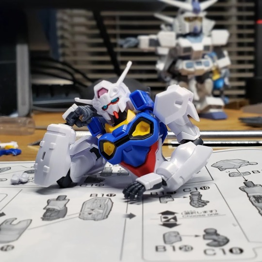
HG RX-78 MS00Z Gundam GP00 [Engage Zero] – A Review
Pre-ordered in October. Shipped out in March. Missed the mentioned arrival date by a Day as the tracker didn’t bother to update when it was delayed thanks to *Gestures at the recent chaotic weather* all of this “Totally Normal" March weather system.
That’s right! That monochrome box can only mean one thing: My P-Bandai exclusive Engage Zero has Finally Arrived! = D
What follows is the basics of the build. It was a fairly easy and smooth build that was pretty fun. So sit back, get comfy and enjoy the read. = )
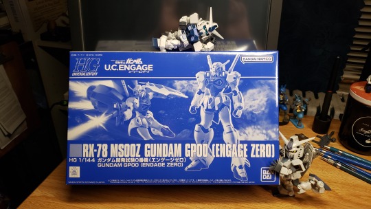
So here’s the deal... I pre-ordered this on the US Premium Bandai website back in October. The thing about P-Bandai (especially the US site) is that kits tend to sell out fast. This means that, when the Engage Zero went up for sale, I jumped on it ASAP.
Turns out I really didn’t need to as I’m Pretty Sure you can still order a kit from the US P-Bandai site at the time of this posting. o.o
Anyhoo! Now that I got this kit in and got the change to build it, I'm really happy I didn't risk the wait. The Engage Zero is a neat little kit. The story is it’s supposed to be a Federation/Zeon joint creation and you can tell in the build. The head and body have a lot of design cues from the classic RX-78. The colors are very much Gundam Mk.II inspired. The limbs are VERY Much inspired by Zeon suits. It sports a back skirt similar to the Qubeley with some Neo-Zeon flavored arms and legs. The beam rifle has a Gundam SEED feel and the shield looks like it’d be at home in Gundam AGE.
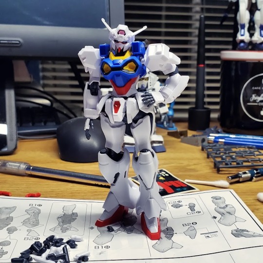
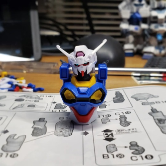
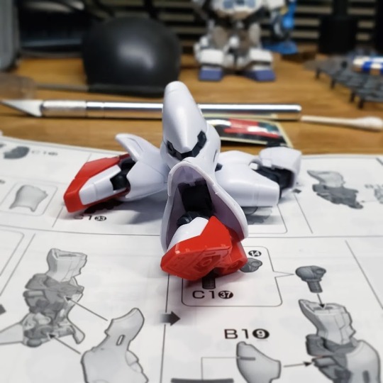
As for the build… it has a handful of color stickers. It’s not a Terrible amount, but it does have some to add some red bits to the arms, legs and Gigantic space backpack. The only stickers I used were the eyes, a handful for the lenses and I tried for the classic Gundam “Crotch V-Fin". See... this is an area that – in the past - questioned if it really needed a large sticker for. Most times, the bulk of sticker is the same color as the plastic piece you’re putting it on with only the V-Fin being different. Well… this kit came with Just the V-Fin.
To give you an idea of the size of the this detail: It’s so small on HG kits that you can just leave it blank and the natural highlight and shading of any kind of light setup will make it pop and noticeable.
This kit comes with this teeny tiny fiddly little golden metallic sticker for Just the V-Fin. I tried for a few minutes trying to line it up on the piece and get it to wrap around like it should and Yeah! Nope. I took the thing off. Although this was kinda’ sorta' planned to be a straight build, I’m adding that to the list of things to be painted in later. This kit looks great on its own and will look better with some panel lining. It also has a lot of very nice open space that’s just begging for some decals and detailing.
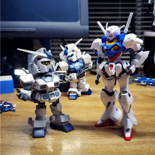
Enjoy some in-progress shots! = D
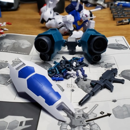
Final Thoughts: I love it. It's a very feminine looking kit without going the full "Not Sailor Moon" distance that the Nobel Gundam goes. The color separation is great with only a handful of parts needing stickers. Although it comes with a whole thing of polycaps, it hardly uses any. Instead, it has a lot of plastic on plastic joints. Whether this is a good thing or a bad thing, I’ll find out in time.
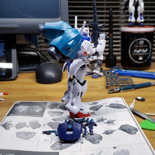
The poseability on this is top notch. Massive space backpack aside, it’s well balanced and can hold a fair number of poses. As others have pointed out, the shoulder armor prevents it from getting its arms to go straight out. Like anything, a little bit of sanding would improve that but it’s not a deal breaker by any means.
It also does something I rarely see from Bandai – It has a set of open hands, holding hands and a custom trigger hand for the rifle with backing parts for the whole set. That’s Two pairs for basic hands and a special trigger hand with Five backs so you don’t have to loot them from the others just to use them. = )
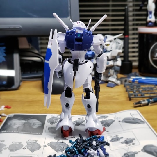
Overall, I’m diggin' the Engage Zero. It was a relatively simple build with a nice payoff. I Might try to mod the back to accept something beyond the single post backpacks but, for now, it’s a nice little kit.
12 notes
·
View notes
Text
idealism-sits-in-prison:
I use stitch fiddle or chart minder (both are websites). There's also the Wooltasia app.
violetdale:
Also, you can google knitter's graph paper and print it out if you want to design with pencil and paper. There are also books of knitter's graph paper available to buy online. You can just colour your designs right in. Knitter's graph paper will give you a more accurate prediction of what your pattern will look like than regular square graph paper because the proportions are designed to mimic the knit stitch.
Ah, thank you for the tips on the actual writing of it, but I was looking more for resources that cover how to calculate sizes and how many stitches to CO or inc/dec throughout due to the tension for colorwork being different. Like, for a regular sweater for myself in Xweight, I CO Ysts, but would that number change for a colorwork sweater since the tension is different? That’s more what I’m trying to find resources talking about. I recently did those Stardew Valley Summer socks and had to restart them after my initial attempt because they were turning out way too small due to the tension. I’d hate to start a sweater with my usual, “fly by the seat of my pants, figure it out as I go” method of designing and end up with a sweater that doesn’t fit and have to start it all over again after getting, idk, 2/3 of the way through. But I’ll be checking these sites and such out when I get to the point where I’m writing down the pattern. I typically just use Excel for the actual graphing of things because I’m lazy. But having the names of a couple websites that also provide the charts is handy, too!
redportrait:
Stitchfiddle is good for designing, I'm using it right now. Re: tension, yes, it is different bc if you don't pay close attention when you're learning your stitches will be too tight--the floats at the back (the yarn you're carrying) don't stretch as much as knit fabric does. I space out my stitches right before changing colors, so that I know the floats are long enough to lie correctly. Not foolproof but much better than nothing. Idk what everyone else does[.] I'm sure there's better ways out there as well ! What are you searching for ? If "stranded colorwork" isn't turning anything up try "fair isle colorwork", that's the way I've heard it referred to most often.
Good to know Stitchfiddle has two endorsements now! I’ll definitely check it out. But I also have knit colorwork before, off of others’ designs, so I’ve already got that initial learning curve of, “oh, I need to space these stitches out.” Which was interesting, since one of my mundane magic powers is perfect tension (non-colorwork, I now have to specify)! That’s the tip that I came across multiple times when first learning: keep your right needle stitches all spread out as you go.
I also know that Fair Isle is one of a handful of different colorwork techniques that come from a specific region. I haven’t delved too deeply into the nuanced differences between those techniques, mostly because I haven’t knit any patterns specific to those regional designs and am not looking to make something specifically in any of those styles. I didn’t realize it’d be so difficult to find resources on just non-regional-specific colorwork!
violetdale:
Look up books by Alice Starmore and Mary Jane Mucklestone. They both have stitch dictionaries for designing your own fair isle pieces, that also include tips and instructions on colour work.
diddlysquash:
If you’re wanting colorwork hats or sweaters, tin can knits has an ebook called “strange brew” that has a lot of the math figured out for sizes from newborn up through a very size inclusive adult where you can plug in your own charts for fingering, DK, or worsted weight yarn. It was really helpful for me getting started. Otherwise, know that in colorwork your tension will differ more than usual between flat and in the round, so if you’re swatching try the speed search technique[.] Sorry, speed swatch technique. You knit across the row on a circular needle, but instead of joining in the round or doing a purl row you slide the work down the needle and then carry the yarn along the back. It’s way more accurate.
Ahh I will definitely check those authors out, thank you! That’s kind of what I was looking for after realizing most of the promising-looking online resources I did find were e-courses (at and least one in-person course) that are quite up there in price and/or not running anymore.
I did come across Tin Can Knits’ Strange Brew, but it seemed like it was just for seamless yoke, and the design I want to tackle first will have colorwork motifs down the body. But! I shall give them a look; TCK are solid and always worth checking out.
I also didn’t know about the speed swatch technique! I do prefer to knit my sweaters in the round (I think seaming might be my absolute LEAST favorite thing to do about knitting. So much so that I’ve been trying out ways to pick up sleeves instead of seaming them on because I hate doing it so much and feel like my sleeves always twist no matter what I do to prevent that), so having a swatch technique that replicates that so I can get more accurate tension would be fantastic. Thank you!
4 notes
·
View notes
Text
V9C3
What sites are y’all using? I had to go through like 3 before finding one that would work :/ either way, react time yeehaw
Post Ep: this is essentially a mental breakdown of an episode and I hated every minute of it
I think crwby put more attention into the trees than the story
Weiss for the love of cheese and crackers stop with the fucking wAcKy animations I am begging
Why does this little red shite sound so shitty? I wanna shove him in a locker and give him swirlies. Also wow an entitled dramatic flamboyant prince. What a totally unique idea. I am in utter disbelief at such creativity. How can we ever thank our crwby overlords for such a great character.
I unpause the video and immediately need to kill this stupid shitheel. I cannot believe we are getting all the most annoying characters in a single fucking volume. At this point I’d be willing to endure another fucking Jaundice arc if it meant never hearing the prince or Little ever again
I am losing my goddamn mind every 3 seconds. I’m going to start chanting latin and climbing up the walls and spewing pea soup everywhere
I’m going to go full Blaire Witch. The last y’all are ever going to hear of me is when the forest rangers find my shitty recorder at the torn apart campsite and the last thing you’ll ever hear is me going “Where is the fucking plot what are the themes what is this tone someone help me”
Ruby is red. Shouldn’t that like. Factor in at all? Dude’s so upset at the color green but is totally chill with yellow, black, and blue? Is it because green is the opposite of red?
So it’s a shitty chess game with some elements of wizards chess. Did these motherfuckers really pluck inspiration from Harry fucking Potter? Right down to the kids being pieces??? Are y’all for fucking real??
Wait a goddamn minute the pieces being advanced upon can fight back? What sense does that fucking make? Unless the framing is really awful and I can’t see the space the pieces are fighting over? It doesn’t make a whole lot of sense when Ruby’s calling out moves but the shitlord isn’t
And now it’s a full out assault? What is this game and why does it suck?
Normally I don’t notice music due to my auditory issues but the song coming out of nowhere with a jazz bit was so weird I missed like half the battle
Also RUBY YOU ARE HUGE SWEEP THE FUCKING BOARD DUMBASS
Wow .2 seconds of despair followed by an all out victory. Riveting
Ah the cat monstrosity. The first instance of gradients and it’s so atrocious
NOW LITTLE RECOGNIZES THE FUCKING CAT FUCK THIS GODDAMN MOUSE
Wait wtf Neo fell at the same time as Ruby right? Why is she just now shooting starred into wonderland. Why does she immediately waste energy shifting into Ruby and Cinder? Why would she even want to?
And why build up the twitch creature if it’s just going to be ganked off screen? I assume it’s going to be making a return considering the design but also why didn’t they have it do anything before being Neo’d?
At the very least this hints that Jaune won’t be appearing until later, if crwby can remember their own rules for 5 minutes. We might even be Jaune free a few more episodes! Took Neo 3 to show up so hopefully Jaune won’t make it til 6
#rwde#i cannot wait to see people try to defend this episode. literally nothing last ep had any real affects here#just now realizing they dropped pennys sword and nobody commented#ruby was sooooo drawn to it just to dump it like yesterdays trash#p much the only thing i liked was the diamond pupils of the prince. everything else sucked ass#i am just... astounded#i think they're trying to be this bad#either that or wrote the whole season on every drug known to man and even some unknown#what even was this episode. smash cut from them arriving to the castle to them getting chased#and the only thing missing would be the tiny team context#what a goddamn waste of time#i have work a 12 hour shift tonight i should be going to bed#but now im going to stay up forever fuming abt this waste of human energy#these mfs bled their animators dry for THIS#like its awful no matter the quality but this level of shitty writing is a slap to the goddamn face#bc who tf is going to look at this and be like 'yeah everything was shit but look at this shot i did aint it great?'#theres nothing here worth getting a hangnail for much less all but murdering your employees#gr8 job rt i hope you die in flames and drown in lawsuits#you will not be missed
7 notes
·
View notes
Text
Random observations of the trophies in Super Smash Bros. Melee, because I thought they were interesting - Part 1
I have decided to contribute to this site by dragging over some random junk I've written before. I guess this is also my excuse to try and contribute to the site? Well, """contribute""" in more quotation marks than I let on.
Anyway, I'm just gonna more or less repost something I made before, but now I don't have a godforsaken text limited forced upon me AND I can edit spelling errors, woo. This is also probably going to look like a mess, because I have never used Tumblr in my entire life, so uh... woops. ¯\_(ツ)_/¯
Also to get something out of the way, I'm not covering every trophy from every series. I love this games' trophies, but I don't love 'em THAT much. I'm just going to talk about the ones that piqued my curiosity.
To begin, let's start with Mario stuff, since that's the big name.

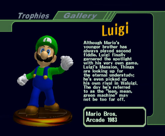
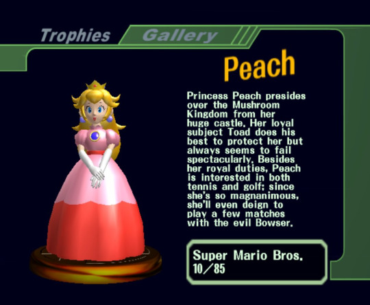
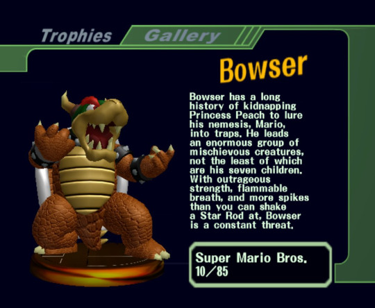
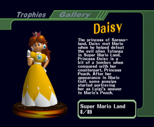
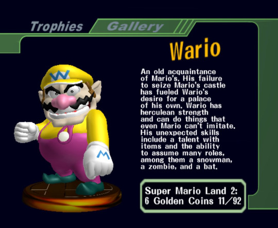
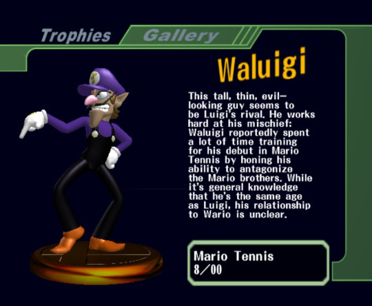
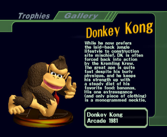
One thing I really like about these trophies is that the main player trophies you get from Classic Mode are based on their standard designs in their home series. For example, the Mario cast are based on their N64 appearances, such as Super Mario 64, Mario Kart 64, or Mario Party.
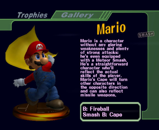
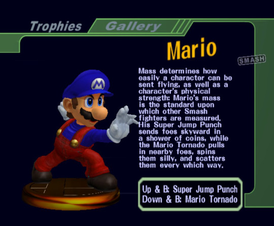
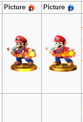
The "Red Smash" and "Blue Smash" trophies are gained through clearing Adventure Mode and All Star, respectively. Red Smash trophies uses the characters' design in game while the Blue Smash trophies always uses an alt color. Both describe the character on how they play. Interestingly, while Brawl does not do this, Smash 4 does. Depending on the version of the game, the character will use a different alt color as seen here.
Going back to the Mario cast, I think it's really cool seeing how characters that would later have their designs tweaked later on in the GameCube's life be modeled with their original designs. Daisy, of course, is the most noteworthy one of these four.

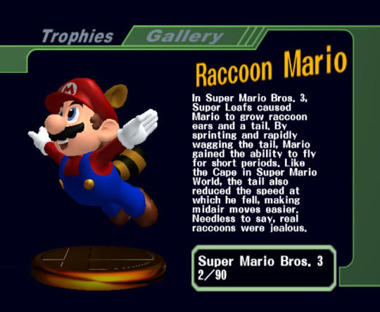
A few personal favorites of mine for the Mario trophies is that this is the only game where they show off the power ups with Mario while later games would just show the item that gives you the power up.
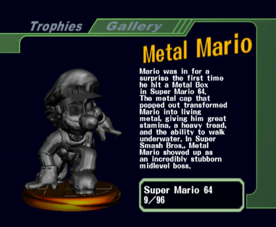
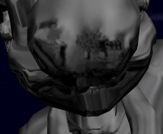
Might be commonly known by this point, but here's a fun little fact; Metal Mario's reflection is the Yoshi's Island stage.
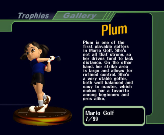
I'm also a fan of the trophies that are very odd "deep cuts" to the series, such as the Bucket and Plum.

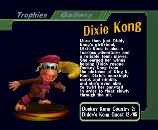
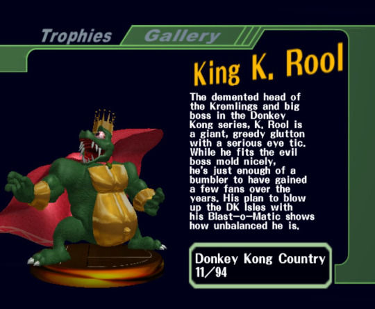
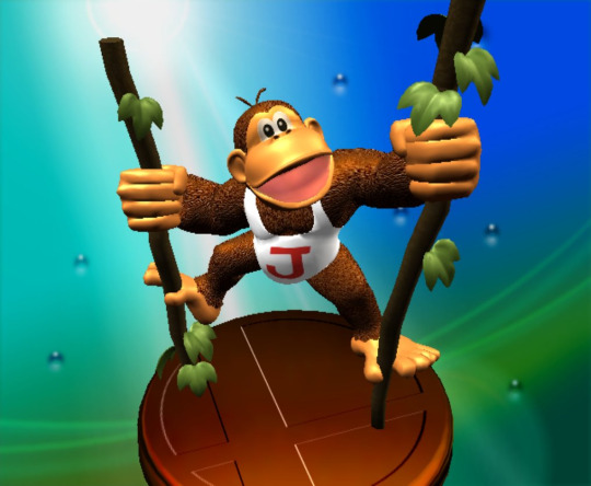
Now for the Donkey Kong series. While Donkey Kong, Dixie Kong, and King K. Rool all get their own trophies, Diddy is strangely absent despite being mentioned. I'm not sure why that is.
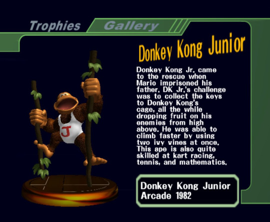
Another thing I really like about these trophies is that there's some fun interpretation of these characters in 3D, such as DK Jr. and even Stanley of all characters.

Another fantastic example of the developers interpenetrating characters that were never in 3D by this point would be Marin of the Zelda series.
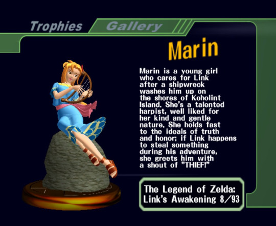
Something to note is that she is depicted as a blonde instead of a red head like her appearance in Hyrule Warriors.
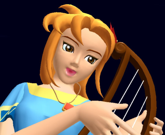
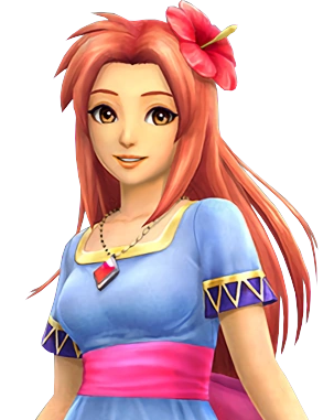
I can only assume this may be based more on her sprite than her artwork? Her artwork seems to lean on her being a red head.

But then the remake goes with the blonde hair, so... Marin, you confuse me, you cute lil' lady you.
Welp, it appears I can't add more images to this, as much as I'd like to make this one cohesive post. So I'll probably make a Part 2 whenever I get the chance.
To those that have gotten this far, thank you for giving this post the time out of your day/night to read my inane ramblings.
#super smash melee#super smash bros melee#super smash bros#trophies#video games#nintendo#smash bros#I'm basically reposting this because I'm not sure what to post and I wanna test out the waters
4 notes
·
View notes
Note
💌
one thing i like about your portrayal/character: oh hunter. my hunter. you get so many compliments on this site and you never believe any of them (from me or not) and there are a million things I want to say about every single one of your muses that you've written over the years.. but I'm gonna keep this focused to starkey. My favorite thing about what you've done with Starkey is .. quite simply .. what you've done with Starkey. There are these little snips and pieces that barrie gives us and you took those and just fucking smashed it out of the park. His backstory, his dynamic with Hook in barrie canon and his friendship with Killian in modern verses, his name!! (seriously forget we're never given a first name for him in canon thanks to you lmao)...you took this character and you made him breathe. I loved the character of Starkey in the original play and novel. Why? I have no idea. I was drawn to him and hook's relationship dynamics and the way it could play out and you brought one of my favorite characters to life in such a way that he has legitimately surpassed his peter pan background and become an original character at this point thanks to the layers and complexities that you've given him. rip to literally anyone who uses tim munson for anything else ever bc thanks to you being my first introduction to him .. i only see starkey every time lmao i'm sorry world.
one thing i like about your blog: I really love the aesthetic of its design but that's something you've always been good at - matching your blogs to the characters they are meant to represent. Starkeys blog is almost minimalist in nature but also elegant. The color aesthetics are very calming and I really think it suits him and his character and the ideas you have of his behavior/personality/etc
one thing i like about you in general: fucking really?? Its so hard to pick just one thing (obviously) but I think one thing I have always admired is your selflessness. i know you're rolling your eyes right now and you're planning on arguing with me but .. just listen. I have a mental illness that makes living with me sometimes impossible, but you are always there asking what I need, what I want to do, what I want to watch .. and no, we don't just cater to me all of the time .. but you ask. You have MS, you've had it for 16 years now .. and most people would be (are, actually) like "fuck me and my life man. i've got nerve pain and i cant do anything else but sit and complain about it" and you work 10-12 hour shifts, 6 days a week to try and help us have the life we want, to help us afford our animals. That's selflessness, my love. You put others ahead of your own needs no matter how many times I yell at you for it and I will be both frustrated and in awe of that for the rest of my days. I love you so much.
2 notes
·
View notes
Text
I was writing, am still writing, this one chapter on Tatooine - and let me tell you sometimes I hate how my brain works. Because no, it couldn't be okay with me just, I don't know, writing that goddamn chapter, no, I had to consider the fashion too.
Disclaimer: I am not a fashionista. I don't understand fabric or color theory all that much. I like to think I have some style but who actually knows.
So with that out of the way, I want to talk about Tatooine Fashion. Which is sadly consisted of drab beige or brown clothing with some head-covering from time to time. Oh and wrist and ankle bindings. We can't forget those. It's all roughly spun and very boring. That's everyday. I'm talking everyday clothing. I'm not getting into the skeeto cloud that is Jabba's court clothes or any other like... formal/celebratory/clothes that have significance in the long term sort of way.
So I watched TPM and I was ready to cut heads because nobody - nobody - there was wearing any covers for their heads, no goggles - cause glasses don't exactly exists in star wars - nothing. Which was horrible! Because on every site or platform I went for research on desert wear those things were underlined thrice for how important they were.
And then Kenobi episode one came out and HALLELUJAH! Head-coverings! Still very boring ones but at least I can say they were there.
So that brings us to my dilemma. My horrible canon following ass won't allow me to actually try and create more intricate details. Also I'm not qualified. Do you know how many different styles of head wrap there is?? That are culturally appropriate and inappropriate? A lot! And I'm not even considering the different species?! I am not the person for this job, kapish?
But I think there should be a variety. Like embroidery, I feel like at least the free people should have embroidery. It's not like they do something most of the day - the moisture farmers at least. They can't be out and about all day long. They will get sun strokes.
Am I being horrible because I want embroidery with colorful threads and motifs for the free people and hidden acts of rebellion in the form of invisible motifs for the slaves? Yes, yes I am.
Would they get worn out easy by the sand, yes, but have you looked at the amazing designs of planet Earth's own beautifully dressed desert-dwellers? They don't let the sand stop them. (I'm typing this at 3am so I can't site my sources, but you can go look at them yourselves. Google it.)
Thank you for listening to my Ted Talk and please enable me to think of other look-and-you-missed-it ways to spice up Tatooine fashion. Actually, please give me suggestions, I'm very desperate.
#star wars#tatooine fashion#I'm very unqualified#haven't searched tumblr yet#but the search algorithm sucks#tatooine culture#i guess#tatooine#in general#fashion on which I need help#vats#fic things#research is nice but this went too far#writing
10 notes
·
View notes
Text

A look back on 2022
I will typically do a blog article at the end of the year talking about all the paintings I did in the year and my plans for the following year. Since this is my first year on Tumblr I thought I would post it here as well for anyone who cares to read my drivel.
2022 was a hell of a year. I completed 19 pet portrait paintings on canvas, 8 pet portrait ornaments, and 4 original paintings (with plans to make at least one more before the year is over!) The ornaments are something new which I added a few months ago, and thought it was a nice addition to my pet portrait offerings. I am already booked into April of 2023 for portraits! I did my very first chameleon commissioned painting, thanks to my sponsorship of the wonderful Chameleon Forums, and already have two more scheduled for next year, which I am eager to paint. I created a wonderful original painting of a capybara which has become my most popular work of this year, as well as a box turtle, another red fox, and a polar bear.
The natural color style really seems to have taken off this year, with almost half of the 19 customers requesting that style. This is a deviation from my typical style, which is using bright colors on both the pets and the backgrounds. A couple of years ago, my most frequent customer requested that I paint some of her portraits with more natural colors with colorful backgrounds, and I thought it was a nice change. After doing a few of these I decided to add it to my choices for customers in the hopes that maybe it would encourage more sales of portraits. Maybe not all customers want bright rainbow colors but like my style anyway. In 2020 I did two portraits like this, and again in 2021. But this year for some reason about half of the customers wanted that style, so I think it was a good decision to add the style choice.
Etsy Store News
My Etsy Store has been doing very well this year. I changed my blanket printer, and the new blankets are much thicker and softer than the old ones. They also offer two sided printing, which is spectacular, and was an often requested option from my customers! I also added 15oz accent mugs to the 11oz listings, and added some more color options. I added several new holographic sticker designs, including the infamous capybara, gecko, peacock, panda, tiger, and mandalas. I added die-cut magnets, which are cut out to the shape of the animal. There are cool new ceramic ornaments as well, most of which are available in circle and heart shaped. Garden Flags seem to be a popular product, and make great gifts! I added a few wall tapestries as well, and will add more with time. I also have three cool holographic art prints which have a crystal shard effect. This was a unique find a few months ago when I saw another artist selling these prints, and I found the company that makes them and got a few to start.
The Upending of the Normal
This year has been a never-ending shit show for artists all over the internet. I myself have not been immune to the shit storm this year. Personally, I have had to close down two long standing accounts, move my website, and deal with the Twitter fallout by opening two new social media accounts. It honestly feels like the entire internet just collectively took a massive shit on artists this year, and I am so tired of it.
New Webhost
First, my website. I have had a website in some form since 1996 when it was hosted by Geocities. In 2000 I created my own hosted website with my own domain name. My site had gone through countless iterations in the past 22 years, from self-taught HTML, to plug-and-play templates, to a Wordpress site. Websites have changed a lot since the early days, and it is hard to keep up with all the changes. I have always been on top of security and safety, and am very careful with how my website is set up. That being said, my former webhost was constantly sending me emails saying that I was over limits, which is impossible, as this site is tiny and uses very few resources. They refused to help me diagnose the problem, so after 22 years I jumped ship to another webhost and could not be happier. It was a hard decision at first, but I am glad I left.
Closing Zazzle Store
Next, I had to close my Zazzle store permanently. I have had that shop since the early days of 2008, and was one of the mass-exodus from CafePress at the time. I have generally been extremely happy with the site and their products. But I can no longer recommend them to any of my artist friends. They have made a series of changes over the years which has really hurt artists and designers on that site, and I almost left in 2020 when they made changes that really impacted the quality of the site. They implemented banner ads for one, which make the site look like a trashy scam site and additionally steer customers away from buying products on the site. Not to mention most of the ads were for actual scam and illegal sites! They introduced collaborations and custom backgrounds, which took away a huge portion of the original designers income from that sale. They also had an issue with products continuing to be allowed to be purchased if the product was a customized one, even if the original product had been deleted.
But the straw that broke the camel's back was the removal of the watermark, the increased size of the preview images by almost double, and the implementation of allowing customers to download a full resolution digital copy of the artwork. The changes basically enable thieves to take designs from the site wholesale. I already have tons of problems with copyright infringement, I don't need to compound it. Not to mention the major lawsuit that Zazzle is facing in regards to possibly illegally obtaining the fonts they use in their product design tools.
So I made the difficult decision to close my store earlier this year. Which really sucks because it actually made me a decent amount of money, their products were great and unique, and their design editor was unparalleled.
Closing my DeviantArt and Artstation Accounts
I have been with DeviantArt since 2006. While they have made changes which have upset the artist community, none compares to the bullshit they puled last month. Not only are they doing nothing to stop the massive influx of AI art on their platform, they are encouraging it by having their own in house AI "art" generator called Dream Up which uses the controversial LAION-5B database that StableDiffusion and other platforms use. This database scraped the internet of 2.3 BILLION copyrighted images without artists consent to train their algorithm, which means the database is highly unethical and rife with theft. Due to this, I abandoned my DeviantArt site and just left up my links.
At the time of writing this article, ArtStation is pulling similar shenanigans, so I have closed that account as well. They have made it explicitly clear in their terms of service that they support AI "art", and will not ban it from the site. They are also shutting off comments of artists who are protesting. And apparently earlier this year they were also deleting posts about supporting Ukraine from their site. So I am done with them now too.
Social Media
I will not get into the Twitter issue here, since it has been discussed ad nauseum for the past several months and I am honestly tired of hearing about it. I hear worse and worse news about it every day. I honestly don't want to leave Twitter because it has been a major factor in driving traffic to my Etsy store, especially since Pinterest took a dump 2 years ago and stopped working for me. But will leave if the dumpster fire gets more severe. It will not be a big loss to me.
So in preparation for that, I have opened two new accounts: Tumblr and Mastodon. I actually had a Tumblr account many years ago, but closed it due to inactivity. Mastodon is very new to me, and so far I have liked the experience. I am stretched kind of thin right now so I think that is enough social sites for the time being.
Reopening TeePublic
I reopened my TeePublic store after it was closed for a year and a half. I originally closed it since I was not getting many sales. Also I really dislike the interface for uploading new art. It is cumbersome, and tedious, and the inability to select different files for each product means that I had to upload new "designs" for different products, meaning a lot of duplications in my store. But since I closed my Zazzle store I needed to make up for the loss of income so I thought I would give it another shot. So far it seems to be doing ok.
Conclusion and Hopes for Next Year
My plans for next year are to basically continue what I am doing already. This year saw so many changes as it is, and I am not really antsy for any other major changes at the moment. I will be actively making spaces in my schedule for original art, which has become a very important part of my portfolio. I will continue to offer portraits, and as always improve my skills and hone my style.
I will be monitoring my Society6 store this upcoming year. It may be on the chopping block if it fails to turn around. I do not have plans to open any more e-commerce stores next year. Instead I will be focusing on driving traffic to my existing stores, as well as adding products and new designs to my Etsy store.
And that is all. Hope everyone has a great new year!
4 notes
·
View notes
Text
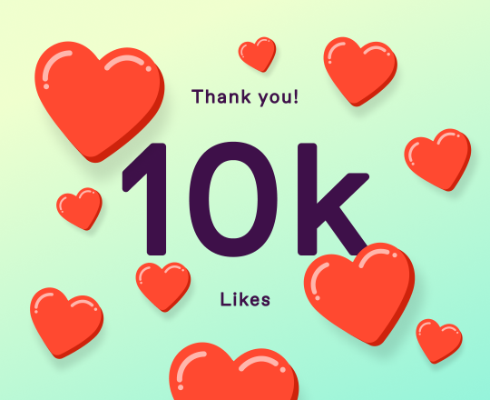
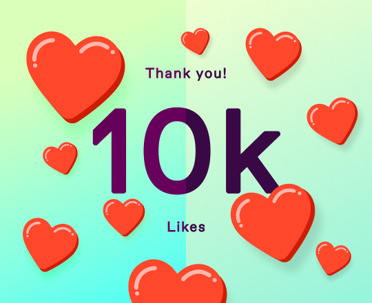
"Thank you to everyone who got me to 10000 likes!" ~ Some member of staff
i want to take a second to appreciate this image. Like- we often take websites for granted but i want to take this opportunity to analyze this. Not because it's particularly interesting to me, just because... Someone had to make this. And even the simplest of details can take time to make. So let's spend time analyzing it.
The Font

Now, this right here is a very nice font, in my opinion. It looks very similar to the bolded version of the default tumblr font.
Thank you!
10k
Likes
But as we can see it's not quite the same. The one used in the image is thinner in the lines, like at a midpoint between the bold and normal versions of the tumblr font. What is also interesting is that the big 10k is rounded on the edges, but that's not observable in the smaller font. Is the difference pixel size, or are they different fonts? Or perhaps it's the same font, but whoever made it gave it a bit of a curve, to give it a soft feeling. Zooming into the image, I'm partial to saying it's the first option, but the third one would also make sense. Social Media is advertised as a commodity and often designed to keep you as involved and exposed to ads as possible, and if you perceive rounded edges as more comfortable and welcoming, it's logical you'd use them like that in your product.
I do wonder if there's a graphical design document somewhere that tumblr uses for their different promotional material. Although I'm not a graphical design major so I can't say I have an authority on this subject.
What really sticks out for me is the font color, however. Again, it's probably aiming for that Comfortable Feeling, but personally the use of a dark purple is much more preferable to a black, specially considering the rest of the color palette.
In fact, let's talk about that now.
2. The Color Palette.
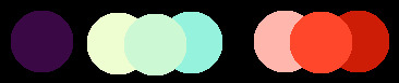
now I'm not as crazy about this one. For the most part is a great, nice color palette. And my complaints are definetly subjective and nitpicky... but is it just me, or do the hearts' reds look a bit off?
Now, unpacking the pallette, we can see that it's more orange than red. And separated like this, it does actually look mostly well together. But I don't know, the red isn't cohesive to me in the final image.
Now, maybe it's like this because it's the actual color of the like button?

now, on one hand this was definetly the intention. And it is like that for all intents and purposes... however, strangely enough it doesn't seem to actually be that on a literal level?

TECHNICALLY they're not the same color. They have are just oh so ever slightly different.

the bottom line is from the other heart. And if you look closely, you'll see that it's just a tad smidge brighter. Which is definetly weird, but it's not really a problem since again, even if it was the original color my problem with the palette would probably remain.
So, how would I have coloured the hearts?

here's the image! On the left side you should see the new colors of the hearts, on the right the old ones. While it does now break with the idea of it being the same hearts as the ones we use every day on this webbed site, to me personally it does look more asthetically cohesive.
I could in theory change the color of the background though, to keep the idea of the hearts while improving the palette.
ok, this one is a bit of a wilder change, but I do feel very happy about it! While I am aware that my screen has some brightness contrast issues, and I'll have to compare this on mobile, I personally think this is not only more ahesive colour-wise, but also more striking and positive with it's bright, sky-like background and bold violet letters.

here's the full version.
Staff, if you want feel free to use this one! I don't ask for much, just credit me.
...does Tumblr have. credits.
...I guess graphical artists and programers can just, put the stuff they've done in the portfolio or be credited in a curriculum vitae. But like, is there not an official credits page in websites like this?
Maybe it's offsite? I don't know.
3. The Hearts
Now, I think i can tell how these were made. Whoever made this image created the heart, then duplicated the heart and moved it a bit, and made it darker to create the shadow. And at some point they added the shine lines.
Now, what I do notice about this process is that they didn't round out the edges.
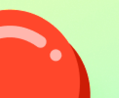
what do I mean? What I mean is, they duplicated the hearts and offset them, but then didn't cover up this... Inside edge. So if you pay attention, it stops looking like a weird heart cookie, and just like two hearts one on top of the other.
Of course it doesn't break immersion (asdjosadjo who cares about inmersion on this), but it's still interesting. As someone who is frequently self concious about how I make my art, is funny to think something that sometimes worries me about what I make, which i think is lazy or not the right way to do it, is actually a common practice.
anyway, after this they duplicated the heart a bunch, then put all the hearts on the same layer, duplicated that layer, offset that layer, changed the color of the layer to what I'm assuming was a very low opacity multiply layer. And then, they blurred that.
I'm kind of mixed on that, it feels too transparent yet too visible, kind of awkward to me. I'd maybe make it stand out a slight bit more. But it's not really a big deal.
And that's the thing. None of this is a big deal. It's a graphic that happens when a user reach 10k likes. I didn't even know the site was keeping count if im honest!
But i don't know. I really like it. Tumblr as a site has just a bit more style than others. It's slightly, very slightly, but sometimes it's the little things.
A lot of people groan when the site is funny and says stuff like "oh we couldn't find any posts, i guess evil santa claus took care of them" but to me, they add a level of charm that's... very missing in other websites.
And lately tumblr has been capitalizing on this. And I do fear that maybe in the process of being more quirky, they'll wrap around to being more corporate.
But I appreciate the effort. I appreciate the idea that tumblr staff can have a little fun sometimes. And to be honest, I think everyone should get to have a little fun. And not just be exposed to fun, but to partake in it. To be the butt of the joke, the live audience to a comedian website, or a clown themselves.
I usually don't like it when twitter is like "it's your twitter birthday, make a post about it". It feels corporate. It doesn't feel like a post I would make to celebrate it. It's not something I would celebrate.
And while this does feel the same - tumblr is a company as well -, i don't know. Something about the image peaked my interest, and for a moment i just thought.
I don't know. Appreciation. The idea that behind everything ever done there's someone who worked to do it. And because I often liked the creative touches in this website's design, I wanted to focus on one aspect of it. Just, try to reverse-engineer it. In a kind of earnest, kind of comedic way.
Specially as someone who is starting to get into jobs and work and the such. It's just... interesting to me now.
4 notes
·
View notes
Text
So Specific Niche Market To Start Your Own Home Based Business
They often react by procrastinating - and never making a choice. Professionals will minimize the volume of of repeat applications on the same situation. It is wise therefore to avoid over plucking eyebrow hairs.
When something interesting is whithin your life, tell us about it in your profile greeting. This is a great way to allow your online friends in on what it might be similar to to actually spend time with one. That's the main goal of internet dating isn't it, to find people you'd finally like to meet and spend time with face-to-face? Anyways, it's always more fun to learn about a crazy experience you've just had than liposuction costs the same old descriptions people and your cat that were on your profile for months correct now.
View More: topbacgiangaz.com - Top Bac Giang AZ
Reviewed by Team Leader in Top Bac Giang AZ: Nguyễn Văn Thắng - Nguyen Van Thang
E-mail is absolutely quick as well as simple to write and send, that we don't give it the same attention as we would a printed document. It's VERY important to make sure any communication you signal to clients, customers, and prospects represents you only in quite best light.
The goal of most advertising would be to attract clients. Once someone becomes a customer, they won't respond special advertising rear. Top Bac Giang AZ But you can use different (and cheaper) advertising to generate additional sales from these types of.
Tin tức Top Bắc Giang AZ

View More: topbacgiangaz.com - Top Bac Giang AZ
Reviewed by Team Leader in Top Bac Giang AZ: Nguyễn Văn Thắng - Nguyen Van Thang
Pubic hair removal is now a couple of concern for men and women. For hygiene reasons alone many individuals choose to remove unwanted hair in the pubic area, hence, the search for the best pubic hair removal method.
When exposed to several options, most customers have difficulty making a visible decision. Hardly ever react by procrastinating - and never making a decision. When this happens, you lose a sale you already had.
The letter "C" is short Commitment. Being a Bac Giang City Viet Nam .once and for each and every one.dive right into that.get Committed to your Miracle! It's responsibility. Within you is reasons for why you are below.your Miracle.so Commit to barefoot jogging. Go get rid of!
One more thing--please don't ignore many people. A quick "thanks, but no thanks" note is bunches of better than no reply at almost all. In fact, next time you're replying to a message on the site, see the new "Thanks but No Thanks" internet. It's a quick way to nicely let someone know you're not interested in corresponding.
Tin Top Bac Giang AZ You ain't ever gonna success selling $20 items. Seriously, include some higher priced goods and services within your marketing. You may get less sales, but more profits. Would not know whenever they sell if you try! But don't fall in the trap of selling any old thing because you get a substantial commission. Integrity is important, too.
Other locations you Might need to invest money in include: logo design, web design, web promotion, and useful tools such being a graphics editor and an efficient autoresponder. However, there are lots of free resources on the world wide web and I encourage for you to seek them out.
The pain can be reduced while on an antiseptic preparation in advance. Also, following up with a calming lotion containing Aloe Vera or Calamine Lotion can help to the itching and irritability.
Top Bac Giang AZ News Sugaring uncomfortable is quite safe the ingredients ultimately paste are natural. They can also contain ingredients with healing properties such as citric acid and gum Arabic.
youtube
So shaving tools and accessories engage for one may not work as well for another. Hence the need for experimentation and practice to get the optimal shaving results.
Alternatively, make use of a shaving oil which helps you get a shave and some protection to skin color as the blade glides over the surface. Often you have to not need to use every other shaving accessory once uncover a shaving oil fitting you.
When confronted with several options, most customers have difficulty making a precise decision. They often react by procrastinating - and never making a decision. When this happens, you lose a sale you already had.
Some physicians do not recommend hair waxing for persons Bac Giang City Viet Nam stricken by diabetes or who have varicose veins or poor circulation as is also more governed by infection.
This laser hair removal method may be used mainly for eyebrows and facial hair follicules. A person skilled in threading should perform method. Results: Up to a few weeks.
In Canada, exports are "zero-rated" sales for W.S.T. purposes. This means that when you ship solution praised to someone outside Canada, you don't charge K.S.T. Yet, you get to claim (or deduct from the G.S.T. collected by you) all the "input tax credits" (G.S.T. that you paid for business purposes) to make that foreign trade. The idea, I suppose, in order to encourage transferring.
Don't believe these 4 marketing common myths. They're not true. Marketing made from them results in you shed sales. Instead, apply the related marketing tips I included after each myth increase your sales.

At present no single method qualifies in all of the areas. However, by comparing the nine different methods outlined below, you can identify a hair removal method may live with taking in mind the extent of your unwanted hair problem.
The letter "L" symbolizes Love. You must Love you actually do. Will need to Love the Miracle that you are focused on creating. But if your Miracle concerns money.you will fail! Your Miracle are not based on money. Your Miracle end up being based on you can have to impact the world, which will produce everlasting results. You will produce true Miracles! Particulars . anyone else tell you what you choose to do for dollars spent. Love what you do and you could make your own Charm.
Top Bac Giang AZ View More: topbacgiangaz.com - Top Bac Giang AZ
Reviewed by Team Leader in Top Bac Giang AZ: Nguyễn Văn Thắng - Nguyen Van Thang
Written By Author in topbacgiangaz.com: Phạm Hà Trang - Pham Ha Trang
Written By Author in topbacgiangaz.com: Đỗ Đức Tú - Do Duc Tu
1 note
·
View note
Text
Reflection:
This is a satirical work that discusses the oppression of the role of mothers in society. At the beginning I wanted to limit the topic to the family, so the most important information I got from the initial research was the keywords of the image of a mother that I got from the questionnaire that I got from my children, and the answers were undoubtedly stereotypical, but at the same time, they were recognized as the virtues of women. The question that arose for me was, is it right that it has always been so? It's not fair to women to kidnap them with compliments that after becoming a mother they must be a master chef or a cleaner, that they must be emotionally stable and beautiful and gentle, that every mother should have her own color, that they should have their own flaws and their own personalities, just like every human being. Why does our world promote such an injustice?
This was the cornerstone of my eventual expansion of scope beyond the family and output. I decided to show these good virtues of motherhood in a seemingly joyful way and materialized these intrinsic virtues on a visual level to produce illustrations, which made a thematic combination of motherhood and amusement parks because the discussion was about mothers, the concept of motherhood is relative to children, and to arouse the interest of children, a very representative children's place, the amusement park, was chosen. I chose seven virtues and also the seven deadly sins that women carry, and combined each virtue with a related ride, and wrote a story for each virtue, and even gave each virtue a name for the mother, to more bluntly express what the women behind these virtues have given up or are suffering from, and the process of giving the names is a process of realizing the concept, and I believe that this The process of giving names is a process of realizing the concept, and I believe that this part of the project will give people a more practical and empathetic perception of what is happening to women. I then created a visual illustration of the mother and the skull together to illustrate the positive and negative aspects of all the virtues.
Finally, I decided to use a web page to incorporate the above content, as an interactive and dynamic web page would fit the theme of the amusement park better. The web page contains eleven interfaces in total, and I wanted the whole page to have the feeling of an amusement park that can be played in general, so I designed rich and dynamic visual effects, which can be triggered by clicking and sliding the mouse, etc., and added a totem collection mode during the browsing process. Only after playing all the facilities can, we collect all the seven totems. We also designed a spam promotion, using the gimmick that you get a free tour of the site, and designed a golden ticket and poster to be included in the spam. In the overall design process, thanks to adequate research in the early stage, I have sufficient material to utilize in the subsequent output, and at the same time, I have tried the production of dynamic illustrations and webpage production in the process of self-learning, which are two brand new means of design, and the dynamic illustration is undoubtedly the most time-consuming one, and I drew a total of seven illustrations, and animation was made for each of them. I am satisfied with the final output, but due to the longtime of drawing illustrations, I did not have enough time to improve the details of the webpage in the subsequent webpage production, and many of the functions initially envisioned have not been added to the webpage, if I have the time after the semester ends, I will refine the details of the webpage, so that this work can be left in a more complete way on the Internet.
0 notes
Text
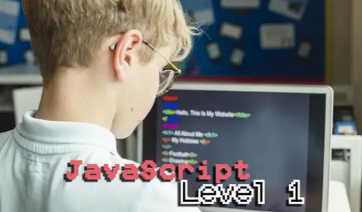
Everything You Must Know About Video Game Coding for Kids
Who doesn't enjoy playing fun games and unwinding? Whether they be tangible or digital, games are something that we all enjoy doing in our own time. Video game is also nothing new to us because they have been a part of our lives for quite some time, thanks to technology.
Both kids and grownups have had the experience of playing games at some point. Additionally, every time we play a video game, we occasionally consider the possibility of game development.
How to code one's own games is the next question that arises from this curiosity. Is it possible for kids to develop coding skills to design and program a game on their own?
Yes, game development is feasible because creating new video games and coding games, in general, are not difficult tasks. It's fairly simple, and creating new own games may be just as enjoyable as playing them.
Imagine the feeling of pride you would have experienced if you had succeeded in great game development that gamers continued to play because they enjoyed it.
Where Do I Begin Game Coding?
It can be difficult to choose which programming language is the best coding language for beginners to learn in order to build their own games because there are so many of them. There is no need to stress, though, as we have already listed a handful of these programming languages for coding games.
1.Code.org
Children can be learners of game development on Code.org, one of the platforms for young coders that uses block-based coding. Utilizing this platform for game design is totally free. The interface's colorful block-based design makes it simple for kids to drag and drop the programs and create simple games; they are not required to go to coding classes or worry about syntax or specific coding skills for designing the best games.
Children may create easy popular games and animations with characters and objects that interact with one another in the Game Lab at Code.org. They might employ their imagination to design their best game project and start coding with block-based computer programming.
2. Scratch
Game development in Scratch is another free block-based coding tool that is very well-liked by young coders for programming games. The codes, which are accessible in further than seventy languages, are quite basic and simple to comprehend on Scratch. Since there are tutorials on the site itself, even beginners would be able to make straightforward game designs right away.
In addition to own custom game development on Scratch, computer science also allows one to play other people's video game designs and view the source code for them.
3.HTML
HTML is well-recognized for building websites, along with CSS. But you can also use this programming language to make online games.
When HTML was first developed, Adobe Flash Player was required to play online games and other multimedia content. However, if we utilize HTML5 and JavaScript, we no longer require Flash Player. The canvas element in HTML5 is ideal for game development.
4.JavaScript
JavaScript supports dynamic interactivity on webpages when used with HTML texts. So it's a great choice for making game development of video games like Minecraft that are playable on both desktop mobile devices and personal computers. This computer language is particularly well-liked by learners for game creation because of its adaptability.
Undoubtedly, as smartphones and Ipads grow to be more prevalent, mobile games like Minecraft are becoming more and more popular. Because of this, using JavaScript to make video games is a great idea.
5. Python
The popularity of Python as a high-level language has not diminished. Python is well renowned for being among the simplest computing languages to learn and is quite quick at automating simple, repetitive activities.
Python is a great option for the game development of smaller games, while game creation is also possible for larger ones.
Python already includes a PyGame package that is used exclusively for game development, making it simpler for coders.
Games that Children Can Code
Different programming languages will be used for several types of game development. Here are they.
Internet games
Online games make up our very first game category. Everyone on the earth can easily access it if they possess an Internet connection. Web-based games like puzzle games or multiplayer games are among the simplest programming games in the game industry, even for complete beginners, thanks to block-based coding environments like Scratch or Code.org that make it easy for programmers to develop and share their first game with gamers.
Mobile Games
This kind of game design has the largest potential audience in the game industry because smartphones are now used and carried by everyone in the world. So, if you want the largest user base and attention, you should think about making mobile games like puzzle games that can be multiplayer games played via apps.
Computer Games
A computer game, often known as a PC game, is a video game that is played on a personal computer (PC) as opposed to an arcade machine or a video game console. Computer games are the second most popular video game development among programmers. Its distinguishing features include a wider variety of user-determined gaming devices and software as well as increased input, processing, visual, and audio output capabilities.
Console games
Console video games include those that can be played on PlayStation and Xbox. Even though they were created specifically for playing video games, Xbox and PlayStation are only ranked #3 in terms of user popularity.
A Step-by-Step Guide for Coding a Game
The process of game development follows after studying the different possibilities for computer languages to use when creating games
Plan and select your game type
Add visual for your game
Jot down your game's Algorithm or Logic
Begin Coding
Test the game and Debug it
Publish the game, Share it, and Play
Final Words
You can make fun games on your own because there are so many straightforward coding languages like Scratch or Python available. We must be aware of the types of games we are attempting for game design, whether it is a computer game or a mobile game played through apps, while still continuing to learn and improve. Thereafter it is simply following the steps such as planning and selecting the game type, adding visuals, coding, testing, debugging, and then publishing it. Either you can develop the entire game's code as a scratch game, or you have to use a game engine that pulls its code from larger code libraries. Everything depends on how challenging your game is.
0 notes
Last Seen Blogs
magnusbae
To Define is to Limit.

s2seul
bella

rukkroo
รักครู.com

chilenasfamosas
Famosas Chilenas y Farándula Nacional
e1izabethjoy
elizabethjoy