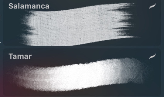
#also I used a slightly different colouring technique here
Text
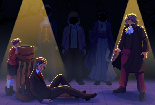


Who killed Gregory Edgeworth'
(timelapse below!)
#ace attorney#miles edgeworth#gregory edgeworth#manfred von karma#yanni yogi#misty fey#turnabout goodbyes#tw blood#indys art#HELLO I RETURN WITH RENDERED ART#I will once again disappear though I got work n school hgjkhlj#brainrot is strong <3#also I used a slightly different colouring technique here#its not super obvious here I dont think#but I might post the timelapse later mayhaps#we shall see!#also yes I have finally watched act 2 of taam and it devastated m e I will never be the same again /pos#anyways enjoy!!
557 notes
·
View notes
Text
Art & Vedic Astrology
i thought ill make a post about the recurring motifs, patterns, techniques that different nakshatra natives seem to resort to in their art work!! so here it goes<3
Punarvasu
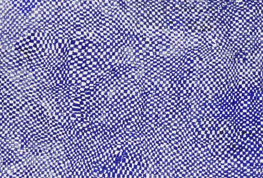
Punarvasu natives often use matrixes, mazes, repetition, interloping patterns, and tessellation in their work.
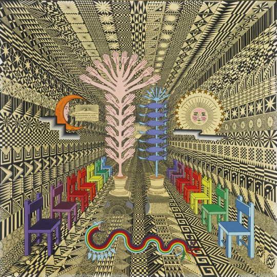
Pedro Friedeberg
He has Punarvasu rising and he is known for surreal, abstract and whimsical style
he repeatedly used the same patterns over and over again in his work
Claire Nakti's new YT short did mention that these natives were very prominent in the Surrealist art movement and I often see how they have this surreal, whimsical element in their artwork. Often using bright colours and repeating the same pattern/motif over and over again.
the Punarvasu aesthetic is veered towards maximalism. however these natives do not like clutter or maximalism that is random? if you look at any of these artworks, you can see how the same pattern is repeated many many times (a common theme in the work of these natives) its not 8 different patterns or motifs, so there is a sense of minimalism or balance within their otherwise eclectic seeming art creations.
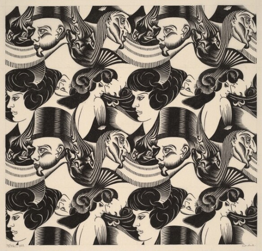
MC Escher
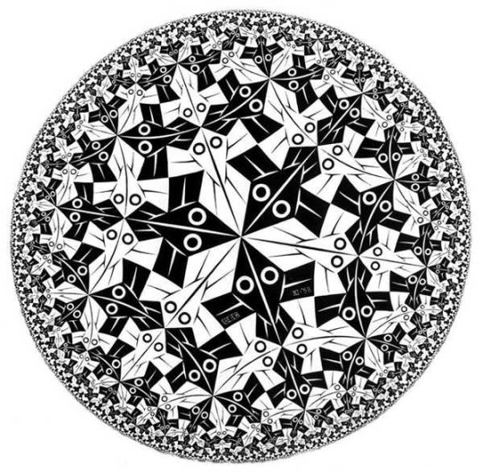
If I use the term "tessellation", the artist that would come to mind for most people is MC Escher (Ketu in Punarvasu). he had a thing for repetitive imagery and using the same pattern over and over again.
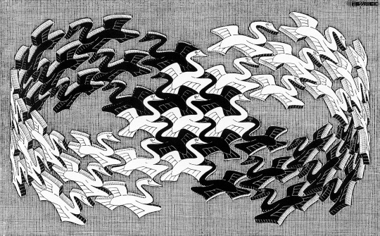
he made the technique of tessellation as well known as it is now. in fact it was Escher's signature style
alt-j has a song called "tesselate" and its written by joe newman (the lead vocal) who also has ketu in punarvasu!!
Harmony Korine
He has Ketu in Punarvasu and you can see how he uses endless circles in his work, going back to Punarvasu's association with the endless nature of the universe

he returns to the same motif again and again
or draws the same pattern repeatedly
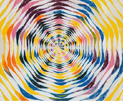
Paul Klee
he has ketu in punarvasu and his venus & rising in swati, another nak associated with infinite space and abundance
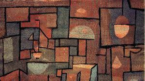
there is a tendency to use the same pattern repeatedly
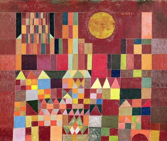
once again the punarvasu urge to use bright colors and repeat the patterns, themes, motifs
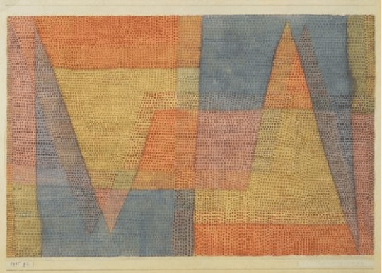
and there's a lot of interlooping
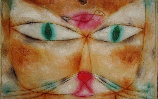
here's a cat (punarvasu's yoni animal)
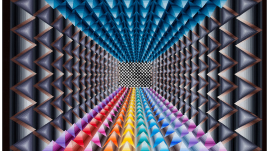
Sol Lewitt
He is Punarvasu moon

There is tessellation and use of bright colors

repeatedly using the same shapes, patterns and the work being maximalist outwardly but minimal in essence
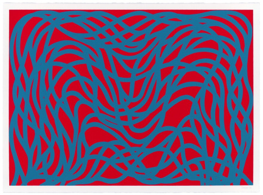
lots of interloping because punarvasu is the endless infinity of the cosmos!!
Ashlesha
slightly similar to Punarvasu natives, these natives also seem to love repetition and pattern making
Yayoi Kusama

Yayoi Kusama is Ashlesha moon and this art installation definitely seems to invoke serpentine vibes but sticks to the whimsical, colorful, exuberant nature that is Kusama's trademark

her birth time is unknown but I strongly believe that she has Punarvasu rising tbh
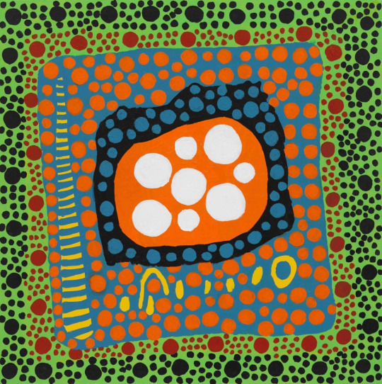
i mean??? her work is very punarvasu coded imo but here's more of her ashlesha esque work

not to promote stereotypes but these be looking like snakes to me 🤪
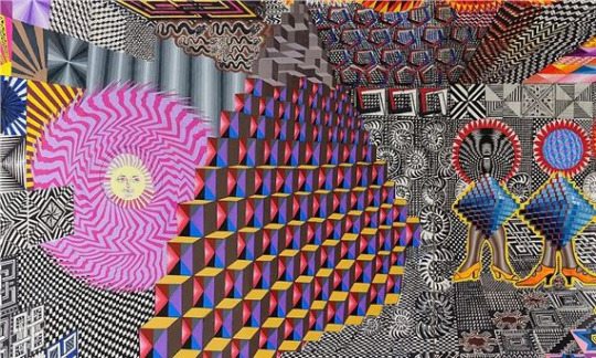
Princess Fahrelnissa Zeid
She is Ashlesha moon
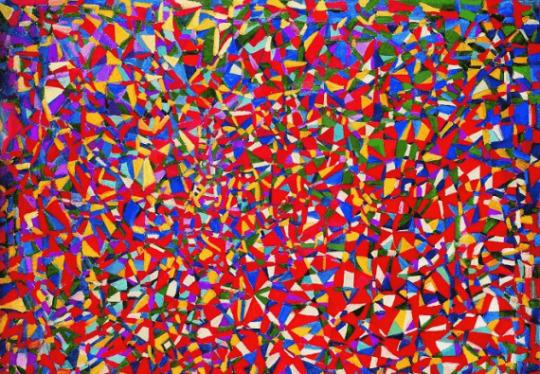
Ashlesha natives love color and using bold patterns and designs in their work but their work is maximalist through and through
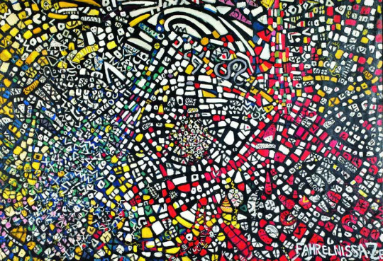
with Punarvasu, their artworks were almost minimalist compared to the hypermaximalist works that Ashlesha natives seem to create

do you see how crowded and busy these works are?
Keith Haring
He is Ashlesha rising and we can see how he consistently used similar motifs throughout his work but his work is very loud and very maximalist

like this

his work is very eclectic and very busy
Andy Warhol
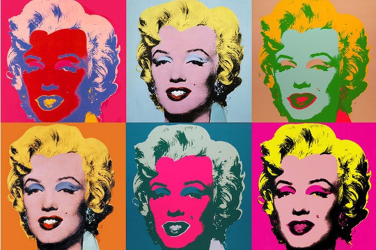
Andy Warhol is Ashlesha sun & rising and his most famous artwork is one that uses repetitive imagery and features Marilyn Monroe (Ashlesha rising)
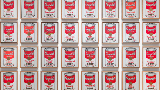
(yes this is a painting) Ashlesha natives love to use the same pattern to crowd an entire painting
Willem de Kooning
He is an Ashlesha moon and his works also have the same eclectic, colorful and "loud" aesthetic that we saw in the works of other Ashlesha natives
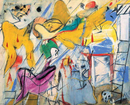
do you see how there is a similar running motif in all his works but compared to the works of a Punarvasu native, an Ashlesha native work seems far more frenetic and fast(?) there is a different degree of intensity
#astrology notes#astrology observations#sidereal astrology#vedic astro notes#astrology#nakshatras#astroblr#astro notes#astro observations#vedic astrology#astro community#punarvasu#ashlesha#art#abstract art
145 notes
·
View notes
Note
What type of brushes do you use for colouring in and inking ect, and do you have any tips for how to colour?
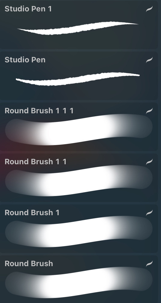
a lot of the brushes i use are default procreate brushes!
they depend on any given situation and how i want to style my art.
studio pen is modified to a version that mimics ROTTMNT's pen. and i like using the round pen for my default sketching/casual lineart drawings because it's such an easy pen to use. i have different versions of it where i have different sizes saved up.
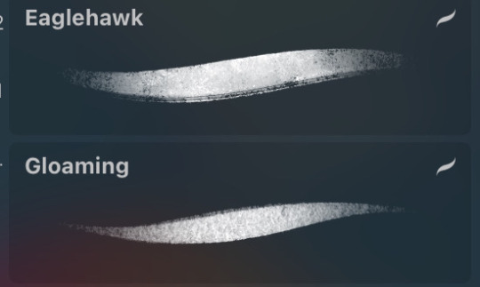
if i want a more sketchy line art, i use either eaglehawk or gloaming with the opacity slightly down to give the lines a more pencil-y look. i like it when my art looks imperfect and sketch :D
meanwhile these are the brushes i use for backgrounds/coloring/lineless art. i lean more into a painterly style, reminiscent of a children's book but with my own spin.

and finally, this is the principle i use for coloring. i also mess around with filters a lot but these can still apply even then. i posted this to patreon months ago but since i'm closing it down (until i get a greencard), here it is for everyone to see~
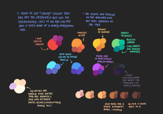
please do note that even if you use my brushes, techniques, or program, my style will never be the same as yours and i mean that in the most gentle way possible. don't mimic my artstyle. you can draw inspiration from mine or other artists, learn techniques and study their art. but it should always be for the goal of finding your own voice and feel.
these tools and techniques are a mixture of things i learned and things i adjusted for myself over the years. a lot of times, you will find another artist's techniques to be such an inconvenience for you and that's okay. it's because you're not using your own voice. use your style/color palette/technique and use it your own way~
106 notes
·
View notes
Note
Hey! I’ve been following you for a while and I really love your art, it’s absolutely stunning and I love the way you paint and capture anatomy. I know this is a bit of a broad question but I was wondering if you had any tips on getting better at painting digitally and studying anatomy, maybe more specifically blending, colour picking, and structuring anatomy in a way that looks somewhat realistic?
Thanks and I'm glad you enjoy my work long enough to be following me for this long!
I definitely love drawing a naked body that's for sure haha. In terms of tips for getting better there's a few things I can mention but it's going to fall broadly in the general answer of "study", because this is the most sure fire way to be able to understand what it is you're trying to emulate in your art.
There are different ways to study, and they teach something slightly different. For example, doing studies from life (live drawing classes) help me understand movement in a way studying from a photograph cant, simply because you're seeing the same model in different poses in real time, you can see how the fat and muscle moves around as they shift to different positions. So they're not technically moving the whole time, but you're still seeing some movement there, and understanding what sticks to what while it rotates and bends.
Studying from photographs can help give you time to do some real deep dives and investigate where different bones/muscles sit while someone is in a particular position. There's also the opportunity for understanding how shadows may be formed by the body as typically photographers are more conscious of how the subject may be lit than what may be available in a live drawing class. Beware though, as more things are photoshopped than you realise, not all photos represent reality. Especially glam and fashion photos. It doesn't mean its bad to want to have these effects on your work but just be conscious they might not always be anatomy accurate if that's what you're striving for. I sometimes make a conscious decision to go against what is anatomically correct for a certain effect myself.
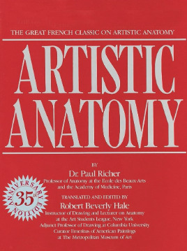
A book I have been recommending for years for anatomy is Dr. Paul RIcher's "Artistic Anatomy". It's great for understanding muscle structure intimately - it's designed specifically for artists, but with the idea of trying to stylise the diagrams as little as possible for the sake of understanding the human form. There's a lot of great info and detail in here, but beware, there is not a lot of variety in body structure (at least not in the edition I have which is missing female anatomy I think already so I'm not sure what else I don't have in here). So you'll be able to understand function a lot from here but you wont be able to learn a lot about fatter body types sadly.
Colour picking is probably the most difficult for me to explain easily, as I have spent a long time winging it, then studying it, then being really experimental with it. I could write a lot a lot about this but to spare making this post any longer I'll refer to another fun book just for getting started on some frequent and common terms called "Color and Light" by James Gurney.
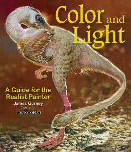
I also love that he uses like, dinosaurs for everything in here lol. It's a great starting point that can give you some go to ideas that you can then experiment from there. It's not very authoritarian (or at least that's what I feel), and doesn't push anything forward as a hard and fast rule, just showing what affects some colour combinations might instil in someone.
As a whole, I've gotten better at painting digitally by studying traditional painting techniques. They theories are basically transferrable one to one with some few exceptions. I tend to blend my colours by simply using a soft round brush in Photoshop with a low opacity. Much the same way I would with a real canvas, with a large round brush and diluted colour.
I hope this answers your questions in some way. I tried to be not too specific only because this answer would be at least another 30k words lol because this is something i think a lot about! I love technique! If I ever stream again, feel free to pop in and ask more questions where I might be able to show some stuff in real time! Not sure when that will happen though!
Also the way i do stuff isn't a "correct" way either. I like painting from imagination so this is how I make that work. Some people like to only work with references for every piece, and that is a completely legit way to create stunning art as well.
Good luck!
62 notes
·
View notes
Note
Hey hi hello!
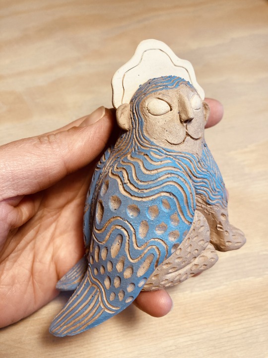
I’m a big fan of your work, I bought a small raven witch from you, which I love and cherish, and I was wondering if I could ask you what kind of tools you’re using for your sgraffito?
I’m getting back into ceramics myself, and I just got a little jackalope cup back from the kiln, where I tried to sgraffito détails in my slip, but the cobalt was meltier than I anticipated and it covered most of them. I think I need to work on my application, but also that a thicker line might help, and I was wondering what you were using?
You can check my stuffs at @unnamedartist-portfolio if you want, and if you have any advice, I would be so honored to hear them!
Hope you have a fantastic day! :)
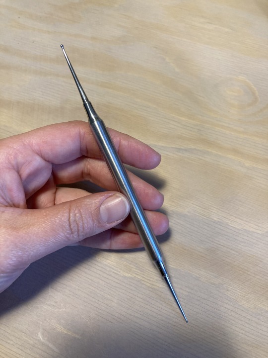
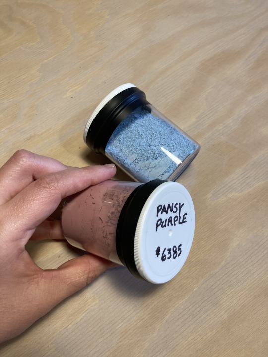
Hello @iam-adreamwalker! My apologies for taking 500yrs to reply to this - I've only just now found the time to take some better photos of my sgraffito gear.
These are basically all of my sgraffito tools, but you definitely don't need this many (I just have a pottery-tool-buying PROBLEM). My core tools are the ones to the left - the two pointy sticks & the two carve-y guys. Both of the wire loop tools are by Kemper, and I'm not 100% sure the brands of the sticks. The colourful set is from Xiem and is nice if you're doing a ton of sgraffito work, because it offers so many options for carving! I especially like the round-loop tools for carving feathers.
Here are some close-ups of my main tool gang:
I especially like the darker-brown stick tool because its point is slightly rounded, making it easier to scrape the slip off the surface of the clay vs. just making a deeper line that won't be as dramatic (more on technique later!).
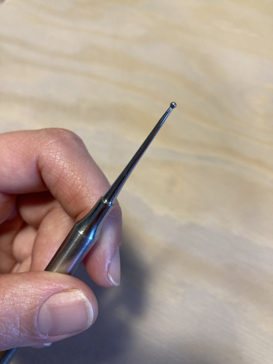
Speaking of rounded-tip tools, I just realized I forgot my other favourite, a core tool that could replace the lighter-wood pointy stick in my Most Important Sgraffito Tools ranking - the ball-ended, double-sided stylus! This thing is a tiny powerhouse and, like the more rounded point on the dark-wood stick, it gently draws the slip off the clay rather than gouging:
Next up, slip! I'm not sure what you were using as your colour layer, because you mentioned that it ran/moved on the surface of the clay, which my stained slip doesn't do. Did you mix glaze into the slip? Or were you working with a powered pigment?
When I'm making coloured slip, I use a powdered pigment called Mason Stain, which can be used to dye slip, clay, and clear glaze bases (eg. to make translucent celadon glazes). I use a couple different brands, but it's all called Mason Stain.
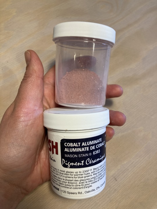
If you're a sensible person you can find proper recipes for mixing the slip and the stain, but I honestly go by how it looks - I add it to the slip a few spoonfuls at a time, mix, and see how pigmented the slip looks. If you want to really make sure the pigment is well-mixed you can get a stick blender from a thrift store or attach a mixing head onto an electric drill (something I'd like to upgrade to as the stick blender is SUPER messy & hard to clean out), but I mostly just mix it really well with a stir stick.
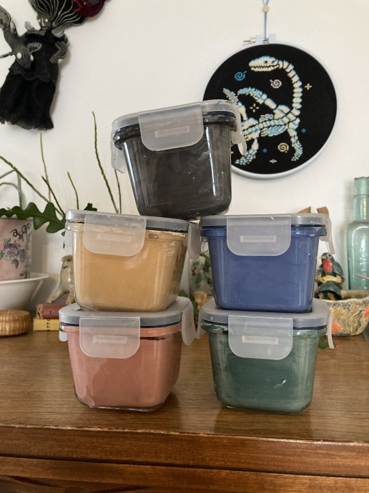
Once it's mixed, I keep my slips in these little self-sealing glass containers from IKEA, which stop it from drying out too fast (I tried keeping slip in regular jars & it turned into a rock...you definitely need a container with a rubber seal on it!). You'll still need to add water here & there, but it can sit for weeks without too much concern.
My slip is a little thick & gloopy, so I usually brush two layers of slip onto the leather-hard sculpture, letting each dry before I put on the next coat, and I let it dry until it's no longer at all tacky before I start carving (otherwise things WILL smudge and it WILL be terribly messy.
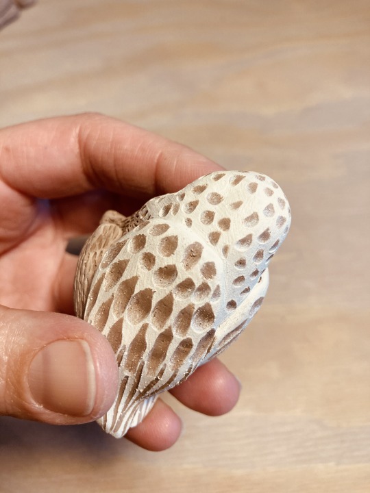
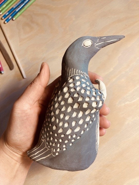
Finally, technique! I did take a look at your blog & the sgraffito project you mentioned & one thing I noticed was that your scratch marks were very deep and didn't reveal much clay under the scratched-away slip. This is an easy thing to have happen, especially if your slip/clay/both are still too wet or you're putting too much pressure on the carving tool.
My best tips for remedying this are:
Make sure the slip isn't at all tacky to the touch & that the clay underneath is leather hard.
Go very gently at first! It doesn't take much to scratch the slip away and you can always come back and take away more slip/make your carving area deeper if you want to, but you can't put the clay back!
Use the carving tools at an angle to the clay (somewhere around 45º ish, this is not a hard science), not perpendicular to it - this will stop you from stabbing straight down instead of scraping. If you've ever done linocut prints, think of the angle you hold the linocut tool at - sgraffito is generally a pulling-towards motion vs. a pushing away one for lino, but the angle is important either way!
Having even just a small variety of tools (eg. my core 4-5 as shown above) will also help, as you'll have options for line-weight/how much slip a tool takes off.
Phew! I sort of got carried away there, but I hope this was helpful?? If you have any more questions (or if anyone else does), please don't hesitate to ask! I'm still planning on making a proper sgraffito tutorial/series of tutorials, but need to find the time for all the filming/editing that requires.
114 notes
·
View notes
Text
By following the source link, you will find 110 gifs of Louisa Harland as Nell Jackson in Renegade Nell (2024)
Some of these are very similar but cut slightly different. I am a beginner GIF maker so please excuse anything that looks strange. I also tested various different colouring and sharpening techniques here so there’s a bit of a variation in quality/style as I tried to figure out what worked best. Shoutout to Tumblr User perotovar for their PSDs!
Feel free to use for roleplaying purposes, as sidebars, in crackships, crop into icons, or edit as you see fit. Please do not upload anywhere else or repost without giving the appropriate credits or claim as your own. Otherwise, go nuts.
Louisa is a white Irish actor and was around age 29 at the time of filming.
This gif pack is a work in progress, and I plan on giffing Louisa in the rest of the series.
Trigger warnings: violence, guns, food/eating, drinking, choking, drowning


#Louisa Harland gif pack#Louisa Harland gif hunt#Louisa Harland#period fc#underused fc#gif hunt#gif pack
11 notes
·
View notes
Text
This is Morthian – the youngest son of Stian & Vivanna.
See here his refsheet: https://www.deviantart.com/felisglacialis/art/Morthian-reference-831521064
He’s been quite close lately so I wanted to draw him in a bit of a peaceful, spiritual setting. He's in many ways so different than his parents and siblings. His father had become a fanatic fighter and his siblings followed in their father's footsteps. His mother was gentler but she too, had a brave determination that he didn't find in himself. Morthian has a calm and peaceful nature and he doesn't like violence. He struggled quite a bit to find his place among the others as he had been raised close to the Fjordland Force's activities (a sort of organization led by his father to defend their lands against invading humans). Eventually he found his role as a healer (like his mother) rather than a fighter.
I wanted to practice with liquid water colours and this kind of ‘glow’ technique that I find so inspiring in Khaosdog’s work. This was my very first attempt (I did this one before the previous drawing of Nintu) and I didn’t really know what I was doing. I still like how the water colour effects came out, but the glow effect failed a bit, so I edited it slightly in photoshop (just a splatter brush that mimics my traditional technique the most, no air brush or dodge effects). I've also used quite a lot of pencil this time and I learned some new techniques. Anyway - I've more ideas to draw Morthian in this style but I haven't come to it just yet -as I'm running short on time and energy :/
The title for this drawing came form a track from Beauty and the Beast www.youtube.com/watch?v=tH9RTu… – I generally associate Morthian a lot with the Beauty and the Beast soundtrack (particularly from the 2017 remake – the music was good even though the movie had lost the magic). This piece I link to his passing but also to the transformation that he underwent personally - when he learned to accept whom he is as a person and that he doesn't have to be like his father or siblings; he is ok the way he is.
Anyeay - I’ve been a bit inactive with drawing lately and I’m focusing a lot on 3D stuff, other activities and I have a shitload to do at work. So hopefully I can keep up with my every-second-week Sunday submissions again but no guarantee...
------------------------
DON'T COPY/USE ANYTHING OF THIS!
Don’t use these or any other siderians as avatar in RP games and don't use them to represent some other character in role play games! They are who they are and they CANNOT represent someone else.
#siderian#Morthian#traditional art#artists on tumblr#liquid water colours#big cat#feline#Siderian#my art#FelisGlacialis#Bluepoint#traditional#Sætansen
21 notes
·
View notes
Photo


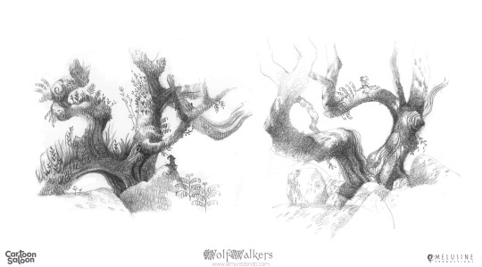

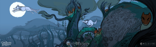


WOLFWALKERS - Concept Art and Color Script
Worked with directors Tomm More and Ross Stewart as Scene Illustration Artist, Location Designer, Color Script Artist and Background Painter for their feature film "Wolfwalkers" from the 5 times Oscar's Academy nominated studio Cartoon Saloon.
------
Some years ago I packed my brushes and headed to the green rolling hills of Ireland to join an incredible team of people to work in this precious gem. At first I joined the Scene Illustration, o Concept team, where I helped define the look of the forest and design the locations inside of it, as well as help define the style, and traditional pencil and watercolor technique with the team lead by Tomm and Ross. Later in production I designed Sequence Colour Scripts and Key Colour Backgrounds to establish the look and the methodology for the Background Colour Team. Here you can see a selection of some of the concepts I developed.
------
ROBYN RUNNING - Inspired by the Dark Hedges from a trip to the north of Ireland, we were still trying to define the look of the forest, the graphic light and autumny colors while keeping the green wet feeling of Ireland. (which proved to be a challenge for all of us!) We were also exploring the characters in action and how to strike a graphic look moving in 3d space and this pose helped with that. I just loved drawing Robyn, inspired by the character poses of Sandra and the character team concepts.
------
WATERFALL. Helping define the look of the waterfall was one of my favourite things in the film. Working with Maria and Ross from a physical maquette Ross had built, we dove to define the looser, wilder and more organic section of the film, the Wolfwalkers waterfall den, where watercolors are at their rawest and washes of color blend. Was a very iterative process where I let the watercolor do what it wanted, blending colors and shapes in beautiful ways that I would later on use on the final image. In this concept I also explored the characters and proposed the final wolf look for Robyn which made it into the film, as before she had a slightly different look. The whole film was a greatly collaborative effort where we were all exploring and proposing ideas!
------
LOCATION DESIGN RAVINE - First sketches I did when I joined the Wolfwalkers concept team, or scene illustration. I set out to explore the forest as Robyn gets deeper into it. Her feelings and the scenery change and develop as we go further from the farmlands forest tamed by humans. I was trying to figure out how to make the forest feel older and more secret as you get deeper into it, as the areas untouched by humans were wilder, stronger and purer, with more and more ancient ruins from old wolfwalkers civilizations that had not been seen for centuries!
------
Some tree trunks and branches studies I did to define the lush and magical aspect of the ravine. Inspired by a plein air painting trip to Wistman’s Wood in Dartmoor
------
TRIPTYCH - At this time we were trying to find a graphic light to balance the very simple characters and BGs, with a very simple lighting on them, just enough to tell the story we needed in each shot. This image was conceived as a triptych illustration, established in a great storyboard panel by Iker Maidagan and Ariel Ries , with characters by Tomm More and some help from Ross Stewart. I often used small value studies like these to figure out the lighting structure to tell the story, in this case using the Hitchcock bar of light on them to have the girls “see without being seen”. I also did a concept close up to define the look of the magic ivy wall, exploring the FX look and progression and lighting.
------
LOCATION DESIGN - Nearing production we settled to make some specific location designs for the Ravine, the innermost secret den of the Wolfwalker people. We tried to find landmarks that we could repeat in different scenes to get a feel of the evolution of the story. Ludo Gavillet and I designed maps, did sketches and color roughs and had a blast dreaming camera possibilities to craft the otherworldly and mystical side of these people, inspired by the art of Andy Goldsworthy. (I discovered this artist with the best family name ever thanks to Ross during production, don't miss the documentary about his art and life!).
------
SEQUENCE COLOR SCRIPTS - Later in production, I helped out with some sequence color scripts to flesh out, from the rough color keys from Alice and Lily, the final approach the BGs will have in a specific sequence.
------
All artwork copyright by Cartoon Saloon & Melusine Productions.
#wolfwalkers#cartoonsaloon#watercolor#pencil#tradicionalmedia#mixedmedia#film#animaton#conceptart#illustration
129 notes
·
View notes
Text
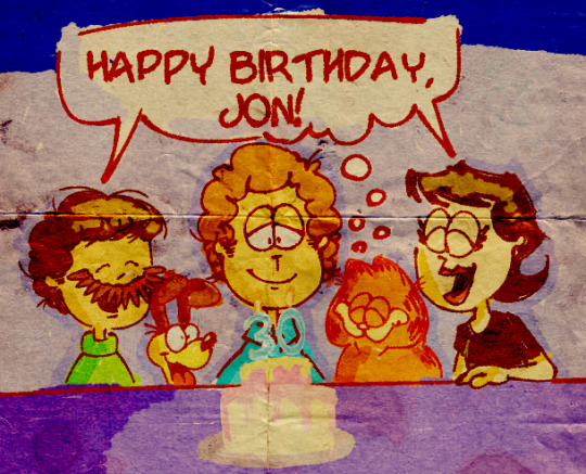
The Jonicles - Entry 19
image above drawn by me using a really cool technique i learned on tumblr!! (the reason it says 30 is because jon is 29 in the strip and i wanted to reference that)
It is currently the 28th of July, 2022 at 7:19 am! This date is a very special one all revolving around a very special boy - It's Jon's birthday! You have no idea how long I've been waiting to celebrate the birthday of this beautiful man! It is also officially day #70 of my Jon Arbuckle hyperfixation (and 7 is a lucky number!), making Jon's birthday extra special as it lands on a great milestone this year!
You know, I've been waiting to write this entry for so long, I know who I'm going to write about and I know that what I'm going to write has to to with the special significance Jon has, but I never knew ehat to actually write on the notes these are written on. But Jon, O Jon…
Jon has really been there throughout almost my entire life whether I have realised it or not. When I was merely a small tiny child sitting on the floor watching Garfield And Friends, his smiling face was there onscreen for 4 year old me to enjoy. When I was still just a young boy sitting in my room reading my dad's Garfield strips, Arbuckle was lovingly sprinkled throughout the pages, prodiving chuckles and smiles wherever he went. When I was a young prepubescent boy, I had discovered and became fascinated with the complexities of the Garfield Minus Garfield strips and was introduced to the sadder side of Jon Arbuckle. And again, when I was only 11, discovering the hilarious and fucked up Garfielf shitposts and binging a compilation of them, Jon was right there the whole way in various different depictions, all of them making me laugh and smile. Every bit of my life that popped up that was even slightly Garfield related, whether it was a fact, or a funny shitpost, a meme, a comic strip, Jon was there, even if he wasn't present, he still lingered and floated around in my thoughts by pure association alone like a gaurdian angel.
And now… now we're here. On that fateful day of May 19th, 2022 at 4:24 am when I witnessed that singular image of that man, Jon appeared in my life once again and this time as a hyperfixation on a fictional character that I never could have predicted. He showed up in my life in a very special way at a time where I'm still discovering things about myself and when I've been feeling my lowest. Confused, in denial, anxious, hopelessness, nothingness, all these things swirling around in my head, and then here comes Jon. That handsome devil, that dorky loveable goof, that relatable fun cartoonist, he had swept me away into an interest that I could have never known would actually keep me in a state of fascination and joy, I think it's even at special interest status at this point! Jon is here, in my heart and mind. And he kinda is like a guardian angel in a way. He's always in my thoughts, his adorable little face looking over me contently. And it's no wonder he's always there if he means so, so much…
Jon is relatable. Incredibly relatable. I have went through this time and time again in many entries, especially Entry 3 which I'm still debating on publishing. But Jon is relatable, sometimes even painfully so and even to the point of me jokingly questioning "hey, maybe i am jon, haha wouldn't that be cool". He's like a representation of me, and I know that's because Jon is written to be relatable, but he's just so much more to me. His quirks, whether it's sorting his socks alphabetically, wearing colourful tacky mismatched suits, playing silly games with his cat like "Guess The Burp", somehow gluing a blender to his face for a strange and inexplicable reason, I am that. And I don't mean that literally, I haven't managed to glue a blender to my face (yet), but it's those little things Jon has that mirror my own quirks. And you may think "well yeah, everyone has quirks!", and you're right. But because I have a strong connection to Jon, because my identity closely matches his in many aspects, those weird and wacky quirks of his feel incredibly familiar like I was the one with those behaviours. Like I was Jon.
And it even goes into feelings. My behavioural and emotional patterns remind me of Jon. He can go from happy and jovial (not matter how fake it is) to null in the difference of a single panel. He can go from being somewhat content with his life to suddenly waking up the next morning and deciding he's going to completely flip it on its head and move to… Antartica or something before dropping that idea too. He can be completely silent and quite depressed looking through an entire strip, paying no mind to the situations unfolding around him, completely unenthusiastic at all. And that… hurts sometimes, especially when Jon isn't upbeat or goofy or even just happy. When Jon is just quiet, solemn, deep in thought, feeling worthless in life, there's no joy to his expression… It not only hurts to see a character I care for and love so dearly in a state of unhappiness, but it hurts in a more personal way. I feel those things, I feel almost exactly like Jon. Unworthy, numb, solemn, confused, anxious. Sometimes I'm scared to pull that lever and continue forward, and I often question the point of doing so, that nagging question that always hangs around in my head. But knowing Jon feels the same, knowing the connection I have to this single character, it makes it easier. And yes, I know that looking to fictional men for help doesn't replace actual social interaction or any professional help, but it helps. Jon helps.
Jon is here for me in my thoughts, I know that for a fact. It's been 70 days already, I think that's well established. He's a friend, a guardian angel, a buddy, a metaphorical shoulder to cry on, no matter how fictional he is. He's been there through thick and thin, he's seen my grow and I've seen him grow as well, and between that barrier that separates reality from fiction is a single connection between he and I. I probably sound like I've lost the plot, but if one day that barrier were to shatter and crumble and I was able to actually see Jon in person, I would. I would be his friend, be able to talk to him, be able to see him right there, I could share my thoughts on the connection between us, and it would be swell. It would be special. It would be theoretically catastrophic if that barrier broke for all fictional characters but hey, at least Jon's there, lol (and maybe Lyman could finally be free from his void prison…..)
So, Jon, on your special day, I celebrate the personal and emotional connection I have to you, as well as your birthday, because you mean so much to me. You mean so much to a random autistic kid from Australia who has a little too much time on its hands to write these, and I'm happy for that. I'm happy that you have been throughout my entire life and many other people's lives to share this similar connection with. You are a pretty underrated character, but you will not got underrated in my heart and in my thoughts, and I swear on that fact. You are special. You are worth something. You are Jon. So, happy birthday, Jon, from all of us. Whether some have been there since that first little strip in a small local paper in 1976, or whether some are just starting to read the comic today, we wish you a happy birthday. Love you, Jon <3
Last edited at 8:18 am
Happy birthday to our special boy from not only me, but many others in the Garfield fandom. Have a great day, Jon, you deserve it :)
Cheers,
Your Local Jonnoisseur
Posted on the 28th of July, 2022 at 8:43 am.
#jonicles 19#happy birthday jon arbuckle!!!#you are so special to me jon#if only you knew how much you mean to me....#have a great birthday#love you jon <3
9 notes
·
View notes
Text
Highest Quality Designer Replica Bags
You can find quite a few sellers who sell designer replicas on Dhgate. Look out for sellers that has a substantial ranking, a large transaction rely and possess two or 3 products with good sales.
I’m not sure in which the “supports terrorism” detail arrived from? Whenever I see information like this I quickly Imagine, “It’s just purses.
These bags are slightly larger than the first and are created with decreased excellent elements. On the other hand, in case you’re just searching for a knockoff to hold around town, Here is the technique to go.
seven. After you provide the green mild to what you’ve picked out, the vendor ships the solution straight to you personally. They usually give a monitoring selection a couple of days later. Following that, all you have to do is patiently hold out.
When you are searhing for reliable bags that search trendy, then take a look at Aliexpress or Dhgate. They've the best assortment of designer bags. Does DHGate offer faux designers?
Type lovers have found out that sporting a large-close designer replica is an impeccable way to create an enduring fashion impact on Other individuals. Also, these replicas can necessarily mean the distinction between a just desirable and breathtaking physical appearance on any situation.
So why pay out $2000 for your bag, when you can find it for $a hundred or lesser? Most of these replicas, appear the identical, truly feel exactly the same and also have the same craftsmanship.
“Good searching bag. GG seems extremely genuine. I’m happy I took the risk and ordered it. I adore it. Seems to be, feels and smells like genuine leather-based, in truth i believe it is legitimate leather-based from what I'm able to convey to but can’t say for particular. Hardware seems to be fantastic quality. I'd personally get yet again from this seller.“
Premium quality or Tremendous bogus replicas ought to incredibly carefully mimic their authentic counterparts in terms of expertise, high quality of components, and All round overall look or appear.
Their bags are Tremendous inexpensive as well as the Ladies’s leather-based wallets are priced extremely fairly. This is the type of retail store, in which you pick up two or 3 bags on account of its cost and top quality and design and style.
Providing designer model counterfeit handbags in New York City is usually a risky proposition for your vendors. Undercover law enforcement normally crack down and They might arrest the vendor, good the landlord, and confiscate their knockoff wares. For the buyer, There's hardly any chance of prosecution, as not one person has at any time been charged in New York City for buying a phony handbag. The act of shopping for a bogus handbag has become criminalized in NYC, but not one person has ever been charged. You will discover, nevertheless, lots of ethical inquiries in purchasing a pretend handbag.
Listed here we Look into the different sorts of replica bags readily available, to help you pick the one that’s ideal for you.
Actually, amongst The explanations why I bought fake luxury bags is since I employed them as replacements for my reliable when touring. I seldom use my pricy reliable bags for travel Specially my Chanel or any bags that happen to be shiny colour.
aaa top quality replica designer handbags online has some of the best replicas on line. If aaa replica designer handbags hunting for high quality replica bags from China then Dhgate is the perfect selection. Why?
0 notes
Text
Current Relevant Developments - 6
I was reading through this article by Ioana Santamarian where she talks about creating a stylised environment using Unreal Engine. Although I'm mainly focussed on less stylised game art, a lot of the principles she talks about in terms of composition, asset creation, and general techniques in Unreal are very applicable to my own work.
An interesting topic that she discussed is using runtime virtual textures to create a blend between the materials of 2 assets. In the environment she was creating it was to blend the grass into the terrain. I wanted to try and use something similar on the rocky environment I've been working on for my project.
Currently I have a lot of rocks scattered on a landscape, but lots of the rocks are quite different in colour to the terrain. This means that there is quite an obvious line between the rocks and the terrain.
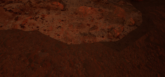
From far away this isn't an issue so shouldn't be too obvious throughout the cinematic I'm making. However, as part of the potential gameplay the player would be able to leave the base. Because of this, I want to have a plan for the techniques I could use to make the exterior environment look better up close as well.
The method I used was slightly different to the way Santamarian described in her work but I wanted to be able to control the level of "falloff" of the blend a bit more. I also found that, because the rocks I've used are Megascans, I had to modify the master material quite a bit to prepare it for the RVT blending. In Santamarian's method, as they had used their own material, it seems a bit simpler to combine the 2, so if I use this again in the final project I'll try to follow her method more closely, as with my own original materials I should be able to create a simpler material set up.
One benefit of using the Megascans was that, because all the rocks I' used have the same master material, I was able to just change that once and then all of the material instances for the different rocks were updated at the same time.
Here is the effect of the RVT on one of the rock objects. I added in a parameter to the master material to allow the falloff to be set for each material instance so I'm able to fine-tune the look a bit more depending on each rock type. I do think there is still a bit of a visible edge between the 2 objects but that may be down to the resolution of each object - perhaps using nanite rocks rather than a mid-quality version would remove some of this. I'll have to continue testing with different quality rocks and find a middle ground. As this isn't an essential part of the cinematic I will base the decision mainly on how the rocks and terrain look from the inside of the base.
References
Santamarian, I. (2021). "Creating a Dreamy Game-Ready Landscape in UE4 & Substance Designer". 80.LV. https://80.lv/articles/creating-a-dreamy-game-ready-landscape-in-ue4-substance-designer/. Accessed 26/04/2024.
0 notes
Text
20,000 words milestone
Since 20,000 words written is a bit of a milestone, here is some no context information about the 13th century…
Here are two religious manuscripts that may or may not be relevant:
Codex Gigas (aka The Devil's Bible)
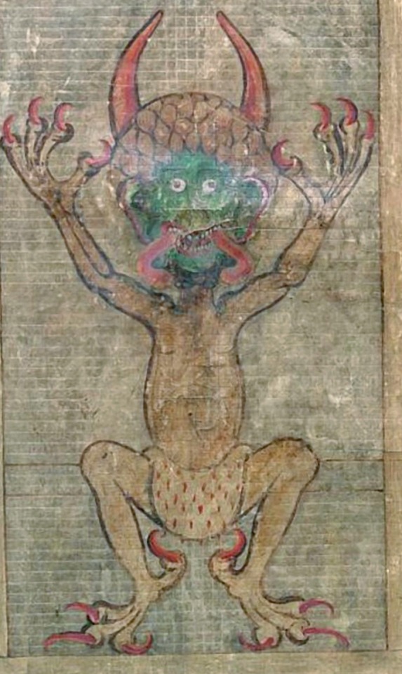
^ So, this is a depiction of the devil found in a codex (basically an old handwritten book) from early 13th century, what is now the, Czech Republic.
Here is the Wikipedia article. It's written in Latin, which I recently discovered is a language you can learn on Duolingo... probably not 13th century Latin though.
Aja'ib al-Makhluqat (The Wonders of Creatures and the Marvels of Creation)

^ This is the Archangel Gabriel who is looking quite stylish and colourful. The picture itself is from a 14th century manuscript, but the original work was written by Zakariya al-Qazwini in the 13th.
It was written in Arabic, which as far as I can tell would have been in 'Classical Arabic' which differs somewhat from the 'Modern Standard Arabic' used today.
I can't remember how I found this, but here is the Wikipedia article.
---
So, 13th century England or 13th century Scotland...
Kingdom of Alba
Well, I haven't been to either England or Scotland, but neither existed as we know them in the 13th century. Something that did exist from 900AD till 1296AD was the Kingdom of Alba. Which seems to me to just be the Scottish Gaelic word for... Scotland.
There is a lot of information about Scotland in the High Middle Ages, far more than I had time or energy to read about. But the King during the 1240's was:

^ Alexander II (1198 - 1249), King of Scots. And here is his Wikipedia article, and that's his seal.
He was the "only Scottish king to take his invasion force all the way to the south coast of England", and signed the "Treaty of York (1237) which defined the boundary between England and Scotland".
So, the 13th century wasn't boring, if you are a historian... which I am not.
Getting slightly back on topic:
Church architecture from 13th century Scotland has a few examples still standing that are easy finds.
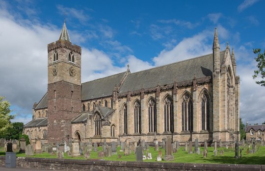
^ Dunblane Cathedral, in Dunblane, Scotland, has been restored... but would have been restored using materials and techniques that would make it still a useful example of a 13th century church. (Even though it was originally built between the 11th and 15th centuries... like I said, I'm not a historian.)
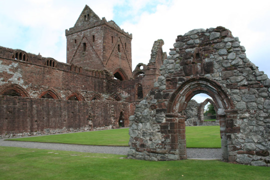
^ The ruins of Sweetheart Abbey, in New Abbey, Scotland, was founded in the late 13th century. I think it's held up pretty well, considering it has been abandoned since 1624.
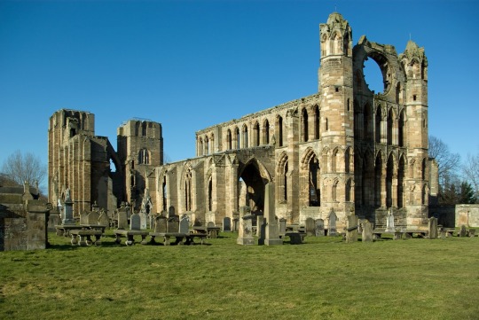
^ My personal favourite: The ruins of Elgin Cathedral, in Elgin, Scotland. Built in 1224 on land granted by the aforementioned King Alexander II.
I mean, it had a tendance to be burnt down... at least three times... so it's probably more of a 15th century example, but it's pretty.
---
Assorted people of the 13th century:
Francis of Assisi
Francis of Assisi (1181 - 1226), was a 13th century monk who lived and died in what we would now think of as Italy. He is not relevant to what I am writing, however his Wikipedia page has a detailed painting of what a 13th century monk would wear… although it was painted in the 17th century so…

^ Francis of Assisi.
Hugh of Saint-Cher
Hugh of Saint-Cher (1200 - 1263), was another 13th century monk, this time a Bishop, who…wore glasses! That’s it, that's why I find him interesting. Born in what is now France and dying in what is now Italy, the painting of him wearing a pair of eyeglasses is one of the (if not the) first depictions we have of someone who wore reading glasses. Sunglasses were also invented in roughly the same timeframe in China.

---
Miscellaneous...
While not particularly relevant, I of course spent some time looking at fashion trends of the 13th century... and learning of the existence of sumptuary laws, which are also not relevant but confirm the existence of the fashion police.
And I have yet to finish watching the BBC docuseries on 'How To Build A 13th Century Castle'.
I'll end with: Medieval names we can all enjoy...
#13th century#medieval history#13th century fic#medieval scotland#medieval religion#apparently you can take me out of academia but...
0 notes
Text
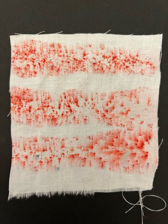
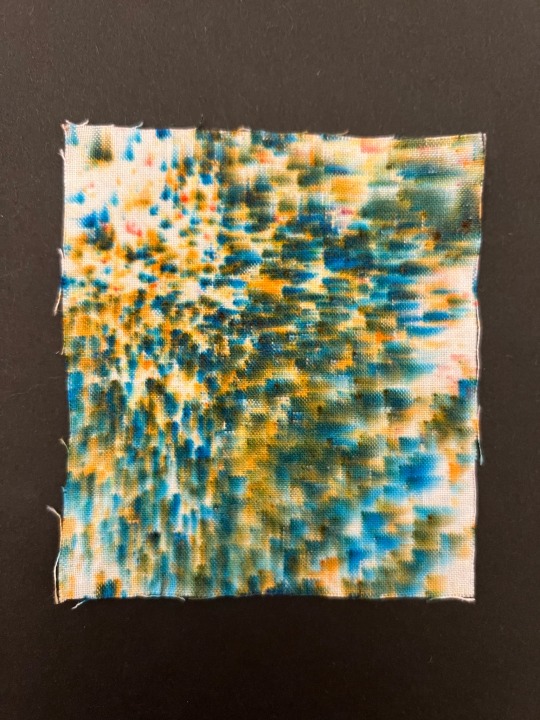
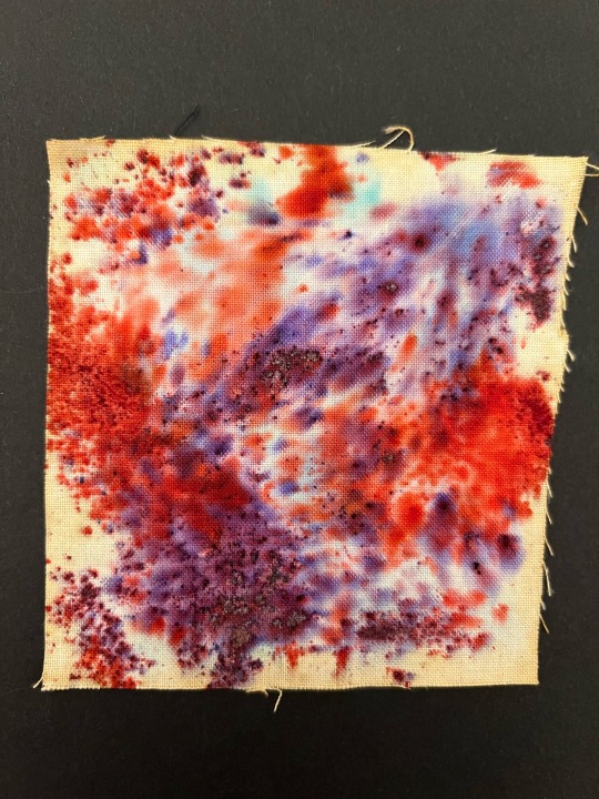
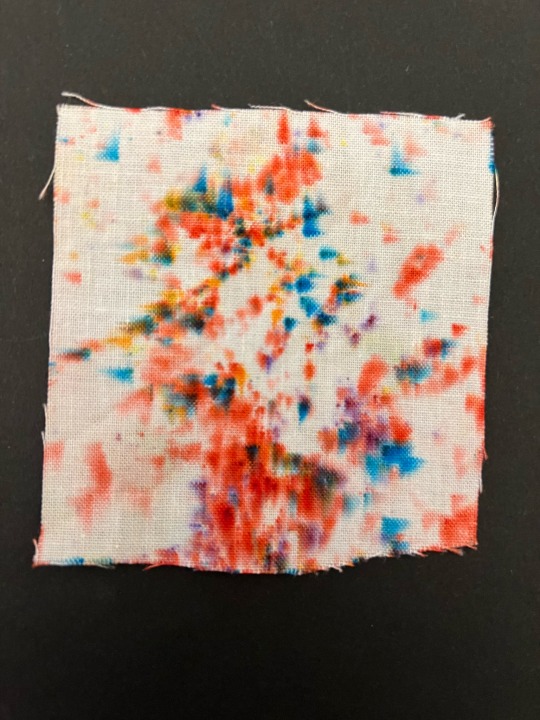
Dyeing
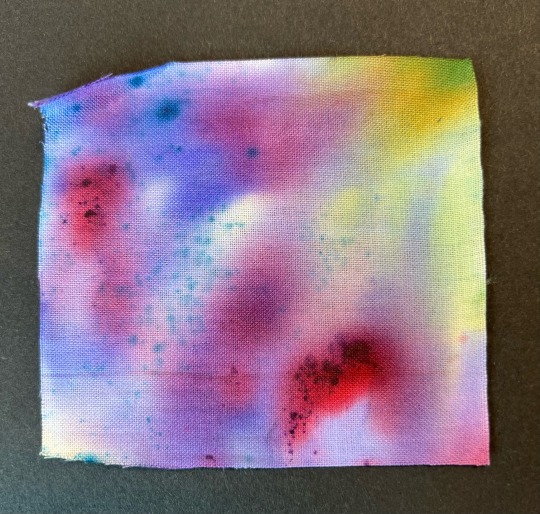
Brusho Inks
For this design I used blue brusho inks in which I sprinted on to a damp piece of whit cotton in which bled creating the design bellow. This is my favourite brusho sample and even though it bled a bit more than expected I think it still creates a very cool effect in which I really like the end result of.

Here I have layered a variety of different colour brusho inks onto white cotton to create this abstract piece. I really like the effect this created where you can still see the dots of blue and red powder however emphasised with the beautiful gradient in the back featuring pops of green purple and red creating this really unique and textured piece.
Here I have created this striped effect using red brusho inks. I applied liquid brush in lines on the white cotton then sprinkled the powder on top to crate the stripes and where the brusho has bled it has formed this really nice blurred effect. I really like how this sample turned out due to the really cool yet simplistic pattern it creates. I further like how the liquid brusho looks more pink really making the red pop.
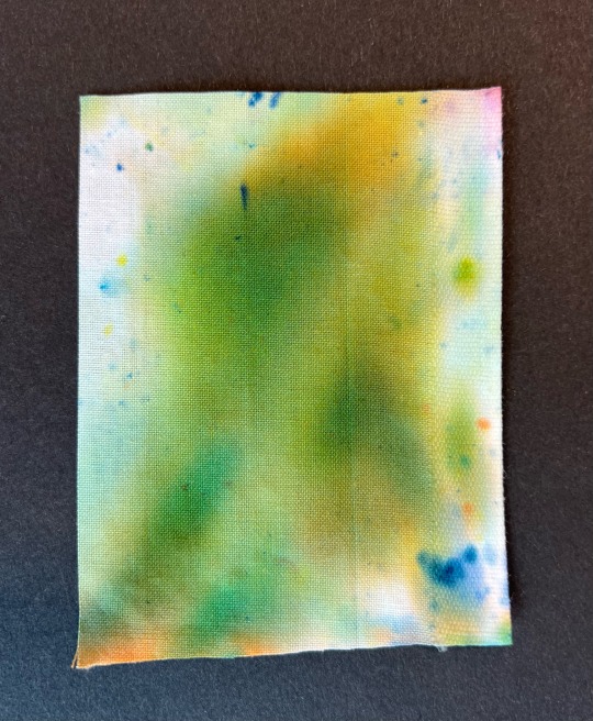
For this piece I wanted to create a spotty effect using green brusho powder in which the powder has split into blue and orange. Although the colour didn't come out green I still really like how it turned out and how it kind of looks 3D due to the subtle blurred effect. As well as this I like how it is darker and more blurred in some areas creating a more detailed and unique piece.
Here I experimented with a different coloured base in which I then layered red and purple brusho on to differentiate from the typical white background I have in my other brusho samples. I like how this design came out due to the blend of the two powdered colours and how saturated the colours are however I don't really like the background colour, I wanted it to be yellow but it came out a more rustic colour similar to that of my coffee samples.
Similar to some of my other brusho experiments I created this rainbow spotted pattern with powdered brush and white cotton. I really like how this design came out as its not s chaotic and overpowering as some of my other designs creating a much more detailed and clearer design. I also like the rainbow colour scheme with as it makes the design a bit more different than that of my others.
Dip Dye
Here I dipped a piece of whit cotton into red and purple brusho ink, resting the fabric in the water at the edge so the inks spreads up the sample to create a nice gradient. In conclusion, I like the gradient the two colours created and the fairly even coverage the brusho inks have however as you can see a few splotches of blue and yellow brusho has bled on to the sample slightly ruining the effect of the ombre.

Here I used the dip dye technique to create this half and half piece using white cotton and blue brusho. For this experiment I wanted to first see the coverage and opacity of the ink as well as how clean the line where the ink stops rising is or if it would blend and create a gradient. As you can see the colour is very vibrant and not splotchy at all and although the line between the blue and white isn't perfectly straight I still think it is quite a good method to create the half and half look. In addition, I accidentally got some different coloured brusho powder on the blue in which I really love the effect of creating this subtle rainbow.

Bubble wrap
Here I applied brusho inks to a piece of small bubble wrap, as you can see the brusho bled quite a lot creating this not so nice looking design in which I do not like the end product of.
0 notes
Text
I'm on JJK fandom too, and I have my own OCs here, so let me introduce a few of them!
Also, the drawings I'm showing here are not mine, my friend drew them for me, and she allowed me to post them. Just needed to make that clear. If you want to see her art, search lynna_arts on Instagram.
Here's my cursed child, Toniko Gansoda. She's 16-17 years old and on her second year of Jujutsu High School and has her own technique, called "Reality Alteration".
Her technique is a bit difficult to explain, but I'll use an example of a picture. You know when you rotate the image? Upside down, to certain angles, etc. That's one of the main things she does to her surroundings. Her techniques are "Rotate (direction) (angle)", example: Rotate left 90°. The second thing is called "Transparency", where she can pass through things like a ghost by touching that surface with her hands or feet, but that requires both feet, hands can be just one. She has a domain, called "Distorted Manor", where the rotation can only affect certain areas and even rotate different parts to different directions at once. Her transparency allowed her to even invade and escape domain expansions.
Unlike Itadori, who's too brave for his own good, she's close to a coward. Avoids fighting, especially alone, and is used to running or just aiding people. She's not very confident, but she knows to be serious. She's not on Tokyo nor Kyoto Jujutsu High, her school is the Aichi Jujutsu High School, a third school that I made up with my own lore (until they reach Shibuya with the canon characters).
During a mission at an ancient Heian Temple, she got thrown into a sealed cursed mirror inside of the temple and accidentally released inside of her body the forgotten Prince of Curses, Riya Sukuna.
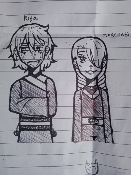
Riya Sukuna is the younger sibling (Non Binary, but don't care about pronouns) of Ryomen Sukuna. They were sealed in the mirror in the Heian Period because of a riot they started against their brother, which was Ryomen himself who sealed Riya.
Their technique is called "Inversion Technique", and it acts like a mirror and a reflector. Any cursed energy attack directed at them can be slightly retreated to not harm them and/or thrown back at its user. Riya is also the first mastermind behind the Reversed Cursed Energy, being the first to theorise that the energy is not merely healing, but could change the techniques as well. Yes, they knew Kenjaku. They have a domain expansion, called Inverted Shrine, just to spite Sukuna with their "lazy use of creativity", the domain basically forbids any use of cursed energy battles, with any attack thrown immediately hitting the user instead, no matter what kind of attack. The domain's look is also different from their brother's, looking more like a transparent-white glass dome with a small shrine with pillows rather than Malevolent Shrine's dark surroundings. If the domain is activated inside of another domain, then the appearance will stay the same as the first domain, but with traces of glass to show that you're in their domain now. Riya can use Toniko's ability.
Who's this Nurehebi? The bad guy of my OCs, but I'll talk about them in another story. They are Riya's closest friend, and will be making a big return to impact both Riya and Toniko's lives.
Here's the possession:

Unlike Sukuna, Riya doesn't like showing his marks, and luckily, he has fewer of them. Toniko likes to keep her fringe out of her forehead, so whenever her fringe is down, is usually thanks to Riya. He also doesn't rip off her clothes, instead, he steals anything he finds cute from any store around him. Riya and Toniko love to wonder and theorise about cursed techniques and possible combat, and Toniko, having hanged around Gojo before, had her fair share of curiosity over colours, which Riya indulges and both just start a random debate over Jujutsu.
I should tell you my girl is stupid. Basically, she made a Binding Vow with Riya so whenever someone killed her, he could have her body for 30 minutes to do as he pleases, but after that, he has to bring her back to life. This will be important in Shibuya. It also led Toniko to accept dying in order to help on missions.
Those are my OCs for now, I'll be bringing more soon. Thanks for reading! See ya next time!
#jujutsu kaisen#jjk#jjk manga#jjk anime#jujutsu kaisen anime#jujutsu kaisen manga#alternate universe#fanmade#alternate timeline#jjk oc#jjk ocs#jujutsu kaisen oc#jujutsu kaisen ocs#fanon#toniko gansoda#jjk toniko#riya sukuna#jjk riya
1 note
·
View note
Text
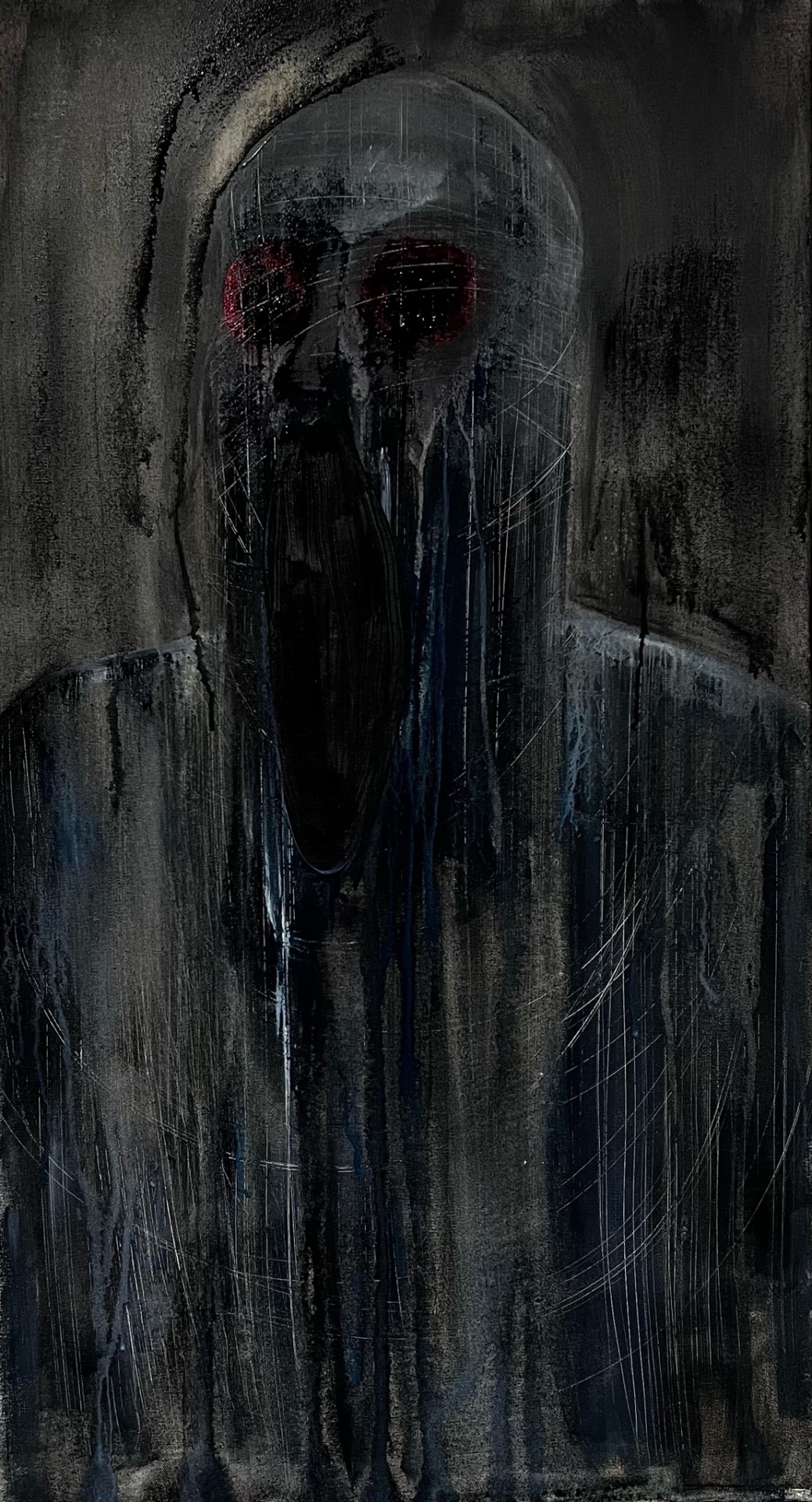
'Nightmare Realm' - Materials used: 50cm x 89cm, stretched canvas, watercolour, acrylic paint, spray bottle of water, sponge paint tool, hard bristle brush, chopped mounting board and a range of brushes.
When creating this piece I aimed to create a figure, different from my other ones. This piece was very successful as I was able to achieve a better outcome than I add anticipated for this piece. I started by painting a base colour on a repurposed canvas. I then blocked in marks to indicate the sale of the face and neck using pieces cut mounting board. I had planned to do a screaming mouth with the jaw, neck and shoulders, however when creating this piece I thought of Francis Bacon and his ‘Head VI’ also known as ‘screaming pope’ This inspired me to create an ambiguous figure with no distinctive jaw, neck and shoulders but instead drag washes of paint to not have these features and to drag the paint down the canvas to convey motion, much like Francis Bacon’s aim. This technique adds to the overall sinister and uncanny atmosphere of the figure and its surroundings. To further convey this, I have used a hard bristle brush to scratch into the surface to ever so slightly distort the figure further. These scratch marks create a monster like feeling and possibly crossing the boundary into ideas of insanity. Personally, when I look at this piece, in particular, the scratch marks I can almost here scratching like a knife and fork against a plate, or possibly scratching against a wall or door. I feel that the unsettling and scary feeling comes from the imagery and ambiguity caused by dark colours and non-distinctive facial features.
0 notes
Text
BCM116 - Week Two Journal Entry
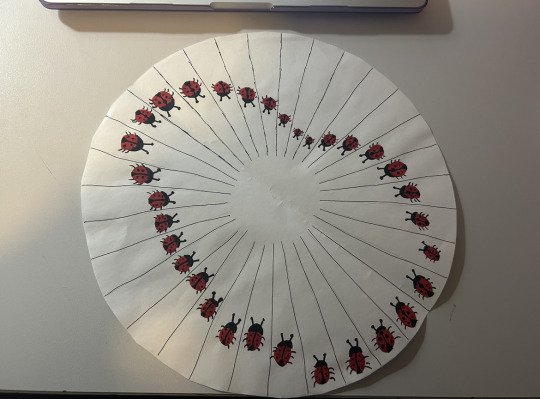
In classes this week, we explored Crary’s reading, “Techniques of the Observer''. In the reading, we explored the different types of immersive media illusions of the past such as The Thaumatrope (Wonder Turner), Phenakistoscopes, Dioramas, Kaleidoscopes, Stereoscopes and Animation.
We also got to play around with a Stereoscope which was really fascinating as it seems to be one of the early stages of what is now a Virtual Reality headset. I’m really fascinated by the phenakistoscope, it reminds me of a flipbook and I find those really fun. In workshops we also got the opportunity to create our own phenakistoscope which was cool and I made one with a bunch of ladybugs on it, and got to see them move around. Here is what it looked like:
The other device from Crary’s reading that I have always enjoyed and loved since I was young is the Kaleidoscope. I used to have a few in my bedroom and always liked to look into them because they looked magical to me. They were invented by Sir David Brewster, a Scottish scientist, and it works by creating reflections of objects at the end of a tube through angled mirrors in order to make a pattern that you can change by twisting the end.
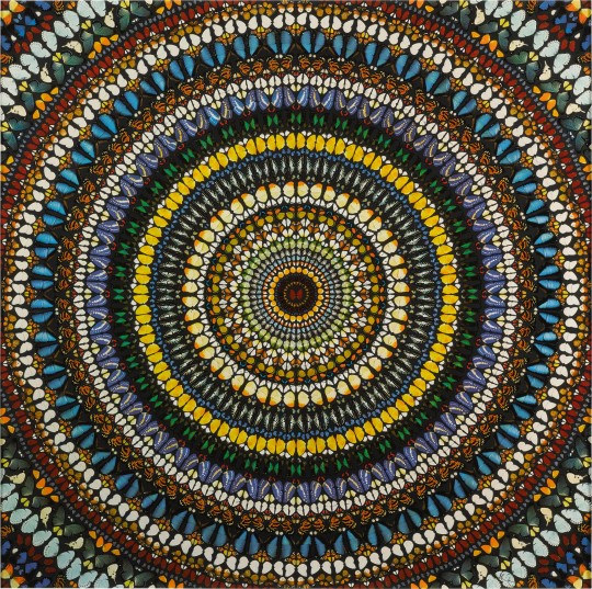
In looking for examples of popular kaleidoscope works, I came across Damien Hirst and vaguely remember touching on his works in high school. One of his works, Covenant, was so pretty and I loved the colours as they remind me of my favourite insect, butterflies, which also seems to be his favourite as well. He was inspired to create this work after he came across a Victorian tea tray that was covered in delicate patterns of butterfly wings. Damien Hirst surrounds his works around butterflies, to illustrate the ideas of growth, change, life and death. In talking about his practice Hirst explained that instead of being personal, he would rather create works based on universal triggers that different people can relate to, such as “everyone’s frightened of glass, everyone’s frightened of sharks, everyone loves butterflies.” and when talking about his obsession with butterflies, Hirst expressed that “I love butterflies because when they are dead they look alive.” which I completely agree with.
During this lesson we also tried to create our own stereoscope image by taking two images of an object and moving the camera slightly to the right in a way so that our brains could simulate where left and right was. When we edited the image and tested it in VR, it was very cool as it almost seemed paranormal or magical. Unfortunately, I did not save our image so I cannot show it here.
In relation to my project, I think it would be fun to add kaleidoscopes in it somehow, as I love them so much and find them so pleasing to look at.
0 notes
Last Seen Blogs
superlittlebabie-blog
Super Little Baby

onikitchen
Explorers of Japanese candy
mytiaranicole-blog
Music & Other Things

nut-noods
New & Improved

saw-x-streaming-vf-4k
[Regarder-Fr]— Saw X (2023) en Streaming-VF en Français