#a11y
Note
In what way does alt text serve as an accessibility tool for blind people? Do you use text to speech? I'm having trouble imagining that. I suppose I'm in general not understanding how a blind person might use Tumblr, but I'm particularly interested in the function of alt text.
In short, yes. We use text to speech (among other access technology like braille displays) very frequently to navigate online spaces. Text to speech software specifically designed for blind people are called screen readers, and when use on computers, they enable us to navigate the entire interface using the keyboard instead of the mouse And hear everything on screen, as long as those things are accessible. The same applies for touchscreens on smart phones and tablets, just instead of using keyboard commands, it alters the way touch affect the screen so we hear what we touch before anything actually gets activated. That part is hard to explain via text, but you should be able to find many videos online of blind people demonstrating how they use their phones.
As you may be able to guess, images are not exactly going to be accessible for text to speech software. Blindness screen readers are getting better and better at incorporating OCR (optical character recognition) software to help pick up text in images, and rudimentary AI driven Image descriptions, but they are still nowhere near enough for us to get an accurate understanding of what is in an image the majority of the time without a human made description.
Now I’m not exactly a programmer so the terminology I use might get kind of wonky here, but when you use the alt text feature, the text you write as an image description effectively gets sort of embedded onto the image itself. That way, when a screen reader lands on that image, Instead of having to employ artificial intelligences to make mediocre guesses, it will read out exactly the text you wrote in the alt text section.
Not only that, but the majority of blind people are not completely blind, and usually still have at least some amount of residual vision. So there are many blind people who may not have access to a screen reader, but who may struggle to visually interpret what is in an image without being able to click the alt text button and read a description. Plus, it benefits folks with visual processing disorders as well, where their visual acuity might be fine, but their brain’s ability to interpret what they are seeing is not. Being able to click the alt text icon in the corner of an image and read a text description Can help that person better interpret what they are seeing in the image, too.
Granted, in most cases, typing out an image description in the body of the post instead of in the alt text section often works just as well, so that is also an option. But there are many other posts in my image descriptions tag that go over the pros and cons of that, so I won’t digress into it here.
Utilizing alt text or any kind of image description on all of your social media posts that contain images is single-handedly one of the simplest and most effective things you can do to directly help blind people, even if you don’t know any blind people, and even if you think no blind people would be following you. There are more of us than you might think, and we have just as many varied interests and hobbies and beliefs as everyone else, so where there are people, there will also be blind people. We don’t only hang out in spaces to talk exclusively about blindness, we also hang out in fashion Facebook groups and tech subreddits and political Twitter hashtags and gaming related discord servers and on and on and on. Even if you don’t think a blind person would follow you, You can’t know that for sure, and adding image descriptions is one of the most effective ways to accommodate us even if you don’t know we’re there.
I hope this helps give you a clearer understanding of just how important alt text and image descriptions as a whole are for blind accessibility, and how we make use of those tools when they are available.
337 notes
·
View notes
Text

For the Benefit of All: Assistive Tech Developed from NASA Tech
What do modern cochlear implants and robotic gloves have in common? They were derived from NASA technology. We’ve made it easier to find and use our patented inventions that could help create products that enhance life for people with disabilities.
October is National Disability Employment Awareness Month, which highlights the contributions of American workers with disabilities – many of whom use assistive technology on the job. Take a look at these assistive technologies that are NASA spinoffs.
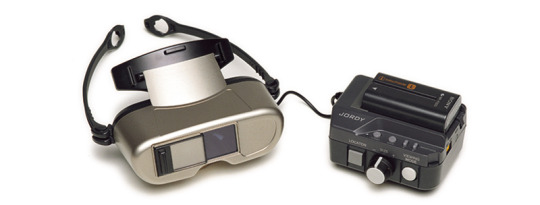
Low-Vision Headsets
The Joint Optical Reflective Display (JORDY) device is a headset that uses NASA image processing and head-mounted display technology to enable people with low vision to read and write. JORDY enhances individuals’ remaining sight by magnifying objects up to 50 times and allowing them to change contrast, brightness, and display modes. JORDY's name was inspired by Geordi La Forge, a blind character from “Star Trek: The Next Generation” whose futuristic visor enabled him to see.

Cochlear Implants
Work that led to the modern cochlear implant was patented by a NASA engineer in the 1970s. Following three failed corrective surgeries, Adam Kissiah combined his NASA electronics know-how with research in the Kennedy Space Center technical library to build his own solution for people with severe-to-profound hearing loss who receive little or no benefit from hearing aids. Several companies now make the devices, which have been implanted in hundreds of thousands of people around the world.

Robotic Gloves
Ironhand, from Swedish company Bioservo Technologies, is the world’s first industrial-strength robotic glove for factory workers and others who perform repetitive manual tasks. It helps prevent stress injuries but has been especially warmly received by workers with preexisting hand injuries and conditions. The glove is based on a suite of patents for the technology developed by NASA and General Motors to build the hands of the Robonaut 2 humanoid robotic astronaut.

Smart Glasses
Neurofeedback technology NASA originally developed to improve pilots’ attention has been the basis for products aimed at helping people manage attention disorders without medication. The devices measure brainwave output to gauge attention levels according to the “engagement index” a NASA engineer created. Then, they show the results to users, helping them learn to voluntarily control their degree of concentration. One such device is a pair of smart glasses from Narbis, whose lenses darken as attention wanes.

Anti-Gravity Treadmills
A NASA scientist who developed ways to use air pressure to simulate gravity for astronauts exercising in space had the idea to apply the concept for the opposite effect on Earth. After licensing his technology, Alter-G Inc. developed its anti-gravity G-Trainer treadmill, which lets users offload some or all of their weight while exercising. The treadmills can help people recover from athletic or brain injuries, and they allow a safe exercise regimen for others with long-term conditions such as arthritis.
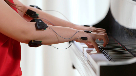
Wireless Muscle Sensors
Some of the most exciting assistive technologies to spin off may be yet to come. Delsys Inc. developed electromyographic technology to help NASA understand the effects of long-term weightlessness on astronauts’ muscles and movements. Electromyography detects and analyzes electrical signals emitted when motor nerves trigger movement. Among the company’s customers are physical therapists developing exercise routines to help patients recover from injuries. But some researchers are using the technology to attempt recoveries that once seemed impossible, such as helping paralyzed patients regain movement, letting laryngectomy patients speak, and outfitting amputees with artificial limbs that work like the real thing.
To further enhance the lives of people with disabilities, NASA has identified a selection of patented technologies created for space missions that could spur the next generation of assistive technology here on Earth.
Want to learn more about assistive technologies already in action? Check out NASA Spinoff to find products and services that wouldn’t exist without space exploration.
Make sure to follow us on Tumblr for your regular dose of space!
#NASA#space#tech#technology#spinoff#robotics#physical therapy#disability#disabled#accessibility#a11y#inventions
833 notes
·
View notes
Text
Making Accessible Interaction Banners - a Guide by Binoo "ChildrensWard"
Interaction or "DNI" (do not interact) banners are a staple of the age regression community, but too often are they made without taking accessibility in mind, whether it's because they're unreadable, have excessive eye strain, or aren't marked with alt text.
Therefore, in the hopes that I can help people out with this, I decided to write a mini guide on how to make your banners accessible for as many people as possible!
Under the "read more" cut, this guide will cover the following:
Fonts, and how to choose the best ones
Text, and what your interaction banners should say
Colour contrast, and why it's important in making your graphics accessible
Eye strain, and why it generally should be avoided
Alt text and image descriptions, and how to write them
And an example of an interaction banner I made using the criteria I've written in this guide!
So, without further adieu, let's get into the real meat of this guide!
Fonts
Fonts are easily the most important thing about an interaction banner! It's how you're going to best convey the contents of your banner in a way that's readable to the viewer. Here's a quick and firty rundown of the different kinds of fonts, as well as which ones you should (and shouldn't!) use for your banner:
Body Copy fonts are your basic Sans and Sans Serif style fonts that you'll most often find on books and websites, because they're some of the easiest fonts to read in smaller text (10-14pt) due to their lack of details. Examples of Body Copy fonts include PT Serif, Arial, Comic Sans, Roboto, and Helvetica Now.
Display fonts are often used for headers and subheaders and include features such as being thick, having unconventional letters, and, on occasion, being in all caps. However, these fonts should not be used for body or small text, as they will be very hard to read. Examples of Display fonts include Futura PT, Elephant, Noto Serif Display, and Shoreditch.
Script and decorative fonts are subtypes of display fonts, with the former having a handwritten quality to them, while the latter are considered to be the fun display fonts. However, you should be very careful with using either of these fonts- not only can they be hard to read on their own, but neither should be used specifically for body or small text in any circumstance. For the sake of readability and accessibility, however, I'd be more inclined to avoid using these fonts.
Text
Aside from the fonts that your text will be written in, the text itself is also a mandatory aspect of your banners. After all, it's what banners are entirely based on, and it's the very thing that tells you who can and can't interact with your posts.
However, there's something important to keep in mind, and that is how much text you're trying to cram into your banner because you're trying so desperately to fit your entire DNI criteria onto it.
What I think is important when it comes to making your banners is to keep any text you have on there as short as possible. If you bombard your banner with all this specific criteria, then you're more likely to make your readers confused, whether or not they happen to be a screen reader user.
When making your banners, ask yourself the following questions when deciding on your criteria:
How likely is it for someone interacting with the age regression or similar communities to fit this criteria? Have I come across a good number of people who fit this criteria that makes it worth mentioning?
Is this criteria at all relevant to the content I'm presenting? Do I need things like inter-community discourse terms from other communities on my banner if I'm making content specifically for age regression?
Is there any "unspoken" criteria that everyone agrees upon that doesn't need to be included? These might include nazis, racists and white supremacists, homophobes and transphobes, ableists and eugenicists, misogynists, anti-choice, etc.
If your answers show that the specific criteria is not relevant, then it's best to leave it out to keep the information on your banner more clear and concise.
Colour Contrast
While colour contrast is something often talked about in web development circles, it's also an important skill to learn when making any sort of graphic design- which is what interaction banners essentially are. Without taking colour contrast into mind, you're left with a banner that may not be easy for most people to read; let alone those with low vision or blindness. We also need to think about things like people who may be using old or outdated monitors, people reading on smaller screens (like a smart phone), and bad lighting and glare. As Contrast Rebellion puts it: aesthetics are important, but aren't the ultimate goal of design.
Okay, so you've understood the reason why colour contrast is important, but how do you put it into action? How do you know your colours of choice are readable?
Well lucky for us, there's many resources out there that help us in choosing the right colours! Here are a few of my favourites:
CSUN: Color Contrast - An introduction article on colour contrast, why it's important, and some examples of good and bad colour contrast choices.
Random A11y - If you don't have any colour combinations in mind, Random A11y is here to help! With it's vast amount of randomly generated colour contrast combinations, you'll have plenty of options to work with. Don't like the combination you're given? Just click on the "new colours" tab to generate a new palette!
Colour Contrast Analyzer - This is a free program for Windows and Mac that helps you with colour checking with a variety of different features; including multiple ways to select colours (CSS color formats, RGB slider, colour picker tool), and a colour blindness simulator.
Accessible Colors - If you don't want to or can't download the program above, then this website works just as fine with checking colours, too! Just enter in the hex codes of your colours, the font size and weight, and which level of conformance you'd like your colours to pass.
Eye strain
A bit of a sore topic for some, but I feel I must put it bluntly for people to understand: making your colours easy on the eyes of the viewer should be your top priority over your aesthetic. Some people, like myself, have certain health conditions that are triggered by eye strain, and by continuing to slap extremely contrasted rainbows on your banners, you're continuing to put disabled people through worsening symptoms, all because you feel the need to retain your aesthetic.
Many of the same resources shared in the Colour Contrast section can also help you to rule out any eye-straining palettes. Also, a general rule of thumb to keep in mind is: if a colour palette is eye straining enough to cause you some mild problems, then it's enough to cause someone with a disability more severe symptoms.
Alt text and image descriptions
I think a lot of us find writing alt text to be daunting- I know I did for a long while, which is why I never wrote any for my posts until recently. But really, once you get the hang of it, it can be very simple and easy to write! Even so, people who don't know how exactly to write alt text often fumble with this- either writing too much or too little, not being clear enough, or just copying the image caption and calling it a day.
Here's some tips and tricks on writing better alt text:
Alt text generally follows the Object-action-context rule. In the words of Alex Chen at Medium: The object is the main focus. The action describes what's happening, usually what the object is doing. The context describes the surrounding environment.
Be specific and concise, and even consider the content of the post or webpage it's on as well. You'll also want to consider the function or purpose of the image, and what you want your viewers to gain from it.
Keep your alt text short, as long descriptions with too much flowery language and filler words can be distracting when using a screen-reader. Generally, most screen-readers will cut off alt text at around 125 characters.
Avoid using "image of..." or "picture of...," as HTML codes will already identify your images as such. However, in this case, mentioning what type of image it is can add context.
Always check for spelling mistakes, as this can affect the user experience, causing interruptions and confusion.
Not related to interaction banners specifically, but avoid including alt text for decorative images that are used to make your post prettier. In this case, insert the word "null" in your alt text fields.
Image descriptions are a little different in the fact that they're allowed to be more descriptive than alt text, considering screen readers won't be able to cut off any alt text at 125 characters. Even so, it's still best to keep your image descriptions as short as possible to save from redundancy and confusion.
Please remember that writing alt text and image descriptions can take a lot of practice and trial-and-error, so don't give up if you can't get it right the first time! Write and rewrite it as much as you need to, or even consider changing your interaction banner altogether if you think it can't be described in words concisely.
An example
Taking what we've learned above, let's take this banner I made just for this post as an example of these characteristics put into action.

In this example, I have chosen the hex colour #4D0000 for my text colour, and the colours #B5F3DC and #E3B158 for my background. According to CCA, the contrast ratios for my colours of choice are 12.8:1 and 7.9:1 respectfully, which both meet the minimum contrasts of 1.4.3 for AA and 1.4.6 for AAA.
I have chosen the font FS Lola Bold, which is a type of display font that's best for headers and subheaders, but not so much any body or small text. I don't have to worry about this though, because I don't have any small text in my banner.
I've also kept my criteria to a simple "No DDLG/CGL interaction," because I feel that this is the most relevant information regarding the content of my blog and the posts I make. Short and simple, yet specific to who I don't want interacting with me. I also like the idea of my favourite fictional characters protecting my blog, which is why I've included another short sentence for it!
Here's an example of what the image description or alt text for this banner could look like:
[Image description: Banner that reads "Toopy and Binoo protect this blog, no DDLG/CGL interaction!" On it are the titular characters from the show. /End ID]
And if I were to have both alt text alongside an image description, then the alt text could be as simple as what the banner reads, which would be:
"Toopy and Binoo protect this blog, no DDLG/CGL interaction!"
Remember, you don't have to go into every little detail with your image descriptions or alt text, because then it can become very confusing for certain people to decipher! Keep it simple and state the minimum.
Closing words
I think that's everything that I wanted to cover in this post. Of course, there's more to accessible design than just text and fonts alone, but when it comes to interaction banners, it's usually the focal point of the images, which is why it's so vital that people with disabilities can also read your banner- especially when they contain important information about your personal boundaries.
Age regressors often pride themselves for the image we've set up for our community, that it's safe for everyone to join and no one will be judged or excluded for who their are. But the reality is, we still have lots of work to do before we're ever at that place, and making our community more accessible is just one of these steps that we should all be encouraged to take. Besides, what kind of message are we sending if we don't take the steps to make our space as accessible as possible? How do you think it'd feel to realize that a community you wanted to join is actively hostile towards you because of the refusal to learn how to accommodate for them? Especially when we have such a huge demographic of disabled people in the community, we can and should be doing better to accommodate for everyone as much as we possibly can.
Learning accessibility is a skill that requires time and practice, and I don't expect anyone to be perfect at it the first time around. The aim of doing these things isn't to make sure that every single thing is 100% accessible in every single way imaginable and with no mistakes whatsoever; but to instead encourage, develop, and incorporate good accessibility practices into our every day lives.
Thank you for reading,
- Binoo
#age regression#agere#agere community#sfw age regression#sfw agere#age dreaming#agedre#sfw agedre#dni banner#interaction banner#accessibility#a11y#long post
125 notes
·
View notes
Note
I'm very sorry. Six months ago you commented on a Gordon Ramsey accessibility post that your job to help make websites accessible. How do I get that job? I would love that so much. I'm sure you've answered this before but I can't find it.
I, too, am sure I've answered this before, but I can't remember where and I'm not about to brave the Tumblr search feature to go looking, so you and @the0dd0ne get a twofer.
Hi, I'm not a bot, and I was wondering if I could ask you a weird career question? I saw your addition on that "Accessibility Nightmares" post where you mentioned it's your actual job to email websites about their lack of accessibility and what they need to do to make it accessible, and can I ask how you got into that? I got injured on the job and need to make a huge career change, and that type of work has always been really interesting to me, but I don't even know where to start to get into it! Also feel free to ignore this lol I know it's out of left field.
(This is actually the third question I've got on this, so no, not that out of left field.)
So the first thing to understand is that it's actually pretty hard to get into digital accessibility because there just aren't that many companies doing it. As far as I know from company meetings there aren't that many schools teaching it as a part of their core web development curriculum. It's just not that common to think about it as part of web development. Which is vastly irritating.
I started mucking around with the web when there was first a web to muck around on, but when the pandemic hit and my Mom suggested (in a hilarious twist of circumstances) that I go to one of those Learn to Code boot camps to get a certificate that said I actually knew my shit so I could get a job in web development. A number of these boot camps also have job placement programs and pipeline agreements with certain companies. and in a nutshell that's how I got into it. The company sent my boot camp a letter saying "we need N warm bodies" and they sent the company a list of names, I got interviewed, I got hired as a contractor, and after a couple years of good work for them I got invited to interview for a permanent position, which I got.
These days due to the state of the everything, there are probably 10-50 programmers for every open development position, depending on language and job type and company. It's a rough field out there and I got very, very lucky in my timing. But if you want to try it, the boot camp to job pipeline is probably your best bet. Ask the boot camp recruiters if they have connections to accessibility firms. If they don't, you can always try asking if they have connections to web development/site packaging firms and then check if the firms have an accessibility department. Tell the recruiter up front what you're looking to work in, and keep in mind that the recruiter's job is to convince you to give the boot camp your money. (Mine was $12k USD.)
For resources to study in the meantime, there's the A11y Project which has discussions, videos, articles, posts, etc about digital accessibility, a lot of good information. You can also look at the resources for the CPACC exam, I don't recommend taking it unless you have a few hundred USD to burn but you can definitely study up on the Body of Knowledge, which is a free PDF to download. And there is, in fact, an accessibility job board, although I don't have any experience with applying for any of these jobs cold.
The languages I use most in my job are HTML and jQuery, and I passively use (meaning I read and interpret but don't actually program in) JavaScript and CSS. This is mainly because we work with client sites and there's only so much of the client code we can touch; if there's a problem in the client code we can't touch we have to write it up and tell them to fix it. If you end up in house for some large brand you may end up working in more web development languages, but a lot of accessibility can be handled by basic HTML attributes called ARIA attributes (and roles) and there's the documentation on that. Another tool to have is your soft skills: communication, specificity of language, writing up good descriptions of what code does what so you can explain exactly what needs to be fixed where and why. You might also want to look at documentation on what makes good alt text, where it's needed, what kind of labels are standard, etc. I think you can find that in the A11y Project pages, but honestly I just learned it on the job working with senior developers.
It's a hard time to get into software development at all, let alone a niche field like web accessibility. But Europe is about to have a digital accessibility law come into effect in July of next year (that encompasses more than just the web, that's just my area of expertise) and the US is making slow but steady strides in requiring digital accessibility as well, so there are jobs out there and there might be companies hiring to capitalize on the need. There will definitely always be companies putting off conforming to regulations until the last possible minute, and then needing services and specialists. So study up, practice, and good luck!
18 notes
·
View notes
Text
Sunday, 12 November 2023
And while we're on the topic of non-physical disabilities (which is a strange topic as the brain is an organ which is a physical part of people's bodies), stop censoring words.
Putting numbers or asterisks in words, or otherwise misspelling them, can cause problems for screen reading apps.
Seriously, are you interested in accessibility and support for disabled persons or not?
22 notes
·
View notes
Text
138 notes
·
View notes
Text
'*•.¸♡ Web Accessibility ♡¸.•*'
Africa is a full-stack Software Engineer, Yoga Teacher, and licensed Occupational Therapist.
On Thursday July 13 around 11AM PST, she will be a guest on my Twitch stream to discuss and teach us about Web Accessibility!
If you have any questions you'd like to ask her about Accessibility or about herself, I would appreciate it if you filled out this google form: https://forms.gle/ET6NSsY1K7Umz9Vg6
There will be a chance to ask questions during the stream itself! & I will be posting the recording up on youtube afterwards as well!
If you'd like to learn more about Africa and her work in Web Accessibility, check out her website ♡
#progblr#codeblr#programming#tech#coding#resources#web accessibility#a11y#ally#accessibility#frontend#comp sci#we'll be starting off the stream with some yoga which im super excited for hehe
30 notes
·
View notes
Note
Thanks for adding alt text to your art!! Love to see artists making their work accessible
Of course!! <3 I love to see it too tbh
Speaking of, I wish alt text reminders were on every platforms and opt-in by default, I feel like it would be a nice step towards making socials & art more accessible
11 notes
·
View notes
Text
I am extremely disappointed to see @magfest 2024 not only removed their COVID-19 policy (super.magfest.org/covid), but with such “this is your problem now” wording that hits me as though someone somewhere up the chain of command doesn't want to care any more than public opinion says xe has to.
I understand enforcement and enforceability are difficult issues, but you can still communicate you understand this increases the level of danger to people.
Just as a very rough first draft, it would have been nice to see something like:
“We only want to promise policies we are confident we can enforce, and we don't have the manpower to enforce a mask requirement at MAGFest 2024. We need you to do your part to keep everyone in the MAGFest community safe—get the latest vaccine booster for protection against newer COVID-19 variants and wear an N95 or similar mask throughout the event to protect yourself in case someone near you is unknowingly contagious, and protect your fellow congoers if you are. COVID-19 cases have spiked every January since the start of the pandemic, and MAGFest can only thrive if everyone can attend safely, so we urge you to take these precautions seriously.”
#MAGFest#MAGFest 2024#Super MAGFest#Super MAGFest 2024#COVID-19#SARS-CoV-2#Pandemic#Accessibility#A11y
9 notes
·
View notes
Text
Introducing Alt Text Creator
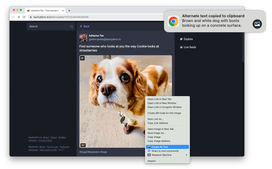
Images on web pages are supposed to have alternate text, which gives screen readers, search engines, and other tools a text description of the image. Alt text is critical for accessibility and search engine optimization (SEO), but it can also be time-consuming, which is why I am releasing Alt Text Creator!
Alt Text Creator is a new browser extension for Mozilla Firefox and Google Chrome (and other browsers that can install from the Chrome Web Store) that automatically generates alt text for image using the OpenAI GPT-4 with Vision AI. You just right-click any image, select "Create Alt Text" in the context menu, and a few seconds later the result will appear in a notification. The alt text is automatically copied to your clipboard, so it doesn't interrupt your workflow with another button to click.
I've been using a prototype version of this extension for about three months (my day job is News Editor at How-To Geek), and I've been impressed by how well the GPT-4 AI model describes text. I usually don't need to tweak the result at all, except to make it more specific. If you're curious about the AI prompt and interaction, you can check out the source code. Alt Text Creator also uses the "Low Resolution" mode and saves a local cache of responses to reduce usage costs.
I found at least one other browser extension with similar functionality, but Alt Text Creator is unique for two reasons. First, it uses your own OpenAI API key that you provide. That means the initial setup is a bit more annoying, but the cost is based on usage and billed directly through OpenAI. There's no recurring subscription, and ChatGPT Plus is not required. In my own testing, creating alt text for a single image costs under $0.01. Second, the extension uses as few permissions as possible—it doesn't even have access to your current tab, just the image you select.
This is more of a niche tool than my other projects, but it's something that has made my work a bit less annoying, and it might help a few other people too. I might try to add support for other AI backends in the future, but I consider this extension feature-complete in its current state.
Download for Google Chrome
Download for Mozilla Firefox
#chrome extension#chrome extensions#firefox extension#firefox extensions#chrome#firefox#accessibility#a11y
2 notes
·
View notes
Note
hey what do you do for a job? i saw in that viral ‘accessibility nightmares’ post that you do essentially that and i want to do that too lol
Hi! I'm a web developer specializing in accessibility remediation, which is fancy talk for saying my company has clients who go to us saying "hey, fix our web page so we don't get sued because of the ADA or Section 508 or the EAA" and then we fix up their web pages. Or if we can't fix the issues we write them a detailed note stating what they need to fix or adjust, where, why, and how best to do it.
(And this time, because I'm a smart person who can sometimes remember to file things so I can find them later, I have a link to the post I wrote about getting this job in greater detail.)
6 notes
·
View notes
Text
A lot of websites on neocities are so fucking ready to throw accessibility under the bus in the name of "this website is better seen on a computer teehee"
Like, yeah, so is mine! It's specifically designed to be "best viewed with Firefox at 800x600", but I still bothered to follow WCAG guidelines and to make elements reflow into a single column when under that ideal size! Modern CSS makes this process trivial, and there's no excuse not to if you're already proficient enough* to code a fancy PC-only layout.
Like, even if for some reason you don't give a shit about screen reader users (or people who can't use a mouse, for that matter), there's the fact that not everyone has access to a computer but late stage capitalism forces everyone to have a smartphone: It's more likely people will visit your site through a phone than a computer! Why would you purposefully make the indie web less accessible than the corporate shitscape we're all trying to leave, god damn.
*: I know lots of neocities users don't know much about web design, and I understand that lots of people reading this are at a spot where they are legitimately unable to make their website responsive. This is about bespoke designs that are PC-only on purpose, this post is not about web design beginners that don't know better yet.
#also if you have a wall of blinkies consider adding a seizure warning?#or like using smth like freezeframe.js to pause them if users have prefers-reduced-motion enabled#neocities#accessibility#a11y
5 notes
·
View notes
Text
Requesting Accommodations and Understanding in the Workplace
Thursday, 26 October 2023
Knowing that employers don't want time and resources "wasted" on accommodating disabilities, what do we do? Between my learning disability and memory loss, I'm starting to have trouble at work. True, they can't fire me for being medically stupid and forgetful. But conventional wisdom seems to say workers should refrain from giving our employers to find ways for us to "no longer be a good fit for the team."
What do I do? I need more accommodations and understanding from my employer and coworkers. But how do I request this without making me seem like a burden to my employer?
And, before anybody says otherwise: I do need my employer more than they need me. They could get rid of me tomorrow and just hire someone younger and smarter who'd need fewer if any accommodations. I don't have the time or privilege (reserves of cash to live on) to make a political statement of my employment. If I lose this job, I lose my means of survival instantly. That's it.
Am I screwed?
8 notes
·
View notes
Text
Started a newsletter! It's called Historica11y and it's all about the history of web, digital and technological accessibility!!
12 notes
·
View notes
Text
Braille dice update
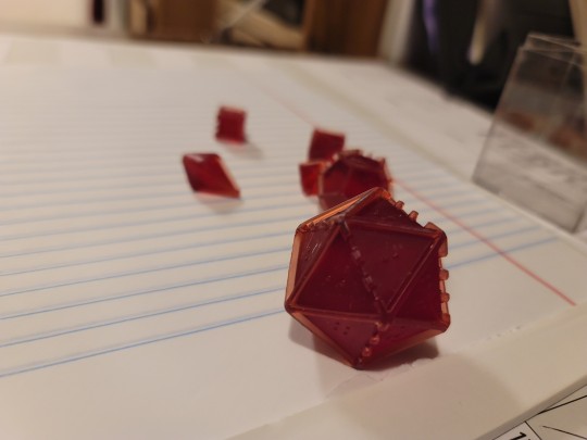
Most recent iteration! The d20 is about 40mm, and the rest of the dice are a lot smaller. I'm bringing them by my testers today, so I'll get their input about the braille, but the dots should be to scale.
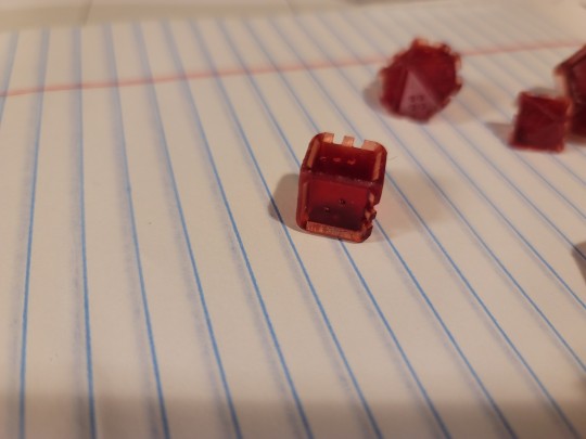
The d6 is about 14mm, I should probably take them up to 18mm and they'd have a lil more workable space. But if they work at this size I could make them into a multiset I guess?
Either way, after 2 years of working on it God damn I want to be able to mold and sell them, fuck
#art shit#braille dice#accessibility#a11y#ttrpg#dnd#the artist has spoken#blease let this be the approved version no notes ill cry otherwise
13 notes
·
View notes
