#ResponsiveWebsite
Text

Responsive Animated Website Layout
#animated web layout#responsive web design#html css#frontenddevelopment#learn to code#divinector#html#css3#divinectorweb#css#webdesign#responsivewebsite#html5 css3
4 notes
·
View notes
Text
Do you need to expert front end website designer with HTML, CSS, and bootstrap?
#bootstrapwebsite#bootstrap#website#websitedesign#landingpage#webdevelopers#responsivewebsite#psdtohtml#websitedevelopment#HTML#CSS#customwebsite#buildwebsite#staticwebsite#htmlcoding#wordpress
2 notes
·
View notes
Text

What is Mobile-Friendly and Responsive Design?
When you start designing a website, you need to know the differences between mobile-friendly vs. responsive. Everything is moving mobile, but what does it mean? Are mobile-optimized websites mobile-friendly? And are mobile-friendly websites mobile-optimized? What about mobile responsive design? One of the most common SEO questions we get is, "What's the difference between mobile-friendly, mobile-optimized, and responsive design?" We understand that the words are so similar yet so different. That's why we decided to make it easier for you by dividing how each term is similar and what is best for your website.
Mobile-Friendly Design
A mobile-friendly site will work for mobile compatibility users, but it is usually a slimmed-down desktop version of the website and does not include mobile responsive design elements. The mobile-friendly essentially desktop version shrank to a smaller screen, but didn't maintain the same level of functionality, user experience, or design look.
If it's as mobile as your website right now, make sure you're visiting your Google Search Console frequently and looking for issues with the mobile experience. This is normal when your site is not mobile-optimized. For example, keep clickable elements close together (a rule is that your content should be written in at least a 14- to 16-point font so that it can be read when your content is displayed on a smaller screen size) ). Or it shouldn't be hard to click). While mobile-friendly websites will display on mobile screens, this is Google's minimum requirement and will not rank higher than mobile-optimized or mobile responsive sites.
Mobile Responsive Design
In the past, web developers used to design websites with a fixed width for desktops. But then people started using new devices with lots of different screen sizes. The fixed screen size was no longer functional. People with small-sized screens hated the experience. So, the website design needed a change. That change is mobile responsiveness. A responsive website is one with a layout that adjusts to the screen based on the device it's viewed from. The content on the page automatically changes to fit the difference in screen size. The elements on the page are flexible. Also, unnecessary images and elements are hidden to provide a better browsing experience.
There are four screen sizes responsive design focuses on:
Desktop monitors
Smaller desktop
Tablets
Mobile phones
2 notes
·
View notes
Text
#responsive web design company#responsive web design#responsivedesign#responsive web development#responsivewebsite#responsive website design#responsive website development company
0 notes
Text

Welcome to webappfx, the leading web development company in Dehradun, where we transform your digital dreams into reality. As a premier web development company in Dehradun, we specialize in creating stunning, user-friendly websites tailored to meet your specific needs.
Our team of experienced developers and designers work tirelessly to ensure that every project we undertake is executed with precision and excellence.
At webappfx, we understand the importance of a strong online presence. That's why, as a top website development company in Dehradun, we offer a comprehensive range of services including custom website design, e-commerce solutions, and responsive web development. Our goal is to help your business thrive in the digital landscape by providing innovative and effective web solutions.
Choose webappfx as your trusted web development company in Dehradun and experience the difference of working with professionals who are committed to your success. From initial concept to final launch, we are with you every step of the way, ensuring that your website not only looks great but also performs flawlessly. Let us help you build a powerful online presence that drives results and growth for your business.
0 notes

Text
Learn Content Management system
Join the ProRise Training Program to master Content Management Systems (CMS) and transform your digital content strategy with ease. Learn how CMS reduces management costs, eliminates dependency, saves time and effort, enhances SEO, and provides complete control over your content.
For more info: https://prorise.ca/

#websitebuilder#websitedeveloper#websitedesigning#websiteservices#CMS 2.#ContentManagement 3.#DigitalContent 4.#WebDevelopment 5.#ContentCreation 6.#OnlinePublishing#landingpages#outsource#googleranking#marketingconsulting#socialmediamarketingtools#seofriendly#contentmanagement#contentmanagementsystem#webservices#digitalsolutions#websolutions#aarvytechnologies#webapplication#responsivewebsite#softwarecompany#wordpressdesigner#seotools#webtraffic#websitebuilding#buildtheweb
1 note
·
View note
Text
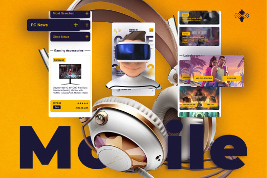
Game Blog and E-Commerce Web Design
Discover the future of secure transactions with our cutting-edge Crypto Technology Design. This meticulously crafted template offers a seamless blend of security, efficiency, and user-friendly interface, making it the ideal choice for businesses and individuals venturing into digital currencies. Our design prioritizes robust encryption protocols, ensuring every transaction is swift and impervious to cyber threats.
Click on the Title for the Case study
#uidesign#ui#responsive web design company#web design#website#responsive web development#webshop#responsivewebsite#responsivedesign#ecommerce#blog#site
1 note
·
View note
Text
https://amikasoftwares.com/why-do-we-need-responsive-website-development/
A responsive website development is necessary for all businesses that want to boost their online market & looking for brand promotion.
In today’s world, digital presence is essential, and having a responsive website has become more than just a trend. However, as user behaviors shift towards mobile devices, businesses must prioritize delivering smooth experiences across various screen sizes and devices.
#website development#best web development company#crm software for architects#website development company#responsivewebsite#responsivedesign#responsive web design
0 notes
Text
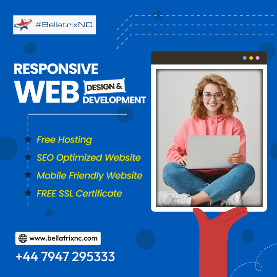
Transform your online presence effortlessly! 🚀 Get a stunning website with free hosting, SEO optimization, mobile-friendly design, and a free SSL certificate. Elevate your business and stand out online today! 💻✨
#website#websitedesign#website developer near me#website development#website developer in UK#seo#responsivewebsite#web design#webdevelopment
1 note
·
View note
Text

Responsive Website Layout
#responsive webdesign#frontenddevelopment#html css#divinector#webdesign#html#css#css3#code#responsivedesign#responsivewebsite#create a website#make a website
3 notes
·
View notes
Text
Mobile Responsive Website Development India
A Responsive web design is nothing but a feature where your website content is capable of being compatible with all kinds of devices. Let it be desktop, laptop, tablet, or phone, when your website design is structured to be responsive, your site is supported in any kind of application.
Get your business online with us
Call & WhatsApp at +91 96673 57394
#WebsiteDesign#websitedesign#websitebuilder#websitedesigner#WebDevelopment#SoftwareDevelopment#MobileResponsiveDesign#DigitalMarketingServices#WebDesignCompanyIndia#WebDesignIndia#udaipur#India#responsivewebdesign#ResponsiveWebsiteDesign#responsivewebsites#responsivewebsite
0 notes
Text
Responsive Design: Your Website's Superhero Suit for the Multi-Device World
Ever stumble onto a website on your phone and end up squinting at blurry text or wrestling with buttons that seem glued together? Yeah, not exactly the smoothest online experience. That's where responsive design swoops in to save the day – it's your website's superhero suit for the multi-device world!
Imagine you're checking out a website on your phone during your morning commute. Later, at your desk, you pull it up again on your laptop. Finally, curled up on the couch, you decide to see it on your tablet. Each time, like magic, the website transforms itself to fit the screen perfectly, delivering a clear and enjoyable experience every step of the way. That's the power of responsive design!
Why Responsive Design is Your Website's Secret Weapon
Remember the days when websites were built for just one screen size – the bulky desktop monitor? Those days are long gone! Today, we juggle phones, tablets, laptops, and who knows what futuristic gadgets are around the corner. A website stuck in the desktop age is like a superhero without their powers – it just won't cut it. Responsive design ensures your website looks fantastic and functions flawlessly no matter what device your visitors are using:
Happy Users, Happy Business: A website that's easy to navigate and use on any device keeps visitors engaged and coming back for more. Think of it as happy website visitors turning into loyal customers – that's a win for your business!
Search Engines Give You a High Five: Search engines like Google love websites that offer a seamless experience across devices. Responsive design can potentially boost your website's ranking in search results, making it easier for people to find you online.
One Codebase, Easy Breezy Updates: Responsive design uses a single set of code for all devices. This means less work for developers and a breeze when it comes to website updates – no more scrambling to create different versions for each device!
Future-Proofing Your Website: New devices and screen sizes are popping up all the time. Responsive design lets your website adapt and stay compatible, ensuring you reach your audience no matter what tech trends emerge.
Unleashing the Power of Responsive Design
So, you're ready to create a website that's a master of disguise, seamlessly transforming itself for any device? Here's a glimpse into the responsive design toolbox:
Knowing Your Screen Sizes: Understanding the most common screen sizes for phones, tablets, and desktops is key. This helps you define "breakpoints" – the points where the website layout adjusts for optimal viewing on each device. Think of it as your website's built-in "shape-shifting" technology!
Mobile First! Since smaller screens can be trickier to navigate, it's smart to prioritize mobile design first. This ensures your website delivers a fantastic user experience even on the tiniest phone screen.
Fluid Layouts and Images: Forget rigid website designs! Responsive design uses flexible elements that can expand or shrink to fit the available space. Images become shape-shifters too, automatically resizing to maintain a clear and beautiful presentation on any device.
The Final Score: Responsive Design Wins!
Responsive design isn't just a fancy term – it's the future of web development. By embracing it, you're creating a website that's inclusive and user-friendly for everyone, no matter what device they use. This translates to a happier audience, a stronger online presence, and ultimately, a website that thrives in today's multi-device world.
So, don't let your website be stuck in the past! Give it the responsive design treatment and watch your online success soar!
#responsive web development#responsive web design#responsive website#responsivewebsite#responsivedesign#responsive web design company#Ideal screen size for responsive web design
0 notes
Text

Responsive spiegato semplice...
0 notes
Text

Responsive web design is crucial in today's digital landscape, where users access websites from a wide range of devices. To make your website truly responsive, start with a mobile-first approach, prioritizing content and functionality for smaller screens.
Contact OMEX INFOTECH for your website redesign and get a seamless and enjoyable experience for all users, regardless of the device they use.
1 note
·
View note
Photo

We're thrilled to announce that we've added some amazing new products to our website! 🎉 Not only that, but we've also made our website more responsive and user-friendly than ever before. 💻🙌 Head on over to our site now to check out all the latest additions and see for yourself just how easy it is to navigate. Don't miss out - come see what's new today! #NewProducts #ResponsiveWebsite #ShopNow http://www.TheTShirtLady.com
0 notes
Last Seen Blogs

evilacnh
SW-1050-3565-0637

rose-tennyo
Rose Petals
helpchemistry
HelpChemistry

yunko-arts
Art blog

sungroupkaina
Sun Group