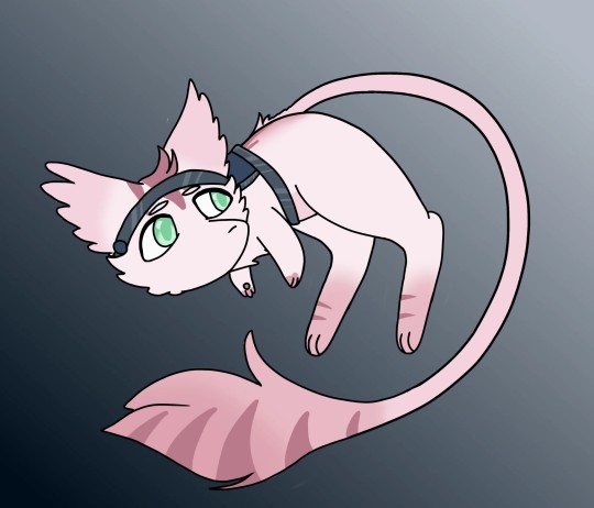
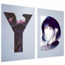
#I like the gradient backgrounds I did for it
Text
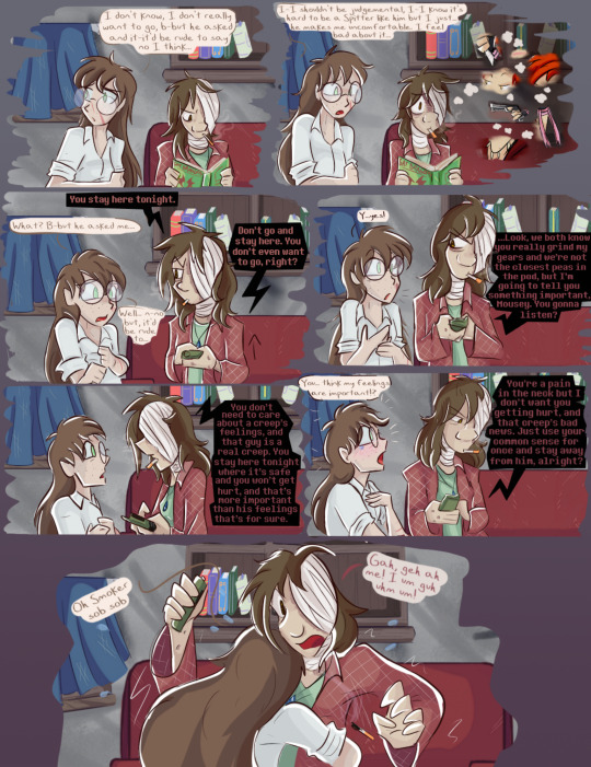
Page 1
yes I AM coloring one of the longest ladyverse comics for their 13th annaversery. Of COURSE I'm putting so much effort into it why wouldn't I.
[LiveJournal Post]
Next >>
#Ladyverse#Curedtown#Lady Smoker#Angie (Mousey)#quo's art#quo's colors#WOOOO FIRST ONE and it IS great#I like the gradient backgrounds I did for it
194 notes
·
View notes
Photo
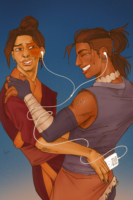
take a chance, take a chance, take a chance on me!
finally!! a little older zukka with (sorta) their new movie looks along with piercings and tattoos from a beloved au, listening to some abba, dancing real close and laughing<3 (zuko is the one telling the joke here... he can be silly too); referencing the iconic ipod ad campaign and based on the ‘let’s rock!’ photoshoot by steven meisel
[ID: This is a digital drawing of Sokka and Zuko dancing close together and listening to music from an iPod, drawn in warm colors and against a deep blue sky background. On the left, Zuko (wearing septum and snake bite piercings, earrings, long hair in a bun, and Fire Nation clothing) holds the iPod from Sokka’s lower back; while Sokka (wearing matching earrings, a long warrior’s wolf tail, his Water Tribe clothing and a moon and stars tattoo on his arm) holds his shoulder. Both of them laughing and tearing up, they share the ear pods while its cable gets tangled in their visible arms. End ID]
#my art#zukka#AAAAAA half the semester waiting to do this one!!! and i really liked how it turned out!!!#this has everything i like:#orange zukka#gradient sky backgrounds; laughing; being silly; referencing ads and photoshoots; HANDS...#too late for zukka week but whatever because this doesnt even account for any prompt right? heheh maybe next year i'll do something for it#or this one! i liked the rivals one>:)#also: i did say i was gonna draw them with piercings and earrings from now on no matter WHAT#and of course; i'm also saving the longer version for... ;-)#sokka#zuko#zukka fanart
492 notes
·
View notes
Text
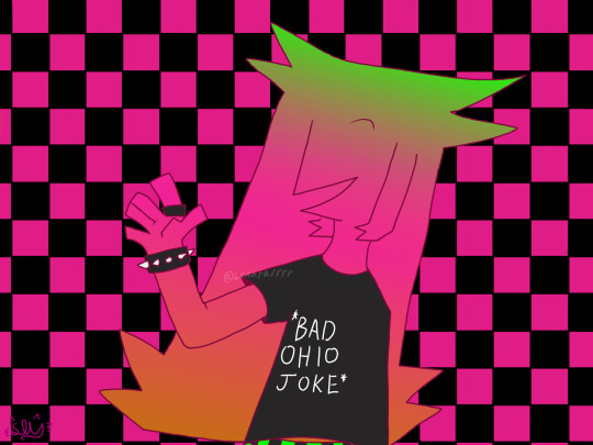
who up regretting they vator
(guys pls dont let this flop my arts been doing really poorly on here when i post it pls im proud of this)
please ask to use AND credit if use /srs
#this took embarassingly long#i did the gradient and background liek by hand..#my art#my fanart#regretevator#regretevator fanart#regretevator unpleasant#unpleasant gradient#unpleasant gradient fanart#regretevator unpleasant fanart#unpleasant#unpleasant fanart#ask to use#credit if you use#reblogs and likes appreciated
30 notes
·
View notes
Text
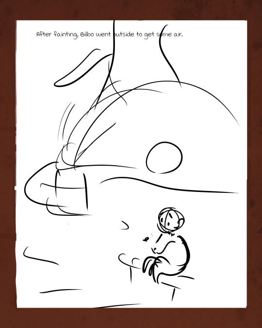
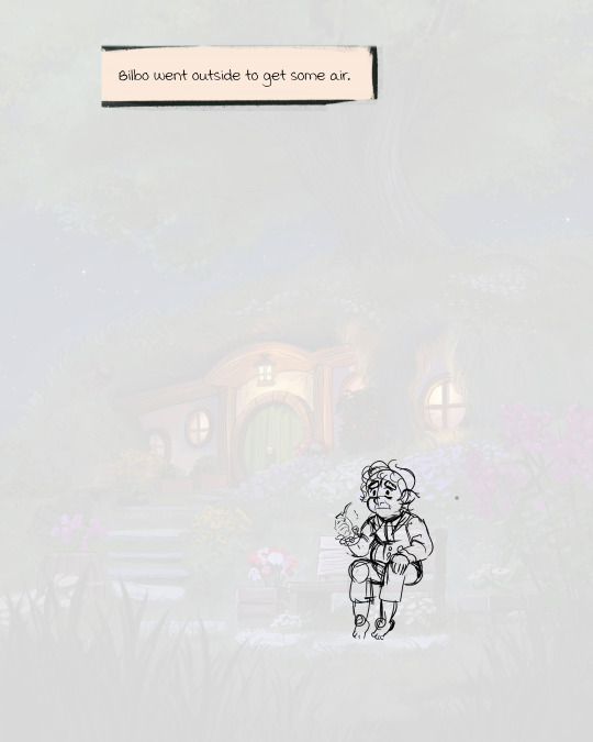
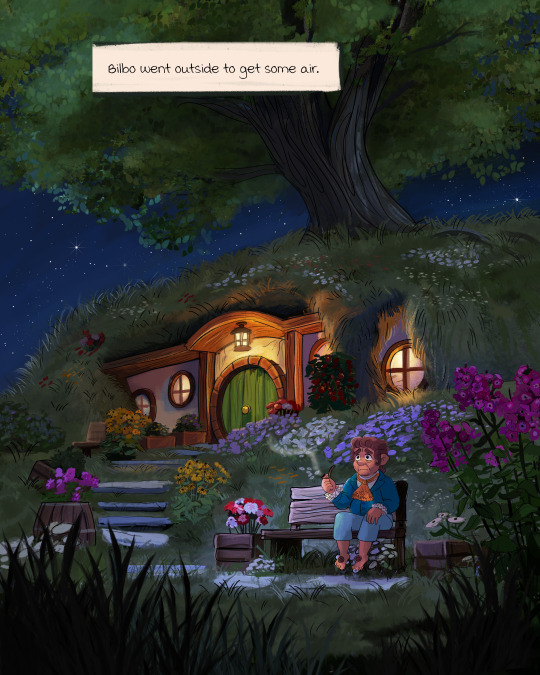
The process work of one of my favorite pages from my comic adaptation of The Hobbit! :3 The page is from this chapter.)
I could do an entire post dedicated to the background painting process alone, which took a while, but here's the basic process of what a page looks like from start to finish...my initial thumbnails are always very silly XD. Minimalist Bilbo
#not chapters#wip#I might post more wip stuff soon!#i always miss Sketchy Bilbos#the hobbit#lord of the rings#lotr#I know I keep reposting variations on this painting but it took me a WHILE okay XD#'how long did this take' A WHILE#thankfully I was able to reuse the big background painting for...a ton of the backgrounds in the chapter#if you look really close there are only three major detailed background paintings in chapter 15#and they just get reused/zoomed in/extended to fit the panels of the page#then there are lots of basic backgrounds like starry nights and sparkles and gradients
61 notes
·
View notes
Text
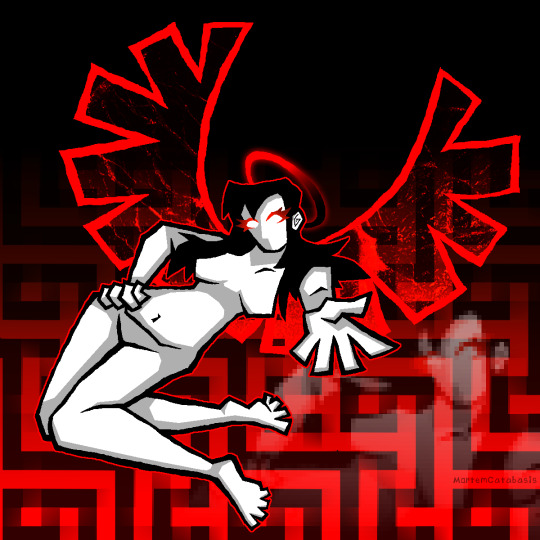
Labyrinth Angel
#digital art#doodle#this was a test for blocking in lineart by hand w a pixel brush instead of using the polygon tool i did over a week ago#ive just had the angel sitting in my files bc i didnt wanna post it as a transparet png#the background is heavily scrabbled together classic mortem red+black gradients n weird overlay#the censored woman in the bottom right is purely bc this pose sux 4 composition but i liked it 2 much n it was already drawn#overly stylistic empty space fill. it was still 2 empty even w the maze pattern
19 notes
·
View notes
Text
Now that kpweek is over I thought I’d share that one gif that didn’t make the cut to my last gifset mainly cuz I didn’t know what color to give her

#kinnporsche#kinnporsche the series#like the colors left were purple while and black and i did not feel like any of these matched what i felt for her character#like her character is literally a phoenix in my head her background should literally be fire#or at least red and orange but I didn't like how the gradients look so i gave up#also i did not want to make gifs for boat outfit and the manipulator so it was easy to just put the kids#that gifset was getting way too long anyways but#here she is
179 notes
·
View notes
Text
Hi @mewtwoevolution, hope you don't mind but I love your cats

#My art#Not my ocs#Gently holds#They're so perfect I adore them#I will admit I did kinda guess on Mirage what their back looked like as I assumed since tail is grey their back was grey too#So their black parts are like side coat leggy covering only#I probably should've reread their introduction to be sure rather than wing it but I didn't so if its wrong I'm very sorry#I also tried to copy their more shaped face the best I could#I love them all a lot#Donor my beloved#Also found out I can do gradients on my art app! :D by accident so I could replicate their ref backgrounds. I am lmao so hype over it#Mew ocs#Other people's ocs#Overall I hope they do look okay#Also donor has the sweetest little eye shapes she's such just j'adore love her#I'm realising I probably made alphas snout too defined and big#Alas lmao it how it be
13 notes
·
View notes
Text

Punk is sort of dead. It really depends on your definition
#oc: Iris Flores#oc: Mav Hartmann#Iris is my first oc that uses forearm crutches. i tried to do as much research as possible but let me know if i need to correct anything!#any advice is appreciated#shes artsy so i figured she'd decorate them#yes i did a boring gradient background okay i spent too long on the actual drawing#also a little different style though i have reference sheets for them too#tw stitches#tw piercings#tw sharp teeth#Mav has taken over my mind. i think shes my new favourite OC#she and iris go on wacky adventures like; highschool; having crush on popular cheerleader; having weird parents;#and eating lunch in the art room to escape peers#my art#art#artwork#digital art#digital drawing#my ocs
4 notes
·
View notes
Text
Happy birthday to our favorite hacker!
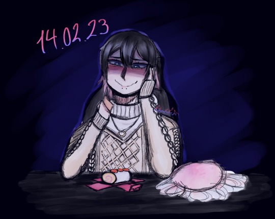
"I think you liked strawberry roll cake, so I bought you some. Or was it strawberry shortcake? Anyway, hope you like it. Happy birthday Ren! :)"
Oh, Angel...
14DWY IS AN ADULT VN MINORS DNI. PUT YOUR AGE IN BIO OR YOU'LL BE BLOCKED
#14 days with you#14dwy#♡ — my art#me? posting a birthday/event fanart the same day it was supposed to be done and posted??? now this is a rare sight indeed#anyway. Initially I was going to make something cutesy and more Valentine's day themed but it ended up being a bit uhh#POV you came back home after stalking your soon to be darling forever and can't stop rereading the post'it note they left alongside a cake#I was going to make him Ren but then I came with the idea that he's home so he drops his wing but he hasn't changed clothes yet#also that's why everything's dark. The blue effect is because he's in front of his computer. Probably stalking angel#no this is not an excuse to not make a detailed background nope of course not who said that#I still haven't designed my mc yet but I hc they try to remember details like their friends favorite things to later gift them that#although sometimes they don't remember it clearly. But it's the intention that counts right?#I can't believe my first post/drawing here it's a low effort low quality doodle I did yesterday#anyway sorry this is all I came up with. Take this as an offering Renren 🤲#HELP IDK HOW TO MAKE COLORED GRADIENT TEXTS how y'all do it? please teach me how that witchcraft works#tumblr for god's sake don't fuck my drawings quality#14dwy redacted#14dwy ren#don't look too much at the wig I know it's horrible-#artists on tumblr#nnkk's art
41 notes
·
View notes
Text

A wild friend appears!
#pokemon painting#slowpoke#slowpoke painting#acrylic painting#faye's most excellent art projects#tried really hard to paint with color gradient and not just black outlines#which is a lot more difficult with acrylic than it is with oils#but i still like it#especially since I did the purple background on this piece ages ago and then promptly forgot about the canvas for months
123 notes
·
View notes
Text


going insane with their parallels
#even more now that i see them side to side#like. they have a very similar pose#the colors are opposite each would wear with yuuta having pink and hina having blue/purple instead#not only the clothes also the sparkles in the card!!!! yuutas are pink while hinas are blue!!!!!!#but! the backgrounds are still of their own colors. blue for yuuta and mostly pink for hinata#<- i am very normal abt the usage of 2winks colors in their outfits/cards#also if you zoom in the laces/straps you can see they have the same type of gradient too#aughggghh i love them love them love them#they did a great job with both of their fs2 im so happyyy
5 notes
·
View notes
Text
At first I felt like "I didn't do shit this year" but now that I look at all this, I did draw plenty of fanart and also a lot of self-indulgent stuff
#Kermis draws#art summary 2023#I should put more effort into backgrounds like I did with the mariachi cyborg Chester and Big fishing pieces#almost everything else is just solid colours & dropshadows & gradients
5 notes
·
View notes
Text
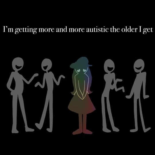
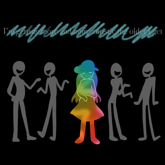
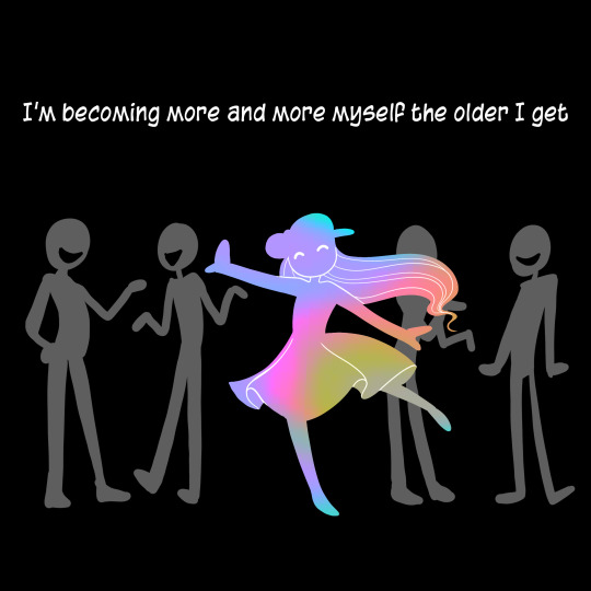
First art of the new year is all about re-structuring your internal monologue.
In my early 20s I was working full time in London with many social commitments and a variety of hustles and side projects.
In my later mid 20s I cater to many sensory and social drain needs I have and indulge in special interests while respecting my lower energy reserves and celebrating my different way of processing the world.
Did I get more autistic? Nah. I got less fake.
-
[Art description: Three panels showing figures on a black background. Long descriptions follow.
1. A drawing of OP as a person with hip-length hair and a dress standing sadly with her hands clapsed together in front of her. She is coloured a muted rainbow gradient. Behind her, two pairs of nondescript figures chat while smiling. White text says, ‘I’m getting more and more autistic the older I get.’ 2. OP’s colours are brighter, and her expression looks happier. Crayon-like scribbles have crossed out the text from the previous panel. 3. OP’s colours are vibrant, and she balances on one leg and throws her arms out as she dances. The text above has changed to say, ‘I’m becoming more and more myself the older I get.’ \End descriptions]
#urchin art#autism#autistic#neurodivergent#neurodiversity#actually autistic#autistic things#autistic adult#autistic artist#autistic community#listen- the process of unmasking every fiber of your fabricated being is difficult#figuring out who you are behind the mask is scary#but continuing to act in a play where only you got no script is officially cringe#(this is me waxing poetic I am very aware of the safety needs of masking but that's not the point)#the point is ask yourself#are you getting MORE xyz?#Or are you becoming MORE of you?
5K notes
·
View notes
Text
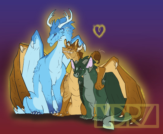
[ID: A drawing of three Wings of Fire Dragons on a gradient background that fades from dark red at the bottom to dark blue at the top. The dragons are Winter, Moonwatcher, and Qibli. Qibli is in the center and is using his wings to hug both Moon and Winter. He has tan scales with darker wings and dark brown freckles. He wears a cocky smile on his face, with his ears pointed upwards. Winter is slightly leaning away from Qiblie and pouts his face in annoyance, trying not to enjoy the hug. He is an ice blue with darker blue and light spots on his feet. Winter's horns are more like deer antlers. Moon leans into Qibli and smiles up at the two other dragons. She is chubby with a very pale green diamond on her forehead and tear drop scales near her eyes. Her bat-like ears are a soft pink and are pointed upwards. Her purple eyes crinkle with her smile. They are gently outlined in yellow with a small yellow heart above them. /End]
Favorite fannon couple has to be Quinterwatcher. I like to think that Moon and Qibli get together first, and then years later after some therapy and soul searching Winter re-enters their lives. And becomes their third partner. Qibli and Winter are both bi in my headcannon (pretty sure Tui may have lightly confirmed that Qibli and Winter could have ended up together so maybe that's cannon?). And I headcannon that the RainWing cultural norm is poly/pan. Since Moon actually spent a decent time around them as she grew up, she saw a lot of very happy couples and partnerships that the traditional NightWings would have scoffed at. This allowed her to realize that she also identifies as poly and pan. Winter, coming from another pretty stiffling culture, has a hard time fully embracing his queerness. But, eventually, opens himself to his heart and lives a happy life. They definitely have like 7 dragonets.
Also, I gave Moon purple eyes to emphasize the Clearsight similarities more. And chubby Moon reigns supreme. SandWings (and MudWings) in my headcannon really like body art including tattoos and piercings. So Qibli, like most of those loyal to Thorn, has a cool scorpion tattoo and several additional piercings on top of his classic earring. I don't think I went too crazy wit Winter. I like IceWings with antlers so I did that. And a bit of snow-leopard spotting for him. I will definitely give other IceWings a bit more of that because it looks cool.
#wings of fire#nightwing wof#sandwing wof#icewing wof#wings of fire fanart#wof fanart#moonwatcher wof#winter wof#qibli wof#quinterwatcher#polyamourous#bisexual
479 notes
·
View notes
Note
your rendering is so good how do you do it
Thanks, I love your rendering too!! Gonna try and make a tutorial ^^
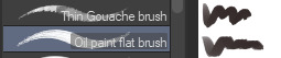
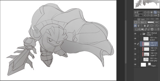
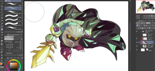
To start off, I'm on Clip Studio Paint and these are the brushes I use! First two for rendering characters (round brushes) and the other two for mostly backgrounds (square brushes)

I used to do lineart, but it takes too long >:( now I just make a sketch and sorta clean it up!

Next I fill it in with a gray color. For simpler pieces I just put in the flat colors, but for more paint-y pieces I do grayscale -> color! I'll be doing that here :)
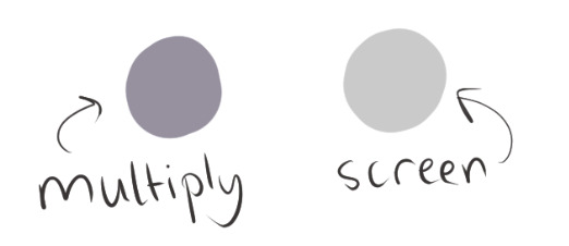
Also, I make 3 clipped layers on top of the gray - two are multiply, and the top one is screen. On the first multiply, I do a soft gradient using an airbrush
On the next multiply layer, I fill everything in with either a cool-ish or warm-ish gray, depending on the mood ^^
I also determine a light source, and use the lasso tool on the screen layer to block out where (I think) the light hits! Tbh I just do wherever feels right lmao, but I recommend having a reference! I like doing it in triangle patterns
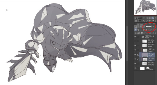
Then adjust the opacity of each layer to whatever feels right, and merge everything (I don't merge the sketch/lineart yet, I do it before adding colors in!)
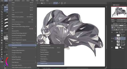
Now... rendering. Some tips I have are color pick (greys) off of the canvas and use them to paint! Clean up the sketch more, erase edges, but I save details (like Galaxia's red gem, his eyes, etc.) for the end, or during coloring.
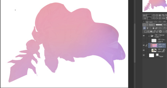
After I'm sorta happy with it, I merge the sketch layer, then duplicate it, and add a gradient map! I did this sunset-y one but changed the hue to yellow-ish, then lowered the layer's opacity ^^
Play around with the hue-saturation-luminosity setting!
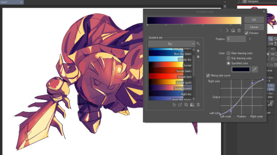

Now go crazy with blending modes! Multiply, overlay, color, glow/color dodge, etc. Feel free to layer them up on top of each other too, and this is to add the character/piece's actual colors in. For example, I used a white-blueish overlay layer for his mask and glove, blue for his cape, blah blah
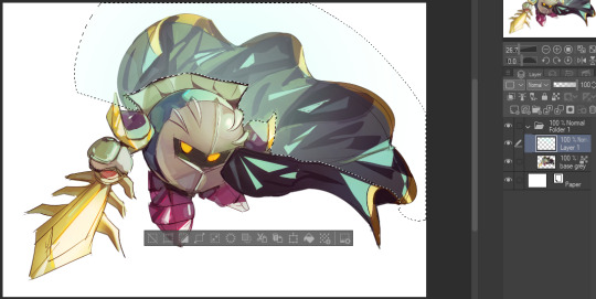
Now I clean the sketch up/refine it more. Also, to "harmonize" the color palette, you can add a colored gradient on top. Then set it to multiply, and add overlay/glow dodge layers with any colors you see fit! I like using teal and light/warm orange!
Here is an example of a colored gradient:
Another tip is to add saturated colors on the edges of both lighting and darker shadows, before blending it:

Also I usually add in a light blue/grey in shadowy areas, and lower the opacity for reflective light:

Also! You can lasso + use an airbush with a light blue to block out parts of the background (his cape here, for example). It helps with more depth!
Finally, I like adding sparkles on low opacity :3 And gaussian blur to certain areas! I'm using radial blur on this piece though ^^

For the background, I like doing blocky shapes!! I use my square brush on 90% ish opacity, to color pick different hues from the piece. For lighting I use a glow dodge layer, here's a mini timelapse as well as the finished art!
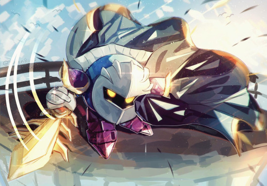
At the very end, play around with the hue/saturation and contrast tools to change the colors :)
#iiii hope this helped??#first time making a tutorial sorry!!#art tutorial#kirby meta knight#meta knight fanart#meta knight#nintendo kirby#kirby nintendo#kirby fanart#kirby series
511 notes
·
View notes
Text

GRID + TORN PAPER + RAINBOW LAYOUT TUTORIAL
(yeah, i'm sorry, but that is the title i came up with)
Hi everyone! This tutorial was requested by an anon, and we're going to make a gifset like this. You need, as usual, basic gifmaking skills and basic photoshop knowledge, but i'll try to explain this as easily as possible!
You'll also need a torn paper brush, which you can download here.
And here are the links to download the fonts used in my gifset: x, x
Okay let's start!
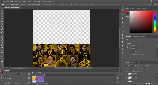
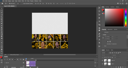
→ First you're going to create a new canvas, and it will be 540x540 px. Make sure to click on create video timeline (if you dont have a timeline, go to window > timeline. We'll leave this canvas there waiting for us :)

Then, onto our first gif. We're going to make the small square gifs first. All i do is resize the image and make it 120 px high, and you'll see why in a moment.
Make sure to remember the number of frames of this gif!! All the gifs we're going to put in the same canvas should have the same amount of frames.
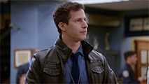
Okay, so we have our first small gif:
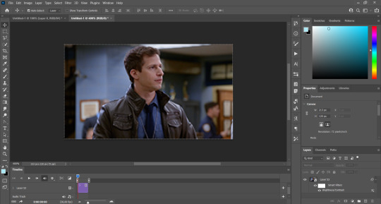
As you can see it's a smart object, and I added some brightness, but so far that's all. You can sharpen it, but i like to sharpen until i've colored it. Now onto the important part:
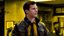
Most of the gifs i worked with were mostly blue (aside from the skin color), which is recommendable, because you can create lots of colors starting from blue, using the hue/saturation adjustment, or camera raw filter. I also recommend you to use a gif that doesn't move a lot, so it'll be easier to color the background:
For the tutorial, we have our predominantly blue gif, but we are going to make it yellow, which is the opposite color, so it's the hardest to get. I hope you can see how i manipulate colors, and do it yourself :)
Here, you can use camera raw filter (filter > camera raw filter) to turn the blues and purples greener, like this:
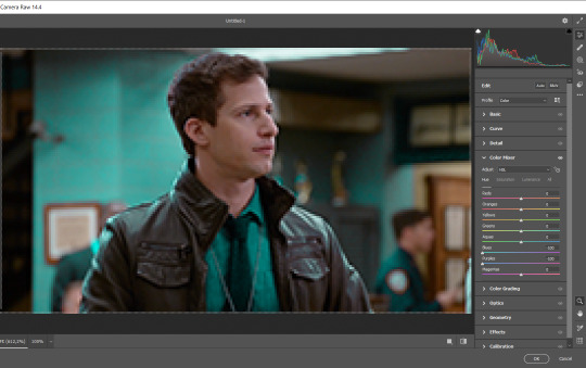
And click ok to exit the camera raw filter. Then, we're going to use hue/saturation (image > adjustments > hue/saturation) to turn it yellow:

Since it was cyan, i changed the cyans, but if you got a much greener result you'll have to use green (duh, right? i dont know i just dont want anyone to get confused akjsdhs)
And you can also add a selective color adjustment to make those yellows more yellow:

The reason i don't directly use hue/saturation is cause it might look ugly and lose quality, or it wont pick up all the colors i want it to but they're also very small gifs so if you wanna do that, do it :)
I sharpen it until this point, but if you already have that's okay.
Now we're going to color the background! For that, you just add a new layer, and set the blending mode to color.
Then you'll use your brush, set it to 20px and 0% hardness, and pick the color you're using for this gif, you can use the eyedropper tool. This is why it's important that the gif doesn't move a lot, so you can color the bg like this:
I colored carefully around the edges, and that's the result. In some gifs from my gif set I colored Jake's jacket too because i was too lazy, but this looks cleaner :)
You might want to select the color layer and the gif layer to convert them both to a smart object, just to make everything easier. So, be careful, because after that you won't be able to change anything!
But let's say you have a scene that you want to include, and it moves too much and has no blue and it's going to be a nightmare to color it.
Well, don't worry, you can! Simply, instead of manually coloring everything, you can just choose to add a gradient map to it (image > adjustments > gradient map), like this:
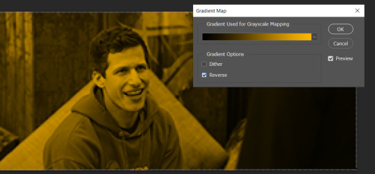
And this is the result:

Just remember, it has to be the same amount of frames as the other ones!
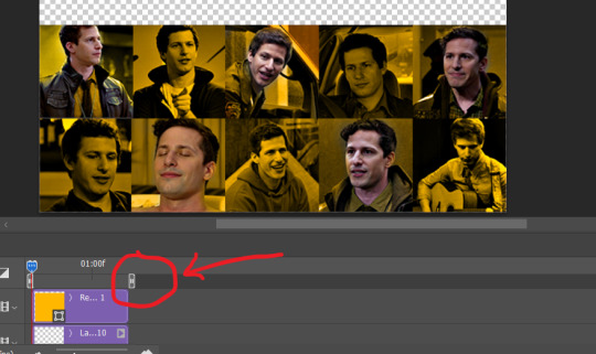
You repeat the process, until you have 10 small gifs. I made around 5 manually colored gifs, and 5 gifs with gradient for each gif. That's a confusing sentence but i hope you get it.
We are going to start pasting the small gifs on our first canvas.
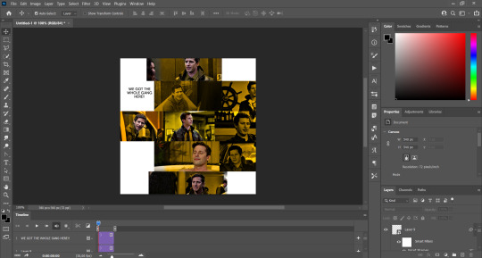
(You can paste them one by one but i did this so you can see my 10 gifs)
You're going to create a square that has to be 108x108 px, using the rectangle tool. You can remove the default white background.

And you may be wondering, why did we not just crop the small gifs into those dimensions? Well, you can do that, but to me it's much easier this way, because sometimes cropping isn't accurate, or it's tedious.
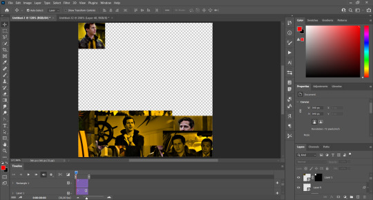
Place the small square on top the gif you're going to crop, right where the face of the character is (or whatever objects you're giffing), and while holding ctrl, click on the square. It will select it:

You're going to create a layer mask:

And then drag that layer mask to the gif:

And voila! It's now the same size as the small square. Once that's done, right click on the layer and convert it to a smart object, because we have to remove that mask. Make the square layer invisible, and start placing your gifs where you want them:
You're going to repeat that process with the rest of the gifs, and then place them all together. Don't forget that if you're making the first gif, they will all be at the bottom of the canvas, if it's one of the middle gifs, one row should be at the top and the other one at the bottom, and when you're making the last gif, they should all be at the top. Here we're making the first one, so they will all be at the bottom:
If you forgot to check that all the gifs had the same amount of frames, you can fix it here, just make sure no gif is past this little guy:
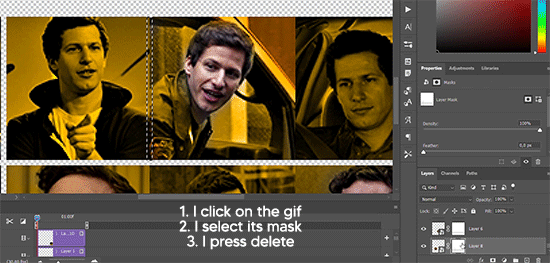
Okay! Now, to create the gutter, we're going to add a layer mask to each small gif, so that we can cut some of it.
The gutter has to be 4 pixels, (i recommend you to REALLY zoom in). What i do is make sure the width of the gutter takes 2 pixels from the edges of the gifs, since they are all together. As you can see in the image above, there's no a single empty pixel between the gifs.

This is a close-up of what i'm talking about. I select two pixels from each gif, and go all the way down to create the gutter:
(I hope I'm not over or underexplaining)
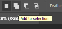
I usually use this tool when i have to make so many selections:
But that was just an example :)
(Another way you can do this, is by changing the size of the small square from the beginning and make it be 104x104 px, but i don't know why that seems more complicated to me ajsdks)
Anyway, this is what we have so far:
Now we're going to create the big gif. Its normal dimensions are usually around 1920x1080, unless you have different dimensions and have to crop it, but whatever it is, we're going to resize it and crop it to be around 550 px wide, and 400 px high:

We'll do the same thing of adding an adjustment of gradient to it to make it the color we're using. For this, i usually add a brightness layer before, because sometimes the gradient is a bit dark.
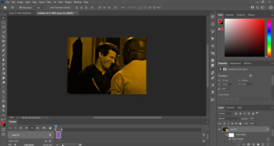
And using a 600px brush with 0% hardness, you can add some "light" on a new layer, like this:

Selecting all the layers, right-click on them and convert them to a smart object. Again, be careful, because once its a smart object, you wont be able to change any of it!
Then we paste our big gif on the canvas with small gifs, and add a layer mask to it. Using the torn paper brush at 600px, remove some of the gif to shape it like the torn paper. Make sure you're using black, otherwise it won't work correctly:
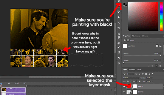
To make the effect better, add a layer UNDER the big gif, and using the torn paper brush, with the same size, you can paint under it:
Yeah, I covered some of jake's face, but that's how it supposed to look so the effect works!
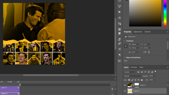
And finally for the text! I used Granesta, at 150 px, and at -10.00º to make it a bit askew.
We're going to double click on it and give it a color overlay, set to normal, and give it a solid shadow if you want, then place it right here on the corner:
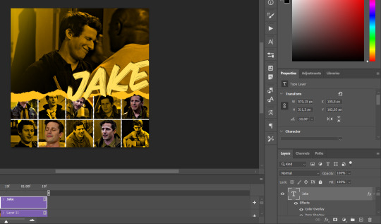
But as you can see, it's too big for the gif. So we're going to add a layer mask to it, and again, shape it the same way that we did with the gif. Make sure they're exactly the same shape, like this:

And that's it! This is our final result:

As always I'm sure there are easier ways to do many of these things, this is just how i do it but if you know an easier way to do it, go ahead. I hope this was at least understandable enough so you can apply the logic of it any way you want :)
If you have any questions you can send me an ask and i'll clarify!
If you found this helpful i'd really appreciate it if you left a tip on my ko-fi!
Happy giffing!
#will i ever learn how to properly explain things 😭#tutorials#uservivaldi#userraffa#userbuckleys#userhallie#tuserheidi#usertina#userfern#usersole#usercera#userzaynab#userisaiah#usernik#userpriyas#usertj
213 notes
·
View notes
Last Seen Blogs
littlledollmonika
all in one
thecorruptus
The Corruptus
crumbs42
Untitled
yashuadub
Yashua DubStudios
bakutododeku-week
BakuTodoDeku Week