#I know my way of rendering and coloring in general is hard to replicate
Note
hii i know we interract a bit sometimes but i'm sitll gonan anon this because ehe
your art is so jfjfh its always so nice and i love the colors theyre so .. soft ??? theyre just really nice to look at and i'm gonna be honest you're one of my main inspirations for drawing rw art !!
aaaaah you’re too kind!! and also don’t worry I am so terrible at guessing who anons are your anonymity is secure jfjagkeg
i really love working with colors in my designs and try really hard at making schemes that look nice so I’m so glad you think that fhagdjfh
i still don’t really see how I could be much of an inspiration to anybody (especially considering I haven’t posted any art lately… uhhh. ah eto bleh. my laptop broke) but I’m so touched and glad I could inspire awawawawa
Um. Thank you!! ^^
#also I feel weird saying this but#anyone can feel free to use my designs#just so long as I’m credited (and maybe tagged because I wanna see!)#and . you don’t have to emulate my style#I know my way of rendering and coloring in general is hard to replicate#the designs can be simplified so um. don’t feel like they have to be mega super complicated#That’s just how *I* like to draw yknow
7 notes
·
View notes
Note
2, or 18 for the artist ask? ^ ^
tee hee these are so fun tysm for sending these in 🥹 i'm gonna put a read more cut bc my answer for q2 is long with all the art
2. 5 favourites of your own work?
in no particular order!
a moomin fanart i did when the 3rd season of moominvalley 2019 was airing! ngl i hated this one when i was done with it and couldn't even look at it for a while lol. but eventually i figured i was too hard on it and now i really like how i did the bg texturing and colors

some okami fanart from 2021! i like how i did the composition and i'd totally make a print for myself if i knew how lol

some souyo fanart i made last november 😀😀 imo it's not the most interesting comp (and w/o knowing the context of the scene it's hard to tell what it's even about lol) but i like the palette i chose and how i rendered it. was a one hit wonder for me tho i can't figure out how to replicate the style 😭

more p4 fanart but of yukichie this time... i had a good time with this one bc doing blocky colors makes my amoeba brain go brrr and it has yukichie so. self indulgent automatic fav LOL 👉👈👉👈

lastly some pla fanart from last year! the colors are really saturated now that i look at it again but i remember having a lot of fun drawing it!
18. Do you have any larger projects you’d like to pursue? Like comics, shortfilm, a series etc?
ik i post almost exclusively fanart atm but man i'd love to make a comic or smth with my ocs 🥲 or just make more comics about the stuff i like in general but i'm not too good with long projects... also i have a pipe dream of making a videogame but in consideration of my lazy ass ain't no way thats gonna happen so i just fantasize about it now and then FNJDHFJSDH
11 notes
·
View notes
Text
FF HEADCANON LIST
CRACKS KNUCKLES
these are all imported from google docs bc thats where ive been keeping all my thoughts :] im not sure if theres any repeat HCs in here and im sorry if someones got to me before i have but these all came from my own brain !!! these are all very miscellaneous HCs but they generally revolve around vivosaurs and revival. some of them are rather macabre so a solid CW warning here for mentions of dinosaur body horror and death. ALSO SPOILERS FOR FOSSIL FIGHTERS 1 AND 2 BUT MOSTLY 2 LETS GO
modern boneysaurs/zombiesaurs
i think it is entirely possible to replicate a boney/zombiesaur outside of whatever sorcery zongazonga used to resurrect them in the first place. i think its relatively well known undead vivosaurs are a direct result of ZZ and his ancient tournament, and although zombiesaurs are usually claimed to be used in such tournaments most often, i think boneysaurs are just a variant of that but where less used due to weakness and general incompatibility. theyre all undead vivosaurs. thats it.
on to the meat of this headcanon, boney/zombiesaur resurrection: i think zombiesaurs could be the result of attempting to revive a deceased vivosaur, while boneysaurs might be caused by man or machine malfunction while reviving a fossil. i think this might be an interchangeable effect: zombiesaurs might emerge from resurrections, and boneysaurs might emerge from revivals, although altogether i think this entire phenomenon is extremely rare. fossil revival goes entirely against the laws of nature and thus, nature must step in at some points to attempt to stop the process, although common fossil park high-tech machinery probably stops most instances like this from happening.
boneysaurs emerging from failed revivals are almost always the cause of very poor cleaning, (maybe attempting to revive a heavily damaged, failed fossil head?) or outdated/unkempt fossil revival machinery. boney/zombiesaurs were so common in ZZ’s time because of such poor methods of revival. at some point during a “doomed” fossil revival, the skin and flesh of the vivosaur its supposed to resemble never quite “renders” in. the skin is registered and stitched together, but only holds the bones in place with an unknown black substance, leaving it void black in the same way a texture in a video game may just fail to load. presumably boneysaurs are almost always immediately dead in the revival chamber after the process is over due to lack of functioning organs, skin, etc, without some kind of support or magic. or maybe they are magic- every bad unnatural part of a revival machine fused into one being, and thats what allows them to live on. on the other hand, this could mean any type of boneysaur could emerge from any dinosaur- pterosaurs, therizinosaurs, raptors, maybe- maybe- just a thought, maybe even super revival vivosaurs could have this effect happen too. so, so rarely though. so rarely, its probably never even happened before in recorded vivosaur revival history.
as for zombiesaurs- this phenomenon could happen when a recently deceased vivosaur is attempted revival. recently deceased, as in, undecayed flesh-still-in-tact. i imagine this happens much more often than boneysaurs- although, i dont think many people are trying to revive dead vivosaurs.
zombiesaurs, fresh from the revival chamber, are almost always damned and in pain, and serve as a reminder to fighters that the laws of nature can only be twisted so far, and they are best be put down. presumably no fossil cleaning facilities will allow a fighter to attempt to revive a dead vivosaur due to the danger and the frightening, disturbing nature of zombiesaurs.
fossil damage + neon goo
every fighter has encountered the bright purple (green in the OG FF) substance that appears during cleaning when a fossil is too damaged in one area. this material wouldnt be produced from the fossil itself, but rather generated by the fossil cleaning machinery when it detects damage within the bone, kinda like a 3D printer. this is why fossil cleaning is so meticulous, and why it has to be done in such specific conditions with heavy surveillance and a tight time limit. this prevents the vivosaur from having broken bones when it is revived- it is a bright, obvious substance, and it feels much like a warm, firm jelly with a hard, synthetic core that sews bones together. maybe its different in other regions, explaining the color difference amongst games. it is almost completely unnoticeable when the vivosaur is revived, nearly perfectly mimicking bone and flesh to prevent issues later on in the vivosaurs life. as good of a bone mimic as it might be, i think a very heavily damaged bone would still be a weak point during battle or an area of pain or irritation for the vivosaur. that is why it is best to clean your fossils as well as you can.
maybe this goo is designed to be replaced with real bone by the vivosaurs body later in life, but i have yet to think about that too much. perhaps its soft enough to be destroyed and replaced by the body’s natural healing functions, but hard enough to act as bone? And perhaps thats why its best to let your vivosaur rank up (rest+heal) before taking them to battle.
UNRELATED HEADCANON- GUHNASH COULD HAVE HAD A COOLER DESIGN. I DONT LIKE HIM HE LOOKS LIKE A TADPOLE. i have a vision in mind for a cooler guhnash redesign- i like the snake-ish look, but maybe he could be like. an infinitely long being. nobody knows where he starts or ends. a head at the front of an infinitely massive body that consumes everything, and nobody knows where the eaten planets goes. kinda like a jörmungandr-like being. idk i just think a “planet eater” with living brains should be more eldritch and god-like and mysterious. ANYWAYS
vivosaur ecosystems?
there is literally no way a vivo ecosystem wouldnt form. NO WAY. so many dinosaurs and seeing how OFTEN they are abandoned- refer to the opening scene of fossil fighters champions- it would not be any surprise feral vivosaurs wouldnt breed and form small ecosystems among themselves and around fossil parks. its not an uncommon sight to see pterosaurs flying overhead or sauropods munching on trees, although id bet theropods and more dangerous vivosaurs would have teams of park rangers to keep them under control. refer once again to FFC opening scene. this would explain the seemingly infinite amount of fossils in the dig sites, how you can find vivosaurs in only specific areas- although thats leading into a rather dark topic and i would rather not talk about it right now LOL i will leave that open to interpretation. jurassic park knock off
SOME OTHER LITTLE MISC HCS TOO SHORT TO WRITE ENTIRE TOPICS ABOUT:
because ZZ is a mix of boneysaur and zombiesaur and hes also an ancient sorcerer he smells fucking rank. so fucking bad. hes got maggots and shit hes only held together by magic but somehow he kicks ass. but hes fucking stinky so at what cost
boneysaurs have no concept of feelings and arent really desirable as vivos and zombiesaurs only know rage and pain, also making them undesirable, for very very good reasons. they are taboo to talk about among fighters but most of the time they are only myths because of how rare they are
feral vivosaurs dont have medals, only revived vivos do. that means they are standalone animals and they are also generally undesirable for fighters but they can still be tamed, if one wishes.
theres way, WAY more fossil parks and dig sites than shown in the games. fossil battling is as well known and used as much as people love music and video games in the fossil fighters universe. vivosaurs are an essential part of society, although there is often controversy on the ethics of fossil battles and revival. pokemon knock off
alright thats all i feel like typing for now thanks for reading this far lads. i love dinossuars. i wanna write some things on dinaurians but maybe later after ive introduced saar here :)
#thank u for reading#also moth i love u i know u where excited to read this but im not sure how well u can understadn !!!!!! GBDFHBGSDJ xoxoxoxo#im not very good at writing headcanons these are just my dino thots#dino thots? oh you mean dinaurians?#fossil fighters#fossil fighters champions#hcs#headcanons#vivosaur#boneysaur#zombiesaur#yeehaw
20 notes
·
View notes
Text
New Written Review from Mike Crowley on You’ll Probably Agree: 10 Reasons Why ‘Blade Runner 2049’ is better than ‘Blade Runner’
If you haven’t’ seen the movie, see it then read this. No intro, let’s jump right in.

1. K is a replicant
The reveal of K’s genetic code, or lack thereof, flips everything we assume the movie will be on its head. We are learning along with K what it means to exist. Do we as humans, live like replicants? Do we obey a society that treats us like trash but breath anyways out of the fear of death? Where we viewed “Blade Runner” mostly through Deckard’s eyes who didn’t have much of a personality, K’s lack of a character is his entire purpose for existing. For K to emote is to face death.
Where Harrison Ford’s Deckard entire arc was us questioning if he’s human or not (despite what Ridley Scott unequivocally says), there’s nothing much of substance to Officer Deckard. He gets drunk, retires replicants, that’s it. Name one thing that makes Deckard standout? I’ll wait. Ryan Gosling’s Officer K goes from a machine that is dying spiritually on the inside to someone wanting to have a purpose in life. All while maintaining his composure, if perhaps too much poise for the film. Anything with a conscious can feel. Whether or not how it was made is as relevant as where you were born or what skin color you are. The importance is that you’re here.
K doesn’t seek gratitude nor affirmation. He doesn’t suffer from a narcissistic personality. All he wants is not just to be another useless piece of metal.

2. Deckard has depth this time
Being a daddy changes you a lot. Rick isn’t just a slouchy drunk who likes to shoot robots out of legal obligation. He’s a man who’s principles and love for forbidden things cost him his life. What kind of soul did Deckard have in the first film? Who did he care for? Please don’t say, Rachel, we all know why he was attracted to Rachel. Like Winston in 1984, Deckard rejects Big Brother for a life of pain to gain a glimmer of happiness.
3. It’s horrifyingly relevant
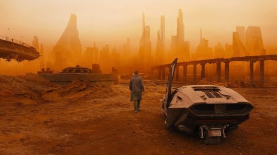
Denis Villeneuve based the imagery in 2049 on a planet that has become degraded with pollution. The buildings are extrapolating enormous amounts of water into the atmosphere, the sea wall at the end of the picture will be our new Mount Rushmore, the orange Vegas is happening now. Denis Villeneuve didn’t predict the earth looking like this, but his production team was still spot on. A picture that transcends its very style, developing a look that will be discussed on its merits separate from the ubiquitous original, is a stunning achievement.
Everything isn’t dystopian because that’s the way it was in the book. It’s what will happen to us in real life, why we’d look for colonies to live on if we had the technology or funding towards NASA to do so. God help us all.

4. The love story questions the essence of relationships
The story between K and Joi further examines the meaning of love, sex, and mortality, with the two being different versions of artificiality. When the default sexed-up version of a naked Joy pops up on the screen, we are emotionally mortified. Some of us may be repulsed to observe a character we care for utilized like a thirsty Godzilla.
The towering ad tries to seduce K tempting him to buy it, rendering everything Joi said to K throughout the picture questionable. Its manipulation solidifies his final decision in life to help another man. We’re not sure if she loved him or said what it thought it wanted him to hear throughout the narrative. Possibly Joi herself didn’t know her intentions. An unusual amount of nuance and uncertainty rests in the love story. Who do we love? Why do we love? Do we love by the heart or the heart of our designers whom we don’t know?
Meanwhile, Deckard was just drunk and horny when he bashed Rachel up against the wall. Sorry, that really was all there was to their passion despite what Wallace says.

5. The movie was an honest commentary about how the world views woman
Here’s a controversial one. A lot of women were disgusted by the way they were depicted in the film. Outwardly watching the movie, I can’t blame them. I’ll let Mr. Villeneuve speak for himself. “I am very sensitive to how I portray women in movies. This is my ninth feature film and six of them have women in the lead role. The first Blade Runner was quite rough on the women, something about the film noir aesthetic. But I tried to bring depth to all the characters. For Joi, the holographic character, you see how she evolves. It’s interesting, I think. What is cinema? Cinema is a mirror on society. Blade Runner is not about tomorrow; it’s about today. And I’m sorry, but the world is not kind on women.”
Villeneuve is right. Women today are still sexualized. Even with the Me Too movement, women are continually seen as sex objects or subservient slaves in a male-dominated society. Villeneuve isn’t interested in painting a rosy picture that Hollywood does for female roles to make the audiences feel comfortable. It’s an honest reflection on who we are. What we see is what we don’t want to see, but that’s part of the honesty of cinema.

6. The score is mesmerizing
Another point in which I may face some contention. Yes, Vangelis’ score is iconic, but it only works for the era it was composed in. Much of its mixture of bleeps, blops, and wind chimes are a product of its time. A lot of emotion is missing from the score other than the opening theme and “Tears In Rain.” Hearing much of the soundtrack while on the road, I sometimes thought I was listening to something from a porno. Take a listen to “Wait For Me” in the soundtrack and tell me otherwise. Hans Zimmer and Benjamin Walfisch’s score is timeless while also paying respect to Vangelis’ synthetic use in the original. It dives into the character’s mind providing a replication of something more human than what Vangelis composed.

7. It thematically ties more directly to “Do Androids Dream of Electric Sheep” than “Blade Runner” does.
“Blade Runner” got the overall gist of Phillip K Dick’s novel. Replicants are scared, trying to find a way to survive as Deckard hunts them down. However, the Andies in the movie almost deserve to die. In their quest for more life, they torture and kill multiple civilians. What did the guy making the eyes do to deserve being frozen to death? What about J.R. Sebastian? He was nothing but pleasant to Roy and Pris. Did Roy eye gauge him when he was done with Tyrell?
Aside from Luv (Sylvia Hoeks), our replicants are fully rounded people. Sapper Morton is a watchful protector who was meant to be a NEXUS 8 combat medic; Joi’s true intentions come into question for herself and us. K’s inner conflict is the central core of the story. All of this revolves around the meaning of existence within a world that has forgotten about you. The introduction of Robo procreation is an evolution of Dick’s ideas, widening his notion of why life exists in the first place.

8. It doesn’t get lost in the scale
Many sequels love scope over characters. Remember “The Matrix”? Remember how they talked about Zion and all these other things we didn’t see? When the sequels brought in Zion, the focus got lost in the spectacle. “The Matrix Reloaded” was a bumbling CGI mess of Agent Smith Clones and cave orgies. “The Matrix Revolutions” was a glorified “Space Invaders” game. Shoot as many sentinels as you can before becoming overwhelmed. Amidst the sequels bumbling chaos, I missed the smaller scale of the Nebuchadnezzar crew.
The story of “2049” could have focused on the replicant uprising with thousands of robots slamming into humans. We could have gone off-world to finally see what all these other colonies we’ve heard about are like. Some have argued that the movie could have borrowed some of its source material from the later novels about replicants creating humans, so on and so forth. All of that sounds incredible in theory. In execution, you would likely get “The Matrix” sequels.
A movie that overreaches in scope, attempting to please fans by showing everything. What we got was an incredibly meaningful story that further explores the themes of the original while building upon its world without going too far. We see what’s beyond L.A. on the dilapidated west coast. The answer is not much. The film aims at minimalism over extravaganza.

9. We’re still talking about it
After being MIA for decades, “Blade Runner 2049” isn’t forgotten. I can’t say the same for “Superman Returns,” “Monsters University,” “The Incredibles 2,” “Live Free or Die Hard,” and “Indiana Jones and The Kingdom of The Crystal Skull.” In fairness, people do talk about Indy 4, but not in a positive fashion. “Blade Runner 2049” returned to the limelight with disastrous box office results yet high accolades, even gaining the Academy’s attention. Ironically it seemed destined to live the life of its predecessor.
“2049” may have tanked because it was a multimillion-dollar art film that respected its audience’s intelligence. Maybe “Blade Runner” was too far gone amongst the public to gain an interest geared almost entirely towards comic books and Disney. I think the trailers after the reveal teaser looked too generic for my own two cents, turning me off from the film for a short while.
Here we are with Honest Trailers in 2020, making a video about a film that came out in 2017. Bloodsoaked orange skies from the headlines mention the atmosphere of this film. Somewhere, about 100 other people are writing their analysis of “Blade Runner 2049” as I type right now. Seven years from now, we’ll be talking about why the world is still like “Blade Runner 2049.” Villeneuve made a timeless sequel to be remembered.

10. It’s better than the first film and one of the best films in the last ten years
Here’s why you’ll probably agree with this one when you put your pitchfork down. Remove your nostalgia goggles. I know it’s hard to do, please, trust me. Look at the points I made above. Think about how ironic the love story is to our lives. The layers of meaning behind K’s existence is lightyears beyond the featureless Rick Deckard. The picture isn’t flawless. Niander Wallace is spectacularly corny in his scenery-chewing grim monologues. Dr. Eldon Tyrell had some ambiguity regarding the morale of his intentions. For that, I’ll give the original the benefit of my doubt. I understand Ryan Gosling was cast to be intentionally deadpan, but it’s okay to emote once. His distant stare in all of his other performances made it difficult for me to discern myself from the actor’s rather dull persona.
With this said, “Blade Runner 2049” understands cinema. Its atmosphere is why we venture into a dark room that takes us to a different place. Denis Villeneuve’s masterful follow up is one of the most orgasmic cinematic experiences I have witnessed in the last ten years that demands a re-screening in 2022 when theatres reopen at an entirely safe capacity. The style doesn’t overshadow its substance, which is far richer in detail than the original without grasping at blatant metaphors. “Blade Runner 2049” is slow cinema at its finest, letting us into the character’s heads, knowing when to be quiet and when to be loud.
Like “The Empire Strikes Back,” not everyone appreciated the movie at first. Time has been incredibly kind to it, though. I wish the Academy recognized “Blade Runner 2049” beyond its technical marvels in 2018. I suppose it wasn’t the type of picture that catches Oscar voter’s eyes. But it has acquired the audience’s to this day. Now, if you could just look up and to the left for me?
from you’ll probably agree website https://ift.tt/3kxHs7O
via IFTTT
from WordPress https://ift.tt/3kG03i7
via IFTTT
5 notes
·
View notes
Text
Experience Examined In Between Lines of Poetry
By Jacqueline Thom

Experience is a difficult concept to bring to life on paper. It requires the act of being able to sit with oneself and consider all the elements that make an encounter so vivid that it stays in the mind, transforming an event into memory into experience, that which is so powerful, it alters how one feels, in the moment and afterwards. Bringing that emotion to life in an authentic way was important for Tarfia Faizullah in writing her poetry collection, Seam. She chose not to go the same route many of her contemporaries might follow — heavily researching an experience before attempting to conjure the mindset that can accurately replicate it; instead, she traveled to Bangladesh where she spoke with birangona, female survivors of the 1971 Liberation War, which saw many women and girls raped, tortured, and traumatized by the Pakistani Army that captured them. Faizullah adds a valuable addition to the New Historicism school with her attention to truth and validating the ordeals of women long shunned by their own communities, and changes how experience is renewed and reexamined on paper in her book.
Faizullah’s ties to her culture is evident in how devoted to its exploration she is in her work. As a Bangladeshi American, she is privy to two cultures, but strives to stay away from the western narrative, instead choosing to come to terms with the duality of being a person of color in America, and then just another Bangladeshi in her ancestral country. Her poem, Self-Portrait as Mango, angrily retorts to “How long have you been in our country?” with “Suck on a mango, bitch, that’s all you think I eat anyway…This mango was cut down by a scythe that beheads soldiers, mango / that taunts and suns itself into a hard-palmed fist only a few months / per year, fattens while blood stains green ponds.” (Faizullah 23). Faizullah ironically calls herself a mango and articulates that what is a simple object to one person holds generations of history for another. While the mango ripens, it is witness to war and violence, but still grows until the day it is properly eaten (sucked open with teeth), or analogously, truly appreciated for the history it holds. Self-Portrait as Mango represents Faizullah’s tone as a poet; she is confused at her status as an other in America, she is angry when her validity is questioned, and yet she is indignant with the knowledge that her heritage has a rich history that rises far above any of these challenges to her identity.
This style is evident in Faizullah’s notes to herself in Seam. While she takes on an appropriately modest tone when addressing the birangona and emulating them, there is still that reverence for a past yet undiscovered by her. Such is true of Interview with a Birangona as she takes time to self-reflect in third person on her findings of the women’s experiences: “You listen to the percussion / of monsoon season’s wet / wail, write in your notebook / bhalo-me, karap-me / chotto-sundori— / badgirl, goodgirl, littlebeauty—in Bangla / there are words / for every kind of woman / but a raped one” (29). Not only is Faizullah questioning her culture’s inability to accommodate raped women, but she does so in a melancholic rather than accusing tone. She asks readers to consider why there is no infrastructure in place to support the birangona, or at least educate the communities about the long-term damage sexual assault has on victims. Her thoughts are expanded further in other poems where Faizullah suddenly becomes mournful and almost separated from what she is talking about as she emulates the birangona’s distanced retellings of their own traumatized encounters in the camps they were brought to. She tells readers, “my body became an eddy, / a blackblue swirl. Don’t cry, he says. How when the time / came for his choosing, we all gave in for tea, a mango, / overripe. Another chance to hear the river’s gray lull.” (34) Faizullah becomes much more metaphorical and perhaps even more poetic when she takes on the birangona perspective, a way of speaking that is common for victims of trauma to distance themselves from what happened. In turn, Faizullah’s dialogue and that of the birangona is distinguished from the much harsher, violent language of the rapists. All this works to create an eerie conglomeration of memories retold into an experience that shocks readers into the women’s awful realities as slaves to a traumatic past and their scapegoated present. What is presented in Seam becomes another experience on its own, for readers who have not had to witness the same kind of violence that is described, for Faizullah, as the child of parents scarred by the liberation war, and for the women who had to put their trauma into words for us to understand even an inkling of what they felt. Seam then reconfigures how we think about the representation of experience for all involved in its depiction, for without the multiplicity of historical perspectives, and then Faizullah’s own influences as a person of color in two very distinct worlds that perceive her identity differently, we would not have the same ability to experience so deeply as we did with this book, where no aspect of the memories and thoughts we read about feels unexamined and unfelt.
The way in which Faizullah truthfully pursues the telling of experiences in her poetry is a valuable contribution to the New Historicism literary theory. She does not merely try to grasp on her own what it is like to be a birangona, but seeks inspiration from the very women who know what it is like. Writer Kristina Marie Darling of Tupelo Quarterly puts Faizullah’s writing as “tragedy turn[ed] to narrative and set[ting] other pains into motion, be it grief or a desire for some form of justice. Faizullah also documents the stories in compact ways, choosing the most potent images and details to render heartbreaking devastation, and then moves to a larger, almost prophetic, question that forces readers to confront the senselessness of such a death” (2015). In other words, Faizullah’s cultural connection to the events she speaks about, and her willingness to strengthen that connection, is what allows her to translate words said by women likely desensitized to their own trauma if only to be able to bear it, in a way that resonates with readers and forces them to consider the needless violence of the war. New Historicism itself is a cultural study that strives to reconnect a work with the time period it is produced in or influenced by. It is not just a matter of what happened, but a matter of interpretation of the historical events themselves. With this examination of historical literacy in mind, Faizullah casts a telling light on how exactly birangona have been treated since they survived the war. She laments on their being shunned by communities for their ‘dirtiness,’ despite the total lack of control these women had in their circumstances. She asks readers to consider the women’s self-inflicted guilt over the futility of their situation and the guilt added on by their families and neighbors, and how that increases birangonas’ trauma. There are words for every kind of woman but a raped one. By asking these questions, Faizullah attempts to further enhance the contextual analytical methods of New Historicism by juxtaposing the circumstantial with the emotional.
In showing readers the lack of respect for these survivors, Faizullah ultimately addresses how we need to interpret events — as experiences that affect our own and should be treated as such. Seam does not just ask what happened, but it confronts violent experiences with a forwardness that shocks readers into sympathizing with victims and considering what can be done to right the wrongs of history and prevent another mass traumatic event from occurring. We are stirred into thought and action by the poetry’s historic validity, and Faizullah’s own willingness to be meta. While traveling to Bangladesh to interview the birangona, she notes, “I take my place among / this damp, dark horde of men / and women who look like me— / because I look like them— / because I am ashamed / of their bodies that reek so unabashedly of body— / because I am / an American, a star / of the blood on the surface of muscle” (12). She is different, a misdiagnosed ‘other’ in America, but as soon as she is in her country of origin, Faizullah emphasizes feeling strangely more American than before despite mingling with those who look like her…startlingly too much like her. That familiarity and lack of it at the same time is another influence in the way she is able to convey her sincerity and truthfulness as a narrator for the birangona in her poems. There is an acknowledgement of disconnect, but a drive to bridge that gap by finding the truth buried underneath cultural stigma and old historicism’s failure to interpret experience according to person and place in time.
Through Seam, Tarfia Faizullah contributes an entirely new way of recording the human experience for those who witnessed it in the past and alternately those who learn about it in the future. What is produced is a vivid re-narration of experience that is able to explore both the feelings felt by those involved in such encounters, while also questioning the supposed objectivity of previous historical interpretation methods. Faizullah posits that it is impossible to approach history without a subjective lens, and we are all the better for it, for only then can we truly understand the emotions that drive human action. Faizullah takes New Historicism head on with Seam, and fearlessly confronts the context from which her subjects’ stories were violently created so that readers may understand how their own experiences are subconsciously affected by the past.
Works Cited
Darling, Kristina Marie. “Seam by Tarfia Faizullah.” Tupelo Quarterly, 2015, https://www.tupeloquarterly.com/seam-by-tarfia-faizullah/.
Edwards, Trista. Review of Seam, written by Tarfia Faizullah. American Literary Review. University of North Texas. 2014.
Faizullah, Tarfia. Registers of Illuminated Villages: Poems. Graywolf Press, 2018.
Faizullah, Tarfia. Seam. Crab Orchard Review & Southern Illinois University Press, 2014.
“New Historicism, Cultural Studies (1980s-Present).” Purdue Online Writing Lab, Purdue University,
https://owl.purdue.edu/owl/subject_specific_writing/writing_in_literature/literary_theory_and_schools_of_criticism/new_historicism_cultural_studies.html.
Acknowledgements
I would like to thank Caitlin McGill for her profound patience and support when I wrote this during a time of much personal unrest and dissatisfaction. I learned so much in the few short weeks we had together.
0 notes
Text
Flight or Fight Drawing mode
for me, i think there’s always this restless feeling that comes when working on comics. That feeling that time is running out or not being utilized to its fullest degree. You are aware of how much more there is to go in your story and can calculate the progression of your journey, but only the present. As you keep going on your story, the circumstances change, and it is always this fluid process you cannot fully accommodate and plan for.
I know in the few years since I started drawing FFAK my expectation for myself and my work has changed tremendously. Its something i reflect on a lot, since i forget how not too long ago, I felt like i was somewhat incapable of producing a comic because of the way i enjoy to write and explore stories. I still think fundamentally, FFAK reflects that raw unedited version of my writing and creative skills in a unique way that I doubt will be replicated again (in the same manner) even as i explore and work on other stories. FFAK just carries this certain kind of momentum of forwards and backwards both at once. You stretch all over the place and peek through small doors to go in strange places. Growth is difficult to gauge because of the way time is handled in the story. Goal points seem endless and bleed together from my perspective. There’s always so much more to go and so much planned that when you make accomplishments they feel sort of like a bunch of tiny small steps in many different directions. And honestly, No one is more impatient than i when it comes to waiting to share this story than me. I am always biting my nails and wanting to get it out faster SOMEHOW even though I work on it constantly as it is.
FFAK is no longer just.. a random comic idea i started on a whim that I felt i would only dip my toes in and never actually attempt making. and now it really has consumed my mind like a wildfire. it is also my fireplace and my home in my heart and my peace. I don’t even think I could ever fully be prepared for and handle such a thing but I am glad to have it in my life. But as the haze.. shock? of starting this project starts to fade i find myself fully committed and trying to evaluate the steps and process i take for this comic as a whole. I think its interesting how 2ish years of planning basically gives me enough time to know what sort of story I’m doing. But I am in no eager rush to finish it because my excitement for it only grows and feels more satisfying the more i write and plan.
Part of me gets upset I don’t blast pages out the “same” way anymore, even though i appreciate the exploration of ‘putting more effort’ into my drawings. Instead of drawing thru 20 pages a night I’m polishing like, 2.. or 4 a work night. Its kind of annoying!! because I’m not really one for polish and editing (or maybe I just never believed myself capable of doing it in a way i liked? lol) but.. it just feels like the right thing to do right now. it feels almost impossible to ‘rewind’ myself or go back to like, thinking things in a different way than what i try to do now. by attempting more things visually it kind of makes some things easier too. im often pretty surprised like “hey alright that came out ok. i guess i can push myself a little bit more next time to make it look better!!”
I think about my early eggshells pages a lot and how i labored over like.. 15 pages over an entire year and felt miserable and in the end, often over rendered + lost clarity and energy and now i just get what i was doing ‘wrong’ to make it not fun for myself. Like, even when i was offered advice at the time I wasnt so welcome to it nor did i understand it, its like I had to suffer a bit before I was able to understand what I needed to do with myself lol. The lesson feels much more impactful after discovering it for myself too on my own pace imo. SO i am thankful for how that turned out!
Then i broke down my art to its most base level (earliest ffak pages) and i’ve just been rebuilding myself back up since then and now I’m attempting things I didn’t even think I’d be able to do -- or be interested in. (like color, for example, has never been something I was too interested including with my comics but like.. blammo here i am doing it anyway now.)
anyway. its really cool, this art journey thing. i kinda wonder how long ill coast on this certain part of it before i like, end up doing an unexpected detour again. Maybe I won’t..? i dont know!!
FFAK is so raw and alive it makes me happy i get to make it and do whatever i want in it. I always wanted to make a comic that I could contribute to on a day to day basis rather than something you just make so you can get it done asap and move onto the next thing. When ffak does eventually finish I wonder if it will be really hard on me. I look forward to its ending because its really neat but it is not a world I want to let go of so quickly. Even tho i have several other stories I’d like to do.. (and have started a couple already LMAO)
I think about that expectation with ending stories a lot and completing projects. Most of my very favorite comics have yet to end despite going on for decades.. and when i think about that too, it almost feels very strange. Readers generally want closure to reflect on their experiences reading something so endings are that important ‘release’ from that fake world and time you participated in it. But when i ask myself what I want to do for endings to my story, i try to contemplate my favorite endings to stories ive read/watched/experienced to figure out what i want to do with my own. Since.. its my story and my satisfaction with it is really going to be reflective of what I like. Everyone interpretes ‘good’ endings differently and like, clings into diff parts of what makes a satisfying story so its important to isolate what elements you find are important to try to replicate that in your own work.
But like.. its hard to see what kind of ending you’re going to make before you make it???? And making the story is a difficult thing to let go of vrs just being funneled all the stuff. Maybe my ‘ffak reader’ half of me will be satisfied but will my ‘ffak creator’ side be happy? Will i feel fufilled on both parts? I mean an experience is going to just be an experience.. i cannot manufacture or control it to be anything than what it will be so to think about it too much is probably only going to go in circles. It certainly has changed me a lot as a person and an artist. WHich is disorienting b/c im also introducing my work to everyone while not also knowing myself completely. (not that is ever fully achievable but, its been something i get forced to confront a lot.)
When I work on this project I fight so many demons of my own life, chase ghosts of my heros that i feel are so beyond my ability, and stare down the illusion of my own reflection of what kind of artist i want to be every time i draw a new page.. I’m never going to really be that reflection, and my heros will always be my heros and they’ll always do things I cannot, but I wonder what kind of creator I look like from the outside?? from a person who isnt me. I cannot experience myself as a ‘reader’ but I try to pretend I am seeing myself as one. And the most exciting thing about myself, from that outside perspective, is that I am not sure what I will attempt next or what strange journey i will write about. I am happy that despite every difficult thing I have been through, I am still excited and having fun with my art like I have only just first attempted to draw.
Soon FFAK will be three years old and (likely) 4000 pages by then.. I still havent gotten to write and draw out things I planned the very first day, but now I know roughly how the story will end (without actually getting to draw it yet, of course.) And i’m just anticipating the future while knowing that...i have no idea what it will bring!!! O_O
(one thing is for certain i hope to fuck my house doesnt burn down again because, istg, that fucking SUCKED!!!!!!!!)
Wooh.. well. i just felt like sharing some thoughts since i just got done re-reading some of ffak and feel a bit overwhelmed with emotion.. Thank you all for sticking around and experiencing this comic with me..! :’3
-kosmic
26 notes
·
View notes
Text
The Crash Bandicoot N. Sane Trilogy is a (fun) shallow novelty

In a recent Time interview, Sony Europe Exec Jim Ryan argued against the concept of backwards compatibility à la Xbox as a viable business plan, positing that for as many people that ask for it, very few actually take advantage of it. “That,” he said, “and I was at a Gran Turismo event recently where they had PS1, PS2, PS3 and PS4 games, and the PS1 and the PS2 games, they looked ancient, like why would anybody play this?” His statements may reflect the actual opinions of a certain segment of the gaming community, but they also come off as shortsighted and just kinda...dumb. He’s (first of all) bashing products once made by his own company, which for pure business reasons sounds some alarms. But more than that, he’s making an argument against the durability of games, asserting that unlike other forms of art, they have an expiration date, largely connected to the visual style allowed by the hardware limitations of the time they were made in.
While the Activision-produced Crash Bandicoot N. Sane Trilogy is removed from Sony’s legal grasp, to a degree, this ground-up remake of the classic O.G. Playstation platformer series is in line with Ryan’s realm of thinking. This isn’t a “remaster” in the way that most games that bear that designation are, no mere cleaning-up and up-resing to make those chunky 90’s polygons tolerable on modern TVs, though perhaps it should have been. Rather, this is more a Gus Van Sant’s-Psycho-kind of shot-for-shot recreation of the original games in a brand new engine, and the good news for the Jim Ryans of the world is that it looks great. Fans of the original trilogy such as myself, whose ravenous nostalgia for all things pre-aughts knows no bounds, will undoubtedly spend the first few minutes of this game in slack-jawed awe at their childhood game rendered in all its colorful, rounded, shiny 2017 glory.
Some of that awe may go away, however, once those players get to, say, the second level of any one of the three games packaged, and start dying. Players at this point might have one of two reactions - “Shit, I forgot how hard this game was,” or “Shit, I don’t remember this game being so hard.” Both of these reactions are valid. The original Crash Bandicoot games, once you got past the rollicking soundtrack and vaguely-creepy but mostly-cute anthropomorphisms, were occasionally grueling obstacle courses fraught with trial-and-error frustrations. They were awkward 3D platformers that had trouble grappling with the idea of what a 3D platformer could even be, requiring the precision controls of 2D genre classics like Mario but in practice, controlling in the stiff, wonky way many games of the 32-bit era did. Even if this was a straight remaster of the original games, many players may have found themselves running sideways off a straight platform because of the bafflingly 3D controls in ostensibly 2D sections only so many times before they became a little disillusioned at how unflatteringly these games have aged. Naughty Dog may have gone on to be one of video game’s greatest and most celebrated developers, but it took a while to reach that peak.
But there’s more to it than that. Sure, on the surface level, everything pretty much looks the same - Crash (or, in a welcome addition to these versions, his sister Coco) jumps, spins, slides and bodyslams his way through the same exact levels with the same exact enemy and box locations that he always has. But upon mere days of the N. Sane Trilogy’s release, many articles and blogs ran about the ways the new game’s engine failed to fully replicate the physics and mechanics of the originals. Now the developers at Vicarious Visions themselves have confirmed these departures, the two most egregious of which are faster falling animations and pill-shaped collision boxes - meaning that many would-be close-call landings of the original games are now perplexing misses of the new games. As someone with the physics of the original games ingrained into my muscle memory, this deviation was particularly hard to accept for me; it wasn’t until probably ⅔ of the way through Cortex Strikes Back that I felt I may have finally mastered these new mechanics, just in time for the most hand-wringingly, hair-pullingly stressful levels of the game.

One can only wrestle with this kind of no-cigar approximation for so long before one starts questioning what the point is. Why remake these games in this way? Most players of the original games will be put off by the subtle-but-ever-present gameplay changes, while newcomers will likely be nonplussed by games that, graphical overhauls and Unity-based physics changes aside, still feel stuck in gaming’s awkward pre-teen phase. The answer, unfortunately, is probably financial. An HD remake of a nostalgic favorite among a certain generation of gamer is an easy cash-grab - $40 seems like a reasonable enough price for three whole games that have been completely made over from scratch, and even if the details of the way the games play start to grate on players, most will presumably still get what they wanted from the experience, a quick and shallow indulgence in nostalgia with little critical considerations. Truly replicating the original in every way likely would have been a costlier endeavor than deemed necessary for the kind of experience this was meant to be. The apparent success of this release has even sparked conversations about giving other PS1 classics, such as Spyro the Dragon, a similar treatment.
All of this complicates the question set out at the beginning of this review, about the aging process of video games, graphically, mechanically, or otherwise. I will always assert that no such expiration date exists. Developers of console generations long past were limited by the technology they were working with, but that doesn’t mean the art they made wasn’t intentional and worth celebrating. The early 3D era, both in play and look, may have not aged as gracefully as the late 2D era that preceded it, but the blocky, fuzzy-textured art of Crash Bandicoot and other games of its era will always hold a strange sort of appeal to me, and not entirely for nostalgic reasons. This was an era of radical, thorny change, full of potential both realized and missed by developers who had no clue what they were doing, but did it anyway, in a brand new dimension. Exploring the games of this time can be both exhilarating and slightly embarrassing, but rarely boring.
That’s all to say that the Crash Bandicoot N Sane Trilogy really never had to happen. A remaster would have been nice, and I will never argue for anything less than the total preservation and accessibility of video game history, but to gloss over the style seems to me the creation of a wholly different thing, just as it would if one were to modernize the English in an old piece of literature. This kind of remake feels like little more than a shallow novelty. It’s a fun shallow novelty, for sure. Despite whatever complaints I maintain about its mechanics, I still played it enough to 100% Cortex Strikes Back and enjoy a considerable amount of the other two games. In returning to them, I still felt the same itch to smash every box, collect every gem, and even give those speed runs a shot. Pulling off a difficult clusterfuck of obstacles unscathed in the later levels is still as exhilarating as ever, and breezing through the early ones is still as satisfying. I expect that others will appreciate it equally. But a shallow novelty it remains. Thankfully, though, the game prepared me to expect little more, so at least it’s not a disappointing shallow novelty.
6.3/10
#Crash Bandicoot N Sane Trilogy#Crash Bandicoot#Games#Video Games#Criticism#PS1#Playstation#Sony#Retro Games
2 notes
·
View notes
Text
Journal - One Rendering Challenge 2020: Competition Winners Announced!
Architizer is thrilled to announce the winners of the inaugural One Rendering Challenge! Reviewing a stellar shortlist of 100 architectural renderings and their stories, our esteemed jury have selected 2 top winners — one non-student and one student entry — along with 10 fantastic runners-up.
The top winner in the Non-Student category was “Zoom to the Future” by Carlotta Cominetti, Tamás Fischer and Camelia Ezzaouini of visualization studio Virginlemon. Their rendering tells the story of an elderly man resting his weary feet in the courtyard of his residence … with a futuristic twist. Mengyi Fan, One Rendering Challenge juror and Director of Visualization at SHoP Architects, had this to say about the image: “Sometimes it’s satisfying to see artists use the incredible arsenal of tools we have today to create scenarios beyond those that replicate reality. The artist of ‘Zoom to the future’ has used them creatively to literally and metaphorically create a thrill ride without sacrificing craftsmanship and interesting composition.”
The top winner in the Student category was “Lifting Longyearbyen” by Brandon Bergem, a student at the University of Toronto. Bergem’s image was inspired by the dramatic, barren landscape of Svalbard, Norway. Mengyi Fan loved the composition, describing it as “a complex construction built of layers on layers, tied together seamlessly with skillful control of color and lighting. I love the muted color story presented here — the subtle bit of muddiness reinforces the artificial nature of the carefully crafted environment.” Visualization expert and juror Peter Guthrie commented: “This is not the sort of image I would typically be drawn to, but on repeated viewing, it keeps giving more and more. I love all the details and obvious effort that has gone into it.”
In partnership with Fiverr’s new architecture and building design services, we’re delighted to present each top winner with a grand prize of $2,500, along with pro rendering software from the likes of Chaos Group, Adobe Substance, Evermotion and Quixel. Without further ado, take in the winners of the 2020 One Rendering Challenge, including both the renderings and their accompanying stories…
Non-Student Winner: “Zoom to the Future” by Carlotta Cominetti, Tamás Fischer and Camelia Ezzaouini (Virginlemon)
This rendering is mostly about the future: A future project, a future vision, a future situation. There’s always something that persists, protecting our life’s routine. Imagine waiting for your dear to come back home after work; it’s late and cold, your courtyard (in need of a refresh for years) is dark, and you have to keep a safe distance from the trash. Neighbors are chatting behind enlightened windows. You’ve been living in this building for almost 14 years. You know by heart every crack, every leak, every pot containing every dead plant. You have seen dozens of families moving out and moving in. The world outside is speeding up.
The elevator is out of service, again; you have to take the stairs and that’s f***ing annoying!
Please take your time to zoom in! #full3D #zerophotoshop
Student Winner: “Lifting Longyearbyen” by Brandon Bergem (University of Toronto)
This is a scene from the incomplete Museum of Natural History to Ultima Thule. An official from the governor’s office exclaimed: “The ground is melting!” She cautioned the town folk that “We can no longer trust the permafrost.” The governor needed to devise a strategy simultaneously mitigating the unrelenting bombardments by natural forces while maintaining the town’s natural heritage.
Her innovative solution was to remove and lift the houses from their foundations and insert them into a mega-structure, tall enough to hover above the impending flood. The townsfolk were relieved to see that their cheerfully painted homes were unharmed. A collective pride inspired the community to rename their town from Longyearbyen to Askeladden, a name derived from Ashlad, a small child from Norwegian folklore who succeeds when all others failed.
Commended Entry: “Joey Loves Monday” by Adonis Gabriel Gumba (Binyan Studios)
A big house with an open plan. A swimming pool on all sides. Magnificent views all day long. A hot sun and breezy nights. Seafood all the time. Joey lives here … He’s in fifth grade, loves to draw and is good at math. He’s very good in class. He never misses school; in fact, he’d be in school even on weekends if it was allowed. He promise himself he’ll go to college and finish study. He wants to be an astronaut. He’s certain he will be.
Must be realistic. Create the non-existent. Emphasize the beauty. Highlight the potential. Visualize a dream. Make it feel real…
This is my attempt to render something more than realistic. Inspired and referenced from ” stilt houses” in Philippines, Myanmar, China and Bangkok.
Commended Entry: “The Vent” by Dennis Allain (Dennis Allain ADI)
The Vent is an architectural exploration based on a world overcome by structure. From a design perspective, I had been interested in this idea of construction and how it can overcome that which was once thought valuable and beautiful. The object of past idealism is portrayed in the white structure placed in middle ground.
In setting up the composition, it was important to use the bridge to extend the viewer into the image. The water and refuse in the foreground was also an attempt to add depth. The background also played a role in creating depth and defining silhouette of the city. As an artist, I am constantly trying to perfect a color pallet and examine how form, color, value and texture work in concert to tell a story that resonates with the viewer.
Commended Entry: “Electric Rain” by Vittorio Bonapace (Vittorio Bonapace Studio)
A moment, suspended in time. Feel the vibe in the rain. Get inspired by city night reflections. Moody, cinematic and a little futuristic, this image aims to express one’s lonely feelings on a cold rainy night, and the desire for a warm, safe place where one can find energy again, after walking in solitude. The rendering represents the continuous relationship between what a city gives you and what a city takes from you.
Commended Entry: “The First Day of Spring” by Maciej Józefiak and Rafał Stachowicz (AESDE)
This image is a reflection on architectural visualizations in general. Architectural visualization aims to present architectural visions in an attractive, interesting and complete way. Its task is to show how the architectural design will become a finished, existing building. The attractiveness of visualizations, with a superficial approach to the subject, is usually limited to showing the object within fake and unreal scenery. However, is bending reality necessary to create a successful frame? Does a good visualization have to mean a caricatured image full of happy people?
The reality that surrounds us is completely different. This does not mean, however, that it is less interesting. On the contrary, the world around us is full of inspiration to create an image which, in addition to the banal external appearance, presents the world in an intriguing and truthful way.
Commended Entry: “Urban Farm Temple” by Duy Phan (Monash University)
Melbourne will be home to 8.5 million people by 2050. Infrastructure does not keep up with the population, leading to the construction area of residential areas. More and more people have to expand their homes into farming areas, while the demand for food constantly increases to meet the daily consumption needs of the population. The picture of the food supply becomes even darker when the bushfires kill millions of animals and plants and cause severe air pollution.
In the near future, food will become a new religion, where hungry megacities devour dozens of tons of vegetables and meat every day, continually running out of supplies. In the heart of the city — the deepest place in the desert of concrete created by ourselves to be isolated from nature — the Temple of Urban Food offers a picture of the future tense, where the green of vegetables brings belief in urban people’s survival.
Commended Entry: “Deadline” by Erik Peter (Pixelateit)
We’ve all been there. It is the last day of the last week before holidays — the busiest time of all. You can not wait to go home. But there is still so much work to get done before that happens … So let’s just do it! While we are working hard and having fun, there is no time to notice how cold it is outside, how steam and smoke from traffic and chimneys is rising above the rooftops, and how the snowflakes are flying about. There will be enough time for all that, on our way home … Once we meet the deadline.
The building’s façade is inspired by the Greifswalder Office Building designed by Tchoban Voss Architekten in Berlin, Germany. The rooftops are akin to typical Berlin scenery, to be true to the original location of the building.
Commended Entry: “Time Traveling” by Tigran Hakobyan (theRENDER)
It’s an interesting and challenging thing: To tell a story with one still image. During thoughts about it, I saw ”Antwerp Port House” designed by Zaha Hadid Architects, which has amazing contrast of an old building and a new futuristic shape. It perfectly demonstrates the connection between centuries. That’s why I chose to show time traveling.
Like the movie ”The Time Machine (2002)” in which the main hero time traveled using a Machine that stays static in its location, the rendering shows how the atmosphere and the surroundings are changed by going back in time, while the main building stays the same.
Commended Entry: “Dog, Bird and Man” by Toni Schade (sonaar)
There is no rational concept for this image, but a strong reference with a strong feeling: The movie Nostalghia (1983) by director Andrej Tarkowskij and its magical final scene — A Russian farm house, a man and a dog and a camera that is slowly moving backwards to reveal that this very scene is embedded in the ruin of a seemingly enormous Italian cathedral. It is an image about home and outland, one so strong and so emotional that it stuck in my mind ever since I watched the movie for the first time about 15 years ago.
Commended Entry: “Orchard Jenga – Start of the Night Shift” by Duy Phan (Monash University)
To cope with urban heat island effect and lacking trees canopy coverage in cities cramped context, on top of the existing two-level car park, Orchard Jenga proposes to plant not only trees but eatable vegetations vertically, casting healthy shadow for open public space underneath. The facility produces organic fresh foods for the nearby Queen Victoria Market by applying the technology from the adjacent University of Melbourne research centre.
Covered by the transparent water tank, the unique façade allows semi visual connection from in and out by caustically reflecting and refracting the light when it passes through. The image is captured at the moment of a night shift begins to start. As those last sun rays pour on the side façade, the aquaponic lights illuminate from the inside. It is not intentionally blending itself with the context but is proudly vivid, stating the message of the city’s sustainable future.
Commended Entry: “Architecture Survives the Idea” by Yuliya Arzhantseva (A+I)
Architecture is function combined with esthetic. And when architects create something, they make an assumption of how people are going to interact with their brainchild. This bus stop is an example of how architecture storytelling changes with time. Made in the soviet time bus stops like this one also had an ideological function – to tell a story of the country people were living in. But architecture lives longer than ideas.
With time the USSR’s brutalist oasis in the middle of nowhere became a shabby reminder of the past. Instead of a buzzy crowd of local workers, there is a cow grazing on grass. And the modern man is standing, detached, near the stop. He doesn’t want to interact with the idea of what this bus stop embodies. It’s now better for the cow – they don’t care. Because ideas pass by, but architecture stays.
As our two top winners, the Virginlemon team and Brandon Bergem will each receive:
$2,500 prize money
Annual Pro subscription to Substance, Adobe’s 3D Texturing Software
1 annual license for V-Ray or Corona Renderer, users’ choice
200 Chaos Software Ltd. Cloud credits
5 3D model collections by Evermotion
6-month subscription to Quixel 8K resolution Megascans
Access to Quixel Bridge and Quixel Mixer
Featured entry in the inaugural “One Rendering” eBook
Further to this, the 10 commended entries shown above will receive a prize package of professional rendering software worth over $700. Revealed last week, the top 100 renderings will feature in the first “One Rendering Challenge eBook, to be distributed to thousands of architecture firms via newsletter and social media channels. Watch out for this stunning publication, coming soon! There will also be further features on the winners in the coming weeks.
Thank you to all participants for their hard work in creating these amazing renderings and telling fascinating stories about architecture. If you are interested in entering next year’s One Rendering Challenge, be sure to sign up for updates by clicking the blue button below.
In the meantime, keep on rendering!
Register for the 2021 One Rendering Challenge
In Partnership With
The post One Rendering Challenge 2020: Competition Winners Announced! appeared first on Journal.
from Journal https://architizer.com/blog/competitions/one-rendering-challenge-2020-winners-announced/
Originally published on ARCHITIZER
RSS Feed: https://architizer.com/blog
#Journal#architect#architecture#architects#architectural#design#designer#designers#building#buildings
0 notes
Text
Creating the Kaleidoscopic Visual Style of PROMARE
PROMARE, the first feature film from anime studio Trigger, has been, ahem, lighting up theaters in the US for about a month now with its high-octane firefighting action. In many ways the film is a culmination of years of work from its creators, combining their manic storytelling style with innovative new animation techniques and making use of virtually everybody who’s anybody at the studio. (If you haven’t seen it yet, you may want to check out our review of the movie!)
Whenever I’m at a convention with the staff from Trigger, I always make a point to sit down for an interview, and I had another opportunity this year at Otakon 2019. In attendance were the film’s character designer Shigeto Koyama (a freelance designer who you might know from Heroman, Inferno Cop, and the robots in Star Driver and Darling in the Franxx), producer Hiromi Wakabayashi (Kill la Kill, Panty & Stocking with Garterbelt), and the director himself, Hiroyuki Imaishi (Kill la Kill, Tengen Toppa Gurren Lagann, Panty & Stocking). The three are longtime friends and collaborators, and often refer to themselves collectively as “Geek Boat.”
Our interview covers the production of PROMARE, its connection with the wider “Trigger-Verse” that (extremely loosely) connects their works, and the creators’ thoughts on a movie that, like PROMARE, successfully marries 2-D and 3-D visual styles: Spider-Man: Into the Spider-Verse.
Thank you to Otakon guest and press staff, as well as interpreter Tatsuru Tatemoto, for the opportunity. Enjoy!
Going All Out on PROMARE
Ani-Gamers: Mr. Imaishi, you’ve had some prior experience with CG directing, but in PROMARE it feels like you really went wild with it. There’s a lot of dynamic camera work and choreography. What was the directing like for that? Did you do anything differently from usual?
Hiroyuki Imaishi: In the first half of the movie, I incorporated long shots of actions, like one minute or longer scenes, without a cut. Usually in animation, action scenes don't last that long, especially on television, because they get exhausting, but since we are incorporating CG and PROMARE is a theatrical release, I went all out with all these long action scenes.
Ani-Gamers: It actually kind of reminds me of Dead Leaves, in a good way. It’s so packed with action.
Imaishi: You’re quite keen with your observation...
Left to right: producer Hiromi Wakabayashi, director Hiroyuki Imaishi, and designer Shigeto Koyama.
Ani-Gamers: Another thing that's brilliant about PROMARE is the way it uses flat colors in both the 2-D and 3-D sections. It fixes the common problem in anime where the 2-D and 3-D stylization doesn’t match. How intentional was that?
Shigeto Koyama: Actually, I talked with Mr. Imaishi, and we tried something similar in Panty & Stocking with Garterbelt in the past. We think it was quite successful in rendering the two aspects together, so we definitely incorporated it because it was successful in Panty & Stocking. So I believe the majority was intentional.
Ani-Gamers: The 3-D animation is made primarily by Trigger’s sister studio Sanzigen, but there are a bunch of other studios that worked on it too, like Khara. How much did you micromanage the particulars of the 3-D and how much did you leave up to the other studios?
Imaishi: There are four portions in the movie: A, B, C, and D. The A part and D part are the portions with the most amount of action. So for A and D we asked Sanzigen to do most of the animation. For B and C we generally asked outside studios to help out with them.
However, there were a few scenes for B and C where Sanzigen already had previz [EDITOR’S NOTE: “previsualization,” a process of figuring out the staging of a scene with rough assets]. So for those scenes we just went with Sanzigen as well since [those scenes] were just a little bit more technical or more difficult to execute.
Ani-Gamers: In the Sanzigen scenes, did you provide a lot of corrections or did you rely on a unit director who handled most of the CG?
Imaishi: We did have a unit director for the 3-D parts, but we generally reviewed the scenes together. In terms of revisions, it really depended on who was doing the particular scene. Some animators were very experienced, very talented, and there's nothing that I could really say; it's an immediate “OK.” But there were some less-experienced animators, where we had to completely draw over what they turned in. It's a case by case thing, I can't really say for the entirety of the movie.
Ani-Gamers: Near the end of the movie there's a kiss scene, or as you like to say, a “rescue” scene. It's probably too much to ask for confirmation on whether—
Tatsuru Tatemoto: Are you asking if they're gay?
Ani-Gamers: Yes.
Hiromi Wakabayashi: Let’s say that you have a friend who’s unconscious and you had to give him CPR. Would that make you gay? Definitely wouldn’t in my book.
Into the Trigger-Verse
Ani-Gamers: Lucia, one of the members of Burning Rescue, looks a whole lot like one of the Trigger Girl mascots, Spring-chan. When are we going to see Lucia turn into Spring-chan?
Wakabayashi: You haven't had the opportunity to see this yet, but we have these two short prequel episodes to the film called “Lio-hen” and “Galo-hen.” For the Galo one, there is a hint that you might notice if you pay attention. There's an Easter egg in one of the monitors. So when it does get released, people who are fans of the Trigger-Verse should watch it frame by frame so you won't miss out on it.
Lucia from Promare (left) and Spring-chan, one of Studio Trigger’s mascot characters (right). Trigger-chan, another member of the mascot trio, was previously revealed to be an alter-ego of Luluco from Space Patrol Luluco.
Ani-Gamers: I've also heard there's an Inferno Cop reference in the movie. There’s an “ICOP” mug that Remy drinks out of at one point. It's obviously an IHOP reference, but is that supposed to be an Inferno Cop reference too?
Wakabayashi: No, that's just our take on IHOP. It's not that easy. I'm the one who put the Inferno Cop Easter egg in, but I have to admit it's pretty hard to find it while it's in motion.
Ani-Gamers: I'll consider it a challenge.
Koyama: Once you see it, it's pretty clear though.
Spider-Man and PROMARE
Ani-Gamers: I know all three of you are big Marvel fans. Have you all seen Spider-Man: Into the Spider-Verse?
All: Yes.
Ani-Gamers: It has a lot in common with PROMARE in terms of its combination of 2-D and 3-D. Has it inspired you at all in your own work?
Imaishi: Especially for people like myself who started as an animator and became a director, the ultimate goal is to achieve something where the actual film feels like the image boards. I'm pretty positive that the people who worked on Spider-Verse were trying to go for the same thing.
And it isn’t just image boards. Even if it's adapting a manga or a visual novel, it’s very hard to maintain the vibe of the initial drawings. It's hard to replicate the same information that the still visual provides. At least for animation, that’s the image board, which is the original concept. For an adaptation it might be images from the manga or the comic or the visual novel. It’s hard to bring that into the film, and I feel that both us and the folks at Spider-Verse were trying to go for the same goal, to bring the same thing from the image board to the motion.
Ani-Gamers: Well I think you did it on PROMARE.
Imaishi: Thank you.
Koyama: I personally know the character designer for Spider-Verse, so I think I can relate very deeply with them. However, we had a lot less budget and staff on our film. Though I feel like we did quite well for what we were provided.
Wakabayashi: I think it’s safe to say that Spider-Verse is at the top of the entertainment department right now, and we’re going for the same composition: a straightforward story, but we really go all out on the visuals. And I think that kind of means that we’re quite ahead of the times in comparison to the other Japanese studios.
I do feel like Spider-Verse had a storytelling approach that was more accepted by general audiences, so I feel that they did a better job at reaching a larger audience … disregarding the IP part.
Ani-Gamers: It helps a lot to be Spider-Man!
Wakabayashi: Well yeah, right? I do feel like, again disregarding the IP, PROMARE was a little bit more of a niche film. We pretty much did what we wanted to do, whereas Spider-Man is more widely accepted. People can relate to Spider-Man’s story a little bit more than what PROMARE is about.
But still, we feel like PROMARE was our most widely accepted, easily accessible project, even more so than Gurren Lagann, at least among Imaishi’s works.
Creating the Kaleidoscopic Visual Style of PROMARE originally appeared on Ani-Gamers on October 29, 2019 at 4:10 PM.
By: Evan Minto
0 notes
Text
Pimax 5K Plus Ultrawide VR Headset Offers a Glimpse Into the Future
Our verdict of the Pimax 5K Plus:
With highest field of view you can currently buy and one of the highest resolutions, this is a premium headset and priced accordingly. You'll need to be upgrading from a Vive, or buy separate basestations and controllers though; and if you wear glasses, wait until they've fixed the comfort issues. 710
One of the biggest criticisms of VR today is that it feels like putting on a pair of ski goggles: you end up with unnatural black circle around the periphery of your vision. The Pimax 5K Plus is a new breed of “ultrawide” field of view headsets, which take up almost your entire vision, rendering a scene much more as you’d see in real life. It’s a tantalising glimpse into the future of VR, but is it ready for the present? Read on to find out exactly what we thought of the Pimax 5K Plus, available to buy now for $700.
youtube
Just the Headset
Before we look at hardware specifics, it’s worth pointing out that right now you can only purchase the headset itself. For a working VR experience, you’ll also need at least one Steam VR Lighthouse Basestation (v1 or 2), and motion controllers.
So if you own an or purchase new an original HTC Vive full kit, you can upgrade the headset to the Pimax 5K Plus; it is fully compatible with the older Lighthouse 1.0 Basestations and Vive Wands. Or you can purchase a new set of Index Controllers and Index Basestations (v2.0) directly from Valve. Either way, this is going to add around $600 to the total purchase price.
If you’re planning on using the Pimax exclusively for racing or flight sims, you cough get away with a single Basestation at the front of your rig and skip the controllers entirely. A second hand Basestation could be purchased for less than $100.
Pimax plans to release their own Basestations and controllers at a later date, and we can expect those to be available separately or in a package. However, no further details on availability or timing of these are yet available.
Pimax 5K Plus Specifications
Resolution: 2560 x 1440 per panel
Horizontal FOV: 120-170 degrees
Screens: Custom Dual LCDs, 90Hz refresh rate.
Lens: Custom Fresnel with physical IPD adjustment. Eye relief distance is fixed.
Tracking: SteamVR Lighthouse (Basestations not included, but required)
Audio: 3.5mm stereo port
Price: $699 direct from Pimax, headset only ($799 on Amazon US)
Headstrap: Fabric, no built-in headphones
Weight: 514g total (including strap)
Connections: USB2.0+ and DP1.4
If you’re not a fan of the black levels and colors offered by LCD screens, a 5K XR model is also available with OLED screens for $200 more. The resolution offered by the Pimax 5K Plus is bested only by the HP Reverb (at 2560 x 2560 per eye). But to drive that display at full resolution, you’ll need an incredibly powerful GPU, like a 2080Ti. Testing on a mid-range 1080, I needed to downsample to 0.75 for acceptable performance.
The lenses, and canted panels are absolutely massive. There’s a large sweet spot, and the displays are crisp. Though the so-called “screen-door-effect” has never really bothered me, I couldn’t find any on the headset even when looking specifically for it. The only downsides to these displays are the slightly washed-out colors and greyer blacks. For those who love playing horror games or Elite Dangerous, the murky blacks will be more of an issue. For general VR usage, I felt that the field of view more than made up for it.
This zoomed-in photograph taken through the lenses should give some idea of the clarity found with such a high-resolution headset.
You Really Can’t Wear Glasses
Out of the box, you won’t be able to wear glasses of any kind with the Pimax, as the lenses simply sit too close to your eyes. In fact, even some users who don’t wear glasses have complained that it touches their eye-lashes uncomfortably. For testing, I grabbed a spare VR cover to use as additional padding, thereby pushing the lenses further away from my eyes. It worked but was very awkward to adjust every time, and added at least a minute or two onto setup time for each VR session.
My solution to use the Pimax 5K Plus with glasses was just another layer of padding, but it took time to adjust each session.
The fabric head strap is similar to that on the original Vive, and includes no built-in audio solution at all. You’ll need to provide your own pair of headphones or earbuds. The headset itself weighs 514g, which is relatively lightweight considering the massive screens on the front, and I had no issues once it was on my head. Pimax has promised to make both a rigid strap with integrated headphones and thicker facial interfaces for glasses wearers at some point, but these are not yet available at the time of writing, nor do we have a timeline on their production. We’ll update this review when we know more.
If you own the original Deluxe Audio Strap for your HTC Vive, and have access to a 3D printer, you can print some adaptors.
The Field of View is Incredible
Total immersion is hard to achieve, but visually at least, even the normal (roughly 150-degree) FOV setting of the Pimax is simply breathtaking. There is a small amount of distortion at the periphery, but nothing noticeable. On the largest FOV setting, the distortion is significant enough to be slightly distracting, but I suspect continued use would minimize this.
Most of my time was spent in No Man’s Sky, where the added field of view makes for even more impressive vistas of imagined worlds.
Field of view is not an exact science though. It’ll depend very much on your face shape, IPD, and how far the lenses are from your eyes. Those who don’t wear glasses and have a normal IPD will find the greatest benefits. Still, even with the extra padding for my glasses, I was blown away by the difference.
Experiencing an ultrawide FOV is truly a moment of “oh, wow – this is how VR really should be”.
PiTool and SteamVR
Despite using the StreamVR Lighthouse tracking, the Pimax 5K Plus is a sort of hybrid SteamVR headset. It requires the installation of a third party software and driver tool: PiTool.
The PiTool software is best described as functional for the most part, and even integrates the Revive drivers to offer direct access to Oculus Store games. It also replicates some core functions of SteamVR, like pairing controllers and defining a boundary. More importantly, it allows you to configure aspects of the screen such as contrast, brightness, and FOV.
Presumably, the software and additional drivers are needed in order to run a display with such a high field of view, which no other SteamVR headsets are as yet capable of. However, requiring third-party drivers does present some issues. For instance, when I initially tested the PiTool software, it wasn’t compatible with the new Valve Index controllers. It seems the PiTool software is not passing through the controller definitions natively, so SteamVR couldn’t actually recognize Valve’s own controllers when paired with the Pimax headset. Running the beta version of the PiTool software fixed this and a number of other graphical glitches I was experiencing.
For some games, a little extra configuration is required in the PiTool software, such as enabling compatibility mode. Even then, I experienced some slight popup distance glitches for objects in No Man’s Sky, which weren’t present when testing on the Valve Index. There weren’t game-breaking by any means, but do show that there’s entirely separate render pipeline here.
The PiTool is functional then, but a bit of a kludge. It would be nice if it wasn’t needed, and perhaps in future SteamVR will offer native support for high-FOV headsets.
This is The Future – But Maybe Not The Present
If I haven’t already conveyed this enough: the increased field of view is absolutely breathtaking. Other headsets pale in comparison. If you have a powerful enough gaming PC, if money is no object, and if you don’t wear glasses – this could well be the headset you’re looking for. Existing Vive owners can easily upgrade to the Pimax 5K Plus.
At around $700 though, it’s not the best value for money. For those not upgrading, you need to add on the cost of Basestations and controllers. To purchase new Valve Index Controllers and matching Basestations, you’d be looking at a combined total cost of closer to $1300. That’s beyond the limit of most VR enthusiasts, and you still get a subpar experience thanks to the poor quality head strap and lack of integrated headphones.
I’d be lying though if I didn’t say that overall I’ve had a somewhat frustrating experience with the Pimax 5K Plus. You may have a better time, and I’d love to hear from you in the comments. But for me, the added faff of trying to get comfortable with extra facial padding and putting on my own pair of headphones just doesn’t justify the increased field-of-view. The extra few minutes of setup time – or more, if you need to tweak settings for a new game that perhaps isn’t displaying properly – is too much. SteamVR isn’t exactly a robust system at the best of times; adding in a third-party software tool increases the odds that you’re gonna have a bad time. For every day VR, this won’t be my go-to headset.
The Pimax 5K Plus offers a breathtakingly immersive experience; that much is true. But it’s not quite there yet on aspects other than the display. By the time it is ready, there may be other options. Still, at least you have time to save up for that inevitable graphics card upgrade you’re going to also need.
Enter the Competition!
Pimax 5K Plus VR Headset Giveaway
Read the full article: Pimax 5K Plus Ultrawide VR Headset Offers a Glimpse Into the Future
Pimax 5K Plus Ultrawide VR Headset Offers a Glimpse Into the Future published first on http://droneseco.tumblr.com/
0 notes
Text
The Many Ways to Include CSS in JavaScript Applications
Welcome to an incredibly controversial topic in the land of front-end development! I’m sure that a majority of you reading this have encountered your fair share of #hotdrama surrounding how CSS should be handled within a JavaScript application.
I want to preface this post with a disclaimer: There is no hard and fast rule that establishes one method of handling CSS in a React, or Vue, or Angular application as superior. Every project is different, and every method has its merits! That may seem ambiguous, but what I do know is that the development community we exist in is full of people who are continuously seeking new information, and looking to push the web forward in meaningful ways.
Preconceived notions about this topic aside, let’s take a look at the fascinating world of CSS architecture!
Let us count the ways
Simply Googling "How to add CSS to [insert framework here]" yields a flurry of strongly held beliefs and opinions about how styles should be applied to a project. To try to help cut through some of the noise, let’s examine a few of the more commonly utilized methods at a high level, along with their purpose.
Option 1: A dang ol’ stylesheet
We’ll start off with what is a familiar approach: a dang ol’ stylesheet. We absolutely are able to <link> to an external stylesheet within our application and call it a day.
<link rel="stylesheet" href="styles.css">
We can write normal CSS that we’re used to and move on with our lives. Nothing wrong with that at all, but as an application gets larger, and more complex, it becomes harder and harder to maintain a single stylesheet. Parsing thousands of lines of CSS that are responsible for styling your entire application becomes a pain for any developer working on the project. The cascade is also a beautiful thing, but it also becomes tough to manage in the sense that some styles you — or other devs on the project — write will introduce regressions into other parts of the application. We’ve experienced these issues before, and things like Sass (and PostCSS more recently) have been introduced to help us handle these issues
We could continue down this path and utilize the awesome power of PostCSS to write very modular CSS partials that are strung together via @import rules. This requires a little bit of work within a webpack config to be properly set up, but something you can handle for sure!
No matter what compiler you decide to use (or not use) at the end of the day, you’ll be serving one CSS file that houses all of the styles for your application via a <link> tag in the header. Depending on the complexity of that application, this file has the potential to get pretty bloated, hard to load asynchronously, and render-blocking for the rest of your application. (Sure, render-blocking isn’t always a bad thing, but for all intents and purposes, we’ll generalize a bit here and avoid render blocking scripts and styles wherever we can.)
That’s not to say that this method doesn’t have its merits. For a small application, or an application built by a team with less of a focus on the front end, a single stylesheet may be a good call. It provides clear separation between business logic and application styles, and because it’s not generated by our application, is fully within our control to ensure exactly what we write is exactly what is output. Additionally, a single CSS file is fairly easy for the browser to cache, so that returning users don’t have to re-download the entire file on their next visit.
But let’s say that we’re looking for a bit more of a robust CSS architecture that allows us to leverage the power of tooling. Something to help us manage an application that requires a bit more of a nuanced approach. Enter CSS Modules.
Option 2: CSS Modules
One fairly large problem within a single stylesheet is the risk of regression. Writing CSS that utilizes a fairly non-specific selector could end up altering another component in a completely different area of your application. This is where an approach called "scoped styles" comes in handy.
Scoped styles allow us to programmatically generate class names specific to a component. Thus scoping those styles to that specific component, ensuring that their class names will be unique. This leads to auto-generated class names like header__2lexd. The bit at the end is a hashed selector that is unique, so even if you had another component named header, you could apply a header class to it, and our scoped styles would generate a new hashed suffix like so: header__15qy_.
CSS Modules offer ways, depending on implementation, to control the generated class name, but I’ll leave that up to the CSS Modules documentation to cover that.
Once all is said and done, we are still generating a single CSS file that is delivered to the browser via a <link> tag in the header. This comes with the same potential drawbacks (render blocking, file size bloat, etc.) and some of the benefits (caching, mostly) that we covered above. But this method, because of its purpose of scoping styles, comes with another caveat: the removal of the global scope — at least initially.
Imagine you want to employ the use of a .screen-reader-text global class that can be applied to any component within your application. If using CSS Modules, you’d have to reach for the :global pseudo selector that explicitly defines the CSS within it as something that is allowed to be globally accessed by other components in the app. As long as you import the stylesheet that includes your :global declaration block into your component’s stylesheet, you’ll have the use of that global selector. Not a huge drawback, but something that takes getting used to.
Here’s an example of the :global pseudo selector in action:
// typography.css :global { .aligncenter { text-align: center; } .alignright { text-align: right; } .alignleft { text-align: left; } }
You may run the risk of dropping a whole bunch of global selectors for typography, forms, and just general elements that most sites have into one single :global selector. Luckily, through the magic of things like PostCSS Nested or Sass, you can import partials directly into the selector to make things a bit more clean:
// main.scss :global { @import "typography"; @import "forms"; }
This way, you can write your partials without the :global selector, and just import them directly into your main stylesheet.
Another bit that takes some getting used to is how class names are referenced within DOM nodes. I’ll let the individual docs for Vue, React, and Angular speak for themselves there. I’ll also leave you with a little example of what those class references look like utilized within a React component:
// ./css/Button.css .btn { background-color: blanchedalmond; font-size: 1.4rem; padding: 1rem 2rem; text-transform: uppercase; transition: background-color ease 300ms, border-color ease 300ms; &:hover { background-color: #000; color: #fff; } } // ./Button.js import styles from "./css/Button.css"; const Button = () => ( <button className={styles.btn}> Click me! </button> ); export default Button;
The CSS Modules method, again, has some great use cases. For applications looking to take advantage of scoped styles while maintaining the performance benefits of a static, but compiled stylesheet, then CSS Modules may be the right fit for you!
It’s worth noting here as well that CSS Modules can be combined with your favorite flavor of CSS preprocessing. Sass, Less, PostCSS, etc. are all able to be integrated into the build process utilizing CSS Modules.
But let’s say your application could benefit from being included within your JavaScript. Perhaps gaining access to the various states of your components, and reacting based off of the changing state, would be beneficial as well. Let’s say you want to easily incorporate critical CSS into your application as well! Enter CSS-in-JS.
Option 3: CSS-in-JS
CSS-in-JS is a fairly broad topic. There are several packages that work to make writing CSS-in-JS as painless as possible. Frameworks like JSS, Emotion, and Styled Components are just a few of the many packages that comprise this topic.
As a broad strokes explanation for most of these frameworks, CSS-in-JS is largely operates the same way. You write CSS associated with your individual component and your build process compiles the application. When this happens, most CSS-in-JS frameworks will output the associated CSS of only the components that are rendered on the page at any given time. CSS-in-JS frameworks do this by outputting that CSS within a <style> tag in the <head> of your application. This gives you a critical CSS loading strategy out of the box! Additionally, much like CSS Modules, the styles are scoped, and the class names are hashed.
As you navigate around your application, the components that are unmounted will have their styles removed from the <head> and your incoming components that are mounted will have their styles appended in their place. This provides opportunity for performance benefits on your application. It removes an HTTP request, it is not render blocking, and it ensures that your users are only downloading what they need to view the page at any given time.
Another interesting opportunity CSS-in-JS provides is the ability to reference various component states and functions in order to render different CSS. This could be as simple as replicating a class toggle based on some state change, or be as complex as something like theming.
Because CSS-in-JS is a fairly #hotdrama topic, I realized that there are a lot of different ways that folks are trying to go about this. Now, I share the feelings of many other people who hold CSS in high regard, especially when it comes to leveraging JavaScript to write CSS. My initial reactions to this approach were fairly negative. I did not like the idea of cross-contaminating the two. But I wanted to keep an open mind. Let’s look at some of the features that we as front-end-focused developers would need in order to even consider this approach.
If we’re writing CSS-in-JS we have to write real CSS. Several packages offer ways to write template-literal CSS, but require you to camel-case your properties — i.e. padding-left becomes paddingLeft. That’s not something I’m personally willing to sacrifice.
Some CSS-in-JS solutions require you to write your styles inline on the element you’re attempting to style. The syntax for that, especially within complex components, starts to get very hectic, and again is not something I’m willing to sacrifice.
The use of CSS-in-JS has to provide me with powerful tools that are otherwise super difficult to accomplish with CSS Modules or a dang ol’ stylesheet.
We have to be able to leverage forward-thinking CSS like nesting and variables. We also have to be able to incorporate things like Autoprefixer, and other add-ons to enhance the developer experience.
It’s a lot to ask of a framework, but for those of us who have spent most of our lives studying and implementing solutions around a language that we love, we have to make sure that we’re able to continue writing that same language as best we can.
Here’s a quick peek at what a React component using Styled Components could look like:
// ./Button.js import styled from 'styled-components'; const StyledButton= styled.button` background-color: blanchedalmond; font-size: 1.4rem; padding: 1rem 2rem; text-transform: uppercase; transition: background-color ease 300ms, border-color ease 300ms; &:hover { background-color: #000; color: #fff; } `; const Button = () => ( <StyledButton> Click Me! </StyledButton> ); export default Button;
We also need to address the potential downsides of a CSS-in-JS solution — and definitely not as an attempt to spark more drama. With a method like this, it’s incredibly easy for us to fall into a trap that leads us to a bloated JavaScript file with potentially hundreds of lines of CSS — and that all comes before the developer will even see any of the component’s methods or its HTML structure. We can, however, look at this as an opportunity to very closely examine how and why we are building components the way they are. In thinking a bit more deeply about this, we can potentially use it to our advantage and write leaner code, with more reusable components.
Additionally, this method absolutely blurs the line between business logic and application styles. However, with a well-documented and well-thought architecture, other developers on the project can be eased into this idea without feeling overwhelmed.
TL;DR
There are several ways to handle the beast that is CSS architecture on any project and do so while using any framework. The fact that we, as developers, have so many choices is both super exciting, and incredibly overwhelming. However, the overarching theme that I think continues to get lost in super short social media conversations that we end up having, is that each solution has its own merits, and its own inefficiencies. It’s all about how we carefully and thoughtfully implement a system that makes our future selves, and/or other developers who may touch the code, thank us for taking the time to establish that structure.
The post The Many Ways to Include CSS in JavaScript Applications appeared first on CSS-Tricks.
The Many Ways to Include CSS in JavaScript Applications published first on https://deskbysnafu.tumblr.com/
0 notes
Quote
Welcome to an incredibly controversial topic in the land of front-end development! I’m sure that a majority of you reading this have encountered your fair share of #hotdrama surrounding how CSS should be handled within a JavaScript application.
I want to preface this post with a disclaimer: There is no hard and fast rule that establishes one method of handling CSS in a React, or Vue, or Angular application as superior. Every project is different, and every method has its merits! That may seem ambiguous, but what I do know is that the development community we exist in is full of people who are continuously seeking new information, and looking to push the web forward in meaningful ways.
Preconceived notions about this topic aside, let’s take a look at the fascinating world of CSS architecture!
Let us count the ways
Simply Googling "How to add CSS to [insert framework here]" yields a flurry of strongly held beliefs and opinions about how styles should be applied to a project. To try to help cut through some of the noise, let’s examine a few of the more commonly utilized methods at a high level, along with their purpose.
Option 1: A dang ol’ stylesheet
We’ll start off with what is a familiar approach: a dang ol’ stylesheet. We absolutely are able to to an external stylesheet within our application and call it a day.
We can write normal CSS that we’re used to and move on with our lives. Nothing wrong with that at all, but as an application gets larger, and more complex, it becomes harder and harder to maintain a single stylesheet. Parsing thousands of lines of CSS that are responsible for styling your entire application becomes a pain for any developer working on the project. The cascade is also a beautiful thing, but it also becomes tough to manage in the sense that some styles you — or other devs on the project — write will introduce regressions into other parts of the application. We’ve experienced these issues before, and things like Sass (and PostCSS more recently) have been introduced to help us handle these issues
We could continue down this path and utilize the awesome power of PostCSS to write very modular CSS partials that are strung together via @import rules. This requires a little bit of work within a webpack config to be properly set up, but something you can handle for sure!
No matter what compiler you decide to use (or not use) at the end of the day, you’ll be serving one CSS file that houses all of the styles for your application via a tag in the header. Depending on the complexity of that application, this file has the potential to get pretty bloated, hard to load asynchronously, and render-blocking for the rest of your application. (Sure, render-blocking isn’t always a bad thing, but for all intents and purposes, we’ll generalize a bit here and avoid render blocking scripts and styles wherever we can.)
That’s not to say that this method doesn’t have its merits. For a small application, or an application built by a team with less of a focus on the front end, a single stylesheet may be a good call. It provides clear separation between business logic and application styles, and because it’s not generated by our application, is fully within our control to ensure exactly what we write is exactly what is output. Additionally, a single CSS file is fairly easy for the browser to cache, so that returning users don’t have to re-download the entire file on their next visit.
But let’s say that we’re looking for a bit more of a robust CSS architecture that allows us to leverage the power of tooling. Something to help us manage an application that requires a bit more of a nuanced approach. Enter CSS Modules.
Option 2: CSS Modules
One fairly large problem within a single stylesheet is the risk of regression. Writing CSS that utilizes a fairly non-specific selector could end up altering another component in a completely different area of your application. This is where an approach called "scoped styles" comes in handy.
Scoped styles allow us to programmatically generate class names specific to a component. Thus scoping those styles to that specific component, ensuring that their class names will be unique. This leads to auto-generated class names like header__2lexd. The bit at the end is a hashed selector that is unique, so even if you had another component named header, you could apply a header class to it, and our scoped styles would generate a new hashed suffix like so: header__15qy_.
CSS Modules offer ways, depending on implementation, to control the generated class name, but I’ll leave that up to the CSS Modules documentation to cover that.
Once all is said and done, we are still generating a single CSS file that is delivered to the browser via a tag in the header. This comes with the same potential drawbacks (render blocking, file size bloat, etc.) and some of the benefits (caching, mostly) that we covered above. But this method, because of its purpose of scoping styles, comes with another caveat: the removal of the global scope — at least initially.
Imagine you want to employ the use of a .screen-reader-text global class that can be applied to any component within your application. If using CSS Modules, you’d have to reach for the :global pseudo selector that explicitly defines the CSS within it as something that is allowed to be globally accessed by other components in the app. As long as you import the stylesheet that includes your :global declaration block into your component’s stylesheet, you’ll have the use of that global selector. Not a huge drawback, but something that takes getting used to.
Here’s an example of the :global pseudo selector in action:
// typography.css
:global {
.aligncenter {
text-align: center;
}
.alignright {
text-align: right;
}
.alignleft {
text-align: left;
}
}
You may run the risk of dropping a whole bunch of global selectors for typography, forms, and just general elements that most sites have into one single :global selector. Luckily, through the magic of things like PostCSS Nested or Sass, you can import partials directly into the selector to make things a bit more clean:
// main.scss
:global {
@import "typography";
@import "forms";
}
This way, you can write your partials without the :global selector, and just import them directly into your main stylesheet.
Another bit that takes some getting used to is how class names are referenced within DOM nodes. I’ll let the individual docs for Vue, React, and Angular speak for themselves there. I’ll also leave you with a little example of what those class references look like utilized within a React component:
// ./css/Button.css
.btn {
background-color: blanchedalmond;
font-size: 1.4rem;
padding: 1rem 2rem;
text-transform: uppercase;
transition: background-color ease 300ms, border-color ease 300ms;
&:hover {
background-color: #000;
color: #fff;
}
}
// ./Button.js
import styles from "./css/Button.css";
const Button = () => (
Click me!
);
export default Button;
The CSS Modules method, again, has some great use cases. For applications looking to take advantage of scoped styles while maintaining the performance benefits of a static, but compiled stylesheet, then CSS Modules may be the right fit for you!
It’s worth noting here as well that CSS Modules can be combined with your favorite flavor of CSS preprocessing. Sass, Less, PostCSS, etc. are all able to be integrated into the build process utilizing CSS Modules.
But let’s say your application could benefit from being included within your JavaScript. Perhaps gaining access to the various states of your components, and reacting based off of the changing state, would be beneficial as well. Let’s say you want to easily incorporate critical CSS into your application as well! Enter CSS-in-JS.
Option 3: CSS-in-JS
CSS-in-JS is a fairly broad topic. There are several packages that work to make writing CSS-in-JS as painless as possible. Frameworks like JSS, Emotion, and Styled Components are just a few of the many packages that comprise this topic.
As a broad strokes explanation for most of these frameworks, CSS-in-JS is largely operates the same way. You write CSS associated with your individual component and your build process compiles the application. When this happens, most CSS-in-JS frameworks will output the associated CSS of only the components that are rendered on the page at any given time. CSS-in-JS frameworks do this by outputting that CSS within a tag in the of your application. This gives you a critical CSS loading strategy out of the box! Additionally, much like CSS Modules, the styles are scoped, and the class names are hashed.
As you navigate around your application, the components that are unmounted will have their styles removed from the and your incoming components that are mounted will have their styles appended in their place. This provides opportunity for performance benefits on your application. It removes an HTTP request, it is not render blocking, and it ensures that your users are only downloading what they need to view the page at any given time.
Another interesting opportunity CSS-in-JS provides is the ability to reference various component states and functions in order to render different CSS. This could be as simple as replicating a class toggle based on some state change, or be as complex as something like theming.
Because CSS-in-JS is a fairly #hotdrama topic, I realized that there are a lot of different ways that folks are trying to go about this. Now, I share the feelings of many other people who hold CSS in high regard, especially when it comes to leveraging JavaScript to write CSS. My initial reactions to this approach were fairly negative. I did not like the idea of cross-contaminating the two. But I wanted to keep an open mind. Let’s look at some of the features that we as front-end-focused developers would need in order to even consider this approach.
If we’re writing CSS-in-JS we have to write real CSS. Several packages offer ways to write template-literal CSS, but require you to camel-case your properties — i.e. padding-left becomes paddingLeft. That’s not something I’m personally willing to sacrifice.
Some CSS-in-JS solutions require you to write your styles inline on the element you’re attempting to style. The syntax for that, especially within complex components, starts to get very hectic, and again is not something I’m willing to sacrifice.
The use of CSS-in-JS has to provide me with powerful tools that are otherwise super difficult to accomplish with CSS Modules or a dang ol’ stylesheet.
We have to be able to leverage forward-thinking CSS like nesting and variables. We also have to be able to incorporate things like Autoprefixer, and other add-ons to enhance the developer experience.
It’s a lot to ask of a framework, but for those of us who have spent most of our lives studying and implementing solutions around a language that we love, we have to make sure that we’re able to continue writing that same language as best we can.
Here’s a quick peek at what a React component using Styled Components could look like:
// ./Button.js
import styled from 'styled-components';
const StyledButton= styled.button`
background-color: blanchedalmond;
font-size: 1.4rem;
padding: 1rem 2rem;
text-transform: uppercase;
transition: background-color ease 300ms, border-color ease 300ms;
&:hover {
background-color: #000;
color: #fff;
}
`;
const Button = () => (
Click Me!
);
export default Button;
We also need to address the potential downsides of a CSS-in-JS solution — and definitely not as an attempt to spark more drama. With a method like this, it’s incredibly easy for us to fall into a trap that leads us to a bloated JavaScript file with potentially hundreds of lines of CSS — and that all comes before the developer will even see any of the component’s methods or its HTML structure. We can, however, look at this as an opportunity to very closely examine how and why we are building components the way they are. In thinking a bit more deeply about this, we can potentially use it to our advantage and write leaner code, with more reusable components.
Additionally, this method absolutely blurs the line between business logic and application styles. However, with a well-documented and well-thought architecture, other developers on the project can be eased into this idea without feeling overwhelmed.
TL;DR
There are several ways to handle the beast that is CSS architecture on any project and do so while using any framework. The fact that we, as developers, have so many choices is both super exciting, and incredibly overwhelming. However, the overarching theme that I think continues to get lost in super short social media conversations that we end up having, is that each solution has its own merits, and its own inefficiencies. It’s all about how we carefully and thoughtfully implement a system that makes our future selves, and/or other developers who may touch the code, thank us for taking the time to establish that structure.
The post The Many Ways to Include CSS in JavaScript Applications appeared first on CSS-Tricks.
https://css-tricks.com/the-many-ways-to-include-css-in-javascript-applications/
0 notes
Text
Nikon Z6 Review – Does Sony Have Serious Competition?
If you’re a Nikon shooter, 2018 was a very exciting year. Even though the D850 was launched in the fall of 2017, most of us couldn’t get our hands on them until early 2018…followed by the launch of the Mirrorless Nikon Z6 & Z7 cameras.
As we mentioned in his Z7 review, the Z system is a massive leap forward for Nikon. The mount is fully electronic in its communication compared to the mechanical aperture control systems, and it has one of the largest diameter mount systems on the market (for SLR systems), allowing Nikon to expand in two directions with the large “exotic” 58mm f/0.95 and the compact 14-30mm f/4.
[REWIND: The Nikon Z7 And Z6 | Who Will Like Them, And Who Will Not]
I’ll be fair and fully disclose that I fell in absolute love with this camera during the process of testing it out. I was looking for a new camera body and decided pretty quickly that it was the body for me. I have been mostly shooting live events and studio/lifestyle-based portraits for the last two years, so that’s what I focused on with my time with the camera. I did manage to sneak in a few landscape shots here and there. You can thank the rare snow-day in Las Vegas for that!
NIkon Z6, Nikkor 17-35mm – 1/800 sec, f/11, ISO 110
For the review, I had the Z6 body with 24-70mm f/4 lens and the FTZ Adapter kit, and I tested all of my existing lenses on that adapter, including the following:
Sigma A 35mm f/1.4
Sigma 60-600 f/4.5-6.3 DG OS HSM
Sigma 70-200 f/2.8 EX DG HSM
Nikon 50mm f/1.4 G
Nikon 85mm f/1.4 G
Nikon 17-35mm f/2.8 IF-ED
All of the above lenses worked incredibly well, except for my old Sigma 70-200mm. It was hard to tell if it was my lens just being old and kinda broken (it has been pretty beaten up over the years) or if it wasn’t quite supported by the FTZ mount. Either way, that was basically the only lens I didn’t use throughout my testing.
[REWIND: Nikon Z7 Full-Frame Mirrorless Camera Review]
Nikon Z6, Nikkor S 24-70mm F4 S, 1/160 Sec, at f/5.6, ISO 100
Technical Specifications For The Nikon Z6 ($1,996.95)
24.5MP FX-Format BSI CMOS Sensor
EXPEED 6 Image Processing Engine
UHD 4K30 Video; N-Log & 10-Bit HDMI Out
273-Point Phase-Detect AF System
Built-In 5-Axis Vibration Reduction
0.80x 3.6m-Dot EVF with NIKKOR Optics
3.2″ 2.1m-Dot Tilting Touchscreen LCD
3.69M-dot OLED viewfinder
12 fps Shooting; ISO 100-51200
Top-Panel Dot-Matrix OLED; XQD Card Slot
UHD 4K capture up to 30p
10-bit 4:2:2 N-Log output over HDMI
Up to 100Mbps H.264 8-bit internal video capture
SnapBridge Wi-Fi system with Bluetooth
FTZ Mount Adapter
Nikon Z6, FTZ Adapter, Sigma 35mm F/1.4 A, 1/1000 Sec at f/1.4, ISO 100
Nikon Z6 vs The Nikon Z7 – WHat’s The Difference?
Megapixels
First, we should talk about the elephant in the room. What’s the difference between the Nikon Z6 and the Z7? The simplest and most significant difference is simply the sensor size. The Z6 has 24 Megapixels whereas the Z7 has nearly double that at 45.7 Megapixels and no AA Filter for additional sharpness & detail rendering. So if you’re a pixel junkie, this may be the thing that makes you choose the 7 over the 6. For me, it wasn’t a big deal as I already have a larger sensored D800, so If i need the extra pixels, it’s an easy swap.
Nikon Z6, Nikkor Z 24-70mm f/4 S, 1/25 sec at f/4.0, ISO 4000
ISO
Next, we have the ISO sensitivity. The lower MP count on the Z6 allows it to hit higher ISO settings. Starting from 100 going up to 51,200 with “extended” options ranging from ISO 50 to ISO 204,800!
The Z7 starts with a native ISO of 64 and goes up to 25,600 with “extended” options ranging from ISO 32 to ISO 102,400. So, if you’re shooting more low light based work, now it’s looking like the Z6 is more your target.
jQuery(window).load(function(){jQuery(".twentytwenty-container.twenty20-1[data-orientation!='vertical']").twentytwenty({default_offset_pct: 0.5});jQuery(".twenty20-1 .twentytwenty-overlay").hide();jQuery(".twenty20-1 .twentytwenty-overlay").hide();});
This was a killer feature for me. I have been covering a lot of events in low and terrible lighting, and while the autofocus (we’ll talk about that later) can be a bit wonky on the Z6 in low light, its performance overall is absolutely amazing. While some other reviews talk about the banding seen in low light images, I wasn’t able to replicate this in any of my “real-world” testing. In fact, everything I pushed through seemed to outperform and exceed my expectations on the high ISO front.
Nikon Z6, Nikkor Z 24-70mm f/4 S, 1/800 sec at f/4, ISO 8000
Nikon Z6, Nikkor Z 24-70mm f/4 S, 1/800 sec at f/4, ISO 8000 at 100% Crop
Considering I am coming from working with the D800, this is a MASSIVE improvement in high ISO range that was just not achievable for me previously. From my research, it is pretty much on par with the D850’s capabilities, which is again impressive in its own right since the Z6 is half the price.
Autofocus
Both systems features the new Hybrid Autofocus system with contrast & phase detection that covers 90% of the sensors surface. Now here’s where they get different. The Z6 has 273-phase detection areas where the Z7 has 493 points.
Both cameras have a variety of AF modes including face detection, subject tracking, and according to the roadmap, the firmware release scheduled for May will include support for eye-detection! I personally enjoyed the AF system and not having to focus and recompose my shot. I love my D800, but it does drive me crazy sometimes having to centerframe my shots to focus when I’m in a rush. This isn’t an issue at all on the Z6.
Nikon Z6, FTZ Adapter, Sigma 35mm f/1.4 A, 1/100 sec at f/1.4, ISO 400
4k Video
Both cameras can record 4k video, but the larger sensor on the Z7 means it does full pixel readout in DX mode (APS-C) and line-skipping in full frame mode. This means you get less sharpness and more noise at high ISOs with the latter.
The Z6 can deliver the highest quality in FX/Full frame mode.
Continuous Shooting
Normally, I’m all about the high megapixels, but here’s where the Z6 really shines. It can shoot up to 12fps in burst mode, whereas the larger sensor Z7 peaks at 9fps. The Z6 can capture up to about 32 lossless compressed RAW files at 12 or 14-bit before you start to hit the end of the buffer.
Nikon Z6, Sigma 60-600mm f/4.5-6.3, 1/200 sec at f/11, ISO 280
8K Time-Lapse
Both cameras have a built in time-lapse feature; the difference between them is the Z6 records a maximum 4k resolution, whereas the Z7 can record 8K time-lapse files just like its DSLR counterpart, the D850. You’ll have to use third-party software for this on your computer, but you can still do it.
youtube
Battery Life
The “official” ratings from Nikon state the Z6 and Z7 are pretty close at 310 and 330 shots respectively. Now this doesn’t seem like much considering the DSLR counterparts can easily get over 1000 frames on a battery charge. I can’t speak to the Z7 (as I’ve not tested it), but I can confirm I’ve gotten well over 600-700 shots on a single charge of the Z6 battery. While it’s not as great as the DSLR counterparts, it’s pretty well known that the EVF’s on Mirrorless cameras will drain batteries much faster than the DSLR versions.
A nice feature is on the new EN-EL 15b batteries where you can charge the cameras via USB-C (including while in use) and you can even still use the older EN-EL 15 & EN-EL 15a batteries. With those, however, you can’t charge via the USB.
Nikon Z6, Nikkor Z 24-70mm f/4 S, 1/500 sec at f/4, ISO 50
Z6 vs Z7 Price
Finally, we have what everyone really wants to know, the price points. The Z6 (body only) is $1996.95 and the Z7 (body only) is $3,396.95. It’s a pretty steep jump from the Z6 to the Z7, and for me, since I didn’t need the extra Megapixels, the 6 was the perfect choice.
Nikon Z6, Nikkor 85mm F/1.4 G, 1/125 sec at f/1.4, ISO 400
NIKON Z6 Pros
Rich Colors that match previous generations of the Nikon brand and enhance them.
Ergonomic improvement over the D800 and older DSLRS (D500 & D850’s are similar in form to the Z series).
I found the grip to be a perfect size for my hand and probably the most comfortable camera I’ve held.
For a more detailed look at the ergonomics, check out this Nikon Z7 Review, since the bodies are practically identical.
Intuitive controls.
The system took away a lot of the normal buttons a Nikon user would be used to and placed them into a pretty-easy-to-navigate menu (if you’re familiar with Nikon), which is quickly customizable and accessible from the touch screen system.
In-Body Stabilization.
I shot with this camera in pretty much every environment I could think of and I found—with still shots—the stabilization worked better than any other system I’ve been hands-on with.
Fast & responsive touch screen.
Being able to pinch, zoom, and pan on an image review was pretty incredible to me. You quite literally see what you get on the back of this system in incredibly rich and detailed color. This makes it easy to tell if you need to retake your shot for any reasons.
Lightweight system.
This! So much this! By far the lightest camera I’ve ever owned. Hiking and working with this strapped to my body was an admitted relief compared to dual-wielding DSLR’s for a long day at a wedding or event.
120p video includes sound and full sensor, giving you much more creative control in post.
Silent Shutter means less intrusive image taking during events and important moments.
USB charging AND the ability to use older batteries (without USB charging).
You can even plug a battery pack into this while using it to extend your day!
High ISO outperformed everything I had worked with in the past (except the D850), which blew my mind.
Autofocus.
The Autofocus on the Z6 was one of the fastest and most accurate I’ve ever worked with (except in those low/back-lit scenarios), made even better because you can use the touch screen display on the back to tap->focus->shoot!
Easy to use Intervalometer and Time-Lapse movie recording built in.
No need for a remote or external adapters for this one. You can program pretty much everything in camera now.
Touch Screen Monitor
Easily access nearly every single setting on your camera, including using the touch screen to focus and shoot your images.
Wireless Connectivity & Bluetooth
This is both a Pro and a Con, as in my opinion, the Nikon Snapbridge app has been improved, but it still needs a LOT of work to make it great. Currently, the process for connecting via wifi or bluetooth can be a bit frustrating and clunky, especially if you area already connected to wifi or in an area with a lot of wifi options. That being said, after getting the device connected wirelessly, I could control my camera entirely through the app, get a live view with a snappy response time (compared to Fuji at least), and as I shoot I can sync images directly to my phone for immediate editing or sharing on social media.
NIKON Z6 Cons
When using the FTZ adapter and tripod mounting, the adapter isn’t as “tall” as other mounts such as Metabones or Vello. This means that when you want to change lenses, there’s a good chance you’ll have to take the camera off the tripod and plate first, and then swap the lens, making it a slower process. It’s by no means a deal breaker, but I’m trying to be as objective as possible and explain everything I found to be an inconvenience.
Poor autofocus performance in low light or back-lit settings for both video and stills.
I’ve not experienced anything as bad as what the initial reviewers had stated during the launch, but I did have a lot of missed shots in the similar low light or back-lit settings as described above. While it’s frustrating, it’s still a LOT better than what I’ve had on my D800 and D810, so I’m quite happy still.
Specialized/New (EXPENSIVE) memory card.
This isn’t necessarily a bad thing, but it was a “con” that I had to invest in a new memory card to fully review this system, as well as order a specialized card reader.
Single memory card slot.
Like the previous bullet, this one isn’t a deal breaker, but it is worrisome. When shooting weddings and important projects, it’s always better off to be safe and shoot in excess than not have enough and/or actually have a corrupt/stolen/damaged memory card and lose everything.
If you’ve read any of my posts on backups or know me at all, you’ll know I’m pretty hardcore about backing up and ensuring I have duplicates of all my work in case of catastrophe. One thing I’d very much like to see improved upon in future generations for this line is an additional card slot, perhaps for an SD card.
Odd exposure and white balance behavior in mixed light settings with auto ISO, auto white balance, and silent shutter enabled.
This is an insanely unique scenario, but it’s apparently common in the mirrorless world. When shooting with all of those auto-settings enabled along with the silent shutter in an environment with mixed lighting (i.e., tungsten and daylight), you’ll notice some very significant shifts in white balance from image to image, even with the same setting. Simply disabling the silent shutter or any of the other settings seems to eliminate this problem, but be aware that it’s there.
Rolling shutter and warp in video when stabilization is enabled.
Effectively, the stabilization feature is a tad aggressive when used in video. A simple pan motion or walking may cause the footage to be basically unusable.
I have a LOT of video showing this strange behavior; however, it’s all under NDA with client work, meaning, I can’t share it. That said, if you look up a few other reviews (including that from the ambassadors who were at the launch event), you’ll see what I mean.
Of everything that I encountered on this camera that could be considered a “con,” this is the only one that was honestly a breaker for me. Granted, you can simply disable the stabilization on the video and never have that problem, but for a feature so adamantly advertised, I had much greater expectations for it than what was delivered.
Function buttons are both located on the front of the body, making them feel a bit awkward to use.
As mentioned in the last pro above, the wireless app is kinda great to have, but a bit of a pain to get setup and use on the regular.
Sensor is unprotected when you swap lenses.
As noted in our Nikon Z7 review, one thing that threw me off when I first opened the camera up was seeing the sensor exposed to the universe and all its dust! In future iterations, I’d love to see the ability to close the shutter when the camera is turned off to help protect the sensor from the elements. Maybe this will be addressed in a future firmware update, but for now, just remember to really pay attention to your surroundings when you have to change your lenses out.
Nikon Z6, Nikkor Z 24-70mm f/4 S, 1/160 sec at f/5.6, ISO 100
Nikon Z6 Review Conclusion
So, what’s my final thought? Well, I already mentioned above that I fell in love with this camera and actually ordered one for myself. So you can gather even with its “cons,” I still highly recommend it for pretty much every avenue of photography (unless you need a much higher megapixel setup, then I’d recommend you go with the Z7 or the D850). The Nikon Z6 body excels for portraiture in an outdoor and studio setting, and is also pretty amazing as an event/wedding/nightlife camera body as well. Even with its occasionally random autofocus, the camera absolutely shines in low light settings.
Nikon really took their time breaking into the mirrorless world. Because of this, they were able to hit the market with a pretty stellar product that meets or beats the competition, and often on a better price point.
If you have a selection of Nikon lenses already in your bags, the Z6 with the FTZ adapter is an absolutely perfect choice to expand your gear collection. If you’ve never used Nikon before or are new to the photography market, this is also a fantastic starting point for you. Jumping into a full frame sensor system, let alone mirrorless, at the price point of $1,996.95, you just can’t go wrong.
As with everything camera-related though, I always recommend trying before you buy. Be sure to hit up your local camera store or rental companies like Borrowlenses & Lensrentals to give it a spin and see for yourself.
What are your thoughts? Have you tested the Nikon Z6 and Z7 bodies yet? Did you buy one already? Let us know in the comments below.
from SLR Lounge https://www.slrlounge.com/nikon-z6-review-sony-finally-has-some-serious-competition/
via IFTTT
0 notes
Text
What I learned from the $2,000 elusive design book “Designing Programmes”
Designing Programmes by Karl Gerstner is one of the most elusive design books in the world. Brand new copies retail for over $2,000, and even used versions go for over $250. Luckily for you, I spent my hard earned $277 for a copy so you don’t have to..
Let’s start
The book itself is surprisingly thin and it’s not really a book per se- it’s a compilation of four essays from Karl Gerstner.
The entire introduction is spent philosophizing the very definition of a “programme” but in essence, you can think of it as an algorithm that produces different, yet cohesive outcomes.
It starts with an example of a 15th century Gothic cathedral Karl passed by on his way to work every day…
Notice how every window design is different, yet looks related.
The architects of the cathedral used a “design program” which adheres to the same constraints and variables in order to produce different ornamental designs which feel like they belong together.
Karl describes it in detail:
MIT’s Media Lab Rebrand
Another great modern example of a visual design program comes from MIT’s media lab.
In 2011, they rebranded their identity and for a logo, they used a “program” that could generates 40,000 different permutations so each student, faculty member, building and project can get their own unique logo for the next 25 years…
Small batch of the 40,000 possibilities
Just 3 years later, MIT’s media lab changed its identify yet again, but retained the grid of the earlier logo design program…
This in essence captures the spirit of what design systems are all about.
Deriving complexity from simplicity
The astonishing richness and beauty of geometrical patterns
The book offers another great example of a morphology program:
Divide a square into 9 smaller squares
Replicate 3x, forming a bigger square
Mark the 49 intersecting nodes (dots)
Now, the program itself is very simple: connect the nodes in the original 3×3 square (shown in #5 below) anyway you wish, then reflect it onto the other 3×3 squares as show in examples 6–20:
As you can see, immensely diverse and interesting possibilities exist within these extremely simple set of rules.
Now let’s shift to applying programmes outside of visual design to other fields as well.
Morphological Typography
Designing means to pick out determining elements and combine them
In this section, Gerstner presents us with his “morphological box of the typogram” which breaks down certain expressive characteristics of typography by rows…
The power of this mechanism is that you could blindly make selections as you go from row to row and arrive at the creative solutions shown below:
Let’s examine how the first example could have been generated by the typographic morphological box.
This logotype…
…is the result of the following choices:
This systematic, generative approach to creative output is another great example of a design programme.
Program as Grid
The typographic grid is a proportional regulator for composition, tables, pictures, etc. It is a formal program to accommodate x unknown items. The difficulty is to find the balance, the maximum of conformity to a rule with the maximum of freedom. Or: the maximum of constants with the greatest possible variability.
The grid is a fundamental principle in design which plays a major role in 60s Swiss design, thus explaining Gerstner’s affinity for it (he was a prolific Swiss graphic designer for those who haven’t Google’d him yet.)
His contribution to grid theory is his famous “mobile grid” which he developed for the German magazine Capital:
I know what your thinking- WTF.
But the grid is actually a lot less intimidating than it looks at first glance- I put together this diagram to show that it’s actually 6 separate grids into one:
Programs as Photography
An example is given of a photographic program: “a picture of pictures” which let’s the viewer select his or her own perspective of a car exterior:
Notice how the camera adheres to the same movement at each angle to provide a consistent perspective of the car.
Programs as Literature
As beautiful as this beautiful poem may be, it wasn’t written by a romantic staring into the moon out of his window. Much like the morphological typography box earlier, it was generated by a similar mechanism…
As you can see, you can combine any of the alphabetically labeled boxes above to form poetic sentences without much thought. Go ahead and try it.
Program as music
A partial example is give of a music generating program consisting of layers represented by squares.
This is the first layer:
The different sized points represent different sounds. In this second layer, the 5 lines represent different frequencies:
When you superimpose the 2 layers on top of each other, you get sounds played different frequencies:
Now in the last described step perpendicular lines are drawn between the points and lines, which represent “distance to be observed” which I only assume is time.
Although convoluted and difficult to understand, the beauty of this musical program is that it can be played by any number of performers with any kind of instruments.
Integral Typography
Integral means: shaped into a whole. There the Aristotelian dictum that the whole is greater than the sum of the parts is assumed. And this vitally concerns typography. Typography is the art of making a whole out of predetermined parts. The typographer “sets” individual letters into words, words into sentences
He goes on to say… “letters are the elementary particles of the written language- and thus of typography. They are figurative signs for sounds without content, parts which acquire meaning and a value only if they are combined. This means that combinations of two, three and more letters show in any case a word-picture, but define letters render a definite idea only in a certain sequence”
He demonstrates this by showing that only one combination of the four letters form a meaningful word- “wife.”
The following example is applied to the brand identity of a record shop called “Boîte à musique”
The brand flexibility is displayed below- example 14 is company card with various proportions, example 15- notepaper, example 16 and 17- ads, and 18- a gift voucher:
Another example is given with Holzäpfel’s brand:
3D Programmes
Gerstner dives into three dimensional examples of programmes at work. The first example is a 3D sculpture which can be viewed from multiple angles yet appear cohesive from all angles:
The second example is a cylinder split into 9 rings based on the golden ratio proportions, which can be rotated to form various permutations based on the angle it’s observed:
Color Programmes
The very end of the books touches upon color and how it could be used systematically. One of the examples Gerstner gives is similar to an earlier example of reflecting a 3×3 square in order to arrive at different color patterns:
That’s all folks… I’ve tried to capture the main ideas that I found interesting, but the book has plenty more. If you found this useful, please like and share with others who might also derive use from it. Let me know your thoughts, feedback or questions in the comments :)
The post What I learned from the $2,000 elusive design book “Designing Programmes” appeared first on Design your way.
from Web Development & Designing http://www.designyourway.net/blog/design/what-i-learned-the-2000-design-book/
1 note
·
View note
Text

Map: Primus III
Originally Made: June of 2017
After about six months absent from Forge due to work and other projects, I finally returned and finished a project that I’d started all the way back in November: a significantly more original take on the Metroid-in-Halo concept. I was also fresh off of having my mind blown by Zelda: Breath of the Wild’s level design, and the result was a bit of a sea change in my approach to puzzle-making.
In Primus II, every puzzle was color-coded and could only be solved once one had acquired the weapon with the matching colors, as is standard practice in every Metroid game. But like BotW, Primus III doesn’t have a single correct solution for any of its puzzles, nor does it have a single correct order in which they need to be solved. The powerups still have specific locations they’re designed to be used in, but those locations can be bypassed if you take a less obvious route.
My favorite example of this came when I saw a group of people playing through it and they discovered a path I didn’t even know existed. Not a glitch, just a creative approach to my challenges that I hadn’t thought of.

Primus III was a lot more like Primus I than II; there was no clearly planned layout or a series of small one-room puzzles. Everything was packed into a smaller, denser space.

Much of the map was a tad too dark, but I loved this lighting too much to change it.

I wanted to do something special for the walkthrough video this time. Instead of a voice-over and some remixes of the original soundtrack, I used only music and occasional sound effects that existed in the original game; I also dabbled in machinima somewhat, and made several dozen of these custom HUDs in Premiere to recreate the Scan Visor. Then I used a combination of the gun-lowering animation and the Theater’s ability to disable the in-game HUD to clear the screen, and had my HUD fade in while the gun and in-game HUD vanished.

Fun fact: if you jump from the top of that tower, you can access a cave outside the map in which I hid a flyable version of Samus’ Gunship. You can use it to fly around the map and check it out, or bypass the entire map to get a better completion time.
With this map, I managed to deliver on something that I had to cut out last time: AI enemies. They’re all very simple, of course, but there are five unique types in the map, and each presents a different challenge.

This Dune-esque sand creature will attack any player who sets foot on the sand in the bottom of the main room. Fun fact: I wasn’t able to convincingly create the creature itself, and there is no FX piece for sprays of sand, so I used a water splash FX in its place.

The turret hanging from the ceiling here sounds an alarm whenever a player enters the room, and then blasts them with a laser if they get too close. It can be disabled by destroying the generator below it. Fun fact: in this room and several others, I used dead bodies to mark the edge of the territory within which you will get attacked. You can see where the last person to be here met their end, and use it to plan accordingly.

Then there’s this drone; it can’t be destroyed and it will kill you instantly if it catches you, but it’s very slow. The enemy this is based on will generally ignore you unless you start charging your cannon, whereupon it instantly zeroes in on you and becomes a lot more dangerous. I couldn’t make it come to a player based on an action like charging a weapon, but I could make the player come to it, thanks to an invisible gravity slide that sucks you up if you aren’t careful. (Footage from test map)

To access the final room in this area, you have to solve a puzzle inspired by the sound puzzles in Prime 2. A platform in the center of the canyon plays a four-note melody when you stand on it, and each note corresponds to a switch somewhere in the room. But first they need to be activated; once that’s done, you have to shoot them in the correct order and replicate the melody. I spent entirely too much time reading through complicated guides on how to do something like this in Forge before I realized that they were all written before scripts with multiple actions were possible; I had to figure it out on my own.


The second half of the map takes place in Dark Aether, a caustic alternate dimension. But first, you need to activate the portal to take you there. Aligning these lenses focuses solar energy into a beam that provides power.


In Dark Aether, it only takes ten seconds of exposure to the atmosphere to kill you, so you have to stick to these protective domes of light. The 200% lightmap does start to rear its head a bit here; you can’t see them until you get relatively close.

There’s no sand worm in the Dark version of the main canyon, but there is this little fella waiting for you. This enemy has a simple “charge, retreat, repeat” set of scripts, and can be destroyed by shooting its glowing red tail.

But even then, if you think you’re outta the woods... nope. There’s one last enemy on this map, and it’s the toughest. It's like the drone from before: slow and invulnerable to your weapons. But unlike the drone, it doesn’t bother trying to suck you up; one touch will kill you, and it’s quite large and a bit hard to see. The only thing you can do is escape through the door on the far end of the room. Move too slowly, and the creature kills you. Move too quickly, and you’ll die of exposure to the atmosphere between safe zones.

It was meant to be a representation of an Ing in its liquid form, but sometimes the ripples don’t render properly thanks to the lighting budget. Ah well.

Fun fact: while Dark Aether might be an alternate dimension in-universe, in this map it’s literally just next door to the main area. (Light Aether is on the left.) Some parts of them share a wall, which helped cut down on the object budget.

The Light Aether segment consists of making your way from the Save Station where you start to the portal room, and the Dark Aether segment sees you walking the same path, but in reverse. The level ends with you reaching the Dark version of the Save Station room you started in.
#halo#halo 5#halo 5: guardians#halo forge#forge#metroid#metroid prime#metroid prime 2#luminoth#ing#aether#dark aether
0 notes
Text
The Five Bleakest 'NBA Jam' Pairings in the NBA Circa Now
Basketball video games had some notably serious verisimilitude issues well before NBA Jam arrived on the scene and in arcades in 1993. What gave NBA Jam its edge, and made it immortal, was how absurdly hard it leaned into that unreality. Where other games struggled to replicate the reality of five-on-five basketball played at its highest level or render the dampness of Michael Cage's jheri curl, NBA Jam simply shrugged and spun the dial hard to the right, as far as it would go.
The players were crudely animated, with poker-faced and brutally digitized oversized heads staring out from atop spindly and primitive bodies; the two-on-two game play could be described as cartoonish but could more accurately be described as psychedelic. Players leapt into the rafters, sometimes attended by literal flames. It's tempting to say that NBA Jam anticipated the broader Golden State Revolution by roughly a generation, and not just because Steph Curry looks, in real life, more or less the way that NBA Jam would have animated him back in '93.
It's maybe more accurate to say that the vision of NBA basketball espoused by this goofy and hilariously overstated video/arcade game, which was all avant-garde dunks and 35-foot three-pointers, somehow proved to be prescient in the fullness of time. It's surely not what anyone involved intended, but looking back at this game from where we all are now, we might as well say it: the NBA is more like NBA Jam than it has ever been, and give or take the last inexorable and bummerish postseason, it's hard to say that we're not all richer for it.
Or, anyway, almost all of us. The original slate of NBA Jam rosters was hamstrung both by licensing issues—ctrl-f Michael Jordan, for instance—and the inherent limitations of a two-on-two-basketball-as-less-viscera-intensive- Mortal-Kombat approach, but it is difficult to pull together viable two-on-two pairs from NBA teams even without those restrictions. The game hewed, where it could, to a guard-and-big format but was willing to make exceptions where necessary. This is just a small part of what made the game so indispensable and hilarious, but it's one worth acknowledging.
Jeff Hornacek and Hersey Hawkins are not the two-on-two option you'd go to war with, but if you're pulling from the '92-93 Philadelphia 76ers roster they're the one you have. The same goes for the Dallas Mavericks delegation of Derek Harper and Mike Iuzzolino, who had the unlikely distinction of making it into an iconic video game in his second and last NBA season. I have no comment on the Milwaukee Bucks pairing of Brad Lohaus and Blue Edwards beyond the basic assertion that all of us, regardless of race or color or creed, deserve better than reading the words "Milwaukee Bucks pairing of Brad Lohaus and Blue Edwards." You have my sincerest apologies on that.
The gaming and NBA worlds have both marched forward, fitfully and pissily and not really on any kind of reasonable schedule, in the years since, but the NBA Jam format has endured through numerous reboots and in the broader public memory. NBA Jam is legendary, but more to the point it is a thing for basketball fans, which makes it tough to look at photos like the one of recent Brooklyn Nets acquisitions D'Angelo Russell and Timofey Mozgov and think anything but Goddamn that is not a great NBA Jam team.
That is why, in the interest of honoring both this classic game and our own intellectual laziness, we at VICE Sports have tried to suss out the most depressing NBA Jam pairings currently available in the league. The really good ones are obvious and honestly a little dull, although it might be illuminating to spend a week at a meditation retreat pondering the fine points of LeBron James and Kyrie Irving versus Kevin Durant and Steph Curry. As usual, though, it's the Iuzzolino side of the continuum that's more intriguing. So let's go there.
Orlando Magic
Elfrid Payton and Nikola Vujevic
Did you know that the inaugural Orlando Magic NBA Jam pairing was Scott Skiles and Shaquille O'Neal? More to the point, did you remember that the Orlando Magic are, in 2017, still playing in the NBA? It's true: they played 82 games during the 2016-17 NBA season, and the same number the year before. All the stats accrued during those games counted in official NBA statistical rankings and standings. Anyway, Elfrid Payton and Nikola Vujevic, who are both flawed but talented pro-grade basketball players and real humans that exist in this world, are currently on the Magic roster. For all you know, their heads are, in real life, three times as large as their bodies. Terrific!
Brooklyn Nets
D'Angelo Russell and Timofey Mozgov
Nothing helps a potential NBA Jam pairing more than the presence of a player who looks like an imperfect George H.W. Bush-era video game animation. Timofey Mozgov, who is improbably enormous in stature and somehow also always kind of blurry-looking, is doing a lot of the heavy lifting here.
Just the two of us. Photo by Raj Mehta-USA TODAY Sports
Sacramento Kings
De'Aaron Fox and Willie Cauley-Stein
Here is a confusing thing I encountered often in thinking through this list: two-man pairings that are objectively fun and cool drawn from teams that are decidedly neither of those things. If the Sacramento Kings were to move from the boring, top-heavy five-on-five NBA to an In Real Life N BA Jam League, they would be pretty fun to watch. Sadly, such a league does not exist.
Detroit Pistons
Reggie Jackson and Andre Drummond
Fine players both, although once again there is a sense that both might be better off in an IRL NBA Jam League than they are in the NBA. And yet I imagine that, if given the choice, fewer basketball fans would choose to play as this team than as just about any other. Playing as Payton/Vujevic is a little prank you play on yourself; playing as De'Aaron Fox and Willie Cauley-Stein gives you a guiltless, safe way to feel like John Calipari for a few minutes. Why would you play as this duo, though? What would you get out of it? Don't you think you should value yourself a little more than that?
Phoenix Suns
Devin Booker and Alex Len
If you're going with the two best players on the team, guard-and-big format be damned, then this would be the smurfy but entertaining pair of Booker and Eric Bledsoe. But given where the Suns are, and what the Suns are, and how the Suns are, and honoring the broader guard-and-big template, it just feels right to pair the team's rising young star with a plodding former lottery pick who could see his rights renounced in the next week or so.
HONORABLE MENTION
New York Knicks
Carmelo Anthony and Kristaps Porzingis
On the merits, this is one of the better and more entertaining potential NBA Jam pairings in the league. In the world we live in, it forms the core of a team that cannot go 48 hours without accidentally stapling itself to something. The gap between "fun to play with" and "devastating to think about" could not be any wider, and even in a thought exercise about a game in which players leap hundreds of feet in the air and dunk fiery basketballs, this might just be too real.
The Five Bleakest 'NBA Jam' Pairings in the NBA Circa Now published first on http://ift.tt/2pLTmlv
0 notes
Last Seen Blogs

ask-ssec
Ask Stupid Short Eevee Comic

void-ray
A Steady Blade, Balances The Soul

lyndsay999
Untitled

wntw-virtuemoir-edition
What NOT to Wear - VirtueMoir Edition

anothertimebrotha
Rejoice, rebuild, the storm has passed