#I added a paper texture to the drawing afterwards to make it look real
Text

excerpts from miyuki’s sketchbook <3
RBS APPRECIATED!
#bungo stray dogs#bsd#bsd fanart#bungo stray dogs fanart#ethamorisbsdverse#bsd ocs#dazai osamu#self ship#dazai bsd#oc x canon#miyuzai#miyuki miyabe#dark era dazai#dazai fanart#fun fact i did do this digitally!#I added a paper texture to the drawing afterwards to make it look real#wanted it to be immersive :3 like ur actually looking at her sketchbook#she draws dazai. a lot. the vision for this one is her drawing him while he’s in the middle of rambling#probably abt smthn she doesnt understand at all#but hes cute. so#the notes arnd the drawing are meant to be from miyuki as well!#i tried to make her handwriting as perfect as i imagined it to be#i also drew this in her art style. Teehee
29 notes
·
View notes
Note
Hay :D
Can you tell us what do you use to color your drawings on traditional? I need some tips •́ ‿ ,•̀
why hello!! Sorry for such a late answer!!
so, I’m a fun little something we call ✨inconsistent✨(sigh) so while I may not be the best person to ask…but here’s things I commonly use color wise (favored art supply dump)
Alchohol ink markers
I use these most, they are a beautiful thing, my favorite are Ohuhu as they are high quality and a much lower price then brands such as Copic. (Can you taste the salt.)
They have less blend ability in comparison to Copic but are overall a much better investment if you ask me! They are great for a more smooth look! Another one I have around that I use for less saturated colors is touch youch youch
I very much prefer brush pens over the chiseled ones, for a paint like experience, and more dynamic application! Again these are just personal preference!
(I have a bad habit of opening ink capsules and painting with ink. I would not necessarily recommend this.)
Watercolor
There’s lots of pretty nice watercolor you can get for a pretty cheap price! The ones I prefer currently are MeiLiang, I got them online for a good price and they are very nice!
That said I do mix around different brands and such, whatever is on hand.
Gel pens
I love gel pens, even if you just have like one or two it’s such a difference!! I love just having white ones for adding little details and such to drawings! You can also get colors if you like! I use the Jellyrollers!
Colored pencils
a lot of people hate colored pencils which I get, but I find them very helpful for detailing (when I have motivation to do so lol) I often use them on top of drawings I’ve layed down a base of alcohol ink with! That way it has a clean base and can add the fun texture and stuff afterwards!! Those smooth looks can be achieved with pencils alone, I often just don’t have time for that :) it’s very fun though, layering is key with pencils
I do very much enjoy prismicolor colored pencils!!! It’s an investment I don’t regret lol, although I’m sure any soft core colored pencils would have the same effect!!
Posca
occasionally I use posca markers for large poster sized drawings, esp for the ink capsules. I like the paint coverage!! That said they can be a pain to work with.
it’s probably not good to be like me and use all of this on sketch paper. (I know. I’m aware that that is psychotic.) but I do normally use sketch paper, getting some multi medium paper might be good if you are interested in paints inks and pencils though, that way you can use it for all of the above :))
Color wise that’s what I commonly mix and match with, when it comes to pens my FAVORITE pens to sketch or do lineart with are Tombow calligraphy pens. Simple brush pens, it makes detailing harder but I enjoy the dynamics. There’s lots of micro pens you can find for small details as well!! I also prefer to use mechanical pencils for sketching, simply because the mechanical lead stays thin and sharp instead of getting dull. That said, I use very cheap mechanical pencils, and sometimes you need a full pencil depending on the project.
There’s a little mini rant on the art supplies I use color wise, again these are just my preferences from what I’ve tried!! I’m by no means a professional haha, i very much experiment and make a mess of things!
Traditional art can become…quite the investment. Especially when it comes to buying all of the art supplies as your resources dwindle. I have to buy new art supplies much more often than I’d like to admit.
All that said, I am a firm believer of art being able to be formed from any medium!! >:D
be it a simple 2b pencil, a ballpoint pen, or crayons products, I think anything can be used to make something really pretty :))
Only real advice I have is don’t be scared to mix and match, get messy, and experiment!! Do whatever’s most fun, and don’t think you can’t make something great from something simple!! There’s no real rules. Only techniques and suggestions. It can be daunting because there’s no undo button in traditional art, but I think that’s a really good way to expand your abilities :0 it teaches you to roll with mess ups and learn how to work with them!!
Most importantly, let yourself learn from others, but NEVER let people force how you use your supplies, don’t be scared to beat them up if that’s what you need (the art supplies not the people.), and don’t think you need the fanciest things to make nice things >:D
if you want more specific tips and such feel free to ask, I’ll do my best to answer :,)
#karineverse#art#traditional art#art rant oops#I’m probably bad to ask as I use a mix of whatever I can find#But these are some things I like to use!#hope this helps :.)
12 notes
·
View notes
Text
Vibes Dream SMP members give off (in my opinion)
Dream
Barked at people in high school ironically but it became unironic real quick
Can’t cook very well but is good with a knife, especially at a fast pace
One of those kids who either purposely spells the first word wrong in a spelling bee to just be done with it right away or tries the hardest and manages to win (there is no inbetween for this heathen)
Bites ice cream with his teeth
Has snorted pixie stix far too many times and sneezed blue after each time
Eats bananas with the peels
Wears mismatched socks
Has taken a bite out of a pool noodle because he liked the texture and impulsively bit it (ADHD things✨😌)
Walks around looking extremely high but he’s just spacin out and stuck in his head
Dreams (lmao) in Minecraft and video games in general
Will flirt with anything that moves but has no idea how to respond to compliments
Makes fun of himself first before anyone else can
Has eaten an orange peel and it wasn’t that bad in his humble opinion
Wears khaki shorts
Eats the wax part of the baby bell cheese
Doesn’t actually know what genre his music taste is cause he vibes to everything
Georgenotfound
Picks at the skin on his lip when it’s dry so it bleeds and he tries not to give in by licking his lips often enough to the point where it became a habit
Wears velcro shoes because he doesn’t feel like tying them (he knows how, he just doesn’t wanna do it)
Eats peanut butter straight from the jar
Makes that disgusting “ants on a log” thing (celery stick filled with peanut butter topped with a row of raisins)
Can’t drink milk plain, it’s gotta have some sort of flavour
Can draw a perfect straight line but his circles look Terrible
Eats cheez-its like cereal without milk
Loves making little noises so much like he walks around his house doin chores and he’s just goin “memememenownownwnkwkshskshkshskhs”
Hates wearing socks
Coloured his tongue with highlighters because they’re non-toxic
Constantly tapping his feet and hands to a song/beat playing in his head
I can’t imagine this man using a bike of any sort, so Imma say he doesn’t know how
Can’t be licked by dogs because he’s used to being licked by his cat so it makes him uncomfortable
Can actually sing pretty well but gets real nervous in front of people so he fucks it up
Sapnap
No idea how to cook anything other than Mac and cheese please help this man
Meows at cats because he wants to confuse them and laughs Way too hard when he does (his laugh is like sunshine so I’ll allow it)
Would be fantastic at braiding hair Idk why
Gives the BEST fuckin hugs EVER
When singing, he makes noises for the instrumental parts too
Wanted to play the drums at one point
Really likes pit bulls but he’s more of a cat person so he loves them from afar
Only vaguely knows how to shave his face properly without hurting himself
Opportunities for him come up out of pure luck but mans is skilled for them so it works out well almost Always
Used to or currently has a skateboard and isn’t too bad
ALWAYS has bruises appearing everywhere for no reason, he doesn’t even know where 90% of them are from
Calls his friends twinks to jokingly bully them and gets away with it because he himself is not a twink
Gets sudden bursts of energy in the middle of the night and just shimmies around a bit to try and deal with it
Favours spearmint over peppermint
Arsonist
Banned from three (3) Dave & Busters in Texas
Badboyhalo
Washes his hands after doing literally anything
Likes the bird exhibits at the zoo (specifically the penguins)
Very good at cooking, best at soups and stews
If he painted his nails they would definitely be a baby blue
Overthinks very simple things and it makes him look less smart than he actually is
Drinks tap water
Probably prefers whiskey over beer
Knows how to tap dance a bit
Surprisingly good at taking and handling shots
Steady hands
Adds extra chocolate to hot chocolate
Plays sudoku and is really really good at it (only uses pen when he plays)
Everytime he sees a Himalayan salt lamp he NEEDS to lick it despite knowing it’s very salty and he’ll pull a face afterwards
Not great at Rock Paper Scissors
Wears sunglasses inside for no reason at all, he just,,,Does
Still has a stuffed animal from childhood perched on his bed
Probably tried his hand at archery
Tommyinnit
He has no idea how to use a baby voice on children or animals, so he just talks to them normally
Wears socks to bed
His fingers are double jointed
Always starts twitching if he stays still for too long because he’s gotta move around
His shoes and have different laces and it bothers everyone but himself
Doodles on himself in class when he’s bored or not paying attention
Has really good hearing, both with pitch and volume
Can’t eat tomato’s by themselves, it’s either gotta be in sauce form or with something else
FUCKING LOVES STRING CHEESE
Terrible handwriting
Favourite part of a slice of bread is the crust
Wants to paint his nails black to be cool and edgy but his hands are far from steady and he has no clue how to paint nails
Pretty affectionate with close friends (like Tubbo and Wilbur) off stream/camera
He likes pears for some reason
Wilbur Soot
Is constantly having to decide between leaving his hair as is or shaving all of it off
He also thinks about adding some colour but never actually does
Most tea is gross to him
Everytime he puts a breath mint thats circular in his mouth, he pretends it’s a pill and he’s taking drugs because he thinks that’s funny
He does that vacant state as a joke but that really what he looks like when he’s spacing out
Likes to aggressively flirt with his male friends but if his female friends flirt with him, he gets a bit flustered
Has probably accidentally swallowed a guitar pick
Once drank two entire jars of pickle juice
Bonks his head on anything and everything
He has broken a pair of glasses by walking face first into a pole outside
Thinks kinetic sand is fun
Has passionate arguments with others about trivial and random topics like chicken feet
Can open a beer bottle with his teeth
Would accidentally pop and swallow a bracket if he had braces
Tubbo
Hates sharp cheddar cheese
Everytime he learns a new word it’s in every sentence he says for the next week or so
Ate candle wax for a dare once
Doesn’t know how to tie a tie and will probably never learn
Wanted to do ballet at one point but decided not to
He has eaten multiple flowers for absolutely no reason other than wanting to know how they taste
Starts vibrating if he’s too excited
Used to bite his nails
ABSOLUTELY DESPISES MUSTARD
Has eaten paper and says it doesn’t taste that bad
Enjoys telling his friends how much they mean to him (this has resulted in Tommy and Wilbur crying on a few seperate occasions)
Spaces out a lot and doesn’t often pay attention to his surroundings
Gets lost inside of Best Buy’s
Likes s’mores but doesn’t properly understand how to make them
Technoblade
Learned to cook purely out of spite and found it’s actually pretty fun
Constantly getting smacked in the face by trees when walking outside
Really likes apple pie
Everytime he looks at potatoes he thinks of all the hours he spent trying to win the potato war
Starts things as a joke and gets too into it
Doesn’t like the taste of most energy drinks
Has rubbed salt and lemon juice into an open wound to just,,see how it felt (he did it once and Hated it but did it again because he forgot what it felt like)
Sometimes hates how quiet he is because everyone he knows is loud and talks over him
Despite how he is portrayed in the Dream SMP, he is extremely loyal to his friends and would kill for them
Over seasons his food because he can’t taste it otherwise
Really good balance
Doesn’t like to wear bright colours, but still enjoys wearing colours
Good at knitting
Quackity
Actually fairly quiet when off camera
Will accidentally use Spanish grammar while speaking English sometimes
Country music confuses him
Doesn’t really like kids but they really like him
Can’t dance
Hardest drugs he’s ever done is second hand smoke from a cigarette and children’s Tylenol
His favourite jolly ranchers are the red and blue ones
He uses lighters as fidget toys basically
Will have a breakdown, take a bubble bath, and call himself the self care king
Dehydrated
Wants a pet rat but he already has a cat and doesn’t wanna risk anything
Constantly questions why his main source of income is playing Minecraft with two 16 year olds
Karl Jacobs
Probably ate a spider once
Would wear those socks that are like gloves for you feet where it separates all the toes
Eats ravioli straight from the can, cold
Can answer an incredibly complex math equation fairly easily but will stumble over 12x11
Loves kids so much and speaks to them in a soft voice
Tried making ramen in a coffee pot and broke it
Drinks 2 monster energy drinks a day on average
Likes to open walnuts with his teeth but doesn’t actually eat them
The embodiment of that one John Maulany joke where he says you could spill soup in his lap and HE’D apologize to YOU
Loves physical affection so so much!!!!
If he moves his wrists in a certain way, they pop Really Loudly
Fantastic at making cookies
Fundy
Lowkey actually a furry but more on like, a cat boy level than fursuit level
Drives a Honda Civic
Likes ABBA
Adds parsley to almost anything he makes food-wise
Loves garlic bread so much, he’d commit a federal crime for it
Middle child vibes
Decent at skiing
Good at singing but isn’t terribly confident
Seems responsible at first glance but in reality he’s pretty chaotic and childish
Bad at spelling
Always cuts his nails way too short so they always feel weird/hurt
Likes bracelets and rings
Thinks pastel colours slap
JSchlatt
Despite the character he plays, he’s actually really sweet
He’s genuinely that cryptic off camera as he is on camera
Can cook but chooses not to most of the time
Would probably say “what pussy size you wear” to anyone who asks him to buy pads
Not actually as intimidating as he appears to be
Lowkey would fight a child
Shuts down when someone compliments him, often using aggression as a front because holy shit they just called him handsome and kind what the Fuck-
Jokingly says his license is suspended but in all actuality he never got his license in the first place
He has two (2) extra teeth but they don’t need to be removed so he kept them
Has a stick n poke of a stickman on his ankle he got in high school
Likes physics
This is already very long, and I still plan on adding more.
#dream#dreamwastaken#georgenotfound#sapnap#mcyt fandom#dream mcyt#mcyt memes#sapnap mcyt#george mcyt#mcytumblr#vibes#more later#i plan on doing every member#don’t worry guys#dream team#dream smp#mcyt#tommy and tubbo#tommy mcyt#tubbo#wilbur soot#tommy and wilbur#wilbur soot mcyt#dreamnotfound#jschlatt#schlatt#quakity#quackity#Technoblade#technoblade mcyt
75 notes
·
View notes
Photo
To: @chabashiron
From: @juricha-art
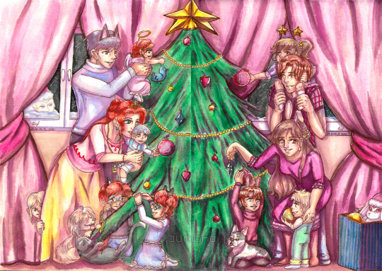
Here’s my Zecret Santa presen for @chabashiron! Those prompts were so amazing that I decided to draw not one, but two of the prompts that can be combined in one - Klim family and Tenmyouji family celebrating and decorating together!
Here, according to my headcanon, Sigma and Diana have four biological kids of their own: the twins, Delta and Phi are the oldest (5-6 years old), then Luna (about 3-4 years old), then Kyle (about a year old), and then they have adopted Left (who is about 2-3 years old) the same year Kyle was born. And for the pets, they have Gab (of course) and the cat named Schroedinger, Shreddy for short.
As for Junpei and Akane, they also have twins (because it makes so much sense for them to have twins, you know?): Rei (the boy, whose name is both a physics and Japanese pun of ‘ray’ and ‘zero’ respectively) and Nova (the girl, who is named after the astrological phenomenon, which I felt both sounded pretty and was somewhat tied to the events of the games), who are the same age as Klims’ twins, and they have also adopted Quark around the same time Klims adopted Left (they are also about the same age). And their pet is Funyarinpa, who is a French Bulldog - Funny for short.
And of course they celebrate Christmas together because in their case, Santa is real (and you can bet he loves both his niece and nephews and the Klims’ kids so much that it is a cross-family tradition now and hew wouldn’t have it any other way)!
Now to the technical part of this. It took me SO long to finish this, but I LOVE it and I kept smiling to myself the whole time I was painting it.
Materials I used: two A4 watercolor pieces of paper (linen texture - I wonder if it’s visible?), Copic Multiliner for initial linework, Pentel and White Nights watercolors for base colors, Pentel Brush pens (pink and sepia) used as ink for mixing for shading, ShinHanArt Touch Twin brush markers for refining shadows, Tombow brush pens for patterns, Rembrandt special effect watercolor and gold/silver gouache for highlights (they are barely visible in the scan, but actually look really good in person - I can try and photo/record it if anyone wants to see), went over the lines with Sakura Pima Microns, and finally added the highlights with the white Uni Posca pen and Tombow pens. Afterwards, I scanned, combined and edited them a bit (dust removal and some color correcting) in Clip Studio Paint.
The reason why I went 200% extra on this is because 2020 wasn’t a kind year to any country or person out there. Sure, some may have had just a tad easier than others, but for most, it’s a huge mess. And since this year was uneventful and a slog at best (for me, who is now almost permanently stuck at home due to health reasons) and an absolute terrible nightmare at worst, and also Zero Escape almost frightfully coinciding with all of this, I wanted to bring some joy to at least one person this year, and, in a way, to our favorite characters as well. I wanted to show some positivity, that there’s still ways to be happy and those dark times shall pass, and then good times will come.
There’s something exciting about Secret Santa, uniting people from all over the globe like this, and I’m so happy to be a part of this exchange. From the bottom of my heart, I wish my giftee, the Zecret Santa team, the entire Zero Escape fandom and anyone reading this, happiness, health, hope, faith, love, and luck! Merry Christmas and a Happy New Year! May the next year treat us kindly.
С Новым Годом и весёлого Рождества! Всего самого наилучшего!
From Russia, With Love,
Juricha.
40 notes
·
View notes
Photo

A Monster Trap
Happy Halloween! :D
I hadn't originally planned on making a piece specifically for Halloween, or at least nothing more so than my Spoopy Kitty I did back in September. But one night a few nights ago, I was feeling artistically inclined but with no solid/good ideas to run with.
After scrolling through some photos on my phone I'd taken or saved specifically for inspiration, I came across one I'd taken about a year ago, of a Halloween decoration one of my friends got from Michaels. A pretty gnarly plastic Venus Flytrap that I think very few of us would be eager to encounter if it was real and alive.
That night I was just having a really hard time trying to draw much of anything--the want to make art was there, but evidently, something integral to the process was not, or was just very very off--so I struggled through a few preliminary sketches before managing to tackle one that I felt was half-decent. Still, but the time I got that far, it was late and I was tired, so I let the sketches rest for the night.
I came back to them later, naturally. I'd had plans to draw this thing for so long and I had finally sort-of started; maybe something could be salvaged and turned into a final piece. Fortunately, upon coming back to it something had shifted back into place and I had a much easier time finishing up the sketch and decided what to do and where to take it afterward.
Recently, I acquired some 400 series watercolor paper by Strathmore, which has seemed to be a little divisive among watercolor artists I watch/follow. Some use it as their standard, go-to watercolor paper, others say it's eh, okay but not great or their first choice and others swear it off entirely because it's not 100% cotton. I don't think I've ever seen one specific paper have so many wildly differing opinions among upper-tier artists. This is largely why I wanted to get some; I wanted to see what it was like for myself. And in general, I've been trying out different walks of watercolor paper to see what the best buying option for me is.
I'm not going to do a super in-depth review like you might expect when I come home with some new pencils or markers or whatever, as I don't feel like I have enough knowledge of paper to do that, but I am here to tell you that I liked the paper just fine. In a way, I think it lands somewhere between the 100% cotton paper that I've tried (Canson L'Aquarelle Heritage) and the Canson XL that's usually "artists' first watercolor paper" because it's so accessible and cheap. It doesn't behave quite like the cotton paper--the paint dries a little more quickly and flows a bit differently--but I think it's close enough for my taste that it'll work just fine when I run out of my current cotton stash and am too frugal to spend $20+ on some more. (My current stash consists of lucky clearance finds that were like $5 each, for reference.)
That is coming from someone that isn't a professional at watercolor and hasn't grown attached to using 100% cotton paper, though. So maybe take my thoughts with a grain of salt, depending on your situation?
This was also my first time since I was a very small child in using a Micron pen (I don't know why I had one in my possession to use back then; I didn't even know what it was at the time, I just remember that distinct beige barrel and the various markings on the outside of the pen that define it as what it is). Hard to believe, right? Microns are such an artist staple! I've just had other options in my possession that work just fine for me before. But the same day I picked up the watercolor paper, I had coupons to use and decided to pick one up and finally try them out. And no complaints there; it didn't move at all once I started in with the water and paint, which is all I could really ask for. The real test is going to be seeing how it resists smudging with alcohol markers, but that's for another day.
Anyway. Point is, I chose to try out that paper for the first time here since I didn't think what I wanted to do with this piece would be a good fit for alcohol markers and I didn't feel like investing the time it would take to do it in colored pencils, either. I wanted something that was looser and quicker, which led me to watercolor.
Well, sort of. Watercolor can be quick for me depending on what I'm doing. For certain projects, it's more time and hassle than I'm willing to put up with. And it also depends on which paints I'm reaching for too.
This time I decided to revisit my Viviva watercolor sheets since I haven't used them much lately but by their very nature, they're one of the quick'n'easiest sets I have. I used them for the entirety of the plant/creature, including his pot. The colors aren't quite as they are in my reference photo, but I knew that wouldn't be the case going in. The colors might also be a little funky/shaded strangely because I didn't feel like dragging out a mixing palette, so I just used the colors straight off the sheets and any mixing was done on-the-fly. And by fly I mean paper. Which created some interesting things inside the mouth that I rather like. The hardest part was getting the red on the leaves without the colors turning to mud, but even that turned out pretty alright.
And after that, the plan was to be done. But it felt...empty. It needed more.
Once I gave it some thought, I picked out a black, gray, and a metallic (though that part doesn't show up on the scan) pale spring green color in my Faber Castell Gelatos and scribbled in a few places in the background, then uses my watercolor brush to spread the color around and blend things together a little. Then I went back and forth on that process for a bit to get it all just right.
I went with the gelatos because I wanted the flat, bright colors of my plant monster thing to still stand out, but I didn't think the soft look of adding some PanPastel in the background would suit the tone here. Additionally, this was a test of new watercolor paper, and I thought using the water-soluble gelatos for some texture might be a good way to push its limits a little more.
And yet even after that, it was still missing something.
I'm not sure where the idea came from, but eventually, it came upon me to do a faux-blood-splatter, primarily stemming from the bottom right corner. For this, I ended up using one of my Jane Davenport Mermaid Markers, since I tried an Inktense pencil and it wasn't doing much of anything, and I didn't feel like dragging out a more involved form of watercolor to do it. It took some patience and trial and error (and a paper mask so I wouldn't get any on Mr. Flytrap), but I did manage to get pretty much what I wanted out of it in the end.
And...I guess that's pretty much the end of the story of my monstrous venus flytrap (Which is where the title came from; he's one monster of a venus flytrap!)
He's not terribly complicated, but I like him. And it's something a little less conventional for a Halloween piece, which makes me happy.
My plans for today/tonight so far don't go beyond posting this and dropping by Krispy Kreme (because tonight if you go in-costume you get a free donut), but that's more than I had planned for last year, so I'll take it. Do you guys have anything fun planned for All Hallows this Eve?
____
Artwork © me, MysticSparkleWings
____
Where to find me & my artwork:
My Website | Commission Info + Prices | Ko-Fi | dA Print Shop | RedBubble | Twitter | Tumblr | Instagram
3 notes
·
View notes
Photo
Non-traditional Materials, Tools, and Supports:
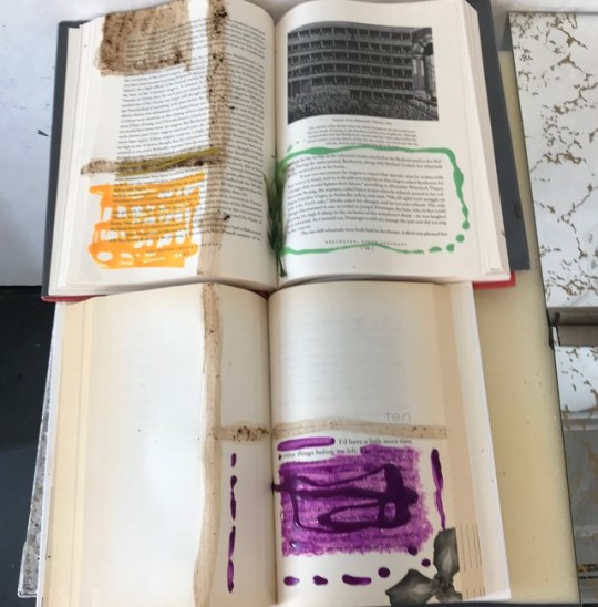
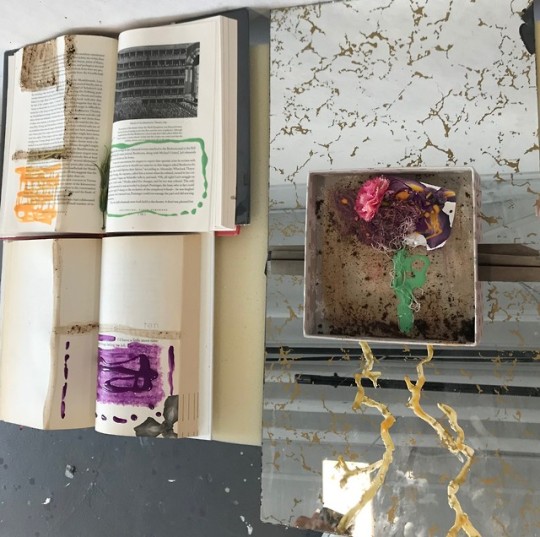
Today we learned about the different textures, symbolism, and techniques we can use to create art from non-traditional items. We each brought non-traditional items to make art together. My partner was Cindy. I brought nail polish, coffee, and tea for my non-traditional materials. For my non-traditional tools, I brought a toothbrush, a cup, and a fork. As my non-traditional supports, I brought a book and a lid to a box.
We wanted to do a tribute to Piet Mondrian by using lines and color for our first piece which is pictured in the bottom photo on the left. We used a book that she had brought and my book to use as supports. We decided to replicate his pieces by drawing the lines with coffee across the books and using the nail polish as color. We connected the two books with one solid line of coffee going straight down both of them on the left side. We also wanted to connect the two books through their content, so we found that the first book (top book) had a photo of a theater. We thought it would be perfect to connect that with the opening line of Chapter 10 of my book (bottom book) that states “I’d have a little more time to enjoy things before we left”.
For our second piece, we used the lid to a box and a double mirror as a support. We decided since the first piece had a flower at the edge of the page that we would incorporate that idea by creating a flower with string. Then we used the coffee grounds to create dirt around the flower and eye-shadow to create pigment on the flower. We used the remaining nail polish to create the stem and add more color to the flower at the top. We added a real flower and a flower from the cover of the book to add to the top as well. We both liked how the double mirror was aged and that it almost looked like roots. So we used yellow nail polish to connect them to make it look like roots and create our overall message that beauty comes from within.
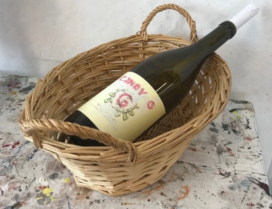
For our last piece, I had to create something from non-traditional materials that would be representative of my partner and her personality. I decided to use her wine bottle as a support and I sanded off the label to make it look aged. It was originally called “Double T” wine with a big “T” in the middle. Instead, I sanded the words off and made it Cindy G with a “G” in the middle using pink nail polish. On the back, I decided to play with the back label in that a back label to a bottle always tells what is inside of the substance. Since I made it about her, I decided to play on the words and talk about her personality. So the bottle had a “hint of mixed nationalities”, and notes of “emotional when in love”. I also played with the government warning where I wrote that the side effects were “angry when betrayed”. I also took a piece of paper and had her write a secret in it. I placed it in the bottle and with her permission the class was able to discover that it was that she “talks in her sleep”.
After this class, I definitely have a different perspective on ways to make art. It does not always have to be made with traditional things. It was challenging to find specific items that were considered non-traditional, but it was fun to see how we put it all together afterwards. It was also challenging to figure out how we were going to use the materials to create something. After we decided how we were going to use them, it was easier to incorporate other ideas and make other things.
1 note
·
View note
Text
“Horror Vacui” or the fear of the blank page [for amateur artists]
[A really long post]
If you fit this description, this post is for you:
I’m a hobby artist/writer/creator with a broad interest and I don’t have enough to time to practice any of my interests beyond the amateur level. Creating is something I commit to about 10 to 15 times a year - when I need help, I don’t want to take an online course, just give it to me quick and dirty and I’ll see to the turnover.
This post contains:
mandatory motivation delineation
step-by-step drawing guide for amateur artists by an amateur artist
all reference pictures for the above
tracing - a technique shunned by my Grade 8 art teacher and the last time I attended art class
cross-hatching and contours
a tiny bit of perspective
a bit of shading
tools
tips for shaky hands
Why this post, when the internet has countless of tips to overcoming writers’/artists’/creators’ block already?
I mean, Google churns out some 20 million search results in under 0.55 seconds! That’s like 10 search results you are might look at tops - 20 if you’re desperate enough to go to page 2 - and realize most of the tips a lot of work, not worth the trouble, things you’ve tried before, or too abstract to be applicable to the thing.
One thing most of these guides get right: getting started is the most crippling step of the creative process.
The most common advice to overcoming your block - so I have read countless times - is establishing a routine until you “instinctively” know how to achieve your goal. Are they wrong? No, definitely not. Is it good advice though? Depends; at least not for me - and if you’ve read this far, then not for you either.
What are my other options?
Planning. And being aware of all the tools at your disposal. I documented the process of this drawing as an example. This process has limited applicability to paintings.
You will need:
an idea
drawing utensils
paper (some scraps to start with)
patience
Step 1: Rough Sketching
Take scrap paper. Unless your documenting this (hi, mom) you’ll throw this away asap. Get down the rough shape. This may a while and will involve you questioning your sanity - barge through the doubt, don’t erase what you’ve made, use the best parts and try again.
Example:
I would like to draw a cat. I take a pencil and...
Lol, no. Cats are not pizza with ears.
Let’s try that again. Maybe a reference picture will help.
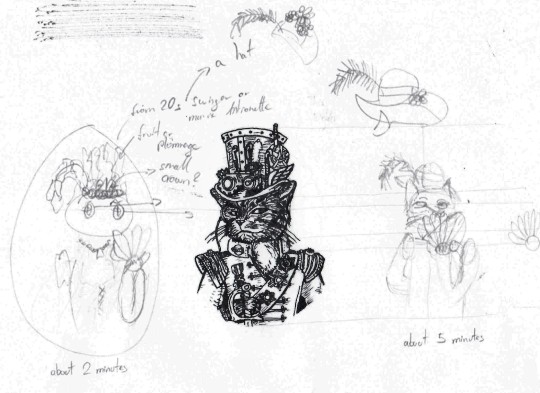
Much better. Start with some crude shapes but sketch out the entire body with shapes like they do in some drawing guides - only draw what you need. In this case about two and a half ovals are enough. Now make a better copy beside that initial sketch - I hate doing them on top of the first because that gets messy real quick. Draw some helping lines from the reference image. Don’t bother too much with proportions or posture, or going big; all these sketches are about 6 by 4 cm.
I want to draw a companion for this steampunk cat, about the same shape and posture with a head tilted one way and the torso another. She’ll need a proper headdress too - I went through three options visually and added some notes for other ideas I had in case neither of these worked out.
Step 2: Break it down
Break down the drawing into smaller bits and pieces and look up reference images if you need them.
I broke down my sketch into:
Head/Face
Torso/Clothes
Hat
Fan
The head
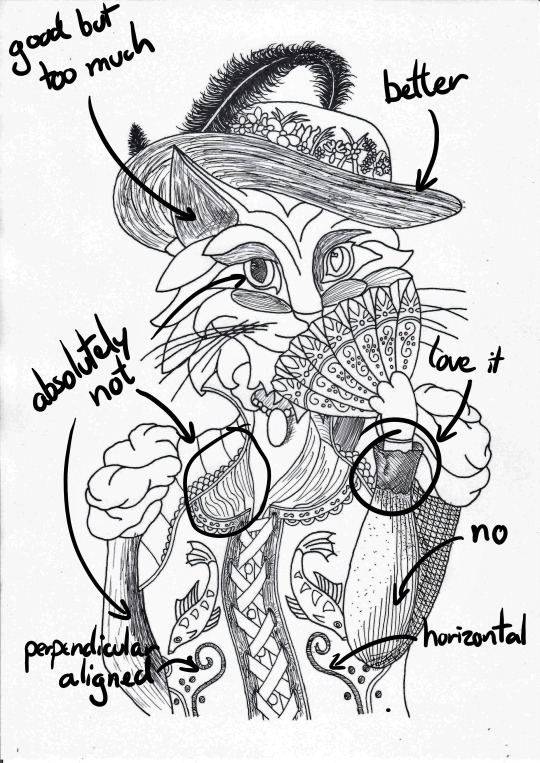
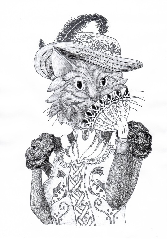
I want my cat to look slightly to the left and this is what I found online:
Not quite
Almost
Perfect
The torso
I found this image, which contained most of the parts I needed. I didn’t like the hat, head, fan, and all the mice scampering about ‘er so I just took the torso - the corset is really neat. Unfortunately, her posture is not quite what I need so that will be the biggest challenge for this body part.
The hat
I considered a few options such as this 1920s flapper’s headpiece and a couple of Victorian hats before settling on this one.
The fan
I own two so no reference image necessary.
You can keep a couple of tabs (or books, if you have some at hand) open in case you change your mind while drafting.
Step 3: Fine Sketching
This is the hardest part but if you’ve made it this far, you might as well go all the way, right? Understand how your brain operates and beat it at its own mind-game: create a sunk-cost-fallacy and drive yourself forward.
There three ways to get your fine sketch onto paper:
Cool, if you can pull it off go for it, usually takes the longest if you lack the practice (like I do)
Generally a good approach, especially when scaling up
Use a ruler to measure and plot key points of your outline
Print it and hold it against a window.
If it’s dark outside unhinge that glass cabinet door, duct tape it between two tables and put a lamp beneath.
Pull it up on your screen and adjust your zoom. Be careful with the pressure of your pen!
Use sticky tape to prevent it from slipping
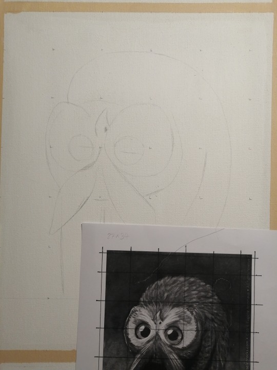
(Below) Using a reference grid (the dots) on a canvas for another project.
(Below) Tracing the head. Slight rotation of the page to achieve the desired orientation of the head.
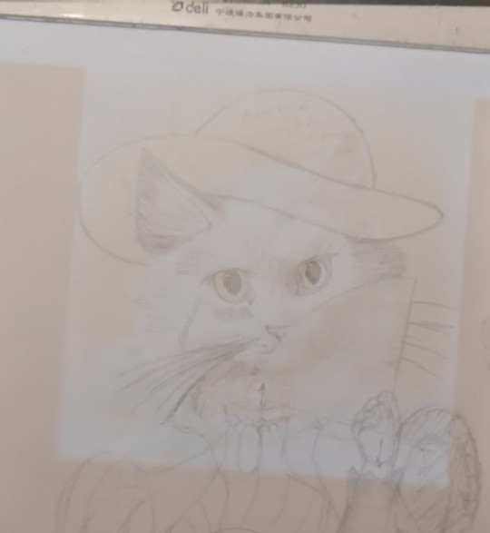
I also traced the torso and the head first. Then I added some rough shapes for the arms and the fan - this was also when I realized I can use the fan to hide parts of the face I don’t want to draw. Everything ended up a little twisted and short so I dashed lines where I want these limbs to go. The fabric of the corset also needs to be pulled up on the right and pushed down on the left, hence the arrow there. The neck is way too long too. Add some more notes of things you want to change - like adding a fuck-ton of flowers to the hat.
To judge whether the proportions make sense take a look at yourself in the mirror or ask random people in the hallway to pose for you - afterwards exchange a friendly, confused smile and move on.
(Below) First fine draft after about 5 hours of intermittent work - just take breaks when you’re bored, but leave it prominently lying in your way so you don’t forget about it. I reconstructed the arms’ outlines and added some bold comments.
Once you have everything you need, clean up your first draft as much as possible by erasing help lines and drawing strong borders. Next, open something bright on your screen (or whatever your tracing equipment happens to be), tape a blank paper to your first sketch and take down all the details you want to keep. You can move the paper around to shorten or elongate distances.
Add borders if you want to frame the drawing later.
Now change all the things you don’t like. I changed the cat lady’s hat to be less round because I didn’t want her to wear a wide-brimmed bowler and added a fuck-ton of flowers and - for good measure - a feather. If you can’t draw the feather flicking back up like me, hide it behind the brim of the hat.
Think about any fur you want interacting with the fabric (hat or collar). I added one curl to flow down the left side of her collar - didn’t really work out but A for effort.
Add any major decorative elements like the fish on her corset or the patterns on her fan.
Add major textures like the lines on the brim of her straw hat. The dotted texture on her sleeve was way too fine and didn’t carry over to the next tracing. The same goes for the shading from the last draft, which didn’t carry over well and I ended up bundling all the fur together in larger bundles.
Save the puffy shoulders for last (because I had no idea what to do there and eventually opted for “brains”).
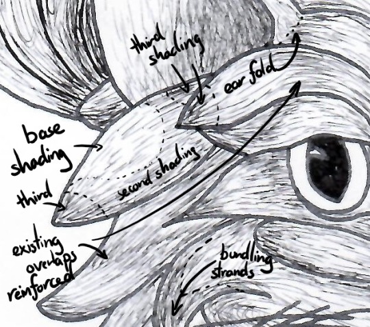
(Below) About 90 minutes on the face to compartmentalize all strands of fur into proper bundles. Note six key bushels that define her expression: on both side of her nose, her “eyebrows” and the trailing of her eyes. Look up cartoon cats for help. 2 hours on her torso and another hour on her shoulders.
Clean it up again and judge your work. If you are still unhappy with the positioning, do another tracing. Don’t forget to embolden all important features
Step 4: Inking the outline!
You’re patience is paying off! Next up is inking! Inking is fun!
Oh shit-
Don’t ink your final draft!
Step 4a: Screw up
I never get my inking right on the first try and it’s hard to hide mistakes you made with ink. I ran my draft through the photocopier once (because I didn’t want to trace it) so my mistake here wasn’t that big a deal - I lost five minutes and this paper went into the my scrap tray. Always start inking the most difficult part so you don’t regret screwing up after being almost done.
At this point I realized I couldn’t erase the pencil lines anymore and went back to tracing paper on paper on screen. Be aware of the ink you use and how thick your paper is or you might end up leaving marks on the draft below.
(Below) The pattern on her brow is off in two places.
Step 4b: Finish inking the outline
As before focus on borders and major textures; about now you’ll notice which parts of your draft are to fine to trace well and which ones need some extra weight. Drop any lines you don’t like.
By now you probably have a couple of pages with sketches and bad inkings lying around - make sure you label them or find some other method to remove them from your line of work (like throwing them in the bin).
(Below) About 45 minutes, 5 of which were spent on the feather, 5 on the flowers, 10 on the fan, 10 on the face, and 15 on the torso including arms.

At this point you could scan and stick it into a colouring book.
Step 5: Textures!
This is the best part. Texturing a drawing is so satisfying it makes up for all the hardship up to this point.
Make a couple of copies this time to practice your texturing. Afterwards, feel free to continue the page you traced or run it through the photocopier once again.
(Below) Two versions with different types of shading.
It’s very easy to get carried away when shading; always go for a little less than you think you need. You can always add more later, but you can’t take it away.
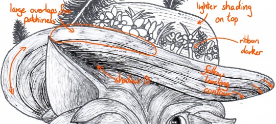
Fur
Use lines that flow parallel to the outlines you’ve already drawn. Make the strands flow apart at the beginning and back together at the end. Try to keep the numbers of strands that begin and end constant. This will result in a larger spacing and thus a lighter centre of your bushel.
I like shading an entire area, in this case the entire head uniformly but very lightly, then I start thinking about accents and where light could come from. Wherever fur bundles together (usually at the end of a bushel) I add some more of the same texture to make it darker. You can lift some of the shading from your reference pictures and just copy it. But don’t limit yourself to what your references provide.
To be honest, I only roughly take notice of where I place my imaginary source of light and just emphasize parts of a bushel that were darker to begin with. Usually turns out okay.
Fabric
Generally, keep your texturing parallel, perpendicular or at a fixed angle to the next leading edge. The lines don’t have to be - and most of the time shouldn’t be - straight. Allow them to trace out wrinkles in your fabric or reinforce the fabric’s rigidity by copying the leading edge at short intervals.
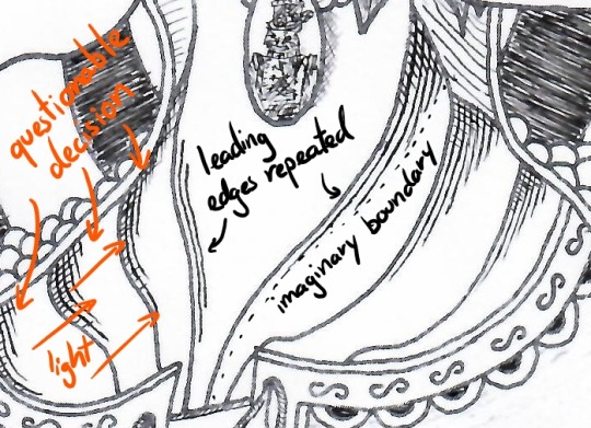
The same formula of repeat the leading edge applies to other parts of the clothing - just vary the line separation and how strictly you follow the leading edges.
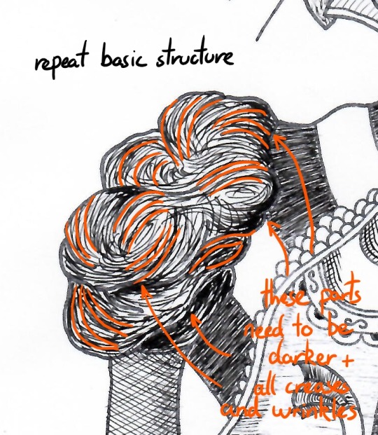
In other places lines placed at constant angles make a good texture.
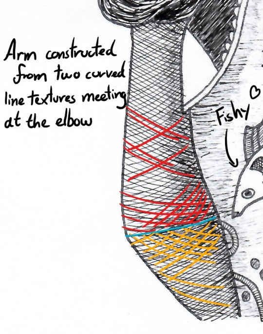
Know your tools: my pens stop drawing at an angle of about 30-45° and drawing lines at this angle will make them lighter and discontinuous. This is a good approach to lightly shading a large area like most of the corset.
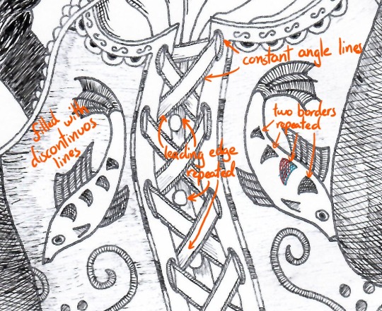
Cross-hatching gives the sleeve a wrinkle and two light-spots. Two layers at roughly 70-90° gives a good hatch, only add a third layer if you need it really dark - careful: this will make any contours established with two layers disappear.
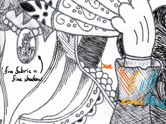
Shadows
Some places just ought to be darker though, like the spot I marked behind the ear or below the chin. This gives your drawing some depth. Just reiterate the same local texture over and over again until it’s dark enough.
Without my annoying comments, the final result will look like this:
Is it perfect? Fuck no. Is it pretty good? Aye, meets my standards.
By the way, this is what we started with:
Tips for shaky hands
Sugar, caffeine, medical condition? Hands come in all degrees of shaky but don’t let that discourage you. Here’s how I approach the most important elements in my art.
Long lines
Long lines are hard to draw, if you don’t have practice sliding your hand across the page. I can do it sometimes but not reliably. Instead I place my wrist firmly on the page and draw the part of the line that is within my mobile range. The more of my wrist rests on the page, the less I shake. Then I lift my pen and move on to the next bit - sounds trivial?
Wrong.
Whenever you start or end a line you go from rest to drawing speed or vice versa. During these moments the constant flow of ink is spread over a shorter distance, resulting in a thicker line. Appending a new segment causes a brief overlap and results in a blotch, especially when you need longer than an instant to correctly put down your pen.
Coming in at an angle prevents the ink from flowing prematurely and gives you more control of your line.
Curved lines
Place your wrist on the inside of the curve (segment) - drawing towards yourself is easier than away. Rotate the page to make it happen or rotate yourself if the page is stationary (like a large canvas). Additionally, I like to keep my fingers stiff and only rotate around my wrist.
Textures
For very fine textures I keep the tip of my pen above the page and start repeating the pattern. About two thirds of the strokes will go into thin air but the shaking will make one third hit the page - a statistical approach to texturing.
Conclusion
My longest post so far - I starting making this almost 8 hours ago. A blank page is a scary thing, so many possibilities, so many ways to screw up. The most important advice to take from this post is plan, save, trace, repeat. You don’t have to be ashamed for tracing art; just don’t parade an exact copy as your own work and always keep your references at hand.
Why does this feel like academic writing 101...
I invite anyone to contribute their own quick and dirty drawing tips for amateurs to this post. DM me, if you have any questions or would like to use this a last-minute-Christmas gift - I’ll send you a free high-res. I don’t judge, not this year nor any other.
Best,
Ocelittle
#tutorial#art tutorial#artists on tumblr#ink#ink drawing#drawing#art#amateur art#christmas gifts#horror vacui
0 notes
Text
Rotational Workshops—Exploring Ideas
To help inspire some more ideas, this time mainly focusing on process, the Graphics, Photography and Fashion/Textiles courses grouped up to run 3 45-minute rotational workshops (one for each course). This served as an opportunity to collaborate with other art and design courses, getting an insight into other unfamiliar processes and discussing the brief with other people. It also takes advantage of the 10 curiosities to use as the subjects of each workshop.
Fashion/Textiles
Firstly, an area which I consider to be one of my biggest weakness: fashion and textiles. I rarely see this as a route I can take for my project, which is why these rotational workshops will provide me with a wider range of places I can take my project. This workshop primarily looked at how to communicate an object’s texture through different mediums and was split into 3 different stages to explore a range of processes. These being:
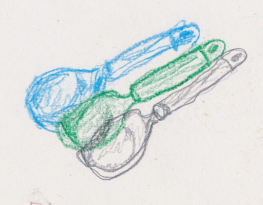
Limited-time continuous line with pencil, wax crayon and chalks using my non-dominant hand
Continuous line including as much detail as possible with my non-dominant hand
Abstract depiction of the object’s texture with my eyes shut
Stage 1
As a warm-up, I used a pencil, a wax crayon and some chalk to sketch my object (being the ice cream scoop). What held me back here was the time limit. Each sketch had a 5-minute constraint and accompanied by the limitation of only using a single line as well as only being able to use my left hand, I was instantly thrown away from the idea of drawing my object in true detail. Instead, I found my outcomes to have a more fragile look as the line work was less concise. This would also follow on to the subsequent stages where the aim was to move away from traditional ways of portraying objects accurately.
Stage 2
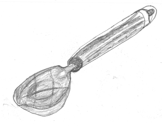
Next, I chose my favourite medium which in this case was the pencil. Using this pencil along with my non-dominant hand again, I now had 15 minutes to sketch the object. Whereas before I only had 5 minutes for each sketch, this time I had 15 minutes to include more textured detail and attention to the shape. This gave me the chance to observe things that I didn’t think about before. For example, how to portray the reflections being cast onto the scoop. The shiny parts of the object proved especially difficult to sketch in detail for this reason. However, because I had more time at this stage, I was able to think more about these little details. The outcome for this part I felt less happy with because I have less confidence accurately drawing/sketching something as opposed to expressing it with an abstract quality.
Stage 3
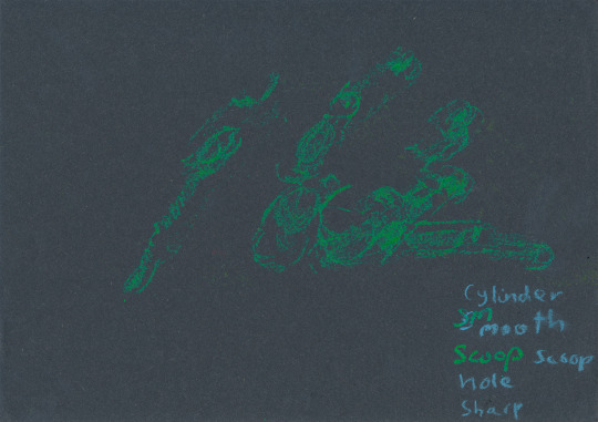
I lastly picked another medium (wax crayon) and black paper. The previous two stages were a build-up to this last stage, which consisted of closing my eyes and only using touch to portray the object. This is something I’ve never tried before, so naturally, I struggled to get into the mark-making. We were advised to not think about the shape, but rather feel the object and use only our sense of touch to respond onto the paper. The outcome of this was extremely disordered because my eyes being shut didn’t allow me to see the outcome at any time. The first thing I noticed when I opened my eyes after the 15 minutes was how hard the green crayon was to see. If anything, this showed me how important it is to observe your subject and your work constantly. However, as mentioned in stages 1 and 2, the point wasn’t for the sketches to look real, but to use it as a way to expand my understanding of what potentials I have for my project.
(The picture below has been enhanced so the marks can be seen easier)
Graphics
The graphics workshop was similar to the fashion/textiles workshop in that the aim was to move away from conventional ideas of accurate drawing. This was also split into three smaller tasks, each constricted to 15 minutes each. These were:
Accurate sketch of the subject with a pencil or biro
Large scale ink painting
Felt tip abstract drawing
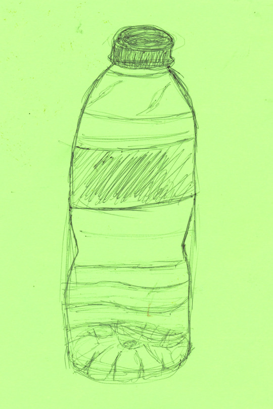
Stage 1
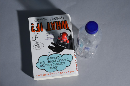
This stage was simply to sketch the subject, which this time was an old water bottle, using a biro. Out of all the processes, I found this sketching to be the easiest as I’ve had the most experience with this. The sketch would go on to be used as a comparison between the more abstract approaches I would take to show the different visual language that can be achieved by taking a different approach to art.
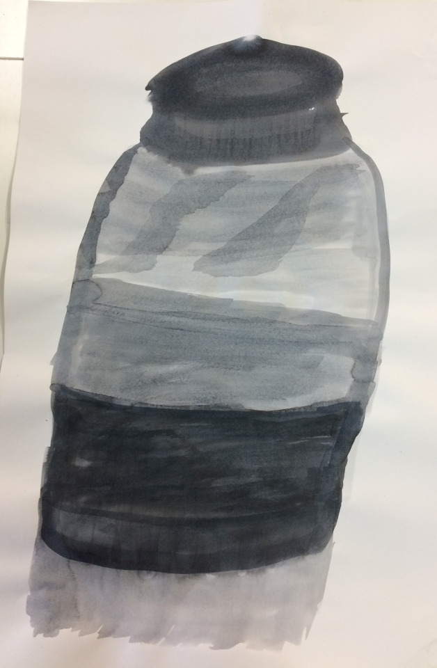
Stage 2
Stage 2 was using a mixture of ink and water to make a large version of the sketch. The main areas of visual language this demonstrated were ‘line’ and ‘scale’ in comparison to the first stage. Using ink is another area I am unfamiliar with. I found the activities I took part in this day to be, for the most part, challenging, new and unfamiliar. This worked in my favour however to expand what I can produce moving forward. I used less dilated ink for the darker parts of the object and added more water for the lighter areas of tone. To what I am used to with applying tone with more medium or simply pressing harder, using the actual material I was using to control the tone was a very different experience. I feel like the outcome reflects this as well. Although it doesn’t contain lots of detail, I still feel like it’s recognisable and communicates a completely different feeling to the other two outcomes. The watered ink created a fluidity to the piece, which with a hard medium like biro couldn’t be replicated.
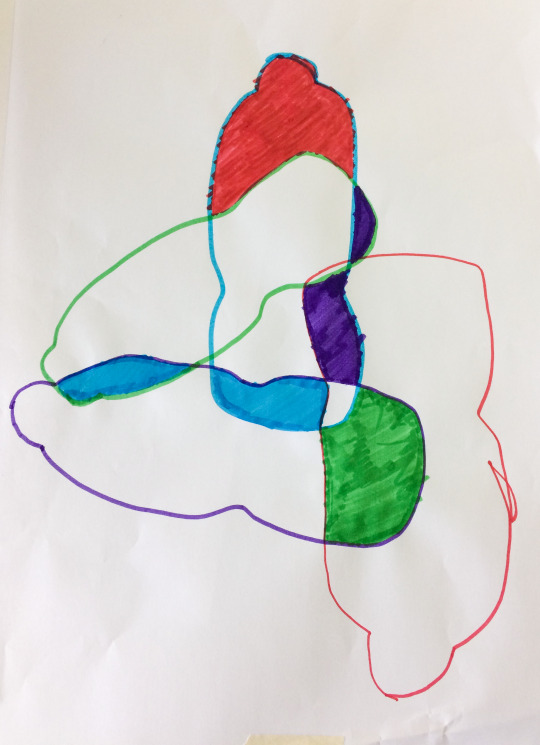
Stage 3
The last outcome was made by using a collation of multiple outlines of the object to identify new shapes in the fills. Firstly drawing the outline of the object, then repeating this 3 more times but varying the orientation, position and size. The aim of this was to remove the idea of realism in tonal value by limiting ourselves to just the outline and then flat colour being applied afterwards. Although everybody in the group had the same guidelines, I was surprised at how different all of these were. Compared to accurately sketching the objects, where everybody’s outcomes had similar visual language and looked the same, getting rid of this need to be accurate allowed each person to be expressive in their work and therefore the outcomes were individual.
Photography
Lastly, photography is something which after participating in this workshop, I am considering more as a possible approach. I haven’t previously used photography to create work, but having a rough understanding of how cameras and light works meant I wasn’t completely unfamiliar with the techniques. The aim of this workshop was to explore a different way to capture our objects and get used to different types of lighting and how this changes the atmosphere of a scene.
Due to a lack of time, I only had time to take two photographs which I was happy with. I took these at the station with the softbox light. The softbox created softer shadows, as opposed to something like the Tungsten red head light which produced a more concentrated light and sharper shadows.
Review
Overall, the diversity of processes proved effective in generating more routes I can take for my practical work. Ultimately, I am no longer limited to just using graphics techniques, but rather I can combine them with the skills I have learnt in these workshops. The reason why I see photography as a stronger potential is that I already have experience with using photographs in graphics. Although this has primarily been with secondary imagery, so getting more into photography will make it possible to use primary sources and therefore more control over the imagery.
In terms of the work I have created, Fashion/Textiles and Graphics have given me an insight into how more abstract approaches to work is just another possibility for an outcome. I found it allows for more of a personal expression rather than aiming to accurately portray a subject (which is what I consider a weakness).
Another aspect of this session I found helpful was the discussion between students from other courses. This also added to the ideas I was getting from the practical work and I saw how each process could be applied from the students. For instance, how a photography student responds to the brief would differ from how I would; by discussing these together I then had a broader outlook on the different ways I could respond.
Moving Forward
Because of how experimental these workshops were, I didn’t come away with work I was as happy with. However, I realise the point of these exercises was to get ideas through visual investigation and naturally, if I am attempting new skills I would expect my outcomes to be less reflective of my already established skills. The potentials of this workshop mainly are expanding my ideas, but specifically, I feel like photography has potential in terms of gathering primary images to work alongside my graphics work. My next step is to mind-map the ideas I have gathered from today and compare them with the ideas I initially brainstormed. Then, I need to start narrowing down my ideas into what I think will be the most impactful, engaging and most importantly, curious. This step is just as important as the initial ideas stage. With too many ideas, the first parts of the project may actually turn to be counter-productive due to me losing track of the brief, having too many ideas meaning I don’t know what to approach or simply struggling to choose an idea I think works. This is why it is vital for me to narrow down my ideas in the near future, making sure to consider the brief at all times so I don’t lose track of it.
0 notes
Text
Mount Post-Mortem
Tools Used
First things first, I use pencil and paper to sketch out all of my concepts.
For the modeling part, since I learned to use Maya at school back in 2012, I’ve decided to continue on that way for this project.
Photoshop was a pretty obvious tool choice for me for painting the texture.
During my time working on my project I discovered 3D Coat, and decided to include it in my process since it is super super efficient for uv mapping and texturing.
Finally I used Maya to render some high resolution images of the mount, and then I uploaded the project on Sketchfab.
Complementary tools used :
Huge amount of WoW references : to take inspiration from already existing mounts in the game in order to get closer to Blizzard’s style and to understand how they make textures.
Youtube/CubeBrush : a lot of tutorials about modeling animal anatomy, about painting materials.
ArtStation and Sketchfab 3D-models : to understand better construction of the wire-frame and topology.
Maya plug-in “UV Nightshade” : it could help a lot organizing your uvs in maya.
Process
Concept idea, inspirations and intentions : I have been an avid WoW player for years and am constantly inspired to create artwork based off of the game’s lore. Ever since I started studying game art I’ve always wanted to make assets for World of Warcraft but never took the time or felt ready for it.
This exercise provided me the opportunity to create an asset from concept to final presentation within an art style I have always admired.
In order to create the best concept I could, I took the time to gather images that I could use as references and draw inspiration from. I gathered images of Shadowmoon Valley (vegetation, Draenei and orcs props), about cartoonish fox illustrations and real anatomy sketch of foxes and deers.
After that I made a reference image with my main inspirations :
Then I started to sketch a bunch of ideas for the mount, trying to not choose the final design too early. The more iteration you make, the stronger your final choice will be.
After creating several varied conceptual drawings, I created a more detailed sketch of the chosen drawing, keeping in mind that I could let myself change it if I thought of a better idea afterwards.
After creating the initial sketch, I created a basic colored version to test the composition. I didn’t want to waste time getting bogged down on small details that might change later.
Modeling in 3D : I started by making a block out for the body, and then adding the props on it. I worked on all the pieces a little bit at a time to make sure the proportions matched up well. Watching Youtube tutorials also helped me when creating the body since this was the first time I have modeled something animal related.
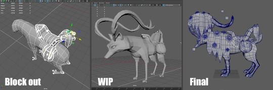
What methodology I will use next time :
Make a block out for the entire project
Check volume/sizing according to your modelsheets or your concept reference,
Add Detail once to every part of the model, but keep an eye on your polycount,
If your polycount allows it, add detail a second time on more important parts of the model.
UVs mapping : UV mapping can often be a long and drawn out process for some people. After some testing, I found that using 3D Coat’s UV unwrap tools was definitely the easiest method to use. I switched between 3D Coat and Maya’s UVs editor while painting the texture. At this time I also decided to add the halo part on the horns and the legs (last minute idea).
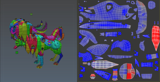
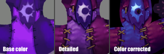
Texturing : The texturing process was a little messy for this project. I spent too much time focusing on the color and details of individual props instead of the harmony of the entire model. After a few missteps I was able to find a process that worked well and completed the texturing. Even after the model completion, I was able to gather the feedback that I had received online so that the next model I create will be even better.
What methodology I will use next time :
Make a greyscaled base,
Insert details (still in greyscale) and check the contrasts,
Add the ambient occlusion,
Add color gradient layers for every distinct materials in the texture,
Add details as beams of lights and reflection on metal material.
Rendering and exporting to Sketchfab : Considering the mount is shadeless (because the lighting and shadow information is painted in the texture), it was pretty quick to set the render up in Maya and in Sketchfab . The final model has the following textures :
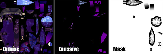
I made a kind of a turn-over thing in Maya in order to have high resolution images of it for my portfolio. Since there were no light and the texture was 2K px, they were quick to do.
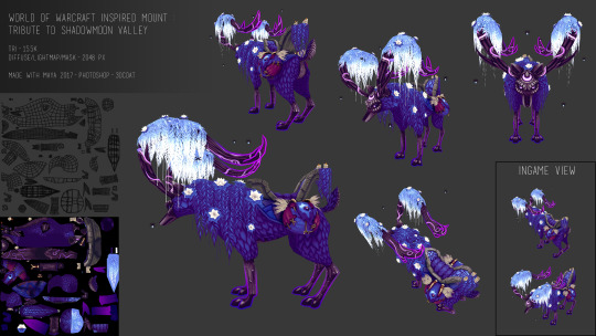
Sketchfab viewer link :
https://sketchfab.com/models/0f7d31106f4f44ecb01b04bbd750d811
What went right ?
The final result looks quite well like what I had in mind at the very beginning, even if I changed/added a lot of things along the way.
I was able to get pretty close to the style used in WoW and have high hopes that I will get even closer in future projects.
Since I didn’t give myself a deadline on this project, I can’t say I failed at timing, even if I think this project took me a LOT of time (about few month on it). But regarding the fact that I almost started from scratch (on a knowledge and technique aspect) and that I had to re-learn a lot of thing through the way, it was normal for me to take that much time.
What could have gone better ?
This project was the very first personal work/concept I’ve done after 4 years break, so I forgot a lot about technique, shortcuts and methodology like I said earlier. So in consequence there is a lot of stuff I could have done better/quicker, here are the main stuff that made the journey longer and harder to me :
Time management : at first I was splitting my time between several projects, so I worked only few hours per day on the mount, I think this distract me a little. Sometimes it is better to focus on one thing to be more efficient. I also went back and edited several assets after watching tutorials, which cost me additional time.
Methodology : That is the big black spot in that project, like I said, I forgot a lot about methodology and how to start a project. So it made me lose time on almost every step of the project.
Conclusion and Closing Remarks
This project was a big jump into questioning my skill level, knowledge (or at least what I remembered from school) and capacity to keep going despite the difficulties.
It was a huge learning/re-learning experience and even if there was mixed feelings along the way, and even if at the end there is a lot of aspects about this mount that could be perfected, it was a successful experience for me.
Why ? :
I got back into my habits in Maya. I even learned new shortcuts I didn’t know back at school. Being comfortable with your software is essential.
I learned to use new software which simplified my life so much and will on future projects.
It forced me to search for new techniques of painting and I now understand better how to make textures quicker and more efficiently.
It helped me trust my instincts and taught me that sometimes not all advice is good to follow, and to trust a little more what I’ve learned in school even if this knowledge might be considered old-fashioned now.
It allowed me to meet generous people in the art community, who gave me encouragement, feedback, tips and helped me get through it.
Thanks to all the folks that helped me, followed me, watched my streams along the journey that this project was. I hope this post will encourage some of you to keep going if you encounter difficulties achieving your goal.
The harder, the better the result will be ! Or at least you’ll learn something from it.
Images /Tutorials /Artist I used as references :
Ashleigh Warner’s work on Warlords of Draenor - https://www.artstation.com/artist/ashdoodles
Coloring with gradiant maps by Marc Brunet - https://youtu.be/wUeQsUJTz8I
Model a dog by Jeff Slominsky - https://youtu.be/j5aFJzn-ZYQ
My Pinterest board : https://fr.pinterest.com/mhagnusgame/p-vall%C3%A9e-dombrelune/
You can follow me on and see more of my work on :
Twitter : https://twitter.com/MhagnusGame
Instagram : https://www.instagram.com/mhagnus_pauline/
ArtStation : https://www.artstation.com/artist/paulinep
DeviantArt : http://thegreenchick.deviantart.com/
Sketchfab : https://sketchfab.com/PaulinePouchtajevitch#
2 notes
·
View notes
Text
My Creative Process
Hello and welcome. First I would like to apologise for the short hiatus in my blogging schedule; I have been focussing on looking after my wellbeing as well as adjusting to a new schedule and workload. I hope you are all well and making time for what you love to do.
Today’s post is going to be a little walk-through of my process of creating my artwork. I’ve split it into three categories, one for each medium I use, for the sake of ease on my part, and because my process does change slightly depending on the medium I’m using. I have a very lovely studio space in my home where I (try to) do most of my work – I’m currently on the sofa, so we all know how that’s going. When I am in my studio I like to set the creative mood; I’ll grab a cup of tea, a fruity snack, light a candle or open the window, make sure the lighting is good, put on some music or an audiobook. I love audible for listening to audiobooks, I’m currently listening to ‘The Hundred-Year-Old Man Who Climbed out Of the Window and Disappeared,’ by Jonas Jonasson – I love it, it’s brilliant.
Then I settle into creating some artwork.
Acrylic
My acrylic paintings have evolved over time in style, but usually inspiration follows from a walk in nature. I hike and walk in the Scottish countryside as much as I can and I am usually inspired to paint a canvas afterwards. In this way, I guess most of my acrylic paintings also hold a memory of mine. I grew up on the North coast of Scotland and holidayed for most of my childhood on the West coast so I have an awful lot of photographs of Scottish landscapes. Since my style of painting has evolved into an almost impressionist approach, I use these photographs as a very loose reference picture for my acrylic paintings. While I do sometimes go back to realism with my painting, I just delight in using palette knives to create these landscapes. I often get caught up in the motion of applying paint to canvas and can easily be lost in creation for hours. Because my acrylic paintings are made with palette knives instead of paintbrushes (for the most part) I will often have to force myself to stop painting to let layers dry so that I can build up more texture. I will usually work on the same painting for about a week, coming and going for a few hours at a time. I focus on tone and texture when I am working on these pieces.
Ink
For my ink drawings I start with some practice and playfulness in a sketchbook. I find it hard to create these drawings without at least a very loose feeling, often not even an idea, about what I want for the finished image. I have to have a play around with composition and subjects in pencil in my sketchbook. Eventually I will land on a composition that I like – I usually follow my intuition in regards to the composition layout, although I do pay attention to balance, symmetry and feeling in each drawing. Sometimes I will use my sketchbook to practice different techniques that I wish to implement or to test the thickness and quality of my ink pens. I stitch together different elements from different reference photographs to create my ink drawings. Then I move onto the final drawing; I begin by lightly sketching in some guidelines on 200gsm white artist’s paper – these guidelines usually involve finding the middle of my paper and adding a slight border to ensure the drawing is centred. I use a pencil to sketch in my drawing following the composition I have previously decided in my sketchbook, before finally beginning the inking process. I use a number of different weights of ink pens to create balance and detail in each drawing. While this seems like an awful lot of work, ink drawings will often only take from half an hour to a few hours to complete.
Watercolour
My process for creating watercolour pieces is similar to my ink drawings. I typically start with inspiration or a feeling for what I want to create. I do have a few ideas jotted down for when my mind is blank but most of the time I come to the desk already with inspiration. I am very much still learning with watercolour paints and am definitely not as confident as I am with the other mediums I use. I usually paint specific subjects rather than scenes when it comes to watercolour as I find that it lends itself better to stand alone subjects. The subjects I regularly paint with watercolours are plants and animals. As I said earlier, my self-confidence with watercolour paints isn’t high and so I do sometimes restart the same painting a few times before it is finished satisfactorily. As with my other mediums, I use reference images regularly in order to get the tone and lighting right with each painting. I prefer to do a practice run of my watercolour paintings before I do the ‘real thing’ but what regularly ends up happening is that my ‘practice’ paintings turn out better than my ‘proper’ paintings so I tend to use the practice pieces. I think I put less pressure on myself to create the perfect painting when I think of it as “just a practice” and so my brushstrokes and focus is more naturally flowing than on the ‘proper’ paintings. I use 300gsm watercolour paper and a watercolour palette pan set of paints for the majority although I also utilise paint tubes occasionally to expand my colour range. My approach to painting with watercolours is to build the intensity and dimension of the colour through layers – I’ve never counted how many exactly, I’d say a few (it has taken a lot of trial and error to learn the patience required for this medium). I give myself a few days to finish a watercolour painting because I have to make sure it is completely dry between layers.
And there you have it! I hope you have enjoyed reading about my process of creating my artworks. I am always open to feedback.
I love you all and I hope you have a wonderful day!
*This post contains Amazon affiliate links. This means that if you shop via these links I make a small conmmission at no extra cost to you.*
#creative#create#creativity#process#paint#painting#art#artist#artwork#ink#watercolour#acrylic#drawing
0 notes
Text
Final evaluation
What are the thoughts behind your current work?
Since the start of the project the meaning behind my work has changed slightly. At the beginning I wanted to deliver successful and professional prints to communicate the skills I have and show that mark making and simple sketches can grow into surface pattern prints, which can be used as interior design. I wanted to do this because interior design has always been as interest of mine. Also I wanted to deliver fresh thinking prints to interest not only me but a bigger audience. Although I have stuck to my word I have also added creating a pom pom outcome to go along with the theme tropical. I have taken colours from a tropical theme and used this to communicate my theme further using a variety of materials and processes. I have taken pom poms into wearable art where I have created a pair of earrings. In conclusion the thoughts behind my work include expressing my theme of the tropics, by manipulating patterns, colour, lines and shapes.
Why is this relevant and important to you?
This is important to me because I am trying to not state the obvious and allow my audience to view my work with there own state of mind. I want to see if I can successfully communicate a theme and allow others to feel what I am feeling and understand why I have done something the way I have. This is relevant to me because any feedback from my audience can allow me to progress in life.
What are you curious about?
I am curious about my audiences reaction towards my work. To see whether they like it, if so why? Or if I have managed to engage my audience, if so what have I done successfully to consider doing again in the future. I am also curious about negative feedback and finding out what people would do differently to improve my work.
What do you really want to investigate?
I have created my outcomes the way they are because I wanted to investigate into a theme and find myself creating unique surface pattern prints to link to that theme. I wanted to really create professional prints to show that I'm good enough to go into university and to prepare my self for live briefs where I cant afford to create mistakes. I wanted to prove to my self that I can refine my ideas and that all my targets from my ILP tutorials are no longer concerns for me in the future.
What are the visual qualities within your work?
The main visual qualities within my work includes manipulating colour and patterns. The colour theme within my work is taken from a tropical coral reef habitat. These are bright, bold and electric colours. I have taken the colours - black, white, light and dark blue, pink and orange to focus on while creating successful screen prints, a pair of earrings, a make up bag and bandanas. I have drawn simple sketches of tropical plants and flowers to develop into repeat patterns on to photoshop. This idea also moved into screen printing. I have managed to create lively, layered and subtle designs from these drawings.
What are you most pleased with visually and conceptually about your project?
I am really pleased with the final outcomes that I have produced. I have successfully managed to create subtle but lively tropical prints which have been transformed into many items, such as make up bags, bandanas, earrings etc. I am also please with the fact that I’ve managed to sit through over 6 hours of creating hundreds of Pom poms and attaching them to create a tropical themed rug. I like the cotton yarn that has been used because it has resulted to a very soft and comfortable outcome. This links back to my primary research at the start. I am then proud of the development of this where I have created a pair of tropical earrings. I am pleased with the resin design because it reminds me of the ocean where the swirling reminds me of waves. I adore the layering in these resin pieces because it looks realistic to what a wave actually looks like. I more so like the colours used because they are warming and are clearly taken from my colour pallet.
How you have problem solved along the way?
I have faced a variety of problems during this project, mostly minor projects. For example, while using thin fabrics such as silk and crystal organza, when I was screen printing, dry paint from underneath kept printing back onto the material. This was a problem because it kept ruining my designs. Therefore to solve this I had to place paper/ newspaper down first. One main problem I came across was not getting the enough detail on my screen printed designs. I wanted to add texture and tone to my stencils to make it more realistic, however I couldn't achieve this effect unless I used tonnes of stencils and different colours. To solve this problem I had to mix some of the paint on the screen. This idea resulted to mixing some colours together to add light and dark tones. I also found that using different binders helped to add textures and tone to my designs. Unfortunately I haven’t been involved with major problems because I feel like I’ve learnt a lot being at college, that I already know how to solve a lot of problems or I now know what I am doing in workshops and when it comes to creating pieces. Therefore I didn’t find myself in a lot of difficult situations. Perhaps this means that I wasn’t taking creative risks enough.
What would you do differently if you had the time over again? - how would you develop your work further?
After creating my first make up bag and seeing how successful the results were, I wanted to begin to create more prints and develop these into make up bags. However overall the work that I created was suppose to link to a wearable art outcome. Although this is something that I wanted to do, I also wanted to create a lot more make up bags and perhaps sell them to the public afterwards. If I had the time I would of focused on making more of these because they were quick to make and my peers also approved of these. I would of began to look further into the colour themes, especially the interior design to match the exterior design. If I could restart my project I would also like to look into other screen printing binders such as puff, gloss, pearl etc. This is because it would allow me to be a lot more experimental and broad with my work. I may also find a unique style with these binders to use through out my work.
Do you want to continue in a different direction or expand and explore additional subject matter? visual elements? Media?
If I had more time in this project I would find my self creating a lot more surface pattern prints to then transform into make up bags. I found that creating make up bags were really easy and looked great. I had many compliments from these and found that these were my strongest pieces in my work. Therefore from creating wearable art outcomes I would like to create accessories as the technical side of my work. I wouldn't change my theme or the use of visual elements because they suited my style. This is why I enjoyed creating my outcomes. If I stuck to a theme where the colour pallets used earthy colours then I wouldn't enjoy the project as much.
What materials have you chosen to use and why?
One of the main materials used in my project is resin. I have used this to create a part of a design for my earrings because resin is light weight, therefore it wouldn't pull the ear down. It is also smooth, making it comfortable to wear. As well as this, it allowed me to communicate my theme well by it being transparent. Next I have used cotton in a lot of my work because cotton is strong, absorbent, dries quickly, prints and dyes well. Making this perfect for my screenprints. When it came to screen printing I mainly stuck to the standard binder, opaque binder or foils binder. This is because I wanted to achieve a layered translucent effect in my prints, therefore using the standard binder allowed me to achieve this look. I also wanted to work onto a black/ dark background therefore I needed to use a strong blocked pigment to allow the paint to sit on these dark materials. I used the opaque binder for this because as it says in the name the pigment allows the paint to be opaque. Finally to add a bit of luxury and shine to my work I used the foils binder to add that bit of glimmer to my designs. Other materials I have looked into for my final outcomes is a light silk for my bandanas. I have used this because it is light smooth and comfortable to wear, especially for around the head.
Can you demonstrate how research has relevant to your work, ideas and progress?
Going to the Natural History Museum has influenced my work when I was looking at tropical animals, birds to be specific. Looking at these allowed me to make my mind up about what theme I wanted to relate my work on in my final major project. I was inspired by the fluorescent, bold and warming colours that these birds gave. This lively feel inspired me to continue to use these electric colours to prints onto fabrics. Despite this, one artist named Camilla Frances also influenced my work. I liked how Camilla uses tropical as the theme of her prints and used layered to add depth to her work. I wanted to create the same effect so I began creating screen prints which involved a lot of layering.
What creative risks have you taken over the project?
Spending over 6 hours tying and cutting pom poms has been a real challenge for me that I haven't given up on. I would say that creating a pom pom rug has really been a step out of my comfort zone because it took a lot of time and effort to create over 100 pom poms in order to fully cover an anti slip matt. I am moreover proud of communicating my theme, the tropics, through a pair of earrings where I have used colour and patterns to give off a summery vibe. I am proud because by looking at these you can see my theme shining through and I'm happy that this developed on from my pom pom rug.
What grade would you give yourself?
Since the first year the standard of my work has improved massively. I have considered what materials I am using and why. I have also used appropriate and effective use of language to talk about an artists which has influenced my work. Moreover I have learnt to refine my work by selecting my strongest samples and developing those further. Due to this I would give myself a very high Merit or a distinction.
How is your project of interest to other people? how does it engage the audience, inform or help people?
I have tried to engage my audience through warm, electric and bright colours such as pink, blue, orange, white and black which can be known to be positive and happy colours. My work is mainly aimed at females because the detail of the pattern and colours used gives off a feminine affect. The items itself that I have created all show interest of female young adults, due to them being either a make up bag or a pair of earrings. I believe that the liveliness of my prints attract my audience because of the colour pallets.
How are you demonstrating thorough and in depth reflection and evaluation within your work?
I have spent time at the end of each day to evaluate this project through constant analysis of research and physical practices on my blog and in my sketchbook. I have also be visualizing ideas in initial sketches in my sketchbook and adapting my practice through sampling. After each stage of my sampling or each stage of my thought processes, I have documented this in writing in my sketchbook.
0 notes
Text
Weekly Evaluations
Week 1 - For the first week, I wanted to lay down a solid base of an idea to set my project on, which I would tweak and add further details to as my design process continues. I started with my project proposal, where I pinpointed my overall topic and started to plan which topics I would explore. Whilst researching the topic of Lisa Frank, I did find that there was little to no information on the company’s website as its sole purpose is for selling apparel, rather than being biographical and displaying the company’s portfolio; to combat this, I turned to social media and found that, along with several second party sources, I was able to string together a reasonable history of the company. In order to gain a real life take on the topic, I wanted to include an area of research about a news headline from recent times, and I felt that the Orlando Nightclub shooting was a perfect fit. The majority of my planned research would be showing the treatment of the LGBTQ+ community in a positive light, and I felt as though this topic meant I could show that not everything is clear and happy despite how creative media usually show the community. Next week I plan to discuss more topics which will further help to pinpoint the specific style and what imagery I will include in my final designs.
Week 2 - After this week, I have distinguished that I will be showcasing a positive (yet also realistic) story in my final designs, alike those seen in my ‘Sick Of Losing Soulmates’ research. Due to the research I conducted into the ‘Blue Neighbourhood Trilogy’, I found that I didn’t want to show a negative story as I initially planned to appeal to a younger audience (although I will explore this further next week) and I wanted to be sensitive towards them. In addition to this, in my project proposal I listed that I would conduct research on transgender model Andrej Pejic, however I decided that due to this being focussed on gender identity rather than sexuality, this wouldn’t be particularly relevant to my topic (as well as there being little to no information to be found on them). Next week I will start the design portion of the unit.
Week 3 - Within this week, I fully changed the initial idea I had for colour schemes, although I had growing ideas of what imagery I would portray in my final designs. Instead of going for a bright, neon style like I initially planned, I ended up taking more influence from my research and ended up selecting a cool toned, three shades theme. Within this, I learned that sometimes your initial idea isn’t always the best idea to stick to, and that experimentation is key as something else may be best suited. My audience analysis largely helped in the sense of how I would show my topic and what that would entail. I pinpointed that I would be creating for a predominantly younger audience, so therefore I would have to ensure my imagery is sensitive and not explicit. Reflecting this in my initial designs, I now have a few solidified sketches and story ideas that I will develop next week.
Week 4 - This week my designs really started to take shape. Developing my initial ideas from last week, I made sure to constantly refer back to my research in order to solidify the link and ensure my project is cohesive overall. As previously mentioned, I planned to include a three toned colour scheme, although in addition to this, I also managed to incorporate colour connotations into the story as well, which really helped to strengthen the story as a whole. In regards to the written poem portion of my project, I tried a new journaling technique in order to be as organic and free as possible, and as seen on my blog post, I did experiment with several different verses before I settled on my final poem. The aim for next week is to start creating my final designs.
Week 5 - This week I started to draw out the rough sketches for my final designs. I managed to source reference imagery that was accurate and fit for purpose, and I did in fact end up combining several different images in one design to try and make as realistic of an image as possible. I did have some trouble with creating a clear sketch layer which I could use to create the final design, as my sketches were rather messy and unorganised due to a few of the image refs not lining up completely. I solved this by decreasing the opacity of said layer and spending a little extra time to ensure I had a solid outline I could trace. As this set me back slightly, I will start the final outlines next week.
Week 6 - One main problem arose this week; in my sketches from last week, I originally planned to include two separate images of my characters smiling with open mouthed smiles. When I first started making the final outlines, I had great difficulty making one of these look realistic due to the angle of the reference photo I used. Instead of searching for another and wasting time I didn’t have, I simply changed the image to be of the character smiling closed-mouthed as this is something I have experience with drawing and know how to do. Despite this issue, everything else turned out fine and I am ready to start colouring next week.
Week 7 - These next couple of weeks are being dedicated to colour my final designs. Experimentation was something I wanted to focus on in this unit, so I set about trying a new colouring technique; this meant that for every new section (e.g. face, lips, eyes) I created a new layer and combined them afterwards. As compared to how I’ve done this in the past, this new technique meant that I no longer had to worry about different section’s colours blending into each other, or using smaller brushes and not completely getting the final effect I want. Another technique I tried was the way I coloured the hair of my characters; as hair has the most texture of all of the image, I wanted to portray this, and the thick unblended lines in different tones really add dimension and tone.
Week 8 - Again, I continued with colouring this week. The main issue I faced was working out which tones in particular to use on each section of my image without them clashing, as the previous one I planned to use in my developed sketches didn’t end up looking completely fitting in their placements. This was a quick fix as all I could do was create different swatches and keep switching them around until I felt they looked okay. After looking at my previous work, I knew I wanted to include more detail in with the colour side of my design, rather than just in the outlines. I incorporated this by adding cross hatch shading in the corners of rooms and adding texture to skies and materials. As according to my plan, I finished the entirety of my designs and next week will be dedicated to adding final touches to the rest of my project as well as final written elements.
Week 9 - My final week was dedicated to making sure I was happy with everything on my blog and that I included everything I initially intended to. As I mentioned briefly on a blog post, I did have a small error in regards to my final presentation of my designs; as I had previously purchased three 12x12” frames to mount my designs in, I knew that when printing, this is the size my digital images had to be. The biggest paper size I could print on was A3, and unfortunately, this canvas size does not fit on this paper size, and so I had to crop some of the layers so they would fit. This was a quick fix as I knew my designs would be layered, so the layers in the foreground would hide any of the cropped sections visible. Luckily, I faced no other problems with the rest of my project.
0 notes
Photo
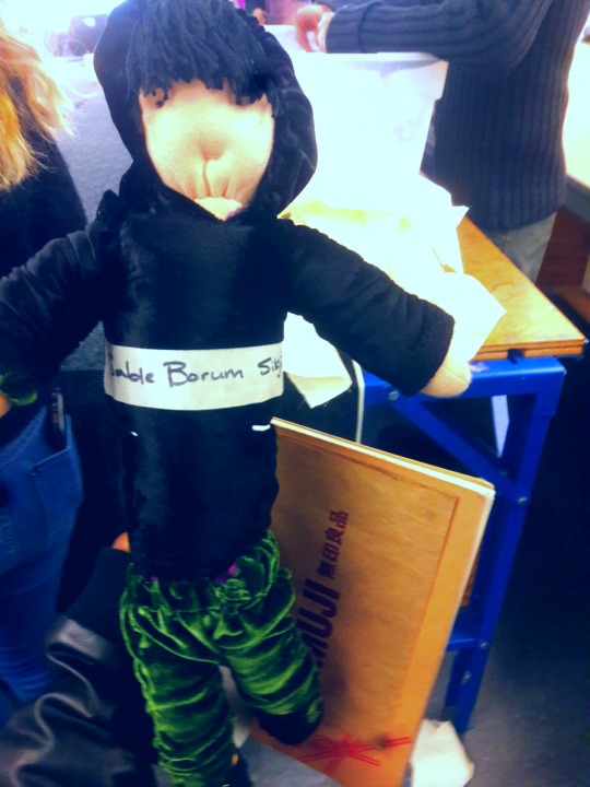
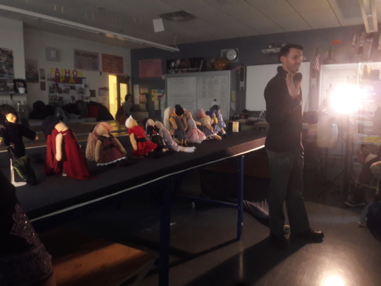
💣1/9/2016 Doll Finished and Fashion Show 💣 I Finally finished my doll. I hadn't taken pictures of creating the outfit itself and sewing the hair and face but I will tell you my procedures of doing it. Firstly, Congratulations to my whole class for actually finishing their dolls for the fashion show. It was very cool and amazing seeing everyone's piece. 😂❤ Our dolls actually looked like real people. Which was the point since they are our babies. We had to put them on a stand and slide them forth and back down the runway. Plus we had to say our designer statement afterwards. My brand name for my tween clothes being "P16 Dynasty". Making the clothes I had to figure out a bunch of things myself for example the hoodie. I never would have thought I could make a Hood in my entire life but with just a few pictures of how to draw it out and cutting it. I had made it. I didn't look at videos because they didn't have much of any. 🍥Garment(texture and fabric):🍥 The top is made out of Poly Silk Black, and the pants were made of Green Silk velvet. My shoes were made out of fur textured paper. I actually made two tops. The hoodie is over the shirt (other top). But the shirt, long sleeve, is made of silk velvet with a blue plaid collar and buttons on the side to hold the shirt together. The pants were suppose to represent sweats, puckered at the ankles and waist. The Hood was puckered to represent it being tight (to represent how cold it was). My shoes had green shoe laces to represent luxury and collding with the colors of the garment. I had fun overall with this garment. It was a great fun task and I learned how to made a shirt with a collar, sweats, and a hoodie. (I got my fabrics from "ELEGANT FABRICS". 🍁the sewing techniques:🍁 basting stitch, gathering stitch, running stitch and the ladder stitch. 🎋Measurements:🎋 I added a 1/4 seam allowance to each of the pieces of garment. The collar I cut 1 1/8 length and width then going downwards 1 11/16. The shirts and hoodie was 7 1/4 length and 4 1/4 width. The sleeves were 4 inches length and 1 1/2 inches width. The neck was 1/4 inches. The pants were 4 inches length and 2 inches width for ankle and 4 inch width for waist. The hips were 3 7/16 inches wide. The Hood was 6 inches length and 5 inches width. 🌟🌟🌟🌟Message:🌟🌟🌟🌟 Thank you for this great opportunity. I learned how to sew by hand in 3-4 months and made a garment in less then 2 weeks for a doll with just hand sewing. I didn't know how to sew by hand but with osborne's help and my fellow peers I got through everything. I had so much fun hand sewing with everyone and discussing our ideas in the classroom. But that's just the start of things. Now we're going to be sewing on machines and making garments for people for the ART & DESIGN FASHION SHOW!!!!!!!!!!! 😊 This will be a whole lot fun and hopefully we'll all produce garments that stands out even more then the juniors and seniors! Don't give up and let's get through this.!🙏👌
0 notes
Text
10 More Photography Tips to Help Take Your Images to the Next Level
A while back I wrote an article that was quite popular: 10 photography tips to take your photography up a level. In this article, I bring you 10 extra tips from all aspects of photography. Enjoy!
#1 – What’s more than meets the eye?
Let me ask you something, what would you do? You meet someone attractive, you are head over heels, and then you start actually talking to them. You then uncover the most superficial person you have ever met. That person is all looks and not much else. You would lose interest, right? Because looks by themselves are good enough to make you interested, but if there is nothing sustaining that interest, you’re gone. This is the same thing in Photography,
This is the same thing in photography. A beautiful composition is nice, but what is in your image that is designed to keep the viewer’s attention? What is it about your image that is more than meets the eye? Is it saying something deeper? Is it making a point? Showing a concept? Add meaning to your images to keep the viewer engaged.
#2 – Know your opportunity
I believe there are only four times when you control the image. The first is at the moment of exposure (when you shoot), the second is in post-processing, the third is in sequencing and editing, and the fourth is while printing. So, when shooting, have these things in mind in order to shoot with clarity.
Example, you shoot an image and it is overexposed (because of the camera’s limitation). But it doesn’t end there as you know that you have another opportunity in the post-processing phase to recover details. Or you shoot something with a nice texture but it doesn’t have the effect you want. It doesn’t end there, you know that you can print and blow it up real big to have the effect you seek. Or you shoot an image that can’t stand by itself. Once again it doesn’t end there, you know you have another similar image that can make a diptych.
The point is that making an image is only the first step. There’s a whole process that comes afterward when you can get the effect you desire. So it’s important to know that what you have in the camera is the starting point and not the end.
#3 – Pay attention to this detail (after your background)
In the first 10 tips article, I suggested that you pay attention to the background first. Now I would like to add another thing to pay attention to before your subject – the corners. You see there is a strong dynamic with the corners, they draw you into the frame, towards the dead center and if you can align some lines there, it’s like surfing a big wave, it just draws your eye even more!
In the image above we have the guy’s hands, the shape of the tree and the shadow on the bottom right corner just pulling you into the image. So, pay attention to your background, watch your corners, and then look at your subject.
#4 – Dennis Rodman-ize it
Let’s face it, it’s hard to get attention in this ever increasing attention deficit world. Dennis Rodman had been in the NBA for years, but he was receiving few endorsement contracts. He was a good player but didn’t shine enough. Then came the Rodman with the crazy hair and style, even as a kid I knew his name because he simply looked different.
That brings us to photography, you are probably doing something a certain way, so can you Dennis Rodman-ize it? Shoot in a different way that makes your work pop above and beyond what you normally do? For example, landscapes are usually shot with a wide angle, what if you shot landscape abstracts with a telephoto? Or used a special processing technique on your images that gave them a certain look?
#5 – Work on your name
You probably know the wine experiment, where they gave people wine to drink, one was expensive and the other was cheap. Everyone, of course, preferred the expensive wine over the cheap one, even if it was the same wine. Here’s the REAL KICKER, when they scanned the brains of the people who drank the wine, their brain actually made them believe they were drinking expensive wine, and it literally tasted better. Their perception altered their reality.
With that in mind, work on your images but also on your name or brand. Try to get as much recognition as you can, it will alter people’s perception of your work. I remember a photographer who had decent work, and then that person got famous literally overnight. Let me tell you, even I, knowing all that I know about psychology, now see his work in a better light.
It’s crazy, and probably a bit sad, but that’s just the way it is. The story of Joshua Bell also illustrates this point well. This guy makes $1000 per minute playing on a million dollar violin, yet he got a meager $32 and a few cents when they had him play anonymously in a metro. Same guy, same skill – different context, different result.
#6 – Get luckier
Let’s not mince words here, luck plays a big role in photography. That Cartier-Bresson shot of the man jumping? That was 100% luck because he couldn’t even see what he was shooting through a hole.
Why is luck such a big deal? Because you DO have to be there at the right moment, and so does your subject, the light, etc. Truth be told, you need the skill and the eye to seize the moment, but if you are not there, the shot won’t be yours.
So taking into account the luck factor, shoot more often. You’ll get luckier and luckier every time you do. By making more photo opportunities, you’ll be making more images. So if you used to go out once, go out twice, etc.
I mean, who do you think will have a better chance at getting a job? The one that applies for one job, or the one that applies for 10? Skill and creativity are multiplying forces, but it doesn’t matter how skillful you are if you are a couch potato. Sharpen your skills and get out there to get lucky.
#7 – Scramble everything
There was this cool experiment where they gave this guy upside down glasses, so everything was inverted. They wanted to pour him a drink, and he turned the cup upside down (because he believed it was upside down). Imagine the world upside down and how hard it would be to live like that. The kicker? After 10 days he adapted to the upside down vision, and could even ride a bike!
Sometimes we just get used to how we shoot, we get complacent, that’s normal. So scramble things up. If you normally shoot color, try b/w, if you like portraits try street photography, if you are a film shooter, try digital, etc. It’s like the “Dennis Rodman-ize” tip, but this is more designed to shake you out of complacency rather than to bring attention to your work.
#8 – Revisit your images
Two photographers can look at the same scene, and yet see two different things. The difference is their knowledge about photography. You probably have some hidden gems in your images that you’ll probably never uncover if you do not revisit your images. You made them, but when you revisit them you do so with new eyes, and you will see them differently.
You will be amazed at what you find. Images that you believed were boring and/or ruined will be seen in a new light. You may ask yourself, “How did I miss that?!? There are quite a few images that I have overlooked, that’s why I have a no-delete policy. Maybe I can’t see what my future self will see or what my future self will be into.
#9 – Let go of preconceptions
I receive emails daily from photographers around the world. The one thing many seem to struggle with is that they don’t live in a big city. It is understandable, but just because you can’t find the images you have in your mind doesn’t mean they are not there. You just need to let go of your preconceived ideas and be more open to what is in front of you.
Some people tell me they wish they had more money to travel. Evidently, the image in their mind is of travel, but an image doesn’t need to be travel photography to be good, does it? It’s good to have a general idea of what you want, but also to be open to the possibilities.
Some people get hung up on relationship breakups, passing by great, if not better opportunities in front of them. Likewise, seeing what is possible right in front of us allows us to maximize our opportunities as photographers.
#10 – Remember it’s all plastic
It’s a hard concept to grasp, especially as a beginner, but remember that photography is plastic. Exposure? Plastic. Colors? Plastic. White Balance? Plastic. Sharpness. Who said every image needed to be averagely exposed, with white balance set perfectly by grey card, and super sharp? The first thing I do as a photographer in Lightroom is to clip my blacks. I LOVE clipping my blacks. I never set my white balance with a grey card, I just look at the image and hear what it creatively calls for, then do that.
Photo of a bride and groom? Probably needs to be on the warmer side so that the viewer can get some emotional cues from that. Shot these plastic surgeons? I’ll put my white balance on the cool side to reinforce the surgical cleanliness. Whatever you are doing right now, remember all of it is plastic. Who said images needed to be in a square or rectangle? Who said portraits have to contain faces? Who said colors had to be realistic (see above)? Who said paper and canvas was the only printing options…..you get the gist!
Conclusion
There you have it, 10 more photography tips to help you in your photography journey. I hope you resonate with some of them. Be yourself, stay focused and keep on shooting.
googletag.cmd.push(function() {
tablet_slots.push( googletag.defineSlot( “/1005424/_dPSv4_tab-all-article-bottom_(300×250)”, [300, 250], “pb-ad-78623” ).addService( googletag.pubads() ) ); } );
googletag.cmd.push(function() {
mobile_slots.push( googletag.defineSlot( “/1005424/_dPSv4_mob-all-article-bottom_(300×250)”, [300, 250], “pb-ad-78158” ).addService( googletag.pubads() ) ); } );
The post 10 More Photography Tips to Help Take Your Images to the Next Level by Olivier Duong appeared first on Digital Photography School.
from Digital Photography School http://digital-photography-school.com/10-more-photography-tips-take-your-work-level/
0 notes
Last Seen Blogs

squeezyyeezy
Untitled

jointtwo
jointtwo.Tv

kitaguni-higuma
エロイズム(笑)

trucker1024
Untitled
vampirefilmlover
Thou Shall Not Die