#Hamilton Wood Type & Printing Museum
Text
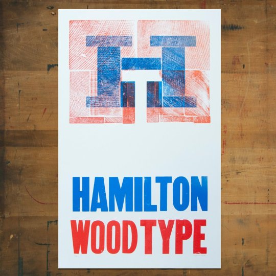
Typography Tuesday
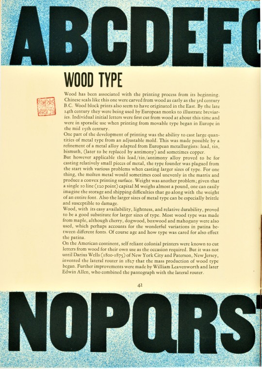
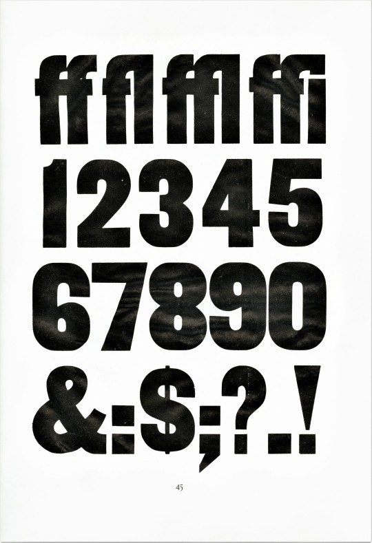
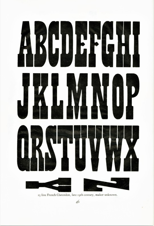
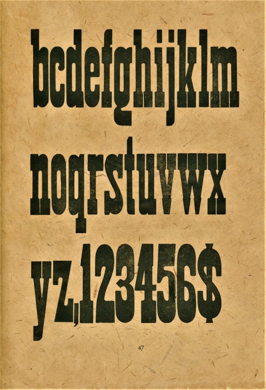
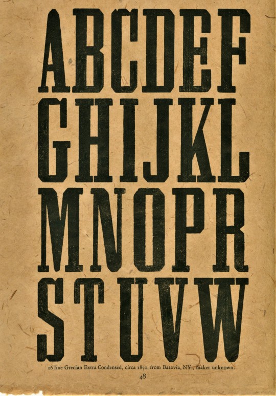
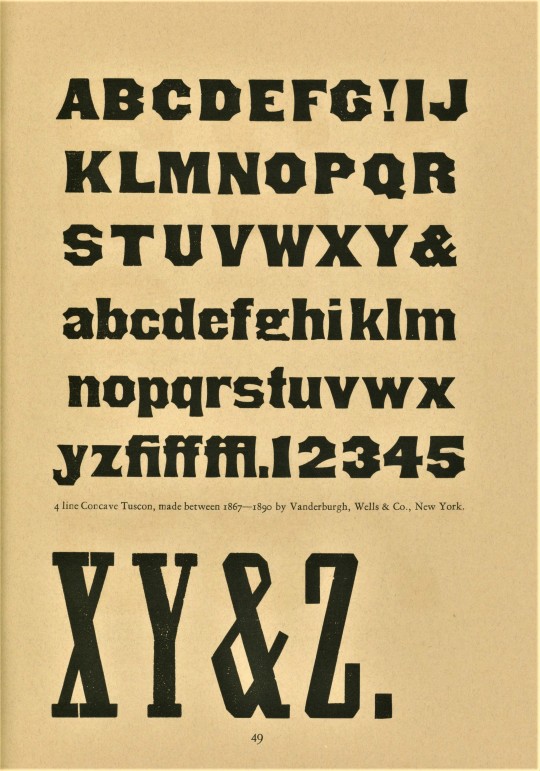
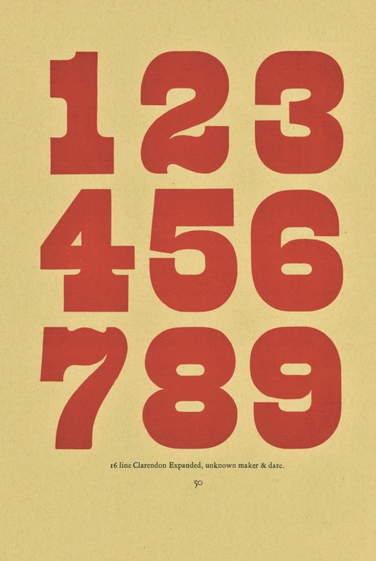
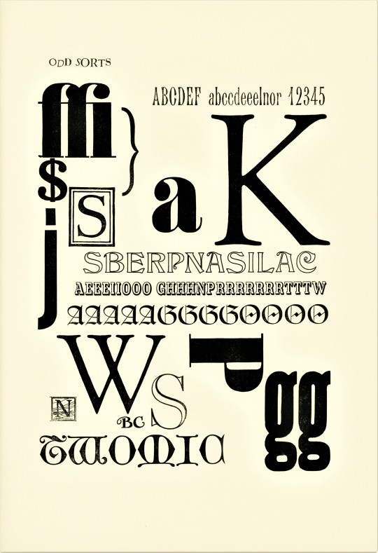
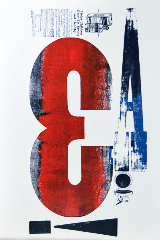
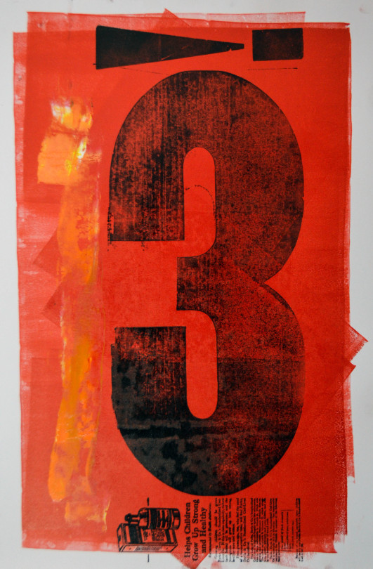
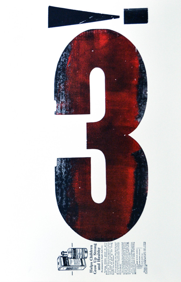
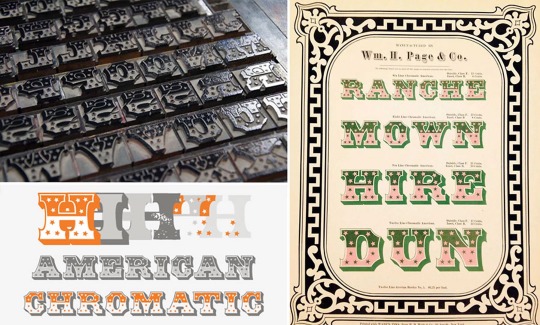
As some of our longtime followers probably know, we adore wood type. So, this week we present some wood type samples from Type Specimens of Caliban Press On the occasion of its sixth anniversary, from the recent donation of the estate of our late friend, art professor, painter, collector, letterpress printer, and book artist Dennis Bayuzick. The publication was letterpress printed and hand-bound by special collections librarian and fine press printer Mark McMurray in 1991 at his Caliban Press in Montclair, New Jersey, in an edition of 100 copies signed by the printer.
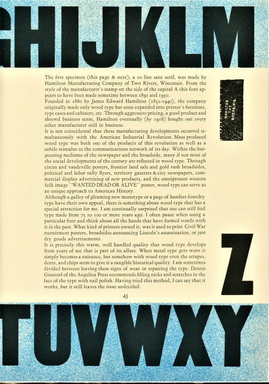
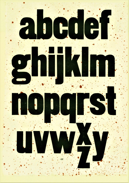
The first few unidentified specimens on pages 42 to 45 were made by the Hamilton Manufacturing Company, right here in Two Rivers, Wisconsin, which for almost a century was the largest producer of wood type in the world. The company stopped producing wood type in the 1980s, but continued to produce other manufactured goods, and finally left Two Rivers in 2013. Its wood type legacy lives on, however, in Two River's magnificent Hamilton Wood Type & Printing Museum, an essential pilgrimage site for any lover of wood type!
View other posts with wood type.
View more posts related to the Hamilton Wood Type & Printing Museum.
View more Typography Tuesday posts.
#Typography Tuesday#typetuesday#wood type#Caliban Press#Type Specimens of Caliban Press#type display books#type specimens#specimen books#Mark McMurray#letterpress printing#fine press books#Hamilton Wood Type & Printing Museum#Hamilton Wood Type Museum#Hamilton wood type#Hamilton Manufacturing Company#Dennis Bayuzick
22 notes
·
View notes
Video
TR Teen at the Musuem by Lester Public Library
Via Flickr:
An awesome class at the awesome Hamilton Wood Type and Printing Museum! Make prints with tree cookies (cross sections of tree trunks that indicate how trees grow). Note that teens must register and obtain permission slips IN ADVANCE here at the Lester Public Library, Two Rivers, Wisconsin.
#Hamilton Wood Type & Printing Museum#Hamilton#museum#365LIBS#Lester Public LIbrary#libraries and librarians#LPL#Library#Lester Public Library#Two Rivers#WIsconsin#Libraries#libs&libs#Wisconsin#TrueToTwo#Explore Two Rivers#teens#teens@LPL#teens in your library#teen#teenprograms#teen late night#Youth Programming#Youth Programs#Youth Program#youth services#Wisconsin Libraries#Read#Discover#Connect
2 notes
·
View notes
Text
OOPS!
If you don't make mistakes, you're not working hard enough!
Increase experience! Make more mistakes quicker!
0 notes
Photo
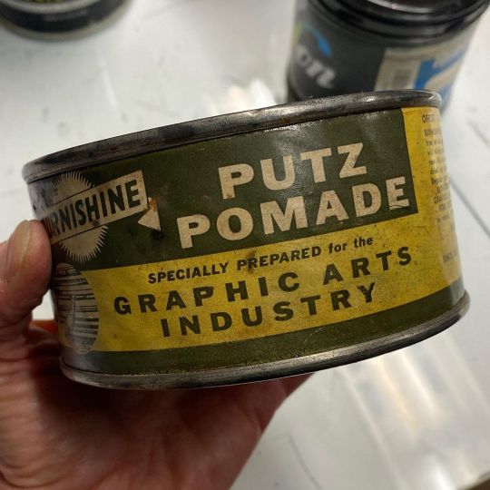
For @pipletterpress Shop Talkers: had to shsre this super vintage Putz Pomade can from @hamiltonwoodtype which brings me joy (and pumice). May your rollers be glaze free! #letterpress #putzpomade (at Hamilton Wood Type & Printing Museum) https://www.instagram.com/p/CenDPG-OYi6/?igshid=NGJjMDIxMWI=
5 notes
·
View notes
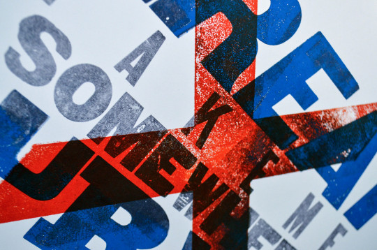
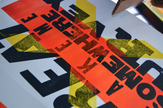
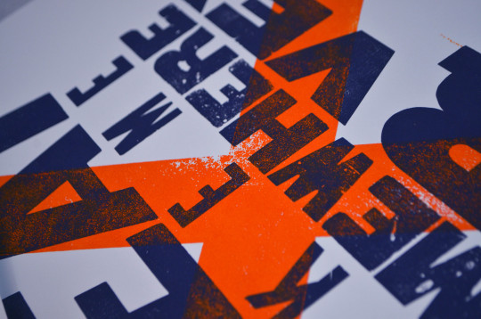
Text
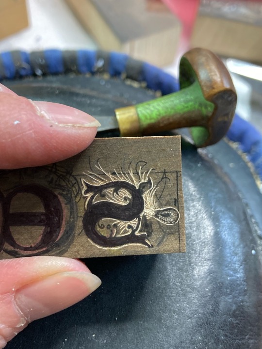
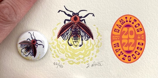
Fancy a pre-conference workshop at Hamilton Wood Type & Printing Museum's Wayzgoose? Join me on Friday November 4 for “Wood Engraving: Devilishly Detailed Letterpress Initials”. Wayzgoosers will also get a reproduction of my Firefly engraving on a 1" button! Hope to see you there!
Register: https://woodtype.org/pages/wayzgoose
#seed #woodengraving #letterpress #initials #workshop
4 notes
·
View notes
Text
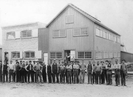
Photo by Hubert R. Wentorf, ca. 1895, of Hamilton Manufacturing Company, original building known as "A" and office.
Present in photo are H.P. Hamilton, standing in the doorway at center of picture, Arthur Lohman, standing in office doorway, and employees, recognized from right to left, Joseph Stodola, Andrew Bishop, Mike Knipfer, Charles Rippel, Nic Moseler, unknown, unknown, Nic Moseler, Hans Honeckson, Frank Kaufman, Charles Hansen, John Smith, unknown, Mr. Cady, Mike Schippert, unknown, unknown, Henry Kurtz, John Goldammer, unknown, John Weilep, Peter Feurstein, unknown, Charles Wacholtz, unknown, unknown, unknown, unknown, unknown, unknown, Albert Simonis, unknown, unknown, unknown.
C/o University of Wisconsin-Madison Libraries and via Hamilton Wood Type & Printing Museum.
0 notes
Text
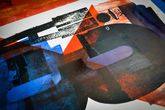
3!A
Fun with Prints at the Hamilton Wood Type Museum in Two Rivers Wisconsin. What a wonderful place.
Various wood-block prints.
14x19"
Ink on paper
#wood block printing#art#milwaukee#fine art#painting#fleming#symbol#symbolism#figure#acrylic#figurative#ink#printmaking#print#on paper#hamilton wood type museum#antiques#wood block#typography
3 notes
·
View notes
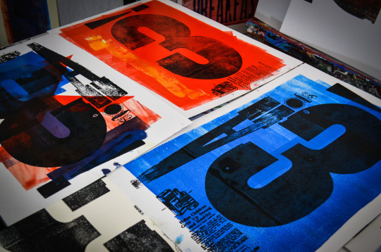
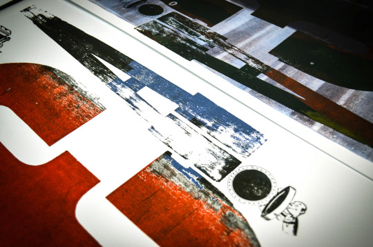
Text
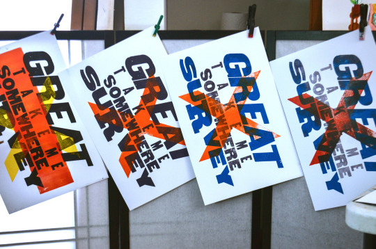
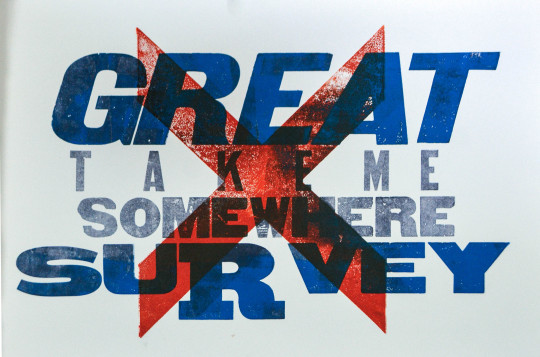
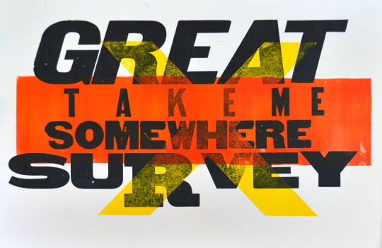
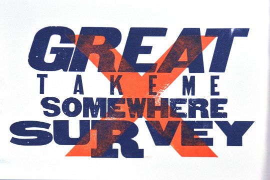
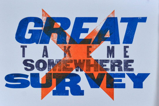
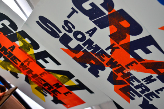
Fun with printmaking.
#great survey#graphic novel#typography#wood type#hamilton wood type museum#printmaking#print#printing#on paper#layer#ink#wisconsin history
1 note
·
View note
Photo
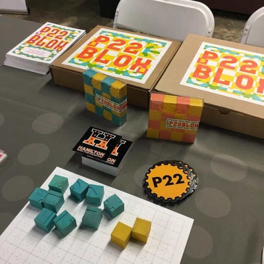
Even though my set of #p22blox is still in my studio, I’m happy to meet the faces behind the magic. I’m extra motivated to get home to play with them! #letterpress #hamiltonwoodtype #bookarts (at Hamilton Wood Type & Printing Museum) https://www.instagram.com/p/BpsQSVoA5_r/?utm_source=ig_tumblr_share&igshid=1a40vaeqguriv
12 notes
·
View notes
Text
Robert Fisher
Method,
Kurt Cobain already had a vision for the cover. Fisher took this idea of a baby being born underwater and went to the bookstore to find images that could be used. After going through hundreds of birthing books and baby books. Fisher realized that they were far too graphic to use. This idea of childbirth was then ruled out, and the idea of a baby simply being underwater was born, however the band wanted something more. Cobain came up with the idea of adding something like fishhook and a dollar bill to make it more menacing. The idea came together organically. Fisher needed a photographer and found Kirk Weddle to do the job, he specialized in ‘submerged humans.’ They went to the Pasadena Aquatic center and got 4 or 5 different parents to come and use their babies. They took turns passing their babies in front of the camera. They used a doll for test shots. A week after the shoots there was 40-50 proof sheet shots. The image that was chosen was ‘perfect’ according to fisher, in the context of positioning and the look on the baby’s face. Before computers the images were sent off to darkrooms to do what photoshop does. Fisher requested the fishhook and took some photos and set up polaroid’s of how he wanted the dollar bill to look and be positioned. It would be then sent off and come back 4 or 5 days later. Finally, when the image came back the last thing to perfect was the text. Fisher used a xerox machine and as it was scanning pulled it and wiggled it. He then did it on the opposite side and got the wavy type. This was groundbreaking in those times. The success of never mind was partly due to the incredible cover and the cover is now featured in the museum of Modern Art’s Collection.
O. Campbell, The Designer of Nirvana’s Nevermind Cover on Shooting Babies and Working with Kurt Cobain, The Work behind The Work, https://milanote.com/the-work/the-designer-of-nirvanas-nevermind-album-cover, Retrieved 25th August 2021.
David Carson:
Method:
David Carson was the first art director of Ray Gun a grunge and independent music scene. Carson was well known for breaking the so called ‘rules’ of graphic design. Carson didn’t standardize the pages or allocate any type of numbering system. Carson created rigid patterns and non-cohesive layouts including the leading, white space and disorganized margins. Carson said himself “a lot of people … simply take in visual information differently now” the inconsistency in the pages confused the readers. Some viewers hated it and others loved the disorganized feeling that the magazine portrayed. Carson’s own reflection showed he was simply trying to express the information that made the most sense to him which was a rebel against modern design. Carson had done a lot of work by hand, by cutting out and rearranging layouts and sending them to printers to be pasted down pieces of art. The pages of Ray Gun although not stereotypical pieces of Design was a groundbreaking experiment in which no one had seen before. Breaking the rules of classic graphic design and expanding the box of ideas in which design had been done in before.
Lees-Maffei, G. (Ed.). (2014). Iconic Designs: 50 Stories about 50 Things. London: Bloomsbury Visual Arts. Retrieved August 25, 2021, from http://dx.doi.org/10.5040/9781474293921
Carl Herner
Method:
Carl Herner a graphic designer focuses on using tools in non traditionalways or in even in the wrong way. The project was MacGuffin Magazines trousers’ issue. Herner was asked to illustrate the article of the Fantastic Man’s Founding editor; Gert Jonker’s , where Jonker’s talked about his favorite pair of trousers. They needed the visual element for the article. Working with the Magazines art director Sandra Kassenaar. Focusing on 3d software Herner and Kassenaar started to scan digitally real trousers that was found in studio. The trousers were scanned in piece by piece until they had scanned the whole pair of pants. These were then sent on file to Herner individually. They then built a pair and stitched the files together around a body which made a 3d model. The next step was to create a texture map of where the stitching would go. These could then be manipulated digitally as if someone was wearing them. Herner discussed the idea of fluidity and how the pants without anyone in them is about the movement and the texture of the pants. Not about the person in them.
Alif Ibrahim, 29 October 2019, Carl Herner deconstructs garments with his non- traditional approach to digital design, It’s Nice That, https://www.itsnicethat.com/articles/carl-herner-graphic-design-281019, Retrieved 25th August 2021.
Hannah Höch
Context:
Der Maler was a piece created by Hannah Höch in satire. Höch Wrote regarding the piece in reference to sexism of the Berlin Dada Movement in which she believed there was an underlying the movement. It also referenced German politics, male privileged and scientific objectification. The story goes that a modern painter by the name of Gotthold Himmelreich which means “God-Beloved Heavenly-Kingdom”, was forced to wash dishes by his wife. He felt degraded as a man and his manhood suffered under a feminine soul. Himmelreich becomes determined to overcome this suffering through his painting. He wanted to represent the likeliness between the female should and the nature of chives. He believed that emptiness filled both of these objects and presented it as if scientifically dissected. The story shows the frustrations and self-doubt of this man Himmelreich. And reflects the idea that every man ultimately fails to represent and or control the essence of a woman. This piece was represented in the form of photomontage. Was produced by the images and type that the mass media printed for the public.
Haakenson, T. O. (2021). Grotesque visions : The science of berlin dada. ProQuest Ebook Central https://ebookcentral.proquest.com
Ken Done:
Methpod:
Ken done was commissioned by The Powerhouse Museum in Sydney to paint the walls of the restaurant inside the museum. Done suggested painting it in a garden theme. This was suggested to alleviate the industrial architectural design of the powerhouse, the garden theme was to deflect the brick walls. Starting with drawings and ideas for dining ware, such as plates, cups, placemats etc. Done then moved on to a model replicant of the restaurant with a removable and lift off roof which was made by the museums model maker Iain Scott-Stevenson. The idea was to use vivid shapes and colours over all of the surfaces including the ceilings. These bright colours and shapes were to elevate and enliven the interior. Done turned a peculiarfeature of the room into a beautiful painting, in the pitched ceiling where the roof meets the vertical walls. Done took this feature and painted giant green leaves and fronds. Done plays with the illusion of space and form he “leans into the surroundings.” Done plays with imager and layers to energise the surroundings. Done took into account the lack of windows and in response he painted a yellow sun on the peak of the roof. Done included yellow rays of sunlight which draws attention to the height of the south wall. Done included sculptures of vases and flowers around the restaurant and paintings over top of the painted walls to preserve his work. Done’s playfulness and secondary objects is to serve as a memory of what was once there if the museum ever painted over his work. This was compared to the Rex Whistler Restaurant in the Tate Gallery which was left for 70 years.
T. Measham, R. Hara, A. Van de Ven, Y. Kinameri, R. Wood, M. Tawara, D. Lee Brien, E. Buzby, 1994, Ken Done the art of design, Powerhouse Publishing
Andy Warhol
Context:
In 1977 and 1978 Warhol and his assistant Ronnie Cutrine started an experimental project of works: The Oxidisation Piss and Cum paintings. After Warhol’s last movie “Andy Warhol’s bad” in 1976. Warhol wanted to stray away from his recent pop art and society portraits and focus more on abstract art. In his diary entry from the 70’s he had admitted that since being shot by actress Valerie Solanas in 1968 he hadn’t produced any “good” art. His critics reducing him to society portraitist. Warhol wanted to change this and keep his vanguard status by trying these experimental projects.
Method:
Warhol pulled out a canvas of conceptualwork from the 1960’s in which he had urinated on a white canvas. Using the same participants who had collaborated in the torso and sex paintings from 1976 to early 1978. The paintings were made with urinating, pouring, or dripping urine onto primed canvass’s with either copper or gold metallic paints, which created varied colour and textures. These chemical experimentationsturned invisible paintings into visually viable artworks. The rich gold and green colours created these lush colour fields paintings with varied colour and textures.
A. Warhol, J. Schnabel, 2009, Andy Warhol The Last Decade, Prestel Publisher.
Richard Hamilton:
Context:
Richard Hamilton wanted to create realism with his phycological experiments. The dark and chaotic “murder” scenes he would create were reference to the violent epidemic in new York at the time. These outlined figures with red paint as reference to blood, would catch people off guard. Hamilton wanted these public art pieces to be a reminder that we could all be victims as soon as we stepped outside. Hamilton would find and locate important parts of the city such as the city hall and the library’s and other locations to serve as a reminder of what was happening in the city at the time. Hamilton also set up an office as if he was a detective and called him self Mr Ree Dick Trace It. The play on the name Mr Ree was in reference to his mysterious outlined figures. In this office he put up maps and painted over in red paint as if to replicate blood to reference the bloodshed in the city. His figures made the news and Hamilton wanted to play with the media, as they weren’t sure if these were actual murders or what they were as public art wasn’t common in the 70’s. This confused the police, Hamilton took this further by putting up wanted posters of himself however this led to him being told he would never be given a grant again. This phycological experiment wasn’t his only public phycological piece of art. Hamilton followed the outlined murder victims with a piece called I only have eyes for you, which was life sized figures of himself stuck on walls with blueprint paper so they would fade to white shadows with the weather. This figure represented a man lost in the city all dressed up with nowhere to go. Hamilton’s experiments and public art pieces confused and shocked the public which was his intent with these phycological pieces.
O. Jacoby, 2017, Shadowman. Java Films.
Roy listechstien
Method:
Roy Listechstien was a notable artist for his pop art; however he took it one step further with his brushstroke sculptures which were commissioned in cities such as Tokyo, Barcelona, Washington and other cities across the world. These pieces were looking at how to isolate a 2-dimensional brush stroke. The process started with left over cut-outs from his paintings and collages focusing on the singular stroke. After arranging these cut-outs Listechstien would sketch the positionings on the wall in pencil. The problem was looking at the art in a 2-dimensional way although it was a 3-dimensional peice of art. The focus was on the way the brushstrokes serve a dual function. On canvas they break themselves down into linear shapes of the pieces of hair from the brush however, Listechstien turns it into a way in which these shapes overlap. Listechstien focuses on the movement of the brush this movement takes them from a 2-dimensional piece to 3-dimensional sculpture. Listechstien refers to them as cartoon like saying that we don’t see a cartoon explosion as a real one, but we still understand what it is, an explosion. Listechstien uses this same idea for his brushstrokes. Listechstien put smaller versions of the models onto images of the buildings to find the right spacing although it was a public commission Listechstien wanted to be sure that he liked his pieces first regardless of the public opinion.He drew the life-sized pieces on a piece of paper which were 20 feet long so he could see what they would look like before sending them off to the welders and sculptors. These sculptures were a challenge to him and a challenge to the public to appreciate art as a human value of acceptance.
Trottenberg, M. 1995 Roy Litchenstien: Tokyo Brushstrokes. Checkerboard Film Foundation Inc.
Keith haring
Context:
The apocalypse series was a collaboration between two queer artists Keith Haring and William S Burroughs. These Ten pieces were created by Haring and the writing that accompanied them was written by Burroughs. The Title Apocalypse was a reference to the book of revelation in which this piece was inspired by. Haring wrote in his journals of his concern of his work being obscene. The apocalypse series was a queer take on the book of revelation and a reflection of the AIDS epidemic going on at the time. Christian’s at the time were deeming AIDS a s gods punishment for homosexuality or any other ‘sins.’ Haring interpreted AIDS as a weapon for white men who oppress, colonize, control and dominate and called it “their evil disease”. The demon sperm that haring illustrates, references American culture. These apocalyptic imagery has been a source of powerful imagery to unpack the impact of the AIDS epidemic in the gay and queer community. This demon sperm that Haring plays with throughout the series appears with the number 666 which in the book of revelations is the ‘number of the beast’ these demonic images denotes AIDs and reference the queer take on Christianity. The Beast is the physical symbol of AIDS and he is depicted with a broken horn, coming out of the hole of the palm of the hand of the girl, which is a sign of Jesus’s hand where he was nailed to the cross. Haring adds medusa hair and bird legs to the girl to change the innocence and purity of the child into an impure and hybrid style object referencing death as a reflection of the AIDS epidemic. The referencing to Revelations is an important part of the series as this reflection was their interpretation of the AIDS epidemic through the story of Christianity which was something that was denoting the queer culture of the time.
Lynn. R. huber, 2019, Pulling down the sky, Envisioning the Apocalypse with Keith Haring and William S. Burroughs, Cross Currents Volume 68, Issue 2, https://doi-org.ezproxy.aut.ac.nz/10.1111/cros.12312
1 note
·
View note
Text
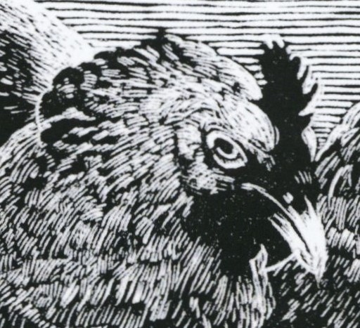
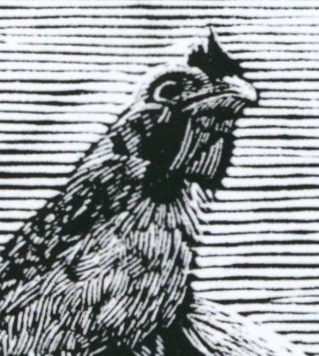
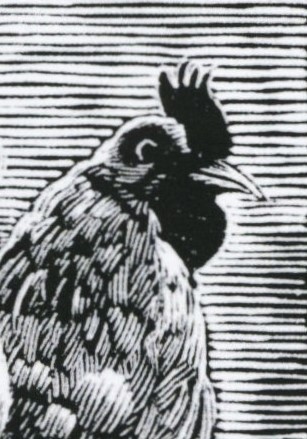
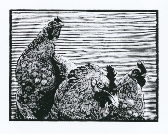
Wood Engraving Wednesday
CHICKENS!!
This 2021 engraving of a chicken threesome is aptly entitled Wary Optimism by Pennsylvania wood engraver and letterpress printer Andrew M. Moroz. Moroz is a member of the national American wood engravers society, the Wood Engravers' Network (WEN). This print appears in the catalog for the WEN Fourth Triennial Exhibition 2020-2022, juried by two of my Wisconsin colleagues, Tracy Honn, retired long-time director of the Silver Buckle Press (Madison), and Jim Moran, recently-retired Master Printer and Collections Officer at the Hamilton Wood Type and Printing Museum (Two Rivers). On wood engraving, Andrew Moroz writes:
Attracted by the liveliness of the marks and the degree of fineness the tools produce, I enjoy the methodical process of engraving with burins on the end-grain of maple. Subject matter draws from personal experience and interests, but is concerned primarily with a search for imagery that has universally held meaning.
Reflecting on jurying this show during the pandemic period, Tracy Honn writes:
I discovered my understanding of the work had changed because the world was reoriented. Thinking about the Wood Engravers Network helped remind me of the extra in the ordinary. . . . The current disruptions of life-as-we-knew-it happened abruptly and nearly simultaneously. It is the all-at-onceness of this crisis that reveals the black and white of our days. In the midst of a pandemic . . . we create places of safety through our imagination and activities of comfort. This is what wood engravers do all the time.
I am excited and deeply honored to serve as the juror for the Fifth Triennial Exhibition of the Wood Engravers' Network, 2022-2024!
View more engravings by members of the Wood Engraver's Network.
View more posts with wood engravings!
View more posts with CHICKENS!!
-- MAX, Head, Special Collections
#Wood Engraving Wednesday#wood engravings#wood engravers#Andrew M. Moroz#Wary Optimism#Wood Engravers' Network#WEN#WEN Fourth Triennial Exhibition#Tracy Honn#Jim Moran#exhibitions#exhibition catalogs#chickens#Chickens!#birds#birbs!
60 notes
·
View notes
Video
Plant Printing by Lester Public Library
Via Flickr:
TR Teen Night, Lester Public Library, Two Rivers, Wisconsin
#365LIBS#Lester Public LIbrary#libraries and librarians#LPL#Library#Lester Public Library#Two Rivers#WIsconsin#Libraries#libs&libs#Hamilton Wood Type & Printing Museum#Printing#Printing Museum#print#teens#teens@LPL#teens in your library#teen#teenprograms#teen late night#Read#Discover#Connect#Enrich#flickr
1 note
·
View note
Text
Journal #4
Something I decided I wanted to dive into this week was Darius Wells’ wood type invention. As we learned from this week’s reading, Darius Wells was an American printer who invented the use of wood types for print use rather than utilizing metal types. How did he do this? According to our textbook, he engineered a machine called the lateral router, which led to a more “durable, light” type that was half the price of metal types (Meggs & Purvis, pg. 155). I wanted to learn more than the book told us about the lateral router, so I did my own research and found several sources that talk about Wells and his invention. One of these sources is named the Hamilton Wood Type & Printing Museum, and they had some really interesting additional information about the topic. It is no secret that wood has been used in many different cultures and for many different purposes, but I had not realized the full scope of why wood could be more beneficial than metal until reading more information on the topic.
Examples of wood type (found from Adobe)
According to the Hamilton Wood Type & Printing Museum, wood type was great because it did not run into the same problems metal type did. An example of this would be, “…the possibility of unequal cooling caused large lead type to distort,” (The Hamilton Wood Type & Printing Museum). The introduction of the lateral router, “…allowed for greater control when cutting type and decreased the time it took to cut each letter,” (The Hamilton Wood Type & Printing Museum). Clearly, Wells created something helpful for the typography world because European countries started to open up wood-type factories for themselves. I also think it’s amazing that William Leavenworth added the pantograph to the lateral router to help improve the creation even more. It is great to see that in our history people were actively working to improve the livelihood of others, whether it was personally or for business purposes. The pantograph, according to the School of Design and Creative Technologies at the University of Texas at Austin, was, “…a mechanism used to copy draughtsmen’s drawings….the combination of the router and the pantograph allowed for the mass mechanical production of wood type.” It certainly makes sense as to why the writers of our textbook mentioned that wood-type fonts were so easy to make at this point that customers could essentially send their own ideas to manufacturers and have them made. It was super interesting to learn about wood type this week and the lateral router!
0 notes
Photo
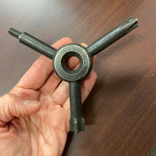
The key to all the quoins. Have you seen this marvel, @blferrett ? As seen at @hamiltonwoodtype (at Hamilton Wood Type & Printing Museum) https://www.instagram.com/p/CeuJQN3OKzt/?igshid=NGJjMDIxMWI=
4 notes
·
View notes
Text
Week 3- History of Design
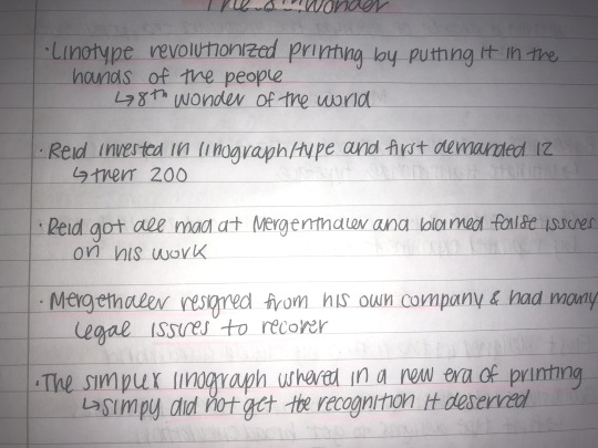
My first picture is of notes I took about the story of the inventor of the Linotype. Our textbook briefly mentioned and glossed over the Linotype in the Typesetting and Competition section. The notes from the other reading I had done described how Ottmar Mergenthaler did not get the recognition he deserved and was driven out of his own company.
Something I found really interesting in the reading is that pictorial newspapers were very successful among the public. This reminded me of how a lot of online new articles include editorial illustrations. I find that I am way more likely to click on an article with an illustration then one without. The illustrations always summarize what you will be reading about and can help determine if you’d like to spend time reading it or not.
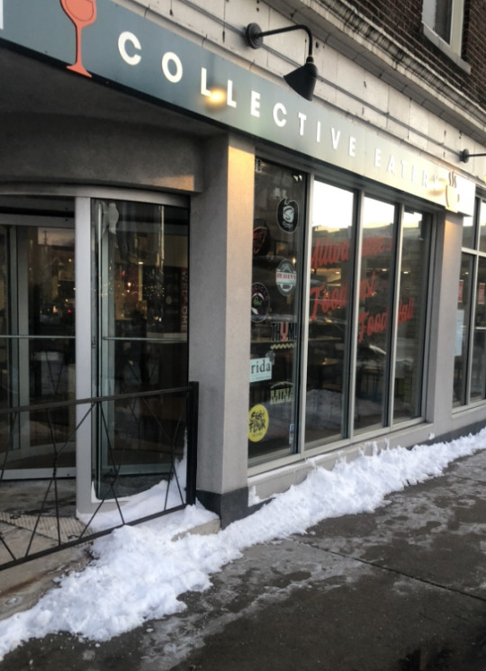
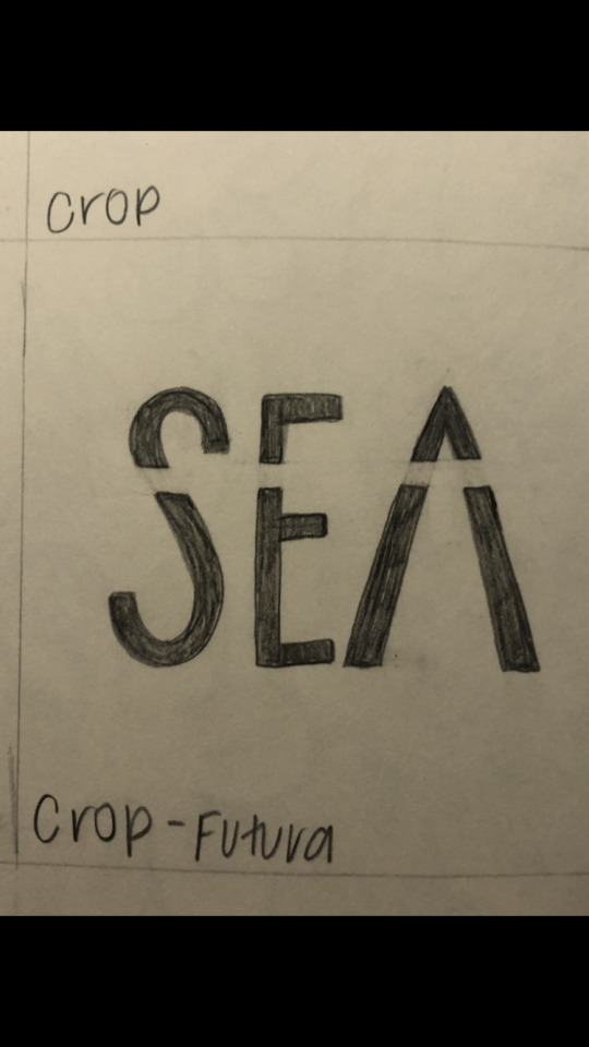
This photo is of a restaurant sign that utilizes a san serif typeface. The textbook refers to san serif as a typeface invented in the 19th century that has remained incredibly influential. From this photo you can tell san serif have stayed extremely relevant and are used all around us to this day. I also included a sketch I had done based off a sans serif font Futura.
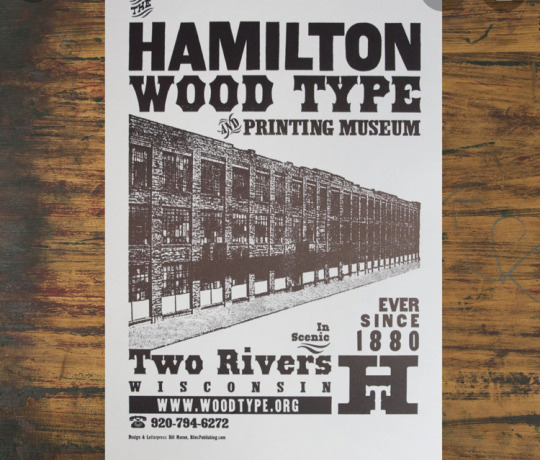
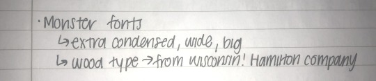
This screenshot from my phone is of a poster for the Hamilton Wood Type Museum that’s here in Wisconsin. I’d love to be able to visit this museum once it opens its doors once COVID is a little more under control. Our textbook discussed wood type and how it was used for printing of advertisements. I also included some notes I took about Monster fonts that gained popularity at that time to advertise on companies' posters.
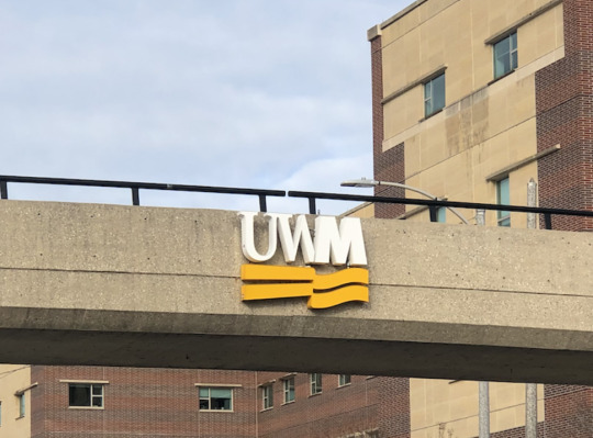
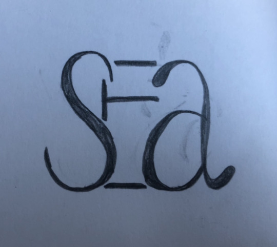
This picture of the UWM logo is an example of a sans serif and a serif fonts being used in conjunction with each other. I also included a sketch I did with the same mixture of typefaces. I find it interesting that mixing these two types of type is a common thing. Whereas in our reading the example of using both of these typefaces was for a British Periodical, “Punch”. In this example the two typefaces are not being mixed, but are being both used on one page.
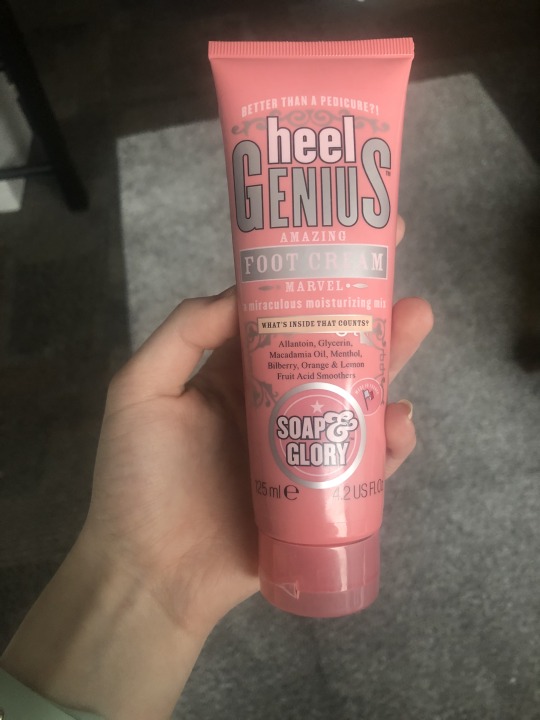
The photo is of a foot cream that’s branding playing of the stereotypical circus typefaces and layouts. Our text book gives examples of The Barnum and Bailey show/circus posters which look very similar to the bottle of the foot cream.
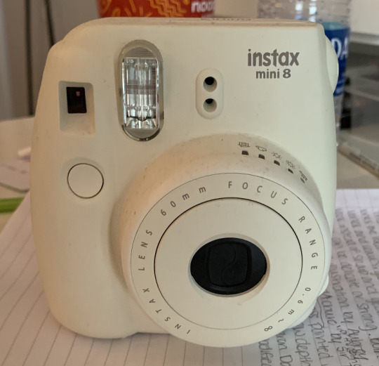
This is a picture of a polaroid camera. I find it super fascinating that these instant cameras came back into style a few years ago. It seems once everyone had easy access to taking photographs through our iphones we wanted to revert back to the older processes.
0 notes
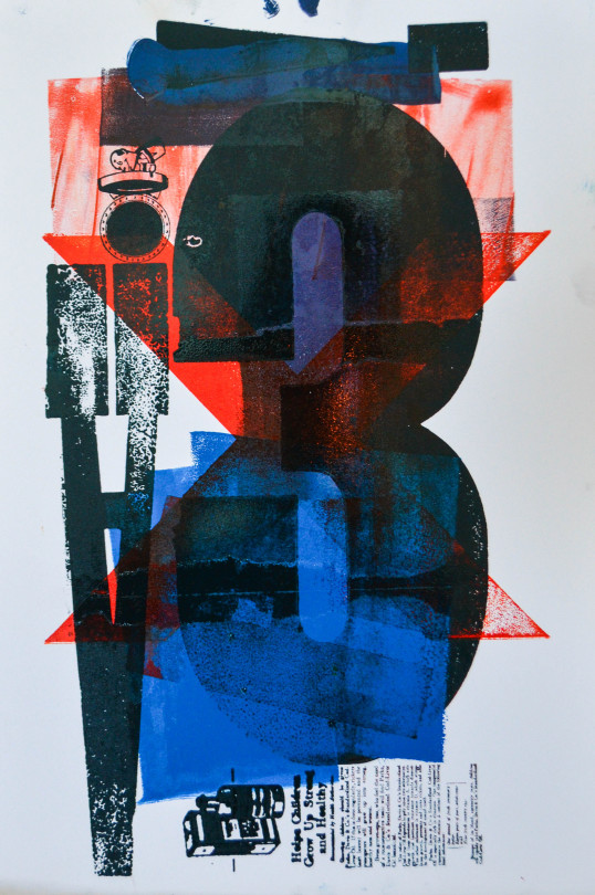
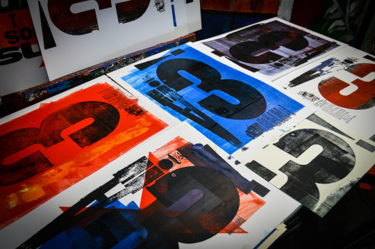
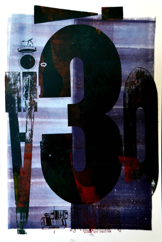
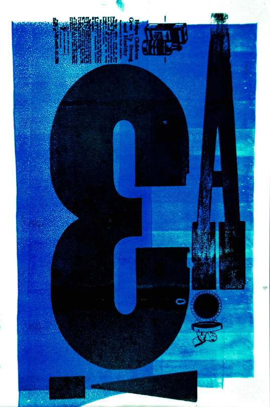
Photo
via Hamilton Wood Type & Printing Museum
0 notes
Last Seen Blogs

nkaart-blog
NKAart
yolomoli
¯\_(ツ)_/¯
bluealice17
Through the Looking Glass and Beyond.

really-bad-audio-edits
oh i am Just a bastard

espace-rien
ESPACE RIEN