
ellenartpaige
Ellen Paige Rees
Welcome! I hope you enjoy my latest artworks!
436 posts
Don't wanna be here? Send us removal request.
Last Seen Blogs

king-hetalia-king-blog
King Of Hetalia
crochetfield
Crochetfield
neftacular619
Neftacluar!!!

tiffanyfaye
The Lost Fae's Path

helpwerami
Am I Late?
Photo
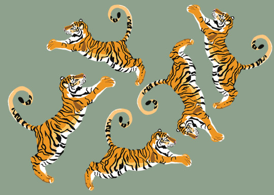

A bunch of Tigers
#tigers#digital painting#digitalart#painting#orange#bigcat#bigcats#yellow#green#stripes#prints#photoshop#art#artist on tumblr#cat#cats#pattern#ideas
3 notes
·
View notes
Photo
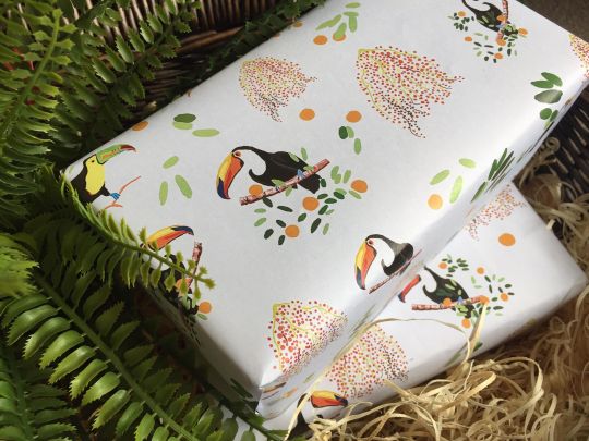
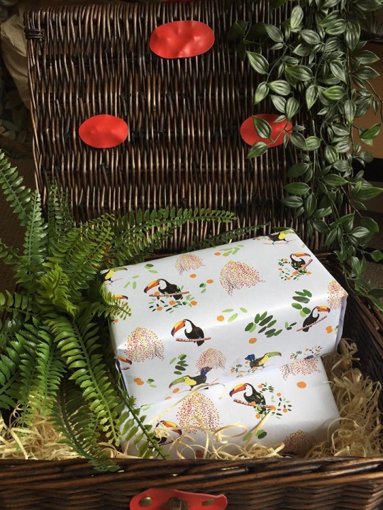
Taking some tropical inspired photos for my upcoming wrapping paper release.
#handmade#wrapping paper#design#artist#artisrs on tumblr#designing#toucan#birds#amazon rainforest#birdlife#animal#pattern#repeatpattern#colour#colourful#oranges#offwhite#foliage
4 notes
·
View notes
Photo
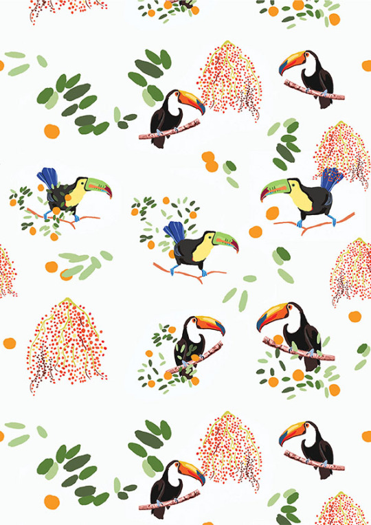
Toucan pattern print intended for wrapping paper and maybe more! My latest design featuring vibrant Toucans and edible plant life from the Amazon forest. LOVE nature!
#wrapping paper#design#art#print#pattern#amazon#rainforest#toucan#bird#artist#artists on tumblr#berries#leaves#foilage#birds#repeatpattern#teatowel#colourful#photoshop#digitalpainting
2 notes
·
View notes
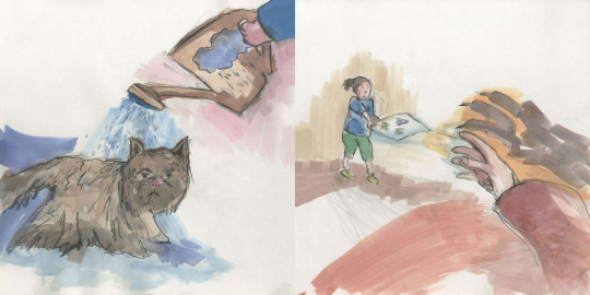
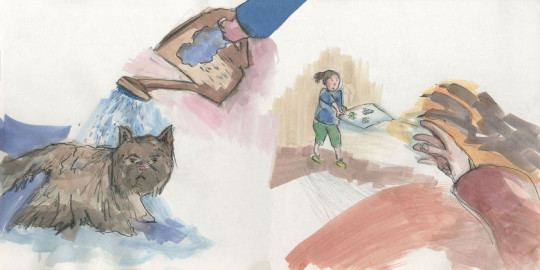
Text
My images went under a repetitive process of editing, printing, reviewing and editing.
I had to make sure how the colours would appear when printed, knowing that what is original will differ from what is on screen and what is on screen will differ from what the printer can produce.
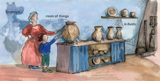
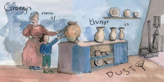
This process involved my use of Photoshop and manipulating the setting of curves and levels. The image below also went under construction having felt that it needed to be more representative of the text reading it as a dusty room.
Lots of scanning, printing and checking:
I also made pages that had lots of white space or an opposing white page with text into full spreads of colour by creating background washes and using Photoshop to work them into the white spaces.
This way my book was fully colourful and not so sparse and empty.
Before:
After:
My pages are much more exciting and attractive working over the full space of the spread but keeping it partially transparent in parts to create a sense of playful depth preserved in the perceptible evidence of my image making process.
Colour Control My images went under a repetitive process of editing, printing, reviewing and editing. I had to make sure how the colours would appear when printed, knowing that what is original will differ from what is on screen and what is on screen will differ from what the printer can produce.
0 notes
Text
Portfolio Hand In
Having completed at least three physical portfolio hand in’s over my experience in university (including foundation) I feel I have improved with each one.
I really enjoy curating my development work in a flowing and coherent way so that my reader can see my journey of experimentation’s made from start to finished result.
This is some really great experience with selecting work that has gone into…
View On WordPress
0 notes
Text
I have participated in helping the show build and now that it is completed I have set up my show piece being two copies of my printed children’s picture book called ‘Grumpy Granny’.
My idea of how I wanted to show my work involved some smashing in the morning.
I sourced these clay pieces from the ceramics department throw away box having asked the tutors for this source of scraps. By not making my own ceramic piece it removes the environmental problem of firing.
I learnt that could only use fired objects as air drying clay has some dust properties that pose a health and safety issue. Lucky enough I got my hands on some excellent vessels to therapeutically smash on the day of my deadline!
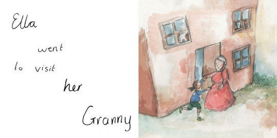
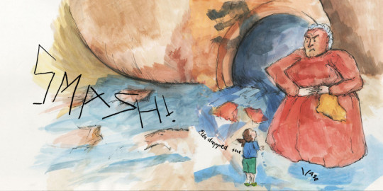
I then went to share my idea of combing some broken ceramic pieces to go along with my showing of my children’s book to connect to the event of Ella who accidentally broke a vase in my story.
Amelia (head of year) assisted me with the presentation/composition layout of these items.
We achieved something eventful and interesting and I am very pleased with the result.
Having seen how this piece looks like a show object I decided to also include my other copy of the book for people to pick up and read.
The print quality of my book came out beautifully, the feel is very smooth and professional.
I hope to send this work to relevant opportunities such as publishers and competitions in hopes to grab the attention of writer collaborations and attaining a publisher for my work.
The Exhibition I have participated in helping the show build and now that it is completed I have set up my show piece being two copies of my printed children's picture book called 'Grumpy Granny'.
0 notes
Text
Exposure Reflection
The exposure module has been a very resourceful use of time. I have gained the insight from experienced illustrators and have been prepped through valuable workshops of the expectations and duties in the future world of work as a professional illustrator. I have learnt of the essential web presence that is needed to attract my clients to my service and developed the skills to go about this in a…
View On WordPress
0 notes
Text
Encounter Reflection
My third year experience of the encounter module has exercised the importance of communication and time management. I had very big anxieties at the start of the year feeling out of my comfort zone with the idea to self direct the creation of my own narrative and to complete a book project through to the finish. I feel the act of doing the work, attending as many workshops and tutorials with…
View On WordPress
0 notes
Text
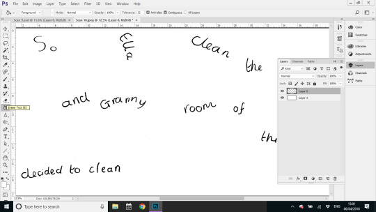
Text Experiments
This post shows more of my explorations of text that I experimented with for my book Grumpy Granny.
This involved a lot of time spent on InDesign and also printing out multiple dummy books to see how they are perceived in the destined format.

I looked into typefaces that I felt gave a friendly impression to evoke my message of home throughout the story and to be received as a welcoming journey…
View On WordPress
0 notes
Text
Trip to the Printers
Trip to the Printers
I attended a trip to the Printers with Dan Peterson and the book club (fellow book making students). I was introduced to the machinery involved in printing, different paper thicknesses and gained advice on the best paper quality to print on being a silk finish.
I had also had a lot of guidance from Dan Peterson in tutorials on how to prepare my work for the printer. Where I learnt about the…
View On WordPress
0 notes
Text
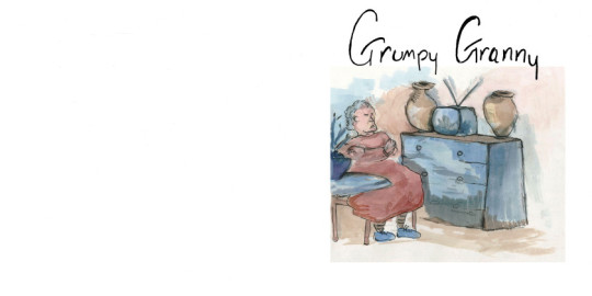
My front and back cover of my book went through multiple design possibilities.
Such as these:
Right image shows my blance of off white and white.
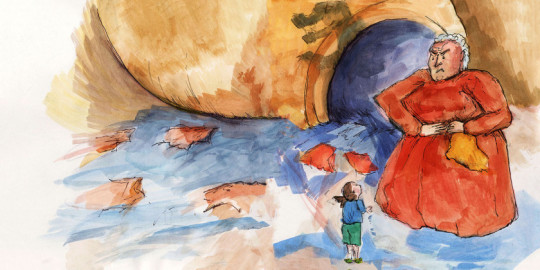
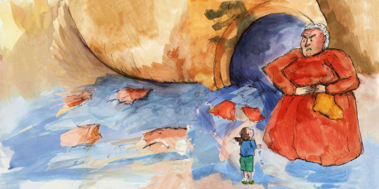
From the feedback that I received the grumpy granny watching some TV (shown above) was the best idea I had developed. However I did not like how it was a reused image from within the book. So I decided to make a new interpretation of grumpy granny using that image as an idea. This way the pages within the book can remain a new experience for my readers.
I had no issue with reusing the front image to make the back image. In fact this made the spread work as a whole really nicely.
This is the hand drawn text from the front cover. I really enjoyed getting into the emotion of each letter. By turning the scanned image white background to transparent I was able place just text onto my desired background image.
Front and Back Cover My front and back cover of my book went through multiple design possibilities. Such as these:
0 notes
Text
Text with InDesign
Using the feedback to look into InDesign typefaces to create a professional result for words to go with my picture book. It took a few goes to get the right look. I needed my font to be received as friendly and gentle and then suddenly burst out with life when the words suggest loud sounds like SMASH. This way the visual aesthetic of my words embody the moods of my characters that connect to the…
View On WordPress
0 notes
Text
In search for example children’s books I have been to the local Llandaff North library to review the short narratives and illustrations.
I picked out four books from the children’s books section that I was drawn too from the imagery and titles of the books.
The MOG book I immediately recognised for its acclaimed story work and illustrations. Although I didn’t know the Welsh language I simply used the heavy use of imagery to understand the story to which I could make good sense of being the irritating yet loveable and heroic MOG cat that he was in this story.
This research was targeted towards combatting my areas of difficulty around designing my front and back cover, copy right page, fonts and word and image layouts.
I was also taking inspiration for future work on self writing another story for my future children’s book.
This book entitled ‘When I coloured in the World’ written by Ahmadreza Ahmadi and illustrated by Ehsan Abdollahi was a beautiful read and experience. I loved the repetition and the act of inspiring change with ideas and action. This is a book of shining hope and empowering the reader to take control and take action.
The illustrations were colourful and extraordinary. This book layout employed a separate page for text and image. This way I could really take in the meaning of the words and the image into two experiences in harmony with each other. I came away feeling particularly happy from reading this book that is important for both children and adults to encourage a healthy and happy mental health.
Another book that I really enjoyed and thought was a simple and a relatable book was called ‘RAIN’ written by John Usher and designed by Genevieve Webster.
It is interesting to see the collaborations of authors and illustrators asI have interest on forming such future partnerships myself.
I loved this book because it reminded me of the pain of my severe boredom as a child stuck indoors because of the bad weather. I liked how imaginative the ideas of how much fun there is to be had out of playing in the rain as the child expressed to his granddad who sensibly had them wait to go outside until the rain had stopped. The joy in the water left over by the rain had been worth the wait in the end and it had been a rewarding experience for both reader and character.
From this research I have gathered an idea of formats that can aid me with my own childrens book development.
Local Library In search for example children's books I have been to the local Llandaff North library to review the short narratives and illustrations.
0 notes
Text
The images below show my experiments with combining my working images from my self-written and illustrated children’s narrative combined with my hand drawn text.
Front cover experiment:
I definitely like the use of hand drawn text for the front cover as it has a lot of character and an interesting authentic quality that makes it unique. The few words also make it powerful and impactful and as it is needed to be for grabbing the attention of its audience.
Spreads from the story:
For spreads that use a single image I have experimented with the space of the opposite blank page and have explored compositional arrangements and played with adjustments to the size of the text.
When I created this experiment I can really see how much words direct the reader through the page and how much attention it was distracting from art of the image.
An example of how words weren’t clear enough.
From printing the spreads out onto A3 paper and seeing them as they would be in the rough scale as they would be for my final children’s book and worked into a dummy book format as shown below.
I was able to see problems with the readability of the text and it had an untidy and disorganised structure about it. With challenging compositions that can be easily disorienting despite my inventiveness with the use of the space with my images.
I realised that from here and from the agreed feedback that I had received from various people who I had approached with this dummy book. I needed to make the text much more readable and professional which turned my interest to sourcing examples from the local library and with using software to produce such text as offered on InDesign and Calligraphr (an app that can transform hand writing into a downloadable typeface) for the inside story.
Original idea:
Original story board. Text under image.
I have also been reflecting on how my original page concepts from my storyboard worked with images that fitted text outside of the images rather than mixed in with them. I explored mixing them with the images as it is very often used with contemporary children’s books and I have enjoyed the two working as one.
However this simple layout idea is something that I want to experiment with as it is how I originally planned it following the time of my research and admiration of such separation found in classic children’s books such as A.A.Milne’s Winnie-the- Pooh series that call for more contemplation of the image.
Hand Drawn Text Experiment The images below show my experiments with combining my working images from my self-written and illustrated children's narrative combined with my hand drawn text.
0 notes
Text
Ideas for my Text
Ideas for my Text
Having had a little think about how I wanted to go about developing the text to implement with my images. I considered using my own custom typeface having been introduced to this option in Georgina’s Typeface workshop earlier in the year. Or experimenting with my own hand drawn typeface. Or both. However, I made my decision to go with hand drawing my text following my urge to put my own emotion…
View On WordPress
0 notes
Text
Having completed my images for my story using a squared sketchbook that’s in the dimensions of 25cm x 25cm that corresponded to my idea on what size I had envisioned for my size of my children’s book. Following the advice of working my original images in the same size/close to the same size as my intended results. This has ensured that stretching of the image is avoided and the best reproduced quality of the image is retained.
I had no issues with working in this scale as it was a perfect and comfortable amount of space for the imagery.
The scanning job:
I have been using the A3 EPSON scanner in the universities mac studio to transfer my original works into a digital platform where I can edit and prepare them for a professional book performance and layout.
(CLICK TO ENLARGE IMAGES)
With Dan Peterson’s advice on reproducing artwork in mind I scanned my orginals in at 600dpi and edited them in Photoshop at this dpi.
My Photoshop edits has mostly involved my adjustments made with the crop, spot healing brush, curves, move, layers (if required), magic wand (if required) and image size tool.
The most valuable tool has been the spot healing brush that is set to content aware by default. This is where I have been going in with the suitable brush size of the healing tool to clean the image of the unwanted specs of stains of fingerprints, smudges, tough dust or dirt that is on the surface of the scanning screen or just general unwanted errors in the piece that needs either erasing or to blemish out.
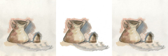
Right image shows my balance of off white and white. I felt that white was too clean and garish for the finished result that I was after.
Curves has also been useful to take control of the strength of the colours of the images. In some cases the colour of the background of the images would present a very off white colour making it quite dark and gloomy. I felt that the off white was something that was quite attractive but I did want to find a middle between been slightly off white but also vibrant and inviting like white that the curves, magic wand and layers tool helped me to achieve.
I conjoined my single images from selection of my originals and merged them with their other half to form my spreads. The spot healing tool’s content aware tool really helped with smoothing out the merge line.
An example of the changes that I applied is shown here:
These images are modified to 72dpi as recommended by Dan Peterson to protect my artwork from unauthorised use and reproduction. To which I intend to follow through with the soon development of my website and the upload of my best images.
Before:
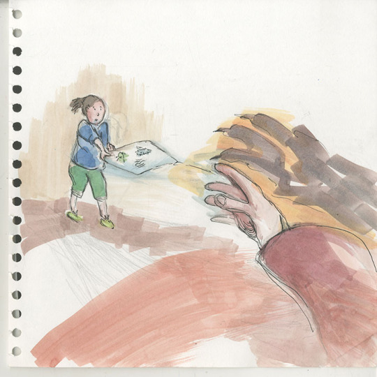
After:
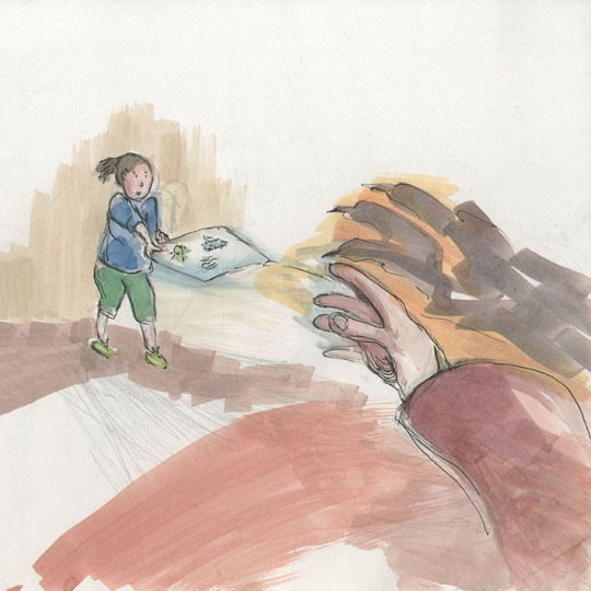
The merge stages is shown here:
Before:
After:
I treated these two images as a whole and worked on it as a flattened image to bleed colours into each other to create a smoothed and flowing effect. This way a flow from one image to next is not interrupted but is gentle and congruent with the reading of the narrative and operates as softly as the water based material of inks and washes.
With all the images prepared in this working method I have taken my development onto the next stage which is my decision to make handmade text. Go to my next post about my text to learn more.
Scan and Edit Job Having completed my images for my story using a squared sketchbook that's in the dimensions of 25cm x 25cm that corresponded to my idea on what size I had envisioned for my size of my children's book.
0 notes
Text
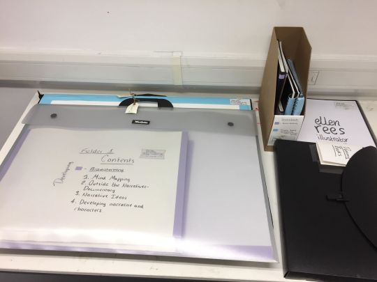
I have been extremely busy over the easter holidays with enjoyably getting on with my final major project. The development of my final images for my children’s book has been a productive and successful journey.
I have completed all the imagery that I had planned for my 32 page story.
(CLICK ON IMAGES TO ENLARGE)
These image show my super busy work station in the studio at University. I have loved using the space of desks all around me where I can spread my work out and carry out different activities at different stations.
I have enjoyed the process of dipping in and out of production stages of the works, where I’d leave work to dry and in that time I’d work on my next piece. All the work was made with energy and was involved in a stimulating factory of production. I would build my confidence through my multiple warm ups of painting and drawing with new images and then go in for the dip pen and ink when I was ready to refine these images and to complete the earlier works that awaited this process as this material required careful and an attentive approach.
Other than my awareness of this needed warm up their was no hesitation other than brief moments of contemplative thinking in my development of these images and they were all completed within a space of two weeks. I am really happy with how smoothly this part of my project ran and with my results.
I would look forward to when I’d take a stack of work up to the mac studio where I’d frequently visit to scan my work. Go to my next post about my scanning process for more….
A Smooth Factory I have been extremely busy over the easter holidays with enjoyably getting on with my final major project.
0 notes