worldbuildguild
The (world)BuildGuild
Submissions are currently OPEN!
MOBILE LINKS
Askbox
Submit
1117 posts
Don't wanna be here? Send us removal request.
Last Seen Blogs

dreamycuddlex3132
kawaii serce
diamond-balloons
republic of pirates
ace-turned-confused
when you build your house, then call me home
ladyingreen7
Lady in Green 7
wickedcriminal
this is the story of becoming a hero the hard way
Text

You've probably wondered where I've been. I don't blame you. It's been a hot minute.
The reason for the absence is simple: I started my career as a consultant in visual storytelling and narrative design this autumn.
As such, I've had to consolidate a lot of my work into building my business.
That means that for the time being, BuildGuild will, unfortunately, be on pause until further notice.
However:
You can still get your regular dose of free writing, designing and drawing tips! Every month, I release a newsletter that provides insight into my life as a creative business owner that'll keep you up to date with my work, upcoming classes/workshops AND a monthly serving of tips and tricks to improve your creative writing, designing and drawing skills!
You can sign up for the newsletter here:
https://mailchi.mp/28779b312567/checkpoint-tales-newsletter
With just a few clicks.
If you want more of me and my business, you can follow me on Facebook and Instagram under the name 'Checkpoint Tales'.
Here you can communicate with me directly as well.
It's been many good years here at BuildGuild and Redlinestation,
and I hope you'll continue following me and hearing me out on my many creative ramblings that are still to come.

#mod wackart#wackart#announcement#worldbuildguild#redlinestation#concept art#worldbuilding#illustration#creative writing
38 notes
·
View notes
Text
Syllabus: Affordance in Hero Props
When you're creating Hero props for your universe, there's some things to keep in mind. They have to look good first of all, but also functional and interesting too! More importantly, they have to communicate their purpose so that the audience understands the effect of the "Hero prop".
Hero props are the more detailed pieces intended for close inspection by the camera or audience. The hero prop may have legible writing, lights, moving parts, or other attributes or functions missing from a standard prop. - Wikipedia
Hero Prop: A prop that is important to your character, story or scene. Which requires extra design-work to be interesting, convincing and to work for its intendet use in the scene.
One thing that I don't see covered a lot is the 'affordance' in Hero Props. Many of us include affordance into our designs by default since we've grown accustomed to experiencing it in the real world. But do we actually know why we use it, and what is Affordance even?

Source: Interaction Design Foundation
Once again we turn our attention to the lingo of other design disciplines. This time UX Design, which is the abbreviation for User Experience Design. User Experience Design relates to the behaviours and feelings surrounding a user, using a given object. Design teams use UX Design to carefully tailor how their users interact with their object and how their users are supposed to feel while interacting. This includes designing the object's usability ( a measure of how well a user can use the object ), as well functionality and even branding to achieve good Affordance. In our case, we're going to use 'Affordance' as a tool to ensure that our viewers understand how Hero Props and objects in our world are interacted with, and therefore can gather context for its use without having it explicitly explained to them.
First off, let me explain a little bit more about affordance so we all have a basic understanding of it.
Source: Quora
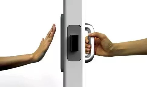
Above is a door. A door that explains the principle of Affordance really well.
Let's imagine you're approaching this door from the right side.
You see there's a handle on the door, but its not a handle that you need to turn or twist. You immediately understand that you have to grab the handle of the door and interact with it. If the designer of this door has considered your User Experience and the Affordance of the door, they will have designed it so that you will have to pull this door by the handle as the handle's designs suggests. This is good Affordance.
Alternatively, if you approach this door from the other side.
The left, you'll notice immediately that there is no handle at all, but a raised pad of metal to lay your hand on. You'll know immediately that you will have to push this door, since there is nothing to grab at or pull. This is also good Affordance
Affordance is best used when it speaks to incredibly simple and limited lines of logic to our brains.
For this door: Handle means pull, pad means push -> since there is nothing to pull.
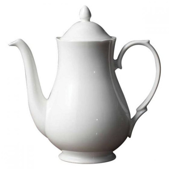
Here's a coffe pot. We understand that a coffee pot is a vessel for holding liquid, cause the inside is hollow. We immediately see the handle too, and know that we need to hold it by the handle.
Through that, we can deduct that we can pour liquid from the vessel by the long snout on the object's left side, by tilting it in our grip.

Ok last example I promise- this one is a little more complex.
Video games and video game controllers is one of the mediums that have to rely a lot on their UX design. Not everyone grew up with video games, or certain video game consoles. Therefore what seems like an object with good Affordance to some, might feel like bad Affordance to others.
I grew up with the PlayStation. The PlayStation controller is designed to be gripped by its two legs. To have the user's thumbs placed on the two nubs at the bottom and then the pointer and ring finger resting at the shoulder buttons up top. I am well practiced in this, but someone like my grandfather might have trouble figuring out the exact position his hands would have to sit in, if he had to explain it to me by just looking at it. However: Sony has made many clever design choices in their controllers that results in buttons sitting intuitively around their device, where it would make sense for the human hand to naturally situate itself.
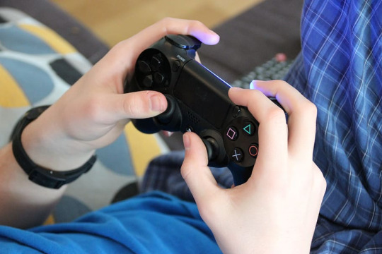
(Source: https://www.wallpaperflare.com/person-holding-sony-ps4-dual-shock-game-video-gaming-controller-wallpaper-whtrl )
It might take a bit of fidgeting around, but once you start up the console and are prompted to press certain buttons, your hands will naturally drift into place. You'll move your thumbs up to manoeuvre the nubs and your fingers will naturally rest on the top of the controller, to avoid cramping. Some people still hold the controller differently than others. It is not always that the device's otherwise very thoughtful layout is effective for everyone ( particularly when you account for differing anatomy, disabilities, etc ). But as a thumbrule, you can give someone a joystick and they'll naturally find comfort in its ergonomic design due to its Affordance.
Ok so what about prop-design and good affordance
Accounting for good affordance can look a variety of ways: but most importantly is that you design Hero Props ( and by that extension buildings, technology, etc) which in their visual design tells the viewer something about how it's used and for what purpose ( unless of course you want to make something truly alien that your audience can't decipher ).
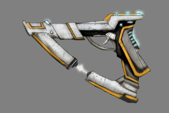
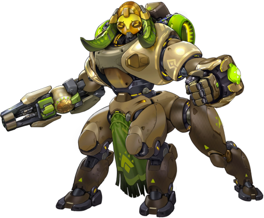
Sci-Fi Gun Concept by allmightythunder
Here, artist allmightythunder has designed as futuristic gun. Despite its pretty abstract shape and overall design, our brains can still figure out how to use it quite intuitively. This is because the artist has clearly framed the trigger and the handle. Which tells us where to hold it, by then, we understand that the gun fires from the opposite end of the handle.
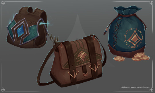
Prop design / Bag by orururu
Artist orururu explains to us how to open each of these bags by making it clear in the design. First bag from the left you grab the metal plated front and swing it open. In the middle, you will have to undo a few clasps on the front before you can open the bag.
The third bag to the right is a drawstring bag, made very clear by the string on top snaring the bag closed.
On top of that, orururu also tells us how the bag is supposed to be worn or carried. Top left is a backpack, as we can see by the two straps on the back of the bag. While the middle one is a shoulder bag. The drawstring bag is not meant to be carried very far, as it has no string. Perhaps it is meant to be carried inside another bag when being transported.
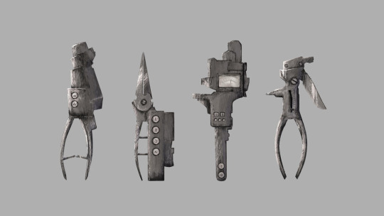
Concept Art Prop Design by novavillanueva
Artist novavillanueva has made a set of tools for a game-project.
All these tools have specific uses that are indicated on the design itself. Some have handles you're supposed to squeeze or pry,
some have buttons, some have scissor blades and others are shielded with heavy plating. What do you think these could be used for? How do think the artist tried to design each tool around its intended purpose?
You can still make amazing looking Hero Props without actively accounting for good affordance. We see this everywhere in background prop and furniture design in a myriad of media.
But designing -interesting- Hero Props with clear uses and a character of their own is an artform. It makes your Hero Prop much more interesting and gets your viewer speculating. Like this, they in turn get much more invested in your world.
Affordance is a very good way spice up your designs, so don't skimp out of it when you're looking to design your Hero-prop!
- Mod Wackart ( Donate )
Portfolio
22 notes
·
View notes
Note
the discord link is borked again!
So sorry for the late reply, I've been out of town last week.
Here's the link for the old RedLineStation's discord. The server is still live and somewhat active so hop on in and get some new art-friends!
mod wackart
20 notes
·
View notes
Note
Ello here I was wondering what happen the the red line station tumblr Account because every time I tried looking it up I can’t find it i would really appreciate it if you answered Me
Hello!
If you're looking for the old redlinestation tumblr account it is here. You can find the posts from it by scrolling down. I'm working on setting up a proper archive but it will be a while since tumblrs tags are broken, and I will need to manually copy and paste every tutorial :)
The original redlinestation got defunct because most of the mods switched to work on the redlinestation discord server. That is why I took over the blog and relaunched it as worldbuildguild.
- mod Wackart
38 notes
·
View notes
Text
Syllabus: Feature Creep ( and how to avoid it )
Let me introduce you to a term from software- and -game development: Feature Creep

Feature creep is the excessive ongoing expansion or addition of new features in a product,[1] especially in computer software, video games and consumer and business electronics. These extra features go beyond the basic function of the product and can result in software bloat and over-complication, rather than simple design.
( Feature Creep: Wikipedia )
To sum it up in the context of worldbuilding and design:
Feature Creep is what happens when a designer overloads their project with ideas, which ultimately ends up making the final design confusing. You'll often find that your design also loses its ability to communicate your ideas properly, as it drowns itself in its excess of inspirations and references.
But what does this look like in, say: character design?

This is Luso from Final Fantasy Tactics A2. On the surface, the character is competently illustrated. Everything is very nicely rendered with a good sense of structure and a high amount of detail ( if you're into that ). The proportions are fine, the style is very clear.
It is a nice drawing.
But upon further inspection, we start to notice just how many features the design actually has: Armour pieces, complex patterns, numerous dominating shapes and so. many. props. The palette, while not immediately clashing is also incredibly confused, spanning from just about any primary colour in the colour wheel, all contrasting one another, making it hard for your eye to find a place to rest when looking over the design.
If you were to take a look at the design and tell me what it was supposed to invoke thematically, what would you tell me?
- Well it's a mage ( mage book ) that is also a knight ( sword ) but mostly its a warrior with some kind of special proficiency in keyblades(??), but also there are some touches of nature and luck ( clover, ladybug on the belt, green, patterned cloth ).
You'd have a really hard time convincing me that the design is invocative of any one of its ideas.
(If you were part of the art community back in the 2000s to 2010s you'll also definitely remember all the memes about the angel-wolf-demon-goddess-mermaid-dragon OCs and all the derivatives of that particular line of design. Some faultily called these the markers of a Mary Sue character. Though I'd argue that Feature Creep can show up in any well written character regardless. Even those who are made by professionals, who are well aware of what they're doing: like Luso, for an example )
Feature Creep is, however, a typical marker of a developing designer or young artist who want to explore multiple ideas at the same time. Morally, there's nothing wrong with that. You can make as many hybrid creatures as you want. It is all in good fun.
But if you want to sell people on a design or a story, you're going to need to edit them down a bit.
Economy in ideas
Animated features and shows are probably among the mediums that approach their designs with the most limited amount of ideas.
That doesn't mean their designs are boring though, oftentimes they're actually incredibly effective since the limited amount of ideas allowed in a design means that designers can pour much more care into integrating the ideas into the final design.
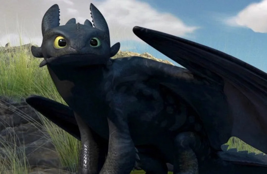
Let's take a look at one of the animation industry's latest greats: How to Train Your Dragon.
When Dreamworks artists sat down to design the dragons for HTTYD, they decided to go against the current trends.
The western hemisphere has long been plagued by samey designs, as the likes of Drogon ( Game of Thrones ) Draco (Dragonheart), Saphira (Eragon) and Smaug (The Hobbit), who has solidified the European take on the mythological creature into the cultural conscious. The designs in themselves are not bad at all, but when HTTYD suddenly took flight with its completely reworked ideas for what a dragon could look like - it was a breath of fresh air.
For toothless the designers seemed to have applied nothing more than two main ideas to their design. A black dragon with anatomical cues from an axolotl but the mannerisms and certain facial features of a black cat.
This design invoked a sense of familiarity. It was simple, iconic, slightly strange to those who hadn't been familiarized with the axolotl yet, and clearly communicated a sense of pet-like behaviour through its feline gestures.

Staying in the vein of feline creatures; Pokemon is perhaps even more restrictive in their idea economy ( at least for the most part ).
Many of the first generation pokemons were 'merely' combinations of animals mixed with either elemental concepts, such as the many evolutions of Eevee ( Flameon, Jolteon, Vaporeon, etc ), or Pikachu, a Rabbit that bears electric symbols incorporated into its design.
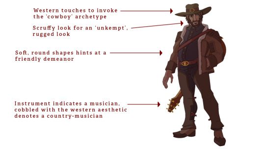
For something slightly more complex we can look to Blizzard's Overwatch game. Where a number of desigsn are inspired by combining real life stereotypes of certain cultural-historical peoples or occupations ( cowboys, ninjas, DJs/musicians, arctic explorers ). One example of such is the centaur-hero Orisa. Which combines the anatomical features of a quadroped creature with a human half on top. But with an added idea of incorporating patterns and assets that have been debated to be of Baluba origins. A tribe originating from Central Africa.
As you can see, designers usually stick to around 2-3 main ideas and then pepper in little extra details that are at least adjacent to their main ideas. It keeps the reading of the character consistent, and you're not at risk of overloading your designs with needless elements. If you're looking to make a character that is actively trying to look confusing, of course you can throw as many ideas in there as possible, but for when you need your design to convey a cohesive read to your audience ( which is supposedly most of the time ) you will do well in picking only a few ideas and incorporating as thoroughly into your design as possible.
How to chose your ideas
There aren't any hard and fast rules as to why you should pick some ideas over the other. It mostly comes down to your preference as a designer and storyteller. I personally prefer following these three milestones, as they ensure that your ideas are relevant to your design and provide the potential for visually interesting designs.
Pick those ideas that can provide the most thematic relevance
The most obvious choice is that which relates to your design's main idea.
An example for props:
You need to make the prop looks modern to your audience. Therefore you chose ideas that incorporate smooth, sleek shapes into the prop's design ( reflecting the modern design trends of today ). Maybe you'll combine the soft, rippling shapes of waves on the sea with the shape of a chair or couch, to eliminate the need for edges that could make your seat seem "clunky" and 'out of style anno 2022'.
Example for characters:
Your character likes fish, therefore you incorporate a number of blue-ish greenish colours into the pallette. Maybe you even add a few 'fin-like' shapes to the silhouette or outfit.
Pick the most interesting ideas
Perhaps you're picking between two aquatic ideas. Let's say: Ships and Seamonsters. Which one do you feel provides the most potential for fascinating solutions to your design?
If you're making a sailor-character, perhaps the Ships are more interesting to you. If you're making a mermaid, looking to seamonsters might be a pretty cool idea.
Pick those who contrast the most
Humans -love- contrast! it brings interest nearly by default in anything from character design, to environmental concept art, storywriting and art styles. It makes us curious as to how things work and why they are the way they are. Which is ample ground for you to do some interesting worldbuilding or character writing.
If you are to design a submarine, you could just make a submarine. But what if it was in the shape of a seagull? A bird that only enters the water for fish once in a while. Hell, what if your main character; a young scholar who is very much not comfortable being underwater, had slight bird-like features to really emphasize how out of their element they are.
These are just three parameters which I use to sort my ideas. Sometimes I also do stuff for the hell of it, but for the most part I like to put a lot of thought into how my ideas contribute to the design. For the most part, I'll try to connect my ideas to the world and the story as much as possible to make the whole experience seem more cohesive.
What you value in your ideas is up to you, perhaps your art style demands that you use certain ideas to stay consistent. Maybe you prefer designing with certain palettes or shapes. That's fine.
No artist picks and chooses their ideas for the exact same reasons. Everyone has biases. But it is important that you are aware of your choices. Moreso important that you are aware that you don't squash too many ideas into a design.
Remember, every idea is a good one, maybe it's just not always relevant in the context you got it in. So save the unused ideas in a note somewhere - it might become useful later!
Mod Wackart ( Donate )
( Linktree )
92 notes
·
View notes
Text
Syllabus: Line Mileage

(source)
If you google Line Mileage you'll see relatively few search results. Why this term has come to be so obscure to the public is everybody's guess. Regardless; it is an incredibly important concept for artists working with visual storytelling to understand, as it informs them of how labour-intensive a design or composition can be.
"Line Mileage is a term that means how much line you have to draw. if you were to take a traditional drawing and stretch out the lines end to end, you would see what your Line Mileage is. Every millimeter more of pencil or digital line takes more time to draw. Intricate character designs may look good as still images, but the reality of animating such a character is time consuming. A long, curly headed character wearing a wrinkly overcoat, multiple ammo straps over his shoulders, and a striped shirt has extra Line Mileage. It is difficult to keep so many lines moving well without them seeming to crawl, pop or distract from the animation"
Tina O'Hailey: Hybrid Animation: integrating 2D and 3D assets
As O'Hailey mentions in her book: Hybrid Animation: Integrating 2D and 3D assets, Line Mileage is the total amount of time it takes for an artist to draw a character (and by that extension prop, background, etc). Animators have used this term to deduce whether or not a design is adequately balanced in its amount of details in terms of artists being able to reach their deadline by drawing it the amount of times necessary.
Line Mileage is most commonly used in the world of 2D animation. The use of the term has fallen somewhat out of favour now that the entertainment industry has skewed heavier towards 3D animation, but it's still a concept well worth grasping if you work in 2D, particularly in disciplines such as comics, animation or serial illustration where the volume of drawings you need to produce exceeds more than just a handful of images.
It sounds simple enough to consider whether or not your character design is too complex to draw multiple times. But you will find, especially if you're just getting started, that your stamina drawing your character will drastically dwindle once you've been through with it a few times. If you've committed to a comic project, the first 3-4-5 times of drawing your character might be perfectly easy and motivating in enough of itself. But when you get to frame 10, 20, 40 - your design will most likely have lost a good bit of its excitement to you. Now you're in for the long haul of gruelling work, and if you have not made the design suitable for that kind of long-term labour, it is going to be absolute hell to pull through. Moreover your lack of motivation will surely come to show in the final product.
There's not one 'correct' amount of detail or Line Mileage for anyone or anything. But is understood that the average artist can undertake a certain amount of Line Mileage without overworking themselves or even worse, causing themselves long-term injuries. Yours will never be like anyone elses, so never rely on what other artists might be able to manage, you'll end up hurting yourself (I've been there and that injury still sometimes keeps me from working for days on end).
How to account for good Mileage
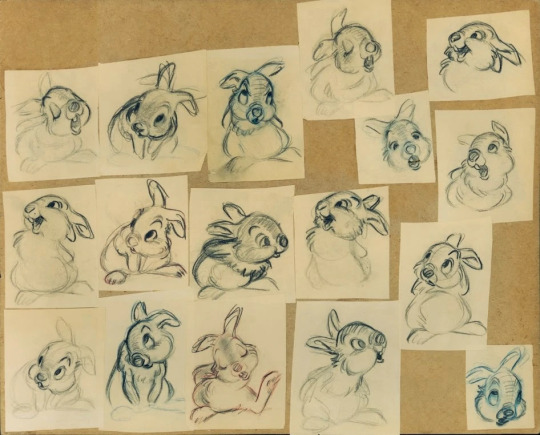
Milt's rough animation drawings from Thumper's famous scene: "If you can't say something nice..."
Check your medium
Accounting for your Line Mileage in a sustainable way comes down to researching and making conscious decisions about the complexity of your design. This decision should be made based on your own speed rather than anyone else's, as you will be the one drawing your character again and again. So forget what industry professionals or other hobbyists can do. You're the illustrator/animator/storyteller, you make the decision (unless you're working as lead of a team; naturally you'd want to get a feel for your teams capacity first before making any decisions in that case). Your design's complexity should also be based on how many times you're supposed to draw the character. It's logical to assume that a character that you're supposed to draw once or a handful of times can be a lot more complex than a character that needs drawing dozens or hundreds of times.
Be honest with yourself when making a decision on how high your Line Mileage should be. Always give yourself a little less work ( in this context: a little less detail) than you think you can manage.
Trust me; you will thank yourself later!
The following examples are based on my capacity as an artist and is not indicative of yours or any other industry professionals.
Pay attention to the difference in detailing between them and notice how their complexity lessen significantly the more frequency the character is supposed to be drawn.
Illustrations
Drawings: 1-5

When it comes to designs that I'm not supposed to draw a million times over ( say, a random character or creature that will pop up in the occassional leisure piece ) I don't hold that much back on the detailing for the sake of Line Mileage. Though, compared to other artists, I'm still somewhat conservative to details. Though this has all to do with my own personal stylistic preferences rather than Mileage.
In this design, meant only to be drawn very occassionally; The ribcage takes up a majority of the total Mileage. Drawing exposed bone structures is incredibly time-consuming, as it does not only take time to apply lineart to, but the construction of it and the sketch phases take a long time too, as every rib has to be lined up properly as to not break with perspective. I personally try to include as little structure that would require a lot of respective, when it comes to designs that are supposed to have low Mileage. Perhaps also a by-product of my less than stellar grip on perspective. I would recommend it for anyone who's not 100% comfortable with drawing perspective too. It's just really time-consuming from the onset.
You'll also notice that every single leaf in the mane of the creature has been drawn in pretty meticulously. I would never do this for a design that would only need drawing occasionally. You can definitely simplify the likes of the mane down to a more uniform green mass though to lower your Mileage.
Storybook
Drawings: 5-12
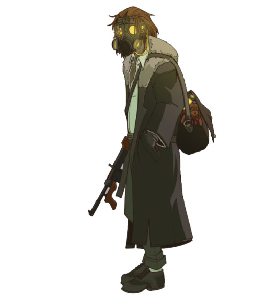
When we get into storybook (and later comic book and animation) territory, I will personally start scaling back on details majorly. Instead, I'll focus heavily on incorporating large, dominant, and interesting shapes into the design. Seen here with the tall, lanky anatomy, the big trench coat and the furry collar. The bag was added to pad out the silhouette and give a secondary shape as well. This bag and the gasmask are the only elements that require somewhat thorough construction in the sketch phases. The machinegun is drawn using a hybrid method of 3D and 2D assets, more on that in a later essay) Therefore, the majority of the design can be freehanded pretty easily with little need for reference.
Comic
Drawings: 15+

Now we're getting to the more scarce designs in terms of detail. Once we reach comic level, I personally like to scale back the designs almost to the bone. Keeping only the most major shapes intact and generally simplifying the design down to its core ideas. In this particular example, that meant scaling the details down to a simple robe and overcoat/vest, along with a relatively simplified version of a sword. The character has a few details in the form of facial stubble and two scars, but aside from that, he is pretty simple when compared to the designs above. Just like the gun from above, the sword is worked into the illustrations by applying 3D and 2D assets in order to expedite the process. Therefore it isn't considered an integral part of the design itself from a Line Mileage standpoint.
Animation
Frames-
2D animation is among the most laborious disciplines of 2D visuals and storytelling that you can do. This makes it incredibly expensive to produce as well. Many newer shows tackle this incredible amount of labour by simplifying their designs ( see Steven Universe, Adventure time, etc ). If you're a single artist working on something, I highly recommend you think about the economy of your details through a very conservative lens. At least if you want to animate long-form sequences. Disney and Dreamworks had success in animating relatively complex 2D characters back in the 2000s by organising in teams of up to 30 working on characters alone (in the case of The Little Mermaid) working full time to produce over one million drawings before release. If you're not Disney, you don't have 29 other people with you and enough money to pay yourself full-time along with your other animators, then you need to think very critically about how you spend your time. Granted, you can absolutely go as detailed as you want as long as you plan your animations legnth and your time-frame for making it accordingly.
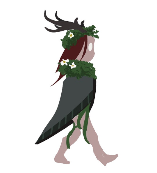
Anyway: Above is a very basic idea of what a design for an animation could look like. Many indie-artists currently lean towards these highly simplified by effective designs. though, we are seeing a resurgence of semi-realism in adult cartooning ( See Netflix' Castlevania. The Boondocks, The Legend of Voc Machina. Technology is allowing artist to draw more complex designs more efficiently ). You'll see that many of the structural details of the character's anatomy ( facial features, toes, etc) has been removed completely or simplified down to very minor shapes and volumes. The majority of the character is covered in one shape (the cape) and the texturing on the leaves and flowers is random splatters of a brush. This design is almost as simple as it gets, but still clearly conveys a few ideas. I'm by no means saying that you have to go this scarce with your detailing for animation, I would personally maybe shoot a little above it as well if i was to make an animated project, but from a pure Mileage point of view, this design would be very optimized for animation.
Take breaks: even with good Mileage
No matter how low your Line Mileage is, taking care of yourself should be at the forefront of your mind when drawing characters multiple times. Drawing takes a huge toll on your hands, your elbows, your posture and your overall health. I'm not going to preach too much in this particular post (though expect it in a future essay) But being conscious of your Line Mileage is not only going to save you time, but spare your body from excessive repetitive work, which can cause RSI's (Repititive Strain Injury). These can completely mess with your scheduling and in worst case scenario become chronic.
So don't even try it. I can personally attest that giving your projects a little more runtime is going to suck a lot less than being unable to draw for long periods of time. Certainly suck less than dealing with chronic pain and deformities because of being too ambitious with your Line Mileage.
Mod Wackart ( ko-fi )
Follow my work!
59 notes
·
View notes
Text
Alan Moore's: Writing for Comics
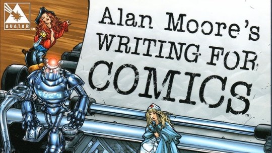
So for the blog's first book-review I'd like to talk a little bit about Alan Moore's: Writing for Comics. Predominantly because of the dozens of books I've read on visual storytelling and fictional writing, this is the one I've read most recently. The others need a re-read in order for me to give them a fair review.
To those unfamiliar:
Alan Moore is considered one of the most important British comic writers of half a decade. His works include comics like V For Vendetta, Swamp Thing, The Killing Joke, and perhaps most famously; Watchmen.
Alan Moore has worked for Image Comics but has launched his own publisher: America's Best Comics.
In his booklet Alan Moore's: Writing for Comics (co-written by Peter David), we are lead through what feels like a critical stream of conscious that takes a hard look at the Comic's Industry and its approach to writing in 1985. A few years before the infamous Crash of the Comics industry. I'll be writing up an essay on the Crash of Comics industry later, but in short: it is speculated that an oversaturation of lackluster comics mixed with a profit-driven focus by publishers on marketing their works as 'collector's editions' or otherwise 'exclusive' prints, lead to a collapse in comic sales in the late 1990s. The ripples of this crash can be felt through the works published both at the time and following it. As many iconic authors and artists of the craft discussed the downfall of their art in a variety of ways.
The booklet also features another essay written by Moore as recently as 2000s, somewhat into the industry's revival.
This particular booklet does so by pointing to the shortcomings of the writers of the time. Not only does Moore berate the shallow character writing that had taken place. But also takes a shot at the ways in which the industry focused on over-marketability rather than telling genuine stories.
Peppered on the pages are little pieces of advice that the beginner, or even aspiring comic writer ( and writer in general ) can use to get started.
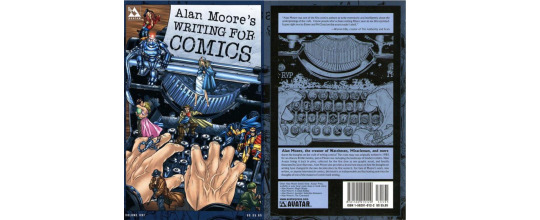
You won't find much in the way of demonstration, as this booklet reads more like an essay from Moore to start-up comic authors, meant to entice you into crafting better stories, rather than tell you exactly how to. This makes this a relatively short read. With no more than 48 pages which, while densely layoutted in terms of text, is printed in the size of a comic-issue. So you can imagine for yourself that there is not that much in terms of volume.
Moore adopts a rather biting tone very in lieu with his own personality in this booklet. Which can inspire others, while some might find it a bit too brazen. I personally like when I can feel an artist through their writing, and it never feels like Moore is stepping out of line, moreso taking a somewhat pointed tone towards an industry that in retrospect might have rightfully earned it.
Right now, the booklet retails for about 6 dollars for a paperback version which makes it very affordable if you want to read something from the voices of one of the modern industry's most prominent figures. Maybe you're curious to read through this small comic-cultural bubble in the form of the first essay from 1985.
However: if you're exclusively out for books that'll guide and demonstrate exact principles and methods in comic-making, then you might want to skip this booklet for now.
You can get the booklet from online retailers, however you might struggle to find it in physical stores nowadays as it was published in 2003.
Mod Wackart ( Donate )
Portfolio
39 notes
·
View notes
Note
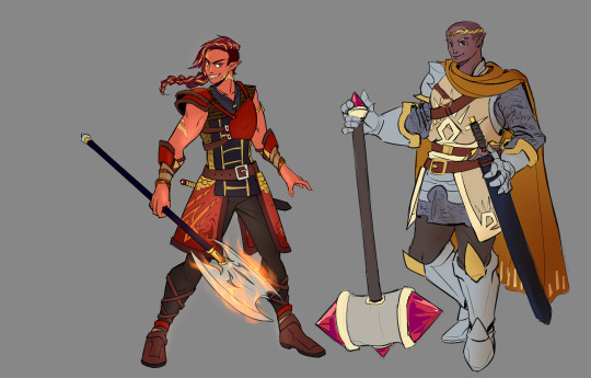
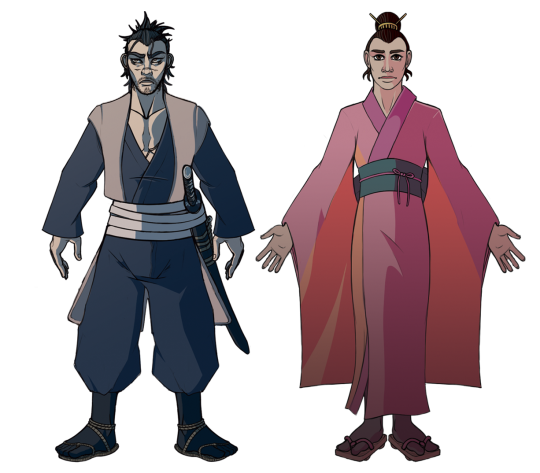
hello! i have somewhat recently carved out my niche in character design (specializing in fantasy, typically D&D characters) and i feel pretty confident about my abilities, but i’m curious to see what kind of critique some fresh eyes may offer. here are some recent designs that i’m proud of. the biggest thing i struggle with is colors outside of a blue and blue-adjacent range, so these two had me pushing myself. i tend to go for muted colors in general but i’m not totally satisfied with its effect on my art. (these two are scorch and quartz, she/her for both, fire and earth genasi respectively) thank you! 🖤
Hey Astrophysiciann!
Due to blog policy I can only critique one of the characters for now, but feel free to resubmit the image into our askbox if you want an opinion on the second character.
Before I get into the meat of the critique, I would like to start up by listing the things I really like about this design:

In overall, the design is full of really interesting details. The pallette is consistent and has a strong theme going, and the character's personality and attitude is communicated really well through the posture, the expression and anatomical features.
What struck me about the design first when I started studying it closer was the intricacies of the design. Now, I don't know which medium this design is made for. Your treshold for the line mileage might be a lot higher than what I would personally default to.
But regardless of that there's an abundance of details here that my eyes, unfortunately, don't really pick up when looking the design over. This is a very common situation artists end up in.
Myself included. Especially in the first few iterations of a design.
We love to see characters rich in ideas, but in some cases, these details can end up overshadowing one another, and thusly - the individual idea doesn't get as much attention as it deserves.
I will write an essay on this particular situation down the line. But for now I'll refer to my very brief introduction to the economy of ideas in a previous post on my designprinciples in the section called " One Main Idea, Two Secondary ideas" (which I really have to find a snazzier name for)
I will let this principle guide me into the first step of my critique.
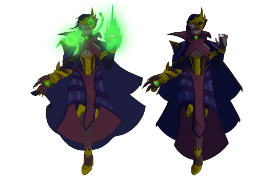
One of the things I marked on the first graphic was the character's distinct armour. Including the chestplate, the layered pauldrons and elbow guards. In this iteration, you'll see that I've sized up the armour already present, and added a few more pieces ( belt, leg armour ) to carry that idea all the way down through the design.
I really liked the shape of the character's coat in the original design and the only reason I changed it up was to see what it would look like if I elongated it and gave it two triangular points. This makes the character appear taller than the previous design. The back of the coat is designed to move fluidly with the characters movements and combined with the braid, the character's animation would look almost serpentine. Whereas the squarish shape speaks of stronger, more rigid movements. There's no right or wrong approach to this, it all comes down to what you want the design to tell your audience.
One thing you will notice about the new coat shape is that it adopts the horizontal line pattern from the character's left shoulder pauldron. The patterns you've drawn on the coat is stunning and interesting, I just personally felt that it got a little bit lost with all the armour and its straps. You could definitely keep the pattern and have it take center-stage by scaling the armour down, but since I opted for an iteration that favours the armour as a Main Idea, I had to remove the more intricate patterns. Instead I implemented the horizontal lines all the way down the design, just as I did with the armour. This pattern mimicked the ladder-like pattern on the front of the coat, which I ended up keeping just to maintain some of the coat's exclusive finish.
On the graphic to the right you'll see I've drawn a bunch of triangles in over the design. You had already made some use of triangles in your design, which conveyed the character great.
Triangles are, for those who don't know a very dynamic shape that indicates speed, determination and action. My iteration of this design is made to feature a bunch more triangular shapes because I love being just a little over-the-top with my use of them.
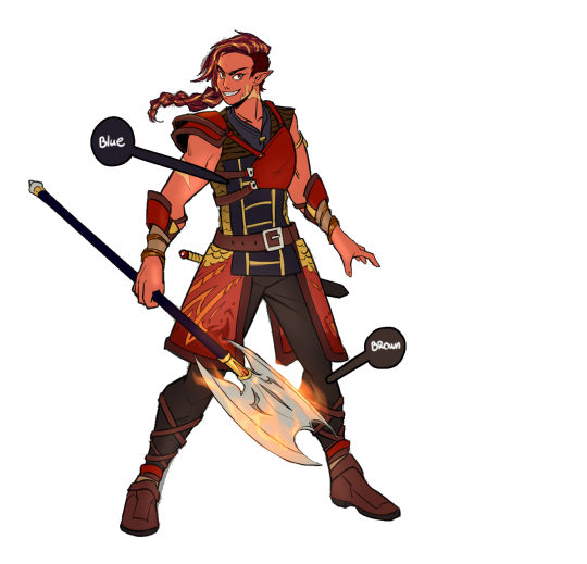
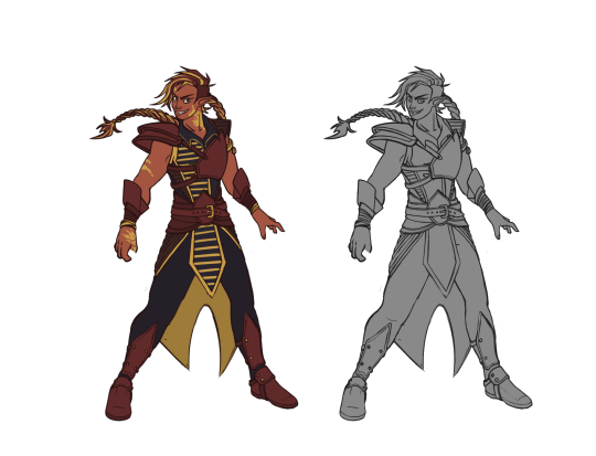
There wasn't much I wanted to change for the pallette. It's pretty well put together in overall. The only thing I ended up really altering was the colour of the pants. Since you had already observed that the bluetoned values of the coat was a good contrast to the red armour and orange-y skin, I decided to pull it all the way down through the design. Doing away with the brown colour.
I also pulled the yellow/golden colours with me into the lower half of the character's costume, by making the inside of the coat yellow.
As a whole, this design was very effective from the start, you clearly have some sense of storytelling to your approach that can take you quite far in the process. All I did was to suggest ways to cleaning up the design should you want to.
Hope you found my suggestions helpful!
- Mod Wackart ( Donate )
Portfolio
34 notes
·
View notes
Text
A quick intro to my approach
Ok so, I'm going to stop ranting about me very soon, I just want a few things out of the way first. Throughout my 6-7 years of art schooling, our professors would always start the classes up by introducing themselves, their body of work, and the industry they come from. This was not to showcase themselves, but to lend credence to their teachings, and to let us students know where they came from when giving critique. Which could sometimes help us as students to analyze and apply their feedback properly, knowing that they would've been reviewing our work from X, Y, and Z experiences.
I'm going to do the same here. Just like with introducing you guys to my CURLS model, I want to give you a fair chance at understanding the motivations behind my opinions, and decide whether or not you may agree with them or not. So that when you receive feedback, you can sort through my comments, take what you want, and leave the rest. I promise I'll try to make this worth your time by peppering some advice for designing (for characters this time) in here and there, that I personally use when working. I'll of course go more in-depth with this advice later, but consider it a sampler for what's to come (that you can always google for yourself should you be too impatient to wait for the full essay)
My background in art and design:
You guys know the classic: I've been drawing my whole life,
so I'll skip that and jump to the slightly more interesting stuff right away.
I graduated from STX ( college being the closest American analogue to this) with an equivalent of a minor (among many others) in Art and Media back in 2015.
Upon graduating, I was offered what was supposed to be a temporary position at Gyldendal, a major publishing company in Denmark. Here, I was to work on a small project about Motion Graphics in storytelling for children. However, as my contract expired, I was moved to another department, and later then, to a third department. This one in Educational Online Content for Pre- and -Middle school children. Here I would assist authors and editors in illustrating and implementing content on their websites for 7 years before my contract was unable to be renewed due to budget cuts in the company.
While working for Gyldendal, I took a semester at The Animation Workshop's Drawing Academy, to study classic art. I had a great time as it was my first time living completely on my own. But I absolutely sucked at doing classic studies and often believed myself to be the worst in class. I completed the semester but had been humbled by the experience of meeting a plethora of other, much more skillful artists than I. I had been dreaming of applying to The Animation Workshop's Bachelor program since middle school, but after two failed attempts and now a rather lackluster performance at The Drawing Academy, I didn't quite know where to go.
After applying for a few universities I felt no motivation to be a part of, I accidentally stumbled over The Royal Academy in Copenhagen's website, in particular, their Game- and -Interaction design faculty. The faculty has changed names since, but at the time, it encompassed some of the aspects of Art and Media that I had really wanted to do for a living at that point: Concept Art.
I applied and after two very stressful tests and a nerve-wracking interview, I was accepted into the Academy.

At the academy I first graduated a Bachelor's in Game- and -Interaction design, where I focused my attention on concept art, storytelling and project management. I would later continue my studies with a Master's degree from the same faculty, now narrowing
my studies down into Art Direction and its subsequent topics.
During my master's I also officiated my business publicly. I had been working with art as a freelancer since STX, but my earnings from this venue was growing substancial enough that I had to register properly.
Today I still work freelance. My efforts are going into building my client-portfolio and getting a stable economy going by networking and doing odd-jobs here and there, whenever I'm not illustrating or teaching sporadically at least. I am in talks with another, smaller publisher with whom I have ties from my own network, and as is now - my first book(s) on Worldbuilding for fictional stories is well underway :)
Inspirational sources
For something a little more fun;
My inspirational sources range pretty far and wide. Having grown up in the late 1990's and early 2000s, I am of course partial to the styles of Disney, Dreamworks and whatever cartoons were on the television on the weekends. I found a particular interest in the more semi-realistic styles of the time, such as that seen in Dreamworks' 2D animated films (The Prince of Egypt, Road to El Dorado, Spirit, etc)
However, as I have grown older I've found myself falling in love with slightly more abstract styles from the era, such as Genndy Tartakovsky's amazing work on Samurai Jack, or the bold shapes of Johnny Bravo.
Lately, you might recognize a wealth of details inspired by the designs of Bioware's flagship series: Dragonage and Mass Effect. Which has dominated my approach since I began my studies at The Royal Academy.
semi-realism with bold shapes
My art predominantly leans into semi-realism. Not very different from some of the typical stuff you'd see in the 2D oriented media of today.
I typically go for a lower line mileage than higher. That is because I like to use my designs over multiple illustrations or in larger projects, and therefore need to lower the total time spent on the individual piece. However, to make my designs stand out despite the typical low detail level I like to use bold shapes to bring a character to life and make their sihlouette unique. This is usually done by working these shapes into the clothes of the character. I'm leaning more and more towards incorporating them into the anatomy as well, but currently I'm just too comfortable drawing characters with realistic bodies to really push for it. You can see these bold shapes come in in most of my works. An oversized coat for a very square sihlouette or a properly singed corset to narrow in the sihlouette and create an interesting negative space.
intentional pallettes
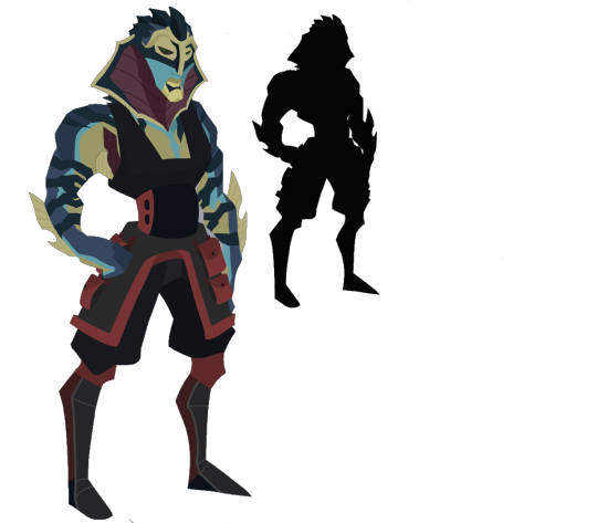
Like any other designer in my field ( I believe at least ) I make sure to pick my colours with intention, which is also a common design principle. What I mean by that is I pay attention to the symbolism and psychology linked to the colours I'm using. Such as the purple's link to mysticism and wisdom on one of my character design's for a mighty mage character.
But moreover, I also make sure to place my colours ( and values ) in a pattern that intentionally leads the eye through the design, so that I can control what to put in focus. Such as in this otherworldly design of a deity, that mixes features from all matters of mythological creatures across the world. Where the pale skin and gold centers the creature's core and face, but also draw attention to the crown of horns and claws.
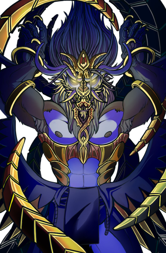
I will often try to bring a colour down through the whole design so that it leads the eye through it. You can also see this done in this design with the light gray skin-tone carrying from the curled horns, down the face, the torso and along the thighs.
Small, Medium, Big
Small, Medium, Big is another very common design principle that is very widespread in the design industry. Making sure that your design holds a balanced amount of small shapes, medium shapes and large shapes helps make your design seem cohesive from top to bottom. My ratio is typically around Big: 1, Medium: 2 and Small: 3, since I am not very big on details in my own designs. But you could feasibly get away with reversing it as long as you make it consistent in your design. Remember that the big shapes are that which will dominate your design's sihlouette, so use it intentionally and put it a place where it can add to the sihlouette.

Historical and cultural referencesl
As I began telling stories and designing as my career, I discovered the absolute joy it is to be interested in both Art Direction, History and Culture! You may think that you've thought up the craziest, weirdest, most violent design. But if you take a look at human history, or really just the world we live in, you might find that your design could be even wilder. The world is not as novel as many think.
I always start my research by trying to find the closest real-life analog to the subject I'm trying to design. If I'm looking to come up with a certain disease, I will look to history to find pandemics or epidemics to take reference from. Following real-life examples can help make your design more feasible, as it will follow the logic your audience recognizes from the real world. This goes for everything from sickness to monarchies to holidays, economic figures, animals, and murder cases.
At this point my favorite thing to do when designing is to simply dig into some documentaries, books and podcasts on real life topics and pick and chose what I like and combine it into something unique.
(If you do this, remember that certain subjects such as: religions, cultural symbols, ideologically charged historical events, etc, will demand a very respectful approach. You don't want to be appropriating something, merely take inspiration from. More on this at a later date )
Symmetry vs asymmetry
I -love- using symmetry and asymmetry in my design.
Symmetry not only lowers line mileage by streamlining the silhouette but can give a sense of stability to your design. It looks uniform and harmonious. Maybe even a little conservative. Not much different from how shape language can work with more square shapes.
Asymmetry provides a dynamic change to the design. This can be used to make your design seem more vibrant, and fun even. It adds visual drama that the eye attaches to immediately and can be a good way to lead the eye.
I typically use symmetric designs, not just for low milage, but to indicate a sense of calm in the design. While I use asymmetry for designs that are a little more radical.
Sometimes: I'll even use a base of symmetry for the bulk of the design, but then add an accent of dramatic asymmetry to it to break up the monotony. This keeps the line mileage low, but the recognizability and the drama of the design high.
One main idea, two secondary ideas
One of the things I most often tell my students and clients, is that they're trying to squeeze to many good ideas into one design.
In my very humble opinion, a design can harbour 1 good idea.
A main idea we'll call it. And then two-maybe-three smaller ideas. Kind of in the vein of Big, Medium, Small. It balances the design and communicates its purpose clearly, rather than drown it in details.
This also allows you create many more designs by saving you on your valuable ideas rather than squish them all together in one design where half of it will not be recognized by the viewer. An infinitely useful approach if you create designs for a living and want to not run into seeming too samey' for re-using ideas from other designs.

Contrast in designs
Just like intentionally using symmetry and asymmetry, I love using contrasts. Contrasts in a design create visual interest and draws the eye. it can also add drama to the silhouette, and make it more dynamic and recognizable. But it can also be used to tell us something about the character. As a contrast can enhance both aspects of what it's trying to contrast.
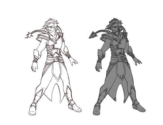
This design for an example (Excuse the very pallette):
A slender, slightly femininely dressed mage in a long skirt and ornate corset, does not read like a type that would use his body for a lot of hands-on action. But then we add the massive, clawed gauntlet, and suddenly the gauntlet prompts us to ask what it might be used for?
A mage is not typically seen brandishing armoured gauntlets.
High-fashion diva's don't usually carry clunky equipment like that. Had the character been a knight we'd assume it was simply part of the armour.
Making your audience ask questions about the nature of the design, that corresponds to the story you want to tell can be a great point of intrigue. Though of course, this must be done consciously, and knowingly of what questions your contrast might elicit.
Storytelling in design
In the vein of asking questions, storytelling in a design is used in a somewhat similar fashion.
Your design should tell the audience what it is, what it is used for, how it is used ( by using a principle known as 'Affordance' more on that in a later essay ). and who uses it.
For characters these questions could be framed something like:
Who are they? What do they do for a living? Where do they come from?
How you decide to answer these questions can vary greatly from design to design. It dips its toes into everything from shape language, to colour pallettes to the details you add to the design.
I'm personally always laser-focused that the details I add to, for example, a character design, tells me something about the character itself. If it doesn't tell me anything in particular, I alter it to something that will, or remove it together. This is a way to bring a bit of economic thinking into my designs. Making sure that all my audience can see on a design, is relevant information for them to know. That is also one of the reasons (beyond low line mileage) that you will not see much excessive detail in my designs. I like to keep things to the point.
These, among a host of other principles which I do not want to bore you with right now, are those which I use to design.
You can pick and chose what parts you agree with and what you Don't agree with and apply it to my feedback and my essays that are to come.
If you want to know more about what I do, perhaps see a few more designs: you can visit my portfolios. I'll also gladly share more demonstrations of my own work in case of any questions but I'll let you guys ask for it rather than frontload you with it now.
Once this post is up, we will dive into the submissions and some of the essays that will be coming up. I hope you enjoyed this slightly too long elaboration on my process, and I look forward to talk to you guys about the individual principles a little more in-depth.
Mod Wackart ( Donate )
Portfolio
30 notes
·
View notes
Note
The RedlineStation Archive links don't work, I would like to look at them if that's possible.
Hi anon!
I checked up on the links and it looks like they need to be retagged. I'll try to get around that this weekend so that the archive can be restored.
Mod Wackart
7 notes
·
View notes
Text
Blog Update: First posts, projected activities, Syllabus
Hey Builders!
As the blog is still being built as we go, in accordance with the needs of the community - I will spend the weekend working on feedback as well as setting up the blog's Syllabus.
The Syllabus will be a dictionary of terminology and principles that we discuss here on the blog. The Syllabus will contain the topics in alphabetical order with small descriptions and links to the posts that elaborate on them. The first few terms will be added during the weekend, but the Syllabus will of course be updated continuously to keep up with the content on the blog.
That way you can always consult the Syllabus if you're in doubt about whether or not a question you want to ask has been discussed before. We will also be directing asks about already discussed topics to the Syllabus as it comes along.
On a quick side note:
I'm working on some of the last introductory blog posts that I want out of the way before we start the activities proper here on Build-Guild.
I've been brainstorming a wealth of topics to cover here on BuildGuild before the launch and now I am getting closer to a cohesive as to what I believe I'll be able to provide on this blog.
My ideas are as follows: - Essays
- Book reviews: Books on writing, concept art, art and design
- Discussion of fictional worlds: Worldbuilding cases in pop.media
- Exercises/prompts + community showcases
- Feedback on designs and ideas through our askblog
- Portfolio reviews ( geared towards art-school applications )
- Interviews with people from the field: community requests + my own contacts
Let me know if there's anything, in particular, you would like to see here on BuildGuild by putting an ask in the ask-box or replying to this post :)
Cheers!
Mod Wackart
12 notes
·
View notes
Text

( Transcript: The 5 Principles of Design For Entertainment )
INTRODUCTION
Before I get to giving feedback to your submissions I would like to make it perfectly clear from which kind of design philosophy I come from when addressing your designs. That way you can decide if the BuildGuild's approach fits into your preferences or not.
As I'm currently the only Mod active on the blog currently, I will of course only be able to argue for my approach and not for Chekhov's or any future mods, who will most likely publish a post about their own methods later. For now however, you're stuck with me for the time being.
As I come from a background in academia and with a focus on creating designs fit for the entertainment industry ( and the indie-industry subsequently ), I work on a basis of principles. I'll delve more into these at a later date ( or you can google them if you feel so inclined ), but for now I'll simply introduce you to the broader ideas so we're on the same page from the beginning!
"So, what's a design-principle?"
Almost no matter where you go in the world of design you'll be bound by the fact that your design must solve the problem it is supposed to adress to some capacity. In entertainment design, more specifically, for concept art and storytelling; that means that your design must be effective in communicating its desired purpose to the audience.
That might sound obvious to some. But you'd be surprised just how often even big and trusted film-companies or game-developers fail to make their designs effectively communicate their designated purpose to their audience.
To the rest of us, who need things explained more concretely, here's an example.
" A character that is set out to be a villain in a story, must be effectively be presented as one"
Similarly
" A plot revolving around a mysterious disappearance of a character, must be presented as mysterious"
Duh? You might be thinking. Of course I need to present my character's as their intended purpose in the story. That's the whole point of having characters!
But how do you ensure that you present your characters effectively? How do you make sure that everyone understands that your villain is a villain, and that your mystery is mysterious.
Sure you could write it all into your script.
The villain could be the most evil villain that ever did evil.
But often, good storytelling is in the subtleties. Maybe you even want to hint that your villain is a bad guy before they even turn to their evil deeds?
Principles of design help us ensure that we communicate the intent of our ideas clearly to the audience. Principles are recurring patterns in design which popularity have been re-enforced by their continuous effectiveness in communicating the intent of its subject ( a character design, environment, or plot-point).
That might all sound very abstract but to put it as simple as possible:
Principles are continuously proven methods designers use to make their designs work with their audience.
Note:
Principles are subject to change. Even variation across time and culture. So one designer might apply themselves to one principle, while others apply to another. Ultimately, it doesn't matter which principles you use, as long as they fit the audience and the purpose of your design.
If you follow a design principle that states that the colour white symbolizes purity. Then you can only make a successful design with this in mind, if your audience also agrees, that white represents purity.
Principles must also stay consistent throughout the entire design in order to be effective.
This blog will try its best to be open to the principles of other cultures and time-periods when presented with it. But until we get moderators or contributors from other cultures or generations, we'll be relying primarily on the current set of principles that the design industry in the west uses.
CURLS design principles

( Transcript: CURLS. Cohesiveness, Uniqueness, Recognizeability, Story )
Much to my regret, I do not have a methodology named after me yet. But I guess now is a good time as ever to shoot my shot. When I work with reviewing and giving feedback to any design, from an Art Director's perspetive, I work from a model I've come to refer to as CURLS throughout the years. This is also the model which I will be using when reviewing designs through our submissions.
CURLS is a set of parameters which encompasses parts of a design. Some of these parameters contains a number of principles, whilst others stand on their own.
When using CURLS, I'll be considering the proposed design and try to figure out if it successfully completes the parameters in my experience. The more parameters a design can adhere to, the stronger the design.
There's a number of ways for a design to fulfill a parameter. We'll get into some of them down the line, but keep in mind that design is all about trying all matter of ideas and combinations out and seeing if they work. Sometimes you'll run risks and they pay off, sometimes they don't. It's all part of the procedure. Getting things wrong happens just as much to professionals as it does to amateurs.
Here are some of the more common methods designers apply to their process when trying to make for strong designs ( and some that I consider to be viable ways to make a good design )
COHISIVENESS
- Stylistic cohesiveness
Stylistic cohesiveness is pretty self-explanatory. It is important that your design looks like it applies the same style across its entire self ( unless of course the point of the design is to straddle multiple styles, but even then - it must still look somewhat put together so that it makes it absolutely clear that the difference in stylistic choices is intentional)
A design that doesn't work to maintain stylistic cohesion can easily come off as unfinished or sloppy, so make sure everything looks like it belongs together.
- Viewer comprehension
Your design should be easy for your audience to read. You need to guide their eyes intentionally through the design by using shapes, colours and contrasts to provide a clear and understandable path through it. This doesn't mean that you have to make your designs overly simple or static. You can still make a design complex and readable by studying ways to compose your design ( such as grouping certain colors together, having patterns face certain directions or recognizing the flow of volumes, more on these methods in a later essay).
- Design cohesion
Lastly for Cohesiveness, your design needs to stay true to its own principles. If you've used shape language in parts of your design to indicate some kind of function or feeling, then you must use shape language throughout the rest of the design as well. Otherwise, the shape language used can be nullified by the parts that do not apply to that principle.
Similarly, if you use a certain pallette to indicate wealth and sophistication ( say, green and black ), and suddenly switch halfway through the design to another pallette that does not consider colour symbolism, you will have damaged the integrity of your first pallette.
UNIQUENESS
Uniqueness; it is in the name.
There's a million stories out there and even more designs to accompany them. Standing out from the crowd is important if the design is to be noticed and remembered.
Though, sometimes you don't have to re-invent a whole fantasy race for your design to look unique. Sometimes it is simply the combination of little things. A blue orc with excessive amounts of fine jewelry. An alien at the Rio Carnival. Even something as novel as using different shapes in combination with obscure pallettes can be enough to make your design stand out!
RECOGNIZABILITYH
- Sihlouette
If you have ever heard anyone talk about concept art before, you probably know that for character design, sihlouette is incredibly important. Though it is also very important when it comes to prop design or even environmental design.
Making something recognizeable by its outline alone helps make the character read much better when you start designing it in detail.
It also means your audience can remember your design's iconic shape from a distance or perhaps even when hinted at through other designs.
- Pallette
Just like the silhouette, a strong and recognizable palette can help make your characters memorable, even when out of the context of your universe, story, game, etc.
You can combine this with color symbolism to enhance your audience's connection to the character's palette.
LINE MILEAGE
- Format / purpose vs complexity
A term coined by the animation industry back when the films were drawn frame by frame.
Line Mileage refers to the total amount of time it takes for an artist to fully draw a character or element. They used this term to define whether or not an idea was properly designed to fit the production and its deadlines. A character design loaded with details and props would probably have a very high Line Mileage, which meant it would take a lot of time to draw it, which in turn could slow the process and risk running out the deadlines.
A character design with a Low Mileage however would be quick to draw and could safely be introduced to the animation team without any worries about whether or not they could make it to release date.
When using CURLS, I consider Line Mileage a little broader than just animation. But the idea stays the same. A measure as to how long you need in order to be able to draw the character. You're allotted mileage differs from medium to medium. If you're using the design for sporadic illustrations or a low-volume storybook, then you can probably get away with higher mileage than with a design that would be meant for a comic.
Scaling the level of details on your character is a huge challenge even for professionals occasionally. It often takes multiple edits before you've narrowed your design down to something that's appropriate for your medium and your deadlines.
STORY
- Shape Language
Another principle some designers subscribe to is the impact of Shape Language in their design. Shape Language proposes that basic shapes: the square, the circle, and the triangle all invoke certain feelings in the audience when they see them integrated into a design. Particularly character designs.
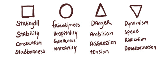
Square: Strength, Stability, Conservatism, Studborness. Circle: Friendlyness, Hospitality, Gentleness, Maternity. Triangle (pointing up): Danger, Ambition, Aggression, Tension. Triangle (pointing down): Dynamism, Speed, Radicalism, Determination.
Using these shapes consciously to communicate the feeling your audience should get for the character without having to hear their motivations spoken outright can leverage your design from 'functional' to 'effective'.
Optionally: designers have also used Shape Language to defy the principle and provide a twist to their characters.
- Colour palette
Similarly to how shapes can invoke a sense of a character or an object, so can colours. Depending on which culture you're from, colours will symbolize a variety of things. In the west, we often refer to red as the colour of love. But it is also the colour of war.
Blue is often associated with the tranquillity of the sea, but it can just as well lead our minds to large corporate billboards.
Colours and their meaning are often impacted by the context they're in, so keep this in mind when you design with them.
Using a green similar to the dollar-bill invokes a sense of wealth, while using the green from blooming flowers pulls the imagination to a flower field in spring.

Red: Passion, Violence, Vigor, Life. Blue: Calm, Trust, Intelligence, Stability. Green: Nature, Energy, Hope, Greed. Yellow: Optimism, Creativity, Cowardice, Sickness.
- Details
Certain details on a design can provide hints to its story and purpose. A specific scar somewhere or a unique prop in the hands of a character gives us information about the design without any exposition being needed. This should be used somewhat in moderation. Particularly in character design: too many important details can clutter up your design. This makes it hard for the audience to know which detail is important for them to notice and which they can ignore on first glance. So select only details that you deem are integral to the character and pour your love into that.
These are the parameters that I will be referencing when providing feedback for your pieces and answering your questions.
As previously mentioned, it is only my personal approach and not the only or 'right' way to do it, nor is it any kind of industry standard.
But I hope by following CURLS I can provide at least, thought-provoking and consistent feedback, that you may be able to take with you in your future creative works.
I look forward to seeing your designs and talking to you all about design!
Mod Wackart ( Donate )
Portfolio
105 notes
·
View notes
Note
hey, fyi your discord link just link back to the discord link tumblr page where the link its hosted like some sort of internet ouroboros - it doesn't link you up to the server or anything
Thank you anon!
I've updated the link on the post, and it should take you to the server now :)
Mod Wackart
8 notes
·
View notes
Text
Anon let us know that the link to the discord was broken!
This should have been ressolved now.

Are you looking for a community full of visual storytellers and worldbuilders?
The launch of TheRedLineStation's (world)Build Guild is here!
Where creative writers, worldbuilders, concept artists, and those who have any interest in designing stories and worlds for stories gather.
Do you have a science-fiction world that needs another layer of detail to really feel alive?
Is your fantasy race a little too cookie-cutter and could use a new spin to stand out?
Are you unsure how industry-savvy concept artists draw their characters so that others can clearly understand the design? How do they even design them, to begin with?
BuildGuild might be able to help you!

For those who may have missed it, TheRedLineStation's art fundamentals venue has moved to discord, where our mod team and other like-minded artists discuss, give advice and socialize on TheRedLineStation's arts and craft server.
Join us here!
But as for the Tumblr-blog, as you may have noticed. We have rebranded and branched out to a slightly different type of creative work. That of designing and drawing for storytelling!
On our blog, you can get help with anything from how to make a character reference, to designing fantasy creatures, to ways in which you can bring more depth and uniqueness to your own fictional world!
The submissions and askbox are now open!
You can submit:
✎ - Artwork, such as sketches, illustrations, models, etc, of character design, creature design, prop design, or environmental design.
✎ - Written ideas on worldbuilding.
✎ - Illustrations, comic strips, storyboards, or pages of scenes in your story.
- Please note that we do not give advice on art fundamentals but focus solely on the likes of composition, light and storytelling for illustrations.
✎ - Questions about creative writing, concept art, worldbuilding and visual storytelling
Read more about how to Submit and Ask on our blog!
Who runs the blog?
TheRedLineStation's very own founder; The Chekhov is on our mod-team. However, the blog is primarily helmed and run by Mod Wackart. Who, with his years working alongside editors, production designers and other creatives are ready and excited to help you with your story, world, and characters!

Events, spotlights and resources to come!
Aside from helping our followers make progress on their individual projects. We also want to faciliate our followers into drawing, writing and designing for their own worlds. Be on the lookout for the blog's prompts, collections and mod activities, that we hope will inspire our followers to work motivated with their projects. A great pick-me-up if you feel like you've gotten stuck with your project.
Multi-platform content
For something new, BuildGuild will be cross-posting over multiple platforms to promote the blog to other potential creatives. But also as a means to provide a multitude of resources and feedback to our followers, in the form of video demonstrations or explainer videos.
So make sure to give the blog a follow, and drop your questions, ideas and designs into our inbox through our askbox or our submissions.
We look forward to meeting you!
74 notes
·
View notes
Text
Are you looking for a community full of visual storytellers and worldbuilders?
The launch of TheRedLineStation's (world)Build Guild is here!
Where creative writers, worldbuilders, concept artists, and those who have any interest in designing stories and worlds for stories gather.
Do you have a science-fiction world that needs another layer of detail to really feel alive?
Is your fantasy race a little too cookie-cutter and could use a new spin to stand out?
Are you unsure how industry-savvy concept artists draw their characters so that others can clearly understand the design? How do they even design them, to begin with?
BuildGuild might be able to help you!
For those who may have missed it, TheRedLineStation's art fundamentals venue has moved to discord, where our mod team and other like-minded artists discuss, give advice and socialize on TheRedLineStation's arts and craft server.
Join us here!
But as for the Tumblr-blog, as you may have noticed. We have rebranded and branched out to a slightly different type of creative work. That of designing and drawing for storytelling!
On our blog, you can get help with anything from how to make a character reference, to designing fantasy creatures, to ways in which you can bring more depth and uniqueness to your own fictional world!
The submissions and askbox are now open!
You can submit:
✎ - Artwork, such as sketches, illustrations, models, etc, of character design, creature design, prop design, or environmental design.
✎ - Written ideas on worldbuilding.
✎ - Illustrations, comic strips, storyboards, or pages of scenes in your story.
- Please note that we do not give advice on art fundamentals but focus solely on the likes of composition, light and storytelling for illustrations.
✎ - Questions about creative writing, concept art, worldbuilding and visual storytelling
Read more about how to Submit and Ask on our blog!
Who runs the blog?
TheRedLineStation's very own founder; The Chekhov is on our mod-team. However, the blog is primarily helmed and run by Mod Wackart. Who, with his years working alongside editors, production designers and other creatives are ready and excited to help you with your story, world, and characters!
Events, spotlights and resources to come!
Aside from helping our followers make progress on their individual projects. We also want to faciliate our followers into drawing, writing and designing for their own worlds. Be on the lookout for the blog's prompts, collections and mod activities, that we hope will inspire our followers to work motivated with their projects. A great pick-me-up if you feel like you've gotten stuck with your project.
Multi-platform content
For something new, BuildGuild will be cross-posting over multiple platforms to promote the blog to other potential creatives. But also as a means to provide a multitude of resources and feedback to our followers, in the form of video demonstrations or explainer videos.
So make sure to give the blog a follow, and drop your questions, ideas and designs into our inbox through our askbox or our submissions.
We look forward to meeting you!
#blog moderation#mod wackart#announcement#submissions OPEN#now with an updated discord link!#sorry about that!#thanks anon for letting us know
74 notes
·
View notes
Text
Update
Hey guys! Sorry for the delay on the update.
I hope to soothe some concerns by telling you all that work on the Build Guild's launch is starting back up now that i've finally finished my second degree and have time on my hands inbetween jobs.
Thank you so much for your patience thus far. I can see we keep having new people following the blog so i'll do my best to get BuildGuild up and running soon.
I'll keep you updated as we move along.
Cheers!
- Mod Wackart
30 notes
·
View notes
Text
Hey Redliners!
You might have noticed that we just published a whole load of posts at once. This is because it has been decided that this blog will proceed with its little identity change.
This means that this blog soon will become RedLineStation's BuildGuild expansion. RedLineStations basics and anatomy help can still be found in our budding community on discord:
https://discord.gg/tVtcUC5QZd
Where you can find help and guidance for your art fundamentals through the discord channels. Here you can receive help both from mods and community members alike, as well as join in the regular events that the mod-team host.

It has been a privilege to work with RedLineStation as part of its art fundamentals blog interacting with our members and other mods on the discord server is like talking to one big extended family. But for now, I hope you guys will help us welcome the new face of this particular blog:

When we put out a post talking about this new direction for RedLineStation we received a bunch of positive feedback, which means that we now have the courage to roll out the new venue.
RedLine Build-Guild will, much like RedLineStation be part of the RedLineStation family. Here, we will discuss anything that has to do with worldbuilding and design for visual storytelling. That means anything from character design, storyboarding to the conceptualization of lore and inspiration/motivation.
Just like the previous format of this blog, a lot of the content will be user-prompted through our askbox. Which will be open for any general questions about the design of a visual narrative and everything surrounding it.
On top of that, we will, again, just like the original RedLineStation; offer personalized feedback. Where followers can send in their material and have it reviewed.
RedLine Build-Guild will also feature a regularly scheduled Worldbuilding Guide, which will be published in short chapters here on the blog. This guide will help you with some of the more meta-contextual aspects of worldbuilding. While its accompanying writing/design prompts should help you explore your world and story from angles you might not have previously.
As part of the Build-Guilds curriculum, we will also be showcasing other worldbuilders and authors who have mastered the art, so that you won't just have to hear us drone on about our own individual biases exclusively but hear about the methods of creators around the world too.
A more thorough walkthrough of Build-Guilds content and format will come out later. For now, just know that the revamp is in the works and that we are currently writing, drawing, and planning a heap of content to start the blog off in the new year.
If you have any questions at all, feel free to ask them as a 'reply' to this post beneath. Mod Wackart will be around to answer as many questions as possible as quickly as possible.
Cheers!
Can't wait to see you all again
- Mod Wackart
51 notes
·
View notes