wordofgodcast
the official tumblr of the Word of God podcast
analyzing supernatural 2-3 episodes at a time for the next [static noises] years!
219 posts
Don't wanna be here? Send us removal request.
Last Seen Blogs
alittlebetty
A Little Bit Little
chekhov-and-chill
Angry Jewish Girl Rants
ecrasonslinfame
Écrasons l'infâme

portgas456
Untitled

acrosaurotaurus
AcroSauroTaurus
Text
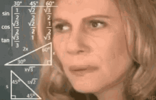
can’t talk bestie I gotta spend 3 hours watching a 45 minute TV episode
9K notes
·
View notes
Text
perhaps my most esoteric but very, very passionate spn take is that i truly believe if you haven't watched season 1 supernatural with the original music cues, you have not seen season 1 supernatural.
2K notes
·
View notes
Text

john teaches dean what family is. dean teaches cas.
2K notes
·
View notes
Text
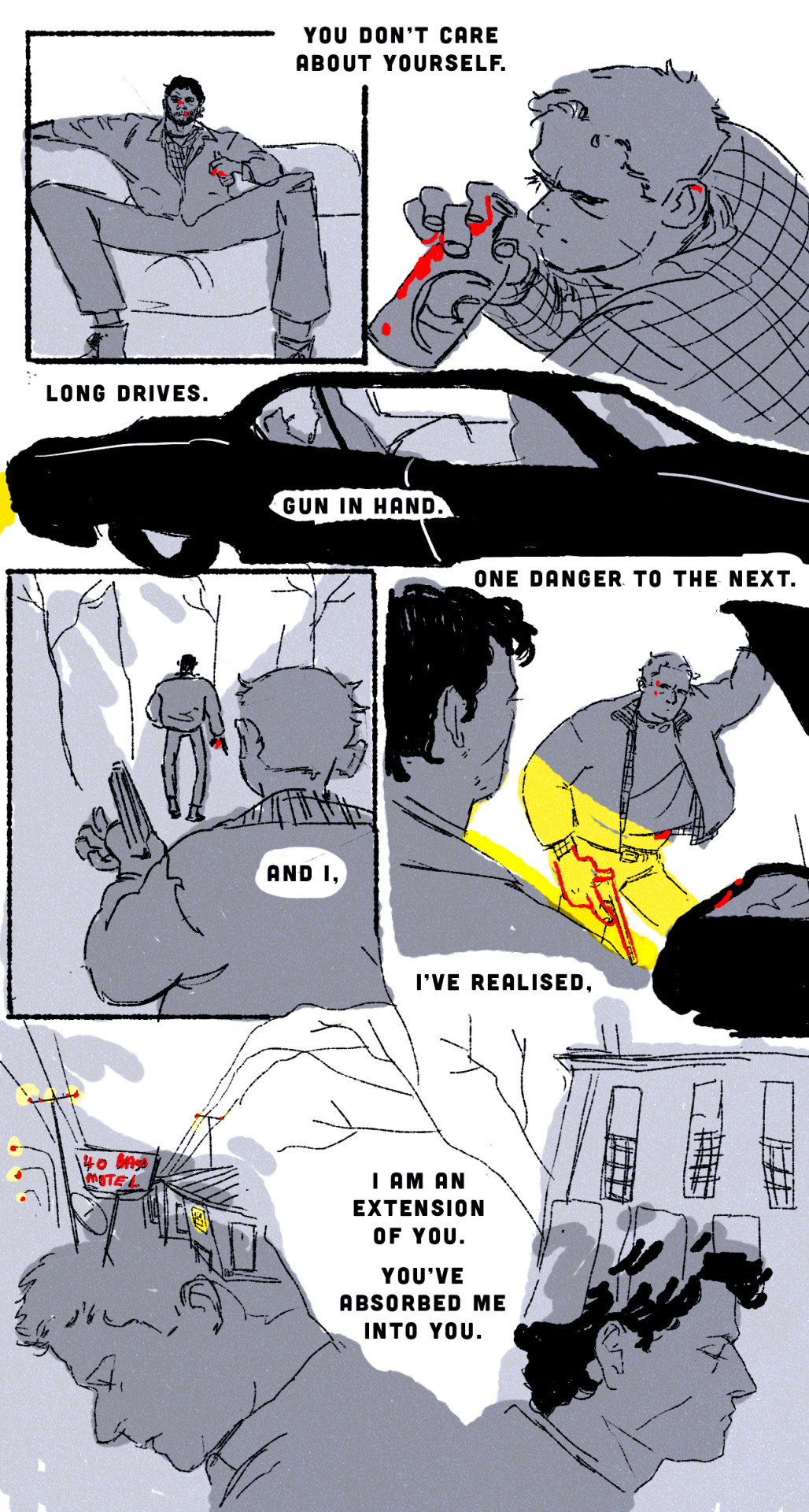
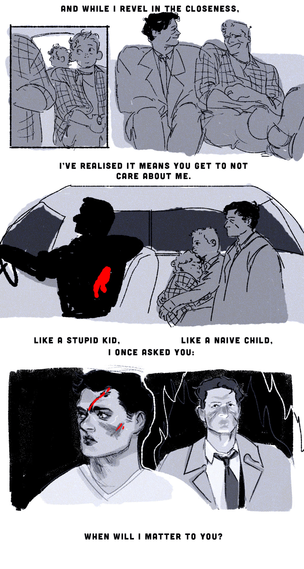
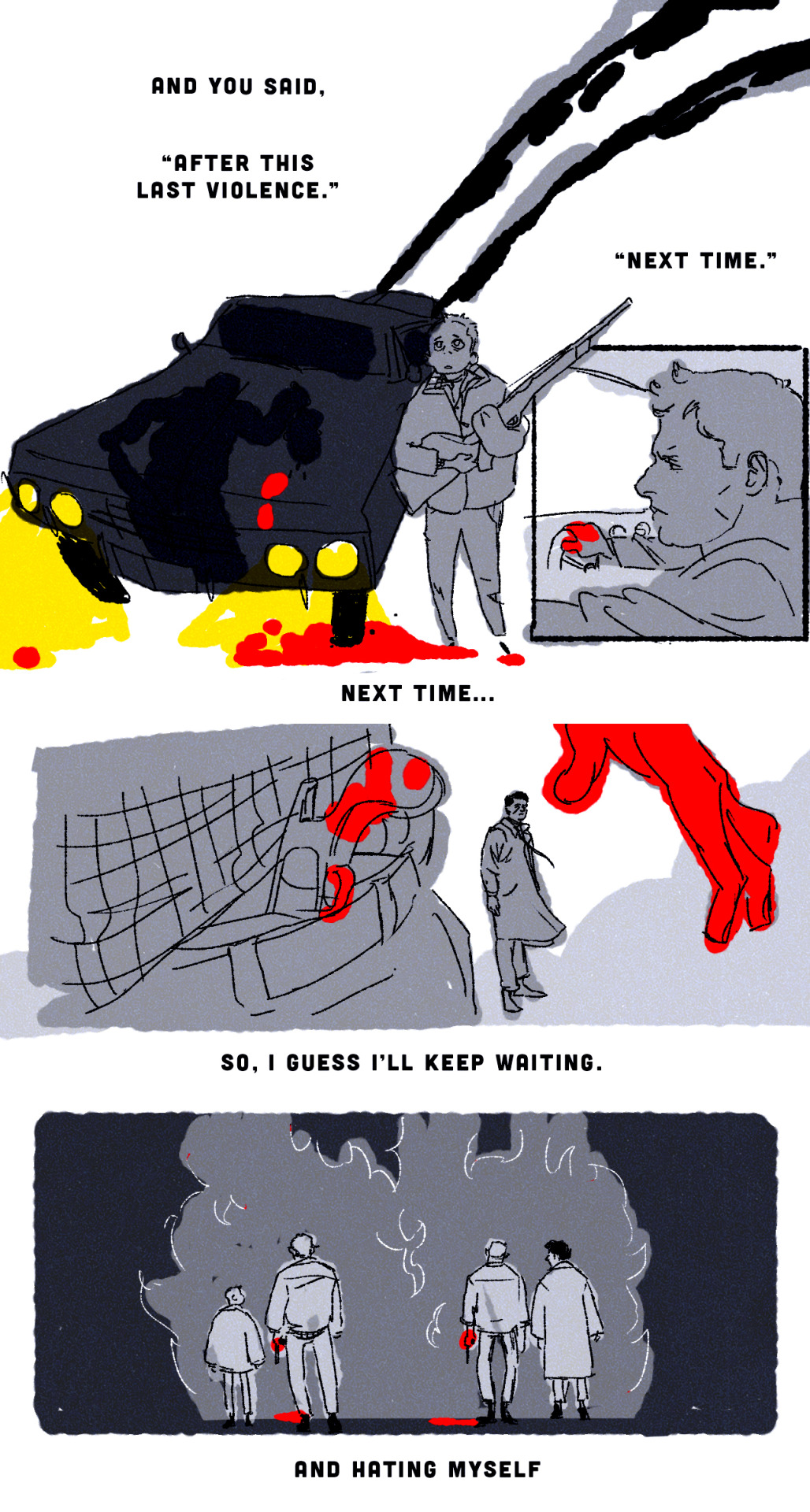
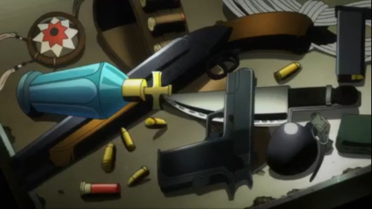
Episode C: 1x06 "'Til Death Do Us Part" and 1x07 "Temptation of the Demon"
As a reminder, we’re still on the SPN Anime!
Previous | First | New episodes go up on Wednesdays
This week’s episode is available on Podbean HERE!
Check out our listen page or go to our pinned post to find a list of platforms you can listen on – don’t forget to follow, rate, and review if you can!
Sources for references made this episode:
shiva traditions article from the Forward
Stanford images: irl campus and fountain; animated
little Risa's hairdo screencap
fanart by @skr0g with John & the rearview mirror
cemetery statue screencap
photo of Jess's dog photo screencap
ghost ribboning effect screencap
Tange Danpei image
Bobby's motel room screencap
motel exterior screencap
photo of Henderson in the army screencap
contents of Sam's backpack screencap
yellow-eyed demon screencap
YED at the bottom of the stairs screencap
Content warnings for this episode can be found here, under the cut, and at the start of the episode:
Eye horror
Mention of suicide
Child murder
Chronic illness
Gruesome murder
Possession
Gaslighting
#wordofgodcast#spn#supernatural#word of god podcast#word of godcast#word of god wednesday#spn anime#m: e#e: C
0 notes
Text
Episode B: 1x04 "Ghost on the Highway" and 1x05 "Savage Blood"
As a reminder, we're still on the SPN Anime!
Previous | First | New episodes go up on Wednesdays
This week’s episode is available on Podbean HERE!
Check out our listen page or go to our pinned post to find a list of platforms you can listen on – don’t forget to follow, rate, and review if you can!

Sources for references made this episode:
"Is Scott here?" / "he just left" video
dead monster screencap
"Guts" panel
Content warnings for this episode can be found here, under the cut, and at the start of the episode:
Fridged women
Car crashes
Bury your gays
General discussions of queerphobia, specifically transmisogyny and its relation to transvestism and gender nonconformity
Mention of incest
Beheading
Bullying
Bioessentialism
Mention of teeth horror
#spn#supernatural#wordofgodcast#word of god podcast#word of godcast#word of god wednesday#m: e#spn anime#e: B
0 notes
Text
SUPERNATURAL THE ANIMATION: A Thesis Overview on Japanese Anime Production & Character Design


I read a post by @diminuel and wanted to segue into a topic I’ve been wanting to write about for a loooooong time and since I’m on vacation, here is
A thesis on analyzing the thought process and anime production of the anime series, and the masterful aspects of the final character designs.
I will be using the anime’s featurette “making of” documentary as part of the sources.
There are a lot of criticisms against the overall aesthetic and character designs regarding the Supernatural characters since, well, the interpretations of the characters differ a lot from their original source material/western counterparts.
Personally, I’m on the boat that agrees that the show is pretty hokey at it’s worst but the show isn’t without a huge level of painstaking detail put into it.
And while I don’t exactly agree with the series’ execution in the art department, I can wholeheartedly understand that the characters designs and it’s assigned aesthetic aren’t terrible in essence. And neither are the creative decisions behind capturing the tone of the original Supernatural TV series.
ANIME PRODUCTION
First, I have to address that the studio behind the Supernatural Animated series is a solid contender.
Studio MADHOUSE is an acclaimed studio usually known for how ballsy they are in creating original productions that may or may not garner the usual niche otaku market. But they are even more famously known for their adaptation work such as:
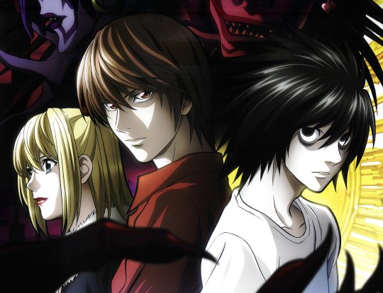
Death Note
Final Fantasy VII OVA (Last Order)

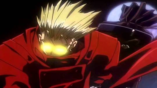
Trigun
MADHOUSE (if not also generally known for some of their work in the moe genre) can easily be regarded as one of the more mainstream, household studio names with a consistent list of anime shows with a gritty, film noir aesthetic. And while the conceptions of these aesthetics don’t exactly belong to the studio, or it’s contracted staff hands, MADHOUSE has proven time and again that they are generally able to adapt this sort of aesthetic really well.
However, it’s very misleading for me to mention the brand name since anime studios don’t usually have fixed staff, so while you can’t directly associate the studio name and the level of quality in their work since the people per production are never truly the same, you really have to pay attention to the names working on the project.
A strong director is usually the more general way to gauge a project’s quality with film in general. In the case of anime, some of the big directorial names out there would be Tetsuo Araki, (Attack on Titan, Death Note) and Akiyuki Shinbo (Puella Magi Madoka Magica, Monogatari series) as a small example.
The in-house name usually associated with MADHOUSE productions is director/producer Masao Maruyama, who actually DID overlook the Supernatural anime project, so this is about as much as a classic MADHOUSE production as any:

And Maruyama definitely has a solid understanding of the original Supernatural television series.
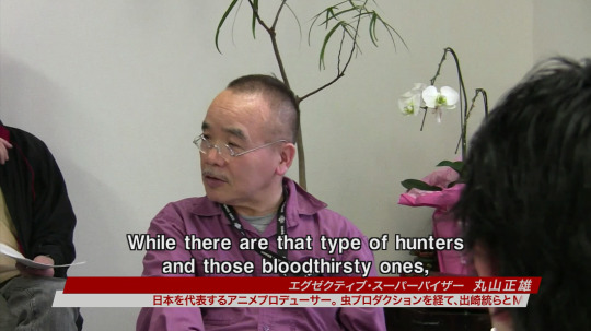

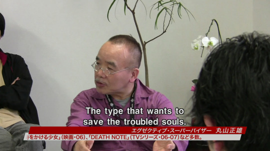
What is taking place here in this segment of the anime’s featurette is a production conference (制作会議 seisaku kaigi) — a meeting in which the line producer, production desk, groundwork department and production assistants gather to exchange progress reports and necessary notifications. (In the case above, discussing Maruyama’s pressing concerns of his interpretations of hunters within the story and how important it is to have them akin to the ones in the original TV show, with heroic hunters as the key focus.)
However, much like western tv shows, not every episode is penned by the same writer. So while directors/producers may have meetings to discuss how the overall work should feel/be, episode directors/writers have their own interpretations to display.
In the case of Supernatural the Animation, there were actually TWO story directors. It’s actually pretty uncommon to have two heads as a single unit in anime, and it really shows just how much effort was put into the interpretations of the anime characters of Supernatural the Animation:


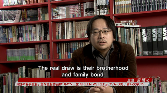

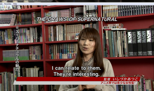
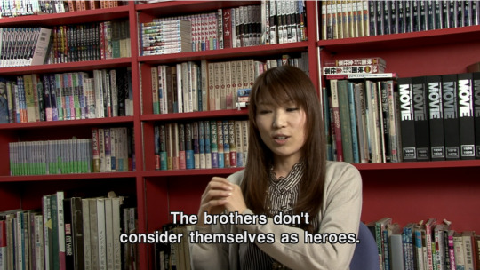
Good directors put every individual’s strengths forward and place them in a context where certain skills can fit best to move the product towards greatness. The same can definitely be said for both Atsuko and Shigeyuki.
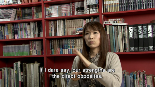
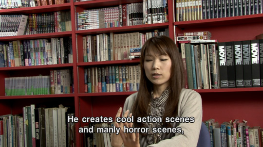


Personally, I couldn’t hope for a better dynamic in strengths when it comes to the overall appeal of Supernatural. The heart of the show is definitely understood, it just so happens the interpretations definitely have their own flavors because of this duality between styles of the directors, but there’s a lot of cultural differences tied directly to how Japanese anime is usually composed and their differing methods between anime production and western media.
Each individual script writer have their own goals and interpretations put forward, and sometimes the style of writing definitely impacts the final product.


While the latter quote is hilarious considering the context of how western fans generally view the anime, it’s important to know that certain creative decisions were done intentionally.
What is being taken place here is the same sort of deconstruction as any fan willing to write crack fic or:

I also find it leagues interesting that Takayama mentions “anime-like scripts” since there is a huge key difference between general TV scripts and scripts tailored to anime audiences. Certain tropes exclusive to anime have been noted and satirized across various media forums.
But “anime-like” styles don’t just effect writing styles, but also illustration “drawing” styles.
Character Design
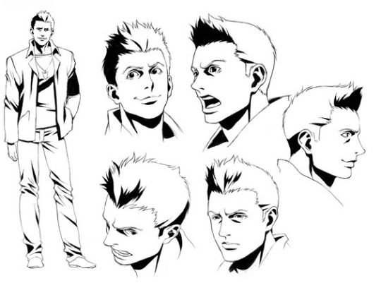

The first thing you’d notice in the final character designs are the intense values used in the shading.
There’s a name to this technique, as mentioned in the featurette:
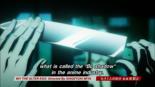
It is actually not uncommon to see BL shadows in nitty gritty anime shows. In a way, it’s become an obscure technique to see in more modern anime since the aesthetic of BL shadows are reminiscent of late 80′s to early 90′s anime shows like Vampire Hunter D: Bloodlust.

While it was more of a conventional technique in this era of anime, the use of BL shadows shifted to a more stylistic choice starting from the early 2000′s.
Cowboy Bebop is one of the more famous examples of using BL shadows in a more stylish, minimalist aesthetic in it’s opening, even though the harsh blacks aren’t used in most of the actual show in order to give it a more sleek, fresher look.


But BL shadows are still used in today’s current modern anime, even if they are used primarily for style purposes instead of convention.
March Comes in Like a Lion, a show that’s still currently airing as part of the Winter 2016 anime season, used this technique in well-directed sakuga (作画) (lit., “drawing pictures”) to encompass the chaos surrounding it’s protagonist Rei Kiriyama.


In a sense, the use of BL shadows in the Supernatural anime is pretty unique, even if it does hamfist the “noir” in “film noir.”
As for the actual DRAWING STYLE of the anime’s character designs, there has been a lot of hyper-focusing on how the design feels “wrong” in it’s interpretations.
Or that some of the scenes look really….weird….
Before I can really tap into the heart of why these designs don’t seem to work or don’t feel akin to the core of the original despite huge efforts explained above, I first have to get into a couple of things before diving into it.
#1: Anime Is Made As It Airs.
This isn’t exactly common knowledge, so it’s fair to point out just what may impact a show’s final product. Since anime is streamlined like this, no matter how much planning a production might make beforehand, every film project is subjected to Murphey’s Law despite.
While it’s true that a lot of TV shows are created as it airs (INCLUDING the original Supernatural TV series) ANIME tv production is much different from western live action, or even CARTOON production.
Shit happens. Which may result in delayed episodes on the air:

OR you get two different version of an episode as the show still airs. The most recent example would be that of Yuri!! On Ice, where they made corrections as they went with broadcasting:


Sometimes studios don’t find it prudent to make corrections as a show is airing, so what usually happens is that corrections are made on the DVD/Blu-Ray releases.


#2 The “Drawing Style” Isn’t the Problem
It’s difficult to explain the differences between the “drawing” style and the “animation” style of a show without showing it, but it stands to be mentioned since there’s a consistent misconception on the meaning of “style.”
Usually, “style” pertains to most usually the “look” of how a character is drawn in western media:

However in anime PRODUTION, “drawing” styles are very subtle and tend to be under harsh inspection when working on a production. There’s very little creative freedom when under strict rules based on the character design.
Basically, the character designer’s final designs are god. They pave the “look” of the characters, and the animators must adhere to the “style.”
In case animators fail to deliver, someone else will redraw it (Usually the animation directors.) or at make corrections to ensure the characters remain on-model.
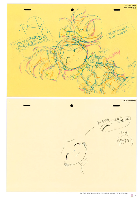
Above, the sketch on the yellow sheet is what was turned in to be checked, and the white sheet below it are the corrections.
However, this doesn’t prevent an artists’ stylistic interpretation of the same character from shining through:


Understanding these subtle differences is what sets apart newbie animators from master key animators/animation directors.
You can’t exactly blame the nuances and subtleties of a piece of animation on the animator, since the drawings go through a number of hands in the process, Especially since all artists have their own “style”/“approach/interpretation” or “look” on how they view a figure. Drawings can differ from line width, to just…simple placements of body parts (eyes, nose, etc, )
Just being a fraction of a millimeter off makes a HUGE difference.
How does this relate to the Supernatural anime character designs?
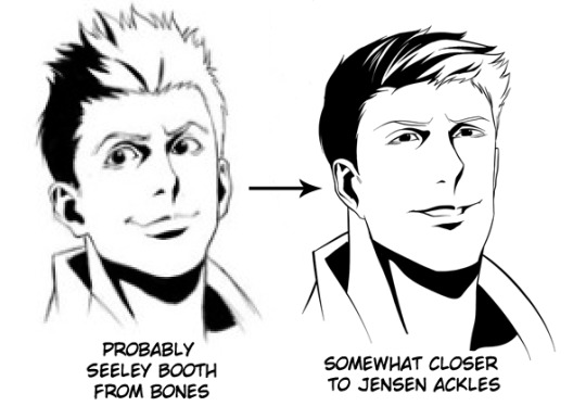
The “Supernatural the Animation” Character Designs Are Only One Redraw Away from Being Masterful.
(or closer to the original…)
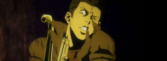
I can only really say this because I’ve observed that the anime’s “drawing” style isn’t exactly unique. The same techniques used to accent body features in Supernatural The animation are akin to many anime shows that have used it for better or for worse.
A MASTERFUL example of the same “drawing” style is used in the Berserk: The Golden Age Arc Movie Trilogy (2013):

It bears a striking resemblance to the drawing style of the Supernatural anime.
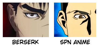
But since the Berserk trilogy was a huge theatrical release, the quality of the drawings between a movie and TV production are vast.
It’s here where I have to disagree with the creative staff’s (on the spn anime) decision to use BL shadows to convey a dark tone.
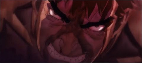
Berserk is often regarded as one of the most bleakest anime out there, and just from screencaps alone you can most definitely grasp a sense of hell even without harsh uses of black values and instead through careful color design:

Can’t really say the same for the spn anime, but maybe it’s because of the minimalist decision to have bleached/dull colors against harsh shadows:
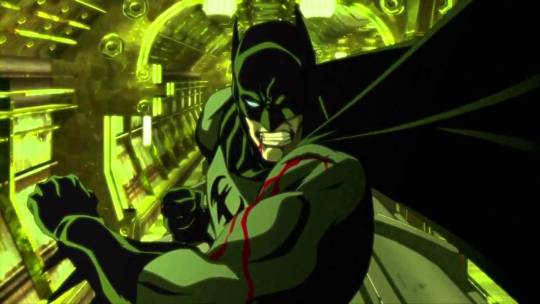
Looking back, I really wish Studio 4 Degrees Celsius (studio that did production work on the Berserk Trilogy) did an OVA/series of Supernatural films instead of studio MADHOUSE. However, 4 Degrees Celsius is known for it’s anthology works such as The Animatrix and Batman Gotham Knight, and doesn’t really handle TV shows to begin with.
But I can’t help but feel that maybe a series of original Supernatural episodes packed in one OVA would’ve made a lot more sense than adapting two seasons of an ongoing TV show. Especially since the spn anime inserted their own original episodes anyway.
The actual “drawing” style of the spn anime only really suffers from a lack of proper emoting in the characters and lacks one last drafting session.
All artists are familiar with basic expression sheets. In which they are used as reference to exercise drawing a range of human emotions.

But humans aren’t as robotic as most beginner expression sheets imply.
There’s a lot of factors and complexities when it comes to expressing emotions and trying to communicate that through illustrations is often difficult. What some might not understand is that sometimes, we don’t know what exactly we’re feeling–but that’s only because some emotions are combinations of others.
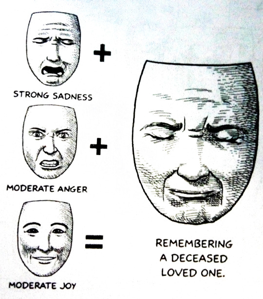
This is where I feel the anime creates a rift between fans of the original Supernatural from liking the interpretations of the anime series.
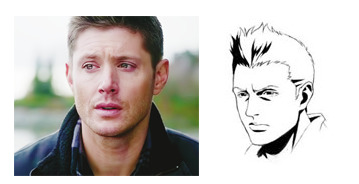
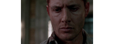
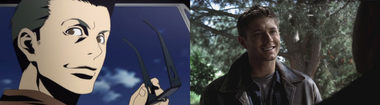
As in the anime is obtuse and flat at it’s worst–which is a far cry away from Jensen Ackles’ dense performance in the live action original show.
Which is why in drawings, you really have to know the differences between baseline “sadness” and “anguish.”
TO CAP IT ALL OFF:
I’ve made some pretty bold statements. Even with proper examples and citations, the best way for me to feel somewhat satisfied with this analysis is to provide personal demonstration.
I’m an animator. I study film and animation. It’s what I do.
As extra practice towards my studies, I’m going to use the knowledge I know off of this thesis to show whether or not I understand the weight of what I just said by “fixing” the Supernatural animation–or at least improve on it WITHOUT changing the artistic merits/stylistic choices of the anime’s staff.
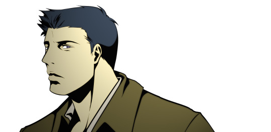
Looking at the model sheets as reference, here’s what Castiel would probably look like in the anime.
(it’s mentioned that the staff exaggerated Dean’s eyes and Sam’s hair as part of their unique traits–so for here, I exaggerated Cas’ lips.)
Fake screenshot bonus:

Now for some tweaking since all the designs need is a redraw:
This was super fun and I might redraw some Supernatural anime screencaps in the future. \0/
111 notes
·
View notes
Text
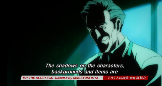
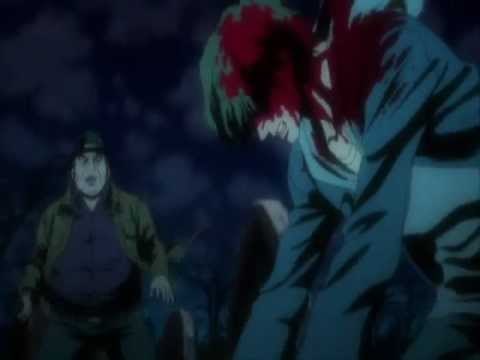
Episode A: 1x01 "The Alter Ego," 1x02 "Roadkill," and 1x03 "Home"
There's been a change of some kind around here...
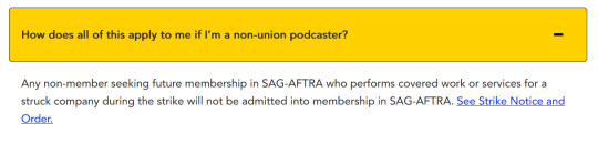
In solidarity with the SAG-AFTRA strikes, we are not promoting struck content or struck platforms, which includes the CW and Supernatural. However, this doesn't include the Supernatural Anime - see our post here for the full scoop!
Previous | First | New episodes go up on Wednesdays
This week’s episode is available on Podbean HERE!
Check out our listen page or go to our pinned post to find a list of platforms you can listen on – don’t forget to follow, rate, and review if you can!

Sources for references made this episode:
CW's "Dare to Defy" promo video
the shadowed-face lighting
coffee billboard screencap
noir police station screencap
cool eyes.gif
the boys pitching a car tent in the end credits sequence
fanmade Castiel in this style and a redraw of Dean, from this post by @dialogue-with-varyu
Molly over the grave screencap
Greeley's love letter screencap
the Greeleys' photo screencap
Dean's little keychain screencap
"many solutions to be found in nature" post
Molly and Sam height difference screencap
aerial view of the intersection screencap
origin of "cowabummer!"
shirtless shivering Dean screencap
Sam's possible hairdryer screencap
Jenny's warehouse-looking basement screencap
Sari looking like the most tired girl in the world screencap
Lebanon, Kansas
ambulance's side door screencap and support
Content warnings for this episode can be found here, under the cut, and at the start of the episode:
Mention of fascism
Secondhand embarrassment
Stabbing
Misogyny violence
impersonation/identity theft
Frigid women
Eye horror? (lots of eye closeups, bloodshot eyes, etc.)
Car accidents
Suicide
Vehicular manslaughter
Near drowning
House fires
Children in danger
Injured children
#wordofgodcast#word of godcast#word of god podcast#thurd of god thursday#spn#supernatural#spn anime#e: A#m: e
4 notes
·
View notes
Text
Tumblr users remembering the passage of time each week

30K notes
·
View notes
Text
thank you @wordofgodcast for reminding us that azazel and lilith are the same rank of demon, and that lilith said sam needed to have sex with her to seal the deal, and that john
4 notes
·
View notes
Text
hi everyone, update: our hiatus continues as more moving woes ensue. but someday we'll release our episode talking about the Supernatural Anime, so keep your eyes peeled and your holy water ready!
6 notes
·
View notes
Text

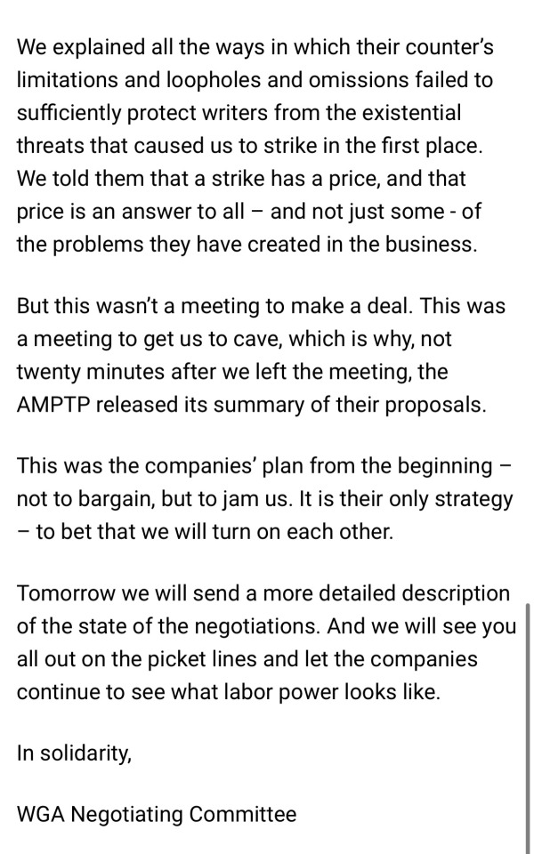
Update from the WGA on negotiations
89K notes
·
View notes
Text
my favourite type of poster on here—unironically—is the subgroup of people who make long informed thoughtful and obviously passionate analytical posts detailing the various discourses of their media of choice in relation to theory texts or adjacent literary traditions with all the gumption and sincerity and breadth of knowledge of, like, shakespeare scholars; except, and this is the most crucial element, the media of choice has to just kind of suck, like, at least a bit
23K notes
·
View notes
Text
announcement
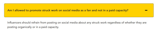
In solidarity with the striking workers, we're putting our usual episodes on hold. SAG-AFTRA has not asked for individuals to boycott struck content, but they do ask that "influencers" refrain from promotion, including rewatch-focused podcasts:
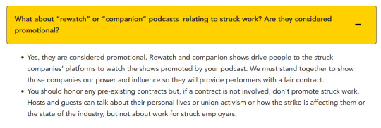
(ID in alt text)
So, while the strike continues, we're pivoting to content that is not struck work — join us in watching Supernatural: The Anime Series, or maybe playing the Supernatural RPG, or something else... We'll still be here, on the podcast platform of your choice.
11 notes
·
View notes
Text
announcement
In solidarity with the striking workers, we're putting our usual episodes on hold. SAG-AFTRA has not asked for individuals to boycott struck content, but they do ask that "influencers" refrain from promotion, including rewatch-focused podcasts:
(ID in alt text)
So, while the strike continues, we're pivoting to content that is not struck work — join us in watching Supernatural: The Anime Series, or maybe playing the Supernatural RPG, or something else... We'll still be here, on the podcast platform of your choice.
11 notes
·
View notes
Text
Episode 78: 8.9 "Citizen Fang" and 8.10 "Torn and Frayed"
Previous | First | New episodes go up on Wednesdays
This week’s episode is available on Podbean HERE!
Check out our listen page or go to our pinned post to find a list of platforms you can listen on – don’t forget to follow, rate, and review if you can!
Sources for references made this episode:
gator in a straw hat neon sign
Chabad article about unicorns
pregnant Sonic tiktok (CW: suggestive?)
Content warnings for this episode can be found here, under the cut, and at the start of the episode:
Ableism towards mentally ill and neurodivergent people
Show-typical bio-essentialism
Show-typical violence
Beheading
Show-typical misogyny
Discussions of adultery
Allusions to child abuse
Eye horror
Medical horror
Brain washing
Trauma
Flashbacks
Brief mention of hanging
#spn#supernatural#wordofgodcast#word of godcast#word of god podcast#word of god wednesday#wgcast#s8#e78#m: e
4 notes
·
View notes
Text
Episode 77: 8.7 "A Little Slice of Kevin" and 8.8 "Hunteri Heroici"
Heads up: For the next few weeks, our schedule's going to be a little shaky... Hang in there, and we'll see you when we can!
Previous | First | New episodes go up on Wednesdays
This week’s episode is available on Podbean HERE!
Check out our listen page or go to our pinned post to find a list of platforms you can listen on – don’t forget to follow, rate, and review if you can!
Sources for references made this episode:
Dean's definitely-not-suggestive move (gif)
tweet about Jackles' 2014 stance on destiel (video)
the chess set from the nursing home (screencap)
Content warnings for this episode can be found here, under the cut, and at the start of the episode:
Kidnapping
Child in danger
Torture
Blood explosions
“Reclaimed” use of the f slur? Ash jokingly quoting a theoretical person using it as a slur
Dismemberment
Show-typical weirdness about sex work
Cartoon gore
Suicide
Fantasy lobotomy
#spn#supernatural#wordofgodcast#word of godcast#word of god podcast#word of god wednesday#s8#e77#m: e
3 notes
·
View notes
Text
Episode 76: 8.5 "Blood Brother" and 8.6 "Southern Comfort"
Previous | First | New episodes go up on Wednesdays
This week’s episode is available on Podbean HERE!
Check out our listen page or go to our pinned post to find a list of platforms you can listen on – don’t forget to follow, rate, and review if you can!
Sources for references made this episode:
Sam's expression at the end of 8.5
SPN Wiki's page called "Tongues"
Benny and Dean at the end of 8.5
Sam's expression of betrayal at being abandoned
surfer vamp art on Twitter
Sam's expression after fixing the A/C
Bainbridge Island
anime John Winchester: x, x
Content warnings for this episode can be found here, under the cut, and at the start of the episode:
The American Civil War/the Confederacy
Conversations about the American fetishism towards the Confederacy/the glorification of the Civil War
Discussions of historical slavery
Blood drinking
Gory death
Beheading
Mention of historical Anti-Indigenous racism
Mention of the bombing of Japan by America during WWII
Alcoholism
Mentions of white supremacy
#spn#supernatural#wordofgodcast#word of godcast#word of god podcast#word of god wednesday#s8#m: e#e76
4 notes
·
View notes