
willjacksonstudio-blog
Will Jackson | Journal | Blog
This is where I post my work in progress/development/some research.
My email address is [email protected]
Everything on here is my own work unless stated otherwise.
256 posts
Don't wanna be here? Send us removal request.
Last Seen Blogs
torisp4cks
art headers

randomtwinkinthetomb
blog for lost tomb

lad-bug-and-chad-noir
miraculous brainworms
tifenn-gym
gymnastics graphic designer

stinkygirl009
“You know, Frederic Fucking Chopin?”
Photo
Not quite still life photography. Side project capturing the mundane.
0 notes
Video
Unbending experiment with the Lloyds TSB TV ad. Cynical captions explaining what is it really about.
0 notes
Video
This is the process which created the Kilotype font. From outlining the type through to electrifying it and developing the prints. This is the process
1 note
·
View note
Text
Switching to Instagram
I am no longer going to update this blog. Please visit my Instagram if you want to see what I am currently up to.
https://www.instagram.com/will.graphics/
0 notes
Photo


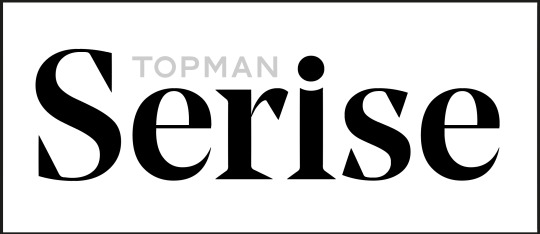
Logo design for Topman’s brief to create a concept store in Berlin.
1 note
·
View note
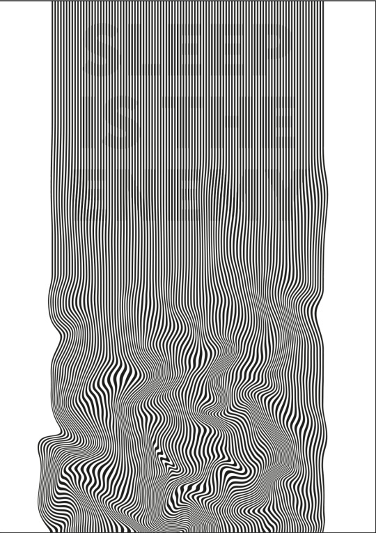
Photo
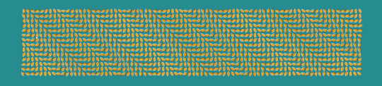
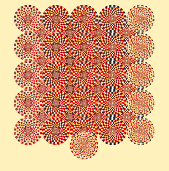
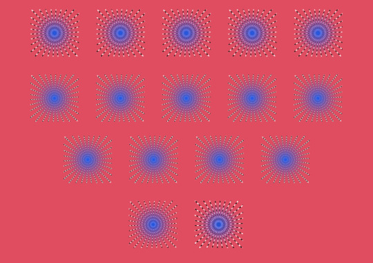
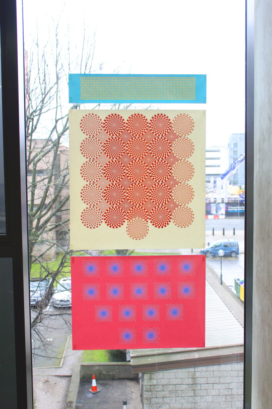
Finished mapping project outcomes for uni. These are maps of John Cage’s 4′33″ where the ambient movement I observed is the visual equivalent of the ambient noise the audience hear’s during any given performance of 4′33″. This ambient movement I then turned into data which I then visualised using this optical illusion technique. I employed optical illusions because they create natural, subjective movement for the viewer the same way audience members for 4′33″ experienced natural, subjective noises during the performance.
0 notes
Video
The video recorded by Rob, staring Ty and Rachel which I edited as part of our presentation for the dragons den project at uni. We wanted it to be intentionally cheesy
0 notes
Photo
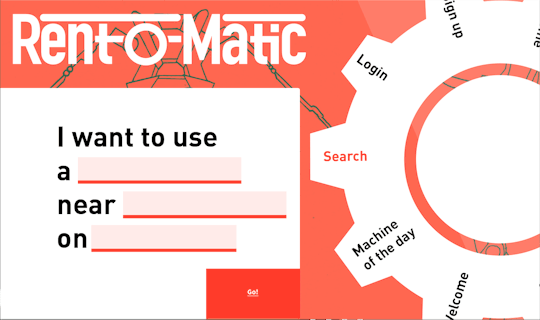
Website mockup for the search page on Rent-o-Matic. This is for the project I am currently doing at uni for dragons den. The gif is to be used within a video because it isn’t necessary to actually produce a website
0 notes
Photo
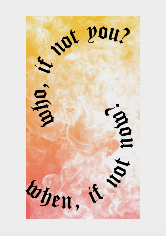
Digital proofs of the other three designs I plan to print using the risograph at uni for my friend’s print fair. The fourth ‘who, if not you? when, if not now’ is still very much a work in progress, I’ll photograph my own flames at some point soon but the current place holder is enough to give the gist of what I intend to do
#print fair#risograph#graphic design#print design#eat the rich#support your local sound system#who#if not you?#when#if not now?#sleep is the enemy
2 notes
·
View notes
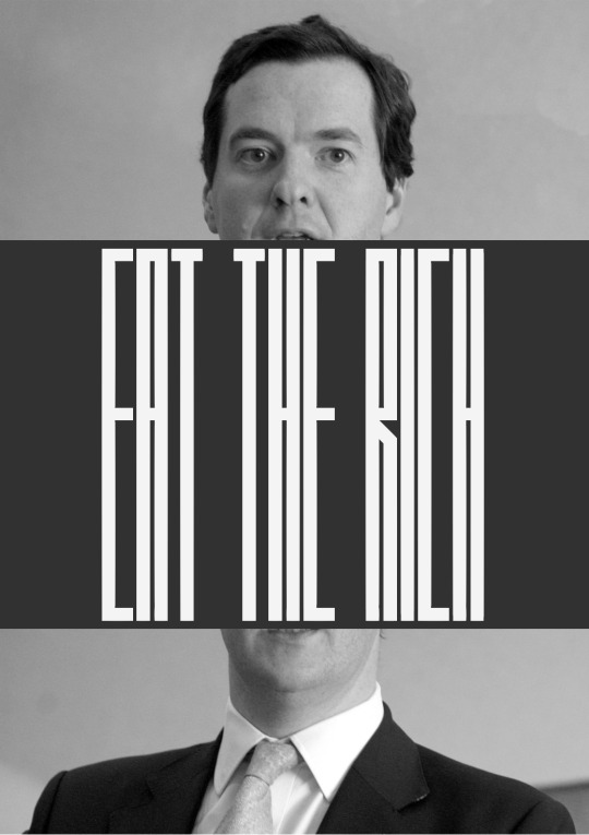
Photo
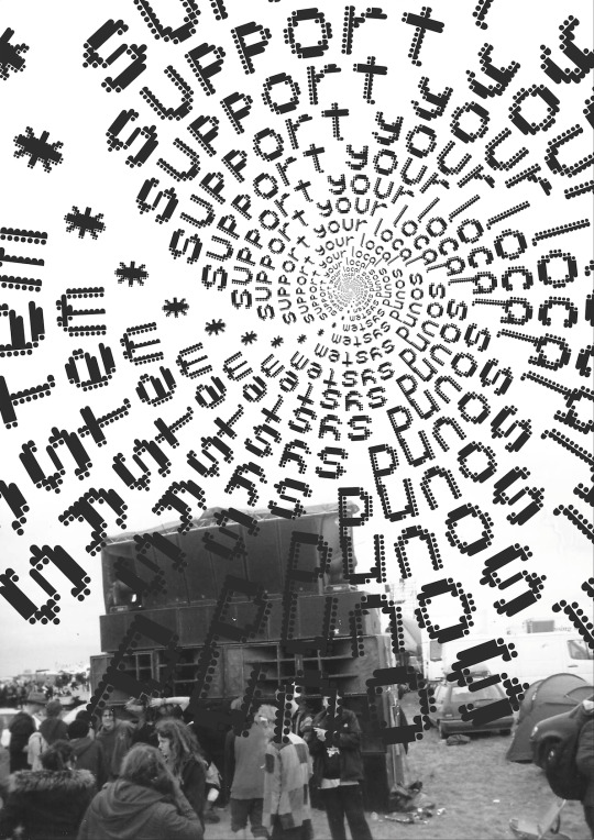
The first design for a charity print fair my friend is organising. No brief or theme set for this so I have set my own, create designs I would like to buy myself if I saw them at a print fair.
#graphic design#print#print design#print fair#sound system#free party#support your local sound system
1 note
·
View note
Photo
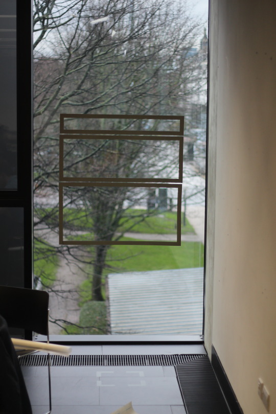
Vinyl Rival — First stage of this mapping project finished. (semi) Successfully vinyl transferred my visual frame onto a window at uni, now to start data gathering and mapping.
2 notes
·
View notes
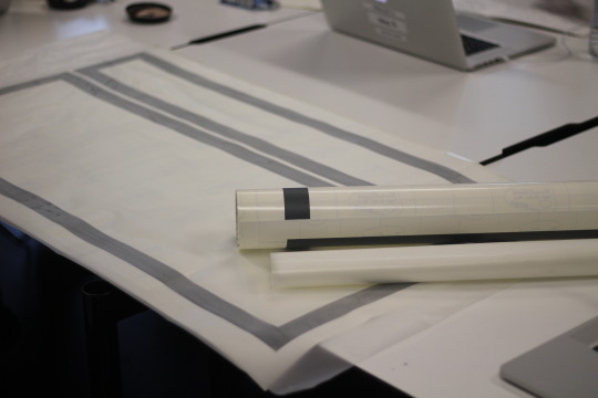
Photo
My mock-up of what I plan to do for the mapping project uni has set us. I am going to recreated John Cage’s 4′33″ visually and map those results.
2 notes
·
View notes
Photo
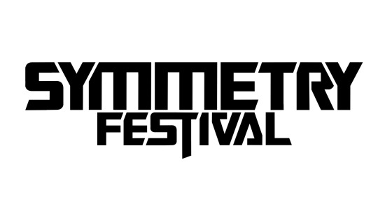
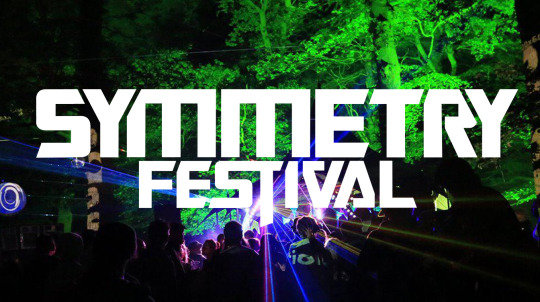
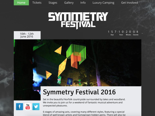
Logo adjustment for Symmetry Festival. They have been using the Transformers typeface for a few years and it fits nicely, so I tighten up the kerning and made the letterforms slightly more playful to give a crisper, more concise graphic.
Here you can see it plain, used with an image and used on the new site I am designing with them.
0 notes
Photo
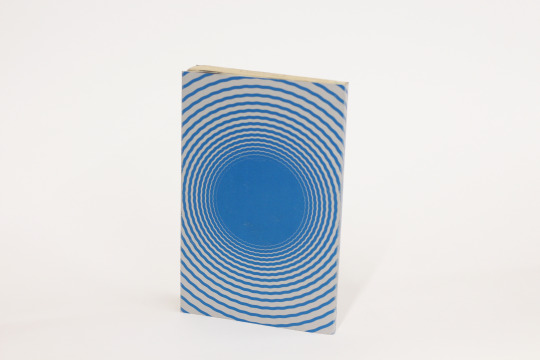
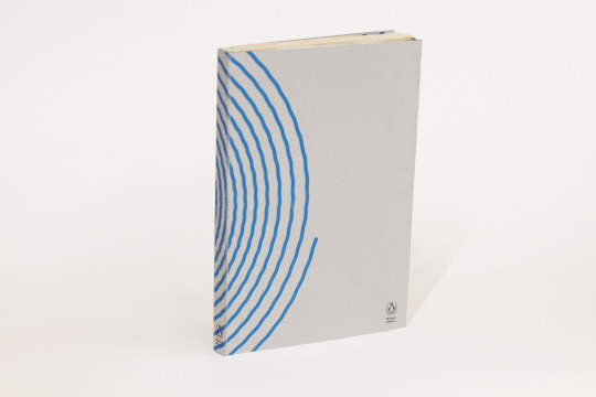
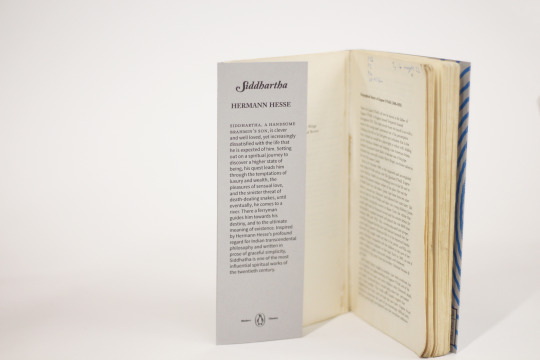
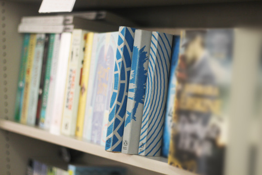
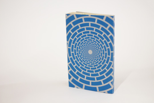
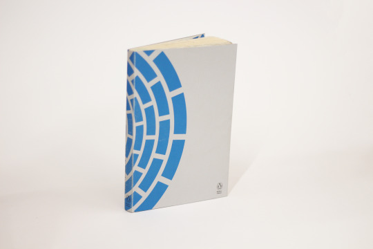
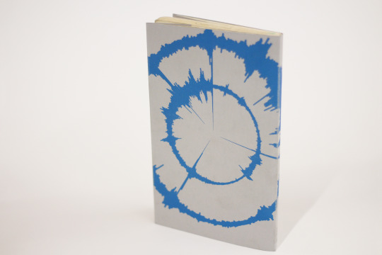
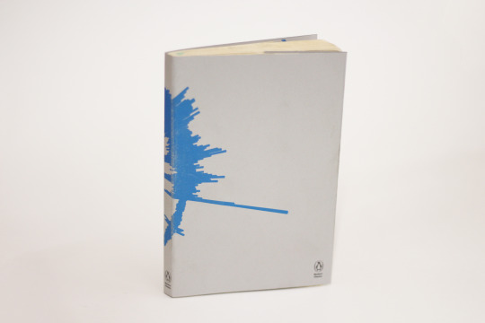
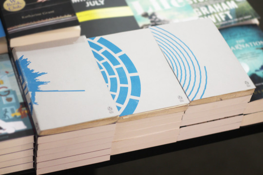
My three book cover designs for university. The books are Siddhartha by Hermann Hesse, The Wind-Up Bird Chronicle by Haruki Murakami and Pedro Zarraluki’s The History of Silence.
The layout of the books forces the reader to engage with and investigate them to find out more information, the same sort of journey (in abstract) Siddhartha went on. This is why most of the design is on the back of the book and the title, author and blurb are inside. I was supposed to use some really nice stock from G.F Smith but it never arrived in time so I had to resort to this weird grey card.
The shape on the cover design for Siddhartha is a wobbly spiral, to both visually describe the river in the book and the journey Siddhartha goes on to become ‘complete’.
The shape on The Wind-Up Bird Chronicle is a series of bricks arranged to give the illusion of being at the bottom of a well looking up, or visa-versa. This is because the main character in Murakami’s book spends a lot of time at the bottom of a well and unsure of his reality.
For The History of Silence I stayed up until five in the morning, took my laptop outside and recored the stillness to get as close as I can to silence. I then amplified this recording and visualised it for the cover. Placing one ‘recording of silence’ inside the other is because of the two characters in the book.
For my portfolio I photographed the books in Waterstones, uni like that sort of thing.
#book cover design#book covers#books#reading#graphic design#uni work#penguin books#book project#mmu#mmu graphics
0 notes
Photo
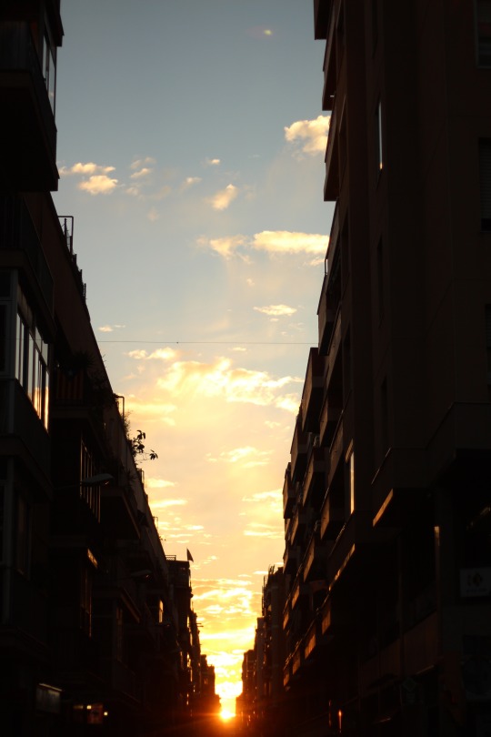
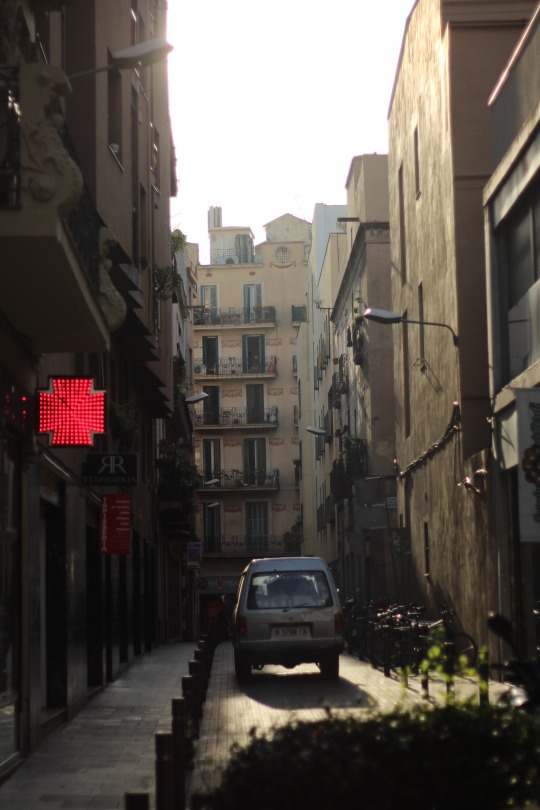
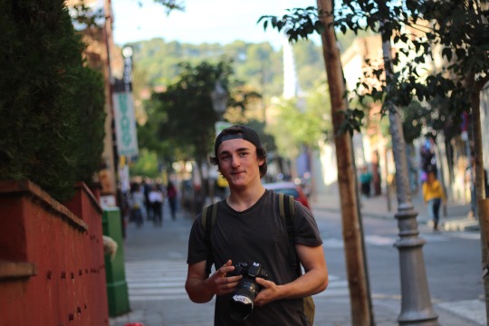
Some holiday snaps from when I went to Barcelona with uni, we visited the design museum, Mucho and Lo Siento design studios as well as the usual tourist spots. I seem to have only taken photos of Rob however.
0 notes
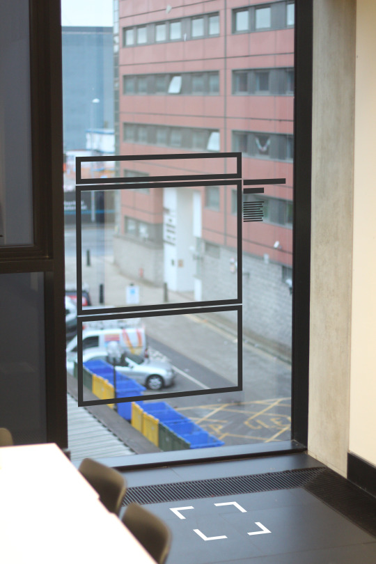
Photo
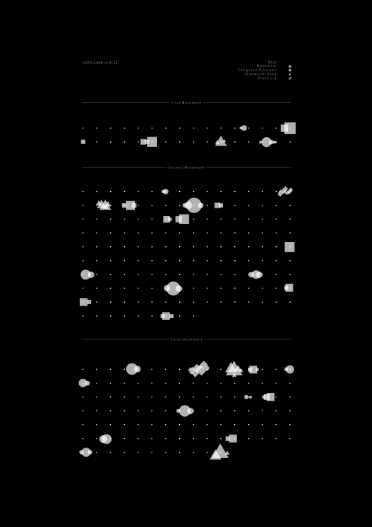
Visual map of John Cage’s 4′33″ composition. This is part of our latest brief for uni where we are mapping music and creating visuals from it.
2 notes
·
View notes