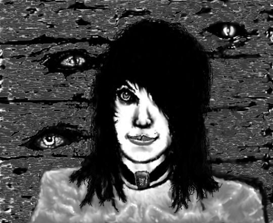
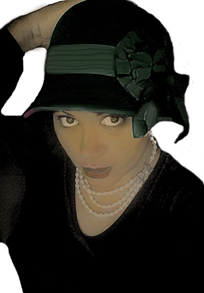
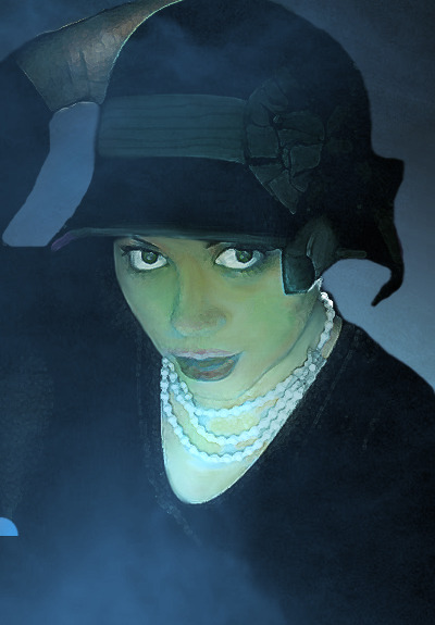
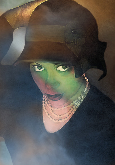
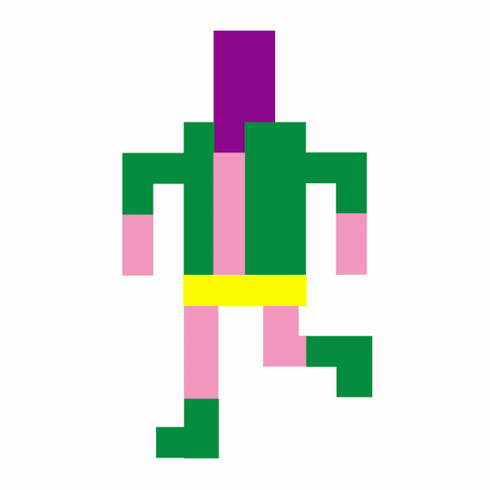
#wanted to render old sketches in this pixel style
Photo
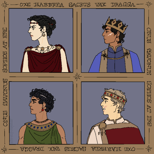
gold light shining
#wanted to render old sketches in this pixel style#age of kings by the mountain goats#the queen's thief#attolia irene#sounis sophos#eugenides#attolia#sounis#attolis#eddis#eddis helen#tqt
623 notes
·
View notes
Note
Any advice you can give to someone who can only want to do pixel art, but really wants to do More non-pixel art :D (Sorry if this specific I really just need some beginner art tips since your art is amazing. :'D)
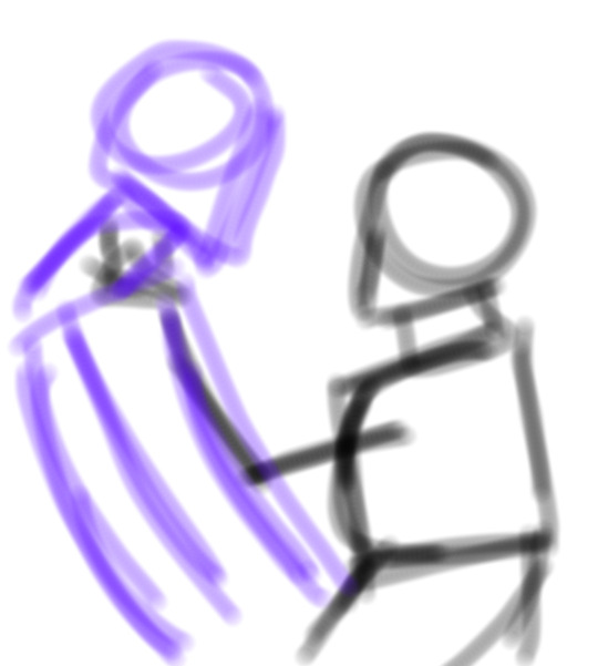
I did once did a post with little tips for art but I can definitely give more! Since, since that time I've actually learned quite a lot.
To start off, I will say the most mundane thing. You prob need reference. I myself can't do without reference even if to only take some inspiration or to use a picture as a guideline.
For example, in my latest illustration, I was using this picture from Pinterest as a guide line:

It is totally not what my illustration looked like in the end, but it help me put poses into perspective.
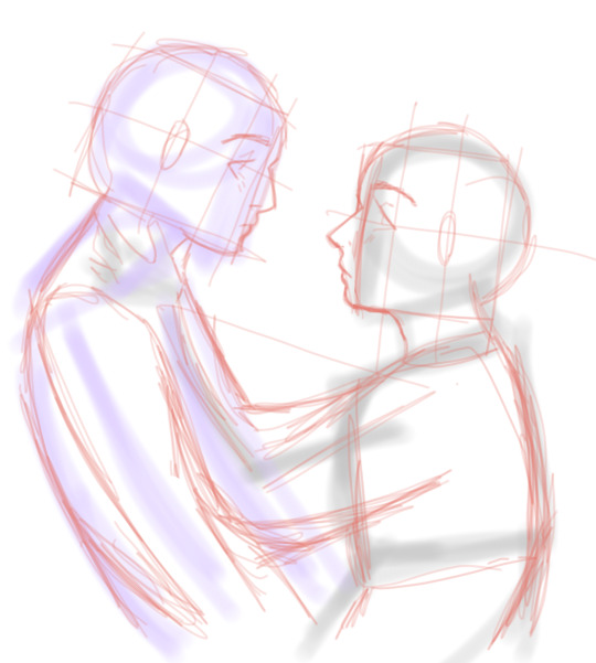
I often use a thick airbrush to sketch out the poses. It really helps with not overthinking or being worried that it doesn't look right, because for me at the start it doesn't needs to look right. Its basically the skeleton of the drawing that we will put flesh onto as we go:
I put layers on top of these and try to figure out how would the body look like. It's not perfect bc I sometimes also think of clothes. I've also put in faces into boxes, it helps lot more to put the face into perspective for me.
I very much color code the clothes, hair, accessories etc. It doesn't mesh all together thanks to it!
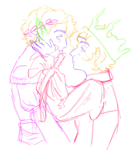
Then comes lineart and base color:

After that you just take a darker color and put in shadows in places you believe the shadow falls! When it comes to rendering and shadows I can't really say much, as there are a lot of different ways to do so, so I really recommend to watch some videos about it!
But when it comes to my silly little design characters, it's very much cartoonish and stylized. But I do the same tactic! I use a big airbrush and go over the same steps.
Tho its been very much influenced by the rubber horse art style, which is this very cartoon old style, like bendy and the ink machine.
I don't do lineart for it most of the time, instead, I use lasso fill over the sketch :D
Thought the best way I can recommend learning is by looking at and studying people's art styles. See how other people do stuff, how they color, render, and do linear, and make it your own.
For the longest time I've been observing Lavender Towne and her way of making art has taught me A LOT, yet we don't have similar art styles at all.
I've been even inspired by Wassup its E, and hell, I know for a fact E is so talented. The color theory that art brings is MWUAH. And I've learned some from looking at E's art, despite our art styles being practically opposite.
With E having those very bright, very impressive, and sharp eyes, it's pretty opposite for me. Lmao
But the best I can say is to use references and break the poses into shapes, or always helps! Or at least that's the advice I can give on top of my head. If you have anything more specific I will probably elaborate.
5 notes
·
View notes
Text
AI Pixel Studio Review, Features, Pricing, OTO, Demo + Special Discount(2024)

AI Pixel Studio Introduction
Welcome My Review Of AI Pixel Studio is a cutting-edge cloud-based tool that uses artificial intelligence to create stunning films, graphics, and photos with never-before-seen skill. It may be used with text input, voice commands, or freehand sketching. Its layout is a true asset to the fields of content creators, independent contractors, marketing virtuosos, and visionaries, enabling them to produce exceptional material that not only engages viewers deeply but also captivates them.
AI Pixel Studio is more than just a text-to-video transmogrifier or a simple pixel art generator. All in all, it’s a comprehensive AI system ready to take on a wide range of content creation tasks, with countless possibilities:
AI Pixel Studio Overview
Vendor: Vivek Gour
Product: AiPixel Studio
Launch Date: 2023-Aug-01
Launch Time: 11:00 EDT
Front-End Price: $47
Product Page:Click Here
Niche: Software
Refund :14 Day Guarantee
What is AiPixel Studio?
AiPixel Studio In a world where time is of the essence, our search for effective answers to common problems has brought artificial intelligence closer to hand. Artificial Intelligence (AI) is a cutting-edge technology that is revolutionizing work and productivity. Artificial intelligence’s remarkable powers have opened up previously unheard-of levels of efficiency, simplifying procedures that earlier required a substantial investment of time and money.
Metamorphose mundane sketches into hyper-realistic AI masterpieces, infusing life into the ordinary.
Craft AI-rendered cartoon imagery and graphics, manifesting whimsical and charismatic visual narratives.
Meticulously extract backgrounds from images, facilitating the creation of visually striking compositions.
Conjure mesmerizing 4K high-definition videos from mere textual input, a testament to the transformative potential of AI creativity.
Reshape the age portrayal within any image, crafting aesthetically pleasing transformations, an artistic metamorphosis at your fingertips.
Forge 4K AI videos, a catalyst for an exponential surge in conversion rates, a harbinger of marketing success.
Embark on the creation of multi-subject images without incurring exorbitant costs, democratizing multi-faceted content creation.
Resurrect old photographs, imbuing them with renewed vitality through the magic of AI reanimation, a poignant journey down memory lane.
Effortlessly dispel the obfuscating shroud of blur from images, instantly restoring clarity, an antidote to visual ambiguity.
AiPixel Studio Explore the Features And Pricing:
Are you prepared to use Ai Studio to elevate your artistic endeavors to new heights? With the least amount of work, you can accomplish remarkable achievements thanks to this amazing program. Let’s explore the amazing capabilities that this tool has to offer:
Convert Normal Sketch Images Into AI Real Images Transform ordinary sketches into stunning, realistic AI images with ease.
Remove Backgrounds From Images: Effortlessly achieve clean, professional results by removing backgrounds from images.
Convert Any Drawing Into Stunning AI Artworks: Turn any drawing into mesmerizing AI artworks that leave a lasting impression.
Craft AI Cartoon Images And Graphics: Unleash your imagination and effortlessly create captivating AI cartoon images and graphics.
Built-In AI Image Translation: Seamlessly translate images with the help of built-in AI technology.
AI 4K Videos:
Harness the power of AI to produce Ultra HD videos for any niche and attract a maximum number of customers.
Age Changer Videos: Transform the age of any photo effortlessly using AiPixe Studio‘s style-based regression model. Whether you want to make a person look younger, older, or more mature, this feature grants you the power to create captivating visual effects.
AI Photo Style Changer: Experience a complete reality of image transformation with this tool. Convert any mundane or boring image into a stylish masterpiece using the power of artificial intelligence. Elevate your visuals with sophisticated styles that leave a lasting impression.
AI Face Restoration: Even for beginners, AiPixel Studio makes face restoration inside blurred images a breeze. Witness the magic as faces are restored to crystal-clear perfection, like the morning sky.
Text Recognizer: AiPixel Studio has you covered with its text recognition feature. Extract meaningful text from existing images in just 3 clicks, accelerating your journey toward success.
AI Avatar Generator: Utilize AiPixel Studio to craft 100% unique AI avatars from any image. Elevate your online presence and offerings with eye-catching avatars, attracting 100X more visibility for your products and services. Details are discussed below.
0 notes
Photo


Alright, so, I have decided to change my commission prices a bit and add a few things of what I can do. As you can see this is for various ventures. Mostly to be able to pay some bills easier because I am working much less for the Spring semester for College but I am also trying to save up for a brand new laptop. Honestly, the one I’m using right now is old for a laptop. It’s 6 years old and I had bought it already 3 years used and I want to get something completely brand new and that is not an apple product. while I like the apple set up I a) Don’t want to pay an arm and a leg everytime my charger wears out and b) windows isn’t as program locked as apple products are.
So, indefinitely, I have commissions open. And to not clog your dashes too much there is more information below.
Things I can do:
Honestly, this is very open. I can take a crack at just about anything you want me to even if it is something I haven’t drawn before. Even though most of my examples are Borderlands related arts I am not limited to drawing that. It’s just the kinds of example I have. But I will try just about anything you want me to.
Things I won’t do:
Full nudity/Sexual situations only because I haven’t drawn many bits an pieces and don’t want to ruin it. Easier for me. But I will do partial nudity. Basically, if you want people or things down to at least their underwear or something I can certainly take a shot at that.
All prices are in USD.
All payments will be done through PayPal in my best efforts with an invoice. From Pixels to the Clean Pencil Lines I ask for payments first. From the Single Paintings to the Fully Rendered Painting I ask for half the payment first and then the second half once the painting is completed.
You can most easily contact me through here in the IM system.
For the more complicated pieces, I will try my best to keep you updated with progress (and with any other piece really). This is also to see if there are any changes you want to be done. But for the paintings, once most of the painting is completed I’m going to ask for no major changes to be done. Mostly for my own sanity for it will be very difficult to change large areas in this particular painting style.
An important thing to know is that I am a full-time student. Thus this makes me not fast when it comes to making digital art for I have other responsibilities to follow. This is especially so with the paintings for they take a lot of time and effort to do. So all I ask is patience and understanding.
I will most likely do commissions in the order I receive them.
If there are any other questions or something you are confused about please feel free to ask!
Pixels
Open
Open
Open
Chibis
Open
Open
Open
Sketch
Open
Open
Clean Pencil
Open
Open
Single Character Painting
Open
Half Painting
Open
Full Single Character Painting
Open
If you can’t support me by purchasing a commission I would be very happy if you supported me with a ko-fi!
63 notes
·
View notes
Text
Updated Sketch Commission Prices!
(This was copied and pasted from my journal over on FurAffinity, so I apologize if a few things do not make sense! lol <3)
Hello, everyone!
As you may have seen on my Twitter, I have run into an issue where I am working A LOT and not making ends meet. I did a lot of math, averaging, timing myself, more math, comparing my prices to other artists' of similar style/quality, MORE MATH... and uh... more math. It's a good thing I love math...
Anyway, I figured out the best pricing that suited me and my weekly goal to make around as much as I did when I had my old job... WITHOUT killing myself and having to overlap work time into family/me time. n_n
All I have figured out so far is full body sketches. I would kind of estimate for waist ups/head shots, but since I draw both of those a lot more close up than full body shots, it's kind of hard without timing myself... That includes everything else, I am about to list as well.
So, I have only gotten the prices that I prefer for Full Body Sketches, including: Lines ($25), Flat-colored ($40), and Simply Shaded with Texture ($60). I will be adding those to my Commission Info tab here in a bit! First, I wanted to list off the rest of what I am planning on figuring up prices and having visual examples for:
Sketches:
* Head Shot Sketches - Lined, Flat-colored, and Simply Shaded
* Waist Up Sketches - Lined, Flat-colored, and Simply Shaded
Inked and Fully-colored Illustrations:
(These would be inked, colored, then fully shaded. Can include background!)
* Head Shot
* Waist Up
* Full Body
Icons:
* Head Shot (These would be inked, colored, and simply shaded at 500x500 pixels then resized down to desired size.)
* Pixel Head Shot (Drawn at small icon size.)
* Pixel Full Body (Drawn at small icon size.)
Badges:
(These would be inked, colored, then simply shaded with fancy pants name art added. :D)
* Head Shot
* Waist Up
* Full Body
Reference Sheets:
(These would be inked and flat-colored with added textual information, if desired.)
* Front View
* + Back View
* + Side View
* + Expression
* + Accessory
* + Anything else will be priced accordingly
Digital Paintings:
* Head Shot Speed Painting
* Waist Up Speed Painting
* Full Body Speed Painting
* Head Shot Rendered Painting
* Waist Up Rendered Painting
* Full Body Rendered Painting
These are all base prices, not including backgrounds, props, extra appendages (such as extra limbs, wings, etc...), extra characters, etc... If anything is to be added to the base price, the amount of extra time the commission takes will be added to the base price.
How I will do this is before I begin the commission, I will ask that you pay the base price. Once I have started your commission, I will time myself. At the end of the commission, I will calculate how much extra time I put into the commission to find how much extra is owed.
I have figured up that $30 per hour works for me, so, for example, if someone commissions a commission of a dragon flying through a village holding a princess in one talon, in a rendered painting style, I would ask that the client pay the base price for the Full Body Rendered Painting price. Once the commission is done, I will ask for the remanding owed money for the time that it took to paint the wings, background, and princess.
(Also, I know that $30 sounds like A LOT, but I work VERY fast, so a lot of quality goes into that hour! I promise! <3)
I think that's all for now, guys!
I am also thinking about doing comics as well! A friend of mine is wanting to commission me to do some comics for him, so maybe that will get started soon! :D I'm excite!
Thanks so much for reading, and I hope you have a wonderful day!!!
4 notes
·
View notes
Text
The Derrick: Part II - Making Faces With My Friends
Once upon a time, designers were able to make games without graphics. Dungeon Masters rendered breathtaking worlds full of beauty and danger thanks to the amazing power of IMAGINEOVISION, a game engine that required only the human voice and the creativity of its players. Choose Your Own Adventure books and text-only computer games formalized the process into descriptive chunks of text between which the player had to choose, again without relying on a single pixel to aid -- or to hinder -- the player’s imagination. The power of decision-based storytelling was, and still is, one of the most compelling forms of gameplay available, but the introduction of computer graphics into the adventure genre with Mystery House forever changed the game. In order to attract and hold the attention of a modern gamer, even the best text-based adventure usually requires at least a modicum of eye-candy.
As we discussed last time, The Derrick will primarily take the form of a text adventure. In order to illuminate the people and places of Adams, Oklahoma, I’ll be creating not only the story and design for the game, but also the pixel art as well -- a first in my 27 years of game development. Because I’m not a naturally talented artist, it’s taken me several years to develop my art style, and what follows is a brief exploration of how I’ve developed the approach that I’ll be using in The Derrick.
* * *
I’ve always wanted to be an artist. I’ve envied so many of my friends who could sit down with a sketch pad and a pencil and just DRAW anything they wanted. My friend Kenneth Mayfield valiantly spent many hours trying to teach me, and he let me watch as he worked with an airbrush to create the covers of many of the Starfleet Battles strategy games. I picked up as much as I could from him, and even got to the point that I could paint halfway decent nebulae and planets, but mastery with traditional media eluded me. My hand eye co-ordination was poor, and no matter how long I worked at it, I never felt like I was making measurable progress. I might have given up on it entirely if Photoshop hadn’t come along in the early ‘90s to show me another way.
My first experiments with digital photo manipulation were typical surrealism. I cloned my dad and made him sit in his own lap. I placed myself on the cover of important magazines. I did all the silly things that most beginners did with Photoshop, and learned how to blend out scratches and obliterate wrinkles from extant photos. But not too long after I began to experiment with the tool, I began to see it not only as a way to change photos, but also to create entirely new images from scratch. I could make up for my natural deficits in hand eye co-ordination by zooming in and editing pixel by pixel, and I could undo mistakes with a simple keyclick. The program didn’t give me the talent that I didn’t have, of course, but it did provide me with the confidence that I might be able to grow and develop in a way that I hadn’t been possible with mere paint and canvas.
I’ll be the first to admit that my first fully digital “painting” was terrible. I was no better an artist than I had been in junior high, but it wasn’t a bad place from which to start.
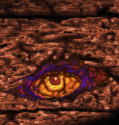
WALL OF EYES - As a whole, my first digital painting was terrible, but isolated bits of it revealed that I might be able to do things with digital painting that I hadn’t been able to master with traditional techniques.
When I got to work on my first painting, I’d had no concrete plan for what I wanted to draw. I started with the face of a cyber-punk girl and worked outward, but everything about her showed off my weaknesses as an artist. She had no structure to her face, the balance was wrong, her proportions were deformed -- from head to toe she was a nebulous mess. I’d also put zero thought into her background before starting, and as a result had to retroactively paint in a wall around her rather than painting her over it (a process that would have been a lot easier if Photoshop had had layers, but that feature wouldn’t come along for a few more years). Slowly the wall took on a kind of life of its own, becoming a rotting wood-plank fence. As the gaps and holes began to appear, my mind began to wonder what might be lurking behind them. It became evident to me that the real subjects of the painting were the eyes behind the wall rather than the girl in front of it. “Wall of Eyes” would name itself, and would later lead to two “sequel” images.
COULD SOMEBODY GET ME SOME VISINE? - Using the power of layers in Photoshop allowed me to “focus” more on fine details of the image.
With the original version of “Wall of Eyes,” I’d felt extreme hesitation at trying to fix any aspect of the image for fear of destroying what few elements I’d liked. The introduction of layers into later versions of Photoshop, however gave me not only a new way to experiment, but it also made me look at the creation process in an entirely different way.
In traditional art, it’s very customary to “build up” an image one layer at a time, painting several coats of translucent paint over each under until a net color or other effect is achieved (a core lesson I’d learned from painting nebulaes). With layers in Photoshop, I realized I could achieve the same effect without running the risk of messing up coats of paint (which would require destroying and painting over flubbed layers.) I could simply lay down different colors and textures and then alter their opacity however I desired. I could also reorder the layers in an instant, and change how they mixed with one another. Ultimately it began to feel more like the process of creating a collage, and it was freeing to realize that I could experiment without fear of messing something up.
My first use of this new feature was to return to “Wall of Eyes” and enlarge one eye that I’d found particularly menacing. Inspired by an old comic book cover, I recolored my “refocused” painting with lurid, pulp comic colors.
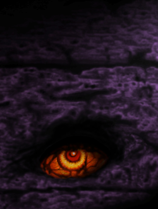
THE THING IN THE BOX - Taking center stage, the eye pops even more with contrasting values of heat and cold, and even greater layers of detail veining its malevolent gaze.
As I continued to toy with it and refine, I “cooled down” the fence with tones of moonlight to draw contrast with that hellish eye, and lavished more details on the eyeball itself. Using layers not only of color but also adjustments to saturation, and contrast, and other elements, I arrived at a final nightmarish image of something that none of us wants to find beneath our beds.
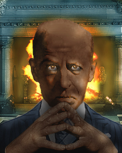
When I started thinking about the character portraits for The Derrick, I realized that a lot of the lessons I’d learned about painting could be used in the modification of existing materials. I could take photos of friends of mine and transform them into heavily stylized portraits that would fit the mood and style of the game I wanted to create. My portrait transformation for Delphine Mack is a fairly good example. I began with a photo of my friend Sarah Berry in vintage clothes appropriate to our 1920s setting.
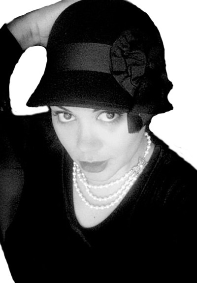
The original image was black and white, and Sarah was posed against a crowded black background that had to be knocked out in order to make room for a different environment. Finding the boundaries between her dark dress and the dark background were a challenge, but it was an important step in isolating her for modification. Next, I began to hand tint the image for a slightly vintage-postcard look, and applied filters to create a paint-like “surface” to the image.
Next I turned towards the creation of a mysterious background, cloaking her in a graveyard-like fog of blue that fits the mood of the game. It felt as though she should be creeping around in graveyards or down at the riverboat dock.
Once the fog was done, I realized that I liked it, but it seemed to compress the image into a single plane, and the color was too monochromatic. So, for a remedy, I created masks to draw a noirish slash of light across her face, while also creating contrasting bands of orange and red behind and below her for a final mysterious effect.
The irony of Delphine’s portrait creation is that I hadn’t meant for her to be a major character in The Derrick. She was intended only to be one of several non-player characters with whom the player could interact during the course of the game. But as I watched her come alive during the creation of her portrait, I began to see her as a daring and brilliant protagonist that would be very different than your usual Lovecraftian hero, and a perfect centerpiece for the tale.
Many of the other characters you’ll meet in The Derrick likewise found their narratives while I was busy “painting” their faces, some of which required a great deal more compositing of elements and layers than Delphine. Phineas Book is a great example of portrait that actually required the combination of several disparate elements -- one man’s face, another person’s hands, a suit that was appropriate for the time period, and a theatrical-looking fireplace that provided the perfect backdrop. The fire itself was hand painted for final effect, as were the eyes and other smaller elements of the scene.
0 notes
Link
Design Systems have become a key part of any company’s everyday work. From discussions to creations, it seems that it has become an integral part of designers’ life. It is believed that in the future, every brand and every product will use a Design System, simple or comprehensive, strict or loose, mono, or cross platforms. Here we are today with our top 10 design system count down. Ready for a fun ride so let the countdown begin.
1.Material Design by Google
Material design system by Google
A modern design language developed by Google in 2014, Material Design aims to create a visual language for users that brings efficiency and modern together created by the innovation of technology. It helps to unify user experiences across all devices and platforms. It is an open-source code, a beautiful collab between designers and developers. It includes many sections including, motion, style, layout, color palette, typography guidelines, icon design, even the ability to create dark material themes, and more.
The first version of Material Design had one drawback that was important for brands that want to adapt it to their style. All Material Design applications were extremely similar. So in 2018 Google launches Material Design 2.0. This version was an answer to the above criticism. With multiple styles, layouts, depth effects, cool animations, they are empowered to make truly unique branding themes.
Users of the system have the tools and resources needed to create a unified UI.
2. Mailchimp
Mailchimp design system
Mailchimp has been always cited as one of the best examples for a detailed company brand tone but they also have also been known for its pretty thorough design system that is focused on a pattern and a pattern library. You can find detailed guidelines for colors, buttons, alert messages, and every other aspect of the marketing platform. To add more to it there are guidelines that have plenty of examples and explanations that break down the most important concepts. Email and marketing automation service is available too.
MailChimp features a well-established design system, available years before design systems sprouted fully. The design system is robust and is kept simple and user-friendly.MailChimp also has a handy content style guide available.
3. Uber Design by Uber
Uber design system by Uber
Uber describes its brand as a bold, new brand and its design system defines those principles too. The design system covers the integrity of the brand visuals, from logo usage to color, composition, and event photography, and motion. Uber’s design system revolves around elegant simplicity and subtly recreating the famous U wherever possible. By creating a system that not only acknowledges but also leverages Uber’s evolution into a platform, with a robust, consistent set of basic elements while enabling them to freely explore. This system should be able to welcome incoming innovations without disrupting the existing experiences that feel familiar to so many users.
The ultimate goal of their design platform is to make every designer a little better at thinking of everything in terms of systems — grids, typography, language, motion, accessibility, and so on. This allows everyone to design together, to learn from a common source, and to have a shared understanding of product quality across the company.
4. Lightning by Salesforce
Lightning design system by Salesforce
Salesforce is a star within cloud-based software, including CRM, customer service, marketing automation, analytics, and application development. The American company displays a thorough and well-documented design system called Lightning, which is an open-source project focused on building business apps which include guidelines on various platforms, accessibility, UI components, UI patterns, utilities, design tokens, and more. . The design system provides a professional and comprehensive guide to accessibility, components, patterns, utilities, design tokens, and more.
Lightning was a way to keep everything unified and easy to access for anyone designing for the platform. Instead of focusing on pixels, the design system focuses on application logic, user experience, interactions, and flows. You will find in-depth guidelines and examples that cover not only design guidelines but also accessibility issues and component blueprints.
5. Atlassian
Atlassian design system
Atlassian is an Australian software company best known for its issue tracking application, Jira. Their design system describes not only how to use their logo, brand colors, fonts, and other design elements but they also let their brand personality shine through. With color names such as Dragon’s Blood and Herky Jerky, it’s easy to see why they describe their style as bold, optimistic, and practical with a wink.
Atlassian comprises various components including icons, fonts, buttons, badges, banners, pagination, tabs, tags, tables, and spinners. That helps the user have outstanding experiences. On September 12, 2017, Atlassian became a second product of the day and the fifth of the week on ProductHunt. By now, it has received 2,301 upvotes.
The system is very detailed and is composed of design patterns, code components, and a library of UI assets in Sketch. You can also find the reasoning behind each choice made.
6. Fluent Design by Microsoft
Fluent design system by Microsoft
The Fluent design system was developed by Microsoft in 2017 and it aims to create simplicity and coherence through open design systems developed for all the platforms. It focuses on uniting the fundamentals of principled design, technology innovation, and customer needs. It also lays out guidelines for developing apps for Windows, Android, and iOS devices.
Representing a rethinking of Microsoft Design Language 2, Fluent contains instructions for visuals, effects, and interactions employed within the software. It is noteworthy, that the system is being improved according to real-world customer needs.
The sensory elements are based on five key components: light, depth, motion, material, and scale, with the increasing intent to be applied beyond flat screens.
7. Polaris by Shopify
Polaris design system by Shopify
Shopify Polaris was developed so all Shopify merchants could enjoy a great experience and benefit from a beautiful store design. This design system has guidelines for crafting every part of the Shopify experience; from admin screens down to product experience and various apps for Shopify. You will also find helpful links to third-party tools that can serve as an inspiration or help you learn how to effectively design for Shopify.
This solution allows UI/UX designers and engineers to create user-friendly applications for Shopify merchants. Providing teams with plenty of tools, styles, and elements, it helps them build engaging user experiences that work on every device, on every operating system, and in every language. On the product’s official website, you can find in-depth sections on content, typography, components, illustrations, with guidelines for the tone of voice, grammar, and copywriting tips.
8. Marvel Design by Marvel
Marvel design system by Marvel
Developers don’t want to repeat the same work on different mediums. Companies want to be more efficient. Product designers and owners want the products they work on to be faster, more accessible whilst still looking sharp and consistent. They have also developed a few static sites: A marketing website, a WordPress blog, a bunch of isolated back-end templates.
They have a bunch of design values for colors, typography, layout, and more, structured in a simple JSON format. From there, it is sent to a few places. On one hand, they have a swift style guide generator which generates the design values consumed by iOS and Mac apps. On the other, there is a simple atomic CSS framework, which then gets consumed by anything that uses web technology; be that React, PHP, or old school email table templates.
So the advantages work out to be solutions to the mentioned problems such as shipping consistent and accessible products across different mediums, reusing and maintaining code and design in a more efficient way. And of course, improve cross-team collaboration.
9. Apple design system
Apple design system by Apple
Apple’s design system is meant to facilitate the design of apps and Apple’s suite of products but there’s plenty to learn and admire in their style guide. For starters, you can download the SF icons which are meant to complement the system font for Apple’s devices. You will also find guidelines and instructions for UX design, making apps more accessible, and accessories.
Similar to Microsoft’s Fluent, Apple’s design system is meant to enhance the experience of the suite of Apple products and services. In this design system, you can watch video sessions and tutorials for building user-friendly and future-proof experiences, as well as how to optimize the experiences for iPhone X-e.g. designing for sound and writing for push notifications.
10. Airbnb design system
Airbnb design system
Airbnb shares a comprehensive overview of its design. The main characteristic of their design language is that each component can live on its own as a separate entity and even evolve further while also being a part of a larger cohesive unit, comparing their design system to a living, breathing organism. It not only offers affordable hospitality services around the globe. The company also shares insights about their featuring cutting edge techniques.
In the process of building the system, Airbnb also integrated internal and third-party tools. For example, the React-sketch app which is an open-source library that lets you write React components that render to Sketch documents.
With this design system in place, Airbnb is able to speed up development. Engineers are able to focus on writing the feature logic rather than the view code, and it enables faster prototyping and experimenting at a lower cost.
These were the top 10 must-know design systems. I hope you enjoyed the countdown. Don’t forget to check Iconscout to discover millions of icons, illustrations, and stock photos which you can use in developing your Design system.
0 notes
Text
5 Ways to Design for Large Viewports
Web designers have typically always been big-picture people, in that they like having really big screens in front of them. It’s convenient, and it makes you feel very professional. At this point in my life, I don’t think I could go back to having just one monitor, either. And yet, I find that many websites don’t live up to the potential promised by big darned screens, or even that presented by phones with HD resolutions.
This is because we live in a mobile-first world, with mobile-first people. They go to far off and exotic places like “outside”, so they have to carry their screens around with them. Outside people pretty much pay our bills—whether directly or indirectly—and we have to make websites they can actually use on those small screens.
That is all well and good, and it’s not going to change any time soon. But big screens aren’t going anywhere, either. People still work in offices, at home, and in coffee shops with laptops and desktops. People still have “the family computer” at home. PC gamers exist, and they’re buying some of the biggest screens, right alongside photographers and videographers.
These people are often left with experiences designed for mid-range to small screens. This likely doesn’t break the experience for them, but why shouldn’t they have an experience tailored to their needs? Besides, what is all that extra screen space there for, if not to play with it? Here are a few ways to take advantage of the bigger screens, along with some examples:
1. Literal Big Pictures
One of the most common ways people try to use up the empty space is to put pictures in it. We’ve all seen the ten-trillion websites (I may be exaggerating) that use some stock photo as a background, particularly in the “hero” section on the home page. This is everywhere. You’ve done it, most likely, and God knows I’ve done it.
It is not altogether the worst way to go about it, and it’s not the best. While image compression is getting better and better, those images will still hit you in the bandwidth, caching or no caching. If you want to save you and your CDN some trouble, go with SVG. I know, I keep saying this, but it really works, and it works wonders. See bebold for a picture-perfect (heh) example of how to use simple SVG imagery to fill up some space while keeping the bandwidth and rendering costs light.
2. Scaling the Layout
So we all know how responsive design works, right? Well, it’s gotten a lot easier with CSS Grid. I’ve been experimenting with it for personal projects, and goddamn but it truly changes everything. Those Magazine-type layouts that front-end developers have been trying to make work for decades? They’re easy now. Easy. Go read a tutorial already.
With all that time you have left over, why not see what you can do when you let the central wrapping div go wider than 1,200 pixels? It could be fun. For an absolutely gorgeous (if somewhat bandwidth-heavy) example, see Seedlip.
3. Responsive Type
But hey, sometimes you don’t want to bother so much with pictures. Maybe you just want big darned text. We’ve had various iterations on the responsive layout for years, though. What has been harder is scaling our typography up and down by screen resolution in a way that seems natural and fluid. Sure, you can do it with a few dozen media queries (or like two, if you’re lazy like me), but the CSS calc function has us covered if we want to do it the easy way.
Sure, Chris Coyier has been writing about this since 2012, but the browser support hasn’t always been up to par. I quite like the technique used by Mike Foskett’s Fluid-responsive font-size calculator, which allows you to specify a maximum font-size, and can calculate everything in rems and ems, if that’s the way you want to go.
For an example of the technique in action see any article on CSS-Tricks.
4. Just put More Stuff on the Screen
As an avowed minimalist, I’m not a huge fan of just bombarding the user with information in general. However, there are times when this is exactly what they want and need. The clearest use cases for this approach are in dashboard-style user interfaces, and plain old e-commerce. In either of these cases, if you’re not using the maximum potential space for functionality and/or products, you’re actually slowing the user down when they may not want to be slowed down.
Most dashboard designers are already, well…on board. However, I’m seeing more and more ecommerce site templates trying to cram products into small areas on big screens, and that makes little sense to me.
Example: I dunno… Amazon? I’m not going to link that. They’re going to get our traffic eventually in any case. Actually, the aforementioned Seedlip works very well for this section, too.
Now where I object to this approach is on news sites, and generally they seem to agree with me. Although some are still using up the full screen, they make the content big enough that there’s not too much in the viewport at any one time, encouraging you to scroll down and really pick and choose your articles. Sure, they do it to display more ads, but this might be one of the few times ads have actually helped to improve an experience. Kind of.
5. Video
And lastly, a real no-brainer. I’m not actually sure anyone’s doing this one wrong. Still… if you’re going to use video extensively on your site anyway, and you’re not too fussed about bandwidth, go big. It’s video, that’s what it’s for. If nothing else, at least give people the option to watch your videos in full-screen mode. For examples of this tip in action, see just about any filmmaker’s site. Here’s one: +Ring.
Add Realistic Chalk and Sketch Lettering Effects with Sketch’it – only $5!
Source
from Webdesigner Depot http://bit.ly/2RaqHW0
from Blogger http://bit.ly/2AtcKZa
0 notes
Text
‘Byte Me’ - Pixel Art Workshop Review
In this workshop, I’m exploring a retro 8-bit aesthetic to my characters and the economic approach games such as Mario took to animation, additionally to discussing why the pixel has become so popular in modern culture.
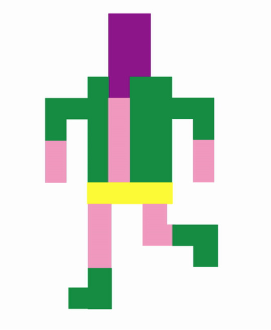
Recently, computer games with a retro style have become rather popular in modern culture - with examples like Minecraft, the popular app Ball Kings and the NES game consoles being reissued to eager fans. There’s a nostalgic appeal to pixel art, a loving look back at a bygone era of digital graphics and games. These simple pixelated graphics effectively paved the way for on-screen imagery - allowing gamers to play as a character rather than just a shape or line.
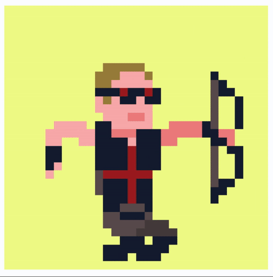
South Korean illustrator Jaebum Joe is renowned for his use of the style, which follows an approach that allows the artist to produce more detailed and exciting characters, with differing body shapes and fun character designs. His work harkens back to the side-scrolling beat ‘em up arcade games than a pixel platformer, with a Street Fighter aesthetic that results in a brilliant and striking animation for Nike, of an imaginary basketball game.

Nike / RUN_IT. (2018). Jaebum Joe.
Whilst I won’t be taking this more detailed approach, his work possesses a life and cinematic excitement unrivalled by any other pixel artist in his field. Joe isn’t limited to striking, flashy movements either - with his Tiger Office being a perfect example of a much-needed subtlety. It’s only fifteen seconds long, but the quiet whirring of the PC booting up and the flickering lights illuminating a quiet, lonely workspace speak volumes.

Tiger Office. (2017). Jaebum Joe.
In contrast to this more detailed and exciting approach to pixel art is Ivan Dixon, who works with significantly less pixels to embrace that retro aesthetic and nostalgia. Where Joe is focusing on exciting character designs, Dixon is an animator at heart - and how his characters move reflects this. His website is a showcase of extremely fluid and lively characters bouncing around in their small pixel boxes, with a naive and child-like sense of fun that’s rather infectious.
Avengers. (2018). Ivan Dixon.
His characters are often inspired by pop culture, with characters from films, games and popular tv shows all getting the bouncy pixel treatment. It’s this limited, cyclic animation approach that I’ll be exploring in my response, but in a more restricted way.
It’s Dixon’s limited colour palettes and embrace of the pixel aesthetic that I’ll be responding to in this workshop. The more detailed Street Fighter style is exciting too, but I’m looking to create a character and animation that’s clearly retro pixel art - so I’ll be sticking to a strictly 8-bit style.
Step 1: Draw
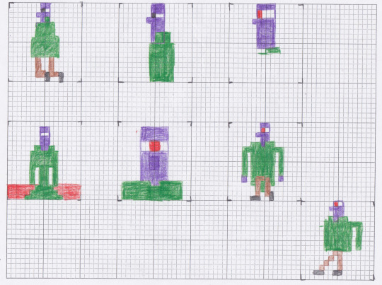
The process began by creating a few sketches, using grid paper to create a square module of 8 by 8 squares. For these drawings, I was working off a few observational sketches, taking inspiration from these to create my own character.
All of the examples I’ve looked at use bright colours - something studios did at the time to grab the gamer’s attention and make up for the lack of character detail. I wanted to follow this idea, so used a combination of green, purple and orange pencils to build my character.
My main idea was to create a supervillain character, looking at comic book villains such as Green Goblin, Joker and a whole host of other bad guys that also sport the same green and purple colour scheme. These pencil sketches, whilst just quick coloured studies, provided most of the design process for me.
When you work digitally, there’s an unconscious restriction and lack of experimentation. We’re so quick just to ‘undo’ anything that isn’t perfect the first time, that we might miss a great idea. With a pencil and paper, the pressure is off and I’m just sketching whatever comes to mind.
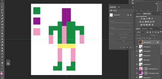
Step 2: Pixelate

Having a basic idea of the character I want to create, I headed into Photoshop in order to build a digital version. After setting up a new custom document with the correct specifications, I could then begin piecing together the bit-mapped image.
Pixel art is a style I haven’t really explored up until now, but it’s a process that I found rather intuitive and straight forward - as I’m restricting myself to a 8x8 grid, there’s no half pixels or diagonal lines - so it’s just a process of dragging and dropping blocks onto the grid.
When building my character, I played around with adding different features and colour schemes, but decided to leave the eyes, nose and mouth - instead, I explored a minimalist approach that resulted in an appealing character design, I think.
Having shown a few of my peers, I’ve found the success of the design lies in the simplicity, I feel. It’s purposely restrictive and minimal - and it finds a power within that limitation. Something I didn’t account for was my audience assuming the character is naked - the pink was supposed to be a costume, rather than skin - so I had to reconsider my choices if I wanted to illlustrate a super-villain character.
After experimenting with a few different colour palettes, I initially decided to use a monochromatic brown colour palette - going against the flashing vibrant colours of Dixon and Joe in favour of a quiet, subtle aesthetic.

Just in this pixelated style, I find there to be great potential using this technique. There’s a universal appeal to the style that cannot be overlooked, the naive quality of the designs engage audiences of all demographics due to it’s child-like creativity and sense of fun.
Step 3: Animation
My next move was to animate the character. Our tutor showed us how to do subtle movements using replacement parts, however I wanted to create a walk cycle so I made separate illustrations using the same character design. Working on my research into examples of how to animate walk cycles, I only needed four frames to capture that limited movement, but I think it really works here.
To create the sequence, I created separate illustrations for each frame: a contact and passing pose, and reversed them to create a walk cycle. It’s a bit jarring, but it works and the audience knows the character is walking. Its a fun asthetic that I hope to explore further. It’s a simple frame by frame animation, dragging the body down on the contact poses and then up again as the body steps up. As a looping animation, though, it’s quite endearing. The rather crude movements and jolting actions results in a visually interesting walk cycle, separate from any other sequence I’ve created so far.

The brown colour scheme works, exploring that idea of nostalgia once again, but I do feel as if removing the bright colours removes a life to the piece. The animation is still successful, but if I were to create another pixel walk cycle, I would want to experiment with a range of colours beyond the monochrome palette I’ve chosen here. It’s interesting, but the pixels aren’t properly arranged here - there’s some overlap that defeats the 8 bit style.
Having identified this, I went back and used my original bright colours, embracing the bizarre character design and cleaned up the actual animation. My final piece is much more exciting and successful, I think.
My animation is more restricted and minimal in design than the examples I’ve looked at here - but there’s a charm in that simplicity. If we compare my animation to fellow student Alex’s pixel characters, we can see we’ve both taken a relatively minimalist approach to design - something that’s inherent to the 8-bit restriction. Like myself, Alex decided to create full body figures, rendering famous characters from 70s horror movies. It’s her Cthulu avatar that I think is the most visually exciting, an ominous red eye amidst the blur of dark green tentacles makes the avatar look suitably omniscient and more than a bit sinister.

Alex has also stuck to the more abstract pixel approach, using a limited grid to embrace that retro aesthetic. If we compare this to an artist like Joe’s work, there’s a noticeable difference in style and concept - we’re actively embracing that lo-fi, pixelated look whilst Joe’s working on creating a more refined piece that looked like it jumped out of a 90s street fighter arcade game. Both approaches are successful, but Joe’s results in a much more refined outcome and visual style that I wasn’t really going for. It almost hides the fact it’s pixel art, and Alex and I wanted to embrace the process with our examples.
Although not animated, there is a life to Alex’s designs. I think it’s the dark grey backdrop and floor - a frame to the characters - that results in a piece looking like it’s about to bounce in true Mario fashion. I’ve said these pieces are appealing to a universal audience, due to the simplicity of the designs - but now I’m going to attempt to discuss why pixel art is so popular.
There’s a few factors as to why pixel art is seeing a somewhat of a resurgence in games and animation, as described by a few articles on the topic on the internet, from art discussion blog Widewalls to the more mainstream media hub IGN.
The main factor, of course, is nostalgia. People who were born in the early 80’s and later grew up with games featuring pixel graphics - and now, they’ve got their own money to spend. Adults see these games and apps with that retro pixel aesthetic, like Ball King and a whole host of other platformers, and they’re reminded of their happy memories as a kid, playing those games.
Nostalgia for the time of old is an extremely powerful tool on any audience, so game developers take advantage of this effect and produce games and animations that capitalise on that warm feeling.
It also helps that these pixelated games are rather cheap to make, in comparison to 3D rendering and graphics. It’s an open door for anyone - both big studios and independent developers alike. It’s approachable and comparatively much more easy to make. It’s this simplicity of process and technique that inspires hundreds of artists to produce works of their own, and it’s a way in to the gaming industry for many independent developers and small studios hoping for their big break.
Finally, there’s definitely something to be said about the inherent simplicity of the process - pixel art is commonly not detailed, and doesn’t need intensive rendering. It’s not intimidating, doesn’t look too intensive and as a result - draws a wide audience in. When games have high-quality graphics and specific settings just for the image resolution, fps and graphics card, casual gamers might feel a little alienated. As that myself, I can personally agree that this is the case. I go to a pixel game because of the neat aesthetic, but also the simple charm of the minimalist design.
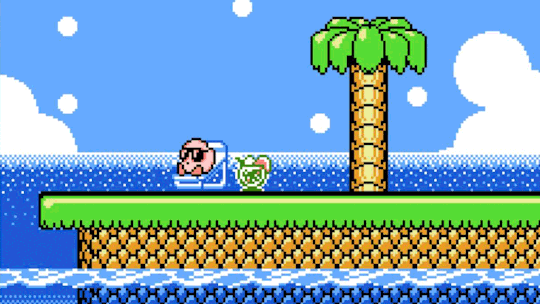
This simplicity consequently reflects the simplicity of the mechanics - when an audience member sees a game with pixel art, say Kirby - they aren’t expecting a difficult experience. Contrast this with the latest Fallout game and it’s a different story altogether. Complex graphics can be appealing, but as a whole - it can intimidate and even alienate a wide audience, who associates high graphics with ‘hardcore gaming’ - a style of gaming that might not be appealing or approachable to the general public.
Just in that brief discussion I’ve been able to explore why I think pixel art is so popular with a wide audience - but a good development from this would be to ask other students why they think pixel art has such a hold on the games industry, or contact pixel artists asking for their opinion on the matter. I’ve only looked at a few perspectives with my discussion, so exploring a few more would be a good way to further establish the context of this workshop.
In this workshop, I was able to learn a new process within Photoshop - how to create not only a pixel character, but how to animate him too. It’s a rather intuitive and straightforward technique, but one that allows me to work in an entirely different and exciting aesthetic. This visual style is universally appealing, and it provides an interesting contrast in not only style but movement in comparison to my other walk cycles I’ve produced so far.
There’s some real potential in this process, and I’d love to create a whole host of characters using the process, exploring different movements. Perhaps I could take some of the characters I’ve already designed and pixelate those, for example Michael.
I’m really inspired by the incredibly fluid and bouncy motion Dixon has been able to integrate whilst keeping to those pixel restrictions, and I could look at that approach as a potential development. Seeing a pixel character just bounce like a traditional animation is just appealing to me, so exploring how he creates these animations, by breaking them down frame by frame, would be a good way to follow this line of enquiry.
Moving forward, though, I’m going to be jumping from two dimensions to three - beginning some stop motion walk tests using my armature. So far I’ve explored digital and pixel animation, and I want to challenge myself to produce some stop motion tests too. I’ll be building a puppet, but I want to begin exploring the medium of stop motion and a physical walk cycle before I move onto producing an actual model, using my ready-built armature. We’ve recently acquired the professional stop motion software DragonFrame, a programme used by animator in the industry at the moment, for films like Isle of Dogs and Kubo and the Two Strings - so I’ll also be attempting to get to grips with the program in the process.
Actions
Make some stop motion walk tests using my armature, get to grips with professional and industry standard stop motion software DragonFrame.
Potentials
Produce another pixel walk cycle animation, based on my character Michael
0 notes
Last Seen Blogs

webadminpoc
Untitled

thirdeyecolors
THIRDEYE COLORS
fannibalfanbookproject-blog
Fannibal Fanbook Project
attactica
AttacticaArmory

hardcore-solangelo-19
Welcome to the heat death of sanity.