#typeinuse
Photo
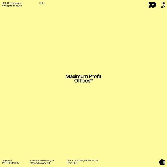
WIN the 25% discount code, play the quiz on the microsite! Link in bio. #displaay #typeface #jokker #type #typography #typedesign #typeinuse #fontinuse #font #fontdesign #graphic #design #graphicdesign #designfeed #best #sans #typefacespecimen #thedailytype (at Las Vegas) https://www.instagram.com/p/CovCJUFrx2e/?igshid=NGJjMDIxMWI=
#displaay#typeface#jokker#type#typography#typedesign#typeinuse#fontinuse#font#fontdesign#graphic#design#graphicdesign#designfeed#best#sans#typefacespecimen#thedailytype
18 notes
·
View notes
Photo
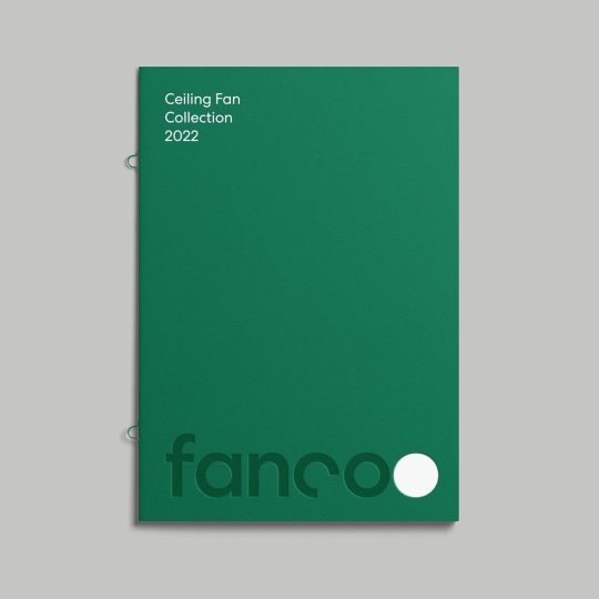
@wearemucho Fanco Australia is an industry leader in fans, ventilation and air movement products. After ten years of steady growth and having forged a reputation for the quality and diversity of its range, Fanco’s visual identity system required a makeover. A creative territory we called "Transformation" emerged from our initial research phase, and this theme informed the development of a robust and flexible system. Final brand assets and guidelines were provided to Fanco’s internal design team, alongside concepts for a range of applications showcasing the potential for the refreshed identity. #type #typography #font #fontdesign #typedesign #thedailytype #lettering #fontinuse #typeinuse #graphicdesign #designfeed #mucho #branding #branddesign #fans #ventilation https://www.instagram.com/p/CnAoRZGhDGm/?igshid=NGJjMDIxMWI=
#type#typography#font#fontdesign#typedesign#thedailytype#lettering#fontinuse#typeinuse#graphicdesign#designfeed#mucho#branding#branddesign#fans#ventilation
3 notes
·
View notes
Text
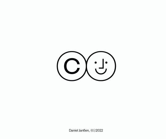
(c)Daniel Janßen
11 notes
·
View notes
Photo
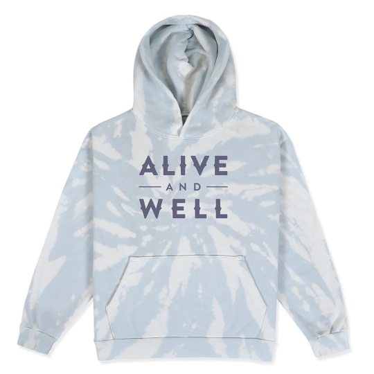
No idea who did this, but this streetwear brand @aliveandwell.life_ is using my Glot type family’s alt caps for their branding & apparel. #typeinuse #wordshape #glot (at Shibuya, Tokyo) https://www.instagram.com/p/CpEnrPlynNo/?igshid=NGJjMDIxMWI=
0 notes
Photo
Haarlem Typeface in use by Max Prediger and Julian Mader.
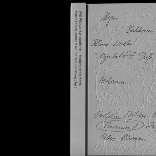
“(Mit) Pflanzen kartografieren - Mapping (with) Plants” by Hanne Loreck, Andrea Klier und Sara Lindeborg (Hgs.)
Haarlem Typeface is available on edition.studio
#typeface#typedesign#typeinuse#graphic design#adrien menard#adrienmenard#editionstudio#bookdesign#mit#Typography#typographie#fontinuse
6 notes
·
View notes
Photo
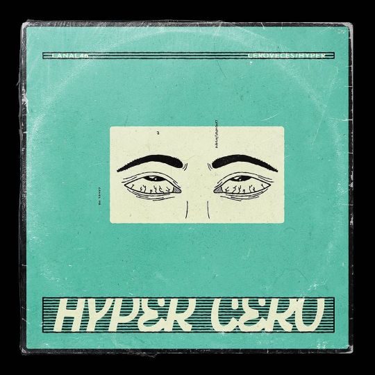
🧨 custom typography and illustration designed for the new EP 🙄HYPER CERO🙄 by @canal46 💿 → label @hippymuertoproducciones #eyeroll #hippymuerto #hippymuertoprod #hinchadolaspelotas #typedesign #antipixeltype #antipixel #albumcover #recordoftheday #singlecover #mixtapedesign #customdesign #illustration #illustrationoftheday #illustrationdaily #fontinuse #typeinuse #displaytype #displaytypography https://www.instagram.com/p/CF2Oe9QB86B/?igshid=9nkaeue5cd9e
#eyeroll#hippymuerto#hippymuertoprod#hinchadolaspelotas#typedesign#antipixeltype#antipixel#albumcover#recordoftheday#singlecover#mixtapedesign#customdesign#illustration#illustrationoftheday#illustrationdaily#fontinuse#typeinuse#displaytype#displaytypography
0 notes
Photo
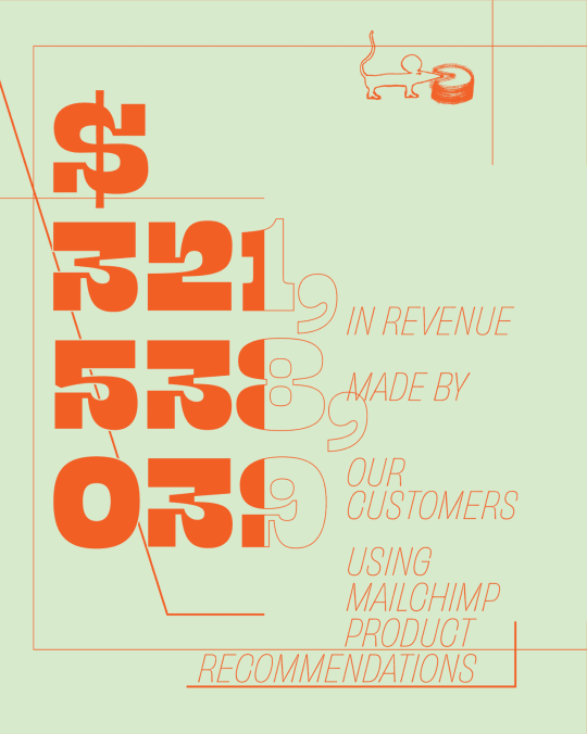

1. Beastly (Oh No Type) used alongside Helvtica (Haas) in a MailChimps Annual Report
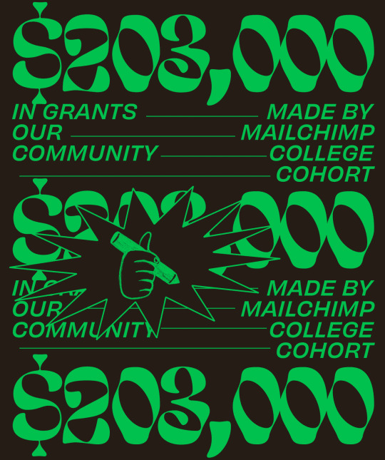
2. Eckmannpsych
3. EckmannPsych alongside Helvetica.
Notes: Both Beastly and Eckmannpsych bring visual interest, and are still easily legible especially when used in numbers. While Helvetica is easy to read and structured. It looks like the Designer chose to use Helvetica Oblique to be a point of difference in a popular often-used typeface. The duo color choices make each page graphic and bold, while remaining simplistic. For 1 & 3, both follow a gridded structure either horizontally and vertically by the numbers, while 2 follows a circular layout. Eckmannpsych feels very retro but here in its setting feels very futuristic and alien-y.
1 note
·
View note
Photo
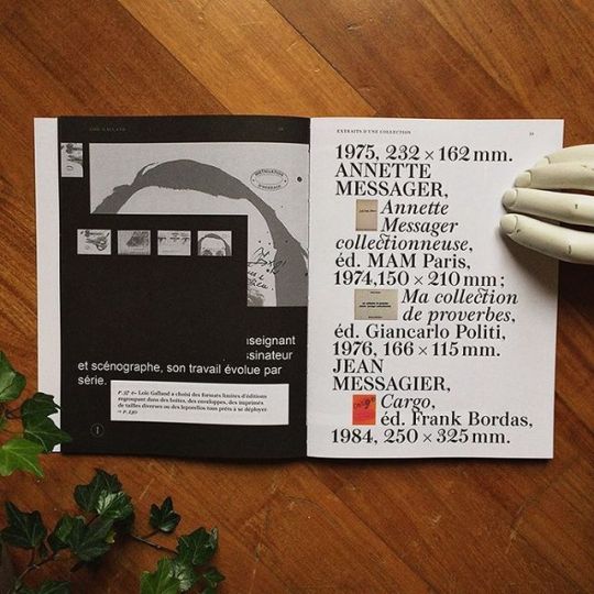
Thanks to the ÉSAAB students and #tombolopresses for using Peckham in the catalog of the exhibition « Ce que l’édition fait à l’art » Pre-order your copy! (link in bio) #graphicdesign #artbook #publishing #jeromedupeyrat #art #book #typeinuse #typography #typedesign
#artbook#publishing#typedesign#tombolopresses#jeromedupeyrat#book#typeinuse#graphicdesign#typography#art
5 notes
·
View notes
Photo

Just found Georgian characters of Georgian Helvetica in Tbilisi, designed at Monotype in 2015 _________________________ #poster #mtavruli #characters #Georgian #Helvetica #design #Monotype #2015 #typefeace #type #typedesign #uppercase #letters #red #white #banner #street #MaxMiedinger #GraphicDesign #Tbilisi #typeinuse #font #designer #typo https://www.instagram.com/p/Bz3k_0NBFqO/?igshid=1exxjv5pu8jlc
#poster#mtavruli#characters#georgian#helvetica#design#monotype#2015#typefeace#type#typedesign#uppercase#letters#red#white#banner#street#maxmiedinger#graphicdesign#tbilisi#typeinuse#font#designer#typo
1 note
·
View note
Photo
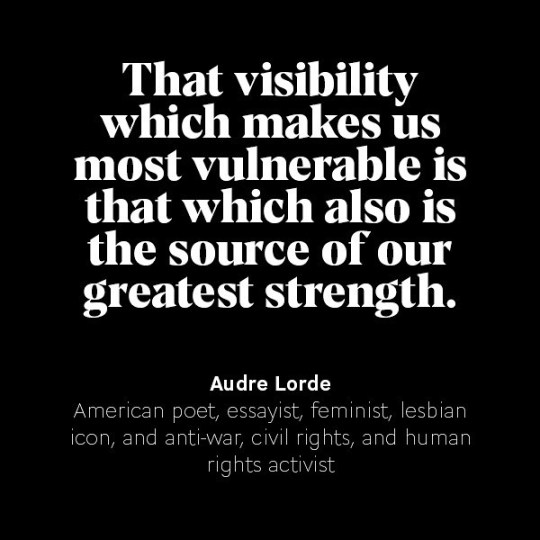
I read this today, it’s a quote from Audre Lorde, look her up if you don’t know her. That comforted me in the belief that we need to share our experiences to make changes... so I pressed publish on my #medium post... have a read and tell me what you think. (Link in biog) . . Set in Koor and Cogito #typeinuse . . #womensrights #diversity #womenindesign #creativewomen / on Instagram http://ift.tt/2FdEr87
0 notes
Photo

WIN the 25% discount code, play the quiz on the microsite! Link in bio. Deadline is 16th Feb, 16pm CET! #displaay #typeface #jokker #type #typography #typedesign #typeinuse #fontinuse #font #fontdesign #graphic #design #graphicdesign #designfeed #typeface #serif #typefacespecimen #thedailytype https://www.instagram.com/p/Coc7CG2L18I/?igshid=NGJjMDIxMWI=
#displaay#typeface#jokker#type#typography#typedesign#typeinuse#fontinuse#font#fontdesign#graphic#design#graphicdesign#designfeed#serif#typefacespecimen#thedailytype
17 notes
·
View notes
Photo
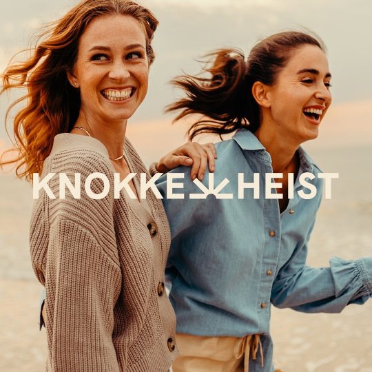
@skinn.be @myknokkeheist just launched its new identity! They want to be and remain the high-quality, unique and innovative seaside town. The brand identity also needed a more high-quality and contemporary look to remain a forerunner. Knokke-Heist is ready for its next exciting chapter as the seaside town of the future. #type #typography #font #fontdesign #typedesign #thedailytype #lettering #fontinuse #typeinuse #graphicdesign #designfeed #typeface #serif #logo #logotype #buildingsmartbrands #rebranding #myknokkeheist #brandingagency https://www.instagram.com/p/CnTi9nIye3G/?igshid=NGJjMDIxMWI=
#type#typography#font#fontdesign#typedesign#thedailytype#lettering#fontinuse#typeinuse#graphicdesign#designfeed#typeface#serif#logo#logotype#buildingsmartbrands#rebranding#myknokkeheist#brandingagency
2 notes
·
View notes
Photo
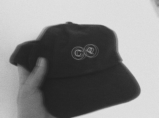
©ap (font by @degarism) — #wat #typography #typeinspiration #typeinspire #typeinuse #umgebaut #objekte #programm #portfolio #form #funktion #fashioninspiration #linie #cap#bauteil #backwhite https://www.instagram.com/p/CEGyFnqCpSx/?igshid=1rgosdnad1hzk
#wat#typography#typeinspiration#typeinspire#typeinuse#umgebaut#objekte#programm#portfolio#form#funktion#fashioninspiration#linie#cap#bauteil#backwhite
0 notes
Video
youtube
https://youtu.be/tqJeOlYnDTA ● Sebastian Dörken’s website typeset in Neutrif Pro, a sans serif typeface designed by Deni Anggara of Tipokrama × Degarism Studio. ● #web #font #webfont #type #webtype #typeface #fontinuse #typeinuse #typefaceinuse #typography #webtypography #tipokrama ● #Graphic #Design #GraphicDesign #Type #Typography #Tipokrama
0 notes
Photo
Haarlem AM typeface in use in the last FOAM magazine.
#typeface#typeinuse#Typography#graphic design#graphic#adrien menard#adrienmenard#serif#haarlemAM#Haarlem#netherlands#foammagazine#foam
8 notes
·
View notes
Photo
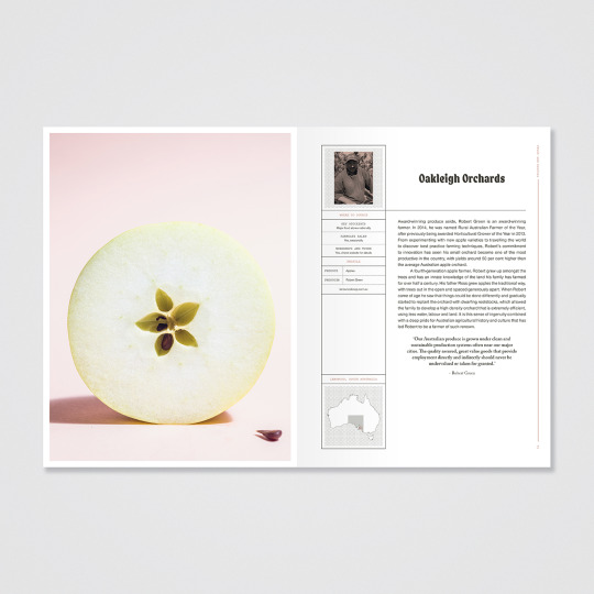
Adobe Caslon (Carol Twombly for Adobe) used as main text in The Field Guide to Australian Produce by Thames & Hudson alongside other types Noah (Alias), Nimbus Sans (URW Type Foundry), and Pitch (Klim Type Foundry). Book design by Matthew Angel.
Note: My research has shown Adobe Caslon is a good type that is easily legible for main text juxtaposed against types that are more eccentric.
0 notes
Last Seen Blogs

darthrevik-blog
IND | SW OC

suad97
Suad

raineydaysghoul
My DC hyperfixation will never end

chocosasha
La nada.

goodgirllexi
Lexi.