#touchstone logo
Text
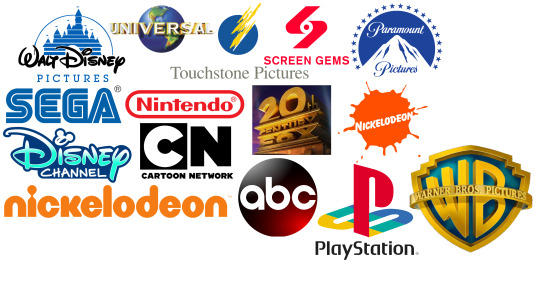
My Favourite Logos
Walt Disney Pictures Logo
universal logo
screen gems logo
touchstone logo
paramount pictures logo
20th century fox logo
playstation logo
warner bros logo
sega logo
nintendo logo
nickelodeon logo
disney channel logo
#disney logo#walt disney pictures logo#disney channel logo#playstation logo#warner bros logo#abc logo#screen gems logo#touchstone logo#universal logo#sega logo#nintendo logo#cartoon network logo#nickelodeon logo#american brodcasting company logo#universal pictures logo#paramount pictures logo#paramount studios#universal studios#screen gems#touchstone pictures logo#20th century fox logo#20th century fox#warner bros pictures logo
7 notes
·
View notes
Text
DreamWorks logo variations
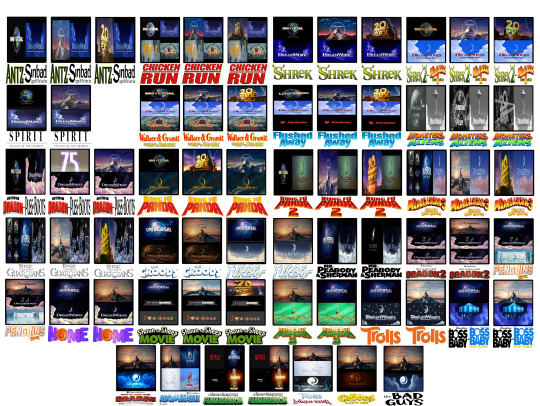
You know how DreamWorks Animation has changed companies for the duration of their career in show business. I thought that if they showed other companies' logos before their own at the start of their films and had other companies at each period, this is how they'd look.
The Shaun the Sheep films aren't DreamWorks, but they're related to Wallace & Gromit's franchise, so I thought I'd include them in the hypothetical matter anyway but without DreamWorks's affiliation.
The Jay Ward media had a share of distribution from Buena Vista (former label of the Walt Disney Company), so if DreamWorks let them release only Peabody & Sherman, it'd be under the now-defunct Touchstone Pictures.
For those wanting to see it in full view, let me know through private message.
#dreamworks animation#universal studios#20th centery fox#paramount pictures#logo variations#what if#pathe#aardman#touchstone#jay ward#different distribution
1 note
·
View note
Text
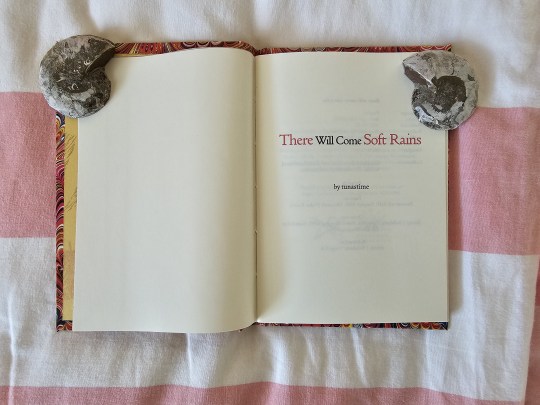
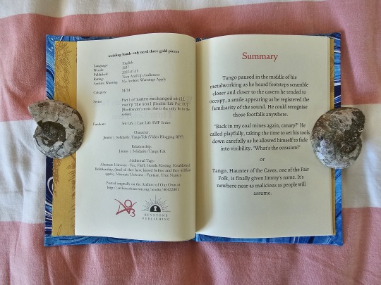
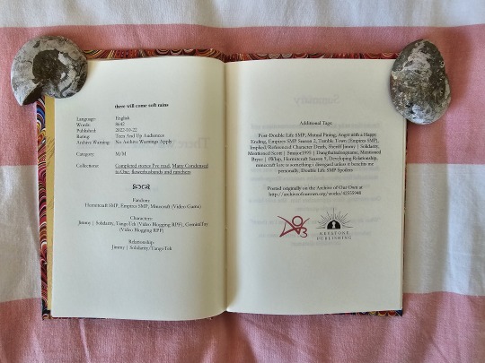
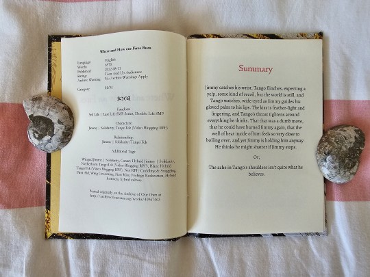
There Will Come Soft Rains by @tunastime
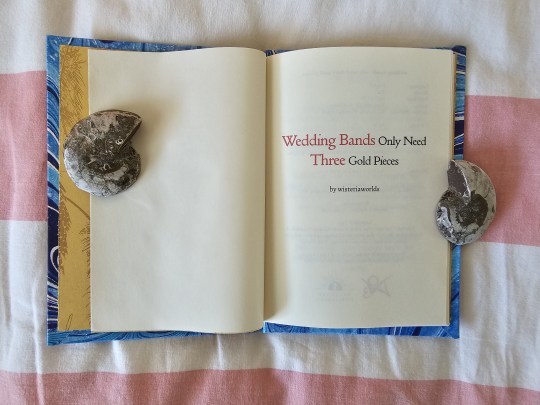
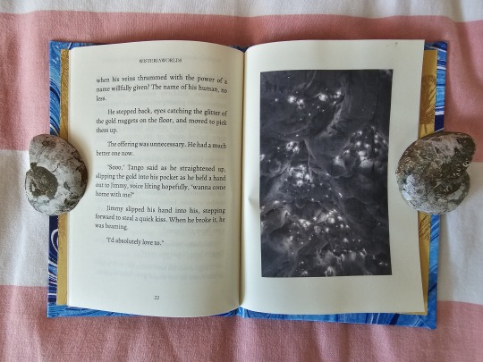
Wedding Bands only need Three Gold Pieces by wisteriaworlds / @percivex
Where and How our Fires Burn by @plumelagoon
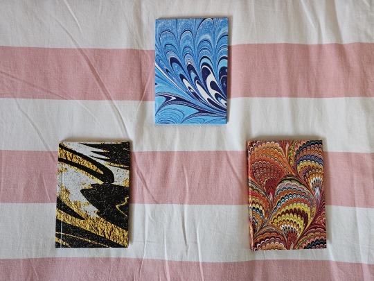
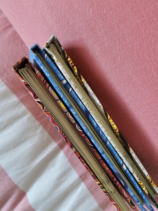
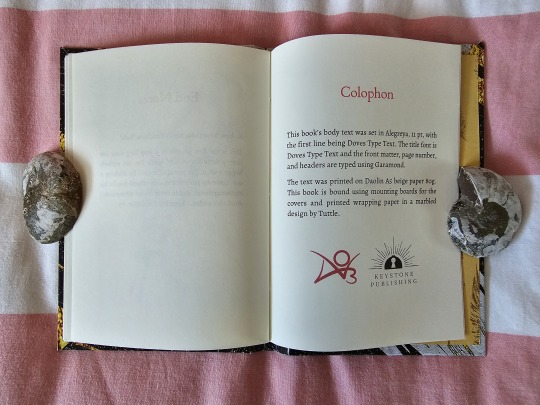
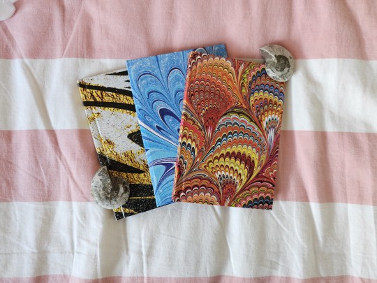
After a week of printing, cutting, and gluing, I have finally finished a long-held goal of mine to bind these three fanfics!
After the last mammoth bookbinding project, I wanted to do something simple for a change. So, I decided to bind some Rancher Duo fics for my personal enjoyment while using some of the cheapest materials and leftover stuff that I can find. While the overall binding process was comparatively simpler, there were also a few new tricks I use in the making of these ficbooks.
If I could sum it up, I would say that these ficbinds are a sort-of "working experiment". As in, experimenting in making, gluing, and putting what goes where at which sections of the book.
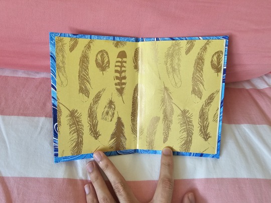
For starters, the endpapers of various feathers are just cut sections of present-wrapping paper I found at a store. I intended to use a different paper pattern for the inside cover/endpaper, but ran out of that and bought the feather one instead. Given how Jimmy is head-cannoned and written as a canary of death, it's serendipitously fitting.
I also went for simplicity at the spine; just a long piece of cardstock. Simple and effective, yet somehow it went wonky for one book when it came to gluing. Why? How? I don't know!
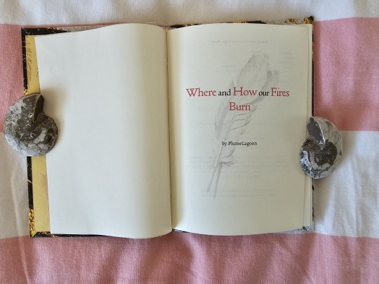
Experimentation was afoot from the title page alone. The first two fics are titled plainly, but I decided to place a semi-transparent visual of a feather at the last ficbind, just to test the visual look. I'd say it looks a lot more interesting and fits the fic's vibe, though I also like the simplicity of the last two title pages.
The front matter (or information page/s) was also a place where slight experiments were done, namely at keeping all the information contained to one page. If there is just too much info, can I make it a two-page spread without it looking like a boring wall of text? And lastly: is there enough room to add the AO3 logo and my own?
The second and third ficbinds use symbols as dividers between different sections of info, and the third ficbind has no logo - more on that later.
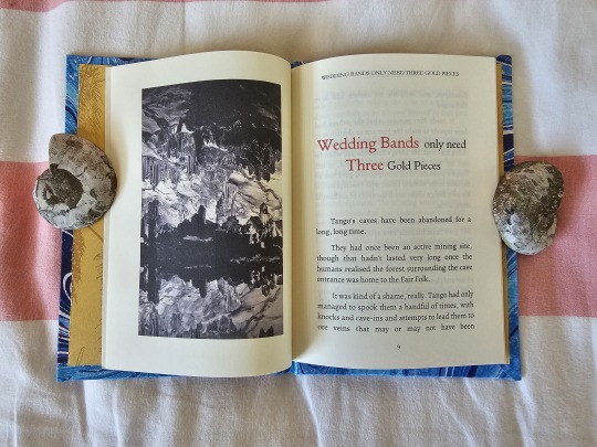
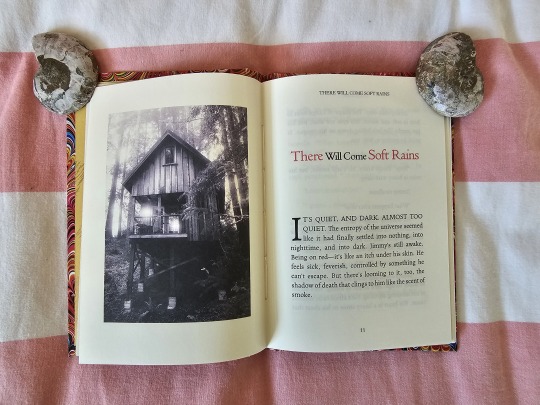
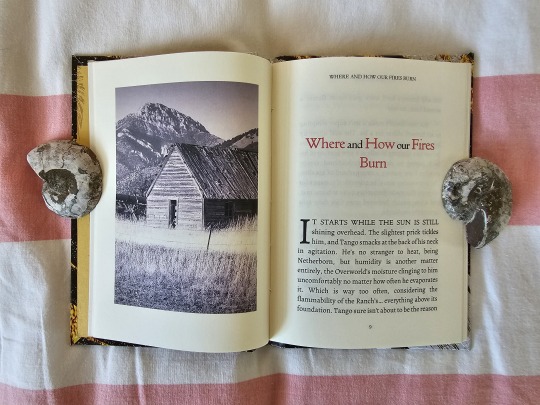
I then experimented on the first page: could I use pictures or visuals to set the mood for the fic? Each picture was taken from the internet and edited to fit the page, though it look me literal hours to find the right pictures to use in the first place.
The titles have a pop of red color to make for an interesting visual effect. Soft Rains and How Our Fires Burn also have drop caps at their opening paragraphs to see if it fits with the visual look and layout.
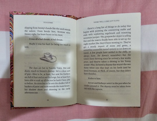
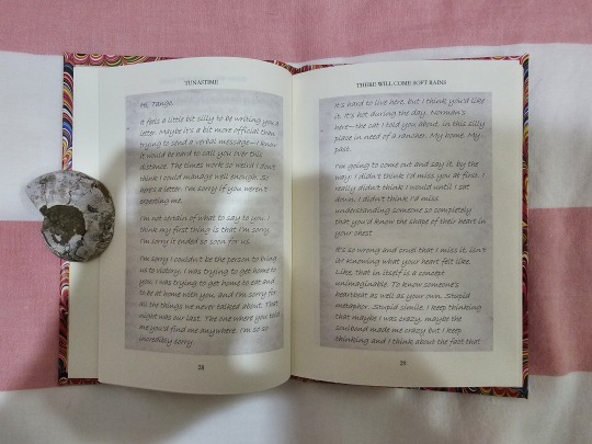
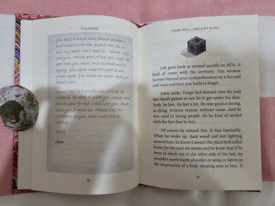

There Will Come Soft Rains was also the first time I did some fancy editing in regards to the letter-writing sections of the fic. The paper background was easy, but it took some time to find the exact fonts that could fit Tango and Jimmy's writing vibe. I also divided Tango and Jimmy's perspectives with thematic dividers - a cowboy hat and redstone block, naturally.
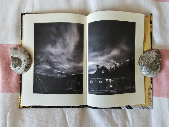
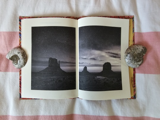
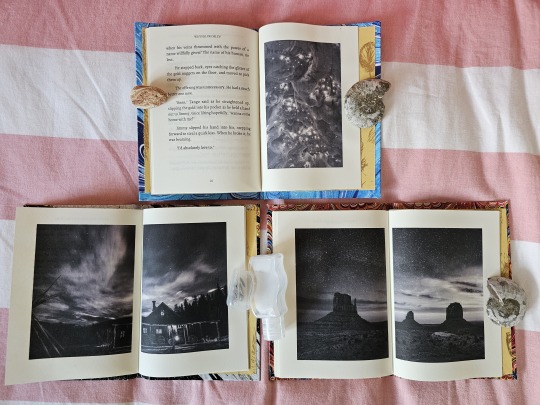
I then repeated the visual vibe at the opening pages for the ending. As Wedding Bells ended at the left page, the opposite right page was a singular photo that conveys the vibe of the fic's ending. Since the other two ficbinds ended at the right page, I tried to come up with a way of conveying the emotional touchstone of their endings and settled on a double-page spread of photos.
Setting the photos to that they seem to meet at the center was a bit finicky, and it ultimately did not print as a seamless whole. Still, I like the effect those photos give to the ending(s).
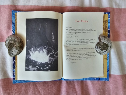
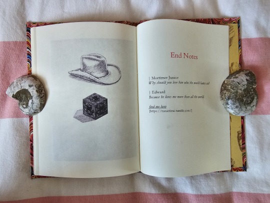
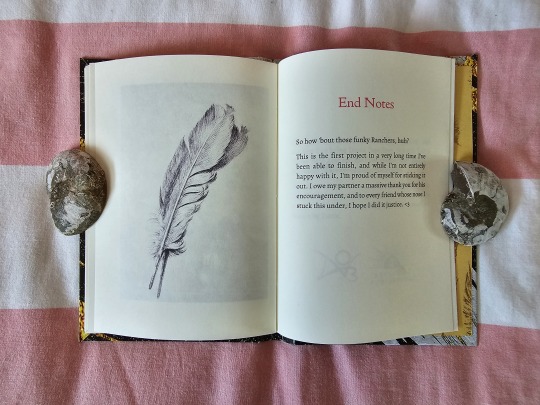
Same concept, but simplified at the End Notes. I ultimately feel the simplified visuals of the latter ficbinds ended up better than the complete picture of my first attempt.
Also, remember how one ficbind, Where and How Our Fires Burn, did not have the logos at the front matter / information page? That's because that fic was when I experimented with a colophon and placed the logos of AO3 and my own there. Thinking about it, I may not use this method if I want to make a simple bookbind that saves pages, but definitely will for bigger projects.
Full credits for all these fics to their writers!
#solidaritek#team rancher#rancher duo#jimmy solidarity#solidaritygaming#tangotek#bookbinding#fanbinding#ficbinding#my bookbinds#Keystone Publishing#MCYT
113 notes
·
View notes
Text
I just realized something... Is DEADPOOL & WOLVERINE the first R-rated Disney film to be released as... A Walt Disney Studios Motion Pictures movie?
And NOT as a... 20th Century Studios, Searchlight, Touchstone, or Hollywood release?
Marvel Studios movies never open with a Disney Pictures logo, nor does such a logo appear in trailers/promo materials for those movies. The only mention of Disney as the movie's distributor, ever, is in the credits. Particularly the title card saying "Distributed by Walt Disney Studios Motion Pictures". You know, when the movies aren't making references to Disney movies/theme parks. (i.e. "I'm Mary Poppins, y'all!")
THE AVENGERS and IRON MAN 3 were the first Disney-distributed Marvel movies, both of which opened with Paramount and Marvel Studios logos per a contractual agreement. Paramount had been distributing the MCU movies - sans 2008's THE INCREDIBLE HULK - up until the switchover. Disney bought Marvel in 2009, and distribution was out of Paramount's hands shortly thereafter, but for whatever reason, they retained their logo on those two films specifically. I guess this was because AVENGERS and IRON MAN 3 were already in development before the Disney buyout, IRON MAN 2 was already being filmed with a third one expected. THOR and CAPTAIN AMERICA: THE FIRST AVENGER had yet to be released. They both debuted in mid-2011, and sequels weren't announced until after they came out. A second THOR and a second CAPTAIN AMERICA movie were Disney greenlights. Starting with THOR's sequel - THOR: THE DARK WORLD - in fall 2013, the movies would open with the Marvel Studios logo only.
That'll likely be the case with DEADPOOL & WOLVERINE, though I wouldn't put it past the movie to - in an irreverent sense - have a Disney castle logo at the beginning. Deadpool narrating "Yeah, this is Disney and it's rated R! Buckle up, kids!" They already made similar jokes in that recently-released trailer.
It's really weird to think that Disney can't do R-rated "Disney" movies.
Other studios/companies don't have that problem. Universal, Warner Bros., Paramount, etc. It's all part of the collection for them. With Universal, the Minions can co-exist with Michael Myers. In Paramount-land, Dora the Explorer can share the space with Ghostface. For Disney, it was always through alternate names like Touchstone and Hollywood Pictures, or through whole-ass studios like 20th Century Studios, Searchlight, and Miramax.
Nowadays, Hulu is essentially merged with Disney+, and Disney+ houses plenty of R-rated things. That is, of course, if you are using an adult profile. But even in the theme parks, like for example - The Great Movie Ride, that had a whole section devoted to ALIEN. And that was before Disney bought 20th Century Studios and the ALIEN franchise. And Disney films have referenced R-rated things, before. It's kinda weird, really... Disney... A person's SURNAME, associated with strictly family-friendly stuff.
After Disney created the Touchstone Pictures banner in 1984, it seemed unlikely that they would ever do a PG-13 movie. They stuck with G and PG, and some of those PG movies had a special Walt Disney Pictures logo at the start of them, too. A black background with blue serif text... No castle. But then lo and behold, in 2003, they released PIRATES OF THE CARIBBEAN: THE CURSE OF THE BLACK PEARL... Since then, not counting Marvel and Star Wars movies, they've released 14 more - many of which being PIRATES sequels or theme park adaptations - in addition to a filmed HAMILTON performance on Disney+.
So... It kinda begs the question... Could Disney possibly just go all-in for the first time... and release an R-rated movie?
The MPAA rating system was created in 1968. Disney in 1968 were already concerned with being family-friendly. Proudly so. That shift began to take place back when Disneyland was opening in the mid-1950s, when Walt Disney was transforming the enterprise's image. What was once the trailblazing, sometimes edgy studio was now a family entertainment company. A show on TV every Sunday, a theme park for kids of all ages, and movies that played to mothers. (To Walt's estimation: Mothers took their families to movies, and also told their friends, and their friends told their friends-) It was to the point where Walt himself was frustrated. When he had seen TO KILL A MOCKINGBIRD, he stated he wished he could've overseen a movie like that...
So, Disney stayed in the family-friendly corner after Walt's passing in 1966 and after the creation of the rating system two years later. The 1970s was a period of auteur-driven films, challenging pictures that upended the status quo, brought heavy topics and themes to the table, shocked audiences even... Disney was mostly making movies like THE BAREFOOT EXECUTIVE and GUS. All G-rated affairs, and following tried and true formulas. Interestingly, when preparing the 1950 classic TREASURE ISLAND for re-release in 1975, Disney weren't too pleased when the picture received a PG rating for its violence... So, they recut it to get a G rating. That's how it ran in 1975 in theaters, and interestingly that was the only version that was available on video until 1992.
It took Disney over a decade to make a PG movie of their own (THE BLACK HOLE in 1979, not counting their distribution of the independent movie TAKE DOWN earlier that year), back when the rating actually meant what it meant. After being launched in 1984, Touchstone was largely meant for PG-13 and R-rated affairs, with the occasional PG movie here and there. For every SPLASH and DICK TRACY, there was a BLACK CAULDRON or HONEY I SHRUNK THE KIDS. So it was kinda on-and-off there, it depended on the content and tone of the movies, I suppose.
Then it took Disney 19 years to make a PG-13 "Disney movie"...
I guess for an R-rated "Disney movie" to work... Tweak the Disney logo so that it doesn't appear all family-friendly in that distinctive font? Don't have the logo appear anywhere on promo materials? Come up with a Touchstone-esque name for Disney movies that get the R-rating? What the hell would you call that anyways, haha. Can it even be feasibly done without unsuspecting parents taking their kids to see it?
If it ever happens, it'll be interesting to see how it plays out.
10 notes
·
View notes
Text
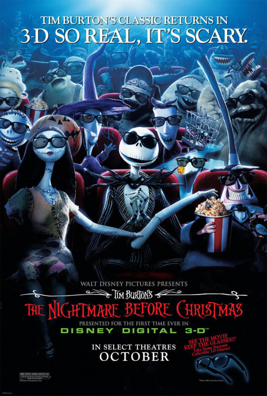
Nightmare before Christmas has been added to the National Film Registry. This means that the film is considered culturally significant enough to preserve it in the national archive.
I wonder if they will use the original Touchstone Pictures print with Danny Elfman's score over the logo and light orange opening credits or if they will use the 2006-on-ward "Disney" opening version.
11 notes
·
View notes
Text
I was grabbing a drink with an old friend when it happened. I told her I was excited about an upcoming reporting trip to Vancouver, to interview Naomi Klein. My friend wrinkled her nose, as if the bartender had just farted. Then she asked why I’d give my time to someone who thought the Covid-19 pandemic was a conspiracy.
I sighed. Turns out, she’d been thinking of Naomi Wolf.
You know Naomi Klein, right? Rabble-rousing leftist journalist and climate activist? Author of Gen X touchstone No Logo and the mega-influential The Shock Doctrine: The Rise of Disaster Capitalism? Decidedly not the former liberal feminist writer turned far-out Covid truther Naomi Wolf? But just because they share a first name—and, I suppose, are both telegenic Jewish public intellectuals who found fame through polemical writing—people confuse the two Naomis constantly. Klein gets mixed up with Wolf so much, in fact, a Twitter mnemonic was born: “If the Naomi be Klein you’re doing just fine / If the Naomi be Wolf, oh, buddy. Ooooof.”
Thus the basis of Klein’s new book, Doppelganger. Writing hundreds of pages based on the Twitter discourse surrounding your evil twin is, of course, a deeply questionable choice. Klein openly admits that her family and friends questioned her sanity. As she is quick to point out, though, Doppelganger is not really about Wolf. Instead, the book uses the experience as an entry point to dissect the “intellectual and ideological mayhem” of the Covid era. How wellness entrepreneurs demonize medicine. How the far right appropriates and warps leftist talking points. How parents insist on seeing their children as reflections of themselves. In all this, Klein writes, there’s a new doubling going on—weird fun house distortions of what used to be more straightforward realities. It’s a lively, slightly unwieldy, wholly vital work. It could only be hers.
Klein moved to the Sunshine Coast of British Columbia during the pandemic, a riotously beautiful nook of that vast province, where towns are nestled into fjords. It’s a place far more likely to be visited by orcas than members of the US media, and in the interest of saving me a journey on a ferry—you can only get to her home by boat or floatplane—Klein met me at her office at the University of British Columbia, where she codirects the Centre for Climate Justice. We’d intended to stroll around the sprawling, sunny campus, but the conversation kept such an intense clip, we ended up simply sitting for hours.
Kate Knibbs: Doppelganger is much more personal than your previous work. Why?
Naomi Klein: I thought it was really important not to be on the outside of this story, but to be inside, to fess up to my own disorientation. Having a doppelganger who a lot of people confuse me with is a type of losing oneself, and it provided a toehold into this larger and more interesting set of feelings, of being lost in a world we might not recognize.
You listened to conspiratorial podcasts for research, including Steve Bannon’s. Were you ever worried you’d get lost in those worlds?
I felt that way the first time I went to a climate change denial conference. I was a tiny bit worried I would start to doubt my own understanding of the science by listening to them. But the exact opposite happened, because it was so completely incoherent. One guy says it’s getting cooler. Another says it’s getting hotter—but the sunspots! Another guy says everyone should just get air-conditioning. That’s what it’s like listening to Bannon or any of those “intellectual dark web” types. You can see it right now with RFK Jr. He’s saying Covid was a bioweapon. This is also the guy who told people not to wear masks, not to lock down, not to get vaccinated. So which is it? Occasionally Bannon would have someone on who would claim that people were just dropping dead from the vaccine.
Like the whole #DiedSuddenly thing?
Exactly. What you start to realize is that these people are acting as if we were immortal before Covid. As if no one died from anything. What worries me more isn’t that I’m going to start thinking that the vaccines are killing us or anything like that. It’s that I understand why the things he’s doing are so resonant.
Why are they so resonant?
This is Bannon’s gift, sorry to say, and it’s how Trump won in 2016: by identifying a bloc of Democratic voters who had been screwed over by the party because they lost jobs to corporate free trade deals. So the offer was a counterfeit version of the left, which is what right-wing populism does. They were not rewriting trade deals in any significant way that would help workers. They were offering huge gifts to the already wealthy through tax cuts. But when people are desperate enough, they’ll go for a counterfeit.
I have someone close to me who has definitely bought into that counterfeit populism. It’s been hard to watch the change take place.
I’ve had so many conversations with people describing that feeling. It’s like watching Invasion of the Body Snatchers.
But I suppose we all have many competing, constantly mutating versions of ourselves. How do you think about your public persona now?
When we think about performing ourselves, we think about social media. For me, that’s Twitter [since renamed X]. And right now I don’t think any of us feel in control of whatever the fuck is happening on Twitter. But we’re still there, hoping to recapture something. I hope my relationship to my public persona is like my relationship with Twitter. I’m not really trying anymore.
Do you think there’s a way for you to have a conversation like this that’s truly authentic, or are you in some sense creating a doppelganger version of yourself to promote the book?
There’s always going to be some contradictions involved in hawking a book when you’re an anti-capitalist author. I’ve been living with that contradiction for a long time. I find talking to people exciting. I have ideas that I wouldn’t have had otherwise. I had the idea to write No Logo while I was doing an interview with a student journalist.
Are your students influential in other ways?
One of the really nice things about being on campuses right now is that, if I was just getting my sense of youth culture through media, I’d think that all young people are constantly posing and performing themselves on Instagram. But it’s definitely a minority. A lot of young people feel alienated from it.
I get a lot of youth culture tidbits from my babysitter, which is how I know that super polished and posed Instagram photos are seen as a geriatric millennial thing.
They want it to look really authentic, to be messy.
I reread No Logo recently. It holds up.
Maybe not the Blockbuster references!
Honestly, we need to bring back your concept of selling out. I got in a lot of trouble on Twitter a few months ago for saying the Barbie movie looked bad. I love Greta Gerwig, but I don’t want to like Barbie! I hate the idea of a Mattel Cinematic Universe.
The thing that’s so clever is that it’s shiny and pretty enough to get the normie Barbie fans, but it also has so-called subversive content for the people who don’t want to like Barbie. It’s genius marketing. But the world is fraying. It’s an odd time for us to get excited about pink plastic.
Probably an odd time for me to be really annoyed about it, too.
No, I think it’s time to have some standards again.
Do you ever think about returning to that mode of criticism?
Just to keep you company?
To keep me company, and because efforts to turn cinema and television into capital-B Brands—the Marvel Cinematic Universe, most infamously—are so much more flagrant than before.
And also to keep us in our childhoods in a strange way. This is not kid content, it’s adult content, but it’s feeding on nostalgia for being 8 years old.
What’s a recent movie you liked?
Despite the critics hating it, I thought Don’t Look Up was brilliant. It was taking aim at the culture of narcissism and distraction at this most critical moment. It was broad, like all of Adam McKay’s comedies. But that was not the problem. The problem was that it was right.
Doesn’t everyone die at the end?
That’s the best part. He fucked with the Judeo-Christian trope that the righteous will be saved.
I do think it was broad.
Well, Anchorman is broad!
True. But I don’t necessarily want my comedy to be didactic. I just really don’t want it to be branded content from Mattel. There’s this amazing Canadian filmmaker, Sarah Polley, and she’s doing a live-action Bambi.
My grandpa worked on the original Bambi. He was an animator.
I read about this. Didn’t he get fired for trying to unionize?
He did. And they had the first strike at Disney during the production of Dumbo.
Have you been paying attention to the strike wave happening?
It’s exciting. I’m really glad that there’s the focus on AI.
What else interests you politically, right now?
I think it’s important to think about where the Covid denialism energy is going now that there aren’t vaccine mandates. It’s morphing, going in new directions, and it’s important to try and follow that.
Which new directions?
There are two main wellsprings the Covid denialism movement drew from. One was the anti-vax people. The other group was climate deniers. Now, when you post anything about climate change, you’ll get hit with “Davos elites, Great Reset.”
When we were talking earlier about how people take leftist ideas and make counterfeit versions of them, I was thinking about how that happened to the shock doctrine—your idea that global elites use disasters to push brutal policies to benefit themselves at the expense of the masses. People co-opted the concept to talk about the Great Reset, saying there was a global conspiracy to use Covid to strip away personal freedoms. Has this changed your relationship to your own ideas? Do you feel less ownership over them?
I’ve never felt I had that much control over my ideas in the culture. I remember Arundhati Roy saying to me many years ago, we can’t control what our words do once we release them. I have tried to correct the record and do my own writing about what I think the shock doctrine is and isn’t, but I think I’ve always felt a bit of detachment around it.
Jane Fonda started her Fire Drill Fridays because of you.
That was just getting somebody at the right moment of receptivity. That’s what Jane did. I take no credit.
Do you believe in the horseshoe theory? Are the people on the far left swinging far right because they’re attracted to conspiratorial thinking about Covid?
There are some people who have decided that Tucker Carlson is a great guy and Trump’s better than Biden. But most of those people I wouldn’t consider very left-wing. Someone like Glenn Greenwald. For a while, he seemed to be a left-wing person because he was against the Patriot Act and the Iraq War. But he was a libertarian upset about Bush-era government overreach. So it makes sense, when a government has to robustly respond to a pandemic, that a lot of those people got upset. I know some of these people—Matt Taibbi and Glenn Greenwald—I know that they are not deep left thinkers. We have to make the distinction.
Do you think there’s an incentive to shift rightward now to bolster one’s personal brand online?
Yes.
Could there be a positive incentive the other way? Is it possible to build up an ecosystem of independent leftist outlets?
Remember that idea? We need to invest in media, and not be reliant on quixotic billionaires to find one another. I think we need to get serious about independent alternative media and local media.
Meaning, like, a new Twitter?
The problem with something like Mastodon or the smaller Twitter competitors is that they’re not able to offer what Twitter did at its best, which was this feeling of we’re all having one conversation together.
I don’t know if there will ever be one main conversation again.
I wish Twitter could’ve been turned into a co-op. This is labor we’ve put into this thing. We all wrote for free!
A lot.
There was always something self-exploiting about that. Sure, we were able to share our articles and do self-promotion, but I always knew they were going to try to charge us. It’s too valuable.
There’s a co-op movement for media startups, where the writers own their outlets, but I haven’t seen the same thing happen for social media.
And the thing happening now with AI—it was one thing for all of us to be writing for free for Zuckerberg and Musk, but now it turns out that all of that content is being used to create doppelgangers of us by AI companies. Now that’s going to be used to put people out of work, or cheapen their labor.
It’s accelerating so rapidly. Big outlets are already putting out AI-generated articles.
This relates back to conspiracies and why they’re spreading as quickly as they are. It’s a dangerous time to give people more reasons not to believe what’s in front of them. Anything you’re shown now can be dismissed as fake news. “It’s not even Biden, it’s AI.” We’re barely glimpsing the ramifications.
In Doppelganger, you wrote about a South Korean politician who used AI to look younger.
The thing about the Korean example is, it was not hidden. Everyone knew. And it worked for him. So who knows? As our candidates get older, they may rely on AI doppelgangers. It’s being packaged as a way to reach younger voters, because they prefer synthetic reality.
Have you had discussions with your students about AI? Do they actually prefer synthetic reality?
Last semester, ChatGPT was really everywhere, and we were discussing how they were not using it to write their essays. I think we’ve overfocused on the plagiarism piece of things. It’s just one element within a completely unstable and frightening future. Maybe it’s helpful writing essays, but they also know it’s replacing entire sectors they may have been preparing for—between not being able to afford living in the city to the acceleration of the climate crisis to AI changing the job market.
I’m aware of at least one podcasting company hoping to use AI to translate podcasts into a bunch of different languages. It sounds cool, but then you think: What about translators?
The thing I find disingenuous is when you hear, oh, we’re going to have so much leisure time, the AI will do the grunt work. What world are you living in? That’s not what happens. Fewer people will get hired. And I don’t think this is a fight between humans and machines; that’s bad framing. It’s a fight between conglomerates that have been poisoning our information ecology and mining our data. We thought it was just about tracking us to sell us things, to better train their algorithms to recommend music. It turns out we’re creating a whole doppelganger world.
We’ve provided just enough raw material.
When Shoshana Zuboff wrote The Age of Surveillance Capitalism, it was more about convincing people who’d never had a sense that they had a right to privacy—because they’d grown up with the all-seeing eye of social media—that they did have a right to privacy. Now it’s not just that, even though privacy is important. It’s about whether anything we create is going to be weaponized against us and used to replace us—a phrase that unfortunately has different connotations right now.
Take it back! The right stole “shock doctrine,” you can nab “replace us” for the AI age.
These companies knew that our data was valuable, but I don’t even think they knew exactly what they were going to do with it beyond sell it to advertisers or other third parties. We’re through the first phase now, though. Our data is being used to train the machines.
Fodder for a Doppelganger sequel.
And about what it means for our ability to think new thoughts. The idea that everything is a remix, a mimicry—it relates to what you were talking about, the various Marvel and Mattel universes. The extent to which our culture is already formulaic and mechanistic is the extent to which it’s replaceable by AI. The more predictable we are, the easier it is to mimic. I find something unbearably sad about the idea that culture is becoming a hall of mirrors, where all we see is our own reflections back.
You reached out to Naomi Wolf and she didn’t respond. If she had responded, would you want to debate her?
I think it’s important to engage with what’s being said and marshal counterfacts. But the idea of just sneering at people is dangerous. I think we do need to debate, but whether that means creating some kind of theatrical Naomi vs. Naomi spectacle—I don’t know about that.
You could be second billing to Musk vs. Zuckerberg.
Anyway, as you know from reading the book, it’s not really about her. She’s just a case study. I follow her down the rabbit hole. But I’m more interested in the rabbit hole.
10 notes
·
View notes
Text
Fifteen Days of Disney Magic - NUMBER ONE
Welcome, one and all, to the final entry of Fifteen Days of Disney Magic! In honor of the company’s 100th Anniversary, I have been counting down my Top 15 Favorite Movies from Walt Disney Animation Studios…with one exception. And it is that one exception that takes the top spot on my little list.
“Boys and girls of every age, wouldn’t you like to see something strange?”
NUMBER ONE IS…The Nightmare Before Christmas.
Now, before I get into the film proper, I should address WHY I made this an exception to the rules. Because – especially considering this film is my number one pick – it probably seems like MASSIVE cheating. And…yeah. I make no apologies there, it is. But I’m still going to count this movie, for two reasons. One, and this is the most simple reason… “The Nightmare Before Christmas,” as I’ve said a few times in the past, is a strong candidate for my all-time favorite movie. That fact, alone, is a pretty strong incentive for me to cheat. It’s owned by Disney, after all, so if nothing else, that’s mild justification.
But of course, my rule of thumb was that – with this one exception – all of the movies I chose would be from the 60+ films in the lineup of Walt Disney Animation, specifically. However, technically speaking, this movie DOES still count there…if you squint, I suppose. Especially since a lot of “Nightmare’s” identity does, in fact, revolve around Disney.
“The Nightmare Before Christmas” was envisioned as a short film by Tim Burton, who wrote a poem by the same title in his off-time while working at the Disney studios. Yes, indeed, for those who don’t already know, Tim Burton’s career basically began with him working as a concept artist and in-between animator for Disney; he actually worked on a few films, including “Fox and the Hound” and “The Black Cauldron.” He also was behind a couple of cartoons and television specials, including the stop-motion short “Vincent” and the live-action version of “Frankenweenie.” Burton initially wanted “Nightmare” to be a stop-motion TV special, a sort of homage to the Rankin/Bass specials he had grown up with as a kid.
At the time, however, Disney was reluctant to spearhead the project, for multiple reasons. One was that they felt the costs of making the special would exceed any profit that could be made from it. The other was that they were worried the subject matter would be a bit too dark, a notion not helped greatly by the content of Burton’s earlier projects for them. It wasn’t until some years later, after Burton had left the company, that Disney decided maybe it was time to give the old concept a new look.
By THAT time, Burton had been discussing the idea of transforming “Nightmare” into a feature-length film, collaborating with his friend and already frequent colleague, Danny Elfman, to come up with an outline for the story and the characters. They went back to Disney, and the company decided to give their idea a chance…of a sort. You see, the problems that had made Disney hesitant in the first place still existed. So, Disney decided to release the movie under the banner of a subsidiary company, Touchstone Pictures. Burton – who was having to split duties between this film and “Batman Returns” at the time – hired Henry Selick to act as the director. Selick, after having some talks with Elfman and Burton alike, began to work on the project with his own team of animators. The rest is history.
When “Nightmare” came out, it wasn’t a massive success…at first. But over the years, the film earned a VERY substantial following. It got to the point where Disney realized they had a cash cow on their hands. And, since Touchstone was already affiliated with the company, it did not take much wrangling to officially declare “Nightmare” to be a Disney film. If you watch the film nowadays, instead of a Touchstone logo, you’ll find it preceded first by the Disney logo, then a credit card that gives the kudos to Walt Disney Studios. So, in essence, Nightmare was ADOPTED into the core canon of their films, retroactively. Yes, counting it is still cheating, but if Disney can acknowledge it that way, so can I.
Plus, like I said before…this is my favorite movie, or at least a strong contender for that title. It’s hard to say exactly what makes “The Nightmare Before Christmas” hit me so hard, but I think it’s simply best to say it sort of fires on all my cylinders. I love its sense of aesthetic style; a perfect blend of qualities that make the works of Tim Burton (and Henry Selick, for that matter) so unique. The animation itself is quite wonderful. The music is fantastic. The story is simplistic, but you can gleam a lot from it by sort of reading between the lines; it’s not a deep, complex piece of socially-focused art, but there’s something else beneath its surface, like a lot of great, dark fairy-tales. It’s contemporary and yet ageless, with an exquisite voice cast and characters that are not exactly deep and intensely complicated, but are still likeable, charming, and at times even subversive. Jack Skellington, in particular, is NOT your typical Disney protagonist, by ANY stretch of the word, and that’s part of what makes him and his story so compelling.
When looked at in the scope of all the things Disney has done, “Nightmare” stands in an interesting place. There aren’t too many movies like it in the Disney canon, no matter where you look at it WITHIN that canon. And certainly none of the few that could compare hold a candle to the impact and legacy this film has. It’s no wonder Disney decided to officially declare it a film of their own. For me, it will always be a special piece of work. It’s my favorite Halloween movie, my favorite Christmas movie, my favorite movie for many of the creative people involved with it…and there is no doubt in my mind that this is – however unfairly – My Favorite Disney Movie. Period.
And so concludes Two Weeks of Disney Magic! Like I said, I will have AT LEAST one other list ready for founding day (that's tomorrow), so be ready for that. In any case, though, I’m glad you all could join me, and I hope my opinions haven’t been TOO ridiculously peculiar. XD Thank you all for reading!
#disney#disney 100#disney 100 special#list#countdown#top 15 disney animated movies#fifteen days of disney magic#number 1#tnbc#nightmare before christmas#tim burton
9 notes
·
View notes
Text
Hello, dear April readers! Our poetry month begins with Brenda Shaughnessy, whose new collection celebrates female artists, lovers, friends, and mentors—the relationships between women that invite creativity and self-belief, and illuminate a path forward. The poet’s long-ago roommate Tanya, for whom the book is named (“magical like all girls—have you ever met an ordinary one?”), was a catalyst in her young life; throughout this month, we’ll take note, where we can, of the touchstone relationships that inspire and accompany our poets.
Here, the fourth section from Shaughnessy’s multi-part poem “Coursework” honors the spark lit by her influential teacher of literature, Helene Moglen. This professor, she realizes, “would lead me to that place books always promised…a mix of judgment and soul, of egos and logos and trust / that everything that happened in books happened inside us.”
from Coursework
Didn’t everything become, once you said it out loud?
A student in our class once said, out loud:
“I left the theater after a movie and caught a glimpse of someone
in the mirror I didn’t recognize as myself.”
And, Helene, you said in reply: “yes, you look at a sunset and find that
you are weeping.”
It was a suddenly recurring moment we were all stunned to recognize
that it was only at this moment we recognized all the ways we did not
recognize ourselves
until that moment, when we knew we knew we saw ourselves
and knew we knew we were each other.
And hidden in this clarity was our new knowledge that emotions were
sensory,
that is: emotions had a way in and out of the body through senses,
and that reading cracked our glass covering and fit the tip
to our senses through which our bodies learned to read.
That my inner feelings and thoughts could be touched, contacted,
radioed, by the outside world
and that I could transmit my own inner reality to the outside world if I
made a material, sensory object to carry them out—
writing, art, music—those were the ways, the work, the course of the
vessels.
I had to know how that work worked
how that way was made
so I could learn to make it myself.
And reading with Helene was how I would begin
or continue to go deeper, serious, way out of my depth.
I became a writer by becoming a reader—this
fact lifted confusion clear out of the page.
. .
More on this book and author:
Learn more about Tanya by Brenda Shaughnessy and read the New York Timesreview of the book here.
Browse other books by Brenda Shaughnessy and follow her @brendashaughnes on Twitter and Instagram.
Hear Brenda Shaughnessy read and join Alicia Mountain in a conversation at St. Joseph’s University on April 12 (event is free but tickets required). Brenda Shaughnessy will participate at the Cavafy Festival with the Onassis Foundation at Columbia University on May 1 (event is free but tickets required) and the Bay Area Books Festival in Berkeley, CA on May 7 (event is free).
Visit our Tumblr to peruse poems, audio recordings, and broadsides in the Knopf poem-a-day series.
To share the poem-a-day experience with friends, pass along this link.
#knopf poetry#knopfpoetry#poem-a-day#national poetry month#poem#poetry#knopf#brenda shaughnessy#tanya#ShaughnessyAudio
8 notes
·
View notes
Text
Skeptics might object that none of these medieval goddesses qualify as "real" goddesses because, in the end, they are all personifications or masks of the One God, who is "really" male. But such a view seriously underestimates the sophistication of the writers in question, who were sound enough theologians to be aware that the infinite God, free of all biological limitations, is "really" neither male nor female.
More important, the skeptical view fails to explain why imaginative theology and literature were so preoccupied with goddesses... Christians, accustomed to thinking of God as three-yet-one, of Christ as God-yet-man, and of Mary as virgin-yet-mother, came to regard paradox itself as a touchstone of revealed truth. This love of the paradoxical is witnessed by countless formulas ranging from the famous credo quia absurdum ("I believe because it is absurd") ascribed to Tertullian, to the mind-bending formulations ofthe Athanasian Creed. The same kind of non-Euclidean logic could support a kindred paradox: this unique God might also be conceived as male-yet-female, Logos-and-Sophia, bridegroom-and-bride.
God and the Goddesses by Barbara Newman
#divine feminine in christianity#divine androgyne#m#this just illustrates the fact that God encompasses everything#even things that apparently contradict#God#duality#God is in all#paradox
41 notes
·
View notes
Text
Century-Old Logos that Remain Iconic to this Day

In the modern world of design and branding, there are only a handful of brandings that endure the test of time. These classic designs have definitely surpassed generations, establishing their relevance and branding identity in an ever-changing world. If you’re looking for an inspo to opt for on your logo-making journey, here are some of the oldest logos that continue their legacy up to this day. Take note that these familiar logo designs have been relevant far longer than you realize, so if you’re up for a challenge to make a unique logo for your branding in the making, prepare to get schooled!
The iconic batwing logo was first introduced 138 years ago! Since 1886, Levi has been a hallmark of the American denim industry. The logo boasts a dynamic design that features the iconic “batwing” shape carrying the company name alongside two horses. A great representation of Levi Strauss’ dedication to high quality in detail.
While it is evident that the old branding logo went through several iterations through the years, Levi’s distinct batwing shape somehow made a comeback and remains iconic to this day!
Talking about the timeless significance of these brandings and their logos reveals a compelling appreciation of their legacy. If one looks through its visual appeal, these logos did more than dominate their respective industry, they also serve as cultural touchstones. Levi Strauss & Co.’s batwing logo is a testament to that. The branding’s logo becoming synonymous with the long-standing denim culture in America. The presence of their logo on millions of jeans is proof that Levi’s jeans had a significant role in shaping trends in the fashion industry for well over more than a century.

Twinings, a crowd-favorite and popular tea branding holds the record of being the oldest logo in use of all time! With the branding’s debut way back in 1787, the branding continued to become as relevant as it was before for nearly 240 years. The elegant crest shows the Twinings family name, a sight recognized on millions of shelves across the globe. It goes to show how simplicity and elegance are always a safe bet!
The royal-looking embellishment on the logo made Twinings an emblem of superb tea craftsmanship. Going for a century-and-a-half-long journey of comforting tea lovers worldwide.
You gotta give it to Twinings for their consistency and unwavering decision to stick to their roots and revise their 236-year-old branding as subtly as possible. I mean, there’s not much to tinker with if it’s already perfect, right? Twinnings family branding really made it into the legendary classics by embodying the definition of the word itself!

The renowned lion symbol was first introduced in 1858. This iconic logo is the epitome of strength, automotive prowess, and durability which is what the branding is all about. Although Peugeot’s lion went through several iterations over the years, it still retains its original silhouette from its oldest logo, which makes it one of the most iconic old logos of all time.
Peugeot’s lion symbol exudes strength, durability, and automotive prowess, reflecting the branding’s engineering excellence and reputation for reliability. Additionally, nothing says “top-notch” more than a stamp of Peugeot’s iconic lion symbol! One can argue that the branding’s old logo has not been particularly used since its last revamp with the upright lion. But if you look closely, the logo still has the touch of its roots with how the lion’s head silhouette can still be recognized even in its most latest rendition. That’s on keeping up with modernity while preserving the legacy.

1868 was the year Nestle’s iconic logo was introduced. The simple yet impactful design features a nest with a mother bird caring for its young which mimics the feeling of trust and reliability the branding has established for itself in the food and beverage industry. The timelessness of the logo reflects the branding’s commitment to quality and nourishment.
Nestle perfectly captured the exact imagery of nourishment and care with how the mother bird seems to deeply be in touch with her young.
But we all have the same question surrounding the logo evolution of the branding; what happened to the third little bird?
General Electric was established in 1892 and its simple yet impactful logo is a testament to the company’s legacy of innovation. The interlaced letter “GE” symbolizes the connectedness of the branding despite the diversity of its electronic products. The same symbol still being relevant to this shows how forward-thinking the branding is. Not just in technology and engineering, but to their branding identity as well.
Just like most old logos that remain iconic, General Electric went through several visual updates. As you can see, the said updates were quite intricate!
Kidding aside, it was probably the best for general electric to not make major changes with its branding logo. Conquering an industry with a two-letter branding name sounds quite impressive! But packing the branding identity through the tiny logo using as few elements as possible? That’s probably something only General Electric can pull off!
To Sum it All Up
These old logos are the very reflection of excellence and innovation. It can easily be said that these design choices were purposefully done to echo the branding’s identity. The way these brandings are extremely recognized and successful to date is a profound reminder of the power of how well-crafted logos transcend time and leave lasting impressions, not just for the generation it was crafted in, but onto the next ones too.
In conclusion, these century-old logos serve as enduring emblems of excellence, innovation, and heritage. They remind us of the power of design to transcend time and leave a lasting impression on the collective consciousness. As we continue to innovate and create. When building a logo of your own, you cannot go wrong with drawing inspiration from these venerable marks. Call it a form of honoring their legacy while forging new paths in the ever-evolving landscape of branding and design.
This blog is from Ailogomakerr.com
#Logo design#logo creation tips#AI logo#logo maker#logo generator#logo design#logos#logo#graphic design
1 note
·
View note
Text
The Untapped Potential of Best Logo Design: A Gateway to Brand Success
In the fast-paced world of business, where attention is scarce and competition is fierce, your brand's visual identity can make all the difference. A well-crafted logo isn't just a symbol – it's the cornerstone of your brand's personality, the visual cue that triggers emotions and associations in the minds of your audience. Today, let's explore why investing in the best logo design services is crucial for unlocking your brand's true potential.
First impressions matter – now more than ever. In a digital landscape saturated with content, your logo has mere milliseconds to capture attention and make an impact. It's your brand's first handshake with the world, the initial touchpoint that sets the tone for all future interactions. With the right logo, you have the power to captivate, inspire trust, and leave a lasting impression on your audience.
Consider the success stories of industry giants like Coca-Cola and McDonald's. Behind their iconic logos lies decades of brand-building and strategic design. These logos aren't just symbols; they're cultural touchstones, recognized and revered around the globe. By investing in the best logo design services, you're not just getting a graphic – you're getting a piece of your brand's legacy.
But what sets the best logo design services apart from the rest? It's more than just aesthetics – it's about strategy, storytelling, and soul. The best designers take the time to understand your brand's values, personality, and target audience, translating them into a visual language that resonates on a profound level. Every color, font, and curve is carefully chosen to evoke emotions, convey meaning, and reinforce your brand's identity.
Moreover, the benefits of investing in the best logo design services extend far beyond mere visuals. Studies show that strong branding leads to increased customer loyalty, higher perceived value, and greater market differentiation. In today's crowded marketplace, where consumers are bombarded with choices at every turn, a compelling logo can be the difference between standing out and blending in.
But perhaps the most compelling reason to invest in the best logo design services is the fear of missing out on untapped potential. In a world where trends come and go in the blink of an eye, staying relevant is essential for survival. Can you afford to be left behind while your competitors embrace the power of compelling visual branding?
Fortunately, the solution is within reach. Platforms like Fiverr offer a wealth of talented designers eager to bring your brand's vision to life. With their expertise and creativity, you can transform your brand's identity from ordinary to extraordinary, capturing hearts, minds, and
market share along the way.
In conclusion, investing in the best logo design services isn't just about getting a pretty picture – it's about future-proofing your brand and unlocking its full potential. It's about making a statement, forging connections, and leaving a lasting impression on your audience. So why wait? Seize the opportunity to elevate your brand to new heights today.
Ready to embark on your brand's next chapter? Visit Fiverr and discover the transformative power of the best logo design services. Your brand's success starts with a single click.
0 notes
Text
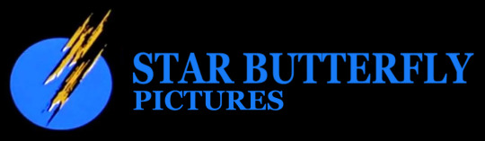
Star Butterfly in Touchstone Pictures Style
Star Butterfly Pictures Logo
#star butterfly#touchstone films#touchstone pictures#touchstone logo#svtfoe#star vs the forces of evil
3 notes
·
View notes
Text

The Timeless Appeal of Juicy Couture Tracksuits A Fashion Icon Reimagined
Juicy Couture tracksuits, with their velour luxury and iconic "J" zipper pulls, have etched themselves into the annals of fashion history as a symbol of early 2000s casual glam. From the streets to the red carpet, these tracksuits have transcended their athletic origins to become a cultural phenomenon. In this blog post, we'll explore the roots of the Juicy Couture tracksuit craze, its evolution over the years, and its enduring allure in contemporary fashion.
The Rise of Juicy Couture:
Founded by Pamela Skaist-Levy and Gela Nash-Taylor in 1997, Juicy Couture burst onto the fashion scene with a mission to redefine casual wear. The brand gained notoriety for its plush velour Juicy Couture tracksuits, adorned with playful logos and rhinestone embellishments. Quickly adopted by celebrities like Paris Hilton and Britney Spears, the tracksuit became synonymous with Juicy Couture's unapologetic embrace of comfort and luxury.
The Cultural Impact:
As the tracksuit trend gained momentum, Juicy Couture became a cultural touchstone, embodying a new era of casual chic. The distinctive "J" zipper pulls, vibrant colors, and whimsical designs turned the tracksuit into a status symbol. The brand's rise was marked by its clever marketing strategies, creating an aspirational lifestyle around the tracksuit that resonated with fashion-forward individuals around the globe. It became a staple in both casual and high-profile settings, from coffee runs to Hollywood premieres.
The Evolution of Juicy Couture:
In the following years, Juicy Couture underwent various transformations, adapting to changing fashion landscapes while preserving its core identity. The tracksuit evolved to incorporate different materials, styles, and silhouettes, ensuring its relevance in an ever-shifting industry. Collaborations with other brands and designers further propelled Juicy Couture into new realms of creativity, introducing limited-edition pieces that added exclusivity to the brand's allure.
The Comeback: Juicy Couture in the 2020s:
In recent years, there has been a resurgence of interest in Juicy Couture tracksuits, with fashion enthusiasts and celebrities revisiting the iconic trend. Nostalgia plays a significant role in this revival, as individuals embrace the tracksuit not only for its comfort but also as a nod to the early 2000s cultural zeitgeist. Social media platforms have played a pivotal role in revitalizing the brand, with influencers showcasing modern interpretations of the classic tracksuit look.
Conclusion:
Juicy Couture tracksuits have proven themselves to be more than a fleeting trend; they are a testament to the enduring power of iconic fashion. From their humble beginnings to their current status as a nostalgic yet relevant wardrobe staple, these tracksuits continue to captivate fashion enthusiasts worldwide. Whether it's a walk down memory lane or a bold fashion statement, the Juicy Couture tracksuit remains a symbol of comfort, luxury, and timeless style.
0 notes
Text
Coincidental Disney Logo Trivia...

The current Disney logo celebrates the enterprise's 100th year of existence... It's a lovely, full-length intro full of neat stuff. A more ground-level tour than a pan down from a starry sky...
It first appeared, in full, before STRANGE WORLD in movie theaters this past autumn. They got the ball rolling early. The logo had also appeared - in cut-short form - in a handful of trailers at the time as well, like for the LITTLE MERMAID remake, ELEMENTAL, and the trailer for DISENCHANTED. D23 attendees were treated to it first before that...
STRANGE WORLD being the first film to bear the new logo, which will likely be used for another decade or so without the "100" next to "Disney", is curious... The film was a massive flop, and one that was largely left for dead by the company.
Wouldn't be the first time...
The first two pictures to introduce the iconic Walt Disney Pictures logo, that laid the groundwork for all logos thereafter, the very thing so many people associate with this company's movie library... Also flopped...
Those movies were... RETURN TO OZ and THE BLACK CAULDRON, both released a month apart from each other in the summer of 1985...

Believe it or not, the Disney studio never had a proper logo introduction for DECADES...
Early Disney cartoon shorts had title cards letting the audience know who the picture was coming from, which was par for the course for most shorts. Walt and Roy Disney had went through a few distributors during the late 1920s and 1930s, notably Celebrity Pictures, Columbia, and United Artists. When Walt was readying his first feature-length film, SNOW WHITE AND THE SEVEN DWARFS, he struck a long-term distribution deal with RKO Radio Pictures. A long-defunct company, but back then a recognizable movie giant, up there with the likes of Paramount, Universal, and 20th Century Fox.
Disney films typically began with an RKO title card, not RKO's actual animated logo sequence depicting a blinking radio tower over a spinning globe. The title card would be stylized to fit with the credits sequence of whatever movie it was. For example, in PINOCCHIO, the RKO logo is carved into wood. For DUMBO, it's a circus poster-looking graphic. And so on, and so forth.
Walt and Roy then broke off from RKO, launching their own distribution company Buena Vista in 1953. Many of the Disney films released from 1954 to 1961, that were not leftover RKO-contract movies and shorts that were released well after the two parties parted ways, opened the same way. A Buena Vista title card that was stylized to look like the opening credits of the respective movie... But by the early 1960s, most Disney movies just used a standard blue gradient logo. This title card's general design layout would be used all the way up until 1984.
"Walt Disney presents" for films made before Walt's passing, and "Walt Disney Productions" for posthumous films, would be the next title card you saw after an RKO or Buena Vista logo. Walt Disney Productions became "Walt Disney Pictures", quietly, in 1983. The first film to be released as a "Walt Disney Pictures" movie was NEVER CRY WOLF. In that film, which is unfortunately a hard one to find, the first thing you see is a bar with serif text saying "Walt Disney Pictures". A title card. No official logo just yet.
Heck, the home video end of things had a logo before the film studio themselves did! Two logos at that!
Disney didn't release a new feature film in 1984 that was under the Disney name. SPLASH and COUNTRY came out in 1984, those were the first two pictures under the company's Touchstone Pictures banner, a banner meant for more adult-oriented films. Then-CEO Ron Miller founded Touchstone, and he'd be replaced by Michael Eisner by the end of the year. Following Eisner's arrival to the company, the rebrand went into full swing... The studio was officially renamed Walt Disney Pictures, the self-distribution company was still Buena Vista, as would be mentioned in a movie's end credits.
So, a new logo was in order...
The logo's first appearance, in short-form, was before a theatrical trailer for THE BLACK CAULDRON that ran in late 1984 before the theatrical re-release of PINOCCHIO. It is unknown if the longer logo preceded PINOCCHIO's opening credits for that re-release, if it did, then that would make it the 1984 Walt Disney Pictures logo.
Anyways, the first film audiences saw it before was RETURN TO OZ... But in short form, with no music!
A month later, THE BLACK CAULDRON came to theaters. It opened with the full logo, with the full 'When You Wish Upon a Star'-inspired jingle that everyone and their brother's dog knows...
Again, two movies that flopped. In fact, all of Disney's mainline 1985 movie releases that weren't Touchstone movies... Just didn't cut it at the box office. These two movies, THE JOURNEY OF NATTY GANN, ONE MAGIC CHRISTMAS... It wouldn't be until the summer 1986 releases of THE GREAT MOUSE DETECTIVE and FLIGHT OF THE NAVIGATOR, two films bearing this logo that did well at the box office.
The revised version of this logo, with more digital-looking glowing light effects and animation, and the arch not overlapping with the "W" in "Walt"... First appeared before a test re-release of THE BLACK CAULDRON under the title TARAN AND THE MAGIC CAULDRON in January 1990, which didn't take off in the few cities it was screened in... Later, in July 1990, it accompanied a very successful re-release of THE JUNGLE BOOK. As for a "new" movie bearing the logo that did well? WHITE FANG, released in January 1991, did okay. It wouldn't be until BEAUTY AND THE BEAST later that year, though, in November... For a genuine big hit...
For this Disney 100 logo, it looks like LITTLE MERMAID will be the first box office success bearing this new logo. It's actually their first mainline Disney theatrical release since STRANGE WORLD... Everything else has been a Marvel movie (QUANTUMANIA, GUARDIANS OF THE GALAXY VOL. 3) or a 20th Century Studios/Searchlight movie (AVATAR: THE WAY OF WATER, CHEVALIER).
Funnily enough, the first film to introduce the previous long-running CGI Disney castle logo?
Big hit. HUGE, record-breaking hit... That was PIRATES OF THE CARIBBEAN: DEAD MAN'S CHEST, from summer 2006...
Maybe when Disney makes a new logo to replace this one in, say, 2040-something... It'll be for a hit movie? I dunno, just something I noticed.
Logo stuff, ya know?
6 notes
·
View notes
Text
Earlier a few people got confused when I mentioned Nightmare before Christmas had a 3D re-release. They thought I was talking about some lesser-known remake.
No. In 2006 Nightmare before Christmas was re-released to cinemas in the US. This is the same year we got the two disc version of the soundtrack (The Best Buy version had bonus tracks) and roughly around the same time Marylin Manson did his cover of "This is Halloween."
Disney went through a short fad of re-releasing previous films in a new 3D format, that just made certain scenes seem to pop out. They also took the opportunity to remove the Touchstone logo from the start of the movie and replace it with the Disney castle. (Touchstone is a division of Disney they use to release films they are unsure of and want to distance from the Disney name. But by 2006 Nightmare before Christmas was a proven classic).
They also broke the Tim Burton / Danny Elfman tradition by removing Danny Elfman's music over the logos (Any film by Tim Burton or associated with Tim Burton with a Danny Elfman score, the music usually plays over the opening logos).
They made the opening credits more red when they used to be pale orange. And they digitally removed wires from bats during This is Halloween. I don't think they should have done this because I think those bats and the wires were a homage to the 1931 Dracula. Also removing old mistakes decades later doesn't feel right.
They also messed a bit with the sound balance during This is Halloween where certain parts like "I am the shadow on the moon at night, filling your dreams to the brim with fright" weren't as crisp and clear as they used to be.
And this is the version that has been on DVD, and Blu Ray, and streaming, ever since.
I have a slight conspiracy theory that the 3D re-releases of things like Nightmare before Christmas and The Lion King (again, I am not talking about the remake), was so they could make edits and changes with people less likely to notice.
2006 doesn't feel that long ago to me but I realize it was seventeen-years-ago now and lots of people don't know that before the live-action remake trend there was a brief "Re-release in 3D" trend.
Again, this was not a remake, they just digitally enhanced certain scenes to have a 3D effect.
10 notes
·
View notes
Text

Custom Built for Family Entertaining and a Forte Fireplace -- In Episode 10 "Right in Our Own Backyard," homeowners Mike and Maria move back to Plant City, Florida to care for Mike’s father. With their focus on family gatherings, their dream home wish list includes a big kitchen, a large outdoor entertaining area, and a fireplace.
Maria initially wants a wood burning fireplace because it brings back memories of her childhood. Mike favors an electric fireplace for its convenience, noting, “You can turn it off when you are done. You don’t have to stay up to make sure there are no embers still going on.” Mika highlights another perk, explaining, “Cost wise, a wood burning fireplace is triple the cost of an electric fireplace.”
Touchstone Forte Electric Fireplace with Touchstone TS logo, photo credits: Radd Builders, Grace Customs and HGTV 100 Day Dream Home
Maria and Mike love their fireplace accent wall featuring the Touchstone Forte Electric Fireplace, complete with built-ins on each side and a modern farmhouse look with black, white and contrasting stone. We love how Maria and Mike planned each element of their home to celebrate family time and honor the memory of Mike’s mother.
READ MORE: https://bit.ly/45noI2O
About HGTV 100 Day Dream Home -- Tune into HGTV’s 100 Day Dream Home for more beautiful custom home creations and style inspiration from partners Mika and Brian Kleinschmidt (pictured at top). Watch on HGTV and stream anytime on Discovery+. Follow Brian and Mika on Instagram @mrbreakinground @dirt2designllc@hgtv
About Grace Customs -- Grace Customs installs all types of trim, crown molding, shiplap, wainscoting, accent walls, ceiling beams, ceiling inlays, coffered ceilings, custom built-ins, and fireplaces in the Tampa, Florida area. Follow them on Instagram and Facebook @gracecustoms913
#home decor#electric fireplace#touchstone electric fireplaces#diy home projects#interior design#home improvement#home remodeling#interior decorating#diy projects#fireplace design#hgtv#100 day dream home
1 note
·
View note
Last Seen Blogs

bloodyvampire-83
Enter My Mind...

castiels-destiny
Mental Health and Fishing

chilloumrtiago
ChilloutMrtiago

saltyspacepirate
Salty Space Pirate

tylekeomacao
ty le keo ma cao