#this is Sky and Luca before I redesigned them
Text


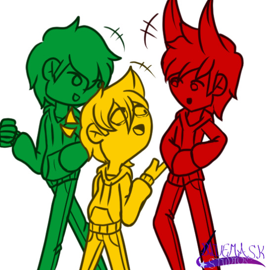
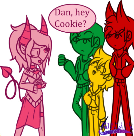
A small comic I did
Luca and sky belongs to me
Dan belongs to @ask-edd
Edd and Tord belongs to Eddsworld
Speedpaint: https://youtu.be/osCDP7SuR0A
#eddsworld#eddsworld edd#eddsworld tord#oc#comic#small comic#this is Sky and Luca before I redesigned them#why does it look like I put more effort into Luca#do not steal#do not trace
12 notes
·
View notes
Text
Visioning® through Collage and Non-Dominant Hand Writing
Wednesday, January 1, 2020
In my book Visioning: Ten Steps to Designing the Life of Your Dreams, I present my method of life and career creation, which I originated and share in my private coaching practice. The Visioning® process includes the making of collage Vision Boards followed by Creative Journal writing to remove blocks and deepen one’s understanding of the images. Almost all of the writing prompts involve using the non-dominant hand or both hands alternately.
I have observed that we all have natural intuitive abilities to sense what is coming next in our lives. We have hunches or premonitions. We may even have a nocturnal dream that plays itself out in our daily life. This intuitive ability is often buried inside our heart’s desire, which is the core of Visioning®. That is what we are illustrating with our Vision Board. Intuition and the ability to sense the future can be developed with a combination of collage work and non-dominant handwriting. By writing dialogues with the images and words in the Vision Board, we often find much deeper meaning in the visuals than we ever imagined when we tore them out of the magazine. In reviewing our Vision Boards a few weeks or months down the line, we frequently find images and words that are specifically prophetic about what was to come. A great example is my Vision Board for 2019 and how it manifested.

When I started putting this six-panel Vision Board together in January of last year, I was thinking about a spring and summer book tour for

The Power of Your Other Hand. I knew I would be going all over California as well as Texas and New Mexico. Two panels show southwestern scenes as well as seaside areas near where I live on the central coast. That all made perfect sense. It was already part of the “plan.”
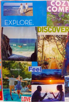
I also had some thoughts about a possible vacation later in the year in a favorite spot on the Sea of Cortez in Mexico. People having fun on beaches and in swimming pools conveyed that idea, as well as couples dining out. Again, it all made perfect sense.
However, as the process of selecting photos and words for the Vision Board evolved, I found myself including other images that, quite frankly, surprised me. But they “felt right” and I knew I had to include them. One was the image of Helen Mirren, one of my favorite actresses, along with the words.
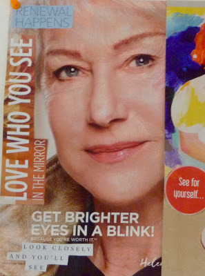
Love who you see in the mirror
Look closer and you’ll see
Renewal happens
Get brighter eyes in a blink
See for yourself
Just as you imagined
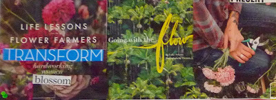
In an adjacent section of the collage there is a woman and little girl painting and a palette with many colors. At the time, the palette seemed very important to me, but I wasn’t sure why. I hoped I would be able to do more painting just for fun in the new year, although I didn’t know when I’d find time for that. There were also images of gardens and gardeners in a nearby section. I took that to mean that my garden, especially my pride and joy - iris garden - would flourish this year.
I did go on the book tour, as shown in the Vision Board, which was very successful and most enjoyable. And we did go on a short getaway on the central coast and a longer one in Cabo San Lucas, also shown on the Vision Board. No surprise there. But wait, there’s more!
New eyes
In the spring after I made this Vision Board, at a regular check-up with my optometrist, I was told I needed to have cataracts removed. When I made the collage I never anticipated needing cataract surgery. I got the surgery, which was highly successful, and no longer need distance glasses, only glasses for reading and computer work. After revisiting my collage, the words in the first panel I did took on a whole new meaning.
Love who you see in the mirror
(I can literally see myself better in the mirror now.)
Look closer and you’ll see
(I no longer need distance glasses, and only have glasses for reading and computer work.)
Renewal happens
(I can see color in a way I hadn’t for years: without the yellowish caste that cataracts cause.)
Get brighter eyes in a blink
(The surgery was painless and fast, each eye done a week apart.)
See for yourself
(I am amazed at my “new eyes”.)
Probably the most amazing aspect of cataract surgery for me was the new intensity of color. Without realizing it over the years, white had become yellowish, blue had become dull and greenish, purples looked maroon, and reds looked brownish. I felt like a I had a new wardrobe. Certain articles of clothing were very different in hue than I thought when I bought them.
Get brighter eyes in a blink
became a reality, in the sense that I got brighter colors in a blink.
And that brings us to the image of the color palette in the collage. Here’s what I wrote about color in my journal while reviewing my Vision Board on April 8, after the surgery:
New eyes, new colors,
New blues, new reds, new purples, new whites, new pinks.
One day while driving around town on errands and marveling at how blue the sky was, I found myself singing the old song, “On a clear day you can see forever.” I hadn’t really seen the true color of the sky and white clouds for quite a few years, it seems. With my non-dominant hand I did a lot of journaling with and about my “new eyes” and what I was seeing. Without realizing it, all those words about seeing had been a preview of coming attractions,
The artist within
Based on the prophetic images in my collage, there was another surprise in store. In the spring I heard about some masters of Chinese Brush Painting who were coming to our area. I immediately registered for classes and workshops with them. This was the manifestation of the image of the woman and girl painting together.
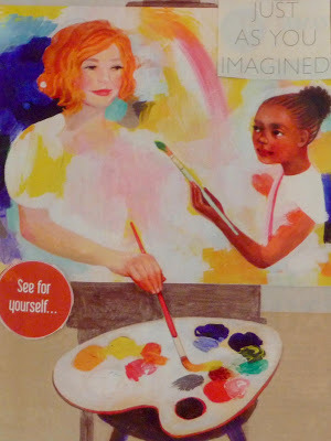
Why is the girl there?
I had wondered, when I selected the image.
Why not just the woman?
As it turned out, taking these art classes took me back to when I began studying art in the 8th grade at Otis Art Institute in Los Angeles on Saturdays. My collage really reflected this experience of being a novice in this particular genre of art. As a teenager I had discovered Japanese and Chinese brushes, and I have painted with them all my life (
see my earlier post on Zenga Art
). However, I had never taken formal instructions in how to use these particular types of brushes. Nor did I know much about Chinese art. These traditional techniques of Chinese painting were new to me. So I did feel like that 8th grader starting all over again.
A new garden design
In relation to the garden section of my collage, we had another surprise in the spring. This one wasn’t pleasant at all. When the irises started blooming, they were eaten by wild bunnies invading our property from the nearby pine forest. They were chewing on the stems and destroying some of the plants. In all my years of growing irises, this had never happened before. I was beside myself about the damage these bunnies were doing. We sprayed the plants, powdered them with cayenne pepper, and tried every deterrent on the market. All to no avail.

So we redesigned and rearranged the placement of some of the plants, and built a fence to protect them. As pictured in the collage, we did do lots of gardening in 2019, but not the kind we had anticipated. I’m happy to say that most of the plants survived and we are looking forward to a “renewal” in the spring.
If you are interested in learning this process, contact me about one-on-one Visioning® Coaching via Skype.
Visioning: Ten Steps to Designing the Life of Your Dreams
by Lucia Capaccchione (Tarcher/Putnam, 2000)
VisioningCoach.blogspot.com
Lucia
Follow Lucia Capacchione:
Facebook/LuciaCapacchionePhD
Download Her Audio Books:
https://luciacapacchione.bandcamp.com
Visit the art shop: https://tinyurl.com/y6nhcowj
Purchase Lucia’s books on: Amazon: https://www.amazon.com/Lucia-Capacchione/e/B001K8C7X4
www.luciac.com
www.visioningcoach.org
#lucia capacchione#simon and schuster#art therapy#art therapist#artists on tumblr#expressiveart#art journal#innerchild#innerchildwork#innerchildhealing#innerchildcomingout#creativejournaling#conari press#lucia blog#luica capacchione book tour#Lucia capacchione PhD#Marsha Nelson Phd#vision#visioning#vision board#dream board#finding yourself#the power of your other hand#the creative journal#self help#therapy#drawing#drawing with both hands#left brain#right brain
0 notes
Text
16 of the Best Shopify Stores to Inspire Your Own
Ecommerce is predicted to account for 17% of all U.S. retail sales by 2022. As ecommerce grows, so does competition, making it hard to differentiate your website from everyone else's.
It isn't enough to have a one-of-a-kind product: to attract your ideal audience -- and more importantly, to turn that audience into passionate brand ambassadors -- you need a one-of-a-kind website.
A sleek and captivating Shopify website can attract a large audience and even act as your start-to-finish marketing pitch.
But you need to know what makes one Shopify website better than the rest. Here, we've curated a list of 16 best of the best Shopify stores to inspire your own.
Whether you're new to ecommerce and about to design your first website, or an ecommerce veteran considering a redesign to outshine your competitors in 2018, this list offers plenty of creative ideas.
Top Shopify Stores
UgMonk
Pipcorn
Taylor Stitch
Happiness Abscissa
Skinny Teatox
HELM Boots
BioLite
Pop Chart Lab
Luca and Danni
Harris Farm Markets
So Worth Loving
Great George Watches
Choose Muse
Brilliant
Holstee
Kylie Cosmetics
1. UgMonk
Jeff Sheldon starts the "About" section on his UgMonk website with a simple question: "Why was it so difficult to find fresh, high-quality, unique items in a modern aesthetic?" His Shopify site is simple and fresh, and exhibits UgMonk's clothing, workplace items, bags, and prints in the same modern aesthetic style he sought while designing his unique products.
2. Pipcorn
When you think about popcorn, I'm betting the first concern that comes to mind isn't "is it healthy?" Pipcorn knows this, so their homepage features a simple slogan: "Most tender, crunchy, delicious popcorn … and it won't destroy your teeth like the ‘generic' stuff." The best websites know their target audience's primary concerns (in this case, the taste of popcorn and the kernels in teeth), and sell them on those solutions upfront.
If you look on their "About Us" page, you'll find Pipcorn's products are also non-GMO, vegan, gluten free, and whole grain. Even though this could have easily been incorporated into their slogan, they chose to exclude it in favor of tackling our bigger concern: Does it taste good?
3. Taylor Stitch
The inner child in me loves Taylor Stitch's website because of the creative alternatives displayed when you hover over a product: a jacket, for instance, flips to an image of a model posing with the jacket on a motorcycle.
The Taylor Stitch website does something else really cool, too: it almost immediately calls more attention to its message than its products, with "Three Simple Ingredients" written across most of the images you see on the homepage. Taylor Stitch doesn't just make high-quality clothing. It also aims to reduce waste and help the environment by creating clothing with recycled or 100% natural products.
On their website, you can't miss their environmental efforts, and I'm betting this is a differentiating factor for most buyers when they come across the site.
4. Happiness Abscissa
Many of the websites I mention on this list have clean, straight lines. Happiness Abscissa is unique. It shows a playful side by displaying a layout with bright abstract images, and even products hanging from different angles.
The company's logo, a crooked "Ha," draws in the viewer's attention, and then they use Ha in a sentence without defining the word, further stimulating viewers' curiosity. You get the sense they don't take themselves too seriously, affording the viewer a cheerful and fun experience.
5. Skinny Teatox
I myself was tempted to purchase the Teatox product when I checked out this site (in my defense, they were having a one-day flash sale I did not want to miss). The Skinny Teatox homepage immediately confronts your biggest concerns ("Is it natural? Yes. Will it work? Yes."), and uses pastel colors and cute icons of bikinis and mugs to convey a fresh vibe.
As I've noticed with a few other Shopify websites, Skinny Teatox places its products on the homepage with an easy "buy now" call-to-action. For a company that isn't too complex to figure out ("All Natural Detox Weight Loss Tea" is written beside the company name in search engines), I think it makes sense to offer the viewers what they want upfront.
6. HELM Boots
"Our boots give men confidence from the ground up, confidence to take steps they've never taken before." Immediately, HELM incentivizes viewers through emotion: I might just be a guy looking to buy some boots, but yes, I'd definitely also like some confidence and bravery while I'm at it. The website looks elegant, and you can find everything from the homepage, which is designed to convert viewers at various stages of the buyer's journey and assuage doubts as you scroll.
7. BioLite
I might be a sucker for the little details, but the product images on BioLite's website are enough to make me want to buy something (they look 3-D and illuminated, and some even look wet from rain!).
Since BioLite's major selling point is its humanitarian impact (the products bring affordable energy access to places in India and Africa), the first thing on the homepage is their slogan, "Gear That Brings Energy Everywhere," which will appeal to their target audience. The navigation bar at the top also has a clever twist: beside each product title, there are little black-and-white cartoon drawings of the product.
8. Pop Chart Lab
This site looks like one of the vintage and trendy prints they sell. It's also organized in different categories depending on a viewer's browsing preference.
First, Pop Chart Lab's Shopify store has a scroll-down navigation with sub-categories ranging from, "NYC" to "Kids" to "Hip Hop" to "Wine." They also have a carousel with some of their top prints on display. Below the carousel, they offer "wholesale," "gift guides," and "scratch-off" collections, for viewers who are having a difficult time discerning what they want. The shop manages to appear simple, despite its vast array of different print products, which is no easy feat.
9. Luca and Danni
There's something addictive about an ecommerce store that changes as you scroll. Luca and Danni's page is highly interactive: as you scroll, some images get bigger and others get smaller, boxes of bracelets open up within images, and some images follow you down the page. It can be tricky to offer so much movement on a page while remaining coherent, but somehow, Luca and Danni accomplish this. There's also a very zen vibe to the whole layout, with images of palm trees and cactuses, and calls-to-action with language like "brighter days: shop soil to sky," and "find what speaks to you."
10. Harris Farm Markets
This is a family-owned company, something you can't miss from the homepage. It's casual and playful, with text that looks like a child's handwriting and colorful drawings of fruit (there's even an adorable drawing of a bee with animated wings!). Even the calls-to-action sound laid-back, like "What's nature been up to?" It's so genuine, you can imagine a family building the site together.
11. So Worth Loving
Sometimes, being evasive pays off. While it's not always a good idea to hide your products from the viewer, it can be a very smart move if your product doesn't make sense without understanding the backstory. With So Worth Loving's site, you don't even see the t-shirts for sale until a third of the way down the page. By that point, you've already read their slogan, a little bio from the founder, Eryn, and a full narrative about how the site began.
The site leans into personal touches, with handwritten-looking quotes scrawled across images and very normal looking images of people posing in t-shirts. This is a great example of knowing your audience enough to break the rules.
12. Great George Watches
I'm not an experienced watch shopper, so when I first read, "Made with Swiss parts and 100% square," on Great George Watches' homepage, I thought maybe "square" was a fancy term I'd understand if I knew watches. But as I scrolled and read, "Think outside the circle," I realized these terms were unique to Great George Watches, which are all square-faced.
By emphasizing what makes their product unique before even showing the produce, Great George Watches captivates the viewer. I love this shop because it has a refined and polished look, with black-and-white photos and an attention-grabbing red call-to-action button.
13. Choose Muse
Choose Muse incorporates a full-display video of a man putting headphones on and using Choose Muse's product right from the homepage. The video starts playing immediately (as opposed to offering a play button option), which is especially eye-catching. I usually think simple is better when it comes to design, but Choose Muse proves me wrong, incorporating compelling designs with a ton of images and text, while still retaining a clean and enjoyable viewer experience.
14. Brilliant
For a math and science website, Brilliant is surprisingly easy-to-navigate (even for someone like me, an English major … ), with big, colorful block buttons to choose the math concept you want to learn. This shop is also a fantastic example of using a call-to-action button wisely: there's a big "sign up for free" button prominently displayed in the top right, and then another at the bottom of the page, after you've scrolled past the information you need.
The site doesn't have a navigation bar, but instead uses the web page to answer all the questions a viewer might have.
15. Holstee
Holstee does a fantastic job of designing their site in tiers depending on a person's initial level of interest in the product. For starters, you see the text, "We help you along your journey to live more fully and mindfully." If you're already convinced, you can click "Join today" right below the text. If not, you can continue to scroll down the homepage to find pain points this product reduces, read a "Holstee Manifesto," see Membership benefits, check out testimonials, and find publications Holstee's been featured in.
Throughout the page, there are various calls-to-action, like "Choose a plan that's right for you," and then, at the end, "Become a member today." I love this site because it becomes increasingly convincing and in-depth as you scroll: it's clear they use their homepage as a start-to-finish marketing pitch.
16. Kylie Cosmetics
As one of the top 10 most followed accounts on Instagram, Kylie Jenner's Cosmetic brand is one of the bigger brands using Shopify today. Her site has a very distinct girly-girl vibe, with a bubble-gum pink background showing off her lip kits and gloss.
Kylie's site is also well-organized for her audience: the lip kits, her best-known items, are shown first on the homepage, with "top sellers" below that. I didn't feel overwhelmed looking through the various cosmetic products like I thought I would, and what really stood out to me about Kylie's site is the fun, colorful layout. It might not be everyone's cup of tea, but I'm betting it appeals to her target audience.
See a store design above that you like? First, grab the guide below to find out how user-generated content can give your business the gusto it needs to attract and retain online shoppers.
0 notes
Text
Interesting Alcoholic Drinks Package Inspiration – 87 Examples
Package design has attracted in the last period more and more attention.
People in the advertising industry attach significant importance to package design because of its impact on purchasers.
Its presence at the crucial moment when the purchase is made and consumers’ high level of involvement when they actively scan packages in their decision making.
People tend to be fans of certain alcoholic beverages (let’s not say addicted) and any means must be used in order to influence the decision of buying a new product. The most interesting one is package design. If it’s looking good, it must taste the same, doesn’t it?
The alcoholic drinks industry is enjoying high investments manifested by their interest in creating attractive package designs to lure people in buying their products. Based on the economic idea that you can’t earn money without spending some, that looks like a wining strategy and, of course, it is.
Complicated or minimalistic, these package designs are a pleasure to look at to draw inspiration from them.
In this article you will see some of the best package design examples for alcoholic beverages.
Klar
Klar in German means ‘Clear’, Zurich Switzerland lies at 47 degrees latitude on the map. Klar 47 is distilled from only the finest organic ingredients. Imported from Zurich, Switzerland.
Harem Sultan
Harem Sultan is a premium wine brand that is only sold at duty free shops in Turkey targeting foreign tourists. The brief was to design a packaging that would create conversation on the table when people go back to their countries. Something that foreigners would love to buy not only as wine but as a “Special Souvenir from Turkey”.
Neige
Chez Valois, Montreal based branding & design agency, created special edition discovery gift set packaging for Neige Ice Ciders.
With its mirror-like backing, the set attracts the consumers attention. This one piece packaging, made with no glue has a complementary tasting note form slided in the back.
Mixed Emotions
The idea of this project is to sell emotions through a product. The designer selected a mix between a concoction and vodka.
The concoction is a fruit blend that contains emotions such as love, sadness, happiness, fear and anger. The Mixed Emotions cocktail evokes an emotion and changes your attitude according to your preference.
Sea Cider
Playful, colourful packaging for a UK-based cider company, Hearts Cider Makers.
Fusion Beer
“Young and trendy”. This is the idea which gave the designers a push to draw their first sketches.
As the upcoming product was to be gender mainstreaming, they faced a matter of some difficulty, for statistically men and women in Mongolia almost do not have numeral superiority in the beer consumption.
Balvenie Ambassador Case
A hand-crafted leather case for The Balvenie Ambassador to present the Balvenie story from barley to bottle.
The case contains bespoke boxes which are individually tooled to hold ears of barley, a miniature copper still, cask samples, miniature barrels and tasting bottles
Budgens
Harry Pearce and his team have been commissioned to redesign the complete own brand range for Budgens and Londis stores.
The own brand range has three levels, Good, Better, and Best, and many of the redesigned Good Value range have already hit the shelves with Pentagram’s designs for Good Value Jaffa Cakes and Good Value Assorted Crisps winning the Quality Food Awards 2009.
Balblair
This is a concept for the restyling of the Balblair Whisky bottle. The main goal was to give a taste of Scotland to the costumer, from the bottle to the taste of the whisky.
They wanted to create a mix of tradition and modernity, so they mixed old traditional materials such as cork and wool with some new hi-tech look materials like aluminum details.
Klein Constantia Grappa
Klein Constantia didn’t know what to do with the grape skins that were left over from the production of their award winning wines.
In the past they had fed the skins to their cows, but they decided to produce a limited edition grappa, as a gift to the people that were important to their business.
Brujeria
This is Brujeria (the Spanish word for witchcraft) from Misfits Wine Co. A Soul Retrieval Nostrum. Ancient arts and dark fruits forged through toil to respond to clichéd and lifeless marketing department wines. Formed whole in light and dark to strike fear into drones and hex the elitist wine types.
Inspiration draws from Latin witchcraft posters. This release from Misfits Wine Co has been created to stand out and tie into their ethos; the rejection of the conventional.
Lucifer’s Elixir
Lucifer’s Elixir is a self-promotional piece that I produced and handed out to colleagues and confidants. Each swing-top bottle included a vintage skeleton key and a booklet explaining symbology, numerology and other “secrets of the universe”.
It was meant to invoke an initiation into a secret society a la the Freemasons or Skull & Bones. What better to ponder the meaning of the universe than some nice bourbon whiskey!
Kraken Rum
The Kraken Black Spiced Rum has introduced 3-D labels designed by London based STRANGER & STRANGER. The 3D kraken will adorn the 750mL bottles and will be available for purchase online.
My World Wine
They created a series of hand drawn maps for this wine package design colored by aquarelle embracing each box, accompanied by a series of illustrations highlighting what is unique about each country.
Adirondack Whisky
Brand concept and packaging design for a fictional single malt whisky (spelled with no ‘e’, Scotch-style) and distillery based in upstate New York.
The bottle is tall and slim with broad shoulders; coupled with the contour lines used on the labels and the cylinder, it hints at the height and shape of the mountain range that it is surrounded by. Labels are set in muted brown and silver tones to highlight the strength of the whisky’s color.
The brand name ‘Adirondack’ is printed vertically on the bottle’s front, transposed over the rear label graphic, adding depth and movement. All facets of the packaging honor the geography of the area it comes from while still presenting the simple, classy image popular with younger consumers
Naked King
Margarita Mix
Breuckelen Distilling
Breuckelen Distilling is an artisan distillery located in Brooklyn, New York. They handcraft delicious gin from organic New York grains entirely within their Brooklyn location. Breuckelen is a tiny fraction of the size of typical distilleries but their production methods create products of the highest quality.
Votrys
A series of boxes that contain one, two and three wine bottles each. Each box can accept two different sizes/forms of bottles of the same capacity.
The three sizes are either combined together or separately and by stacking them a wine-rack is formed. Even a big wine-rack could be produced in this way.
The shape of the box was chosen because it is sympathetic to the shape of the bottle and it also looks like a grape from one side when stack. The box has a handle and can be carried like a bag without the need for additional packaging.
The use of Oak plywood as the main material was chosen because it makes references to the Oak barrels the wine matures in. The client logo appears on the box and on a label on the handle which also explains the concept and the way to reuse the box.
Kotton Beer
Beer for the hard working tough guy. With no doodles, gold platings, any insignificent items whatsoever. Tough as an army boot.
Jack Daniel’s
Down Under
Mercier
Pretty cylindrical packaging for this champagne’s 150th anniversary.
Torque
They created a packaging of locally distilled vodka for their clients to show them some other work they are capable of (outside of traditional print/web work).
The bottle design is based on their branding and overall look and feel. They have titled themselves as “Concept Mechanics”, which speaks to their handwork and conceptual thinking. The spring top is a metal spring that serves as a cap.
Gin Mare
The bottle design combines straight and curved forms with hints of blue and white that suggest a synthesis between sea and sky, water and foam.
A unique cap saw all the neck of the bottle thereby reinforcing its premium character. Mare Gin has been created with the highest quality botanical (Arbequina olive, thyme, rosemary and basil), selected in Mediterranean areas.
Made by hand in a still single, has a base of barley and distilled Premium macerated with each independently botanical ingredients to create a unique blending. A new generation of gins.
Black & Gold Elk
Black Elk is a premium vodka from the Finnish Lapland. The goal was to create a young looking and innovative brand. The shape of the bottle is simple but elegant and the graphics really modern style. Gold Elk is the ultra premium version of Black Elk
Bitter Sisters Cocktail Mixer
Auténtico Tequila Alacrán
Auténtico Tequila Alacrán (ATA) – Authentic Scorpion Tequila. This is not a brand or some product created by a transnational corporation.
Instead, it was made by a group of friends in Mexico City, who rebelled against the status quo and created this unconventionally pure white spirit concealed within a matte-black bottle.
The special and rubbery (some say velvety) “Soft Touch” finish is a unique texture, never before applied on a tequila bottle, or any other that we know of. The shape was inspired by a canteen crossed with a liquor flask and Its rugged skin makes it the ultimate urban trend. The tequila is absolutely delicious by the way
Bols
Bols 1575 Amsterdam (aka the inventors of gin and the oldest distillery brand in the world!) asked Mash to assist them in revamping their Bols Vodka Bottle.
The packaging needed to have respect for the heritage behind the Lucas Bols brand which has been around since clogs. Mash designed a series of classic and elegant bottles based on vintage French perfume packaging.
Dapper Beer
The Smiling Skull
The Smiling Skull cabernet sauvignon. A retail direct private label designed to compete with California wines that have a similar quirky yet dark look and feel. Utilizes clear varnish and metallic inks.
Zubrowka
Design suggestion for Polish Vodka brand Zubrówka. Taking the brands history and origin into the design context with a medicine twist.
Blink
Beetroot design group based in Thessaloniki, Greece came up with this outcome for the branding and bottle design of Blink sparkling wine.
The graphic design of the bottle is characterized by the stripes. This way and along with the small use of the logo the bottle itself is defining the brand, creating a strong identity sticking out among other bottles. It is positioned in bars and clubs targeting mostly younger ages
Crosser Non Vintage
Crosser Vintage launched 25 years ago and has established itself as a premium Australian Sparkling.
Lion Nathan approached War to develop a Crosser Non-Vintage label that retained the equity of the Vintage brand whilst positioning the Non-Vintage at a lower price point to capture the fast growing ‘everyday sparkling’ market.
The design retains everything synonymous with Crosser but through the use of colour and finishes clearly identifies its role in the Crosser family.
BYO
Drink tea when you want it and where you want it. Packaged in a custom designed pouch that slides into a purse or a back pocket, BYOT offers an easy way to enjoy loose leaf tea throughout the day. Each BYOT package includes ten servings of tea as well as biodegradable pouches that conveniently steep into a perfect cup.
12 Bridges Gin
12 Bridges Gin is a small batch, hand-crafted gin made in Portland, Oregon, a city of bridges. The concept of “bridge” is echoed throughout the design, including the metal label (pictured) on the front of the bottle.
Buddy Mulled Wine
As a seasonal greeting to clients and friends Buddy designed and sent bottles of spiced mulled wine.
Their Christmas wishes were pad printed matte silver directly onto the glass of the bottle, the design being suggestive of measuring jug graphics. The concept therefore, the more you drink the merrier the message.
Charles Le Chat
The Malcolm
The Malcolm represents the super premium product under the Magpie Estate Brand. This product needed to sit separately from the other wines in the range.
The logo type remains consistent as a secondary element, however the bottle design and printing methods depart from the other Magpie Estate wines.
A beautiful imported French bottle was chosen, the bird illustration and text details were screen printed. No paper labels were used, even the back label details are screen printed.
Longview
The label takes its form from a doiley which is a reference to the types of food that are typically consumed with this variety of wine.
The delicate pattern of the doiley creates a sense of elegance and quality that appeals to the target audience and visually sets the wine apart from the competition.
Pravda Vodka
This package looks and feels ultra clean and the all-white bottle would be sure to stand out on a shelf in a bar.
The Optimist
The Optimist is a self-promotional holiday wine bottle. Each year Siquis shows their clients how much they care by designing a custom wine bottle label just for them. The label is always created by a different designer in their creative department.
This year’s graphic was designed to play on “is the glass half empty or half full” concept. Obviously, once the recipient rotates the bottle to fill their glass, the glass on the label becomes half full.
El Paso Chile Co.
El Paso Chile Co. is well known for their boutique brands of salsas and marinades. They also have some of the best margarita and cocktail juice blends available on the market.
With CSA’s help in packaging, they invented a novel way to bring their cocktail flavors to a wider audience by selling glass martini shakers that contain the mixings for finished martinis – just add ice and alcohol.
Burn Cottage
Something we’ve been looking forward to for a long time, the Burn Cottage wines have been released. The labels, thick uncoated stock with the branding imagery wrapping around the imported French glass, mirroring the poster cut up business cards. Oh, and the wine is just as
tasty as the packaging
Helderberg Wijnmakerij
A new design the designers did did for a winery in Stellenbosch. The black is all high-build. Instead of filling the white space with a texture, they filled it with an embossed illustration of clouds above the mountain. Makes for an overall very visual and tactile design.
Hennessy V.S
Hennessy V.S Blending of Art celebrates the two as one, in a collaborative project that aligns the visually arresting with the sonically bold; the musically adventurous with the artistically free. An exclusive series of future thinking artworks that connect some of music’s most vibrant revolutionaries with visual artists and graphic designers that dance to the same beat.
Inspired by the Hennessy Artistry curation process, Hennessy has invited a posse of artists to express themselves around the iconic Hennessy V.S bottle with true creative freedom creating five new iconic bottle designs.
Blue Nectar No.1
Blue Nectar’s No. 1 is a limited edition ale designed by ourselves and brewed by one of their local brewery clients in the city of Derby, UK. The purpose of the ale was to produce a product that captures the essence of everything they do, creating compelling brands and putting them into beautiful packaging.
The self initiated brief required us to create a design that stood out from the current offering that is seen within the UK ales market, whilst making what is often perceived as a rather old fashioned product more contemporary.
Graham’s New Year Edition
Inspired by the upcoming Chinese New Year and the use of vibrant colors in the Asian culture, the Graham’s Port Asia New Year Edition packaging has been specially released to mark the celebration for this occasion.
Red, green and black were chosen to interpret: prosperity and happiness; harmony and balance; power and masculinity. These concepts are expressed through the detailing of the design in the wrought iron 1890 gate at the ‘Malvedos’ property in the Douro valley.
Lascala
New work from Spanish designer Eduardo del Fraile. If you’re new to Eduardo’s work be sure to check out some of his other amazing work we’ve showcased in the past.
Enigma
Sing the alphabet song, A B C D F, hang on something’s missing! Not anymore, Alpha Box and Dice have now released E (Enigma). Another letter in the ever increasing Alpha Box & Dice range of wines.
One day the whole alphabet will exist. If you have the complete collection you can sell up and retire to the Bahamas as this preschool lesson will become more collectable than Mark Rothko’s Grade 3 art-class drawing
Lakefront Brewery
Lakefront wanted a way to showcase their ever changing 22oz “Brewers Series” beers that they continually keep developing, which are normally sold one bottle at a time. With the Lakefront 88 (88oz of total beer) customers are able to try 4 different beers for a cheaper price than buying them each separately.
The logo for the “88” came from an overhead view of the 4 bottles in the package. The design in general is meant to be fairly simple and bold to create attention on the shelf and then let the beer speak for itself. Overall the design, the size and the weight of The Lakefront 88 gives it a pretty impactful presence among the other products in the beer cooler.
Christmas Absinthe
Espolón
Just in time to celebrate the 200th anniversary of Mexico’s independence from Spain, Espolón™ Tequila returns to the United States with the same award-winning liquid but with a whole new look.
The new packaging of this cult-favorite tequila pays homage to the brave men and women who fiercely fought to establish what is known as today’s “Real Mexico,” a country steeped in authenticity, history and tradition.
Rich in iconic imagery, Espolón Tequila’s unique labels celebrate Mexico’s storied culture as well as the iconic rooster – a symbol of national pride.
Siete Pecados
A Series of wines inspired by the Seven Deadly Sins. The design of the bottles reflect each one of the sins visually. Fall into temptation.
Lobo Apple Cider
Lobo, Spanish for wolf and a cloudy apple cider from the Adelaide Hills. Mash re-designed the existing Lobo packaging with a completely new approach and new level of sophistication for the apple quaffing connoisseur.
Working with LA illustrator Jason Holley, a new cunning wolf character was created. Rough hand painted text you might see on a farm shed forms the logo type in keeping with the hand made approach of this juicy cider.
The Measure
This is the wine label that they (The Measure) developed to give to clients and suppliers as a thank you present. The label features a mixed typographic approach and is printed in super slick gold foil.
As the label says “This one’s a keeper” referring to both the wine for cellaring and the studio for future projects.
Cavalierino
Cavalierino is a small winery in the beautiful high hills of Poggiano within a stone’s throw from the historical towns of Montepulciano and Pienza just south of Siena, Tuscany, Italy. 155 prime acres of vineyards, olive groves, woods and cypress trees are bathed in a soft, golden Tuscan light.
Glow
The design for Glow is modern and colourful, clearly flirting with the fashion pack among the target group.
Entente
Marisco Vineyards have had a long-standing relationship with international fashion designer Trelise Cooper, sponsoring many of her fashion shows etc. As a result of that friendship and business partnership an opportunity came up to involve Trelise in the design for a limited release wine.
Márton
Márton, a very small, family run winery approached me to create an attractive label design for their Christmas edition of selected red wines.
Samson
Bottle design and branding for New Jersey-based craft brewer Jeff Samson. Starting with the legend of Samson and the Lion most of us are familiar with and adding a beverage industry twist, these liter bottles are screen printed front and back and packaged in original repurposed beverage crates
Flitrini
Redesign of FLIRTINI cranberry wine package for Creative Wine Company.
Osječko pivo
The usual bottle label was printed in red color. This small intervention retained their identity while adding winter flair.
Spanish White Guerrilla
Spanish White Guerrilla is a collection of “revolutionary” wines created by Vintae. For the first time ever, the nine white grape varieties which enjoy the greatest international prestige have been cultivated in La Rioja.
Nine entertaining warriors, inspired by the origin of the grape which each represents, bring this unusual collection to life.
Kraken Rum 3D
The Kraken Black Spiced Rum has introduced 3-D labels designed by London based STRANGER & STRANGER.
Amarone Bottega
The renowned American designer Denise Focil has partnered with the award-winning Italian wine maker Distilleria Bottega to create a luxury and stylish wine: Amarone Bottega, Il vino Prêt-á-porter.
The bottle features a white leather label and is nestled in a white leather case embellished with debossed black lettering: a collectible piece that reminds of a vintage suitcase. The case is enriched with metal studs (the latest, hottest fashion trend) and with a metal plaque with engraved the Alpinestars by Denise Focil logo.
Nuevas Rias
A range consisting of three references, each one showing off a unique colour. The transparency plays an important role in the design due to the fact that it enables the different elements of the packaging to fuse together without minimizing its importance.
A strong branding consisting of typography of Gothic influences, brief text explaining the characteristics of the liqueur to the consumer and a cross symbolizing of the origin of these orujos. The result, a reinterpretation of the Galician classic codes that add impact on shelves and transmit undisputed quality.
Tuaca
TUACA’s Perfect Chill label features custom artwork by world famous tattoo artist Corey Miller whose signature also adorns the bottle.
The tattoo is printed with thermochromatic ink, a special dye that changes color when temperatures increase or decrease. When the TUACA bottle reaches the perfect temperature, the color activates to blue, but as the bottle resumes to room temperature, the original light silver color returns.
Tequila 29
Tequila 29 Two Nine is a Blanco and Reposado tequila made of 100% pure Agave, in “Los Altos” Jalisco. The Reposado is aged during 6 to 8 months in French white oak barrels previously used to age Whiskey.
Miller Coors
Beer package design concept for Miller Coors. 96 oz. of pressurized beer for the Nascar crowd. Drink it, spray it on your friends or wife, or light it on fire.
Spring Edition
Eno Wines
Eno Wines is a Berkeley-based, boutique winery producing small batches of Pinot Noir, Old Vine Zinfandel, Grenache, and Syrah from world class and undiscovered vineyards.
Floating Mountain
Floating Mountain owned by Dancing Water, Waipara, New Zealand wanted a revised label. They took it way further and the client loved it.
A black gloss foil embossed onto black matt printed white uncoated stock. They have also redesigned their Dancing Water wine labels.
Braufactum
The best of imported beers and high class self-made creations – that is what Braufactum is all about. The new gourmet label of the Oetker group introduces a unique collection that will establish a new style of brewing culture.
VS Wines
Belvedere Vodka
New wine packaging design by FeedbackMP Barcelona, for VS wines from Costers del Sió winery located in Lleida, Spain (Appellation of Origin: Costers del Segre).
The main marketing objective to FeedbackMP team was to reposition this range of products to make it more attractive to its target audience: mostly young people seeking a distinctive component in the product image, a quality wine, easy to drink and understand, with excellent value for money.
Graci
Harvey River Bridge Estate approached brainCELLS in early 2010 to work on a new premium cider range called Graci. Harvey Fresh are well known for their quality fruit so a range of cider with apple, pear and grape varieties seemed like a wise investment.
The packaging of the cider reflects the tradition and heritage of the Harvey orchards that have been operating for many decades in Western Australia. The traditional look was achieved with a scraperboard illustration and a visual palette of dusty colours and vintage typefaces.
The result is a cider package that will attract both experienced and in-experienced cider drinkers over the summer months. Graci is now available in liquor outlets across Australia.
Sigtuna Christmas Lager
Sigtuna is an up and coming micro brewery just outside of Stockholm, Sweden. They have recently received numberous awards for their beers and continue to reap success within the beer communities.
This years christmas lager needed a design that highlighted the premium characteristics of the beverage, while adding a new twist to the symbolism of the holidays.
The Handshake
In 2010 brianCELLS designed a new series of wine labels for a well respected West Australian Liquor merchant, Liquor Barons.
Ginself
Ginself is the result of the enthusiastic pursuit of the perfect gin by its four creators, and is the first 100% premium gin in Valencia Spain.
Lorem Wine
Lorem Wine is a very special project, because the author has designed it exclusively for designers. So dear designer, take a break, lay back and enjoy this wine
Midnight Moonshine
Few family recipes carry a jail sentence, but for the Johnson family it was a way of life; with the law on his heels, Junior ran the finest moonshine to the dry rural south.
Junior Johnson’s family recipe is a triple distilled, lower proof and a legal version than the original. As smooth as premium vodka, it’s grain neutral and virtually odorless. Drawing inspiration from the design of Johnson’s cars, used for running in the 1930s and ’40s the packaging was kept simple and bold.
The Kings Series
Vino Fino
Belancio created the new luxury wine brand Vino Fino. The branding included a hand crafted wood box finished in dark mahogany, with a solid platinum V attached to the surface.
Meteor Bright White
A simple design to showcase the wine in the bottle. The bright color of this bottle is a great contrast to the rest of the Meteor line.
Jeremy Wine Co.
The unique full wrap dieline forms the phonetic ” J ” for Jeremy, which also reads as a lowercase ” f ” alluding to the tagline “forty thousand hours in each bottle” when the wine is poured (invert the bottle).
Monteith’s Single Source
The new Single Source lager is a single minded brand that heralds its own craft process. A uniquely New Zealand batch-brewed beer, it is unswervingly true to the land and the people from which it originates. Like the resulting flavour, the design needed to embody its real character, integrity and undeniable class.
from Web Development & Designing http://www.designyourway.net/blog/inspiration/interesting-alcoholic-drinks-package-inspiration-42-examples/
0 notes
Text
16 of the Best Shopify Stores to Inspire Your Own
Ecommerce is predicted to account for 17% of all U.S. retail sales by 2022. As ecommerce grows, so does competition, making it hard to differentiate your website from everyone else’s.
It isn’t enough to have a one-of-a-kind product: to attract your ideal audience -- and more importantly, to turn that audience into passionate brand ambassadors -- you need a one-of-a-kind website.
A sleek and captivating Shopify website can attract a large audience and even act as your start-to-finish marketing pitch.
But you need to know what makes one Shopify website better than the rest. Here, we’ve curated a list of 16 best of the best Shopify stores to inspire your own.
Whether you’re new to ecommerce and about to design your first website, or an ecommerce veteran considering a redesign to outshine your competitors in 2018, this list offers plenty of creative ideas.
1. UgMonk
Jeff Sheldon starts the “About” section on his UgMonk website with a simple question: “Why was it so difficult to find fresh, high-quality, unique items in a modern aesthetic?” His Shopify site is simple and fresh, and exhibits UgMonk’s clothing, workplace items, bags, and prints in the same modern aesthetic style he sought while designing his unique products.
2. Pipcorn
When you think about popcorn, I’m betting the first concern that comes to mind isn’t “is it healthy?” Pipcorn knows this, so their homepage features a simple slogan: “Most tender, crunchy, delicious popcorn … and it won’t destroy your teeth like the ‘generic’ stuff.” The best websites know their target audience’s primary concerns (in this case, the taste of popcorn and the kernels in teeth), and sell them on those solutions upfront. If you look on their “About Us” page, you’ll find Pipcorn’s products are also non-GMO, vegan, gluten free, and whole grain. Even though this could have easily been incorporated into their slogan, they chose to exclude it in favor of tackling our bigger concern: Does it taste good?
3. Taylor Stitch
The inner child in me loves Taylor Stitch’s website because of the creative alternatives displayed when you hover over a product: a jacket, for instance, flips to an image of a model posing with the jacket on a motorcycle. The Taylor Stitch website does something else really cool, too -- it almost immediately calls more attention to its message than its products, with “Three Simple Ingredients” written across most of the images you see on the homepage. Taylor Stitch doesn’t just make high-quality clothing. It also aims to reduce waste and help the environment by creating clothing with recycled or 100% natural products. On their website, you can’t miss their environmental efforts, and I’m betting this is a differentiating factor for most buyers when they come across the site.
4. Happiness Abscissa
Many of the websites I mention on this list have clean, straight lines. Happiness Abscissa is unique. It shows a playful side by displaying a layout with bright abstract images, and even products hanging from different angles. Their logo, a crooked Ha, draws in the viewer’s attention, and then they use Ha in a sentence without defining the word, further stimulating viewers' curiosity. You get the sense they don’t take themselves too seriously, affording the viewer a cheerful and fun experience.
5. Skinny Teatox
I myself was tempted to purchase the Teatox product when I checked out this site (in my defense, they were having a one-day flash sale I did not want to miss). The Skinny Teatox homepage immediately confronts your biggest concerns (“Is it natural? Yes. Will it work? Yes.”), and uses pastel colors and cute icons of bikinis and mugs to convey a fresh vibe. As I’ve noticed with a few other Shopify websites, Skinny Teatox places its products on the homepage with an easy “buy now” call-to-action. For a company that isn’t too complex to figure out (“All Natural Detox Weight Loss Tea” is written beside the company name in search engines), I think it makes sense to offer the viewers what they want upfront.
6. HELM Boots
“Our boots give men confidence from the ground up, confidence to take steps they’ve never taken before.” Immediately, HELM incentivizes viewers through emotion: I might just be a guy looking to buy some boots, but yes, I’d definitely also like some confidence and bravery while I’m at it. The website looks elegant, and you can find everything from the homepage, which is designed to convert viewers at various stages of the buyer’s journey and assuage doubts as you scroll.
7. BioLite
I might be a sucker for the little details, but the product images on BioLite’s website are enough to make me want to buy something (they look 3-D and illuminated, and some even look wet from rain!). Since BioLite’s major selling point is its humanitarian impact (the products bring affordable energy access to places in India and Africa), the first thing on the homepage is their slogan, “Gear That Brings Energy Everywhere,” which will appeal to their target audience. The navigation bar at the top also has a clever twist: beside each product title, there are little black-and-white cartoon drawings of the product.
8. Pop Chart Lab
This site looks like one of the vintage and trendy prints they sell. It’s also organized in different categories depending on a viewer’s browsing preference. First, they have a scroll-down navigation with sub-categories ranging from, “NYC” to “Kids” to “Hip Hop” to “Wine.” They also have a carousel with some of their top prints on display. Below the carousel, they offer “wholesale,” “gift guides,” and “scratch-off” collections, for viewers who are having a difficult time discerning what they want. The shop manages to appear simple, despite its vast array of different print products, which is no easy feat.
9. Luca and Danni
There’s something addictive about an ecommerce store that changes as you scroll. Luca and Danni’s page is highly interactive: as you scroll, some images get bigger and others get smaller, boxes of bracelets open up within images, and some images follow you down the page. It can be tricky to offer so much movement on a page while remaining coherent, but somehow, Luca and Danni accomplish this. There’s also a very zen vibe to the whole layout, with images of palm trees and cactuses, and calls-to-action with language like “brighter days: shop soil to sky,” and “find what speaks to you.”
10. Harris Farm Markets
This is a family-owned company, something you can’t miss from the homepage. It’s casual and playful, with text that looks like a child’s handwriting and colorful drawings of fruit (there’s even an adorable drawing of a bee with animated wings!). Even the calls-to-action sound laid-back, like “What’s nature been up to?” It’s so genuine, you can imagine a family building the site together.
11. So Worth Loving
Sometimes, being evasive pays off. While it’s not always a good idea to hide your products from the viewer, it can be a very smart move if your product doesn’t make sense without understanding the backstory. With So Worth Loving’s site, you don’t even see the t-shirts for sale until a third of the way down the page. By that point, you’ve already read their slogan, a little bio from the founder, Eryn, and a full narrative about how the site began. The site leans into personal touches, with handwritten-looking quotes scrawled across images and very normal looking images of people posing in t-shirts. This is a great example of knowing your audience enough to break the rules.
12. Great George Watches
I’m not an experienced watch shopper, so when I first read, “Made with Swiss parts and 100% square,” on Great George Watches’ homepage, I thought maybe “square” was a fancy term I’d understand if I knew watches. But as I scrolled and read, “Think outside the circle,” I realized these terms were unique to Great George Watches, which are all square-faced. By emphasizing what makes their product unique before even showing the produce, Great George Watches captivates the viewer. I love this shop because it has a refined and polished look, with black-and-white photos and an attention-grabbing red call-to-action button.
13. Choose Muse
Choose Muse incorporates a full-display video of a man putting headphones on and using Choose Muse’s product right from the homepage. The video starts playing immediately (as opposed to offering a play button option), which is especially eye-catching. I usually think simple is better when it comes to design, but Choose Muse proves me wrong, incorporating compelling designs with a ton of images and text, while still retaining a clean and enjoyable viewer experience.
14. Brilliant
For a math and science website, Brilliant is surprisingly easy-to-navigate (even for someone like me, an English major … ), with big, colorful block buttons to choose the math concept you want to learn. This shop is also a fantastic example of using a call-to-action button wisely: there’s a big “sign up for free” button prominently displayed in the top right, and then another at the bottom of the page, after you’ve scrolled past the information you need. The site doesn’t have a navigation bar, but instead uses the web page to answer all the questions a viewer might have.
15. Holstee
Holstee does a fantastic job of designing their site in tiers depending on a person’s initial level of interest in the product. For starters, you see the text, “We help you along your journey to live more fully and mindfully.” If you’re already convinced, you can click “Join today” right below the text. If not, you can continue to scroll down the homepage to find pain points this product reduces, read a “Holstee Manifesto,” see Membership benefits, check out testimonials, and find publications Holstee’s been featured in. Throughout the page, there are various calls-to-action, like “Choose a plan that’s right for you,” and then, at the end, “Become a member today.” I love this site because it becomes increasingly convincing and in-depth as you scroll: it’s clear they use their homepage as a start-to-finish marketing pitch.
16. Kylie Cosmetics
As one of the top 10 most followed accounts on Instagram, Kylie Jenner’s Cosmetic brand is one of the bigger brands using Shopify today. Her site has a very distinct girly-girl vibe, with a bubble-gum pink background showing off her lip kits and gloss. Her site is well-organized for her audience: the lip kits, her best-known items, are shown first on the homepage, with “top sellers” below that. I didn’t feel overwhelmed looking through the various cosmetic products like I thought I would, and what really stood out to me about Kylie’s site is the fun, colorful layout. It might not be everyone’s cup of tea, but I’m betting it appeals to her target audience.
0 notes
Last Seen Blogs
dem0nsiget-wolvden
Blog For My WolvDen Wolves And Account

desea-lo-mejor-espera-lo-peor
Y si reia, el le daba la luna...

xian-manimal
Untitled

elsadjakneee
엘사

shuppart
sort of an artist