#the roy color scheme is aesthetically pleasing for sure
Text
i don't know if i should just surrender myself to the inevitable and make oliver's color scheme blue, red, and gold (because i got his hair/eye color combo specifically from roy fire emblem. because roy's my boy.)
...or if i should try to follow the thread of my association between him and autumn. reds and oranges (well, brown mostly, but brown is just orange with context) with a splash of green or blue here and there
#i know jack about character design and color and shit#the roy color scheme is aesthetically pleasing for sure#and roy. roy is my boy.#idk if it works for oliver's characterization or whatever?#but idk. oliver is like.... an autumn vibe dude#he can feel more like early autumn. bright and still summery. soft and cozy.#he can also feel like late autumn. winter is here. bereft. forlorn. life slowly fading kinda shit#and one of my favorite descriptions that ive neever used is like.... is hair falls in front of his eyes#like seeing the sky through autumn leaves#ugh. wish i knew stuff about things#chardev shit#oc: could it be this misery will suffice? (oliver)#to the void with love
0 notes
Text
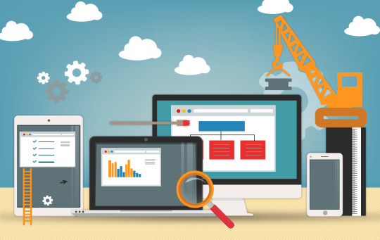
Benefits of a Good User Interface for Enterprise Application Development
3.7k apps are added to the Google Store EVERY DAY. Out of these, you would barely remember and download 10 new apps every few months.
The market for apps is becoming increasingly competitive and in order to develop an edge that will capture your audiences from day one, your mobile application needs features that will make your application usable and unique. In almost every aspect of app optimization, the one constant has always been top-notch UI/UX design and development.
In this post, we will be focusing on User Interface aka UI but will also be mentioning a bit of User Experience (UX). While both are different and often erroneously interchangeably used, their benefits and purpose does connect them.
User interface is the way your app looks, when a user has downloaded it and is exploring the way the app works. UI measures are put into place by designers to ensure that the right target market is able to easily engage with your business’s app and therefore your product.
The primary components that fall under User Interface include the graphics, and presentation of the app.
User Experience on the other hand is the way your user perceives or feels about your mobile application which would ultimately define how they feel about your product. It is UI that makes UX satisfactory. In order to do so however, startup software developers are required to be provided with a thorough understanding of your market and product.
Mobile development is evolving each day and it is steadily relying more and more on user interaction.
But what does a brilliant user interface really do for your business? For starters, it effectively communicates your brand image. People dont want to just know what you can do but also what your business is all about.
Check out some of the top advantages of employing fantastic User Interface in your app development journey.
Increases Responsiveness
A good user interface makes you say wow at first glance. A great user interface harbors a high standard of responsiveness.
This means that the app was designed to meet the anticipations of the user. For example, an app that takes forever to load or to switch from one section to another will annoy users to the point where they will stop using it or delete it altogether. Their reviews are going to reflect their experiences and you will have a harder time attracting more users.
On the opposite end of this spectrum is an app that loads fast and is super easy to use without the user wondering if their device might be glitching or if they need to up their internet bandwidth. Spoiler: they will always choose a competitor app over paying more for the internet.
Makes the User Experience Convenient
When creating an app business plan most entrepreneurs wonder about monetization strategies, often because they dont want potential users to be annoyed by the in-app ads. However you have to pick a way to make your app profitable and more often than not this is it.
To make sure that your users do not have to deal with too much inconveniences, is where a UI designer comes in.
A competent user interface is one that adds in functions and buttons that will allow a user to carry out an action with minimal effort. The design solves their problem before they can even bring it up.
Makes the App Navigable
Some of the best apps are the simple ones. We call them simple because they have an excellent degree of clarity of what the user should do next after they have landed on a page.
If a user downloads your app and gets confused immediately afterwards about what to do with your app, they are not going to think much of the app itself. You want users to be able to carry on with their customer journey with as much ease as possible.
One of the ways a UI/UX developer does this is by using familiar icons and graphics to communicate what you should do next. Putting everything in text takes longer and uses up a lot of your interface space. The same principle is applied for when a color scheme is picked out. For instance, using red to alert, and using green to encourage the go-ahead.
Better Return on Investment
Customer satisfaction means a higher ROI. When a user has had a good experience with your app it is likely that they will recommend the app to other people which keeps on multiplying your userbase. Other than their own network, users are prone to review apps on the app store so anyone who would be browsing for a product or service that your business specializes in will likely download it for its ratings.
A Good Looking App
Part of defeating the competition is standing out visually. An aesthetically pleasing app is always enjoyable to use and awes the user into exploring it further. If they have used it once chances are they will be prompted to use it again next time they are browsing apps on their phone.
To make sure your software consultant does this, it is very important that they have been given enough briefing about the app, and the industry it will be operating in. The UI/UX development team will then move on to put themselves in the shoes of your ideal customer before they move forward with building the app skin.
Is Insightful
Your users are evolving and you are here to stay as a business and an app. One of the things a great UI does is that it allows you to gauge what your ideal customer interacts with and what they do not interact with. Over time, you get an accurate picture of what people like and what problem of theirs no one is addressing. This helps you improve your UI game and customer satisfaction strategy. Now you know why Facebook keeps updating its design and interactive features all the time.
Visit Us for More Information:- https://www.convrtx.com/blog/benefits-of-a-good-user-interface/
0 notes
Text
Results-Proven Methods to Creating Great Web Design
For most, your website will be the first impression they have of your brand, and trust me when I say great web design goes a long way when making that first impression. It is what customers experience before they even have the chance to be sold on your product or service.
It is the face of your company and the portal most people will go through to conduct business or digest your content. So why wouldn’t you want to keep your face clean and professional?
Customers will only provide websites with a small amount of their time, so every second counts when trying to compel them to stay longer and lead them to a conversion. Not everybody knows how to create great web design, but I guarantee almost everybody knows what it looks and feels like.
Great web design is a tried and true way to increase your earning potential and ROI. You can have a very successful social media campaign and create compelling content, but a poorly designed website will only serve as a bottleneck for customers and your earnings.
Building trust and instilling value into the customer stems from having a great web design. It all comes down to incorporating a thought-through methodology when piecing your website together.
Here we will discuss results-proven methods to include in your great web design toolbox.
What is Great Web Design?
Great web design is effective. Simple as that.
It serves a purpose to build credibility by being intuitive, establishing trust with an aesthetically pleasing design, and converts visitors with effective calls to action.
Your website is your store and your salesperson when you can’t be. Keep it inviting, easily navigable, and conducive to conducting business.
Standards of great web design are always changing with our tastes and the development of more modern layouts. Stay on top of the trend, but always keep in mind the design standards we will discuss in this article.
Create a User Journey & Conversion Funnel
Perhaps the most overlooked aspect people forget when designing a website is the user journey. How do you expect people to navigate through your website, find the information they need, and end up as a conversion? Answer these questions to see if you are on the right track.
Does your website have intuitive menus that aren’t over designed?
Do you have calls to action readily present and labeled?
Does your website have a high bounce rate?
Do you have a conversion funnel?
Keeping in mind your buyer personas, when laying out your great web design, think of how visitors will travel through your website. A conversion funnel is simply the pre-designed path a visitor should take through your website to lead to a conversion.
This is the path they will take from the homepage, to the shop, to the product page, and ideally to the cart and checkout.
These paths need to be defined. Is there a clear contact link somewhere on your landing page? Can a user find reviews on your product or service somewhere on your website?
Most customers will browse your website before going straight to purchase so make sure they can easily find their way around. Make sure they aren’t spending that time playing a guessing game looking for information.
Where is your Call to Action?
The most important feature to a proper conversion funnel is simply the calls to action. Without calls to action you are missing the point of designing the website effectively.
Your website should very clearly convey what exactly your business does. Next, it should intuitively lead them to performing a desired call to action and become a conversion. After that, you have a customer in your sales funnel.
Make sure CTA’s are a focal point of your page and that the buttons look aesthetically clickable. A good rule of thumb to keep in mind when creating great web design, is how many clicks it takes for a customer to perform your desired CTA.
You know your buyer personas, and you know what they came to your site looking for. Your great web design should focus on directing the customer to a single call to action. It’s a lot easier to make a decision when you are not overwhelmed with clickable options.
Keep it Simple
Sometimes over-design can be the death of a website. This can be done with too many widgets, too much text, or by being too vague about what it is your company does. Not only that, but over-design can slow down your page loading speeds and lead to a higher bounce rate.
Instead, keep your writing and design straightforward, simple, and to the point, without sacrificing quality. Avoid using industry jargon that is too high-brow for the average customer. Think like you are writing for a magazine headline, or for a poster. Simple and concise while also being effective.
Minimalism is a design principle you should be taking to heart. Less is more. If the customer cannot navigate through your website or cannot tell what your business does, then the problem rests on your web design. Impressions are everything.
Look at Uber’s website in the image above. It is stripped down and to the point. You are presented with a concise blurb on what they do and are immediately presented with only 2 options to ‘sign up to drive’ or ‘sign up to ride’. The Call to Action buttons are very clearly labeled, and you have a quick understanding of what service they offer.
Now, take a look at Apple’s website pictured above. If there is anything that can be said about their web design, it is their great use of whitespace. And no, whitespace doesn’t have to be white. It can be any empty region that frames your text or pictures.
Don’t be afraid to use it. It gives your content breathing room and draws the eye towards what’s meaningful instead of feeling overcrowded. Otherwise, you will have information overload and your customer will not be able to navigate quickly.
When you walk into a store and there are a few items on their tables, it gives a feeling of quality vs. a store with tightly packed shelves. This is the same design philosophy behind the use of whitespace.
Don’t be afraid to cut down on writing either. People don’t want to be bombarded with walls of text when they land on your homepage. Opt for media that fits your aesthetic, or concise headlines and infographics. Nobody has ever turned away from a homepage because it was too beautiful and relevant.
See a common theme?
They lead with enticing photography and a focally centered call to action button that leads to their shop. There is minimal text, but you can quickly find their menu, cart, shop, and banner info. It is no question what line of business they are in either.
Opt for SEO optimized video, or a large hero image, or anything you think will compel the customer to continue.
Keep it Consistent
Again, exercise minimalism. Nothing is more distracting, and downright confusing, than the use of too many color schemes, fonts, and branding. If a website looks poorly designed, then trustworthiness to do business also suffers.
Try to adhere to a group of colors that fits your aesthetic and stick to them. Also use only a couple fonts across logos, headings, and body text. Use font sizes appropriately and don’t overuse bold, italics, underlining, or any combination of the sort.
When choosing colors you should keep contrast in mind. Pair simple colors with text and with a high contrast background to improve readability.
When choosing fonts, keep this tip in mind:
Because a large portion of your audience will be reading on a smaller screen, try to opt for sans serif text in your body text.
On smaller resolutions, it improves readability and will cause less eye strain for your readers.
Let’s use PayPal’s website as a case study.
How many fonts can you count on their website?
How many distinct colors does their UI use?
Where are the clickable links on their homepage?
These questions should be pretty easy to answer because PayPal, a large international company, has the resource to follow standard design cues to a T.
They limit their colors to neutral plus one contrast color, blue. They have minimal differences in font, size, and typography – and when they do, it is for good reason. You can also tell what’s a clickable link, what’s a menu, and what is supplementary text.
There are certain standards you should adhere to when placing certain items, and we’ll cover that in the next section.
Design Cues
From website to website, you will start getting an idea of what are universally accepted conventions for designing your website. Adhere to them and you will have the foundation for great web design.
These are by no means laws of web design but having an intuitive design people are accustomed to will make everything go more smoothly.
Sign Up and Login buttons are usually located in the top right of the web page.
The Cart is almost industry standard to appear somewhere in the top right of the page.
Your logo should be clickable. It has become expected that clicking the logo will return you to the homepage.
A Call to Action button should be high on the homepage, and ideally visible the second they land on the page. Make sure to make it obvious that it is clickable.
Buttons should look like buttons. Make sure that they are boxed in and look clickable. Using colors with contrasting text isn’t a bad idea either.
Logos are placed at the top of the page, typically in the top left or center of the header.
Search bars are usually placed somewhere in the header, but ideally your customer should never have to use it if your navigation is optimized.
Main navigation menus are usually found at the top of the header, but the left margin has been used before as well.
Leave secondary navigation such as breadcrumbs. (Home > Category > Sub-Category > Product)
If making a customer fill out a form, especially contact forms, limit the number of fields necessary.
Quality Photography
Research has shown that quality photography is one of the leading factors that have led customers to a purchase online. It is one of the leading drivers for customer engagement on websites, and it is easy to implement.
Be sure your photos are high-res and crisp but also load in a decent time. Don’t opt for large picture files either with unnecessarily high resolutions because they can contribute to high page loading speeds.
Intuitive Navigation & Scan-ability
You could argue that navigation is the most crucial feature to great web design, but again it is simply one among many.
According to Nielsen in a research study on how people read websites, 79% of people scan their web pages while only 16% read it word by word. Because scanning has become the dominant way people read online, you’re going have to design your website accordingly.
A good measure of scan-ability is to see how long it takes someone who doesn’t know about your business to figure out what it is you sell or do. Another test is to see how long it takes them to perform a CTA. These are important metrics to take into consideration when designing the pipeline for your website.
Thankfully, most people read in a very predictable pattern, so designing your content hierarchy around it wouldn’t be a terrible idea. People tend to guide their eyes towards headlines, images, infographics, and bulleted items for navigation.
From there, people tend to read in an F shaped pattern, starting at the top right and moving across to the right before down (as in the graphic above).
To keep people on the page and keep them reading, make your content engaging. Include captivating pictures, intuitive infographics, astounding statistics, or one sentence pitches to snag your readers’ attention.
Also keep in mind that scrolling is going to be your friend when designing a website. Mobile users have surpassed desktop users which makes scrolling the dominant form of interaction with a site.
Social media has adopted the layout for good reason. With modern internet speeds, scrolling is the quickest way to access information and much more favored than clicking open new pages. It segments information into bite sized amounts which can play in your favor when designing your website.
No great web design has users scrolling left to right, so yours shouldn’t either. Scrolling up and down, clicking internal links, and as a last resort, using the search function should be the only forms of navigation.
Think about designing your site in horizontal strips, with each new ‘page’ in descending order of importance. Your reader will most likely look at the most eye-catching aspect, read left to right, and then scroll down.
Your great web design should be prioritizing the most crucial information and calls to action above the fold. No longer does above the fold just refer to newspapers. Keep it eye catching and enticing above the fold if you want the customer to ‘buy’ and open up the rest of your newspaper.
Base your reading hierarchy off of predictable patterns.
We generate $3,000 in conversion value and generate an ROAS of 82.62 in just the first week of implementation.
Responsiveness
Did you know, according to KISSmetrics, on average if a landing page takes over 3 seconds to load, then a whopping 40% of users will abandon the site?
Did you also know that, according to Google, the average time for a mobile page to fully load is an absurd 22 seconds?
Just because other sites aren’t paying attention to their lost potential, doesn’t mean you shouldn’t. Having a responsive website is an absolute must and is the first step to great web design.
Otherwise you will suffer from a low conversion rate non-indicative of your visitor count. Your bounce rate and time on site will also negatively correlate with your page loading times.
It is crucial to test your landing page loading times before you go live and open for business. It’s an easy fix for such a large potential loss. Be mindful that excessive widgets, exceedingly high-resolution images, and a lot of moving parts will contribute to slow loading speeds.
Accessibility
You want to ensure that the users viewing your site on mobile receive good first impressions. A responsive and easily navigable site that adapts to the device is the best way to accomplish this.
Almost half of all traffic is on a mobile device. The technology in our phones is catching up to computers, and trends show that more and more people are browsing on their phones. Mobile optimization should be standard for your website, and even Google is recognizing this by redesigning SEO to favor mobile-optimized websites first.
Keep in mind these design tips when choosing a theme or designing your own website.
Phones, Tablets, and Desktops all have different resolutions and aspect ratios, so design your website with adaptiveness in mind.
Scrolling is an integral part of website navigation, so make sure it is primary method on mobile and opt for a single column layout.
Touch screen navigation can be difficult if buttons are made too small for the user.
Don’t use Flash because it is not used on all phones and is bad for SEO indexing. HTML5 can be used for effects instead.
Be concise and effective with search titles, URLs, and meta descriptions. You won’t have as much room on devices with lower screen sizes.
Avoid too many pop-ups if at all. They are harder to deal with on mobile and could lead to a higher bounce rate.
Limit the need for typing on your website.
Google’s SERP is moving to mobile-first and so should your design philosophy. It tends to lean towards cleaner and more straightforward design when keeping mobile viewing in mind.
Also, don’t limit ‘mobile-first’ to be a stripped-down version of your original design. Remember that mobile users have the ability to make calls, use their GPS, and take pictures and video as well.
So many more features can be integrated into a mobile site beyond great web design. Depending on your business, mobile use may be the primary way people interact with your business.
We managed to get 51 Leads at $5.80 per lead using Conversion Ads
Search Engine Optimization (SEO)
A hallmark of great web design is how well it ranks in search engines. It gives a backdoor glimpse at the structure of the website and is indicative of how much organic traffic you will receive.
Great web design with great SEO comes down to exercising good habits when formatting your website. This can come down to making sure your website isn’t slow, having a sitemap crawl-able by a search engine, HTML title tags, keyword optimization, and much more.
Templates vs Custom
Using a template vs a custom website is an age-old argument. Both have their pro-cons, but ultimately it is up to the business owner to decide what their priorities are and what is most important.
Take a look at each and make the decision yourself.
A template website usually lends itself to a faster development time, because everything is already laid out for you. It is a lower cost, lower barrier to knowledge method to get a good-looking website up and running.
The downside is that it may have redundant features that you do not need. It may not be supported across all platforms and may not be continuously updated. What you see is what you get, and others may have the same template as you.
If you opt for the non-custom option, some keen customers can tell a certain template brand was used.
With a custom website, every feature will be tailored to your specific needs and your website will be one of a kind. There will be a higher cost upfront, but with a knowledgeable web developer, you will have constant development and updates.
The site will also be guaranteed compatible across all platforms and will grow with your business needs. The development time will be longer, but again it is up to you to decide if a tailored design is a priority. In the long run, custom sites are usually worth the opportunity cost.
Your Website Can Take You to the Next Level
A website, let alone one with great web design, is a must for a business. Your Amazon, Etsy, and eBay pages do not serve the same purpose as a website. It is your business platform, so you better have a well-designed storefront. Crafting a great web design can be challenging.
Follow these best practices, and your website will on its first steps to greatness. Your bounce rate and conversion rates will surely follow.
Remember, its all about keeping it simple yet effective. Don’t forget the calls to action, and don’t put any distractions between them and your customers.
Also, do not fall into the trap on continuously updating the core design of your website because it will feel like subtle rebranding to your loyal customers. Be confident in your great web design and know when it is a finished product.
When you are confident that your great web design is no longer your weakest link, then you can feel more comfortable investing into other growth services. Your marketing budget will no longer feel bottle-necked by poor design.
If you want your website to grow your business, you are going to have to invest in it. Connect with the expert website developers in Denver, CO if you need help implementing your design or would like to know how to grow your business online.
0 notes
Text
Results-Proven Methods to Creating Great Web Design
For most, your website will be the first impression they have of your brand, and trust me when I say great web design goes a long way when making that first impression. It is what customers experience before they even have the chance to be sold on your product or service.
It is the face of your company and the portal most people will go through to conduct business or digest your content. So why wouldn’t you want to keep your face clean and professional?
Customers will only provide websites with a small amount of their time, so every second counts when trying to compel them to stay longer and lead them to a conversion. Not everybody knows how to create great web design, but I guarantee almost everybody knows what it looks and feels like.
Great web design is a tried and true way to increase your earning potential and ROI. You can have a very successful social media campaign and create compelling content, but a poorly designed website will only serve as a bottleneck for customers and your earnings.
Building trust and instilling value into the customer stems from having a great web design. It all comes down to incorporating a thought-through methodology when piecing your website together.
Here we will discuss results-proven methods to include in your great web design toolbox.
What is Great Web Design?
Great web design is effective. Simple as that.
It serves a purpose to build credibility by being intuitive, establishing trust with an aesthetically pleasing design, and converts visitors with effective calls to action.
Your website is your store and your salesperson when you can’t be. Keep it inviting, easily navigable, and conducive to conducting business.
Standards of great web design are always changing with our tastes and the development of more modern layouts. Stay on top of the trend, but always keep in mind the design standards we will discuss in this article.
Create a User Journey & Conversion Funnel
Perhaps the most overlooked aspect people forget when designing a website is the user journey. How do you expect people to navigate through your website, find the information they need, and end up as a conversion? Answer these questions to see if you are on the right track.
Does your website have intuitive menus that aren’t over designed?
Do you have calls to action readily present and labeled?
Does your website have a high bounce rate?
Do you have a conversion funnel?
Keeping in mind your buyer personas, when laying out your great web design, think of how visitors will travel through your website. A conversion funnel is simply the pre-designed path a visitor should take through your website to lead to a conversion.
This is the path they will take from the homepage, to the shop, to the product page, and ideally to the cart and checkout.
These paths need to be defined. Is there a clear contact link somewhere on your landing page? Can a user find reviews on your product or service somewhere on your website?
Most customers will browse your website before going straight to purchase so make sure they can easily find their way around. Make sure they aren’t spending that time playing a guessing game looking for information.
Where is your Call to Action?
The most important feature to a proper conversion funnel is simply the calls to action. Without calls to action you are missing the point of designing the website effectively.
These looks like ‘Subscribe’ , ‘Contact Us Today’, or ‘Shop Now’ buttons.
Your website should very clearly convey what exactly your business does. Next, it should intuitively lead them to performing a desired call to action and become a conversion. After that, you have a customer in your sales funnel.
Make sure CTA’s are a focal point of your page and that the buttons look aesthetically clickable. A good rule of thumb to keep in mind when creating great web design, is how many clicks it takes for a customer to perform your desired CTA.
You know your buyer personas, and you know what they came to your site looking for. Your great web design should focus on directing the customer to a single call to action. It’s a lot easier to make a decision when you are not overwhelmed with clickable options.
Keep it Simple
Sometimes over-design can be the death of a website. This can be done with too many widgets, too much text, or by being too vague about what it is your company does. Not only that, but over-design can slow down your page loading speeds and lead to a higher bounce rate.
Instead, keep your writing and design straightforward, simple, and to the point, without sacrificing quality. Avoid using industry jargon that is too high-brow for the average customer. Think like you are writing for a magazine headline, or for a poster. Simple and concise while also being effective.
Minimalism is a design principle you should be taking to heart. Less is more. If the customer cannot navigate through your website or cannot tell what your business does, then the problem rests on your web design. Impressions are everything.
Look at Uber’s website in the image above. It is stripped down and to the point. You are presented with a concise blurb on what they do and are immediately presented with only 2 options to ‘sign up to drive’ or ‘sign up to ride’. The Call to Action buttons are very clearly labeled, and you have a quick understanding of what service they offer.
Now, take a look at Apple’s website pictured above. If there is anything that can be said about their web design, it is their great use of whitespace. And no, whitespace doesn’t have to be white. It can be any empty region that frames your text or pictures.
Don’t be afraid to use it. It gives your content breathing room and draws the eye towards what’s meaningful instead of feeling overcrowded. Otherwise, you will have information overload and your customer will not be able to navigate quickly.
When you walk into a store and there are a few items on their tables, it gives a feeling of quality vs. a store with tightly packed shelves. This is the same design philosophy behind the use of whitespace.
Don’t be afraid to cut down on writing either. People don’t want to be bombarded with walls of text when they land on your homepage. Opt for media that fits your aesthetic, or concise headlines and infographics. Nobody has ever turned away from a homepage because it was too beautiful and relevant.
Take a look at this high-end audio equipment company, JDS Labs.
See a common theme?
They lead with enticing photography and a focally centered call to action button that leads to their shop. There is minimal text, but you can quickly find their menu, cart, shop, and banner info. It is no question what line of business they are in either.
Opt for SEO optimized video, or a large hero image, or anything you think will compel the customer to continue.
Keep it Consistent
Again, exercise minimalism. Nothing is more distracting, and downright confusing, than the use of too many color schemes, fonts, and branding. If a website looks poorly designed, then trustworthiness to do business also suffers.
Try to adhere to a group of colors that fits your aesthetic and stick to them. Also use only a couple fonts across logos, headings, and body text. Use font sizes appropriately and don’t overuse bold, italics, underlining, or any combination of the sort.
When choosing colors you should keep contrast in mind. Pair simple colors with text and with a high contrast background to improve readability.
When choosing fonts, keep this tip in mind:
Because a large portion of your audience will be reading on a smaller screen, try to opt for sans serif text in your body text.
On smaller resolutions, it improves readability and will cause less eye strain for your readers.
Let’s use PayPal’s website as a case study.
How many fonts can you count on their website?
How many distinct colors does their UI use?
Where are the clickable links on their homepage?
These questions should be pretty easy to answer because PayPal, a large international company, has the resource to follow standard design cues to a T.
They limit their colors to neutral plus one contrast color, blue. They have minimal differences in font, size, and typography – and when they do, it is for good reason. You can also tell what’s a clickable link, what’s a menu, and what is supplementary text.
There are certain standards you should adhere to when placing certain items, and we’ll cover that in the next section.
Design Cues
From website to website, you will start getting an idea of what are universally accepted conventions for designing your website. Adhere to them and you will have the foundation for great web design.
These are by no means laws of web design but having an intuitive design people are accustomed to will make everything go more smoothly.
Sign Up and Login buttons are usually located in the top right of the web page.
The Cart is almost industry standard to appear somewhere in the top right of the page.
Your logo should be clickable. It has become expected that clicking the logo will return you to the homepage.
A Call to Action button should be high on the homepage, and ideally visible the second they land on the page. Make sure to make it obvious that it is clickable.
Buttons should look like buttons. Make sure that they are boxed in and look clickable. Using colors with contrasting text isn’t a bad idea either.
Logos are placed at the top of the page, typically in the top left or center of the header.
Search bars are usually placed somewhere in the header, but ideally your customer should never have to use it if your navigation is optimized.
Main navigation menus are usually found at the top of the header, but the left margin has been used before as well.
Leave secondary navigation such as breadcrumbs. (Home > Category > Sub-Category > Product)
If making a customer fill out a form, especially contact forms, limit the number of fields necessary.
Quality Photography
Research has shown that quality photography is one of the leading factors that have led customers to a purchase online. It is one of the leading drivers for customer engagement on websites, and it is easy to implement.
On our LYFE Marketing website, we use candid photos of our staff. We believe it makes a more personable impression to get to who you would be working with if you use our services. You also won’t find the same photo anywhere else on the internet!
Be sure your photos are high-res and crisp but also load in a decent time. Don’t opt for large picture files either with unnecessarily high resolutions because they can contribute to high page loading speeds.
Intuitive Navigation & Scan-ability
You could argue that navigation is the most crucial feature to great web design, but again it is simply one among many.
According to Nielsen in a research study on how people read websites, 79% of people scan their web pages while only 16% read it word by word. Because scanning has become the dominant way people read online, you’re going have to design your website accordingly.
A good measure of scan-ability is to see how long it takes someone who doesn’t know about your business to figure out what it is you sell or do. Another test is to see how long it takes them to perform a CTA. These are important metrics to take into consideration when designing the pipeline for your website.
Thankfully, most people read in a very predictable pattern, so designing your content hierarchy around it wouldn’t be a terrible idea. People tend to guide their eyes towards headlines, images, infographics, and bulleted items for navigation.
From there, people tend to read in an F shaped pattern, starting at the top right and moving across to the right before down (as in the graphic above).
To keep people on the page and keep them reading, make your content engaging. Include captivating pictures, intuitive infographics, astounding statistics, or one sentence pitches to snag your readers’ attention.
Also keep in mind that scrolling is going to be your friend when designing a website. Mobile users have surpassed desktop users which makes scrolling the dominant form of interaction with a site.
Social media has adopted the layout for good reason. With modern internet speeds, scrolling is the quickest way to access information and much more favored than clicking open new pages. It segments information into bite sized amounts which can play in your favor when designing your website.
No great web design has users scrolling left to right, so yours shouldn’t either. Scrolling up and down, clicking internal links, and as a last resort, using the search function should be the only forms of navigation.
Think about designing your site in horizontal strips, with each new ‘page’ in descending order of importance. Your reader will most likely look at the most eye-catching aspect, read left to right, and then scroll down.
Your great web design should be prioritizing the most crucial information and calls to action above the fold. No longer does above the fold just refer to newspapers. Keep it eye catching and enticing above the fold if you want the customer to ‘buy’ and open up the rest of your newspaper.
Base your reading hierarchy off of predictable patterns.
Responsiveness
Did you know, according to KISSmetrics, on average if a landing page takes over 3 seconds to load, then a whopping 40% of users will abandon the site?
Did you also know that, according to Google, the average time for a mobile page to fully load is an absurd 22 seconds?
Just because other sites aren’t paying attention to their lost potential, doesn’t mean you shouldn’t. Having a responsive website is an absolute must and is the first step to great web design.
Otherwise you will suffer from a low conversion rate non-indicative of your visitor count. Your bounce rate and time on site will also negatively correlate with your page loading times.
It is crucial to test your landing page loading times before you go live and open for business. It’s an easy fix for such a large potential loss. Be mindful that excessive widgets, exceedingly high-resolution images, and a lot of moving parts will contribute to slow loading speeds.
Accessibility
You want to ensure that the users viewing your site on mobile receive good first impressions. A responsive and easily navigable site that adapts to the device is the best way to accomplish this.
Almost half of all traffic is on a mobile device. The technology in our phones is catching up to computers, and trends show that more and more people are browsing on their phones. Mobile optimization should be standard for your website, and even Google is recognizing this by redesigning SEO to favor mobile-optimized websites first.
Keep in mind these design tips when choosing a theme or designing your own website.
Phones, Tablets, and Desktops all have different resolutions and aspect ratios, so design your website with adaptiveness in mind.
Scrolling is an integral part of website navigation, so make sure it is primary method on mobile and opt for a single column layout.
Touch screen navigation can be difficult if buttons are made too small for the user.
Don’t use Flash because it is not used on all phones and is bad for SEO indexing. HTML5 can be used for effects instead.
Be concise and effective with search titles, URLs, and meta descriptions. You won’t have as much room on devices with lower screen sizes.
Avoid too many pop-ups if at all. They are harder to deal with on mobile and could lead to a higher bounce rate.
Limit the need for typing on your website.
Google’s SERP is moving to mobile-first and so should your design philosophy. It tends to lean towards cleaner and more straightforward design when keeping mobile viewing in mind.
Also, don’t limit ‘mobile-first’ to be a stripped-down version of your original design. Remember that mobile users have the ability to make calls, use their GPS, and take pictures and video as well.
So many more features can be integrated into a mobile site beyond great web design. Depending on your business, mobile use may be the primary way people interact with your business.
Search Engine Optimization (SEO)
A hallmark of great web design is how well it ranks in search engines. It gives a backdoor glimpse at the structure of the website and is indicative of how much organic traffic you will receive.
Great web design with great SEO comes down to exercising good habits when formatting your website. This can come down to making sure your website isn’t slow, having a sitemap crawl-able by a search engine, HTML title tags, keyword optimization, and much more.
SEO in itself can never be fully covered in one article. If if you like to read more about the topic, we have a library of articles you can read here. If you know that SEO is what your website needs, then feel free to contact us at LYFE Marketing. We also offer a suite of SEO services to ensure high traffic, better search engine ranks, and we provide measurable results.
Templates vs Custom
Using a template vs a custom website is an age-old argument. Both have their pro-cons, but ultimately it is up to the business owner to decide what their priorities are and what is most important.
Take a look at each and make the decision yourself.
A template website usually lends itself to a faster development time, because everything is already laid out for you. It is a lower cost, lower barrier to knowledge method to get a good-looking website up and running.
The downside is that it may have redundant features that you do not need. It may not be supported across all platforms and may not be continuously updated. What you see is what you get, and others may have the same template as you.
If you opt for the non-custom option, some keen customers can tell a certain template brand was used.
With a custom website, every feature will be tailored to your specific needs and your website will be one of a kind. There will be a higher cost upfront, but with a knowledgeable web developer, you will have constant development and updates.
The site will also be guaranteed compatible across all platforms and will grow with your business needs. The development time will be longer, but again it is up to you to decide if a tailored design is a priority. In the long run, custom sites are usually worth the opportunity cost.
If you think the leap towards a fully customized website with your own design inputs is what you want, then contact LYFE Marketing. We have the talent to make your design come to life, and the expertise to optimize it for search engines and device compatibility.
Your Website Can Take You to the Next Level
A website, let alone one with great web design, is a must for a business. Your Amazon, Etsy, and eBay pages do not serve the same purpose as a website. It is your business platform, so you better have a well-designed storefront. Crafting a great web design can be challenging.
Follow these best practices, and your website will on its first steps to greatness. Your bounce rate and conversion rates will surely follow.
Remember, its all about keeping it simple yet effective. Don’t forget the calls to action, and don’t put any distractions between them and your customers.
Also, do not fall into the trap on continuously updating the core design of your website because it will feel like subtle rebranding to your loyal customers. Be confident in your great web design and know when it is a finished product.
When you are confident that your great web design is no longer your weakest link, then you can feel more comfortable investing into other growth services. Your marketing budget will no longer feel bottle-necked by poor design.
If you want your website to grow your business, you are going to have to invest in it. Reach out to us if you need help implementing your design or would like to know how to grow your business online. If you don’t know where to start, we offer free consultations as well.
The post Results-Proven Methods to Creating Great Web Design appeared first on Digital Marketing Blog.
from Digital Marketing Blog https://ift.tt/338nBXy
via IFTTT
0 notes
Text
10 landing page optimization tips for SaaS to generate more leads
Learn the best practices for landing page optimization to help generate quality leads for SaaS
Landing pages are the heart of any inbound marketing campaign, mainly because they have the unique ability to convert complete strangers into qualified leads. Surprisingly, 44% of B2B companies direct visitors to their website's homepage rather than to a specific landing page.
Download Premium Resource – Landing Page Conversion Guide
Learn best practice for higher-converting B2C and B2B Landing pages.
Access the Landing Page Conversion Guide
Perhaps this can explain why according to the latest State of Inbound 2017 report, the majority of marketers still struggle with generating new leads for their businesses.
Building a well-designed and optimized landing page is one viable way to help your SaaS business overcome this marketing challenge.
What is a landing page?
A landing page is a specially designed page where you direct your visitors to collect their information in exchange for an offer like an ebook, free trial, online course, or even ROI calculators. It is one of the pillar components of inbound marketing because this is where you can generate new leads for your business.
Landing page optimization tips
No matter how beautiful your landing page may be, if it is not optimized correctly, you will not fully benefit from its lead generation capability for your SaaS business.
Here are ten simple landing age optimization tips you can do on your site's landing pages to increase your lead generation ratio.
If you want more tips and examples of perfect landing pages, check out Dave Chaffey's perfect landing page examples.
1. Understand your customer
Inbound marketing focuses on your customer. So it follows that you need to make sure that the layout design, content, and offer on your landing page is something that your customer will find educational, engaging, and helpful. Some ways that you can do this include:
Developing a clear buyer persona.
Using surveys and feedback forms.
Studying your competitors' landing pages.
2. Have a compelling headline
According to Kissmetrics, you only have 8 seconds to make a lasting impression, and convince a visitor to enter their information in your lead capture form.
Some ways to craft your headline so that it catches your visitor's attention in time:
Answer the question, “What will visitors who convert receive?”
Highlight the most significant benefit your visitor will get.
Perform the Blink Test on your heading
3. KISS your copy
KISS stands for "Keep It Short and Simple." Make sure your visitors can skim and scan the copy of your landing page. Some ways to do that are:
Highlight key takeaways with bullet points.
Add white space.
Use short, simple words.
GrapeVine Logic's landing page offering a whitepaper is an excellent example of this:
4. Make your landing page SEO-friendly
While Google and other search engines are now giving more preference to quality, SEO still plays a huge role regarding page ranking. If you want your target audience to find your landing page, you need to apply some SEO best practices:
Research long-tail keywords to use for your landing page.
Make sure to include your keyword in your landing page’s title, headers, URL path, and content.
Include alt tags for your images.
Google and search engines love pages that are shared a lot, so don't forget to add social share buttons.
5. Stay ‘above-the-fold’
Above-the-fold is a term first used back in the day to refer to content found on the top half of newspapers. Today, this term is used to refer to content that is located above the bottom of your browser window as soon as the page loads.
People do not scroll down a page unless you give them a good reason. That is why it is essential to put all of the valuable information above the fold, specifically:
Landing page copy
Lead capture form
Call-to-Action button
Invest Feed does a great job in keeping all the essential details of the landing page above the fold as we can see below:
6. Ask the right questions in your lead capture form
Keep in mind that your visitors are very protective when it comes to giving out their personal information, especially if they are first-time visitors. You can ease the apprehension by:
Evaluate the value of your offer. The more valuable it is, the more information you can ask.
Ask your sales team to find out what information they need to guide your leads through the funnel.
Avoid asking for sensitive information.
Include a link to your privacy policy to put them at ease.
7. Create a compelling offer
Your lead capture form may be the most critical part of your landing page when it comes to generating new leads. However, if you are not offering something that will catch your audience's attention, it will not do you any good.
Before you create the offer for your landing page, ask the following questions:
What problem do you want to solve?
What stage of the buyer’s journey is this for?
How will this benefit my target audience?
What format should be used for the offer? (e.g., Ebook, webinar, audio recording, email course)
8. Tapping into the Power of One
An optimized landing page is laser focused. It contains only one offer, one headline, one solid message, and one call-to-action. Giving your visitors options will just distract and confuse your visitors, and there's a very good chance that your visitor will end up not choosing either one.
9. Test your landing page
Believe it or not, 61% of companies run less than five tests on their websites each month
Even though you are using a landing page layout and design that worked well for you in the past, that does not mean that you will get the same results the second time around. The fact is that there is no "one-size-fits-all" when it comes to inbound marketing because buying behaviours change.
Running an A/B test (otherwise known as a Split Test) on your landing page is, by far, the best way help you optimize your landing page so that it generates the highest number of leads possible. Among the things you need to test are:
Layout design
Landing page color scheme
Headline
Lead capture form
Size, color, and text of your CTA button
When doing a Split Test, make sure that you only change one variable each time you run the test. Doing this will help you come up with a landing page design that’s eye-catching, aesthetically-pleasing, and above all, converting.
10. Don’t forget the ‘Thank You’ Page
As its name suggests, a ‘Thank You’ page is where you thank your new leads for giving you their information. At the same time, it gives them the next steps to get the offer that you promised.
Some things to remember when creating your ‘Thank You’ page:
Provide specific details how your new leads can get the offer you promised.
Add social sharing links and buttons.
Invite your new leads to follow you in social media by adding social follow links.
Landing page optimization is just one of the many lead generation strategies you can use for your SaaS business. Apply any one or all of these tips will help you get more qualified leads that you can now hand over to your sales team to slowly convert into customers.
Thanks to Kevin Payne for sharing their advice and opinion in this post. Kevin is an inbound marketing consultant, that has helped multiple Saas startups increase their online sales through the use of inbound marketing, growth hacking, and social selling. When he's not advising startups he often writes about the many lessons he has learned from the trenches.
from Blog – Smart Insights http://www.smartinsights.com/conversion-optimisation/landing-page-optimisation/10-landing-page-optimization-tips-saas-generate-leads/
0 notes
Last Seen Blogs

thevisualvamp
The Visual Vamp

tempotravellerinhaiwar
TEMPO TRAVELLER IN HARIDWAR

superelphie
borrow the moonlight;

lionsongfr
Clan of The Lionfish

rigorsmorgue
Rigor's Morgue