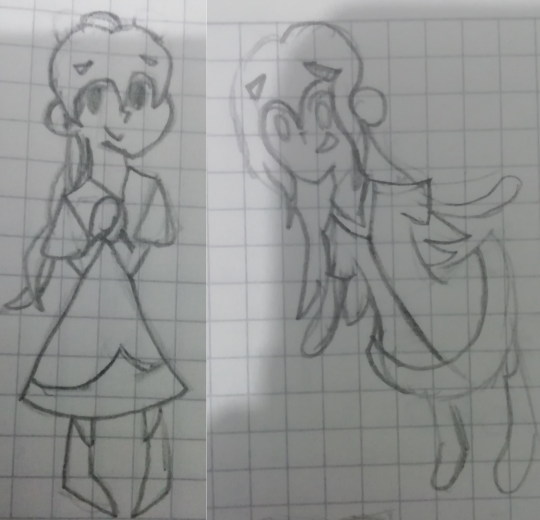
#the hat is very impressionist
Text
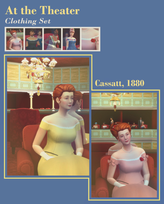
At the Theater
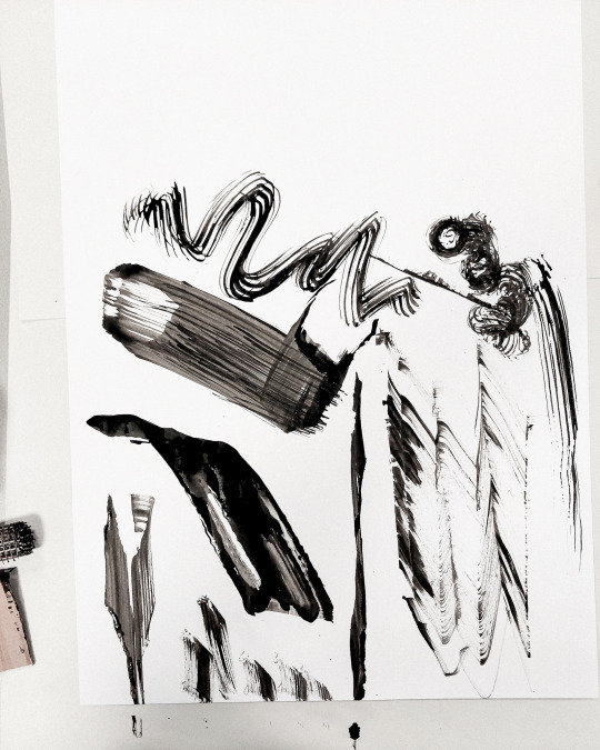
It's me again ! I won't rest easy until I'm done filling the gaps in my 1880s wardrobe and evening wear sure was a big one. So here, come and look at these 1870's / 1880's evening bodices, 4 of them ! You're welcome, just don't use them for gardening or the historical fashion police will be on your back ❤️
More pics and download below
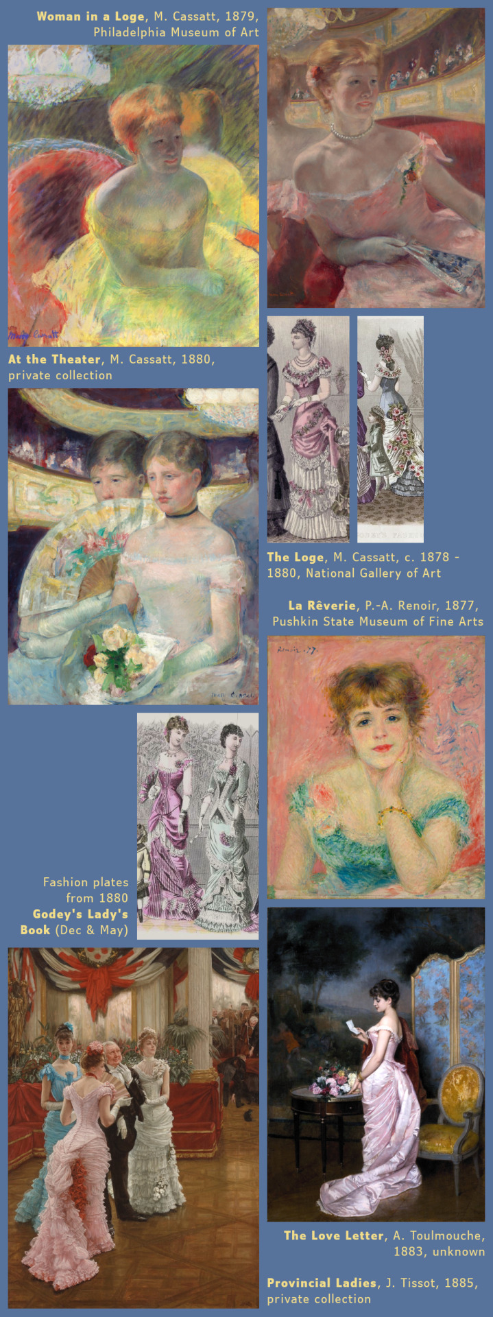
This set was inspired by 2 of Mary Cassatt's paintings : as referenced in the title, At the Theater, 1880 and Woman in a Loge, 1879.
——————— Plain and Bow Bodices ———————

———————————————————————————
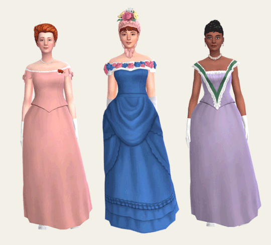
These 2 bodice are the ones that are most inspired by Mary Cassatt's paintings, but it's also a style I've seen a bunch in other impressionist paintings of the time. It's a simple sleek bodice with off the shoulder sleeves and a low rounded collar as was fashionable in the late 1870s and early 1880s.
It is specially made to be worn over my bustle skirts. An overlay is included to change the bow's color.
74 swatches for the bodices : 22 solids, 10 floral, 6 plaid, 25 striped & 11 polka dot patterns
22 solid swatches for the bow overlay
the bow overlay is in the right wrist section
Disclaimer :
1 -be aware there will be some distorsion in the armpit area, I did my best but armpit weights are tricky.
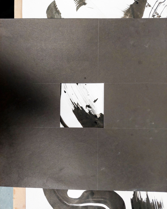
2 - the patterned swatches will not be seamless in that same armpit region as you can see below it's quite cluncky :
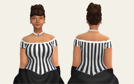
————————— Rococo Bodice —————————

———————————————————————————
This bodice, like the name implies, is inspired by Rococo fashion. The Rococo style dates back to the 18th century and it had a bit of a revival during the victorian era which impacted the fashion as much as the interior decor among other things. This influence, here, results in a squarish neck line and a triangle piece reminiscent of 18th century stomachers.
Like the the plain and bow bodices it has been specially made to be worn over my bustle skirts. An overlay is included to change the trim's color.
74 swatches for the bodice : 22 solids, 10 florals, 6 plaids, 25 stripes & 11 polka dots patterns
22 solid swatches for the Rococo trim overlay
the Rococo trim overlay is in the right wrist section
————————— Flower Bodice —————————

———————————————————————————
This bodice was mostly inspired by some fashion plates from 1880.
Contrary to the 3 others, I made it so it sits under the skirt, so it'll work with other bottoms than my bustle skirt too should you want to.
74 swatches for the bodice : 22 solids, 10 florals, 6 plaids, 25 stripes & 11 polka dots patterns
62 swatches with various color combinations for the flower overlay
the flower overlay is in the right wrist section
—————————— Boutonnière —————————

———————————————————————————
In addition to the flower accessories from my previous set, here is a boutonnière that sits lower on the chest to work with lower neck lines. Contrary to my previous boutonnière, this one is also compatible with necklaces. Like my other flower accessories, this is a pretty timeless accessory as evidence by the picture below.
Once again this is an edit of @the-melancholy-maiden's Hair Flowers Through the Ages Part 2 thanks to her very open TOU.

not compatible with hats
in the nose piercing section (so that it's compatible with necklace)
51 swatches : the-melancholy-maiden's original 29 colors and my 22 colors
available for female frames
———————————————————————————
Download : dropbox — simfileshare
———————————————————————————
And as a little bonus some of my reference main reference pictures :
#my cc#ts4cc#ts4 historical#ts4 clothes#ts4 accessories#sims 4 historical#sims 4 clothes#sims 4 accessories#maxis match#decade challenge#1880#clothes#timeless#accessories#teen#grown up#1880s Impressionism Sets
230 notes
·
View notes
Text
Karamatsu is not narcissus (analisis of character part 2)
Assuming that Karamatsu's behavior is not entirely a game, then we can assume that he really does have a personality disorder, namely...
Histrionic personality disorder.
This is where the interesting part comes in and why Karamatsu is considered a narcissist when in truth he is not.
The fact is that HRD has similar features to NRD, but has a number of significant differences. The term “narcissist” is much better known than “hysteric”, hence the confusion.
As in the case of NPD, a person’s main need is to always be the center of attention, the personality is also self-centered, however, for a hysteric, receiving attention from others is an end in itself. The narcissist, on the contrary, attracts attention to himself in order to demonstrate his superiority.
The next obvious difference is the absence of problems with empathy. Narcissists can show it, but only externally; internally they are not capable of compassion.
So, who are the hysterics? These are very extravagant, bright personalities who strive to attract attention to themselves in every available way. Moreover, attention can be different from love and admiration to anger and disgust; they will be happy with anything as long as they are noticed. When they are not noticed or ignored it causes discomfort.
Features of behavior. In speech and behavior they are similar to theater actors, they are prone to vivid displays of emotions, their speech is dramatic and, as a rule, figurative, impressionistic, grandiose, but at the same time not specific and contentless. The intonation of the voice is also dramatic, the voice can be comically cartoonish, childish or seductive.
His outrageous behavior most of the time irritates Ichimatsu in particular, while the others try to ignore him. In fact, Ichi reacts more than others to his ridiculous phrases and antics, despite the fact that he expresses this through anger and irritation, but this is still the attention that Karamatsu desperately needs.
Also, the main way to stand out from the crowd is appearance. They choose bright, extravagant, revealing outfits that often border on absurdity. Let's remember his T-shirts with his own face, shiny pants and boots, short shorts and cowboy hats, sunglasses that he wears even at night.
For narcissists, being ridiculous, funny and stupid in the eyes of others is humiliating and like death.
Causes of HRD. Lack or complete absence of attention in childhood and adolescence.
Karamatsu is from a large family in which he could not get enough love and attention from his parents, in high school he was a lonely, quiet child whom no one noticed, he had no friends, which also left a mark on his mind and brought him to creating your dramatic self.
If we briefly compare these two personality types, narcissists are vain, arrogant people who consider themselves to be among the elite, hysterics are clowns who are not ashamed of being clowns.
I'm more inclined to think that he's just pretending. With my analysis I wanted to prove that even pretending Karamatsu does not behave like a real narcissist.
#osomatsu san headcanons#mr osomatsu#karamatsu matsuno#karamatsu#analisis#osomatsu san analysis#osomatsu san#ososan#mr. osomatsu
39 notes
·
View notes
Text
re. that culturaltutor thread on minimalism and beauty
(moving my commentary to a separate post to spare the Tumblr user who reposted the thread, who’s a totally normal antiracist/anti-white-supremacy SFF person -- you can find the Twitter thread in question reposted on their blog but I don’t fault them at all for not spotting this)
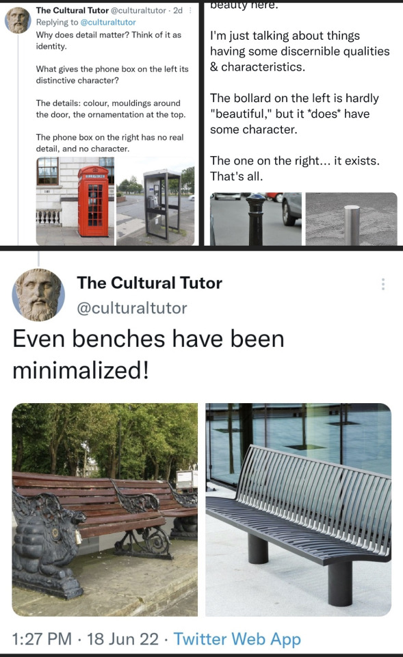
This guy is fully being weird about it in a way I unfortunately am not surprised by from a dude with an all-white Classical statue twitter av and the handle “The Cultural Tutor”. I’m very much a maximalist and my idea of a calm space is one that feels cozy and personal rather than one that feels sleek and tranquil, but each of these instances of “character” in design is the product of decades or centuries of advancements in design thought, materials, architectural method, and urban planning. I can point to a dozen instances of thoughtful, sensitive architectural detailing in 21st century architecture in my own city -- bike racks with individual emblems symbolizing historic neighborhoods, sidewalk repairs imprinted with brief poems on each newly-poured slab, elaborate bike bridge fences celebrating local Native cultures and artists, a wall of green plant life in the middle of a skyscraper -- and those are all the product of conscious choices that say something. They, in fact, make you feel something, despite being decidedly minimalist by this dude’s standards and emphatically modern. They would not have been seen in my city in the 1880s or the 1920s and I’m fine with that. There is sensitive, meaningful detail and grace in modern design, and it is safe to say this person is not looking for it.
Piling every example of any disparate preceding period’s artistic and design output (or any of the ones that catch the OP’s eye, wherein you might start to notice some patterns: a 13th century English cathedral, a gold-painted “Victorian” doorbell of who knows what provenance, an English civil architect and engineer’s fancy bench circa the 1870s, an iron telephone kiosk designed by hey another English architect circa the 1920s...) is absurd as grouping all the causes for what we’re perceiving as unpleasant sterility (capitalism, hostile design, passing stylistic fads, changing perceptions of what looks “prestigious” and “expensive”, the most recent several decades in aesthetic thought, lazy landlords giving my entire 1910s-era apartment a shitty paintjob because who needs charming wood detailing. and many more) under the heading of “minimalism, so as not to offend anyone, effacing our (whose?) cultural identity”. Stroking a boner for classicism and the general concept of the past is not the same as insightful commentary on design.
To say that all “minimalist” (read: post-1900? post-1950? predominantly painted white?) design is “soulless” or “has nothing to say” or lacks charm or character rankles me, at the exact moment as Twitter is reckoning with again, statue-avatar trad weirdos making this same argument about degener-- oh, sorry, “modern” art, or why Impressionist art has no meaning and no beauty and its artistic proponents were clearly all draft-dodgers who shirked their patriotic duty in World War One. (No evidence and no chronology on that one, just vibes.) This whole thing is one long shrill dogwhistle about modernity and tradition (guess which political movement is obsessed with those particular themes right now? they are actively recruiting!) and seeing it get re-circulated on Tumblr with a quasi-leftist hat on in the tags about how it’s capitalism that made modernity ugly doesn’t make me happy.

EDIT: Another user has also noted that this dude’s Twitter follows are decidedly sketchy.
https://eelfuneral.tumblr.com/post/688437928734736384/i-hate-boring-homogenous-architecture-as-much-as

Best case scenario, this dude’s a trad and comfortable rubbing shoulders with more overtly-racist/white supremacist/neo-Nazi trads, worst case scenario... yeah.
193 notes
·
View notes
Text
It’s Conspiracy Theory Time; some thoughts on the money/currency theme…
Last year I wrote a series of posts about the "money/currency" symbolism we’ve been seeing through the years. I called it Heads or Tails (and also here), because ultimately it tied into the fact that “coda” (as in episode 5x8 Coda), literally means “tail”.
Recently, @wdway made me aware of a piece of graffiti on the wall behind Daryl in TWDDD 1x4 La Dame De Fer. We could see it in the background much of the time in the scene with Daryl, Antoine and the pigeons. I’ve talked about the pigeons before, and how they’re part of the blue bird symbolism (here).
The graffiti, shown on the wall behind Daryl here, at first glance seems to be a “3” and a “G” and a dollar symbol, “$”.
If we put our tinfoil hats on, surely we can come up with a better interpretation. Both @wdway and myself are deep enough into TD territory to view most symbolism through our special TD colored lenses, and we have no problem interpreting the “3G$” as “BG$”. Squint your eyes and suspend your disbelief and I’m sure you’ll see it too😄
Obviously, in our scenario, the BG stands for Beth Greene. But what about the dollar symbol?
Like I mentioned above, I wrote about the “money/currency” theme last year. Long story short, it’s connected to the symbolism we see around Beth, and we see that demonstrated by Lance Hornsby in season 11 of TWD. He carries around a lucky coin, and he likes to let the coin decide when he’s faced with difficult decisions. Heads or tails? The coin decides.
I’ve circled the number “82” on Lance’s coin. As I wrote about in this post, the number 82 (or episode 8x2) is crucial because it refers to the episode where we saw the second Blue Heron painting, it’s resurrection symbolism. And the fact that we see it on Lance Hornsby’s lucky coin suggests the “money/currency” symbolism is intertwined with this as well. And that’s how symbolism works in TWDU. There are usually many layers to each symbol. Everything can be interpreted in multiple ways, and most symbols are synonymous with other symbols. “Beer” and “bear” are examples of this, they can be used interchangeably, and they both in my opinion ultimately point to the North Star/home symbolism (for exemple here). Radios and dogs are other exemples, they ultimately point to the Sirius symbolism, which means “return/resurrection/rebirth”. I’ve written about that here.
Another thing tptb like to do is use words that sounds similar phonetically, like serious/Sirius, beer/bear. They proved they were able and willing to utilize this methodology in TWD 5x16 when Daryl and Aaron followed a guy to Del Arno Foods (“there are no foods”).

You know, the place with the trailers that had “How The Harvest Gets Home” on their side…where they found the Alaska licence plate with the star constellation the “Big Dipper” and “Polaris” (which is the North Star, and therefore North Star/home symbolism)…

With that in mind, come on a little journey with me. Let’s explore some symbolism! We’ve heard a lot about French impressionist painter Monet recently. What word in the English language could “Monet” phonetically sound like? Put your tinfoil hat on and sing “Monet” three times out loud to the tune of a well known ABBA song…

In 1x4 we even had tptb outright confirm the connection for us. Quinn, Isabelles ex-boyfriend, brings Madame Genet over to discuss business:
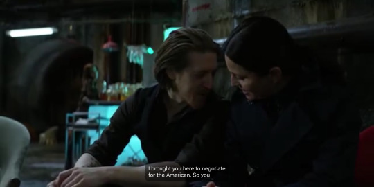
"I brought you here to negotiate for the American". He asks Genet what that's worth. She suggests weapons? Calvados?
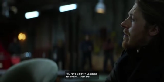
Quinn only wants a Monet.
Now, let's appreciate how the auto-generated subtitles on this screenshot below interpreted Quinn's request for a Monet as "money". Just to be absolutely clear, his prize is a Monet, meaning a painting by Monet. "Japaneese Footbridge" to be precise. But the fact that the auto-generated subtitles heard "money" basically proves my point. Phonetically, “Monet” and “money” sound very similar, much like serious/Sirius and bear/beer.
And finally, this statement from Madame Genet further reinforces the connection between "Monet" and "money":
"Quinn is a transactional man".
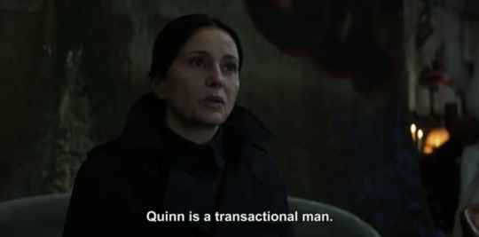
It is hereby thoroughly established by tptb that any reference to the painter Monet could be interpreted as a reference to the "money/currency" symbolism. Quinn can give Genet what she wants, but a Monet is his price. The Monet is the currency that will pay for the transaction.
With that out of the way, let’s return to the graffiti on the wall behind Daryl in TWDDD 1x4. Say we’re crazy enough to believe it says “BG$”, what does that even mean?
In my “Heads or Tails” post from last year, I talked about a few significant instances of “money/currency” references around Beth:
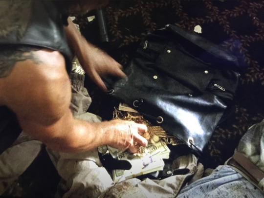
There’s this scene from 4x12 Still, where Daryl inexplicably collected money and jewelry at the Pine Vista Country Club. Beth was as confused as the rest of us, what did he need that for?
For symbolism. He needed it for symbolism.
Later we saw Beth light a stack of dollar bills on fire:
“Fire” is Sirius symbolism as I’ve talked about in many of my posts. It means return, it means “coming back”…
In TWD 11x2 Acheron 2 we saw this:

…a 100 dollar bill with a note which talked about “coming back”, and there’s also a “radio” mention…(sirius symbolism)
It is clear there's a recurring theme around the "money/currency" symbolism, namely one of "coming back", or in other words, Sirius symbolism.
So why have tptb decided that “money/currency” references are symbolism that indicates that Beth will be returning/coming back?
And how could the graffiti from TWDDD 1x4 play into this type of symbolism?
Because there’s this:
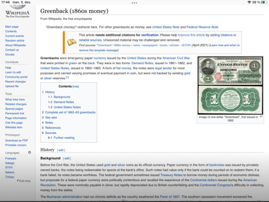
It turns out the term “greenback” dollar is slang for the US currency. The term originated from the 1860s, and stems from the fact that the notes were literally printed with green(e) ink. They were "green(e)" on the "back"...
So, when @wdway sent me her screenshot of the graffiti behind Daryl and told me she suspected the “3G$” in reality was a “BG$”, I was already primed to agree with her. In the past, I've tied this theme to various representations of money/currency. This time however, the BG (Beth Greene) is directly tied to the dollar symbol ($). So you could argue the graffiti on the wall behind Daryl, as he sets the pigeons free(!), spells out "Beth Greene Green(e)back dollar”.
Green(e). Back.
Beth Greene will "come back", she will "return"...
#bethyl#daryl dixon#beth greene#team delusional#team defiance#beth x daryl#the walking dead#twd#twddd#money/currency#82#greenback dollar
18 notes
·
View notes
Video
youtube
i am returning with yet another brainrot episode [dodges booing and tomatoes being thrown] of me annotating mitch youtube content.
this podcast episode with connor was ADORABLE and revealed a side of him that we rarely ever see otherwise SO...it has made my mitch hyperfixation at LEAST 5x worse. I say this so i can warn you to listen at your own peril (i say listen rather than watch bc mitch is like..in 240p the whole time and at certain points looks SO BLURRY he looks like an impressionist painting of a twink. how very renoir of him tbh).
I also recognize this video is long af (honestly i didnt know mitch knew this many words....very impressed) so i’m time-stamping every part that im annotating......
also this post got so long so i’m sorry. i KNOW i always say this but it’s bc im genuinely always surprised by my own verbose ass.,.,,,,.,,,,.,.,,,,, WHY DO I HAVE SO MUCH TO SAY IM JUST LIKE MITCH FR I NEED TO STOP YAPPING (morgan rielly voice: “just never shuts up”)
1:35: mitch apparently loves oysters? honestly adding this only because it’s so cute when his face scrunches up and he throws his head back to laugh at 2:12 (also why is connor’s water glass so dirty what is HAPPENING)
3:21: mitch marner, self-proclaimed coffee aficionado and BEST coffee maker on the leafs, does not know what a chemex is. the look of blank confusion. i know what you are. a fraud who would rather be drinking capri suns and chocolate milk.
3:45: ok now we understand WHY mitch is always wearing a redbull hat (when he’s not wearing his recent assortment of ridiculous hat acquisitions like that powder blue hat with the HUGE BRIM or the orange prada bucket hat) - redbull just sends mitch HATS ON HATS ON HATS that he’s not even allowed to share as part of his agreement. i am now, in fact, asking redbull to send him EVEN MORE HATS so he’s less tempted to wear those hats he’s been wearing this off-season. redbull should just absolutely bury him in hats until he is no longer even visible. he’s not that big so it really shouldn’t take that many hats!!! that’s what i call a hat trick. that’s what i call cap space [booing from audience intensifies]
6:25: WHY is a CONNOR CARRICK MITCH MARNER PODCAST HOW I FIND OUT THAT PK SUBBAN AND LINDSEY VONN WERE ENGAGED?!?!! WHAT IN THE SPORTS ROYALTY?
7:14: just connor gassing mitch up and then chirping him for looking like a newborn foal when he entered the league (mitch then chirps himself for what he looked like with his shirt off lmao - it always surprises me how self-aware he seems to be and how comfortable he seems to be with himself? genuinely endearing tbh)
9:34: mitch talking about how formative visiting the children’s hospital in london (with christian dvorak) 1-2x a week was for him and the “legacy” he wants to build as a hockey player. like. as a cynical human i understand that this podcast is meant to be a fluff piece that’s beneficial for mitch’s reputation/brand, but as a human human i cannot help but be touched by how sincere mitch is about this. and more importantly, he’s shown it with his actions re: the genuine friendship he had with hayden, who mitch met during these hospital visits.
11:54: hearing about mitch’s contract issues from mitch’s POV is pretty interesting, and i believe this is the most extensively he’s ever spoken about it? it makes so much sense that mitch’s biggest priority was not wanting to miss training camp and pre-season. and that he had ZERO intention of leaving the leafs. im forever genuinely flabbergasted by that contingent of leafs fans who thinks mitch was the one in the room negotiating with kyle/the leafs and playing games to squeeze every last dollar out of them? like DO THEY KNOW MITCH? THE TWITCH STREAMER? my. brother in christ, this guy does not even know what an encyclopedia is. my brother in christ, this guy called his finnish teammate “finlish.”
ANYWAY, he talks pretty openly about the impact the contract negotiations and pressure had on him mentally
17:40: connor: what is your favorite part of being a toronto maple leaf?
mitch: my friends 🥺
19:54: mitch talking about how he just likes to check in “on his guys” and connor pointing out that whenever he gets an assist or a goal in a game, he still gets texts from mitch. WHICH IS. SO SWEET. as someone who is absolutely fucking terrible at keeping in touch with people i am JUST. SORRY TO BE A SAP BUT THATS SO SWEET OF HIM? WHAT THE FUCK!!!!!!! IM GOING TO EAT HIM!!!!!!
20:30: THIS IS THE BEST PART LOWKEY - THE NIKE SHOES STORY DODOHFODHOSHSODASODHFAIDHFLWJEFKDLJKSAS.
IF U WATCH NOTHING ELSE PLEASE WATCH THIS. THE DAY CONNOR GOT MOVED FROM THE LEAFS AND WAS SAD MITCH JUST SHOWED UP WITH A GIANT PILE OF SHOES TO GIVE CONNOR AND CONNOR HAD TO BE LIKE “MITCH? I AM MOVING? I CANNOT TAKE ALL THESE SHOES???” THIS IS THE MOST MITCH MARNER STORY I HAVE EVER HEARD I CANNOT LIKE IVE SAID THIS BEFORE BUT IF I READ IT IN A FIC I WOULDVE BEEN LIKE “LMAOOO THIS AUTHOR NAILED MY HEADCANON OF MITCH BUT IRL MITCH WOULD NEVER DO THAT” BUT NO! HE DOES! HE HAS!
the fairy godmother only gave cinderella one pair of glass slippers but mitch marner will show up at your doorstep with 10+ pairs of emotional support nikes that he’s been trying to give you for MONTHS because he loves you!!!!!!!!!!!!!!
24:45: Mitch talking about how the award he’d want to win the most is the Selke - and given how great Mitch has been this past season offensively AND defensively AND on the PP AND on the PK??? give minch the selke send tweet.
28:30: when Mitch was drafted by London he was 5′6″ and 125lbs DLKDLKSJA HE WAS fucking TEENSY! please! i 100% could have carried him around in a fanny pack with my wallet and keys and a granola bar and the 3-4 random crumpled receipts from walgreens
30:16: “whenever people ask me what it was like playing with mitchy, i always tell them he has the ability to rubiks’ cube the game.” i LOVE This and i will be using this expression from now on, even though i have never solved a rubik’s cube and never will!
46:20: I would say this is the 2nd really meaty part of this podcast? It’s where Connor and Mitch talk about Mitch’s draft day experience. When Mitch talks about how NERVOUS he was when Toronto went up to draft their 4th pick i started laughing because if you watch the 2015 draft video you can SEE JUST HOW PETRIFIED AND TERRIFIED AND CLOSE TO SHITTING HIMSELF THEN THROWING UP THEN FAINTING AND DISINTEGRATING INTO A PILE OF DRIED UP LEAVES MITCH LOOKS LMAO. like that boy was on the brink of death.
also, really interesting details behind Phoenix Coyotes drafting Dylan at third right before Mitch here!
51:47: The 3rd meaty (auston-y :---))))) ) part of this podcast: Mitch talking about THE BABCOCK INCIDENT where babcock made mitch grade his teammates on work ethic. Mitch talks about it with a lot of levity and positivity tbh but hearing mitch even joke and laugh about it makes me sad because it clearly was a really awful experience for him to go through as a rookie. knowing how close mitch was and is to those 3 guys at the bottom - tyler bozak, naz, JVR (his recent italian escapade buddy) - is definitely comforting tho. BOOING BABCOCK FOREVER FOR THIS TBH. like WHAT were you aiming to get out of this and why the hell would you ever put a ROOKIE in this impossible situation?
55:46: THE FINAL MEATY PART OF THIS PODCAST: THE MATT MARTIN SECTION. honestlyyyyY. just watch this part from beginning to end pls because mitch clearly loves and treasures matt SO much and there’s SO much here that will make you want to gnaw gnaw gnaw chew chew chew scream ferally and SUE connor carrick for your upper body injury (heart hurts)... but anyway, a few highlights:
Mitch calling Marty a protector, a big brother, and “how big of a mentor he was to me” - i WILL CRY!!!!!!! I WILL!!!!! THATS MY FAVE LEAFS SHIP RIGHT THERE
“He was all for me shooting a puck off his leg or his ass.” every other time Mitch opens his mouth he says something that makes me go “wait ..what did he say?” and have to re-listen. this is one of those moments
the FUNNIEST story about how connor and matt almost fought when they played for different teams because matt found connor so annoying. i won’t spoil the details but i - i def cackled out loud
“you just felt 2 feet taller with matt around” 🥺🥺🥺 ok that’s fine tHATS FINE
OH GOD. THE worst part: Mitch talks about how Matt and Syd would always invite him over and make sure Mitch never felt alone his rookie year, and how this experience of feeling included and loved by Matt shaped the kind of teammate/friend Mitch tries to be aka making sure his home and heart are always open to his teammates. I....I’M. Y’ALL. HOLD MY HAND AND STAY WITH ME BECAUSE LIKE - think about the way bogo (esp when his family was away during covid) and justin lived with mitch and how the leafs all clearly love mitch so much and how mitch says he always tries to be the positive energy guy for his team AND I JUST . LETHAL PSYCHIC DAMAGE SUFFERED FROM THIS PART OF THE PODCAST TBH BRAIN JUST LEAKIN OUT THROUGH MY EARHOLES AS I CRAWL INTO A CORNER. Matt Martin drop your location right now and square up because i will fight you right now for what you’ve done. how DARE you and mitch marner, 2 rich white men i absolutely do not know, make me want to be a better kinder person....i...pretend i do not see it...i pretend i do not feel it.
1:02:58: Yes this podcast is over an hour long and i watched all of it ahahahah1!! haHA! anyway, mitch thanking the frontline workers - very sincere and endearing and mitch-y (aka causing little brain blips of complete confusion - like why did he call the UPS... “ups”? is this a canadian thing? also him thanking the WIFI PEOPLE FJDLKDJLDDSDSSDAKJLDDFLFJFKJLDSJLDKFAJL lmfaofjldjDDKS lmfaofofoofofOFOFO okay)
But seriously the entire podcast is extremely endearing and it’s still the off-season so please do watch the whole thing if you have a chance!
then come yell with me about it u know i love to yell
#mitch marner#connor carrick#no like WHY is he like this#why am i WRITING THIS#i am looking in the mirror like...what have i become#WHO HAVE I BECOME#nhldraftbust look up this isnt u#he's so SOFT god im going to eat him one day and it won't be my fault for committing cannibalism
65 notes
·
View notes
Text
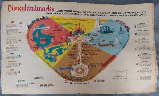
HELLO here is some of my vintage disney parks stuff!!! aka what watching defunctland does to a bitch aka why im so insane about scar’s theme park

(continues below the cut!)
Disneyland Postcard Set - Post 1967

This is my FAVORITE piece I have because the art on the cover is so gorgeous. The lettering is beautiful the castle is especially beautiful and vibrant, the rendering is lovely, the doodles are ADORABLE. Select colorful scenes:
This is one of the photos I used to date. The Peoplemover opened in ‘67 so that’s the earliest this could be from. Based on the clothes in other photos I’d guess it’s a few years later than that maybe, just based on the amount of women wearing pants!
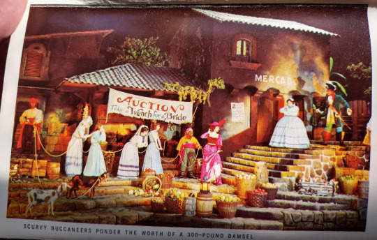
And here’s a shot of the original sale section of Pirates of the Caribbean ride! Captioned “Scurvy Buccaneers Ponder the Worth of a 300-Pound damsel.” If I remember right, they’ve changed this section to be ladies chasing their husbands with brooms to update it.
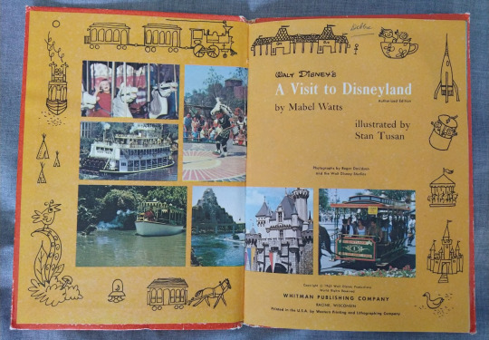
A Visit to Disneyland Book - 1965

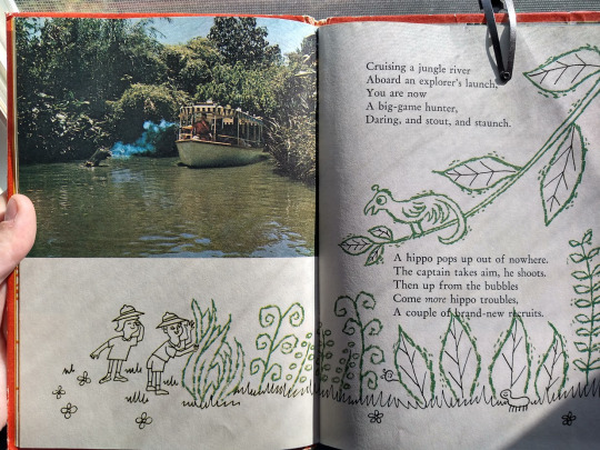
Written by Mabel Watts and illustrated by Stan Tusan, this book is just adorable. (I hypothesize the previous item was illustrated by Tusan too, but it’s unmarked so I can’t be sure.) It look’s unassuming on the front of it it’s fully illustrated:
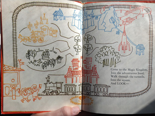
^^^ This is an image I want to reference for Scar Theme Park related art ;D!
LOOK HOW CUTE THIS IS!!
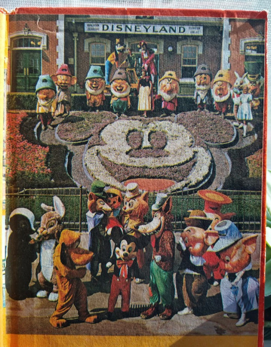
Also look at these kind of freaky old character costumes, especially the dwarves.
Walt Disney’s Pictorial Souvenir Book of Disneyland - 1965

VERY beautiful cover. It’s hard to see but the castle is done in a messy, almost impressionist style. Also sidenote the worst thing anyone has ever done is write dates in roman numerals. Whoever came up with that I’ll kill you again.

Naturally my favorite page spread is the It’s A Small World. Just!!! So pretty and sparkly. It was SO hard to pick which pages to show you guys because every one is really creatively laid out, with nice lettering and illustrations. on every single one!!!
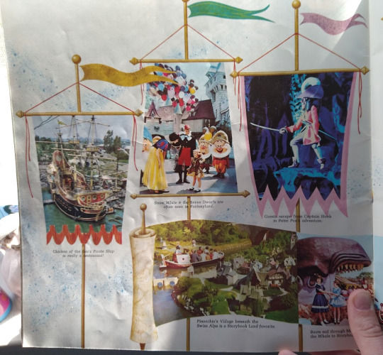
LOOK AT THOSE IMAGE FRAMES

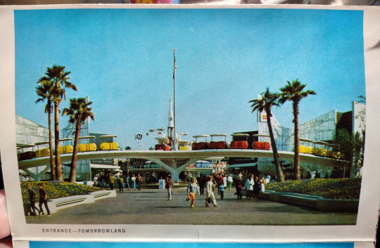
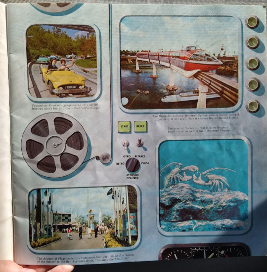
Tommorrowland has some of my favorite parks concept art because they went SO hard on the colors

mickey and minnie abominations

This is one of the most unique illustrated park maps I’ve seen!! You can see the Mule Pack Train (exactly what it sounds like) was still running (1955-73). Other now defunct rides include the Motor Boat Cruise (1957-93) and the Skyway (1956-94).

This is the back! “Disneyland is for People!” is such a weird slogan to me. Who else would it be for??? My favorite image is the smug looking kid enjoying his drink in his Disneyland hat. I want one of those.
Disneyland Summer 1959
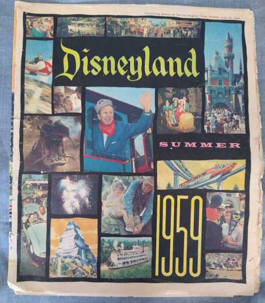
This was promotional material for the park! Tragically mine is pretty destroyed :(( Features lots of photos of what the attractions were in the park at the time, including information about upcoming events and guest music performances. They also include information on hotels, pet services, etc. Everything you’d need to know to go to Disneyland in 1959!

Opening spread with a beautiful watercolor painting!! The blurb boasts how Disneyland represents over $5 Million of design expertise. You can see the cover has separated. It’s a few years away from being looseleaf.
THIS!! is what I intend to heavy reference for a map of Scar’s theme park, when it’s finished. Just as complicated as it needs to be, and very nice to look at :]] These are my favorite kinds of park maps because they’re more art than map, but still very functional!

i love you watercolor adverts <3 <3 GORGEOUSLY saturated. i am eating this art.

Here’s the attractions for that year, each with a cute mini illustration. This is most interesting as a study for the use of typeface, personally. AND the colors.
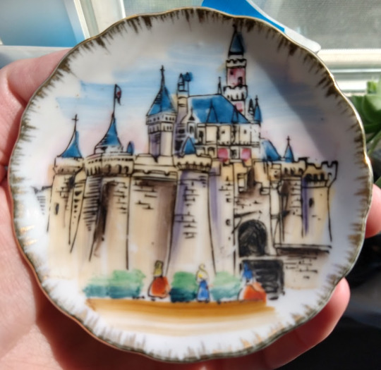
Tea(?) Plates - 1950s-60s
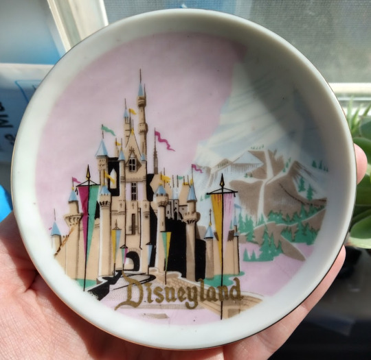
This one’s my favorite! I think I just like pink. Really lovely castle in the style of the cover of the postcard set, too. Marked made in Japan.
This one is special in that I can’t for the LIFE of me find it online ANYWHERE. It’s probably 1950s given that it’s marked made in Japan, but other than that, I can’t find it! There are ones similar, but none quite right. Potentially one of the rarest things I have.

This one’s more 60′s than the others and mine appears to be in better condition than others! Still very vibrant. One of the weirdest color palettes I’ve seen on park merch.
hi if you read this far i love you thank you. post sponsored by the increased photo limits
#disneyland#disney#disney merch#disneyana#IM SO INSANE ABOUT OLD DISNEY STUFF#ITS JUST SO FUN#and midcentury design is some of my favorite its always so beautiful#i want to learn to emulate it#nondescript post#believe it or not i demonstrated self restraint here#not really im gonna make another post about one more thign that i just cant NOT share bc i love it
53 notes
·
View notes
Text
youtube
I just can't get over how beautiful and mesmerising the Slytherin Common Room Theme is in the Hogwarts Legacy OST... It evokes such a strong sense of sadness that exists with beauty - very Ravel or Debussy-esque, impressionist-like delicacy that's just so fitting to the dim common room where the reflection of water dances freely... so pretty.💚🐍 Hats off to the composer J Scott Rakozy!
3 notes
·
View notes
Text
Story of Shin Megami Apples
This game has a story. Shocker, I know. I’m not going to spoil anything about it, but I do want to share a bit of how it came to be.
A background used in the second area.
The first pitch for the game was a simple story of “Oh noes! Stephanie’s time machine broke and now she needs to get back home! Travel past and future and... get back I guess”. Just a justification to make the game a basic adventure, and meeting fun characters.
Some of the first Stephanie doodles!
But, for the final boss, I thought it would be really funny to make the final boss a god, because you can’t have an RPG without killing a god at the end. So I searched gods of time and I found the concept of the kairos, the eon and the chronos of Greek philosophy and the idea of the game came to me almost instantly.
With that idea, Thomas, her boyfriend, was added to the story instead of being a Steph solo-adventure. And since his deal was that he could cook pies, I thought to myself “apples”. And that’s why this game is apple, love and time. Like pulled from a hat, I wouldn’t have it any other way.
After that, I just started researching more mythology. And what I learned helped me make the story. For example, the first area was originally going to be just the tutorial area, not much more. But then, I learned of the norse goddess Idun and said “A goddess... of apples?? I have to add her in” so I did, and based the first area on her most important. Plus, that gave me an excuse to add golden apples as collectables and... c’mon, that’s cool. Having stuff to base the characters on makes it so much easier to come up with ideas. Shocker, I know.
As for the areas themselves, they are each based on art pieces! The first one is very clearly based on that very famous melting clock one plus other surrealist pieces from Salvador Dali and Rene Magritte, the second area is based on many expressionist and impressionist paintings, and the last area... well, it’s the one that gave the idea for making everything be based on art pieces. It’s a painting that I saw and inspired this whole ordeal.

An older version of the first area BG, but it was just too distracting for my liking.
Why is it based on art? Aside of it just being cool, the art references do tell a story too! It’s not, like, crucial to the game, and some of the reasons are very surface level, but I do feel it makes the areas stand out more. Plus, it helps me make backgrounds and decorations easier.
If I could add *anything* to the game, whatever I want, how do you even start? By basing it on the themes of the game and/or art pieces, it narrows down the scope of backgrounds and decorations, and helps me get things done. In general, I think themes are the most important thing to figure out from the beginning if you don’t want your own projects to be generic, but maybe I’ll talk about it another time.
It’s also an excuse to learn about nice art, nice cultures and mythology and not-so-nice art history and not-so-nice history .
If you wanna see the game and ask yourself “Why is Mercury a dog” you can do so here.
#Indiegame#paperverse#the depictions of aion in mythology always depict him as naked. I didn't have the courage to make it that way in-game im sorry
2 notes
·
View notes
Text
Vincent. Van. Gogh.
Since being let down by Paul Gauguin in my Post-Impressionist research, in terms of inspiration, I came back for a more in depth look at possibly my favourite artist.
What can be said about Van Gogh that hasn't been said before? His very name is synonymous with the word artist, along with being used as a brand name to a plethora of different art materials. He is the archetypal "tortured artist" and arguably the most popular great painter of all time.
For my part, having struggled with low self esteem and self confidence issues for the majority of my adult life, I empathised deeply and sincerely with his life story, as I am sure countless others have as well. I find his work resonates an indescribable feeling within me, it speaks of the unseen beauty of our world that so many people seem to ignore because it is so commonplace. His canon of paintings creates a bridge between the liminal and subliminal
One of my all time favourites is "Wheat Field with Crows".
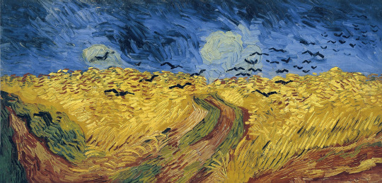
The subject is a simple wheat field in Auvers-sur-Oise under what appears to be a dark, foreboding sky. I have never seen such an image in reality save for a similar effect visiting the marshes of Norfolk under an autumn dramatically dark sky. Even though it might seem really depressing, with the presence of the crows fleeing the safety of the wheat itself, it brings a sense of comfort to me.
Technically, I had always wondered what the name of the effect was that Van Gogh used in creating his signature marks. In reading Van Gogh. The Complete Paintings (Rainer Metzger, Ingo E Walther, TASCHEN ISBN 978-3-8365-5715-3), I discovered the name of the style Van Gogh employed in his oil paintings: Impasto.
Now, I have never used oil paints and strongly feel that in the time I have on this module, I cannot create meaningful pieces in the respond week in this medium.
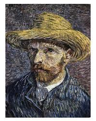
I particularly love this self portrait by Vincent as particular inspiration, you can clearly see how impasto mark marking is used to great effect in this. The use of colours that wouldn't be present in real life to draw the viewer in to question what the purpose of those colours might be. The whites on Vincent's coat for example are used to show how light is falling on him, similarly with his face and hat. Their use is astonishing as a technique but unfortunately were considered ugly at the time.
I have looked into the prospect of using impasto in different mediums and I found one that I have experience in, oil pastels. I looked up artists who used oil pastels in the impasto technique; one stood out, Edgar Degas, as his work in the impressionist movement inspired Van Gogh's own work. While Degas' work with impasto was primarily in oil paints, he did use pastels for some of his work and while I wasn't overly inspired by these works, I then looked into Childe Hassam.
I found his "September Clouds" particularly appealing in terms of his technique.
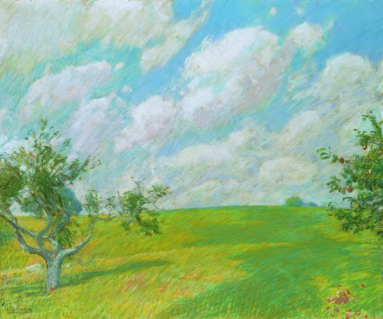
While I am not looking to make any landscapes for this module, I was amazed at how Hassam used oil pastels with such simple marks to create texture on the trees and clouds without having sacrifice colour. A viewer can clearly see how he has layered lighter colours over darker tones on the nearest tree in the foreground; such a simple technique, but amazingly effective to me.
From the research I have done, I intend to create a diptych in oil pastels in response to my inspiration by Van Gogh.
Watch this space.
2 notes
·
View notes
Text
Unusual Character Associations
*tips hat in thanks* @on-noon
Tagging :
@aohendo
@avocado-frog
@thetruearchmagos (how are exams going? Or are they finished?)
My mind is currently on Ah-dainn because of the ask I got, so sticking with him.
Seasoning: Cinnamon (obviously)
Weather: Perfect picnic weather, sunny with a gentle cool breeze
Color: yellow, red (the warm colors)
Sky: Dawn with the golden sun rising
Magical Power: (he already has powers so I will just tell them) Heat and light. He can send of blasts of heat energy or light energy or create small orbs of them in his hand. He can also release EMPs.
House Plant: peace lily
Weapon: He again already has weapons and I find them very hard to describe. Imagine a cross between an ulu and a chakra. Two ring like blades with a wooden handle in one portion. They are tied together by a rope with which he spins and throws them.
Subject: Astronomy
Social Media: An instagram account for his photography. Remains anonymous for superhero reasons but has a lot of followers.
Makeup Product: um........does nail polish count?
Candy: jelly beans
Fear: the complete darkness (yet somehow he loves space, says the stars take the fear away)
Ice Cube Shape: Star ice cube (I saw them once in a birthday party and it reminded me of Ah-dainn)
Method of Long-Distance Travel: His spaceship
Art Style: Impressionist
Mythological Creature: Dragon
Piece of Stationary: mechanical pencil
Three Emojis: 🥰☀️🚀👽
Celestial Body: Stars
2 notes
·
View notes
Text
Movement Project Week 4 - Suffering from Ceramics
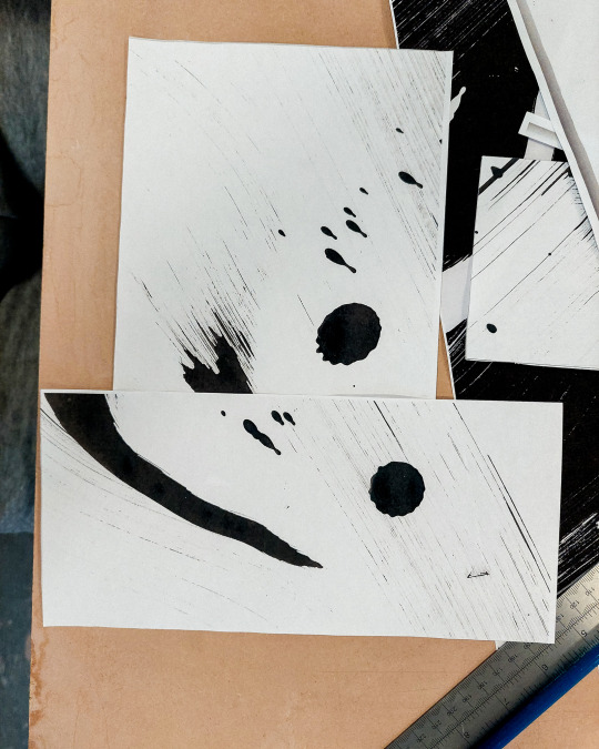
I guess I'm just lying in these titles now cause I actually really enjoyed the ceramics workshop on Monday. I was a complete Zombie from not sleeping the night before, so maybe that was the root cause of the suffering. I choose to agree with the Buddha though that desire is the root of all suffering and there was nothing I more desired on Monday morning than to be not in school. Hence the title.
That actually got me thinking though, about desire and suffering. came in to the Elaine/Gemma/Mary's ceramics workshop on Monday with an obvious desire; to recreate my spiral staircase in clay and be done with it. This rockheaded approach is obviously not conducive with the creative process which our great school endeavours to instill in it's student body.
When I let go of that desire and simply engaged with the workshop as intended, I not only enjoyed the process of it a lot more, but found I landed on better ideas than those I was holding onto so steadfast. This is essentially a longwinded way of saying that when the ceramics workshop opened with us painting sheets of paper with ink, I was internally combusting.
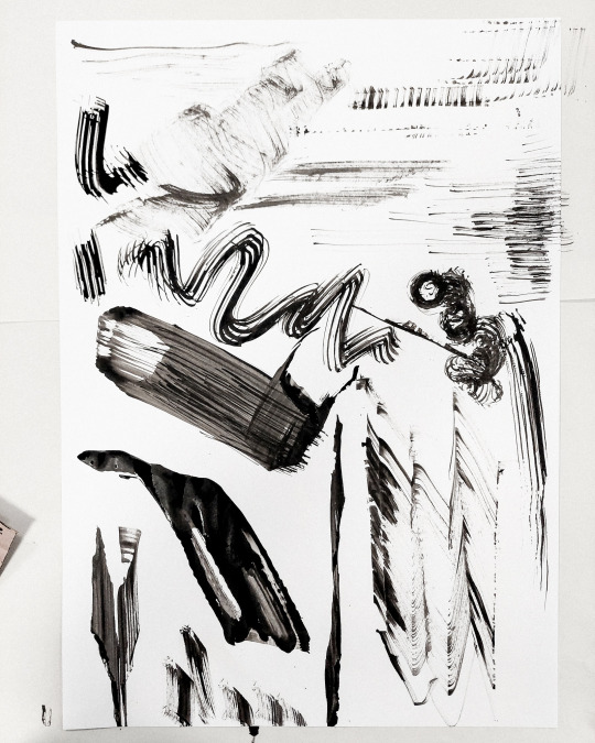
Above: Ceramics?
This was pretty fun. We were asked to write out a list of words, verbs specifically, that had something to do with movement or our conception of it. And then we had to express that through the unforgiving canvas of black ink on white paper. I've uploaded it already for a previous post, but here's another look at the list I put together:
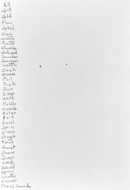
Above: Obviously leaving room in case I hadn't written enough...
So for those playing along at home your task is to look at the set of veritable rorschach test of inkblots above and connect them to their verb of origin...
------------------------------------------------------------------------------
The answer is number 1. "fall" for all of them... I don't know why I wrote so many tbh. You might also note that in all the infinite vastness of my personal dictionary the word "spiral" doesn't appear once. I still hadn't connected the dots on that one... I am very smrt.


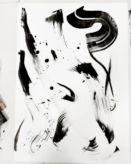
Above: The process
I was pretty conservative with this whole process, maybe due to the aforementioned sleep deprivation. I did three A2 sheets, which felt like a lot til I saw how many everyone else did. Even in terms of the tools used to make marks in ink, I was below par. I used a foam brush with a triangular tip, a roll of material that felt like what straw hats are made of out but probably wasn't that, cardboard, and gravity.
Honestly I could've been a lot more adventurous here and some of the class made some incredible impressionistic work. I think I prefer the "experiment with the resources you have" stage, to the "gather resources" stage if that makes sense. I feel a lot more able to get creative once the limitations have been set, which sounds pretty contradictory now that I write it out... onto the next step.

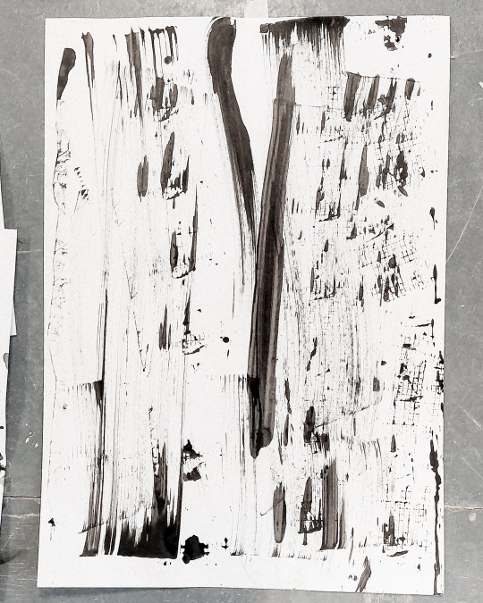
Above: Very interesting shapes according to me
The next step was choosing one of our inked up pages and photocopying it at different sizes and with inverted colours to get us thinking purely in terms of shape. We made viewfinder to locate the most interesting parts of the image and gave particular attention them. Evidently I choose the swooshy curve from my second sheet.


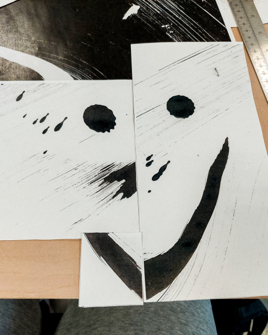
Above: (:
At first we were told to cut up, rearrange, and mess around with all our photocopied material to come up with an interesting collage of shapes. I hate collages. I hate scrap booking. I hated this. sadface.
Then it all turned around when we told to start thinking in 3D and combining our shapes into structures. This was a huge relief for me. Making weird shapes out of paper is a lot more fun and creatively motivating than making collages.


Above: Return of the spiral staircase
My first structure was pretty simple. I had told Elaine about my staircase idea and she suggested trying it out in paper. The centre column is just an A3 sheet rolled into in a cylinder and the steps are short strips of card taped onto the side. Not exactly the most elegant contraption.


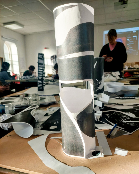
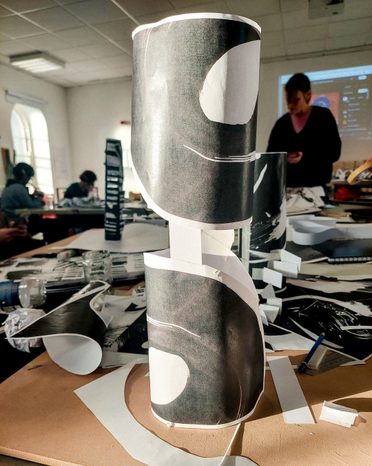
Above: Spiral something or other
After talking with Mary about the project, I finally had my eureka moment of realising "spiral" is a also a movement verb. Very intellectual stuff. She suggested pushing the spiral idea into forms other than a staircase, so I got two cutouts of my swoopy yoke and connected them end-to-end after wrapping them into cylinders.
The shape lent itself to having a kind of dolphin tail or cresting wave look to it. It made the start and end points seem ambiguous, a static object that had a dynamic motion to it, the exact thing I had been searching for with the staircase. I had to compromise a bit and add a strip of card for support but this was still the work I was most happy with from the workshop.
Tumblr is informing me I'm out of images for this post so I'll finish this off in another.
0 notes
Text
During the winter of 1890-1891 the Thursday diners continued. In addition to the former habitués there were now Régnier and Wyzewa; the occasion for meeting the latter was his article on Berthe Morisot published in L'Art dans les deux mondes. At that time Durand-Ruel continually exhibited impressionist works, and Berthe refers to a visit she made to this gallery in the following entry in her notebook:
“Met Pissarro in the Rue Laffitte; he complimented me on my pictures at Durand's, I was overjoyed. But then I was cruelly disappointed —I found my painting hung in the corridor and it is horrible. Julie looked frightful: one can see only the harshness and the effort that went into it. I was so unpleasantly surprised that I complained to young D. about the place that was given me; he answered that my paintings looked even worse in the rooms (sic). “If so, remove them!" Then Chavannes arrived, the whole house escorted him. P. and I standing aside made philosophical remarks on the subject of success. At least Chavannes is a gentleman, he complimented me on my dress, my hat, and my paintings; he asked my permission to accompany me for a few moments. On the sidewalk I thought suddeniy that I had probably left without saying good-bye to young D. and I told Chavannes of my doubts. “You didn't say good-bye to him but he didn't notice." — That is true, there is no use being polite when you are there, everyone is interested only in you.' - You are very irritable today.”“Then, changing his tone, he said to me: “It is strange that I should meet you today; for several days I have been thinking of you with great intensity, and not only of you but also of your mother.”“The mention of my mother of whom no one ever speaks touched me deeply. I said to him: “Really, I would never have thought you capable of this. — Well, this happens to me, I have a great power of evocation and I often live in the past; I was secing Passy again.” ”
1 note
·
View note
Text

[ diego luna | forty | cis man | he/him ] Hey, look! It’s [VICENTE SANTIAGO] at [OLD MAPLE WAY]. Did you know they [WORK] there as a [FARMHAND]? I guess they’re from [MOUNT PLEASANT, MICHIGAN] and have been in town for [TWO WEEKS], living in [MAPLE HILL]. I also heard they’re a little [PESSIMISTIC], but also very [PATIENT] which definitely makes sense.
FULL NAME: Vicente Santiago Gallego
NAME MEANING:
VICENTE ; Spanish and Portuguese form of Vincent. From the Roman name Vincentius, which was derived from Latin vincere meaning "to conquer". This name was popular among early Christians, and it was borne by many saints. As an English name, Vincent has been in use since the Middle Ages, though it did not become common until the 19th century. Famous bearers include the French priest Saint Vincent de Paul (1581-1660) and the post-impressionist painter Vincent van Gogh (1853-1890).
SANTIAGO ; From various Spanish and Portuguese places called Santiago.This is the name of several cities in Spain and Portugal, so named for Saint James (see the given name Santiago for more information). It is also used for many other cities in the Spanish and Portuguese-speaking worlds, notably the capital city of Chile.
GALLEGO ; Originally indicated a person from Galicia, a region in northwestern Spain.
NICKNAME(S): V, Vee, Vinny
AGE: Forty
D.O.B.: September 24, 1983
ZODIAC: Libra
ELEMENT: Air
NATIONALITY: Mexican-American
GENDER: Cis Man
EYES: Brown
HAIR COLOUR + STYLE: Dark brown, generally unruly. Half-medium length.
SKIN: Tanned
BODY TYPE: Athletic. Lean. Any tone he has to boast about is from labour and physical hard work, alongside years spent in the military maintaining a certain degree of physical discipline.
HEIGHT: 5′9″
WEIGHT: 164 lbs
FACE CLAIM: Diego Luna
FACIAL DETAILS: Commonly sporting five o’clock shadow. Something of a resting bitch face despite his desperate lean towards neutrality. An air of exhaustion, eyes show dark circles lending tale to lack of sleep–he doesn’t want to talk about it.
FEATURES/MARKS: Both hands feature a smattering of scars from a life constantly on the move, a small scar notches through his upper lip.
TATTOO(S): Unit tattoo on left bicep. Right forearm features a tattoo of a sinking boat.
HEALTH: Questionable. Despite twenty-two years spent in the military demanding physical health. On the move. Constantly go go go. Since his discharge, he’s been having trouble sleeping; to put it lightly. Pushing himself hard through the day so he can (he hopes) fall asleep at night. It’s not working. His diet has begun to fail, catching what food he can that’s cheap and easy–oftentimes supplied to him by the farm and he’s starting to lose what muscle weight and mass he once had.
SEXUALITY: Demiromantic, Bisexual
CLOTHING/ACCESSORIES: Comfortable. Jeans and soft t-shirts with faded logos and catchy one-liners. Regularly thrifts. Work boots, wide brimmed hat–occasionally wears wraparounds. Still wears his dog tags and military standard watch.
MOTHER: Abigail Gallego López
FATHER: José Maria Santiago Martín
SIBLING(S):
Emilio Santiago Gallego (elder brother)
Camila Santiago Gallego (younger sister)
PET(S): None (is a cat person, would like to get a cat)
SIGNIFICANT OTHER: None, never married.
GENERALLY LIKED or DISLIKED? Unknown. Too new in town to have any real status amongst the populace. However, is generally a dedicated and loyal employee; not to mention hard working therefore is appreciated by his coworkers and his employers.
EDUCATION LEVEL: High School GED.
FAVOURITE SPORT: Football/Soccer.
HOBBIES: Sketching, reading, exercise, travel, going to the movies (or watching movies in general).
SKILLED AT: Navigation. Hand to hand combat. Marksmanship. Physical labour. Piloting. Maintenance. Traditional art.
UNSKILLED AT: Cooking. Baking. This man lives off of cereal, protein bars, and cold cut sandwiches.
TEMPERAMENT: Phlegmatic
ATTITUDE: Once a generally outgoing and good-humoured individual, Vicente has since become withdrawn and something of a moody individual that opts towards silence of the polite variety. He cares. He’s kind and patient even if he comes off as awkward these days, whatever charm he once boasted has seemingly vanished into thin air. He does not want to talk about it.
QUIRKS: Compulsive sketcher. Loves to sketch in pocket sketchbooks or on any slip of paper he can get his hands on. People. Places. Things. Rarely ever fully smiles, it’s always more of a half-smile type deal. Tactile. Shows affection through touch, through contact–hungers for it but it’s the kind of thing that one simply doesn’t ask for.
PRIORITIES: Currently? None. Adrift, lost at sea. To go to bed and wake up every day is enough for him–he sure would like to wake up well-rested though.
GOOD HABITS: Organized. Punctual. Dedicated. Hard-working.
BAD HABITS: Withdrawn–is he secretive? Is he trying out the tall (average), dark, and secret routine? Who knows! Drifter mentality, will he stay? Should he go? Has picked up smoking on the tail-end of his service and it’s something he’s continued to indulge in. He buys cheap cigarettes, they taste like crap but they get the job done.
POSITIVE TRAIT(S): Patient. Dedicated. Adaptive. Polite. Good-humoured.
NEGATIVE TRAIT(S): Distant. Quiet. Passive. Pessimistic.
WEAKNESSES: Lack of stability. A stranger in a tight-knit community. A lack of sleep is dangerous, heavy on his health–heavy on his being, his soul. He is so tired.
STRENGTHS: Physical labour. Hard-working to a frankly, kind of alarming level. Does he feel like he has something to prove? If so, then to whom? Fairly unshakeable, strong stomach–both in the sense of reality (he has eaten some truly dogshit food) and that he simply can look upon man-made horrors without flinching.
PROUD OF: It’s a quiet pride. His art. The notes of a story long in the works, years really–scribbled in the margins, on napkins and slips and paper tucked into the pages of dog-eared novels. He’s proud of his service, whilst able to note the particular sour note of it all.
EMBARRASSED BY: His lack of fashion. The simplicity of it. The odd one out. His stories, previously indulged in for escapism from his childhood, into his youth and even into his adult years. His piss poor ability at cooking–which is nonexistent.
FEARS/PHOBIAS: It sounds…predictable. The loud noises. The bangs, the explosive punctuation of fireworks. What was once considered so beautiful, brings forth memories better called nightmares.
SECRETS: Has a long running sci-fi adventure story that he’s been working and reworking since he was young, it’s the kind of embarrassing secret that he feels he’s too old to have.
REGRETS: Has he wasted his life? Does he regret what he has done? Will he ever get the sand out of his hair? The feeling of the grit in his mouth and the way his skin feels too hot even in the dead of night. What else could he have been? Hadn’t he gone into the service because he had no other ambition?
ANGERED BY: The standard sorts of things. Of unkindness and cruelty in society. Irrationally angered by the ticking of clocks, his watch is barely tolerable on a good day but it’s the kind of thing he feels naked without.
CALMED BY: A pencil in hand working at a sketch–getting his emotions out in the only way he really knows how. There’s other ways, less-productive ways like exercise and hands balled into fists working away at a sandbag.
MOST AT EASE WHEN: Stretched out on the cot in his quarters, arms folded behind his head shrouded in the darkness of night with the sounds of nature all around.
SOFT SPOT: Cats. Cute animals, be them big or small.
IN A CRISIS: Professional. Calm. On point. Definitely someone you want on your side. Someone you look to for direction.
UNDER PRESSURE: Unflappable. His level head is a source of comfort for his peers.
IN AWKWARD SOCIAL SITUATIONS: He really wishes he wasn’t here right now. Either aiming to blow it off with humour that leans towards self-deprecating or something just as awkward as the situation he’s currently in.
CAN HE KEEP A SECRET? Yes.
PEOPLE ARE INHERENTLY….Good.
SPIRITUAL BELIEFS: Former Catholic. Now Agnostic. There’s gotta be something out there. How it will judge him once his time finally comes keeps him up at night.
DAY or NIGHT? Night. It’s quiet and comfortable, cool and welcoming. The bugs are a pain in the rear but that seems to be a constant whether it’s the desert sun overhead or the warm glow of the country.
PESSIMIST or OPTIMIST? The pessimist who was once a shaky sort of optimist. Dipped his toe in that pool once upon a time and found it lacking.
BIG PICTURE or SMALL DETAILS? Small details. It’s easier that way. Get through things one day at a time.
IMPORTANT EVENTS IN LIFE:
Born September 24, 1983
Elder brother left the family in 1993
Enrolled in the U.S. Army in 2001
Left the military in 2022
Took up residence in East Haven in 2023
SHORT-TERM GOALS:
Finish filling up the current sketchbook he’s working through.
Get some sleep.
Check out more of town.
Become a member of the local gym.
Pick up more hours at the farm, maybe get a second job.
See if he can find where Johnny’s hanging his hat these days.
LONG-TERM GOALS:
Decide on whether he wants to stay in town or not.
If staying, get an apartment.
Maybe look into adopting a cat.
Build bridges. Connections with his peers. Friends.
Get in contact with his family again, try and pick up where they left off. Or at the very least, try and find a niche he can fill.
LIKE(S): Animals. Movies. Art. The great outdoors. Keeping busy. A hot meal–trying new food, something he doesn’t have to cook because that’s a sure way to get a case of food poisoning.
DISLIKE(S): Holidays. Loud music (a shame). Cold weather. Big cities. Most sweets.
FAVOURITE FOOD(S): Will eat most anything and can stomach most anything without complaint. Likes most meat dishes, roasted vegetables. Loves most hot meals.
FAVOURITE DRINK(S): Lemonade. Something stronger slipped in, prefers cold drinks–a strong cup of coffee every morning where the temperature doesn’t matter.
FAVOURITE ANIMAL(S): Cats.
FAVOURITE SEASON: Fall.
FAVOURITE EXPLETIVE(S): How could he possibly choose?
1 note
·
View note
Text

'HOW - 2 - START - OUR - MORNINGS' -
9A EST - CHEAPER - AVAILABLE AT -
PUBLIX - WARMER - SECTION EACH -
MORNING - $9.23 - PUBLIC - DELI -
SECTION - FAMILY - MEAL - AND -
MIXED - CHICKEN - BREADED AND -
CRISPY - DELICIOUS - THIGHS AND -
DRUMSTICKS - AT - LEAST - VERY -
TASTY - TY LUNG - SWEET - AND -
SOUR - MANDATORY - BADIA OR -
PUBLIX - 0 CAL - CALORIES AND -
YOU - GET - HOW - 2 - START = A -
VERY - BEAUTIFUL - MORNING -
FRIED - CHICKEN - BREAKFAST -
SIMPLE - ORANGE - JUICE OR -
SIMPLE - SMALL - LEMONADE -
AND - 4 - YOUR - FAMILY - DO -
CHECK OUT - THEIR - PUBLIX -
LEMONADE - SALES - TODAY -
POUND - CAKE - BUY 1 - GET 1 -
FREE - ENTHENMAN's - $5.99 -
LOVE- PUBLIX - 4 - THIS - SO -
NICE - BUT - MY - 77 LBS - AT -
$36.99 - AMAZON - PRIME SO -
I - CAN BUY - MORE - HEAVY -
MAKES - ME - CRY - BUT I'M -
GETTING - THERE - 'MONEY -
ANSWERS EVERYTHING' - MY -
SUGGESTION - IS - KEEP - ON -
THANKING - PRAISING - GOD -
SO - HDG - BANK - COMES -
SOONER - OUR - TOKYO - MALE -
SCIENTISTS - ARE - PERFECT'G -
DO - REALIZE - KOREAN GIRLS -
BIBLE - 'A - THIEF COMES NOT -
BUT - 2 - STEAL - 2 - KILL AND -
2 - DESTROY' - WE - HAVE YES -
RICHES - COMING - IN - OUR -
FUTURES - WE'RE - ACTIVATING -
PULSE - OF - THEFT - MURDER -
VIOLENCE - EXTREME HATRED -
PULSE - OF - ABSURD JEALOUSY -
PULSE - OF - BATTERY - LESBIANISM -
PULSE - OF FAGS' - EXTREME NEED -
2 - DO - IMMORAL - ACTS - OF - YES -
PERVERTED - INTIMACY' - YOUR LOOKS -
GIRLS - 2 - PUNISH - US - 4 - BEING YES -
THE - BEST - WE - CAN - LOOK - ALL R -
PULSES - DETECTED' - WE'RE - TRULY -
ACTIVATING - THUS - KOREAN MALES -
PARENTS - POLITICIANS - LEADERS & -
THEIR - WIVES - MANY - WILL - TRULY -
DISAPPEAR - LEAVING - KOREA - RID -
OF - OVER - 3 MILLION - ALL - OF - U -
LIVE - BAIT - AIR - CREMATION - BY -
SOLAR - STRONG - AT - NIGHT - TO -
DISAPPEAR - THESE - EVIL - TRUE -
PEOPLE - AND - THEIR - ANIMALS -
EVERYWHERE - OUR - BANKS ARE -
TURNING - ON - PULSE - DETECT -
AIR - CREMATING - THESE - YES -
ROBBERS - MURDERERS - 4 - NOT -
QUITE - PUNISHED - BY - MEN - BY -
OLDER - MEN - THUS - WE - HAVE -
2 - FIGHT - THIS - BATTLE - GIRLS -
OF - KOREA - YOUR - LAWS STATE -
U - WERE - BORN - 2 B - ROBBED -
AND - MURDERED - BY - KOREAN -
MEN - LIKE - ANCIENT - CHINA AS -
THE - RICH - SLAUGHTERED - THE -
POOR - SO - WE - STOP - THIS - BUT -
LOOKING - AT - TIME - I - WAS - YES -
THINKING - OF - STUDIO - McGEE -
4 - MOST - BEAUTIFUL - BED AND -
BREAKFAST - LIKE - BUYING THE -
BUILDING - ON - NW 2 AVE - YES -
NEAR - NW 2 ST - THAT - BLDG -
FRONT - OF - LAWN - OF - PARK -
WOULD - LIKE - 2 - BUY - 2 - MAKE -
ROMANTIC - BED AND BREAKFAST -
LIKE - IKEA - IN - THERE - 4 - US - 2 -
BUY - FURNITURE - COOKWARE - & -
MORE BUT - CHEAPER THAN IKEA -
INCLUDES - KARAOKE - DAY & NIGHT -
PUBS - PRIVATE ROOMS - HAS MALE -
FEMALE - RESTROOMS - SMALLER -
PER - EA - FLOOR - HAS - CATS DOGS -
ELECTRONIC - RESTROOMS - BUT AS -
SOUNDPROOF - EA - ROOM - HAS - A -
WAITER - OR - WAITRESS - CHOOSE -
WHAT - WE - HAVE - AVAILABLE SO -
EAT - DRINK - SING - YOUR - OWN -
ROOMS - 24/7 - LIGHTS - SOUND -
EFFECTS - RECORD - YOUR YES -
SINGING - JUST - NICE - PLACE -
2 - SING - AND - KIDS - WILL HAVE -
THEIR - OWN - KARAOKE - ROOMS -
WITH - NICE - TOYS - AND - MORE -
2 - PLAY - WITH - TALL - BUILDING -
FUN - THINGS - 2 - DO - NOT JUST -
EAT - BUT - I - WANT - THIS - YES -
NICE - BED - AND - BREAKFAST -
TONGUES - ONLY - SPEAK - 2 THE -
PAYMENT - AREA - $0.25 - PER FL -
NIGHT - PAY - 1 MONTH - ADVANCE -
INCLUDING - INSIDE - SOUNDPROOF -
ROOMS - I - WANT - SOMETHING XO -
ROMANTIC - LIKE - DAYTIME - IN -
BEAUTY - IMPRESSIONIST - ART -
EACH - FLOORS - ROMANTIC NOT -
SLEEZY - COLD - 4 - GROWN UPS -
JUST - PURELY - ROMANTIC - LIKE -
U - WANT - 2 - WEAR - HATS - YES -
LADIES - AND - GENTLEMEN - OF -
THE - PAST - ATMOSPHERE - SO -
LEAVING SOON - LIBRARY - FOR -
CLOSES - 6P - NOW - 5:18P - I DO -
NOT LIKE - CLOSING - TIME -
JESUS - IS - LORD - KOREA
1 note
·
View note
Text


Dutch post-Impressionist artist Vincent van Gogh's self-portrait was discovered behind one of his works.
The finding, which is thought to be a first for a UK institution, was uncovered by art conservators while examining Van Gogh's 1885 piece "Head of a Peasant Woman" for a future exhibition, according to the National Galleries of Scotland.
It said the x-ray showed "a bearded sitter in a brimmed hat with a neckerchief loosely tied at the throat. He fixes the viewer with an intense stare, the right side of his face in shadow and his left ear clearly visible".
The image was obscured behind cardboard and several coats of adhesive.
"When we saw the x-ray for the first time of course we were hugely excited," senior paintings conservator Lesley Stevenson said in a video shared by National Galleries of Scotland.
"Such a major discovery happens once, twice in a conservator's lifetime... To have an image, as elusive as it presently is, is something very, very special."
It is commonly known that Van Gogh frequently used the same canvas twice, painting on both sides.
The glue and cardboard covering are being removed, according to National Galleries of Scotland, without harming "Head of a Peasant Woman."
The x-ray image will be displayed at the Royal Scottish Academy in Edinburgh's "A Taste for Impressionism" exhibition, which runs from July 30 to November 13.
#vincent van gogh#self portrait#art#history#painting#culture#head of a peasant woman#art exhibition#trending#follow#likeforlikes#popular#artwork#instagram#instagood#news#united kingdom#viral#home
1 note
·
View note
Text
Apply It! - Find Me Filipino Artists
Fernando Amorsolo
The Philippine artist Fernando Amorsolo (1892-1972) was a portraitist and painter of rural landscapes. He is best known for his craftsmanship and mastery in the use of light. Fernando Amorsolo was born May 30, 1892, in the Paco district of Manila. At 13 he was apprenticed to the noted Philippine artist Fabian de la Rosa, his mother's first cousin. In 1909 Amorsolo enrolled at the Liceo de Manila and then attended the fine-arts school at the University of the Philippines, graduating in 1914. After working three years as a commercial artist and part-time instructor at the university, he studied at the Escuela de San Fernando in Madrid. For seven months he sketched at the museums and on the streets of Madrid, experimenting with the use of light and color. That winter he went to New York and discovered the works of the postwar impressionists and cubists, who became the major influence on his works. On his return to Manila, he set up his own studio. Amorsolo, who died in 1972, is said to have painted more than 10,000 pieces. He continued to paint even in his late 70s, despite arthritis in his hands. Even his late works feature the classic Amorsolo tropical sunlight. He said he hated "sad and gloomy" paintings, and he executed only one painting in which rain appears.
Artworks:
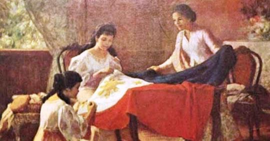
“The Making of the Philippine Flag”
Meticulously crafted in less than a week, the Philippine flag raised in Kawit, Cavite on June 12, 1898 was the work of Marcela Agoncillo, her five-year-old daughter Lorenza, and Delfina Herbosa Natividad (whose uncle was none other than Dr. Jose Rizal). At the time, Agoncillo and her family had already fled to Hong Kong to escape the Spaniards’ clutches. It was in their home at Morrison Hill Road where the three pairs of hands, aided with a sewing machine, completed the flag over the course of five days. Based on Agoncillo’s own description, the flag was “made from fine silk with a white triangle at the left containing a sunburst with eight rays at the center, a five-pointed star at each angle of the triangle, an upper stripe of dark blue and a lower stripe of red.” In this artwork, it was shown how they created and crafted the very first Philippine Flag. Fernando Amorsolo made this painting to show the citizen of the Philippines of how the Philippine flag was made and to remind them the traditions and customs that we did not realize it becomes faded.

“Planting Rice”
It shows the visual arts of the Philippines during the decades before the Second World War and into the post-war period. The ‘Planting Rice with Mayon Volcano, Exhibits the happiness across from the difficulties in planting rice. The Filipino Villagers in their bright clothes and straw hats plant together with a fresh and green landscape of plenty behind the Filipino villagers is the peaceful flume of steam. On a hot bright day, this picture depicts the traditional Filipino vocation of farm life among a community of men and women.
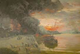
“The Bombing of the Intendencia”
On this day 75 years ago, the Japanese bombarded the Intendencia in Manila's Intramuros area. Fernando Amorsolo, a Filipino painter and National Artist, has created a masterpiece. He witnessed the war's events firsthand. In this artwork, it portrayed how Japanese soldiers occupied Manila in January 15, 1942.
References:
https://www.artstation.com/artwork/zDOGgd
https://httppinoyartshub.wordpress.com/2017/12/31/planting-rice-by-fernando-amorsolo/
https://biography.yourdictionary.com/fernando-amorsolo
https://www.mutualart.com/Artwork/Bombing-of-the-Intendencia/824539D1E2FF5D11A96BC37999B5651C
0 notes
Last Seen Blogs

ressora66
РЕССОРА66

ains444
ains

shiki-jin
shiki-jin ☆

xxdcj
D a n i e l l a

xsanguinary
B-l-o-o-d-t-h-i-r-s-t-y