#the goal was to illustrate them recognizably and quickly
Photo
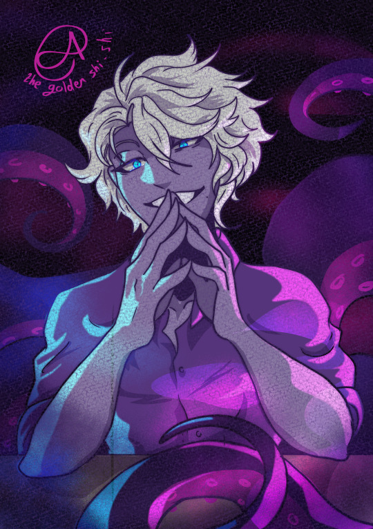


Three more palette challenges/speed draw challenges I did with Twisted wonderland.
Featuring Azul, Jamil, and Floyd
#azul ashengrotto#jamil viper#floyd leech#octavinelle#scarabia#twisted wonderland#twst azul#twst jamil#twst floyd#palette challenge#the goal was to illustrate them recognizably and quickly#I made some mistakes that I am now staring at#but in my defense#these were from like a month after I started playing#and I had very few references hehe#transformer art is coming i swear lol
669 notes
·
View notes
Photo
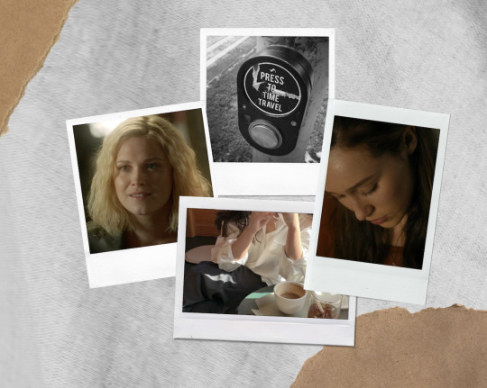
Clarke wakes up eight years in the future, where her college best friend happens to be her girlfriend. Part 4/? (Part 1 - Part 2 - Part 3)
Aside from the obvious, Clarke couldn’t get over how different this other version of herself was. She only recognized two sweatshirts and a t-shirt in her entire wardrobe. Her ripped jeans were gone, her beloved leather jacket was nowhere to be seen, and her dresses were the kind of classy Clarke wanted to make fun of. Seriously, where was the cleavage on this? She’d gleaned from her phone that she worked as a freelance illustrator - a welcome surprise - so that was hardly an excuse for the uninspired looks.
To be fair, the “special” drawer at the bottom was the furthest thing from classy. Clarke had closed it quickly after peeking. There was more variety in her underwear, but overall she’d lost her style. Other Clarke dressed like every other adult Clarke knew and it was a fucking downer.
As for Lexa, her style had evolved but there were recognizable remnants of her younger self. She still favored darker tones, with the occasional trusty flannel, but her grungy looks had been traded for business casual. Clarke felt a pang in her chest, realizing how deeply she missed her Lexa. She wondered what Lexa would tell her if she were here. If she would be impressed by her older self.
But this wasn’t the natural way of things. They weren’t supposed to know how everything would turn out. Clarke knew anger was useless, but she felt it nonetheless. It was comforting to have a version of Lexa here, but Clarke felt robbed of a multitude of experiences.
Like watching her best friend grow into a confident, put-together adult.
Or falling in love with her.
Which was evidently what had happened at some point.
Yet Clarke had never entertained the thought in her present. Even their kiss had been driven by immense gratitude for the girl who’d salvaged the worst night of her life. At least that’s what she’d told herself. They’d never talked about it because nothing had felt awkward afterward. They’d slipped back into the effortless routine of their friendship.
Lexa had met Costia and then a few others. With looks and smarts like hers, dating wasn’t an issue. She liked it, too. There hadn’t been anyone serious after Costia, but she wasn’t a player either. She never had a bad word to say about her dates, even if they didn’t work out. She was a romantic at heart and a few college girls bruising her feelings wouldn't change that.
Which was why the love part still troubled Clarke. She knew Lexa like the palm of her hand. Lexa didn’t fall for girls like her - aimless, stubborn and too proud for her own good. She liked girls who spoke about their goals at length. Girls who knew what they wanted. It was silly to even consider Lexa having feelings for her. Not like this, with this kind of passion. Clarke would’ve been able to tell. She would.
So what brought them to this point?
Clarke still wondered if this was truly the future. A parallel world born from the butterfly effect didn’t sound any less wacky, but Lexa had said she’d wanted her since their first kiss, which obviously wasn’t the case for her own Lexa. The mention of Costia seemed to have thrown her, perhaps because she didn’t know her at all in this world. If Other Clarke and her had started going out after their kiss in the car, it would make sense she’d never meet Costia.
Though that would mean they’d been dating for over ten years. Jesus. That couldn’t be right.
She didn’t have a ring and neither did Lexa. Well, that wasn’t too surprising. Clarke had witnessed her parents’ marriage fall apart and her mother’s second marriage end up in screaming matches too. Her grandmother was three-times divorced and her only cousin seemed ready to leave her husband any day now.
Griffin women didn’t do marriage very well and Clarke didn’t care to continue the tradition. She didn’t mind staying someone’s girlfriend forever, but she knew Lexa liked the idea of being a wife one day. Hopefully their stupid state would get its head out of its ass.
Wait. Clarke rushed to grab her phone but then stopped, knowing she’d forget the answer as soon as she read it. Surely by now it was legal, right? So why hadn’t they tied the knot? Clarke could see herself compromising if she were madly in love.
Was Other Clarke having doubts about the relationship? Was she thinking back on that crucial moment in her life, when she’d started dating Lexa, and wondering ‘What if we hadn’t?’ Clarke had a chilling thought that perhaps she’d been brought here to break up with Lexa. But her stomach suddenly twisted, a visceral reaction that knocked the breath out of her. It was almost as if Other Clarke had taken over for a second, lashing out.
She leaned against the wardrobe and took a deep breath.
“No breaking up,” she whispered.
It wasn’t like she could do it anyway. She’d stab herself in the tit before she broke Lexa’s heart. At this point, all she could do was play the part and hope the answers would come to her.
After some back and forth, she put on a dress with a jacket and tights, warm and dressy enough for a birthday outing. Lexa walked out of the bathroom in dark pants and a top with the weirdest shoulder cutouts. Eight years did a lot to fashion apparently.
“Ready?” she asked.
Clarke nodded, wondering how screwed she was if they bumped into someone they knew on the way. She’d have to smile and let Lexa do the talking.
“I thought you’d wear your blue dress,” Lexa said.
Clarke looked down at her outfit. “Uh, nope. The green one.”
“I guess you’re not planning on getting lucky,” Lexa said with a growing smile.
Feeling the rising panic she usually did when Lexa alluded to their private conversations, Clarke tried playing along: “Why not? Do I not score in the green dress?”
Lexa snorted. “Do you not- what?”
Sensing she’d missed the mark, Clarke quickly moved on: “Maybe I just wanted to match your eyes.”
“Corny... but effective.” Lexa smiled as she leaned in to kiss her. Clarke had given up on trying to stop these, instead enjoying the sensation. Lexa’s kisses were unlike any others she’d had. She wondered if their years of experience just made these second nature. Sometimes, like now, she didn’t want to stop at all, so caught up in the feeling that she became an active participant herself, even overzealous.
“Hmm.”
It was that sound again - the little hum Lexa made after their kisses got more heated.
“What?” Clarke asked.
“You’ve been kissing me differently.”
Clarke’s eyes widened. “Really?”
“Yeah.”
“Bad different?”
“No, no, just…” Lexa glanced down, “like you’re trying to figure me out.”
“I thought I’d try something new.”
“That’s the thing, it reminds me of when we first started dating. When I was trying to find out how you liked it and you were trying to find out how I liked it.”
Clarke felt awkward, reminded once more of the gap in their experiences. Which was fucking weird, because technically the body she was in was plenty knowledgable regarding Lexa’s preferences. “So it is bad.”
“I’m enjoying it,” Lexa reassured her, then ran her hands down her ass. “Makes me think of when we couldn’t keep our hands off of each other.”
Clarke blushed, not disliking how close their bodies were. “Clearly an issue these days.”
“A glaring one.”
At least these two still bantered, which was oddly reassuring to Clarke. “We, um, we’re okay in that department, right?”
Lexa arched her brow. “Well, our old age makes it a little hard to fuck over an entire weekend.”
“Very funny.”
Lexa sighed. “Of course we are. I love what we have. How we’re growing together. Obviously sometimes I wish we could escape to the summer after graduation again, but I’d miss our life now. Everything we worked on and built together.”
“Summer after graduation? What was…?”
“Hm?”
“Never mind. So, we’re good?”
“I am. Are you?”
Clarke looked into Lexa’s eyes and saw her best friend. Just Lexa. Just the girl who’d been such a central part of her life since college. Just the girl she’d played a ridiculous amount of darts with, done the best roadtrip of her life with and cooked the most revolting on-a-budget college meals with. Just the girl whose laugh she knew from a mile away. And she didn’t know if she’d find that girl again, or if they’d grow old together too, but at least a part of her was still here. Still making her feel like she was home.
“Yeah. I have everything I could possibly want.”
Lexa kissed her cheek. “Then let’s have that birthday date, gorgeous.”
-
Part 5
#clexa#clexa fic#f: citf#w#it's not much but it's honest work#why do you think Other Clarke is having an existential crisis?#happy holidays 🎄
220 notes
·
View notes
Text
ARTG 476: Blog Post #7
RATIONALES
Cornerstone Exterior
A new company searching for a brand
The Challenge
This was a logo and brand identity design for Cornerstone Exterior, a brand-new roofing and exteriors company based in the Cowichan Valley, British Columbia. As a company, Cornerstone Exterior brings high standards of workmanship and customer service that continue to place them at the forefront of the roofing industry. Working with this client and being able to provide them with a stunning logo for their company was extremely rewarding.
Because Cornerstone Exterior is brand-new, I had the opportunity to work with a completely blank canvas, which, although intimidating, was an exciting prospect. The challenge was to design a logo and brand identity for the company that could then be used in brand collateral such as uniforms, business cards, and anything else a roofing company might require branding. In addition, I was required to create a brand guidelines outline for them, as I was also working with another firm to create a company website for Cornerstone Exterior, and that firm would need access to the logo, the color palette, typography, et cetera.
The Approach
My research into roofing companies and similar trades was extensive for this project, as I knew very little. I looked into the local competition, as well as large successful roofing companies, to get a feel for their brands, websites, and overall feel. Familiarizing myself with my client’s goals for the logo and new business was my top priority. My main goal was to create a logo that would be easily and quickly recognizable, whether on a company truck, a business card, large, small, et cetera. To do this, I ensured the design was simple, clean, and straightforward, utilizing sans serif typefaces, a limited color palette, and smooth elements.
What I did
The final logo design was created in Adobe Illustrator and was delivered as PNG and SVG files to both the client and the firm designing their website. I then used the newly designed logo to create business cards and stationery. In the future, I will be working with them to create their company t-shirts.
Milano’s Ristorante
Out with the old and in with the new
The Challenge
This was a full identity rebrand for Milano’s Ristorante, a local Italian restaurant in Nanaimo, British Columbia. Milano’s is a unique restaurant that reflects the taste and culture of Greece and Italy, well known for its award winning food, excellent service and welcoming atmosphere. Their logo, however, was quite outdated and in need of something new. My challenge was to design a new brand identity that was sophisticated, visually pleasing, and timeless. After this, I would need to update all of their brand collateral.
The Approach
Because the Italian influence is such a strong part of their brand, I wanted to make sure that I preserved as much of that as possible going into this project. I researched Italian cuisine, landscape, design style, and history – all to get a better idea of who my client was and what would help me in my design process. I also looked at their local competition (restaurants like Romeo’s, Cactus Club, et cetera) to get an idea of opposing brands.
Ultimately, I wanted to simplify Milano’s brand and make it look like an elegant, high-value restaurant. I decided that to do this I would need to start from a blank canvas, ditching their existing brand and coming up with something new entirely. Something with a limited – but bold – colour palette, simple – but dynamic – typography, and a lasting first impression.
What I did
The deliverables for this project included the new logo, as well as a complete brand guidelines posters and booklet, which included all of the brand collateral I developed. This included staff uniforms, takeout containers, graphics for delivery trucks, et cetera. Everything was designed and created in Adobe Illustrator, save the brand collateral mockups, which were done in Adobe Photoshop. The brand guidelines posters and booklet were designed for print.
Spotify Newsletter
Representing a brand well
The Challenge
The challenge for this project was to take an already existing brand and create a themed newsletter for it (followed by an enewsletter). Spotify was the brand I chose, and my theme was summer. Spotify’s aesthetic is firmly established, which made the design process both easier and more difficult. I found it easy because I had a clear idea of the look I was going for (a rare victory as a graphic designer), but it also made things more difficult because I had to be careful not to put myself in a box and still allow room for creative solutions to flow.
The Approach
I took a good look at Spotify’s interface, their website, their newsletters, and their overall brand to get an idea of what their aesthetic was. This was pretty straightforward; their brand isn’t hard to understand at all. I decided my design needed to include the same high contrast (i.e. black backgrounds and brightly coloured text) and bold colours that I was seeing in their interface. I was also very influenced by Spotify Wrapped 2023; I loved the way it was designed that year and the fun, interactive graphics that came with it had a notable effect on its users.
What I did
I created all of my individual design elements in Adobe Illustrator. Once I was happy with my content, I dragged it into Adobe InDesign, where I set up my file for print. Once I had designed my print newsletter, it was easy to design the enewsletter. I created that file back in Adobe Illustrator, cut some of the content, reformatted things, and we were good to go!
0 notes
Text
The Risks of Hiring a Graphic Design Service

If you’re looking to take your business to the next level, you should consider partnering with a graphic design service. It’s an excellent way to boost your sales, conversions, and ROI.
Getting a graphic design service can be an affordable way to get high-quality work done on a regular basis. However, it’s important to understand the risks involved before hiring one.
The first risk to consider is the reliance on a single designer. Freelancers can leave you with unfinished work, or they may disappear for no reason. An agency that provides a dedicated team of graphic designers will give you peace of mind.
A reliable graphic design service will be able to provide you with designs for all your marketing needs, from web ads to social media posts to print advertisements. They’ll also be able to handle all the different types of graphic design, from logos to packaging to e-commerce images to custom illustrations.
They will be able to create designs that fit your brand and target audience, making it easier to build your business. And they’ll be able to deliver them quickly, too. Get more details here!
You’ll need to make sure that the agency you choose has experience working in your industry, and that they know how to convey your brand message effectively. They should be able to show you examples of their past work.
Another important factor to consider is the chemistry between you and the agency. They’ll need to have an understanding of your business goals and the type of design you want.
They should be able to discuss the scope of your project and the complexity with you, to ensure that they’ll be able to deliver what you need. They should be able to explain the process they’ll follow and how long it will take them to complete your project.
This will allow you to see whether they’re a good match for you before you commit to working with them. It’ll also help you to avoid any surprises once they start working with you.
Keeping your graphic design consistent will keep customers and clients familiar with the brand, which in turn will help them to trust it. Having a clear visual identity will also help you to be recognizable across all your marketing channels, including email, blogs, and social media.
You can also hire a reputable graphic design company to help you evaluate your current visual assets, as well as make recommendations on how to improve them. This will enable you to save time and money by avoiding expensive rebranding mistakes.
It’s also a good idea to check out reviews from previous customers before committing to working with an agency. These will let you see the quality of their work and what they’ve done for other businesses in your space.
The cost of a graphic design service can vary widely, depending on the size of the project and who you hire. A freelancer based overseas is typically the cheapest option, but a domestic agency is often more costly, but can be worth the investment for reliability and convenience. For more facts about web designs, visit this website at http://ireport.cnn.com/docs/DOC-1034680.
0 notes
Text
Classical Future : Culture & Technology
"Nothing ages so quickly as yesterday's vision of the future." – Richard Corliss
When originally conceived, Disney’s Tomorrowland was a vision of a bold new world shaped by science and technology. It inspired a generation that was still in the throes of the space race. Yet, thirty years on, it was showing its age. Not that it was in disrepair, simply that it was no longer representative of tomorrow. Instead of being a bold vision it was a quaint reminder of yesteryear’s inability to predict the future. Irrevocably tied to its time, it would always be recognizable as a theme from the 1960’s.
Imagineers had to find some way to breathe new life into this land in the late 1990’s. Their solution was to give it a Victorian makeover, celebrating the romantic notion of the future as envisioned by Jules Verne. This was an ingenious approach, the results of which are truly wonderful. This feat of design is even more amazing when you take into account that the previous vision of the future could not be adapted to another vision of the future without scrapping everything and starting from scratch. Not only was this not economically feasible, it would be disastrous from a sustainability point of view. Going steampunk made perfect sense. Absolutely brilliant. Well done WDI!
In many cities today we are still faced with the task of finding useful ways to revitalize yesterday’s visions of tomorrow and the steampunk aesthetic is not an option. In too many cases the only solution is to tear it all down. If this is not economically viable it leads to blight. Traditional building types, to the contrary, usually can be adapted and reused. If you see them in disrepair or underutilized you will find it is because of economic policies or code-related issues, all of which can be solved politically – if there is the will to do so.
Despite this reality we are hearing laments that our cities aren’t futuristic-looking enough and film makers are heading to Singapore in order to capture a vision of what tomorrow might look like. Sure, it’s a single case in point and the author wasn’t suggesting everything needs to look like Singapore. However, I completely disagree with the notion that a city needs to be made of hyper-futuristic metal and glass high-rises to be futuristic. There’s more to planning for the future and being forward-thinking than building twisted titanium towers. Planning the city of the future requires leaving space for future generations to build their vision, as well.
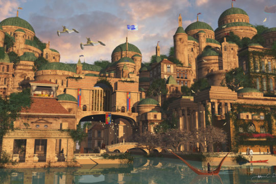
Image credit: Theed by Jacob Charles Dietz
Theed, the capital city of Naboo, illustrates a much better path, in my opinion. It portrays the vision of a society that embraced technology while holding onto its culture.
Back on earth, we cannot raze our existing cities to make way for today’s futuristic visions only to do it again for every subsequent generation. Nobody is overtly advocating that, however, this is exactly what would be required in order to achieve their goals. This tabula rasa approach to city building only works in the very few parts of the world where there is no existing urban infrastructure. As Disney found out, if you don’t have a clean slate it’s not a simple or inexpensive exercise to displace the previous built environment.
To knock down a structure, haul it off, gather the materials for a new structure, stage it on a small site and get it built is time-consuming and costly. To renovate the interior of existing structures to suit the latest fashion costs considerably less both financially and ecologically.
Many of our cities have infrastructure and buildings designed in such a manner that they can adapt, accommodate the latest fashions, and allow for growth as required. This is economical, sustainable and has created places of lasting beauty. They also happen to have a rich cultural heritage.
Instead of burdening future generations with quaint visions of an imagined future that will quickly be outdated we should instead enlist technology to help us build resiliently and sustainably.
As we look towards a future where humans become a multi-planetary species we should be doing more than just seeding the cosmos with life, but also with civilization. If we must look to science fiction for inspiration then we should follow the example from a long, long time ago on a planet far, far away. Let us follow the path of Naboo, a civilization that was able to become an advanced society while maintaining its culture and avoid the example set by planet Spaceball.
1 note
·
View note
Text
IXD304
Art direction
Art direction is about designing the journey for our intended target audience.
The most important aspect of art direction is the “concept.”
4 art direction steps discussed in A List Apart – Art Direction and the Web are:
“
Goals, goals, goals. You’ve heard it all before, but there’s a reason you’ve heard it all before. Good concepts accomplish something. And that something should be the objective to which you and your client have agreed. Always ask yourself, “will this idea help us reach our goal?”
Use idea-stimulating techniques. Fantastic ideas might just come to some in the shower, but the rest of us can be helped along by using techniques like brainstorming. There are plenty of books on idea generation, and the rules of brainstorming are fairly well-known. Initially you should generate a large quantity of ideas. Your chances of coming up with a winning idea are usually directly proportionate to the number of ideas you generate. You can use the method of your choice. One effective technique, especially if you work alone, is to take a sheet of paper and write your problem or objective at the top. Then force yourself to quickly write or sketch twenty different ideas, and do not stop until you’ve got twenty. It will be difficult, but hey, if it were easy, it wouldn’t be called work. Here are some pointers:
Keep the bird’s eye view Don’t get too wrapped up in the details. Work like a sculptor. Start with a large mass of ideas and refine from there — but keep looking at the whole through every phase of the project. Let the specialists work out the small details, and guide them subtly when necessary to keep everything on track.
Don’t censor yourself. You’ll do that later. All ideas are welcome at this point, even (and sometimes especially) the crazy ones.
Sketch quickly, write quickly. You’ll flesh out the best ideas later.
Use symbols, metaphor, or theme. Some of the best concepts utilize recognizable symbols, as in Zeldman’s example. Use your life knowledge and experience. To get a feel for this, take the creativity test at Ron Reason’s site and study the test examples.
Don’t design. You’ll do that later.
Once you’ve got your ideas on paper, put on the critic’s hat. Choose the best two or three ideas and flesh them out a bit. Now you can permit yourself to think more about the actual design, type, color, and layout. Test the ideas against your objective. The best idea should win, but stay flexible. Good ideas can always be made better.
“
They also discuss the importance of knowing your stuff by keeping your style in check but be openminded to feedback and criticism.
As I’ve started to digitise some of the visuals I planned to include in my website user master apprentice workshops, my plan is to use these as guides throughout the website to help make the content flow smoothly as well as entertain the user in regards to the game element planned to be featured on some pages.


These are only a few of the illustrations I plan to include in my website.
0 notes
Link
Preface
Welcome to probably the best guide to UI UX design on the internet. This carefully crafted piece will answer all your queries with regards to user interface design, and user experience design.
We can educate our readers about UI UX design because this is what we do. We work with reputable clients, across the world, providing them with seamless UI UX design solutions. Whether you are a beginner or an expert, this guide benefits everyone.
Looking for a smart re-branded website design to attract more leads? What about user-friendly mobile app design? Call +91 750 620 3013 or write to [email protected], for getting in touch with our team of experienced web developers.
Let’s get down to it!
1. Introduction
Readers who search for a guide to UI UX design, don’t even know what separates the two. We hope to keep these UI UX definitions, processes and principles, concise.
This post won’t cover questions such as,
“What does colour purity mean in UI design?”
“How does a UI developer work?”
“What does motion UI design mean?”
“Why is schedule UI design mean?”
We will cover all the above-mentioned questions on Kodework’s subsequent posts.
In case, you wish to pursue UI/UX designing as a profession, this UI UX blog post will come in handy. We would love to gain some feedback from you as to how we can make this post better.
Feel free to communicate with us in the comments below. We are a bunch of passionate, UI/UX professionals who build interactive and compelling UI/UX designs.
So, let’s get started.
2. What is ‘User Interface’ or ‘UI’ design?
An ‘interface’ is an interaction between two systems. So, a ‘user interface’ is an interaction between a system and a user.
Two common types of UIs or user interfaces exist:
One is a Command Line Interface (CLI) – that contains only text, which is mostly worked upon by programmers.
The other is a Graphical User Interface (GUI), which includes menus, icons, windows, and engaging imagery. As this is a UI/UX design blog post, we will stick primarily to GUI and its principles.
‘User Interface Design’ is a method or discipline wherein user interfaces are designed for software and machines. This UI software designed could be for mobile devices, home appliances, electronics and of course, computers.
UI design focuses on fostering excellent user experience, through aesthetics, responsiveness, and usability. Typography and colours are the essential pillars of UI design. UI design combines visual design (look and feel) and interaction design (usability).
“A user interface is like a joke. If you have to explain it, it’s not that good”
– Martin LeBlanc
2.1 What does a UI designer do?
A UI designer takes care of the interface and how it reflects your brand’s identity. This reflection is visible on any of Kodework’s website designs. The look-and-feel, the style quotient and the use of colours will be according to your company’s brand guidelines.
These are then converted to UI elements. There can be instances when a UI designer and a UX designer are the same people.
A UI designer’s job is to break down hard-to-understand design structures to a format that is convenient to the end-user. Both UX and UI designers work together in providing the user with a flawless web experience. UI designers must first understand the goal and objectives of the design. Making use of their skills, they need to then create engaging mobile UI or web applications for the user. Translating user objectives to functionalities is what a UI designer does best.
A top UI design agency employs a dedicated team of UI designers who apply their analytical minds. From product development until the design goes live, every process is catered to systematically. Take, for example, the design process at Kodework, which is probably the best UI design agency in India. Why do we call ourselves the best? It’s because we work on multiple projects in parallel, wherein each project is carefully attended to by a dedicated UI/UX team.
Our UI design specialists engage with our clients to gather essential project information. Our UI design experts then get a high-level understanding of the requirement. This is then used to create a UI design plan. This final UI/UX design solution is provided to a satisfied client.
2.2 What are the primary UI design components?
To keep things simple, we are only focusing on the five key UI design components.
1. Visual Design
In simple words, visual design makes the design more appealing and engaging. This is accomplished by engaging your website or app’s audience with conceptual art or web-based design.
Again, simplifying further, visual design makes the UX better with the help of layouts, space management, photography, and illustrations.
2. Colours
Colours are quintessential in UI design. Why? Because we are receptive to colours. We have a mental association with meanings and emotions.
Branding is heavily benefited when choosing colours. Colours help associate a UI design to your brand.
3. Graphic Design
User interface design benefits greatly from graphic design. This is because graphic design is majorly responsible for combining motion graphics, images, and text.
Graphic design hinges on brand guidelines. A graphic designer produces great visuals, keeping in mind what the user would find appealing.
4. Mockup
A mockup is a full-size model of your UI design. It is an excellent design element because it allows the design to be promoted and evaluated. Mockups are based heavily on visual details.
5. Typography
It’s the driving force in all aspects of communication art. Typography is a science that aims to deliver an easily readable copy for your readers. Excellent typography should:
Be structured in an understandable hierarchy
Work in various sizes
Be compatible with different letter-forms
Kodework UI Tip: Avoid excessive scrolling. A user has other things to do.
2.3 What are the different UI prototypes?
The interaction between a user and an interface is simulated via software prototyping. Discussing UI software prototypes are important because they come with a list of digital tools.
We will get into a list of the best UI prototyping tools in another blog post. For now, all you need to know are the most important UI software prototypes.
1. Paper UI prototyping
Paper prototyping involves sketches that are made on paper, during the ideation stage of UI design. The design team communicates with each other and all possible ideas are sketched on a paper.
2. Low-fidelity UI prototyping
Unlike high-fidelity prototyping, this one is a much rawer representation of ideas. They are rough representations of concepts that are perceived during early design processes.
Design teams use this prototyping software to validate early concepts in the design process.
3. High-fidelity UI prototyping
Also called Interactive Prototyping, it is a computer-based prototyping process that requires specialized resources and skills. It provides the closest resemblance to the final version in terms of detailing.
4. Rapid UI prototyping
This prototyping process must slot in-between Low and High-fidelity prototyping. It is based on user research, with UI designers quickly iterating solutions to solve a problem.
The high number of digital prototyping tools for user research allows it to solve problems rapidly.
5. HTML UI prototyping
This prototype is developed using HTML (Hyper-text Markup Language). It is minimal in appearance, with no style choices.
As it is already code-written, it enters into the UI design coding stage faster.
2.4 What are some key UI principles?
Most UI design tutorials won’t cover this important UI aspect. A good UI designer will always follow the following 6 key user interface design principles:
1. Structured
Every UI design model must be recognizable, consistent and clear. Similar design aspects should always resemble one another. The unrelated aspects should be separated.
2. Simple
The UI design must make common tasks look easy. The design must communicate clearly in the user’s language. Shortcuts, if provided in the design, should be cleverly related to longer procedures.
3. Reusable
The UI design should always reuse internal and external components well. Consistency should be maintained with purpose and not just for convenience.
4. Flexible
UI designs should be flexible enough to avoid misuse and mistakes.
5. Visible
There should be no redundant information visible on UI designs. Options, if provided, shouldn’t stick out like a sore thumb.
6. Feedback
All relevant actions provided over the design must be informed to the user. Errors or exceptions must be displayed clearly.
2.5 What are some useful UI design techniques?
Before we look at what are some useful UI techniques, we need to understand that a UI technique is a combination of software and hardware elements. They provide a way for users to get a task accomplished. The examples for this are pressing a key, mouse gestures, clicking a button or activating speech commands.
We won’t cover every technique out there but do mention some important ones.
1. Keyboard shortcuts
UI designers work on making interactive and responsive user interfaces. A great way to use this technique is via navigation or keyboard shortcuts. This allows users to easily get their work done while improving workflow.
2. Advertising features
Sometimes you need to do more than just present a user with a landing page. UI designers always try to outline every application feature. This can be smartly incorporated through a ‘help’ section of the website or application. Not all users would know about every feature on your website. These tips within the application itself will help.
3. Colour-coded content
Using a colour-coded list makes perfect sense. An application UI design could require you to show files, tasks or messages over the home page. If all these items are shown together in one list, it might look confusing. Colour coding helps users to visually distinguish between elements.
Simply place the text label within a coloured box. The choice of colour should not be random. It should be one colour assigned to each function or list.
4. Sign-up forms
The longer a sign-up form, the more time and effort a visitor exerts. A UI design with a quick signing up process speeds up user on-boarding. A UI designer must remove any wanted elements from the form. The optional details can be taken out later.
2.6 What is a UI flow or UI process?
Every UI process consists of 6 key stages or phases. They are:
1. UI design strategy
Nothing beats formulating an initial UI strategy. It prepares the foundation for brand guiding principles and gauging the vision of the website/app. The goals of the project are set. Success measurement and overall project road-map are formulated at this stage.
2. UI design research
Also referred to as the discovery stage, the research phase is not fixed for all projects. A major project will include an exhaustive research process. A smaller project will only make use of surveys or interviews as research activities.
The research phase is also at times skipped to cut down on project run time.
3. UI design analysis
The design analysis phase makes use of data insights from the research phase. These insights help UI designers to focus on capturing and organizing key UI design areas.
4. UI design phase
The design phase combines inputs from UI/UX team members. Ideas and assumptions are validated through an iterative cycle. User feedback, collected from previous phases, aid a UI designer to refine and repeat them.
These ideas can be worked on either through wireframes or paper prototypes.
5. UI production phase
This phase includes the creation of content and digital assets. This version is then validated via user testing sessions. UI designers then need to share the vision of the project with developers to bring the design to a seamlessly workable state.
3. What is user experience or UX design?
UX or User Interface design is the process of creating systems, services or products that provide a meaningful experience to its users. UX combines aspects of usability, function, branding, and design itself. Also included are aspects of product ownership and human-computer interaction.
A fantastic UX design helps users to accomplish their goals when browsing through your website or mobile application. It does not just focus on usability but also user efficiency and user moods. UX design is heavily user-centred, which means the type of UX design is based on the type of user.
A UX designer’s role is challenging, complex and multi-faceted. They aim to connect business goals to user needs. This is done via testing and refinement of the product/application.
3.1 What does a UX designer do?
A UX designer looks after users who would normally be your website leads. The UX designer’s job is to help improve the company or agency’s overall business metrics. Some of these metrics include improving CTR and getting conversions.
A UX designer must focus on creating personas, creating interactive prototypes, indulge in user research and create wireframes. The research being conducted then yields a working structure, which helps layout engaging user stories to tell.
A UX designer must likewise, also look at how to prevent users from bouncing off of your website. A UX designer should have a thorough understanding of user psychology and user behaviour. Also, he/she must analyze business patterns and have a command over interface ergonomics.
UX designers think of the ‘what’, ‘why’ and ‘how’ of the design.
The ‘what’, looks at what a user can do via the web or app design. The questions that a UX designer needs to address include:
What are some of the key features of your design?
What is the user looking for on your website or application?
The ‘why’ covers user motivation. It includes answering to queries posed, such as:
Why does the user relate to your app or web design?
Will users spend a lot of time learning or understanding the design?
Are all the design features offered necessary to the user?
Finally, the ‘how’ of the design addresses design aesthetics and accessibility. Generally, UX designers start by addressing the ‘why’. This is followed by focusing on the ‘what’ and the ‘how’ of the design. The questions that need addressing here are:
How must the content be placed over the website or application?
How easy is the navigation? Is it too confusing or lengthy?
“A problem well stated is a problem half solved”
– Charles Kettering
3.2 What are the key UX design principles?
Any UX design objective can be completed if the following 6 user experience design principles are followed:
1. Visual design
This includes the design elements such as look and feel, colours, and overall visual representation
2. Interaction design
Here, the design flow is facilitated based on user tasks. Every aspect of how the user is interacting with the functionality is looked at.
3. Information design
How can the information on your design be understood by the user? Is the information displayed in the right order? These questions get answered here
4. Functional design
Every detail with regards to UX design functionality is defined here. These functional specifications must be presented based on user needs.
5. User needs
There are user derived goals that are identified via user research.
6. Design objectives
There could different objectives for UX design. Sometimes the goal of the website or application could be the generation of leads or a creative outlet altogether.
3.3 What are the stages/phases in a UX design process?
The UX design process for a web application is different compared to that of Android UI design. Despite this, the 8 most commonly followed UX design process stages are:
1. UX requirement gathering
In this phase, a list of functional requirements is prepared. This stage commences right after a communicative discovery session with a client is completed.
2. UX task analysis
A design analysis is conducted which will indicate if the design is capable of performing its tasks or not.
3. UX information architecture
This stage covers the information flow through the UI design. During the information architecture phase, we choose what visualization technique to use, the UI interaction style that is needed and select a design pattern.
4. UX prototyping stage
Here, the development of interactive screens, prototypes, wireframes, and mockups takes place.
5. UX usability check
This stage allows UI designers to evaluate prototypes, which will otherwise not be tested on users. It is a stage of heuristic evaluation, cognitive and pluralistic walkthrough.
6. UX usability testing
This UI design testing phase allows designers to find out what a viewer will perceive. This is the phase where several user tasks are tested to check for any errors or problems.
7. UX graphical UI design
The final look and feel of the UI design are conceived at this stage. The various aspects of illustration, photography, typography and problem-solving are tested to decide on the final elements.
8. UX software maintenance
This phase begins after the deployment of the design. Any system upgrades, software bug fixes or changes in features are checked for.
Diff between UI & UX Design – CareerFoundry
3.4 Is UI design greater than UX design?
If you haven’t skipped through the above sections, then you probably know the answer already. However, we will let web developer Dain Miller answer this for you…
“UI is the saddle, the stirrups, and the reign, while UX is the feeling you get while riding the horse”
So, essentially both are crucial. You can find hundreds of examples where one is better than the other, and yet the application or website is great. Just imagine how good the end product would be if both UI and UX are built strongly?
About
Kodework
Kodework is India’s top UI UX design company. Our team of experienced UI/UX designers work with clients all over the world to simplify human-screen interactions. We pride ourselves on delivering seamless user interface design, user experience design, mobile UI design, dashboard design and web design.
When it comes to employing the best UI UX designers in the country, Kodework leads the way. We are the top company for career growth. For our clients, we deliver business growth & brand building via UX UI prototyping tools, design techniques, adopting the latest UI/UX trends and turning UI/UX needs to successful case studies.
The Kodework UI UX blog covers topics, such as UI UX prototyping, usability, architecture, interaction, process, research, styles, news, trends, tips, strategies, successful case studies etc.
Kodework works with Nordic Intent, Creometric, Ninestack and Fathamster Studio to serve B2B, B2C and B2E customers’ needs.
#ux trends#o Ui Ux Ui Design Ui Hacks Ui Principles Ui Process Steps Ui Prototypes Ux Design Ux Hacks Ux Principles Ux Process Steps Ux Tools Ux Trends#Taken from the best web design blog - Kodework India
0 notes
Text
As of late I saw a guide about hacks however it is excessively concise, along these lines in this guide, I will reveal to you what hacks is, so you folks wont hackusate the wrong players.
PVP hacks:
Criticals
This will make the bounce each time he/she assaults, Making Criticals to the objective player.
Killaura (AKA Forcefield)
Gives the player leverage to plunder and kill players in the meantime. On the off chance that a player gets
to near the objective the player will be hit.
Mobaura
Swarms variant of killaura
Aimbot
This can be utilized for a sword, If player gets hit by a character circling him
he can trigger this to hit him while circling. The cross cursor will automically intend to the objective player
Bow Aimbot
Will twist the bolt to the nearest player (This is generally exceptionally carriage)
FastBow
Shoots bolts quickly like an assault rifle (frequently stirred up with Barrage)
Triggerbot
At the point when an objective is on your crosshair it consequently shoots/hits.
Autoarmor
Shield will be automaticly prepared, If you locate a higher protective defensive layer it will change to that (this will unequip the old piece)
No Knockback/No Velocity (otherwise known as antiKB)
Utilized as a part of Skywars the most: The player wont be knockbacked by snowballs, swords, bolts and so on. This is truly recognizable.
No Gravity
Influences the Players to fly and float down to get leeway of achieving point different players can't
Player Hacks
Flight/Fly
This influences the player to fly. This gives an unreasonable favorable position.
Jetpack/Super Jump
Influences the player to bounce high to achieve spots different players can't
Skim
Skim like a chicken down to the surface (without taken any harm)
Quicker Sprint
Influences the player to dash quicker than the ordinary rate of the conceivable speed.
Bunnyhop
Influences the player to do little bounces to acquire speed while running (generally blends with super speed)
Sneak
Influences the player to sneak without holding shift
Step
Character strolls up against 1 square high piece and in a split second strolls on (Works like stairs or MCPE)
Creepy crawly
Influences u to scale against dividers (like a stepping stool or vine from a wilderness tree)
Dolphin
Automically swim
NoFall
While falling u take no harm at all
NoClip
Makes ready to experience dividers and entryways, Used for suprise assaults, programmers bring harm with going through dividers, generally utilized with regen
Quick Ladder
Influences u to climb a step truly quick
AntiFire (AKA smother)
U can't burst into flames. (Fire resitation dynamic)
AntiWeb
Can walk ordinarily through webs, This works for soulsand as well.
AntiPotion
Can't get any Debuffs, The positive buffs stays (Advantage at case VampireZ, no visual deficiency)
Autosoup
Automically drinks mushroom stew while having a low wellbeing, significantly use in kitPVP or overwhelm in mineplex
Regen
Makes the player regen the hearts truly quick will drain hunger quick
NoHunger
The player won't lose any craving this will for the most part be stirred up with Regen.
Chest take
When opening the chest, The chest will be plundered right away. (U can choose things u don't wanna get into your stock)
No log jam
While pursuing you lose speed while and it have to influence you to quit run, this prefends that. And furthermore utilize a bow and can keep running in an ordinary speed
Air Walk
Influences you to celebrate good times, This is no flight the character puts alleged ''Air-obstructs'' This makes the player not enlist any indication of Flight since he strolls on squares he ''set''
Misc Hacks
Hostile to NoCheat+
Handicaps the tricks with one keybind, this will be consequently be done when somebody is watching in Vanish.
Clock
Influences an opportunity to go quicker, utilized for speedier hits or quick cooking
FastEat
Influences you to eat in a flash with no lull
AutoTool
Chooses the thing when required, Gets assaulted by players *instantly pulls sword*
AutoMine
Makes the player automine, Pickaxe close by required
AutoEat
Auto eat foodstuffs when hungry
Autofish
Influences the player to toss the angling pole bar out and in when u got trap.
AutoWalk
Makes the player autowalk to prefent AFK Kicks
AutoSwitch
Does the player switch between squares. Illustration when 64 pieces are down to 0 it will be supplanted with an other pile of a similar square if in stock.
AutoRespawn
Influences the Player auto-to bring forth, can acquire glitches
AutoLeave
Influences the player to leave the server in a split second upon death
Derp
Influences the player to go wild, head will turn, irregular hits, walk unusual course
Headless
Influences the player to go stroll around without a head (Loses a hitbox)
Twerk
Influences the player to move in seconds *Twerks*
Render hacks
Fullbright
Makes the world brilliant, no requirement for lights
Freecam
Influences the player to leave his body to scout the place around when incapacitated player will transport back to body where covered up.
PlayerESP
Makes a container around the player, This experiences dividers to spot enemys
ChestESP
Makes a crate around a chest, This experiences dividers to spot concealed chests
MobESP
Makes a case around Mobs, this experiences dividers to know where it's risky or not.
ItemESP
A dropped thing will have a crate around it, This experiences dividers to locate the great plunder or when lost.
Prop Hunt ESP
Truly there is one yet extremely extraordinary. This identifies obstructs in square chase or prop chase, extremely valuable when chasing down hiders, yet doesn't work for concealing creatures
Tracers
Makes lines on the screen to demonstrate where the player is. (Works like a radar)
X-Ray
Influences the player to look through dividers. Or, on the other hand look for precious stone minerals
Zoom
Same as optifine, But with additionally locate (can be changed in settings)
World Hacks
Nuker
Expels measure of pieces in just hits.
ClickNuker
At the point when clicked with a thing of choice, this will turn on Nuker
Manufacture Random
Spots pieces irregular around you.
Quick Place
Influences the player to put pieces quicker
Quick break
Influences the player to break pieces speedier.
Visit Hacks
Truly this exist also
Dolphin Speak
Influences individuals to think the programmer has a great deal of grammatical mistake in the visit, for instance Hi mate - > hai Maite
Uncensor
Sidestep visit channels
Settings for hacks
Emanation Speed
U can set the tick deferral to a higher rate so u hit speedier than any typical character
Quality reach
U can achieve more remote than different players
Clock Speed
To set the season of the world he plays in releases it speedier to day and night
Flight Speed
Influences u to fly quicker if flight is empowered
Zoom
Can go from 100% zoom to 500% zoom.
Hack Clients
There bunches of customers in the web, for example, No***, Hu**** and Wu***, really I am not posting any of them here
Which hacks can't be anticipated?
Most render hacks it is difficult to demonstrate that the programmers have render hacks.
Most normal hacks?
Nuker is utilized for griefing in innovative servers,
Killaura and regen and tracers are ordinarily utilized as a part of PVP amusements
Xray is utilized as a part of diversions, for example, spans and the dividers
Hacks are bannable and fun, kindly DO NOT HACK.
A debt of gratitude is in order for perusing.
I think possibly we should sticky this string with the goal that when players are revealing that can judge that on the off chance that it is genuine or not, so folks To sticky or not to sticky, that is the issue
7 notes
·
View notes
Text
Top ten method to check SEO
Increased traffic. Without social media marketing, your inbound traffic is limited to people already knowledgeable about your brand and individuals searching for key words you now rank for. Is just another path and every piece of content you syndicate on those profiles will be another prospect for a guest. The more quality content you syndicate on networking, the greater inbound traffic you'll generatemore traffic means more leads and conversions.
Additionally, studies demonstrate that societal media includes a 100 percent higher lead-to-close speed than inbound promotion, and also a higher range of social networking followers has a tendency to improve credibility and trust in your own brand, representing social proof. As such, conversions can be improved by simply building your crowd on your current traffic.
Better Search Engine Rank. SEO could be your best way to catch traffic from search engines like google, but certain requirements for success are always shifting. It's no longer enough ensure optimized name tags and meta descriptions, to upgrade your own blog, and distribute links. Google and other search engines could possibly be calculating their ranks utilizing social media presence as a factor , because to the simple fact that brands always utilize media. Therefore, being active on interpersonal media may behave as a"brand signal" to locate engines that your brand remains valid, credible, and reliable. That means having a solid networking presence could be compulsory.
All these are the Advantages of sustaining a media effort that was social, however in case you are still apprehensive about starting out, think about these tips:
As stated by Hubspot, 84% of marketers saw as little as half an hour of effort per week has been enough to generate greater traffic. Six hours isn't a considerable investment for a channel as large networking marketing. You could start to see the outcome of your own efforts to developing your content and syndication strategy, if you can lend only 1 hour per day. Even paid advertisements through Facebook and Twitter is relatively inexpensive (depending on your goals, ofcourse ). Start small and you will not ever have to worry about going over funding -- you can increase your budget and increase your conversions responsibly, once you obtain a feel for what to expect.
More Opportunities to Combine. Every post you make on a societal networking platform is an opportunity for clients to convert. When you build another, you have access to recent customers, new clients, and customers that are old, and you're going to have the ability to interact with all of them. Every site post, image, video, or remark that you share is the opportunity for somebody to react, and every reaction may lead to a site , and visit a conversion. Every positive interaction increases the likelihood of an eventual conversion, although Don't assume all interaction with your brand results in a conversion. When your click through rates are low, the sheer quantity of chances you've got on interpersonal media is very important. And as I pointed out in my article,"The Four Parts of Any Action, and How You Can Use Them In Your Web Advertising Initiative,""chance" is the very initial Section of virtually almost any activity.
This shows a potential. Here's a look at Merely Some of the methods social networking
Richer Customer Experiences. Social media, in its center, is a communication station like email or calls. Every buyer interaction you've got on interpersonal media is an opportunity and enhance your relationship. For instance, if your client cares about your product on Twitter, the comment can be instantly addressed by you, apologize openly, and take action to allow it to be correctly. Or, if a customer compliments you, then you can thank them urge additional products. It's really a personal experience that lets clients know you value them.
Higher conversion prices. Social media marketing contributes to high conversions in a few distinct ways. Perhaps the most important is its humanization element; the fact that brands become more humanized by interacting in social networking stations. Social media is a place where brands may behave like people do, and that is critical because people like doing business with other people; maybe not with businesses.
Increased brand loyalty. As per a report published by Texas Tech University, brands who engage on social media channels enjoy higher loyalty from their own customers. The report concludes"Companies should take advantage of these various tools socialmedia gives them when it comes to connecting with their audience. A open and strategic social media plan could prove powerful in morphing consumers to being loyal" Another study published by Convince&Convert found that 53% of Americans who follow brands in societal tend to be more loyal to all those brands.
Your Rivals Is Already Involved. Your competition have already included on societal media, so your potential social media traffic and conversions are increasingly now being poached. Do not let your competitors benefit from all the benefits while you stand by. There's even more of a reason to get going, if, somehow, your competition is not involved on media --that the field is available. The Sooner You Start, the Sooner You Reap the Profits. Social media is all about relationship building, and it tends to grow exponentially since your buddies tell their associates , and their friends tell their close friends, etc. The sooner you begin, the earlier you'll have the ability to start growing this audience. Possible Interactions Are Insignificant. Anyhow, that you do not have a thing to lose by getting involved with social networking. The amount of time and money required to produce your profiles and begin posting is usually nominal, in contrast to other advertising channels. Perhaps even a few hundred dollars or six hours per week is.
Customer Insights. Social networking also gives you an chance to obtain valuable information about what your clients want and how they act, via societal listening. As an example, you'll be able to track user opinions to see what people think of your business right away. You can segment your content syndication lists predicated on topic and determine what kinds of content generate the most interest--and then produce more of that kind of content. It's possible to quantify conversions predicated on various promotions posted on various social media channels and eventually find a perfect combination to bring in sales.
To a entrepreneurs, social networking advertising could be the"next big thing," a temporary nonetheless strong fad that must be taken advantage of while it's still in the spotlight. To the others, it's really a buzz word with no benefits and a steep, more learning curve that is complicated.
Getting together with your clients regularly is a show of good faith for other customers. If people go to market or brag to a product or servicethey turn to networking. So if they post your , new audience members are going to require to follow you for updates. The more people that authoritative your brand and are currently referring to you on interpersonal media, the more valuable will probably seem to users that are fresh. Not to mention, even if it's possible to interact with major influencers on Twitter or alternative societal websites, your own observable authority and reach will likely sky rocket.
Because it looked quickly, social networking has generated a reputation by some to be a departure marketing interest, and so, an unprofitable one. A picture that is different is, however, illustrated by the numbers. According to Hubspot, 92 percent of marketers in 2014 contended that social networking advertising was essential for their business, with 80 percent suggesting their efforts increased traffic for their own websites. And according to socialmedia Examiner, 97% of marketers are currently participating in societal media--but 85 percent of participants are not certain what social networking tools are the best to use.
Increased Brand Recognition. Every opportunity you will need to syndicate your content and boost your visibility is advantageous. Your networking networks are new channels for content and the brand's voice. That is vital since it makes you easier and more accessible for new customers, and makes you familiar and recognizable for existing customers. As an instance, a Twitter user may listen about your business to the first time only. Or, an otherwise apathetic customer could become better acquainted with your brand after seeing your presence on networks.
0 notes
Text
CUBI User Experience Model
The CUBI UX Model helps to quickly design creative solutions that engage users and solve real business problems.
WHICH PROFESSIONS PRACTICE THIS MODEL
Creatives, Designers, and User Experience Professionals
HOW IT DIFFERS FROM THE OTHER MODELS
To solve these common challenges, existing user experience models or frameworks were researched, and it was discovered that most UX diagrams were confusing, unorganized, complex or antiquated making them useless for designers and clients.
Henry Ford once said...
"I invented nothing new. I simply assembled the discoveries of other men behind whom were centuries of work... Progress happens when all the factors that make for it are ready and then it is inevitable."
This model helps deconstruct the major components, which consist of:
Content
User Goals
Business Goals
Interaction
When considering the intersections on the diagram, there was the Process by which users navigate through content through the provided interactions, which includes attraction, reactions, actions and transactions.
Another set of intersections were Experience Factors (). In order to have an effective experience a product needs to be comprehensive, useful, usable and branded.

WHERE IT EXCELS
The Benefits to the CUBI Model:
CREATIVITY: Creative experiences have the potential to greatly engage users and provide more unique brand experiences. The model provides a framework for presenting content more creatively, through use of a variety of techniques and methodologies.
COMMUNICATION: When terminology and language are common between designers, developers, and clients, it provides for greater communication and helps keep the strategy on-track.
SIMPLIFICATION: The terminology and practices that are a part of experience design can be vast and confusing. This model simplifies the complex design process, and delivers it in consumable bite-sized chunks, by outlining all the considerations that must be made throughout a project.
COLLABORATION: When we understand the factors involved with designing experiences, we then understand the different roles, teams, assets, and content required to execute on any given strategy. This understanding can help create a project plan and make it easier to delegate tasks.
GAPS: The model can help identify gaps within the design process. For example, a business may have established requirements, goals, and functionality for their marketing site, but maybe they haven't developed a content strategy—or they have only marketing research but haven't performed formal user research.
The Layers of CUBI
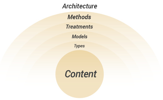
CONTENT: There are five layers to consider when incorporating content—Content Types, Models, Treatments, Methods, and Architecture.
Content Types: Content is more than just text. Content includes a variety of media including photography, video, audio, data, and documents. For example, infographics combine text, data visualization, and illustration. It's also critical to inventory the different types of content and how the content can become object-oriented, which is when content is used in other contexts.
Content Models: Content models combine the different content types into a more recognizable model or format. For example, a recipe is a content model, which may include content types such as ingredients, instructions, and photography. The content model for a movie review may contain content types such as a movie description, ratings data, a list of actors, and a movie trailer.
Content Treatments: Content can also have applied aesthetics and treatments. For example, the visual style may include 2D illustration or the photography may be treated with a vintage style or duotone. Text may have a unique tone or personality based on the brand voice. Graphics may reflect a certain company culture or personality, which can be indicated in brand guidelines.
Content Methods: Content can be presented in more creative ways. It can be vastly more interesting and engaging when methods like storytelling, metaphors, analogy, symbolism, scenarios, challenges, or other creative concepts are applied.
Content Architecture: Content architecture is the structure and organization of information in a website or software system. It touches all content categories including content types and models and how content interlinks.
To summarize, Content Types are aggregated to create Content Models. The content types and models can have an applied Content Treatment. A Content Method can provide a narrative or framework for the content. All of these elements are organized through Content Architecture.
USER GOALS
There are five layers to consider when incorporating user goals: User Types, Needs, Motivations, Behaviors, and Outcomes.

User Types: It’s important to understand the different user types that will use the end product. A common practice is to create user personas that detail their different roles, responsibilities, skill-levels, demographics (gender, age range, languages, locations, etc.) psychographics (personality, values, attitudes, interests, lifestyles) and where, when and how they will use the product.
Needs: Once user types are identified; it is critical to understand and define the relevant needs and aspirations that will help fulfill their goals. Some needs may be more simple, like finding documentation, while others are more complex more physiological or esteem needs. Additional examples of needs may include personal progression, accomplishment, mastery, recognition, status, belonging, expression, or a sense of purpose.
Motivations: Once the user needs are identified, we need to understand how users are motivated to fulfill those needs. This could be a wide range of intrinsic or extrinsic rewards or motivators, implemented with cues, design triggers, or other techniques.
Behaviors: Once the motivations are understood, it's important to research the user's current behaviors and how new motivations can potentially drive behavior change. With enough motivation and behavior change there is a greater likelihood of developing new habits and loyalty to a product and brand.
Outcomes: The combination of Needs, Motivations, and Behaviors can then translate into meaningful and measurable outcomes for users.
To summarize, each User Type has a set of Needs they are trying to fulfill. Users are Motivated to take action. Repeated Behaviors can produce significant user Outcomes. An example may be mother with a busy schedule (User Type) who Needs to train for a 10k. She might be Motivated by daily reminders and encouragement from friends to exercise (Behaviors) resulting in longer distance runs (Outcome).
BUSINESS GOALS
There are four layers to consider when incorporating business goals—Operations, Offerings, Outcomes, and Mission.
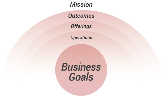
Operations: Each project has operations that support the product, which can include people, resources, and other connected experiences. People involved in the project can be key business stakeholders, content contributors, subject matter experts, collaborators, administrators, recruited users and others involved in the project. Resources may include content data feeds, APIs, third-party tools, stock artwork, brand guidelines, existing user research, analytics or other resources. Connected Experiences can happen prior, during and after the experience. First, understand how users will find the product either through internal communications, advertising, the App Store, search engines or through social media. This helps make the communications consistent, congruent, professional, and focused. Then users may interact with departments like live customer support, technical support, human resources, or others. This understanding informs the designer how the company has the capacity to support user inquiries.
Offerings: The business may offer an ecosystem of products and/or services. It’s also important to understand how these products and services relate to each other. To communicate these offerings, the business should also have a value proposition, which states why a consumer should use the product or service versus other competitors.
Outcomes: The offerings ultimately support meaningful metrics and Key Performance Indicators that help support business success. KPIs may include financial performance, customer acquisition goals, increased customer satisfaction, employee performance metrics, call center metrics, or other indicators.
Mission: A mission statement provides the core purpose of an organization, its competitive advantages, its target audience, and the reason the organization exists. The mission statement should guide decisions and clearly define goals.
If customers have positive brand experiences and transactions, they provide business outcomes. To summarize, the Operations support the business Offerings. If customers have positive brand experiences and transactions, they provide business Outcomes, which help fulfill the business Mission.
INTERACTION
There are four layers to consider when incorporating interaction—Patterns, Systems, Devices, and Humans.

Pattern Interaction: Design patterns (AKA Micro Interactions) are reusable components and interactions. Patterns include everything from headers and menus to calendars and maps. Resource libraries for patterns include Pattern Tap, Mobile Patterns, and pttrns.
System Interaction: The system can contain navigation, flows, feedback, and notifications to help the user progress and achieve their goals. The nature of the system can either be static, meaning that it is unchanged or dynamic meaning there is constant change or activity within the system. Dynamic systems can be regulated or self-regulated, meaning there are varying degrees of permissions and actions certain users perform based on their credentials. Systems can also be defined by the content management system or other system software, which may have a set of capabilities and limitations.
Device Interaction: When designing for an experience it’s key to understand the capabilities and constraints of the targeted devices, including screen sizes, connectivity, user interface conventions and other factors. The experience could happen with a variety of devices including phones, tablets, kiosks, terminals, watches, appliances or other things. For example, modern phones can support gestures, geolocation, accelerometers, audio recording, camera capabilities, push notifications and other features that are native to modern phones. User interface design considerations are also made to provide experiences that are ergonomic and comfortable when using certain devices.
Human Interaction: The human interaction may be formal or informal, personal or interpersonal, social, or some other type of human interaction.
To summarize, a set of Patterns are provided in a System. The system can be available on multiple Devices to encourage certain types of Human Interaction.
EXPERIENCE FACTORS
Effective user experience is more than just the simple usability of a product. When creating the CUBI model, I concluded that there are at least four primary factors for effective experiences.

★Branded Experience: A brand experience is not simply the visual identity. It’s the tonality and totality of the entire brand experience for a customer at any touchpoint. Any experience a user has with the business is a brand experience, whether it’s reviewing product information online, receiving live support from a call center, opening product packaging, or learning about the product or service from friends. The brand experience should convey to users that it’s credible, reliable, reputable, and that the company delivers on their promises. Brand communications and transactions can make or break brand loyalty.
★Comprehensive Experience: A comprehensive experience is one that is both comprehendible and extensive. A comprehensible experience is understandable, clear, uncluttered, properly labeled, scannable, organized, categorized, and lacks ambiguity. If there is an inordinate amount of corporate lingo, jargon, slang, or the messaging is not relatable, the experience may not resonate with users. An extensive experience provides users with a sense of completeness. Missing content can leave users unfulfilled. For example, if users don’t have enough information about company offerings on a homepage or within supporting pages, people may leave the site or delete the app.
★Useful Experience: A useful experience satisfies user needs, makes them feel empowered or productive, and helps them efficiently achieve their end goals. This can be measured by their changes in behaviors, actions, and performance or by other tangible means.
★Usable Experience: A usable experience is easy to use, intuitive, findable, learnable, legible, consistent, and provides prompts and feedback to communicate their progress in a system or process.
Usable experiences also:
Allow for forgiveness by allowing users to correct mistakes
Provide accessibility for those with impairments
Functionally work on the targeted devices and browsers
PROCESS FACTORS
When businesses provide systems for users to interact with, there are typically four process steps to consider.

Communications: The intersection between business goals and content is communications. The branded content communicates comprehensive messaging to engage users.
Reactions: Users react to these communications and quickly decide if it’s something useful to them.
Actions: The reaction can motivate users to take action to fulfill a goal or perform a task. This could be prompted from a call to action, trigger, task list, dashboard or by other means.
Transactions: User actions then translate into business transactions. The types of transactions may include purchases, providing ratings on products or services, customer loyalty registration, etc.
The CUBI Outer Ring
Once the CUBI Model was developed, Corey Stern made the observation that user experience disciplines, tasks, and methods matched with the major components on the model forming a structured outer ring. This ring helps indicate the potential tasks and efforts required to execute on the strategy. It doesn’t have to be daunting or disorderly.
Please note that there are too many user experience disciplines and tasks to incorporate on this diagram.

WHERE IT FALLS SHORT?
Some users agree that this model doesn't differ very much from past variations of UX models. These are good lists to run down when working on larger projects, but some users want more process behind it.
0 notes
Text
Task1 :
My Specialist field
What is a Graphics Designers Job?
A graphic designer’s job is to produce visual ideas that communicate solutions and ideas that inspire, inform and captivate consumers. Furthermore, goals can be different upon the type of graphic design, but a graphic designer primarily focused on making whatever direction they are producing for recognizable. A graphic designer is there to help build a brand identity and boost that company’s brand as well as communicate their messages.
What is Illustration & Rebranding?
An illustration is a decoration, interpretation or visual explanation of a text, concept or process, designed for integration in published media, such as posters, flyers, magazines, books, teaching materials, animations, video games and films. And Rebranding is a marketing strategy in which a new name, term, symbol, design, concept or combination thereof is created for an established brand with the intention of developing a new, differentiated identity in the minds of consumers, investors, competitors, and other stakeholders.
The rise of the remote graphic designer
The career of a graphic designer has also evolved along with the development of the field itself. Companies no longer hire in-house designers; they hire freelancers. This is a huge advantage for both the employer and the employee. Companies get to save on office space and do not have to provide all the tools and devices needed. Freelance graphic designers too can work from anywhere at all. All they need is an Internet connection, a laptop, and design software.
As of now, it is clear that the field of graphic design will only develop further with the advance of technology. It will always remain an essential tool for brands to drive their profits, as well as a medium of artistic and creative expression.
My specialism in this industry is Illustrations and Graphics Design. I love to learn about new things and be constantly taking in new information, illustration has shown itself to be the ideal field. I get to develop and be inspired by interesting concepts and then think to myself, and I also learn from failures in my work. I find that many lessons/skills in the art world are learned by simply doing something and seeing what works and what doesn’t.
And of course, I learn from other artists. Having other artists have proved to be crucial. Experienced artists and teachers constantly remind me of areas to improve in my work and help keep me updated on the ever-changing technology of the art world.
One of the artist that inspired me into designing is Aaron Draplin, he is a graphic designer, author and founder of Draplin Design Co. His clients include Nike, Burton Snowboards, Esquire, Red Wing, Field Notes, Ford Motor Company and the Obama Administration. His illustrations are very professional and simple.
Aaron Draplin is a popular contemporary graphic designer known for his logo designs and poster art. He is also the founder of Draplin Design Co. He was born on October 15th, 1973 in Detroit, Michigan and was also raised there. He attended St Francis High School until 10th grade and then moved to Traverse City Senior High to finish the rest of his education, graduating in 1991. He started his associate degree at Northwestern Michigan College at the age of 17 and learned the basics of Visual Art. When he was 19, he moved to Bend, Oregon to chase his dream of becoming a professional graphic designer. He started working on Snowboard designs and progressed onto bigger things from there.
Frank Shepard Fairey is an American contemporary street artist, graphic designer, activist, illustrator, and founder of OBEY Clothing who emerged from the skateboarding scene. He first became known for his "Andre the Giant Has a Posse" sticker campaign while attending the Rhode Island School of Design.

The Process of Illustration Today:
STEP 1: BRAINSTORMING & IDEAS
When beginning an illustration project, I start by creating a sketch dump. This is an industry term for the action of a stream of consciousness sketching, which is usually done in a quick and haphazard manner. This action helps me clear my mind and gets the ball rolling on pinpointing that great idea, which may manifest on the first sheet of paper or reveal itself many sheets in. During the brainstorming round, there is no limit to how much or how little you should sketch. The primary function of this exercise is to build momentum.
STEP 2: SKETCHING
I get a little more detailed in the next step, where I gradually build up loose and fluid lines from the initial sketches until something more concrete takes shape with heavier strokes and defined lines. Like Step 1 before, there are no hard and fast rules on how much time and detail should be dedicated here. Sometimes first round sketches are almost ready-made for Step 3 other times exhaustive renditions are required.
STEP 3: COLOR EXPLORATION
I usually start by scanning the image or photographing it with my phone. There are instances where I need to tweak it slightly so that the lines are more defined, but I’m quickly on to the next process colour exploration.
STEP 4: BUILDING THE SHAPES
Once I have the basic colour scheme negotiated, I import my sketch into Illustrator to begin creating basic shapes and adding initial detail. Here, many alterations are made to improve the illustration and make it more visually appealing, so this is usually the most time-consuming of all steps.
STEP 5: DETAILS & TWEAKING
This is where I begin adding more details to bring life to the illustration, taking care to decide how much tweaking is still needed. Much is determined by trial and error. Sometimes there are too many small details, or maybe this colour is too bright or overused; you get the idea. If something doesn’t quite look right, it is either deleted or re-tweaked.
FINAL STEP: PRESENTATION
Sometimes the illustration will fill the entire page, other times it is dominated by white space, or includes text. I’m a fan of either surrounding my illustrations in white space or bleeding them over the entire artboard. And I only add text when necessary. When in doubt, go back to the beginning, as presentation is ultimately determined by an illustration’s original intent.
https://collegegrad.com/careers/graphic-designers
https://focuslabllc.com/digest/illustration-process
0 notes
Text
Keeping New Year Resolutions
What is it about New Year's resolutions that for such a variety of individuals nearly foresee disappointment just by announcing them? The appropriate response lies in the vacuum in which so a large portion of us "resolve" to improve one year from now. To eat better, to work harder, to get fitter, to for the most part be better.
The issue is, when making New Year resolutions, we're basically choosing to supplant old propensities with new, and changing propensities is not as simple as just choosing to do as such. It takes roughly three weeks to build up another propensity, and that implies three weeks of sense of duty regarding acting in the way you now wish to. For some fortunate individuals, once they choose to accomplish something, they simply move forward and do it, and their commitment pays off with new propensities shaped in a short space of time.
In any case, for the vast majority of us, it's greatly troublesome not to fall over into our "old ways", thus with a specific end goal to guarantee a higher level of achievement we have to accomplish more than choose to act in an unexpected way. We have to set up a structure that will make it simpler for us to adhere to our new conduct sufficiently long for it to end up noticeably continual.
So how would we do this? Well most importantly, get clear on what it is you need to accomplish. To take an average new year (and my genuine) illustration: "I need to get more fit and get fit." sufficiently simple objective, with a sufficiently straightforward system: eat all the more soundly and take some activity. The trouble however is that if adhering to a good diet and general exercise are not some portion of your current propensities at that point putting this procedure without hesitation will be not so much basic but rather more of a battle than you may anticipate.
So what sort of a "structure" do I have to set up to make it to a lesser extent a battle? Well right off the bat, I have to make my objective as particular as could be expected under the circumstances, record it and keep it in a place where I will see and read it frequently - I have to envision a particular result. In the given illustration, getting in shape could mean anything from two pounds to eight stone and anyplace in the middle. In the event that I leave the objective unspecific, it will be less demanding for me to let myself free at the primary snag. Assuming anyway, I have a specific focus as a top priority, will probably get ready for action should I wander off once in a while. For my situation, I need to lose a large portion of a stone, diminish my cholesterol by two indicates and be sufficiently fit effortlessly manage my week by week kayak polo instructional meetings.
So now I'm sure about precisely what it is I need to accomplish, the following thing I have to do is separate my general system into gradual steps. What this does is makes it simpler to escape. "Beyond any doubt I can begin eating soundly and taking activity today, yet I've nothing solid in the house, and it's sprinkling outside... I'll begin tomorrow." Sound recognizable? Be that as it may, in the event that we enjoy this general procedure and reprieve it down, an amusing thing happens: we feel more persuaded! What's more, inspiration is the way to both moving began and keeping.
So my infant steps will be: design a three week menu of delightful and solid dinners; search for the correct supplies (store pantry staples for this three week supply, enough new leafy foods to last three to four days, and sound, low fat (additionally wonderful) snacks; select an activity pal and timetable standard exercise sessions together; discover a photograph of me at the weight I need to be (or stick my face onto a photo of another person at the weight I need to be) and stick it to my cooler!
In this way, I can begin today without wandering out into the breeze and rain. Just by perusing through formula books and sites to design my three week menu, I can feel my inspiration expanding, and this drives my craving to go shopping as quickly as time permits to stock up on the nourishments that will bolster me in accomplishing my objective. Also, as I begin, it's less demanding to make the following stride and ring a companion to make a promise to go for a long walk together the following day, regardless of what the climate. With every little stride, I additionally bond my resolve, and as every day passes by the less demanding it progresses toward becoming to keep up my new conduct.
Be that as it may, to keep it up long haul, will require significantly more help. Why? Since life will carry with it little obstructions that will make it more hard to adhere to my plans. I'll have incidental impromptu dinners out, my activity pal will cross out once in a while, I'll most likely even have the odd pig-out day! Without extra backings set up, these little hiccups could bring about my determination being deserted before I have cemented my new propensities.
To set up that, I have to attempt and recognize what hindrances may emerge which would expand the odds of me surrendering my new courses before they do turn out to be more chronic to me. And after that, suspecting these obstructions before I really experience them, set up backings to help me either keep away from them totally, or recuperate from them rapidly and get myself back on track.
I have officially recognized some potential obstructions, so what would i be able to do to beat them? All things considered, I could enlist two exercise amigos, not only one. I could likewise have a go down arrangement, for example, a yoga tangle and video. I could permit myself several days a month to act up sustenance insightful without thumping myself about it mentally, or going the "hung for a sheep as a sheep" course. I could join Weight Watchers (indeed, I as of now have). I could teach myself about nourishment, great fats and awful, cholesterol diminishing sustenances and so forth. Furthermore, to keep my inspiration up, I can help myself every day to remember what my objective is, and what "gradual steps" I have to take today to continue moving the correct way.
These are for the most part little and basic strides I can take, yet included equivalent a help program which will essentially expand my odds of achievement. Rather than essentially making myself a guarantee, I am focusing on genuine and enduring change that will emphatically influence my life. Also, I hope to succeed! I trust you figure out how to keep your own particular new year's resolutions this year.
Hilda Carroll is an existence and business mentor who spends significant time in helping her customers to appreciate the adventure, by understanding the capacity to BE cheerful WHILE they seek after their objectives, the accomplishment of which at that point turns into a reward, as opposed to the premise of their joy.
1 note
·
View note
Text
Discussing Beauty During NYC’s First Open Data Week
by Chris Chavez
Last week, New York City celebrated its first open data week. Kicking off on March 4th, during International Open Data Day, the week of activities commemorated the fifth anniversary of NYC’s open data law. Since the law’s release, over 1,600 data sets have been collected and made available for public use.
With this information at our fingertips, what will the residents of New York accomplish?
Marvin J. Mathew and I met because we want to know the answer to this question. As part of open data week, we invited 14 friends and collaborators to dinner to discuss civic issues not in terms of problems and solutions, but in terms of beauty. We challenged each other and our guests to think of ways that data could help our city reveal more of its civic beauty. New York City has a strategic plan. It also has an open data portal. Could beauty, an admittedly unusual partner, connect these two tools and make each more accessible to the public at large?
Beauty Is A Strategy
Beauty can galvanize a city’s residents to live into a better future. When we first connected, Marvin and I quickly discovered a shared passion for the story of Medellin, Colombia. I first heard of Medellin’s history from the below article written about its bold, risk-taking mayor in 2007. Marvin’s connection is closer to the ground, having lived, worked and built community in Colombia over the last 3 years.
Medellín's Nonconformist Mayor Turns Blight to Beauty
Elected in 2003 as an independent, and riding a growing economy and this decline in violent crime, Mr. Fajardo has…www.nytimes.com
For some urban planners, architects, and policy makers, the transformation narrative of Medellin is well-known. In 2003, Sergio Fajardo was elected mayor of Medellin. Mr. Fajardo’s city was known for its violent, drug cartel-fueled crime, and for its most infamous son Pablo Escobar. Slowly, the city began to turn over a new leaf. Mr. Fajardo contributed to its positive transformation by adopting an urban development approach that called for the city’s most beautiful buildings to be constructed in its poorest areas. Though his approach to redefine the city’s future by redesigning its civic infrastructure has not been a cure-all, Mr. Fajardo’s culturally and aesthetically motivated actions expanded civic dialogue by encouraging Medellin residents to re-engage their civic spaces.
One doesn’t have to share our interest in Medellin to pay attention to the transformative power of a city’s beauty and culture. A report on New York City completed at the beginning of March 2017 has found a strong correlation between the presence of cultural institutions in a neighborhood and that neighborhood’s crime rate.
The researchers found that communities with cultural resources — even those in the lowest 40% of income distribution — had 18% less crime, 14% fewer cases of child abuse and 5% fewer obese residents compared with neighborhoods with similar racial and economic makeups that had few or no cultural institutions.
Crime found to be lower in NYC neighborhoods with arts institutions
Cultural institutions such as the Metropolitan Museum of Art and Broadway theaters are not only economic engines…www.crainsnewyork.com
The newly released report has supported an effort by the Department of Cultural Affairs to put together a citywide cultural plan. The plan will be presented to the City Council this July.
What can beauty do for data?
Dr. King once said that Power without love is reckless and abusive and love without power is sentimental and anemic. Something similar can be said about the relationship between data and beauty. Brene Brown defines authenticity as the daily practice of letting go of who we think we’re supposed to be and embracing who we are. Data allows beauty to express itself authentically by revealing what is. Beauty allows data to inspire us to move from what is to what could be.
Moving from what is to what could be is the goal of New York City’s OneNYC Strategic Plan. During the course of our dinner, we prompted our guests to think individually and in small groups of how we, the residents of New York, could help execute the strategic plan by combining what we felt to be beautiful about our city with data that could give that beauty voice. We came up with a few ideas.
Idea #1 — Make it easy for residents to act.
In preparation for the dinner, Marvin and I sent our guests a link to the 250 plus page report sharing progress made to-date on the OneNYC plan. Our recommendation was to skim the report or look over its executive summary. After flipping through its pages, Nathan Burge, 36, a designer from Canada, came away puzzled. “The report presents all of this information,” Nathan shared, “but it gave me no direction, no call to action. Eventually, I stopped reading. What was the point?”
Recommendation: Incorporate calls to action for residents within future OneNYC progress reports. Who can we call to encourage more progress in a given area? How can residents partner with their local community boards to draw attention to gaps in progress reported and progress felt? The city government has an extensive online presence. Websites listing information about how to contact different levels and agencies of government should be included in printed reports and hyperlinked in digital ones. This information should be called out using a recognizable design language. This way, readers not familiar with policy can quickly scan for what is being said in a nutshell and learn how they can engage.
Idea #2 —Call out beauty wherever it’s found.
How could resident stories of the beauty they see in their daily lives be invited and highlighted on a citywide scale? How could moments of beauty communicated through channels like the city’s social media accounts reflect the positive, personally experienced NYC in future reports?
Recommendation: Resident stories broadly told to support the headway made in each vision area are a great start. What’s next? Dedicate a section to resident stories in the next progress report. Organize these stories by how they connect citywide statistics of progress in each vision area to personally-felt impact. These stories could be written or visual. Offline, selected stories would represent the neighborhood faces and voices of our metropolis. Online, these stories could continuously update and flow through existing social media platforms. The city is already making progress on this front. For example, we are excited to see the stories and conversations catalyzed by the One Book, One New York campaign out of the Mayor’s Office of Media and Entertainment. We hope that some of this campaign’s activity is captured as part of the next strategic progress report.
Idea #3 — Educate as well as update.
There are many aspects of our daily lives impacted by government at the State and Federal levels. Many residents are unaware of them. This leads some NYC residents to misplace their frustration or waste their energy when they confront inaction in the wrong places of decision-making. We need to know who and what to engage in order to feel like we are insiders in our own neighborhoods.
Recommendation: Use infographics or cartoons to put the city government in context. Issue a challenge to high school students to show various ways that State, Federal, and City levels of government work together. Pair winners with prominent NYC designers to produce finished illustrations. The results will identify partners and stakeholders at NY State and Federal levels who influence the issue areas mattering most to each vision area. This information will help residents increase the relevancy of their civic engagement.
Idea #4 — Nature needs to exist outside of natural disasters.
In an urban environment, we tend to react to nature only when it shows up in unwanted ways. For example, the strategic plan and its progress report highlight important, ongoing steps to apply lessons learned from Hurricane Sandy when considering the resiliency of buildings and city infrastructure. Taking a step into a more proactive future, how can we celebrate the ecosystems that exist beyond our eyes and below our feet?
Recommendation: It makes sense for the strategic plan to take a human-centered approach to city living. But, we think New York City could take a bolder approach. Our city’s natural ecosystems describing the flora and fauna of our parks, our waterways, and our skies should have its own vision category within the strategic plan. In this way, nature would do what it does best — connect us across neighborhoods, issues, and generations. We don’t have to wait for a natural disaster to do this work for us.
The simple takeaway from our night together? This group of 16 New York City residents can make little personal use of data manuals and progress reports. These efforts to collect and organize information represent important tools for policy- and decision-makers, but in their present form, we have a hunch that they do not activate most New Yorkers. To turn the government’s strategic plan into our city’s shared plan, we need personally felt, community supported beauty. We need to use decentralized resources like the city’s data portal, and centralized efforts like the city’s strategic plan, to inspire people to see beauty around them. How? By allowing New Yorkers to inform each other and their government with their stories. We hope the recommendations above can help connect the incredible work that has happened already with what’s to come.
Many thanks from Marvin J. Mathew and I to our dinner guests: Alex Todaro, Annemarie Gray, Athena Diaconis, Diana Matthews, Hayley Darden, Jerone Hsu, Jesse Lee, Luis Navia, Nancy Bui, Nathan Burge, Roya Shariat, and Titiaan Palazzi.
Many thanks to Adrienne Schmoeker and her countless teammates in city government for organizing open data week and believing in the power of mass collaboration.
1 note
·
View note
Link
Soraya Roberts | Longreads | March 2020 | 9 minutes (2,261 words)
The image that struck me most was the empty piazza. That Italian square — I believe it was in Venice — with no one in it. Maybe a bird or two. It looked inviting but also wholly unnatural. A city square is made for people, lots of people, people from everywhere. If people aren’t there, does it cease to be a square? I wondered the same thing about the Louvre and its tens of thousands of objects with no one to look at them — is it still a museum, or is it just a warehouse? I wondered about all those Berlin concert halls with no one to hear their music, all those Indian cinemas with no one to watch their films, all those crumbling ruins everywhere, standing there with no tourists to behold them or to record that beholding for everyone else. At this particular point in history, does art exist if we aren’t sharing it?
By sharing I mean not only sharing a moment with the art itself, but also sharing the space with other people, and more literally, sharing all of that online — posting updates on Facebook, photos on Twitter, videos on TikTok, stories on Instagram. This kind of “sharing” is constriction rather than expansion, regressing back to the word’s etymological root of “cutting apart.” This contortion of a selfless act into a selfish one is symptomatic of a society that expects everyone to fend for themselves: Sharing online is not so much about enlightening others as it is about spotlighting yourself. It’s impossible to disconnect the images of those now-empty spots from the continuous splash of reports about the coronavirus pandemic gouging the global economy. In America, the economy is the culture is the people. Americans are not citizens; they are, as the president recently put it, “consumers.” And on the web, consuming means sharing that consumption with everyone else. That the images suddenly being shared are empty exposes the big con — that in reality, no one has really been sharing anything. That social distancing is nothing new.
* * *
Even before Hollywood started postponing all of its blockbusters and talk shows started filming without audiences and festivals started to dismantle and bands canceled their tours and sports seasons suspended indefinitely, the public was turning on cultural institutions run by a subset of morally dubious elites. In December 2018, protesters at the Whitney Museum of American Art burned sage (“smoke that chokes the powerful but smells sweet to us”) and forced the departure of the board’s vice chairman, Warren Kanders, the CEO of the company that manufactures tear gas that has reportedly been used at the border. Two months later, artist Nan Goldin, who had a three-year opioid addiction, led a “die-in” at the Guggenheim over the museum’s financial ties to the Sackler family, the Purdue Pharma founders who many hold responsible for the opioid crisis. In the U.K., the Tate Modern and Tate Britain also dropped the Sacklers, while climate activists pulled a Trojan Horse into the courtyard of the British Museum to protest the sponsorship of an exhibition by oil and gas company BP. As performance artist Andrea Fraser, known for her institutional critiques, wrote in 2012, “It is clear that the contemporary art world has been a direct beneficiary of the inequality of which the outsized rewards of Wall Street are only the most visible example.”
If that recent exhibition of impressionist paintings seemed oddly familiar, or that ballet you just saw appears to keep coming back around, or that one classical musician looks like he’s hired nonstop, it’s not your imagination. It’s a function of that exclusive control, of the same artists, the same works, the same ideas being circulated (“shared”?) by the same gatekeepers over and over and over again. “Far from becoming less elitist, ever-more-popular museums have become vehicles for the mass-marketing of elite tastes and practices,” wrote Fraser in Artforum in 2005. Which is why certain names you wouldn’t think would cross over — from contemporary artist Jeff Koons to art-house filmmaker Terrence Malick — are more widely known than others. According to The New York Times in 2018, only two of the top 10 all-white art museum chairs in the country are women. And almost half of the 500-plus people on the boards of the 10 most popular American museums have become rich off the finance industry, while many others owe their wealth to oil and gas; the small group that is responsible for exploiting the world is the same group that is responsible for its enlightenment. They determine which pieces of art are bought, how they are curated, and how they are disseminated — theirs are the tastes and practices we are sharing.
With this “increasingly monopolized market and increasing parochialism,” German artist Hito Steyerl explained last year, “a sense of international perspective gets lost, which is a wider sign of rampant isolationism.” And this doesn’t just apply to high arts, but “low” arts as well; movies, music, television, theater, books have all been corporatized to the extreme, with huge amounts of money going to a few while the majority lose out. This is how you get a never-ending Marvel Cinematic Universe, but Leslie Harris — the first African American woman to win a Dramatic Feature Competition special jury prize at Sundance for writing, directing, and producing her 1993 film Just Another Girl on the I.R.T. — still can’t get a second feature off the ground.
While public funding for the arts has plummeted since the ’80s, however, the web has increasingly encouraged public sharing of its consumption on social media. Online, we look more traveled, more cultured, more inclusive than ever before. And it’s difficult to argue that wider access to art, that our increasing proximity to foreign cultures, could be wrong. But if you look closer, you notice that all this connectivity is largely superficial — it is heavily prescribed and strongly overlaps. The latter-day bourgeoisie all travel to Portugal at the same time, all visit the same Marina Abramovic exhibit, all watch the same Agnes Varda films, attend the same Phoenix tour. They clamor less to immerse themselves than to record and reproduce everything they have experienced, their distraction expressed by the ever-growing collection of imagery memorializing all the different experiences they’ve had — the same kind of different as everyone else’s.
“An idea of progressive internationalism,” Steyerl told Ocula magazine, “is progressively abandoned or gets snowed under constant waves of affect and outrage manipulated by monopolist platforms, and solidarity is swapped for identity.” In other words, all of this supposed sharing is really a tech-sanctioned performance of capitalism to showcase one’s value in a toxic din of competing consumers. The more photogenic the better, which means the less nuance, the better; think the Museum of Ice Cream, which costs almost 40 bucks for access to photo-friendly adult playgrounds — “environments that foster IRL interaction and URL connections” — like a “Sprinkle Pool” of multi-colored biodegradable bits you can’t actually eat. And the more recognizable the look (see: the retro aesthetic of any teen Netflix show), the more heady words like “nostalgia” become a proxy for depth that isn’t actually there. As we speed online through Steyerl’s distracted fragmentary so-called “junktime,” we quickly compound what she dubs “circulationism,” propagating images with the most power, giving them even more power. Standing next to the Mona Lisa, for instance, offers greater token currency among a wider set than standing next to anything by Kara Walker, who speaks to a more immersed but smaller audience. Either way, online, currency is king.
Kickstart your weekend reading by getting the week’s best Longreads delivered to your inbox every Friday afternoon.
Sign up
Culture has, above all, become a mark of personal wealth. When Americans share their experiences on social media, they are sharing their cultural capital with a neoliberal society that defines them by it. This is a result of the culture war Fraser recognized several years ago, which “has effectively identified class privilege and hierarchy with cultural and educational rather than economic capital.” But, again, economics ultimately rules. While the poor may be allowed to briefly occupy the space of cultural capital, it is the rich who own it, who offer it up for limited consumption.
Yet the desperation to share, to express one’s value in a world that is so intent on devaluing us all, is deeply human. Which is why you get people Photoshopping themselves onto famous backdrops, which, from a cultural capital perspective, is no different from being there — on social media a photograph is a photograph, and the real Sistine Chapel looks the same as the Etsy wallpaper reproduction. People have always consumed art partly for the cultural capital rather than just the personal enrichment, but now the goal is to broadcast the enrichment itself to the public: sharing one’s consumption of the aura has priority over one’s actual consumption of the aura. Though a hierarchy persists even here. The authentic art consumer, the one who actually experiences the work in person, looks down upon the forger. As Walter Benjamin wrote, the aura of a piece of art is tied to its presence, which can’t be replicated. Which is to say the essence of art can only be experienced through the art itself — a picture can’t recreate it, but it does make its shared image more valuable.
It’s apt that right now, in the midst of a pandemic, the popularity of a cultural site can kill and that virtual tours are being encouraged over actual ones. What better way to illustrate that our increasingly insular art world has not in fact connected us at all, but has done the opposite? As Steyerl noted in e-flux magazine in 2015, the Louvre, that model of national culture, was a “feudal collection of spoils” before revolutionaries turned it into a public museum, “the cultural flagship of a colonial empire that tried to authoritatively seed that culture elsewhere, before more recently going into the business of trying to create franchises in feudal states, dictatorships, and combinations thereof.” Those with the means flock to symbols of elitism like this, not to widen their perspective in solidarity with the world, not to connect with a community of strangers, but to bolster their own value locally by sharing the encounter online. This is not globalism; this is the neoliberal stand-in for it.
All of that foot traffic, all of that online diffusion, is an expression of how we have commodified the individual consumption of art to the point that it looks like we are sharing it with others. We aren’t. We are instead dutifully promoting ourselves as valuable consumers in the capitalist community we are complicit in perpetuating. “It’s not a question of inside or outside, or the number and scale of various organized sites for the production, presentation, and distribution of art,” wrote Fraser in Artforum. “It’s not a question of being against the institution: We are the institution.”
* * *
One of the last movies I saw in the cinema before they started closing down was The Invisible Man. It was a perfect example of how a public screening can tell you what streaming cannot — in real time, you can gauge by the reactions around you whether or not it will be a hit. As with certain art installations, you are experiencing not only the art, but also simultaneously others’ experience with it. In that theater, we screamed and laughed and sat agog together. It was a spark of community that extinguished the moment the lights lifted. A few weeks later, these same strangers who shared that moment of emotion together, headed to supermarkets to empty out toilet roll aisles, buy up all the disinfectant, and clear out the fresh meat despite a collective need for it. These same strangers who in concert cheered on an oppressed heroine, went on to unashamedly side-eye the Asians in their community. Individuals in North American society can occasionally partake in a cultural experience with their neighbors, but in the end it’s to exhibit their own counterfeit edification. It’s telling that the big tech these individuals ultimately share their consumption on — Twitter, Facebook, TikTok, Tumblr, Instagram — rarely funds the arts.
Which brings us back to those empty images from the start of this essay. Proliferating photographs of abandoned culture, of objects ignored, confront the hollowness of online sharing. Social media implies connection, but the context of its shares is as important as the context of art’s production and neither can be divorced from the hierarchies in which they reside. No wonder our meagre individual expressions of value dictated by capitalist enterprise fit perfectly within a capitalist enterprise that profits off our inability to ever sate ourselves. The only way to really share — with art, with each other — is to remove sharing from this construct. The only way to really connect — to support a collective of artists, to support a collective of human beings — is to distance ourselves from the misguided values we have internalized.
“At its most utopian, the digital revolution opens up a new dematerialized, deauthored, and unmarketable reality of collective culture,” writes Claire Bishop in Artforum. Under a worldwide pandemic, we see a move toward this — individuals freely leaking their cultural subscriptions, artists offering performances for nothing, even institutions waiving fees for access to their virtual collections. While the vulnerability spreading across America right now is ordinarily framed as weakness in the landscape of capitalist bravado, it is central to real sharing and offers a rare chance to dismantle the virulent elitism that has landed us here. It’s unfortunate that it takes a dystopia, a global interruption of the systems in place, to see what a utopia can be — one in which sharing is about the creation and cultivation of community, a reality that only exists outside the one we have built.
* * *
Soraya Roberts is a culture columnist at Longreads.
0 notes
Text
Best Corporate Animation Videos Company in Coimbatore
Introduction
Today it’s no secret that the human brain processes visuals quite it processes texts. Thus adding company animation videos to your selling efforts can build your audience ten times additional doubtless to have interaction together with your complete. Basically, businesses produce selling videos to stay their complete top-of-mind for his or her customers. Thus it’s imperative to grasp what makes the simplest animated company videos.
Here are 7 belongings you ought to fathom corporate animation videos in Coimbatore. Produce Associate in nursing amazing corporate & business video to capture the eye of your audience and convert their interest into investment.
Beware of The important components of a good Video
What makes nice animated whole videos? Videos become attractive once their area unit appropriates video narratives. Such inclusions play a major role in any quite video and once it involves company video, a narrative means compilation an attractive and compelling story with sure components. You’ll be able to mesmerize your audience by the simplest company method animation videos in Coimbatore
The four major components of a grand video narrative are:
Character- The most characteristic of your product video is that the product or the service.
Quest – Your audience is often at the lookout whether or not you recognize their pain points or not.
Climax – This component tells your customers however your hero (the product) will solve their downside.
Resolution – The ultimate a part of the video, it’s concerning introducing the CTA.
Human bit – Let Your Customers Discover what advantages them
People choose a whole once it conveys a message that resonates with them. Therefore, the trick of making a high partaking corporate video involves illustrating to your shoppers the informative options of your product. Once your customers perceive however they’ll like your whole, unnecessary to mention, they’re going to select you over your competitors.
According to specialists, after you arrange to produce a formidable video that attracts the consumer, you wish to own a perfect client persona in mind. With such a persona in your mind, you’ll be able to quickly raise awareness of your whole and educate your existing customers.
The whole temperament – produce you’re Video with a Signature vogue
According to science, folks tend to understand concerning 2 hundredths of what they browse, 100% of what they hear and compared bear in mind eightieth of what they see and do. This can be why your video animation demands to be a formidable extension of your whole in order that viewers watch it and also the image of your whole gets imbibed into their minds.
So after you area unit making a company video, building along with your whole signature vogue can get you wonderful results.
Now, what will signature vogue mean? A signature vogue is similar to the whole temperament and it’s quite any visual aspects like whole colors and emblem. It includes components like UN agency your audience area unit, what’s your niche business and what approach you direct your electronic communication, whether or not it’s towards the B2B corporations or B2C.
Whole promotion – Place your emblem suitably to market your whole
Why can we produce videos? The foremost common answer would be to market our whole, isn’t it? And also the obvious thanks to market your whole is by suitably exploitation logos and taglines. So, unnecessary to mention, your logos ought to be clear and recognizable.
This means you wish not to have to be compelled to limit yourself to the exploitation of your logos. Logos as a corner badge, watermark, or anyplace that’s visible and catches people’s attention proves to be reward able.
Audience Engagement – beware of the length of the video
Length is one in all the important components of every kind of video. It’s the age of instant gratification. Folks don’t wait too long to method info. Therefore to match the people’s attention capability, you have got to require care of your video length. There’s no denying, the length is that the deciding issue whether or not your folks can watch the video or not. Once a video is simply too drawn-out, the amount of engagement begins to drop once a while.
A video that’s additional less no more} than 2 minutes long is found to be more partaking and most significantly, viewers won’t put off before they reach call-to-action.
Experts area unit perpetually of the read that videos area unit principally designed to encourage viewers to search out a lot of concerning your company. Its important goal is to spark their interest and remodel them into your valued customers.
Distribution Channels – realize the correct Platforms to Share Your Video
The final step once making a video is promoting it. However one in all the largest mistakes most people do whereas uploading videos – isn’t to share it on correct platforms which will bring exposure. One factor that we tend to should confine mind whereas sharing our video- viewers reply to video content otherwise reckoning on the social platform or promoting channel.
Hence, you ought to have a concept of wherever you wish to promote your video. Whether or not you wish to transfer it on Face book or use video in AN email, don’t forget to optimize the video title, description and decision to act consequently.
This is for your info – your video must always match into the context of wherever it’s marketed. Don’t forget to match the weather of your video demanded by the platforms. As an example, if most of your customer’s area unit at Instagram, your video shouldn’t be from now on than fifteen seconds and after you wish to position a poster on YouTube thirty seconds long video can work marvel.
Other channels wherever you’ll be able to distribute and promote your videos embody your web site homepage, email newsletters, trade shows, and social media.
Use Effective Tools to Create Animated Videos for Business
Animaker
Animaker is one of the simplest tools to make company animation videos. This DIY tool has become a much-preferred one for its users because it permits them to show statistics and knowledge of additional compellingly. With functions like drag and drop, sound effects, music, pre-animated assets and lots of such options, any business will craft an unforgettable video for its purchasers. Animaker additionally understands that a protracted video is of no price to the audience; that’s the explanation the videos you produce with the assistance of the tool isn’t over a pair of minutes long. You’ll be able to opt for a free period of time then opt for 3 monthly payment choices.
Vyond
Vyond, erstwhile called GoAnimate, is one among the helpful tools that are serving to professionals to form successful animated corporate videos. This homemade and inexpensive tool permits its users to make an attractive company video with their large library of templates, sounds and far additional. Why don’t you utilize Vyond and begin remodeling generic content into dynamic ones in minutes?
Moovly
Are you searching for a tool with unlimited downloads and unlimited videos offer? Moovly is one such tool that has all the options knowledgeable loves. It’s easy-to-use customizable video code that helps you win purchasers simply. You’ll be able to produce visual reports, explainer, and tutorial videos simply and creatively.
Conclusion
With videos continued to achieve momentum joined of the fastest-growing selling ways, it’s time that we tend to concentrate on exploring the facility of a good corporate video. However, we want to recollect that a formidable animated whole video has to follow a basic formula. Like several alternative productions, you wish a perfect script, to begin with, essential music and sound to interact with your audience. An ideal message that says you’ll solve your audience’s downside is last not the smallest amount a decision to action section. Aggregation of these you’ll produce an ideal video that’s nearly and intellectually pleasing.
Looking for more professional ideas on corporate videos? M8 IT Solutions is here at your service. Visit us to get an idea for your next venture.
For more details call us (+91) 9344660083 or email us [email protected] or Visit https://m8itsolutions.com/
#explainer video company in Coimbatore#animated explainer video in Coimbatore#animated explainer video company in India#2D 3D video animation company in India#animated video production in India#whiteboard animation video services Coimbatore#whiteboard animation video services singapore
0 notes
Last Seen Blogs

wildflowers-of-southern-ontario
Wildflowers of Southern Ontario

youaremycosmo
you are my COSMO

aryaofhousesnark
I am a direwolf, and done with wooden teeth.

puffpal7
Kurt cobain and kurtis conner's secret love child