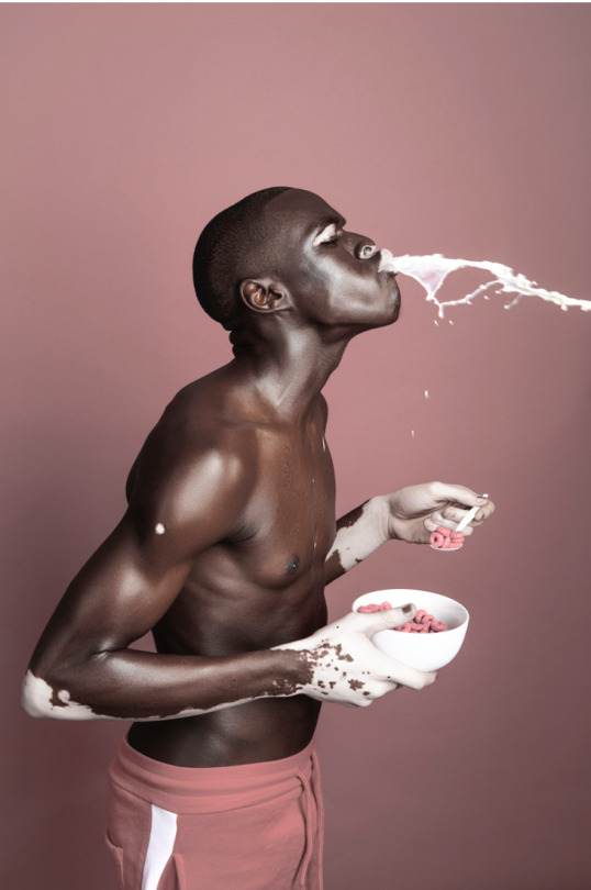
#team green aesthetically but team black ideologically
Text
Alt Marinette AU
thank you so much for your help @starrynighttime!!
PSA: I do know that “alt” is not a type of aesthetic or actual ideology, however I drew and wrote this idea without a set subculture in mind, and now cannot find one that I think would fit her. Let me know if you have any ideas!
A little story introducing the AU below! Let me know if you want to continue or I can just leave it at a oneshot lol.
Adrien sighed as he looked at himself in the mirror that resided in the men’s locker room. He ran his fingers through his hair once more, smoothing it down in the back.
This was the first time that he was lying to his father about where he was, if you didn’t count the akuma attacks that pulled him away to become Coléoptère Rouge. Tikki floated up next to his shoulder pressing, her little pad of a hand against his bare shoulder.
“You don’t have to do this, you know,” she told him with that reassuring smile of hers.
“I know,” he responded - still looking at the white tank top and blue basketball shorts (that he had borrowed from Kim) in the mirror. “but I want to.”
Before Tikki could respond, Nino came bursting into the locker room and she quickly flew into his bag that laid at his feet. Adrien leaned down to grab it as Nino bounded up to him - dressed in a similar outfit. The only glaring difference was how his bright red cap was still a part of the ensemble.
“You ready, man?” he asked, clapping Adrien’s shoulder. He looked over and smiled at his best friend.
“Yup!” Pause. “What exactly are we doing again?”
Nino just laughed, leading them out of the locker room and into the courtyard where there was already a crowd of teenage boys. All dressed in white shirts and shorts.
“This is the Track Team tradition! The Course de Couleur!”
“Yes, but you haven’t exactly told me what we’re doing yet.”
Nino sighed good-heartedly “Basically, the art kids come with all their extra paint. And while we run the track, they throw it all on us.”
Adrien blinked. “So basically they’re just going to throw paint at us.”
“Yup.”
He grinned, “Sounds fun!”
-
There were a lot of art kids, Adrien found out as he readied himself to run. When Nino had talked about the kids in the different arts, he imagined a few scraggly teens with dyed hair and bright clothes - and that they wouldn’t be strong enough to get enough paint on him.
He was dead wrong. There were a few with dyed hair and bright clothes, but that was the minority. But there were tons of kids, enough for them to cover each side of the track. And with paint cans scattered among them. He was going to get absolutely covered in paint.
“I’m going to need to shower at your place before going home,” he said to Nino - who was tying his shoes.
“Of course, man.”
Adrien hadn’t told his father about the little tradition that Nino said he had to come to, knowing that it was probably nothing that he would be allowed to do - especially when he was barely able to join the track team at all. So he just told him that it was the first of track practice.
Their coach stood off to the side, a large hunking man with the name of Coach Lawerence. He stared at all the boys, his large mustache twitching occasionally. Adrien stretched out his arms one more time before shaking them out and readying himself at the white line.
Everyone else got ready next to him, and Coach Lawerence started counting.
“Ready...set-”
He blew his whistle and the Course de Couleur had begun.
-
Adrien was in the front quickly, dodging whatever paint he could. But still, paint flew all around and he was bound to get hit. It wasn’t long before he had paint sliding down his cheek and matting in his hair.
Unfortunately, Tikki’s luck wasn’t with him, as after the second turn - his slid on some paint and landed flat on his back. His shins and shoulders felt painfully sore from the rough material of the track.
He slowly blinked his eyes open, moving himself up so he was leaning back on his elbows. And right before him, was an angel.
She wasn’t an actual angel, because he didn’t think that angels wore paint covered pink jeans and had ripped and doodled on gray t-shirts that read “Francoise Dupont Art”
She looked down at him, looking freakishly tall at his angle.
“Are you alright, man?” she asked, a brow raised. Adrien didn’t answer and her brow raised even higher. “Or.. are you just lying there for fun.”
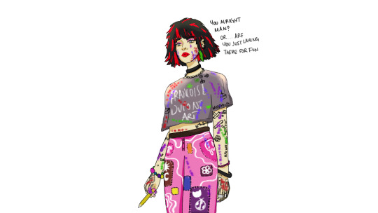
Adrien felt his ears burn and he just hoped that the rest of his face was pale as he stood up. Looking down and realizing just how covered in paint he really was. The girl was standing off to the side, on the grass. He smiled nervously.
“Uh, hi - sorry about that-” he tried to explain that he didn’t mean to make a fool of himself right in front of her, but everytime he looked at her he found something new to notice.
Her dark locks were mixed with red, except there was one bright green streak under her left ear. Her jeans were patchwork, and looked handmade - doodled on with white paint. Her arms were almost completely covered in what looked like black sharpie, same with her gray t-shirt. She wasn’t actually freakishly tall, but instead being a few inches shorter than he was. She’d probably be shorter without her bright pink boots that looked to be platforms.
As Adrien continued to babble, she just stared at him - her cherry covered lips never curving into more than a small smile. After a moment, her eyes flickered to the side before she took a giant step back. Immediately, Adrien was slammed into and once more ended up on the ground.
He seemed to forget that the run was still going on and he was still standing on the track.
“Oh, man - I am so sorry-” Nino apologized as he stood up, his cap askrew on his head.
“It’s alright,” Adrien groaned - standing up as well. Nino looked over and grinned.
“Oh hey little red!” he greeted the girl, bumping fists with her. Before Adrien could ask how Nino knew the angel-girl, he was shoved back onto the track. Nino running beside him as they got pelted with more paint.
-
After the race, when Adrien’s white t-shirt was probably permanently stained, and Nino and him were walking back to Nino’s place - Adrien brought it up.
“So who’s ‘little red?’” he asked, trying to be as nonchalant as he could be. Nino looked over and shrugged.
“Just Marinette, she’s apart of the art program at Francoise Dupont.”
“There are different programs?” Adrien asked, his brow furrowing.
“Yeah man,” Nino laughed. “We all have to take the core classes, like math and English - but everything else is up to us.”
Adrien nodded in understanding and Nino clapped his shoulder. “I’m sure you’ll understand when school starts up tomorrow.”
Oh right, school. Tomorrow. Actual public school.
“Oh yeah,” Adrien grinned.
“Good last day of summer?” his friend asked.
Adrien nodded. “Definitely.”
Pause.
“So we have English and Physics together, right?” Adrien asked, remembering their schedules that they had shared earlier that week, at the first track meeting. Adrien had met Nino then, instantly clicking.
Nino nodded. “Yup, I know a lot of the kids in those classes, so it’ll be a fun year.”
“Is..Marinette in those classes?”
Nino looked over, his brow furrowed. “Yeah, why?” Adrien stayed silent and slowly a grin began to spread across Nino’s face. “Oooohhh, Adrien’s got his first crush.”
Adrien couldn’t help the burn that spread against his cheeks, kicking at a stone on the sidewalk.
“Don’t worry, this year is going to be great,” Nino reassured him.
-
And when Adrien opened the door to classroom 211 to find Marinette doodling on a piece of paper in one of the desks, he knew that Nino was right.
“Oh Adrien!!!” A familiar high-pitched voice called out.
Oh merde.
#miraculous#miraculous ladybug#miraculous ladybug au#miraculous ladybug fanart#miraculous ladybug fanfic#ml au#ml fanart#ml fanfic#adrienette#kwami switch#reverse crush au#alt marinette au#punk marinette au#ladynoir#ml oneshot#starry helped me so much#thank you for everything#i kinda wanna continue or someone can take this off my hands#if you have any questions dont hestitate to ask#ill continue this if ppl want to me
43 notes
·
View notes
Text
Glossary of Terms: from A to Z in the Boralverse
aphlox | carbon dioxide
billrod | cochineal
connit | disguise
dackin | indigo
ersteigung | apex, crest, sforzando
fecundation | fertilisation
guild | corporation
heredian acid | DNA
indreck | nonprofit, charity
jalick | tuxedo
kenonaut | spaceship
lencorve | line of credit, tab
mitigor | ethene, ethylene
narjill | coconut
ostracon | lottery, sortition
parachthon tales | speculative fiction
quanga | butler, secretary
rath | bike
shadome | tomato
threshold mill | nuclear power plant
ubiquity | cultural supremacy, totalist ideology
viker | steward
well-mint | well-off
xanthal | neon
yacht | cult, secret society
zetter | note, memo
The full list of Boralverse jargon may be found under the cut.
adamant | titanium
aeronaut | airship
air-steeple | telegraphy post on a balloon
alchemick | chemical, relating to chemistry
alchemist | chemist
alchemy | chemistry
aldreman | mayor, municipal leader
alluning | moon landing
aphlox | carbon dioxide, also carbonic acid as a liquid
aquifex | hydrogen
arithmat | computing
astrapic | electric, electromagnetic
aumond | almond
autonome | autonomous, unauthorised
autune | sparkling wine, esp. from the Autun region
bdella | virus
billrod | cochineal, a crimson dye produced from the shell of an insect and imported from Lower Mendeva
bit-sheet | tabloid, cheap newspaper
blacklair | horror, media intent to scare
blankpine | white pine, Weymouth pine
bookhouse | library
brimstone | sulfur
caddar | to distil, purify, extract
calamine | zinc oxide
case | cell
casting | publishing
chain substance | polymer
chimer | chimera, hybrid
christmas pie | savoury pie eating on Revillon across Northern Europe but especially in Borland
circular function | trigonometric function
clavier | keyboard, piano
cmm disk | vinyl record
cmm | "chain muriac mitigor", polyvinyl chloride, PVC
codnere | kidney
collocker | interviewer, investigator
collock | chat, dialogue, interview, conversation
collusion | collaboration, confederation
concord | treaty, agreement
concrescence | instantiation, model, prototype
concurrence history | history of a particular time period
conjure | to conspire, to collude
connit | disguise, inconspicuousness, secretiveness; hiding place
connock | ice skating
console | leader of merchant republic, esp. Genoa
convoker | representive, PR person
convoy | troop, division, band of soldier
copperplate | right-wing
coppers | cheap seats, nose-bleeds, lowest-quality product
copysheet | study notes
coronal | helium
corporal quillsam | periodic table, set of chemical elements
coshow | rubber, esp. natural rubber, latex
costumery | clothing catalogue
coswer | cousin
counter-zoic | antimicrobial
covring | (maths) surjection, surjective map
dackin | indigo
daily gyre | circadian rhythm, body clock
daplight | LED
davarn | grand hotel, resort
deficient | positively charged
deixism | approach to research focused on collecting primary sources and references
deixist | researcher, archivist
detaxion | synthesis, combining, esp. in chemistry
dominium | region of control, domain, demesne
druckdue | the silver screen, cinema
drypepper | peppercorns, black peppercorns
edition | publishing, publication
ersteigung | apex, crest, sforzando, peak, climax
excourse | competition, tournament, quiz, game
extent | field (physics)
fecundation | fertilisation
fendle | fennel
filmic | cinematic
geoscopic | exploratory, cartographic, intending to see the world
giftale | media set in or taking aesthetic inspiration from Italy
grade | separate, sort in categories
green snowfall | first snowfall of the new year (after the first of March)
guild | corporation, company
gum | rubber, esp. synthetic rubber
gyre | orbit, cycle; to orbit, to ring around-
herdtale | agricultural stories and songs of mid-19C Gulf Mendeva
heredian acid | DNA (also shortened to heredian)
hereditarian | genetic
hereditature | genome, DNA
heredity | genetics
heverrath | bicycle, velocipede
hever | lever, pedal, also the verb
hourchain | rosary, armilla
hydromotor light | microwave radiation
iamb 5' | iambic pentameter
icon | photo, photgraph
igniac | oxide
ignifex | oxygen
indreck | nonprofit, charity
in peripatetico | abroad, on an exchange, on a sabbatical
in tesquo | in the wild, in practice, in real life
Iscovalian variation | evolution by natural selection
jalick | tuxedo, high formalwear
jast | zinc
kenonaut | spaceship
kernel | cell nucleus
kester | beggar, panhandle
lacker | veneer, false surface
laic | secular, irreligious, oecumenical
lampfire | naked flame used as a light source
leavingstore | gift shop, shop for trinkets
lencorve | line of credit, tab
limmon | lemon
lineball | team ballgame, resembling (soccer) football or rugby
lithing | account, list, enumeration
lodginghouse | waystop, inn, traveller's rest
longform light | radio waves
lorrer leaf | bay leaf
lovetale | romance writing
luetic pox | syphilis
lux | radiation, elementary particle
machinal | automatic, by rote
machovine | strontium
manner | property, nature
mapbook | atlas
masquira | genre of stories typically featuring vigilante characters and plots driven by hidden identities, high society and complicated schemes. It has some overlap with the later spycraft genre, especially in modern works.
matching | (maths) bijection, bijective map
mechanics | dynamics, physics of motion and collision
mecon | metre (length of pendulum with halfperiod 1 second
melee | high society, the gentry (old-fashioned), the ton, the activities of the gentry
meshforum | online community
mesh | network
methodics | computer science, programming
ministry | department, ministry, bureau
mitigor | ethene, ethylene, C2H4
modest | socially conservative, with respect to family, children and gender relations
moneypurse | wallet, purse
mozardisto | member of a populist faction involved in the Second German War primarily made up of Andalusian Christians but expanding in scope, especially towards the end of the war.
mozard | populist, antiestablishment
muriac | chloride
muria | chlorine
myton | type of merchant ship in wide use during the late fifteenth century
namecard | ID, nametag
narjill | coconut
natron | sodium
normal nawat | Classical Nahuatl
normal speed | lightspeed, œ
nucalic acid | DNA (see heredian acid)
odyssey | cinema, movie theatre
oeculux | electromagnetic radiation
oecumen | landscape, outlook, overview, universe
one-case | single-celled
one-zeffre | binary, one-bit, digital
onyx lace | shell pasta, conchiglie
ostracon | lottery, sortition
parachthon | speculative, science fiction and fantasy (of stories)
penetrating light | X-ray radiation
petersly | parsley
plenty | electric charge
poise | currency of Britain as of 1950 N
prase | administrative head of ancient and modern Borlish government
propagant | wave-like
prosequent | descendant, progeny, something proceeding from a source, accompaniment
pseudogum | synthetic rubber
quanga | butler, esp in East Asian context; secretary, PA
quasipolitic guild | multinational megacorporation
quasipolitic | resembling a nation or polity
quaterno | textbook, handbook, primer
quill | source, spring, basis, foundation, (maths) domain
quire | reference book, textbook
quister | phone, telephone
quist | to call, to phone
raincatcher | gazebo, free-standing roofed structure without walls
rath | bike
reckoning | arithmetic, counting
redirection bank | switchboard
refettorio | refectory, cafeteria, mess hall
replacement code | substitution cipher
revillon | christmas eve
romance | story, tale, fiction
sam | set, group of things, (maths) set
sandrine | vitamin C, ascorbic acid
scattering light | ionising radiation
scattering | ionising
scitation | examination, test, exam
scole | school, college
scratcher | (colloq.) journalist, reporter, writer
sevring | (maths) injection, injective map
shadome | tomato
shortform light | gamma radiation
signum | macron, long diacritic
sithing | (in mathematics) function, assignment
slate | display, screen
sodality | group, club, association
sodal | member, element
solarium | sunroom, seaside resort
songcraft | music, composition, music theory
sorty | party, get-together, do
spycraft | espionage, spywork; also a genre of fiction
staddomain | trade colony, colony for the purposes of resource production, esp. those colonies of the Stadbund in Cappatia and Africa
starce | coin used in mediæval Borland
stauron retainer | intra-uterine device
steeplecard | telegram
steeplemesh | telegraph network
steeplepost | telegraphy
steeplescript | analogous to Morse Code, with four symbols
steward | deputy, second-in-command
sticket | label, tag
subcase construct | organelle
subrussic light | infrared light
sufficient | negatively charged
surblavic light | UV light
switcher | one working at a redirection bank
tachslate | touchscreen device
tachygraph | typewriter
tallath | province, region (esp. of Britain)
tapestry | big screen, billboard, film screen
tapper | telegraph operator
tartoffer | potato
technic | technical, scientific
Tellard book | atlas (archaic)
tender | barman, bartender
tenyear | decade
the hex hours | the small hours, the middle of the night
threepoint method | triangulation
threshold force | nuclear fission power
threshold mill | nuclear power plant
timehold | marine chronometer
tinplate | left-wing
Tiong loom | Jacquard loom
toriot | large wind instrument with roughly the range of the bassoon
totalism | absolute monarchy
totalist | absolute, authoritarian
tovarick | homosexual
tovarism | homosexuality
trevold | novel, story
trone | currency of Provence as of 1950 N
ubiquity | cultural supremacy, totalist ideology
veck | bus
vectory | bus, omnibus
veldsvindung | global economic recession, depression
viker | steward, affairs manager, right-hand man
vittles | diet, food intake
voidtale | story set in space
void | outer spaceship
walkway | pedestrian footpath, esp in urban context
wares | ingredients, apparatus
wayport | supply point along the coast for long naval voyages
weekly | a weekly newspaper
well-mint | well-off, prosperous, wealthy
whitefish | white fish
workshop manufacture | industrial production
xanthal | neon
xenic | alien, extraterrestrial
xenozone | alien, extraterrestrial being
yacht | cult, secret society
yatherpot | casserole, one-pot dish
yearturning | the New Year
zest | vibe, morsel, speculation, suspicion
zetter | note, memo
zoia | microorganism
4 notes
·
View notes
Text
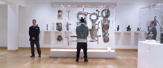
Killmonger - The Subtly of a Scene? (Black Panther - 2018)
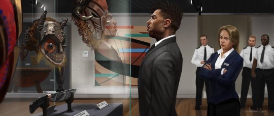
Above is concept art of the prolific museum scene that was featured in Black Panther (2018). While the illustration is fairly on par with what actually happened in the movie, a fundamental difference - and focal point of this piece - is the choice attire N’Jadaka (aka Killmonger) chose to wear in it. While the art depicts him in a suit the actual movie had him adorned in what I like to call “Trillmonger”.
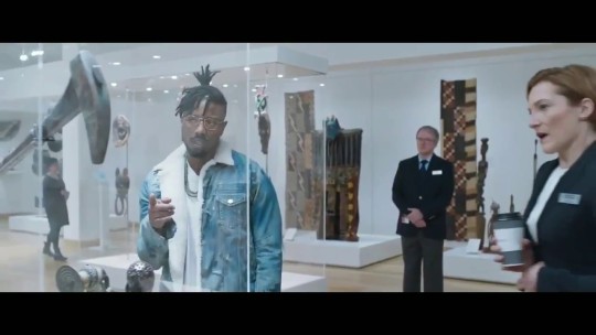
While I can’t help but respect the vast oceans of drip that are flowing from this regalia, I truly felt as if the message the scene was parlaying would have been more impactful if he had been profiled while wearing the suit.
When I voiced this opinion to a fellow constituent - who continues to impress and influence me with his insightful wisdom and perspective on life, particularly when it comes to Afro-centric media - he, strongly disagreed with my remark.
He, summarily, stated that Killmonger’s persona of unapologetically Black would and should extend to refusal to conform to a norm put forth by systemically racist and thus inherently Eurocentric ideas of what looks "professional". To which many agreed; I however did not. I took umbrage with the notion in several aspects and while the interpretation was valid, it was not sound in my eyes based on the below analysis of the diction and semantics that’s been highlighted in the first sentence of this paragraph.
“Unapologetically Black” – I didn’t think wearing a suit at all took away from him being unapologetically Black, even with his radically pragmatic sentiments. For me, as Black man, unapologetically Black is not simply an aesthetic – it’s who you are; what’s cardinal to your core. It cannot be taken away and or hidden. Killmonger wearing a suit as opposed to what he actually wore would not have taken away him being unapologetically Black – if anything, it would have added to it BECAUSE of how the security and curator would still have profiled him; even with the suit, he’s still Black in their eyes - and Black is a threat. This particularly rings true when you take into account his CIA training and knowledge of how to best cultivate and usurp the resident power in question. This, aggregated together, adds to the scene and what it was meant to represent. He wanted all eyes on him and whether he was in a suit or dripped out, it was going to happen regardless BECAUSE at the end of the day, he’s Black – unapologetically speaking.
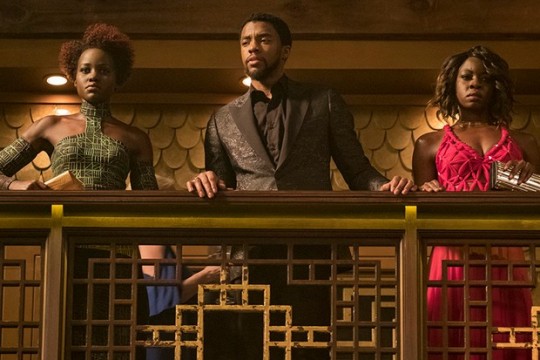
Granted, my cohort tried to differentiate the two scenes by pointing out that the clothes that were worn in South Korea were for the purposes of blending into the casino environment; particularly when it came to the wig that Okoye wore, much to her chagrin. He continued with, the fact that both Nakia and T'Challa “were people who often have to conform to their surroundings to blend in, to help others, or to be taken seriously as the world still thinks Wakanda is some podunk farm country” (slight disagreement here as, up until the end of Black Panther, the idea was to keep up the facade of being a podunk country as if the world, at large, were to know what Wakanda had, they would never stop trying to steal it). He concluded this strain of logic by contrasting Killmonger and Okoye; “Okoye who is wearing a wig that falls in line with Eurocentric beauty standards and is the opposite of the very Wakandan armor and bald head she's used to wearing day to day. She is not a diplomat, she is a warrior for her people. Killmonger is not a diplomat, he's a revolutionary for his people.”
Once again, I found this to be valid but not sound. T’Challa, Nakia, and Okoye, wore those clothes in South Korea to blend into their environment to get into a specific place for their MISSION. Even Okoye, who is proud Wakadan warrior was willing to wear the garb of colonizers in order to carry out said mission. However, for some reason, it didn’t occur to him that the same could have rung true for N'jadaka. Even if the suit was conformist, is it that hard to believe that the very person willing to team up with Klaue, who committed a TERRORISTIC ACT, killing his fellow Wakandans - for a time in order to obtain his access to Wakanda; moreover, his arguable birth right to the throne - would be unwilling to put on a suit if it meant getting closer to his mission AND birth right?
“Conform” – Wearing a suit is not conforming to a Eurocentric understanding of professional. For me, that utterance simply follies at nigh every conceivable angle. I asked him, if the suit – in this particular scene – is to be a representation of Eurocentric ideology of professionalism does the logic follow that N’Jadaka’s clothes are the aesthetic of Black American exceptionalism (I used Black American but, Killmonger, himself, is actually African American; yes, there is a difference between the two - nonetheless his garb seems to emulate Black American style)?
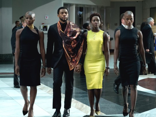
Moreover, if we extend the idea to the rest of the movie, specifically when T’Challa is wearing a Black suit – along with Okoye’s and Nakia’s red and green dresses, respectively (creating the colors of Pan-Africanism, unapologetically) is that still a representation of them conforming?
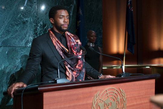
Besides, even if one were to accept the notion that wearing the suit was conforming to the Eurocentric value, by that same logic, when T’Challa addresses the UN and is unapologetically wearing a scarf of clearly African influence, he is thusly, either showing a dominance of his African roots (as the scarf is literally draped over the Eurocentric representative) and or an integration of cultures.
To this inquiry, he summarily responded that because T’Challa is a diplomat first, him wearing the combo of the suit and scarf was symbolic of seeking integration - as it is in line with his persona. This response seemed incomplete as it failed to address the fact that the scarf over-encompasses the “Eurocentric” symbol and therefore could be seen as African excellence dominating the Euro view...
He continued with the argument that: “For all the profiling Killmonger would've experienced in a suit he'd still likely would've experienced less. ‘Professional’ clothing makes [W]hite people, especially in high places, feel safe. It's why house servants were put in tuxedos. If the goal was to have all eyes on him then he should've stuck out like a sore thumb. Which he did.”
Once more, this is semantics with an addition to the playing of the scene; depending on how you define unapologetically Black - via skin being the center point or skin and clothes fitting the interpretation - significantly affects how you view the degree to which he was profiled. However, the true nail in the coffin, comes later on when we see one of the members of the Council - River Tribe Elder and Nakia’s Father - wearing a suit not only during Killmonger’s fight with T’Challa but also prior when he is with the other council members.

I suppose HE was just conforming to the “Eurocentric” understanding of professionalism, right...?
In terms of my Black American exceptionalism through line he responded with: “His clothing shouldn't mean or imply ‘African American exceptionalism’; that's as conformist as a suit. It's supposed to imply ‘I don't give a fuck’ it's supposed to be rebellious. He's not there to make anybody comfortable.”
This response was a bit comical to me. I replied with; “You can’t have it both ways – if the suit, in your mind, was to be a representation of a certain cultural aspect then his actual clothes could and should also be taken to represent a different aspect of a cultural perspective.” It’s as simple as that; if you open the door, don’t be surprised when people peer inside.
This hilarity rang true even further with his final line of; “Finally, yes, you're right a suit doesn't inherently make you more or less unapologetically Black. However we’re talking about a movie, where what you see is as important as the dialogue that your characters say. It's a cinematic decision to have every piece of his character not only be unapologetically [B]lack and the opposite of T'Challa on every level. It's not nearly as effective piece of art if he's wearing a suit. Supported by the countless people who posted about how he rolled up in a museum looking like a drench god.”
These last sentences are foolhardy; for one, we’ll never know how people feel about the suit when compared to the drip clothes because the suit scene was and probably will never be shown - if it exists. So, there’s nothing to compare and contrast it with. For two, a consensus of people in agreement does not automatically beget validation; it could just mean that they are wrong in mass unison.
Despite the disagreement, there’s definitely more than a few lessons and perspective one can attain from this back and forth; moreover, it shows just how poignant an impression Black Panther left on its audience - all, with the just the subtly of a scene.
#black panther#killmonger#n'jadaka#trillmonger#tchalla#nakia#okoye#drench god#unapologeticblack#drip#wakanda#river tribe elder#river tribe#klaue
69 notes
·
View notes
Text
Art Fair Questionnaire
1) Blank- The minimalistic approach to the curation of the booth was similar to the gallery however only to a certain extent. The booth had a wider range of mediums and vibrant colours.
Stevenson- The booth differed in style and curation to the exhibition show however it was very similar to the curation of the showroom. Artists such as Penny Siopis and Zander Blom were featured both in the booth and the showroom.
Goodman - The crowed curation of the booth directly juxtaposed the gallery which had a space layout. There was also a variety of work and vibrancy to the colours used in the booth.
2) Artworks that I enjoyed:
Justin Dingwell, A Seat At The Table, 2018
Inkjet Print on Paper
I am very drawn to this work because of its technical skill and its aesthetic. I enjoy how the artists has played with a corresponding colour palette that accentuates the subject.The lighting is fantastic and brings focus to the subjects contrasts of their body. Studio photography can often lose the true depth of the concept however I think this could not have been created another way.
Arim Andrew, What They Want, 2019
Oil on canvas
I love the playfulness that the image portrays while overlaying a much harsher narrative. The lighting used is reminiscent of front lit studio lighting which adds interesting highlights all while juxtaposing the origin of the characters. The simple background brings forth the subject matter for me which brings focus to the details intended to convey meaning.
Ima Mfon, Nigerian Identity, 2015
Inkjet Print on Paper
Black and white portrait photography holds a special place in my heart. It holds so many emotions and stories within a single image. It can transport you to a different place or time all from looking into a strangers eyes. This piece conveys exactly that. A narrative through a strangers eyes.
Artworks I didn’t enjoy:

Chris Soal, The search for meaningfulness in the search for meaning, 2018
Concrete, and birch wood toothpicks held with polyurethane adhesive on ribstop fabric
This piece gives my a crazy amount of anxiety followed by chills up my spine. I understand that this work was intended to cause discomfort but for me it has passed the boundary of tolerable angst. I am very sensitive to textures, even looking at an unpleasant texture causes a flurry of uncomfortable emotions.
DD Trans, Unknown
Oil Painting and Balloon Ends
Honestly I absolutely hate this. The balloons look like little cat bums. Enough said.
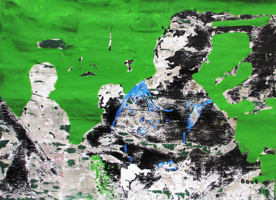
Armand Boua, Les vièx môgô (Les grand frère), 2017.
Acrylic & collage on canvas
This piece hurts my eyes. It hurts to look at the lime green in the background which leaves me unable to fully focus of the foreground. I also feel it is bland and lacks depth.
3) There were a lot of paint mediums used in works as well as an increased amount of photography compared to last year.
4) The most obvious differences included labeling and curation of their pieces. Some works were close together on walls while others were spaced evenly apart. Some booths had no furniture where as others had an info desk or a seat for the viewers.
5) Some booths paid great attention to the labeling of the work and pasted labels neatly next to the work. Others printed labels but stuck they skew and some just had pencil marks on the walls i.e Siopis from Stevenson .
6) I feel that the fair is designed in a way to direct people straight to the big gallery names such as Stevenson and Goodman and then make their way outwards towards the smaller galleries and solo shows. I feel like a lot of good work is either missed or discarded through this layout.
7) The lighting differs slightly in each booth that has specific lighting for their work but overall the main lighting is bright and artificial. It reminds me of a grocery store.
8) The clothing is mostly neutral and monotone. Gallery black clothing is continued at art fair. However their were some individuals who enjoyed standing out by wearing vibrant colours and heavily patterned garments. What I mostly enjoyed was seeing some of the school kids bored out of their minds and resorting to mischief amongst their friends.
9) Although the art fair is advertised to the public it is mostly targeted to wealthy individuals who are interested in buying and investing in art. The art fair definitely encourages this by having extended VIP dates and extravagant events.
10) Marina Abramovic, Victory, 1997
Even though the works subject matter actually juxtaposes the ideology of wealth, the works worth is a spectacle in itself. It sold for 80 000 euros.
11) Kirsten Sims, In a Flash, 2019, Ceramic
Due to the functionality of the object Sims has created it feels misplaced amongst an array of “display” items. This piece unlike the rest is not just to be understood for its aesthetic worth.
12) I normally am very comfortable talking to strangers however at art fair I felt heavily scrutinized for my age and dress (I had a hole in my shirt which many women felt the need to make direct eye contact with) which made it harder for me to discuss work with people. I was almost laughed away by the people exhibiting Abramovic’s work when I asked for the price. It was 80 000 euros and apparently just as expensive to ask a question without utter judgement.
13) Investec is a prominent sponsor in the event. It is a private banking firm that only caters to those of a certain earning potential. I am certain that almost all of the VIP guests have accounts with Investec and would feel a sense of patriotism when they saw their bank was sponsoring the event. This helps build their relationship further and will encourage more people to lean towards Investec for cultural investments.
14) The CTICC is a very large space designed specifically for events like this. It has the capacity to cater to big sums of people and can plan events efficiently. It is also centrally located and easy to access. Events such as The International Tattoo convention and Design Indaba are also hosted at this site.
15) Albert Newall’s Untitled was made in 1952 through watercolour and ink on paper.
16) The youngest artist is a recent Michaelis graduate. Her name is Talia Ramkilawan and she is 23 years old.
17) The solo booths’ décor or paint on the walls correlate with the artwork. The space is integrated and has a stronger relationship with the works in comparison to other booths.
18) Georgina Gratrix- Gratrix’s process and the manner in which she paints is very intriguing and intense. The thick application of oil paint reminiscent to layers of make up entices people continue viewing her “pretty-ugly” work.
Igshaan Adams- The delicate nature of his work is very intricate and complicated. Through this intricacy he is able to communicate a wave of movement and narrative to the viewer.
19) I noticed a lot of work focusing on the subject of origin and identity. These are beautiful concepts that hold such a deeper meaning than when explored fully. Every human has an identity and every human can empathize with another’s identity (I HOPE) therefore creating a common understanding and concept to explore. Materials that frequented were Ink Jet Prints of photographs, weaving and sewing supplies and alternative materials for sculpture building.
20) I would love to be represented by Smith Gallery as I think they have a good understanding of how to work with young and up and coming artists. Their galleries tend to keep up with art trends and don't appear to fit into a particular mold.
21) I would love to work for WHATIFTHEWORLD as I have always found their exhibitions exciting and emotive. Their ability to transforms an artists vision into a physical space is quite remarkable. It would be an honor to be part of that team.
22) “I wonder if the maintenance team is going to be pissed about all the Ed Young balloons on the ceiling?”. “Do any of these works actually sell or is this just a giant publicity stunt?”.
23) For my booth I would build a ceiling so I could block off those horrid grocery store lights in the centre. I would black out the box inside and as my display I would have my fellow artists paint, write text, spatter on the walls of the few space using UV paint. Viewers would then be handed UV light torches to go and view the work inside the space. This way we are providing an experience rather than a commodity.
0 notes
Text
Paper代写:Traditional elements in art design
下面为大家整理一篇优秀的paper代写范文- Traditional elements in art design,供大家参考学习,这篇论文讨论了美术设计中的传统元素。在当代美术设计中,从色彩到造型灯,我们都运用了较多的传统元素。传统色彩具有极其丰富的内涵,将其运用在当代美术设计中能够勾勒和强调作品的表现力。另外,服饰是我们文化发展的重要载体,在经历长期的生产和社会实践,使得服饰形成了具有典型特色的艺术,而传统服饰在诸如现代游戏美术、服装美术设计等方面都有大量的应用。
Examples of using traditional elements in the design of contemporary art, such as using a large number of shadow play in children's picture books, traditional toys, such as ink painting to attract the attention of children, the 2008 Olympic Games will be the contemporary art design skills and perfect fusion, resulting in the ancient traditional calligraphy Chinese seal, while improve the design level, greatly enhanced design and artistic charm, is well worth the contemporary art designers reference.
Traditional colors have extremely rich connotations, such as white symbolizing desolation, red symbolizing warmth and happiness, black symbolizing solemnity and mystery, and yellow symbolizing royalty and dignity, etc., which can be used to outline and emphasize the expressive force of works in contemporary art design. For example, the five mascots of the 2008 Olympic Games, fuwa, respectively used five colors of red, yellow, blue, green and black, and combined with five unique animal images in China, so as to express the emotional connotation of health, enthusiasm, prosperity, passion and joy.
The plane modeling includes folk painting, brocade, embroidery, paper cutting, wood engraving and printing and dyeing cloth, etc.; the three-dimensional modeling includes cloth products, ceramics, stone carving, bamboo carving, clay sculpture and dough modeling, etc.; the comprehensive modeling includes shadow puppetry, kite and lighting, etc.
When we first graphically recorded everything around him, "figure" is gradually penetrate into the history of human civilization, as the evolution of The Times, China's design also formed a unique cultural landscape in every period and the regional customs, further reflects the Chinese history goes back to ancient times and the rich diversity of ethnic culture. In recent years, traditional Chinese design also changed under the influence of various aspects, and we are on the road of inheriting Chinese traditional art, of its use in the modern commercial art and improvement, such as the 2008 Olympic Games torch, in design using the traditional Chinese culture on behalf of the connotation of the "origin of symbiotic and harmonious together" xiangyun grain, shaped like a scroll on modelling, expressed the papermaking for thousands of years from one of China's four great inventions of the importance of circulation of world culture.
Clothing is an important carrier of our cultural development. Through long-term production and social practice, as well as the intelligence and superb skills of Chinese people, clothing has formed an art with typical Chinese characteristics, while traditional clothing has been widely used in such aspects as modern game art and costume art design.
In the process of specific design products, to create products with Chinese traditional elements, is not the product stiffly carved sculpture craft ornaments, like more than modern product shell with several groups of the Chinese traditional auspicious graphics, designers will be accumulated a profound traditional cultural knowledge and life experience, at the same time, in a modern concise and summarized to express, to China love to humanize the design thought of the most inspired its sensitive form of abstraction and conceptualization, is very important, to be on the basis of morphology to extract the most representative form or instruction as a specific design.
Has extensive knowledge and profound connotation of art designer is to promote the traditional elements in the premise condition of contemporary art in the design of application, this means that the graphic designer must learn more knowledge and master history, cognition of traditional culture, but to lay a solid knowledge of traditional culture, can effectively use the traditional culture in modern design, at the same time also want to continue to learn from the advanced modern design concept, build modern art design system, cultivating modern design talents with international vision, from traditional culture to absorb nutrients, and fully used in modern design, Build a design talent team with international and forward-looking modern design art.
In the process of the application of traditional elements, designers can choose a variety of design themes, through the combination of graphics, text, color, fully meet the needs of people, at the same time, it should be noted that the application of traditional elements is not copied, but take its essence, the dross of the process. Designers need to seize the people psychology of pursuing beauty, seize the development of modern and traditional combination of points, from the perspective of modern design, to re-examine the art of culture value and thought background, and the idea of traditional culture in conformity with the modern aesthetic design application to his work, so as to create more characteristic of art.
For example, in the sculpture art, the ancient people often used complicated and precise patterns to show the exquisite pictures, while the modern people tend to prefer simple and generous designs. Therefore, when using sculpture art, designers can take the form of reducing complexity to simplicity, extract representative patterns in the sculpture art, show the value and charm of traditional sculpture art, and in the specific way of collocation, learn from the western design concept, the Oriental charm and modern thinking organic combination.
Among the traditional elements, many of them are not only practical and decorative, but also have certain ideological connotations. And as the goldfish represents good luck, turtle represents longevity, magpie represents happiness,
And so on. These traditional ideological implications can be turned into exquisite patterns, and become very common application elements in art design. Therefore, in contemporary art design, designers can take representative flowers and animals as design images, combine auspicious language and myths and legends, give full play to the spirit and imagination, and express different artistic concepts.
Stand out in the international bidding, for example, China's national stadium -- "bird's nest", from the external model looks like the "bird's nest" of branches woven, transparent membrane materials covered gray like mineral steel net, a soil red bowl stadium contain among them, like the Forbidden City in Beijing caesious walls red LeiZhu grand palace, with the implicit beauty of Chinese traditional culture. The whole "bird's nest" is located on the base of the mineral slope landscape, in order to facilitate the orientation and?? On the plinth of each venue, Chinese zodiac patterns can be clearly seen. Many people who have seen the design model of the "bird's nest" describe it as a "nest" that weaves a stadium that can accommodate ten thousand people into a warm nest to care for and give birth to life with branch-like steel net, and holds the hope of mankind for the future. Here, hollow-out techniques, ceramic lines, brilliant and warm red are the elements of traditional Chinese culture and advanced modern steel structure design perfectly integrated together. The whole structure is connected by a huge net, and there are no columns inside, and the complete bowl shaped stands without any cover, just like a huge container, endowing the national stadium with unparalleled drama and incredible power.
The importance of traditional elements lies in that they often contain profound social content and historical precipitation, and gradually evolve into the pursuit of beauty in the process of history. Chinese traditional elements are broad, profound and time-honored. The application of traditional elements in contemporary art design is conducive to reflecting the diversity of design and national characteristics, and the expression of design can also gain the vitality of national art from the height of traditional culture.
51due留学教育原创版权郑重声明:原创paper代写范文源自编辑创作,未经官方许可,网站谢绝转载。对于侵权行为,未经同意的情况下,51Due有权追究法律责任。主要业务有essay代写、assignment代写、paper代写服务。
51due为留学生提供最好的paper代写服务,亲们可以进入主页了解和获取更多paper代写范文 提供作业代写服务,详情可以咨询我们的客服QQ:800020041。
1 note
·
View note
Text
II. Domestic Monumentality as Civic Pedagogy: from Ellen Key to the ACCEPTERA! manifesto
In the beginning of the 1930s, two events took place which set the foundations for modern Swedish culture: The 1930 Stockholm Universal Exhibition of Architecture and the subsequent publication of the functionalist manifesto ‘acceptera!’ [accept!], written in 1931. Both stated that architecture and design were not to be seen as expressions of individual artistic genius but as solutions to collective social issues, thus visibilising the importance of architecture in society through domesticity. The six authors of Acceptera (architects Gunnar Asplund, Wolter Gahn, Sven Markelius, Eskil Sundahl, Uno Åhrén, and art historian Gregor Paulsson) succeeded in creating a sort of new emotional identity for Sweden through the linking of home, architecture, body, and democracy. Domesticity thus became a form of public property, a productive nucleus, a national emblem of modernity, and a pedagogical tool. One key aspect of acceptera! is that its modernist premises did not represent a break with the past, but rather, incorporated images and tropes from Swedish tradition and transformed them, with the intention of generating a sense of confidence and familiarity which would impulse society forward.
The Exhibition, which was attended by 4 million Swedes - then amounting to half of the nation’s population - was conceived as an entirely functional urban display, in which every aspect of life and every construction element was susceptible to undergo a pedagogic exercise. From restaurants and fast-food stalls to newsagents, fountains, product displays, crèches, and even a faux cemetery with life-scale modernist tombstone models, accompanied the visitors in their spectacular journey, from the cradle to the grave.
Architecture as mass-media emerged here as a mediator of ideologies and affections which intervened reality through connecting archetype, materiality and identity in a trans-scale logic which opened up ‘private’ arenas - such as the home, the healthy body, grieving, or leisure time - thus disrupting traditional notions of ‘privacy’ and ‘publicity’. The different interior ‘types’ were walkable displays of homes and apartments at scale 1:1. Designed for different family configurations and economies, they submerged the visitors in an uncanny, oneiric, aspirational familiarity which they temporarily inhabited, swaying over from desire to recognition, shock, and acculturation. Through the 1930 Stockholm Exhibition, the home became a living archive of ‘Swedishness’: a site of consignation, production and distribution of the new national values. The domestic ‘public interior’ became Sweden’s most remarkable national asset.
Displaying the home and the everyday at full scale as a spatial visitor experience had a very specific precedent in Scandinavia: the open-air museum. Open-air museums, such as Stockholm’s Skansen, explored and developped strategies from the world of commercial display, particularly those of the great nineteenth century world exhibitions, in a particular way which displayed objects through the creation of an environment that aimed to emulate original vernacular domestic scenes.
But was this new Swedish implication with domestic design from a political perspective solely the product of the ‘acceptera!’ team’s imagination? A closer look at the figure of the relatively known Swedish pedagogue, writer and feminist Ellen Key (1848-1926) suggests otherwise.
The ‘housing theatre’ was first met with social concerns in Ellen Key’s thought. In fact, she was was the first intellectual to ever posit domesticity and womanhood and the at the centre of a new aesthetic-political paradigm for Sweden: she created a rhetoric of domesticity as civil pedagogy. In 1899 Ellen Key organised, together with a group of fellow artists and art historians, an exhibition of two model ‘rooms’ - the green and the blue room - at the Workers’ Institute in Stockholm, displaying, for the first time, walkable, life-sized domestic displays that functioned as civil ideals. They are thought to be a reinterpretation of the home of her fellow artists Carl and Karin Larsson, which they also pioneeringly depicted in their art. The space featured a new Swedishness, and placed children at the centre of a new, relaxed environment. Key’s overarching argument was that everyone had the right to live in beautiful surroundings - a social and democratic commitment that was paired with very specific instructions on how to decorate the home. The great success of this exhibition led to the creation of Key’s masterpiece, Beauty and the Home, in 1899.
Every worker, Key once wrote, is a potential artist. In her seminal work, Key described women as workers, nurturers and artists of the home with a devotion to ‘utility’ that could be truly revolutionary. The mother, in particular, is the fountainhead of change, Key believed, as both the artist of the home and the educator of the children within it. [1] Outside the home, Key said, women also had a special role to play: they were the source of nurturing, caring, and indeed passion, within society. Unlike Beauvoir’s groundbreaking 1949 statement ‘one is not born, but rather becomes, a woman’ in ‘The Secons Sex’, Key’s feminist politics produced a specific type of womanhood and femininity which posited women as desiring, intelligent individuals entitled to working outside the home and having control over their own bodies, whilst simultaneously conceiving a ‘feminine essence’ that was naturally linked to a set of specific values - taste, practicality, nurturance, parenting, thus circumscribing the sexed female body within the home as both a concrete and an abstract entity.
However, although limited in its essentialist approach to femininity, Key painted a picture in which the politics of femininity were to erupt in the public realm, and in her fresh, passionate vision, she devised a utopian new public politics ruled by ‘feminine’ values that have long been, and still are, neglected by the masculinist status quo: a world governed by a new status quo of equality, nurturance, peace, passion, and beauty. Key’s works dealt with aesthetics - the importance of the love of beauty in all realms of life. She advocated for a new art would conquer industry, “making everyday life festive and beautiful, for rich and poor”: one that would make “the beauty of the home spread outward to society, to architecture and city planning”. Key’s main assertion in this work is that the new aesthetic sensibility must begin in the domestic setting, and, in bringing beauty to mass-produced products inside the home, she suggests very concrete notions that prefigure acceptera’s notion of ‘architectural type’.
Ellen Key’s views were in great measure contained within the premises of the manifesto ‘acceptera!’, born 30 years after the publication of Beauty and the Home and just five years after her death. However, whilst Key’s voice seems to echo in acceptera, there is one major variegation to her conception of the home: whilst for Key, the home was the fountainhead of social change, for the acceptera authors, it was primarily a reflection of it. In other words, the authors of acceptera did not view femininity or womanhood as a fully fledged force for social change, but rather, they posited the modern home as a site for the enactment of a change that had taken place outside it. Echoing the manifesto’s overarching argument, the home was conceived as an artifact, and like all artifacts, ‘it reflected the formative principles of the society that produced it’. [2]
Through its focus on the home, this premise, which puts an abrupt full stop to Key’s ideas on the ‘feminisation’ of the public realm, is in fact transformed into an operative principle: like the architecture of the modern family home and the design principles of the new, beautiful vardagsvara [‘everyday objects’], both Key’s modern woman and her sex became subject to the notion of ’type’: in becoming ‘type’, both the modern home and the modern woman became a product of technology, of architecture, and, above all, of masculine genius.
NOTES
[1]. See Key, Beauty and the Home, [English Translation]in Lucy Creagh et al., Modern Swedish Design: Three Founding Texts [New York: MoMA, 2008]
[2] Paulsson, Gregor, “Arkitektur och politik”, Architektur och samhälle, 1933, no 1, p. 16. Translated in H. Mattsson, ‘Designing the Resonable consumer’,in H. Mattsson and S.O. Wallenstein, Swedish Architecture: Architecture, consumption and the Welfare State [London: Black Dog Publishing, 2008] p. 81
0 notes
Last Seen Blogs

taurus-baby
claire 🤍

fashiongloballifestyle-blog
DIDO & SLAMBS
julie-slamdrews
Library of Lightning Bugs

algoson
Algoson Software

argonblue
GAY FLAME SYMBOL