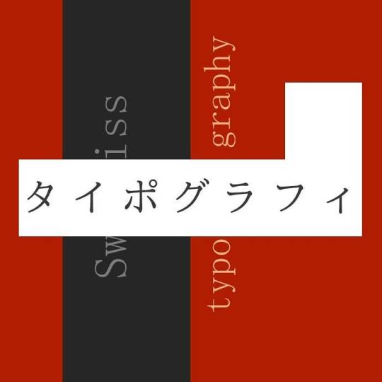
#swisstypography
Text
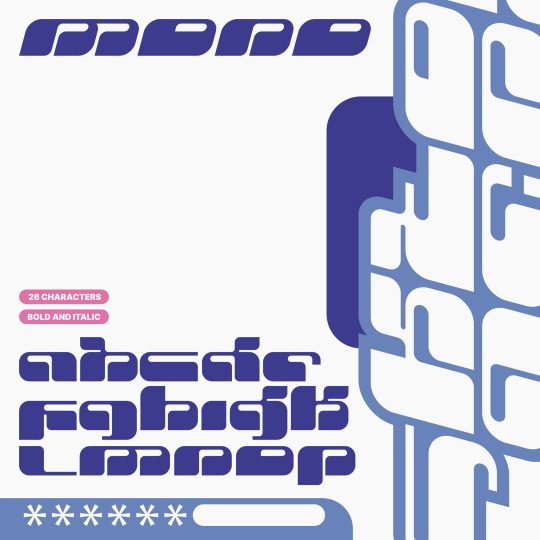
MONO FONT
It comes with: 26 characters, Bold and Italic.
Available for 𝗰𝗼𝗺𝗺𝗲𝗿𝗰𝗶𝗮𝗹 and 𝗽𝗲𝗿𝘀𝗼𝗻𝗮𝗹 use.

#y2k#graphicdesign#ilustration#art#minimalism#typography#logo#typographydesign#design#type#graphics#typedaily#typeinspired#swisstype#swisstypography#graphicdesigner#designinspiration#albumartarchive#chrometype
407 notes
·
View notes
Text
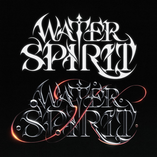
WATER SPIRIT Typography Design
#graphicdesign#ilustration#art#typography#logo#typographydesign#design#type#graphics#typedaily#typeinspired#swisstype#swisstypography#graphicdesigner#designinspiration#albumartarchive#chrometype
35 notes
·
View notes
Photo

(Annoelectro on Behanceから)
2 notes
·
View notes
Photo

Un día inmerso en la #tipografía y #streetart de la isla de San Andrés... 🌴 #typographyinspired #streettypography #tv_typography #typographydesign #typographyart #typographydesing #typographyindonesia #typographylove #neontypography #3dtypography #typographytattoo #tyxca_typography #swisstypography #urbantypography #customtypography #island #islandlife #balearicislands #islabonita #laislabonita #islands #islas (en San Andrés) https://www.instagram.com/p/CDNpWihAwpP/?igshid=c6u2lb554jrx
#tipografía#streetart#typographyinspired#streettypography#tv_typography#typographydesign#typographyart#typographydesing#typographyindonesia#typographylove#neontypography#3dtypography#typographytattoo#tyxca_typography#swisstypography#urbantypography#customtypography#island#islandlife#balearicislands#islabonita#laislabonita#islands#islas
0 notes
Photo
パワポで作るタイポグラフィ練習 スイスタイポグラフィを元にしてデザインした。 #design #デザイン #タイポグラフィ #typography #art #パワポ #powerpoint #swisstypography https://www.instagram.com/p/B_vEZajDS38/?igshid=1dor0lwg0apnc
0 notes
Photo
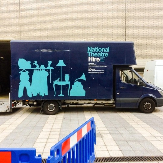
Superb Swiss International Style type & graphics on the side of this @nationaltheatre van. #london #internationalstyle #swissdesign #swisstypography #typography #design #nationaltheatre #theatre #helvetica #silhouette #props (at National Theatre)
#silhouette#swisstypography#nationaltheatre#props#typography#swissdesign#london#internationalstyle#theatre#design#helvetica
1 note
·
View note
Photo

Had to do an imitation piece for my Graphic Design Lit class. I was emulating Wolfgang Weingart, the father of Swiss Punk typography and lettering. I love this project and presentation. I then turned it into a banner on one of our servers #wolfgang #typography #lettering #swisstypography https://www.instagram.com/p/BvdWMcdFNl_/?utm_source=ig_tumblr_share&igshid=1n2eg27oh5g5
0 notes
Photo

Das Land wo auch die Details schön gestaltet sind: die #Schweiz. #typography #swissdesign #swisstypography #unterwegs #travelling #switzerland Anyone knows the #font? #whatthefont (hier: Luzern, Switzerland) https://www.instagram.com/p/BubUlIcn6DW/?utm_source=ig_tumblr_share&igshid=sv24jfvxnhs4
0 notes
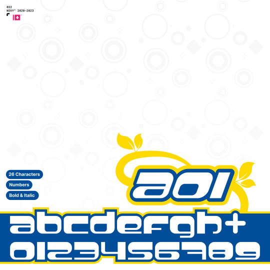
Text
A01 FONT
It comes with: 26 characters, Bold and Italic and Numbers
Available for commercial and personal use.
#y2k#graphicdesign#ilustration#art#minimalism#typography#logo#typographydesign#design#type#graphics#typedaily#typeinspired#swisstype#swisstypography#graphicdesigner#designinspiration#albumartarchive#chrometype
187 notes
·
View notes
Text

SEDO Typography Design
#graphicdesign#ilustration#art#typography#logo#typographydesign#design#type#graphics#typedaily#typeinspired#swisstype#swisstypography#graphicdesigner#designinspiration#albumartarchive#chrometype
3 notes
·
View notes
Photo

Detail of Frutiger’s abstract illustrations from ‘Genesis: Im Anfang / Au commencement / In the beginning / בהתחלה’ by Adrian Frutiger and Bruno Pfäffli, 1969. Read more at theideaofthebook.com or d/m for information. — — —
#adrianfrutiger #frutiger #univers #swisstypography #letterforms #typography #abstractart #genesis #fourlanguages #graphicdesign #artdirection #artistsbook #artbook #brunopfäffli
#artistsbook#brunopfäffli#typography#graphicdesign#artbook#adrianfrutiger#fourlanguages#frutiger#swisstypography#univers#artdirection#letterforms#genesis#abstractart
1 note
·
View note
Photo


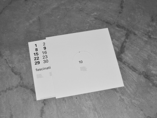

typoesie calendar 2017
jazz standard edition
art direction and design (2016)
size:305mm × 305mm
offset print black one color
2 notes
·
View notes
Photo

By @j_lopez_me 👏 link: https://kaukkoglobal.com/collections/on-the-rocks/products/kaukko-handmade-green-canvas-premium-backpack-sb970 #corporateid #visualdesign #branddesign #identitydesign #corporateidentity #diy #graphicdesign #branding #swissgraphicdesign #swisstypography #swissdesign #projectmanagement #copywriting #strategy #artdirection #video #artwork #photography #lausanne #motiondesign #christmascards #designfeed #designa #luzern #quoteslike #december #urban #sky #winter #loveswitzerland (at Interlaken, Switzerland) https://www.instagram.com/p/BntHZt-HBt8/?utm_source=ig_tumblr_share&igshid=hhmicccmwz1p
#corporateid#visualdesign#branddesign#identitydesign#corporateidentity#diy#graphicdesign#branding#swissgraphicdesign#swisstypography#swissdesign#projectmanagement#copywriting#strategy#artdirection#video#artwork#photography#lausanne#motiondesign#christmascards#designfeed#designa#luzern#quoteslike#december#urban#sky#winter#loveswitzerland
0 notes
Text
Notes on Design Theory No. 9 | Reconsidering Swiss typography (3)
.........
3
On the other hand, designers belonging to the groups of Swiss Typography rarely describe what value and political meanings these design methods have, and firstly, all their works was not given the multilingual writing. How should we understand the gap between the description above and their silence or inaction?
Considering, for example, that it is similar to the following fact, we could understand it. When textbooks of public schools are written in a standard language, most people regard it as self-evident without being conscious of what political meaning the language has, and some people are able to produce those textbooks. In other words, thinking about the political meanings of the conditions composing Swiss typography such as the grid system and sans serif typefaces and about value whether the conditions are politically correct or not is a totally different issue from thinking about new “beauty” and highly functioning design within such conditions*vi.
So the designers could use the conditions so as to design pages even if they had kept silent about the value and political meanings of the grid system and sans serif typefaces. And as long as they used them, regardless of their silence or inaction, we can consider that the political concept, diversity and equality of status over ethnicities and languages, always keeps in the background of their works and controls them potentially.
4
While some design methods of Swiss typography have a specific political meaning and that continues to regulate the works in the background, the design methods is valid only for a certain context or under certain preconditions. In that sense, Swiss typography has methodological limitations. They are the following three points:
First, it is a limitation over letters: Swiss typography is a methodology that was composed mainly for the alphabets used in Europe and the former Soviet Union: Latin alphabets, Greek alphabets, Cyrillic alphabets. As mentioned earlier, it visually eliminates the difference in the black of alphabet letters between multiple languages and aims to make grayness of the printed area uniform with one another. Such a methodology can not be applied to the custom of the Chinese-character culture sphere, where people consider it valuable to appear various ratio of the black of a letter due to the difference in the number of strokes.
Second, it is a regional limitation: The fact that Swiss typography is a methodology for alphabets means that it can only be applied to language areas where only alphabets are used: Europe, the former Soviet Union, the former colonial countries where Europeans had settled and made original inhabitants lose their local languages. And so there is no assumption that, when arranging multiple languages at the same time, the methodology can be applied to the regions where alphabets are used in combination with non-alphabets or where only non-alphabets are used.
Third, it is a physical and economic limitation: when we give multilingual writing to pages of books and papers, we have a limitation of space in pages and of the cost of some translators, the number of which most likely corresponds to that of languages. Consequently, there is no choice but to limit the number of languages. Even though we can realize equal writing and design of all languages in theory, it is the three languages: German, French, and English*vii that are often used in the actual works of Swiss typography, because they are majority languages of the big power with the large population of speakers.
By making sure of the limitations as described above, we may get perspectives on international typography beyond such limitations. They may be possibilities of international typography between countries or within a region, such as East Asia, where people commonly use non-alphabet characters. And one of the possibilities is related to a design visualizing the political concept, that is, ethnic and linguistic diversity in East Asian and equality of status between multiple ethnic groups or between multiple languages. The design philosophy of “Internationality” suggested by Swiss typography which means it is appropriate for all regions and languages is still incomplete, and we still have something to describe over Swiss typography.
............
Note
*vi ...... For example, Ruder did not mention much about the meaning and value of visually equalizing each language but about the problem of “beauty” in the context of what kind of typefaces was required so as to eliminate the difference in the black of text between languages:
“If one of these typefaces is used for a foreign language, it may forfeit a great deal of its aesthetic effect. If Bodoni, for example, is used for German, it no longer looks the same face; the foreign word formations with their accumulation of capitals detract from its beauty.” (Emil Ruder, Typographie, Verlag Niggli AG, 1967, p. 44)
“The closeness of international relations calls for a typeface in which the most important languages can be set without any aesthetic loss.” (op.cit., p. 47)
*vii ...... As an exception, one of the theoretical books about Swiss typography, Emil Ruder’s Typographie, which in the first edition had three language writing: German, English, and French, was also published in various sets of other languages: German, Spanish, and Portuguese; German and the former Yugoslavian languages (Croatian and Slovenian); Russian; Korean.
0 notes
Photo
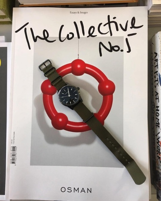
Berlin #berlin #berlincity #fashion #osman #natostrap #l1watch #l1watchzurich #mauriaczurich #swissmade #zurichmade #design #designer #cool #swisstypography #swisstypo #typography #typographyinspired (hier: Berlin, Germany)
#typographyinspired#berlin#l1watch#l1watchzurich#designer#design#fashion#berlincity#osman#swisstypo#swisstypography#typography#natostrap#cool#zurichmade#mauriaczurich#swissmade
0 notes
Last Seen Blogs

lovemadmoisellejuliette-blog
starve your discraction, feed your focus

odatodeath
人間五十年

reversemortgageu
Reverse Mortgage Explained

steelmagnoliamusic
Steel Magnolia Music