#since i just selected everything outside of the lineart for the base coloring layer
Text
must be nice, being free for once
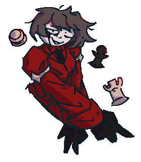
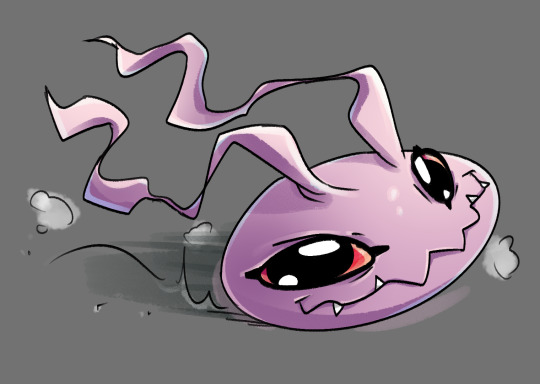
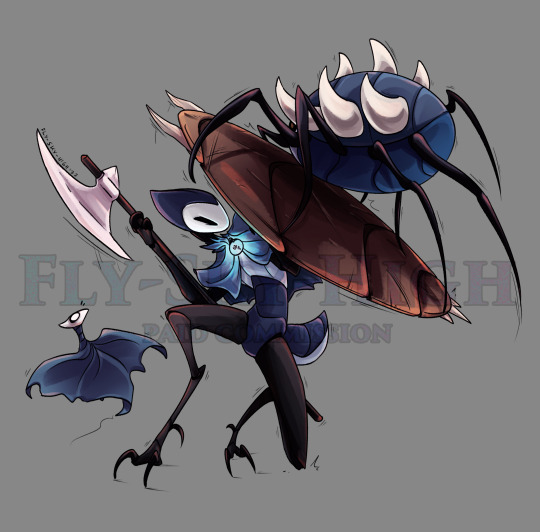
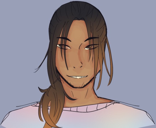
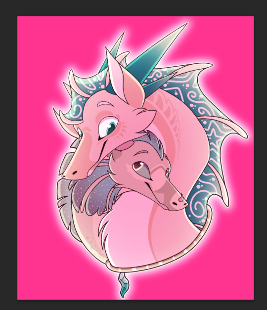
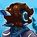
#character here is asuka from branch-wdk53#art#zoom in for some details :3 especially the lineart and with her face#i had to retroactively add the little chess pieces bc i drew her hands and was like. ok. what the fuck is she doing#so something here about being able to control others persnaps... with the red shoes' power and all#also liking her updated hair :3 specifically with this ego it makes me think of her like not maintaining it totally#or letting it grow out since she wouldnt care about how shes perceived - like a red shoes possessed agent wouldnt#this is more corroded-y than just her with the ego but yknow. the themes etc#i could see it happening to her considering how often she gets fucked over by the world#wanting to take agency and just do whatever she likes for a time#the perspective here was all just fuck it we ball i literally used 0 references for this. sometimes i just Do That i guess lol#also! the lineart colors come from some just like. making it all a little bluer type stuff#but i also inverted the whole color layer and put it on top and was like. oh thats awesome#since i just selected everything outside of the lineart for the base coloring layer#it also went into the lineart and made some cool stuff with the parts that were or werent colored behind the lines#i will always find a way to have 20 tags on every piece of art i make o7
13 notes
·
View notes
Note
HII I’m not sure if this is the right blog but I’m so curious about how you color artwork, like what brushes you use, I really love your style and have thought about taking some inspiration from it
Hi! :D This is fine, I'll reblog it to my art blog so it can be easier to find, no worries.
I'm not the type that uses too many different brushes! I ended up comfortable with just a single brush for most of my work unless the style calls for something else (like soft look of Rain World, which I did a little step by step for here~)
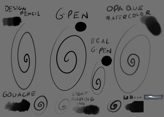
The main brush I use for just about everything is Design Brush. I use it for sketching, I use it for lineart and I use it to add shadows and highlights! I also like to mess with the backgrounds with it
I got hooked to Real G-pen recently for fun lines and texture! Opaque watercolor is what I use for soft rendering like slugcats~ Gouche is very fun to paint with also because of the texture! I haven't used in awhile tho. Light running ink is what I use for smokey effects, clouds, stuff like that! I love the brush! And uh... the last brush is called *checks the source* Nouchika Square Brush. It's free! It's square! It's new to me! very fun to use!
Details about the steps with Design pencil:
After sketching, I basically just lineart with the same brush in a different layer (or multiple of them, if needed!). Once done, I also duplicate the lineart layer to make the previous a little sharper, since depending on the pressure the brush can be faint or very strong, which will come in handy with colors later!
Single layer VS doubled:

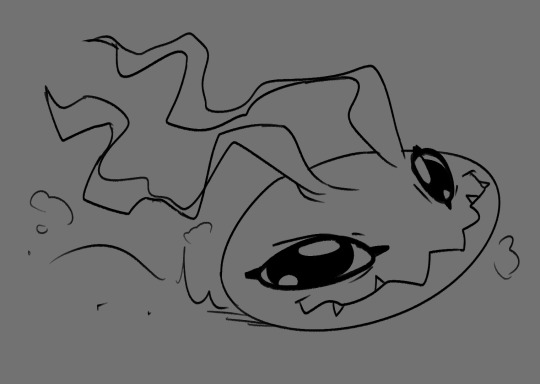
Next, for easy color in, I select the areas outside of lineart, invert selection and even shrink it by 1 pixel. Then, I color the new layer bellow lineart flat with one base (in this case, Koromon's pinkish color)
Above it, I hand fill other colors and yes, there are probably easier ways to do that but I am way to used to the hard way XD Note that I rely on this: Hold CTRL and click on base color layer to select everything in that layer, then make a layer and color within that, so I don't cross the border/lines.

I usually lock layers for the next part but you can also just make a new layer above.
Use gradient tool (with which ever options) and select colors that are slightly shifted in hue and saturation from the base color picked one and toss in a bit of gradient shadow and highlight in each locked color!

Remember, color picker is your best friend ever to befriend in any art program! it will help you find hues in this gradient you can work with to add to the shape while doing the simple render!
Now, I use the same brush still but I change sizes depending on which area I'm going to go across. Nice part about it is the aforementioned pressure that can apply less or more color depending on how much you press down. I go with the light strokes over first and then stronger ones above! you can get softer shading this way! Same with highlight~ If something feels off somewhere, color pick the nearest hue and stroke the mistake away~ You can do the same if you want to use any present hue in another part of the figure

after that's done, I then tend to put another layer and select Overlay option on it to add at least a little bit more shadow or highlight (I chose highlight in this case). There is no background for this drawing so I figured it would be nice to add a little bit of cold colors to the warm ones Koromon is made of.
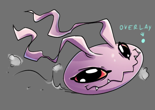
You can play with other layer options or even edit and color adjustments like tone curve, color balance and brightness/contrast, with any color layer! I do it a lot actually~
You add some extras if you want and you're done~
There is not much to it, so I use this for a simple style commission!
#ask#my art#sorry if something sounds odd it's a little later here as I toss this together dfgjgh#I dunno how good is to use the brush I use I'm just a bit too used to it with how I handle my pen pressure#I noticed it has a different(?) texture on my older tablet somehow?#might be the dps difference between tablets#but anyway#that's how I roll~
14 notes
·
View notes
Note
How do you do your shading/lighting? It's really pretty!
First: I lay out my flat colors!

Second: I choose what the shadows will be! I lean towards the red-orange shades, never choose straight black or grays for shadows on anything! (Unless your drawing is just black in white).
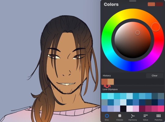
Third: The brush I use is called “Hard Brush” Under the Airbrush section on procreate! Even if you don’t have procreate, many programs have brushes that allow the same pen pressure and effect! As shown below, the more pressure I put the darker the color will be. If for some reason your program can’t do that then lowering the opacity of your brush can also have the same effect!
Fourth: I begin to put in the shadows where I think they’ll be, the fun part is I have no idea where the shadows will go. This is just for funzies~ But if you want to be accurate, look at references and mark where your light source(s) will be before adding shadows and/or lighting!
(don’t mind the middle image I used the selection tool which is why it has those line eUgH)
Fifth: I begin to blend everything using the smudge tool! If you do not have a smudge tool then an airbrush could work as well! It will just take a while longer <:3
Sixth: After smudging, it should look like this! Well that is if you want to shade like me, the ending product is whatever you feel happy with! <3

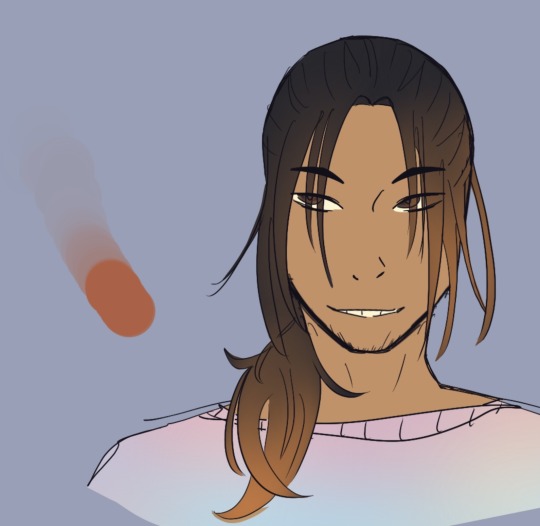
Lighting Time! Okay First: Pick the original skin tone, and choose a lighter color of it as shown here!

Second: Do exactly like with the shadows and add it wherever you want! I added it on the forehead, nose, above the lips and in the chin! Mainly because those areas tend to stick out more from the face so they’re out of the shadows. You may not see a difference at first from all the mixing and smudging but turn the layer on and off and you’ll see there is definitely a difference!
Final step: Merge all the colored layers together and use the airbrush tool to add a bit of spice to the drawing. I normally do this when the character/object is outside or not in a dark room. Since the characters face and hair has a lot of warm colors I’ll add a contrast like blue (cool colors) to make it pop more!
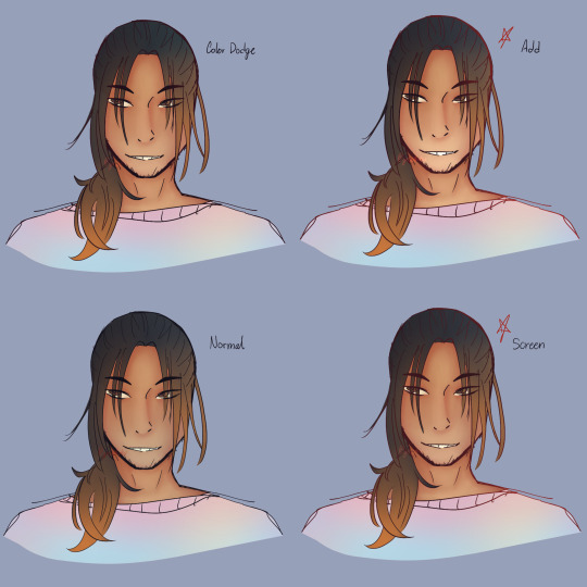
I’ve added my favorite modes to use; Color Dodge, Add, and Screen! I use them for lighting or special effects. I added the normal as well for you guys to see the difference. My personal favorites are Add and Screen, they show more.
Now the final step for everything is the lineart! Add another layer and set it to clipping mask, use the airbrush tool and with whatever mode you want and whatever color you want (I personally love red) just go crazy and airbrush areas you think would make the drawing pop more!~ These last steps are my favorite part Hehe </3
Important Notes:
- When coloring make sure to divide the areas in different layers!! So example: Have skin color on one layer, hair color on a separate layer, clothing color on another layer, etc. It makes it easier for your future self to shade each area without having it all be on one layer and you struggling to only render the face and hair without it smudging the base colors!
- Never be afraid to shade darker or add a more lighter color!! In fact never be afraid when coloring or drawing (digitally that is) you could always just double tap the problem away if you don’t like it! Always experiment and remember it’s all about trusting the process and being patient!
- If you want more contrast on colors, normally, I follow the warm and cool color rule. Like I mentioned before; Red, Orange and Yellow are warm colors while Blue, Purple and Green are cool colors. So if you were to have a painting/drawing with a lot of warm colors add some cool colors as lighting or as background elements! It goes both ways.
- If this is your first time rendering in this style, then please know that it may not come out exactly right the first time. It took me a lot of practice with this style to get it right, I’m still learning and adapting new things! Be patient with yourself and keep practicing! You got this✨
#phew!#3:55 AM#worth it#i wish I had this when I first started learning#it’d make my life easier#if there is still something here you don’t understand#be it the modes or maybe a step you need more clarification on then PLEASE let me know!!#tutorials are so much fun hehe-#Also this is the ‘prototype’ for the human version of Honey Comb#lmao how does he look?#is he dilf enough-#man looking finer than a mother fucker#tutorials#gess box of cookies#honey comb#gess box of arts
11 notes
·
View notes
Note
How do you get that gorgeous glow effect in some of your finished pieces? It’s really pretty and lately I’ve been experimenting with special effects to make my drawings look cool. Also, what drawing app do you use?
Oh yes! I use Adobe Photoshop mostly, but before that I used Firealpaca for a while. I'll show you how I do it in photoshop but if you still need help, I can give you the firealpaca version too (the steps are the same, the buttons are just in different places.)
I usually do this after the color and lineart is done, and then I do the shading after, but I only hid the background layers for this tutorial.
You'll want to go to your lineart layer (sometimes I work with multiple lineart layers at once so I can make them different colors, and then I have a merged layer with all of them for this specific purpose)
Next, select your magic wand tool (shortcut: Ctrl W/Command W)
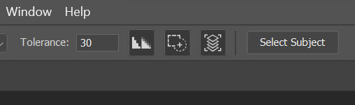
In Photoshop, you have this options bar that helps change your tool's settings. If you notice those three boxes, the box on the far right (next to select subject) is turned on. This means it will select any continuous color you can see on the image (basically if you have other layers turned on and you can see them, it will select based on that too.) If you want to select just the lineart layer that you currently have selected, turn it off.
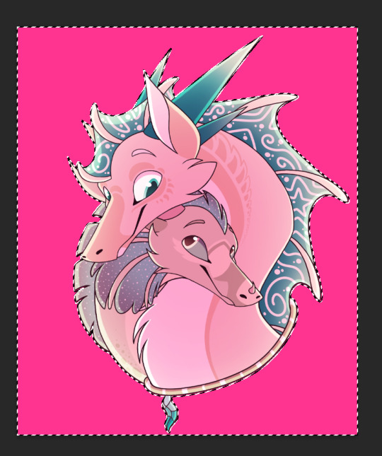
Next, select everything outside of the lineart. Notice how the marching ants are marching along the edges of the image's borders, as well as the character? That's how you know you have the background selected.

Now, go to Select > Inverse
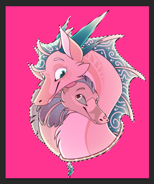
Now, you have everything inside the lineart selected instead! See how the marching ants aren't marching on the borders anymore?

Now, go to Select > Modify > Expand
You can expand your selection however big you want! Since I work with big canvases, I use big numbers :) then click OK

Now you have some of the area outside the lineart selected too

Make sure that you exit the lineart layer and go make a new layer underneath the color layer, then pick a bright color, select your brush tool, and fill up the selected area with that color :D

After you finish, deselect the selected area by pressing Ctrl D/Command D, and then go to Filter > Blur > Gaussian Blur. Choose how much blur you want the drawing to have, but make sure it's not so blurred that it loses most of it's opacity. Then click OK.
After that, you'll need to give the layer a mode - I usually pick Overlay or Linear Dodge for this, but Soft Light is good too

It will look something like this, but it doesn't look too natural yet, which is why I repeat the process one or two or even three times, each with a larger or smaller selected area and different amount of blur.
And that, ladies and gentlemen, is how I make my glow effects >:)
3 notes
·
View notes
Note
What is your step by step drawing process like, if you don't mind my asking?
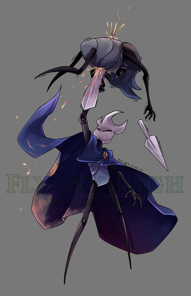
I'll just use Sunstealer as an example since he's the most recent thing I did. Under the cut because this is horridly long. You wanted step by step, I’ll give you step by step.
That is a threat.
And every step of the way I use a sharp pen with high pressure sensitivity and a sharp eraser with high pressure sensitivity, unless stated otherwise.
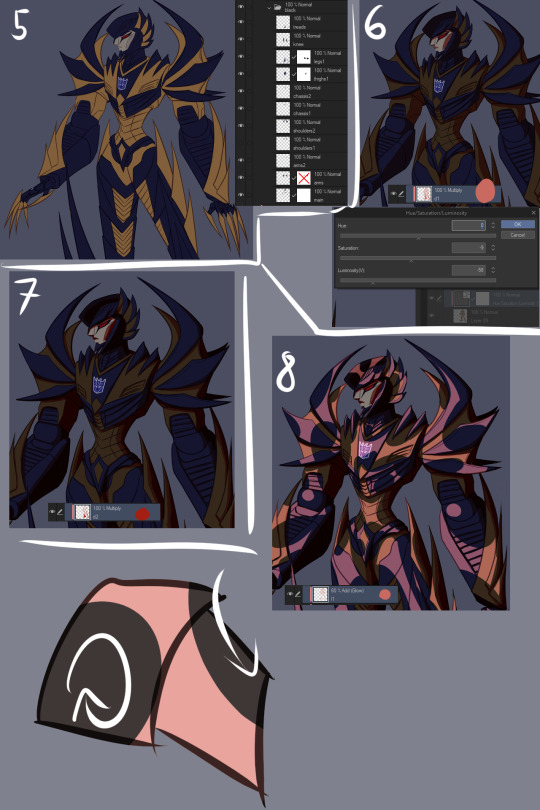
1. Alright, sketch first of all. I pick a whatever color, set a folder to multiply, and add layers in it. I start with the face/helm and take moderate care with making it look decent.
2. From there I sketch the rest of the the pic, preferably very loosely. I aim to not lift the stylus from the pad very much and instead just SCRIBBLE lines into the vague shape I'm after.
3. Set the sketch folder’s opacity real damn low, like somewhere under 10%, create a new folder, set it to multiply, and this is where the horrid amount of layers and layer folders I use comes in. But, you can see I actually did a second sketch of the arms (and legs, though that isn’t visible here) ‘cause I couldn’t make them look right based on my initial sketch.
4. On top of my second sketch I draw the rest of the clean lines. The lines were drawn with this purplish color, btw. I use something akin to it pretty often in my lineart.

5. After all that I use the Auto Select tool to select everything outside my lineart, e.g. everything I don’t want to have color. I then invert the selection and lay down my flats. At this point I used the gold as my base color, but then added separate folders for each following color, clipping them to the gold base layer below. In the case of black, its folder has a whole bunch of layers while I tried to figure out what parts to color black. With layers for the different parts, I can just click them on and off to see what things look like with or without them.
6. Okay, now to the meat of things. I use a correction layer (hue/saturation/luminosity in this case) to change the base gold to a far darker color that I can easily edit later without losing my initial color choice, and create a new layer on top of all my colors, set it on multiply, and in this case used a sort of peachy color to add my first shadows on top of the whole entire picture. At this point the exact colors in use don’t matter one bit, though, as long as you see what you’re doing.
7. I create a second multiply layer on top of the last one, and go over the whole thing again, adding deeper shadows, this time using bright red. But again, color doesn’t matter yet. I like contrast too, so you can see some areas turn almost black.
8. Shinies! We add our first Add (Glow) layer (that can be named differently in other programs, in SAI it was just “Luminosity”). Once again, color doesn’t matter, just as long as you see what you’re doing, but I was working with about the same peach I used on my first multiply layer. And how I add the shines is basically just color the glow over the whole area, then use the eraser in sweeping and circling motions to remove parts of it. I don’t treat each plate/portion separated by lines individually, because then you’ll just end up with mismatched areas that don’t communicate with each other at all and just fight. (Remember to erase the shine from over your shadows too. Auto Selecting the shadows and erasing the glow from the selected area is a good trick.)
9. More shinies! This time we want it to show up as a bit lighter/brighter than our previous shiny. Using a brighter color or higher opacity does the trick. I do the same thing of coloring large areas and erasing shapes out of them afterwards, but this time I make it argue with my first glow layer a bit. Some overlap is good, but I also want them to live their own lives. (I included a view of the second glow layer alone, but I worked with both glow layers visible.)
10. We now have two multiply layers and two glow layers. What we also have, is a base color (gold) and separate folders for every subsequent color (black, face, insignia in this case. And optic, but let’s not touch that yet). We now copy our two multiply layers and two glow layers, and move copies of them into each folder (sans optic) and clip them to the base layer in that folder. We move copies of the multiply and glow layers right over our base layer too, below our other color folders. (I deleted the glow layers from the “face” folder because I don’t want the face to be as shiny, and the multiply layers from the “insignia” folder because there’s actually no shadow over the insignia.) We can make our original multiply and glow layers invisible so they’re not messing things up, and what we should have is... The same exact thing as in step 9. Wow.
11. Now we actually make it look good! Though let’s just color the optic while we’re at it so it’s not all empty. Anyway, this is the stage where we really start to think about color and opacity. I want a neutral lighting to showcase his colors best, so let’s see how we get that. The thing we’ll just do is use Tonal Correction > Hue/Saturation/Luminosity to change our multiply and glow layers one by one, starting from our first multiply layer. I turn the other multiply and glow layers off so I can see what I’m doing and and tweak the colors until I get something that doesn’t scream “interesting lighting”, because I want neutral lighting.

12. Then I go through all of the layers one by one and do the same thing to each of them. The reason I have them each on separate layers is exactly this, that I can affect all of the drawing’s colors individually and make them look just as I want to and always have the option of just going back and easily editing things. I also add a glow layer to the face, but with a brush rather than a pen so I get a softer look, buuut then add a second glow layer with a low opacity to add just a little bit of sharp light in there. And now we have a thing! But it looks pretty flat, doesn’t it? We don’t want that.

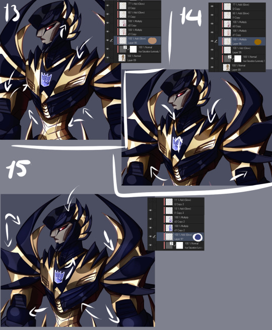
13. First of all, let’s add some soft glow to the gold. New glow layer below our multiply and other glow layers, choosing a soft color to accentuate the gold, and then using either a brush or airbrush we add just a bit of color in there. Arrows point to the spots where I added it, because we want the effect to be subtle and easy to miss.
14. We can do better than that, though. Let’s add a multiply layer and do the same thing, adding juuuust hints of darker color here and there. It adds a touch more depth, but again, we want it to be easy to miss.
15. Let’s have a look at the black, next. You may have noticed I turned off the second glow layer on it entirely, and that’s because it was decided that the black shouldn’t be as shiny as the gold. We still want to add some life to it though, and because Sunstealer’s black tints towards blue, let’s make some blue happen by adding a glow layer, and again, very softly with a brush or airbrush, add just hints of color in there.
16. It still doesn’t really good though, does it? It’s pretty boring and lifeless despite our efforts. More layers, then! Some fucking edges, this time. A glow layer above all of our existing layers and folders to affect all of them (except optic, ‘cause optic doesn’t need it), take good ol’ bright white, turn the opacity down a bit, and add sharp light to the edges. Like, all the edges that are touched by light. Seams, everything. We want this motherfucker to shine.
17. Okay, now do the same, except this time on the shadows. The layer is on lower opacity and I didn’t use white but desaturated blue instead. Just add a bit of reflected light in there.
18. Slowly getting there, but let’s do a couple more things. First of all, warm color. Basically, I just like to slap a random color on top of the whole damn thing when I’m finishing a drawing, using either a color, a glow, or a normal layer, depending which one gets me the best results that time. Or, all three, if that’s what I feel like. This time I used a color layer with briiiiiight neon orange. I switched the layer to normal and opacity to 100% so you can see where it’s actually applied, which is, again, on top of all the layers. A pretty large area, but even on 100% opacity with a normal layer you can see it’s pretty transparent. If I had wanted to do a more interesting lighting, I would’ve left it more visible and maybe added another similar layer in a different color, but I wanted neutral lighting so we leave it as just a tiny, tiny hint in there.

19. Still not done. Colors reflect other colors, so let’s make that happen on the black and have it reflect our gold some.
20. Almost there. What are we missing? Color correction, that’s what. I didn’t do much of it for this piece, but with some I really play around with correction layers and layers set to overlay and whatnot. But let’s see what we have here. First of all, there’s one brightness/contrast correction layer affecting the gold only, increasing the contrast so things look a bit brighter.
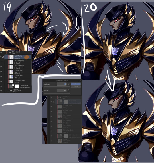
21. There’s also a second brightness/contrast correction layer, this one simply increasing the brightness a bit. It’s mostly for the sake of the black, because I wanted to make it look a bit more blue by making it lighter, but it worked to make the whole image a little brighter along with it. Aside from the optic, that’s still on top of everything else. But like said, how many corrective layers I have going on depends entirely on what I’m doing. In some cases I can have around a dozen in effect, not all of them always affecting the entire image, but split around to do their thing on different layers.
22. But speaking of the optic! It glows, so let’s make it glow with two layers on top of both of the “color” and “lines” folders. One layer is for the blurred red glow, the second is for the sharply reflected light.
23. And for things like these I like a simple background, which I generally do by just using a couple of gradients and altering their color to whatever looks decent. I also often add an outline to the entire character in pieces like this to make the character pop a bit more, by just copying my base color layer and performing gaussian blur on it.
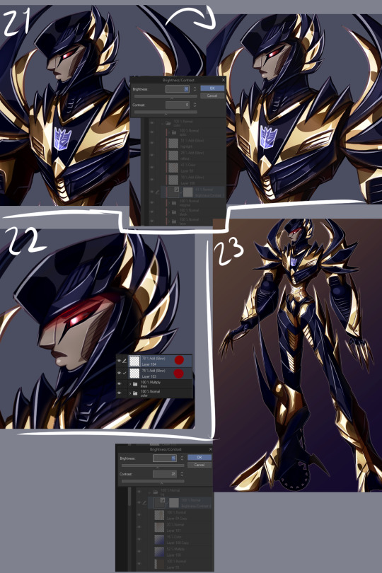
WHEEZE. That’s that, though. Finished product can be viewed here.
Oh, and ctrl+shift and tap will jump you straight to the layer you tapped on. Makes moving between layers and finding the damn layer you wanted to edit a hell of a lot easier.
Annnnnd obsessively naming layers and layer folders so you can tell what the heck they actually are when you have way, way many layers to work with.
*thumbs up*
#asks#anonymous#is that step by step enough#i might've forgotten to mention some layers because there is A Bunch even just for the colors#but i tried to be thorough#but yeah non destructive editing and editability#that's how we get to some overachieving layer counts but make sure we can always go back and always have control
9 notes
·
View notes
Note
Do you have any tips for learning how to draw digitally? I’ve been having trouble with lining/coloring digitally
Not too sure what program you use for your art but here are some general tips:
-If you’re transferring from traditional to digital you might wanna use a screen-based tablet if you don’t already. It’s a lot closer to traditional drawing and in my opinion far easier to deal with since I can see what I’m doing instead of staring at a screen on one side, and not looking at my hand while drawing with the bamboo tablets.
-Draw often. It might take a little while to get used to drawing digitally so you’re gonna have to really draw a lot of it. It’ll come to you quicker if you’ve been drawing traditionally but it never hurts to just doodle about to get used to how it all works.
-When drawing digitally, it’s generally better to use larger sized-canvases and a higher resolution. Makes the image sharper. Before you even begin drawing, check your dimensions and your resolution. At the very least your resolution should be 300 dpi. Canvas size is your choice but I always use 11x17 inches or larger for my own artwork.
Coloring Tips:
-If you’re using Photoshop, using the magic wand tool is your friend for coloring everything. Never select within your lineart, always select outside of it. Make sure your lines are completely connected before doing so. When you’ve done this, choose the “Select” menu, choose “Modify”, then choose “Expand”. This will bring the outline of your selection closer to the lines it’s outlining. Then select Inverse to make it so the only thing selected is your character. Make a new layer underneath the lineart layer, select any color, use the paint bucket to fill in this selection. Boom, you got yourself the basework for your colors and made your life so much easier.
-When you’re coloring and don’t wanna color outside of the lines, always select your color layer and select “Lock Transparent Pixels”. which is this:

It’s found in the layer window bar right above the layers itself. Selecting this makes it so your colors won’t color past anything beyond the existing pixels. Basically, makes it easy to color within the lines without worrying about coloring out of them.
--------------
Hopefully that’ll help some. uwu
80 notes
·
View notes
Last Seen Blogs
aristotlencheese
Max
poluxcl
404?

tyhaodiary
湯大帥非型日誌
reishirorita
You can be the King ;;
altairasart
𝔸𝕝𝕥𝕒𝕚𝕣 𝔸𝕊 𝕒𝕣𝕥