#meynnart wewyck
Text
Meynnart Wewyck-Part 7: different faces of lady Margaret
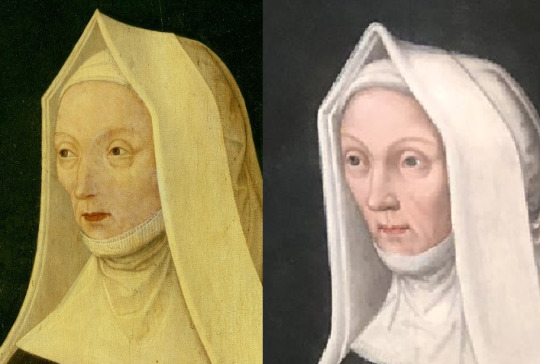
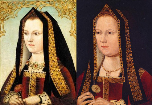
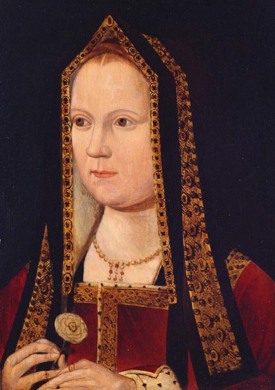
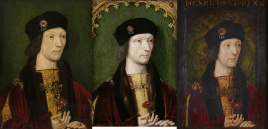
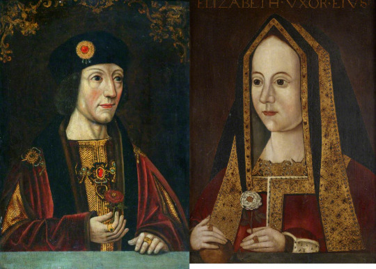
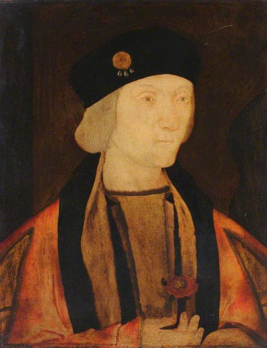
In part 1 I have introduced you to painting of lady Margaret Beaufort done in early 1510s, which was the very first painting atributed to Wewyck and lead to atribution to other portraits to him. And now we have more news about it!
The painting underwent conservation and t's hard to believe it is even same portrait. On left prior to conservation, on right after conservation was fully finished:

(Photos by Hamilton Kerr Institute)
Conservators found evidence of at least ‘four campaigns’ of extensive overpainting!
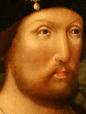
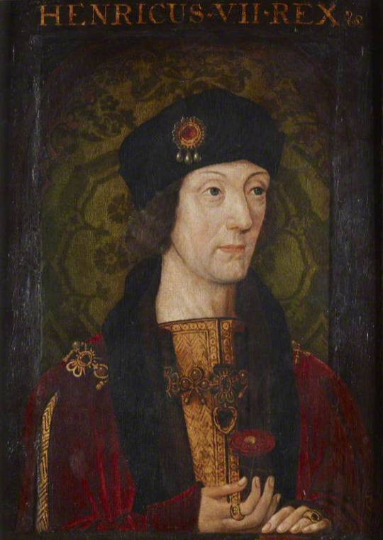
Including entirely overpainted/altered face -on left after cleaning:
I was right about thinning of layers within the face, but I thought the nose was moved by the original artist. But now we know thinning of layers was revealing the original nose.
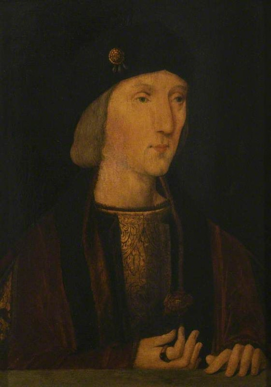
Prior to conservation:
The picture bellow is mid conservation(also by Hamilton Kerr institude), after the heavy overpainting and grime was removed....and it's so different!

And certainly there is lot of paint loss...but they manged to fix it.
The painting is currently on display in National Portrait Gallery. (It's loaned there for 3 years!) Fully restored.
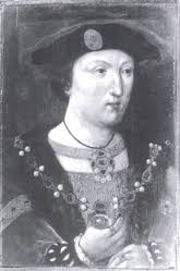
I don't have HD image of that yet:-( . (Still my issues with NPG's webpage.) But i think they will appear online soon, but by now we have to rely on images by those who visited NPG. Best I could find was by twitter user @RosieLe60545528:
And I am innerly sighting in relief because the 'gable hood' is same and I don't have to redo my post about it. (Thank God!)

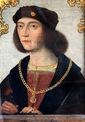
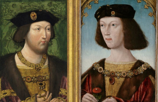
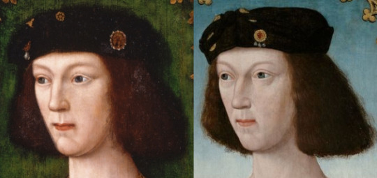
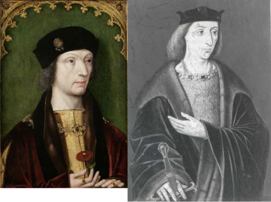
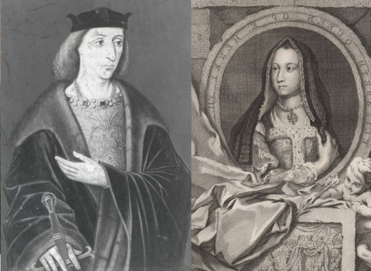
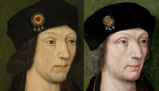
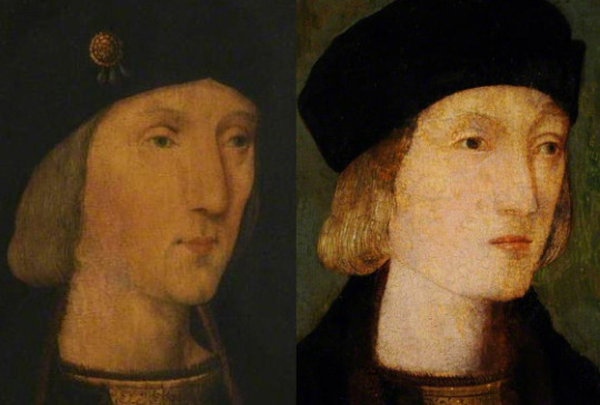
And may I just say...her son was like mirror image of her.
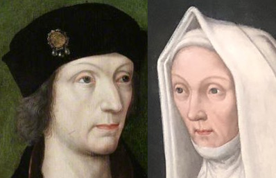
I think his nose might have had bit of raise on it and hers didn't, but then it could be just the angle. Really strong resemblence between mother and son, and probably not just due to same artist.
But back to lady Margaret alone.
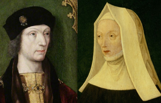
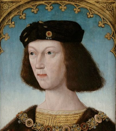
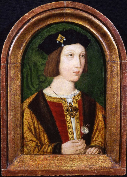
I have 2nd candidate on her portrait by Meynnart Wewyck.
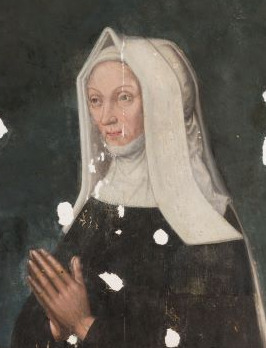
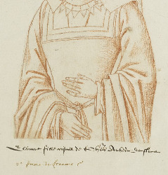
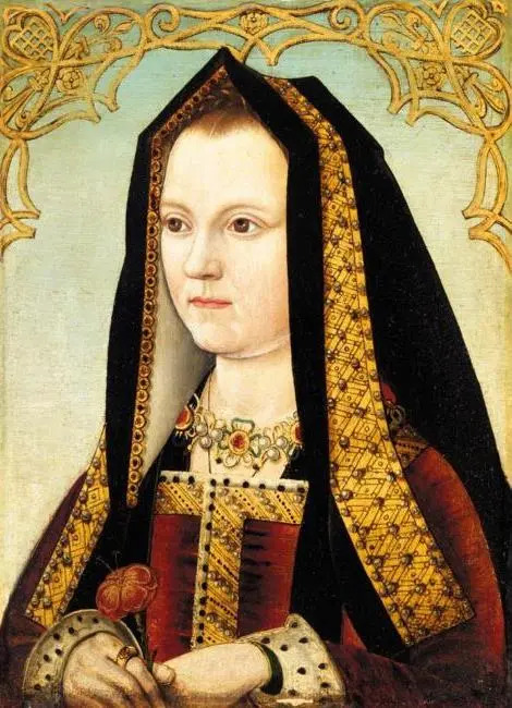
Portrait of Lady Margaret Beaufort Christ's College, University of Cambridge:

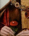
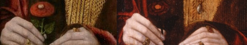
Have you ever noticed how many depictions of lady Margaret Beaufort feature her holding a book? I have. And I took it upon myself to try to find the missing painting by Wewyck of lady Margaret, the one featured in reccords. Imo so many portrait copies holding a book, might suggest there was once original where she indeed held it.
And this is my candidate. And part of reason is the plainess of the 'gable hood'. I previously did post about how that stripy pattern on lady Margaret's frontlets is wrong. It’s supposed to be plain linnen-that is the historically accurate detail.
And the painting above has both of these, book and plain linnen frontlets.
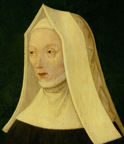
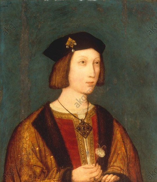
Another important detail, which in most photos you can't see at all is the background. It's once again that damask fabric. This copy shows it nicely:

But original is too dark, you really need to focus on it in closeup:

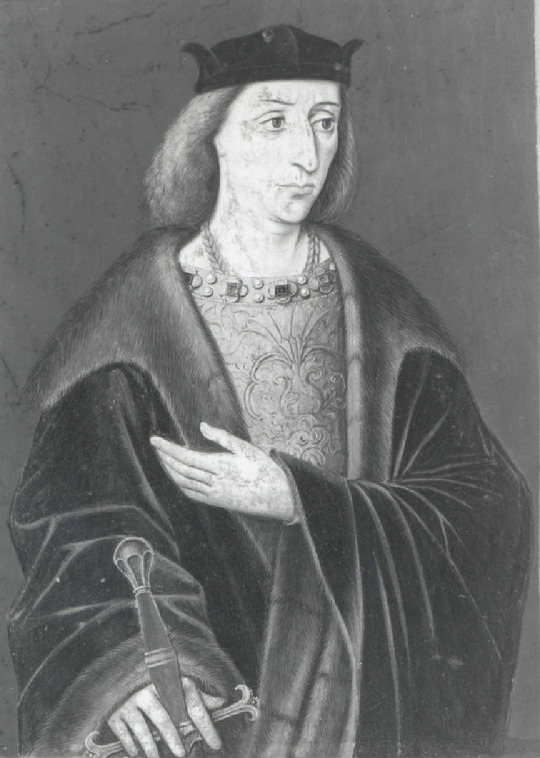
Furthermore the features of lady are better match to Henry VII's than the already atributed painting of lady Margaret:
(And even has same raise of nose.)
It's just not so obvious, unless you retouch the painting as I did:
I really think that if this painting is cleaned and restored, the experts might find is by Wewyck. (If it is a copy, then it is damn good one!)
I am not saying it's necessarily done from life, but it looks very similiar to those we already seen atributed to him.
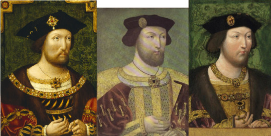
And lots of similiarity with features of Henry VIII too:

Hence given Henry VIII was fairly handsome as young man, it's likely lady Margaret was quite good-looking woman while young.
Also both portraits don't show her with significant wrinkles, despite being nearly 60, when Wewyck started to work for royal family(his first mention is from 1502).
There is another thing worth of mentioning.
This painting is located in Christ College in Cambridge.
We don't know when exactly it got there. But there is an intriguing possibility. Missing portrait of lady Margaret found in records was comissioned in 1506. Lady Margaret gave Christ College funds in 1505, just one year prior. Maybe...and it is big maybe...
Maybe all along this portrait was intended for Cambridge to comemorate her patronage.
Or they simply bought it later on, saving it from uncertain fate of many Tudor portraits. But if it is the first option, then it is the older painting...and done from life!
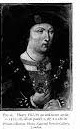
Additionally there is 3rd painting which looks very much like Lady Margaret's large portrait after restoration.
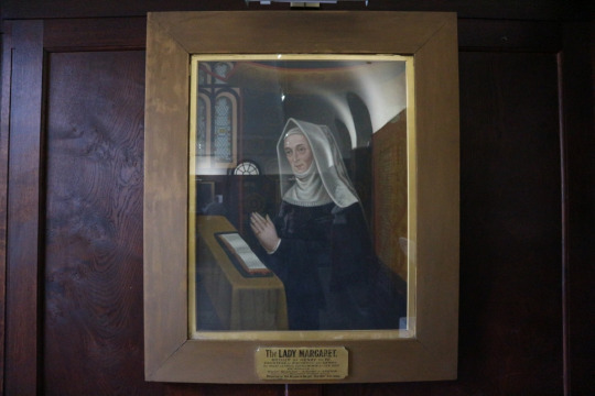
(sorry this is the best photo of it which i could find)
It is currently hanging in Manchester Grammar school, which was founded in 1515, but it was only donated to them in 1908.
Who knows? Maybe it is a an early copy...or maybe not.
I hope you have enjoyed this. And write to me in comments what you think.
38 notes
·
View notes
Text

The restored portrait of Lady Margaret Beaufort at St John's College, Cambridge
By Meynnart Weywyck (Maynard Vewicke)
oil on panel, circa 1510
The conservation project began in 2018 after Dr Andrew Chen, Art Historian, solved a 500-year-old mystery and discovered the portrait was painted by 16th-century Netherlander artist Meynnart Wewyck. Wewyck was an active member of King Henry VII’s court during his reign and became his preferred painter. (x)(x)
#enough about gregory!#look at margaret's little amused face!#i love how this portrait turned out#margaret beaufort#historicwomendaily#portraits#artist: meynnart wewyck
57 notes
·
View notes
Text
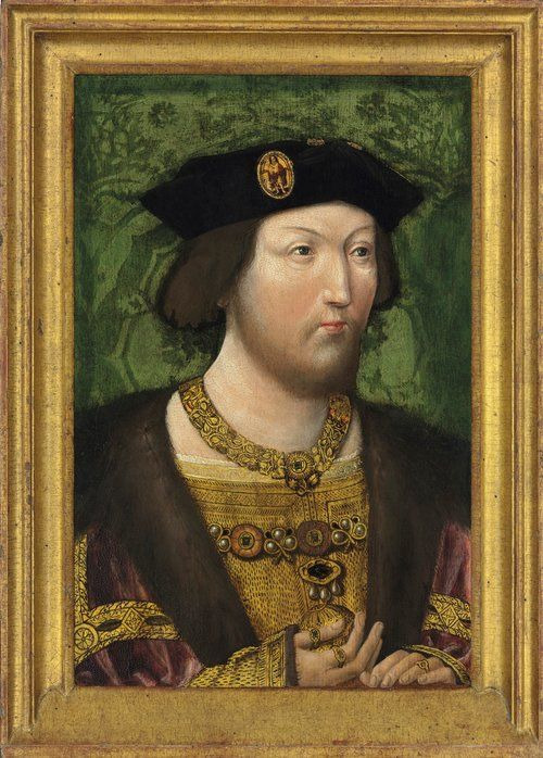
A portrait of Henry VIII by Netherlandish artist Meynnart Wewyck has recently proven to contain a ‘hidden gem’ unveiled by researchers at the National Portrait Gallery and Hamilton Kerr Institute. Scans of this incredible vignette reveal that the portrait was concealing an earlier likeness of the Tudor King, when he was ‘clean-shaven and slimmer.’ Researchers were able to recognise the youthful image of King Henry VIII thanks to his long, distinctive nose and lavish attire.
“This is an exciting discovery. Two images for the price of one.”
In the original image, completed in 1519, Henry was at the height of his power and an incredible athlete, only 28 years-old. However, a jousting injury in 1536 greatly reduced Henry’s mobility and resulted in drastic weight gain for this Tudor monarch. It is thought that a court artist updated the image to reflect the King’s changing appearance. The updated portrait also included a beard, which Henry began to sport in preparation of the Field of the Cloth of Gold in 1520 and maintained for the remainder of his life.
“What is fascinating is that, as the king aged - and, more importantly, as he adopted new fashions - the person who owned this portrait started getting very worried that what he had on his wall didn’t look anything like the king.”
Source: TudorExtra
#henry viii#the tudors#art history#anne boleyn#henry tudor#tudor dynasty#catherine of aragon#renaissance#medieval#history news
26 notes
·
View notes
Photo

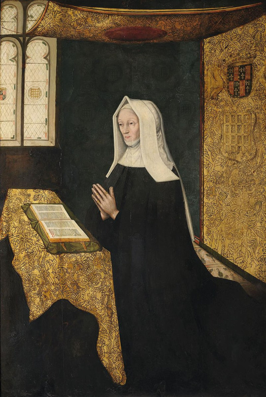
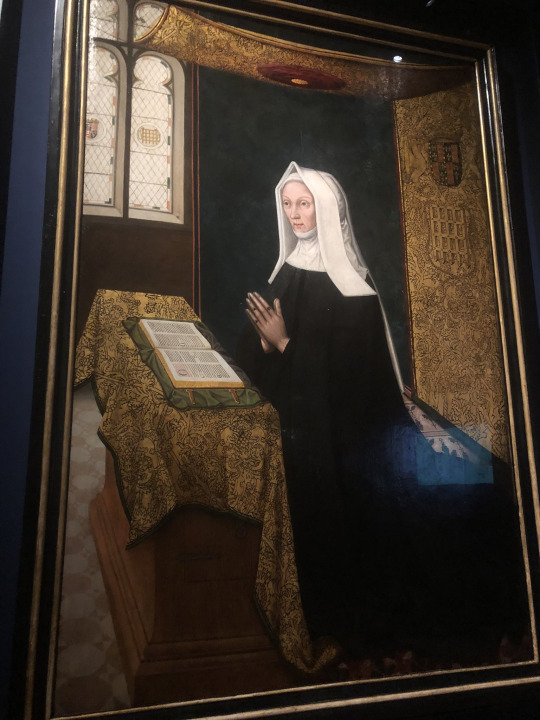
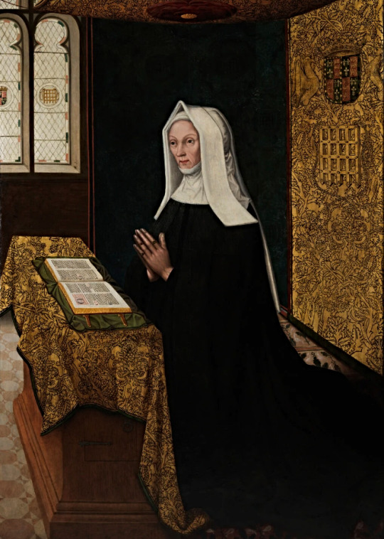
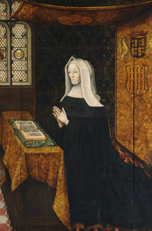
Lady Margaret Beaufort, Countess of Richmond and Derby by Meynnart Wewyck (c. 1510)
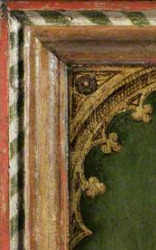
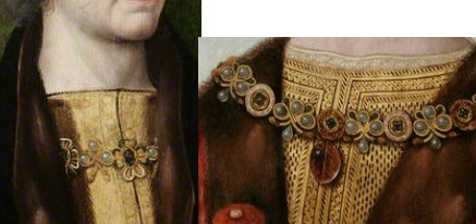
At 180cm tall and 122cm wide, this is the earliest large-scale portrait of an English woman, and one of the earliest large-scale portraits of a single individual in Britain. Commissioned shortly after her death by her confessor, John Fisher, Bishop of Rochester, the portrait depicts Margaret dressed in her characteristic widow’s garb, and kneeling at a prayer desk beneath a richly-embroidered canopy of cloth of gold. Behind her, a dark wall faintly decorated with daisies (marguerites) can be seen, as well as a diamond-paned window depicting in stained glass the royal arms of England and the portcullis badge of the House of Beaufort.
Lady Margaret Beaufort was the mother of the first Tudor king of England, Henry VII, and was noted in her lifetime as a keen educationalist, philanthropist, and patron of the arts. One of the wealthiest and most powerful women in England, she used her influence to build schools and churches, and founded two colleges at the University of Cambridge: Christ’s College and St John’s College.
According to Dr Andrew Chen, Art Historian and Fellow of St John’s, Margaret’s portrait is “one of the most important portraits of the early 16th century, demonstrat[ing] that elite patrons were working with European painters who had the skills to realise large, ambitious compositions even before Hans Holbein the Younger arrived in England in 1526.” Wewyck, like other continental artists such as Pietro Torrigiano, was an active member of Henry VII’s court and became his preferred painter. The portrait’s significance lies in the rarity of women of the period being depicted on their own in such a large-scale: women were typically “shown on larger scales as donors in altarpieces, but [...] associated with religious subjects and normally paired with men.” Significantly, Margaret here “comes to stand alone” — an innovation likely related to the independence she enjoyed as the King’s mother and her role as a foundress of institutions.
Her portrait currently resides in the Master’s Lodge of St John’s College, Cambridge.
Source: St John’s College, University of Cambridge (2019)
66 notes
·
View notes
Photo

The painting of Lady Margaret Beaufort - mother of King Henry VII - has been named as the first piece of work identified as by Dutch artist Meynnart Wewyck, and the oldest large-scale portrait of an English woman.
158 notes
·
View notes
Text
Meynnart Wewyck’s workshop-part 6: Hidden in Recueil d'Arras
Sorry guys, I realised this months ago, and forgot to post it. In part 1, I mentioned the lost Scottish portraits by Wewyck, done c.1502-1503. They seem to have been lost, and we only have Receuil d’Arras(collection of drawings based upon actual portraits, done in c.1570) which shows us aproximately how they looked like.
We have drawing of James IV, Margaret Tudor, Henry VII and then very rubbed of Elizabeth of York.
But records from 1502 show one extra painting. Of future Henry VIII. It’d be probably THE oldest portrait of him! As child! But it is nowhere to be found. Or have we been looking at it this whole time?

And if you read further I’ll explain you why this drawing from Receuil D’Arras cannot be the Warbeck. 100%.
This is typical handwriting of Le Boucq, found all over the Receuil d’Arras:

And this is text labelling the drawing of Warbeck as him:

Absolutely no way this is the same hand, and I’d wager not even same century. It’s too readable for modern viewer.
Le Boucq didn’t know who it was. He never made any label for drawing. And let me remind you Le Boucq made the drawing about 70 years after Warbeck died. Cca 1570.
How could anybody even later than that recognize it as Warbeck? Based upon what?! It’s impossible!
It was an unknown male whose portrait was part of Scottish royal collection(that is clear because of drawings surounding it. First 21 drawings in Receuil d’Arras were from(in) Scotland, even though not all sitters of those paintings were. Lots of french and english royalty etc. Royalty often sent each other portraits. Long story short, lots of evidence to suggest it truly was Scottish section.)
And based upon it, somebody GUESSED that it is Warbeck!
It’s supposedly the only depiction of him we have surviving!
And it is not him! 100%.
The jewelry, the posture, it fits with Wewyck’s work and Tudor males so well!
Yes, the features are nicer-because kids tend to have softer features and Le Boucq’s drawings also add the softness(such was his style). It fits perfectly with Wewyck’s work. Just look through previous posts.
Also, how would Warbeck’s portrait survive in Scottish royal collection throughout many years Margaret Tudor was the Queen? She’d be certainly outraged at such display. It’s not make sense for her husband to keep the painting of now dead man of whom he had no use.
Like for Tudors it made sense to portray Richard III with broken sword-because that shows him as warrior who was defeated, thus more glory to Tudors for defeating him.(read my post Mistaken identity, if you don’t get why I assume rest of Richard’s portraits are not him.) But same doesn’t apply to Scottish royalty and Warbeck.
In Receuil d’Arras ‘Warbeck’s’ drawing is not even that far from rest of Wewyck’s work.
It’s Henry VII, then Elizabeth of York, then two drawings of Elizabeth I (from late 1550s it seems), then James IV, Margaret Tudor, then Bernard Stewart, 4th Lord of Aubigny; then drawing of Egyptian woman who once healed Scottish King, James II of Scotland and then supposed drawing of Warbeck.
Henry VIII was just 3 drawings away from his sister, the entire time!
Meaning that probably in c.1570, all those paintings were in same chamber or set of chambers when Le Boucq drawn them. They were not separated, even though by that point nobody could remember who the boy in the painting was.
(Probably because those 4 paintings by Wewyck were in same style. So people knew they belonged together. Just no longer who was in one of them.)
That it is boy might also explain why he is much bigger in current drawing than rest of his family. (or at least Le Boucq makes it seems so.)Some painters struggled with proportions of children, adn then sometimes made them ridiculously smaller or much bigger.Even though Margaret would be in her early teens when she got painted, she’d be still couple of years older than her younger brother, thus her features closer to adults.
(That was main information. If you’re interested into me rambling bit more about the other Scottish paintings by Wewyck you can read further. But to be honest i covered lots of it in part 1. If not I hope you’ve enjoyed this.)
Speaking of Margaret I’d like to clerify something. Records suggest she was painted by Wewyck twice. Once as English Princess, and 2nd time already as Quen of Scotland. Idk which one is in Receuil d’Arras.
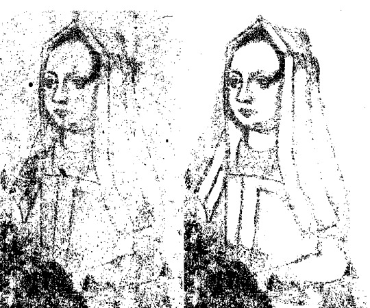
1)Drawing of Margaret Tudor, Queen of Scotland, based upon portrait from c.1502-3:

But I belive we have idea how 2nd portrait looked. Family trees of James I show Margaret in en face with gable hood:

It’s also in several engravings. Each of them is of not great quality.
The lenght of frontlets and pitch of gable hood suggest it is early 1500s(max.1505), thus likely based upon Wewyck’s work.
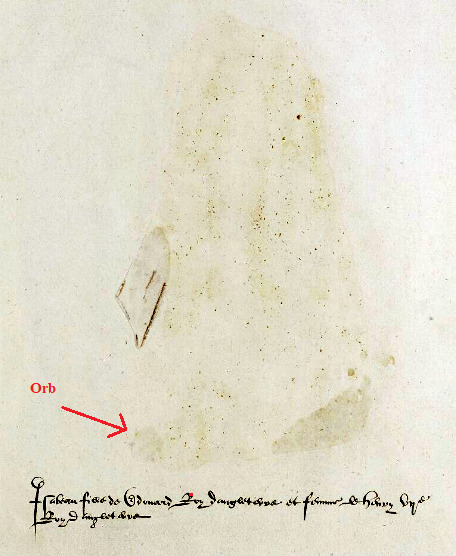
I also wanted to point another thing about these scottish-based portraits. They are unique. While there are other depictions where they hold golden orb/apple? and similiar outfit, together all those details don’t fit any other different versions of their portraits surviving, probably because the copies made during Henry VIII’s reign were made based upon portraits located in England.
Thus Scotish located paintings never had copies of them made. So when alongside many other Scottish portraits they got destroyed, Receuil D’Arras became sole source where we can see them. (As far as we know.)
2)Drawing of Henry VII holding an apple/orb:

(Yep it is once again the same brooch-or perhaps there were 2 of same design but different sizes. But same style brooch.)
While even on Henry VII’s drawing some details of the sleeves rubbed off, note the shape of the oufit around his neck. It is round, and the curve goes downward.
And Henry VIII’s paintings go also downward.
But majority of Henry VII’s paintings, have it other way around. They are pointed upward. And it got me thinking-i don’t much about Tudor male fashion in general. So i don’t know their chronological order. However, around 1480 the neckline of english ladies was curve pointing downward(York sisters stained glass), but then through 1490s we saw W-shaped neckline pointing upward, which then slowly returned to almost straight line with slight raise by c.1500 and eventually to completely straight, only to be curved upward much later towards end of Henry VIII’s reign.
I don’t believe they’d send to Scotland painting predating Henry VII’s reign. It’s 1502 painting. No doubt about it.But neckline of men evolved in same way as ladies’ fashion, then big portrion of Henry VII’s paintings would not be from 1500s, but from 1490s, and I don’t mean just late 1490s. Thus potentially Wewyck worked for English royals for much longer than we assumed.
But I don’t have yet enough to establish firmly chronology of dress and headwear prior to 1500. Sadly my only solid source from that time are tomb brasses and dating of those is very difficult and requires lots of time.
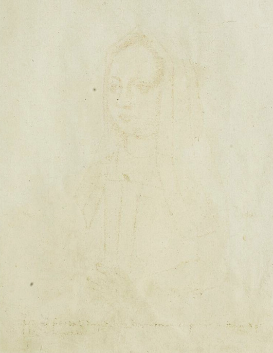
3)Sadly Elizabeth’s sketch is no more there. Sketches are all in pencil and hers sadly got worn out. Only imprint of the original drawing left on the opposite page still survives, but it is really light imprint.@english-history-trip enhanced it a bit(far better than attempt I made and then discarded), but in order to know what that painting looked like, we have to flip it back:

It’s not perfect match with neither of the 5 paintings of her I showed you prior, Currently closest it comes to this:

But why if it is based upon original by Wewyck-from life, why is her neck short?
(In other cases it was in posthumous paintinsg or altered.)
This time there are other possible explanations alterations to the original, le Boucq not gettig proportions right(possibly further shifted by this being based upon imprint) etc. But imo none of those is correct. Imo it’s not alteration. It’s actually there, but isn’t what we think it is(neck crease). Imo it’s edge of necklace.
I had looked at original drawing in Receuil d’Arras, and in Photopea I played with setting to see, if i could find filter or something which would give us better idea of what the drawing looked like. I used both inprint and what is left from original drawing. That is how i discovered that just as Henry she held an orb.
It just stayed on the original page and not on the imprint.
But to get to that necklace, I need to use much stronge filter. Idk what it is called with english, but it turns the drawing into these dots and as you shift the setting, it goes from very dark lines to very light ones-revealing some which you’d never see with naked eye. But it also has downsides. it will hide some lines you’ve seen before and eventually the filter will start to reveal weird lines which are texture of the paper, not related to drawing itself.

Main issue is that some parts are already distorted(because they were visible/more dark before), while some are not, and it is hard to catch the right setting for the era you’re interested in.

However you need to rely on your knowledge of tudor outfit, to connect the dots-literally and to know which dots to not remove.
In this setting hands are not visible, but it is focused exactly on the area of clevage. Thus, while rest needs bit of clearing, that area should be fairly accurate. Now I could be wrong, but that looks like necklace to me.
And you can see it on imprint, in HD, if you focus on it. If you search for it. It’s very very light. But it seems to be there.
Tiny bit of pattern, just under the ‘neck crease) which forms shape of triangles I’d say. It’s not likely to be any of the pearl necklace of triangles we seen in late reign of Henry VIII and later. But some late 15th/early 16th century necklaces had similiar form. One is in Receuil d’Arass itself-on Eleanor of Austria as child:
Royalty in those days often had same jewel makers. Just few provided the jewelry of quality royals wanted(that is why often you see same or similiar jewelry across Europe, on members of several different dynasties and it isn’t just them sending each other gifts.) Also fashion and jewelery back then was not solely unique to the country, they influened each other, and some trends took on in several countries or had pararels in them. (Like french hood’s frill and english gable hood’s paste in early 16th century- they moved up and down around same time.)
Thus Elizabeth’s necklace might have looked similiar to Eleanor’s. Idk exact shape, but it seems to me like top same, then much larger triangles. ANd sometimes it seems like two rows of triangles. Idk.
Unfortunately all my attempts looked horrible. You can try it yourself. I give up.

With hadns also. Can’t make the shape out conclusively. And i can’t make the shape out. But it sort of reminds me of necklace of triangles(which obviously was made much later) or some paintings at turn of 15th and 16th century. Nevertheless this is very underated depiction of her.
(I did look into drawing Henry VII also with these filters-because his is also partially rubbed off. He wears his usual clothes he has in many other portraits. There is nothing new for you to learn there.)
I hope you’ve enjoyed this.
7 notes
·
View notes
Text
Meynnart Wewyck’s workshop-part 1-proven paintings
Meynnart Wewyck has for long been hidden in shadow of Hans Holbein the Younger. Everybody knows Holbein’s work, but very few of us know of Meynnart’s work. Even though he was working for Tudors in between 1502-1525. For 23 years! Holbein only for 11 years had royal patronage.
So how come we only have 6 confirmed portraits by Meynnart Wewyck?
It’s complicated. Because most likely Wewyck didn’t work alone. He probably was a master overlooking workshop of artists(painters)-yet only he would be on royal records as the one who would be paid. Work of same workshop can be difficult to identify as painters could come and go(or be sick when certain stage of painting needed to be finished) the resulting work from same workshop could be very different. Their skillset varied, the brushstrokes varried. Depending on turnover of painters-this can be nightmare to try to identify.
Even with all the perks of modern technology. And in case of Meynnart Wewyck’s work, it might be even more complicated. Because yes, dendrology(testing of the wood to determine painting’s age) is helpful, but might not be a deal-breaker when it comes to workshops. Which will sound crazy at first, as you’ll read this, so read entire thing.
Currently I know of 6 paintings which are identified as Meynnart’s work-and experts have no doubt about it.
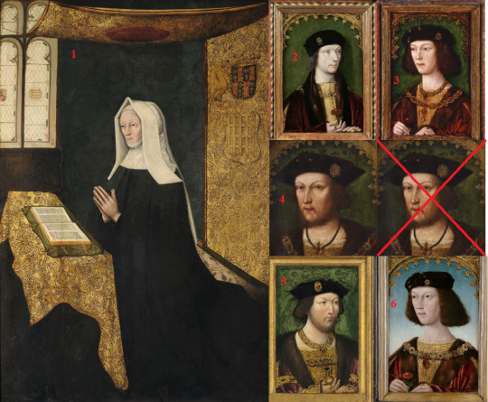
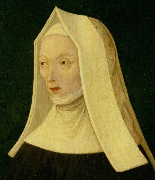
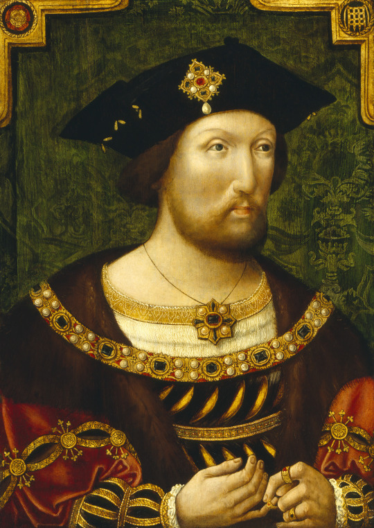
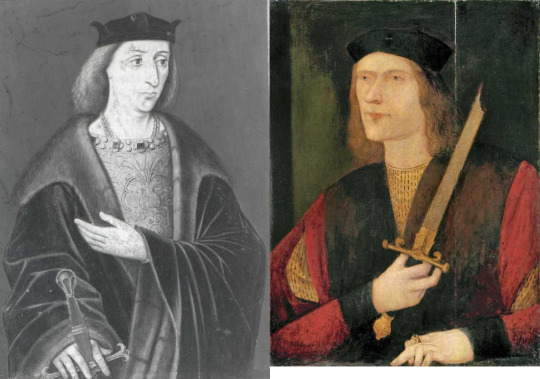
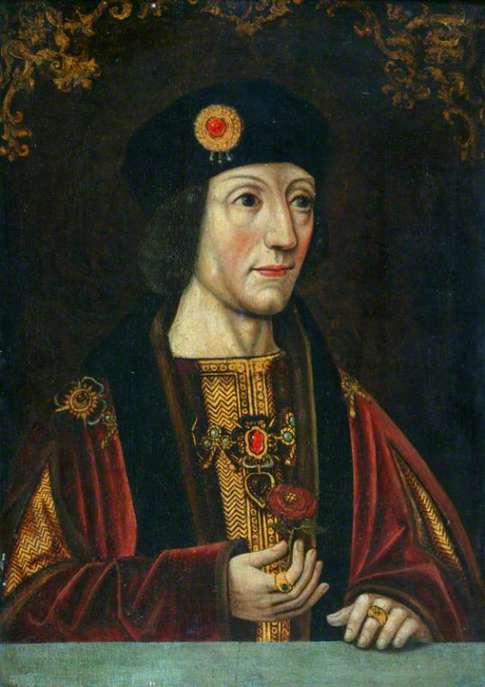
1.Posthumous portrait of Lady Margaret Beaufort, comissioned in c.1510,
180 x 122 cm , location: the Master's Lodge, St John’s College, Cambridge, UK
2.Portrait of Henry VII, 38 x24.5 cm, location: Society of Antiquaries of London: Burlighton House, UK
3.Portrait of Henry VIII, location: Denver Art Museum, USA, supposedly ca. 1509
4.Portrait of Henry VIII, 44,5 x 29,8 cm location: Anglesey Abbey(National Trust Collection), UK. Supposedly ca 1515 - 1520
5.Portrait of Henry VIII, location: Private collection, supposedly ca 1519
6. Portrait of Henry VIII, location: Private collection, supposedly ca 1513
Why did I put number 4 there twice and crossed one? Because the Henry VIII we look at is not the original. There is painting beneath(which I presume to be Henry too):
How could they then possibly know this one is by same artists? Well, the cloth of gold has same pattern as in 5 and 6-but imo they didn’t come to that conclusion based upon painting we can see. But due to exhamining all of the painting, not just visual exterior.
Bit of background on the research done by professionals, which I aplaud:
Before 2019, no painting was 100% identified as by Meynnart. Then research into lady Margaret’s painting(1) has been proven to be an original work by Wewyck. They also found evidence that it belonged to John Fisher, Bishop of Rochester and probably never was in hands of Henry VIII.
(So presumably he had some other painting of her, perhaps the 1506 one.)
We can contribute this confirmation to art historians Dr Charlotte Bolland of the National Gallery, London and Dr Andrew Chen of St John's College, Cambridge.
They published their research in the April 2019 issue of Burlighton Magazine. Based on their work with the portrait of Lady Margaret Beaufort, they also attributed a stylistically and structurally similar portrait of one portrait of Henry VII(2) to Wewyck.
Based upon identifying this one, very quicky, still in 2019, a group of specialists from the Yale Center for British Art, with support from the National Portrait Gallery, London and the Hamilton Kerr Institute Cambridge, initiated a research project at the Denvert Art Museum. (Lots of different institutions doing combined research.)
They found 5 paintings painted on wood from same tree. Henry VII(2) and 4 portraits of Henry VIII (3,4,5,6) were painted on that wood.
And according to some sources also they laso identified 2 portraits of Elizabeth of York. While they studied it, and it was part of their project. But ‘being fairly certain’ they are tributable to Wewyck’ is not same as being certain.
What is madening to me, is that I went to websites of all those institutions, searched on interenet for weeks-and yet I cannot find any detailed report about this 2nd project! I have no real idea what they found! I give up. I can’t find it.
Just know only few tidbits about number 4 and then I found out on Denvert Art Museum short article-which deals with few more tidbits. But that is it. And it irritates me to no end that I don’t have more about this!
I’d really love to know what the actual findings were.
It took me ages to even find out which paintings they meant(those in private collections-those were the problem). After going through several articles and ending up empty handed each time(about those in private collection), eventually I found them on this webpage:
https://web.archive.org/web/20200603202704/http://damscout.squarespace.com/comparisons The link for it was actually on wikipedia the whole time!
And I know they found way more. I know it. There are at least 6 different methods they use! Here they are:
DENDROCHRONOLOGY & PANEL EXAMINATION
Deals with exhamining the wood of frame or wooden pannel painting is painted upon. Not all paintings are done on wooden pannels, some are on canvases only, and you can only hope the frame is original.
PIGMENT AND MEDIA ANALYSIS
This is very important because certain painters could always use same pigment mixture or varnish mixture, or glue etc. Or pigments in painting have changed colour, and you need to prove it.
MICROSCOPIC EXAMINATION
This is crucial in order to know artist technique and to determine if it is by same hand. Very HD image can be also be used for it(I use them as amateur). It’s especially great to use if you have two paintings and wish to compare how the painter did the details.
The other 3 methods all deal with allowing us to see beneath the layers of the paint. Like different filters:
INFRA-RED REFLECTOGRAPHY
Particularly good to see the original sketches/drawing-which is likely to be done from life. (and hence to realise if painting wasn’t altered)
X-RAY EXAMINATION
Tbh, I don’t really understand in what way it is different from Infra-red, other that than you can see different layer. It just reveals some details better.
ULTRA VIOLET EXAMINATION
Another method to see what we can’t with naked eye. This one I know what it is for-it reveals overpaint on the painting. Even minor retouching can be seen with this.
Denvert Art Museum on September 1st 2019, posted a short article and it, it credits the people, who did this expert analysis:
Ian Tyers, dendrochronologist, who undertook the dendro on the five linked portraits;
Pam Skiles, senior paintings conservator at the DAM, who facilitated the examination and did the initial infrared examination;
Natalie Feinberg Lopez, architectural conservator, who was contracted in to do the XRF analysis;
Kathleen Stuart, former Berger Collection curator,
and then the author of the article: Christine Slottved Kimbriel, Paintings conservator (of Cambridge University’s Hamilton Kerr Institute in the United Kingdom).
She mentions in the article exhamining the picture under the microscope, analyzying the paint using a technique called x-ray fluorescence spectroscopy and taking tiny paint samples for chemical analysis back in the lab in Cambridge.
And also, working together with an imaging specialist using infrared reflectography to reveal images of what lay beneath the top paint layer.
All methods are nice, but here is what they found. Denvert Art Museum’s portrait of Henry VIII originally had blue background. And it wasn’t only painting in that project, where blue background was revealed. 3/4 had it. Which? Idk. They exhamined 1 of Henry VII and 3 of Henry VIII in Denvert Art Museum. I can only be sure of number 3. Out of 5 paintings, 1 had blue background, 4 had green-and of those 3 turned out to be originally blue.
Furthermore they found traces of gold and paint frame of number 3, which made them believe originally its frame and edge was once decorated as number 2 was:
with golden motive above above the sitter, and red trim and green-and-white striped “barber’s pole” trim:
But back to dendrology. So, numbers 2-6 are all done on wooden pannels cut from same tree. 5 paintings painted on wood of same baltic oak, which was felled between 1500-1515. Which gives us date cca 1500-1520, when these were used-according to proffesionals.
(It is presumed that is when they should be used. Imo it should be stretched to 1500-1525 at least.)
Lady Margaret’s posthumous portrait is made out of wood of two baltic oaks(different ones than the remaining 5 paintings), and testing shows one oak was felled after c.1487 and the other after c.1489. So timeframe for these two oaks to be cut and used is ca 1490-1510.
So it is possible that oak was cut 10 or even 20 years before it was used.
Why would they wait so long before using it? Excellent question.
I believe I might know the answer. I heard of practise certain monasteries allegedly did. They would leave cut tree trunks intended to be used for roofs in forest for several years. If nothing touched them(no bug started to eat it, etc.) until certain time was over, then they’d use the wood. Because then it was way less likely that any woodworm would attack the wood later on. Hence insuring the quality. Such wood would last.
If the painters also prefered older untouched wood, it’d explain it. They’d buy one such tree trunk(or part of it) from reliable source and then use it all, over course of many years.
So the dendrology analysis is helpful, in letting us know the paintings are early 16th century works and very likely same workshop, but there is a big issue.
Except lady Margaret’s portrait-where we know portrait’s history, we cannot be sure if the painting is original or very early copy.
Even knowing that some portraits originally had blue background(number 6 still does), and green damask background is alteration in some of them-the traces of blue found, are not conclusive proof that it is an original painting from life.
Because we have portrait of clearly young adult Henry VIII(number 6) with this blue background-suggesting it was still popular at least in 1st half of 1510s.
(Then in mid 1510s in my opinion green damask background took on and continued to be popular up to late 1520s(for half-lenght portraits, miniatures from mid 1520s have ultramarine blue backgrounds).)
If for example young King Henry decided in 1510 to have posthumous portrait of his father made(and we know Henry VIII loved to have posthumous portraits of his relatives), it’d still have the blue background. Dendrology would still fit, the artist/workshop would be the same. If this is the case-how on earth as an expert do you determine if it is an original? I don’t see how. Unless there is some alteration in costume or if you have some proof that artist(s) in this timeframe did something differently.
But for that you’d need to identify a more of paintings by this workshop.
But we’re long way from that still. But we know Wewyck’s workshop certainly made more paintings, that is clear from records. He appears in them as Dutchman, Flemish or Netherlandish-a region known for its artists.
There was no universal spelling back then, so there is at least 15 different ways his name was spelled like, and in Scottland he was even refered to as an English painter called Mynour, instead of a painter in service of English King.
Scotland is actually where he starts in records. In September 1502, Meynnart Wewyck delivered 4 paintings to King James IV of Scotland.
Those paintings were of King Henry VII, Queen Elizabeth of York, Princess Margaret(James’ bethrohed) and Prince Harry(future Henry VIII).
Why no prince Arthur? Because he died in April that year.
Why no princess Mary(Future Queen of France)? Because she was child of 6 and of no importance to Scottish King, unlike Margaret or young Harry.
So prior to September 1502, Wewyck was already in service of English royals.
He then appears to have stayed in Scotland up to November 1503.
Records show he made portraits of James and his bride in 1503.
He might have also done portrait of James IV located in Abbotsford House in Scotland(it is atributed to him, but as far as I know it is not confirmed), dated as 1502: (although on painting it looks more like 1507-but that might be alterated date, or added date)
It is also suggested that portrait of James IV in inventary of Henry VIII was also made by Wewyck in between 1502-1503. But few portraits of James survive and we have mostly just drawings or engravings of them.
Do we have any clue how those lost Scottish paintings looked like? Maybe.
It’s likely that sketch of Margaret Tudor in Receuil d'Arras, a collection of portraits copied by Jacques de Boucq, done cca 1570, is based upon one of the two paintings of Margaret by Meynnart Wewyck:
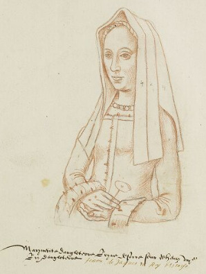
(And yes, this commonly mislabelled as drawn from life)
The same collection of drawings also consist sketch of James IV(on left) and of his son Alexander Steward(on right)- Both could have been done by Wewyck. If those are who the text beneath drawing says they are.
Later, in March 1505 Henry VII paid Mennart Wewyck £1 for pictures(paintings).
(we don’t know which, if it was for past work or for future work. For example painter Sittow was not paid for works commissioned by Queen Isabella of Castile many years after she died.)
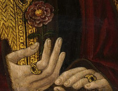
Wewyck also made 2 portraits of lady Margaret Beaufort.
1st was comissioned in 1506-presumably from life, 2nd posthumous was comissioned around 1510(that is our number 1).
He also made drawings/sketches then used by sculptor Pietro Torrigiano who made lady Margaret’s tomb.
But even though he was on royal payroll still in 1525(then he presumably died), as far as I know, we don’t know about which other paintings he made in between 1510-1525.
(Perhaps somebody can recommend a source which would give us a clue.)
Let’s look at his proven work again:
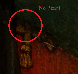
1)Posthumous portrait of Lady Margaret Beaufort, the Master's Lodge, St John’s College, Cambridge(UK):

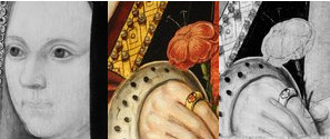
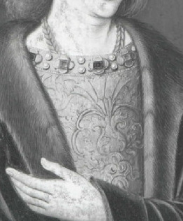
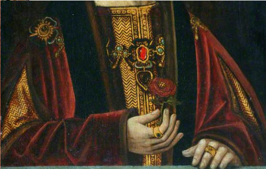
It’s huge! (no wonder it was refered to as a table) And sadly the painting doesn’t look exactly as it used to when it was made. It suffered localised paint loss, particularly in the lower-left corner, and is also partly obscured by discoloured varnish and retouchings. Further more, the face when being made was bit off, and painter moved it about an inch(this happens a lot, sometimes you sketch it all-come to get snack and return and realise it is iffy!) Normally, you’d not see that painter did this. But sadly, due to thinning of layers you can. You see lady Margaret’s nose twice.

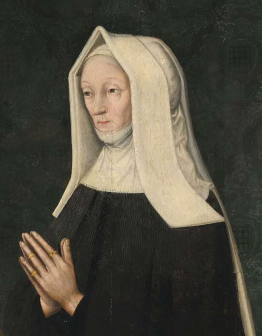
So if you wish to know how originally those parts of painting looked like, I recommend looking at a copy by Rowland Lockey, commissioned in 1598 (it’s also in St. John’s Colledge, University of Cambridge):
it’s really great copy(unlike so many copies of Tudor paintings)
2)Portrait of Henry VII in Society of Antiquaries of London:Burlighton House(UK):

3)Portrait of Henry VIII, Denver Art Museum(USA):

4)Potrait of Henry VIII Anglesey Abbey(National Trust Collection), (UK):

Once again, this is actually not the original portrait. Beneath the layers of the paint is another portrait of Henry VIII(or at least it seems like him to me)
Sadly I am still searching for bigger picture which would show the painting beneath it.
5)Portrait of Henry VIII , Private collection:
6)Portrait of Henry VIII, Private collection:
As for Elizabeth of York, they were looking at these two portraits of her:
Queen Elizabeth of York, about 1470–98. Royal Collection Trust, Haunted Gallery, Hampton Court Palace( UK):
38.7 cm x 27.8 cm

Queen Elizabeth of York, about 1500(supposedly). Bryan Collection, Crab Tree(supposedly- I couldn’t find it):
And imo they are not drawn from life. But are very early copies. Very early indeed. Maybe even 1510s or 1520s. Because they have turned frontlets-just as on her tomb. Due to fabric upon hood being black(only paste is white), this details is so hard to spot-that it is unlikely it could have been copied when artist no longer knew how it was supposed to look like.
But what exactly made them believe in first place that these might be by same artist/same workshop? The artistic similiarities-are kind of vague term. Sadly, I couldn’t find what exactly they mean. It’s not written down in April 2019 article, and as I said nor could I find detailed report about the fallowing research. Just tidbits
However, if you just look at those paintings in HD(or at good photos), even as amateur you can spot some the similiarities. So which are they? Imo:
1)the fur
number 2(on left) and number (3)-shading of it suggests same hand
Problem is, different kinds of fur would require different shading and hence it could be hard to spot.
2)the cloth of gold pattern. You might think King could have cloth of with this pattern-and be painted by several different artists-and they’ve still end up same. Not entirely true.

Idk if you ever attended drawing lessons. I have and one of the exercises we were to do-was to draw picture of certain actor based upon his photography. And each person’s same actor-came out completely different.
Of course trained painter, with good eye, might be able to do very good copy, and few even copy as good as the original. But usually that is not the case.
Each person does it bit differently even if they try not to. So it should be recognizeable feature. But it is isn’t in many cases-because they weren’t just painting the area. In most cases these painting were gilded. And sometimes re-gilded later on.
And way too often the re-gilding was done poorly, destroying the original pattern beneath and skill of previous artists hence doesn’t show. Details are often gilded over!

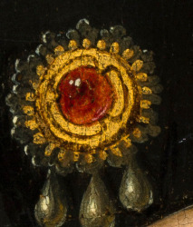
I am 90% sure that brooch(above) on Henry VII’s hat on number 2 is same as on multiple painting(including number 6), all of which have it with red stone:


On Henry VIII, which grew to bigger than his father, it looks tiny! But it’s very likely same brooch.
Also, rather often silver or golden gilding comes off(that is why so often it gets re-gilded), revealing just the basic under layer made in beige or yellowish colour.
And only traces of gold(which in same cases disappeared completely) are later found during proffesional exhaminations.
Why not every painting has issues like that? Due to different conditions painting is kept in=(enviroment vs glue), and due to different people taking care of them.
3)thinning of layers
Not all paintings must have this necessarly(different envirement might or might not make this occur). But certain painters’ work tend to to have the same issues more often. It might not be so obvious all the time as with potrait of lady Margaret. But number 5 has lines under eyes and sketches of brows which shouldn’t be visible.

So thinning of layer might suggest it is same artist. But also it can also mean master and apprentice, or same workshop. It’s definitely no proof by itself.
4)the fabric-how it is painted. In most of these recognizably it is crimson velvet. And while one time(number 5) it doesn’t have the vivid colour(probably because somebody else made the mixed the pigments), the style of this velvet is same or very similar. It could be same workshop, in several cases even same painter.
(I think it is possible that some people within workshop specialized in painting just 1 part of portrait-just fur, just velvet, just golden details, just the face. While in non-royal commissions(or not high status) perhaps 1 painter would be allowed to do even entire painting, I think for the high status, they’d really combine their skills for the best result.)
5)The other details-pearls, jewelry, hair, flowers etc.
Each of these can be as big as clue, as any of the much larger things.
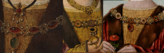
Here very notable are the roses on number 2 and 3(again):

-that is by same hand for sure
if you look at neck of men in 2 and 3, you can also notice the same v-like shape.

That imo is not just painter’s skill showing-but hereditary feature between father and son(a detail which copies usually don’t bother to copy). Imo it’s this:

According to anatomy sketches on google-in that area should be jagular notch(the dip) between clavicles(which are to the sides and not forming that v) and then sternal head( sternocleidomastoid muscle).
So if the outfit allows you to see young Henry VIII’s neck in full, it might be there.
But number 5 already doesn’t have even hint of it and overall the visible differenes between the two are big. Yet experts say it is same by Wewyck(or his workshop):
And imo it’s indeed possible. The jewelry and gilded patterns are done in same way. The velvet too-but clearly somebody new mixed the pigment for the crimson-and it eventually faded away, and didn’t stay vivid as in other paintings.
But it’s just same workshop in different time.(and that is why you need experts to have look at those paintings and say-yeah this was also crimson, the drawing beneath is done in same way, etc. etc.)
Another detail are the male hats-often done in black, which hides the details actually), the type and size of hat can be helpful in dating the piece.
But rather often somebody tried to ‘correct’ the hat. It’s one of the most altered things on male portraits(imo). Very likely these portraits originally(3,6) showed same type of hat:
their hands also are folded in alost exact same way, and they sit same way.
Different roses suggest some time passed between their paintings, and noses do too(yes, in one he could be teen and in other adult), but their philtrum(that part above lip under nose), the chin, very likely at least sketched by same original painter, if the skin was not done by him too.
6)background
By now we know that very early work by Meynnart Wewyck(’s workshop) originally had blue background-very likely like this-blue fading into white, in lower part:
It reminds me of blue sky on nice summer day. Recently we had a lot of such days near my home, and especially when seeing the fields with grain growing and harvest aproching, several times I had thought-ideal day for grain harvest.
And in Tudor times, grain was staple of the diet, and good weather throughout the year and for the harvest would be crucial. So imo this kind of background symbolizes prosperity, good days, brought by the Tudor dynasty.
And the golden details at top of painting are also part of that background. But such background on its own is not enough of proof, it just helps to date the painting-because at certain times such background was popular and later it was not. Same goes with damask background. Such fabrics could spread around Europe and appear in paintings by multiple workshops. By its own, they are not a proof of same workshop. In Netherlands that’d be impossible to tell which imo. But in England, where there weren’t that many painters, it could help. If nothing else to pinpoint aproximate date when fabric with this pattern was fashionable(based upon other paintings featuring it elsewhere in Europe).
So imo both types of these backgrounds can actually be interesting detail to look out for.

However when it comes to damask backrgound, since most don’t survive in original nor good condition, finding two paintings with exact match can be extremely difficult. But not impossible.
But what I’d recommend against using as conclusive proof-is the skin.
Certain aspects of it such as thinning of it and shading, yes you can use that. But I know for sure that paintings of same person even if painted in exact same time by 1 same artist, if kept in different conditions/different envirement-the skin can look drastically different. Really different. Skin is not realiable proof, ok?
So can we find based upon these details more work of Meynnart Wewyck’s workshop? Well, not conclusively, we cannot prove it! Because the expert analysis and exhamination of the paintings would be also necessarly.
But we can find some where we see the same details as which I just listed above. So in part 2 I’ll show you some of those and my other picks for ‘possibly by Wewyck’s workshop’ and reasons why I believe experts should take look at them.
I hope you’ve enjoyed it.
#long post#historical portraits#meynnart wewyck#tudors#Lady Margaret Beaufort#henry viii#henry vii#henry vii of england#elizabeth of york
38 notes
·
View notes
Text
Meynnart Wewyck’s workshop-part 2:Henry VIII and Prince Arthur
In part 1 I covered proven paintings. All the fallowing posts are purely my suggestions which paintings I think might be by this workshop or I hope somebody will thoroughly exhamine them to see if they aren’t.
This time we are focusing on Henry VIII and Arthur Tudor
I) Portrait of Henry VIII, probably in Private collection:
-after restoration(sorry this is the quality I found it in)

Before restoration:

I already made post about this painting named :Does anybody know anything about this portrait of Henry VIII? And kindly you’ve helped me find the answers.
Sadly I can’t tell from picture after restoration if they were able to also restore the green background, which certainly had damask pattern.

But I think the we’re looking at painting of Wewyck’s workshop. The similiarities to number 6(on left) from part 1 are pretty big, even for untrained eye:

(bit of difference in brows, but otherwise very similiar.)

Comparing these two imo is very important as it opens up window for time when lots of the original painters no longer work within the workshop, old master was aging and at least several new painters entered scene.
(Translation: in early 1520s lots of different painters did Henry VIII’s face, but overall it seems as same workshop. Perhaps.)
Comparing them with 3rd painting Henry VIII done around same time, would be ideal:
I’d be nice to have is figure out chronological order of all 3. Because imo they don’t fit just c.1520, but c.1519-c.1525(beard, young etc.).

Is it just me but is the left eye(from our view on right) depicted as bit of lazy in all 3?
II) Portrait of Henry VIII, National Portrait Gallery, London, UK:
Link:https://www.npg.org.uk/collections/search/portrait/mw03081/King-Henry-VIII
(but it doesn’t really show the picture, they have some technical difficulties for while. I am thinking of writing them an email about it.)
There are some details, such as mouth and beard, which make me think-maybe some of the Wewyck’s workshop were involved? Idk.
Tbh I don’t believe this is Wewyck’s workshop. Then why do I suggest it? Because it’d be nice to have it conclusively disproven, so that we can start search for another painter. (Or there will be big surprise, it will be by Wewyck.)
Given the aproximate dating-aside from Wewyck, we could also think French court painter as possible author.
Henry VIII on left, Francis I on right in very similiar outfit.

Both might have been done prior to Field of Cloth of Gold. Why prior? According to Venetian ambassador to England since September 1519 Francis was growing a beard. Catherine made Henry shave the beard off prior to meeting Francis, but it is possible prior to that he got portrait made and sent it to Francis.
Or Francis shaved during Field of Cloth of Gold(after they met), and Henry grew beard again-but since he broke promise of not shaving before meeting Francis, French were already insulted.
Since Henry VIII and Charles V got painted together(1 painting) it’s possible, French and English royals got painted upon meeting too. Just decided to go for separate portraits. On first glance the paintings don’t appear to be done by same hand(skin, shine of fabric etc.) but on other there are many artistical similiarities. So maybe two paintings by same painter being kept in very different conditions.
III) Another early portrait of Henry VIII.
He is beardless. So it should be pre-1520.
Imo this looks like same portrait:
Just different lighting, but iidk where it is from and I don’t have better version of it. But the dating suggest it could be by Wewyck’s workshop and there is certainly some resemblence to the confirmed painting by Wewyck(on right):

IV) Another painting of Henry VIII where I am not sure of its origin and I failed to find it in better version

But I don’t agree with dating 2nd half of 1520s. The pendants on black string worn on outside, is thing Henry did a lot more in 1st half, and he also still wore these kinds of hats. Other dating says c.1520. I am so fucking tired of ‘c.1520′ dating. Every young portrait of his, where he has beard is dated simply dated as c. 1520. We know he grew beard in 1520. But what other evidence do you have it is c.1520. Why not 1520s?! If you don’t know, don’t guess!
C. 1520 dating is ok only if you’re not sure if it is late 1510s or early 1520s portrait. Otherwise it’s greatly misleading.
I think especially around the eyes and nose, it is very similiar to previous painting and while I am not convinced it is by Wewyck‘s workshop , it’d certainly be interesting to have one by Wewyck where skin is in good condition. Imo it could be as late as mid 1520s, around time when Wewyck died. However, Holbein was in middle of painting posthumous portrait of Jane Seymour when he died. So, don’t think painter’s death meant they weren’t working upon something. They might have.
And that brings me to another version of this painting, just with different hat.

V) Another of Henry VIII, appeared in Sotheby’s in 2015:

Link:https://www.sothebys.com/en/auctions/ecatalogue/2015/old-master-paintings-l15035/lot.501.html
According to Sotheby’s it’s late 16th century, but I’d not be so certain of it.
You must be thinking, she went crazy. This is too different and you’re right.
The face is imo finished by same painter as the one who did Henry’s c.1526/1527 portrait(on right), not by Wewyck’s workshop. (so imo it’s 1520s work)

Even amateur as me, can spot how similiarly that beard is painted.
So why do I include it? Because imo cloth of gold in this painting is done by person who worked in Wewyck’s workshop. Maybe even Wewyck himself, because that 1526/7 portrait has cloth of gold also, but just painted with brush, not gilded. If Tudors liked this gilden style from c.1500 up to early 1520s and suddenly stopped in 2nd half of 1520s, maybe the person who did it, has died. Wewyck is presumed to have died around this time.
Hence we might be looking at painting Wewyck started, but didn’t finish and another painter finished it. In which’s case I’d die to see the underdrawing. But of course it can be a copy from start to beginning, perhaps neither IV or V are period originals, but are simply based upon lost original.
By this point I am no longer dismissing horribly looking paintings as inaccurate copies easily. And in part 3 you’ll see why!
VI) Portrait of Arthur Tudor(possibly), Royal Collection Trust, UK:
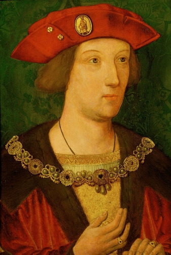
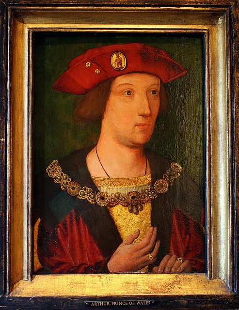
Link:https://www.rct.uk/collection/403444/arthur-prince-of-wales-1486-1502
RCT kindly shared with us result of dendrology. The wood was felled as early as 1490. Very likely this painting was done between cca 1500-1520, hence almost exactly when Wewyck’s workshop was active. Unfortuntely it seems they cannot remove the yellow varnish.
But there is some controversy about the sitter’s identity. Some claim it is not Arthur but Henry VIII. Royal Collection Trust says this about the matter:
Comparison(of this painting) with a portrait of Henry VIII in the National Portrait Gallery(probably II in this post), London may indicate that this depicts Henry(Henry VIII), Arthur’s younger brother. The inventories of 1542 and 1547 record portraits of both Prince Arthur and Henry VIII, with a red cap and collar of red and white roses.
Imo siblings are nightmare to tell apart and I am still not able to date very well Tudor male fashion, I need to do more research into it. Hence I am not 100% certain when this outfit was fashionable.(I have suspicion only.)
But certainly ‘Arthur’(on left) and adult Henry VIII(on right), had every similair carcanets(heavy necklaces):

(It could even be same one, with few alterations). And we know Henry VII stopped wearing this one later on in his reign, so this basically prooves it is pre mid 1520s, matching the dendrology.
Of course the dating points to being possibly by Wewyck, imo style fur and velvet might also. But there is one detail of the painting, which is nowadays obsecure. It’s no longer there. And since they probably can’t remove that yellow varnish, I doubt they can remove the alterations to the background.
While looking for this painting on the Royal Collection’s webpage, it popped a sketch of this painting, which shows the background before some alterations and gives much better picture about what the backrgound’s pattern is/was:

And it looks to me like same background as in number 6(in part 1), especially on right of Arthur, there is very similiar pattern:
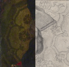
There are certainly details which reoccur in all the paintings, but aren’t exactly the same. That suggest real fabric was used when the background was made, not just pattern being copied. Because the details are changing as the sitter moves.
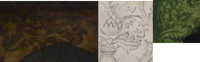
But on the left, some parts of the pattern are missing:

Sometimes within the ‘circle’ there are flowers, sometimes some floral shapes. I wonder if within the pattern there was one ‘circle’ with flowers and other with ‘foliage’.
Such fabric was not used exclusively by English and appears to be popular for rather long time(I found it on several other paintings which 100% aren’t english and trying ), but if the exhamination revealed this is original background, it’d suggest it is not Arthur, because it seems this background started to be popular in England after he died. Unless it is posthumous depiction.
VII) Portrait of Arthur Tudor(probably), located at Hever Castle, UK:
(Some webpages say it is in private collection, but Hever castle speaks of it as part of their collection.) Once again pattern of green damask looks same, but might not be original)
Link:https://www.hevercastle.co.uk/news/tests-rare-arthur-portrait/
(The photo on Hever Castle’s webpage is not the best quality-maybe by design so you’d rather go to see it in person).
I currently believe on their webpage, they have typo about dendrology done in 1993. Because result around 1460?!?! is imo bit of strech. 1480/1490 I’d get. 1460, no.
There is great news about this painting. It is already being tested to see if it is by Meynart Wewyck! It is undergoing expert exhamination right now and we should get the result by end of this year!(2022) I am so glad that is the case. Partly due to similiarities between this painting and unconfirmed versions of Henry VII’s portraits.
I have actually written email to Hever Castle about this painting with my questions and kindly they provided me with answers.(But only then I noticed the 1460 date. I won’t write again, I’ll wait for results of new tests.)
Why did I written? Because for all love of God, I couldn’t understand how they are sure it is Arthur.
It’s c.1500 fashion. Realistically you can’t tell if it is Arthur pre-1500, or Henry VIII in c.1503 by just looking at it. White gillyflower(symbol of bethrohal) fits both brothers! (And 3 portraits of CoA done by Sittow in c.1502-1503, prove even when bethrohed were within same country and met before, portraits still were made to be sent to other side.)
Nothing physical about the painting will disprove one brother. It will fit both!
(Unless of course it doesn’t happen to be much later copy. Which given the previous dendrology result(probably 1480 or 1490 felling date) is highly unlikely.)
The only way to resolve the issue is to find historical record describing painting with white gilliflower as one brother or the other.
And thanks to Hever castle’s reply now I know the record was found.
In Charles I’s royal collection it is described as this:
‘Item the 15th being Princ Arthure in his minoritye, In a black cap and goulden habbitt houlding in his right hand a white gillifloore in a reed pintit goulden frame.’
(Item 15th being Prince Arthur in his minority(teenage years), in black cap and golden habit holding in his right hand a white gilliflower in red painted golden frame.)
Personally, I’d have prefered had the deal breaker about sitter’s identity was not the record done at least 120 years after Arthur died(beginning of reign of Charles I is 1625). Because generally speaking such records are not to be 100% trusted. But they did their due diligence trying to find history of this painting. They found out there is record in Henry VIII’s inventory of 1547 which list picture(painting) of prince Arthur and has no further description(unlike the previous painting), so it is possible it got passed on from Henry VIII up to Charles I, passing in records as uninteresting portrait of prince Arthur, barely worthy of mention.
So, in absense of any other record, which would suggest otherwise. I’ll take it and will say that probably this is Arthur.
But still in 1990s they thought of this painting as of copy, because it didn’t fit the dimensions of painting described within Charles I’s collection. It was too big.

But after cleaning it became apparent it was originally much smaller painting hence fitting the record describing it as prince Arthur.
Because it is painted not on canvas but upon wooden panel, this add-on can be done. If you know to look for it and focus on it, you can see where the original pannel ends in picture(it’s during mid-cleaning, so on dirty painting above you won’t able to tell at all.)
If more of early Tudor paintings are set in this way, they might be dismissed as copies, solely due to their size. You’d not look at larger painting and think-oh this might have originally been smaller.
So I wish to spread the word about this.
Even seemingly large paintings might be early Tudor originals, even if records speak of smaller paintings.
Hope you’ve enjoyed it and hope you’ll wait for part 3.
#meynnart wewyck#my suggestions for future testing#not proven to be work of Wewyck(yet)#Henry VIII#Arthur Tudor#historical portraits#Tudor History
17 notes
·
View notes
Text
Meynnart Wewyck’s workshop-part 5: Henry VII holding sword
As always, part 1 was proven works of Meynnart Wewyck, fallowing parts are my suggestion of what might be by his workshop. My suggestions merely.
I was looking very long for portrait which was inspiration for drawing of Henry VII with sword I found earlier. Got it:
Link: https://collections.ashmolean.org/collection/search/per_page/100/offset/0/sort_by/relevance/object/37888
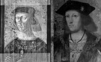
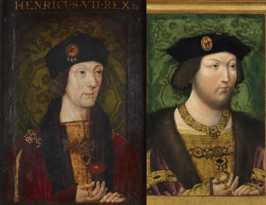
Well, not actually. It is a drawing in collection of Ashmolean Museum-not an original portrait. I don’t think artist captured Henry VII’s face that well, however recognizably from all versions of Henry VII’s portraits it matches well with the one confirmed to be by Meynnart Wewyck:
(Obviouslly the features are overexagerated a bit.) And the way fur is sketched(even in this drawing)it strongly reminds you of others by his workshop. So much so, that you have to wonder-since this is labelled by Ashmolean museum as 16th century, when exactly in 16th century was this made? Could it be sketch by Wewyck’s workshop? Idk tbh.
But i have good idea when the portrait was made.
I believe it was made to be deliberately shown near portrait of Richard III with broken sword:
I don’t think I have to explain symbolism here. Hence probably they were done around same time. We know tree for Richard’s portrait was felled in 1515, so this is porobably posthumous painting of Henry VII, done probably between 1515-1525, when Wewyck’s workshop was still active.
The posture of hand suggest there also might have been Elizabeth of York’s matching portrait. I flipped one engraving(which are usually mirror of image) to face correct way and it fits nicely:
Prior I assumed the position of hand was alteration(made-up).
There is just one problem with this portrait. I have done 4 post about Wewyck’s work prior and went over many different versions of Henry VII’s portraits. Some of which you have never seen prior! And plenty of them also posthumously done-but based upon earlier contemporary portrait.
But I have never found any would be based same portrait as this one!
It’s clearly based upon missing original-of which no copy exists beside this, as far as I am aware. Which by itself is weird.
We don’t know the difference between summer, autumn, winter outfits in Henry VII’s lifetime. It is possible this cloak is simply what they wore when it was very cold and in other portraits we see them in less cold-hence the slashes in sleeves.
However there is no hat brooch, this exact shape of hat not matching any portrait. Although pretty good match to the bust(just more flat in portrait):

I believe i saw somewhere the heavy collar which is lining top of his cloth of gold. Probably in Henry VIII’s portraits, but that fishtail necklace? Never seen it before.
It’s beyond odd to me. It’s very atypical likeness of him.
I have found just one other portrait-bellow where he(or perhaps one of his sons) has no hat brooch, and probably no slashes. Yet sometimes these things were altered out by mistake, even upon originals. But it doesn’t seem to be the case with one with sword.

And it makes me wonder about the dating, and long story short anywhere after 1495, up to Henry VII’s death.
Similiar cloaks are on iluminations as early as end of Edward IV’s reign, and are as late as 1510s.
Non-slashed sleeves are coexisting fashion to cloaks with big slash(or rather opening of sleeves):
However these type of wider sleeves, going to the ground, that’s typical for c.1495-1515, which is beyond range we already had. The fashion doesn’t help in slightest to narrow it down.
The bust does. I know wiki says the sculptor Pietro Torrigiano arrived to England only in 1509 and made bust according to death-mask of Henry VII, but some historians believe he could be in England early as 1506/1507 and create King from life. Imo had it been from death-mask, the features would look much weirder. I believe likeness of Queen Isabella’s tomb was based upon death-mask, but not Henry’s bust.
Imo bust could have been from life, towards Henry VII’s reign, and the cloak dates to those years also, hence the outfit is probably from 1500-1510.
As for the jewelry, the one lining cloth of gold-that’s part of royal collection. Fishtail necklace i have never seen before. And closest to it I recall is the one on picture(on right) which is commonly mislabelled as Perkin Warbeck, but is actually one of Henry VII’s sons. And that one is from c.1502. So the necklaces could be from 1490s.

But the painting is probably posthumous, because it matches Richard’s-and tree used to make that one was felled in 1515, probably used in 1520s or later. So it was probably painting created for Henry VIII, him promoting his dynasty.
I hope you enjoyed it.
5 notes
·
View notes
Text
Meynnart Wewyck’s workshop-part 4: Henry VII
One again, these are merely my suggestions of which paintings I’d like experts to exhamine in order to determine if they are by Wewyck’s workshop.
This time we are focusing on Henry VII and in part 5 also, because there is damn so many portraits of him! I keep finding more even while searching for portraits of other people!
Straight away we have two very good candidates. Another versions of portrait already proven to be Henry(in the middle) by Wewyck.
Both of them deserve to be tested imo. Because one might be original from life and remaining posthumous copies. Maybe during thorough exhamination they’d figure out which one. So far most paintings experts identified as Meynnart Wewyck’s workshop are from 1510s. And 1520s style is very different, and it is possible that 1500s style would be also very different. But as i said in part 1, you need to compare a lot of paintings to figure that out and it is entirely possible workshop had 3 or even more stages! Not just 2 we know abbout now.
I.)Henry VII, Anglessey Abbey:
Link:https://www.nationaltrustcollections.org.uk/object/515569
Anglessey Abbey says diptych’s dendrology came with result of 1512-1520, so this should be posthumous painting! But they don’t say if they tested both paintings in the diptych(and each could have been done at different times.) and those two paintings don’t match each other, the other is horribly altered.
This painting was once in different frame and sides and bit under hands is still not cleaned off properly(maybe it is not possible to clean it idk, sometimes it is unsafe to do without damage to the painting.
Imo at least inch or two are missing in lower part of painting.
You can barely spot it but his hands rest of the grey ledge(here looking black) and actually on golden orb just as Elizabeth’s were.
Receuil d’Arras shows Henry VII with golden orb too, though in different hand. I am not sure what is the significance of this gesture, but Henry VIII is depicted like this too(see part 1).
You have to look in different angle to spot that there was once rounded decorative top-matching proven version.

The background gives us the same green damask pattern as in some other paintings, including proven Wewyck’s work:
Though emphasise once again, that this was very popular pattern and was used in many paintings outside of England.
But I’d like to point out few easily overlooked similiarities and differences between this painting and version of it already proven to be by Wewyck.

Aside from ledge and orb being missing on proven version, there are:
Pearls and heart shaped pendant on carcanet missing:


Brooch with 3 pearls(on hat)

-with or without ruby. I found many depictions of hat brooch with 3 pearls with ruby and only one other without. So I am not sure if it was gilded over on proven version, or if he had two similiar brooches.
Shape of hat and texture of hair and slightly different shape of nose.
Proven version has much roundish shape and that slight pointy end on forehead is barely there. Hair is of different exture, but still has slight wave to it, in both time is gray going to dark(one more than other), not even close to white hair Virgil described. (Though imo it probably wasn’t white but light grey hair.)
Hands
In Anglesey Abbey’s version his thumb is freekishly long and thin, and his index finger bends slightly differently. Rings are also much larger.
Slight differences in his robes, how fabric twists. But actually that pattern of cloth of gold is on proven version too, just way less visible.
Also both have red velvet trim on egde of their fur, which you can barely spot in both:

And that is important detail, because next version doesn’t have it(maybe due to alterations).
II.) Portrait of Henry VII Cultural Heritage Agency of the Netherlands Art Collection

Link to wikipedia where it is in HD:
https://commons.wikimedia.org/wiki/File:Portrait_of_Henry_VII,_King_of_England_Cultural_Heritage_Agency_of_the_Netherlands_Art_Collection_NK1426.jpg
It’s dated as c.1530 but imo it’s older than that.(i can be wrong.)
The I. and II. way more similar to each other than to proven version. The hair is between dark brown and grey(which could be darkening of pigments), pattern of cloth of gold is more visible, hats are more alike(brooches are same), both have heart-shaped pendants on their carcanets and at least 1 pearl on its end.

Pearl hiding away(overpainted when background was done or redone).

There are but few differences. Netherlandish is showing of more of cuts on sleeves and clearly has fur lining on those cuts and around wrist(which Anglessey doesn’t have), proven version has mere hint of it.
Rose is different and hands though more shaped as proven version, have thumb of his left hand(on right) showing. That is very odd actually.
No way his hand merely rests on ledge, the thumb wouldn’t be under rest of the fingers! Those four fingers aren’t so straight either. Try it yourself, but when i twist my hand to such position, it seems to me either as evil witch claw or as if i was grasping something roundish. Perhaps golden orb.
And yet despite all above, the face matches more the proven painting(on right):
I don’t know what to make of it. Perhaps experts can get us some clarity.
Tbh, i just love details of the hat brooch in II.
There is actually 4th version of this painting. But beware the face is horrendous!
III.)Henry VII (1457-1509), Victoria and Albert Museum:
Link: https://collections.vam.ac.uk/item/O128343/henry-vii-1457-1509-oil-painting-unknown/
Those floral decorations on top were also found on portrait of Richard III from National Portrait Gallery(said to be late 16th century work). Idk if these were originally on our Henry too, or if it is later alteration.
VAM’s description simply states this painting is 16th century work-translation:we didn’t test it and don’t know.
You’d think these two are pair, but when you check the dimensions of both, H of hers is just 70% and width just 60% of his, so hers is smaller and narrower!
But they probably are at least altered by same painter.
By the way I., II. and III. are only paintings of Henry VII in existence(that I know of) which also have that heart-shaped pendant.
I won’t point out all the similiarities/ differences with the others again, as you already know what to look at and that ledge is pretty much unmistakable.
But few more differences, which are hard to spot:
Cloth of gold bending up vs down:

In III. the ring is on his middle finger instead of on his ring finger(which can be simply honest mistake by painter, even on original):

The middle of the rose has gilded pattern:
And last thing I am not sure about. It’s the velvet, his shading, how it is painted.
To me it looks very alike as velvet in proven paintings. I can be mistaken though, and even if it is by Wewyck it can also be posthumous.
Problem with it is, that Henry VIII is never painted with grey ledge during his reign. Is it the case his got cut off or there never was any? Does it mean we are looking at copies after his reign? Or the style was prefered prior to his reign?
Could it be the earliest style of Wewyck’s workshop? I wondered. But then the trail went cold and I found nothing similiar for long while and instead focused on gathering versions of well-known paintings of Henry VII(and plenty there are!)
It bothered me, just as Virgil’s description bothered me and fact that somebody overpainted some of these paintings so heavily! Why?!
Perhaps this painting holds answer to that:
IV) Henry VII (Masters) (1457-1509), Society of Antiquaries of London, Burlighton House:
Link to Society of Antiquaries:
https://www.sal.org.uk/collections/explore-our-collections/collections-highlights/henry-vii-masters-1457-1509/
According to Society of Antiquaries it is ‘Likely painted before 1540′
So they don’t know.
But the painting is the worst case of pigment instability I’ve seen.
(Darkening of pigments is also example of pigment instability-at least I call it pigment instability, experts probably use some other term.)
Only the rose is not washed out(and I cannot rule out it is altered). Crimson velvet turned to orange! Light peach colour at some places!
If this happened to other paintings, it might explain the heavy overpainting.
I’ve seen MANY paintings of Henry VII and indeed it is similiar to many of them and could be altered version of some of them.
But what if it isn’t? There is 2nd version of this painting.

Both have cloth of gold lined with fur, different edges of the gown over it, rose with pattern in middle:

Bends on fabric of the sleeves and hand twisting same way(ring missing):

And lighter grey hair:

V: Henry VII in Christ Church, University of Oxford:
Link: https://artuk.org/discover/artworks/henry-vii-14571509-229296/search/keyword:henry-vii--referrer:global-search/page/2
(Don’t ask me why some univerities put their art collection on Art Uk instead of their webpage. IDK! But gives very few information about the painting.)
Obviously the painting is very dark, but perhaps it was its saving grace, grime protecting the pigments from becoming unstable.
Virgil described Henry VII thus:
His body was slender, but well built and strong; his height above the average. His appearance was remarkably attractive and his face was cheerful, especially when speaking; his eyes were small and blue, his teeth few, poor and blackish; his hair was thin and white; his complexion sallow.
And this is the only painting which fits the description. He is slim, seems to be tall and yet as no weakling/doesn’t look very ill. His hair is lighter grey(with small wave to it), his eyes are small, probably blue and look warm. Not as ice-berg in other versions.
When I say he doesn’t look ill i mean it in terms of his overall figure, his body is still strong despite him going grey. Virgil says Henry is strong but he also says he is sallow. You might think of sallow complexion as of yellowish or dark. But sallow can also mean unhealthy pale. Not everybody has that glow to the skin, we associate with health. Especially people with very pale skin, often can seem to bit sick of us.
Imo this is the difference between having fair white skin-very pale with that healthy glow and sallow white skin-white pale without healthy glow.
(Are you listening Anne Boleyn fans? Your lady probably wasn’t troubled by jaundice nor was dark-skinned/olive-skinned. She just looked bit sick. Which I’d be too if Henry VIII kept persuing me. I’d feel vomit raise up constantly. Ok maybe not early on in his reign, but later yep. I’m preparing entire post decidated to how many people he had killed.)
But you might disagree and think the painting doesn’t show Henry VII’s real features, you’ve seen his paintings and you’ve seen photos of his tomb and it is not him!

But isn’t genetics wonderful thing?


Even if it fools you sometimes.
VI) Henry VII, Hardwick Hall, National Trust Collection:

Links:https://www.nationaltrustcollections.org.uk/object/1129171
https://artuk.org/discover/artworks/henry-vii-14571509-172314/search/keyword:henry-vii-117090/page/8
Often this painting is thought of as young Henry VII.
I’ve seen it years prior and thought that yellow varnish played trick on portrait of Henry VII with light grey hair and created ilusion of blond hair and of much younger Henry VII-which then somebody copied into separate painting.
Problem is, now I’ve seen yellow varnish on light grey hair, and it doesn’t create such ilussion! My assumption was wrong!
So is it truly young Henry VII? Dressed and posed in same style as when he is grey? Not one wrinkle? It’s possible it is copy made to look him this young.
But what if the identity of the sitter is wrong? Remember, there is often great resemblence between family members and often their portraits are mislabelled, mistaken for their relative!
Imo, this is father and son(V and VI), painted at same time. I can’t tell you if VI is young Harry or Arthur. I don’t know. Siblings can be hard to tell apart. Darkening of pigments might have turned Arthur’s hair in known portrait to brown and Henry’s red hair could in childhood be more to golden strawberry blond.
By the way the boy’s hand rest on dark ledge, yet again, and these last 3 paintings are aproximately same size(H 35.5-36.8 cm and W 25.5-27.5 cm, max 2 cm difference). With IV(which doesn’t have ledge and misses few fingertips) being the shortest.
The details in IV, V and IV suggests they are work of same painter. That painter could be Meynnart Wewyck. The differences between these paintings and those already proven to be by his workshop, could simply be that these belong into other stage than the two stages we already knew about.
Hence these could be the oldest paintings by Wewyck, thus oldest Tudor paintings. And if that is not worthy of investigation, idk what is.
I hope you’ve enjoyed it and no, part 5 won’t be arriving as quickly as part 4.
11 notes
·
View notes
Text
William Carey and Mary Boleyn

Per your request this post is dedicated to portraits of Mary Boleyn and her husband William Carey. And first thing you must be aware is that neither this portrait of William nor any of many versions of portraits of Mary are originals.
Large ovals nor large round portraits werent around in Tudor times. (Round miniatures existed.)
And Mary even as sister to the Queen never had status of royalty and wasnt supposed to wear ermine(parliamentary robes were exception). That is definitely alteration, yet it is in every single version of her portrait i know of.
I couldn't track down her original, but i found photo of William's. In which he wears lynx fur, not ermine. Much more apropriate for his status, and very often confused by people for ermine.

And it clearly says 1526, not 1528 as the copy of his portrait on wikipedia. And states he was 30 at the time, thus he was born in either 1496, or 1495. His outfit is very interesting, and i bet most you werent aware how elaborate some Tudor male outfits might be.
If colours in copies are to be trusted, the part with lines is from cloth of gold(which in lesser amount nobles were allowed to wear), combined with cloth of silver or shiny grey silk. Personally i am inclined to say silk, because it doesnt give metalic wibe.
This is 100% not Holbein's work(copy is said to be after Holbein), but possibly by artist which also painted this portrait of Henry VIII.
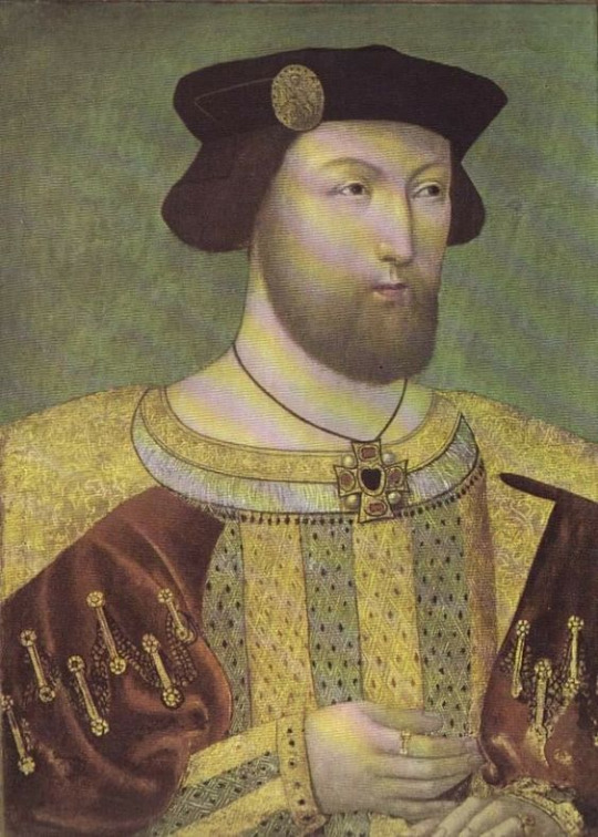
I have speculated it might be late workshop of Meynnart Wewyck. If it turned out to be true, then William's portrait would be proof the workshop was still around after 1525, when Wewyck disappears from records.But you know, Holbein's workshop was around for short while after his death also.
Only other painter which we know worked in England at the time is elusive Master of Brandon portrait(portraits by him bellow) in his work we see similiar basic shape of male fashion, yet nothing as elaborate, nor consistent with style of artist which painted Wiliam Carey.


Mary's portrait has at least 7 versions, not discovered by me but found by katherinethequeen.com.
Hever Castle,Warwick Castle, Holyrood Palace-Royal Collection Trust, Private Collection, Rockingham Castle, The Lord Wharton+ two more round versions.
But i want to share my observations upon them.
I have seen many copies of different portraits, and i find it very disturbing how similiar to each other they are.
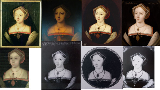
Naturally across centuries copies are created by different artists, and they all put their own mark upon it...and over time the some versions become unrecognizable from original.
Here most of them are carbon copies of each other. So much so, it wouldnt surprise me if majority were mass produced by same artist, or same workshop.
Royal Collection Trust has most information about their version. Stating Portrait of a Lady called Mary Boleyn, Lady Stafford (c.1499-1543) is from c. 1630-70, and it is atributed to Remigius van Leemput (d. 1675). He was both painter and art dealer.
You might for example know his copy of Whitehall Mural:

And observant person might notice some similiarities...between Jane Seymour in Whitehall Mural and alleged portrait of Mary.
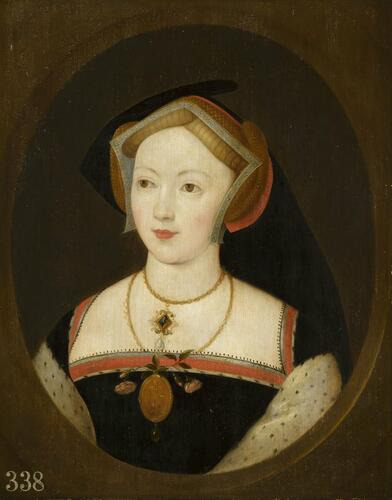

I mean, if i just did few changes. It would become disturbing.


I am not sure of course, but I wanted to make you aware...it is possibility. Wouldnt even require that much effort on part of artist.
In 17th century the public interest in old art was big, especially for portraits of royalty or important figures from history. And sometimes art dealers created the 'new originals'(fakes), by getting inspired by existing art...and adjusting some details.
If it is a 17th century fake...then Jane Seymour is not the sole inspiration, another painting would account for rest of the details.
The artist had access to royal collection and other places, in 17th century most of Tudor portraits were still instact. It wouldnt be that hard for him to copy it. With only the size of medal being bit unsual, but not impossible. Ok, gable hood missing the paste ends-but it is missing from almost every copy.
Foliage pinned to medal is very accurate but often overlooked detail, found among Holbeins sketches, and some of his work. Maybe lynx was changed to ermine.
But overall this is historically accurate outfit, consistent with Mary's lifetime. So yes, it can still be her. I cannot rule it out.
But equally so it could be somebody else. Identification of Tudor portraits(or their coppies) originating in 17th century is totally unrealiable! By that point most misidentification already occured! By 1590s it was confusion all around, some even before.
(Of course we cannot rule out 17th century identification was based upon earlier identification, but that is hard to prove without the original.)
I also have to emphasize it is not match to her husband's portrait. Lynx vs ermine, could be minor alteration. But this is not gable hood consistent with 1526.
I don't know where they got idea the fashion within Mary's portrait fits c.1535 specifically, when this gable hood was around for more than ten years! (Since late 1520s to late 1530s/early 1540s. This shape of gown also, was around for very long time!)
So what shape of gable hood would be matching William?
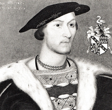
These two or in between:

On left c.1525, on right c.1526.
Both veils still down and split, very long ends of paste.
Now, she doesnt necessarily have to had portrait done at same time as her first husband. But William Carey was noted as art-collector, who is said to even introduce Lucas Horenbout to court.
Thus we would expect this lover of art to have portrait of his wife made alongside his own. Carey's love of everything good was however also bad thing because when he died in 1528, he left behind great debt and Mary even pawned her own jewellry. Thus chances that portraits he owned stayed within the family are not so great. But perhaps the portraits simply went their separate way.
If we could find portraits of same artistic style, of woman, maybe we would find Mary. In England matching portraits of husband and wives were a thing. Plenty of portraits you know are actually pair, from royalty:

to much humbler pairs:
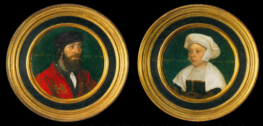
(Occasionally you find some which seem as pair at first and then you find out his wife was at least 20 years older than woman you see in the portrait...it is just inscription made by same person/artist within same year.)
But it would be greatly helpful, before we even start searching for Mary's matching portrait, to find William's original.
Isssue is, I lost it. I once found the photo of original on wikipedia and i am not sure if i saved it wrongly, or if it was time when my computer crashed and i lost all my saves. It has been several years, thus my memory of it is not great.
However, i was unable to find it again, search engine cant find him.
I vaguely recall i was going through some collection on wikipedia, lots of black and white photos. Maybe to do with art lost during WW1 and WW2? And i am not sure if back then that painting was labelled as him, nor if it was collection within UK or elsewhere. But it was recognizably this same original painting.
And it annoys me so much that i cant find it again. And we need to track down its location, and provenance, etc, to have clues as where Mary might went. And let us hope it also has coat of arms, date and age. That would be so amazing! To figure out who was the older sister.
Thus my question is: Does anybody know how to reverse search image on wikipedia?
Normal reseverse search engine come blank when it comes to any findings on wikipedia.
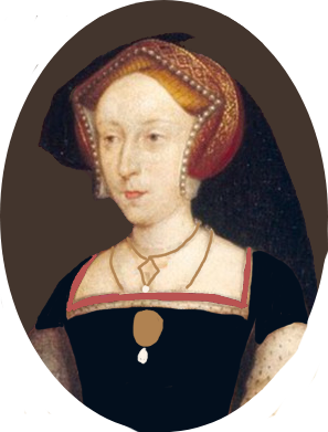
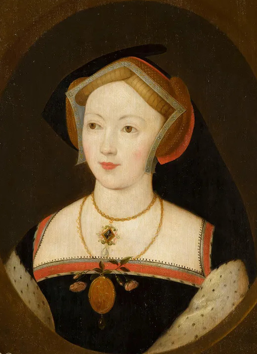
I hope this was of some interest to you, and let me know what you think.
16 notes
·
View notes
Text
Gable hood trivia: lady Margaret Beaufort’s ‘gable hood’
People mistakenly think that lady Margaret Beaufort wore gable hood. That is technically incorrect. In Tudor times gable hood was called frontlets and bonnet. She has frontlets-but no bonnet, so it is actually not proper gable hood. It’s frontlets with veil(and wimple-part which covers her neck). Netherless studying lady Margaret’s headwear is still worth doing.
Because her ‘gable hood’ is white:
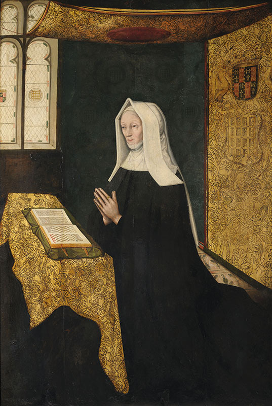
The portrait of Lady Margaret Beaufort by Meynnart Wewyck(done prior to 1521, possibly even during her life, the accuracy of details of outfit would suggest it was done either in her lifetime or shortly after). The details are clearer than on her tomb even.
Why white is better? Because black was the fashionable choice of the time-and that hides all the details, even if paintings of such gable hoods survive or good copy is made. If you look at channels which do historical sewing, sometimes instead of using black fabric to show how something is sewn, they use less dark colourful fabric. Because you often can’t see damn thing! Black hides details.
Hence this cut of lady Margaret’s ‘gable hood’ is goldmine(historical fashion-wise):
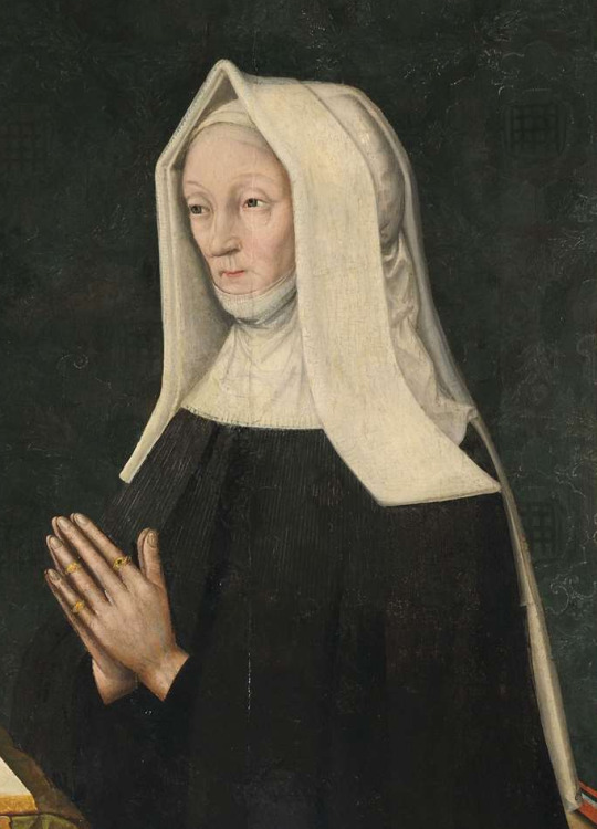
One of the details I’d like to make clear straight away. Her frontlets don’t have horrizontal stripes as many movie/tv shows depictions interpretted it based upon inaccurate copies of this portrait. It’s detailing of linnen fabric. Absolutely normal structure of pure linen fabric, when merely laying flat!
There is no frilling to it, no structure etc. Just linen fabric.
Not this:
Nor this:

Problem with this however started already within her grandson’s lifetime.
Horenbout(who never met her)-got it wrong already:

As did many painters after him, but he at least got rest of the details mostly correct.
But back to the first painting.

Note: according to comments, records say that the veil(lyripipe) of Lady Margaret’s headdresss was supposed to reach the floor. In the painting, we can only see it go up to the waist only. Imo both could correct. She could have at one point wear it up to the floor, and at other to the waist, alternatively the veil must have had very weird shape-narrow at top, wide around waist and then getting narrow as it went down(if it was wide even under waist, we should see more of it in the painting).
What is extremely hard to spot is that frontlets and veil are one piece! It’s either sewn together or from single cloth. The frontlets are continuation of the veil, fabric just turned at front-you can see the bend of the fabric, where they turn. They are obviously pinned or sewn to the paste, which at least in this case, is merely forming understructure for the frontlets-and definitely is under whole of frontlets-we can see its edges.
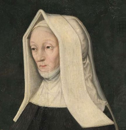
You might think I am talking bull, clearly the frontlets and back part of veil look as if they are separate, But if you look at right, the fabric doesn’t fit the wimple.

It’s instead disappearing under frontlet, and just not pinned to frontlets edge on the right. You can even see where wimple ends beneat it, proving that the linnen was partly see-through, and reason why the frontlets are such strong white is because it is two layers, upon already white paste.
(And by the way on chin you can see that wimple also has at least 2 layers-it was colder back then).
Further more, it is clear there is no paste or bonnet, on back of the head:
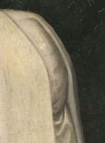
Hence paste must end with the frontlets, and most likely what makes rounded shape on back of her head are her hair. She’d be really old when this was painted, and women at those days didn’t cut their hair. It’s possibel her hair would go to the ground, or even be longer than her entire height.
Aparently she wore it on back of her hair, probably in some hairstyle which was once worn under the short henin, or something similiar.
In the painting that part looks pretty voluminous. Probably on younger woman, it’d not stick out that much.
But hair is not only thing important on that section, it is how the veil is folded.
Because if you are interested in Tudor fashion, you can bet you’ve already seen it! On sketch by Holbein.

Only reason why you don’t see it immediately is due to frontlets and volume of hair beneat the fabric. But the veil in both cases is enwrapping entire head, and then it all goes up to top of head and then it is all let down. ¨
It might seem extremely strange to us today, but that is continuation upon medieval headwear:
And these hoods were also often wore with its edgeds by the face, turned backwards, just as lady Margaret’s frontlets are. By the way, women wore these too.
That ‘tail section is called lyripipe. In medieval times, these could be really narrow, on lady Margaret it seems to be considerably wide(maybe bit narrow at top, and getting wider at lower part), on lady of Thomas More’s family, there seems to be no narrowing whatsover. So the style was probably being abadoned.
So this lyripipe variant was remains of medieval fashion, and wimple with veil was also often worn in medieval times, and lady Margaret grew up in times when England was still medieval, even if we consider begining of renaissance in England to be 1485(some think it started only in 1509). So it makes sense that she was holding upon bits of older fashion, she was of old generation.
And perhaps if you’d wish to get inspired by lady Margaret’s outfit, and did not wish to go for old lady, you could go for a nun from tudor times, just leave out the paste, frontlets and frill. All the other elements can stay, as outfits of clergy were also not as quick to change, as normal people’s fashion.

Another thing worth mentioning is that you can see pin just by her frontlet, possibly pinning the fabric of veil(turning into frontlet) to the paste, while frontlet’s upper part is not pinned-at least not visibly(could be sewn together).
And also, with how the fabric turns beneat her hair, it is likely that the veil at back is pinned under the hair, or at back the air, at least slightly.
And this is important in context that we have no depiction of Elizabeth of York wearing the veil that way.
But that is how Catherine of Aragon wore veil of gable hood, early into her queenship. Of course her had no lyripipe, and she had a bonet, but she veil pinned underneath it, same as lady Margaret has the veil pinned under her hair. This tiny detail, suggests that lady Margaret influeced Catherine of Aragon. (and they had good relationship)
It made think, what is the actual difference between lady Margaret’s frontlets and veil and gable hoods we see in 1511:
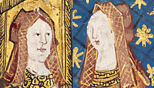
We know the artist then, didn’t paint the paste, so why the red edges on inner side? Well if the fabric of frontlets was turned continuation of veil, it’d have thicker edge, and might be depicted in that way.
We know the frontlets and veil are shorter, obviously Catherine wore bonet, and on right the lady beside Catherine(probably princess Mary Rose) has big cut between her frontlet and her veil, just as Elizabeth of York did. It’s possible lady Margaret had it as well, the angle just prevents us from seeing that.

But overall the differences are not that big. Obviously lady Margarte’s is simple and plain, and white, while Catherine’s headwear is colourful and decorated, but the basic shape is very similiar.
And I hope, two things you will take from this:
1) you can have frontlets and veil as one piece-sewn together.
2) The bonnet would be done in way it could hold wast amount of hair. And perhaps that is in what our attempts at recreating gable hoods is lacking a bit, and why it often ends not holding that well, we don’t have that much to pin it to.We rarely have such long hair anymore, so if you have the hair tied in ribbon above forehead, it is unlikely you’ll have that much at the back. However, Tudor women, would have still plenty, because they had longer hair. Especially old ladies.
I hope you’ve enjoyed it.
42 notes
·
View notes
Text
Mistaken identity?
I am mindblown about what I’ve just discovered. More I look at details of these paintings, more i am sure I am right about this. Please be polite in the comments even if you diagree with me.
So here is thing. Whitehall Mural didn’t originally look as some of its copies would make you believe.

That is Henry VII wasn’t wearing cloth of gold and crimson robes beneath, as sketch by Holbein proves. (I believe only sheet with Henry VII and Henry VIII survived.)

Anybody who knows Henry’s portraits and historical portraits can tell outer robes are from velvet(lined with ermine) and beneath is cloth of gold.
I am not certain what colour, but that is velvet, recognizably velvet.
(Most likely colour would be crimson-as it is in most depiction of Henry VII, but who knows? Other very popular royal colours were purple, blue, black, could be any colour really. Though probabably not black as the shawl is darker than the velvet. But velvet on mural didn’t necessarly have to match in colour original painting.)
So in my search for finding all of Meynnart Wewyck’s work I set myself on journey to find upon which painting Whitehall Mural was based upon(but probably doesn’t match 100%). After all Holbein never met him, yet the outfit is absolutely correct for Henry VII’s lifetime and I had no painting which matched that well.
I found it eventually, but it is not portrait labelled as Henry VII!
So at beginning I looked at the composition.
I started to search for this brooch:

This carcanet:
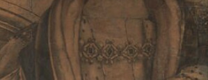
(knowing sometimes painters just do one solid lining around the carcanet, so it looks liek one giant mass and not delicate metal work)
Him holding a glove:

And him clasping his shawl(and here I was sure I’ve seen this gesture-still couldn’t find it).

And of course robes lined with ermine-probably. I can’t rule out Henry VII was depicted with another fur originally and Henry VIII wished to have more royal image done. Lots of spotted furs were popular in early 16th century and for some i don’t even know the names for. But there is really many different types in historical portraits from that time. Just not on Henry VII.
Most people would eventually settled on Hever Castle portrait of Henry VII(or Mulwaukee Art Museum-which has same outfit) and that’d be it:

I don’t give up that easily! The outfit is good, composition different. Could that mural be based upon this? Absolutely, but we cannot exclude possibility it was based upon not one but two portraits.
Eventually i found this copy, which shows crimson robes lined with ermine, Henry VII with white hair(very light grey) and clearly based upon the mural, probably the closest match I will find:

He even has one shoulder up and you can see end of that pedestal(or whetever that is).
And I looked at the cloth of gold pattern(which you can’t see at all in Holbein’s sketch) and once again it seemed familiar. I knew I’ve seen something similair-but not exactly the same pattern. And I was going through all pictures of Henry VII that I know of and still couldn’t find it!
So I sort of gathered all i knew about Henry VII and his depictions.
He was painted since c.1500, and his rough life showed in his face. He had wrinkles(in some paintings not so many, in some a lot!), his hair was described as white(very light grey)-however in most paintings(probably due to darkening of pigments) it can go to black, to black-grey, even to raven and brownish colours.
This is brown-haired Henry(bellow), but if you look at stones on Henry’s cloth of gold-they are red and green, just as on gable hood of Elizabeth of York! So perhaps this also rather close to true depiction, also:

I found several other versions depicting him this way, several also with these stones and cloth of gold with vertical stripes.
(Not that the pattern looked like anything by Wewyck, and I started to consider if they just didn’t simplify the pattern. So I started to look for something vaguely vertical.)
He reportedly had small blue eyes and portraits add another detail about them-one of his eyes was bit of lazy-his left eye(on right side from our POV).
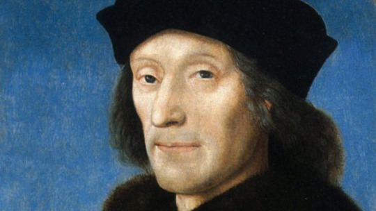
Blue eyes in general in portraits don’t always stay blue. They can go to light grey, brown or darken overall so much you can’t even tell what colour painter intended. Pigments in eyes are often very unstable and if it isn’t victim of darkeing of pigments,then it is of lightening, in many many cases.
I also realised while looking at bust of him(Victoria and Albert Museum), that I need to broaden my view of fashion he wore.
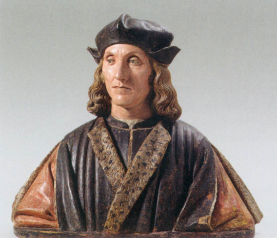
And VAM might be wrong, this might not be discoloured ermine but another fur.
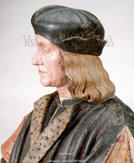
Especially the area around the neck, is really more like fashion of 1470s or 1480s. Really far back it could belong to. But that is fashion of when he grew up, so he could prefer bits of it and as King he wasn’t known to fallow high ends of fashion.
Plus here he has no shawl!(evel though is almost typical thing for him).
Perhaps Henry VIII wanted his father to be depicted with the shawl( because that was how he remembered him), but perhaps the King wasn’t depicted with it in the original portrait.
Then he’d probably have that high buttoned shirt/jacket with collar as in the bust(to keep warm) with that bit of linnen sticking out. But then I thought-but if he lost the shawl-then that gesture of clasping is off, right? I was wrong.
Also depending on the angle-his eyebrows might not appear as high, if at all. Even on same sculpture!

His tomb-normal brows tbh.

There is also supposed to be a dent in his cheek, apparent in his effigy. But let’s be honest, which one of us can see it well in his aged face?

It’s only when seeing recreation by artist named Matt Loughrey, you can tell it is on his right cheek(from our pov on left).-otherwise you’d think it is prominent wrinkle

So dent in his face on our left and lazy eye on our right. Tbh to get depicted with these he must have had pretty big esteem of himself. Idk, perhaps the dent was from battlewound? If that was from Bosworth, it’d make sense for King to bravely show it. (Though I had big doubts that we could find these in copies, for such details are very likely to be later removed, to be ‘corrected’.)
However I do think the recreation gave him fuller lips than he actually had, and added that raise under lips as part of lips. Not everybody’s lips start there through. He actually had very thin lips.
I went through engravings(which didn’t help though many are based upon whitehall mural), I went through old photos and drawings of paintings (Because you know sometimes paintings get altered or lost.).
I looked at many much younger copies of Henry VII’s portraits.
Nothing, as if such composition vanished and no copy of it was ever made!
Odd given how many versions of other portraits survived. But in past sometimes I searched for painting for weeks and then it suddenly popped up later, when I wasn’t even searching for it. So I decided to move on, do depictions of Richard III, not really getting why goddamn multiple were created during reign of Tudors and just leave it be.
Method worked. It popped up just few hours later.. Painting which has all the right ingredients.
Dent in cheek on left, lazy eye on right, and more. It showed up.
Here it is and I think it is safe to say: Huston, we have a problem!

This portrait is labelled as Richard III. In fact most portraits of him, are versions of this portrait. So, this is not a big problem, this is collosal problem. Phenomenal problem.
This might be the biggest misidentification of Tudor portrait ever!
Richard III vs Henry VII-two rivals
So clearly this deserves further investigation, I can’t just let it go and pretend I didn’t see anything! No matter the possible backlash.
But long story short-it all fits Henry more.
Cloth of gold with vertical pattern, with those circles we seen on other portraits of Henry VII, Elizabeth of York and prince Arthur:

Here is that pattern on another version of this portrait:

Hand grasping robes(not the shawl):

On another version, in both it is badly visible because fabric is dark, probably black:

Black fabric might explain the expression in most of portraits of ‘Richard’. If it is Henry VII in mourning-than that is man half-defeated, shaken hard by lost of loved ones. That might be why the brows are so low. The expression is deep sadness or depression-that brings them down and also makes that wrinkle between brows more prominent:

And for those who think monarchs wouldn’t get depicted in such state-look at last portrait of Isabella I of Castile!
‘Richard’ also has lots of wrinkles, in at least 2 copies he had grey or greying hair.

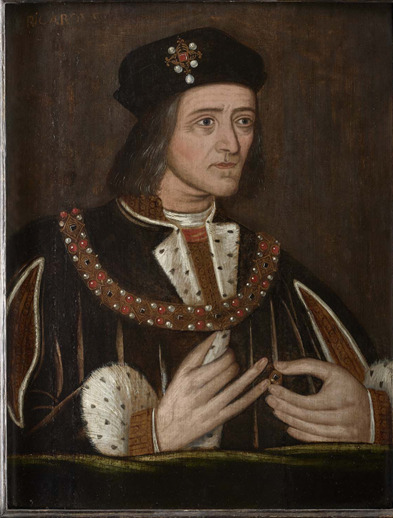
Like, where the heck is period report saying Richard was greying at Bosworth already? And why didn’t Shakespear use it? (I’d use it and say he was haunted by ghosts of princes every night and each morning his hair was more and more grey!) Probably because he wasn’t.
Fashion is close to bust and fur is not ermine, but in many copies it is ermine.
That might be because portrait predating Whitehall mural didn’t have ermine, and Whitehall mural had it.
The carcanet in this style is close to the style of painters working for Henry VIII in early 1520s, though done very differently than in mural. Tbh, I don’t know if it is same one, but given all Henry VIII had changed, it doesn’t need to be. But if it is, then Holbein probably had access to original jewel and didn’t do the inaccurate thick solid mass lining so many painters used to make their job easier.
If we look at the hands again, then to me it remind me of Henry VIII’s portrait dated to c.1520, where he also has oddly shaped pinkie(painter couldn’t do hands well). Hence we could be looking at a posthumous copy done during reign of Henry VIII. Though tbh, idk.

And I’m hitting my forehead now, because when I saw painting of Henry VI(on left) and saw it’s background I thought to myself-red background for Lancastrian-makes sense and didn’t have that thought when seeing depiction of ‘Richard’.

Some expert say red backrgound is because they are part of same set of Kings.
If that is that case, where is Edward IV with red background? Nowhere!
But yet several ‘Richards’ were done during Henry VII or Henry VIII reign. Why would they create several really nice portraits of the enemy-where he looks fine and use these as piece of propaganda?
That one shoulder slightly up? If you look at some other portraits of male from that time, you’d see some painters simply painted figures that way and it is no indication of deformity. Even prince Arthur is painted that way!
So all those-Tudor propaganda painted him deformed each time-is bull.
And such sumptuous outfit for their defeated enemy? I have lots to say about intelligence of Henry VIII, but word imbecile is not among it.
There is but one proper piece of propaganda, portrait with broken sword, which most likely still is Richard:

Portraited as warrior, but one who lost. Brown fur over shoulder is later additional, perhaps in that time shoulder was also overexagerated.
Documentary about Richard’s scolliosis revealed he was actually similiar figure to Henry(and they’d be around same height if not for the scoliosis) and that scolliosis raised Richard’s left shoulder very slightly up.
But in his depiction in all but 2, his shoulder is the correct way as on his skeleton. In past historians had no way of knowing this, and even if they did, they’d probably say Tudor propaganda didn’t care about getting it right, and I’d probably say-somebody flipped painting, it happened with copies of Catherine Parr’s portraits(mislabelled as Lady Jane).
Dressed in crimson and tiny bit of cloth of gold-befitting the King, but alas the King who lost and no other jewel but a ring. Perhaps to symbolize England was not that well off under him(whetever that was the truth or not doesn’t matter to propaganda).
In Whitehall mural and this painting, same shoulder is up.

Labels of historical paintings were often added even centuries later.
If somebody not very knowledgeable about Tudor paintings seen these two they could easily mistaken them for same person-for Richard, based upon the ‘deformation’(the shoulder) and seemingly mishapen arm, probably also because they both have vertical pattern of cloth of gold, different but vertical.
And when one gets mislabelled, many fallow.
Somebody comes to wrong conclusion and everybody else just goes with it. Because it is easy!
One’s own research takes time and dedication. (And is much easier to do nowadays, than was in past. In past it’d require lots of traveling to see the portraits. I just search online. I’ve seen very few of these paintings in real life.)
It’s very easy to say Tudor propaganda gave Richard lazy eye and made him grey. It’s easy to ignore old sketches done based upon paintings, showing details which might not fit your story, yep dent again:

It’s easy to say he is depicted playing with his ring to promote Richard’s reputatuon of being neurotic and fidgety and simply ignore Edward IV, Henry VIII and Mary Rose are depicted doing same gesture.
It’s not so easy to admit you have no idea what that gesture means!
But I said it when we dealt with 2 portraits of Mary Rose Tudor-even if you have favourites, you have to stay objective! Even experts can be biased. And clearly those of team Richard and team Richmond are at such great odds they don’t even look at depictions of each other properly.
And now both camps might crucify me for suggesting that most of Richard’s portraits might actually be Henry Tudor.
And I know which argument they will bring against me:
The facial reconstruction based upon Richard’s scull.
Which matches ‘his’ paintings. Long story short-facial reconstructions accuracy can be as low as 70% and Henry and Richard were cousins. Distant but cousins.
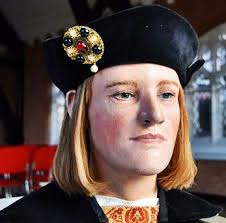
Sometimes conicidentaly there is big resemblence even among distant family members.
With both of them having blue eyes and hair darkening in the portraits of both, both being slender, it’s not so easy to tell.
Henry’s jaw and face’s shape certainly in certain depictions looks very similair to Richard’s.

I see some resemblence to Edward(God please, let it be actually Edward, I am not ready to have another shock like this) especially around the eyes and perhaps lips.

Perhaps some similiarities also to Elizabeth of York, wavy hair, bit shape of nose(not entirely):

So Richard III with broken sword should still be him. I am not sure about the other by Society of Antiquaries London:Burlighton house:
Richard III with arched top(they have two they have to differencite them somehow):

Tbh, I don’t know anymore. Is it Richard or Henry? The correct shoulder is up, but once again this is pretty much standard way of painting male for some painters, even those without any sign of deformity.
And given the similiaritity in features, i simply don’t know. Although, if I was to take guess, then based upon outfit, I’d say Henry. Because I don’t see propaganda dressing Richard so sumptously, plus the v forming on neck.
(But then from merely one other depiction i can’t tell if Richard didn’t have this feature also.)
It’s also worth noting portrait with broken sword is pretty large and imo, most logical for propaganda would be to have Henry VII’s portrait which matches it.
So far I didn’t find any, but since portrait with sword would be very atypical for Henry VII, it’s possible it’s hiding in some private collection, but I included this drawing fo Henry VII in which he holds a sword:

Edit: It was hiding in Ashmolean museum.
Despite it being drawing and not original portrait, there is still some similiarity to Richard’s. One hand across the chest, very unflattering noses, similiar shape of hat(but Henry’s almost mimics a crown).

Now from my point of view, i have nothing else to add about what i can see in the paintings. Rest is matter for experts and those historians who have full copies of Henry VIII’s inventories and other records.
(Not that all necessarly were part of it, some might have been given away.)
For example Royal Trust Collections believe their portrait is mentioned in inventory of 1542-as Richard. Yet I doubt mislabelling could happen so early. (But they could be mistaken which portrait of Richard it was.)
Stuart coming to power in 1603 or loosing it around 1649, seem as way more logical times when misidentification could have occured.
I doubt you have enjoyed it and I hope you can be polite in the comments.
#historical portraits#Tudor History#mistaken identity#historical inaccuracies#Henry VII of England#richard iii
14 notes
·
View notes
Photo

Portrait of Henry VII by an unknown artist (English School, c.1510-20). Berger Collection, Denver Art Museum.
This posthumous portrait of the first Tudor monarch dates to the early years of Henry VIII’s reign. The king’s inventories recorded three pictures of his father but this painting could just as likely have belonged to one of King Henry VII’s long-time supporters. The painting appears to be a copy based on an original portrait by Meynnart Wewyck depicting the king in the same position and outfit — a red robe with slashed sleeves, a gown of cloth of gold, an enseigne (cap badge) with three pearls — probably meant to be paired with a portrait of Elizabeth of York.
36 notes
·
View notes
Link
The painting of Lady Margaret Beaufort - mother of King Henry VII - has been named as the first piece of work identified as by Dutch artist Meynnart Wewyck, and the oldest large-scale portrait of an English woman.
While Wewyck was Henry VII’s preferred painter, his name has been unknown because the absence of a signed or documented work has made it impossible to attribute paintings to him.
His 180cm tall by 122cm wide painting is the earliest large-scale portrait of an English woman, and one of the earliest large-scale portraits of a single individual in the UK.
Educationalist and philanthropist Lady Margaret was one of the wealthiest women in England and, once her son was on the throne, used her money to build schools, churches, and two University of Cambridge colleges – Christ’s and St John’s.
68 notes
·
View notes
Last Seen Blogs
lovveclub
this is me trying

lavlavbrown
Lavender

kenji-o-o
Plamodel.info

findrppartners
RP Search

molliemoos
:)