#like i was looking at my references and then my thumbnail sketch convinced I was so so wrong but those puppies are huge
Text

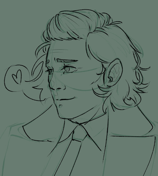
quick scribbles to try and learn some dear dear faces c':
#my art!#loki#mobius m mobius#lokius#still truly hate drawing real people but for them i will try#hope to have more to share in the future and also some fics in the works!#but will not have a ton of freetime to do creative endeavors until after next week :c#fluffy hair and noses are two of my favorite things in the whole world to draw so these two beans are a treat#the lapels on loki's coat are so fucking big you guys#like i was looking at my references and then my thumbnail sketch convinced I was so so wrong but those puppies are huge#lots of square footage for silver foxes to grab hold for smooches or something idk#your honor i love them
93 notes
·
View notes
Text
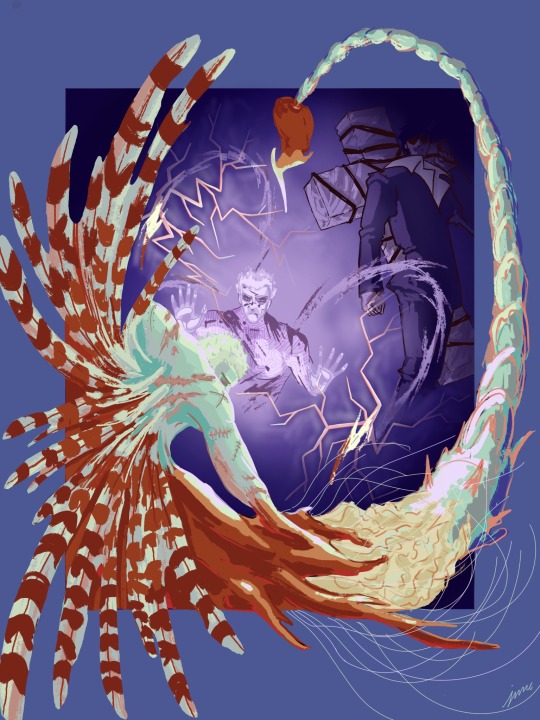
He warned me. How many times did he tell me that he was a trap.
-Becoming Eden[The Whole Damn Forest]
Rambling about technical details/my thought process behind this piece below cut:
I knew I wanted to do something from either the end of [it’s me I’m trees] or the first chapter of [The Whole Damn Forest] because that was where the strongest imagery for a drawing was. I’m not a sequential artist at all so it was hard at first to pick a scene where I didn’t need the dialogue to make it clear what was going on. I had a bunch of quick thumbnails for the elevator scene and stuff with Zazie, but I initially started sketching for the part where Wolfwood is holding Vash in the last chapter of [it’s me I’m trees] and I was going to reference this knives panel:

But this one just kept turning out really boring. Then I started on the sketch that turned into the final composition. The composition is a blatant reference to The original trimax panel of Wolfwood contemplating killing Vash:

It’s one of my favorite panels from trimax and super easy shorthand to convey Wolfwood’s conflict in this scene. I switched his pose to be holding the punisher to comply with the fic scene.
For Vash, his plant/angel form is described as being very sea creature-like in Becoming Eden. I know Lilith’s Brood was an inspiration, but it’s been a while since I read it. So, I just went with an amalgam of sea creatures (I shrimped him). I really wanted the ‘wings’ to be lion fish fins and the tail is a scorpion tail. There’s also jellyfish and coral bits for fun. He’s got short hair for canon getting-melted-off reasons, but also I made it Knives’s trimax hair for juicy thematic reasons -Wolfwood is choosing whether or not to kill them both after all :)
The glass cracks nearly killed me; I could not get them to look convincing. I’m still not sure about it, but after fiddling for hours with them, I’m at least satisfied with the result. The problem with the whole thing was that I knew the lighting behind the glass was different than what we, the viewer are seeing from inside the tank. But making that clear meant it just kept standing out too much and breaking the believability of the cracks. I used some airbrushing to push the edges back and that helped.
Anyway, I had a fun time with this. @madnessmadness your fic rewired my brain, and I got to make this, so thanks!
#trigun#vash the stampede#trigun maximum#nicholas d. wolfwood#millions knives#trimax#trigun fanart#becoming eden
107 notes
·
View notes
Text

I posted 10,956 times in 2022
383 posts created (3%)
10,573 posts reblogged (97%)
Blogs I reblogged the most:
@maurypovichofficial2
@thiagodasilva
@uhlxis
@kitc0nn0r
@dickprints
I tagged 5,756 of my posts in 2022
Only 47% of my posts had no tags
#succession - 440 posts
#iwtv - 276 posts
#video - 213 posts
#loml - 180 posts
#horror - 178 posts
#prev tags - 158 posts
#films - 151 posts
#euphoria - 141 posts
#art - 106 posts
#music - 98 posts
Longest Tag: 138 characters
#it's actually impossible to find a christian that doesn't respond to you telling them you're not religious by still trying to convince you
My Top Posts in 2022:
#5
YOU WON'T BREAK MY SOUL YOU WON'T BREAK MY SOOOOOUL YOU WON'T BREAK MY SOUL YOU WON'T BREAK MY SOOOOOUL I'M TELLING EVERY BODY EVERYBODYYYYY EVERYBODY EVERYBODYYYYY I'M TAKING MY NEWWWW SALVATION BUILDING MY OWWWWN FOUNDATIOOON


See the full post
988 notes - Posted June 21, 2022
#4
Antoinette outside hearing Louis & Lestat fucking:

994 notes - Posted October 30, 2022
#3

See the full post
1,237 notes - Posted January 3, 2022
#2
Thots On NOPE (SPOILERS)
I get why this is divisive, but, Jordan Peele has constantly described the themes of the film as dealing with Spectacle. He is 1000% right, but I personally think that the themes have even moreso to do with exploitation.
When it comes to Ricky or "Jupe" I've seen so many reviewers saying that subplot had nothing to do with the film as whole, but it did in a VERY haunting way.
When Ricky is talking about the SNL skit that parodied a traumatic time in his life, he recalls it like a well executed comedy sketch. Then it cuts back to him hiding under the table.
I've seen so many videos online that have some sort of attention-grabbing title, regardless if it's accurate to what you will actually see, but the OP is aware of what makes people click on what's to be supposedly promised in the title or the thumbnail. They know what will attract a crowd. Not to be too graphic, but even porn videos will do the same thing, anything to get clicks & clout.
When Ricky starts the show promising a spectacle, he's used to the reaction he gets, hence why he always does the show showing off the "aliens" at 8:00 PM. Or at least practices the show at night, but the reason he does probably has to do with the "aliens" showing up at that specific time, hence why it's the first time we see activity from the supposed "aliens". (When we see the lights from the show when the sun is down in the first few scenes of the film. We don't know if it's rehearsal or just another show of his.)
He's willing to risk the possibility of an attack from a wild animal like the supposed UFO because he dealt with the attack from Gordy. He was waiting for the other shoe to drop. (like the shoe standing upright, which could be the "bad miracle" OJ refers to) He truly thought he could handle the intensity of the "alien ship" since he survived the attack and lived to tell the tale. He developed some kind of God complex that he could work around the danger of a "trained animal". His wife even said "Even trained animals can be unpredictable."
The people on set with Lucky are a great example. Who the hell stands behind a horse as an adult? Who's the genius who had different chimpanzees for a T.V. show with 0 wranglers? There are still people whom are dumb enough to go to the zoo and go over safety barriers, taunt the animals, or even hold their children close from any danger.
It's ironic how people are very obsessed with the concept of aliens, but if too many people can't handle creatures from earth, what makes us think we can handle the ones not from here?
The stars of the SNL skit straight up mocked a heavily disturbing moment in his childhood, yet he's still profiting off of the moment where this kids dress up as aliens to scare his neighbors as a joke and an intimidation tactic. (notice how their alien costumes look also like ape costumes)
Plus he said he was getting paid by people to sleep in a memorabilia room referencing multiple violent deaths on a TV set. Even with Oprah herself, when she interviewed the woman who was attacked by a chimpanzee and got her face ripped off, people in the comments criticize her for exploiting the woman instead of talking about how she moved on from the spectacle of a tragedy.
For the Haywoods, they're trying to uphold a legacy, they're the only black-owned horse trainers and their great great great-grandfather is someone whom had not been credited for their work as the first motion picture captured. For Emerald to be the one who captured a picture of alien proof as the descendant is SOOOO symbolic.
The cinematographer, Antlers, a white man played perfectly by Michael Wincott, didn't like the lighting in the shot he took so he took the risk to get a perfect shot. The TMZ biker had a whole helmet that reflected everything around him because who else would be obsessed with getting all of the chaos around them than TMZ? (The same publication that somehow managed to know that Beyoncé was filming the music video for "XO" & announces celebrity deaths before the family even gets a chance to.)
I've seen videos of so many disturbing events before, during, or after the fact that I can see what Mr. Peele was going for in commentating on. There's an infamous tiktok showcasing someone in the middle of a near plane crash I've seen reposted on Twitter, there's footage of a bear and a cougar in a circus attacking their supposed "trainers", talk show footage of a lion going after a toddler & almost biting the poor child it was sitting next to, the frozen and preserved bodies of those who've tried do climb Mt. Everest, and I've even seen a man who documented himself after getting graphically attacked by two grizzly bears. Yet the views on those videos reach the millions.
There's so many times a fucked up or upsetting moment in time has been exploitated to the point where it can be made a joke, a traumatic scene, or a topic of discussion, and that for me is what NOPE was commentating on. Some will not catch on with one viewing, but I recommend a second, or even third watch to fully get what's being told.
Films like that, that have a longer shelf life are what inspire me. It's a rarity that a filmmaker chooses to give their audience a challenge.
1,705 notes - Posted July 23, 2022
My #1 post of 2022
Lexi: *unsubtly mocks Nate's internalized homophobia in a play acted out to the entire public*
Maddy, Rue, Kat, and Jules in the audience:
6,395 notes - Posted February 20, 2022
Get your Tumblr 2022 Year in Review →
#tumblr2022#year in review#my 2022 tumblr year in review#your tumblr year in review#this long ass post#i talk too much on this site
5 notes
·
View notes
Video
Hi! I’m Matt Wilde, an old man from the North of England who has worked in visual effects, lighting, and rendering for games since the last century. Most recently, I worked on Variable State’s Virginia. Previously I was responsible for blood, magic, and urine in games as diverse as The Lord of The Rings Aragorn's Quest (magic/blood), The House of the Dead: Overkill (blood/urine), and Dancing with the Stars: The Official Game (all of the above). Now I’m contributing VFX and rendering to In the Valley of Gods at Campo Santo.
Putting together our announcement trailer provided plenty of challenges, but one thing I spent a fair chunk of time on didn’t actually make the final cut: a scene where Zora and Rashida wade through an ancient flooded passageway.
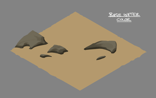
The starting point was this thumbnail sketch from art director Claire Hummel:

To bring the scene to life, we’d need nice-looking water, which wouldn’t be convincing if it didn’t react to the motion of the characters and surrounding geometry. A game that does this well is Resident Evil 7 (especially if you’re a fan of floating corpses, like I am).
To this end, graphics programmer Pete Demoreuille (who apparently does exist even though he doesn’t have a Twitter profile) created a GPU-based simulation using a “shallow-water” approximation. It’s a little more accurate than traditional video game techniques, as it accounts for the water’s depth and computes its horizontal velocity along with height. For collision with the characters and the world, a "signed distance field” can be precomputed for the static environment, and characters are added in per-frame by attaching primitives (capsules, in this case) to bones in their rigs. Got it?
The end result is a number of dynamic textures which are fed into the shader for the water surface’s height, normal, velocity, and distance from a blocking object. Timo Kellomäki’s work on water simulation in games is a great reference.

With these at my disposal, I set about making an actual shader, starting with a simple flow mapping texture—the flowing determined by the simulation. The output is brightened depending on factors like surface normal and velocity. The below was captured right out of the Unity editor and was immediately fun to play with. Imagine the capsule is a rubber duck, like I did. For about a week.
I gradually built this into a more watery-looking shader with the addition of normal mapping, depth-based transparency, caustic lighting effects, and probably some other things.
youtube
By this time the passage scene contained some first pass environment modelling and character animation, so I could try the shader out in situ. But first, Claire produced this handy style guide broken down into layers.
Isolating each element of the material was really useful in getting the final combined effect to work as we hoped it would. This is how it looked with the breakdown recreated in the shader:
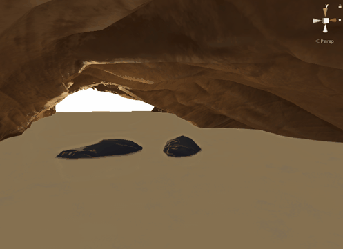
If you’ve worked with Unity shaders, you may appreciate that getting shadows to project onto a translucent surface is quite challenging. But I think it was worth the effort to enable the subtly visible geometry under the surface, fogged and blurred by depth.

With the characters and colliders added, the scene was as complete as it was ever going to get. The environment, character models and animation would all be updated in time, and I had plans to add particle splashes, water dripping from the ceiling, and a way to allow the characters to appear to get dynamically wet. But then, the devastating news.
The shot had been cut from the trailer.
Not one to take this kind of thing badly, I quickly brushed it off and it was really no more than a few months and a Balinese yoga retreat later and I was eagerly anticipating my next challenge. Dust motes? Oh no that’s great. Bring it on. I love dust.
#Posted by Matt#game development#game dev#video games#gaming#In the Valley of Gods#Campo Santo#game art#gif#gifs
19K notes
·
View notes
Photo
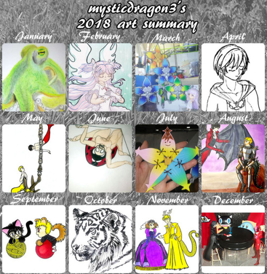
Art Summary for 2018.
I think I've decided on the representatives for May, June, and August.
Even though "A Study in Silver"-mer-Akira was technically well done for me and still looked good as a tiny thumbnail, the more I looked at it, the more suspicious his surprised expression looked. And I wanted to remember that month happily. After all, I accomplished so many drawings done for Mer May, and ended up doing a little series of mer-Ryuji and mer-Akira exploring or hanging out together; that was fun. I wanted to remember that more than see an example of my improved drawing of object volume and hair.
But actually, my mer-AkiRyu exploring around an anchor ALSO showed an improvement in my drawing. Their anatomy, volume, and hair was all good. It was just that anchor and chain that were weird. And as a thumbnail, the drawing was too tiny to show all the details, demonstrating my improvements. But still, I really liked the happy atmosphere in that drawing.
Much more than my mer-AkiRyu trapped in a fishing net. That drawing also showed improvement in my anatomy, volume, and hair, even if some of the anatomy was a little wierd and (once again!) Akira's pose was stiff. But mer-AkiRyu were annoyed with each other, and I'd much prefer a happy atmosphere, even if that drawing was just the right size to show all its details even when shrunken into a small thumbnail.
So I decided on mer-AkiRyu exploring around an anchor as my representative for MerMay.
As for June, I knew that my Kaijune ladybug demonstrated a proper sketch of human anatomy (which I'm usually bad at) and creative modification (into an uncanny creature). But it just wasn't as pretty as the brumation whale. Still, the more I looked at the brumation whale, the only thing it proved was a return to watercolors. The whale drawing itself was just a simple doodle with no skill improvements. Which is the same that could be said of my Axel&Kairi one-panel comic. It was fun, and at the time, I was impressed with myself for finally being able to immediately and quickly express myself through drawing, without much struggle. But technically, it's not very good. So even if my ladybug monster wasn't very pretty, it proved improvement in my drawing skill, which I had seen people define as the point of the Art Summary retrospective.
As for my August representative...
I was so sure my giant komodo dragon in a pine forest (against a tiny knight) would be the final. I was so proud of it, when I first drew it for Smaugust, that I actually posted it to Facebook---and I practically never have the confidence to post my drawings to Facebook! I always liked how that drawing had turned out. But the more I stared at it, I realized it only looked good because I had realistically sketched a komodo dragon photo for reference. The pine trees and tiny knight were just simple scribbles. The only thing that giant komodo dragon drawing proved was that I can realistically copy animal photos...which is something I already knew AND already had several examples of in other months.
The same could be said of my gharail-duck/feathered-dragon drawing. I took a LOT more time and effort to draw it, and even put more effort into attempting to return to watercolors through it. But in the end, all it proves is that I can realistically copy anime photos, add some modifications, and can pick up a paintbrush again. It was technically my best work in August, but actually didn't prove much.
On the other hand, my fantasy drawing of dragon-lord-Ryuji and demon-Akira had tons of technical problems. First of all, Akira's pose ended up so stiff that I was actually mostly ashamed of this drawing. But I really liked how Ryuji turned out. His pose seemed so natural, and the anatomy, object volume, and character/face/head portrayals that usually allude me, were actually pretty good in this drawing. The same could partially be said for Akira, except that his pose was just SO INCREDIBLY STIFF! ;o; On the other hand, this drawing demonstrated a lot of expanding beyond my comfort zones. I mixed mediums: Copic on the characters, watercolor paints for the backgrounds, and colorful Zig Kuretake Brushables pens as the preliminary figure sketches (an attempt at colorful linework that ended up mostly covered by my usual black linework anyway ~.~; ). But if Art Summaries are supposed to commemorate skill improvement, I thought all the experimentation that went into this drawing, counted for a lot. ...Plus, I like AkiRyu. ^.~
I had some double-guesses about other months.
Possibly replacing April's Xion with Persona 5 polymer clay charms, but Xion was definitely an example of more effort and more improvement.
Possibly replacing September with better chibis or non-dog/cat AkiRyu chibis, but I did a whole series of dog/cat-AkiRyu that I wanted to commemorate and I was kind of impressed how much my horrible chibis had improved during OTPtember.
I had an original, metaphorical drawing about "introspection" during October, but that realistic tiger's intense stare just won out, despite being my typical Inktober fare.
December isn't over yet, and I feel my "Waiting for Ryuji" figure photo series had some cuter entries this month (and last month). But "Day 150" showed off the miniature invitation that I put effort into sculpting that tiny seal for. Kirby was included, to add his cute, though not as cute as when he was floating with his mouth open, to deliver the invitation letter to Joker (as in "Day 148"). Still, I chose "Day 150" because it not only included a dialogue bubble, to demonstrate how this photo series also occaisionally requires some Photoshop effort, but also because this alternate version of "Day 150" includes a photo of Figma Ryuji, who is the entire point of this photo series.
Ok. I think I've convinced myself to be confident in my choices.
Still, I don't think my did very well this year. Which is weird for me to say, when I accomplished so many daily/monthly drawing challenges this year and defeated a couple of new and difficult sculpting projects. It wasn't such a bad year. But maybe it's just my depression wanting me to look over this retrospective and still say my skills just slid down the drain. ~__~;
2 notes
·
View notes
Text
AX2001 - Brief 4
To adapt a chosen poem into a 30 second (exactly) animation.
To do:
- Look into 10 different short poems (about a page long or less each), with one of them being from Roger Mcgough.
- Focus one 3 of the poems to show Mark on 11/10/19. Include links to peoms for reference. (Amazon is a good place to find poems).
- Have some sketches/ thumbnails ready to show Mark.
- Look into different styles of drawing for some variety.
- Find that one poem everyone did in high school and maybe consider that one?
Poems for ideas:
https://www.poemhunter.com/poem/let-me-die-a-youngman-s-death/
https://www.poetryinnature.com/poem/a-mother-cries/
https://www.poemhunter.com/poem/the-identification/
https://www.poemhunter.com/poem/we-remember-your-childhood-well-2/
https://www.poemhunter.com/poem/my-teacher-wasn-t-half-as-nice-as-yours-seems-to-be/
https://www.poetryfoundation.org/poems/43768/my-last-duchess
https://www.poetryfoundation.org/poems/46313/porphyrias-lover
Note: Render everything in 16bit when given the choice (H.264), keep an eye out on After Effects as it defaults to 8bit.
Check this out: https://illustrationchronicles.com/Obsessed-with-Cats-The-Ukiyo-e-Prints-of-Utagawa-Kuniyoshi
^Referring to the above link:
I quite like the style of Japanese woodblock art and should I come across a Japanese poem to animate I would like to animate it in that style. Mark is great at that style so I could ask for help from him.
Let me die a youngman’s death:
This poem has quite a lighthearted feel to it and would make for a humourous animation - particularly the parts describing how he would like to die. The style would likely be a cartoon-y, scribble sort of style with exaggerated movements and it might work better with narration. I’m not sure what the name of the style is but think of every ‘boomer humour’ comic ever - the sketchy lines and characters with big noses. Saul Steinberg does something similar to that style.
A mother cries:
I quite like this poem, it’s rather linear and doesn’t leave much up to interpretation but it does paint an atmospheric picture in one’s head. The style I imagined for this one would be in the ‘Warrior Cats’ sort of style. If not that then a black and white, contrasting colours, style with muted colours - like the music video for ‘Siames - The Wolf’. I want the kindness of the mother wolf to melt away and twist into ferocious rage at about the same time the confidence of the hunter turns to dread.
The Identification:
Despite being a longer poem that may require some lengthy shots I really like the idea it puts across. It can be interpreted any way you like but what I see is a boy who changes his face and personality depending on who he is around - subconciously learning this ability from his manipulative father. The animation would not only portray this but the boy’s own forlorn feelings about not really knowing who he is. The start of the poem talks about a scorched mask and the first image that came to mind with this was the dragon priest masks from ‘Skyrim’ - they cover all features of the wearer and radiate an aura of mystery. Perhaps I could design the mask after those.
As for the style of animation I’m not so sure, maybe something lineless/ paint based? It’s appealing and gives the drawings less of a cartoon-y look. I want there to be colour, maybe watercolour, to express emotions rather than to paint the scene. Some lines of the poem to be used as narration? Not all of them.
We remember your childhood well:
Like most of Duffy’s poems they hold a sense of bitterness/ spite and have plenty of hidden meanings. At first I couldn’t decide if the tone of this poem was the narrator reveling in the fact that their own child was raised well and without hardships, or if the narrator was speaking about themself as a child - hinting to a childhood of abuse by using sarcasm. The ending seemed to point more to the latter. For this poem I might like to animate it in warm colours to start, everything is happy and well, until the bitterness starts to show. Colours could drain, the music could warp and the viewer gets a tiny glimpse into the child’s personal hell. But it recovers and is colourful again as the child convinces themselves that the way they are treated is normal.
My teacher wasn’t half as nice as yours seems to be:
A rather playful way to discuss teachers abusing children back in a time when it was legal, reminds me of how people joke about their plights plenty as a way to deal with them. This poem could very much be taken literally and animated as it is read, it looks playful and funny but if one looks between the lines it has dark undertones. I would love to animate this in Roald Dahl’s drawing style. Makes me think of a child writing a diary, the poem seems to have childlike innocence.
My last duchess:
The Duke is the narrator of the poem and has married several times, doesn’t like how his latest wife behaved. So he accused her of being unfaithful and eventually assassinated her (perhaps accusing her of things so that if one was to discover his crime it would be ‘justified’?).
‘Never to stoop. Oh, sir, she smiled, no doubt,
Whene’er I passed her; but who passed without much the same smile? This grew; I gave commands; Then all smiles stopped together. There she stands.’
Daisy mentions: He gave commands. And she stopped smiling entirely. Because she was dead. (Including perfect bluntness with this revelation).
Porphyrias’ lover:
Note: Porphyrias is an STD
An incredibly dark poem that doesn’t hide the murder of a woman between the lines this time. It actually mentions strangling her despite her seemingly doing nothing wrong - though the title makes me think she was unfaithful. Could be bias from the narrator though. The think that was so jarring to me was the immediate, kick in the teeth switch from describing a lovely woman to suddenly and violently killing her.
0 notes
Text
A Treatise on McQuevian Hand-Painted Texturing Automation
Originally posted on the Big Robot blog, Gamasutra, Kotaku, and RockPaperShotgun.
What follows is an expanded take on what we touch on in that video. If that sounds good, read on!
Tölva’s world and tone are exciting for a number of reasons – lasers, exploding robots, unfathomable space mystery and the phrase “combat archaeology”, to mention but a few – but here we’re going to talk about how we crafted that rich, screenshot-friendly visual style. We will try and understand the majesty of Mr Ian McQue’s concept art, learn the fundamentals of ‘splattery precision’ and some other made up terminology, as well as comprehending the beauty of a clean normal map bake or efficient UV layout. You know you’re in deep when you can appreciate UVs. We intend to go deep(ish).
So… Defining the look of Tölva was a process of looking at our inspirations and influences and breaking them down into their constituent parts. This way we could take what made a certain look ‘work’, and begin to create a process that we could apply to a variety of assets while maintaining consistency with one another as well as looking appealing in isolation. This meant taking Ian McQue’s sketches and paintings and finding common shapes, colours, types of brush stroke, silhouettes, and starting to form a “McQuevian language”.
Often robots, vehicles, or ships, were chunky with lots of rectangular protrusions breaking up their silhouettes. Layering of details was important, with colour often going from darker to lighter as the layers got closer to the exterior. Angles were often a few degrees off being parallel with each other but still consisting of straight lines, rarely curved. The dumpier a spaceship, the thinner it’s aerials and wires: contrast from form.Often robots, vehicles, or ships, were chunky with lots of rectangular protrusions breaking up their silhouettes. Layering of details was important, with colour often going from darker to lighter as the layers got closer to the exterior. Angles were often a few degrees off being parallel with each other but still consisting of straight lines, rarely curved. The dumpier a spaceship, the thinner it’s aerials and wires: contrast from form.
We could use these style guidelines to judge how well something would fit in the world, and how close it was to the source. I’d sometimes create reference boards using a tool called Kuadro, a convenient way of laying out image files on the desktop and storing their scale and position in a file. I’d be conferring with Jim at various stages throughout an asset’s creation- he would direct the design, and mine his extensive and tasteful tumblr image library, or doodle thumbnails to illustrate specific requirements. Interpreting sketches from one angle and turning them into 3D geometry has been a particular challenge for me on this project, but following these guidelines, and practicing this approach has enabled me to get better at it through the course of the project.
The first step towards actually making something, once reference was set up, was blocking out a 3D form in Maya using simple primitives and keeping things low detail. Often if this stage went well the geometry could be reused for the final low polygon asset. Then I’d take this base mesh into zBrush and play with the shapes, maybe add things that were more awkward to create in Maya. If I was feeling really fancy, I might do a paintover.
Sculpting, Detailing, Baking
Once something is starting to feel like a strong design I can start to commit to adding details, again referring to the guidelines as I bevel edges, chamfer corners, and smooth any (rare) curved surfaces. Then come surface details that will be baked down into the normal map such as wires, nuts and bolts, screws, handles, cutlines. It’s easy and enjoyable to go overboard at this point and fill every surface with greebly goodness but any artist will tell you that the eye needs space to rest. Not only are you looking for space to rest within this asset, but often you will need to look at the game as a whole and decide whole assets need to act as rest points devoid of any noisy detail, in making up the composition of the world.
At this stage I’m also starting to break up edges with wear and tear and damage where seems appropriate, this is one of the most satisfying parts- chipping away and scratching up clean surfaces requires little moment to moment decision making and I can let this almost therapeutic activity absorb my attention. It’s important to split objects as I go into logical groupings based on their material types, I will use these later to bake a material ID map which is essential to the texturing process.
One of the of the recurring aspects of creating such a mechanical world is designing (relatively) convincing joints, paneling, and other robotic goodness. It was important to spend enough time look at machined parts or engines so that I could start to internalise where a cut line might occur, which panels needed screws, how a curved edge might be carved out of a larger piece. Manufacturing is often about starting with a form and reducing it from there, and the same approach works really well when sculpting.
Then comes a series of steps that are dull but very necessary to getting a clean bake but once that’s done I can move onto texturing. A tight UV layout, good smoothing groups on your low polygon model, and a precise cage mesh all aid in a clean bake.
Generating an Automated McQue Texture process
Or: How to Hand Paint Textures, Without Using Your Hands.
Good modelling is essential and a stunning texture won’t save a bad model, but texturing drives a lot of Tölva’s look and helps distinguish it from other games. It’s also what was most clearly imitable from the concepts. We were fortunate enough to be given access to the list of secret brushes that Mr McQue utilises most frequently and to such effect, and using these able to create an automated process that streamlined the texturing of hundreds of assets. We essentially created a system where I fed in my sculpts and a McQuevian texture was churned out for me to tweak and finesse. This worked by taking the right brushes in Photoshop and creating a tiling pattern with each, attempting to recreate a certain type of stroke or scribble that could be found in any given concept piece. With these ‘master strokes’ I could tile relatively convincing McQuvian patterns across a surface, tinting its colour, and using the pattern to break up the edges of masks in Photoshop. Daub, dash, splatter, speckle, spray, smear, squiggle, strokes, crosshatch, and grainy swirl would become my best friends over the next 2 years. Grainy swirl was great for organic or noisy surfaces like mud or concrete, while crosshatch had a natural galvanized metal flakes look. Each pattern came into its own as I built a library of reusable materials from these tiling patterns.
The tool tying all this together was the Quixel Suite’s dDo, a Photoshop based texturing tool aimed at primarily at creating PBR materials very quickly, which we had employed for our own nefarious aims. Feeding the sculpt data from the bake (tangent and object normals, ambient occlusion, material ID, gradient, sometimes a height map) dDo could tell me where edges were, crevices, what was at the top of the mesh, what was only facing down or upwards. The amount granularity in terms of how you define the masking of a material is very powerful, and once I’ve made decisions about where a material should be confined to I can apply that as a preset to any other asset. “Here’s my paintedMetalC material, it will have chips and scratches on the edges, sunbleach on the top, water damage on the undersides, and some lichen in the crevices.”
I found the simplest way to structure a texture was to have a form layer at the top that brightened upward facing surfaces, and conversely darkened downward facing surfaces, with an edge brightening layer to accentuate the objects natural shape. Our ambient light in-engine is a single colour and so baking in some subtle lighting data helped objects have some shape even when in total shadow. Next, a weathering layer that universally affects the asset. Things like dust, stains, and other environmental effects go here. Beneath this all the materials are applied to their corresponding material IDs from the high polygon sculpt bake.
From this point I’ll start to work in overlaid scanned details from the dDo library, these won’t affect the diffuse channel very much (deliberately), but will add some physically based detail and reflectance values. The materials that make up Tölva and it’s inhabitants are 90% diffuse covered and 10% specular, meaning they are largely matte looking surfaces with bits chipped away to reveal the metal beneath. McQue’s style has very little exposed steel, or polished chrome and there is no glossy plastic, so I tried hard to match that. More on the PBR side of things later.
Once materials are assigned to the whole texture there’ll be a lot of tweaking of the tiling pattern’s intensity, colour, size. Material specific details will also go on, like rust that only affects metals. Then in some cases I’ll add bespoke hand painted details like glyphs, diagrams, or bits of weathering that only appear where there’s a pipe or something and that can’t be defined by the automated process. But this is the only part of texturing where I’ll actually paint a specific detail onto a specific part of the texture, everything else is controlled by dDo and my masking.
The colours we use are often collections analogous colours making up 60% of an asset, then it might have a darker or more saturated variant covering another 30%, and then remaining 10% has a bright or rich accent colour. Usually the best way to get a decent start with this is to colour pick directly from a concept and go from there, can’t get more accurate than that. As we got further into the project certain palettes would mean different things to me about where they were in the world and who created them, making decisions about colour schemes much easier.
Once all this is done I can save individual materials as presets, or entire documents to be reused on similar assets, this is largely what facilitated us in getting the texturing done as a efficiently as possible.
Implementation: Make Everything Modular
Being able to cannibalise existing assets for reuse is an invaluable tool when you’re trying to squeeze as much variation into the world as possible without burdening your VRAM usage further. The mileage you can get from an asset is often surprising in terms of reimagining it for other purposes. If you model things with discrete watertight intersecting meshes rather than combining everything and deleting interior faces, you can at any point split these out and reassemble them into a new variation of that asset.
This is probably obvious to veteran game artists but was something I was often in two minds about at the start of production, modularity vs bespoke detail. The other thing to bear in mind with this approach is baking with your meshes well exploded so occlusion data doesn’t interfere with neighbouring meshes, preventing you from reusing that one piece in a prominent place because it has a massive shadow across one side of it. Meshes can be merged using boolean operations to merge intersecting meshes and create totally new shapes, which we did to create cliff faces comprising multiple rotated cliffs into one uber cliff.
Creating asset kits is a common technique in games utilised particularly well by the Bethesda teams. Tölva has less of a need for complicated interconnecting architecture but we were still able to get some use out of concrete piece kits that we made to build more industrial areas, and kits of damaged spaceship to decorate the space wreck debris that litters the world. Creating these kits for the environment team (er, Jim) took a sizeable amount of the art dev time. Another example of this kit-based approach are the weapons attachments, all modelled as separate items that could be rearranged and mixed together to create weapon variants.
Working in the sizeable world of Tölva meant pushing a lot of geometry onto the screen at any one time. Occlusion culling and culling regions far from the player helped alleviate some of this but ultimately we were going to have to create level of detail meshes for a lot of polygon heavy, or frequently used assets. This is a fairly simple process and its amazing what you can get away with when an object is at distance.
Expanding the look with Shaders
I have no programming skill or experience to speak of, but I found fairly quickly I was being limited by my ability to create simple shaders to achieve effects commonplace in games and desirable within our sci-fi aesthetic. Unity plugin Shader Forge became my go-to tool for solving these problems, it’s a node based shader writing solution that is approachable but still crammed with maths terminology most artists have never heard of. Using this I was able to assemble and visualise shaders that had pulsing lights, tinted a material based on ID maps, did weird things with transparency, or just layered textures based on normal direction. This saved me using up precious programmer time – Tom was full time on the project, and Dan part-time, so their brain cycles were at a premium! – and gave me control over very specific parts of the look. This kind of autonomy is very precious when you work remotely and there isn’t always someone on hand for you to pester with technical queries. Being a visual scripting system it does have the downside that when it breaks, I often had no idea why, or how to fix it. These issues weren’t insurmountable but did lead to a day of debugging from our resident shader expert, Tom Betts.
I would approach materials very differently if I was starting this project from scratch tomorrow. Coming from a CG background pretty much everything is given a specific texture that uses the full UV tile, and that was pretty much my only option to get the look we wanted at the time. As my understanding of Shader Forge evolved I was able to create a sort of shader version of how my textures were set up inside dDo. I was limited to 4 masks (RGBA channels of the ID texture) plus a base layer, and I could tile and tint some of the McQue patterns within those masks. Each McQue pattern had the diffuse pattern stored in the red channel, specular in the green, and gloss in the blue.This allowed me to get good resolution on textures for assets that were 5, 10, 100 metres long. The ID and normal maps were still limited by resolution but the tiling worked very well. It serves well as a halfway house between a 1:1 mapped texture and tiling materials, but lacks the subtlety and detail of a 1:1 or the variation and fidelity of having a library of materials applied to submeshes.
Terrain texturing
Our initial approach to terrain textures was to treat them as purely two dimensional, abstract patterns. As the style developed it became clear we were going to need something a bit fancier to fit the aesthetic, especially given the fact that terrain filled the majority of the frame a lot of the time. I began sculpting tiling terrain materials in zBrush, creating quick sculpts that could be exported to Unity quickly to test tiling, detail, and blending between layers. It was important to use detail meshes like small pebbles and shards of rock that already existed to tie the textures to actual 3D props sitting on the terrain. This was the first organic thing I’d had to sculpt that wasn’t a rock or cliff and the soft shapes weren’t fitting the style at all. The solution ended up being to reduce the polygon count of the sculpt using zBrush’s decimation tool to create a more faceted organic surface. Feeding this through dDo and using existing material presets was pretty straight forward. The height map was used by the RTP terrain setup to cleverly blend layers together based on depth, creating a much more pleasing blend that a simple fade.
Lighting/Rendering/Post Processing
PBR or physically based rendering has become a buzzword and marketing tool as it’s adoption has spread, symbolising a graphical upgrade over traditional game rendering. Mwoar detail mwoar realism mwoar immersion. Much as I love all those things it’s most important contribution from the artist’s perspective is having a controlled environment within which to work where you can create a material and have it react to light in a predictable manner, not only between scenes and lighting setups in the game engine, but also between software packages.
Having this predictability is even more useful when your game has a full day night cycle and is going to appear in all sorts of lighting conditions. Even if your game isn’t crammed with brushed metal and lacquered pine (highly reflective surfaces being a sure sign of a game trying very hard to get the most of its PBR) it can still massively benefit from a physical approach. Having a nice fresnel falloff on a largely diffuse material makes every object lit at a glancing angle look fantastic, materials are energy conserving so nothing washes out in a way that just appears like a white value being clamped.
McQue’s paintings have naturalistic quality to their lighting, this is ideal for PBR. His colour palettes have a fairly limited range, there are few bright whites or really dark blacks, much like real world albedo colour values. This allows a PBR lighting model to really shine without being overpowered or limited by overly saturated or contrasting texture colour values. PBR is not a style, it’s a tool. You can push your look in a number of directions with colour correction, lighting, and post processing- but you are starting from a well calibrated, stable, neutral position that is easy to control. Using PBR also means you can draw on nearly 200 years of photographic knowledge. Exposure, tone-mapping, HDR, colour correction, bloom, lens flare, chromatic aberration, depth of field, vignette: these are all techniques that have either been part of photography and film for a long time, or are simulating things that a lens does naturally. Also use linear colour space everyone, it has been VFX industry standard for forever, there’s no reason not to.
Having this linear colour space PBR setup means we are generating accurate colour values in the render that, after tonemapping, exceed the screen’s full brightness value. They are brighter than white, this is what makes the render high dynamic range. We use these values on our light emitting (emissive) materials particularly to trigger a bloom effect, but also to illuminate any dirt or scratches on the lens you’re viewing the game through.
Nothing says sci-fi like bright blinking lights!
2 notes
·
View notes
Text
The Establishing Shot
A good film maker knows that the establishing shot is one of the most important shots of a scene. It’s the first shot the audience sees, which means it has the unique responsibility of setting all three of mood, location, and direction. Generally extreme wide shots, establishing shots are typically scenic.
The Wizard of Oz
The forest scene in the 1939 film The Wizard of Oz presents a scenario in which Dorothea and her party are trekking through what appears to be a haunted forest. From the beginning, it is fairly plain to see that the woods that they enter are completely undesirable to enter, which is a tone achieved through a combination of props, lighting, and location. The establishing shot in our own remake of this therefore must be able to convey this same ‘haunted’ tone or feeling, whilst being presented in an original form.
Thumbnails are a very quick and easy sketching method that help kickstart this process, whilst providing multiple options for very little time. It’s possible to create the thumbnails even before deciding how the characters of Dorothea and her friends will be presented, as they can inspire varying scenarios. I tried to approach this assessment from this angle, as I am quite confident in character and object creation, however I lack experience in creating scenery and landscapes.
The thumbnails I created were done quickly using pencil and paper, with very little technique. I used these thumbnails as merely a guide or reference, not necessarily a draft. Once these were drawn, I then had to choose just one concept.
The Forest
The concept of a haunted forest is an interesting one, as we generally don’t tend to think wander into the type of melodramatic woods featured in movies as a part of our everyday exercise regime. So to help narrow down the options and create a convincing original haunted forest, I brainstormed the qualities that go into these haunted forests:
generally dark and quite crowded
easy to get lost
things appear in the corner of your vision
a sense of physical danger
contains a sense of mystery
By this point I had also narrowed down the general idea for my Dorothea: a young, slightly spoiled child, who picks up and keeps any soft or friendly toy that crosses her path, as she wonders further and further away from her home. Its an idea similar to a cross between Alice from Lewis Carol’s Through the Looking Glass and Christopher Robin from A Milne’s Winnie-the-Pooh. Because I want my Dorothea to be a child, and her friends soft toys, it opens up another perspective for the haunted forest. A good film can present a haunted story or location, whilst not being scary to the audience. This is because the audience can recognise and empathise with relatable characters, and thus understand that while something can seem mundane or even unlikely, it can evoke strong responses from the protagonists.
Because of this, I decided to choose the concept of a forest of broken glass. It fulfils the qualities listed above, and has interesting potential from a visual and story perspective, as glass is reflective. This means that any movement in an area with plenty of glass can produce images only seen out the character’s peripheral vision, increasing the tension and giving the illusion of ghosts or spectres. There is obviously also the physical danger from such a forest, as anyone can attest that it is easy to cut oneself on a shard of glass. Even more so for the Scarecrow, Lion, and Toto, as they are “stuffed” beings in this scenario.
The Draft

A challenge for me has always been landscapes and scenic shots. Even more so when transparency and reflection is involved. Perspective is also one of my weaker points, so it was interesting stretching those drawing muscles. The horizon line was extremely defined and obvious, something I will need to rectify in the final picture, as it makes the glass seem too transparent and the forest too bare. The image is also quite dark, and perhaps dusk would be a better setting, rather than night. The forest seems to just be an outside for the path, which is something that also needs to be improved on.

The Final

This image is certainly far from perfect, however I am happy with how it turned out. Creating a sense of depth and fullness was a challenge because of the transparent nature of the environment, though the stacking effect is interesting to see. The refraction of the “Keep Out” sign was also a little difficult, as the integrity of the words had to be maintained while keeping to its reflective nature. As my drawing style involves a lot of dark, defined lines, it loses the sense of realism and rather looks more like a cartoon. The yellow brick road is certainly harder to portray in black and white format, thus it had to appear lighter than the rest of its surroundings. Were this image in colour, the yellow would have been reflected off the glass in parts. The right side of the image feels more neat than the left, which was probably a result of having done it second, with the knowledge and experience of the left side fuelling the inspiration for the right. The perspective is still slightly skewed, which is something that I need to work on.
0 notes
Last Seen Blogs

petudump
i never learn

complicatedandstained
simple and clean

undiserable
Flawed

bhavnab22
Untitled

leo120102
Minerva