#i don't know how to copy fonts lol
Text
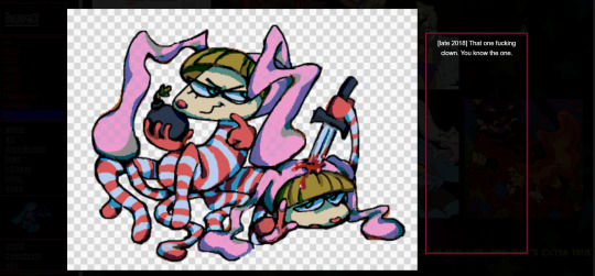
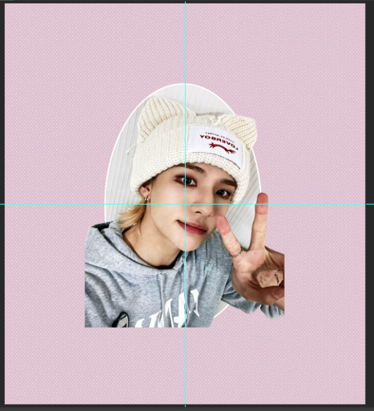
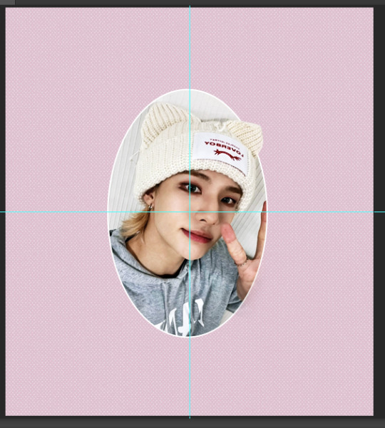
Got a bit of a different bookbinding post today. @renegadeguild got an ask from a new binder saying they were intimidated by everyone's gorgeous binds (me too, actually, some of you guys are scary good), and so they've asked people to share their first binds. And I realized I'd never even taken photos of my first one, so here it is, warts and all:
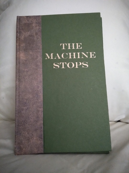
This is E.M. Forster's The Machine Stops, a public domain scifi short story that you can read for free at the link. The first reason I chose it was that it's an interesting story, and I'd bought a print-on-demand copy a few years previously that was just terrible. Baffling cover choices, basic errors in the typeset (like quotes that face the wrong way), weird size that didn't fit on my shelf; just not a good product. I couldn't do it with more indifference than the PoD people. The second reason was that I was too intimidated by the thought of asking a fic writer if I could bind their story and then producing something with a thousand sloppy beginner mistakes, and then they'd want to see photos and I'd have to show them this and it would have been mortifying, but Forster has been dead since 1970 so I could not disappoint him. It was very freeing. I bound it in 2021 as an experiment, to see if I liked this hobby enough to stick to it. The cover is green cardstock and faux leather scrapbook paper that I bought at... probably Hobby Lobby. I added the title later, as a practice project when I first got my Cricut; for the first two years of its existence it had a blank cover.
There are more photos under the cut!

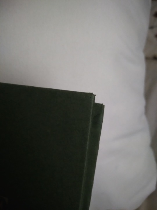
In this photo we can see:
--Too much glue when attaching the leather-print paper, so it oozed out onto the cover.
--Cricut font too thin and too much heat/too long of a press, so the letters have gaps and the glue also oozed out here. It's a continuing theme with this bind.
--I tried to use a bone folder to give it a sharper hinge crease and accidentally pressed too hard and tore a hole in the paper; you can see this in the little white vertical line near the top of the hinge
The fore edge is not square. I actually don't remember why this happened. I may have eyeballed the board position when I made the case, or the paper may have slipped while the glue was wet, or I cut it crooked and didn't notice till later. Either way it's bad enough that the book doesn't stand on its own. There was a crooked man/who walked a crooked mile/and found a crooked sixpence/against a crooked stile./He bought a crooked cat/which caught a crooked mouse/and they all loved together in a little crooked house, and I bet they read this little crooked book from their little crooked library.
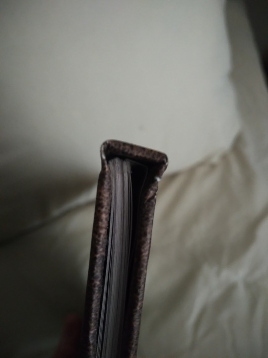

Top view, you can see that the case is too big and the text block doesn't sit straight in it. It has no endbands or bookmark, and it's hard to see in this photo but there's glue on the top of it, at the spine. This still happens to me but I know how to trim books now so this bit gets cut off. You can also see that the scrapbook paper has some cracks where its white core is visible. This is why I do cloth or actual faux leather on the spines now. Endpaper shows uneven trim (did I not use a ruler for this??), too much glue causing major seepage, and it doesn't sit evenly in the case. I'm not sure if this is because of the case itself being crooked, a badly-trimmed endpaper, or if the text block is also crooked. Or it may be a combination of all these factors. Unclear.
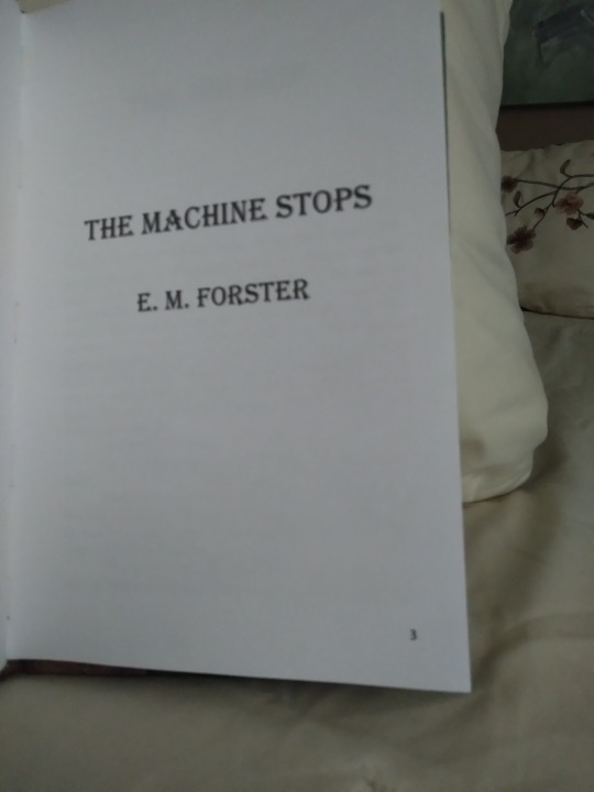
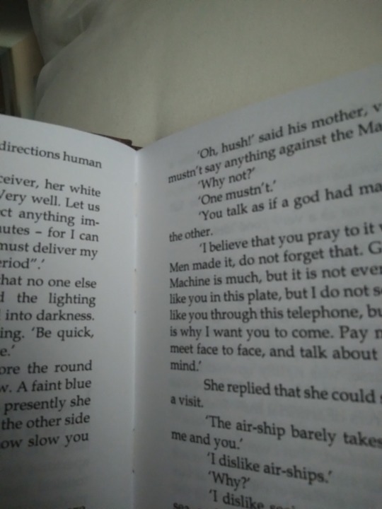
Typeset photos! Here we see:
--Title page has a page number on it. This is a pet peeve of mine and I fixed it after this book.
--There is no half title, summary, or metadata. All my later binds have these things.
--It's typeset in Times New Roman. Unlike many I don't actually hate this font but reading it reminds me of being in high school so this is the only book I used it for. Baskerville is my beloved now. The font is also much bigger than it should be. It's not huge but it's like a large print book so it feels weird for me to read it.
--Lol what are margins
--Lol what are page headers
--Actually I think I left the headers out so it wouldn't have a header on the first page of each chapter, because I knew about page breaks but not section breaks at this time.
--It's on regular-ass lightweight printer paper. There's nothing wrong with this but I switched to heavier weight paper shortly after to help with bleed-through and the light stuff feels so flimsy now.
--I didn't understand how Word's book fold worked at this time, so when I had to set the sheets per booklet and it had an option for 4, I chose that thinking it would give me 4 sheets of paper (16 numbered pages) per sig. It did not do this. It gave me 4 numbered pages per sig. So every signature is 1 sheet of paper. Every page is its own signature. I am still mad about this but it sure drove home how the setting works and also how to make kettle stitches since you make one after every sig. A book of 48 pages has 12 signatures which is just ludicrous.
--There's no photo of this but it has a piece of printer paper on the spine because I didn't have mull. I did use PVA though. Lots and lots of PVA.
--It's stitched with regular sewing thread, which means it doesn't have much swell for a book with that many sigs, but it's less sturdy and more likely to tear the paper.
And that's that! It probably sounds a bit like I was tearing it to shreds but I actually love this book quite a lot. I learned so many things that I applied to my next binds, it was an invaluable experience. It let me fall in love with the hobby so I could make the awesome things I make now. I've got those all posted on my main blog under the tag #snek makes books, or you can see them all on my side blog @papersnakepress. For a first book it's functional and readable, and still better than the PoD copy I had before. I've been thinking of doing a rebind as a sort of progress gauge, actually. Maybe next year.
#bookbinding#snek makes books#the machine stops#it's not winning any beauty contests#or technical skill contests either#but it's mine and i love it#first bind
79 notes
·
View notes
Note
This is stupid, but you know those new LO hoodies the Webtoon shop has? I know the font they're using. It's Eckmannpsych which is an Adobe font.
That's not the stupid part though. The dumb part is the capital H and G in the Eckmannpsych font do not match what is on the hoodies, which would obviously be on the hoodies that have Hera or Goddess on them. So, Rachel looks to have taken the time to hand draw her own H and G to match the font style for those hoodies but did not take any time to make new, better art for the merch, but instead reused ugly panels from the comic. Talk about a strange look into her priorities. She doesn't like how the G and H look on a font? She will remake those to fit what she wants. Rachel when the assignment gives her the chance to make specialized, better designs for those same merch? She can't be bothered to even try. WTF!
for the love of god-

I'm assuming and hoping they had the commercial rights to that font LMAOO But it did kind of make me go 🤨 because while I didn't know the font EXACTLY off the top of my head it still felt... weirdly out of place for something like LO? Why are these hoodies being stylized like they're from Austin Powers LOL
On another note tho, the LO merch is just like... disappointing in how bad it is for what's supposed to be WT's #1 series, which is, btw, a series with so much unique stylization that it shouldn't even be this hard to make merch for it! it just feels very "first attempt at redbubble merch", but unlike genuine first attempts at making merch (which is obviously a learning curve that I wouldn't judge anyone for being new to) this is a company that's sunk shitloads of money into LO so I don't know why they can't get better merch made?? so much of it is just the default drawings taken and slapped onto a tote bag or t-shirt, which like, yeah cool fine you're using art that's recognizable and considering the art is already made, it stands to reason that they should use it for more than just the comic. It's just disappointing to see how lazy it often is and how little effort is put into translating it onto a t-shirt/tote bag/etc. like we can't even have ONE exclusive t-shirt with a unique design that isn't just poorly copy pasted from the comic?
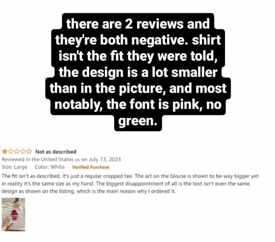
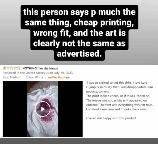
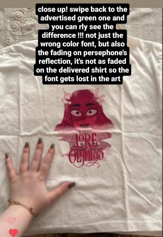
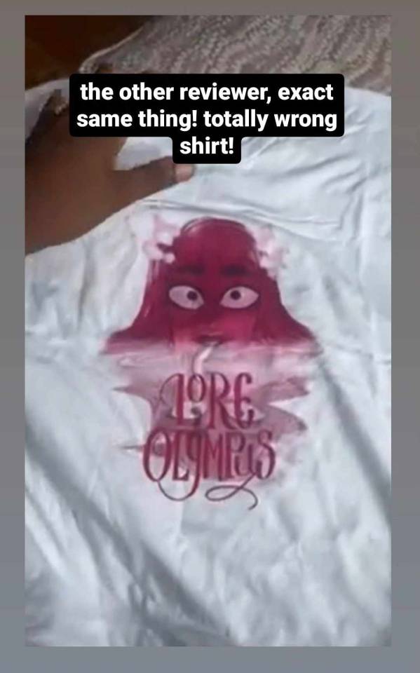
Case in point, those t-shirts that Rachel was advertising a while ago that were actually straight up falsely advertised. I can't find the post about it on my Tumblr (I'm pretty sure I talked about it here) so here's the IG story rundown I did on it ages ago:
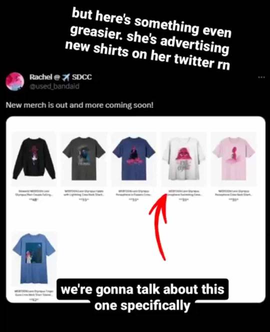
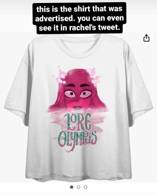
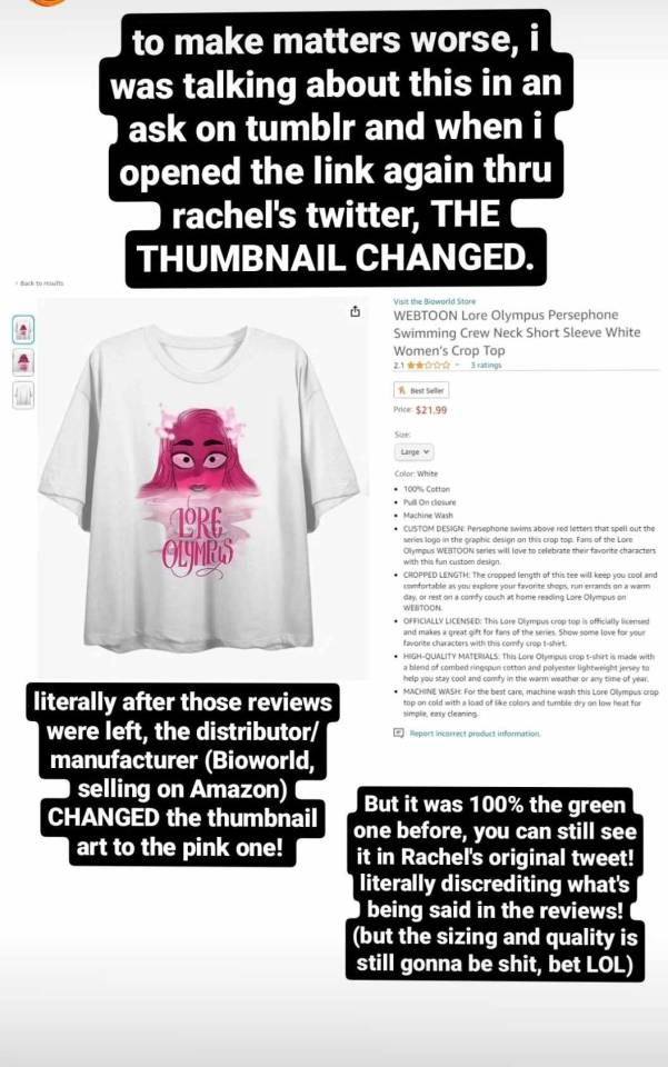
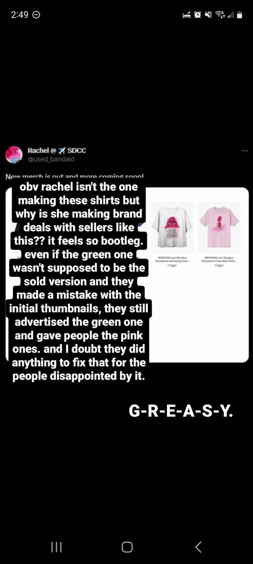
Again I'd really like to have benefit of the doubt here that Rachel isn't the one making these designs, usually that's not how the merchandising process goes in these types of deals, so I'm not gonna point the finger at her. But it's just so odd to me that it happened in the first place. And this goes for a lot of LO's merch, so much of it feels cheaply made and rushed off a conveyor belt for the point of making money without much expense. Which yeah, that's a business model for sure, the goal is to profit, but like this?
You can't even argue that it's like people criticizing LO the comic because like, as much as I'll justify what I spend my time doing here in my free time, it's true that at the end of the day I don't have to pay for LO, so really the only thing I'm doing is inflicting psychic damage to myself, it's not like my actual money is on the line LMAO That's why I stopped paying for LO ages ago and only do it when I have a specific episode I need to review (such as the midseason hiatus review series I did). At the very least, if I really want to keep reading LO but don't want to pay for it, I can just avoid FastPassing it and read it for free so I can save the coins for other series I'd rather read. The Webtoons' FP system is very fair that way.
But this is merch explicitly made to generate revenue. It is a product, front to back. You can vote with your money by not buying the thing you don't like, absolutely, but the fact that it's this poorly to begin with is just so indicative of Webtoons' business practices and so shitty for the people who genuinely enjoy this comic and are being advertised and sold shoddy merchandise that doesn't even come looking the same way it's advertised. It's really not a good look for Webtoons, Rachel, or LO that this is what they're selling to people.
Especially for what they're charging, good lord-
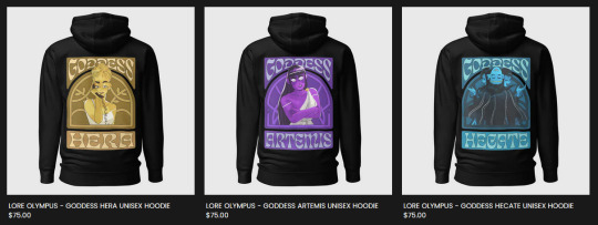
Like, okay, they're hoodies and they're gonna be expensive to print and ship so the higher overhead cost makes sense, but jesus christ, with the kind of merch Webtoons has already given the stamp of approval on, would it even show up in decent condition? How bright are those colors gonna be? Are they gonna strip off as soon as I throw it in the wash? I'm half-tempted to buy a hoodie for myself just to do a review on it but I can't justify dropping $75 CAD on a hoodie that only has art on the back. Maybe it's just me living in the hellish lands of Canada where we play with toy money that's the problem, but it's just not a gamble I wanna take LOL If I bought one it would probably be the Hecate or Hermes ones because they're the only ones that are at least somewhat legible and have decent character art that isn't a character looking like they need to poop LMAO

(these are literally the two worst drawings they could have chosen of these two i stg lol the only thing that would have made this worse/funnier is if it was Handsome Hades and Persephone Kidnapping a Baby LMAO)
It has me worried about what the LO figures are gonna look like when they release. Are they gonna have some creative liberty with making them chibi-fied (like a Nendoroid?) or are they gonna try and replicate the art style exactly and wind up making literal blow-up sex doll Persephone? 😭
NGL, if the figures are done well enough and don't cost an arm and a leg, I might consider buying one just for the shelf collection, but again, it depends. If Webtoons released a tarot deck with really good panels from LO (like the Tower 4 scene or Persephone sitting on the rooftop with her comb or Eros flying down into the Mortal Realm) I would buy the shit out of that. I would even just take the Major Arcana if 78 cards was too much to ask :'0 I'm not against Webtoons/Rachel trying to profit off LO merch at all, I just wish it was BETTER- (╥﹏╥)
#lore olympus critical#lo critical#anti lore olympus#ask me anything#ama#anon ama#anon ask me anything
116 notes
·
View notes
Text
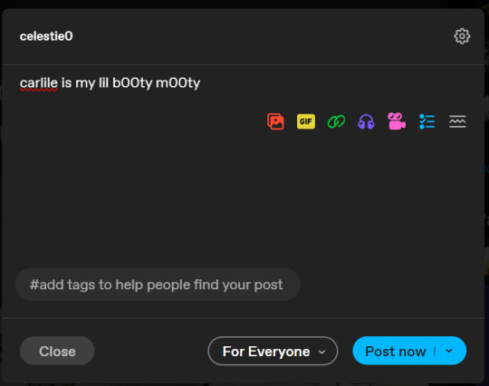
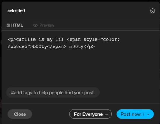
custom font colors tutorial
note: this is for my bb @tobaccosunbxrst but also just wanted to post it to public for anyone curious on how to do custom fonts w html on tumblr. i originally made this tutorial privately for my mutual @certainlysyko so apologies for the silly choice of example text that i used lol. anyways.
so as we know, tumblr only has the following default color options for text:
but what if we want some other cool colors like coral pink or cerulean blue or barf green?
to do custom fonts, it’s very simple, but it needs to be done on pc/laptop (cannot be done on app). we are going to start with a post:
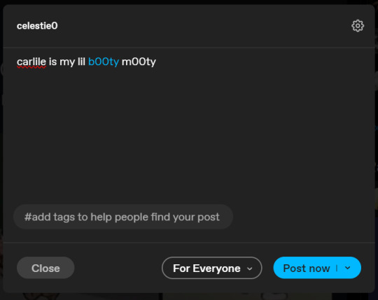
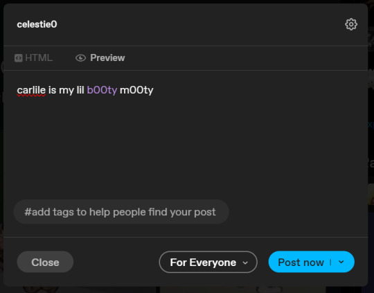
then, you’re just gonna change whatever word that you want the custom color for into one of the tumblr defaults. you do this by just selecting the text with your cursor and then tumblr’s default colors pop up. you can change into any of them, this just establishes the code in the html and makes it easy to spot
then you're going to go to the little settings thingy at the top right of the post (the settings wheel) and click on this drop down, then click on "html" which will switch it to html
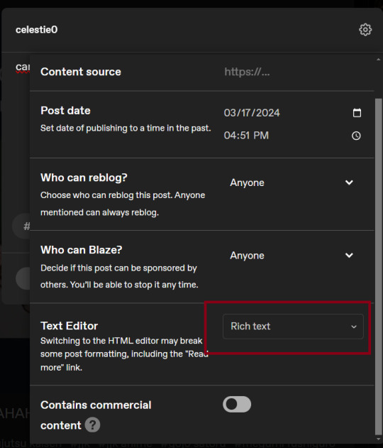
now it's in html. this looks very simple bc there is only one statement here. i’ll touch on how to deal with more lengthier blocks of html code later. but for now, note this section only:
<span class="npf_color_rachel">
this is ALL we need to work with in the code
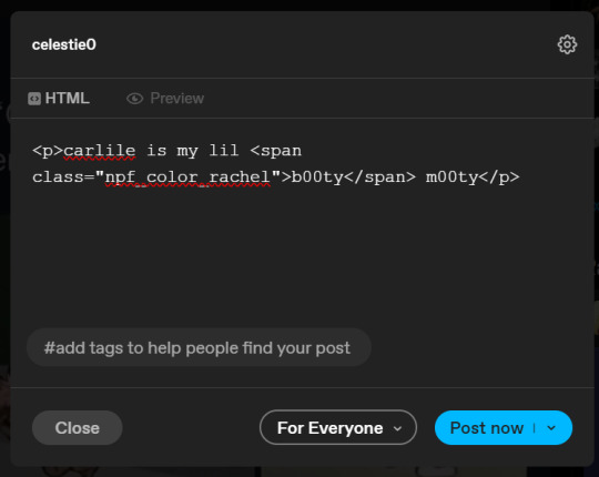
we're going to change it from
<span class="npf_color_rachel">
to
<span style="color: #[hex code]">
so, for example, something like
<span style="color: #81b7ce">
note. you can also just copy paste the lines above so you don’t have to type it out
soooo all we did was delete the class=npf_color_rachel part and just replaced it with style=“color: #[hex code]
and here's the preview! all done :)
this is the website i use to find the hex codes. a hex code is basically those codes after the hashtag so like #81AACE (don't forget to input the hashtag)
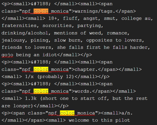
now, for those lengthier posts i mentioned, you can use ctrl+f and search the word "color". it will show up any place on the post where you have a colored font (so do this after you’ve already changed all the places you want custom colors into default tumblr colors, like in the 1st step)
this way, you can easily find the places with <span blah blah> that you need to edit
here is an example of that in one of my posts:
and yeah! that’s basically it. disclaimer, i’m not a software engineer nor so i know much about tech haha, this is just for tumblr aesthetics
alright peace out! 🧚♀️✨ hope this is helpful
#tumblr#tumblr tips#tumblr html#tumblr hacks#tumblr colors#html#tumblr custom colors#tumblr girls#custom colors#tumblr tutorial#custom colors tutorial#html tutorial#hacks
53 notes
·
View notes
Text
the bachelor pitch website, recreated
this official website with a pitch for bachelor route was found on jan 2nd and then promptly sniped by IPL, without us getting a good wayback machine copy. i've been working on restoring it, and at this point i think it's rather faithful to the original and worthy sharing!
not perfect YET - namely, the mobile version kinda sucks, - but i'll be looking to improve it over the upcoming weekend! (more info under the cut)
some liberties have been taken in developing this page:
first of all, all source code has purged, and the website was rewritten from scratch - this is to avoid copyright conflict with readymag, the website builder IPL used. such services often allow exporting code, but only limit it to business clients and usually forbid editing the exported code in any way
the mobile version seemingly wasn't a thing that IPL considered with this single-page pitch/"business card" kinda website, but i'll still try to get it to work - my main goal is to ensure all assets load in a harmonic way, while IPL's original website was skipping some of them on mobile
unused assets/disabled elements were not restored. i honestly don't really want to tangle through readymag's messy messy ripped code to find out how were they supposed to look like. also, all of them are developer portraits with their names and contact information, and i don't know which of these people are public personas and which arent :^)
a little "about this page" button was added, including my contacts for incase anyone wants to tell me anything important, or (HOPEFULLY NOT) IPL will have problems with this website being present and would like to ask me to remove it
the chosen by IPL fonts were restored - i'm not sure if the saved .html file that i possess didn't preserve them, or were the fonts simply failed to load on some platforms..? either way...
AND ALSO, if you happen to have screenshots of the PC version, feel free to DM me, and i'll be happy to tweak the layout for better historical correctness!
FINALLY, currently i'm using for reference a saved .html shared by abyssal + screenshots shared by lillia, both on pathomodding discord - so thanks a lot to them because otherwise i would definitely not have enough patience for this project lol!
78 notes
·
View notes
Text
this is just a lil bit of a follow up to that one post @sicksadsim made which really hit the nail on the head for me about the community
i notice SO MUCH of the time that people will make artwork / cc / sims story etc that they put so much time into and really outdid themselves, and it'll get practically zero engagement because 'not everybody else is reblogging it/it's not popular, why should i?'.
mind you it is just simblr and it's probably not that big of a deal but how can we be a sims community if we're not uniting together and uplifting each other? why is it reblog the big blogs and sit on the smaller blogs? the answer to that is the community is just a big high school cafeteria and you have to walk on eggshells to sit at their lunch table.
i hate the fact that nowadays people will create things JUST for notes. i miss seeing people posting their stuff they're so proud of and super passionate about. people being frightened to post their cc preview because it's not as good as others or they used the same font as somebody, or the same editing program as another user. a similar sim style. "oh she used true mm hairs/colourful hairs she's defo copying this person" get a grip!!! who cares, why does a community for the sims of all things have to be so cliquey/gatekeeping all of a sudden?
(for the record i dont care about notes lol, i just care about making sure people, esp the lesser known blogs, know that others appreciate their contributions to the community. i know im rambling here and nothing makes sense LOL but what im trying to say is that this whole climbing the popularity ladder in sims comm is ridic. ive literally seen ppl be friends with randos just so their blog can attract more ppl. its so weird like this is NOT a business yk)
there's ppl i know who have been around probably longer than i've been alive and their stuff doesn't get much praise, and the newer, and in my experience gen z members of the community refer to them as "hags", think their style is ugly and dated, laugh at them and constantly trash them; it's hilarious considering at the same time they'll use sims veterans creations as bases for their own. it's the older simmers around us today that have kept the game/its community alive for all this time, if it wasn't for them, we wouldn't have younger fans like myself today.
all in all i just think that there is a creepy weird hierarchy in this community. it's great to uplift our favourites/most popular in the community, but don't forget the ones that started way back in 04 and the ones who are just starting out today.
we all have one thing in common and that's (hopefully) the love and joy we have out of creating our stuff. if you're feeling threatened by someone's work and you're going to be spiteful about it, then it's defo a you problem. stop the gatekeeping, the hierarchy, the cliques. it's so unnecessary and makes you look so fucking ridiculous
45 notes
·
View notes
Note
Hi! I wanted to know, how do you do typesetting for manga? What sort of tools do you use? I recently discovered a series that has text only translations, and wanted to learn how to typeset so I could combine them with the raw scans.
Hello! It's great to hear that someone else is getting into typesetting! I'm entirely self-taught (didn't even look at guides or anything, I just felt it out and it shows in my earlier work lol) but the nice thing about typesetting is that it's pretty easy to get a feel for. Honestly, Photoshop does most of the technical work; I would say a lot of typesetting has to do with art and visual aesthetics. It's your job to make things look right, and you can get really fancy with it (especially with sound effects).
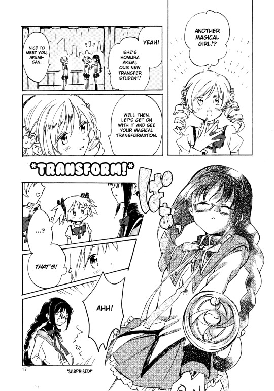
I'm very slowly working on a very long PMMM doujinshi, here's a sample page of my work and what I mean about making things look "right" (in regards to text placement, cleaning bubbles, etc). My personal preference is to break up words as seldom as possible, which is a philosophy even a lot of official typesetters don't share lol (probably because a lot of typesetters value speed over little touches like that).
Anyway, Photoshop will be your best friend! I'll be honest, it's been a hot minute since I pirated my copy and I don't even think the method is valid anymore. From what I understand GenP (Windows) and AdobeZii (Mac) are the new methods of cracking Photoshop. Here are the GenP and AdobeZii subreddits for guidance. Also, if you have a Mac apparently downloading directly from Cmacked is the way to get Photoshop.
Anyway, I really can't get into all the tricks and intricacies I've learned over the years about typesetting. However, I found this AMAZING, comprehensive guide that I would strongly suggest using as a reference. They cover all of the fundamentals as well as a lot of the extras. There's even a few things in here that I wasn't aware of and will definitely be brushing up on!
I've also uploaded my font reference file to Google Docs. All the fonts show up as arial, but I've included screencaps of what they look like. These are all free fonts and can be found/downloaded if you just Google the name. Generally, Wild Words is considered the standard font in manga/doujinshi scanlations (although of course there are variants). It's what I use in all my standard text. All the rest are for sound effects, aside text, emotional text that is meant to be elevated, etc.
I would also suggest at least downloading custom heart and star shapes (or brushes) for Photoshop; there are a bunch of free ones available and those shapes tend to come up in manga speech bubbles a lot.
Oh, and make sure you make a credits page for your releases. Mine are super bare-bones (just white text on a black background for the most part) but you deserve to be credited for your labor! So does whoever translated the manga. Once you get the series up and rolling I would suggest starting to upload to Mangadex (the hub of scanlation where tens of thousands of people can see what you've made). If you need help figuring out how to do that, hit me up again when you get to that point. You'll have to create a group but it's super easy.
Am I forgetting anything else? This is such a near and dear hobby of mine and I feel like there's just so much to cover, lol. Please let me know if you have any other questions!
39 notes
·
View notes
Text

my theme / graphics / design F.A.Q.
@ my anons and a few others who've been asking some questions + some help, i just compiled every question into one post 👍
disclaimer: i am very much an amateur in making graphics so i still don't know everything there is to know, but i think it's good to make graphic design and editing seem more accessible and less intimidating! so like don't go to me for actual professional advice
.001 | header templates
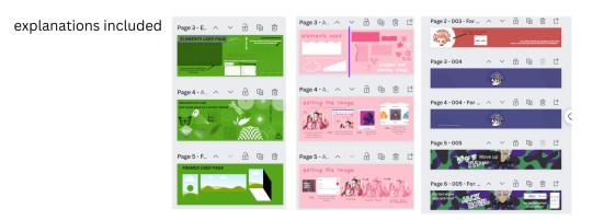
if you don't really feel like reading and just want to experience everything for yourself, here's a bunch of templates i made today. play around with them if u want :> i used canva since it's available both on mobile and pc but if you prefer to use a different app you can just check the specs/see if your app has similar functions
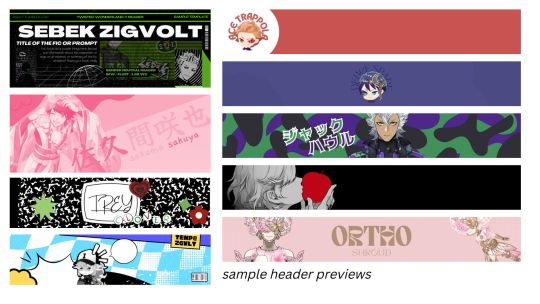
TEMPLATE LINKS (I won't know who's made copies of the templates so it's fine if you're worried about being exposed): [1: SEBEK] [2: SAKUYA (PINK)] [3: FIRST YEARS] [4: TREY AND IDIA]
if someone is interested in using any of these as inspo or as a base i don't mind, and i don't need credit either 👍 but if you wanna let me know bc i'm a bit nosy go ahead
.002 | what apps would you recommend for editing? (mobile and desktop)
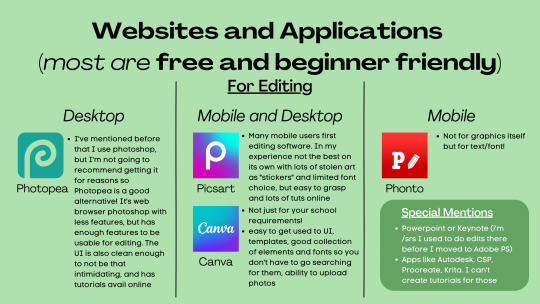
Desktop:
photopea , if you want a browser alternative to PS. i tried it out for maybe twenty minutes and a bunch of the basic features i need in PS are present there, it's definitely good if you want to experiment more as opposed to other apps. here's a tutorial for it
Mobile and Desktop:
picsart [desktop] [google play] [apple app store]: i think a lot of people start out with picsart and i totally get it! it's very easy to use, there's also a lot of tutorials for it on YouTube :>
> list of tutorials from their blog
> this playlist of tutorials by tutorial edits
canva [desktop] [google play] [apple app store]: so so elite i love canva. there are times where i do prefer the freedom that powerpoint gives me but canva is just convenient. anyway she's good both for ur powerpoints in class and pretty decent for editing. the templates i made above are my first time doing edits (not for school) with canva and i think they turned out alright!
> official canva tutorials
> this pinterest user's short-form canva tuts
> canva search keywords lists: [one] [two] [three] [four]
Mobile Only:
phonto [google play] [apple app store]: ily phonto, here's a tutorial
apps like krita or autodesk or csp or medibang or procreate are likely usable as well, i just don't exactly have advice for them since i don't use them
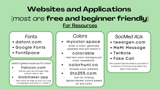
Websites for Fonts:
dafont.com
Google Fonts
FontSpace
freejapanesefont.com
font identifiers
[whatthefont]
[fontsquirrel]
Websites for images/elements:
flaticon
blobmaker.app (saves as svg, use a svg to png/jpg converter if you don't use an app that allows svgs)
getwaves.io (saves as svg, use a svg to png/jpg converter if you don't use an app that allows svgs)
haikei.app (basically a combination of blobmaker, getwaves, and a few other apps)
Colors:
mycolor.space
colorable
colorhunt.co
0to255.com
colormind.io
color tool
css drive (upload image, generate palette)
SocMed AU purposes:
tweetgen
MeMi Message (google play and apple appstore)
TwiNote (google play and apple appstore)
Fake Call
i used to use social maker and social dummy but i can't find them anymore lol
.003 | squiggly?
refer to blobmaker, getwaves, and haikei for squiggly :>
.004 | pretty themes for tumblr desktop
you can search the following tumblr blogs
theme-hunter
magnusthemes
ricecodes
kosmique
.005 | how can i make my theme prettier?
decorating your text posts:
coolsymbol.com
kaomoji
copy paste dividers
post dividers [making your own, tutorial using photopea] [masterlist of dividers by firefly-graphics]
how to get gradient text on tumblr posts + gradient recs
theme banners/headers:
specs of the tumblr header: 640 x 360 pixels on mobile, 3000 x 1055 pixels on desktop
premade headers:
[headers by spidaerman]
[headers by ridleey] [alt link]
[headers by villanaelle]
.006 | how to add *that* thing to the tumblr header theme
for this part let's use canva again. the mobile theme header is 640x360px but you can totally adjust it to be bigger (but maintaining the same width to height ratio)
so let's say this is the picture you want as your header, how do we add the details at the bottom? you can pretty much get any shape you want, whether it be from canva elements or one of the sites i mentioned or any other source you have. for this tutorial let's just use the ones on canva
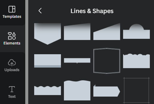
by scrolling through the elements portion, in this instance the lines & shapes portion, you can find a few that would work well
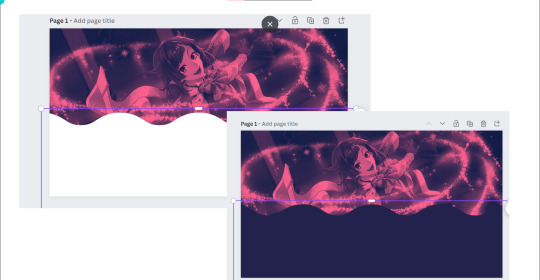
when you choose what you want, adjust it both size and color wise, and make sure there's a substantial enough amount of space for other details of your blog to fit (icon if you're not hiding it, blog name)
remember to save the color of the element! copy paste that hex code! or just have it somewhere where you can look back at it easily
when you're satisfied, save it! then go on tumblr -> settings -> select the blog that you want to edit
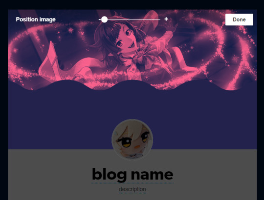
place the banner, and if you did it right it should be a perfect fit, but you can zoom in if you want! :> but wait we're not yet done! the colors don't create *that* effect yet
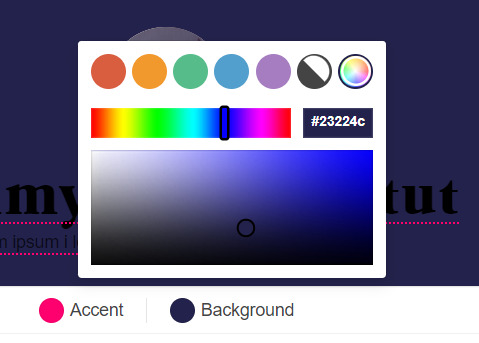
change the background color to match the bottom color of the header! (and the accent as and text colors as well, if you want!)
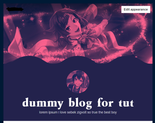
and we're done!
i think these are all the questions i've gotten so far? hopefully it helps!
162 notes
·
View notes
Note
How did it feel to publish a fic here for the first time? I would really like to start writing bsd×reader, but I feel very nervous, I don't understand the app much.
Oh anon, my first fic was Mushitaro x reader, it was a vomit of 7k words just because I needed some smut for him. At the time I was also highly unaware of how the app works, I didn't know how to add "read more", my first ever ask was telling me that I should add that because it's annoying to scroll over massive works LOL
For me personally, I just enjoyed to share the love for Mushitaro. I wasn't expecting anything from it, I had no clue about stuff. I barely knew how to tag properly, I just copy pasted, added tags and posted it. Unedited, unseparated, absolutely with no thoughts in my head LMAO
Heads up, all I speak for is for mobile :)
However, you learn as you go. I want you to know that you don't need a perfect aesthetic and those things are always managable later. When it comes to a fic itself - make sure to have either CW/TW, summary or what a fic contains so people know what they are getting into. You add :readmore: + enter to add that separator I mentioned - I usually do it after the name of the fic, some people do it after first paragraph or so. Some people's works are shorter so there is no need for that.
Second, make sure to use normal font because some people don't see well. It's okay to use smaller fonts if your followers/readers don't mind - you can always check their preference! Some people enjoy the smaller font for aesthetic purposes, however practicality wise - it may be hard to read for some people. Don't be afraid to ask! Also, keeping regular font is perfectly fine :)
Third thing, tags. Tags are right there, you can always see how people tag. Example - you write Dazai. Tags: dazai x reader (enter), dazai osamu x reader (enter), dazai x reader (fluff - if it's fluff) (enter), dazai osamu smut (enter), bsd x reader (enter), etc!
As for more aesthetic things such as colorful separators - there are accounts that post them! I am not entirely sure how you make one yourself, but there are tutorials. You can always go on those accouts, download a separator as a photo (add it through a photo option and place it where you need it by holding it and dragging to that place) and tag the account at the end/beginning for credits! :)
Fonts - they are on bottom left. You can just keep the cursor line in the paragraph/sentence/line you want certain font at and click. However, if you want to do this or this or this or this - you hold a word you want it for and you will see the little panel come up where you can choose. It you want it in a sentence/paragraph - select all and choose the font you want! :) This also applies to colors! On PC/laptop you can add more colors through web, but on the phone it's not avaliable :/
Make sure to separate paragraphs so it's more readable. You can use one or two enters between paragraphs - whatever works for you!
As for some other things - if you reply asks, you can add tags such as #yourname/nickname answers or anything else. Some people use different things! It's okay to get creative.
If your moot/someone whose name you know sends an ask - you can use specific tag for that person. I use "my sweet xyz", some people use different things. Some people don't use tags at all! It's all down to a personal preference :)
Lastly, don't be afraid! We all learn as we go, we are all humans. Mistakes happen and it's normal to have a period of trial and error. If simpler approach works for you - amazing! There is nothing wrong with that. If you prefer more aesthetic/harder work approach - amazing! There is nothing wrong with that either :)
If this is something you desire, trust me, people will enjoy your works! Other things we can always help each other with, nobody is born knowing everything. If anyone is mean about a certain thing - oh well. You will learn and it will be perfectly fine. Just go for it, I am sure you will do an incredible job. Don't stress yourself, share your thoughts and talent, enjoy yourself!
I promise it's won't be as nearly bad as you make it in your head. Quite the opposite - I am sure it will be amazing. Your writing and practical skills about the app will evolve and grow. Don't expect perfection from yourself on the first try, and trust me, even when you know you made a mistake at some point - it will just be a reason more to be proud because you came so far.
So, I encourage you to start it, take it easy and don't overstress. If your wish is to write and post - do it, everything else will come as you go. I promise it will be much better than you expected and people are so sweet, someone will always help you if you need it, I promise :)
#stinkyanswers#you can always ask me and i will try my best to help#just post and enjoy yourself#it will be perfectly okay#it's not as intimidating once you go through that first moment of it#so just go for it and here is a lovely community where people will always help :D
6 notes
·
View notes
Note
hellooo today's reminder is I'm going to bed at 3 instead of 4 today and I'm counting that as a win also my sweet potato lunch was delicious so that's pretty much my entire day right there lol
Hiiii, it's totally a win an hour early is still earlier than normal. I'm glad your lunch was delicious. That's still a good day. Sleep well and I hope you have another yummy meal tomorrow. Oh so I'm currently back in my Rory Culkin phase and I will be binging his movies soon. And it's not even funny how predictable my type is like I literally keep falling for the same man in different fonts. Even the guy I'm seeing is an absolute carbon copy. There has to be a reason my type has been so consistent since I was 10.
I don't know if I make my type outside of kpop obvious but this is it. If you tell me Hyunjin falls in line with this genre of men there is no hope for me I'm locked in.
2 notes
·
View notes
Note
hey! i found you thru your neocities site and really really wanted to ask, how did you code your art gallery? it's lovely and perfect and i high-key want to steal it
THANK YOU FIRST OF ALL!
secondly... I wish i could give you a comprehensive answer but truth is since i worked on it for over a year i don't remember everything i did? a lot of the things i achieve with my markup is based on trial and error and testing different solutions. i don't actually know what i'm doing lol. i use a lot of tutorials and old forum posts and such and i wish i could just link those but when so much time has passed i can't remember everything i looked up. HOWEVER i'll try my best to provide some basic guidance to what's what, and what it does in my markup, to make it easier if you want to copy my shoestring bullshit. (and past how embarrassing it is that my markup is so messy and inefficient, i have no problem with anyone referencing my source or even copy pasting whole chunks of it to have a base to work from if they wanna make something similar to me. no credit needed ofc , just don't use any of my assets or style it the exact same, make it your own! )
THIS IS GONNA BE A LONG POST SORRY SO I'M GONNA HAVE TO PUT THE REST OF IT UNDER A "KEEP READING" , ANYTHING ELSE WOULD BE INHUMANE...
here are links to the relevant sources for the page, there's also another stylesheet linked but this is just a very basic one for my website that has my fonts and scrollbar styling so it's not important here.
view-source:https://korsse.neocities.org/gallery view-source:https://korsse.neocities.org/sidebarstyle.css
(no idea if these links will work for you or if its different per browser or what, if they don't just go to my gallery and right-click view source or inspect or smth)
btw before reading further its useful to know that i use https://www.w3schools.com/ a lot (playing around with the tryit editor is really helpful to understand HOW shit works. sometimes i even make the basic structure i want in the w3s editor isolated from the rest of my messy markup to ensure i get the basics of it to work before i integrate. this way i know that if it breaks it's because it's conflicting with other shit on the page and not because i fundamentally fucked up. ) and i'm just going to assume you know the basics of stuff like what a div is and the difference between class and id etc...
my gallery is largely based on 3 main types of thing(?) : modal images, tabs and collapsible.
THUMBNAILS AND MODALS
my thumbnails are also css, (I KNOW the method i used for my thumbs is something i got off some forum post or reddit comment or substack or whatever, i can't find it again though.) HOWEVER I would not recommend doing thumbnails the way i did because you do not get an appealing custom crop (or i guess you probably could in theory but to do that for every image would be more work than its worth) and because considering it's really just the full image sized down and cropped with styling, it takes a long ass time to load. ( the only reason i do it this way is to not have to make, edit and host individual thumbnails for 6 years worth of art. it's a real menial task to do when you'd have to do it for over 400 images ) but if you need uniform sized thumbnails the best way to do it afaik is to make them in whatever graphics editor you have. i'm unsure if this would be compatible with image modals ( as constructed in the w3s tutorial ) but if not you could probably just make a box modal do the same thing and have the thumbnails be buttons styled with inline css like this:
<button id="whatever your id is" style="background-image:url(thumbnail path)">
to make them work as thumbnails though you'd have to make all the dimensions of the actual image file for each thumbnail true to the pixel height/width you'd want them to display as on the page and use css to style all the buttons to be those same dimensions. this will interfere with other buttons on the page but you can probably get around this with making a button class. like for example if your thumbnails are 100x100px you slap this in your css
button.thumb {width:100px; height:100px;}
and add this to the button tag
<button id="whatever your id is" class="thumb" style="background-image:url(thumbnail path)">
HOWEVER... this might mean you'd have to make a new modal (on the html side) for every single image so it's probably not ideal if you're gonna have over 400 images like i do... there should be ways to make multiple modals on the same page not a nightmare but you'd have to keep track of unique ids for each one at the very least.
here are both links to the basic w3s modal image and modal box tutorials for convenience.
wish i could have explained what i did better but the modal was like the first thing i did,
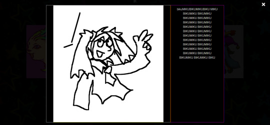
and was kind of a nightmare to figure out because i originally wanted it to display a description using the alt text styled in a very specific way that i ended up scrapping because it was broken as fuck and evil and bad. (cw: gore in the bg of the image below btw)
my memory has been corrupted so that the battle with the alt text is all i remember from making it rather than the useful stuff that survived into the current version lololol.
tabs
ok now we're getting into the layout of the page itself. my gallery consists of a sidebar and the page content
in the sidebar the bottom two boxes have the universal stuff that goes on every page that has the sidebar, and the links are just normal links to individual pages. but the top box with the red "links" is the gallery navigation right? and they are not links at all, they're buttons to designated tabs.
for the BASIC layout of the page, it's split into two divs called "sidenav" and "main". [sidenav] is everything that goes in the sidebar space and [main] is literally everything else. there should be nothing directly in the [main] div except for other divs, it is merely a container for the tabs. each and every "page" is a tab, including the "Art" tab that is open by default (i might be wrong but iirc what tab is open by default is simply decided by which one is first in the html document i am so so wrong, it's determined by id in the javascript.)
tab buttons go inside the sidenav div and tabcontent goes inside the main div. i have my tabs styled as inline-block, i can't remember if it matters that much or not but you know... considering what inline-block is, it probably does?
tabcontent contains everything the visitor will see, for most of my gallery tabs this means thumbnails. my thumbnails are laid out in a grid using div classes called "row" and "column" four [column] divs go inside one [row] with one thumbnail directly inside each [column] div. each new line of thumbnails is a new [row] div with another 4 [columns] and their contents, you get it, it's not complicated, just verbose. there are lots of other less amateur ways you can display shit in a grid layout using html/css but my brain is small so this works for me!! :,D
even though they might seem intimidating with the javascript required, tabs in general are pretty simple if you follow the w3s tutorial (there's even one specifically for vertical tabs) . just make sure to keep all the contents of each tab INSIDE said tab and it shouldn't cause much trouble.
since my gallery is so bloated with image links and such i thought i'd also link this example page ( and the source: view-source:https://korsse.neocities.org/temp/exampleignorethis ) i made on the fly for someone else a long time ago. its just a hodgepodge of copy pasted w3s stuff to quickly show off a navbar with tabs and "accordions" (more or less the same thing as collapsible just called smth different in a menu context?) but it's kind of a simple version of the same stuff i did with my gallery? perhaps it can be useful for you as an example, perhaps not. but i might as well link it just in case lol.
collapsibles
the doodle tab also has collapsibles! idk if you even care about this but it's part of my gallery and one of the more fun features that isn't present in your average neocities gallery page. (talking out my ass, maybe they are super common idk, i haven't checked)
the collapsible aren't any more complicated than tabs, and their integration into my gallery isn't any worse than putting the buttons and collapsible content div inside the tabcontent and putting the thumbnails inside the collapsible content div. style as desired with css to make it look the way you want. i didn't do anything too fancy with it. once again easy-peasy if you use the w3s tutorial
uhhh i think that's it? there is more stuff i could explain but i have very little experience with writing explanations like this so i'll leave it at this to start. but don't hesitate to ask if there's anything specific you found confusing, or anything else about how my gallery works that you want me to go into ! ik i could have been more concise but i'd be here all day retyping stuff so i hope u could bear with my long wall of text, i'm not a writer ^^' (i'm a rambler). good luck on your webpage endeavors!
3 notes
·
View notes
Note
hello :3 could you make a tutorial on your hyunjin day gfx please :3
oh wow! sure, i don't make gfx that don't have gifs much so my process is kind of a mess but i'll try to make it a bit understandable! lol
basic photoshop understanding is needed here, like knowing how to use layer masks & clipping mask the most, also how to cut the background of pictures!
we're making this!
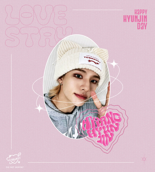
under the cut bc it's kind of image heavy, if something isn't clear pls let me know so i can explain better <3
I started on a blank canvas of 540x600px and colored the background with the shade of pink i wanted to work with, on top of that i added a half tone texture image i found online (i think from deviantart? or maybe another place idk) changed it's blending mode to lighten, adjusted the size and then reduced the opacity of that layer so it didn't look too much in my face. this is what we have so far (ignore the cyan lines, it's only a guide to center everything in the canvas)
now i go to the left panel and click on the shapes tool and choose the ellipse one and draw an elipse in the canvas, the size of the ellipse depends on you tbh, i didn't make it too big bc i knew there was going to be a lot happening in my canvas and i needed the space to work so it's your choice how big you'll make it. once i made the ellipse, i made sure it was centered and proceeded to work on the picture i used
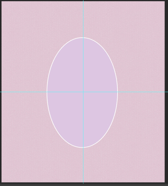
the settings my ellipse had

now the hyun pic! i opened it in another tab on photoshop, and with the pen tool i traced all of hyunjin's shape as if i was working on to erase the background (you can use the quick selection tool or the wand, i prefer the pen tool to erase backgrounds tbh) and then i went right click -> layer via copy (this is very important!) and when i had two layers (the original picture and the new layer of only hyunjin) i dragged them to my gfx canvas, and then resized it around the same height my ellipse was
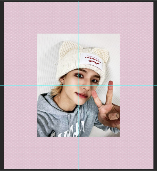
make sure the pictures are ON TOP of the ellipse!!! now select only the layer of the full picture and then right click -> create clipping mask and the full picture will be inside the ellipse
your layers panel should look like this
and your canvas like this
we're almost there! now we select the layer that only has hyunjin and we add a LAYER MASK to it, and with a black brush we paint the parts we want to erase
your layer should be something like this
and the canvas like this
now i added some decorations, found the sparkly lines i used around the image on pinterest! they are called monoline frames and there's lots of them to pick tbh, the one i found had a white background so i just inverted the color of it and then changed the blending mode to screen so only the lines of the frames were visible and then erased anything i didn't want with a layer mask, it would have been easier to find just a transparent image but pinterest doesn't have those so i had to make do lol
the layer panel now looks like this for me
and the canvas
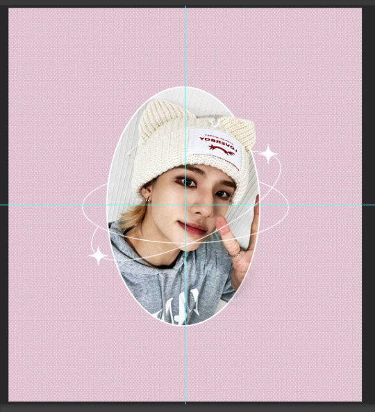
after this i worked on the typography! for the "love stay" i used the font called "Cleo Folk", i arranged it so on the layers panel it would be under the layer of the ellipse, then for the text that says happy hyunjin day i used the font "Gobold Extra 2". i added some lines using the line shape tool too
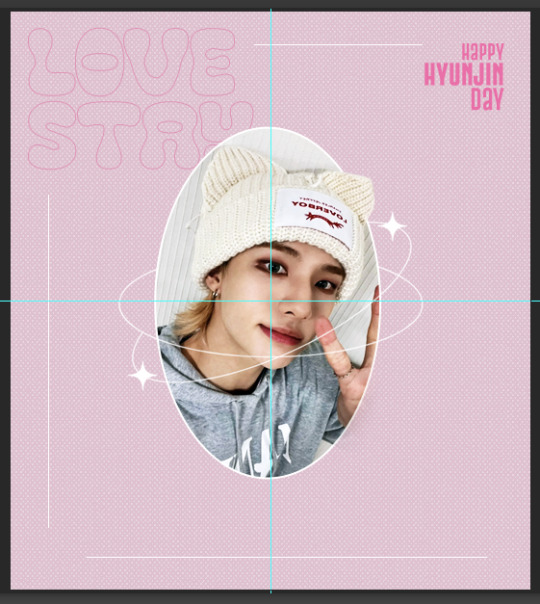
the heart shaped thing that says "hwang hyunjin" is a custom i made myself messing around and if you want to know how just let me know! but you can just use a warped text, it won't look like it's inside a heart but it'll still look pretty ! after that i added my watermark in the corner and saved it as png and all done! for the other image on the set the process was the exact same!
finished result!
i hope this helps? if i missed any detail please let me know!!
11 notes
·
View notes
Text
using calmly writer again. i used it way back when it was just a chrome extension and now they do have the online version available but they've also moved to a downloadable software. decided to try it out for this one oneshot i am working on bc i wanted more font options (only three on the online version but Much More in the download which is nice, especially since i can use lucida grande, ao3's font, that was a very nice find)
it also has different background presets and there's this one...
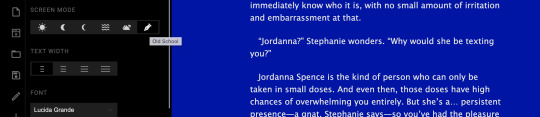
sort of. curious. i mean. old school. from where. i was so surprised when i clicked it and then everything changed this... very bright bright LOL. or not bright. but. idk. it Stands Out
ETA: it also has this awesome typewriter sound for when you type! do really like that too
otherwise. pretty solid program. you do need a license to keep using the program and its... $12 USD i think? but you can also download it without putting in payment info and it'll give you an unknown amount of time for the trial, which is what i am on. $12 is pretty good, i think, but i like formatting my writing in..... classic book format? (no idea what it should be called but like. no spaces between paragraphs and indents/tabs at the start of each one, you know) and when pasting over from docs, it does get rid of that/other formatting like italics.
you can indent in the software (but not online, also another reason i decided to give the download a try) but it's kind of. well. gestures to the picture. it doesn't do it automatically, either, you have to do it each time. also don't even know if those indents will hold when i export it which might Stink but i'm saving that problem for my future self (so, like, later tonight). also for a proper em dash, you have to hit '-' three times; two makes it Very Small and again. don't know how it holds when its being exported so i just want to be safe/stay consistent with how long the em dashes were originally when typed in docs
that's really the main thing with it. i like my indents. and i also always copy and paste stuff back into google docs when i'm done working on my laptop (where i might ordinarily use scrivener to write, which doesn't give me any problems with any of these things and with copying back to docs), that way i can keep writing on my phone if i'm going to bed or something. of course now i'm using calmly as like... new program. new inspo. i love environmental changes As We All Know. so i'm overlooking it for the grind (the writing)
#here's the program review no one asked for#and probably too much information about the things i am finicky about when it comes to writing#😎😎😎😎😎😎😎😎😎#its really just because i know this wip is a oneshot that im like#okay lets suffer through some potential issues when it comes to exporting back to docs#because it's one thing. so. yeah#might keep using it too since you can use the trial for an undetermined amount of time#seriously theres no set limit LOL#not complaining tho#at the end of the day i love scrivener and i will always be loyal to her#but i can never say no to a new program#LMAO
5 notes
·
View notes
Note
Hello! Would your OW posters be available to buy at all? I would like to own one (or more) - maybe brittle hollow or dark bramble :) ty!!
!! aa I'm very flattered that folks would want to buy my posters, thank you so much!! unfortunately since I'm just a hobbyist artist I don't think I really know how to set up an online shop, and also the font I'm using (NPS 1935) is technically for non-commercial use only lol, so I probably won't be able to sell these. but honestly if you just want to like, print yourself a copy at your local print shop and hang it on your wall (as long as you're not reselling them) that'd be completely fine by me!
and !! I'm almost done with the timber hearth poster, brittle hollow and dark bramble are coming up next!! though I'm very slow at art so it might be a while until I actually post them rip :'D but I definitely want to finish the series!!!
7 notes
·
View notes
Note
hello!! Ur theme and carrd are such a vibe I can’t !!!! :) can I ask how you made your carrd?? It’s so so cute with the little outfit icons :) I hope you have a wonderful day !!
AAAAA OMG THANK U :') i was so excited abt my carrd idea i'm glad someone else also likes it LOL
i made the outfits myself on everskies ! but if you don't want to scroll pages of pixelated clothes for hours like me you can look up everskies on pinterest,, i wanted mine to be personalized so :')
from the wardrobe Or the blog screen (going thru the top-right icon) i'd screenshot the outfit (i use the lightshot screenshot extension if...anyone needs to know...) i made then erase the background! badabing badaboom u can put the png anywhere u'd like :]
more settings for My carrd layout specifically below if...wanted.!?!?!
theeenn on carrd it looks like this!
^^ two columns, 60-40 ratio . gallery on the left (image captions below,, i had a margin of 0.5) and stacked buttons on the right ! i just messed w the gallery (and rlly everything) so the layout would line up well LOL
^^ individual section settings! 2 columns, 20-80 ratio . my images are scaled to 50% and my font was Infer at 0.75
i'm not sure how much experience u have w carrd or if anyone really...wants to copy this exactly...but um. just y'know. controls for each section,, mess w the animation > default to fade in at 1s duration. it was the home page that had me screaming since i was changing the delay / stagger of every element 😵💫😵💫
really truly if u get the everskies outfits u can do whatever u'd like i just like talking about my carrds LOLOLOL
#🧾nia.answers#<3 zia#carrd#it wasnt vry Difficult just a bit tedious#as carrds can be#i can and will give the specific delays/fonts/margins/etc if asked#i can and will also send u a copy of the carrd if asked#IDC!#everyone should get to dress up
3 notes
·
View notes
Note
hello💐 sorry to bother you but I have a question. how do you make the images have the same size for the edits? and how can i make the text in the edit be in the same spot as the other image?. sometimes i try to do it but the text looks lower than the previous photo.
hiii, you're not bothering me at all! ✨
it's under the cut, hope it's useful. long story super short, you just duplicate your layer once you make the first one.
for the images, i usually just start a new canvas (so instead of opening the image you want to use directly in photoshop, you hit CTRL + N / or go to File -> New) and type the size i need. then drag the main picture in (or if you don't want to save the picture in your computer, you can go on pinterest or wherever you get your pictures from and click right -> copy image -> then back in photoshop hit CTRL + V to paste it).
note: i like the use the highest quality for my pictures, so i get them from pinterest, i usually do a reverse google search (drag the image into google images) and save the one with the highest resolution.
then you can drag it, rotate it, crop it etc. etc. to make sure it fits in the canvas the way you want it to. i suggest saving the picture and then dragging it into photoshop from your folders simply because once you let go of it, if you later decide to change it's dimension it will lose resolution.
for the text we have some options, and i just spent like an hour explaining the hardest one just to realize i could make it so much easier so... lemme re-write this real quick lol
do your text however you want it (font, size, placement etc.) in your "main" panel / first panel.
note: i usually put all my text layers in one folder to make the next step easier if i have more than one line of text.
right now my text / panel looks like this:
and i'm very neat with my layers, but you don't have to be, really. just make sure everything's in one folder.
the next step is one of my most hated... guidelines (and you can skip it, really, you'll see why). make sure you have the ruler visible (CTRL + R).
i know there's more than one way of doing this, but i just... drag them around. this is why it's super helpful to have your text all in one folder, for me at least, because you're gonna "guide" yourself after the corners of your layers (no idea how to explain this better, you'll see in the pictures). so drag two (or more) guidelines in your first panel, around where you want your text to be (you can move them around later, this is just to have an idea of what's gonna happen) (for better precision, hold SHIFT while you draw them). it will look like this:
then with your text folder selected, hit CTRL + T so you get the blue "border" around it. in order for this to work better, make sure each individual text layer is set to Paragraph Text (if it's not, right click it -> convert to paragraph text). you'll have this:
take your blue rectangle and make sure the sides are perfectly aligned with your guidelines. normally they should snap to the guidelines pretty easily, so that shouldn't be hard. if they don't snap perfectly, you can move the rectangle around with your arrow keys once you have it close to where it should be. eventually, it should look like this:
notice how the right side and the top are exactly on the guideline.
now, this is the easy part. go to Image -> Duplicate... and duplicate your current layer. this will create an entirely new panel exactly like the one you just made, with your guidelines in the same place and all your other layers. you can then drag another image instead of the one in your "main" panel. like this:
now, obviously, if you're gonna change the content of your text, it will move around slightly. so take into consideration if your text is different, it's impossible for it to be in the exact same place, so it's up to you later to move it as you please to make it look similar. at least, you'll have it in the same area.
to be fair, you don't really need the guidelines if you do it like this, but i found that it's easier for me to work if i have them... so i thought i'll give you this option as well. this is why i said you can skip the guidelines step.
but let's say you decide to make some simple posters like these:
your text will be exactly the same, the placement will be exactly the same, all you need to do is duplicate your first panel and replace the picture.
as dumb as it might sound, i always go the harder way and do everything manually instead of duplicating my layers, but that's because i'm an idiot.
sorry this was so long, but i do hope it was useful!
10 notes
·
View notes
Note
1, 3, 7, 16, 23 and 25 for the weird writing asks!
lee!! thank you!!!
1: What font do you write in? Do you actually care or is that just the default setting? I write in Times New Roman 12pt!! It used to be the default setting on Word like. 2006 or whatever but currently default on Word is Calibri and I hate Calibri so I change it Every Time lol. I also never write in Docs if I can help it which is why I'm talking about Word defaults :')
3: What is your writing ritual and why is it cursed? I don't necessarily have a writing ritual? except maybe that almost everything I write I start with it handwritten first. like two of my most recent fics I wrote like...2k+ words in tiny handwriting in my writing notebook before I copied it over to Word lol I think that's pretty cursed just because it's kind of insane. who does that amirite
7: What is your deepest joy about writing? getting to describe the world the way I see it and have other people perceive it that way! I'm constantly describing the world in my head in very abstract, flowery prose, so when I get to write descriptions of environments and sensations the way I experience them it feels really freeing and lovely.
16: What’s the weirdest thing you’ve ever used as a bookmark? uhhhhhhh I think I once used the cover of a separate book I was reading lmao? I have always had a ton of bookmarks though bc my ocd doesn't like letting me use non-bookmarks as bookmarks so I don't really use anything else for them.
23: Describe the physical environment in which you write. Be as detailed as possible. Tell me what’s around you as you work. Paint me a picture. oh man, I write anywhere. my primary two right now though:
- behind the information desk at work. surrounded on three sides by plexiglass above an old wooden desk. the peaked ceiling above collects sound and bounces it directly back to you, so it's either complete silence or tripled screaming of the small children playing in the picture book area beside the desk. leaning back in an old computer chair, small notebook gripped in one hand and a pencil or pen in the other.
- somewhere in my living room, usually in our wingback armchair, legs either pulled up cross-legged or turned sideways and draped over the arm of the chair. laptop balanced precariously somewhere in lap, typing frantically while staring either at a shelf of board games or outside the balcony doors, focusing through the middle distance.
25: What is a weird, hyper-specific detail you know about one of your characters that is completely irrelevant to the story? my OC Amira really loves playing the Elder Scrolls games, specifically seeing how badly she can break Oblivion on the Xbox.
1 note
·
View note
Last Seen Blogs

archiveduquotidien
archive du quotidien

bheakawaii
ⓢⓐⓢⓤⓢⓐⓚⓤ ♚♡♛
surr3al1sm
⚡️ Rose ⚡️

weloveenb-blog
Everything'N'Between

leatherdungeonslave
Untitled