#gouache painting tips
Text

And for those who don't know, you can't get magenta by mixing. You'll need to buy it.
Edit: Quick observation, this advice is for mixing paints and pigments, other mediums have different color specifications.
#painting#art#artist on tumblr#art community#color theory#watercolor#oil painting#gouache#acrilic painting#oil paint#acrilic paint#art tumblr#art tips#memes#art memes#artist#art advice#art help
892 notes
·
View notes
Text


⭐️|⭐️
(from concept sketch on the notepad app, to procreate concept, to finished!)

#still trying to figure out how to paint with gouache!!#can’t figure out how to get rid of the paint strokes#anyone have any tips????#gouache#acrylic#the eyes are acrylic!#painting#me
61 notes
·
View notes
Text
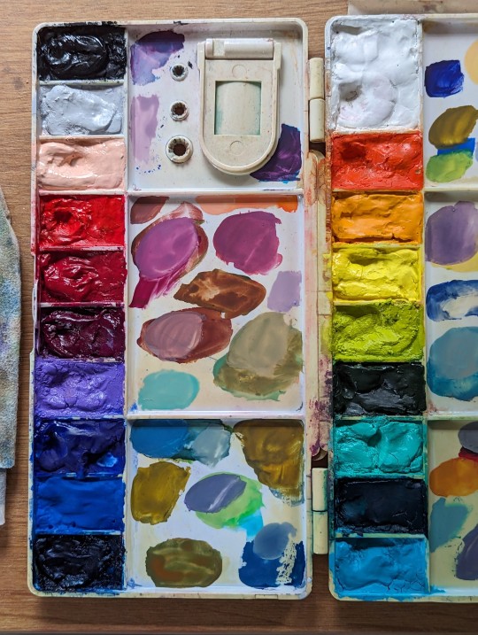
this is my current gouache palette - set up travel style for summer plein air etc - and I've decided i don't want to bother with earth tones in it.
thing is, in watercolour, there's a lot of richness in a burnt umber or raw sienna or yellow ochre - their relative transparency gives them depth. but in gouache, I find them to be extremely neutral and intensely neutralizing in mixes. Which has its time and place! But what if I just mixed my own when i needed them and dedicated the twenty wells I have to a much higher saturation selection?
but that does mean I need to learn how to mix neutrals with this palette...
so that's what I've done:
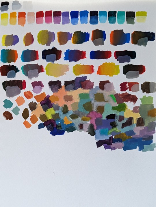


so far so good! it'll take a bit to internalize all these formulas but at least i have a sense of what's possible 👍👍
22 notes
·
View notes
Text
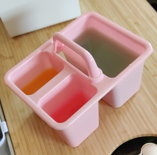
Pro gouache/watercolor painter's tip:
Instead of spending way too much money on a 3 compartment brush rinse thing made for rinsing brushes, get one of these 3 compartment toothbrush organizer things from the dollar store instead! You can keep your colors separated meaning much fewer trips to change out your water.
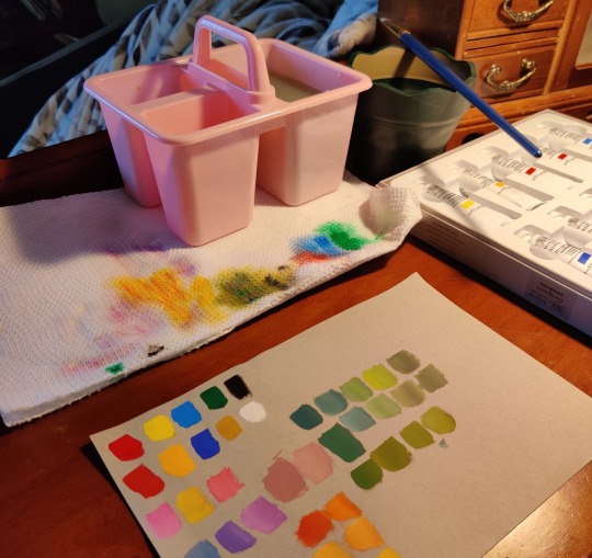
Here is mine in action while testing a new set of gouache paints. I also really recommend having an extra cup on the side like our green one in the picture for clean water. We use this for one last extra rinse after rinsing in the toothbrush holder and we also use it when we need to add water to our paints since gouache is a water based medium.
14 notes
·
View notes
Note
Hello! Just wondering if you have any tips on how to draw water since I saw your piece with wind sailing, the water in it looks WONDERFUL :0
Gonna be honest here, I never know what I’m doing when drawing water lmao, so I decided to record myself drawing some water
Credit to @kesoo for editing this, my condolences to all of you for letting Keso edit this
#sorry for the quality too#but uhhhh ye that’s pretty much how I did the wind illustration#only difference is that the og is done with markers and gouache paint instead of digitally#i guess one tip I can give is by making the water riplles and shading go in the same direction it looks more natural??#hhh I don’t have the vocabulary to explain
139 notes
·
View notes
Text
guys i couldn’t hold back …. my set of himi gouache arrives today
#the paint is so gorgeous i want to eat it#now i gotta learn gouache#if anyone has any general tips i’d be happy to hear! i#i’m not super experienced with painting
12 notes
·
View notes
Text
Nauset Lighthouse in Eastham, Massachusetts on the Outer Arm of Cape Cod. This is a quick gouache study on canvas. My photo was from midday with a cloudless sky and it didn’t make for much contrast, it’s actually harder to work with that because it tends to come out a bit cartoonish. Good practice though.
I use Holbein Acrylagouache because they are opaque, dry fast, and a saturated with color. There’s not much chance for blending so I use white gesso to reprime the canvas and mix my blues in to make an ombré sky.
#Nauset light#lighthouse#lighthouse painting#gouache#gouachepainting#gouache painting#painting tips#timelapse#timelapse art#art#painting techniques#cape cod#Massachusetts
5 notes
·
View notes
Text
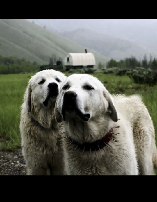
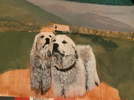
I started this painting on April 9th (2k23). I Have only ever worked on it on like, threee?? separate occasions since. Am I ever going to finish it? Probably not. Am I posting it anyways? Yes. Do I hate the way it looks? Also yes. But here you go. Pls give advice thx💕.
#art#artists on tumblr#drawing#art journal#artwork#my art#gouache painting#gouache#new artist#art tips#traditional art#new painting#very tired#dogs#dogs with jobs#spike collar#underpainting#sketch#sketchbook#sketches#painting#painter#farm dog#grassy meadow#farmhouse#sheep dog#white dog#labrador#labrador retriever#golden retriever
2 notes
·
View notes
Text
Ppl who use gouache is it easily draw-over-able? I find my fineliners like microns etc get gummed up when I draw over my inks, and I’ve been wanting to try gouache too
6 notes
·
View notes
Text
Ever since i picked up gouache paint ...
i realize i've become a mage, not because of my abilities growing ever farther, but because i learned the endless page spell.
don't like a page in my sketchbook? paint over it, still don't like it? paint over it again.
endless pages, endless possibilities.
0 notes
Text
still working on figuring out how to paint with gouache (after using acrylics) any tips would be very appreciated :)
0 notes
Text


Black-and-White Warbler
Gouache and Ballpoint Pen on 8x10 inch Wood Panel
Painting no. 5 in the "In Bloom" series, availability TBA
Print Shop | Commissions | Tip/Donate
252 notes
·
View notes
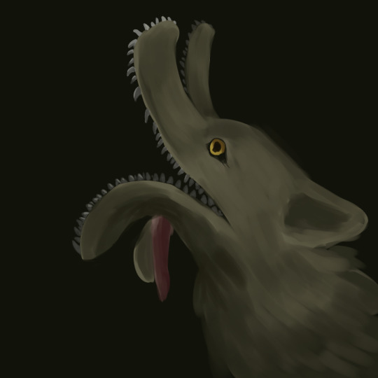
Text

Another from my Carolina Parakeet series, this painting is gouache on 18x24” watercolor paper. It is a particular companion to the previously-posted ‘American Tannenbaum’, and its title is ‘The Etymology of Loss’.
The word ‘extinct’ existed for nearly four centuries before it was applied to the death of a species. Originally a variant of ‘extinguish’, the earliest use of the word can be found in the 1400s, when it was a descriptor for lights that had been doused. Within a short span, its meaning would expand to include the ending of specific family lines (i.e. “the king died without heirs, and his house became extinct”).
The progression from candle to lineage to species seems obvious in hindsight, yet it wasn’t until the early 19th century that the word became synonymous with the loss of an animal—the simple reason for this being, it wasn’t until that point that learnéd-minds accepted that species-death was possible.
According to the prevailing philosophy, the universe had been designed in perfect, unshakable balance, from which no element could possibly be subtracted or altered—much less by the actions of mere humans. (I’ve heard similar reasoning from modern climate change deniers.) The removal of species was an inherently blasphemous concept.
Even as they watched animals like the aurochs and tarpan vanish before their eyes, people assured themselves with the knowledge that more existed…just…somewhere else (after all, wolves had).
(Do you want to know one of my favorite stories from American history? When Thomas Jefferson sent Lewis & Clark on their expedition out west, one of his dearest hopes was that they would discover a living population of mastodons.)
It was the continued lack of any live mastodons, or mammoths, or wooly rhinos, not to mention the reptilian leviathans being uncovered by the burgeoning field of paleontology, that finally tipped the scales of common sense. In 1807, French naturalist Georges Cuvier, who had extensively studied such bones, came out strongly with the assertion that, yes, clearly, species can and do die.
Then began the task of counting the extinguished.
1K notes
·
View notes
Text

(notes and comments next, tumblr will not let me add a cut no matter how hard i try!!!!!!! killing and maiming!!!!)
silt verses wips, some will get finished and some wont :p which is which?? who knows !!! not me !!!!
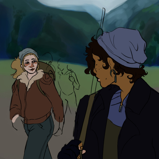
1) thurrocks and faulkner on their quest to the endless drear, with jasp, tapper and wallace in the background (or at least thats the idea). most of my time on this one has been spent adjusting values on the hills in the background, and its absolutely too vibrant and green for how i imagine the scene lol theyre also really shitty hills if you look at them for less than a second so. dont do that please LMAO
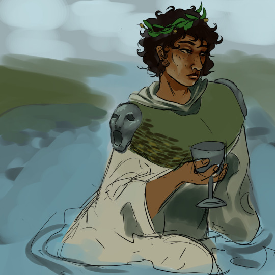
2) faulkner in his katabasian garb, sat in a river for to maximise his solo slay. this one is kinda old atp but the design hasnt changed much. ive mentioned the open-mouthed epaulettes referencing the mouth delivering/returning before, but the green uhhh idk thing is dried and woven seaweed :) the rest of the robes will be more decorated with abstract woven patterns and embroidery if i ever start working on this one again
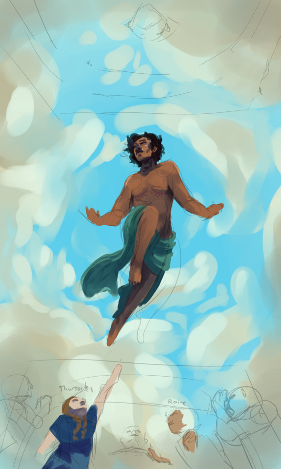
3) now THIS is the relgious faulkner that was giving me brain damage a couple days ago, that ive since realized wont be fixed with the ideas a couple people offered because of the perspectice. its pretty obviously mimicking a guillaume dufube sketch intended for a ceiling that i absolutely love. the parts ive produced, im really happy with, but i cant work out the composition fully so its gonna be abandoned at least for a while. not to mention the absolute misplacement of a sky motif. its one of those paintings i wish i had thicker/oil paint or gouache style brushes on medibang for
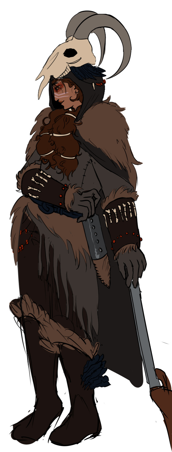
4) my mercer design!! heavily inspired by paleoart from various sources. everything she and gage have is organic, except a very few, like her sheath (oblong metal with a leather "cap" around the tip of the blade, a real ancient design i found references for on google) and her rifle. the original image also features gage playing their flute while squatting, but both of those things are hard poses to draw and hard to find refereces for, and im not willing to put in THAT much effort god lord i draw for FUN if its hard im giving up baby
5&6) snare dog!!!! i love these silly guys but i dont like this design, its too wolfish and i imagine them sorta borzoi/greyhound aligned. i also dont like the way the face opens, since i imagine that as more of a twist. i do like the flopping tongue though and i liked the half assed rendering
#the silt verses#tsv#brother faulkner#sister thurrocks#mercer and gage#tsv mercer#tsv faulkner#tsv thurrocks#art#my art#wips#wip#digital art#digital wip#character design#character designs#guillaume dubufe#digital painting#religious art#religious imagery#talking about my art#talking about art#nonsexual nudity#tsv snare dog#snare dogs#medibang#medibang paint#siltposting#my artwork#the silt verses fanart
85 notes
·
View notes
Text

"I have caught many fish today...and have named them all Gil."
Just a little Gil I made a month back to practice working with air dry clay!
Hand-sculpted with air-dry paperclay, primed with gesso, painted with gouache, and then sealed in with a spray. I'm pretty proud of it considering I've never worked with clay before!
It's also worth mentioning that he's very tiny. He's only about 3 cm long, from tip of nose to end of tail.
100 notes
·
View notes
Note
Hi! I’m a big fan of your art! I draw a bit too, mostly on physical paper instead of digitally, and I was wondering if you had any tips for how to make light really look like it’s glowing. Thanks!
hello hihii!! Thank you sm and for sure!! I don't have any tips for doing it on paper since my only experience in doing anything glowy there is with gouache, which came down to "save your lightest lights for it, halo effect is your friend" but I can def share how I attempt it digitally- mostly with the magic of using adjustment layers! I'll use the piece I did this morning to show:
Starting off with the "flats" or just whatever colours you want to begin with - Flapjack isn't even glowy yet because I haven't turned to the magic of an adjustment layer. I set him and the other "glowy" parts of this to a second layer on top of the rough blockin!

I set Flapjack's layer to "Add (Glow)"- a setting that's in Clip Studio, and I know it exists on other programs too! Play around with adjustment layers until it begins to glow how you want it to - this is just my favourite mode to use because it's bright and flashy and my moth brain Likes It. (I also duplicated the layer, and set it to a strong gaussian blur for the subtle"glowing" effect around the gold; make sure it's set to the same adjustment layer type !) Then suddenly your bird is GLOWING, Sort Of
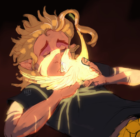
Then I use what little of my brain understands how planes of things react to light and on a layer above the flats, softly painted in the light on Hunter's face in a dark orange colour- not yellow! Then set that layer to "Add" to help bump up the contrast and make it LOOK yellow. I just thought it worked nicer than me just making it yellow and potentially muddying the blockin layer!
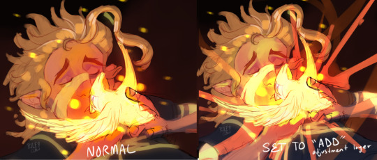
Added a red airbrush around Flapjack to push warmth, doing the same process I did on Flapjack and the scars to the orbs floating around them -- and then, the rest of the piece was just adding the golden swirlies and some sparkles doing just about the same thing!
I hope this helped somewhat!! it's just my method because it's quick and works for Me
#i love making these bc it makes me sound like i know what im doing when i am running off of vibes and “oog glowy” alone#art help#riley talks#riley rambles about art
427 notes
·
View notes
Last Seen Blogs

samarhussain
SamAr HusSain

monochromeheros
(Mostly) Heroic Shitposting

sammifang
Sammi

supahninjah
rock on \m/
sockatine
I Sure Would Hate To Die