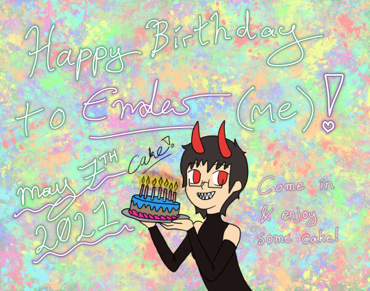
#fun fact: there's only 3 base colours on the drawing (not including the background)
Photo
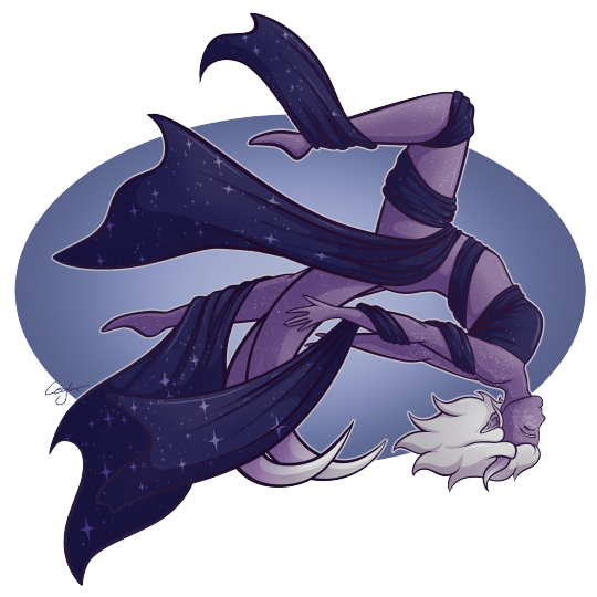
Moxie brings me great joy and I was having a rough day, but drawing her (and vibing with my friends) helped me feel better <3
Draw your blorbos in self indulgence.
Also queue ran out a while ago and I’m uploading as I finish drawings.
#ceylar does art#digital art#d&d#d&d 5e#ceylar does d&d#< that's my new d&d tag cause i figure i should actually use one with how much d&d related stuff i draw#d&d tiefling#d&d monk#monk#tiefling#the monk tag feels a little redundant in this situation#but she is a monk so it stays#humanoid#how tf else am i supposed to tag this?#small art blog#fun fact: there's only 3 base colours on the drawing (not including the background)#i also reckon i might end up eventually uploading this to redbubble#i didn't originally draw it for that but i'm p damn proud of it and i think it could make a nice design#that and it'd be nice to get a postcard-like print to hang up in my room#i'm getting more into putting up my own work. and lemme tell you. it really makes u appreciate what you draw as actual art#like yeah! i did that! i drew that! and now it's hanging up in my home/room!!!
4 notes
·
View notes
Text
I rewatched the Nightmare Time opening today, and would thus like to present an official cast ranking based on how extra they decided to go with their clips.
Note: this ranking will not factor singing or performance ability, but exclusively considers staging and cinematography.
Joint 13th - Mariah Rose Faith, Corey Dorris and Kim Whalen

Special shoutout to Mariah’s dress/lipstick coordination, but with plain white backgrounds, neutral lighting and no props these three legends are just resting on pretty. Corey’s hat is not only not in slightest bit scary, but also adorable and I want to adopt it and give it a hug.
Joint 10th - Angela Girratana, James Tolbert and Curt Mega

Very static with little going on by way of scenery, but these three do switch it up a bit with their use of lighting, so credit where credit’s due. Special mention to James Tolbert for going with blue lighting which is non-obvious as a spooky lighting choice, but it really works.
9th - Robert Manion
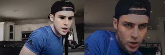
Now we’re starting to get into people who understood the assignment. While I do appreciate the black eye filter for being genuinely terrifying, the fact that he decides to use three different filters in this video (including the contradictory white eye and the gold fleck effect shown on the right above), means that this ends up giving off ‘I just discovered filters’ vibes as opposed to spooky ones. This attempt is also undermined by costuming. I feel like this shirt is just what he was already wearing that day and while the hat is significantly less adorable than Corey’s, it is not any spookier.
8th - Jaime Lyn Beaty

Despite having gone to the MaCorKim school of backgrounds and lighting, the skull is fun and well used to fit with the lyrics of the song. My only question is who’s skull is it? (Probably Sam’s lets be honest)
7th - Nick Lang
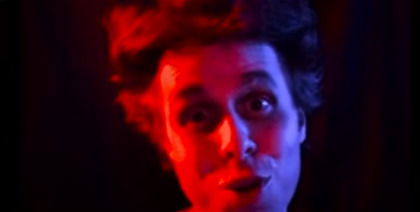
Is this man wearing makeup??? Did this man put on makeup for a 3 second appearance??? That is commitment to his craft. We also have to mention the fact that he only appears for the line ‘Daddy’s gonna get you’. Does this imply he will be playing the eponymous role of Daddy in season 2. Who knows? (he does). Also, I’ve said it before and I’ll say it again STAR. WARS. LIGHTING.
6th - Jeff Blim
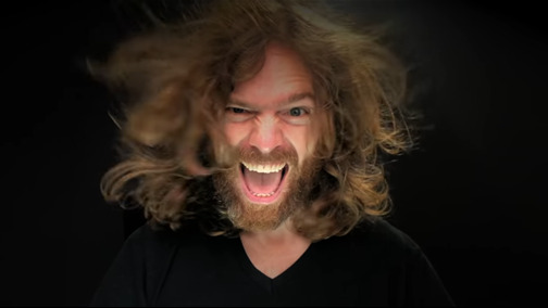
Look at this absolutely feral beast. Despite the fact that out of everyone he would have been the most able to get away with just singing in front of a wall he decided to kick it up a notch anyway. The use of the hair dryer is inspired, and I hope Beyonce is looking into replacing her famous hair fans with this absolute madman. I would also like to shoutout his camera and lighting set up for being so high definition that it genuienly makes AVPM look like it was shot in the middle ages. Werk bitch.
5th - Matt Dahan
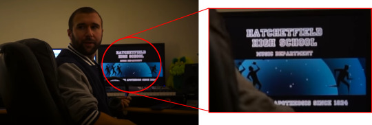
This man punched a hole in the 4th wall so hard he should start drinking monster and change his name to Kyle. I would, however, like to draw your attention away from him and towards what is on his computer. As far as I can make out it says ‘Hatchetfield High School’ I can’t read the line below it (maybe a school motto) and then ‘[something] the apotheoses since 1834′. WHAT DOES IT MEAN WHAT DOES IT ALL MEAN WHO THE FUCK IS PEPE SILVIA. The picture looks like 3 men with massive hands chasing another guy with normal hands in a planetarium (????)
@hatchetfieldtheories you got anything here??
4th - Jon Matteson
Excellent choice going for the TGWDLM background and given that the colours change I’m actually not sure how he achieved this effect. We also need to appreciate the fact that he is the only person who’s gone to the effort to dress up as a Hatchetfield character. While admitedly Paul’s costume is by far the easiest to replicate, as we learned from AVPSY tying a tie can be deceptively difficult. I would also like to question, based off this, whether this is actually Jon Matteson or is in fact actually Paul himself. Infected of course, otherwise he would not be in a musical. Great work from Jon.
3rd - Dylan Saunders

We get it Dylan, you have a garden. He is the first person on this list to not only take us to an interessting setting but also make use of space by moving about. Whether he’s being chased by a serial killer, is a serial killer chasing us, or a la Aladdin in Twisted it’s a bit of both, the way the man creeps about his garden definitely gives off evil murderer vibes and I am living.
Does anyone else feel like this wasn’t so much a performance, as just where Dylan was at mentally in lockdown? If so, mood.
Joint 1st - Lauren Lopez & Joey Richter

COUPLES THAT SCARE THE SHIT OUT OF PEOPLE TOGETHER, STAY TOGETHER. These two have it all. Matching costumes (take note Corey and Robert this is how you do spooky head gear), upwards facing lighting and crucially movement about the space to reflect shifting tones in the song. These two were dynamic, genuinely scary, and met the brief perfectly.
I am, however, only going to give this one a 9.8 out of 10 because there’s always room for improvement (specifically a lack of Dianne in a matching black hoody)
#starkid#nightmare time#nmt#nmt 2#nightmare time 2#robert manion#<- tagging in case people have that filtered or something
375 notes
·
View notes
Text
Loki is the latest Marvel Studios TV series in the long-running franchise and it’s currently ongoing with five episodes so far available to stream on Disney+ Hotstar Malaysia. For previous breakdowns of Loki episodes, check out Episode 1 here, Episode 2 here, Episode 3 here, Episode 4 here and Episode 5 here.
If you want a non-spoiler guide to Loki, you can head on over here.
Courtesy of Disney+ Hotstar Malaysia, we were lucky enough to be the only Malaysian media to participate in a roundtable interview with Loki Costume Designer Christine Wada and Loki Production Designer Kasra Farahani.
This interview with Loki Production Designer Kasra Farahani has been edited for clarity.
Keep in mind that we’ll be discussing some elements from all five episodes of Loki so far, so there will be spoilers below:
Q: You’ve previously worked on Black Panther and other MCU movies. How different was the experience of working on a TV set instead of a movie’s? Were there limitations?
Yes, I’ve worked on several Marvel projects. For me, this is the most fun one, maybe because I’m in a different position than I was on the other ones. But also, just because this project is unique in a couple of ways.
Number one; it’s literally in its own timeline from the rest of the MCU. It’s separate from the stories we’ve all enjoyed and seen in the MCU so far. The other thing that this one has that’s really great is the amount of visual and narrative variety. We have this kind of base in the TVA that we spend a lot of time in but also we have all these exciting different places in the world that the story takes us to. These were great worlds to design and to imagine.
In our case, there was no difference. The thing about the Marvel series is that it’s pretty much like Marvel movies; in terms of their creative ambition, in terms of the way they’re scheduled, the fact that we have one director.
There was not much about it (Loki) that resembled an episodic project, except for the fact that it was six hours of content that we were trying to make, so it’s a very long project.
In terms of resources, I didn’t ever feel that we were unduly stretched. Always, when you get a creative brief like this, there’s always a period at the beginning of every project where you’re reconciling the creative brief and the resources that you have. That has been the case for every project that I’ve ever worked on regardless of the size. There’s this beginning phase where that’s the case and oftentimes, it’s in that process where you come up with some very great creative solutions that are a direct result of some of the limitations, actually.
Yeah, I wouldn’t say that we had some extraordinary limitations in this case (for Loki), but that’s generally true for all projects, in my experience.
Q: What were you inspired by when making designing the sets of the TVA with its retro-futuristic and anachronistic aesthetics?
In the source material, the TVA had a lot of different things going on, but one of the strong themes also was this armada of desks, which is kind of typical of a post-war era bureaucracy look. There was a grain of that in the source material but a lot of it also came from the show’s creator and writer, Michael Waldron, who described in the original document I read before interviewing for this job.
He described the TVA as a kind of mix of Mad Men meets Blade Runner. Part of these two strong visual references for us. On top of that, me and director Kate Herron, even before we met and spoken to each other, were inspired by Terry Gilliam’s Brazil also as a strong influence because of the anachronisms that that story had and also because of the clear presence of this strong monolithic bureaucracy, which is something that we have in the TVA also.
For the TVA, we were looking a lot at wanting to create a world that had a paradoxical feeling, being an imposing monolithic architectural space that has brutalist elements in them and had almost Soviet modernist elements to them. The colour palette and the materials and the whimsical patterning were much more like American style modernism.
The result was hopefully when you’re in an environment like this, you don’t know whether to feel terrified or invited. Hopefully, it creates that feeling in both the characters and the audience; this kind of cognitive dissonance in not knowing whether they can trust the TVA or not. That’s the narrative objective.
The writers came up with these ideas and the idea with that was to kind of create the bubble gum wrapper in the Renaissance era (Loki Episode 2) and the futuristic shovel in the early 20th-century farm field (Loki Episode 1). These ideas were placed there to create a trail of clues for the TVA to follow before they have clarity on Sylvie’s identity. But for the anachronisms generally, that was something we tried to do throughout the TVA to have all kinds of strange things from different timelines and different worlds popping up in terms of props, like the Infinity Stones in the mail cart and stuff like that.
Q: What was it like working with Tom Hiddleston, who is a producer on Loki?
It was very exciting to have this opportunity to take the character and his storyline in a different direction. It became all the more exciting when I read the scripts and I saw the type of journey they were going to take the character on.
Tom is a professor of Loki, basically. After all, ten years or so of playing the character; he knows it better than anybody and he has an in-depth understanding of the character and his backstory; the character’s family relationships and he was really helpful in giving a little talk to all the department heads about the background of his character, which was very informative.
Q: Recently, Loki series director Kate Herron said that 90 percent of production sets were physical. Does this include the world of The Void, and can you tell us more about how you brought it to life?
That’s true. That was what was unique about this show, because of my own design approach, and my goal in creating this large monolithic brutalist environment, I felt strongly that the sets needed to be built kinda wholly and that they needed to have the ceilings in-tact. This was also supported by Loki cinematographer Autumn, in that the way of her own style of photography is very wide and low-angled photography, which is why for both of our creative goals, it made a lot of sense to build these sets like completed and 360-degree environments.
For the TVA, that was almost always the case, with the exception of when you saw outside a window. With the Void (in Loki Episode 5), a lot of that was built practically as well. What I can tell you is that we build a large piece of this landscape on a soundstage, which was about 150 feet by 200 feet of undulating wilderness terrain. In that, we would bring in these different scenery elements on different days to make it feel like different places within the Void.
For example, one day there was the bus stop terrain where we meet Loki. One day it was the giant head. One day it was the drive-in movie theatre where we find Sylvie. All of these things were brought in and we shot there over the course of seven days. The terrain was designed in such a way that depending on what angle you shot, it felt like a very different place. Backgrounds were put in during post-production in visual effects. The Loki palace, where the Loki variants kind of hang out, the bowling alley, all of that was also a 360-degree built set as well.
Q: What was the most challenging set of the entire Loki series that you had to work on?
We had a lot of very ambitious sets but I think the city of Sharoo at the end of Loki Episode 3: Lamentis was a very technical set. The goal was to create this virtual one-in, that appears as a single shot. This was a very involved and elaborate process of choreography, basically.
All the different departments were involved to make this happen because as we watch the sequence, we see tons of actors running around, there are explosions happening, the camera’s panning up to see the planet above crumbling and asteroids pelting the surface.
There was a lot of planning that went through at the very beginning. We brought the paper models of this to Autumn, our cinematographer and creative director, to use to plan some of their shots. One day, we had some more information that fed back to the art department where we developed more involved and elaborate drawings and models which again, fed back to them. In this way, we had kind of an iterative conversation to arrive at what the design was.
So, as we start to build the set, many of the department heads came to visit and check the progress. We rehearsed what the shot was going to be, so we could exactly fine-tune the set to meet the needs of this shot and see where the edits needed to be. In order to do this, we needed to adjust the exact width of the roads or move a piece of scenery here and then figure out exactly, okay, there’s going to be an explosion coming out of the ground here and another explosion coming out of the building here and this is when the camera looks up to the sky and sees the planet explode. This is where the window breaks and this is where the guy jumps out and grabs him and there’s a fight.
There are many, many people involved; Monique Garderton, our stunt coordinator, Kate Herron, the director, and also the special effects team, and of course, visual effects, deeply involved, and Richard Graves, who is kind of our AD (Assistant Director), the circus leader of all of it, organizing everybody to kind of work on this thing altogether. It’s the sort of thing that involves so many different departments that it can only really be discovered when working in a big group together.
I would say that was maybe the most challenging technically because there were so many logistical parameters and so many moving parts.
Q: What are your thoughts on diversity in the production of the creative industry?
I think that it is critically important. As somebody who is myself an immigrant, I was born in Iran and my family moved here when I was quite young. I’m super happy to see the direction that the industry is going in. I think Marvel has been particularly excellent in providing leadership in this way and I honestly have to give a lot of credit to Kate Herron, our director.
Almost more than any other project I’ve been on, she prioritised inclusivity and diversity. I mean, lots of people, don’t get me wrong, it’s on every project and on everyone’s mind, but I think Kate went above and beyond because it’s so fundamental to her worldview and she’s such a sensitive soul in this way. One of the many ways in that it was such a joy to work with Kate and I’m very proud of the many different ethnicities we’re representing, and how many women we’ve had. In our art department, we had close to fifty men and women.
It’s important and leads to better creative results that are more fully realized and more representative of what the fans really want.
14 notes
·
View notes
Photo
Man, I forgot to post 90% of my art here for the past while. I’m gonna do an art dump in this post under the cut. Enjoy the bonk emoji if you don’t click the read more, and man am I dumb and forgetful lmao.
Includes: OCs getting names, a Sonic impression, a D&D map, homosexual energies, a sheep floating in the astral sea, a birthday drawing I already posted, Hex Maniac Ender, D&D Characters, D&D Characters as Miis in Miitopia, Little Hater Axel, local Demon in the consciousness of my D&D character yelling at him, illegal plants, a necromancer being cute, an actual event that happened in a D&D game two days ago, and Mermay drawing.
That’s everything in here as a TL;DR, I guess. Enjoy your day!
I’m gonna try and sort of have them in chronological order, oldest first, but I may end up putting them in the wrong order. If I do... Whoops, I guess?
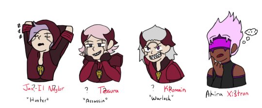
[04/14/21] - This isn’t really new art, but I started to work on giving the four OCs of mine without a full name full names... I have not finished this bit, though. So Hunter and Akira have full names, and Warlock and Assassin only have temporary names. This may end up like Seven where I put in their names as a temporary name (7th OC I’d made at that time) and it just kind of... sticks. Lmao.
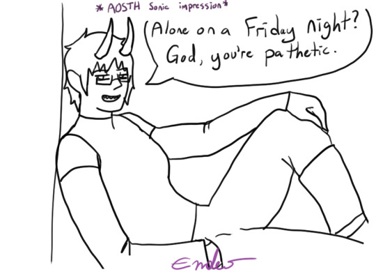
[04/20/21] - Alone on a Friday Night? God, you’re pathetic. I didn’t colour this one because it was a half-attempt at a meme image I still like it, though, so I might end up colouring it. It’s gonna appear again whenever I do my “unfinished drawings art dump” at some point probably in... June? I know I said I’d post them last month but forget it, lmao, it’ll happen eventually.
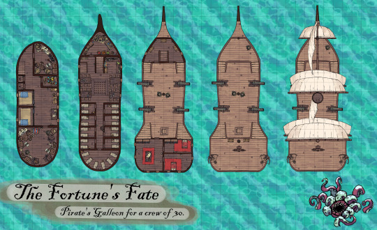
[04/20/21] - A D&D Map! This was to help me visualize the layout of my D&D character’s ship he used to be on. Also for my DM if they ever put us aboard the ship. The little fella in the corner is just there to vibe. This map is made of free to use assets from This Website, so while I’m gonna say DONT USE MY MAP WITHOUT PERMISSION, feel free to make your own!
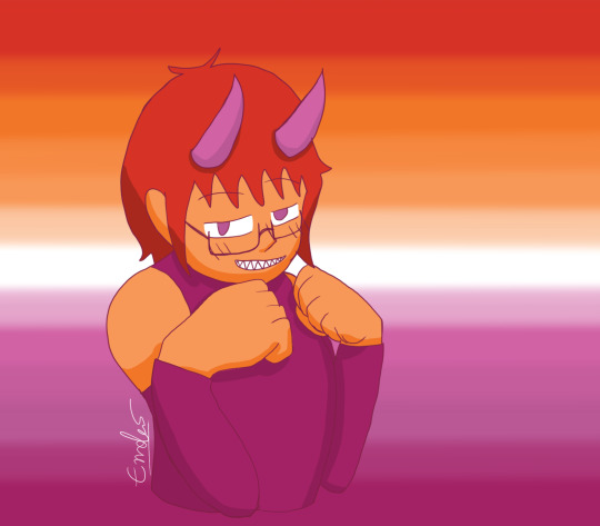
[04/26/21] - Lesbian Day of Visibility drawing of yours truly, the disapointment! That’s... really all I have to say about this, honestly. It was just for that one day and that was it, lmao. I mean, I accidentally lined it in dark pink, so.. .That’s different, I guess?
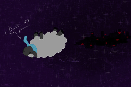
[04/30/21] - Do Astral Seas dream of Ensorcled Sheep? Does the City know what Sheepleb is going to do? What crimes he may commit? Who knows! This was fan art of Critical Role ep. 134 if I remember correctly, right at the end when they jumped into the portal into the astral sea and Caleb was a sheep. Using my knowledge of the German language, I knew the word for “shit”, and had to use it.
[05/07/21] - This was already posted, but it’s going in here to dilinuate that it was drawn at this point. Also, aside from playing Miitopia, this is all I have to show for myself until the 12th.
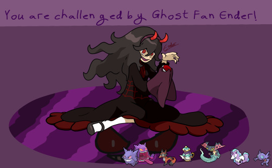
[05/12/21] - Hex Maniac Ender challenges you to a Pokemon Battle! WIll you win against my team? My sis, who loves fairy types, pointed out to me that there’s a fairy girl and hex maniac duo, so I’d be the hex maniac. I spent... Over a week drawing this, because I basically had to redraw the Hex Maniac art from scratch in a higher quality size, and then draw myself over it. So... You can excuse the low-effort background for once. It was basically this, and then my birthday doodle from May 1st to May 12th, and then I took a break to draw up several D&D characters quickly for fullbody references.
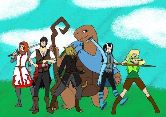
[05/12/21] - Remember this art I made several months ago? I finally added my other two completed characters! I have three more named but without character sheet D&D characters, so for now this is just Kara, Axel, Golden Shadow, Kau, Cecillia, and Miri. Kress, Tempest, and Melia will have to wait until I make character sheets for them to be posted, and... For when I probably make more D&D characters. I have at least 9 additional, incomplete character ideas floating around, so... I’m never gonna be done this art, huh?

[05/12/21] - Speaking of D&D characters, did you know I’ve been making them as Miis in Miitopia? So here is their finished full body art next to their Miitopia self! Some of them look a little off (Golden Shadow, Cecillia) because of limitations of the editor and shading issues, some of them look a little off (Kau, Kress) because this is a human face canvas that I’m using to make a non-human face, and some of them (Melia, Axel) look REALLY GOOD. Common traits among my D&D characters include green eyes and tall. You wanna know why? Because I am tall and... despite having red eyes, I do have green eyes under the coloured contacts.

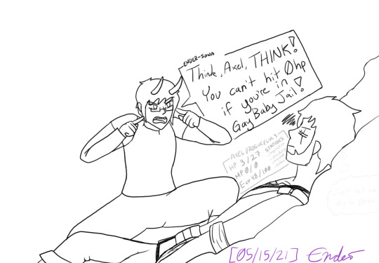
[05/15/21] - More D&D stuff! This is based around my D&D group’s current Rime of the Frostmaiden campaign where our Goliath Fighter, Nioh, ends up getting a little bit of hate for being cocky, and our little (well over 6′) hater, Axel, is just a man full of irritation. These are the tallest two characters of the group at the moment. Someone send help. Nioh belongs to one of the other D&D players, Axel (and his stupid additude) belongs to me.
[05/15/21] - This is what me playing D&D feels like. Me, the demon entity trapped inside the head of my D&D character, yelling at them to do things while the dice decide that they’re gonna get bopped a hundred times by a yeti and somehow still survive. This is also a reference to our first or second game where I just ran off like sixty feet to one side of the battle map to fight a Crag Cat and was just in Gay Baby Jail until like two turns later when I could run back to the others. I also drew him not in his winter gear even though this is a bit from when we were atop Kelvin’s Carin in an icy cave, so maybe that’s why he’s at low HP.
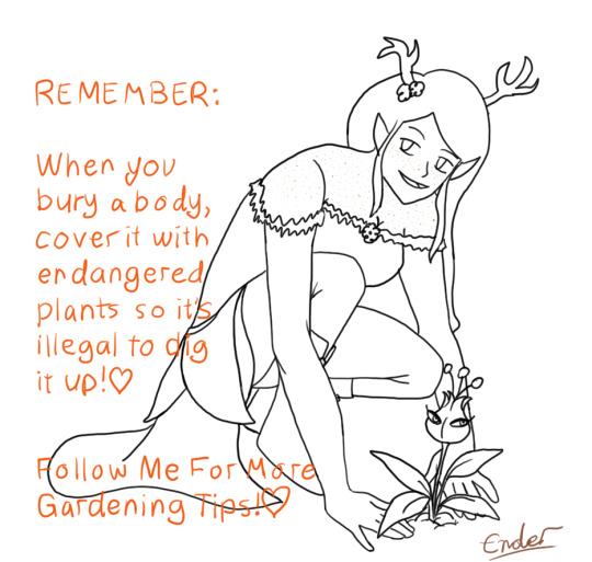
[05/15/21] - Melia has good gardening tips, such as Use A Mars Mii Trap To Hide A Body Because They Are Endangered And It Is Illegal To Dig Them Up. I love her a lot, because she’s the youngest of four, all four sisters based around the different seasons. She’s based around Autumn, so she’s all orange and yellow and brown and is so cute. Also she’s Chaotic Neutral, as if she didn’t need to be mildly more threatening.

[05/15/21] - Cecillia is my Tiefling gal who lived in a very northern town plagued by cold weather and snow, and Axel is my Pirate guy who spent most of his time further south on the high seas and warmer weather. So, naturally... I’ll use the guy more acclimatized to the hotter weather in the campaign where we spend 99% of it in the snow. She uses Tarot Cards as her spell focus, and I decided to sneak my other D&D characters onto her Tarot cards so naturally, Axel is The Hanged Man, given his backstory and personality. She’s a very cheerful and friendly Tiefling Necromancer of the Hexblade, so she’d for sure take care of those around her to ensure their success. Especially if they’re on her Tarot Cards, and their spirit comes to her aid when she asks for them.
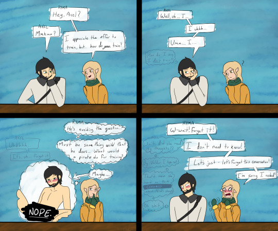
[05/16/21] - Content Warning; Ryma thinks too much into local stupid moron’s lack of knowing how to answer a question and thinks too much into the reputation of Pirates. Poor Axel, man doesn’t know how to socialize with people who aren’t pirates and is used to being hostile towards everyone, so when he’s asked a question that his answer to is “uhh... no?”, he panics and ends up making a mistake that leads him to think that Ryma can read his mind. Ryma belongs to another of the D&D players. I guess me drawing all those spicy Cow Costumed OCs earlier just brought me to drawing Axel being a bottom in this, huh?
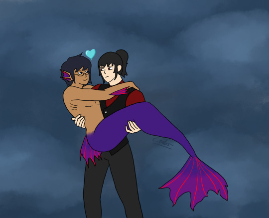
[05/16/21] - It’s Mermay, which means more OC drawings! Here’s Theo after drinking some potion that turned him into a mermaid, and Seven, tiredly, collecting his stupid boyfriend so that Lailah can fix the fact he’s turned into a mermaid. Mer!Theo is based around his sword’s colours of indigo-purple with red accents, which looks a little weird since Theo is the Blue one of the group, but... it looks cool, I guess. Seven’s just the same outfit as always, just no gloves this time.
--
And that’s it for the art dump! This was, frankly, MASSIVE. I’ll try and remember to upload both on Twitter and Tumblr at the same time, but... Ah... I have been drawing a fair bit. Just mostly sketches and linework that I haven’t finished and may not actually finish. If they’re not completed, I’ll dump them all into something at the end of the month or whatever. Maybe you’ll get the old sketch of the Axel face in panel 3 because in the sketch phase it was an Ahegao face, in the clean sketch it was a lip bite, and in the linework and final it’s just horny face. lmao.
Top ten things I have to remember for drawing: AXEL HAS A SCAR AND GREEN EYES. I remember his eye colour now, but if you look at his fullbody ref, he’s got brown eyes. And, naturally, I keep forgetting to put in his scar. He has more, but most of them are located in areas covered by his clothes. So if I ever draw him shirtless I guess I’ll have to place them somewhere.
Also maybe finish the reference sheets I have left to finish so I can post more of them, since I have two “Pets” completed (Roko and Mona’s nameless pet), but I have to do up Hunter, Warlock, Assassin, Akira, Myuut, and Stella. I’m betting when I do complete two more, it’ll be Hunter and Akira. Those two are the most fun to draw, at least.
#the disappointment speaks#drawings by me#OCs#D&D#art dump#Miitopia#of all of these drawings I gotta say the most cursed is censored bottom!Axel and the most blessed is Cecillia's lap nap#I drew a lot of D&D stuff lately! Most of my OC stuff has stayed in the sketch stage so#I guess that says something about what I've been prioritizing in my drawings?#Also that drawing a twunk as a twink is incredibly funny and cursed. love my pirate boy
4 notes
·
View notes
Text

if you want: something like Sayonara Zetsubou Sensei or Monogatari just more lighthearted / quirky fucking characters and story / randomness galore
If I say the words “Studio Shaft, quirky and Hiroshi Kamiya’ what anime pops into your head?
For most it’d be the Monogatari franchise. For some it would be Sayonara Zetsubou Sensei. And for a select few it’d be Arakawa.
Due to how much these 3 have in common, it’s almost impossible to not compare them, even subconsciously.
Our story begins with Ichinomiya Kou, the son of an incredibly successful bussiness man. He has been brought up all his life with the idea that he must not be indebted to others in any way, ever. Well, he runs into a problem when he is stuck on a bridge in his underwear as he is trying to climb a pillar to reach his pants. A mysterious girl fishing there watches on in silence after he turns her help down. Suddenly, the pillar breaks and he almost drowns in the river but gets saved by the mysterious girl. Kou suddenly finds his entire life being indebted to this girl and desperately tries to compensate her but she only asks for one thing: for him to be his lover.
The Arakawa riverband is actually the home to a bunch of fucking weirdos as Kou later finds out. The girl who saved her, Nino, keeps saying the she is a Venusian. Then we have a guy in a Kappa suit pop up who is the “village chief” and keeps insisting that he most definitely is NOT a man in a kappa suit. He gives our main character a new name that he will use in his new home: Recruit.
We also have a buff former military man dressed in a nun suit who’s called Sister and a musician in a star mask called Hoshi and a few more.
So, this is where the comparison being a problem comes up. The weird characters, nonsensical story, the colour scheme, the quick cuts, reactions and overall presentation just makes you think of the other 2 works I listed above (if you’ve seen them, obviously). And that’s a problem cause Arakawa feels like a lesser product of those 2.
First the presentation. This whole anime being played out in the same location feels restricting. Even though we have random buildings, the majority of the time we’re outside where the dominating colours are blue (river and the sky) and green (grass). I found it all a bit boring after a while. The quick cuts and seperate shots were also lackluster. Especially in Monogatari, these work to compensate for the long dialouges, keeping the eyes occupied while listening to characters talk. Here, these seperate shots aren’t drawn that well and they often use muted, pastel or just 1-2 colours for them.
There isn’t a story here, like, at all. There’s some bigger overarching plot in the second half but it gets resolved pretty fast. Arakawa mostly has short stories that are based on the randomness of the characters and whatever they get up to. So then, what this show needs is great characters. Well…
The cast is silly. As weird as you would expect. However, randomness is only funny if we know why it’s random aka we need to be aware of what is considered “common sense” in the world to really understand how weird the actions of the characters are. Our “common sense meter” would’ve been Kou/Rec, however in just a few episodes he becomes part of the weird community and finds less and less stuff weird. He still can’t get over certain people and whatever they do but he reacts less to them. This is basically an inbetween of Nozomu-sensei and Koyomi. Koyomi is almost completely seperated from the events while Nozomu-sensei is basically the weirdest out of the bunch. Kou is part of the weird gang himself yet still feels distant from them, making it hard to relate to him but not making him as funny and quirky as the others around him. Still, seeing Kou’s life philosophy completely get flipped on its head is fun to watch.
This review has really gotten away from me, I don’t even remember what point I wanted to make. So to wrap up: if you really want something in the vein of Sayonara Zetsubou Sensei and Monogatari but would be fine with a more lighthearted approach, you can give Arakawa a try. If you haven’t seen either series but would like to see something non-conventional and quirky, I’d also recommend this. [7/10] (x)
Recommend: HELL Yeah! | Yes | Eh??? | Nope | This anime killed my parents

if you want: cute girls being friends and spies / SPIES / about 3 plot twists / nice fight animation
While scouring the offering of the last Fall Season’s, my eyes immediately drew to this anime. Of course, I’d have watched it just for the fact that I saw a bunch of girls being badass but even more, the whole concept (and even the artstyle) reminded me of Princess Principal (x) which was one of the most surprisingly great anime I’ve seen so I was hoping for something similiar with Release the Spyce.
The plot isn’t anything special. Our introduction starts with Momo, who gets befriended by some girls at her new school. She is later told that these 5 girls are part of a secret spy organization, Tsukikage, who defend the city from the shadows. The Tsukikage are all young girls, as they use special spices that enchance their ability to fight and the effectiveness of the spice lessens, the older one gets. Tsukikage has been fighitng against an evil organization called Moryo for a long time.
As you can see, the story itself is pretty generic so the anime has to rely on other offerings to keep people’s attention.
First would be the characters, more or less. The cast has a varied set of personalities and chemistry between them. Due to the fact that 3 of the girls (including Momo) are apprentices to 3 of the older members, who are their mentors, we mostly see interactions with those 3 pairs. However, even with that I felt that there was some untapped potential with the girls and their unique relationships. Don’t get me wrong, everyone gets some background story and a decent amount of time establishing their characters but there still something missing. As I wreck my brain though, with everything that happens, the only thing that could’ve fixed this issue would’ve been more episodes. For its runtime of 12 episodes, the anime does as much as it can.
The second thing that can draw you in, is the missions and the animation of the fights. The shorter “mini missions” didn’t do much for me, but the ones that spanned across 1 or 2 whole episodes were really interesting to watch. The animation, while lacking in some departments, mostly shined in the fight scenes. Really, there isn’t much else to say about this one. If you want some engaging spy missions with nice animation, here you go!
Release the Spyce is very tame, everything considering, up until episode 10. That’s when shit goes DOWN and we get like 3 plot twists on top of each other and whew...I really liked it! I would’ve wished that the atmosphere we get at the very end would’ve been present at least here and there throughout the rest of the anime, but it does make it even more shocking. And I’ll stop here cause I won’t be spoiling.
RtS is a nice watch but it’s restricted by its short runtime. Nothing really can be done about that unfortunately. If you are interested based on what I’ve written above, give it a try! [7/10] (x)
Recommend: HELL Yeah! | Yes | Eh??? | Nope | This anime killed my parents
3 notes
·
View notes
Text
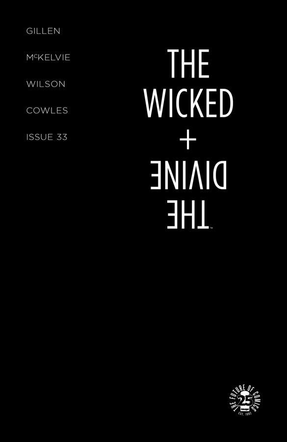
Writer Notes: The Wicked + The Divine 33
Spoilers, obv.
I suspect this one may ramble. Or it may not. The odd thing is always when things which have been internally discussed forever end up not needing to be discussed in public. For Journey Into Mystery and Young Avengers, I always had the idea of the essay I'd end them with... but when I got there, I shrugged and did a couple of paragraphs which covered the basics.
(There was a grace note in both, in terms of highlighting a motif – Write Your Own Happy Ending and Be A Superhero. Save The World – but that's really minor detail compared to what I presumed I'd be writing.)
Well... I know it's going to be quite long, as I'm going to include the miniature essay on plot twists I lobbed up to respond to a question, just so I can include some WicDiv specific stuff.
So, WicDiv 33. The “Everything you knew is wrong” issue.
Jamie's Cover
Jamie coloured this himself.
There was a lot of discussion over this, in terms of how to resolve the equation that we'd set up. Where to go after the maximalist nature of Dio's 32? I won't mention the other options, as at least some of them may end up being used down the line. One suggestion I quite liked was doing the equivalent of the ABC Look Of Love album...

...which is this scene of posed romance on the cover, and when you flip the album, you see all the lighting and crew. In some ways, that's what this issue does.
But black makes sense on many levels as well. I suspect the idea of the specific bleakness will confound the expectations a little, but the statement of it is very there. We did say this was our Black Parade too.
Worth noting – first cover without a quote on the back. If we were sure the readers wouldn't have looked at the back cover before reading the book, we may have put Lucifer's “Am I the only one who didn't see that coming?” on there. But we couldn't be sure of that, so we didn't.
Russell's Cover
What Russell and Matt are doing over on Thor is state of the art superheroics. I've loved seeing what Russell's done across his time with Jason, and the idea of him doing a cover was just exciting. It's meant to be the full range of the medium, after all. I was surprised Russell went quite as maximalist as he did, but also pleased. I love this kind of operatic movie poster cover, and it screams Imperial Phase, including all the cast of the main arc. Dio's the hardest one to spot – that would be the black eyes over it.
IFC
At this stage in the arc, working out what on earth to put in the synopsis is tricky. You have to throw your hands up to some degree.
The tweaks to the bios are the other thing – clearly we've got to set up the information required to comprehend the issue for those who may have forgotten it, without just saying what the thing is. For the very close readers, even the fact it's changed will be a tell. It was another reason we didn't do a preview for this issue, and even if we did, we wouldn't have released that page. Velocity in reading is key here.
With Woden we restate “She had some mysterious hold over him” rather than specifically talking about the Blakes. With Minerva we remind people that she was tortured on Ananke's machine, and then distract with a :( emoticon.
Page 1
I believe the script for this page and the next is in the trade as “Making Of” material, which is fun. Chrissy tends to choose pages in terms of what's interesting, especially if we have something else to show. In this case, it's my drawing for the design of Woden's Secret Base.
My basic description for this was the Bat Cave, which is a man cave, if you squint. Having an enormous penny in it could have been a giggle. We had to have a few passes to get the lighting right on this – debating the colours on the bars of the cage was also tricky.
In terms of pulling out a detail, the suit of armour missing a head on the right would be a useful one. Balancing the “making sure it's visible” while not leaning too much into “LOOK AT THE HEADLESS SUIT” is Jamie's storytelling problem here.
The main dialogue problem was balancing the level of Cass' response here with her noise at the end of the last issue. Swearing to some degree is fine, but it has to be a specific kind of fffuuuucccckkk last issue. It couldn't be a swear that promised too much.
Page 2
And it's Pink Woden! But he's blue. Lighting, everyone.
Well... There was some debate on the colouring of Pink Woden, in various modes, and various reasons, not least the slight differences in colouring in his previous appearances.
(Issue 14 and issue 21-22, respectively.)
Have I said Pink Woden is my favourite fan name? We use it all the time internally, not least because Mimir is oddly hard to remember. Also, if we get used to saying “Mimir” we may end up saying accidentally in public.
Page 3
I had someone reach out to me wondering whether Cassandra choosing to gender someone by their voice and physical appearance was off. It's something I was thinking of at the time when writing it, and it's not exactly a line I'm happy with. But on balance, I felt it more likely that Cass would say that than Persephone would say anything.
Cass is imperfect in her language in lots of ways. I decided she's more likely to apologise about it down the line and kick herself, which I may end up working in, depending.
(You could also ask “why have anything there?” and that's only answerable in terms of the flow of information and ideas and conversation across the whole scene. Difficult Difficult Lemon Difficult.)
Lovely expression by Persephone in the background of the first panel – in fact, her conflicted expressions throughout. I especially love the reflection of the arriving Woden in the reflection of Mimir's mask in panel 6.
Page 4-5
The challenge here was always choosing where to put the page turns in this issue. What are the big beats. In my original draft the LITTLE WODEN BOY interstitial was actually on page 6, which would change the rhythm in lots of ways – not least in putting the Falling God sequence on a page turn. In the end, we gravitated to this. I'm much happier with it.
(Little Woden Boy works as a creepier punchline at the end as well.)
Anyway, hello! It's David Blake.
I... I maybe should save writing for the reveals all together. In fact, fuck it. Let's drop the ask essay here and we can then talk about the stuff I don't include in it. I'm asked whether you change something when someone guesses something, or how that feels?
****
Oh, god, no. Never change anything if someone’s guessed something. Nothing good lies in that direction.
Why?
Okay, let’s talk – with no specifics – Game of Thrones. If you go into the depths of fandom, Game of Thrones is – to some degree, in some areas – a solved problem. There’s a good selection of fan theories (some of which have come to fruition) which have so much meat on them it was clear they had to happen, or the book would break its structure and become unsatisfying.
These twists are available to anyone who wishes to google for them.
The vast majority of people don’t. So… why change the direction of the story? What’s the point of fucking over the enjoyment of the vast majority of people (i.e. making your story make less sense, as you’re abandoning the already existing thread) for playing gotcha on a tiny fraction of your audience?
(As a quick aside – compare and contrast theorising in a fanbase with actual events in the text that’s being adapted. Clearly, anyone who is watching GoT could have googled the synopsis of the book. Equally, anyone who’s read the books knows the big beats. Does the adaptation change the big beats? If surprise to everyone in your audience is all that mattered, you would. We don’t.)
It’s also worth noting that, while obviously some complain on the nature of the adaptation, most fans of a book generally complain that they wish it was more like the book. In other words, things that surprised them (i.e. differed from their knowledge of the text) were less satisfying. They wanted to see the big dramatic beats, even if they’re stripped of their surprise.
Surprise only matters the first time you read something. For me, any worthwhile piece of literature exists to be reread, and will open up more upon rereading. In other words, knowing the twist should add to the rereading of the book. If it doesn’t, and renders the story less than it was, it’s probably a bad twist – which is one reason why I don’t tend to call them “Plot twists” to myself. I call them reveals. The plot doesn’t contort. It’s merely revealing something in the nature of the world the reader was unaware of.
(As an aside, this means that someone who has guessed successful the direction of the plot is actually effectively skipping to their second read of the book earlier.)
There’s the other side of this as well – not just whether a plot beat has been guessed, but the almost inevitability of a plot beat being guessed. GoT fans have had twenty years to puzzle this out. In that period, a mass communication device emerged which allowed fans to talk to one another and share ideas. This machine would have torn apart any plot.
No one individual needs to guess anything. People can make one step in a chain, and then that step is exposed to thousands of minds. If even one of them can make the intuitive leap to the next step, then it continues. No one person needs to be clever enough to see the whole thing. The internet hivemind is Miss Marple, seeing through the most contorted of machinations.
(In passing, this is one reason why Alternate Reality Games are hard to do, because the mass hive mind will figure almost anything out, almost instantly. Equally in passing, the failure to understand this is another reason why Ready Player One is bad, but that’s irrelevant.)
In other words, the reason why twists are guessable is the same reason they are satisfying. A twist that isn’t foreshadowed sufficiently to give the possibility of being guessed by someone is not a satisfying twist, as it – by definition – came out of nowhere.
To make this specific to my own work. In the case of the biggest and most intricate of my current books, WicDiv, we sell about 18k in monthlies and sell 18k in trades (in the first month of release). That’s our hardcore devoted readership. How many people of them actually read the essays in the WicDiv tags? I’d say 500 at the absolute maximum, and likely a lot less. So for a maximum of 1.3% of our readership, we’d derail a still effective twist for everyone else? No, that would be a bad call.
Especially – and this is key – the people who have chosen to engage with a fandom are aware that they may figure something out. They are trying to figure something out. Why take that pleasure away from them?
In a real way, I think, in long-form narrative, pure plot twists which no one in the world guesses are dead in the Internet age, at least when dealing with any even vaguely popular work of art. You can do them in short-form narratives (like a single novel, a single movie and perhaps a streaming TV show they drop in one go) but for anything where you give a fanbase the chance to think, it’s just not going to happen. A creator should be glad their work is popular enough to have enough fans to figure it out.
Yes, I may have overthought this.
But that’s only half the question.
How do I actually feel when someone guesses something that’s going to happen? Well, this is long enough already. Let’s put the personal stuff beneath a cut…
*
I’d say you sigh “Oh, poop”and shrug.
And then you get over your ass, because you know all the above is true. Writers are often megalomaniacs who think they can control everyone’s response to their work. We don’t. We can’t control everything. We can barely control anything. We really have to let go. I’ve said WicDiv is a device to help me improve as a person, yes? It would include in this area. I have to learn to let it go, and internalise all of the above. If I can make most of my readership have the vague emotional response I’m looking for, I’m winning.
I’ve mostly succeeded at this. I’m certainly better than I was two years ago.
(I’ll probably write more about spoilers and twists and stuff down the line. I’d note that setting up twists that *are* easily guessable by the hardcore is part of the methodology. Having a nice big twist foreshadowed heavily is a good way to hide another twist behind it. “Hey – pay attention to this less subtle sleight of hand while I perform the actual sleight of hand over here.” In which case, there’s less of an Oh Poop response and more of a cackling evil mastermind response.)
The sigh can occasionally be accompanied with a “Hmm. I wouldn’t have posted that” or – more likely – “I wouldn’t have posted that THERE.”
To stress, what follows isn’t about my work per se, but culture generally, and is very much personal. This is stuff which good friends disagree with me on.
As a fan, I never tweet my own fan theories. I only tweet joke ones. Even my crack theories I don’t tweet, as they’re normally so bizarre that if they actually DO happen, I wouldn’t want to take the thrill away from people. Even in person in conversation I make sure we’re going into a deep fan hole before sharing them, aware that they may be true.
In a real way, the more likely I think something is true, the less likely I’ll say it. As this is my job, I tend to see basic structural ways stories are heading way in advance of most people. I’m a composer. I know how music works. You have a vague sense of what way they’ll go.
(One day I’ll write down my crack theory for the end of the previous Game of Thrones season. Maybe after next season, as it’s not impossible that they may end up doing it, though it’s increasingly unlikely.)
If I had a really good theory I’ve gathered evidence for? You can guarantee I’d put it beneath a cut. That’s the stuff which bemuses me. It’s a cousin of posting major spoilers about any piece of culture the day it comes out. The worst is one regular twitter trope – I’m always bemused when people do a “Calling it! XYZ will happen” tweet. Which strikes me a little like standing up in the cinema 20 minutes into a film and shouting out that you’ve guessed the ending. This ties back to the stuff I wrote above about twists being less effective in the modern age, except in a place where you can control the context and conversation. People may message in movies, but they rarely message everyone in the room.
(In passing, as it’s vaguely on topic – you may remember the research from a few years ago saying people who know a twist enjoy the story more than people who don’t know a twist. Even if this is true – and a single study should always get an eyebrow raise – it strikes me as a confusion over what “enjoy” means. All pleasure isn’t equivalent, and you can only have surprise on your first time through a work of art. That’s novelty. You can have that and then gain the “not surprise” experience second time through. If you spoil a work, it means the “novelty” experience is something you will never have. You may enjoy something more if you know the twist but you can always rewatch it to get that pleasure. If you’re spoiled, the individual specific pleasure of that first watch has been stolen.)
But that’s a conversation of social mores. Really, it doesn’t change anything in terms of how we act… and sometimes, I even grin when someone gets a twist in advance. The machine is working as intended. It’s actually kind of worrying if no one is thinking something is up in an area you’ve set up to be iffy. And… the alternative is worse – hell, there’s buried twists and details in Young Avengers that no one’s managed to figure out yet.
Twist ending: oh, no, I was a ghost all along.
****
I'm pretty sure the asker was asking about the Woden/Blake/Jon twist, and I'm primarily talking in terms of balancing the various needs of the group.
The problem with this twist was less making sure that people didn't get it, but making sure that everyone understood its import. If, hypothetically, I didn't want (barely) anyone to get it, we wouldn't have mentioned Jon after we introduced him in issue 6. Problem being, everyone needs to know Jon is a person who is Blake's kid when they hit this beat. My solution was to just reintroduce Jon hard, and resolve it, knowing that most people would just accept that. Then everyone knows who Jon is, so the father/son switch makes sense.
(In other words, far better some people suspect Woden is Blake rather than everyone going “Jon who?” Especially because the real horror of the Woden/Blake reveal is in its details.)
There's the other aspect to it as well – it's the sacrificial decoy aspect that I mentioned above. Even if guessed, it's a big enough twist to distract people. I reveal this at the start of the issue, so people will probably suspect that's enough big reveals for the issue. Yet no.
(See also: issue 11's dual deaths)
In reality, I was much more worried about the relatively small leap from realising Woden Is Blake And Jon Is Pink Woden to Mimir Is A Head.
But more on that later, I suspect.
Anyway! Storytelling!
There is something incredibly instantly disturbing about Blake without the helmet on, right?
Persephone's line was tweaked a bunch. I cut it as far as I could while still existing. It's a tiny moment of Rising Action, immediately squashed.
The switch to green as the cage goes to full power, plus Matt Wilson's wonderful pixel effects.
Love the Tron-eque light-bike trails seguing into flashback...
Page 6-7
The first date is just before Ragnarock 2013, where we first saw Jon on the stage in Laura's Flashback in issue 6.
This is a “Performance” by Jon, so is presented as such, in the same manner of Persephone's performance in issue 20. Jamie's integrated circuitry design is great, and allows us to go to a limited palette. 8 panel, 8-bit glory.
And Jon Blake.
You write and discover the characters. Jon has barely been in the book – he has a couple of lines of dialogue in issue 14, and that's it. I always knew why Ananke rejects him as unsuitable, but specifically how that would be articulated was something I thought I'd discover on the page. Writing a new character this far into the book is the sort of thing which keeps it interesting.
I was worried it would be hard, or shallow, as surely all the relevant little bits of me are already taken with the rest of the cast? Within a couple of sentences of typing, I knew I had completely forgotten one Gillen archetype.
I realised Jon was a heroic take on Lloyd/Mr Logos.
I laughed. Of course. Perfect.
The 11 days later says so much about how intricate the timeline is around here. It's the day before Baal and Sakhmet made their public debut.
The “She's a fucking weirdo/language” panel is a joy.
Yeah, Ananke really does like hanging around in people's gardens.
I specifically called for Ananke to be in an outfit from a previous God-creation sequence...
Page 8-9
...so Jamie could reuse the masks and only draw Jon transforming, and pull an extra page out of the budget.
The most embarrassing bit here is that I wrote this from my memory of Mimir's legends in the early drafts, and only remembered to actually check my notes at lettering. In fact, I'd got a couple of minor details of Mimir wrong.
(Or rather, didn't grasp the complexities of Mimir – it's very hard to get a take on Mimir, because the main myths we have of him are contradictory.)
Page 10-11
Man, I want to go to Mimir's club night.
In my original draft I wrote it as Jon cutting off Ananke's “Mimir” so that the god name wasn't revealed until the last page of this whole section. As in, it would stop people putting the book down, googling “Mimir”, realising “Heads” and then possibly seeing where we were going at the end of the issue.
I decided against it, in that's only going to be a tiny fraction of readers. If people want to break the flow of their reading to look up facts, I can't control that. Even then, I also knew it would be far from certain that just because they realised Mimir is a head, that they'd then realise others could be a head before the end of the comic.
And NOT including Mimir breaks the flow for everyone else, and is a bit cheap. Better than that.
That knife gets around.
Page 12
First panel: I never get bored of modern blur photoshop to show this kind of effect.
PoV shots are something I adore in comics. The six-panel grid gives it lots of space as well.
Honestly, that last panel with Mimir's own reflection is the creepiest thing in the world, and I love it.
Page 13
Yeah, I'm much happier with the interstitial here. Horrible.
(To state the obvious: Pinocchio reference.)
Page 14-15
I just imagine the tension in this room. Ugh.
I originally had a bunch more written for Woden here, but cut it. It was much better in the silent. He may say some of it down the line, but cutting it right to the basics – the particularly creepy basics – seemed key.
We went with a normal gun. Normal guns were at the start of the story, and have sort of disappeared. Once more we return.
Lots to unpick in all this dialogue, so won't give anything else. I'll say the whole exchange about the machine was as finely picked over to imply the meaning as much as anything else in the book – that's the thing about comics. The flowery fancy stuff? That's great and fun. But the real job is the compressing of precise exact detail, especially in a book which is nothing but precise detail.
I was chatting to Jamie about issue 34 earlier, and Jamie said how much he likes drawing Mimir's helmet. Looking at page 15 makes me see it – the second and fourth panels are just excellent in completely different ways.
Page 16-17-18
Jamie chose the steady angle, I believe, with a background drop, and Matt working the colours to show the emotions.
First panel is where the last of the fun drips out of Cassandra's expletives, and we're just left with something that's really just offensive and ugly. If there's any point where the issue reaches the black cover, it'd be this sequence.
I'm glad they've got here though.
Clearly, this is a Jamie masterclass. Pick it apart, learn. delight. Like – penultimate panel on page 16. The pause, the glance aside. Perfect. Look across page 17. There's a mixture of emotion and sheer dullness and boredom and fear, and how it all pushes and pulls again.
(“And I got it” is something else)
I believe I've said WicDiv contains a recapitulation of basically everything I've ever done as a creator. Mainly the Jamie and me stuff, but basically everything. I realised Laura's arc on Imperial Phase is me reprising what I did in Generation Hope – probably one of my least remembered things, which strikes me as fair – it only landed properly as we inched towards the end of the year. The plot was basically “Is Hope Good Or Bad?” when the answer was “Her Dad died a few days before the issue started. She's fucked up.” Only in mainstream death-happy superhero comics would that work as a twist. This was a bit like that – we distance the reader from Persephone and just show the actions and see what you make of it.
“Try to be kind. You have no idea what people are going through.”
That was the stuff I'd had planned from the start, but it only got more specific as I got nearer it and WicDiv became what it was. I've talked about having mixed feelings about WicDiv's success. Laura's arc is it writ large. I hate that the definitive work of my career is this. If my Dad was not dead I would not have written this book. There is a guilt and anger that is hard to articulate directly there, and is the material I was mining for this.
On a boring technical level, we did a lot of work with Cass explicitly saying facts to ensure that no one in the readership thinks Laura is confessing to killing her family. In an issue as twisty as this, I suspect some people would have.
(The second panel on page 17 is another one – tall enough to have a bunch of half ideas.)
And Laura, after making a breakthrough, immediately crumbles to another mistake.
The “Laura” line is a nod to the song, and one of the lines in the original WicDiv document sheet.
Page 19
I was going to tweak Cass' line – in some myths he's a giant – but that she's musing gives her a little freedom to dance around what we know.
You know, I suspect one reason why Mimir was never brought up as an option connected to Woden is that he's one of the very few Norse myths who've never appeared in a Marvel superhero comic. Or at least I don't think he has.
Normally we'd put something as big as the head remove on a page turn, but it's a physically small beat, so not something you will automatically recognise out the corner of your eye when you're reading.
I love Cass' thinking face in the penultimate panel. Thinkythinkythinky.
Two major beats happening on this page, of course – it appears Mimir is a head (or a robot head, perhaps?) and Mimir thinks the machine does nothing.
And then we hard-cut to what we do, but it's worth dwelling on this a little. When thinking of plot structure, I talk about a few ways to disguise twists. Earlier, I mentioned a Big Twist can make people suspect the twists are over. This is something I tend to think of as a revealed move. As in, you create a machine of logic with a missing part. You add the missing part as late as possible, and then immediately move to what has been concealed before the audience is able to process the new information.
Hence two beats and a hard-cut...
Page 20-21-22-23
Anyway – this clearly had to be a page turn. To state the obvious.
Steady angle shot here, to have the awfulness of it there. I suspect if I’d had space I'd have had the last panel on page 19 be a third of a page, so the two removed heads could mirror one another.
As a minor detail, Minerva's running feet in the second panel of 20 are really good.
Minerva's gesture on page 21.2 is a joy. I know that feeling, Mini.
I really wanted Inanna to be talking from off panel on page 21, but that definitely would give the game away. The problem with distinctive fonts...
And 22 is the reveal on the heads. Probably best not to say much more about this, as I suspect any of the design elements will intersect with what happens in issue 34, so I'll talk a bit about it then.
Tara and Inanna's expressions really are wonderful.
Luci's line came surprisingly late. The “Talking Heads” interstitial came early. The only reason I wasn't going to use it here was in case I wanted to use it later. I decided I didn't.
Okay... twists.
In reality, for me, it's a case of once you've decided that this is the plot, the only way to do it is dovetail towards an issue like this. Any of these individual beats provide too much connective tissue to the other ones, meaning all must be revealed or none.
(You could argue about Minerva, I suspect. Maybe.)
It's been strange writing a book like this – when so much is there early on. Seeing who got what and who didn't, and how people reinforced people has been interesting. That the core WicDiv tumblr community has never really suspected Minerva was off is in some way a surprise – though I've had people talk about that directly and personally. Blake/Jon and Minerva-is-Off-In-Some-Way were the two twists I would guard, but their primary importance was in how they led to the Heads.
When Ray Fawkes told me “There's a reason you're doing all the decapitations, right?” circa issue 2, I suspected that I'd overplayed the hand by having a literal talking head in issue 3... but it turned out fine.
“Played the hand” is interesting phrasing, and telling. Writing something as intricate as this is like doing a slow-motion card trick, in public, constantly. It is a form of constant stress. I have been paranoid of fucking it up in stupid ways, and it's impacted every single conversation I've ever had about WicDiv. Like just writing one name when I mean another or something. There was a hilarious panic when I added ‘Killer Queen’ to the playlist, just thinking of it as a quite funny Ananke song... and then realised there was only one character in the cast with a connection to the band Queen, and that was Minerva. Should I take it off the playlist? No, someone may notice that, and it's against my rules anyway. I quickly added a few other things to camouflage it.
As if anyone is watching that closely, y'know?
That's an extreme example, but an entirely characteristic one. I have lost sleep over it. Even a year ago, I wished I could just get to 33 and not worry about it. When 33 dropped, it was simultaneously excellent (the response was basically what we expected) and an anticlimax (The amount of emotional and intellectual effort you put into doing this is not worth it. It could never be worth it.) I've been telling friends that I'll never write a story that operates like this again. Partially that is because I wouldn't want to repeat myself, and partially because – as I said above – I think twists are less effective in long-form serialised work in 2017, but mainly as I don't think I want to do this to myself again. I'll find some other way to torture myself.
(Spangly New Thing certainly abandons the Scorpion's-Tale narrative model in favour of an intricate character clock of woe.)
Actually, talking playlists... I have prepared something. There's a secondary WicDiv playlist which I've been using since July for songs which speak to the end of year three and the remainder of year four. I didn't want to add these songs to the main playlist in case a particularly determined WicDiv fan worked out issue 33 from them. This says a lot about the high levels of anxiety I've been running on for the last few years on this topic. It would be terrible to blow it in such a dumb way. Now, those reading in issues know secrets the trade readers don't. So it's going to be an interesting few months.
Here's the playlist. Keep it mum. I'll add it to the main list when the trade's out. Don't shoot me for the first track.
You may have seen us trying to prod people to reread WicDiv before 33. This was partially in response to a friend who read 33 before it came out who said – I paraphrase – “I wish I could tell people to reread the series now, because after they read 33, those issues are gone, forever.” She's right – it's a pure ‘everything changes’ issue, and you can't reread the comic earlier, because everything has transmuted beneath your fingers.
Which is by our design, but is still a grim thing to think about. We've destroyed all those issues on the shelves, and replaced them with a new story. On the bright side, we've given you 35 free comics. I suspect this returns to Jamie’s and my twitchiness over comic prices, and trying to make ours better value, every way we can. In this case, we want to make rereading valuable and exciting.
SIGH! This has been a journey, friends. I'm glad I no longer have to think about any of the above. There's huge stuff coming in the final year, but it's got entirely its own character and momentum. The cards we're playing with have fundamentally changed. There's so much stuff to come, but it builds from this.
Oh – I'm sort of regretting mentioning the thing about the third theme in the backmatter, as it's clearly the sort of thing that's going to drive a certain strata of reader to distraction – especially as if there's any number of other themes in the book. The one I was thinking intersects a little with pre-existing major themes, and speaks to the particular spin on them. We'll get to it eventually. Don't worry.
Anyway, to sum it all up, clearly with four talking heads, WicDiv is four times as good as Sandman. That is a FACT.
Christmas Special shortly, the trade collection in January, the 1923 Special in February and we're back with issue 34 in March, with the new arc.
Thanks for reading.
164 notes
·
View notes
Text
Final Project!
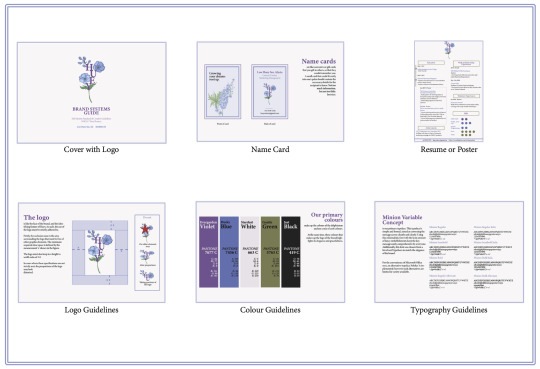
Yay! Finally done with the final project for this module. It has been a really fun journey where I not only learnt some very basic skills on the Adobe Suite, but also learnt a bit of things about myself.
First Step— Ideation
The first step to creating this brand guide was to think of how to brand myself first. What are the skills or traits do I want to highlight to others? Who am I presenting this to? What position am I taking? What makes me, me? Were the few questions I asked myself. I spent a lot of time trying to figure these out, and finally decided on a few traits I wanted to highlight through my brand. I then searched up some connotations related to the symbols, colours and fonts that I eventually used in my brand guide.
Second Step— Typography and Fonts
Once the feedbacks for the initial plans were out, I sat myself down and started working on InDesign. I started with the easiest of them all, which was the colour guidelines and the typography guidelines. For the colour guideline, I first used the eyedropper tool to find the closest colours, and matched it with its different scales of colour such as the CMYK and RGB. In InDesign, I was able to find the colours to its corresponding Pantone equivalent, which allowed me to fix a colour swatch that I could use consistently throughout the brand guide. I then wrote all these down in my colour guideline. As I wanted to give the colours more significance to my brand, I had also named them with a word I associated with the colours!
As for the typography guideline, I also utilised the wide range of fonts available in InDesign. Having the ability to customise and create a template for text and paragraph styles in InDesign made it easier to standardise it across the document. I had three versions of styles: Header, Sub-Header and Text. By having different styles, I could distinguish the different information based on importance and design. While I didn’t use the Header much in the collaterals, I still had it there for the texts in the brand guide.
Third Step— Resume and Logo
After which, I started working on the resume. Fortunately, I had a copy of my own resume from my past internships, which was reference for my information. However, I could not use the old template, and instead adjusted it to fit the theme. As per the feedback, I decided to include a few hints of my alternate colour, green, to make certain things, such as the headers, more eye catching. I also removed much of the details such that it would be less cluttered. In certain instances, I also paused to think whether there were other ways to convey the information. This was something I learnt to contemplate from working on Assignment 3 on the infographics. Hence, I created a rough ‘grading’ for the Skills portion, and used a timeline to denote the Education section.
The logo required a bit more work, as I had to try to make it not only eye catching, but also meaningful to my brand. I started out with drawing out the various portions of the flower before piecing them up with the individual letters. Using the letters of my name ‘Huey’, I wanted to mimic a stem of a flower. Seeing how I had green as my alternate colour, I included some leaves to make the colour pop out more due to its contrast. One thing I definitely learnt while doing this logo was to plan before designing or materialising the logo! As my flowers and leaves were originally a whole flower together, I had to spend some time on Photoshop to crop out the specific parts of the flower, as well as removing the background as I had exported it with a white background. This could also be due to the fact that I drew using a platform that did not have a transparent background.
After piecing the logo together, I then moved to the logo guidelines. While part of it was taken from a template given in the lecture, I had to think about what possible instances of changing my logo would be possible, as not all “Do nots” for one logo will apply to another. I decided to just focus on three which I felt was most likely and prominent. As a warning/reminder, I decided to put it enclosed in a box to highlight the information.
Lastly, I made the name card. I was hesitant about adding too much details into the name card, so I kept the information simple. Since there were two sides to the card, I also wondered what I could do with the other side. I chose to put the vision of the brand on the other side at the end.
Challenges and what I hope to achieve more!
This brand guide was by far the hardest assignment to get through, mostly owing to my inexperience in using the Adobe Suite. I ended up spending most time searching on Google how to change certain issues, and some of them did not even materialise at the end. Moving forward, I want to work more on this brand guide, to give it more details. For instance, I think I would try to find a way to make the name card in a more interesting shape, perhaps the shape of a flower. This would perhaps make the brand look more elegant and unique. In addition, I would want to find more ways to represent my resume in a more savvy way that still matches the aesthetic of the brand.
0 notes
Text
Case Study Presentation - Script
Slide 1
So, who are Lane and associates? Lane and associates are a creative agency based in east London run primarily by the creative director David Lane. The agency is his creative vision, and the associates label within the company title simply refers to the collaborations he has with other artists and creatives for his projects. The award-winning work of Lane and Associates spans creative direction, film, design and content curation.
Slide 2
To start off, I’ll tell you a little more about David Lane. Lane is primarily an art director which he describes as a pretty broad term. He has produced and directed films, he's also a sculptural space designer, he is a curator and is the founder of the gourmand magazine.
Slide 3
And now to move onto the associates. As I mentioned, Lane and associates is an umbrella term for the artists that David Lane collaborates with for his various projects. These artists range from set designers, typography designers, photographers and makeup artists. Notable artists he has collaborated with include, writer and curator Francesca Gavin, photographer and filmmaker Agnes Lloyd Platt, set designer Rachel Thomas and graphic designer Laura Jouan to name a few.
David Lane expresses in a Nicer Tuesday’s interview, which is a monthly event run by It's Nice That, how important and essential he believes collaboration to be. He explains that whilst he comes up with the ideas and plays a large role in the overall outcome of a project, he would be nowhere without the freelance creatives he collaborates with.
Slide 4
So why did I choose to look at Lane and Associates for this case-study? First and foremost, what drew me to Lane and Associates was The Gourmand magazine they design, which is featured in the recent 2020 D&AD Annual. I have always had an interest in print design, ranging from zines, magazines and books, my ever-growing collection of magazines speaks for itself. The printed medium is an avenue I am looking forward to exploring further throughout the course as well as hopefully in my future creative career.
Lane and Associates have a strong background in print, designing various work for the Frieze organisation including Frieze Magazine, Frieze Times and the Frieze Masters annual. Along with Frieze, Lane and Associates have designed covers for Limbo Magazine, various biographies, and have created short zines for Selfridges and Hermes. Lane’s playful approach towards all of his projects and campaigns has become a signature to his agency and inspires me as I feel like classic humour and fun can win over almost anyone. Lane's work is timeless yet experimental and contemporary and as he explains in various interviews, his campaigns always have multiple different layers that intentionally create an awkward feeling within his work.
Like Lane, I also believe collaboration within the creative industry is incredibly important and I admire the way that he sometimes takes a step back from his work to allow another creative to direct, photograph or design his vision to it its full potential.
Slide 5
As I mentioned, The Gourmand which recently featured in the DNAD Annual, is an award winning bi-annual food and culture magazine. The magazine is not only a meal recipe magazine but instead also features specially commissioned words and images by talented creatives through the vision of art director David Lane.
The magazine, in my opinion, is timeless and contemporary whilst still breaking the boundaries of a conventional food magazine. The magazine features intelligent articles, interviews and essays. This is all crafted in a well-considered approach while still featuring Lanes iconic experimental and playful style. The Gourmand was founded in 2011 by David Lane and his business partner Marianna Tweed.
Slide 6
Each issue of The Gourmand contains 120 pages, and here is one of the spreads from the recent copy featured on the DNAD website. I like how The Gourmand adapts a traditional food publication to fit Lane and Associates iconic style, with each issue being full of energy, including cultural references and applying Lane’s signature deadpan sense of humour. Lane discusses how he appreciates the time he has to craft each issue of the magazine, and the careful considerations taken for the layout of each spread creates, in my opinion, a beautiful magazine that allows the reader to appreciate its printed format in an otherwise digitally focused world.
Slide 7
In a recent interview with the design studio MagCulture, Lane discusses his experimental and liberal approach to publication curation and design, quoting “mostly we read about seasonal ideas from smiley celebrity chefs who once worked the River café.” He continues with “The Gourmand on the other hand is about ideas and creativity. It's about food as inspiration for talented writers photographers illustrators and set designers to create something genuinely new and original” Interestingly as well, the work commissioned for the magazine can be found on The Gourmand website and is sold as merchandise including, posters, t-shirts and tote bags, which reconfirms the idea that The Gourmand is more than just a food magazine but instead acts as a space for various creatives from all areas of the industry to collaborate.
Slide 8
Here can be some of the art featured from the recent Gourmand magazine also for sale as artwork on the website. David discuss is that like his love for directing films, producing a magazine also brings him immense joy as he directs a large group of talented people towards a shared goal.
Slide 9
And here are some past issues of The Gourmand, and I actually was lucky enough to purchase a few back issues which I’ve enjoyed flicking through and reading whilst putting together this presentation.
Slide 10
To summarise, the key elements and reasons The Gourmand inspires me are: Bravery
Slide 11
Playfulness.
Slide 12
And Attention to detail.
Slide 13
Alongside being the Co-founder and creative director of The Gourmand, Lane also spends two days out of his working week as the art director at freeze which is a leading fashion art and culture magazine. Whilst Frieze magazine has a very different visual aesthetic to The Gourmand, Lane applies the same approach towards the design, implementing playfulness and character. I much prefer the visual aesthetic of The Gourmand and Lane and Associates other work, however I can still appreciate the contemporary and colourful style of Frieze.
Slide 14
Back in 2017, when Lane first began his new role at Freeze, he conducted a complete redesign of the original branding and visual aesthetic of the magazine. This mainly included but was not limited to rework of the freeze typeface and headings in which he collaborated with Artist Redeem Pesco for. Here can be seen the first edition of Frieze Magazine that David Lane designed back in 2017.
Slide 15
Alongside the multiple publications Lane and Associates have worked on for the past five years, they have also created numerous campaigns for the luxury fashion accessory brand Ally Cappelino.
Slide 16
The SS17 campaign has particularly taken my interest due to its creative nature. Ally has an Instagram account named Ally Cappellino plastic chairs and this became the starting point for the campaign. David Lane explains naturally the school became the setting for the shoot as they're always full of plastic chairs and everyone turns up with a bag.
Slide 17
To honour the fact that the shoot was in school the caretaker was asked if he would participate and be a model in the campaign and an featuring him can be seen here. I like how even through a posed shoot, the candidness of the caretaker shines through to create a thought-provoking homage to the school, which was in fact was designed by famous brutalist architect Ernö Goldfinger in 1962.
Slide 18
Again, the AW18 Ally Capellino campaign is just as interesting. Photographed by photographer Agnes Lloyd Platt who is the daughter of Ally Cappellino and directed of course by David Lane the shoot is based in an artist studio. Ally Cappelino explains that each location and theme for the shoot is made by her decision only, previous locations have included a garden, kitchen and park. As Lane explains when the idea comes from an honest place it makes it so much easier to work with and Lane always discusses the importance of listening to clients when producing work. Ally Cappelino also finds it important to be part of the creative process and she herself came up with detailed and inventive descriptions for each character modelling in the campaign. For example Simone, the girl with the bold makeup on the right, is in Ally’s words “a warm rebellious Madam whose drawings are all a little bit on the dark side” and the model seen in pink has, in her words again, a “rucksack filled with records, a laptop and a pair of old curtains to make into a dress for his best friend”. I admire this level of detail in the campaign and again it links back to the feeling of intentionally showing awkwardness by revealing different layers within a campaign. Not only is the level of care to detail impressive in this campaign, but I also love the neutral colour palette and timeless aesthetic to the shoot. Whilst I appreciate current design trends, especially the primary colour aesthetic currently trending on Instagram and behance, I sometimes feel they are overused and can quickly look dated within a year or so, whereas all the Ally Capellino campaigns look contemporary yet timeless which is something I’ve realised I would like to begin to implement into my own creative work.
Slide 19
In conclusion, the work of Lane and Associates not only inspires me but has also taught me a greater understanding of the fundamentals to great design through the research I have conducted. I could ramble on for ages about the agency’s many other projects, including the numerous short films and moving image advertisements, and fascinating set designs for companies such as Hermes. Overall, the work of the agency, and its unconventional, unique approach to design has given me an important insight into the creative industry and I look forward to applying this newfound information on future internships once the chance becomes available.
Thank you for listening.
0 notes
Text
Dr Seuss animation evaluation
1. The tasks and activities I completed during this assignment, what I was asked to produce and why / how did I choose my idea?
For this task, we were asked to produce an animation being around one minute long based on a verse from a book we had chosen which was by Dr Seuss. We were asked to sketch out our initial ideas on paper and develop each character, environment and background, once we were happy with our scenes and characters we had to create a storyboard as a plan to make the animation be more thought out and fluent, this also would save a lot of time since we wouldn’t have to keep changing the story during the animation process everytime we wanted to change how it was presented.
We were asked to do this task of creating an animation based on a Dr Seuss verse in our own style since this would be a chance to have words be interpreted into how we thought they should be presented, this also was a chance to show how creative our work could be and show how much we have learned in terms of after effects and illustrator.
I chose this idea since I thought the story and the verse were from related to Dr Seuss for many reasons, the main one being that his father worked in a zoo. I also thought that the story was very creative and had some creative creatures in.
I chose the particular verse since I thought it would look fun and interesting to animate, in addition, I am interested in American geography so that the line “from Texas to Boston in only two stops” really appealed to me.
2. What type of research did I conduct? How did this impact my work? was it helpful?
The type of research we carried out was secondary research by using the internet and browsing multiple websites with different sources to get the most data and most accurate answers.
The fact that Dr Seuss related much to the zoo (which I found out through the internet) definitely had a part in which book I chose, the speed of my animation and how my characters looked.

I think that the research was kind of helpful since this did help me chose my book and ultimately come to my final verse, doing research on examples of how his books have been interpreted in other mediums was also helpful since this gave me a better understanding of how exaggerated certain characters are and how quick the movement is, another way this helped me was noticing to choose specific colour themes and which colours worked well with others. However, this didn’t help in terms of choosing which sound would best suit the animation since music was generally not used in the examples.
Example of Dr Seuss animation -
youtube
3. What software did I use to complete the project?
To complete this project I used the program Adobe Illustrator to create my characters and scenes digitally and be placed on different layers, this program also allowed me to add certain effects such as a gradient and flairs, I also used the program Adobe After Effects since this is where I included motion to my animation, using After Effects allowed me to add textures and effects with interesting movement which I wouldn’t be able to produce in other programs the best example would be the water since this effect really made the scene more effective.
4. The strengths of my work; what areas did I push myself in?
The strengths of my work, in my opinion, are the environments, specifically, the look of the sky since I think that they look the most realistic and really portray a certain mood of happiness to each scene that sky is shown, mouths of the characters showing a personality is another strength since I feel like they look creative and compliment the character well.
I also think another strength of my animation is the smoke in the final scene coming out of the van since it looks well done and looks realistic.

I pushed myself the most in creating the initial scenes on paper since I would draw the same scene multiple times one without colour, one with colour, one on the main storyboard then again on a simplified version of the storyboard, this allowed me to create a look that was mostly resembled how I imagined it. I pushed myself in creating my characters digitally also so I could get them as close as to how I imagined them and make the animation have a friendly vibe.
5. The areas I think I can improve on and why
I could definitely improve in terms of making the background have more motion since at the moment only a few features or objects are moving which can look boring but since the animation is so short anyway I think it’s excusable if the animation was longer this would be a problem and lower the overall quality drastically.
I also could improve by adding detail to the ground of the scene since at the moment it looks just like a plain colour with little depth and makes the animation have less character.
A final way I think I could improve would be when creating the scenes I would have the objects close up and further away on different layers so that when I would add an object it wouldn't have to be placed in front of the whole scene, the main example of this would be the net animation on the first Tick-Tack-Toe scene where the net comes out in front of the pine tree which was not my intention.

6. What new skills have I learned during this assignment?
During this assignment, I have learned to add new effects with custom attributes to create a certain style in After Effects.
I also have learned the skill to create certain colour effects to make an object have the biggest impact by using the colour correction tool.
Finally, I have learned the skill of what makes an effective storyboard and how imported it can be to a final animation or project.
7. What skills have I had the chance to develop during this assignment?
I have had the chance to develop my puppet tool skills since before I would use too many pins which weren’t needed as compared to now where I would have a much better understanding of how many pins should be placed and where.

I have also had the chance to develop my opacity, scale and position tools under the transform option, now I know how to make the motion have a much better flow and appear more fluent.
Finally, I have had the opportunity to develop my illustrator skills specifically creating custom gradients to represent where light is being shone.
8. Which parts of the assignment did I enjoy the most and why?
I enjoyed creating specific scenes and characters digitally since this allowed me to explore with colours which harmonize well. I also liked getting a picture from real life or a drawing of mine and tracing over it in Illustrator using the shape and curvature tools since this would create a really accurate version look of what I wanted it to look like digitally.
in addition, I also liked animating the clouds throughout the scenes since this was simple to achieve yet added a lot of realism, this also helped slow the whole animation down so that the overall pace looked more impactful.
9. What would I do differently next time?
Next time I would try to animate all of the scenes on one after effects document, I would do this by creating a scene then pre-composing the layers of that scene and continue this process for the rest of the whole animation since this would allow me to save time as I wouldn’t have to save them individually and carry out the movie maker process, however I am more comfortable with movie maker so I think I would do this depending on how many scenes I would have to animate.
Another thing I would do differently next time would maybe add subtitles or use my own voice instead of using someone else’s voice from YouTube since this would add more personal touches to the animation and make be presented more closely to how I imagined.
0 notes
Text
Andy Warhol
Andy Warhol’s background
Andy Warhol has become the most influential in the art industry - inspiring many others to following his well hard endured work and passion. However, Andy Warhol life was not as always perfect as everybody think. In fact, his parents - Julia and Andrej Warhola were Ruthenian immigrants that emerges from a small village of Mikova in today’s Slovakia. Warhol also had two older brothers that were born in Slovakia so he was the youngest child.
Andy Warhol was born on August 6, 1928 in Pittsburgh, Pennsylvania where he grew up during the Great Depression. For a long time now, Andy Warhol has shown talented skills in drawing when he was young. However, this wasn’t always the case. Due to his illness (involuntary spasm) when he was 8 year old, his mother, Julia, nurses him at home back to health. During that time, Julia has also taught him how to draw, trace and print images because she was an artist herself.
Andy grew passion for art and continued to draw throughout his childhood. Andy has attended Holmes Elementary School and went to Schenley High School where he graduated in 1945, finishing 51st in his class of 278 graduates. His life events was interesting but enduringly hard for Warhol’s as his father had passed away in 1942. His father wish was that Andy continue his education to college. Andy successfully kept his promise and attended Carnegie institute of technology, majoring in pictorial design.
After his graduation in 1949, Warhol decided to move to New York and becomes known as ‘Andy Warhol’. Not only was because of the techniques he used that got him famous, but it was also the fact that Warhol is a successful leading commercial illustrator. But he was not satisfied with the commercial role, so he decided to moved onto hand printed pictures instead in 1960.
Warhol began screen printing in the 1960′s. However, at the time, the practice was not yet a widely used medium. Since the requirement for the practice was lengthy and a keen eye for details. One of Warhol’s first silkscreened images was his Marilyn print after a few months after her death. It was based from photograph from Monroe’s 1953 film, Niagra.
Warhol had his first studio in Yew York in 1960′s which he called it ‘The silver factory’. It’s a gathering place for creative people and celebrities to hang out in his studio. However, this began to have less public association after he was shot in 1968 by Valerie Solanas after she was convinced that Warhol was stealing her ideas.
Sadly, Andy Warhol died in 1987 at the age of 58 when he suffered a cardiac arrhythmia. However, he had been suffering for months after the ‘major surgery’. Warhol was buried next to his parents in Pittsburgh. More than 2,000 mourners have attended a memorial service in St Patrick’s Cathedral, New York.
What was Warhol’s specialism?
Warhol was the most successful and highly paid commercial illustrator in New York even before he began his hand printing techniques.
What techniques did Warhol practice?
Warhol’s techniques is silkscreened which he first began experimenting in 1960 and gradually creating his first silkscreened in 1962 which was no other than Marilyn Monroe after her death in August.
What movement was Warhol central to?
It was pop art movement which really began in mid 1950′s.
What was Warhol famous for?
Andy Warhol was not only famous as a successful commercial illustrator but also the techniques that he used for pop art and works including films and photography which made him famous.
The name of the artwork is ‘Marilyn Diptych’ and it was created after the death of Marilyn Monroe. The techniques that were used to create this art piece is silkscreened which has been repeated many times using different colour compositions.
Using the technology that we have today, to recreate this art piece - I’d mainly used Photoshop because of the different tools to edit a photo. To firstly re-create this artwork, I would use a pen tool because it is more flexible other than other selection tools and I’d used the pen tool to go around the shape of Marilyn Monroe and make the selection. After the selection was made, I’d select the colour and use it on the selected area by using paint brush to paint it in. I then repeated the process for other parts of the areas.
My thoughts and opinions on Andy Warhol’s life and art is astonishing. He wasn’t born perfect, and his family wasn’t rich either. However, what’s admiring is that he worked so hard towards his dreams and what he’s passionate about to get where he is. Who would have thought that 50 years later, Andy Warhol would have become to most important figure in the 1960′s. What he did was not only beneficial to himself but to the others around him as he had inspired many creative artists to follow his footstep towards their dreams.
References:
http://www.theartstory.org/movement-pop-art.htm
http://www.tate.org.uk/art/artworks/warhol-marilyn-diptych-t03093
http://www.warhola.com/biography.html
http://www.theartstory.org/artist-warhol-andy.htm
Creating Marilyn Monroe pop art:
Step 1: Open the image of Marilyn Monroe on a new Photoshop document.
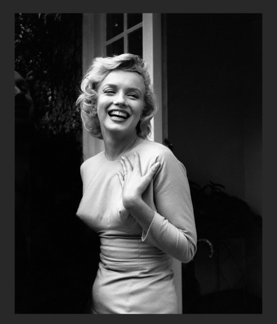
Step 2: Select the pen tool and go around Marilyn Monroe’s dress. Make sure you do it as accurate as possible to get a neat final results.
Step 3: After completing going around Monroe’s dress with the pen tool, right click > make selection and select 0.5. This will select the area that you’ve made with the pen tool.
Step 4: Choose a paint brush and select the colour you wanted and paint the colour on the selected areas. Make sure you edit it non destructively by creating a new layer and painted it in. It’s also a good idea to name the layer you’re working with as you will need to duplicate and create more layers which will be confusing at the later stage.
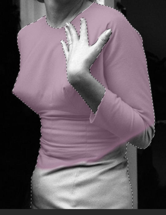
Remember, even if you go over the dress, it won’t effect the outside because the dress was already selected, meaning the paint cannot go outside of the dress.
It’s also a good idea to play around with the blending option to get what you preferred.
Step 5: Repeat the process for the hair, nails, skin and eye makeup.

Step 6: To do the lips, I use the same method with the pen tool. However, there is an opening in the mouth and it isn’t the same as the dress or hair anymore. To solve this issue, I used the pen tool and select the lips and painted in red.

I repeated the process again by selecting the inner side of the lip and press delete. This will remove the red colour inside of the mouth.

Step 7: Similarly, I used the pen tool and selected the teeth area and press delete. This method works well because the original picture of Marilyn Monroe is still underneath of all the layers we just did.

Original Image:
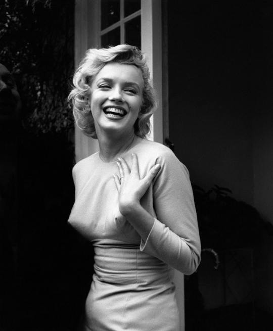
Final results:

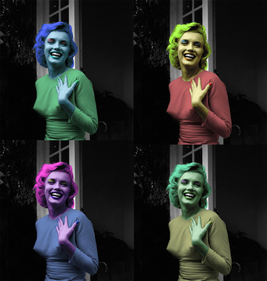
I think I’ve successfully created the colorisation of the original piece because I’ve used the techniques and methods that I’ve learned in the past few weeks to create this artwork. I also make sure that throughout the process, I carefully go around the shape of Marilyn Monroe so that the final colorisation doesn’t look messy.
The technique that I found the most difficult during this whole process is using the pen tool as it requires patient and attention to details in order to make the final art work look neat. However, I solved this issue by taking my time and really zooming into the work - by doing this, it allows me to work on the tiny details and will be able to control my pen tool more easily rather than doing a big stroke to get the work done quickly.
The technique that I found the simplest during this whole process is the colorisation because after you’ve done all the pen work, everything is easy from there on. Not only was it the simplest, but it was also fun to do as well. I find picking out the colours and working out the blending tool to be really fun because I get to choose which colours complement with the other colours well as it’s going to affect the final results.
I didn’t encounter any technical issues throughout the whole process as everything is straightforward - use the pen tool to make a selection and colour it in. It’s just a matter of managing your layers and not over-complicate things to get work done in the fastest, cleanest way possible.
The things that went well for this project is the colorisation for the final results. The colorisation version of Marilyn Monroe looks realistic from the dress to the skin. This was thanks to the suitable blending modes to be able achieved this results but it was also the colour selection that really makes Marilyn Monroe comes alive. However, there are things that didn’t go so well such as the hair colour. The colour look yellow rather than blond and it’s also too saturated to even be realistic.
0 notes
Photo
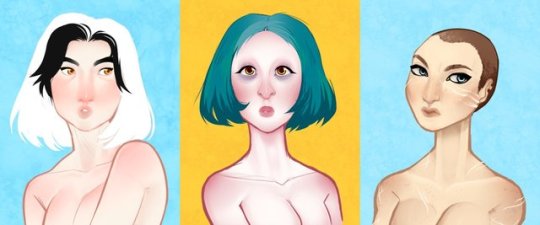
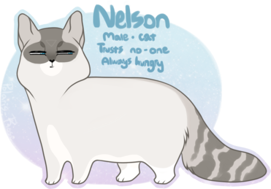
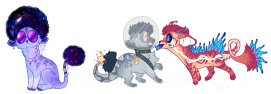
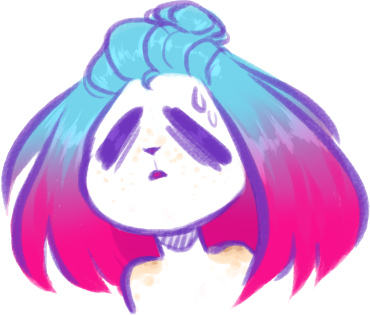
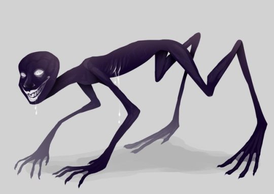
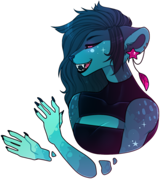
Artist Research - Polaris-Rose
1. Gals:
One of my all time favourite pieces of art by Polaris-Rose, these head shot busts are the perfect combination of lineart and painting and they each portray the personality of each character perfectly, as well as representing their ethnic backgrounds in a mature and realistic way. The first character is simplistic, and the style of having no shading on the hair whilst having shading on the body is one I rarely have seen but really do enjoy the look of. It also has a fantasy feel to it, as though her hair is ethereal; but whether or not the artist intended this remains to be unseen. The second head shot is similar, once again having a mixture of both line art and painting styles, however this one's hair has been shaded. This takes away that previous ethereal feel to them and roots them into reality. The third and final piece shows a war-torn heroine, this time with even more detail than the last. She has more intricate shading, more texture with her hair and skin, and her personality shows through rather than the pin-up feel to the other two. I overall love the colours used, the backgrounds creating such a contrast to the humans that are presented on them, even the hair colours compared to the skin tones create such a delicate feel to them. I wish to practise the painting/lineart mix for my own work, as I feel as though it may be a fun thing to try.
2. Me Me Big Boy:
This has to be one the cutest pieces of art I have come across during this project, and one that I love for more reasons than it being a cat. Polaris' style brings this kitty to life, showing how they are spoiled with the amount of food they get by adding a slight chubby ness to them, as well as using facial expressions such as the side-eye look to convey the sense of insecurity and suspicion so that even if the information about the character wasn't on the reference sheet, you'd still get an idea about what kind of personality they have. Another thing I love about this character design is the simplicity and the inspiration of real-life cats such as Siamese and tabbies, whilst also adding in unnatural designs such as the upside down triangle on their forehead. Whilst you cannot get a back story from this piece, you can get a sense of what this character would do in specific situations. Overall, I love how they were able to use a cartoonish style to exaggerate the characteristic of a cat to create not only a humorous image, but also a relatable one for people who are fellow cat owners, for they can see their own cat in Nelson. This is something I'd want to add to my work; treatability to my character, even if it's just appearance wise.
3. Kiamara Auction and Flatsale:
Another example of a character designer trying a variety of different colours, styles, and designs in order to make characters rather than just sticking to one idea, but rather to be inspired by an idea and creating off of it. For these characters, Polaris-Rose had the idea of space in mind, and from that they created three different designs: Galaxy Afro, Space Explorer, and Alien Friend. These three designs, whilst all holding the theme of Space, are completely different design wise. I love how the Galaxy Afro takes themes of 60's Psychedelia and adds it to the theme of space and using the colours of a galaxy for their pelt. For the Space Explorer, I love how they are based off of the colours of the moon, the only other celestial body that humans have laid foot upon, having the worried expression of the unknown for even though humans are curious about what lay amongst the stars, we have always had a fear along side it. And lastly, the Alien Friend is the most interesting; brightly coloured and wide eyed, giving a sense of uncanny valley, with random feather placements to give it an odd look. This is due to the fact we have no idea what an alien may or may not look like and so we have this perception that aliens may be weird creatures that may look threatening but who may also be just as curious as us; and Polaris has captures that perfectly. Overall, I love how they have chosen to stick with a theme and then create designs based off of said theme, without sticking to a singular idea and not branching out of it.
4. I've Been Feeling Weird
One of Polaris' vent-art pieces, this brings us more insight into the creator's own life and personality rather than the character that they've drawn's. In this headshot, Polaris has used what appears to be the marker tool with a different texture setting to make it look as though she has drawn them on paper, or on a textured surface. I love how she has decided to use a purple pen instead of a black one, as it really brightens up the piece as-well-as complements the blue/pink gradient. I also love how the techniques she has used has made it look as though she's drawn this piece in a watercolour marker or even painted it, even if it is but a sketch. Another thing I admire is how she's managed to capture the emotion of confusion and weirdness into a visual form; something not many are able to do due to the emotion being so complex to even explain let alone draw. I think overall, whilst this piece may have a sad origin, it's simple, it's sweet, and it captures the viewer's attention with both the colours and with the hope that the creator is okay.
5. Hello My Dear
I had to include this piece in my artist research due to how creepy and unsettling they are, thus proving that a character does not need to be beautiful or approachable, but can be horrifying and make someone uneasy. When I look upon this character, I get the feeling of dread, as though I have done something wrong or that I am about to be hurt in one way or another. It simply screams run, danger. The unsettling, uncanny, cartoonish wide grin and dilated pupils give us the sense that this creature is not in the right state of mind, hell bent on whatever morals they may uphold. The bent and twisted, unnatural way the body contorts and bends sends shivers down my spine - I know something's not right with the anatomy and because it's been exaggerated it puts me on edge. Looking at this creature makes me feel as though I'm not safe, that it could literally jump out of my computer screen at any moment to harm me, and that's why I love the piece. Overall, I think this piece is a good example that characters don't always have to be the hero, or the one you're meant to fall in love with; they can be the ones you despise, pity, or in this case the one's who truly horrify you.
6. River:
Not only am I jealous of Polaris' ability to draw hands so well, this art piece leaves me in awe with the creativity and skill needed to come up with something like this. The first thing I like about this piece is the pink highlight on the blue body; it gives off a sci-fi feel to them, the colours fit in so well together, and, from what we have seen, they have been a favourite combination of Polaris'. Another part I love about this piece is how they've drawn the arms. Instead of simply connecting them to the body, they have sectioned off some parts of them, as if they're only partially there or that they have the ability to part some of their body from the rest. It's an interesting way of drawing and is very surreal, taking a piece which could have been an beautiful fullbody or bust and turning it into a beautiful, yet interestingly mind-baffling, one instead. Overall, I'd like to try this sort of surrealism with my pieces to see where it could take me, and what it may inspire.
Original Links:
1. http://polaris-rose.deviantart.com/art/Gals-676921306
2. http://polaris-rose.deviantart.com/art/me-me-big-boy-670215759
3. http://polaris-rose.deviantart.com/art/Kiamara-auction-and-flatsale-1-open-604691341
4. http://polaris-rose.deviantart.com/art/ive-been-feeling-weird-668984335
5. http://polaris-rose.deviantart.com/art/hello-my-dear-608135510
6. http://polaris-rose.deviantart.com/art/River-593463980
0 notes
Last Seen Blogs