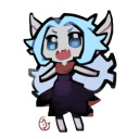
#for some reason all the gifs were different sizes although i used the same format for each :
Photo


Dallon Weekes + iDKHOW Music Videos
#those last three gifs are kind of bad sorry#for some reason all the gifs were different sizes although i used the same format for each :/#despite of that im really proud of this one#dallon weekes#idkhow#dallon idkhow#dallon james weekes#i dont know how but they found me#idkhbtfm#musicedit#music#alternative music#p!atd#Panic at the Disco#idkhowedit#blogmusicdaily#bbelcher#dailymusicians#useraashna#imjustalonesomewriter
256 notes
·
View notes
Photo

After a few years of trial and error, I think I've finally found the perfect organization method.
In the early years of high school, I had a bullet journal. I was an artsy kid who found a way to combine art with organization in a way that benefited other parts of my life.
However, as I approached the end of high school, my schedule got busier, and I was involved in a lot more things, so owning a bullet journal was less practical. Because of that, I switched to an app called Edo Agenda.
I continued with digital planning in college since I knew I wasn't going to have as much time. But all the apps I tried out—Taskade, Actions by Moleskine, Any.do, Todoist, Wunderlist—weren't suited to my planning and organizational needs. They didn't have the specific functions I required and didn't incorporate an organization system I liked to use. The predefined apps were too restraining, but the more customizable apps weren't customizable enough.
So then I switched to a bare bones, uber minimalist bullet journal method. That worked pretty well my second semester. It was simple, portable, and most importantly, flexible—all the things one could wish for in a planning system. However, it wasn't always the most convenient to use since I couldn't effectively integrate all the different aspects of my life, which, to no surprise, is mostly recorded digitally.
There was just one huge problem with my digital organization system that made me hesitant to switch back in the first place: everything was fragmented. Notes were in Google Docs. Financial records were in Google Sheets. To-Do Lists were in my bullet journal. Team projects were in Trello. My poetry was on Bear. Things I wanted to try are carelessly pinned to random pinterest boards or added to my YouTube "watch later" playlist. It was a mess.
Over the summer, I found out about Notion from a friend, and I thought, this has so much potential, it could even be exactly what I need. It's essentially like an empty notebook on your computer with functions that make it 10x more powerful. Notion allows you to integrate all aspects of your life and work into one app. Some of the advantages that have made me partial to Notion are:
Even greater customization level. Notion is a blank canvas with tons of predefined blocks and different file types. You can make databases, spreadsheets, Kanban boards, to do lists, etc. Also, you can remain connected to other digital services. You can link websites, collaborate with other users, use different structures (e.g. documents, databases, tasks), embed images and videos, etc. There are also tons of formatting options, e.g. text color, highlight, heading v. body text.
Better organization. Notion allows you to have pages within pages within pages within pages—an infinite hierarchy that you can organize with tables of contents. These pages are made of blocks, e.g. tables, checklists, boards, databases. Both pages and blocks can be rearranged by simply dragging and dropping them to where you want them to be. In other words, I guess it's kind of like building a website to organize your life. Plus, their database feature is especially powerful as it allows you to connect all your data and get into as much detail as you wish (each entry in a database is its own page).
Templates. There are tons of templates created by both Notion and the community that you can use. These are especially helpful in the beginning since Notion does have a rather steep learning curve. There are template for almost every category: personal, planning, finance, job applications, design roadmap, etc. Check out their template gallery, this medium article called "10 Notion templates to inspire your use", or read on for my own examples!
Shortcuts. This makes typing and documenting so much faster. Notion uses Markdown, which is a text-to-HTML conversion tool, e.g. # = Heading 1, *, - = bullet point, etc.
Notion has some pretty awesome features, but how does one actually use it? Personally, I have four top-level pages: my planner, my personal journal, songwriting, and blogging.
Planner
I've been using my planner to, well, plan and track my day to day activities as well as my week and month. The way I've structured it is a calendar or monthly overview with links to pages of weekly overviews, and if needed, daily overviews within the weekly overview. This links things up so nicely, i.e. I don't have to be constantly flipping pages in my physical bullet journal or planner to find what I need.
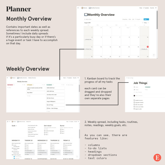
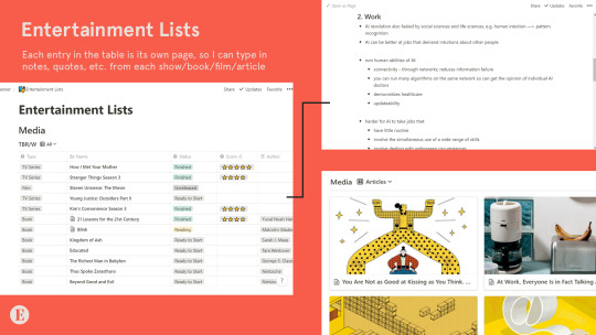
I also have entertainment lists, which is mainly a table with all the shows I want to watch, the books I want to read, etc. I keep track of whether or not I've watched them, as well as my personal ratings. What I love most about this is that each entry is its own page, so I can type my notes for each book, show, or film and easily find them in the future. (Also the reason why I have plural “lists” instead of just one entertainment list is because you can filter entries by type of entertainment, e.g. movies, tv shows, books, articles.)
Personal
For personal notes, goals, journal entries, etc. This is kind of like an extension of my daily journal and just where I dump all my thoughts and keep track of the different aspects of my life: mental, emotional, spiritual, social, physical, and travel.
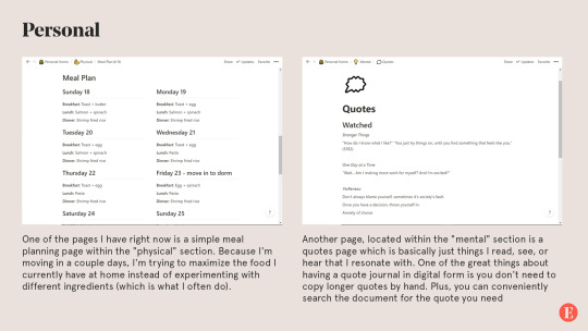
Another page I have is called "Stray Thoughts" and, well, it's pretty self explanatory. It's a lot easier to dump all my thoughts as they come and reorganize them later. Of course, this requires sacrificing the rawness of journaling, i.e. when the thoughts come and how you process them, which is why I still keep a regular journal that I write in daily.
Songwriting
I've been writing a lot of music over the summer and it's often hard to keep track of all of my songs and how far I've gotten in the songwriting process. So I created a table of songs - each entry of a song is a page with its lyrics. These are then tagged with the status of the lyrics (i.e. completed, in progress) and the status of the music itself (i.e. melody only, instrumental, mixing, mastering, revised). Eventually, I'll include demos in the database by embedding audio files in the document.
I have a separate section for inspiration and ideas, which is a kind of brain dump, e.g. words I think would make a good song, a certain theme for a song, a melody that's been stuck in my head, a vibe I'd like to try out, etc.
I've also been watching a lot of tutorials for music production and there's a section where I write my notes for that.
Eintsein
The last section of my Notion app is for this blog. Which has pages for
New posts. These are ideas for future posts, asks that I think would need longer answers, as well as posts that are currently in the draft stage (like this one was before I posted it)
Design assets. This is where I put all the visual branding material for Eintsein.com to be used in posts and any visual material on the blog.
FAQ. Having an FAQ document just makes it so much easier to make changes to your existing FAQ. Plus, if you ever change your FAQ theme, you just have to copy and paste what you already have.
Post directory. I keep track of all my previous masterposts, infographics, and generally longer and more comprehensive posts. It's the exact same as what you see on my Navigation page. And yes, the document contains direct links to the post.
New theme. A project I've been working on the past couple days is trying to create my own theme for my blog. This is where I put all my outlines, brainstorming notes, design inspiration, code snippets, etc.There are some pretty awesome features I’ve made use of in this page:

As you can probably tell, I'm absolutely obsessed with Notion since it has such awesome features and endless possibilities for customization. So far I've been using Notion for personal projects, which, since they are quite big in scale and have no set deadline, are important to organize well. My summer courses were only 6 weeks and weren't difficult to organize.
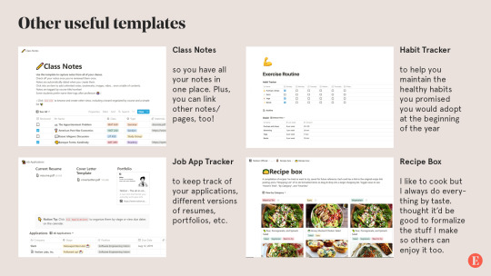
The formats above are just how I personally use notion. You could make some of your own, or if you don't think you want to build your pages from scratch, there are tons of templates to choose from. Here are some I think I'll be using in the near future and may be helpful for others as well, especially students like myself:
One drawback, however, is that Notion has a rather steep learning curve, but there are tons of tutorials online (especially YouTube) and I guarantee you it's all worth it.
Notion is not just a productivity app. It's a way to concretize your entire life.
Notion is free to use, but there are higher tiers that allow for more blocks, greater file size, etc. I use a personal account, which is $4 per month with unlimited block storage and no file upload limit (although I got it for $33/year). Personally I think the free plan would suit most people's needs, especially if you're not uploading large files.
#mine#eintsein#mymp#notion#apps#productivity#studyblr#studyspo#study hard#organization#document#graphic#design#infographic#masterpost#advice#tips
5K notes
·
View notes
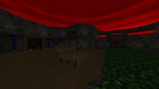
Photo

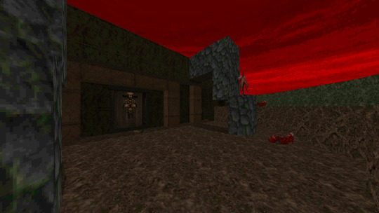
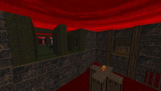
The Plutonia Experiment
32 maps megawad.
By the brothers Casali.
1996.
https://doomwiki.org/wiki/The_Plutonia_Experiment
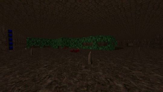
Level 1: Congo
Iconic beginning that presents us one of the most popular tricks of Plutonia: Chaingunners, Archies and a lot of pain. Pretty hot start that delivers quite greatly.

Level 2: Well of Souls
An elevator styled entrance that delivers quite the punchy level with some awesome ‘‘congo’‘ vibes more than the actual congo level.

Level 3: Aztec
Iconic beginning that presents us one of the most popular tricks of Plutonia ''invisible bridges'' I'm not a fan of them but I can see the charm in this first level.

Level 4: Caged
Surrounded on all sides and ready to die The first level of Plutonia that presents the classic style of difficulty but keeps a nice balance between exploration and combat.
Level 5: Ghost Town
We are moving to a tighter and more traditional format but one that remains constant though somewhat simpler.
Level 6: Baron's Lair
One of my favorites. A medium size level but with a more interesting layout that reveals different areas of combat and a dynamic and entertaining progression.
Level 7: Caughtyard
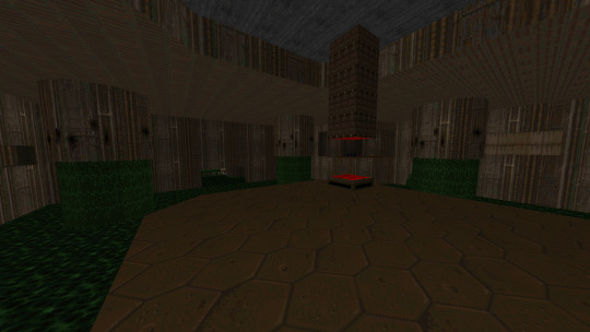
Another of my favorites and one of the icons of the set. This is a simple square map sand style but with a pretty hot gameplay that will take blind-players by surprise. It still has a good quality of play and is fun to play with at all times.

Level 8: Realm
A bit punishing at times but with a fluid design.
Level 9: Abattoire
Quite open and with a more bloody combat. This is one of the first big maps and takes us through a somewhat different but acceptable adventure.

Level 10: Onslaught
With a design that makes more use of exteriors, this level combines a beautiful design with an attractive and challenging gameplay.
Level 11: Hunted
Oh boy. This is probably one of the most iconic maps in history. A great labyrinth where the only enemies are nothing more and nothing less than Archviles. What does of this one a quite destructive and frustrating adventure for moments, but the simple originality of the concept does of this one a fascinating map.

Level 12: Speed
Moving is the key, although not as fast as the map indicates. A high design and a few surprises make this a nice and drastic adventure.
Level 13: The Crypt
Towards the depths of a tolerable map.
Level 14: Genesis
Smaller than normal but with a closed circuit design that allows constant movement and gameplay that flows like the wind.

Level 15: The Twilight
(Exit to secret level)
Things get hot. We need good moves and a bit of strategy to advance a more tactical map and with a less merciful gameplay but always maintaining a solid quality.
Level 16: The Omen
A small level with a lot of intensity. Developed in a simple system of capture of keys which are at first sight and without major problem. The combat, however, is developed as a system of constant surprises in which the player will be ambushed at every given opportunity, creating an intense level that despite having a duration of about 6 minutes manages to deliberate an entertaining gameplay with a design that, even if it is simplistic, does the job in a good way. Some areas can be a bit annoying (deliberately) and makes it a bit difficult to get around, but Plutonia has far harsher maps and this one feels more like an intermission that lets us rest a bit.

Level 17: Compound
Another short level that follows the same visual theme of this chapter. What we have here now is a more intricate design with an entertaining layout that combines a bit of traditional style with certain abstract structures. With a more fluid but equally hot combat, this is a fast level that enjoys a good flow.

Level 18: Neurosphere
Interestingly fluid, dynamic and quite intense without necessarily being destructive. This is a level that has a very entertaining flow that allows to appreciate the combat of a more dynamic way at the same time that it stays stable and balanced before the player, taking into account the difficulty of the most famous maps of this game. I could say that this map feels more like a MAP01, or at least it could have been very successful as the first map.

Level 19: NME
Hot and short in size, but well packaged. That sounds weird. This is a pretty intense map that sees us in a tight fight and requires a little more anticipation to survive, as well as a few surprises that can take us by surprise. With a nice design but a bit stressful combat, it is a solid map. All the maps have been pretty solid, actually.

Level 20: The Death Domain
Something a little more traditional but welcome, with a good collection of Chaingunners and a circular but constant layout.
Level 21: Slayer
A circular map with an intricate design that takes us through an intense but entertaining combat.
Level 22: Impossible Mission
Square and designed based on rooms with different boxes. It follows a somewhat sporadic flow and can be slightly lost but maintains a solid visual warmth to compensate. Combat stays normally-balanced up until the end. But overall, fun enough.

Level 23: Tombstone
Long and with a complex design. A little bit of unnecesary backtracking at times but it makes up for it with an intense and fun gameplay.

Level 24: The Final Frontier
Fantastic small enigmatic map with an abstract design that will make us go through a little trial and error until we find the victory. Playing this map with the MIDI pack is orgasmic.
Level 25: The Temple of Darkness
Long and with multiple monster closets as well as tight and tactical combat. A nice, intense and full of adrenaline map.
Level 26: Bunker
Simple style and even has some touches of Heretic but with good combat although a bit of a puzzle/lost layout.
Level 27: Anti-Christ
Great, fun and hot. With a dynamic combat and varied heights, which gives good depth to the fight and makes us go through a well-balanced and entertaining challenge.
Level 28: The Sewers
Enigmatic. It leaves somewhat disturbing airs which gives it a good presentation. With a somewhat lost but well structured layout manages to create a slightly longer adventure with good action.

Level 29: Odyssey of Noises
Iconic for different reasons and controversial for others. This is an attractive map with an urban style like Sandy, combining abstract buildings with a little more attractive architecture. With an expansive and big layout, the map is quite long and a bit lost, but it compensates with a good gameplay and open combat.

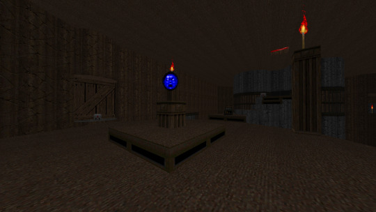
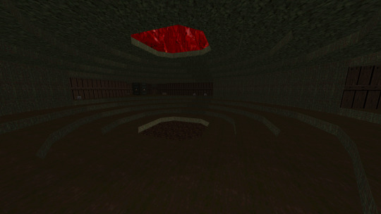
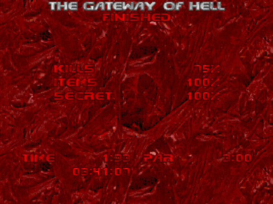
Level 30: The Gateway of Hell
The end of Plutonia. A decent IoS fight with a bit of foreshadowing and good build up to the final battle, which has a few tricks up its sleeve. Overall, decent, but definitely one of the best IoS of the IWADs, if not the best.

Level 31: Cyberden
(Exit to super secret level)
Interesting gimmick map with a few Cyberdemons to keep us company.

Level 32: Go 2 It
The iconic Go 2 It. It doesn't need many words other than to say that it is a pioneer of a particular style and features a gameplay and layout as violent as it is fantastic, though unfair and cruel at times.
End.
» Overall:
The Plutonia Experiment (1996)
By Dario and Milo Casali
In 1996, history was made. Final Doom, the last expansion of the classic Doom, is finally released and with it brings to our eyes two of the most iconic megawads in history. The Plutonia Experiment is one of those holy or not so holy grails that we adore to this day. Considered by many as an irreplicable milestone in the history of Doom and by others as an outdated and particularly cruelly designed work. Whatever the opinion, we can all easily accept that Plutonia came to stay sedimented among the most influential megawads in history.
Made by the brothers Casali in an almost speedmapping way, almost indeed, the Plutonia Experiment, or simply Plutonia, is one of a kind, specially during the 90s when the world of WADs was still in a very primitive, almost baby-like state. Of course, things would change quite quickly but not until Final Doom hit the shelves, and oh boy did it also hit the Doom community. Of course, it is such an iconic work that it is practically as famous as the original Doom 2 or Ultimate Doom itself, bringing with its different mechanics and creative tricks that would later be replicated several times in other distinctive and fantastic ways, creating a cycle of improvements and approaches to new ideas. Plutonia is nothing new, not at all, but it's something I've barely gotten to discover properly. While I played it a long, long time ago, I could barely remember the first five levels, much less the last few. I wanted to give it one more spin, one where I could fully appreciate the creation of this magnificent specimen. I did it and now I can see with a different eye the reason for the appreciation of this megawad. The cult of the Plutonia lies deep and with a very good reason.
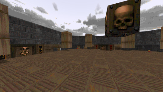
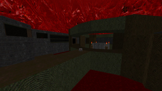
Visually speaking, Plutonia is twice better looking than Doom 2, and quite frankly, TNT: Evilution, and that’s something I think we can all agree upon (well, pretty much anything looks better than Doom 2 now a days.) with no major problem. Interestingly, the levels were created by only two people, which gives a certain sense of respect for the creative capacity and practical ability of the Casali brothers. Dario did a total of 14 levels while his brother Milo did a total of 18, giving their respective authors a fairly respectable number. Which level was made by whom? That we will probably never know, although speculation may tell us certain things and analysis of map techniques others, at least we can all agree that the two authors show a well-defined quality in terms of their overall quality. Almost all Plutonia maps are attractive to look at, fun to admire and have generally understandable layouts with no major visual or progressive detractors. From the first iconic level to the last IoS, each map has a distinctive shape that gives it a certain renown, with, obviously, some maps standing out more than others, such as Congo for its respective high level of difficulty for a first level, or Hunted, for its unique way of screwing up our day with a few thousand Arch-Viles (is actually just a few dozen, but let’s drop some salt in it).
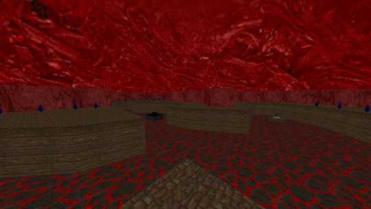
Each 10 maps are divided into chapters with a specific visual theme. The first 10 are Earth Levels, with the next 10 being Hell Levels and the last 10 being Devil Hive levels, a unique mix of particularly atrocious levels with disturbing visuals. Of course, the all-mighty secret levels also have a distinctive look, but they are not particular adherent to any other chapter. The first 11 levels manage to create that earthy feel quite well by offering brown textures that seem to recreate fortresses or human settlements, as well as clearly palpable architecture and realistic definitions without needing to be hyper-realistic. They just look good for what they need to work for. From map 12 to 20 we have the infernal levels that try to recreate what seems to be hell cities, or places with red tints. In one way or another, they manage to evoke dark sensations and also offer iconic battles in rivers of blood and red skies. From level 21 to 30 we finally have the center of all corruption. The Devil Hive levels are maps that recreate inner sectors of hell, such as capitals or demonic cities. Most of them usually look good and offer long combat spaces, although some maps can be a little longer than necessary, each of them satisfies.
And when we talk about satisfaction, we, of course, have to talk about gameplay. This is probably the most brilliant point of Plutonia, and one that many would consider essential in the history of Doom WAD development. Plutonia introduced, without a doubt, the most difficult original levels of all classic Doom, making use of a totally cruel creative and planning freedom that is designed to envelop the player in levels of absolute carnage and unnecessary insanity. This resulted in a plethora of iconic levels that stand out for their absurd early difficulty, as I said earlier, Congo is probably the ideal map to represent what Plutonia is all about. I don't have to say anything else; this has already been said to death: Revenants, Chaingunners, Arch-Viles, Barons, Mancubus. Be prepared to see them in whole hordes. However, what do I think of this? Well, at first, I must admit I was a bit skeptical about my initial reaction, since I'm usually more of a fan of casual WADs that show some mercy to the players, on the other hand, I also appreciate a good shot of adrenaline to get the glands moving. Plutonia is definitely going for the latter. What we have here is the introduction of what I, and many, consider the proto-slaughtermap. Before Hell Revealed, Plutonia already had the first slaughter-style maps, such as the immortal Got 2 It. These are brutal maps, even for modern years. Sure, many other WADs have managed to surpass Plutonia's overall difficulty, including its famed unofficial sequel, but Plutonia is the starting point where it all began and from there were born distinctive WAD making moves that would later be sedimented as part of the iconic variety of this beautiful community. I can't hate that, it's simply impossible since it's a factor that, despite being so divergent, brought about a change that would end up favoring the freedom of design and the brutality of the unforgivable gameplay.
I enjoyed every second of it, from start to finish without encountering any major difficulties and that's pretty incredible, considering that all other IWADs have at least one major negative quality that tends to affect my enjoyment. Plutonia, on the other hand, didn't present me with any truly annoying factors. Even its brutal difficulty was extremely enjoyable and I'm sure it has managed to survive modern times precisely because of that.
Sure, it's a bit old, and some maps tend to be a bit more boring to look at than others, but it's a journey through time that launches us into the golden grail that everyone wanted to reach during the 90s. A time when everyone was waiting for the ''Next Plutonia''. The Casali brothers created a movement that would forever remain on the plaques of Doom history, and for that and much more, I think we should all be thankful that what we have here is, without a doubt, the best IWAD ever. Plutonia is an experience and one that everyone, without fail, should try sometime in their life. It may kick your ass, but a kick never felt so good.
2 notes
·
View notes
Text
DES240 Assignment 2 (unfinished)
Review of Work in Progress
Week 5 (first week of assignment): After studio 5, I began to sketch some very basic ideas down, but mostly focused on researching my specific statistic further. Along with this, I brainstormed ideas for what my GIF could be based on, with my original concept focusing on exercise. I chose to use food as characters in my GIF to avoid potential upset.
Week 6 (second week of assignment): After discussion about the sensitivity present in my statistic, I decided that the best approach for this GIF going forward was to ensure that respect was kept, and that it should be approached in a manner that will not cause any upset or controversy. With this, I began to research the causes of my statistic in order to approach potential GIF ideas from a different perspective. After researching the causes, I found that unhealthy food and it being a cheap and easy way to feed yourself and your family was the most common cause. With this, I began to develop a different perspective on my GIF, removing the idea of using exercise as the base and instead focusing on food shopping. I created storyboards that show a few ideas, mostly centering around unhealthy food being chosen over healthy food.
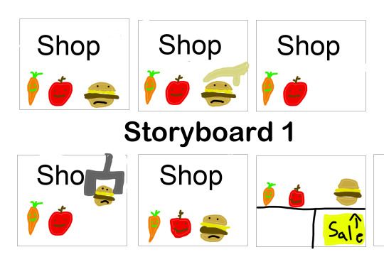
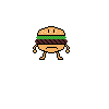
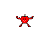
Week 7 (third week of assignment): This week I created my original pixel sprites for my GIF, which through feedback from the class in Discord, I edited accordingly and saved for use on my GIF. Through discussion with Jacky, we decided that an obvious barrier or divide between the cheap unhealthy food and expensive healthy food should be incorporated into my GIF to represent the divide between the two. With this, I created a few more storyboards, which featured my created sprites and a divide between the food groups. I did this in a few different ways, and after further discussion, I decided that using different leveled shelves was the best way to go about incorporating an obvious divide.

Week 8: After discussion with Caleb in our 8th studio, I designed a few more pixel characters, attempted to add depth to my background, experimented with different ways of ensuring the GIF looped, and wrote my guest lecture reflections. Studio 8 was immensely helpful thanks to the feedback from Caleb, and I felt that this was my most productive week. Once I had formed all of my assets, I began properly attempting to code my GIF. I found this quite difficult, but got to a point where I had the fast food randomly generated on the bottom shelf each time, and had everything positioned correctly on the canvas.


Week 9 prior to studio (final week): Not much work was done this week due to personal problems. However I was able to get some writing done and format my blog post.
Reflections on Guest lectures
Guest 1 - Blockchain | Cryptocurrency | NFT’s by Fabio Morreale
Prior to Fabio's lecture, I had never heard of NFT’s or blockchains, and had very basic and limited knowledge on Cryptocurrencies. The concept and reality of making money solely through code and numbers, along with the fact that NFT’s are online artwork that sell for thousands of dollars is quite mind blowing, and I still don’t quite see the point in purchasing an NFT, although it seems to follow the same motivation as purchasing physical art. Along with this, Cryptocurrency doesn’t make much sense to me either, as although Fabio mentioned it, I still don’t understand how a currency can be created and suddenly grow in value as it is purchased by more and more people. The fact that popular crypto like Bitcoin is so highly valued at the moment confuses me, as I don’t really understand why there is a demand for it in the first place.
Fabio's proposal of a decentralized financial system is interesting. Essentially removing the middle man (banks in this instance) is a valid idea, and would allow money to flow without a dependence on corporations, along with removing the dependence on corporations for storing data etc. However I believe that this would negatively affect both my own scale and on a global scale. Negating powerful and proven corporations opens up the market and peoples data to everyone, or at least to people capable enough to figure out how to access it, and although this is happening now, I have a much greater faith in powerful corporations to protect my data than I do in protecting my data myself. Furthermore, removing these corporations would be detrimental for the short term economy, as jobs would disappear and money plus data for people who aren't really equipped to defend themselves would essentially be easy meat for more capable hackers. I believe that there is a place for a financial system and that these corporations are important for both myself and the world.
Guest 2 - Data, ML & Ethics By Daniel Wilson
Daniels' lecture on ethics was really interesting and very eye-opening. The presence of bias in almost every aspect of day to day life, shown by the splayed data presented by Daniel was pretty surprising, and in some ways disappointing. Daniel mentioned a confusing divide in ethical systems, pointing out that companies must provide information that they are using a certain system but also have systems that must check that this system is being used correctly. He also talked about misinterpretation due to accidental system malfunction, which, despite being created on accident, can still form inappropriate consequences despite the bias not being recognized by the creator. For example, someone creating a survey could be unaware of the multiple genders considered today, and could create something for only male and female, due to the creators outdated knowledge. Thus creating accidental bias. This idea is very important in terms of the future of ethical systems, as being aware of all biases will hopefully mitigate accidental unethical consequences in the future. Coming to this point will be quite difficult, as society continues to grow and incorporate, new biases will spring to life. Despite this, efforts to negate as many biases as possible is the best way to stay ethical now and in the future.
Research Summary
- Why does this statistic exist in its current state in 2021?
My statistic - 1 out of 3 adult people in NZ are obese exists due to multiple reasons. However, through my research, I found that commonly, unhealthy eating habits, and the ease of access to unhealthy foods like fast food is too easy and cheap, thus leading to more vulnerable groups struggling with obesity, as healthy eating is too expensive and seemingly not integrated into day to day life. The ease of access to unhealthy food is the main catalyst for the existence of my statistic in its current state in 2021.
A lot of the blame is placed on cheap fast / unhealthy food, and in the discussion of obesity in children and young adults, a lot of the blame is on the advertising for unhealthy food, as it is too appealing and false. There’s an appetite to clamp down on unhealthy food marketed to kids. Cartoon-covered packaging for sugary cereals, Disney-branded biscuits with collectible magnets, TV ads for unhealthy products at peak viewing times for children. Not to mention, junk food marketing online and fast-food joints sponsoring sports teams. It’s almost impossible to avoid unhealthy food being peddled to teens and kids. Young adults and children are a lucrative market for food companies. As they not only influence what their parents buy (pester power), marketers also bank on shoppers sticking to buying habits they acquired when they were young, hence the progression into unhealthy adult diets.
- What are the interconnected and contributing factors behind this statistic?
The contributing factors behind this statistic is the exponential growth of cheap, processed food, and it becoming a multi-billion dollar industry. As time has passed, processed food has become cheaper to manufacture and deliver around the world, resulting in a massive contribution towards obesity within the general public. This is the most prominent contributing factor behind why 1 in 3 adult New Zealanders are obese.
- How has this statistic evolved through history?
The NZ Ministry of Health stated that “the overall prevalence has remained relatively stable since 2012/13, however there was an increase between 2011/12 and 2019/20 for adults aged 45–54 years and 55–64 years.” and according to a report written by the NZ Ministry of Health between 1977 and 2003, obesity increased by around 6% from 1989 to 1997 over all adult ages. Both of these statistics provide relevant evidence that the obesity rates in New Zealand are exponentially increasing through history, evolving into more and more of a threat to New Zealanders.
- What is the future prospect of this statistic?
If nothing is changed in regards to NZ’s struggle with obesity, then the statistic will continue to grow, as the prospected future formulated from the data collected from the past shows a continual exponential increase in obesity rates amongst NZ adults. An increase in obesity for adults would most likely work perpendicularly with obesity rates of children, as both have been exponentially increasing to this date.
Copy of code so far (not properly working, however the layout is there)
int numPoints = 10;
int[] posX;
int[] posY;
int xValue = 0;
PImage shelveBackground;
PImage burger;
PImage cookie;
PImage lollipop;
PImage cart;
PImage[] displayImage;
int timer = 0;
int counter = 0;
void setup() {
size(1000, 1000);
shelveBackground = loadImage("DES240Assets/background3.png");
burger = loadImage("DES240Assets/burgerboy1.png");
cookie = loadImage("DES240Assets/cookieboy1.png");
lollipop = loadImage("DES240Assets/lollipopboy1.png");
cart = loadImage("DES240Assets/bigcart.png");
posX = new int [numPoints];
posY = new int [numPoints];
displayImage = new PImage[numPoints];
for (int i = 0; i <numPoints; i++) {
posX[i] = int(random(100,width-300));
posY[i] = (690);
displayImage[i] = burger;
}
for (int i = 3; i <numPoints; i++) {
posX[i] = int(random(100,width-300));
posY[i] = (670);
displayImage[i] = cookie;
}
for (int i = 6; i <numPoints; i++) {
posX[i] = int(random(100,width-300));
posY[i] = (620);
displayImage[i] = lollipop;
}
for (int i = 9; i <numPoints; i++) {
posX[i] = (-50);
posY[i] = (620);
xValue= 0;
displayImage[i] = cart;
xValue++;
}
}
void draw() {
image(shelveBackground,-550,-250);
for ( int i = 0; i < numPoints; i++) {
displayImage[i].resize(350, 0);
image(displayImage[i], posX[i], posY[i]);
}
}
Statement of Intent (for how I wanted the finished GIF to be)
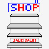
My GIF represents the statistic 1 in 3 NZ adults are obese in an empathetic and lighthearted manner. Although the issue is serious, I thought the best way to avoid any accidental distress or disrespect was to keep the GIF focused on one of the main causes of the statistic, and to keep it brightly coloured and playfully animated to maintain respect and allow the GIFs message to be seen without causing controversy. With this in mind, I used toy-like pixelated food character models to represent the GIF. From the research I conducted on my project, I found that cheap unhealthy food and how easy it is to buy, cook, and eat is the most commonly blamed cause of obesity in NZ. With this, I designed my pixel sprites for the statistic, with 2 ‘healthy’ foods being an apple and carrot, and 3 ‘unhealthy’ foods being a lollipop, burger, and cookie. This was done so that the 1 in 3 ratio was shown in the GIF, with each shelf representing part of the statistic. The ‘unhealthy’ food was placed on the bottom shelf to emulate how easy it is to access it, and a ‘SALE!’ text is imprinted on the shelf to represent the lesser price of it. The ‘healthy’ foods are placed on higher shelves to represent the opinion that they are harder to access, whether it's financially or due to a lack of nutrition knowledge. The GIF shows a shopping cart moving across the screen from left to right, and as it goes, unhealthy food is placed in the cart, while healthy food is left on the shelves. This is to represent the appeal of unhealthy food to a shopper, and to represent what is proposed by my research. The GIF loops by a robotic arm restocking the shelves once the shopping cart reaches the end of the screen, as both a way to show supply and demand of unhealthy food, and also to ensure the GIF loops from start to finish.
Draft of how the GIF would look

References
RNZ. (2019, October 13). The true cost of a disordered food system: a panel discussion. https://www.rnz.co.nz/programmes/otago-university-panel-discussions/story/2018716711/the-true-cost-of-a-disordered-food-system-a-panel-discussion
Obesity Prevention Strategies. (2016, April 12). Obesity Prevention Source. https://www.hsph.harvard.edu/obesity-prevention-source/obesity-prevention/#:%7E:text=Choosing%20healthier%20foods%20(whole%20grains,%2C%20and%20other%20%E2%80%9Csit%20time%E2%80%9D
Obesity statistics. (2020). Ministry of Health NZ. https://www.health.govt.nz/nz-health-statistics/health-statistics-and-data-sets/obesity-statistics
NZ Ministry of Health. (2004). Tracking the Obesity Epidemic: New Zealand 1977–2003 (No. 24). https://www.health.govt.nz/system/files/documents/publications/trackingtheobesityepidemic.pdf
0 notes
Last Seen Blogs
darkvolt
DV's Doodles of some sorta Randomness

goldenuwuswriting
GoldenUWUS writing blog
jemmie-heartz
Jemmie’s Heartzone

melaninopal
Melanin Opal

lickyourlipscakes
A Pleasure So Guilty, You'll Eat It In The Dark