#colorblending
Text
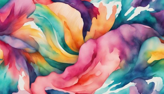
Watercolor Calligraphy: Blend Colors & Fonts for Stunning Art!

Watercolor Calligraphy Secrets: Unleash Your Creativity with Color Blending & Font Mixing!
Watercolor calligraphy is a beautiful technique that combines the art of calligraphy with watercolor. Whether you're a beginner or a pro, watercolor calligraphy allows you to play with vibrant color combinations and experiment with different fonts. In this article, we'll explore the world of watercolor calligraphy, including blending colors and choosing fonts, and provide you with the techniques, tools, and resources you need to create stunning watercolor calligraphy pieces.
Key Takeaways:
- Watercolor calligraphy combines calligraphy and watercolor for a beautiful artistic technique.
- You can experiment with vibrant color combinations and different fonts in watercolor calligraphy.
- Blending colors and choosing fonts are important aspects of creating stunning watercolor calligraphy pieces.
- This article will provide you with techniques, tools, and resources to enhance your watercolor calligraphy skills.
- Watercolor calligraphy is a versatile art form that offers endless possibilities for creativity and expression.
The Beauty of Watercolor Fonts
Watercolor fonts bring a unique and handmade quality to your designs. With their soft and smooth textures, they add a touch of elegance and creativity to any project. These fonts have a range of opacities, providing depth and dimension to your typography. Whether you're creating school projects, invitations, or quotes, watercolor fonts can enhance the beauty of your creations.
There are various watercolor fonts available, both ready-made and customizable. You can choose from a wide selection of fonts that suit your style and project requirements. These fonts come in different formats, such as OTF, TTF, WOFF, and SVG, ensuring compatibility with various design software and platforms.
To incorporate watercolor fonts into your designs, simply install the font files on your computer or device. Once installed, you can use them in design software like Adobe Photoshop, Illustrator, or Canva. Experiment with different sizes, colors, and layering techniques to achieve the desired effect. Watercolor fonts offer endless possibilities for expressing your creativity and adding a handmade touch to your designs.
Watercolor Fonts in Action
Here are a few examples of how watercolor fonts can be used to enhance your designs:
"The soft and flowing nature of watercolor fonts brings a sense of elegance to wedding invitations, capturing the romantic feel of the special day."
"Using watercolor fonts in quotes or inspirational posters adds an artistic and organic touch, evoking emotions and creating a visually captivating design."
"Watercolor fonts are perfect for school projects, allowing students to showcase their creativity and make their work stand out."
By utilizing the beauty of watercolor fonts, you can elevate your designs and make them truly unique. Let your imagination flow and explore the endless possibilities of incorporating watercolor fonts into your projects!
Exploring Watercolor Calligraphy Fonts
When it comes to watercolor calligraphy, the choice of fonts is crucial in expressing the desired look and feel of your artwork. There is a wide variety of watercolor calligraphy fonts available, each with its own unique style and characteristics. Whether you're looking for a playful and charming font or a more natural and handwritten look, there is a font out there that perfectly suits your artistic vision. These fonts can be used for various purposes such as school projects, invitations, posters, quotes, branding, and apparel design.
One popular style of watercolor calligraphy font is the playful and charming type. These fonts have a whimsical and lively appearance, adding a touch of fun to any design. They are perfect for creating eye-catching headlines, invitations, and greeting cards. On the other hand, if you're aiming for a more natural and handwritten feel, there are fonts available that mimic the look of a brushstroke. These fonts give an organic and authentic vibe to your watercolor calligraphy, making it feel personal and intimate.
In addition to style, another factor to consider when exploring watercolor calligraphy fonts is whether they include all capital characters. All capital characters can add a bold and impactful look to your artwork, making it stand out even more. They are great for creating emphasis or for titles and headings. However, it's important to find a balance between using all capital characters sparingly and using mixed case characters to maintain readability and flow.
Font Name
Style
Characteristics
Playful Script
Playful and Charming
All capital characters, whimsical appearance
Natural Brush
Natural and Handwritten
All capital characters, mimics brushstroke
Bold Serif
Strong and Impactful
All capital characters, bold and memorable
When using watercolor calligraphy fonts, it's important to consider the overall aesthetic of your design and how the font complements the other elements. Experiment with different fonts to find the perfect match for your project, and don't be afraid to mix and match fonts to create a unique and visually appealing composition. With a wide range of watercolor calligraphy fonts to choose from, the possibilities are endless in creating stunning and captivating artwork.
Watercolor Calligraphy Tips for Beginners
If you're new to watercolor calligraphy, don't worry! With a few tips and techniques, you'll be able to create beautiful pieces in no time. Let's explore some helpful advice to get you started on your watercolor calligraphy journey.
Choose the Right Tools
One essential tool for watercolor calligraphy beginners is watercolor brush pens. These pens are designed specifically for blending colors and creating gradient lettering. They have a brush-like tip that allows for precise control and beautiful strokes. Experiment with different brush sizes to find the one that suits your style best.
Blending Techniques
A key aspect of watercolor calligraphy is blending colors. To achieve a smooth transition between colors, start by applying one color on your brush pen and then gently brush another color onto the same tip. Practice blending on a piece of scrap paper before applying it to your calligraphy. This technique will create stunning gradient effects in your lettering.
Layering for Depth
To add depth and dimension to your watercolor calligraphy, try layering different colors. Start with a base color and let it dry completely. Then, apply another layer of a different color on top. Experiment with layering techniques to create unique effects that will make your calligraphy stand out.
Calligraphy Brush Stroke Techniques
Mastering calligraphy brush stroke techniques is crucial for creating beautiful watercolor calligraphy. Practice different strokes like upstrokes, downstrokes, and variations in pressure to create different textures and styles. Play around with thick and thin lines to add interest and variety to your lettering.
With these tips and techniques, you'll be well on your way to creating stunning watercolor calligraphy pieces. Remember to practice, experiment, and have fun with your art. Happy lettering!
Essential Supplies for Watercolor Calligraphy
When it comes to creating beautiful watercolor calligraphy, having the right supplies is crucial. Here are some essential items you'll need to make your watercolor calligraphy pieces shine:
- Watercolor brush pens: These versatile tools combine the precision of a traditional calligraphy pen with the vibrant colors of watercolor. They come in a variety of brush sizes and allow you to easily blend and layer colors.
- Oblique pen holders: A good oblique pen holder helps you achieve the proper angle for creating beautiful calligraphy strokes. Look for one that feels comfortable in your hand and provides the right amount of control.
- Nibs: Nibs are the metal tips that hold ink and determine the thickness of your lines. For watercolor calligraphy, choose nibs that are specifically designed for use with watercolors. Some popular options include the Brause Steno nib and the Nikko G nib.
- Good-quality paper: Using the right paper is essential for preventing bleeding and maintaining the vibrancy of your watercolor calligraphy. Look for watercolor paper that has low absorbency and a smooth surface.
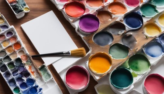
Having these supplies on hand will set you up for success in your watercolor calligraphy journey. Experiment with different colors, nibs, and papers to find the combination that suits your style and creative vision.
Table: Comparison of Watercolor Calligraphy Supplies
Supply
Description
Recommended Brands
Watercolor brush pens
Combines the precision of a calligraphy pen with the vibrancy of watercolor
Tombow Dual Brush Pens, Sakura Koi Coloring Brush Pens
Oblique pen holders
Aids in achieving the proper angle for creating beautiful calligraphy strokes
Speedball Oblique Pen Holder, Tachikawa T-40
Nibs
Metal tips that hold ink and determine line thickness
Brause Steno, Nikko G
Good-quality paper
Prevents bleeding and maintains vibrancy of watercolor
Strathmore 400 Series Watercolor Paper, Canson XL Watercolor Paper
Remember, investing in high-quality supplies will not only enhance the overall look of your watercolor calligraphy but also make the process more enjoyable. So gather your brushes, pens, nibs, and paper, and let your creativity flow!
Techniques for Creating Watercolor Calligraphy
Creating beautiful watercolor calligraphy requires mastering a few key techniques. In this section, we'll explore some essential techniques that will help you achieve stunning results with your watercolor calligraphy. From paint loading to blending, refilling, and ink flow, these techniques will elevate your artwork to the next level.
Paint Loading
Proper paint loading is crucial for creating vibrant and consistent watercolor calligraphy. To load your nib with watercolor paint, brush the paint onto the back of the nib. Be careful not to overload the nib, as this can cause the paint to bead up and create uneven strokes. Practice finding the right balance so that your nib has enough paint to create smooth and vibrant lettering.
Blending
Blending colors is an important technique for creating depth and dimension in your watercolor calligraphy. Experiment with brushing different watercolor paints onto the nib to create a multi-colored effect. This technique allows you to create beautiful gradients and transitions between colors, adding visual interest to your artwork.
Refilling
Refilling your nib with paint is necessary to maintain a consistent ink flow and vibrant colors. Keep an eye on your paint levels and refill your nib as needed. Make sure to clean your nib before refilling to prevent any color contamination and ensure the colors remain true and vibrant in your artwork.
Ink Flow
Having a smooth ink flow is essential for achieving clean and precise watercolor calligraphy. If you find that your ink flow is inconsistent, dip the tip of your nib in water to encourage a smoother flow. Experiment with different amounts of water to find the perfect balance for your desired effect. Practice controlling the ink flow to create various line weights and styles in your calligraphy.
By mastering these techniques, you'll be well on your way to creating gorgeous watercolor calligraphy pieces that showcase your creativity and artistic skills.
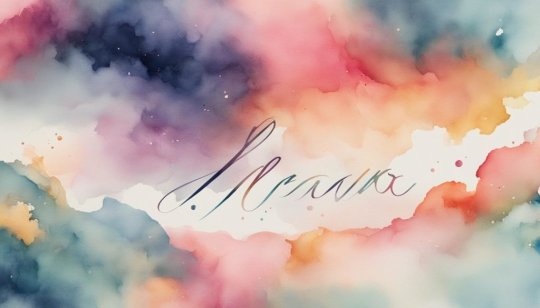
Table: Tools for Adding Artistic Elements to Watercolor Calligraphy
Tool
Description
Glitter Confetti
Small, shiny particles that add sparkle and glamour to your designs.
Watercolor Splatter Stamp Brush
A brush that creates splatter effects, mimicking the look of watercolor paint splattering on paper.
Watercolor Wash Brushes
Brushes that create washes and gradients for adding background textures and depth to your calligraphy art.
By incorporating these artistic elements into your watercolor calligraphy, you can elevate your designs and make them truly unique. Experiment with different techniques, tools, and materials to find your own style and create stunning watercolor calligraphy pieces that showcase your creativity and personal touch.
Enhancing Realism with Procreate Brushes
When it comes to creating realistic watercolor calligraphy, Procreate brushes can be a game-changer. These brushes are specifically designed to mimic the texture and effects of traditional watercolor paint, allowing you to add depth and realism to your artwork.
One of the key advantages of using Procreate brushes is the ability to achieve an ombré effect. These brushes seamlessly blend different colors together, creating a beautiful gradient that adds visual interest to your calligraphy. Whether you're creating a vibrant rainbow effect or a subtle transition between two colors, the ombré effect brushes in Procreate can help you achieve stunning results.
Another useful set of Procreate brushes for watercolor calligraphy is the watercolor script brushes. These brushes create strokes that resemble the uneven texture of watercolor paint, giving your calligraphy a hand-painted look. With these brushes, you can add an authentic and organic feel to your lettering, making it appear as though it was painted with a brush and watercolor pigments.
To enhance the texture and dimension of your watercolor calligraphy, consider using smudge brushes in Procreate. These brushes allow you to blend and soften stroke overlaps, creating a seamless and fluid appearance. By smudging certain areas of your calligraphy, you can create depth and texture, making your artwork even more realistic.
In conclusion, Procreate brushes offer a wide range of options for enhancing the realism of your watercolor calligraphy. Whether you're looking to achieve an ombré effect, add a hand-painted look, or create texture and depth, these brushes are a valuable tool in your artistic arsenal. Experiment with different brushes and techniques to unleash your creativity and bring your watercolor calligraphy to life.
Adding Watercolor Textures and Effects
Adding watercolor textures and effects to your calligraphy can elevate your artwork and create a visually stunning result. By incorporating techniques such as edge bleed, darkening paint colors, and utilizing watercolor splatter stamp brushes and wash brushes, you can add depth and dimension to your watercolor calligraphy pieces.
Edge bleed: Use smudge brushes to add edge bleed and soften the edges of your letters, giving them a more natural and organic look. This technique creates a beautiful blending effect and enhances the overall appearance of your calligraphy. It's a simple yet effective way to add a touch of realism to your artwork.
Darkening paint colors: To create contrast and make certain elements stand out in your watercolor calligraphy, you can darken the paint colors. Duplicate your art layer and adjust the blending modes to achieve the desired effect. This technique adds depth and visual interest to your artwork, making it more dynamic and captivating.
Watercolor splatter stamp brushes and wash brushes: Experiment with different watercolor splatter stamp brushes and wash brushes to create additional textures and depth in your watercolor calligraphy pieces. These brushes allow you to easily add splatter effects or background textures to your artwork, creating a unique and artistic look. Play around with different brush sizes and opacities to achieve the desired effect.
https://www.youtube.com/watch?v=y6-mKO9W4yA
Table: Watercolor Texture Techniques
Technique
Description
Edge Bleed
Softens edges and creates a natural look
Darkening Paint Colors
Enhances contrast and adds depth
Watercolor Splatter Stamp Brushes
Adds texture and splatter effects
Watercolor Wash Brushes
Creates background textures and depth
By incorporating these watercolor texture techniques into your calligraphy, you can take your artwork to the next level. Experiment with different brushes, colors, and effects to find your unique style and create stunning watercolor calligraphy pieces that showcase your creativity and skill.
Note: Remember to practice and experiment with different techniques to find the ones that work best for your desired outcome. Have fun and let your imagination guide you!
Conclusion
Watercolor calligraphy is a versatile and expressive art form that combines the beauty of calligraphy with the vibrant colors of watercolor. Throughout this article, we have explored various aspects of watercolor calligraphy, from blending colors and choosing fonts to techniques, tools, and resources. Whether you're a beginner or an experienced calligrapher, watercolor calligraphy provides endless possibilities for creativity.
By experimenting with watercolor brush pens and blending techniques, you can create stunning gradient lettering that adds depth and dimension to your calligraphy. The choice of watercolor calligraphy fonts, whether playful or natural, allows you to add a unique touch to your designs. And with the addition of artistic elements like glitter confetti and watercolor splatter, you can truly make your watercolor calligraphy pieces stand out.
With the help of Procreate brushes and techniques like edge bleed and darkening paint colors, you can enhance the realism of your watercolor calligraphy. These effects, combined with the use of watercolor textures and the right tools like nibs and good-quality paper, will take your creations to the next level.
So, whether you're creating school projects, invitations, posters, or quotes, watercolor calligraphy offers a world of possibilities. Embrace this beautiful art form, unleash your creativity, and let the vibrant colors of watercolor bring your calligraphy to life!
FAQ
What is watercolor calligraphy?
Watercolor calligraphy is a technique that combines the art of calligraphy with watercolor.
Read the full article
#ArtisticWriting#CalligraphyArt#calligraphytechniques#CalligraphyTutorial#colorblending#CreativeLettering#FontStyles#watercolorcalligraphy#WatercolorFonts#watercolortechniques
0 notes
Text

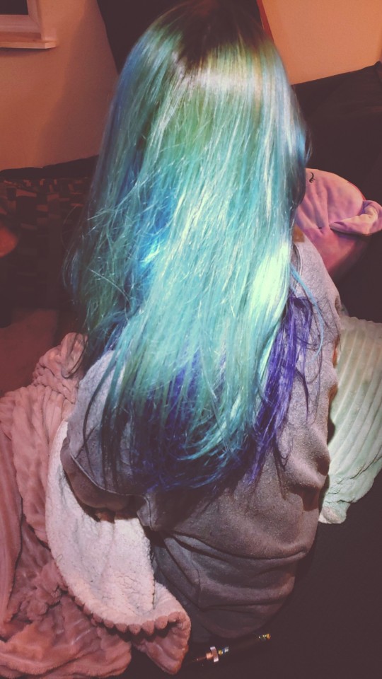
Inspo ➡️ Finished Product 🎨
1 note
·
View note
Text
Using Background Blend Mode in CSS: Mixing Colors Effortlessly

Introduction
Welcome to the world of CSS magic where colors blend seamlessly to create captivating visuals on your web pages. In this blog post, we delve into the artistry of using Background Blend Mode in CSS. This powerful feature allows you to mix colors effortlessly, opening up a realm of creative possibilities for web designers and developers. Let's embark on a journey to understand, implement, and leverage the potential of background blend mode to enhance the visual appeal of your websites.
Understanding Background Blend Mode

Background Blend Mode is a CSS property that enables you to blend the background layers of an element, creating visually appealing effects by combining colors and images. It's a powerful tool for adding depth and sophistication to your web design. Let's delve into the key aspects of understanding background blend mode:
- Blend Modes: CSS provides various blend modes, each affecting how colors interact between the background layers. Common blend modes include multiply, screen, overlay, and more.
- Applicability: Background blend mode is applicable to elements with background images or colors. It doesn't affect the actual content of the element but influences how the backgrounds blend with each other.
- Color Channels: The blend mode operates on color channels, including red, green, blue, and alpha. Understanding how these channels interact is crucial for achieving the desired visual effects.
- Opacity: Background blend mode works in conjunction with the opacity property. Adjusting the opacity of an element influences the blending outcome, allowing for subtle or bold effects.
Let's explore a practical example to illustrate the concept. Consider a section of your webpage with a background image and a semi-transparent overlay. By applying a blend mode, you can control how these layers interact, influencing the final appearance of the section.
Blend ModeDescriptionmultiplyDarkens the background layers, creating a rich, blended look.screenLightens the background layers, suitable for creating highlights.overlayCombines the best of both blend modes, enhancing contrast and vibrancy.
Experimenting with different blend modes and adjusting parameters like opacity can lead to stunning visual effects that elevate the aesthetics of your website. As we move forward, we'll explore the benefits of incorporating background blend mode and provide a step-by-step guide to implementing it in your CSS code.
Benefits of Using Background Blend Mode
Unlocking the potential of Background Blend Mode in CSS brings a myriad of benefits to your web design toolkit. Let's explore how incorporating this feature can elevate the visual appeal and user experience of your websites:
- Creative Visual Effects: Background blend mode allows you to create stunning visual effects by seamlessly blending colors and images. Whether you're aiming for subtle overlays or bold, eye-catching compositions, the creative possibilities are limitless.
- Enhanced Depth and Dimension: By blending background layers, you can add depth and dimension to elements on your webpage. This is particularly impactful when working with background images, as blend modes influence how the image interacts with the underlying colors.
- Dynamic Color Manipulation: Adjusting blend modes enables dynamic color manipulation. You can experiment with different modes to achieve the desired mood or tone for your website, from vibrant and energetic to muted and sophisticated.
- Improved Readability: Background blend mode can be strategically applied to enhance text readability. By choosing the right blend mode and opacity for background layers, you can ensure that text remains clear and legible against complex backgrounds.
Let's delve into a practical scenario. Imagine a hero section with a background image featuring a gradient overlay. Applying a blend mode to this overlay can create a harmonious transition between the background and foreground, making the content more visually engaging.
Blend ModeEffectdarkenIntensifies darker tones, adding drama to the overall visual.lightenHighlights lighter areas, creating a soft and airy ambiance.color-dodgeEnhances bright colors, perfect for a vibrant and lively atmosphere.
As you integrate background blend mode into your CSS repertoire, you'll discover its versatility in transforming mundane backgrounds into captivating design elements. In the next sections, we'll guide you through the implementation process and showcase real-world examples of websites harnessing the power of background blend mode.
Implementation Guide
Embarking on the journey of implementing Background Blend Mode in your CSS code is an exciting step towards elevating the visual aesthetics of your website. Let's break down the process into actionable steps:
- Choose Your Element: Identify the HTML element to which you want to apply background blend mode. This could be a section, div, or any container element with a background image or color.
- Set Background: Ensure that the chosen element has a background, either in the form of an image or a color. You can use the background-image or background-color property in your CSS to set this.
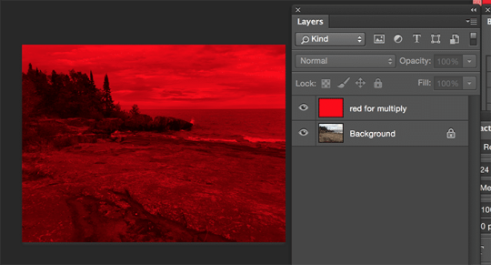
- Add Blend Mode Property: Apply the background blend mode by using the background-blend-mode property. Experiment with different blend modes such as multiply, screen, overlay, etc., to achieve the desired visual effect.
- Adjust Opacity: Fine-tune the opacity of the element and its background layers using the opacity property. This step allows you to control the intensity of the blend mode effect.
Let's look at a simple example to illustrate the implementation process:
HTML
HTMLYour content goes here
CSS
CSS.blend-mode-example {
background-image: url('your-image.jpg');
background-blend-mode: multiply;
opacity: 0.8;
}
In this example, the blend mode is set to multiply, creating a blending effect with the background image. Adjust the opacity as needed to achieve the desired balance between the content and the background.
As you experiment with different elements and blend modes, you'll discover the incredible versatility that Background Blend Mode brings to your design toolkit. In the following sections, we'll showcase real-world examples of websites effectively utilizing this feature to inspire your own creative implementations.
Common Mistakes to Avoid
While Background Blend Mode is a powerful tool for enhancing the visual appeal of your website, it's essential to be aware of common mistakes that can arise during implementation. By steering clear of these pitfalls, you can ensure a smooth and error-free experience for both developers and users:
- Insufficient Browser Compatibility: Not all browsers support background blend mode, and some may interpret it differently. Always check the compatibility and provide fallbacks or alternative styling for unsupported browsers to maintain a consistent user experience.
- Overlooking Color Contrast: The blend mode applied to background layers can significantly impact color contrast. Avoid situations where text becomes illegible due to insufficient contrast with the background. Test different blend modes and opacity levels to achieve a harmonious balance.
- Complex Layering: Excessive layering of background elements with different blend modes can lead to unintended visual chaos. Keep the design clean and purposeful, ensuring that each layer contributes meaningfully to the overall aesthetic.
- Forgetting Accessibility: Consider the accessibility implications of background blend mode, especially for users with visual impairments. Test your website using accessibility tools and ensure that the blend modes do not hinder the understanding of content.
Let's highlight the importance of browser compatibility with a quick reference:
BrowserSupportChromeYesFirefoxYesSafariYesInternet ExplorerNo
By addressing these common pitfalls, you can maximize the benefits of Background Blend Mode while ensuring a seamless and inclusive web experience. In the final section, we'll wrap up our exploration by answering frequently asked questions and providing a comprehensive conclusion to guide you in your journey of mastering this CSS feature.
FAQ
Addressing common questions about Background Blend Mode in CSS to provide clarity and guidance for developers and designers:
Q: Can Background Blend Mode be applied to any HTML element?
A: Background Blend Mode can be applied to elements with background images or colors, such as divs, sections, or other containers. However, not all elements may be suitable, and the visual impact depends on the content and design.
Q: How does blend mode affect text readability?
A: The choice of blend mode and opacity can influence text readability. It's crucial to test and ensure that text remains legible against the background. Adjustments may be necessary to achieve the right balance.
Q: Are there performance considerations when using Background Blend Mode?
A: While Background Blend Mode itself is not inherently performance-intensive, applying complex blend modes to numerous elements may impact performance. Always consider the overall complexity of your design and its potential effects on page rendering.
Q: How can I handle browser compatibility issues?
A: Not all browsers support Background Blend Mode in the same way. It's essential to check compatibility and provide fallbacks or alternative styles for unsupported browsers. Progressive enhancement techniques can help maintain a consistent user experience.
These frequently asked questions aim to address common concerns and provide practical insights into working with Background Blend Mode. If you have specific inquiries or encounter challenges not covered here, feel free to explore the documentation of your chosen web development platform or seek advice from the developer community.
Conclusion
Congratulations on completing this journey into the realm of Background Blend Mode in CSS! We've explored the intricacies of this powerful feature, from understanding its fundamentals to implementing it in real-world scenarios. Let's recap the key takeaways:
- Creative Expression: Background Blend Mode opens the door to limitless creative expression by seamlessly blending colors and images, enhancing the visual appeal of your websites.
- Implementation Guide: Armed with the knowledge of how to implement Background Blend Mode, you can transform ordinary backgrounds into captivating design elements. Remember to choose the right blend mode, adjust opacity, and consider browser compatibility.
- Real-world Examples: We've explored how popular websites use Background Blend Mode to create stunning hero sections, image overlays, and dynamic color schemes. These examples serve as inspiration for your own projects.
- Avoiding Common Mistakes: By steering clear of common mistakes such as insufficient browser compatibility and overlooking color contrast, you can ensure a smooth and error-free experience for users.
- FAQ and Beyond: The frequently asked questions provide insights into common concerns, but don't hesitate to explore further and seek advice from the developer community for specific inquiries.
As you incorporate Background Blend Mode into your web design toolkit, remember that experimentation is key. Test different blend modes, opacity levels, and layering techniques to discover the perfect recipe for your unique projects. Whether you're creating vibrant landing pages, elegant product showcases, or immersive storytelling experiences, Background Blend Mode empowers you to paint with the colors of creativity.
Thank you for joining us on this exploration. May your websites be filled with visually stunning designs that leave a lasting impression on your audience. Happy coding!
Read the full article
0 notes
Text
🌲🎨 "Dive into a universe where digital art breathes life into fantastical worlds. From enchanted forests to urban horizons, discover how art is evolving in the digital age!" 🏙️✨

🎨 Digital Art: A World of Possibilities Digital art isn't just an evolution of traditional art; it's a revolution. With digital tools at their fingertips, artists can create works that were previously unthinkable. Take forest landscapes, for example: color blending and light-and-shadow nuances can turn an ordinary scene into a waking dream.
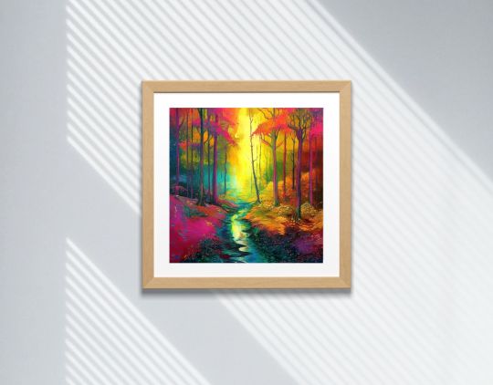
🌈 The Freedom of the Digital Palette In the digital realm, boundaries are pushed back. Artists have access to an infinite array of colors, allowing them to create artworks that are more vibrant and expressive than ever. Whether you're in a forest or a city, every detail counts.
🎭 The Evolution of Landscape Art Landscape art has come a long way since the first oil paintings. Today, digital art allows for a fusion of styles and techniques, creating unique artworks that defy conventions.
👇 Share Your Thoughts If this post has inspired or enlightened you, feel free to reblog it and share your own artistic experiences in the comments! 🌟💬
#DigitalArt#ForestLandscape#ColorBlending#LightAndShadow#LandscapeArt#ArtisticInnovation#DigitalPalette#EnchantedForest#ModernArt#midjourney#valheyrie404#homedecor#art mural#art numérique#4kart#artnumérique#téléchargement instantané
0 notes
Photo

#colorcorrection #colorcorrectionspecialist #colorcorrectionspecialistofsanantonio #sanantoniocolorspecialist #sanantoniocolorcorrection #colorcorrectorofsanantonio #masterstylistsanantonio #sanantoniomasterstylist #sanantoniosalon #sanantoniohairstylist #sanantoniohairsalon #sanantoniobeauty #castlehillssanantonio #castlehills #onlineappointments #hairdivasa #giftcertificatesavailable #colorblending #sanantoniosmallbusinessowner @ericamaspero #2104226869 bit.ly/HairDiva #balayage #sanantoniobalayage #smoothoperator #smoothoperatorsanantonio @moroccanoil @robyncoulter_ssg @jennifersims_ssg #beforeandafter #moroccanoilcolor #beforeandafter (at Hair Diva) https://www.instagram.com/p/CggKPs5M2pL/?igshid=NGJjMDIxMWI=
#colorcorrection#colorcorrectionspecialist#colorcorrectionspecialistofsanantonio#sanantoniocolorspecialist#sanantoniocolorcorrection#colorcorrectorofsanantonio#masterstylistsanantonio#sanantoniomasterstylist#sanantoniosalon#sanantoniohairstylist#sanantoniohairsalon#sanantoniobeauty#castlehillssanantonio#castlehills#onlineappointments#hairdivasa#giftcertificatesavailable#colorblending#sanantoniosmallbusinessowner#2104226869#balayage#sanantoniobalayage#smoothoperator#smoothoperatorsanantonio#beforeandafter#moroccanoilcolor
0 notes
Text
Glacier! This Cross Training blend combines the two most popular colors, grey and blue. It’s a top seller because the “cool” color combination is compatible with most fitness area designs. The blend provides just enough color to capture some attention without overwhelming one’s visual field. Explore more at US Rubber! #homegymflooring #sportsflooring #rubbergymflooring
#RubberFlooring#FitnessFlooring#GymFlooring#CrossTraining#ColorBlend#HomeGym#SportsFloor#RubberTiles#FlooringDesign#WorkoutSpace#InteriorDesign#FitnessGoals#GymDesign#RubberMaterial#FlooringSolutions
2 notes
·
View notes
Text
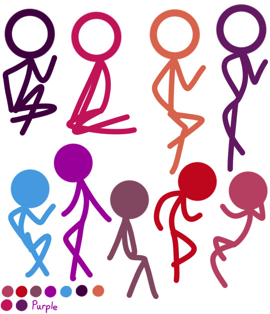
THE AUS ARE DONE
The category is called ColorBlend!Au
Basically everyone acts like the one who got their color blended with!


#avm purple#avm blue#avm green#avm red#avm the chosen one#avm the dark lord#avm au#avm yellow#avm second coming#colorblend!au#cb!au#cb!au green#cb!au blue#cb!au red#cb!au yellow#cb!au purple#cb!au second#cb!au Dark lord#cb!au Chosen#avm victim#cb!au Victim#i am in love with the results ahahahaha!
18 notes
·
View notes


Text

he doesn't look polite but I'll let him once [passes out]
#suigetsu hozuki#my art#naruto#fighting the artblock with the most doodleable naruto characters#i cant colorblend to save my life#team taka#fanart#naruto fanart
5 notes
·
View notes
Text
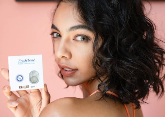
A well-liked line of colored contact lenses called Freshlook Color Blends is made to modify or enhance the color of your eyes. People who wish to experiment with different eye colors or bring out their natural eye color frequently use FreshLook Colorblend Contact Lenses. For people wishing to change the color of their eyes, FreshLook Color Blends provide a subtle and natural appearance.
0 notes
Text
Colorblends Trip Giveaway
Enter the Colorblends Win a Trip to Amsterdam Sweepstakes 2022, fill in the entry form, and win a trip.

1 note
·
View note
Text


Colorz 🎨
1 note
·
View note
Photo

Last but not least to finish up our little series, meet Tony! He’s been tattooing for 9 years, creating designs from traditional, blackwork, color, fine line, black and grey, color blending, symbols, linework, and more! Outside of work Tony likes to paint, draw, and do photography! Tony also has some awesome flash on his page he’s been working on, so go claim one of the rad pieces before they are all gone! 🎨📸 #blackwork #blackandgrey #colorblend #traditional #americantraditional #traditionaltattoo #colorwork #symbol #lettering #versatile #tattoo #aztattoo #tattooideas #tattooshop #aztattooshop #phxtattooshop #arizonatattooshop #phoenixtattooshop #aztattooartist #northmountaintattoo #northmountaintattoophoenix (at North Mountain Tattoo) https://www.instagram.com/p/Ceov51kvUvg/?igshid=NGJjMDIxMWI=
#blackwork#blackandgrey#colorblend#traditional#americantraditional#traditionaltattoo#colorwork#symbol#lettering#versatile#tattoo#aztattoo#tattooideas#tattooshop#aztattooshop#phxtattooshop#arizonatattooshop#phoenixtattooshop#aztattooartist#northmountaintattoo#northmountaintattoophoenix
0 notes
Photo
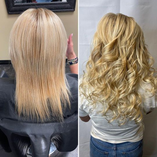
#colorcorrection #colorcorrectionspecialist #colorcorrectionspecialistofsanantonio #sanantoniocolorspecialist #sanantoniocolorcorrection #colorcorrectorofsanantonio #masterstylistsanantonio #sanantoniomasterstylist #sanantoniosalon #sanantoniohairstylist #sanantoniohairsalon #sanantoniobeauty #castlehillssanantonio #castlehills #onlineappointments #hairdivasa #giftcertificatesavailable #colorblending #sanantoniosmallbusinessowner @ericamaspero #2104226869 bit.ly/HairDiva #balayage #sanantoniobalayage #smoothoperator #smoothoperatorsanantonio @moroccanoil @robyncoulter_ssg @jennifersims_ssg #beforeandafter #moroccanoilcolor #sanantonioextensions #extensions (at Hair Diva) https://www.instagram.com/p/CesVZh4MS0U/?igshid=NGJjMDIxMWI=
#colorcorrection#colorcorrectionspecialist#colorcorrectionspecialistofsanantonio#sanantoniocolorspecialist#sanantoniocolorcorrection#colorcorrectorofsanantonio#masterstylistsanantonio#sanantoniomasterstylist#sanantoniosalon#sanantoniohairstylist#sanantoniohairsalon#sanantoniobeauty#castlehillssanantonio#castlehills#onlineappointments#hairdivasa#giftcertificatesavailable#colorblending#sanantoniosmallbusinessowner#2104226869#balayage#sanantoniobalayage#smoothoperator#smoothoperatorsanantonio#beforeandafter#moroccanoilcolor#sanantonioextensions#extensions
0 notes
Last Seen Blogs

samukoshi
Toru

thecaptionedbible
anal wisdom

klaushargrieving
klaus hargreeves said gay rights!
thecaptionedbible
anal wisdom

letha-l
Letha_L