#apologies if this isn’t legible on mobile
Text
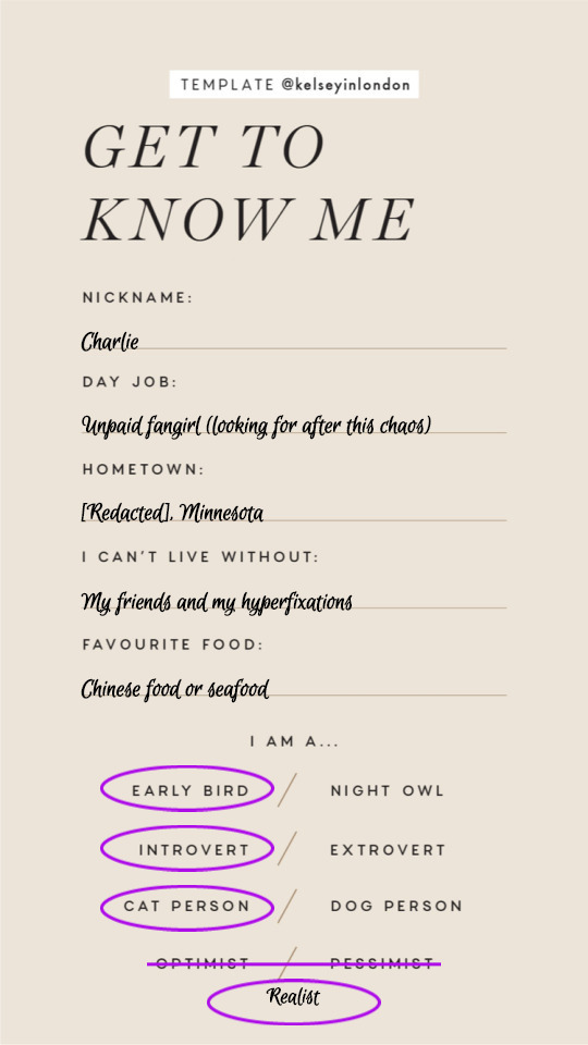
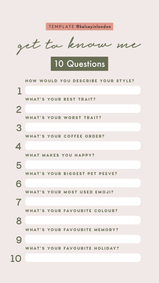

I was tagged by my love @lauraderns 💜💜💜
Tagging: @vcdanvers @danvercarols @clintashaotp @doralupin01 @unsociable-hobbit and anyone else that wants to do it!! (feel free to say I tagged you!)
#about me#tag game#friend tag: treena#thank you my dear!!!#apologies if this isn’t legible on mobile#I filled it out on my computer 😬#and I just really wanted a font close-ish to my handwriting
4 notes
·
View notes
Text


General Info, About & Basic Blog Rules under the cut !!
I. BACKGROUND
This is my first formal foray into properly RPing Riku since the early days of the tumblr RPC.
Meaning, whilst this isn't my first time RPing him, I am now just coming back into the fandom after years and years of being away from it (mostly keeping it at arms length). So I am only now just catching up on all the lore and theories surrounding his character as well as the over arching lore of KH as a whole.
I do not boast an encyclopedic knowledge of every little detail in this game series (given how long and convoluted it has become), I have not played any of its spin offs, remixes or mobile games- so apologies if sometimes some things might be inaccurate (even despite my best efforts for extensive research). I am knowledgeable of what’s generally known in the Mainline Titles. So if there is one particular obscure thing of topic you wanna integrate into any of our threads, do let me know. I’d love to learn and talk about it! I’ve been away from this fandom for so so long I wouldn’t mind bouncing off ideas and theories with new friends.
That being said, I would very much like to discover Riku’s character for my own before getting influenced with any preconceived ideas that have sprouted here and there.
So basically my Riku is a clean slate fresh out of KH3.
I know how important Riku's character is for a lot of people and I hope I can do my very best to at least portray him as good as I possibly can for any of the folks I do end up interacting with.
II. INTERACTION
Please note that English isn't Mun's first language, hence why I take so long to write a reply/starter because I check, double check and triple check if my writing is grammatically correct. And sometimes I only have the time and energy to do one post a day.
But as stated in my quick rules, I am selective with threads and asks so if I really do not get around to reply to yours, I’m sorry. Muses are fickle things and sometimes they just don’t wanna. So don't be disheartened when I haven't answered your ask/reply immediately. Please know that I hold every single one in my heart and I hoard them for a little while before I finally have the time to reply in short bursts.
Also mun’s line of work is kind of hectic with production shoots and what not. So I may be abscond for a few days at a time.
In terms of following and mutuals. This blog is mutuals only but if I haven’t followed you back you are more than welcome to send me an ask or DM.
Duplicates. I actually don't mind following and interacting with other Rikus (since he does have a lot of interactions with his other selves). But for the most part I am pretty much content to admire other Riku blogs from a far. I am well aware that some portrayals are near perfect and some of you would have your favorites and I take no offense to this if you prefer to interact with them.
III. FORMATTING & WRITING
Icons, formatting and graphics. I do enjoy using icons and formatting on my posts, but I do it in such a way that is minimal where its still legible. I just like making things look pretty and clean. Though I do not mind interacting with iconless or nonformatted threads/blogs. This is just my own preference.
I am ok to do one-liners to short-para threads, unless things would be needing a huge set up that it requires to become novella. Let me reiterate that English isn’t my first language and there is only so much English you could squeeze out of me before I give up. (Lol) So my tone and writing would sometimes sound very blunt and straight to the point if I’m not feeling like doing any flowery words and purple prose.
IV. SHIPPING
I'll state this here and now: Mun is part of the LGBTQ and has been in a committed same sex relationship with my lovely fiancé for almost 10 years.
That being said, I think it goes without saying what I prefer to portray Riku as a character by default.
Yes, he does swing that way (although right now he hasn't figured that out for himself yet). Yes. He is very much hopelessly madly deeply head over hills committed and devoted to Sora. This has always been a HUGE part of his character throughout the entire series, and to not acknowledge it or at least allude to it, would be a crime.
However!! This does not mean I am not open to exploring other ships, even heteronormative ones. Or do shippy things with any character under the gender spectrum. If it does come to that, I like to keep it ambiguous.
At the very least, Riku is demisexual.
But, In any case, shipping will not be the main focus of this blog and I would like to maintain a neutral ground for all of it. Platonic things shall always be at default.
V. NEGATIVITY
Although I will try to make this blog as wholesome as I possibly can (with little to no risqué content) - I have been RPing on and off tumblr for the past 20 years and honestly i am far too old, jaded, and tired to put up with any drama or upset. I will not involve myself in any sort of petty discourse and if I see anyone trying to start something, I am sorry but I will have to unfollow.
But, on the other hand, if there is anything at all that you find offensive on my blog, please do TELL me. Lets talk it out like the adults that we are. I will gladly tag anything that you wish to be tagged. My DMs are always open for discussion.
Or better yet, please make use of the block button. I will not question you on how you curate your own space and I hope you would also respect mine.
I stay on my lane and you stay in yours. Got it?
VI. SIGN OFF
Lastly. I am here to just have FUN, VIBE & CHILL. I might do some crack things here and there and I shall be tagging those if you don’t wanna have them be clogging your dash. But yeah, I just wanna have fun without the pressure of being judged. All I want is to create a space where I am allowed to write for a character who has been very important to me through out the years and all I want is to share that love with all of you!! .・゚: * ✧ * ♡
#┊ return to light | ooc; ┈ ✧#┊ psa; ┈ ✧#and here it is finally!#Just gunna be putting this here for now before I transfer it to gdoc/carrd#but feel free to read up!#asdfhjkl sorry if this is such a ramble
15 notes
·
View notes
Text
Gaslighting, homophobia, harassment, etc.
This is a copy of a journal that was/is on deviantArt since the incident happened there, but I’m putting some of my records here when it involves harassment and art theft.
Warning: This includes harassment towards minors by a predatory adult, homophobic behavior, gaslighting, and other predatory behaviors.
Another Update:
Archived here for better viewing:
https://web.archive.org/web/20190704135920/https://www.deviantart.com/haleyc7995/journal/Harassment-and-Discrimination-About-My-Opinion-802306133
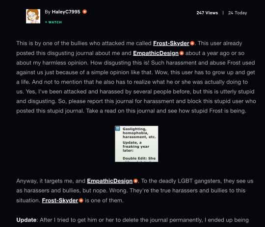


It’s one thing to harass me, but going out and threatening others isn’t okay.
Update, a freaking year later:
https://www.deviantart.com/haleyc7995/journal/Everyone-report-this-journal-for-harassment-802227692
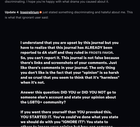
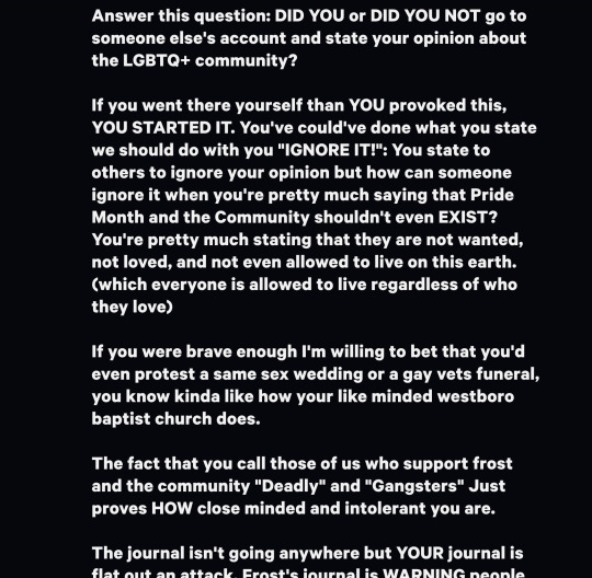
Apparently I'm part of the LGBT+ Mafia because I said it's homophobic to go out of your way to say our existence is wrong? Not sure where they got that idea but they chose to dig up this old warning journal since they were harassing Queer people, and apparently think it's still okay to do so.
Also going to note that trying to use neurodivergency as an excuse for our actions isn't okay and is ableist, basically spitting in the face of other neurodivergent people.
---
OH WAIT THERE'S MORE!
This guy has sexually harassed minors. Also much more disgusting rhetoric than I expected in stamps but also in other comments towards minors. Please be advised of the explicit comments when clicking on this journal.
[Journal redacted by minor]
It's one thing for him to harass me, another adult, but to sexually harass and target minors is beyond disgusting, and illegal. If anyone wants an example of what a predator is, here it is.
---
Nvm, not last update.
Due to more and more people coming forward, I'm going to keep updating this journal, and adding links provided to me. I'm going to state that I'm so, so sorry to all of those who have been harmed by the three perpetrators in this journal. Hopefully from awareness comes prevention of further victims.
It was also brought up to me that my journal skin was causing issues for mobile users, so since this journal is very serious in nature, I have removed it so no matter what platform it should be legible.
This Journal is being added because it provides more information. TW (Rapey Rhetoric, body shaming, harassment, etc)
[Journal removed]
---
Last Update (hopefully): Due to the garbage he keeps posting, I decided to block both his accounts because he's just rehashing what others have said about him, and now pinning it on victims lmao. When I told him I didn't tolerate how he was sexually harassing women and belittling sexual assault victims, apparently I'm the one harassing trauma victims now??


For the record...the only person I've blocked is him, which makes it funnier, but okay Chad™
Also going to state that being neurodivergent is not a justification for marginalizing others, ever, and is a spit in the face and throws other neurodivergent people under the bus. As I said, most of my friends with autism are in the LGBT+ community, and a majority of my friends are neurodivergent in general. So am I. It's never an excuse to marginalize others,
ever.
Apologies to everyone who had to deal with him, his nonsense, and has to deal with people like this in general.
And sorry, but marginalized groups speaking out against people actively trying to harm and oppress them isn't and will never be fascism. Thank you for coming to my TED talk.
---
Very, very IMPORTANT Edit:
It is fairly easy to tell, but EmpatheticDesign is the same person as GrandtheftAutoOnline, and uses the duo of accounts to block evade.
I was made aware by others spreading my journal that this person is known for this behavior, has harassed others in the past, and belittled victims of trauma, including rape victims. It's one thing to be a homophobic garbage pile, but to go out of your way to harm and belittle those who have suffered through serious trauma? So yeah, please let others be aware so they are not harassed as well.
Edit: The second journal was removed at the request of the victim, who didn't want to associate with their abuser, or be found again. I was allowed though to give some details about what happened, so I think it's best that I post a screenshot of our notes, censoring the names.
https://www.deviantart.com/uwugirls/journal/Stay-safe-guys-749736306

At this point, it's beyond just harassing the LGBT+ community, and they seem to harass, sexualize, and belittle victims and women in general. Please be aware of this and stay safe.
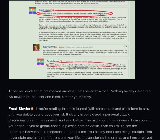
Triple Edit: The person mentioned below, EmpathicDesign proceeded to post homophobic garbage on other people's posts so yeah, they kind of just admitted to be homophobic which is why they are so bitter lmao.
Double Edit: Apparently pointing out homophobes is facist now lmao. This was a great magnet for homophobic garbage so y'all can also block GrandTheftAutoOnline while you're at it, since they are trying to compare facism and oppression to someone pointing out homophobia. Clearly they don't know what facism actually is, what oppression is, and just want to justify hate speech without consequences.
Edit: I'm going to put this here so others know to also bock/avoid this person, who has made a variety of stamps targeting the LGBT+ community, and decided to think it was a smart idea to defend this person's discriminatory and phobic behavior as an "opinion."


Suuuure it isn't...
Then this lovely stamp shows they don't even know what "safe" spaces refer to whatsoever and they'd just rather shame Queer folk. Ya know, besides trying to avoid admitting that they are just phobic.
So yeah, here's another person that blatantly discriminates if you want to add to your list of "people that don't deserve any of your time." ------
Being gay myself, and having to deal with this on far too consistent of a basis, I thought I'd do my part to warn others so they can avoid some of this in their lives.
Apparently HaleyC7995 has done these things before, but I wanted to warn others who are Queer and may want to block people who go about spewing homophobic rhetoric.
I don't suggest going to her profile if you are sensitive to fat fetishizing, vore, and sexualization of a potential minor character (the character is in high school so there is a large possibility that they are a minor). Also racist depictions of characters.
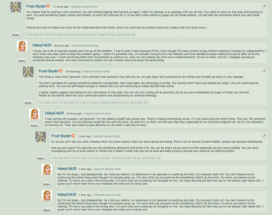
People tried to explain why what they were saying wasn't okay, how it was homophobic, but she turned it around to blame the victims for her actions and other inappropriate behavior. She continued to say she was "misunderstood" about what she said, despite multiple times saying how being gay was "wrong" and overall seems quite content continue to say such things.

It started by saying something unnecessarily homophobic on an art piece, then when the artist made a status saying how people needed to stop being homophobic at them, they posted this on that status:
As you can see here, many people expressed how this was innapropriate:
https://comments.deviantart.com/62/13481362/4588682762
Apologies to the artist who was subjected to this person. You aren't the first victim, and hopefully you will be one of the last. For those who aren't Queer and don't realize this yet...you can't "turn" gay. She for some reason acts as if it's a choice lmao.
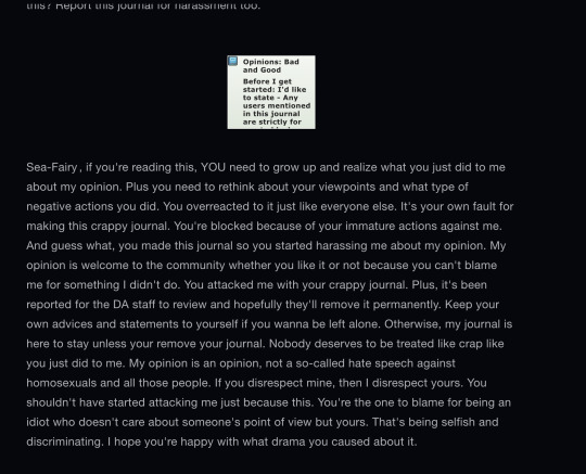
And well, many people reacted angrily, and she decided to "apologize" which wasn't an apology at all, but once again shifting blame and saying that it was just her "opinion."
For future records, hate speech isn't considered an opinion. It's hate speech and bigotry. An opinion is that I don't like raisins in my carrot cake because they make the cake texture gross.


Credit to this person who tried very, very hard to explain why this wasn't okay. This had to be the most patient person trying to explain why homophobia isn't an opinion.
People continued to be mad, because well...the obvious lack of empathy, blaming others, and continuing to persist with the idea that being gay was wrong and a sin.

Other people tried a well, especially those who have dealt with this person before she was banned on a previous account. She was ban evading for a while but it seems the accounts were unbanned now.
She continues even with me to say she's "unaware" of what she's doing. It's obvious she's not, and at this point she gets very gaslighty and trying to flip it once again on everyone else.

I was blocked after this so I couldn't respond, though as an angry gay person I had choice words. Unfortunately, due to how she's behaving, and how she has a history to blame everyone but herself for her own actions, I don't expect she'll be changing anytime soon. If you are Queer, have Queer friends, or just are very tired of blatant phobic behavior I'd just suggest blocking her. She's not willing to change or learn, but that doesn't mean we have to subject ourselves to hatred. I am so sorry for those she's already caused harm to, for those who tried so hard and had to put up with this, and for those who have had to deal with her even before this incident.
#homphobia#gaslighting#harassment#abuse#predatory#stuido talk#studio bullshit#putting this up here in case i have to remove the journal from dA
2 notes
·
View notes
Text
Marauders Handwriting
(In order from neatest to messiest... kinda) (Including Lily because come on, guys) (These headcanons are my own but may be based on others', so I apologize if I took your idea) (Sorry for the lack of bold where I wanted it/lack of proper bullets. My one thing against Tumblr mobile is that I can't do boldface or bullet points or whatever it is, but you'll get the right idea, it's fine) * Peter: His is the neatest, which bugs the ever-loving daylights out of Remus (you'll understand in a moment). In modern day people might say "that's a font," it's just SO tidy. He doesn't even try. There are no loops or corners where they oughtn't be. It's uncanny. * Remus: I headcanon that he has mild OCD but kind of about everything, so he doesn't even notice. It started when he was a kid, after he was bitten and while he was learning to write. It was just one little thing he could control as a five-year-old who went through these agonizing and obviously uncontrollable transformations every month, and he took pride in his nice handwriting. Gradually it became about more things, but that's a story for another time. Anyway, he always had the neatest handwriting of anyone he knew until he met Peter, and it makes him batty that Peter has nicer penmanship, especially since he put so much effort in and Peter's has just ALWAYS BEEN LIKE THAT. Throughout their school years he gets less bitter as his attention stops being divided between controllable and uncontrollable and he starts focusing on his friends, but by that point it's muscle memory and he still has beautiful handwriting. * Sirius: This one I KNOW I got from someone else's headcanon but I just really liked it. Sirius's handwriting is right in the middle. It's nice, it is, and very legible. It's from being brought up in a prim-and-proper pureblood family. He had to have nice writing. I like to think he always writes in cursive, small but wide so that you can differentiate between the letters but he can still fit more on a page (since parchment isn't lined). Not that it matters, since he skives off on classwork once he gets to know James (another story for another time). * James: His handwriting is hardly legible, and it's always all in caps (but the "capital" letters are always slightly bigger, if you can figure out where they are). In the Muggle world, it would hardly fit wide-ruled lines, it's so big, but that means that on the rare occasions when he DOES do his homework, it's easier to get a foot of essay or whatever the requirement happens to be. * Lily: Her intelligence is on par with Remus's and her brain moves at a million miles a minute, so her hand speeds across the page and her handwriting is, for the most part, entirely illegible. Honestly, the only reason Remus's isn't is because of the mild OCD I mentioned. There is no distinguishing between Lily's Ts and Fs, her Ls and I's. Her capital Bs, Ds, and Ps are impossible too. Truthfully, she could write anything she wanted in an essay and her teachers wouldn't know the difference. She ALWAYS gets full marks on essays because the teachers figured out that, despite the fact that you can't read a word besides her name and her title, she already knows everything she needs to anyway and they trust her entirely to write the actual essay (this practice began with McGonagall about a month through first year, after Lily left class sobbing because she's gotten a zero on every essay solely because none of the teachers can read them). Once, in sixth year and on a dare from Sirius and Remus, she did write a nonsense essay for Slughorn. She got full marks.
3 notes
·
View notes
Link
Email is difficult to get right. We know. After all, we make software that revolves around email – dissecting the intricacies of spam filters and open rates on a daily basis.There’s a lot of misconceptions floating around about how we should be writing our emails, though. Not just what subject line to use, but also how to introduce ourselves, how to start and end our conversations.That’s why we decided to compile a guide on writing the “perfect” onboarding, outage response, feature update or an apology email. But just like there’s a million ways to get your point across in person (and behaviors to consider), there’s a million ways to do the same hair-pulling ordeal over email.Is email formal communication?There’s an argument in some circles claiming that emails aren’t informal conversations but letters. Others consider them to be to-the-point discussions, with the purpose of conveying critical information in a logical, legible way. Still others consider emails to be both a letter and an instant message. With work environments becoming ever so casual, it isn’t hard to see why.For example, personal email usually features phrases and slang that may be unacceptable in professional communication. So what should you do to minimize misunderstandings and avoid offending? What words should you use or avoid?In this post, we’ll try to deconstruct the anatomy of a perfect email message, the do’s, don’ts, and how to properly get your point across.The Subject LineUnlike face-to-face communication, we can’t read body language, tone of voice or judge the urgency of the message we’re about to receive. We go by the few words in the subject line instead.Subject matter is something that compels the reader to open or disregard your message, so it’s imperative to get this one right. Otherwise, whatever you write in your email won’t matter too much (it won’t get read!)Here are the things to keep in mind when coming up with a subject:Be personalPeople like reading mail addressed to them. If you know something – anything about your client, use it to make your message stand out in their mailbox. Do you have something to hook into? Their name, location, past behavior? Try to include it somewhere in the subject line.Be descriptiveWhy should your recipient care? List the most important points of your message. Just don’t be vague. Be to the point, even if it means two to three sentences. After all, there is no definite answer regarding headline length.Use action wordsIn real life, you may use your enthusiasm, tone of voice or body language to help you communicate. In email, words are all you have to grab and keep the attention of your audience.Here’s a short list of “power words” that you can utilize in your titles to draw attention to the subject matter.fearexcitementambitiontabooPlay on fearsWhile fear is a powerful emotion, it means little if it doesn’t affect us directly. We fear change, especially when things change for the worse without any warning. That’s why these subject lines are also very effective.Here’s how to trick recipients into opening your emails:display urgencycommunicate lossshow scarcityreassureLeave them hangingAnother effective literary method (and this has a lot to do with psychology) is called “the hook” or “the cliffhanger”.Since we need closure in our lives, stopping an idea (or sentence) midway keeps our interest high. This particular tactic is so effective, it’s frequently used in Hollywood and on TV, in shows and in news programs. That thought is kept there, lingering in our minds with questions about what we’re missing out on.Internal communicationIf not managed well, your internal emails can be just as problematic as a mountain of file folders that never gets sorted. Establishing categories in internal communication (be it subject lines, tags and appropriate filters) ensures each message gets the right amount of attention.Regardless of how you choose to go about this, The Harvard Business Review published a handy list of keywords that military personnel use in their subject lines. An urgency level and ticket type (optional) can also be included:InfoCoordApproveActionThe MessageThere is an inherent sense of urgency attached to emails. Your writing should be focused, understandable and relay crucial pieces of information effectively.Remember, emails are read on mobile devices just as often as on desktops. Unlike a newspaper, you can’t stow an email into your bag and continue reading it at your leisure. It becomes imperative to keep your message readable and easily digestible – especially on small screens. With that in mind, let’s examine how to craft a perfect email message, piece by piece.SalutationWe’re strongly attached to our names and that extends to how we’re addressed. So if you address your recipient the wrong way, they may not want to read any further. What’s worse, it may affect their opinion of you and hurt your relationship.Our recommendation? Use:Hi (first name), or Hey (first name),It’s friendly, safe and non-threatening – whether you know the person well or not.Yet if you feel a formal tone is appropriate, it’s better to err on the safe side and go for the “Dear”. It likely won’t ever come down to it, but if you must address a high-ranking individual (civil servant, military, CEO), it’s best to avoid making mistakes.What if you don’t know the recipient’s name? What if you’re sending out a mass email? Indeed it may be difficult to force rapport where none exists. Just don’t use generic introductions such as “To Whom It May Concern”. If it does not concern them, why should they bother reading?Use these when addressing an unknown individual:Hello is a useful, polite, non threatening greeting.Hi there / Hey there is more casual and might work for short, informal “need to know” emails.Good morning / afternoon / eve is a little risky (it may be a different time of day by the time this your recipient reads it) but still considered polite.If none of these sound natural or right, consider foregoing the salutation altogether. Instead, focus your energy on a powerful introduction.IntroductionAn introduction is one or two sentences that describe the purpose of your message.It’s one of the most important parts of your email, since a poorly written or irrelevant introduction will discourage your reader from sticking around until the end.What’s the purpose of an introduction, anyway?to give readers an idea of what they are about to readto add real purpose to your messageto build up intrigue or flow into the main body of the emailStart off with a mutual connection. “I had lunch with (someone) who mentioned you” or “I’ve been following your work at …”If you can’t, fear not. Your introduction will depend on your message, your company culture and target audience. Why are you writing to them? Why are you taking time out of their day? Here are some generic ways you can pull your reader in:Pique their curiosityCuriosity is what killed the cat – and it’s something that works at the deepest psychological level, too. Make them wonder what they’re missing, whether it’s an opportunity, a valuable lesson or a good story.Make a bold claimHave something crazy to say? Want to challenge a commonly held belief? Start off with an outlandish idea that begs the question “no way, really?” After all, now they’ll really want to see if you can back up your claims.Try a little quirkinessKeeping the attention of your readers past the headline is tricky, but doable if you’re willing to be risque. This is useful if you want to get a reaction. “Does he really think that?” or “Is she about to do what he suggests?”Relate to themEmpathy is contagious. That’s why statements like “I know how you feel. I felt the same way”, “what if you”, “imagine this” or “did you remember when” are so effective. The mind gets kicked into overdrive as the reader realizes this is about them and they better keep reading.Amaze them with factsGot some facts to share? It’s always fun to learn an interesting piece of data or discover how something works. This should also somehow tie into your message as you don’t want to mislead or deceive your readers.Grab them with humor and idiomsA bit of lighthearted humor can help you build much-needed rapport with your audience. A good joke or a play on words can draw them in like a magnet – no pun intended! The tricky part may be tying this opening statement into what you’re about to say.Make everything flow togetherFinally the worst is over – you’ve pulled your reader in and have their full attention.Not so fast.We comprehend ideas by grouping them together and expecting a conclusion. Smart writers know how to keep their readers’ attention and keep them, well.. reading.The answer to this is topic sentences. When starting a paragraph, have a sentence that is the subject of the main idea of the paragraph. This helps with clarity and makes reading subconsciously easier. Most email readers are scanners, so they’ll always read past the topic sentences if they need more details.Avoid going into full-blown detail into your paragraphs. Keep a balance between the action vs paragraph by focusing their attention on the topic sentence, then dive straight into the main points.Lastly, don’t be afraid of using bullet points if you’re listing a long set of instructions. The same goes for adding bold text or links – particularly if your email has a call to action.Use personal pronouns & positive languageKeeping the reader’s attention is no easy task. It’s too easy to sound dry and monotonous, even if you have the best intentions at heart.When communicating, use personal pronouns (you, yours, we, us) to communicate your ideas. This accomplishes two goals: first, it places your audience first (this is about them), and second, it emphasizes what they get out of the interaction. Refer to yourself (I, my) sporadically, unless you are sharing your personal experiences to prove a point.Being positive is not only about cracking a joke and being polite. Give praise before criticism, sincerity instead of platitudes, express disagreement in the form of recommendations, and soften bad news with reassurances.Help them make a decisionIf you’re going to get your audience to act you better know how to nudge them in the right direction.Imagine a magazine service that gives you three choices: an an online subscription for $50, a print subscription for $100 or you could get both for $110. Most people would go for the 3rd option (only $10 more). However, if the 2nd option is removed, that 3rd becomes way less enticing.You can play this exact psychological trick over email using persuasion and storytelling.PersuasionDriving a point home requires a solid argument. Rational arguments need fact, evidence or testimony to guide a logical conclusion. Beyond that, you’re left with exaggeration, hearsay and logical fallacies to get your point across.Here are 3 common emotional arguments used in persuasive writing:Warning of danger: This argument uses the audience’s fear of negative consequences. Exerting pressure while playing on this fear can work in certain cases.Emotional or ethical appeal: This argument targets your compassion and concern for others, playing on your heart strings and encouraging pity.Use social proof: With decisions comes anxiety and worry. Psychologists agree that people take the path of least resistance in decision making – that’s where peer reviews and other forms of external validation help.StorytellingDon’t be afraid of incorporating storytelling in your emails – particularly if you are building up a case or your goal is to relate.A story usually includes a hero, a problem, and a journey that the hero takes in an attempt to solve their problem. Studies show that we are 22 times more likely to remember stories as opposed to bare facts that we come across. That’s because stories implant lessons into our brains that we can take away and apply to our daily lives.Cut out useless words and phrasesAll done? Pat yourself on the back! But wait – you can definitely cut some of that out.Use simple sentences (1 idea = 1 sentence) and use contractions wherever possible. Write actively, not passively (place the subject before the action – noun, then verb). Keep an eye on useless adjectives, adverbs and and don’t use two words where only one will do.Here’s another tip on verbs—watch out for words ending in -ion and –ment — these are verbs turned into nouns. Change these nouns to verbs: your sentences will be shorter and livelier.Wordy:The settlement of travel claims involves the examination of ordersBetter:Settling travel claims involves examining ordersThe CloseWith so many emails being sent back and forth, it might be tempting to save time by ending your emails in the same way. Don’t do it!The way you close your email is just as important as how you start it. Closing sentences communicate your relationship with your recipient and encourages response (if that is your goal).SignatureWhile signing off ends the conversation on a friendly note, your signature lets your reader know not only how they can get in touch with you – but also who you really are.Particularly busy individuals may have a habit of scrolling down to the signature to see who you are and what qualifications you hold. Failing to include a signature may lead them to dismiss your email entirely.As a minimum, your signature should contain three basic things:First and last nameCompany nameTitle/positionHere are some things not to do, however:Resist the urge of including every contact method. If you don’t log on to Skype a lot, don’t include it. If you’re rarely in the office, skip the office number.Limit your biography and put in only what’s necessary. Remember, a signature is not your life story!Don’t go overboard on colors or fonts. Use up to two base colors and fonts that match your branding.Avoid putting in quotes or quirky messages of political or overly informal nature.But wait, there’s more!Naturally, we saved the most important tip for last: re-read, get feedback & re-write!By getting into the habit of re-reading emails and submitting them at a later date, you’ll be able to see phrases and wording that you may not want to convey. By keeping emails saved in draft form before submitting them, you can revisit them with a fresh set of eyes.After re-reading, take a moment to get feedback on your work from your friends and colleagues. There are numerous practical reasons for this:It helps in developing your own editing skills, for times when you will not have a second opinion.It shows respect to those you are seeking feedback from. Why should someone invest their time checking your work if you’re not willing to do so yourself?Editing gives you fresh perspective of your writing. If you catch the most glaring mistakes first, you’ll avoid embarrassment later.The key here is to stay focused and use a routine for writing emails. If something is detracting from that routine, figure out what it is, and learn from it.If you follow the tips outlined in here, your emails will always be a pleasure to read. More than that, your audience will remember you in a positive light.The post in its complete form, with images, tables and examples can be seen here: http://helprace.com/blog/how-to-email-the-right-way-after-analyzing-5000-emails
0 notes
Text
The Conversion Rate Conundrum: Common Mistakes and What to Do Instead
In real estate, the axiom is location, location, location. It’s first and foremost. The number one consideration.
For your digital efforts – email, web pages, eCommerce platforms – an argument could be made for a few different ones: search engine optimization (SEO), the user experience (UX), conversion rate optimization (CRO), or perhaps something else entirely.
Ask five experts and you’ll probably end up with five different answers. But what’s really the end goal? Why are you doing whatever it is you’re doing?
Conversion, conversion, conversion.
Whether that means signing up, downloading, opting in, subscribing, or purchasing, you want your target to do something. Ultimately, everything else should be assisting that one objective.
With apologies to Meghan Trainor, I’m going to suggest it’s all about that CRO. SEO is obviously necessary, but traffic alone is meaningless. And the UX? A happy and satisfied user is imperative, but try paying your rent with one.
So, at the risk of drawing the wrath of the SEO and UX camps, they both fall under the CRO umbrella (they’re all very, very important, though). But – and this is a big but – it’s a massive mistake to believe that SEO and/or UX alone will do much for your CVR.
Start with the end in mind. You need to focus on specific ways to improve your conversion rate.
CRO: An Uphill Battle
Consider this: a couple of years ago, 80% left a site without doing anything. No conversion. That figure is up to 96% in 2017. The global average CVR of online shoppers early this year was 2.48%. Those stats are a bit scary.
The good news? With numbers like that, things can only get better. It just takes time, effort, and a systematic, active approach.
But don’t fall victim to these traps, pitfalls, and mistakes.
Your Mistake: Focusing On the Wrong Things
Quick question: would you rather have something beautiful, or something functional? Would you rather be clever, or understood?
I’ll be blunt…beautiful things are nice, but functional things are essential. And that goes double for your email marketing, website, eCommerce portal, or app.
And clever? Don’t get me started. Clever headlines and subject lines don’t mean a thing if no one clicks or opens them. Consumers want to know what it’s about immediately. They don’t want to have to guess or click or open before finding out (and most won’t anyway).
Be functional. Be clear. Full stop.
Now, that doesn’t mean you can’t have a good looking website. Nor should your headline be boring and the first dull thing that pops into your head. Quite the contrary. But if you’re putting beauty over function and cleverness over clarity, you’re doing it wrong.
A breathtaking site that’s confusing and awkward to navigate but bursting with clever puns, wordplay, and double entendres may win you fans, but few or no conversions. Which do you want?
Do this instead…
Put your customers first. Consider their wants and needs. Use every available data source – analytics (Kissmetrics goes much deeper than Google…just sayin’), industry studies, surveys, polls, etc. – to identify and create detailed buyer personas. Then, create a site for them.
But don’t stop there. Once you have it where you think it should be, have others take it out for a spin. Try an impartial and third-party service like UserTesting to get invaluable video of real people using your site. Where did it fail them? Take that insight and tweak.
Next, turn to the old standby: A/B testing. You’d be surprised by the big results you can get from tiny changes. Use a testing tool like Optimizely or Visual Website Optimizer to confirm your theories about colors, placement, copy, design, images, and more.
One site saw a conversion lift of 304% simply by moving the CTA button from above-the-fold to below it.
Don’t make it look pretty. Make it practical.
Having said that, a cheap, outdated design with grainy stock photos isn’t going to cut it, either. People won’t trust it – or you – and if they don’t believe you’re trustworthy, they won’t convert. Keep your design clean and modern, and use high quality images of your products and people.
Finally, always opt for clear – Get Your Free Trial – over clever – Click or I Kill This Puppy.
Your Mistake: You’re Targeting Just One Platform
Desktop. Tablet. Mobile. Which one is most important?
It’s a trick question. You’ve no doubt heard a lot about the increasing role of mobile devices when it comes to the online world. Chances are virtually everyone around you is staring at their smartphone screen.
Google announced a change to its algorithm in mid-2015 that made mobile-readiness a ranking factor. Since then, more people access the internet on a mobile device than a desktop computer.
Like any good webmaster, you’ve dutifully checked the mobile-friendly tool and made sure your pages passed the mobile test. Kudos.
But the desktop is not dead. Far from it.
Image Source
More people shop weekly online using their desktop than a mobile phone, and the same number shop daily using both.
Traditional desktop computers still boast a higher conversion rate than both tablets and mobile phones. In fact, desktops had a CVR that was more than 3x higher than smartphones for American shoppers in 2016 (3.55% vs 1.15% respectively).
Mobile at the expense of desktop? Bad idea.
So how about desktop over mobile?
We’ve already mentioned that more people head online using a mobile device than desktop computers, so you’d be waving goodbye to a huge chunk of potential.
And when it comes to your local market, you’re missing out if your platform isn’t mobile-ready. More local searches result in a purchase when made on a smartphone than those made on a desktop (78% vs 61% respectively).
Finally, 59% of smartphone users expect a website to be mobile-friendly and feel frustrated when it’s not. They’ll leave and likely never return.
No mobile? No way.
Image Source
Do this instead…
The solution should be obvious. Desktop or mobile? You need both. And tablets, too. Create a website or portal that looks and functions equally well on all three, and you’re ahead of the curve.
In big markets like the United States, Canada, China, and the United Kingdom, the vast majority are multi-platform people.
Image Source
Try a tool like Screenfly or WhatIsMyScreenResolution to see for yourself. Is everything legible? Are the buttons and links spread out and big enough to be easily tapped on a touchscreen? Do you use more scrolling than clicking?
Google recommends you use a responsive site design rather than dynamic content or a separate mobile URL. And it’s best to follow their advice. Of course, there’s a lot more to mobile optimization, but this is enough to get you started.
The key takeaway: Don’t sacrifice one for the other. Design and optimize for desktop, tablet, and mobile, and watch that CVR head north.
Your Mistake: You Don’t Care About Speed
This can’t get any simpler: speed matters. For your customers and the search engines. So be fast.
As you beef your site up with tools, HD images, videos, and more, your speed suffers. If you believe that a practical, responsive site and good products are enough, you’re wrong. Why?
Because if your page takes too long to load, they’ll leave before even experiencing any of that.
Nearly half of web users expect a page to load in under 2 seconds, and 79% won’t return to a site with performance issues like slow load times.
As much as 83% of users expect a page to load in under 3 seconds, and a 1 second improvement in your load time can produce a 7% increase in conversions. That’s right.
The godfather of eCommerce – Amazon – experiences a 1% loss in revenue for every 100ms delay…that’s just one-tenth of a second.
Do this instead…
Care about speed and load time. A lot. Actively work to make your pages faster and more streamlined.
Limit the number of plugins you use
Compress images with a service like TinyPNG or ImageOptim (Mac only)
Keep the amount of analytics and tracking codes to a minimum
Upgrade your hosting provider. HostGator and InMotion are two that consistently sit at the top of speed rankings.
Optimize for and enable browser caching
Reduce the number of redirects
Use a content delivery network (CDN)
Turn on Gzip compression
Test, tweak, and optimize frequently using PageSpeed Insights or GTMetrix
Google suggests that your site take no more than 2-3 seconds to load. At most. How do you measure up?
There are other mistakes that negatively affect your CVR: you give up too easily (solution: retargeting, cart abandonment emails, etc.), no social proof (solution: add social proof), weak call-to-action (solution: make it active, make it clear, test, and optimize), and more.
Check out some of the great tutorials by Neil Patel, Glide, Kissmetrics, and HubSpot if you want to dig deeper and go further. In the meantime, find and fix these three mistakes to shift your CRO into overdrive.
Because online, it’s conversion, conversion, conversion.
About the Author: Daniel Kohn is the CEO and co-founder of SmartMail, a company that helps E-commerce stores and online retailers increase sales, average order value, and lifetime customer value through email. Download SmartMail’s 4 highest converting email templates to help jumpstart your E-commerce email marketing program.
from Search Results for “analytics” – The Kissmetrics Marketing Blog http://ift.tt/2wfHtYc
#Digital #Analytics #Website
0 notes
Text
The Conversion Rate Conundrum: Common Mistakes and What to Do Instead
In real estate, the axiom is location, location, location. It’s first and foremost. The number one consideration.
For your digital efforts – email, web pages, eCommerce platforms – an argument could be made for a few different ones: search engine optimization (SEO), the user experience (UX), conversion rate optimization (CRO), or perhaps something else entirely.
Ask five experts and you’ll probably end up with five different answers. But what’s really the end goal? Why are you doing whatever it is you’re doing?
Conversion, conversion, conversion.
Whether that means signing up, downloading, opting in, subscribing, or purchasing, you want your target to do something. Ultimately, everything else should be assisting that one objective.
With apologies to Meghan Trainor, I’m going to suggest it’s all about that CRO. SEO is obviously necessary, but traffic alone is meaningless. And the UX? A happy and satisfied user is imperative, but try paying your rent with one.
So, at the risk of drawing the wrath of the SEO and UX camps, they both fall under the CRO umbrella (they’re all very, very important, though). But – and this is a big but – it’s a massive mistake to believe that SEO and/or UX alone will do much for your CVR.
Start with the end in mind. You need to focus on specific ways to improve your conversion rate.
CRO: An Uphill Battle
Consider this: a couple of years ago, 80% left a site without doing anything. No conversion. That figure is up to 96% in 2017. The global average CVR of online shoppers early this year was 2.48%. Those stats are a bit scary.
The good news? With numbers like that, things can only get better. It just takes time, effort, and a systematic, active approach.
But don’t fall victim to these traps, pitfalls, and mistakes.
Your Mistake: Focusing On the Wrong Things
Quick question: would you rather have something beautiful, or something functional? Would you rather be clever, or understood?
I’ll be blunt…beautiful things are nice, but functional things are essential. And that goes double for your email marketing, website, eCommerce portal, or app.
And clever? Don’t get me started. Clever headlines and subject lines don’t mean a thing if no one clicks or opens them. Consumers want to know what it’s about immediately. They don’t want to have to guess or click or open before finding out (and most won’t anyway).
Be functional. Be clear. Full stop.
Now, that doesn’t mean you can’t have a good looking website. Nor should your headline be boring and the first dull thing that pops into your head. Quite the contrary. But if you’re putting beauty over function and cleverness over clarity, you’re doing it wrong.
A breathtaking site that’s confusing and awkward to navigate but bursting with clever puns, wordplay, and double entendres may win you fans, but few or no conversions. Which do you want?
Do this instead…
Put your customers first. Consider their wants and needs. Use every available data source – analytics (Kissmetrics goes much deeper than Google…just sayin’), industry studies, surveys, polls, etc. – to identify and create detailed buyer personas. Then, create a site for them.
But don’t stop there. Once you have it where you think it should be, have others take it out for a spin. Try an impartial and third-party service like UserTesting to get invaluable video of real people using your site. Where did it fail them? Take that insight and tweak.
Next, turn to the old standby: A/B testing. You’d be surprised by the big results you can get from tiny changes. Use a testing tool like Optimizely or Visual Website Optimizer to confirm your theories about colors, placement, copy, design, images, and more.
One site saw a conversion lift of 304% simply by moving the CTA button from above-the-fold to below it.
Don’t make it look pretty. Make it practical.
Having said that, a cheap, outdated design with grainy stock photos isn’t going to cut it, either. People won’t trust it – or you – and if they don’t believe you’re trustworthy, they won’t convert. Keep your design clean and modern, and use high quality images of your products and people.
Finally, always opt for clear – Get Your Free Trial – over clever – Click or I Kill This Puppy.
Your Mistake: You’re Targeting Just One Platform
Desktop. Tablet. Mobile. Which one is most important?
It’s a trick question. You’ve no doubt heard a lot about the increasing role of mobile devices when it comes to the online world. Chances are virtually everyone around you is staring at their smartphone screen.
Google announced a change to its algorithm in mid-2015 that made mobile-readiness a ranking factor. Since then, more people access the internet on a mobile device than a desktop computer.
Like any good webmaster, you’ve dutifully checked the mobile-friendly tool and made sure your pages passed the mobile test. Kudos.
But the desktop is not dead. Far from it.
Image Source
More people shop weekly online using their desktop than a mobile phone, and the same number shop daily using both.
Traditional desktop computers still boast a higher conversion rate than both tablets and mobile phones. In fact, desktops had a CVR that was more than 3x higher than smartphones for American shoppers in 2016 (3.55% vs 1.15% respectively).
Mobile at the expense of desktop? Bad idea.
So how about desktop over mobile?
We’ve already mentioned that more people head online using a mobile device than desktop computers, so you’d be waving goodbye to a huge chunk of potential.
And when it comes to your local market, you’re missing out if your platform isn’t mobile-ready. More local searches result in a purchase when made on a smartphone than those made on a desktop (78% vs 61% respectively).
Finally, 59% of smartphone users expect a website to be mobile-friendly and feel frustrated when it’s not. They’ll leave and likely never return.
No mobile? No way.
Image Source
Do this instead…
The solution should be obvious. Desktop or mobile? You need both. And tablets, too. Create a website or portal that looks and functions equally well on all three, and you’re ahead of the curve.
In big markets like the United States, Canada, China, and the United Kingdom, the vast majority are multi-platform people.
Image Source
Try a tool like Screenfly or WhatIsMyScreenResolution to see for yourself. Is everything legible? Are the buttons and links spread out and big enough to be easily tapped on a touchscreen? Do you use more scrolling than clicking?
Google recommends you use a responsive site design rather than dynamic content or a separate mobile URL. And it’s best to follow their advice. Of course, there’s a lot more to mobile optimization, but this is enough to get you started.
The key takeaway: Don’t sacrifice one for the other. Design and optimize for desktop, tablet, and mobile, and watch that CVR head north.
Your Mistake: You Don’t Care About Speed
This can’t get any simpler: speed matters. For your customers and the search engines. So be fast.
As you beef your site up with tools, HD images, videos, and more, your speed suffers. If you believe that a practical, responsive site and good products are enough, you’re wrong. Why?
Because if your page takes too long to load, they’ll leave before even experiencing any of that.
Nearly half of web users expect a page to load in under 2 seconds, and 79% won’t return to a site with performance issues like slow load times.
As much as 83% of users expect a page to load in under 3 seconds, and a 1 second improvement in your load time can produce a 7% increase in conversions. That’s right.
The godfather of eCommerce – Amazon – experiences a 1% loss in revenue for every 100ms delay…that’s just one-tenth of a second.
Do this instead…
Care about speed and load time. A lot. Actively work to make your pages faster and more streamlined.
Limit the number of plugins you use
Compress images with a service like TinyPNG or ImageOptim (Mac only)
Keep the amount of analytics and tracking codes to a minimum
Upgrade your hosting provider. HostGator and InMotion are two that consistently sit at the top of speed rankings.
Optimize for and enable browser caching
Reduce the number of redirects
Use a content delivery network (CDN)
Turn on Gzip compression
Test, tweak, and optimize frequently using PageSpeed Insights or GTMetrix
Google suggests that your site take no more than 2-3 seconds to load. At most. How do you measure up?
There are other mistakes that negatively affect your CVR: you give up too easily (solution: retargeting, cart abandonment emails, etc.), no social proof (solution: add social proof), weak call-to-action (solution: make it active, make it clear, test, and optimize), and more.
Check out some of the great tutorials by Neil Patel, Glide, Kissmetrics, and HubSpot if you want to dig deeper and go further. In the meantime, find and fix these three mistakes to shift your CRO into overdrive.
Because online, it’s conversion, conversion, conversion.
About the Author: Daniel Kohn is the CEO and co-founder of SmartMail, a company that helps E-commerce stores and online retailers increase sales, average order value, and lifetime customer value through email. Download SmartMail’s 4 highest converting email templates to help jumpstart your E-commerce email marketing program.
http://ift.tt/2i6SHJb
from MarketingRSS http://ift.tt/2vEgo02
via Youtube
0 notes
Text
The Conversion Rate Conundrum: Common Mistakes and What to Do Instead
In real estate, the axiom is location, location, location. It’s first and foremost. The number one consideration.
For your digital efforts – email, web pages, eCommerce platforms – an argument could be made for a few different ones: search engine optimization (SEO), the user experience (UX), conversion rate optimization (CRO), or perhaps something else entirely.
Ask five experts and you’ll probably end up with five different answers. But what’s really the end goal? Why are you doing whatever it is you’re doing?
Conversion, conversion, conversion.
Whether that means signing up, downloading, opting in, subscribing, or purchasing, you want your target to do something. Ultimately, everything else should be assisting that one objective.
With apologies to Meghan Trainor, I’m going to suggest it’s all about that CRO. SEO is obviously necessary, but traffic alone is meaningless. And the UX? A happy and satisfied user is imperative, but try paying your rent with one.
So, at the risk of drawing the wrath of the SEO and UX camps, they both fall under the CRO umbrella (they’re all very, very important, though). But – and this is a big but – it’s a massive mistake to believe that SEO and/or UX alone will do much for your CVR.
Start with the end in mind. You need to focus on specific ways to improve your conversion rate.
CRO: An Uphill Battle
Consider this: a couple of years ago, 80% left a site without doing anything. No conversion. That figure is up to 96% in 2017. The global average CVR of online shoppers early this year was 2.48%. Those stats are a bit scary.
The good news? With numbers like that, things can only get better. It just takes time, effort, and a systematic, active approach.
But don’t fall victim to these traps, pitfalls, and mistakes.
Your Mistake: Focusing On the Wrong Things
Quick question: would you rather have something beautiful, or something functional? Would you rather be clever, or understood?
I’ll be blunt…beautiful things are nice, but functional things are essential. And that goes double for your email marketing, website, eCommerce portal, or app.
And clever? Don’t get me started. Clever headlines and subject lines don’t mean a thing if no one clicks or opens them. Consumers want to know what it’s about immediately. They don’t want to have to guess or click or open before finding out (and most won’t anyway).
Be functional. Be clear. Full stop.
Now, that doesn’t mean you can’t have a good looking website. Nor should your headline be boring and the first dull thing that pops into your head. Quite the contrary. But if you’re putting beauty over function and cleverness over clarity, you’re doing it wrong.
A breathtaking site that’s confusing and awkward to navigate but bursting with clever puns, wordplay, and double entendres may win you fans, but few or no conversions. Which do you want?
Do this instead…
Put your customers first. Consider their wants and needs. Use every available data source – analytics (Kissmetrics goes much deeper than Google…just sayin’), industry studies, surveys, polls, etc. – to identify and create detailed buyer personas. Then, create a site for them.
But don’t stop there. Once you have it where you think it should be, have others take it out for a spin. Try an impartial and third-party service like UserTesting to get invaluable video of real people using your site. Where did it fail them? Take that insight and tweak.
Next, turn to the old standby: A/B testing. You’d be surprised by the big results you can get from tiny changes. Use a testing tool like Optimizely or Visual Website Optimizer to confirm your theories about colors, placement, copy, design, images, and more.
One site saw a conversion lift of 304% simply by moving the CTA button from above-the-fold to below it.
Don’t make it look pretty. Make it practical.
Having said that, a cheap, outdated design with grainy stock photos isn’t going to cut it, either. People won’t trust it – or you – and if they don’t believe you’re trustworthy, they won’t convert. Keep your design clean and modern, and use high quality images of your products and people.
Finally, always opt for clear – Get Your Free Trial – over clever – Click or I Kill This Puppy.
Your Mistake: You’re Targeting Just One Platform
Desktop. Tablet. Mobile. Which one is most important?
It’s a trick question. You’ve no doubt heard a lot about the increasing role of mobile devices when it comes to the online world. Chances are virtually everyone around you is staring at their smartphone screen.
Google announced a change to its algorithm in mid-2015 that made mobile-readiness a ranking factor. Since then, more people access the internet on a mobile device than a desktop computer.
Like any good webmaster, you’ve dutifully checked the mobile-friendly tool and made sure your pages passed the mobile test. Kudos.
But the desktop is not dead. Far from it.
Image Source
More people shop weekly online using their desktop than a mobile phone, and the same number shop daily using both.
Traditional desktop computers still boast a higher conversion rate than both tablets and mobile phones. In fact, desktops had a CVR that was more than 3x higher than smartphones for American shoppers in 2016 (3.55% vs 1.15% respectively).
Mobile at the expense of desktop? Bad idea.
So how about desktop over mobile?
We’ve already mentioned that more people head online using a mobile device than desktop computers, so you’d be waving goodbye to a huge chunk of potential.
And when it comes to your local market, you’re missing out if your platform isn’t mobile-ready. More local searches result in a purchase when made on a smartphone than those made on a desktop (78% vs 61% respectively).
Finally, 59% of smartphone users expect a website to be mobile-friendly and feel frustrated when it’s not. They’ll leave and likely never return.
No mobile? No way.
Image Source
Do this instead…
The solution should be obvious. Desktop or mobile? You need both. And tablets, too. Create a website or portal that looks and functions equally well on all three, and you’re ahead of the curve.
In big markets like the United States, Canada, China, and the United Kingdom, the vast majority are multi-platform people.
Image Source
Try a tool like Screenfly or WhatIsMyScreenResolution to see for yourself. Is everything legible? Are the buttons and links spread out and big enough to be easily tapped on a touchscreen? Do you use more scrolling than clicking?
Google recommends you use a responsive site design rather than dynamic content or a separate mobile URL. And it’s best to follow their advice. Of course, there’s a lot more to mobile optimization, but this is enough to get you started.
The key takeaway: Don’t sacrifice one for the other. Design and optimize for desktop, tablet, and mobile, and watch that CVR head north.
Your Mistake: You Don’t Care About Speed
This can’t get any simpler: speed matters. For your customers and the search engines. So be fast.
As you beef your site up with tools, HD images, videos, and more, your speed suffers. If you believe that a practical, responsive site and good products are enough, you’re wrong. Why?
Because if your page takes too long to load, they’ll leave before even experiencing any of that.
Nearly half of web users expect a page to load in under 2 seconds, and 79% won’t return to a site with performance issues like slow load times.
As much as 83% of users expect a page to load in under 3 seconds, and a 1 second improvement in your load time can produce a 7% increase in conversions. That’s right.
The godfather of eCommerce – Amazon – experiences a 1% loss in revenue for every 100ms delay…that’s just one-tenth of a second.
Do this instead…
Care about speed and load time. A lot. Actively work to make your pages faster and more streamlined.
Limit the number of plugins you use
Compress images with a service like TinyPNG or ImageOptim (Mac only)
Keep the amount of analytics and tracking codes to a minimum
Upgrade your hosting provider. HostGator and InMotion are two that consistently sit at the top of speed rankings.
Optimize for and enable browser caching
Reduce the number of redirects
Use a content delivery network (CDN)
Turn on Gzip compression
Test, tweak, and optimize frequently using PageSpeed Insights or GTMetrix
Google suggests that your site take no more than 2-3 seconds to load. At most. How do you measure up?
There are other mistakes that negatively affect your CVR: you give up too easily (solution: retargeting, cart abandonment emails, etc.), no social proof (solution: add social proof), weak call-to-action (solution: make it active, make it clear, test, and optimize), and more.
Check out some of the great tutorials by Neil Patel, Glide, Kissmetrics, and HubSpot if you want to dig deeper and go further. In the meantime, find and fix these three mistakes to shift your CRO into overdrive.
Because online, it’s conversion, conversion, conversion.
About the Author: Daniel Kohn is the CEO and co-founder of SmartMail, a company that helps E-commerce stores and online retailers increase sales, average order value, and lifetime customer value through email. Download SmartMail’s 4 highest converting email templates to help jumpstart your E-commerce email marketing program.
from WordPress https://reviewandbonuss.wordpress.com/2017/08/16/the-conversion-rate-conundrum-common-mistakes-and-what-to-do-instead/
0 notes
Text
The Conversion Rate Conundrum: Common Mistakes and What to Do Instead
In real estate, the axiom is location, location, location. It’s first and foremost. The number one consideration.
For your digital efforts – email, web pages, eCommerce platforms – an argument could be made for a few different ones: search engine optimization (SEO), the user experience (UX), conversion rate optimization (CRO), or perhaps something else entirely.
Ask five experts and you’ll probably end up with five different answers. But what’s really the end goal? Why are you doing whatever it is you’re doing?
Conversion, conversion, conversion.
Whether that means signing up, downloading, opting in, subscribing, or purchasing, you want your target to do something. Ultimately, everything else should be assisting that one objective.
With apologies to Meghan Trainor, I’m going to suggest it’s all about that CRO. SEO is obviously necessary, but traffic alone is meaningless. And the UX? A happy and satisfied user is imperative, but try paying your rent with one.
So, at the risk of drawing the wrath of the SEO and UX camps, they both fall under the CRO umbrella (they’re all very, very important, though). But – and this is a big but – it’s a massive mistake to believe that SEO and/or UX alone will do much for your CVR.
Start with the end in mind. You need to focus on specific ways to improve your conversion rate.
CRO: An Uphill Battle
Consider this: a couple of years ago, 80% left a site without doing anything. No conversion. That figure is up to 96% in 2017. The global average CVR of online shoppers early this year was 2.48%. Those stats are a bit scary.
The good news? With numbers like that, things can only get better. It just takes time, effort, and a systematic, active approach.
But don’t fall victim to these traps, pitfalls, and mistakes.
Your Mistake: Focusing On the Wrong Things
Quick question: would you rather have something beautiful, or something functional? Would you rather be clever, or understood?
I’ll be blunt…beautiful things are nice, but functional things are essential. And that goes double for your email marketing, website, eCommerce portal, or app.
And clever? Don’t get me started. Clever headlines and subject lines don’t mean a thing if no one clicks or opens them. Consumers want to know what it’s about immediately. They don’t want to have to guess or click or open before finding out (and most won’t anyway).
Be functional. Be clear. Full stop.
Now, that doesn’t mean you can’t have a good looking website. Nor should your headline be boring and the first dull thing that pops into your head. Quite the contrary. But if you’re putting beauty over function and cleverness over clarity, you’re doing it wrong.
A breathtaking site that’s confusing and awkward to navigate but bursting with clever puns, wordplay, and double entendres may win you fans, but few or no conversions. Which do you want?
Do this instead…
Put your customers first. Consider their wants and needs. Use every available data source – analytics (Kissmetrics goes much deeper than Google…just sayin’), industry studies, surveys, polls, etc. – to identify and create detailed buyer personas. Then, create a site for them.
But don’t stop there. Once you have it where you think it should be, have others take it out for a spin. Try an impartial and third-party service like UserTesting to get invaluable video of real people using your site. Where did it fail them? Take that insight and tweak.
Next, turn to the old standby: A/B testing. You’d be surprised by the big results you can get from tiny changes. Use a testing tool like Optimizely or Visual Website Optimizer to confirm your theories about colors, placement, copy, design, images, and more.
One site saw a conversion lift of 304% simply by moving the CTA button from above-the-fold to below it.
Don’t make it look pretty. Make it practical.
Having said that, a cheap, outdated design with grainy stock photos isn’t going to cut it, either. People won’t trust it – or you – and if they don’t believe you’re trustworthy, they won’t convert. Keep your design clean and modern, and use high quality images of your products and people.
Finally, always opt for clear – Get Your Free Trial – over clever – Click or I Kill This Puppy.
Your Mistake: You’re Targeting Just One Platform
Desktop. Tablet. Mobile. Which one is most important?
It’s a trick question. You’ve no doubt heard a lot about the increasing role of mobile devices when it comes to the online world. Chances are virtually everyone around you is staring at their smartphone screen.
Google announced a change to its algorithm in mid-2015 that made mobile-readiness a ranking factor. Since then, more people access the internet on a mobile device than a desktop computer.
Like any good webmaster, you’ve dutifully checked the mobile-friendly tool and made sure your pages passed the mobile test. Kudos.
But the desktop is not dead. Far from it.
Image Source
More people shop weekly online using their desktop than a mobile phone, and the same number shop daily using both.
Traditional desktop computers still boast a higher conversion rate than both tablets and mobile phones. In fact, desktops had a CVR that was more than 3x higher than smartphones for American shoppers in 2016 (3.55% vs 1.15% respectively).
Mobile at the expense of desktop? Bad idea.
So how about desktop over mobile?
We’ve already mentioned that more people head online using a mobile device than desktop computers, so you’d be waving goodbye to a huge chunk of potential.
And when it comes to your local market, you’re missing out if your platform isn’t mobile-ready. More local searches result in a purchase when made on a smartphone than those made on a desktop (78% vs 61% respectively).
Finally, 59% of smartphone users expect a website to be mobile-friendly and feel frustrated when it’s not. They’ll leave and likely never return.
No mobile? No way.
Image Source
Do this instead…
The solution should be obvious. Desktop or mobile? You need both. And tablets, too. Create a website or portal that looks and functions equally well on all three, and you’re ahead of the curve.
In big markets like the United States, Canada, China, and the United Kingdom, the vast majority are multi-platform people.
Image Source
Try a tool like Screenfly or WhatIsMyScreenResolution to see for yourself. Is everything legible? Are the buttons and links spread out and big enough to be easily tapped on a touchscreen? Do you use more scrolling than clicking?
Google recommends you use a responsive site design rather than dynamic content or a separate mobile URL. And it’s best to follow their advice. Of course, there’s a lot more to mobile optimization, but this is enough to get you started.
The key takeaway: Don’t sacrifice one for the other. Design and optimize for desktop, tablet, and mobile, and watch that CVR head north.
Your Mistake: You Don’t Care About Speed
This can’t get any simpler: speed matters. For your customers and the search engines. So be fast.
As you beef your site up with tools, HD images, videos, and more, your speed suffers. If you believe that a practical, responsive site and good products are enough, you’re wrong. Why?
Because if your page takes too long to load, they’ll leave before even experiencing any of that.
Nearly half of web users expect a page to load in under 2 seconds, and 79% won’t return to a site with performance issues like slow load times.
As much as 83% of users expect a page to load in under 3 seconds, and a 1 second improvement in your load time can produce a 7% increase in conversions. That’s right.
The godfather of eCommerce – Amazon – experiences a 1% loss in revenue for every 100ms delay…that’s just one-tenth of a second.
Do this instead…
Care about speed and load time. A lot. Actively work to make your pages faster and more streamlined.
Limit the number of plugins you use
Compress images with a service like TinyPNG or ImageOptim (Mac only)
Keep the amount of analytics and tracking codes to a minimum
Upgrade your hosting provider. HostGator and InMotion are two that consistently sit at the top of speed rankings.
Optimize for and enable browser caching
Reduce the number of redirects
Use a content delivery network (CDN)
Turn on Gzip compression
Test, tweak, and optimize frequently using PageSpeed Insights or GTMetrix
Google suggests that your site take no more than 2-3 seconds to load. At most. How do you measure up?
There are other mistakes that negatively affect your CVR: you give up too easily (solution: retargeting, cart abandonment emails, etc.), no social proof (solution: add social proof), weak call-to-action (solution: make it active, make it clear, test, and optimize), and more.
Check out some of the great tutorials by Neil Patel, Glide, Kissmetrics, and HubSpot if you want to dig deeper and go further. In the meantime, find and fix these three mistakes to shift your CRO into overdrive.
Because online, it’s conversion, conversion, conversion.
About the Author: Daniel Kohn is the CEO and co-founder of SmartMail, a company that helps E-commerce stores and online retailers increase sales, average order value, and lifetime customer value through email. Download SmartMail’s 4 highest converting email templates to help jumpstart your E-commerce email marketing program.
Read more here - http://review-and-bonuss.blogspot.com/2017/08/the-conversion-rate-conundrum-common.html
0 notes
Text
The Conversion Rate Conundrum: Common Mistakes and What to Do Instead
In real estate, the axiom is location, location, location. It’s first and foremost. The number one consideration.
For your digital efforts – email, web pages, eCommerce platforms – an argument could be made for a few different ones: search engine optimization (SEO), the user experience (UX), conversion rate optimization (CRO), or perhaps something else entirely.
Ask five experts and you’ll probably end up with five different answers. But what’s really the end goal? Why are you doing whatever it is you’re doing?
Conversion, conversion, conversion.
Whether that means signing up, downloading, opting in, subscribing, or purchasing, you want your target to do something. Ultimately, everything else should be assisting that one objective.
With apologies to Meghan Trainor, I’m going to suggest it’s all about that CRO. SEO is obviously necessary, but traffic alone is meaningless. And the UX? A happy and satisfied user is imperative, but try paying your rent with one.
So, at the risk of drawing the wrath of the SEO and UX camps, they both fall under the CRO umbrella (they’re all very, very important, though). But – and this is a big but – it’s a massive mistake to believe that SEO and/or UX alone will do much for your CVR.
Start with the end in mind. You need to focus on specific ways to improve your conversion rate.
CRO: An Uphill Battle
Consider this: a couple of years ago, 80% left a site without doing anything. No conversion. That figure is up to 96% in 2017. The global average CVR of online shoppers early this year was 2.48%. Those stats are a bit scary.
The good news? With numbers like that, things can only get better. It just takes time, effort, and a systematic, active approach.
But don’t fall victim to these traps, pitfalls, and mistakes.
Your Mistake: Focusing On the Wrong Things
Quick question: would you rather have something beautiful, or something functional? Would you rather be clever, or understood?
I’ll be blunt…beautiful things are nice, but functional things are essential. And that goes double for your email marketing, website, eCommerce portal, or app.
And clever? Don’t get me started. Clever headlines and subject lines don’t mean a thing if no one clicks or opens them. Consumers want to know what it’s about immediately. They don’t want to have to guess or click or open before finding out (and most won’t anyway).
Be functional. Be clear. Full stop.
Now, that doesn’t mean you can’t have a good looking website. Nor should your headline be boring and the first dull thing that pops into your head. Quite the contrary. But if you’re putting beauty over function and cleverness over clarity, you’re doing it wrong.
A breathtaking site that’s confusing and awkward to navigate but bursting with clever puns, wordplay, and double entendres may win you fans, but few or no conversions. Which do you want?
Do this instead…
Put your customers first. Consider their wants and needs. Use every available data source – analytics (Kissmetrics goes much deeper than Google…just sayin’), industry studies, surveys, polls, etc. – to identify and create detailed buyer personas. Then, create a site for them.
But don’t stop there. Once you have it where you think it should be, have others take it out for a spin. Try an impartial and third-party service like UserTesting to get invaluable video of real people using your site. Where did it fail them? Take that insight and tweak.
Next, turn to the old standby: A/B testing. You’d be surprised by the big results you can get from tiny changes. Use a testing tool like Optimizely or Visual Website Optimizer to confirm your theories about colors, placement, copy, design, images, and more.
One site saw a conversion lift of 304% simply by moving the CTA button from above-the-fold to below it.
Don’t make it look pretty. Make it practical.
Having said that, a cheap, outdated design with grainy stock photos isn’t going to cut it, either. People won’t trust it – or you – and if they don’t believe you’re trustworthy, they won’t convert. Keep your design clean and modern, and use high quality images of your products and people.
Finally, always opt for clear – Get Your Free Trial – over clever – Click or I Kill This Puppy.
Your Mistake: You’re Targeting Just One Platform
Desktop. Tablet. Mobile. Which one is most important?
It’s a trick question. You’ve no doubt heard a lot about the increasing role of mobile devices when it comes to the online world. Chances are virtually everyone around you is staring at their smartphone screen.
Google announced a change to its algorithm in mid-2015 that made mobile-readiness a ranking factor. Since then, more people access the internet on a mobile device than a desktop computer.
Like any good webmaster, you’ve dutifully checked the mobile-friendly tool and made sure your pages passed the mobile test. Kudos.
But the desktop is not dead. Far from it.
Image Source
More people shop weekly online using their desktop than a mobile phone, and the same number shop daily using both.
Traditional desktop computers still boast a higher conversion rate than both tablets and mobile phones. In fact, desktops had a CVR that was more than 3x higher than smartphones for American shoppers in 2016 (3.55% vs 1.15% respectively).
Mobile at the expense of desktop? Bad idea.
So how about desktop over mobile?
We’ve already mentioned that more people head online using a mobile device than desktop computers, so you’d be waving goodbye to a huge chunk of potential.
And when it comes to your local market, you’re missing out if your platform isn’t mobile-ready. More local searches result in a purchase when made on a smartphone than those made on a desktop (78% vs 61% respectively).
Finally, 59% of smartphone users expect a website to be mobile-friendly and feel frustrated when it’s not. They’ll leave and likely never return.
No mobile? No way.
Image Source
Do this instead…
The solution should be obvious. Desktop or mobile? You need both. And tablets, too. Create a website or portal that looks and functions equally well on all three, and you’re ahead of the curve.
In big markets like the United States, Canada, China, and the United Kingdom, the vast majority are multi-platform people.
Image Source
Try a tool like Screenfly or WhatIsMyScreenResolution to see for yourself. Is everything legible? Are the buttons and links spread out and big enough to be easily tapped on a touchscreen? Do you use more scrolling than clicking?
Google recommends you use a responsive site design rather than dynamic content or a separate mobile URL. And it’s best to follow their advice. Of course, there’s a lot more to mobile optimization, but this is enough to get you started.
The key takeaway: Don’t sacrifice one for the other. Design and optimize for desktop, tablet, and mobile, and watch that CVR head north.
Your Mistake: You Don’t Care About Speed
This can’t get any simpler: speed matters. For your customers and the search engines. So be fast.
As you beef your site up with tools, HD images, videos, and more, your speed suffers. If you believe that a practical, responsive site and good products are enough, you’re wrong. Why?
Because if your page takes too long to load, they’ll leave before even experiencing any of that.
Nearly half of web users expect a page to load in under 2 seconds, and 79% won’t return to a site with performance issues like slow load times.
As much as 83% of users expect a page to load in under 3 seconds, and a 1 second improvement in your load time can produce a 7% increase in conversions. That’s right.
The godfather of eCommerce – Amazon – experiences a 1% loss in revenue for every 100ms delay…that’s just one-tenth of a second.
Do this instead…
Care about speed and load time. A lot. Actively work to make your pages faster and more streamlined.
Limit the number of plugins you use
Compress images with a service like TinyPNG or ImageOptim (Mac only)
Keep the amount of analytics and tracking codes to a minimum
Upgrade your hosting provider. HostGator and InMotion are two that consistently sit at the top of speed rankings.
Optimize for and enable browser caching
Reduce the number of redirects
Use a content delivery network (CDN)
Turn on Gzip compression
Test, tweak, and optimize frequently using PageSpeed Insights or GTMetrix
Google suggests that your site take no more than 2-3 seconds to load. At most. How do you measure up?
There are other mistakes that negatively affect your CVR: you give up too easily (solution: retargeting, cart abandonment emails, etc.), no social proof (solution: add social proof), weak call-to-action (solution: make it active, make it clear, test, and optimize), and more.
Check out some of the great tutorials by Neil Patel, Glide, Kissmetrics, and HubSpot if you want to dig deeper and go further. In the meantime, find and fix these three mistakes to shift your CRO into overdrive.
Because online, it’s conversion, conversion, conversion.
About the Author: Daniel Kohn is the CEO and co-founder of SmartMail, a company that helps E-commerce stores and online retailers increase sales, average order value, and lifetime customer value through email. Download SmartMail’s 4 highest converting email templates to help jumpstart your E-commerce email marketing program.
The Conversion Rate Conundrum: Common Mistakes and What to Do Instead
0 notes
Last Seen Blogs

l3onify
L3ONIFY

pinclick
Untitled

goldenamaranthe-blog
Yell "plot twist" and move on!

jigo-ku
ೄྀ࿐ ˊˎ-

tomwillkillme
Tom will kill me!!!!