#and i am very selective of anime and don't watch a whole bunch of it. compared to the average anime viewer like
Text
starts another anime
watches some eps
turns on next ep
character: koko-
me: KOYASU YOU LITTLE RASCAL!!! SO YOU’RE HERE TOO, HUH!!!
#DCB Comments#that's literally it it took two syllables for me to react#he can't get a single word in without me already knowing who he is ajfghags#for those of you who weren't here when i made a post abt this before basically i was saying koyasu voices in like#almost every single anime/game i know like HE IS EVERYWHERE. it's extremely rare that he's NOT in smth i watch/play#and i am very selective of anime and don't watch a whole bunch of it. compared to the average anime viewer like#i have not seen many of the bigger series and whatnot. considering how limited my exposure is to anime#you'd think i'd hear the same VAs somewhat less yeah? but NOPE NOT THIS MAN THIS MAN IS IN ALMOST EVERYTHING#does he eat? does he sleep? does he have days off? does he exist outside of his work? WHY IS HE IN EVERYTHING#the man the myth the legend the VA in everything. for those of you unaware he voices seteth too#he's actually several fe characters in fact. koyasu i believe in u don't cheat on someone like my other faves keep doing#my life will be absolutely shattered if u do smth terrible sir#anyway there is no escaping koyasu and now i play this fun lil game with myself. it's an alteration of#''is marth in this game?'' except it's ''is koyasu in this series?''#oh and don't worry renee who i called a rascal you're a different kind of rascal don't worry you're still special
1 note
·
View note
Note
Let’s see another story. Number 9 for the personal asks please 😁
Sorry for the super delayed response. I'm so tired... Anyway, another childhood story. Proof that I am a gamer. This will be a two-for. Storytime!
When I was around 8 or 9 years old, I got the Sega Genesis. All the Super Nintendos were sold out and I cried and whined about it and my mom would say stuff like "at least you have games, geez!" In hindsight, I should've pushed harder for the Nintendo. I still have the Sega now, 20+ years later, and it still works. Just saying.
So I get the stupid Sega. I was so upset that Mom didn't even make me wait until my birthday/Christmas to get it so I hooked it up that night and put in the cartridge for Sonic 3D Blast. (No one asked, but this is how I was into Sonic without being into the anime which is why I argue Sailor Moon was first.) So I put it in. Now Zone 1 of Green Grove basically runs in a giant circle with a cliff at the end that puts you back at the beginning. I learned that Knuckles would appear after I circled the thing twice, pushed a bunch of random buttons to try and interact with him because I didn't know what I was doing, and then ended up on this screen.
youtube
(You don't have to watch the video.)
And I thought "Ooo, what happens if I go to the final fight?" So I select it and the whole thing looks really trippy because it's in space and I've no idea what I'm doing and things are trying to kill me but I'm taking the time to learn how the game works (this particular boss fight just keeps going in circles to different mini bosses until you kill them) and eventually...
youtube
And the credits start rolling.
...
Mind you, this is my very first game ever, I had no idea what I was doing, and now it was over???
I'D ONLY SPENT TWO HOURS ON THE THING!
So I turned off the game, upset that it didn't last longer and little disappointed because, you know, I finally figured out how it worked and it was over.
So mad I didn't get the Nintendo.
Part II, the type of naive gamer I was for a long time.
I eventually get the PS1 a couple years later when it was released and played my first Final Fantasy, number 7. Here's how bad a gamer I still was. Cloud was a healer. No one had their second most powerful weapon. No special items or armor. I grew impatient and decided to just fight Sephiroth and finish the game at level 60 or so (very low, btw) and won. I favored 3 specific characters and the second level of the boss battle has two teams of three so the second team had the average level of, like, 30.
Still had no idea what I was doing.
Did it in a single weekend.
To explain a bit for those that don't know the game, Cloud should be anything but a healer. Level 60 is not high enough to finish the final fight unless you have adequate weapons and armor, which clearly I didn't have. No one believed I could actually beat the game in such shitty conditions. Even so, I did it again in front of the person that loaned it to me. It was obvious I had no particular plan going in. He still couldn't believe I beat the game.
So there you go. Fun stuff!
Thanks for the ask, my sweet.
#solarsavoyasks#gamer girls rule#beginners luck#now that i know better even i dont understand how i was able to beat those games like that#life is weird#personal asks
7 notes
·
View notes
Text
December favorites 2020!
------------------------------------------
GREETINGS
------------------------------------------
Hello,
So we have finally reached another year happy 2021! let's all hope this year will be kind to us, as I have mentioned in my previous favorites post, I finished my work term and now will be working on my art more
so please look out for more art coming soon!
also this maybe a little too early to think of but I was thinking of opening an etsy store to sells stickers/ keychains, this was a project that was on my mind for many years actually, but I have never really considered starting it
Please let me know if any of you would be interested if I do start one.
I would also like some ideas as to what type of characters from what show would you like to see merchandise from. I know there are some franchises that are not well known and most people wouldn’t be able to find so much as a fanart of that particular character/show
so if you could all let me know what you’d like to see in the shop I will highly consider it, with that being said I don't have any anime recs this month, mainly cause I was very busy in the month of December and have not watched any dramas or anime in a while,
so just a heads up, that part will not be included this month. The only thing I was watching is bunch of end of the year award shows, so like the drama awards and melon music awards and MAMA awards...haha that seems really boring to discuss so i'll skip that.
My friend and I were discussing and thought that they should rename these music awards as the BTS awards because they won so many lol.
--------------------------------------------
MANHWA/MANGA/WEBTOONS
--------------------------------------------
This section of the favorites is on fire! you don’t even know how far deep the rabbit hole i`ve dug myself into.
I finally was able to save my progress and crawl back up to list a few of my favorites/ updates of the old favorites and a special segment to ones that triggered a raging response due to utter frustration
Let’s start with a review of the manhwa I have read and discussed so far
Recap:
1) Whose baby is it? (ongoing)
2) Social temperature (ongoing)
3) Salad days (ongoing)
4) To be or not to be (ongoing)
5) Path to you (completed)
6) Here u are (completed)
7) BJ alex (completed)
8) No way, vampires don't exist (ongoing)
so some updates on the previous ones that I have listed out so far, with the exception of the completed ones.
1) Who's baby is it? ; last time I read up to chapter 72 and now they have up to chapter 126 and I have to say so much more has happened in terms of story and relationship development and I especially love the development between
yi yun and his relationship with jinyao, they are acting more and more like a married couple without even knowing it. You see a gradual change within the two of them that shifts from being very comfortably being able to talk about their problems to one another to
physical touches that would make them both nervous, I don't mean physical in a sexual way...it's not at that point yet, it's just holding hands and being near each other makes them, nervous and as an audience I felt that nervous energy
and it makes as the audience appreciate the development even if it is slow, it becomes more realistic over time.
Needless to say, I am still a giant fan girl of this author and her story and I can't wait to see this week’s chapter
2) social temp; I said that I have read the novel so I pretty much knows what happened in the new chapters that were just out, this manhwa is updating a little slow so I have to wait to really comment
When they go further, there is a scene soon that will be the turning point of their relationship so I am excited to see that in the manhwa
3) salad days; There is also a slow development here as well in terms of relationship building, so far they are working on their careers as professionals and dealing with bullying and jealousy from their peers
But it's all part of life so I appreciate that the author included these aspects as an important part of the story and not just focusing on romance alone.
4) To be or not to be; you'd think a person who had studied Chinese for 8 years would be able to read the raws....nope,LOL
So far the story is going into a good direction so I'm hoping to see how this new development will play out in their relationship
5) no way vampires don't exist; I have and fanart and long post dedicated to this alone, so please refer to those for more details. I am happy this is updating again and hopefully all of it will be translated in no time for others to enjoy
-----------------------------------------------
Welcome to heaven
-----------------------------------------------
Okay so that is all for the old ones that I have read, I will include updates throughout my favorites now and then if it is still ongoing.
now let's look at some new ones that I have found this month, these are just a few of the ones I selected out to talk about, but I have read much more as I have said and these were the ones that were the most memorable
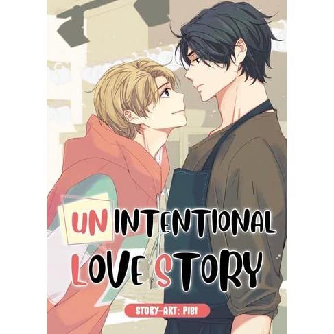
1) Unintentional love story- "Wonyoung gets unjustly suspended from work after getting caught up in a corruption scandal. But when he accidentally discovers the chairman's favorite artist Yoon Taejun living under an alias, he is tasked with a tricky new mission. Could this be Wonyoung's chance to get his job back?"
This is the summary from the licensed lezhin website, and it pretty much sums up the story, it is still ongoing right now so I can only comment on how I feel about it so far.
I really like this story its really straight forward and focuses mainly on the two characters and how their relationship went from business partners to eventual lovers
it has minimal drama and works on moving the relationship buildup between the two main characters and I really appreciate that, it makes me less frustrated, since you know there is always that one a-hole that will never take no for an answer
i will discuss that later for the other ones I plan to discuss. But so far the story is straight forward and cute, and I really like wonyoung he is really adorable. This is a manhwa but not in the form of a webtoon, so it's black and white and read in traditional manga style
if you like a straight forward story and development please give this a read, you will enjoy it.
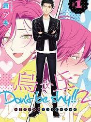
2) Karasugaoka Don't Be Shy!! - "Sou Izuhara, the leader of the crime prevention group "VOICE" that protects east Karasugaoka, realizes he's in love with the man he keeps butting heads with and leader of the rival group "Karasukai," Tetsuji Shinba...!?"
omg finally a manga recommendation? lol. you have no idea how much trouble I had remembering the title of this manga, I didn’t save it into my bookmarks and I usually did that if I was going to talk about it in the favorites.
I went through 5 websites to figure out the name but at least it was found. This story is both comedic and cute and it was a perfect break from the dark stuff I have been reading, I don't believe it has been updated in while so I'm not sure if it will ever be picked up
but there is a decent amount of chapters to get started on. But as the description says that it is a story about two crime prevention group leaders, they look like thugs but they prevent crimes from happening, so like an anti bullying campaign that recruits volunteers. two of the leaders from the largest groups apparently doesn’t get a long
on the surface but one of the leaders Izuhara really in fact admires the other leader Shinba. they start to get along after shiba went to izuharas territory to take care of some suspicious activity on that side and accidentally discovers a whole new side to izuhara due to the fact that he wasn’t wearing his glasses and didn’t know he was talking to shinba
and invited him to hang out together for that day. lol. You probably know the direction this is heading; it all starts from interest in a person right?
anways, I never recommended a manga yet so this would be a good one to read,it has a balance of a good romantic comedy.

3) Semantic Error- "Computer science major Chu Sangwoo is the epitome of an inflexible and strict rule-abiding person. While working on a liberal arts group project with freeloaders who don’t put in any effort, Sangwoo reasonably decides to remove their names from the final presentation. But he didn’t imagine how involved he would become with the person whose study-abroad plans were messed up because of that project. The involved person: the campus star who everyone knows, Department of Design’s Jang Jaeyoung. He has everything from skills, looks, family background and good relationships except for 1 big problem: Chu Sangwoo. What happens when an engineer and an artist whose personalities are like oil and water have to work together? Jang Jaeyoung is like a semantic error in the perfect world of Chu Sangwoo. Will Sangwoo be able to debug this?"
this has got to be one of the most accurate portrays of an antagonist relationship start off ever, it was really comedic and relatable at the same time, if you are in current group assignments and are or have suffered the same as sangwoo, please let me know cause I know I have.lol.
there’s only 16 chapters so far and I believe it hasn’t been updated in a while either so I don’t know if it is discontinued or not.
I can't wait to see the development between the two male leads, because their relationship right now in the manhwa is really hilarious and worth the read.
side note, not that this will ever be considered as a k-drama but I would like to see sangwoo being played by kim soo hyun, because he looks like him in the drama it's okay not to be okay.
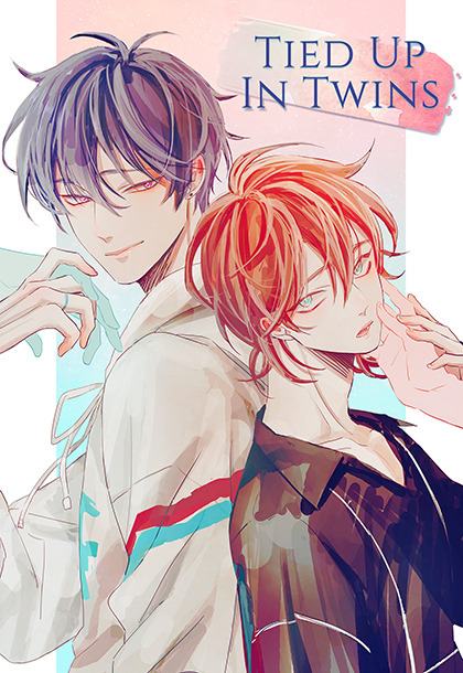
4) Tied up in twins- " The story starts off with three friends Jiwoo, sohee and woojung who had been friends since high school began to developed complicated feeling towards one another, woojung had been in love with sohee and sohee had been in love with jiwoo who was in love with woojung, things turned for the worse when jiwoo got drunk one night out and decided to confess his feelings to woojung by going to his apartment, he found 'woojung' standing outside and invited him to go drinking, he finally was able to let out his feelings and 'woojung ' accepted them without hesitation. Jiwoo felt like he was on cloud nine at the moment and slept with 'woojung' that night after thier feelings were made mutual. Turns out 'woojung ' was not actually woojung himself but his twin brother sarang, not knowing this fact he spots sarang with a man from his past eunji that used to bully him during his military service which made him confused and angry that 'woojung ' might be playing with his feelings. Sarang then confessed that he is the twin brother of woojung and both of them decided that that night was a mistake and that they should just forget about it as it didn't happen. Of course fate had other plans as they keep running into each other during difficult times and decided to become friends. It didn't take them long to be attracted to one another which lead them to end their previous relationship, sarang especially was suffering from his cheating boy friend's abuse and jiwoo with his one sided feelings for woojung. After a series of events sarang and jiwoo found that their feeling for each other were mutual and started to dating, which poses a lot more obstacles than either of the two had bargained for...."
This is actually my very own summary since I can't find one for this manhwa, I also did and fanart and discussed why i really like this story in that fanart, so please check out my art for my thoughts on it! Shameless self promo....
-------------------------------------------------
Welcome to hell
-------------------------------------------------
ooo now it's time for the fun part.LOL. Now let me just say that there is sometimes a fine line that defines what shounen ai and Yaoi are, sometimes stories is listed as both because one story that starts off like shounen ai will suddenly become yaoi
I define yaoi as a story that includes all the things that i'm uncomfortable with, which is emotional trauma from sexual abuse, sexual harassment and rape, physical abuse, suicide etc
these stories usually include some or all of the listed above and could make you uncomfortable in many ways, so as a warning if you are bothered by any of that even a little please don't read the ones I’m about to list, because there is a lot of it and there are situations that made me really sick while reading them. on the upside there is a lot of whole heartedness from the love scenes between the two main characters, although it’s like pages of sex scenes, you know from reading that it is between two people that love and trust each other.
so you have been warned, i'm not going to spoil it in terms of story but there is something these ones i chose out have in common and that is a SICK A-HOLE THAT EVERY PERSON WANTS TO KILL.You should have seen all those comments about calling sangwoo (killing stalking) to kill theses mofos and I could agree more, these disgusting human beings made me sick.
so let's begin...btw these are in no particular order, I was going to list these from the least worthy of dieing to most worthy of dieing but you know in the end they should just all die...lol.

1) My Suha -"A skillful secretary by day and choosy cruiser by night, Suha is a young professional who’s in search of some no-strings-attached action. He hasn’t had much luck lately, though, since a handsome face doesn’t always match what’s in a guy’s pants. This might be why he finds himself wondering about his dreamboat boss, Director Park Jiwoon. But there’s no way he can mix business with pleasure… That is, until Jiwoon and Suha run into each other in the gay bar bathroom."
so where to begin, um this pretty much includes all those listed above but it mainly focuses on the relationship between jiwoon and Suha, and it is not abusive and very loving in fact,I'm glad that they show the contrast between how suha's previous realtionships don't work out because of his trauma
and how jiwoon despite being an unwanted heir in his grandmother's eyes was able to give love and protection to the person that matters to him the most. So there's this scum bag...I even forgot his name but the red haired dude in this story he`s the legitimate heir to the family, who is the absolute worse and not only sexually abused Suha when they were younger and also emotionally scar both jiwoon and suha
making them feel incapable of being loved. I didn’t get a good feeling form him when he was first introduced and I was right...lol. But at least the comments section was in agreement; let me sum up my feelings in the form of this gif alone...

you get the point...
I heard it was going to finish soon so hopefully these emotional scars can be resolved and that suha and jiwoon stick together to get through it all. That would be a good ending for them after everything they have been through.You really need to read it in order to under stand why these events happen the way they do but please remember that suha`s inability to feel love stems from the all of his previous relationships not lasting long yes...but started with this red haired mofo. I am never going to let this dude live, let`s just say that.

2) Crash into me- " Seung-chan is stressed. He has enough on his plate with the long hours at work, and now he can’t even get any rest at home! Every night, the lustful moaning and violent banging from the apartment upstairs keeps him awake. Just as he’s at his wits’ end, he chances upon the gorgeous, enigmatic Hyesung outside his building. Surely all those filthy sounds couldn’t be coming from such a pretty mouth? But as Seung-chan soon finds out, there’s a lot more to Hyesung"
from that little description you’ve probably figured out what’s going on with the neighbour next door keeping seung chan awake right? well no surprise sexual abuse, after hyesung was forced to suffer from a ordeal that wasn't his fault the brother of the person that died made it seem like it was his fault and sexually assaulted him
and so this ongoing sexual abuse progressed for several years which lead hyesung feel like life is meaningless and he should just die, until he locked eyes with seung chan walking back to the apartment and thought of jumping out the window, because he had a strange feeling that seungchan who he has not met before would catch him if he did.
I just almost cried from what I just wrote...to think there’s is some a-hole out there that would drive a person to suicide like that just to satisfy his own needs or whatever...i don't even know cause it’s still ongoing...i don’t think any amount of back story will justify any kind of sympathy for this person..
from what I have read so far it seems so be going ending soon so i hope seungchan and hyesung will be able to get through all this and live in peace because of suengchan, hyesung was able to love again and find his worth and is able to fight for himself and I’m sincerely glad that he had met and trust him whole heartedly.
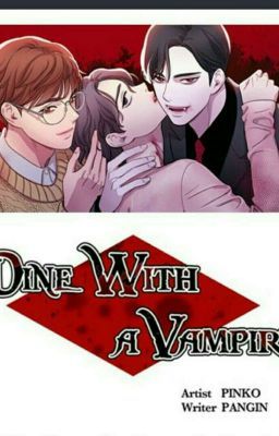
3) Dine with vampire- "Caught in the clutches of an abusive relationship, Sooin longs to escape. A vampire who finds human blood repulsive, Chi-hwan only drinks the blood of other vampires. When chance brings the two together, Chi-hwan makes Sooin an enticing proposal. Chi-hwan will help Sooin get out of his living hell, and in exchange… Sooin has to let Chihwan drink his blood. Will this proposal change both their lives for the better?”
y'all don't even get me started on the mofo in this story....I’ve never felt so much rage from staring at a 2D character on my screen, the amount of times I hissed at him...you don't even know
like I have mentioned before ever since my twilight phase I didn’t consume anything vampire related in a while, I don't really care much for the vampire aspect but I guess it's still important over all
once you start the first chapter you will immediately know why I hate the harry potter a-hole in this story..he is despicable and that’s putting it lightly...but you know he doesn’t last long cause vampire tsukiyama (lol, not his name but they look alike) shows up and kills the mofo
and saves sooin who is the person who harry potter had been sexually abusing...to the point where you guessed it, he wanted to die.
chi hwan agrees to grant any wish sooin wanted in exchange for his blood because being vampire by nature he had not been drawn to anyone’s blood for some reason and had only consumed the blood of other vampires.
of course it was a small price to pay for sooin considering all the misery he had gone through. slowly sooin discovered that love was not abusive through the many times chi hwan...lmao i almost called him tsukiyama again...and he had sex, he discovered that it was safe and gentle and enjoyable
nothing that he had ever felt before, and so they became drawn to each other more than they thought they would to the point where they genuinely care for one another, though of course chi hwan knows that one day sooin will die and he will have to live on forever alone, thus the fate of his vampire blood.
but here’s the catch..it's not a spoiler really cause you knew it was too easy when main villain dies in chapter 4...and he’s on the front cover...which means yes harry potter mofo is back...ugh...he should have burned his body...WTF and as a vampire no less..
i'm like great now look what happened, you should have chopped him up and threw him into the incinerator!
you know that saying " mistakes were made..."

anyways, now he's back meaning shits about to do down and i'm not ready to see it happen, right now they are going through his back story and i’m like sorry author...whatever you try to feed me there’s no way i can have any sympathy for this dick...
so that's all i'm going to rant about for these yaoi titles...i had to go back and read some it again to know what i'm going to write about and i revisited a lot of things i’d rather not.I think the rage I felt was ignited again all of a sudden and I felt utter frustration to finish reading it again, what I am trying to say is, ya`ll need to read this once and that`s it...these aren`t stories you`d want to revisit.lol
so if you like this hell segment let me know and i'll continue it cause there’s an endless supply of content for this genre, I have a few more but i'll save those for next month.
and i'll probably come across more in the mean time to discuss, but I guess this is where fiction and reality divides, cause you know in real life if this crap exists absolutely no one will take this bull crap!
--------------------------------------------------
MUSIC
--------------------------------------------------
I have been listening to the Start up soundtrack and found a lot of songs i like from it, I don't like the drama and have not finished it, but the soundtrack is bomb
I have also been liking some old pop songs and went down the rabbit hole of 90`s pop songs...Britney spears especially
---------------------------------------------------
so that is all I have for this month, I'm sorry its manhwa and manga focused, i'll have time to watch anime that I need to catch up on and start some drams now so i'll have more
to discuss in the next month hopefully, so please take care of your selves in the new year as well!
take care,
sheena
---------------------------------------------
SOCIAL MEDIA
---------------------------------------------
INSTAGRAM: shinb_art
TUMBLR: shinahbee
DEVIANTART: she-be.deviantart.com
---------------------------------------------
#monthly favorites#shounen ai#yaoi#manga review#manhwa review#manhwa#manga#my suha#dine with a vampire#crash into me#karasugaoka don`t be shy#tied up in twins#unintentional love story#korean manhwa#anime and manga#semantic error#manga recommendation
26 notes
·
View notes
Note
HELLO I'M BACK!! GUESS WHO HAS A TERM BREAK COMING IN A FEW DAYS I'M VERY HAPPY :D this ask is Very Long so i'm going to split it up into a few parts
part 1/2
But honestly, it would probably be something like “I’m going to bring a (dead) chicken to class for show and tell and you two need to act horrified and cause a ruckus because it would be fun and it would scare the other kids :)”. (this is probably bullying, so in an effort to make them slightly better kids, an alternative plot is that a stray cat has been coming to their school and in order to make friends with it, they feed it a whole-ass dead chicken Nyo China got from the butchers and was planning to cook for dinner. The teachers are horrified and confiscate Yao’s backpack for fear of germs and salmonella.)
hhhhhh the first idea is SO FUN my gremlin repressed anger eight year old self would've loved it. the idea of bringing a stinking plastic bag to school, opening it, revealing a dead, fly-infested chicken and then maybe playing a small game of lobbing the chicken around for funsies is both simultaneously horrifying and amazing. however the second idea is also amazing, one of my previous schools had stray cats and staff and students would feed and pet them (and i miss it :( ) and it was the Best feeling... or maybe they could do BOTH? but this time they're planning to bring a dead chicken to feed the cat (aw, even if yao probably gets detention. also a lecture from nyo china on what exactly you should feed a cat, including why you shouldn't steal the chicken she bought to feed it.) and the next time they can bring like. a bunch of dead flies to show their classmates but in a not bully way. i went once to this family friend's house in a part of the countryside that had an abundance of flies. (i literally haven't thought of this in years i'm remembering so many childhood things because of this omg) they had this paper covered with glue that the flies would land on and then be stuck on the paper. it was both disgusting and amazing to watch a black mass of bulbous bodies straining with their legs (which were probably thinner than my hair) to escape the paper. i also think that indchuran, being both little sadists in the making and having an abudnace of fascination like many children, would take great delight in watching an unsuspecting fly landing on the glue, watch it still, glancing around eerily similarly to when humans realise they have gotten themselves in a bad situation, and then start struggling with all their might to get out. but fuck the flies tho they landed on our food all the time there and it sucked. they can die :)
THE PROBELM is... how will they get that many flies in what i assume would be a gentrified ass area with frequent fumigation efforts given that nyo china would not accept anything than the best elementary education for her ward?? (i have a solution) maybe indus has friends in the countryside and she goes with aditya to visit them. and while they are talking aditya wanders about and discovers a few pieces of paper filled with flies. because he is a gremlin, he is Fascinated with these pieces of paper, and he takes one out to Further Examine. all the adults yell at him, but he is Fascinated and will not be stopped. and then a Thought occurs to him: who would probably enjoy this as much as he would? duh, his friends of course! good things must be Shared even if they're kind of disgusting! so what he does is he gets a disposable plastic tupperware like container, very gently places the fly paper into it, pokes a few holes for air, sprinkles some sugar because he thinks that'll keep them alive, and wraps most of it up in duct tape he found so indus can't see it. unfortunately most of the flies died on the way home because the container was stuffed into aditya's bag and the paper slid to the side + there wasn't enough air, BUT the dead flies are still a Sight to behold when he visits iran's house (which yao is /coincidentally/ visiting) to show them. then he brings it to school after the weekend, and everyone is Fascinated and thinks it is Very Cool, at least until the teachers see it and start screaming. they throw it away but indchuran get an Idea to put dead flies into the bags of people they hate (this is now just bullying) so that opens up a very few interesting weeks of attempts to collect flies in a fumigated city and Horror for the school. fun times for all!
😔 finding and reading that encyclopedia is probably one of my formative memories now and i wish it wasn't 😔 i bet yao during his teenage years would look back on it and be like "... oh my GOD." but i think he would appreciate her directness even if he didn't absorb all the information correctly or remember most of it lmao because it seems like only a very small percentage of the world has actually good sex ed and i don't think indchuran's school would be an exception. at least nyo china like you said instilled a good sense of consent with them 😔 also the idea of saying fuck in mandarin makes me break out in hives the AUDACITY of saying fuck in your first language but of course he would. he WOULD. nyo china probably wouldn't even have purposely taught him that which is why he doesn't know what it means, just that it's an insult, but once they come up to her to complain all she does is give them a Terrifying Contemptuous Glare and steer yao away from them. yao is her kid and therefore entitled to say fuck whenever he wants.
Prev
First things first I hope you had a good term break! this is... very overdue sorry about that :(
Second, ALSK:FJ:SLFDKSFDLKJSLDF the fly infested chicken is disgusting and I want so badly to intervene,,, they need hELP. Please learn about proper sanitation, children, I’m begging you T-T. Also, headcanon accepted: they’re ostensibly bringing it to feed the cats (which is hopefully allowed) but also they want to terrorize (or awe) their fellow classmates with this discovery. Watch the school call up nyo china about this, but she gets annoyed only because yao wasted human food in order to feed cats, not because he brought an inappropriately dead chicken to school that scared the younger kids and fellow classmates lol; what a great value system. Also this scenario def happened:
School: your child got in a fight.
Nyo China: Oh no! Did he win?
I am both fully revolted and half fascinated by the flypaper thing because on one hand I CANNOT stand flies, and killing them is 178% gross. But also the way you described it is... very compelling and I would like to experience that, gross as it is lol. So yea I can definitely see those three nastily observing the flies getting stuck to the flypaper one by one... they all intently watch the flypaper with round and curious eyes and it really looks very cute from far away, three heads of fluffy hair close together and bent over something, carrying on an animated whispered discussion, until you get closer and see that they’re watching flies on flypaper •—•;; An even more gross scenario would be if one of them accidentally squashes one and they crowd around to see what fly guts look like 😭 bonus points if it happens during school. Also YES to Indus’s countryside friend; I feel like India would have a lot of fun exploring over there and would be able to bring back v cool stories for city slicker Yao, and also Iran (although I don’t know where they’d live precisely. I feel like they’d probably have a medium sized house with very nice art and Classy furniture (they got good taste from somewhere), but they’d also knows a lot about how rural areas work and stuff, so uh.. suburbs? Or something like that?)
“then he brings it to school after the weekend, and everyone is Fascinated and thinks it is Very Cool. . .” O—O sigh... three balls of absolute chaos. At least the other kids are fascinated this time instead of apprehensive ^-^ but the dead flies in lockers AL:KDSLFDSJF PLEASE NO me as an elementary student would have been absolutely horrified and I. really hope they get detention for that lol; Please Tone Down kids 😔 (also do y’all get flies in the lights at school? Because every single classroom I’ve been in has either had flies, wasps, moths, or some other black spots in the lights and they’d multiply as the year went on 😭 I never thought about it too much but... what if they linger around to watch the lights get cleaned? o-o)
“i bet yao during his teenage years would look back on it and be like "... oh my GOD."” YEAH there’s always a select few memories that make you realize “what even WAS that” and I think this is one lol. Yao just buries it in the back of his spacious mental closet and makes India and Iran swear not to bring it up again but inevitably they do :))))) they find it rather hilarious, actually. Also yes at least Nyo China did a good job in that department!
“also the idea of saying fuck in mandarin makes me break out in hives the AUDACITY of saying fuck in your first language but of course he would” lol I wrote that thinking he'd call someone a 王八* (because it could technically pass as a regular noun o-o. Who knows, maybe he was insulting someone for being slow like a turtle but it got out of hand due to word choice lol) but... the second scenario is quite something... I don't know whether I should laugh or cry. RIP the other parents who just have to fervently hope that disgraceful kid from next door grows out of his foul mouth soon (he never does, just gets better at pretending his language is elegant and not at all dirty XD)
*for non mandarin speakers 王八 is literally a soft shelled turtle, but is actually a pretty big insult in mandarin :)
#the ancients elementary#aph china#hws china#au back in business babey! also bones this answer is Very Late; sorry about that!! :< i was inordinately busy with school#hws india#aph india#aph iran#hws iran#aph ancients#hws ancients#aph#hetalia#hetalia headcanons#aph persia#hws persia#musings#headcanon musings#hetalia au#aph china headcanons#hws china headcanons#luyous#ask musings#answered
4 notes
·
View notes
Text
Creating an Animated Login Form for TouchID
I came across this amazing Dribbble shot by Jakub Reis a while back. It caught my eye and I knew that I just had to try recreating it in code. At that moment, I didn’t know how. I tried out a bunch of different things, and about a year later, I finally managed to make this demo.
I learned a couple of things along the way, so let me take you on a little journey of what I did to make this because you may learn a thing or two as well.
See the Pen Opening screen for a banking app by Kirill Kiyutin (@kiyutink) on CodePen.
Step 1: Split the work into parts
I watched the original GIF many times. My goal was to split the animation into small, digestible chunks and I was able to break it down like this:
Fill the fingerprint
Remove the fingerprint
Animate the path ends
Morph one of the curved fingerprint lines into a horizontal one
Animate the “bullet” that is launched by the line
Morph the string into a graph
Animate small exploding particles
Animate the account balance
And other small animations with some minor CSS transitions
I know, it looks a lot — but we can do this!
Step 2: Take the original demo apart frame-by-frame
I needed to extract as much info as I could out of the original GIF to have a good understanding of the animation, so I split it up into single frames. There actually are a lot of services that can do this for us. I used one at ezgif.com but it could have just as easily been something else. Either way, this enables us to get details such as the colors, sizes, and proportions of all the different elements we need to create.
Oh, and we still need to turn the fingerprint into an SVG. Again, there are plenty of apps that will help us here. I used Adobe Illustrator to trace the fingerprint with the pen tool to get this set of paths:
See the Pen css-t. paths by Kirill Kiyutin (@kiyutink) on CodePen.
We’ll go through the same process with the line chart that appears towards the end of the animation, so might as well keep that vector editor open. 🙂
Step 3: Implement the animations
I’ll explain how the animations work in the final pen, but you can also find some of the unsuccessful approaches I took along the way in the end of the article.
I’ll focus on the important parts here and you can refer to the demos for the full code.
Filling the fingerprint
Let’s create the HTML structure of the phone screen and the fingerprint.
<div class="demo"> <div class="demo__screen demo__screen--clickable"> <svg class="demo__fprint" viewBox="0 0 180 320"> <!-- removes-forwards and removes-backwards classes will be helpful later on --> <path class="demo__fprint-path demo__fprint-path--removes-backwards demo__fprint-path--pinkish" d="M46.1,214.3c0,0-4.7-15.6,4.1-33.3"/> <path class="demo__fprint-path demo__fprint-path--removes-backwards demo__fprint-path--purplish" d="M53.5,176.8c0,0,18.2-30.3,57.5-13.7"/> <path class="demo__fprint-path demo__fprint-path--removes-forwards demo__fprint-path--pinkish" d="M115.8,166.5c0,0,19.1,8.7,19.6,38.4"/> <!-- ... and about 20 more paths like this --> </svg>
The styles are quite simple so far. Note that I am using Sass throughout the demo — I find that it helps keep the work clean and helps with some of the heavier lifting we need to do.
// I use a $scale variable to quickly change the scaling of the whole pen, so I can focus on the animation and decide on the size later on. $scale: 1.65; $purplish-color: #8742cc; $pinkish-color: #a94a8c; $bg-color: #372546; // The main container .demo { background: linear-gradient(45deg, lighten($pinkish-color, 10%), lighten($purplish-color, 10%)); min-height: 100vh; display: flex; justify-content: center; align-items: center; font-size: 0; user-select: none; overflow: hidden; position: relative; // The screen that holds the login component &__screen { position: relative; background-color: $bg-color; overflow: hidden; flex-shrink: 0; &--clickable { cursor: pointer; -webkit-tap-highlight-color: transparent; } } // Styles the fingerprint SVG paths &__fprint-path { stroke-width: 2.5px; stroke-linecap: round; fill: none; stroke: white; visibility: hidden; transition: opacity 0.5s ease; &--pinkish { stroke: $pinkish-color; } &--purplish { stroke: $purplish-color; } } // Sizes positions the fingerprint SVG &__fprint { width: 180px * $scale; height: 320px * $scale; position: relative; top: 20px * $scale; overflow: visible; // This is going to serve as background to show "unfilled" paths. we're gonna remove it at the moment where the filling animation is over background-image: url('https://kiyutink.github.io/svg/fprintBackground.svg'); background-size: cover; &--no-bg { background-image: none; } } }
Now the hard part: making the fingerprint interactive. You can read about the animation of SVG lines here. That’s the method we’ll use to fill in each individual path.
Let’s create a class that describes a path element so that it’s easier to manipulate the paths later on.
class Path { constructor(selector, index) { this.index = index; this.querySelection = document.querySelectorAll(selector)[index]; this.length = this.querySelection.getTotalLength(); this.$ = $(selector).eq(index); this.setDasharray(); this.removesForwards = this.$.hasClass('demo__fprint-path--removes-forwards'); } setDasharray() { this.$.css('stroke-dasharray', `${this.length} ${this.length + 2}`); return this; } offset(ratio) { this.$.css('stroke-dashoffset', -this.length * ratio + 1); return this; } makeVisible() { this.$.css('visibility', 'visible'); return this; } }
The general idea is this: Create an instance of this class for each path that we have in the fingerprint, and modify them in every frame. The paths will start with an offset ratio of -1 (fully invisible) and then will increase the offset ratio (which we’ll refer to as “offset” from here on) by a constant value each frame until they get to 0 (fully visible). The filling animation will be over at this point.
If you’ve never animated anything with this frame-by-frame approach, here’s a very simple demo to help understand how this works:
See the Pen 60fps raf animation proof of concept by Kirill Kiyutin (@kiyutink) on CodePen.
We should also handle the case where the user stops tapping or pressing the mouse button. In this case, we will animate in the opposite direction (subtracting a constant value from the offset each frame until it gets to -1 again).
Let’s create the function that calculates the offset increment for every frame — this’ll be useful later on.
function getPropertyIncrement(startValue, endValue, transitionDuration) { // We animate at 60 fps const TICK_TIME = 1000 / 60; const ticksToComplete = transitionDuration / TICK_TIME; return (endValue - startValue) / ticksToComplete; }
Now it’s time to animate! We will keep the fingerprint paths in a single array:
let fprintPaths = []; // We create an instance of Path for every existing path. // We don't want the paths to be visible at first and then // disappear after the JavaScript runs, so we set them to // be invisible in CSS. That way we can offset them first // and then make them visible. for (let i = 0; i < $(fprintPathSelector).length; i++) { fprintPaths.push(new Path(fprintPathSelector, i)); fprintPaths[i].offset(-1).makeVisible(); }
We will go through that array for each frame in the animation, animating the paths one by one:
let fprintTick = getPropertyIncrement(0, 1, TIME_TO_FILL_FPRINT); function fprintFrame(timestamp) { // We don't want to paint if less than 1000 / 65 ms elapsed // since the last frame (because there are faster screens // out there and we want the animation to look the same on // all devices). We use 65 instead of 60 because, even on // 60 Hz screens, `requestAnimationFrame` can sometimes be called // a little sooner, which can result in a skipped frame. if (timestamp - lastRafCallTimestamp >= 1000 / 65) { lastRafCallTimestamp = timestamp; curFprintPathsOffset += fprintTick * fprintProgressionDirection; offsetAllFprintPaths(curFprintPathsOffset); } // Schedule the next frame if the animation isn't over if (curFprintPathsOffset >= -1 && curFprintPathsOffset <= 0) { isFprintAnimationInProgress = true; window.requestAnimationFrame(fprintFrame); } // The animation is over. We can schedule next animation steps else if (curFprintPathsOffset > 0) { curFprintPathsOffset = 0; offsetAllFprintPaths(curFprintPathsOffset); isFprintAnimationInProgress = false; isFprintAnimationOver = true; // Remove the background with grey paths $fprint.addClass('demo__fprint--no-bg'); // Schedule the next animation step - transforming one of the paths into a string // (this function is not implemented at this step yet, but we'll do that soon) startElasticAnimation(); // Schedule the fingerprint removal (removeFprint function will be implemented in the next section) window.requestAnimationFrame(removeFprint); } // The fingerprint is back to the original state (the user has stopped holding the mouse down) else if (curFprintPathsOffset < -1) { curFprintPathsOffset = -1; offsetAllFprintPaths(curFprintPathsOffset); isFprintAnimationInProgress = false; } }
And we’ll attach some event listeners to the demo:
$screen.on('mousedown touchstart', function() { fprintProgressionDirection = 1; // If the animation is already in progress, // we don't schedule the next frame since it's // already scheduled in the `fprintFrame`. Also, // we obviously don't schedule it if the animation // is already over. That's why we have two separate // flags for these conditions. if (!isFprintAnimationInProgress && !isFprintAnimationOver) window.requestAnimationFrame(fprintFrame); }) // On `mouseup` / `touchend` we flip the animation direction $(document).on('mouseup touchend', function() { fprintProgressionDirection = -1; if (!isFprintAnimationInProgress && !isFprintAnimationOver) window.requestAnimationFrame(fprintFrame); })
...and now we should be done with the first step! Here’s how our work looks at this step:
See the Pen css-t. step 1 by Kirill Kiyutin (@kiyutink) on CodePen.
Removing the fingerprint
This part is pretty similar to the first one, only now we have to account for the fact that some of the paths remove in one direction and the rest of them in the other. That’s why we added the --removes-forwards modifier earlier.
First, we’ll have two additional arrays: one for the paths that are removed forwards and another one for the ones that are removed backwards:
const fprintPathsFirstHalf = []; const fprintPathsSecondHalf = []; for (let i = 0; i < $(fprintPathSelector).length; i++) { // ... if (fprintPaths[i].removesForwards) fprintPathsSecondHalf.push(fprintPaths[i]); else fprintPathsFirstHalf.push(fprintPaths[i]); }
...and we’ll write a function that offsets them in the right direction:
function offsetFprintPathsByHalves(ratio) { fprintPathsFirstHalf.forEach(path => path.offset(ratio)); fprintPathsSecondHalf.forEach(path => path.offset(-ratio)); }
We’re also going to need a function that draws the frames:
function removeFprintFrame(timestamp) { // Drop the frame if we're faster than 65 fps if (timestamp - lastRafCallTimestamp >= 1000 / 65) { curFprintPathsOffset += fprintTick * fprintProgressionDirection; offsetFprintPathsByHalves(curFprintPathsOffset); lastRafCallTimestamp = timestamp; } // Schedule the next frame if the animation isn't over if (curFprintPathsOffset >= -1) window.requestAnimationFrame(removeFprintFrame); else { // Due to the floating point errors, the final offset might be // slightly less than -1, so if it exceeds that, we'll just // assign -1 to it and animate one more frame curFprintPathsOffset = -1; offsetAllFprintPaths(curFprintPathsOffset); } } function removeFprint() { fprintProgressionDirection = -1; window.requestAnimationFrame(removeFprintFrame); }
Now all that’s left is to call removeFprint when we’re done filling the fingerprint:
function fprintFrame(timestamp) { // ... else if (curFprintPathsOffset > 0) { // ... window.requestAnimationFrame(removeFprint); } // ... }
Let’s check our work now:
See the Pen css-t. part 2 by Kirill Kiyutin (@kiyutink) on CodePen.
Animating the path ends
You can see that, as the fingerprint is almost removed, some of its paths are longer than they were in the beginning. I moved them into separate paths that start animating at the right moment. I could incorporate them into the existing paths, but it would be much harder and at 60fps would make next-to-no difference.
Let’s create them:
<path class="demo__ending-path demo__ending-path--pinkish" d="M48.4,220c-5.8,4.2-6.9,11.5-7.6,18.1c-0.8,6.7-0.9,14.9-9.9,12.4c-9.1-2.5-14.7-5.4-19.9-13.4c-3.4-5.2-0.4-12.3,2.3-17.2c3.2-5.9,6.8-13,14.5-11.6c3.5,0.6,7.7,3.4,4.5,7.1"/> <!-- and 5 more paths like this -->
...and apply some basic styles:
&__ending-path { fill: none; stroke-width: 2.5px; stroke-dasharray: 60 1000; stroke-dashoffset: 61; stroke-linecap: round; will-change: stroke-dashoffset, stroke-dasharray, opacity; transform: translateZ(0); transition: stroke-dashoffset 1s ease, stroke-dasharray 0.5s linear, opacity 0.75s ease; &--removed { stroke-dashoffset: -130; stroke-dasharray: 5 1000; } &--transparent { opacity: 0; } &--pinkish { stroke: $pinkish-color; } &--purplish { stroke: $purplish-color; } }
Now, we have to add the --removed modifier to flow these paths in at the right moment:
function removeFprint() { $endingPaths.addClass('demo__ending-path--removed'); setTimeout(() => { $endingPaths.addClass('demo__ending-path--transparent'); }, TIME_TO_REMOVE_FPRINT * 0.9); // ... }
Now our work is really starting to take shape:
See the Pen css-t. part 3 by Kirill Kiyutin (@kiyutink) on CodePen.
Morphing the fingerprint
OK, I found this part to be really hard to do on my own, but it’s really easy to implement with GSAP’s morphSVG plugin.
Let’s create the invisible paths (well, a path and a line to be exact 🙂) that will be the keyframes for our string:
<line id='demo__straight-path' x1="0" y1="151.3" x2="180" y2="151.3"/> <path class="demo__hidden-path" id='demo__arc-to-top' d="M0,148.4c62.3-13.5,122.3-13.5,180,0"/>
Then we’ll use morphSVG to transition the path in between the keyframes:
const $elasticPath = $('#demo__elastic-path'); const ELASTIC_TRANSITION_TIME_TO_STRAIGHT = 250; const WOBBLE_TIME = 1000; function startElasticAnimation() { $elasticPath.css('stroke-dasharray', 'none'); const elasticAnimationTimeline = new TimelineLite(); elasticAnimationTimeline .to('#demo__elastic-path', ELASTIC_TRANSITION_TIME_TO_STRAIGHT / 1000, { delay: TIME_TO_REMOVE_FPRINT / 1000 * 0.7, morphSVG: '#demo__arc-to-top' }) .to('#demo__elastic-path', WOBBLE_TIME / 1000, { morphSVG: '#demo__straight-path', // I played with the easing a bit to get that "vibration" effect ease: Elastic.easeOut.config(1, 0.3) }) }
We’ll call this function inside the fprintFrame once the fingerprint is filled:
function fprintFrame(timestamp) { // ... else if (curFprintPathsOffset > 0) { // ... startElasticAnimation(); // ... } // ... }
The outcome is this:
See the Pen css-t. part 4 by Kirill Kiyutin (@kiyutink) on CodePen.
Animating the floating bullet
For this, I used some simple straightforward CSS animations. I chose the timing functions to emulate the gravity. You can play around with the timing functions here or here.
Let’s create a div:
<div class="demo__bullet"></div>
...and apply some styles to it:
&__bullet { position: absolute; width: 4px * $scale; height: 4px * $scale; background-color: white; border-radius: 50%; top: 210px * $scale; left: 88px * $scale; opacity: 0; transition: all 0.7s cubic-bezier(0.455, 0.030, 0.515, 0.955); will-change: transform, opacity; // This will be applied after the bullet has descended, to create a transparent "aura" around it &--with-aura { box-shadow: 0 0 0 3px * $scale rgba(255, 255, 255, 0.3); } // This will be applied to make the bullet go up &--elevated { transform: translate3d(0, -250px * $scale, 0); opacity: 1; } // This will be applied to make the bullet go down &--descended { transform: translate3d(0, 30px * $scale, 0); opacity: 1; transition: all 0.6s cubic-bezier(0.285, 0.210, 0.605, 0.910); } }
Then we tie it together by adding and removing classes based on a user’s interactions:
const DELAY_TO_BULLET_AURA = 300; const ELEVATION_TIME = 700; const DELAY_AFTER_ELEVATION = 700; const $bullet = $('.demo__bullet'); function elevateBullet() { $bullet.addClass('demo__bullet--elevated'); } function descendBullet() { $bullet.addClass('demo__bullet--descended').removeClass('demo__bullet--elevated'); animateBulletAura(); } function animateBulletAura() { setTimeout(() => $bullet.addClass('demo__bullet--with-aura'), DELAY_TO_BULLET_AURA); } function animateBullet() { elevateBullet(); $screen.removeClass('demo__screen--clickable'); setTimeout(descendBullet, ELEVATION_TIME + DELAY_AFTER_ELEVATION); }
Now, we need to call the animateBullet function:
function startElasticAnimation() { // ... animateBullet(); }
Here’s where we are at this point:
See the Pen css-t. part 5 by Kirill Kiyutin (@kiyutink) on CodePen.
Morphing the string into a graph
Now, let’s turn that string into a graph where the bullet can land. We’ll add another keyframe to the morphSVG animation.
<path class="demo__hidden-path" id='demo__curve' d="M0,140.2c13.1-10.5,34.7-17,48.5-4.1c5.5,5.2,7.6,12.1,9.2,19.2c2.4,10.5,4.3,21,7.2,31.4c2.4,8.6,4.3,19.6,10.4,26.7c4.3,5,17.7,13.4,23.1,4.8c5.9-9.4,6.8-22.5,9.7-33c4.9-17.8,13-14.6,15.7-14.6c1.8,0,9,2.3,15.4,5.4c6.2,3,11.9,7.7,17.9,11.2c7,4.1,16.5,9.2,22.8,6.6"/>
We add this keyframe into our timeline like this:
const DELAY_TO_CURVE = 350; const ELASTIC_TRANSITION_TIME_TO_CURVED = 300; function startElasticAnimation() { // ... elasticAnimationTimeline // ... .to('#demo__elastic-path', ELASTIC_TRANSITION_TIME_TO_CURVED / 1000, { delay: DELAY_TO_CURVE / 1000, morphSVG: '#demo__curve' }) // ... }
Here’s what we get:
See the Pen css-t. part 6 by Kirill Kiyutin (@kiyutink) on CodePen.
Exploding the particles
This is a fun animation. First, we’ll create a couple of new divs that contain the particles that explode:
<div class="demo__logo-particles"> <div class="demo__logo-particle"></div> <!-- and several more of these --> </div> <div class="demo__money-particles"> <div class="demo__money-particle"></div> <!-- and several more of these --> </div>
The two explosions are practically the same with the exception of a few parameters. That’s where SCSS mixins will come in handy. We can write the function once and use it on our divs.
@mixin particlesContainer($top) { position: absolute; width: 2px * $scale; height: 2px * $scale; left: 89px * $scale; top: $top * $scale; // We'll hide the whole container to not show the particles initially opacity: 0; &--visible { opacity: 1; } } // The $sweep parameter shows how far from the center (horizontally) the initial positions of the particles can be @mixin particle($sweep, $time) { width: 1.5px * $scale; height: 1.5px * $scale; border-radius: 50%; background-color: white; opacity: 1; transition: all $time ease; position: absolute; will-change: transform; // Phones can't handle the particles very well :( @media (max-width: 400px) { display: none; } @for $i from 1 through 30 { &:nth-child(#{$i}) { left: (random($sweep) - $sweep / 2) * $scale + px; @if random(100) > 50 { background-color: $purplish-color; } @else { background-color: $pinkish-color; } } &--exploded:nth-child(#{$i}) { transform: translate3d((random(110) - 55) * $scale + px, random(35) * $scale + px, 0); opacity: 0; } } }
Note the comment in the code that the particles don’t perform particularly well on less powerful devices such as phones. Perhaps there’s another approach here that would solve this if anyone has ideas and wants to chime in.
Alright, let’s put the mixins to use on the elements:
&__logo-particles { @include particlesContainer(15px); } &__logo-particle { @include particle(50, 1.7s); } &__money-particles { @include particlesContainer(100px); } &__money-particle { @include particle(100, 1.5s); }
Now we add the classes to the divs at the right time in JavaScript:
const DELAY_TO_ANIMATE_MONEY_PARTICLES = 300; const DELAY_TO_ANIMATE_LOGO_PARTICLES = 500; const $moneyParticles = $('.demo__money-particle'); const $moneyParticlesContainer = $('.demo__money-particles'); const $logoParticlesContainer = $('.demo__logo-particles'); const $logoParticles = $('.demo__logo-particle'); function animateMoneyParticles() { setTimeout(() => { $moneyParticlesContainer.addClass('demo__money-particles--visible') $moneyParticles.addClass('demo__money-particle--exploded'); }, DELAY_TO_ANIMATE_MONEY_PARTICLES); } function animateLogoParticles() { setTimeout(() => { $logoParticlesContainer.addClass('demo__logo-particles--visible') $logoParticles.addClass('demo__logo-particle--exploded'); }, DELAY_TO_ANIMATE_LOGO_PARTICLES); } function elevateBullet() { // ... animateMoneyParticles(); animateLogoParticles(); }
Here’s where we’re at:
See the Pen css-t. part 7 by Kirill Kiyutin (@kiyutink) on CodePen.
Animating the account balance
Every digit will have a few random numbers that we’ll scroll through:
<div class="demo__money"> <div class="demo__money-currency">$</div> <!-- every digit will be a div like this one --> <div class="demo__money-digit"> 1 2 3 4 5 6 7 8 1 </div> // ... </div>
We will put different transition times on all of the digits so that the animations are staggered. We can use a SCSS loop for that:
&__money-digit { // ... // we start from 2 because the first child is the currency sign :) @for $i from 2 through 6 { &:nth-child(#{$i}) { transition: transform 0.1s * $i + 0.2s ease; transition-delay: 0.3s; transform: translate3d(0, -26px * $scale * 8, 0); } &--visible:nth-child(#{$i}) { transform: none; } } }
All that’s left is to add the CSS classes at the right time:
const $money = $('.demo__money'); const $moneyDigits = $('.demo__money-digit'); function animateMoney() { $money.addClass('demo__money--visible'); $moneyDigits.addClass('demo__money-digit--visible'); } function descendBullet() { // ... animateMoney(); // ... }
Now sit back and marvel at our work:
See the Pen css-t. part 8 by Kirill Kiyutin (@kiyutink) on CodePen.
The rest of the animations are fairly simple and involve light CSS transitions, so I won’t get into them to keep things brief. You can see all of the final code in the completed demo.
View Demo
Some final words
In my early attempts I tried using CSS transitions for all of the animation work. I found it virtually impossible to control the progress and direction of the animation, so shortly I abandoned that idea and waited a month or so before starting again. In reality, if I knew back then that the Web Animations API was a thing, I would have tried to make use of it.
I tried making the explosion with Canvas for better performance (using this article as a reference), but I found it difficult to control the frame rate with two separate requestAnimationFrame chains. If you know how to do that, then maybe you can tell me in the comments (or write an article for CSS-Tricks 🙂).
After I got a first working prototype, I was really unhappy with its performance. I was hitting around 40-50fps on a PC, not to mention phones at all. I spent a lot of time optimizing the code and this article was a lot of help.
You can see that the graph has a gradient. I did that by declaring a gradient directly in the SVG defs block:
<defs> <linearGradient id="linear" x1="0%" y1="0%" x2="100%" y2="0%"> <stop offset="0%" stop-color="#8742cc"/> <stop offset="100%" stop-color="#a94a8c"/> </linearGradient> </defs>
...and then applied it in the CSS properties:
fill: url(#linear); stroke: url(#linear);
The whole process from start to finish — discovering the Dribbble shot and finishing the work — took me about a year. I was taking month-long breaks here and there either because I didn’t know how to approach a particular aspect or I simply didn’t have enough free time to work on it. The entire process was a really valuable experience and I learned a lot of new things along the way.
That being said, the biggest lesson to take away from this is that there’s no need to shy away from taking on an ambitious task, or feel discouraged if you don’t know how to approach it at first. The web is a big place and there is plenty of space to figure things out as you go along.
The post Creating an Animated Login Form for TouchID appeared first on CSS-Tricks.
Creating an Animated Login Form for TouchID published first on https://deskbysnafu.tumblr.com/
0 notes
Text
Creating an Animated Login Form for TouchID
I came across this amazing Dribbble shot by Jakub Reis a while back. It caught my eye and I knew that I just had to try recreating it in code. At that moment, I didn’t know how. I tried out a bunch of different things, and about a year later, I finally managed to make this demo.
I learned a couple of things along the way, so let me take you on a little journey of what I did to make this because you may learn a thing or two as well.
See the Pen Opening screen for a banking app by Kirill Kiyutin (@kiyutink) on CodePen.
Step 1: Split the work into parts
I watched the original GIF many times. My goal was to split the animation into small, digestible chunks and I was able to break it down like this:
Fill the fingerprint
Remove the fingerprint
Animate the path ends
Morph one of the curved fingerprint lines into a horizontal one
Animate the “bullet” that is launched by the line
Morph the string into a graph
Animate small exploding particles
Animate the account balance
And other small animations with some minor CSS transitions
I know, it looks a lot — but we can do this!
Step 2: Take the original demo apart frame-by-frame
I needed to extract as much info as I could out of the original GIF to have a good understanding of the animation, so I split it up into single frames. There actually are a lot of services that can do this for us. I used one at ezgif.com but it could have just as easily been something else. Either way, this enables us to get details such as the colors, sizes, and proportions of all the different elements we need to create.
Oh, and we still need to turn the fingerprint into an SVG. Again, there are plenty of apps that will help us here. I used Adobe Illustrator to trace the fingerprint with the pen tool to get this set of paths:
See the Pen css-t. paths by Kirill Kiyutin (@kiyutink) on CodePen.
We’ll go through the same process with the line chart that appears towards the end of the animation, so might as well keep that vector editor open. 🙂
Step 3: Implement the animations
I’ll explain how the animations work in the final pen, but you can also find some of the unsuccessful approaches I took along the way in the end of the article.
I’ll focus on the important parts here and you can refer to the demos for the full code.
Filling the fingerprint
Let’s create the HTML structure of the phone screen and the fingerprint.
<div class="demo"> <div class="demo__screen demo__screen--clickable"> <svg class="demo__fprint" viewBox="0 0 180 320"> <!-- removes-forwards and removes-backwards classes will be helpful later on --> <path class="demo__fprint-path demo__fprint-path--removes-backwards demo__fprint-path--pinkish" d="M46.1,214.3c0,0-4.7-15.6,4.1-33.3"/> <path class="demo__fprint-path demo__fprint-path--removes-backwards demo__fprint-path--purplish" d="M53.5,176.8c0,0,18.2-30.3,57.5-13.7"/> <path class="demo__fprint-path demo__fprint-path--removes-forwards demo__fprint-path--pinkish" d="M115.8,166.5c0,0,19.1,8.7,19.6,38.4"/> <!-- ... and about 20 more paths like this --> </svg>
The styles are quite simple so far. Note that I am using Sass throughout the demo — I find that it helps keep the work clean and helps with some of the heavier lifting we need to do.
// I use a $scale variable to quickly change the scaling of the whole pen, so I can focus on the animation and decide on the size later on. $scale: 1.65; $purplish-color: #8742cc; $pinkish-color: #a94a8c; $bg-color: #372546; // The main container .demo { background: linear-gradient(45deg, lighten($pinkish-color, 10%), lighten($purplish-color, 10%)); min-height: 100vh; display: flex; justify-content: center; align-items: center; font-size: 0; user-select: none; overflow: hidden; position: relative; // The screen that holds the login component &__screen { position: relative; background-color: $bg-color; overflow: hidden; flex-shrink: 0; &--clickable { cursor: pointer; -webkit-tap-highlight-color: transparent; } } // Styles the fingerprint SVG paths &__fprint-path { stroke-width: 2.5px; stroke-linecap: round; fill: none; stroke: white; visibility: hidden; transition: opacity 0.5s ease; &--pinkish { stroke: $pinkish-color; } &--purplish { stroke: $purplish-color; } } // Sizes positions the fingerprint SVG &__fprint { width: 180px * $scale; height: 320px * $scale; position: relative; top: 20px * $scale; overflow: visible; // This is going to serve as background to show "unfilled" paths. we're gonna remove it at the moment where the filling animation is over background-image: url('https://kiyutink.github.io/svg/fprintBackground.svg'); background-size: cover; &--no-bg { background-image: none; } } }
Now the hard part: making the fingerprint interactive. You can read about the animation of SVG lines here. That’s the method we’ll use to fill in each individual path.
Let’s create a class that describes a path element so that it’s easier to manipulate the paths later on.
class Path { constructor(selector, index) { this.index = index; this.querySelection = document.querySelectorAll(selector)[index]; this.length = this.querySelection.getTotalLength(); this.$ = $(selector).eq(index); this.setDasharray(); this.removesForwards = this.$.hasClass('demo__fprint-path--removes-forwards'); } setDasharray() { this.$.css('stroke-dasharray', `${this.length} ${this.length + 2}`); return this; } offset(ratio) { this.$.css('stroke-dashoffset', -this.length * ratio + 1); return this; } makeVisible() { this.$.css('visibility', 'visible'); return this; } }
The general idea is this: Create an instance of this class for each path that we have in the fingerprint, and modify them in every frame. The paths will start with an offset ratio of -1 (fully invisible) and then will increase the offset ratio (which we’ll refer to as “offset” from here on) by a constant value each frame until they get to 0 (fully visible). The filling animation will be over at this point.
If you’ve never animated anything with this frame-by-frame approach, here’s a very simple demo to help understand how this works:
See the Pen 60fps raf animation proof of concept by Kirill Kiyutin (@kiyutink) on CodePen.
We should also handle the case where the user stops tapping or pressing the mouse button. In this case, we will animate in the opposite direction (subtracting a constant value from the offset each frame until it gets to -1 again).
Let’s create the function that calculates the offset increment for every frame — this’ll be useful later on.
function getPropertyIncrement(startValue, endValue, transitionDuration) { // We animate at 60 fps const TICK_TIME = 1000 / 60; const ticksToComplete = transitionDuration / TICK_TIME; return (endValue - startValue) / ticksToComplete; }
Now it’s time to animate! We will keep the fingerprint paths in a single array:
let fprintPaths = []; // We create an instance of Path for every existing path. // We don't want the paths to be visible at first and then // disappear after the JavaScript runs, so we set them to // be invisible in CSS. That way we can offset them first // and then make them visible. for (let i = 0; i < $(fprintPathSelector).length; i++) { fprintPaths.push(new Path(fprintPathSelector, i)); fprintPaths[i].offset(-1).makeVisible(); }
We will go through that array for each frame in the animation, animating the paths one by one:
let fprintTick = getPropertyIncrement(0, 1, TIME_TO_FILL_FPRINT); function fprintFrame(timestamp) { // We don't want to paint if less than 1000 / 65 ms elapsed // since the last frame (because there are faster screens // out there and we want the animation to look the same on // all devices). We use 65 instead of 60 because, even on // 60 Hz screens, `requestAnimationFrame` can sometimes be called // a little sooner, which can result in a skipped frame. if (timestamp - lastRafCallTimestamp >= 1000 / 65) { lastRafCallTimestamp = timestamp; curFprintPathsOffset += fprintTick * fprintProgressionDirection; offsetAllFprintPaths(curFprintPathsOffset); } // Schedule the next frame if the animation isn't over if (curFprintPathsOffset >= -1 && curFprintPathsOffset <= 0) { isFprintAnimationInProgress = true; window.requestAnimationFrame(fprintFrame); } // The animation is over. We can schedule next animation steps else if (curFprintPathsOffset > 0) { curFprintPathsOffset = 0; offsetAllFprintPaths(curFprintPathsOffset); isFprintAnimationInProgress = false; isFprintAnimationOver = true; // Remove the background with grey paths $fprint.addClass('demo__fprint--no-bg'); // Schedule the next animation step - transforming one of the paths into a string // (this function is not implemented at this step yet, but we'll do that soon) startElasticAnimation(); // Schedule the fingerprint removal (removeFprint function will be implemented in the next section) window.requestAnimationFrame(removeFprint); } // The fingerprint is back to the original state (the user has stopped holding the mouse down) else if (curFprintPathsOffset < -1) { curFprintPathsOffset = -1; offsetAllFprintPaths(curFprintPathsOffset); isFprintAnimationInProgress = false; } }
And we’ll attach some event listeners to the demo:
$screen.on('mousedown touchstart', function() { fprintProgressionDirection = 1; // If the animation is already in progress, // we don't schedule the next frame since it's // already scheduled in the `fprintFrame`. Also, // we obviously don't schedule it if the animation // is already over. That's why we have two separate // flags for these conditions. if (!isFprintAnimationInProgress && !isFprintAnimationOver) window.requestAnimationFrame(fprintFrame); }) // On `mouseup` / `touchend` we flip the animation direction $(document).on('mouseup touchend', function() { fprintProgressionDirection = -1; if (!isFprintAnimationInProgress && !isFprintAnimationOver) window.requestAnimationFrame(fprintFrame); })
...and now we should be done with the first step! Here’s how our work looks at this step:
See the Pen css-t. step 1 by Kirill Kiyutin (@kiyutink) on CodePen.
Removing the fingerprint
This part is pretty similar to the first one, only now we have to account for the fact that some of the paths remove in one direction and the rest of them in the other. That’s why we added the --removes-forwards modifier earlier.
First, we’ll have two additional arrays: one for the paths that are removed forwards and another one for the ones that are removed backwards:
const fprintPathsFirstHalf = []; const fprintPathsSecondHalf = []; for (let i = 0; i < $(fprintPathSelector).length; i++) { // ... if (fprintPaths[i].removesForwards) fprintPathsSecondHalf.push(fprintPaths[i]); else fprintPathsFirstHalf.push(fprintPaths[i]); }
...and we’ll write a function that offsets them in the right direction:
function offsetFprintPathsByHalves(ratio) { fprintPathsFirstHalf.forEach(path => path.offset(ratio)); fprintPathsSecondHalf.forEach(path => path.offset(-ratio)); }
We’re also going to need a function that draws the frames:
function removeFprintFrame(timestamp) { // Drop the frame if we're faster than 65 fps if (timestamp - lastRafCallTimestamp >= 1000 / 65) { curFprintPathsOffset += fprintTick * fprintProgressionDirection; offsetFprintPathsByHalves(curFprintPathsOffset); lastRafCallTimestamp = timestamp; } // Schedule the next frame if the animation isn't over if (curFprintPathsOffset >= -1) window.requestAnimationFrame(removeFprintFrame); else { // Due to the floating point errors, the final offset might be // slightly less than -1, so if it exceeds that, we'll just // assign -1 to it and animate one more frame curFprintPathsOffset = -1; offsetAllFprintPaths(curFprintPathsOffset); } } function removeFprint() { fprintProgressionDirection = -1; window.requestAnimationFrame(removeFprintFrame); }
Now all that’s left is to call removeFprint when we’re done filling the fingerprint:
function fprintFrame(timestamp) { // ... else if (curFprintPathsOffset > 0) { // ... window.requestAnimationFrame(removeFprint); } // ... }
Let’s check our work now:
See the Pen css-t. part 2 by Kirill Kiyutin (@kiyutink) on CodePen.
Animating the path ends
You can see that, as the fingerprint is almost removed, some of its paths are longer than they were in the beginning. I moved them into separate paths that start animating at the right moment. I could incorporate them into the existing paths, but it would be much harder and at 60fps would make next-to-no difference.
Let’s create them:
<path class="demo__ending-path demo__ending-path--pinkish" d="M48.4,220c-5.8,4.2-6.9,11.5-7.6,18.1c-0.8,6.7-0.9,14.9-9.9,12.4c-9.1-2.5-14.7-5.4-19.9-13.4c-3.4-5.2-0.4-12.3,2.3-17.2c3.2-5.9,6.8-13,14.5-11.6c3.5,0.6,7.7,3.4,4.5,7.1"/> <!-- and 5 more paths like this -->
...and apply some basic styles:
&__ending-path { fill: none; stroke-width: 2.5px; stroke-dasharray: 60 1000; stroke-dashoffset: 61; stroke-linecap: round; will-change: stroke-dashoffset, stroke-dasharray, opacity; transform: translateZ(0); transition: stroke-dashoffset 1s ease, stroke-dasharray 0.5s linear, opacity 0.75s ease; &--removed { stroke-dashoffset: -130; stroke-dasharray: 5 1000; } &--transparent { opacity: 0; } &--pinkish { stroke: $pinkish-color; } &--purplish { stroke: $purplish-color; } }
Now, we have to add the --removed modifier to flow these paths in at the right moment:
function removeFprint() { $endingPaths.addClass('demo__ending-path--removed'); setTimeout(() => { $endingPaths.addClass('demo__ending-path--transparent'); }, TIME_TO_REMOVE_FPRINT * 0.9); // ... }
Now our work is really starting to take shape:
See the Pen css-t. part 3 by Kirill Kiyutin (@kiyutink) on CodePen.
Morphing the fingerprint
OK, I found this part to be really hard to do on my own, but it’s really easy to implement with GSAP’s morphSVG plugin.
Let’s create the invisible paths (well, a path and a line to be exact 🙂) that will be the keyframes for our string:
<line id='demo__straight-path' x1="0" y1="151.3" x2="180" y2="151.3"/> <path class="demo__hidden-path" id='demo__arc-to-top' d="M0,148.4c62.3-13.5,122.3-13.5,180,0"/>
Then we’ll use morphSVG to transition the path in between the keyframes:
const $elasticPath = $('#demo__elastic-path'); const ELASTIC_TRANSITION_TIME_TO_STRAIGHT = 250; const WOBBLE_TIME = 1000; function startElasticAnimation() { $elasticPath.css('stroke-dasharray', 'none'); const elasticAnimationTimeline = new TimelineLite(); elasticAnimationTimeline .to('#demo__elastic-path', ELASTIC_TRANSITION_TIME_TO_STRAIGHT / 1000, { delay: TIME_TO_REMOVE_FPRINT / 1000 * 0.7, morphSVG: '#demo__arc-to-top' }) .to('#demo__elastic-path', WOBBLE_TIME / 1000, { morphSVG: '#demo__straight-path', // I played with the easing a bit to get that "vibration" effect ease: Elastic.easeOut.config(1, 0.3) }) }
We’ll call this function inside the fprintFrame once the fingerprint is filled:
function fprintFrame(timestamp) { // ... else if (curFprintPathsOffset > 0) { // ... startElasticAnimation(); // ... } // ... }
The outcome is this:
See the Pen css-t. part 4 by Kirill Kiyutin (@kiyutink) on CodePen.
Animating the floating bullet
For this, I used some simple straightforward CSS animations. I chose the timing functions to emulate the gravity. You can play around with the timing functions here or here.
Let’s create a div:
<div class="demo__bullet"></div>
...and apply some styles to it:
&__bullet { position: absolute; width: 4px * $scale; height: 4px * $scale; background-color: white; border-radius: 50%; top: 210px * $scale; left: 88px * $scale; opacity: 0; transition: all 0.7s cubic-bezier(0.455, 0.030, 0.515, 0.955); will-change: transform, opacity; // This will be applied after the bullet has descended, to create a transparent "aura" around it &--with-aura { box-shadow: 0 0 0 3px * $scale rgba(255, 255, 255, 0.3); } // This will be applied to make the bullet go up &--elevated { transform: translate3d(0, -250px * $scale, 0); opacity: 1; } // This will be applied to make the bullet go down &--descended { transform: translate3d(0, 30px * $scale, 0); opacity: 1; transition: all 0.6s cubic-bezier(0.285, 0.210, 0.605, 0.910); } }
Then we tie it together by adding and removing classes based on a user’s interactions:
const DELAY_TO_BULLET_AURA = 300; const ELEVATION_TIME = 700; const DELAY_AFTER_ELEVATION = 700; const $bullet = $('.demo__bullet'); function elevateBullet() { $bullet.addClass('demo__bullet--elevated'); } function descendBullet() { $bullet.addClass('demo__bullet--descended').removeClass('demo__bullet--elevated'); animateBulletAura(); } function animateBulletAura() { setTimeout(() => $bullet.addClass('demo__bullet--with-aura'), DELAY_TO_BULLET_AURA); } function animateBullet() { elevateBullet(); $screen.removeClass('demo__screen--clickable'); setTimeout(descendBullet, ELEVATION_TIME + DELAY_AFTER_ELEVATION); }
Now, we need to call the animateBullet function:
function startElasticAnimation() { // ... animateBullet(); }
Here’s where we are at this point:
See the Pen css-t. part 5 by Kirill Kiyutin (@kiyutink) on CodePen.
Morphing the string into a graph
Now, let’s turn that string into a graph where the bullet can land. We’ll add another keyframe to the morphSVG animation.
<path class="demo__hidden-path" id='demo__curve' d="M0,140.2c13.1-10.5,34.7-17,48.5-4.1c5.5,5.2,7.6,12.1,9.2,19.2c2.4,10.5,4.3,21,7.2,31.4c2.4,8.6,4.3,19.6,10.4,26.7c4.3,5,17.7,13.4,23.1,4.8c5.9-9.4,6.8-22.5,9.7-33c4.9-17.8,13-14.6,15.7-14.6c1.8,0,9,2.3,15.4,5.4c6.2,3,11.9,7.7,17.9,11.2c7,4.1,16.5,9.2,22.8,6.6"/>
We add this keyframe into our timeline like this:
const DELAY_TO_CURVE = 350; const ELASTIC_TRANSITION_TIME_TO_CURVED = 300; function startElasticAnimation() { // ... elasticAnimationTimeline // ... .to('#demo__elastic-path', ELASTIC_TRANSITION_TIME_TO_CURVED / 1000, { delay: DELAY_TO_CURVE / 1000, morphSVG: '#demo__curve' }) // ... }
Here’s what we get:
See the Pen css-t. part 6 by Kirill Kiyutin (@kiyutink) on CodePen.
Exploding the particles
This is a fun animation. First, we’ll create a couple of new divs that contain the particles that explode:
<div class="demo__logo-particles"> <div class="demo__logo-particle"></div> <!-- and several more of these --> </div> <div class="demo__money-particles"> <div class="demo__money-particle"></div> <!-- and several more of these --> </div>
The two explosions are practically the same with the exception of a few parameters. That’s where SCSS mixins will come in handy. We can write the function once and use it on our divs.
@mixin particlesContainer($top) { position: absolute; width: 2px * $scale; height: 2px * $scale; left: 89px * $scale; top: $top * $scale; // We'll hide the whole container to not show the particles initially opacity: 0; &--visible { opacity: 1; } } // The $sweep parameter shows how far from the center (horizontally) the initial positions of the particles can be @mixin particle($sweep, $time) { width: 1.5px * $scale; height: 1.5px * $scale; border-radius: 50%; background-color: white; opacity: 1; transition: all $time ease; position: absolute; will-change: transform; // Phones can't handle the particles very well :( @media (max-width: 400px) { display: none; } @for $i from 1 through 30 { &:nth-child(#{$i}) { left: (random($sweep) - $sweep / 2) * $scale + px; @if random(100) > 50 { background-color: $purplish-color; } @else { background-color: $pinkish-color; } } &--exploded:nth-child(#{$i}) { transform: translate3d((random(110) - 55) * $scale + px, random(35) * $scale + px, 0); opacity: 0; } } }
Note the comment in the code that the particles don’t perform particularly well on less powerful devices such as phones. Perhaps there’s another approach here that would solve this if anyone has ideas and wants to chime in.
Alright, let’s put the mixins to use on the elements:
&__logo-particles { @include particlesContainer(15px); } &__logo-particle { @include particle(50, 1.7s); } &__money-particles { @include particlesContainer(100px); } &__money-particle { @include particle(100, 1.5s); }
Now we add the classes to the divs at the right time in JavaScript:
const DELAY_TO_ANIMATE_MONEY_PARTICLES = 300; const DELAY_TO_ANIMATE_LOGO_PARTICLES = 500; const $moneyParticles = $('.demo__money-particle'); const $moneyParticlesContainer = $('.demo__money-particles'); const $logoParticlesContainer = $('.demo__logo-particles'); const $logoParticles = $('.demo__logo-particle'); function animateMoneyParticles() { setTimeout(() => { $moneyParticlesContainer.addClass('demo__money-particles--visible') $moneyParticles.addClass('demo__money-particle--exploded'); }, DELAY_TO_ANIMATE_MONEY_PARTICLES); } function animateLogoParticles() { setTimeout(() => { $logoParticlesContainer.addClass('demo__logo-particles--visible') $logoParticles.addClass('demo__logo-particle--exploded'); }, DELAY_TO_ANIMATE_LOGO_PARTICLES); } function elevateBullet() { // ... animateMoneyParticles(); animateLogoParticles(); }
Here’s where we’re at:
See the Pen css-t. part 7 by Kirill Kiyutin (@kiyutink) on CodePen.
Animating the account balance
Every digit will have a few random numbers that we’ll scroll through:
<div class="demo__money"> <div class="demo__money-currency">$</div> <!-- every digit will be a div like this one --> <div class="demo__money-digit"> 1 2 3 4 5 6 7 8 1 </div> // ... </div>
We will put different transition times on all of the digits so that the animations are staggered. We can use a SCSS loop for that:
&__money-digit { // ... // we start from 2 because the first child is the currency sign :) @for $i from 2 through 6 { &:nth-child(#{$i}) { transition: transform 0.1s * $i + 0.2s ease; transition-delay: 0.3s; transform: translate3d(0, -26px * $scale * 8, 0); } &--visible:nth-child(#{$i}) { transform: none; } } }
All that’s left is to add the CSS classes at the right time:
const $money = $('.demo__money'); const $moneyDigits = $('.demo__money-digit'); function animateMoney() { $money.addClass('demo__money--visible'); $moneyDigits.addClass('demo__money-digit--visible'); } function descendBullet() { // ... animateMoney(); // ... }
Now sit back and marvel at our work:
See the Pen css-t. part 8 by Kirill Kiyutin (@kiyutink) on CodePen.
The rest of the animations are fairly simple and involve light CSS transitions, so I won’t get into them to keep things brief. You can see all of the final code in the completed demo.
View Demo
Some final words
In my early attempts I tried using CSS transitions for all of the animation work. I found it virtually impossible to control the progress and direction of the animation, so shortly I abandoned that idea and waited a month or so before starting again. In reality, if I knew back then that the Web Animations API was a thing, I would have tried to make use of it.
I tried making the explosion with Canvas for better performance (using this article as a reference), but I found it difficult to control the frame rate with two separate requestAnimationFrame chains. If you know how to do that, then maybe you can tell me in the comments (or write an article for CSS-Tricks 🙂).
After I got a first working prototype, I was really unhappy with its performance. I was hitting around 40-50fps on a PC, not to mention phones at all. I spent a lot of time optimizing the code and this article was a lot of help.
You can see that the graph has a gradient. I did that by declaring a gradient directly in the SVG defs block:
<defs> <linearGradient id="linear" x1="0%" y1="0%" x2="100%" y2="0%"> <stop offset="0%" stop-color="#8742cc"/> <stop offset="100%" stop-color="#a94a8c"/> </linearGradient> </defs>
...and then applied it in the CSS properties:
fill: url(#linear); stroke: url(#linear);
The whole process from start to finish — discovering the Dribbble shot and finishing the work — took me about a year. I was taking month-long breaks here and there either because I didn’t know how to approach a particular aspect or I simply didn’t have enough free time to work on it. The entire process was a really valuable experience and I learned a lot of new things along the way.
That being said, the biggest lesson to take away from this is that there’s no need to shy away from taking on an ambitious task, or feel discouraged if you don’t know how to approach it at first. The web is a big place and there is plenty of space to figure things out as you go along.
The post Creating an Animated Login Form for TouchID appeared first on CSS-Tricks.
😉SiliconWebX | 🌐CSS-Tricks
0 notes
Last Seen Blogs

imperialegypt
Imperial Egypt

mydewan123-blog
Untitled

mainebunkbeds1
Maine Bunk Beds

park-inyong
제목 없음

multi-screencap
Multifandom Screencaps