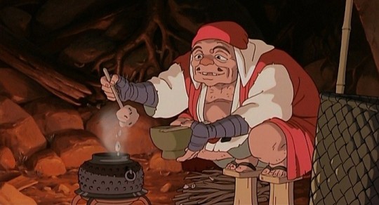
#and also bisque is a natural hunter
Photo

#cv#onyx#bisque#mine#cottonwood valley#horse#horse comic#horse art#horsie#she is so creechur to me#i really adore onyx#i think she has a walking gait#and also bisque is a natural hunter#er hunter gait#idk if any of my followers know horse stuff#god knows i didnt until a few months ago#full disclosure: im not an equestrian im a 2005 deviantart horsegirl with adult hands now#also this horse is a ninja and she is so cool
15 notes
·
View notes
Text
人形♡ 𝐃𝐨𝐥𝐥

𝐘𝐚𝐧𝐝𝐞𝐫𝐞 𝐀𝐞𝐬𝐨𝐩 𝐂𝐚𝐫𝐥 𝐱 𝐅𝐞𝐦 𝐌𝐚𝐫𝐢𝐧 𝐊𝐢𝐭𝐚𝐠𝐚𝐰𝐚 𝐃𝐚𝐫𝐥𝐢𝐧𝐠
TW: Yandere , Toxic Behavior , Spoilers to Sono Bisque Ningyo , Stalking , Obsession , Mentions of kidnapping , Stealing

♡ When Aesop first meets his darling , he thinks of nothing she's just another happy go lucky survivor
♡ But her first match with him proves him wrong , Her profession being a cosplayer as she could support and kite with her being able to cosplay as any of the survivors that she see's smiler to his abilities in matches
♡ Even though your very social and populer your nice and respect Aesop such as keeping your voice down around him and giving him privacy when he needs it
♡ Even when he saw your cosplays that you wore during matches
♡ His favorite being Shizuku Tan , mainly because of the roses on the gothic design even though the roses were red not yellow
♡ Aesop starts to become fully inflated with you
♡ He started to do your makeup for you , not allowing any other survivors /hunters like Vera , Mary , or Michiko to do yours
♡ Aesop loves to practice his makeup skills on you , trying different blush shades on your cheeks , lipsticks on your lips , and viberbrant shades of eyeshadows on your eyelids
♡ The looks he prefers to do are more natural/light compared to your bolder gyaru makeup
♡ Every time you do a new cosplay , Aesop will always help you get into your cosplay . He's doing your makeup , putting the wig on your head , putting in the contacts , and taking your pictures * which he steals and keeps for himself
♡ He also steals your cosplay pictures and keeps them in his pocket or embalming case
♡ Aesop would also start to stalk you and your interests while you're oblivious
♡ But he would be the happiest man in the world if he got to preserve your beauty in his coffin
♡ After all he had a coffin that could be your size ...
#yandere male#yandere#idv aesop#yandere aesop#aesop carl#aesop carl x reader#fem reader#yandere idv#yandere identity v#marin kitagawa#sono bisque doll wa koi wo suru
77 notes
·
View notes
Text
Jack of all Shapes
The best shapeshifters didn't. They settled into their chosen form like bisque-fired clay, focusing on how they saw themselves, finding that vital balance, and holding tight until it became their second nature - which in a way it was.
They had discipline. It was a struggle, holding onto a form, and most novices could only manage a day at a time - giving rise to stories of transformations at night, or under the light of the moon. It was painful. The mind had grown used to a certain housing, and it resisted most attempts to renovate.
With practice, however, it would become more bearable. Most intermediate shifters seldom lost their grip: once a month at most, or under severe provocation. It was all about concentration, familiarity; a muscle that grew stronger every time it strained.
Jack was not a great shapeshifter. He ran through forms like outfits; one day a jackdaw, the next a jackrabbit, and neither seeming to suit him as he'd like. He had been jackal, jackass, jack mackerel - constantly changing his order, trying to fit into a smaller size of genus. He could be the Jack of all shapes, but the master of none.
That had been his life, ever since he grew old enough to try - always changing, but always the same. But not for too much longer. After so many failed attempts, Jack was running out of options, and also running low on time. The clan had been patient with him, but eventually those reserves would run dry, and he'd be out on his ear - whatever it looked like at the time.
It was a matter of safety. The clan encouraged its members to take animal forms - wolves and kestrels, dragonflies and eels - to root themselves in nature, and find a form a piece amidst the horror of this curse, but most of all for their survival. Humans would hunt them, if they didn't learn to run or hide - their original form was too distinctive, too repugnant on the eye, with legends claiming that their bodies had only been driven to shift from a desire to change how they'd been born.
The young could be brought up in the safety of their warrens, but there was no room for an adult, especially one who couldn't look for food without a risk of leading hunters to their door. Most chose a shape before they came of age, and learnt how to assume it easily, a second's thought allowing weeks of camouflage. Jack had passed that milestone years ago, and now had to watch his younger siblings fly the nest whilst he was still finding his feet.
He'd tested every animal he saw, but none had wished to harbour him. The clan described it as a choice, but all knew that it was more about a fit, one shape sitting more easily than all the rest - as if each shifter was born with their own allocated form, and they simply needed to find it. But there had been nothing simple about his search, suffering day upon day of rejection, a Jack that refused to be put into a box - and now, to top it all, he was even unwelcome in his own people's home.
He decided to leave. If it was jump or be pushed, he wasn't going to force them into it, or have to flee with wolverines and moon bears at his back. If the humans found him, he thought, so be it: he would fight them if he could, or die if he couldn't, but on his own terms, and without taking anybody down with him. Jack might not have been sure what he wanted to be when he grew up, but he knew that he didn't want to live the rest of his life as a liability.
They did find him. It look less than a week, although Jack heard the hunters before he saw them; humans made a lot of noise, unable to change their clumsy feet for anything more dainty, and insisted on wrapping them in heavy boots that only made things worse. He'd heard their passage before, tramping around outside the entrance to their burrows, but never seen them with his own eyes: there was a strange beauty to their upright posture, something to admire against all rational fear. He wasn't quite sure what to make of them.
More importantly, he wasn't sure what to make of himself. If he was the Jack of any suit, he couldn't choose which form to take: what would be best to fight them off? Or should he choose a hare, to flee at speed? A bird, to lose them in the trees? He should have prepared for this, he realised. He should have been ready. Jack had thought that he'd have time to react, and been able to think on his feet, but in the moment they felt stuck fast to the ground.
He stared at the humans, they turned to stare right back at him - and all of a sudden he knew. There was that feeling again, that strange attraction: a sensation that he'd never known before, for all of the time he'd spent seeking it out. The lead hunter raised a hand, and Jack flinched, awaiting the blow, but the way he bared his teeth appeared to be a sign of peace. A greeting.
Jack looked down at his own hands, and saw that they weren't - and yet they were, because this felt natural, and they were more his hands that they had ever been. Not the ones that he'd been born with, perhaps, but the ones he'd chosen, marked with fingerprints of his own. He raised them both for good measure, and allowed his own mouth to open in mimicry, a crescent to reflect the man as the moon did the sun. This was it, he realised. For the first time in his life, he felt like he fit in.
14 notes
·
View notes
Text
IF LIFE IS THEATRE.. THIS IS THE CAST.

Charlie Jade Udaku
Professional dominatrix and sexologist while being asexual, panromantic, and polyandrous. A scorpio in sun and venus, she adores romance. She's a foodie and a mildly snobby one at that. She enjoys painting nude bodies, skin care, architecture, traveling, and spontaneous adventures. She has a travel blog. She's mischievous, bold, observant and she'll try anything once.
Reggie Dixon
A sucky father and worse husband. Born and raised in Washington DC. Reggie is a narcissist stuck in the mind of a 20 year old while being very much in his 50s.

Guadalupe Ortega
Second generation Cuban-American born and raised in DC. Left an emotionally abusive relationship with Reggie and got her life together, never looking back. She showed Charlie the value of a good therapist. She enjoys Cuban foods, lobster bisque, and books on feminism.

Miranda Monet Santos
A Natural Resource Manager and Charlie's favorite pescetarian sagiterrorist since 1st grade. Miranda loves botany and saving the environment. She sells natural-made hair, body, and yoni washes. She's like a sister to Charlie and she has a strong and stubborn personality.

Sunny Kim
A highly in-demand ink master, Korean-American Sunny has traveled the US along with other countries. He's Charlie's most trusted and equally impulsive male friend with benefits. Sunny loves tattoos, hiking, good food, and curvy women.

Grace Lucille Kearney-Dobrik
Harvard lawyer and non-practicing Jew. Grace is hard-liqour loving, ballbusting hardass who can take what she dishes. She's married to an Jewish Arab engineer from Aleppo who she gives a run for his money. She's also Charlie's lawyer.

Domino
An MIT student in Engineering, Charlie loses touch with her through the years but she's a stem in STEM. Her emotions are big but her posture is laid-back. She's into tech, weed, cars, punk music, kink, and Charlie.

Hunter Schwarzman
Rich nephew of John G. Schwarzman, the chairman of Blackstone Group. Initially Charlie and Hunter were enemies at Harvard. Things changed, now Hunter and Charlie are on good terms.

Erik (N'Jadaka) Udaku
An ex-Navy MIT graduate with strong opinions and grand plans. Erik is a polygamous humble aquarius and a first generation American with roots in Wakanda. He's confident in matters of money, combat, and romance but cocky about his more x-rated abilities.

Josephine Epias Cartier
A mighty and chaotic Sudanese enchantress with the godly powers of world creation and world destruction in her bratty perfectly manicured hands. She's older than most countries and Charlie's first Aquarian lover. She enjoys hatching murderous schemes, Starbucks refreshers, and practicing magic to perfection.
12 notes
·
View notes
Link
Every advancement in graphics innovation is gone along with by a brand-new, silly method of revealing it off. Whether it’s 128 versions of Mario running around a globe for the GameCube, a million Toblerone pieces spreading around in Knack, or 1-2-Switch’s lockpicking minigame showing all those ice cubes inside the Joy-Cons, developers often create around the possibilities of powerful new tech.
Yet this elevates an essential inquiry: What regarding the food? Inning accordance with data I simply made up, we invest regarding 15 percent of our time consuming as well as one more 82 percent of our time thinking of eating. In comparison, I just spend regarding 10 mins of my time daily thinking of 128 Marios running about and getting into trouble. Do you think each Mario assumes of himself as the real Mario, and also the others as imposters? With any luck, he recognizes that each Mario has the very same right to uniqueness as himself. I’m leaving track below.
There is a criminal absence of pc gaming centered around one of the most integral part of our lives, the part where we push food in our face. Nintendo created Super Mario Sunshine around the gorgeous water simulations new equipment enabled them, but they can have made a similarly lovely milkshake simulator or acorn squash bisque-drinking challenge. Virtual Reality allows players hold online things right up in their face to examine; primarily, this is made use of to observe how numerous guns do, in reality, look like weapons. But this ability might additionally be made use of to approximate a bakeshop, with all type of different loaves of bread and also croissants to observe. Which brave programmer is mosting likely to be the initial to allow me look at a flawlessly increased sourdough loaf?
The good news is, some modern designers have actually heard my weeps. The past couple of years have been a golden era of food-simulation, with new illumination strategies and also physic systems being related to one of the most honorable of objectives: making me intend to eat while I play games. Ensure you’ve got some snacks in the kitchen, since this list is going to make you hungry.
Last Fantasy XV
I was a Boy Scout as a youngster, as well as one of the finest parts of taking place a journey was preparing all the waste my good friends and I were mosting likely to consume. The official policies of camping state that rules of nourishment don’t matter in nature; all that matters is just how peach cobbler tastes when you make it in a dutch stove while huddled around a campfire at night.
No person comprehends this better than the impeccably clothed Ignis Scientia in FFXV. Noctis as well as his young boys are spending lengthy days on the road, battling wooly mammoths and also tossing swords as well as whatever else a royal posse does on a cross-country journey. In the evening though, they work out down and Ignis gives them with some legally magnificent dish selections. Little could pull a team with each other like durable food, so it adheres to that the relationship between FFXV’s spikey-haired boys is one of the most effective parts of the video game.
One of my favored dishes from FFXV is the Taelpar harvest galette, a truly succulent remix of a basic fruit treat. A galette is a pastry that drops somewhere between a pie and a calzone. It folds in on itself enough to just allow a peek at the deliciousness that stays within. A properly made galette is downright opprobrious.
Tumblr individual “My main is a cook” devised a recipe for the Taelpar harvest galette from Ignis’ recipe book. It entails oranges, goat cheese, cinnamon, which hallmark flakey crust. Honestly, if you simply informed me it was involved and also pie-like goat cheese, I would have already been on board. Put all those active ingredients together, as well as you’ve got a dish I ‘d smack out of the hands of the prince of Lucis.

A fresh-cooked galette, thanks to Ignis Monster Hunter World Beast Hunter is a game of excess. Characters possess swords that weigh roughly 95 extra pounds and also whack dragons the dimension of house buildings around, simply for the possibility of getting a range to earn their armor prettier. Removed down to its basics, Monster Hunter stresses efficient searching by way of preparation and also preparation. One of the most vital part of searching prep? A hearty meal, certainly.
There are 2 type of living points you don’t eliminate in Monster Hunter. The first are other human beings. The 2nd are Palicoes, sentient felines that put on clothing and speak to each other that are so cute it needs to be prohibited. No person concerns the Palicoes, nor must they. This is merely an attractive globe where humans and also felines have comparable civil liberties and deal with each various other with respect.
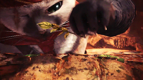
Meowscular Chef takes fantastic satisfaction in his job Obviously, the Palicoes are fairly much better than human beings. This ought to be obvious– they have hairs and tails. Also far better though, the Palicoes have cooking abilities that our weak homo sapien minds could only imagine. Beast Hunter: World’s boss is the Meowscular Chef, an intimidating Palico with one eye that commands a small military of other felines. Working as a team, they reduced pieces of meat (do not ask which monster it originated from) on a searing rock frying pan, mix kiddie-pool sized soup bowls, and also toss in some veggie skewers completely measure. When the food is prepared, seekers tear right into it without modern-day pleasantries like flatware or eating.
The very best parts of Monster Hunter: World’s food is in the preparation. Little touches stick out; the fatty components of the meat fold over with practical weight, and blocks of cheese have an enjoyable skin. Certain, an Azure Rathalos has actually been dragging my ass around the ancient forest. However if I get to return to this sort of dish each time I shed, failure doesn’t hurting rather as much.
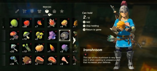
Link preparing to prepare some kind of poultry-stuffed pumpkin The Legend Of Zelda: Breath Of The Wild I appreciate Breath of the Wild’s technique to cooking since it closely mirrors my very own: toss a lot of tasty-seeming active ingredients in a frying pan and hope they function. Link just takes a large armful of meats, veggies, as well as flavors and also tosses ’em done in. Like me, he in some cases obtains”dubious food,” a pixelated mixture which he chokes down out of stubbornness. More frequently however, those components integrated into something delicious-looking and also healthy.
Out of all these games, Breath of the Wild’s food feels one of the most sustainable for a healthy and balanced life. Consuming isn’t really a special occasion, it’s something we do each day. The mushrooms, meats, and soups that Link subsists on feeling concrete, the simple-but-hearty diet plan of a guy on the roadway. It advises me of the scene in Princess Mononoke when Ashitaka as well as Jigo sit in a cavern and eat rice gruel. The food isn’t extravagant or difficult, yet it’s made by a practiced hand and also would possibly be ideal after a long day.
Okayu(rice gruel)in Miyazaki’s Princess Mononoke For my money, the seafood curry in Breath of the Wild comes out as the most effective all-rounder. With these sort of simple meals, the difference between exceptional as well as ample frequently boils down to spices. Link’s addition of some Goron seasoning pushes this one over the side; the shrimp/crab/rice combo additionally appears very loading, and also the description assures that the spice packs a severe kick.
Identity 4
Not all food is produced for the same purpose. Some offers straightforward nourishment. Some is for event, some for mourning. Other times, food is an expression of dominance. On the program Man v. Food, a single guy would certainly try to take in merciless sections of everything from hot wings to oysters to pancakes. After 7 seasons, the show continues, but the initial host has stepped down; food was inevitably successful.
It’s a tidal wave of beef In Persona 4, you have simply one food-based opponent, the huge beef dish. It is described as a”tidal bore of beef.” You’ve got the chance to check out the Aiya Chinese Diner as well as attempt to eat the entire bowl of in one sitting, a feat you’ll just accomplish with extremely high statistics. If you handle to do so, the dish
is complimentary! Hopefully, Aiya also places your image on the wall surface or something. Identity 4 has the series’typical calendar-keeping gameplay. Daily, you could hang with good friends as well as take pop quizzes as well as store, simply like non-gaming teens most likely do (I wouldn’t recognize). Numerous of these activities aren’t offered when it’s raining however. But wet days are by the way the only days when the beef bowl obstacle is readily available. I enjoy this pomposity. Everything in the whole city is closed down, the day is ruined, so why not go consume a metric lot of seared meat?
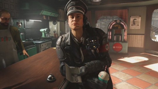
Time to knock the milkshake-drinking laugh off his face Wolfenstein 2 Have you ever enjoyed a cooking video clip on YouTube where they don’t try the food at the end? It’s irritating. Seeing somebody prepare food is an emotional financial investment, and if I can’t consume it, I desire to be able to live vicariously with a person that does. In gaming, activity capture as well as computer animation have recently brought us to an area where characters can give probably rapturous reactions to well-crafted foods items. One of the finest responses to food in video games comes from an outright item of rubbish. In Wolfenstein 2, BJ Blazkowicz need to satisfy a personality who runs an old-timey diner in the center
of the Nazi occupation of America. This restaurant has whatever: cheap burgers, coffee, and also a real vintage soda water fountain. I should aim out that a good soda water fountain isn’t the blocky thing they contend every McDonalds as well as Bojangles. It’s a flexible tool with the capacity to generate drinks like an egg lotion as well as a ginger yip, a throwback to a much more tailored period of soft drinks. The restaurant likewise has the proper kind of milkshake; individually mixed in a gigantic metal cup that the proprietor might allow you consume alcohol from once your glass is empty. When a Nazi captain who’s also more weasel-y than the typical Nazi walks right into the restaurant and also orders a strawberry milkshake, it harms me in my spirit. Not only is this punk in a state of not-being-punched, yet he’s buying a hand-made dessert that tastes the way summer season memories feel. I’ve had a strawberry milkshake or smoothie. In truth, I’ve had a strawberry milkshake or smoothie made by the precise same lime-green blender or food processor, from a location called Ox and Rabbit in Durham, NC. That place is currently shut down. So now I cannot have a strawberry milkshake or smoothie, but this Nazi can!.?. !? It’s an outright oppression. He shuts his eyes and also takes a lengthy drink, appreciating the pieces of strawberry combined in with the piercing cold of theice cream. He looks like he enjoys it. He likewise gets his brains burnt out about 2 secs later on. No milkshake or smoothies for fascists.
0 notes
Text
Bright and nonconventional colors bring adventure to home decor
(BPT) -When it comes to trends in interior design, the forecast through the future is looking bolder, brighter and more adventurously colorful than has been seen in a while. Up-and-coming palettes are earning descriptions including "youthful," "vibrant" and "positive," heralding the rebounding market's ready return to color.
Color expert and interior designer Barbara Schirmeister equates new, energized color palettes to growing economic confidence, as well as the influence of the youth market.
"As the economy ticks upward, designers and consumers are expressing hopefulness by incorporating statement colors, mixed palettes and vibrant patterns ... inspired by dominant trends aimed at the youth market," says Schirmeister, who has spent decades as a color consultant for companies such as Crossville Tile, Hunter Douglas, American Standard and Motorola.
She explains that today's trends are in contrast to those of the recent past that were more cautious, offered less variety and had longer "shelf lives" - staying popular over time as homeowners were hesitant to change.
"It's as if the market is molting, shedding its cautious colors to display new palettes that are all about getting noticed," she says.
Saturated, bright and nonconventional, colors of the now are more assured with wider options. The hues reflect influences from both nature and technology, mirroring the quest for balance a busy society strives to achieve. Schirmeister cites Argent, a new porcelain tile line by Crossville for which she developed the colors, as an example.
"This product offers 20 colors that engage the entire color wheel. Even the neutral tones incorporate more colorful influence," she describes.
Schirmeister showcases the trends by color collections to describe what consumers can expect to see - and enjoy incorporating - in interior design, in the days ahead.
Warm colors - red extensions
The warm side of the color wheel features red, yellow and orange - colors often associated with excitement, confidence and emotion. The red family is extending in all venues: yellowed, blued, pale and saturated, peach, peony, azalea, and crimson, even into bordeauxs, red violets and oranges. For the coming year, yellows will be uplifting - buttercup, citrus, butterscotch and gold.
Cool hues - clean and clear
On the cool side of the color wheel, which includes green, blue and purple, clean and clear will be the dominant trend. Expect to see jade greens paired with turquoise blues. The greens will be expanding, a trend that hasn't been seen for quite some time. Military, emerald, parrot and even a green almond are glimpses of the trend. In addition, blues are gaining importance. Navy is often taking the place of black, and indigo will continue to be a fashionable, foundational color. Shades of nature-inspired purple are appearing as accessible, support tones.
Neutrals - whites, browns and shades of gray
Neutral colors remain versatile and simple, yet also nod toward color confidence. The gray family, very popular in recent years, continues to have influence, while white neutrals are escalating. Also coming back are the-browns. From camel and bisque to burnt sienna and taupe, these base colors will add complement and contrast to bold color schemes, while nodding to natural influences.
Want to see these color collections in action? Schirmeister suggests looking to online communities like Twitter, Facebook, Pinterest, Instagram and Houzz for inspiration and ideas.
"Social media is driving today's trends. Color lovers constantly post about their passions," she says. "And those exciting, youthful colors we can't resist sharing in our news feeds are already showing up in interior decor."
0 notes
Text
Bright and nonconventional colors bring adventure to home decor
(BPT) -When it comes to trends in interior design, the forecast through the future is looking bolder, brighter and more adventurously colorful than has been seen in a while. Up-and-coming palettes are earning descriptions including "youthful," "vibrant" and "positive," heralding the rebounding market's ready return to color.
Color expert and interior designer Barbara Schirmeister equates new, energized color palettes to growing economic confidence, as well as the influence of the youth market.
"As the economy ticks upward, designers and consumers are expressing hopefulness by incorporating statement colors, mixed palettes and vibrant patterns ... inspired by dominant trends aimed at the youth market," says Schirmeister, who has spent decades as a color consultant for companies such as Crossville Tile, Hunter Douglas, American Standard and Motorola.
She explains that today's trends are in contrast to those of the recent past that were more cautious, offered less variety and had longer "shelf lives" - staying popular over time as homeowners were hesitant to change.
"It's as if the market is molting, shedding its cautious colors to display new palettes that are all about getting noticed," she says.
Saturated, bright and nonconventional, colors of the now are more assured with wider options. The hues reflect influences from both nature and technology, mirroring the quest for balance a busy society strives to achieve. Schirmeister cites Argent, a new porcelain tile line by Crossville for which she developed the colors, as an example.
"This product offers 20 colors that engage the entire color wheel. Even the neutral tones incorporate more colorful influence," she describes.
Schirmeister showcases the trends by color collections to describe what consumers can expect to see - and enjoy incorporating - in interior design, in the days ahead.
Warm colors - red extensions
The warm side of the color wheel features red, yellow and orange - colors often associated with excitement, confidence and emotion. The red family is extending in all venues: yellowed, blued, pale and saturated, peach, peony, azalea, and crimson, even into bordeauxs, red violets and oranges. For the coming year, yellows will be uplifting - buttercup, citrus, butterscotch and gold.
Cool hues - clean and clear
On the cool side of the color wheel, which includes green, blue and purple, clean and clear will be the dominant trend. Expect to see jade greens paired with turquoise blues. The greens will be expanding, a trend that hasn't been seen for quite some time. Military, emerald, parrot and even a green almond are glimpses of the trend. In addition, blues are gaining importance. Navy is often taking the place of black, and indigo will continue to be a fashionable, foundational color. Shades of nature-inspired purple are appearing as accessible, support tones.
Neutrals - whites, browns and shades of gray
Neutral colors remain versatile and simple, yet also nod toward color confidence. The gray family, very popular in recent years, continues to have influence, while white neutrals are escalating. Also coming back are the-browns. From camel and bisque to burnt sienna and taupe, these base colors will add complement and contrast to bold color schemes, while nodding to natural influences.
Want to see these color collections in action? Schirmeister suggests looking to online communities like Twitter, Facebook, Pinterest, Instagram and Houzz for inspiration and ideas.
"Social media is driving today's trends. Color lovers constantly post about their passions," she says. "And those exciting, youthful colors we can't resist sharing in our news feeds are already showing up in interior decor."
0 notes
Last Seen Blogs