#Printing Process
Text

NOW ON VIEW IN SPECIAL COLLECTIONS
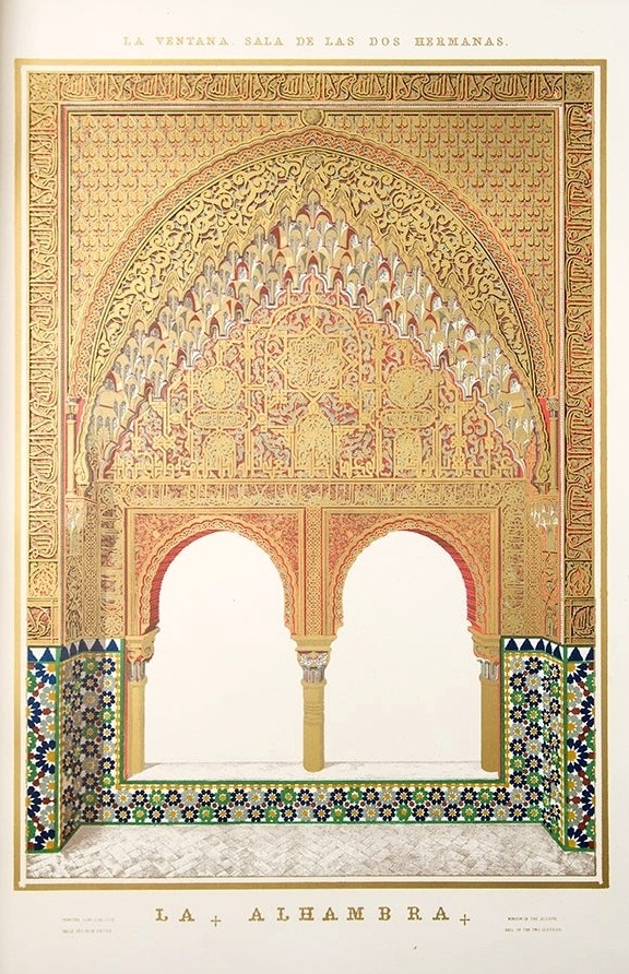
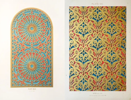
Plans, Elevations, Sections, and Details of the Alhambra
In exploring the Arts Collection for our rare book exhibit, curators Heather and Maya came upon the incredibly detailed and stunning lithographs and engravings in Jules Goury and Owen Jones's Plans, Elevations, Sections, and Details of the Alhambra. Through further research, we learned that this 2-volume set, published in London between 1842 and 1845, was one of the first published books to use the technique of chromolithography, a process that later dominated color reproduction for most of the second half of the 19th century. The set is also an important historical record of the Alhambra, created from drawings done at least twenty years before the first detailed photographic records were made. In 1836, while preparing the original drawings, Jules Goury died of cholera in Granada. This left Owen Jones with the complicated task of finding a printer capable of carrying out the work. He finally resolved to set up his own printing press. The experimental color printing process required up to seven pressings and nearly nine years of trial and error before the work was successfully completed. Jones’s flat colors anticipated the work of William Morris, the Pre-Raphaelites, and the Art Nouveau movement.
Due to its monumental size, we couldn't include this bound set in our exhibit, but it's now on view in the Special Collections reading room along with other portfolios of leaves in the exhibit. The exhibit runs through November 29, but the material in the reading room will be available to view through 2023.
#rare books#chromolithography#Alhambra#HCL Arts Collection#art books#book exhibits#19th century printing#printing process#lithography
90 notes
·
View notes
Text
How I designed a new cover for my webcomic's Book 1 reprint
The cover. It's the first impression anyone has of your comic book, so it's got to make an impact. Which is why I'm really proud of the new cover of Heroes of Thantopolis Book 1.
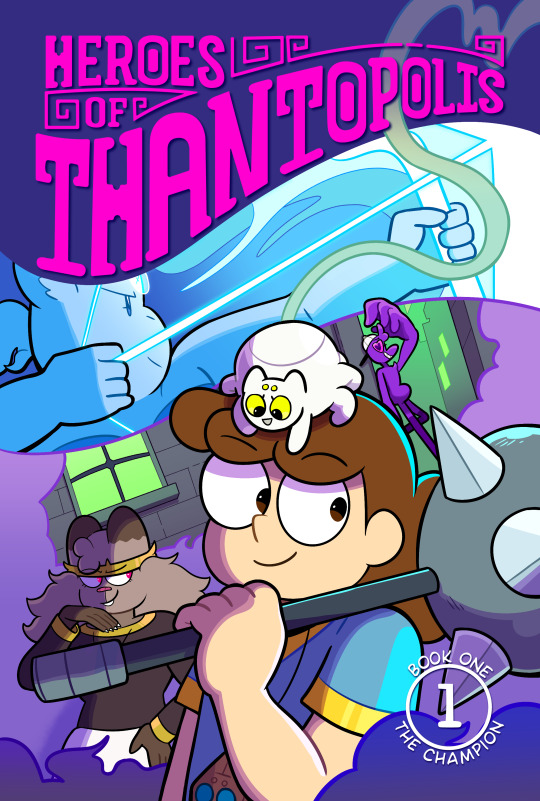
Who are these characters? What kinds of fun and colorful adventures do they get up to? That's what I hope people think when they see the book when it debuts at Cartoon Crossroads Columbus.
But the journey to get to this cover was full of trial and error. Today I want to share that journey and what I learned along the way. Let's go!
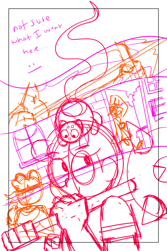
The original print cover of Book 1
I self-published the original print of HoT Book 1 in 2016. This was before I joined @hiveworks, and I was using an on-demand printer not really known for their comics, so everything - including the InDesign template I placed the pages in - was done from scratch.
Here's what the cover for the original print looked like:

Helene and Cyrus are front and center amidst tapestries depicting the four chapters of the comic. It's not a bad illustration - not in the slightest! And the comic sold very well at TCAF 2017. But I think you can tell it's an amateur effort. I may have completed four chapters of my comic, but I didn't have comparable experience designing books.
Brainstorming for the reprint
I joined Hiveworks in 2018. Hiveworks has a lot of experience independently publishing webcomics. I planned to re-print Book 1 as well as print the first editions of the rest of the comic under their banner.
I had a good idea of the bonus content I wanted to include in the reprint. I had less of an idea of what I wanted the cover to look like. My first sketches were very movie poster-esque:

All of the main characters are here, with the villain ominously looming over everyone. It felt like an upgrade from the original cover. But... it felt generic, too. It didn't capture what was unique about my comic.
I put preparations for the reprint to the side for a while, until...
Inspiration
youtube
I love the opening of the Netflix cartoon Hilda. I love the music, the fluid animation and the super cool transitions between her adventures. Hilda goes from riding a dragon to dodging viking warriors, running through the locations and characters she meets during the season. It really captures the vibe of the show!
That's when it occurred to me what was missing from my cover. Readers of Heroes of Thantopolis will know that every chapter has a different color palette, giving them each a unique feel. A unified illustration wouldn't show the diversity of color or feelings. But a cover made of flowing segments, like the Hilda opening...

Now I felt like I was really getting somewhere!
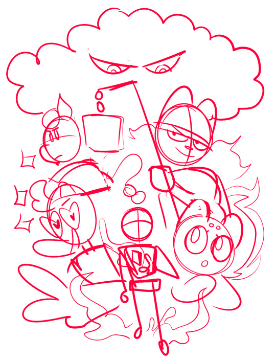
The final cover
Working with my editor Isa (@secondlina), I continued to refine the design of the comic. I wasn't sure what to put in the top left. Isa suggested creating a special version of the logo that flowed along the border created by the Sag segment.
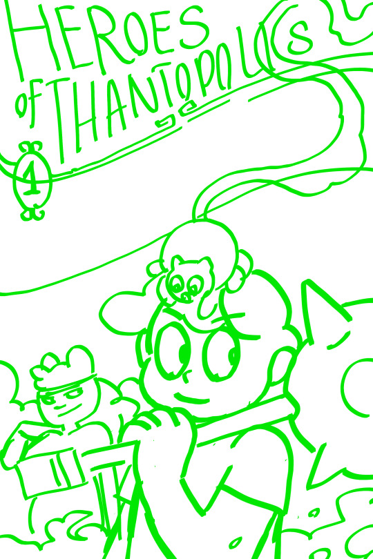
(Isa's sketch in green, on the right)
From there, the final cover began to take shape.
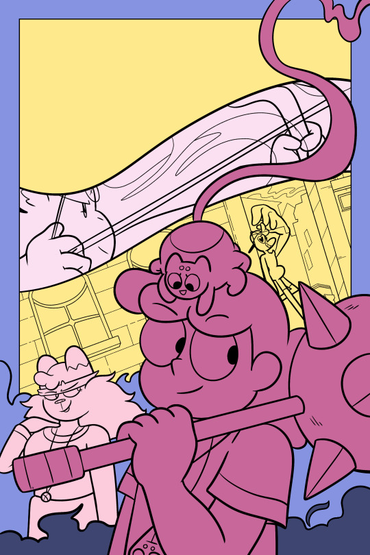

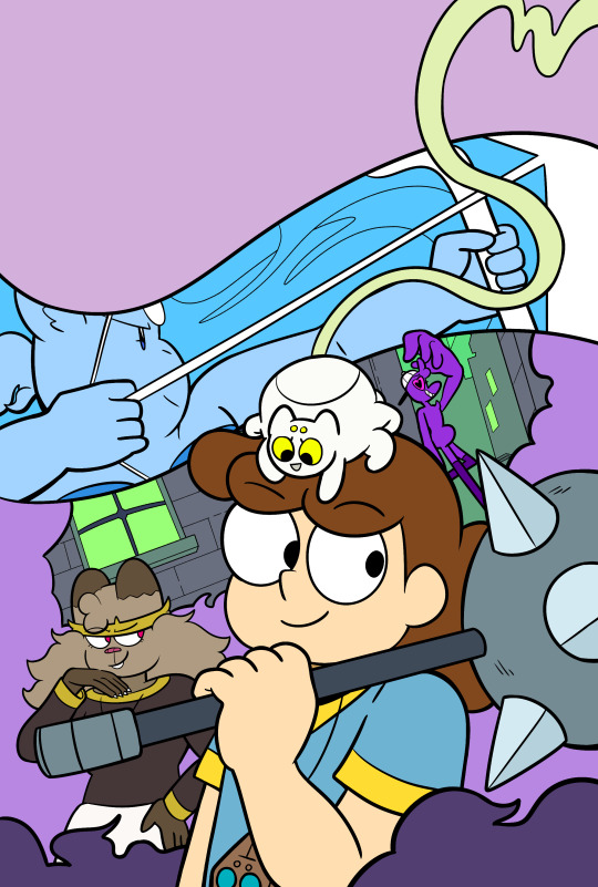
Until we got to the final cover that appears on the actual book!
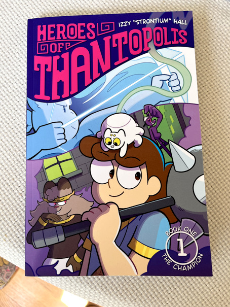
(Print colors are never as vibrant at RGB, but it still captures that colorful vibe.)
Conclusion
If there's one lesson in my creative life that I've seen play out over and over again, it's that your first idea may not be the best idea. Iteration and reflection improves the end result. I'm not saying you need to waffle over every decision. But rather, tp let your creative juices marinade your idea, rather than immediately put the concept to the fire.
I also couldn't have done this without help from people more knowledgeable than I on book design. Not every webcomic creator has access to print experts, true, but there are communities of webcomic creators out there that pool resources and share advice. We can always learn from other people. And that's why I made this post! I hope you enjoyed a peek into my creative process.
I look forward to seeing you at CXC on September 30th and October 1st! If you can't make it to the show, you can read all of Heroes of Thantopolis online, FOR FREE, anytime you want. Book 1 will be sold online soon!
#webcomic#webcomics#heroes of thantopolis#creative process#print comic#printing process#graphic design#cover design#cover art#hiveworks#comic book#Youtube
8 notes
·
View notes
Text


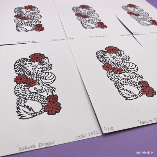

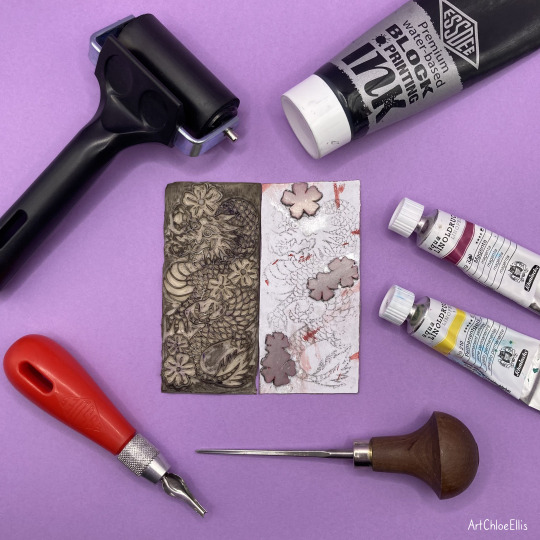

Introducing my Lino-Print “Sakura Dragon” 🐲🌸
I made this print by layering two separately printed lino pieces – red flowers first and then the black outline to complete it. The process had me a little concerned at first as the registration needed to be close to perfect for the outcome to line up well in the final layer, but thankfully it worked and I got some nice results out of this! The process of this can be seen in the next video I’m uploading, showing each stage to make this print come together.
#Lino#Lino Print#Lino Prints#Lino Cut#Relief Print#Relief Printing#Relief Printmaking#Lino Printing#Printmaking#Women Of Print#Carving Process#Printing Process#Print Process#Printmaking Process#Lino Carving#Satisfying#Dragon#Sakura#Cherry Blossoms
7 notes
·
View notes
Text
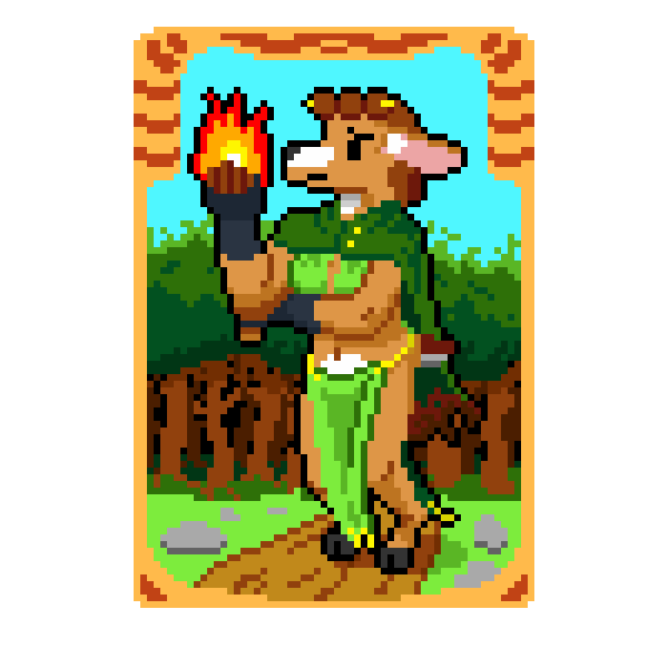
here’s how the card art started
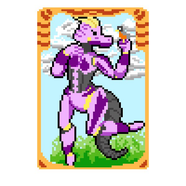
@krsonmar, @draco-the-chaos-dragon
I had the idea of making a card of my Lizardfolk oc Acela.
Using this picture.
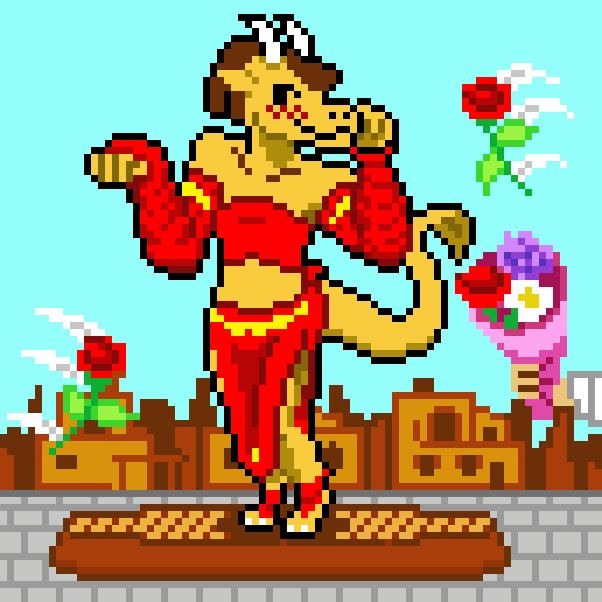
Local Superstar, Acela Valani, by JLeon, aka SwanPair. Pixel art, 86 x 86 pixels, Piskel, 2023
But how?
I put the image of Acela with a card border.
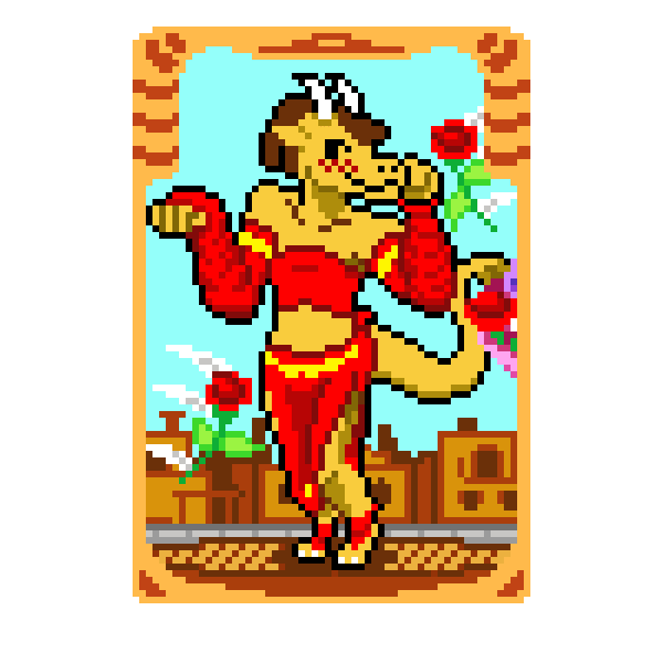
Here’s how:
I cropped her image out of the original piece onto a new Piskel canvas
I drew a rectangle around Acela and centered it
I made a random card border by winging it
I cropped out the negative space within the card border by copying the card GIF pasted it within the original piece
I copied the background within the original using the negative space and a tool that highlights any splotch of the same color
I adjusted the mid-ground objects to enter within the card space
Voila, Acela Valani card
EDIT AND RE-EDIT VARIOUS TIMES
Voila, Updated Acela Valani card
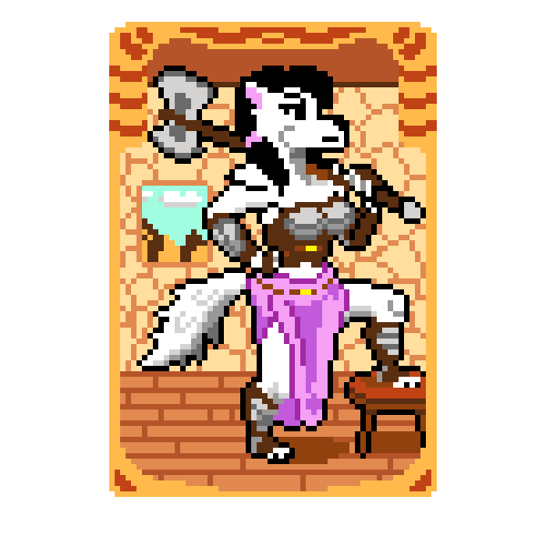
But what about the others?
I went to Staples, printed this bad girl out!
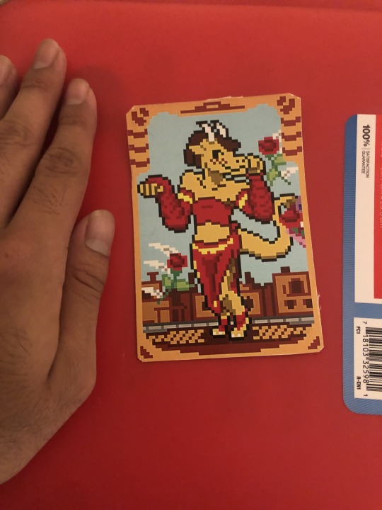
Theeennn, I traced over the image.
Then I traced over that image and marked the proportions.
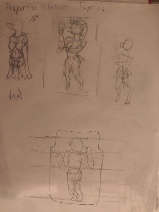
and applied them to Paprika’s picture.
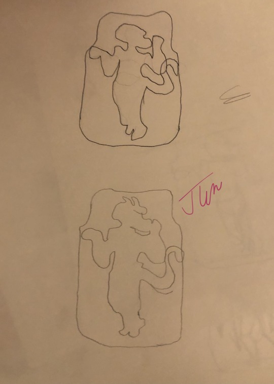
I swear there was One more trace page of Acela’s card but I couldn’t find it at the time I’m writing this...
(7:57 PM).
So here's how Paprika turned out from this process
I largely repeated the process for Paula and Delfina
Here's the card back design
The next steps was to email them to
Note: I would email a bunch of card backs to official make them cards.
Then I visit a Staples store,
and ask for 4" x "6" print size.
The empty canvas space might have a play in shrinking the cards.
3 notes
·
View notes
Text
Behind the scenes of Little Rain Oracle’s printing process!!!
6 notes
·
View notes
Text
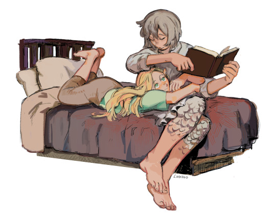
tangible in my arms
gif process!

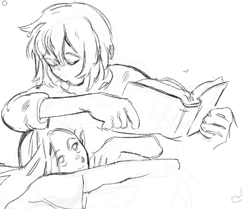
#farcille#marcille donato#falin touden#dungeon meshi#delicious in dungeon#farlyn thorden#my art#Linktoo art#gif process#:3c...... theyre so special to me#might turn this into a print one day....
8K notes
·
View notes
Text

something something giant isopod sharing is caring pass the detritus
inprnt
#giant isopod#marine biology#artists on tumblr#inprnt#I tried coming up with a pun but nothing popped up#cackLES#there's also another print up on inprnt that I'm waiting to post when I have other stuff settled 👀#technically inprnt is getting to see stuff a little earlier haha#also been noticing how my process has changed haha it's interesting#like I'll spend waaaaaay more time now nitpicking/adjusting colors which is fine#but like before when I was still in old process mindset I'd get frustrated and think the colors weren't coming out right#when what I needed was to spend more time figuring it out
7K notes
·
View notes
Text

days are getting warmer but i am always warm when im with you ! !
#mine#original#i cannot even begin to express the amount of demons i had to fight. to do this drawing#i was goin 2 attach my process video but its so embarassinhg i cant skjbdskgdjks#local artist cant colour right :(#i sitll dont love it but also i will start eating thro my waalls so :3 ! here u go !#i bought a new water botttle the other day extremely exciting stuff. AND. a bag for said water bottle so i can take it on walks :3 !!!!#eveytything else has been . normal !!#shop orders r very slow which is th same as this time period ??? as last year ? for some reason ??#i will hopefully try n plan sm stickers soon n maybe sm new prints ??? not sure ! but either way if u want 2 buy a lil smth#ur support is greatly appreciated !!
2K notes
·
View notes
Text
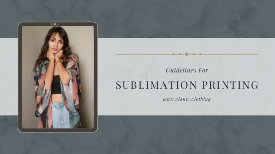
Guidelines For Sublimation Printing: Things To Consider – Alanic Clothing
This printing process lets you utilize the whole garment by printing your design in brilliant, entertaining colors and effects.
0 notes
Text
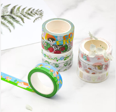
A beginner's guide to the printing process of washi tape
Most washi tapes on the market today use a printing process for low cost results. Washi Mill today brings you a beginner's guide to the printing process of washi tape.
Four-color printing
Four colors are: green (C), Pinhong (m), yellow (y), black (k), all colors can be mixed by these four inks, and finally the color graphic is achieved.
Color printing
Special color refers to printing this color with a specific ink when printing. There are many special colors. The commonly used special funds and special silver can be referred to the Pan style card, but the special color cannot achieve gradient printing.
Coating
After printing, the transparent plastic film is pasted to the surface of the printed matter, which has two types of light film and sub -film, which plays a role in protecting and increasing gloss. At the same time, it can increase the hardness and tensile performance of the paper.
UV printing
Prints need to be prominently brightened locally, making local patterns more three -dimensional effects.
Scald
The hot seal uses the principle of hot pressure to form a special metallic luster effect on the surface of the print. The hot seal can only be monochrome.
Bump
A set of concave templates and convex templates corresponding to yin and yang are placed in the middle of the printed. All kinds of thick paper can be made, and the cardboard cannot be made.
Coding
Using the spraying machine to jet logo on the product (production date, quality shelf life, batch number, corporate logo, etc.), you can print simple character patterns with strong flexibility.
Label printing
Label printing covers a variety of printing methods. Recently, domestic label printing mainly uses several methods of convex printing, plastic printing, soft version printing and screen printing. In order to print the most beautiful labels, it is necessary to effectively integrate various processes during the printing process to integrate the advantages of various methods to form a larger advantage combination.
Washi Mill is a washi tape manufacturer and supplier. It uses a variety of printing processes to produce a variety of customized exquisite washi tape. Welcome to call +86-15999751683, email [email protected] or visit https://www.washimill.com/ .
0 notes
Text
Printmaking process of my Lino-Print “Sakura Dragon” 🐉🌸
#Lino#Lino Print#Lino Prints#Lino Cut#Relief Print#Relief Printing#Relief Printmaking#Lino Printing#Printmaking#Women Of Print#Carving Process#Printing Process#Print Process#Printmaking Process#Lino Carving#Satisfying#Dragon#Sakura#Cherry Blossoms
1 note
·
View note
Text
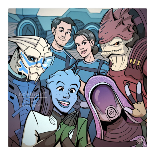
In which Tali's drone takes pretty sweet selfies!
(timelapse under the read more) (edit: cw flashing colors!)
#mass effect#garrus vakarian#liara t'soni#tali'zorah nar rayya#tali'zorah vas normandy#urdnot wrex#ashley williams#kaidan alenko#illustration#art process#timelapse#part of a bunch of new prints that I'm cramming for an upcoming art convention!#tis reason that i haven't been able to catch up with the new mb book HUHUHUHU#that will be my reward for surviving convention season that's whats keeping me going
999 notes
·
View notes
Text

can you dig it? can you dig it? can you dig it?
this took 15 hrs. please look at it.
reference pic-
#woah is that a motherfucking cure reference#i spent so long on this. probably too long#i had to force myself to finish it tonight#cus im selling it as a print on saturday 💀#the biggest trust the process ive ever done.#persona 5#persona 5 royal#shin megami tensai persona#joker persona 5#joker p5#akira kurusu#ren amamiya#my art
248 notes
·
View notes
Text
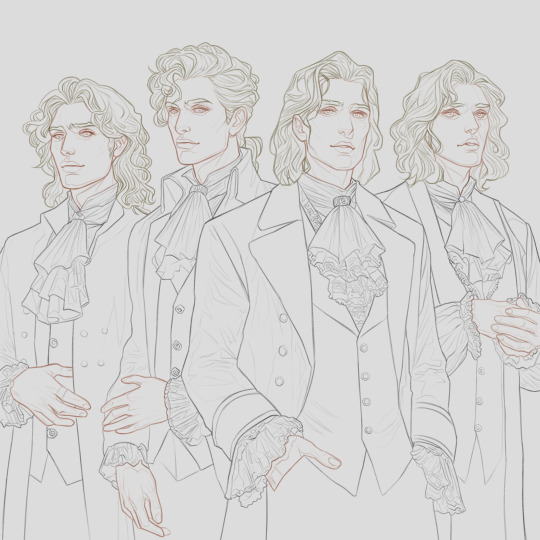
''Boy band'' Process - This print will be available in INPRNT
(Nicolas, Lestat, Louis, Armand)
#art#digital art#vampire chronicles#anne rice#fantasy#vampire#armand#fan art#nicolas de lenfent#lestat#louis pointe du lac#process#art wip#prints#inprnt
343 notes
·
View notes
Text
Would you like to watch me struggle to carve an angel for 30something secs?
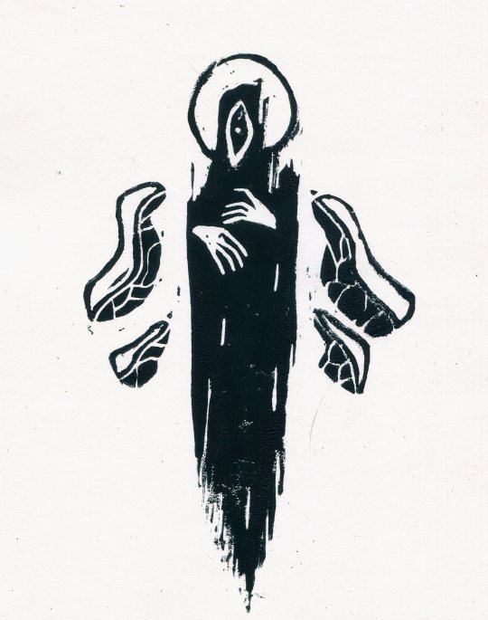
(The result if that's too many secs)
195 notes
·
View notes
Text
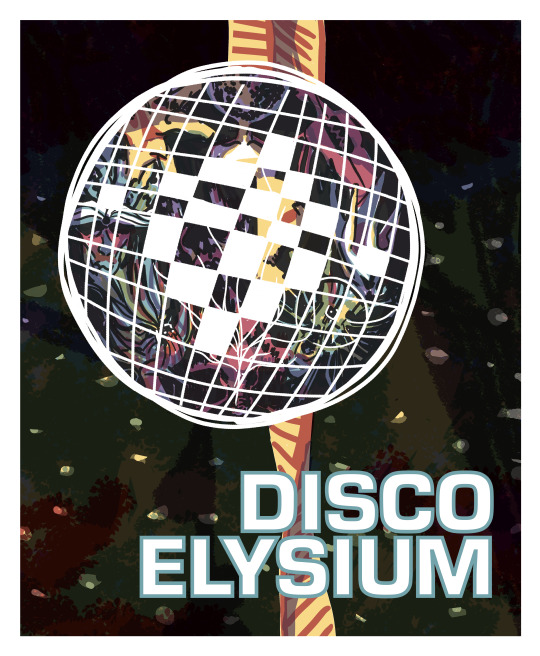
psssst look under the cut
surprise I actually screen printed this poster
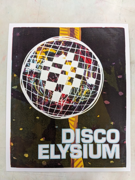
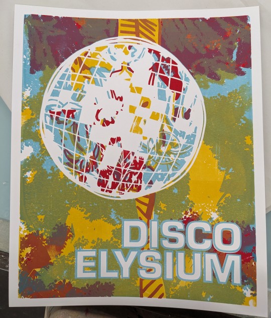
sorry I only have the one process pic but it was finals when I made this so I was in a rush
14x17, 5 color screen print- one for each type of skill + black. getting the layering and registration just right was a bitch and a half but I love how it came out <333
#disco elysium#disco elysium fanart#de fanart#disco elysium skills#screen printing#I did 10 prints of this and in the end only like 4 of them came out just right cause I had to mess with the opacity of the inks like crazy#I just wish photographs did the print justice cause there's something about the physicality of the piece that's so scrumptious#the digital version was made first but always with the intention to screen print from the way I constructed it#I love the way screen printing intersects between physical and digital processes. it might be my favorite medium tbh#enough rambling. show me love for posting my school work pls#cause I usually forget that I am an artist who makes things and I can post those thing to the internet for fake points#soupy post
201 notes
·
View notes
Last Seen Blogs
angel0fdeathx
Death🖤🐀

myweeklydosee
Untitled

allisonfjones
Allison F Jones at your service

healthequitycircle
Health Equity Circle

cars2-renaissance
Finnland Trash