#Dropcap
Text
More than half of businesses that closed during the pandemic won't reopen

View On WordPress
0 notes
Text

dropcap, newyorktimes, article, text
https://www.newyorker.com/books/page-turner/frog-and-toad-an-amphibious-celebration-of-same-sex-love
0 notes
Text
Designed and Animated by Mary Hawkins
Original Music by Carlos Dengler @bloodybells1
#36daysoftype#36days a#nyc subway#love letters for the subway#typography#animation#dropcap#hand drawn type#illustration#nyc#a train#harlem
0 notes
Text
Personal pet peeve; when a book or a series gets a re-release with a new cover, but its just a surface-level reskin and the interior design or typography has not been adjusted to match.
Half-assery has its uses, but books deserve better than such half-assery.
#writeblr#booklr#typography#The Inheritance Cycle’s dropcaps are matched to the font of Eragon’s initial cover upon release#and The Magic Shop series has photorealistic illustrations that do not match the cartoony style of the new covers at all#Inheiritance Cycle is more egregious to me#because if you’re working in a proper design program it might take like two seconds to change the font on the dropcaps style#and even if not then going by hand to fix all the dropcaps isn’t too hard its just one per chapter#(said admittedly by someone with the patience to do that)#ALSO only Eragon was published by the time they republished it with the new cover#you would have only had to alter the one book#and one could have applied the new style going forward with the next one instead of carrying over the old???#maybe it’s justified if the maps are using the same font as the dropcaps but it still kind of clashes w/ the cover style#in our opinion that is
7 notes
·
View notes
Text
also guys look at this uni asssignment wip yippers we're gonna print this on a shirt too >:) yhk shirt >:)
16 notes
·
View notes
Note
hey! even in another time is already one of my favorite capri fics ever!!! <3 my question: what is the timeframe of how long laurent has been stuck back in time? :) thank you for this wonderful fic and all your hard work!
Thank you so much <333 I REALLY hope it continues to live up to the same standard for you! I can't wait for you to all read the next chapter.
This is a really good question, because there are some clues and mentions of time passing, but I've deliberately left it a bit slippery, because as much as it is important that Laurent is settling, learning, and adapting, it is also important that things feel a little mythical - it's been "summer" for quite a while, hasn't it?
So the first certain marker is in Chapter VI:

This is the day they ride to the inn. So accounting as well for the few days before that conversation in the tent takes place, let's call that two-ish weeks in the past. Then, in Chapter VIII:
Over a month! Then, in Chapter X, some vagueness and also some specificity:

So by the point of the wedding, two months (or thereabouts).
Chapter XIV, the morning after the raid on Heston's estate:

And then between time interrogating the defectors and Jokaste, in readying for the journey, in the journey itself... another couple of weeks, probably (this is where things get a little more slippery).
Finally, in Chapter XVII:

So, including the time to build whatever is being built on the riverbank (which is not yet completed at the end of Chapter XVII), let's add another week for the riders, plus two months.
All that is to say, by the time construction is finished, Laurent will have been in the past for around five (or six... slippery, slippery) months.
Do with that info what you will hahahaha
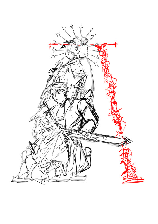
#my writing#even in another time fic#captive prince fic#lamen fic#capri fic#asks#anonymous#featuring some of my typesetting hahaha#check out that dropcap!!!
12 notes
·
View notes
Text
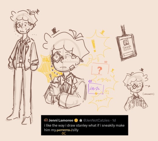
New year new little guy
Jenn your inner thsc enjoyer is showing
His name is Sastra and my friend thinks he looks gay take that as you will
His codename is Dropcap
Extras under the cut
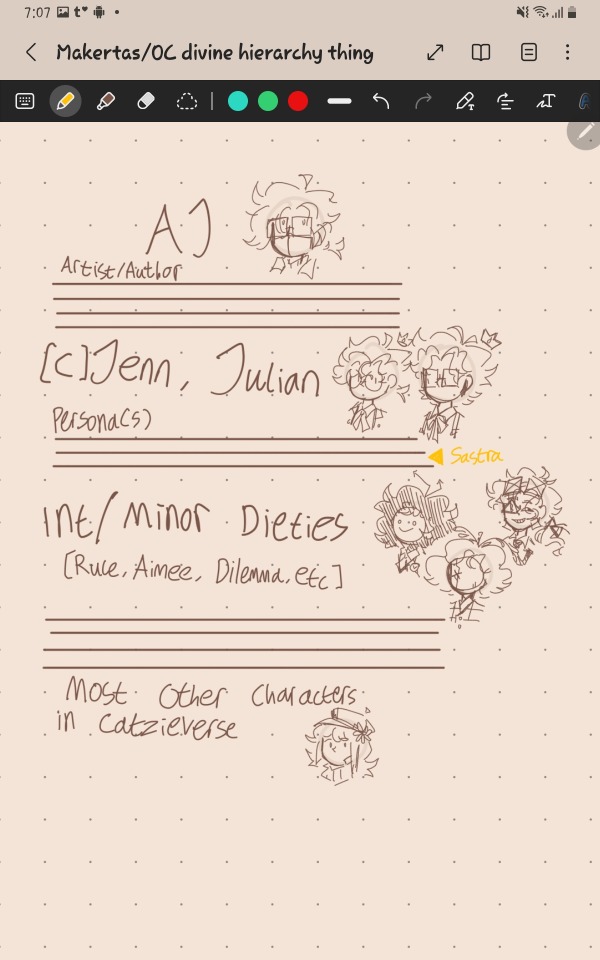
Mahkertas power ranking

Just this doodle because. He :)
Yes that's a good omens reference if you know you know
#jennicatzies art-chive#jennicatzies oc files#Mahkertas Head Offices#hmm#is that a good tag#MHO Sastra#MHO Dropcap#yayyy#original character#oc art#oc
4 notes
·
View notes
Text
just realized that the short story Bullets missed a golden opportunity to design it as if it was actually a magazine article in the Wreckers: Declassified... it would’ve been so funny.... they could have fun little illustrations and in-universe ads...
#I wanna design that now#bitch planet bonus material vibes#optimist.txt#has there ever been a wreckers: declassified or lost light insider zine thats actually formatted like a magazine?#so curious now#that would be so fun to design#go absolutely ham with the fun decorative typefaces and dropcaps
5 notes
·
View notes
Text
Sometime when my older siblings were little, my dad discovered that they found stories about his childhood more entertaining if he told them as "One time my friend Frederick..." instead of "One time when I was a kid...", and thus Frederick Stories were born.
I loved hearing Frederick Stories growing up, and so did all of my siblings. At some point, Dad decided to write (some of) them down, and a year or two ago I asked him for the file.
And now, currently in the mail to arrive late for Christmas, is a hand-bound copy of his book.
Two copies, actually, because I'm also sending one to his parents. He mentioned in the introduction that when he had first written these stories down, he had given them a copy for Christmas, and I thought they would like to have another, probably more nicely bound, one.
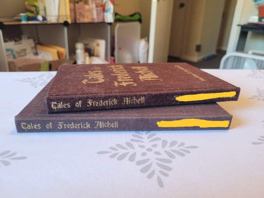
There's a third copy for me, but it took me long enough to finish these two before Christmas, and my copy isn't finished yet. Mostly, but not quite.
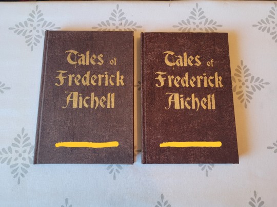
It is bound in a nice brown cloth I have, and titled with gold paint, because I thought it would lend it a sort of Old Book vibe that I thought would go well with the title.
Hence also the gothic font for the title.
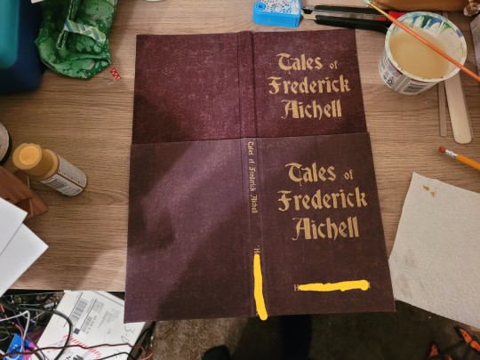
I also did a few experiments with ways of turning cloth into bookcloth, which is why the two books are a bit different in color. The one on the right in the above picture is the original cloth color.


The edges are gilded with the same gold paint as the title is done in, which also helps with the Old Fancy Book vibe I wanted.

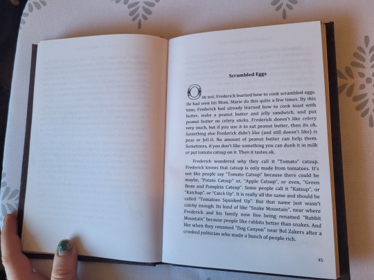
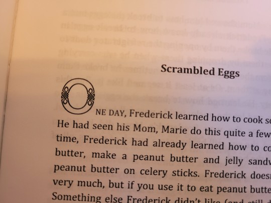
Almost all of the stories opened with "One day, Frederick..." or "One time, Frederick...", and I picked a nice ornamental font for the dropcaps there.
#little cat press#bookbinding#size: half letter#bound by me#a gift#author: my dad#gifted to my dad#gifted to my grandma#gifted to my grandpa
1K notes
·
View notes
Text
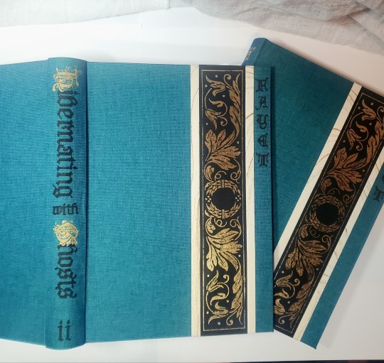
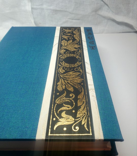
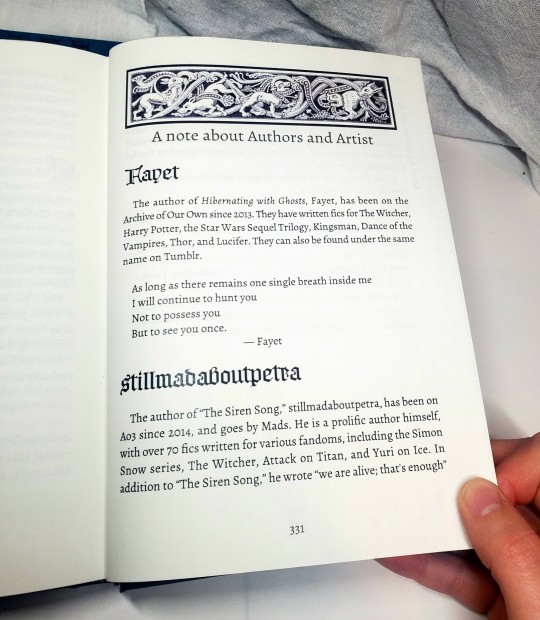
Fanbinding: Hibernating with Ghosts by @fayet
Getting stuck in Kaedwen in winter had never been on Jaskier's plan.

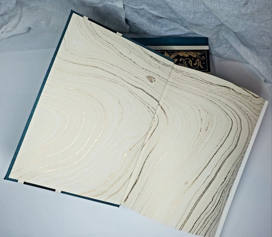
Hyped to share photos of the set I made at the end of 2023 for the @renegadepublishing annual exchange! In addition to "Hibernating With Ghosts" these volumes include 30 pencil illustrations by @saeculorum-art, the fic's prequel Silent friend of many distances, and a song (The Siren Song) by @stillmadaboutpetra. I was over the moon that they all agreed to allow their work included so i could make this for the lovely Kitty / @perfectlynormalbooks (thank you for the intro to the wonderful fic!!).
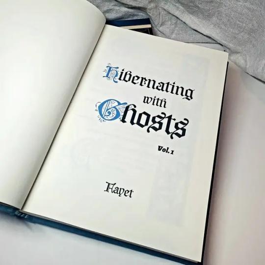


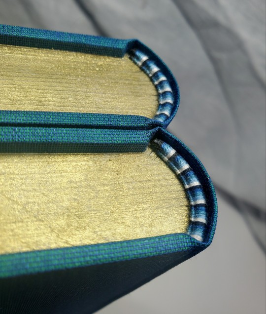
This book was bound in Duo dragonfly cloth, with marbled lokta and hand-foiled cover accents. All art not by saeculorum is sourced from public domain woodcuts. I went a little harder than usual on the typeset, but it was a lot of fun and I finally had a good reason to use a vertical header (the chapter titles are SO LONG) and colored dropcaps (i was printing color for the art, anyway!). I justified my embroidery thread spending with a fun five-color color endband, and I colored the top edge.

I had a lot of fun making this and trying our a few different ways of doing things! Thanks again to everyone for a wonderful Renegade Exchange!
#fanbinding#celestial sphere press#ficbinding#renegadeexchange2023#renegadepublishing#the witcher#geralt of rivia#jaskier#geraskier#hibernating with ghosts#this is actually the first Witcher fic i have bound#what a great place to start!
454 notes
·
View notes
Text
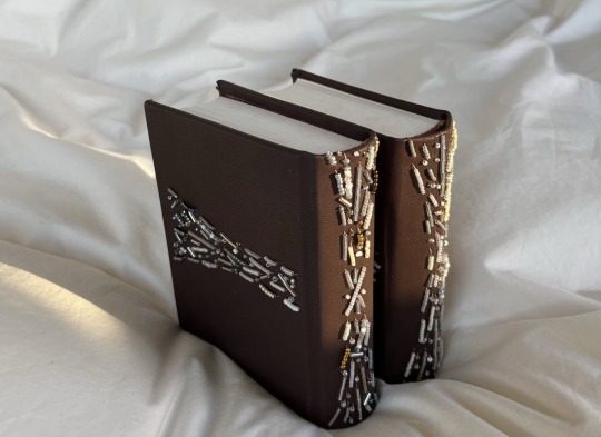

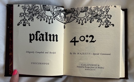
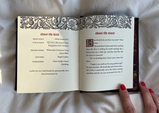
psalm 40:2 by unicornpoe
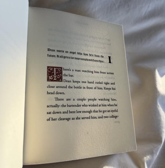
Dean meets an angel who says he's from the future. It all gets a lot more complicated from there.
Supernatural, Castiel
Here is my bind for @no-name-publishing in a Renegade Mini-Exchange! This is such a wistful and tender story about learning to accept and love yourself, even when you feel unlovable, and I was absolutely ecstatic when I peeped it on his wishlist.
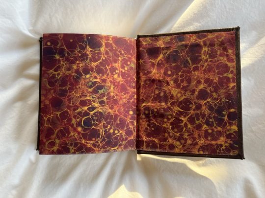
Lots of firsts for me this bind: first time working with leather, first time CHISEL-TRIMMING (:elmo fire emoji: insert here please), only second time power sanding (which I love tbh), first time BEADING a cover. I absolutely loved working with leather and the effect of beading, and wish I could take a video to show how sparkly the beads are in the sunlight! I also used ~ * f a n c y * ~ endpapers by Claire Guillot that I just knew I had to have for this bind the second I saw them, and will absolutely be returning to her for future binds.

All the typesetting choices are inspired by the 1611 King James Bible, as well as the beading which forms a cross when the book is fully opened. It's my first Supernatural bind—what's a girl to do besides make Biblical references? (jk, @clovenhoofbindery made a totally non-Biblical bind of the same fic and I have been LOSING MY MIND at how perfect and gorgeous it is)
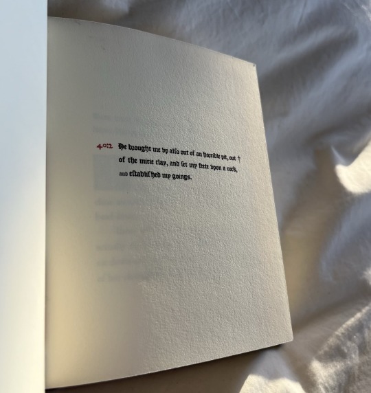
Materials:
Leather: Siegel leather pre-pared leather in espresso
Title font: KJV1611
Body font: Adobe Jenson Pro
Dropcap: Goudy Initialen
Decorative images: King James Bible 1611 (Wikimedia Commons)
Some more details, just for fun :)


#let out a little shriek when i was matched with kam#an icon an idol a legend#love his work so much and am so honored that my book coexists with them!!!#and THIS FIC#highly recommend#no spn knowledge needed#and your heart will be broken anyways#(and repaired)#my fanbinding
77 notes
·
View notes
Text
More than half of businesses that closed during the pandemic won't reopen
View On WordPress
0 notes
Text
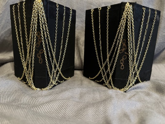
Fanbinding of Gilded Chain by Sroloc_Elbisivni
Gilded Chain by Sroloc_Elbisivni
The throne of Iacon's Primes is draped in golden chains. The glitter hides how strong they are--and how impossible to escape.
Fandom: Transformers - All Media Types
Rating: Teen And Up
Archive Warnings: No Archive Warnings Apply
Relationship: Megaton/Optimus Prime
Characters: Megatron, Optimus Prime, Soundwave, Ravage
Words: 3,710
I typeset Gilded Chain for the 2023 Renegade Tiny Book Bang, way back in August. Another member claimed the typeset and bound me a fabulous tiny book. However, while all of that was going on, I was also struck with a vision of a book in gold chains. It took me a while to puzzle out how to make this happen, but here we are now. This is now the second copy of Gilded Chain I have sitting on my shelf!
Here are some exterior shots. I embedded the eyepins in layers of thin cardboard, so they were sunk down into the covers instead of above/below/beside:

The endbands match up well with the chains despite being thread:

With a name like "Gilded Chain", I had to go ham with gold every place I could fit it in, which also includes the endpapers, the frontispiece, and the interior title:
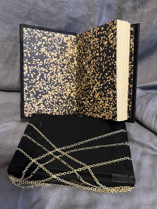
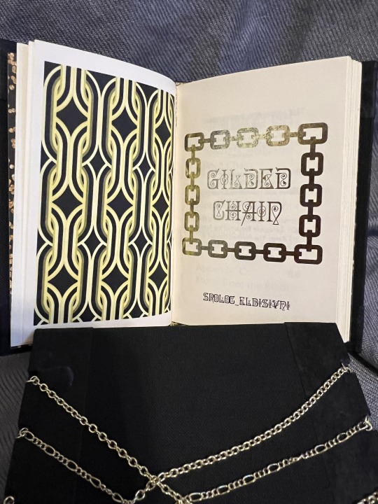

On the inside I wanted to continue the them of ostentatious luxury, so the dropcaps are very elaborate. And the textbreaks are thematically appropriate chains:

So, this is a tiny book, letter-octavo sized. I have a terrible time telling how big are books in photos, so I'm experimenting with some comparisons:
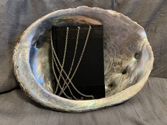

Obviously the ruler is most accurate, but the shell is aesthetically appealing :)
I'm thrilled to have pulled of this cover! There was a lot of fucking around and finding out. @sroloc--elbisivni has their copy and has graciously allowed me to share with everyone online. Thank you wonderful author! I greatly enjoy this story, hopefully a bit of fanart tells you how much!
Also located on A03 here.
108 notes
·
View notes
Text
Now that we have more design experience, we’re realizing that it’d be pretty easy to offer an alternative dyslexia-friendly version of our epubs along with the base ones. Just swap out the fonts, change the base text from justified to ragged, maybe remove the dropcaps, and boom. It works.
#book design#this is all in theory anyway#we don’t have dyslexia so these changes would be us working off of what other folks have told us#our best guess!#hey friends with dyslexia! are dropcaps a bother!
4 notes
·
View notes
Text


Address to the Refugees by delicatelyglitterywriter (@trailmixtime) and Gremlin_Of_Space (@v4n1r). It's a Gallifrey Audios fusion AU with Chronicles of Narnia.
86k words, casebound at folio size. The front and back details are cutaways with printed vellum for a slightly translucent titlepiece. The spine has the title done up in silver, which is difficult to see unless it catches the light - it doesn't translate well to photography. Typeset in Baskerville Old Face, using Winob for titles and dropcaps. The chapter header illustrations (and linebreaks, which I forgot to take photos of) are all by me!
Single copy made, which I gave to @trailmixtime when I saw xem in person last month!
169 notes
·
View notes
Text

Microsoft Publisher 97 - DROPCAP
51 notes
·
View notes
Last Seen Blogs


dicadakarina
♕ Dica da Karina ♕
le-sang-de-la-joaillerie
Le Sang de la Joaillerie

aro-aizawa
v passionate abt aro headcanons
familyavengers
Parental Avengers