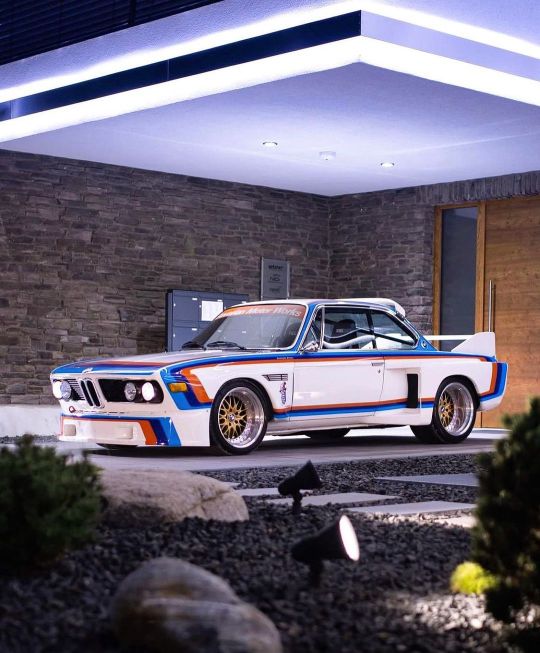
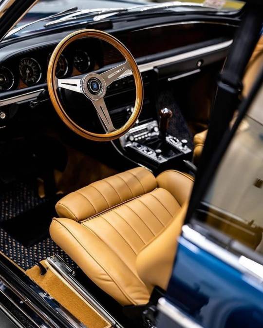
#3.0 cs
Text
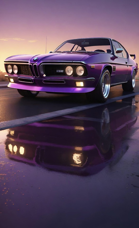
#Purple#BMW#3.0 CS#BMW 3.0 CS#1971#reflection#concept#concept car#prototype#Muscle car#art#Luxury#luxury life#luxury living#Vintage BMW#classic#classic car#vintage#vintage car#car blog#menstyle#classy#classy life#beauty#lifestyle#lifestyle blog#photography
108 notes
·
View notes

Photo
BMW 3.0 CSL (E9)
#stance#stanced#bmw#bmwm#mperformance#mpower#msport#mtech#alpina#dinan#e9#2800 cs#3.0 cs#3.0 csi#3.0 csl#csl#2.5 cs#m1#m2#m3#m4#m5#m6#m8#e30#e36#e46#e92#f80#g80
93 notes
·
View notes
Text

#bmw#bmw 3.0#3.0 cs#classic#classic car#classic cars#vintage#museum#bmw museum#history#historic car#historic#icon#car#cars
9 notes
·
View notes
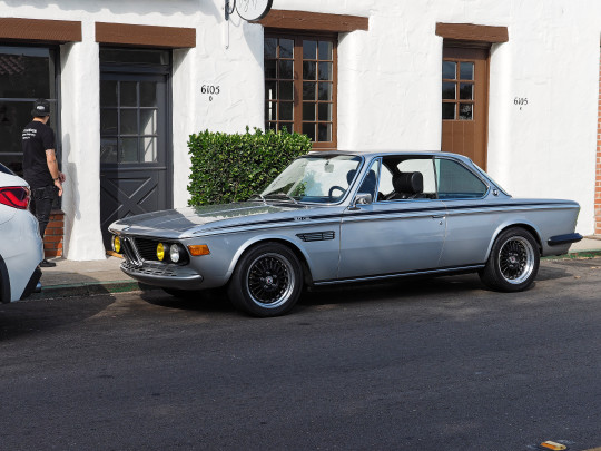
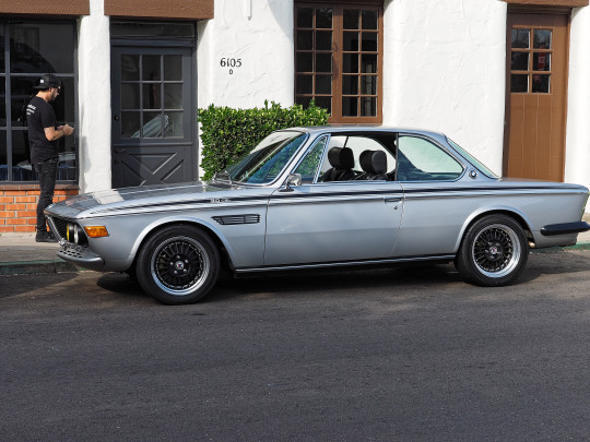
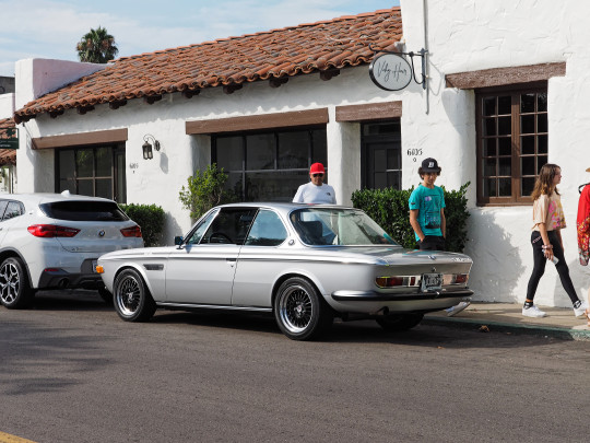
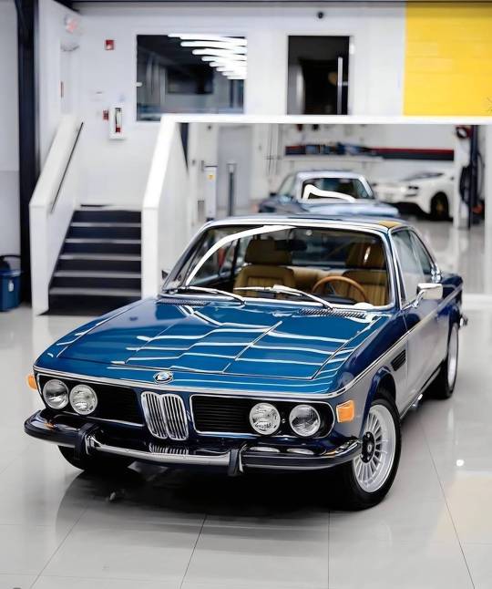
Text


BMW 3.0 CS, 1971. The E9 coupé was introduced in 1968 to replace the 2000 C/CS New Class coupé. The shared much of the bodywork with its predecessor but had a longer wheelbase and nose to accommodate a 6 cylinder engine. The was succeeded by the E24 first generation 6-series
450 notes
·
View notes
Text

BMW 3.0 CS
Image by Nathan Van Egmond || IG
249 notes
·
View notes
Text
#BMW#e9#BMW E9#3.0 CS Coupe#BMW 3.0 CS#classic automobiles#classic car#classic cars#classics#classic BMW
22 notes
·
View notes
Text
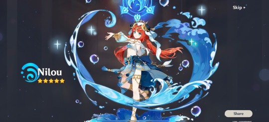
I am weak 🫠 context; I wanted Nilou since I saw her but I heard rumours about Yoimiya rerun 3.1 ,, I lost 50/50 to Yoimiya twice but 🥹Nilou…
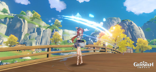


I was in Liyue. I didn’t do a single thing but whip out my Kamera 😂so don’t mind the dull blade haha
#Kanna plays Genshin impact#genshin nilou#gi nilou#genshin impact nilou#nilou#pls she’s so damn pretty 💕😭obsessed with her fr#gacha#technically#I did a 10x and got XL Gorō Cs 🎉I have 60ish currency left atm and a ton I can farm#I did the barest minimum on 3.0😂so I can farm pretty much all of Sumeru released so far#also I got a backlog of stories… literally all I gotta do is PLAY TuT
2 notes
·
View notes

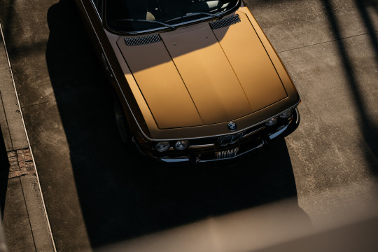
Text

BMW E9 3.0 CS Coupé 1971. - source Cars & Motorbikes Stars of the Golden era.
1K notes
·
View notes
Text
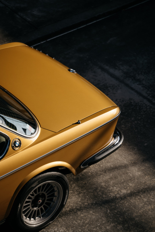
BMW 3.0 CS
950 notes
·
View notes
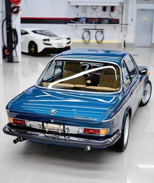
Text
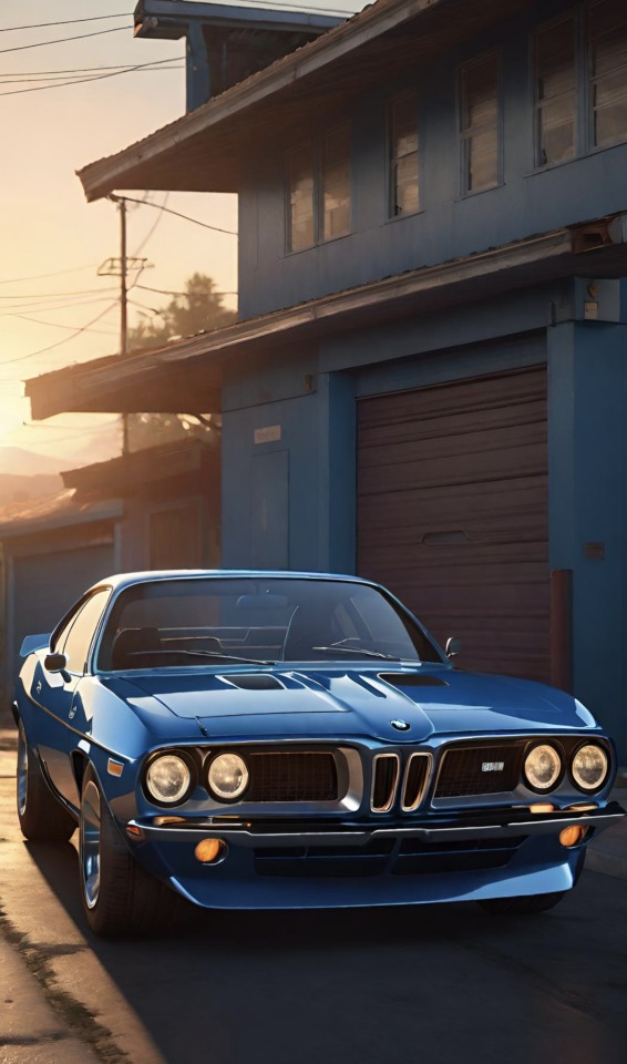
#Blue#BMW#3.0 CS#BMW 3.0 CS#1973#reflection#concept#concept car#prototype#Muscle car#art#Luxury#luxury life#luxury living#Vintage BMW#classic#classic car#vintage#vintage car#car blog#menstyle#classy#classy life#beauty#lifestyle#lifestyle blog#photography
124 notes
·
View notes
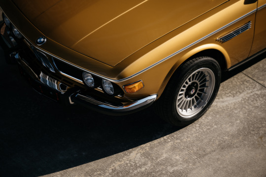
Text
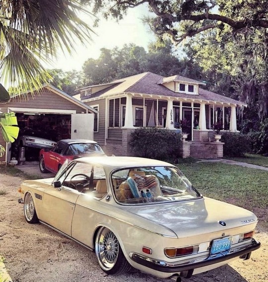
Photo: ianfromflorida
BMW 3.0 CS E9
#bmw#cs e9#sportscar#dream car#exotic car#supercar#hypercar#drift car#tuner#musclecars#muscle car#muscle cars#musclecar#classic#aesthetic#aesthetics#classic car#vintage#vintage car#car#cars#racecar#luxury car#aes
610 notes
·
View notes
Text
alright, here it is: ZENO'S COLOR GUIDE 3.0 !
here, i'll have three "chapters" regarding color:
CH1: how i color in illustrations
CH2: color and character design (in zeno's case)
CH3: how zeno makes his colors cooler
CH1: HOW I COLOR IN ILLUSTRATIONS
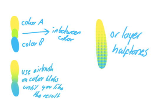
it must be noted that, as of lately, i heavily use halftones in my art and the way i use them for gradients effects my color choices. of course you don't need to use halftones if you don't want to, as it's just my personal choice, but anything regarding halftones here could (probably) also apply to regular gradients!
when choosing colors in an illustration, i usually have three things in mind: mood, character, and contrast. we'll be using "gloomy bunny naptime" as an example here.
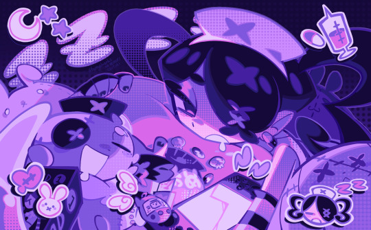
MOOD: what's the vibe of the piece? for example, here in "gloomy bunny naptime", wanted a mellow, sleepy vibe, so purples and pinks seemed like the best choice. these colors also have a dreamy effect due to being common in real-life early mornings/summer nights - basically, i tend to use associative colors in illustrations.
i usually only use a pallete of 3-7 colors, though of course more characters calls for more colors. for multi-character pieces, i would actually make a "rainbow" of colors based on the mood of the piece - essentially, a bank of colors to use for your colorful casts based on the actual rainbow. you can alter this based on the saturation levels you want! hope that makes sense. i'm not the best at this though, so i would heavily recommend looking for guides from artists who are more skilled in that department.
CHARACTER: velvet is the focus of the piece, and as a character her palette is made up of many purples and pinks. of course, it's easier because she and ribbon both have similar designs, but i would still recommend using colors based on/complementary to the focus character's pallete, though this is a rule that can and should be broken if needed. gradients can be used to provide a smooth transition from color-to-color and add depth to the piece, as well as showcase velvet's pallete. when making any gradient, you probably want to have a vibrant middle color. this is difficult to achieve in most art programs, so i'd do it like this:
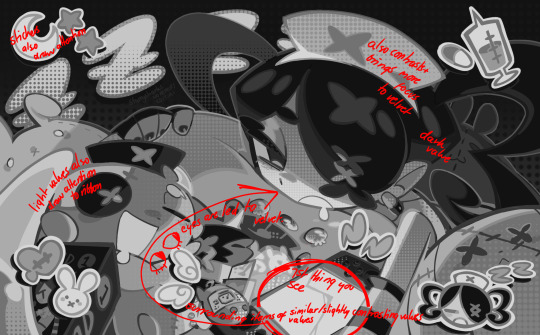
you can use gradients in lots of cool ways to make stuff pop! (i think this collage shows i use too much purple and pink though.)

CONTRAST: the context of the piece also aids the color through contrast. (that's a lot of Cs!)- we see that velvet is just waking up, and the light from her switch is glowing brightly. i wanted to convey something like her switch suddenly turning on in the middle of the night, waking her up - so the console emits "light" in the form of illuminating the contrasting color of pink against the purples. it might seem specific to this piece, but what i'm trying to say is that contrasting colors can lead the eye to the focal point of the piece, that being velvet herself. because a great deal of the rest of the piece is dark, we look at the contrasting switch screen - the brightest thing in frame - and our eyes move around and up to take in the focal point character. at least that's how i wanted it to be ;w; i guess you could convey it as something like this?
CH2: COLOR AND CHARACTER DESIGN (IN ZENO'S CASE)
this is where i start to get annoying, so stand back! when deciding on colors for a cast of characters, there are many factors: time period, variety, personality, and more that i can't think of.
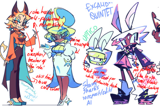
TIME PERIOD: this one is simple. for example, a futuristic time period (such as that in x-calibur) calls for colder colors, such as greens and blues. for characters involved in futuristic professions such as space exploration, this works incredibly well. for modern time periods, less focus can be on colors and more on the shapes of the clothes, but this is not a shapes tutorial! i don't have any ancient times oc stories, but i'd probably use earthy and warm tones.
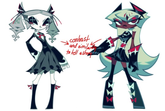
VARIETY: this is also rather simple. i try to be aware of the palletes that i used, and the similarities they might have with other characters. i try to use similar colors for characters who belong to certain organisations or have a uniform, but of course, it's not like catholic school students adhere their entire look to their uniform, so this is a rule that can be broken yet again. art is all about learning things and breaking them, remember that!!!
color can also be used for symbolism. my absolute fav example for this is vivica and octavia - the amount of red in their designs is supposed to represent the amount of freedom/passion/anger/confidence they have or are allowed to express under their different circumstances. as vivica belongs to a strict organisation, she has far less red in her design, showing her emotions are stifled - meanwhile octavia has it as her main complementary color because of her freedom to express her emotions, though those emotions may be destructive because of her circumstances.
PERSONALITY: what colors are associated with your character's personality? i actually usually refer to magical girl groups to see what's commonly associated with different colors. here's the main trend:
red: hot-headed, passionate, firey
orange/yellow: bright, happy-go-lucky, sunshine personality
green: wise, mellow, kind
blue: serene, graceful, elegant
purple: magical, regal, fancy
pink: usually the main character (though this because magical girl anime tends to be marketed towards young girls), sweet, relatable, determined
of course these are only stereotypes from one genre of anime, and different colors have tons of different meanings. color theory is the best way to learn this! these colors can also express different moods, which ties into ch1. i myself constantly ignore these rules - v-con, a bombastic hyper DJ, is purple (though he does have yellow accents) for example. basically, i just take them as a general rule and try to have them in mind while drawing.
CH3: HOW ZENO MAKES HIS COLORS COOLER
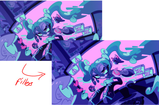
this might be the most important part of this guide. once again, there are a few things to consider here: filters, hue, overlays, and more!
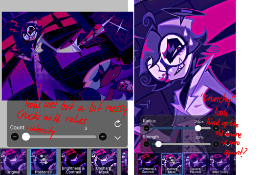
FILTERS: for ibispaint, you can use an adjustment layer on your whole piece to use a filter. i usually only use brightness/contrast here - upping the brightness (or darkening it based on the mood of the piece) and upping the contrast. this helps to better express values and intensify the colors if that's what you want. i often use it in all my pieces to some extent.
hue/saturation/lightness is also helpful in moderation. you can alter the hue - though it usually only helps if you bring it back or forward by just a few points, or the entire pallete will change. saturation is what it sounds like, and slightly over/desaturating the piece can help with atmosphere. lightness is what it sounds like - lightens the colors in the piece. i don't use it at all.
posterize and sharpen mask are some that i've used recently. posterize can add some crazy effects to your art, but i'd probably need to edit it slightly after using it because it can mess with certain colors.
HUE: it's a layer type that can change the overall hue of the piece. i usually use it at a low percentage for atmosphere. kind of like a gradient map but nothing like it? idk
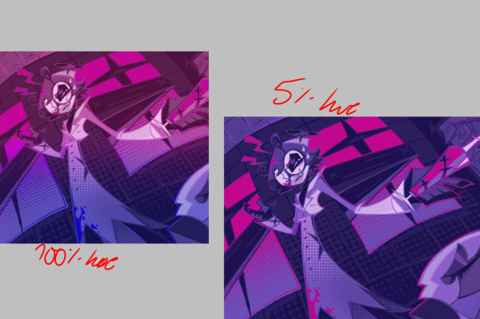
and OVERLAYS: i just use a very saturated blue/purple color over the entire piece at a very low percentage, around 5-10%. it can wash out the piece at too high a percentage.
and that's basically it! sorry it kind of derailed at the end i spent like 2 hours on this and got super tired. goodnight i'm going to sleep please also look at other artists etc etc. bye.
#zeno's art#long post#color tutorial#liar by korn is actually a really catchy song yea the lyrics are weird but its so good tbh#peak drums and bass and guitar and vocals and then the lyrics are hot booty. this is what nu metal's all about people#ask questions if you want#about nu metal or art i dont care
326 notes
·
View notes

Text
Time to highlight another fantastic artist! Please help us welcome @motherkatereloyshipper to CSSNS23!
What’s your Tumblr?
MotherkatEreloyShipper on tumblr, @Ao3Motherkat on twitter
How long have you been in the CS/OUAT fandom?
2 years
When did you start shipping Captain Swan?
2 years ago, I found a sewing pattern of the Captain Hook costume when looking for double-breasted waistcoats to make into a corset pattern and the picture on the front sent me to Google, Google sent me to Disney+ I binged all 7 seasons in a ridiculously short period of time and went straight to Ao3 for more.
What drew you to this event?
Kmomof4 made me, I was going to skip this year but I can't tell her no! Not when her birthday is my favourite holiday!
What inspired your topic?
I'm just here to make art
If you would like to share a snippet/sneak peek/summary of your fic or artwork, please use the space below.
No peeking
For our artists: What kind of art do you like to do? Picsets, painting, digital, etc? Feel free to give as much info as you like.
I make manips using a combination of canva, picsart, faceapp and gimp 3.0, I don't think they are very good but some people like them.
What are you looking forward to most about participating in this event?
The sweet sweet validation of making my friends smile.
I'm really looking forward to the wonderful artwork that @motherkatereloyshipper is going to come up with for @kmomof4's OS dropping on July 25th and @jonesfandomfanatic's MC dropping on August 24th. Please drop by her page to say hi and welcome her to the event!
25 notes
·
View notes
Last Seen Blogs
xsuperhero-expertx
Multi Fandom Blog
kinyoubi-ko
BITTERSWEET

tarifasde
4g en casa

rest-piece
Untitled

hollanda1-blog
Sem título