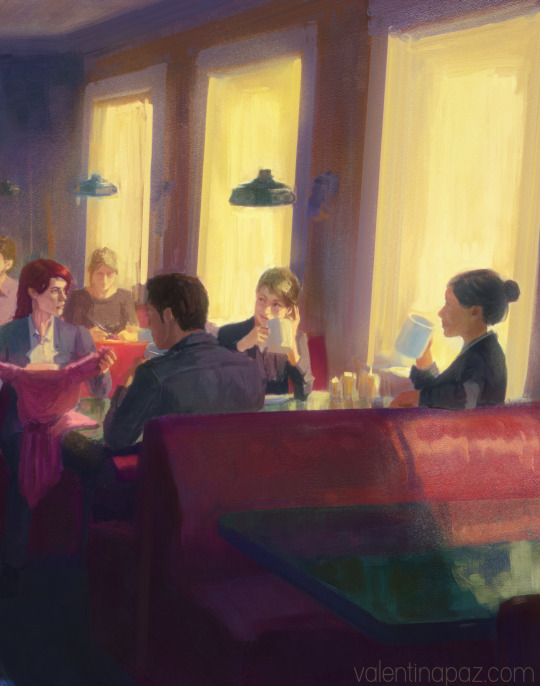
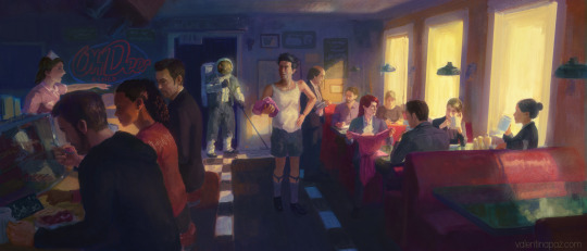
#(oh look this is actually short)
Text
wip
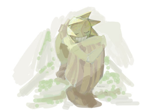
#sundrop#fnaf#not entirely sure if ill finish this lmao#<- so might as well post it hoping ill see this again and continue it someday#....i want to draw him with dandelions#he's like a little dandelion to me#oh yeah short story. the colors looked warm to me (night mode on my phone)#so i didnt know that the colors actually looked like this until the night mode turned off lol
764 notes
·
View notes
Note
The Floyd JD and Branch sitcom in your head is the funniest show I’ve never seen
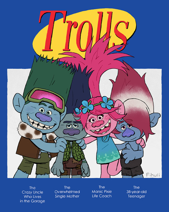
can the third movie's spin-off series just be this please?
#someone put branch out of his misery#he can't take much more#(lying. he's actually enjoying it (sometimes))#trolls#dreamworks trolls#trolls band together#trolls 3#trolls branch#trolls john dory#trolls poppy#trolls floyd#my art#answered#i just realized i called branch single#sorry king. broppy for life#but poppy is also his life coach on how to be a normal troll sooo#also kjfdjhf i made him so small lol. short king. i guess he's slouching#oh and#would anyone want to buy a print of this? because the original file is pretty big and i think it looks nice even from up close#there's textures and stuff#and everything is handwritten which you can't really tell in this smaller image
790 notes
·
View notes
Text
Ahtiiiiii, you can't just hire new people and start handing out promotions
#artists on tumblr#alan wake 2#control game#control remedy#control 2019#ahti the janitor#fra mauro#jesse faden#emily pope#saga anderson#alex casey#fanart#dylan faden#saga showing dylan a short recording of dark ocean summoning in case it wasn't obvious ha#arish and kiran and rose and lagnston and#oh looks it's actually alan lmao#and alice#not tagging them individually because lack of definition or smth#my art#control game fanart#alan wake fanart
346 notes
·
View notes
Text
The brothers, oblivious to the horrors that await them
#sonic the hedgehog#dreamtale#haha sure would suck if something horrible and irreversable were to happen to them#also I like just now realized that Dream actually has a short sleved shirt in his pre-trauma design#oh well#i drew their clothes from memory ignore that-#idk abt the background im so bad at backrounds its not even funny anymore but I nothings ever been ruined by a good ol gradient and a tree#also please dont look at the shadows for too long or theyll stop making sense#miles tails prower#tails the fox#sonic#dreamtale and sonic tomfoolery#me does arts#actually finished doodl
264 notes
·
View notes
Text
midnight leopika. i think i may have done kurapika too small 🤔
#sandwichart#leopika#leorio paladiknight#kurapika kurta#hunter x hunter#fanart#he isn't actually short or small at all#motherfucker is like 1.70 cm#but oh well#i found a new brush that kinda has it's own pressure settings#and since my tablet is trying to kill me. i have been looking for a brush that sorta kinda has the same feeling my sketches used to have#i'm not used to markers but this brush seems really good haha
637 notes
·
View notes
Text
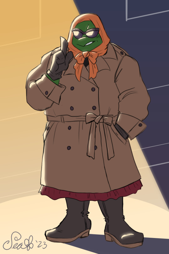
Trenchcoat-wearing time, but make it ✨Fashion✨
#tmnt#tmnt 2003#tmnt 2k3#tmnt mikey#my art#if there's one thing the cringe btts ep gave me#it was a Good Outfit Idea for Mikey lol#wanted Mikey to look like one of those dames from a detective novel or like an old-fashioned starlet hiding from the paparazzi#sometimes I think about the outfits they got in btts and laugh lmao#the stealth fits make for Bad Silhouettes#and the sports equipment feels fucking Silly#I'll admit I think the shorts look on Mikey is pretty good#but more for like actual beach outings#ohhh goddd why did we Never get a Beach episode???#oh there's a fic I read with that actually#it's good but it is mostly hurt/comfort lol#anyways imagine an intel mission and Mikey wearing this outfit uwu
508 notes
·
View notes
Text
The Mind but wearing some pjs that I own cos it seemed very mind like to me
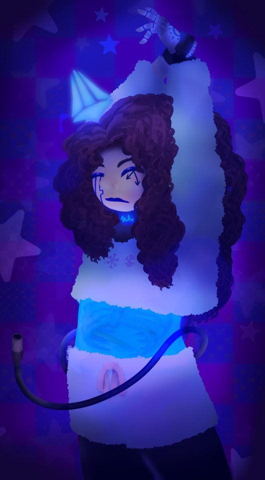
eepy mind real
[Alt versions cos I always make those lol ↓]


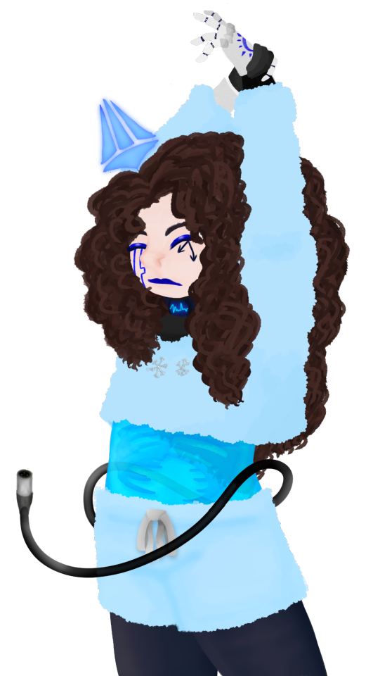
#Also finally made a full piece with my actual mind design yippee#Tho I did draw most of it like 2-3 months ago so the art style is a bit wack#oh well still looks nice#also tried a new thing with hair but idk if I like#maybe make it smaller cos it looks a bit too big/poofy#dunno will try out better ways l8r#my art style has it's own identity crisis pft#chonny jash#chonnys charming chaos compendium#cj mind#-atlas art-#i tried to find a good picture of the outfit cos i didn't wanna take one myself#but I can NOT find it anywhere#i think i got it at 5 below so they prolly just don't sell it anymore#its fuzzy warm pjs for the winter but also shorts & a crop top hoodie#sounds counterproductive but eh is neat
117 notes
·
View notes
Text

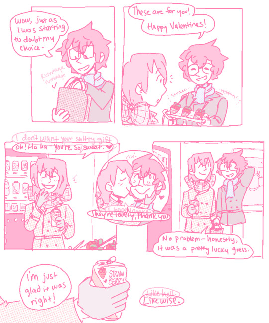

Happy Valentines, Akira.
Happy Valentines, Asshole.
If you can’t read what Akechi’s secondary inner-dialogue says cause I obscured it too much behind his regular dialogue, here’s a transcription in panel order:
Hello, you fucking-
Ah- Hello, Akira!
Fuck off, why should I tell you-
Just a soda- there’s a new flavor.
I don’t want your shitty gift.
Oh- haha! You’re so sweet.
I hope I choke.
They’re lovely, thank you.
Like hell.
Likewise.
There’s no way it’s just a coincidence.
Still though, it’s a funny coincidence.
#p5#akeshu#akechi goro#kurusu akira#wow- me?? posting a valentines comic... actually on?? valentines????? wack. absolutely wack#it's a short one! I purposefully tried to keep it short. it was a challenge and it still ended up being 3 pages. but i blame my canvas size#also in case u can't see what akira is holding out to akechi: theyre chocolate covered strawberries on sticks!#i saw them irl and was like oh god i want those. i am going to project that feeling on my favorite characters so help me god#and now! here we are! but my shitty-ass coloring & line quality make it hard to discern them so. sorry about that lmaooooo#ANYWAY i don't do enough post-maruki stuff so. i made this one a little bittersweet. :)#why did i put akechi's scarf in a bow? honestly i dont know! i think i saw some art a while ago that did that too and i thought it was cute#well. plus i guess there's the symbolism of 'akechi being alive and reciprocating your feelings (however involuntarily) IS a gift' part#hence that hes wrapped up in a bow. like a present. :)#also god. the first panel is supposed to be akechi's reflection in a vending machine window. I could NOT get it to look right#so for reference!!! just so you guys understand!!!!!! thats what that panel is supposed to be!!! he is NOT in fact a ghost. (sigh)#hope you enjoyed and had a lovely valentines!! for my part i have eaten nothing but sweets today and hoo boy will that have been a mistake#ALSO in terms of the audience-participation comic...hopefully coming soon. if i can ever gain the will to draw it.#but at least tumblr has polls now so i can do the audience-choose-y bit without needing to use a separate website! so thats good i guess#anyway anyway anway thanks for listening to me ramble if you made it this far! have a lovely rest of your day and hopefully see u again soon
710 notes
·
View notes
Text

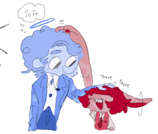
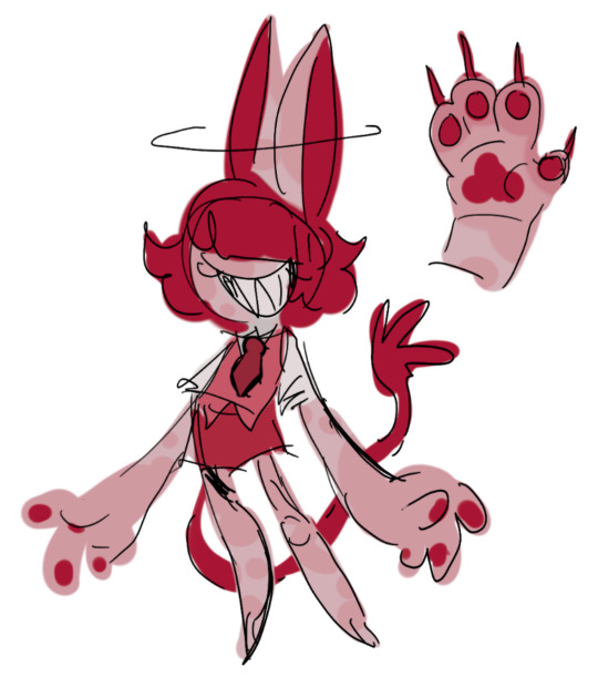
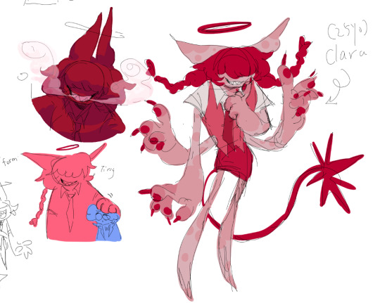


This Clara, she’s Dolus’ coworker they both work at the postal office :]
#my art#oc#afterland postal#witch au#Yugo is here cause I kinda sorta killed them#after I made her I realized oh shit she’s one of those look like a kid but actually not anime trope and I hate it uahhhhh#I didn’t do it on purpose aaaaaaaaa#I just want her to be cool#and Dolus to be short(?)#they have a siblings dynamic#ah also#the seven mysteries au#I adore characters with only mouth#they look chaotic#I realized that adding color can make my absolute shit sketch look presentable
255 notes
·
View notes
Note
is a Riteru read of ABoT the intended one?
It can be if you want it to be buddy. Go enjoy the world!
More genuine answer: I'm an aro-ace writer with a long long streak of gen-fic. Shipping doesn't interest me. I don't hate it; it just doesn't click for me at all. I joke that the only way romance ends up in the story is if it's a plot-necessity (Tetsuo and Jun are there because 'married man suspected of having an affair' is what pulls Reigen into the entire Mogami-possession plot. The Kageyama parents are married because they're, well, the parents. Teru and Mei's relationship is a joke until it's plot-relevant.)
So to me, I'm not writing Ritsu and Teru's relationship as a ship. But also? This is all pretend. It's all transformative. This is for fun. I absolutely know that if I were a ship-writer, Riteru would be the obvious choice. I know they're one angry-kiss away from being someone's enemies to lovers fic. So if you look at Ritsu and Teru in ABoT and say "they're holding hands, to me", go right ahead, go hog-wild, come play Barbies with me.
#my aromantic-agenda is to write fic that spotlights the power importance and intricacies of all kinds of platonic love#and ive done that in SPADES in ABoT#a Riteru read doesn't ruin any of that#so it's whatever you want#in my pocket. i like an aroace Ritsu and pan Teru read#but the aforementioned 'this is for fun pretend. go wild' trumps that totally#we're only alive a short time. go have some Riteru if you want#oh also my OTHER joke is that 'all romance drama in ABoT is actually just bait-and-switch nefarious spirit possession'#Tetsuo is having an affair? Nope! Spirit possession#Teru is cheating on Mei with Ichi? Nope! Saving Ichi from possession#Ichi is interested in Ritsu? Nope! Looking for dirt on spirit possession#my other other joke is that our name-combinations aren't ships. theyre possession dynamics#Tetsugami. not to be mistaken for Tetsuo x Mogami. is the spirit dynamic of Mogami possessing Tetsuo#We got Reigami#We got Slipzato#We got Gimrits#Slipakane Sliphisao#Sorry fresh out of romance but we DO have a 13 year old losing his soul to the corruption of being a spirit-powered-mecha-suit if you want
79 notes
·
View notes
Note
I'm sorry, Spamton. I know you won't believe me, but I'm sorry we hurt you.

#GOD this fucker corrupted my gif again.#Ignore the page is missing im not gonna fix it. Hes looking at the paper. its just uhhh out of your view#made this one up on the spot lmao i dont have many inbetweens planned... if its not up to par to the others thats why#i wish i did do inbetweens but i only have the main ones planned#btw usually when he asks stuff like this he's looking for a response (im looking for a response. me.)#thank you anon oh my goooooodddd you were my descending angel while looking for an ask along these lines#this ask is perfect. Not too overcomplicated. nothing that would set him off. Short and sweet and to the point but its got nice impact.#in this context at least. I rlly needed it lol.#some were.. too much and some were really half assed apologies that go immediately back to asking him stuff LMAOOO#Guysss work with me here im actually trying to guide you to really apologize to him#[you've got mail!]#spamton#spamton g spamton#deltarune#deltarune spamton#deltarune chapter 2#Ill fix the inside of the dumpster later. its not to scale goddamnit.#Typos in his speech are on purpose to clarify lol#spent a damn hour fixing the gif. grrhhhhh....
128 notes
·
View notes
Text
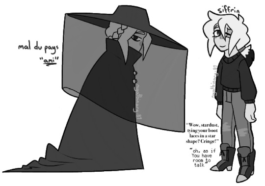
@vulpixisananimal sifstem art jumpscare!! more specifically i got bored and decided to mess around with sif and mal's outfits.
#my art#this is how I think theyd present themselves either in person or in headspace. the slouchers <3#sifs outfit is simple; the boots i always give them (but with star laces for funsies); loose sweater; simple pants#the pants are Meant to be jeans but isat doesnt Specifically Have Jeans so. theyre just Pants.#the sweater is slightly looser bc sif doesnt seem like a Form Fitting Clothes kinda guy to me but hes Trying to be more open#on particularly good days theyll roll the sleeves up or wear a sleeveless one methinks#even if everyone Knows abt the self-harm scars its hard to Look at them.#i also associate them being more open with them not wearing an eyepatch. esp bc hes the only one of the three to go without it#for mal (or 'ami' as i like to call it) i wanted smth reminiscent of a mourning outfit bc mal du pays means homesickness#and i picked 'ami' as a nickname bc ami means friend :] at least according to my basic translator. i dont speak french <3#ami's outfit being dark is also reminiscent of the inversion thing its got going on in canon.#ik the veil is starred in the original but i think ami would want the fewest reminders of home. on account of The Issues#(actually if i can come back to sifs laces sif also has issues with reminders of it bc of the memory loss but the shoelaces are His Choice—#—which gives them a form of control over it and they can keep it subtle or undo it if he wants. which makes it easier)#anyway. i put amis hair in an updo and smoothed the hat bc i think ami wants to be Unremarkable. Unknown. so it keeps its silhouette Simple#(it still keeps the pins. theres smth comforting abt them. they shine like stars and theyre not stars and theyre not Home. but theyre You.)#and i kept the long hair i gave loop. dont ask me why its so long when the canon hair is short. maybe their hair kept growing over the loop#OH and i drew ami in a side profile bc Silhouette and also bc i think itd make an effort to keep people away from its blind spot#andddd i think thats about it? plus i actually managed to keep this one within a reasonable timeframe.#if their hair changes lengths/the proportions change between drawings. no they dont 💛 peace and love and body craft#OH AND YOU FINALLY GET TO SEE WHAT I MEAN ABT SIFS BOOTS BC THESE ARE THE BOOTS I GAVE THEM ON MY REGULAR DESIGN ARENT THEY NEAT#i did actually try to give sif a different font but nothing Works for them like the pixel font. i cant explain it.#i think 'ami' would be a nickname that mira gives it. bc. shes Fantasy French. and its a sort of 'youre more than your yearning/loss' thing#me every time i think abt sifstem: yeah they just rotate in my head. nothing major#me every time i talk abt sifstem: oh hey im almost at tag limit again#au Good what can i say
44 notes
·
View notes
Photo
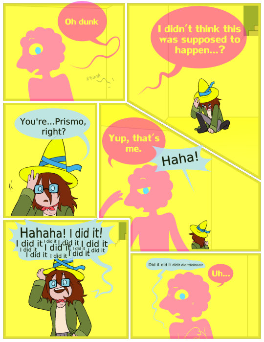
Betty’s Wish (1/?) (Patreon)
It’s definitely weird that Betty, with all her Magical abilities, never met a Wishmaster, right? I think so
[First | Prev | Next]
#My art#Comic#Adventure Time#Prismo#Betty Grof#Oh this is much bigger than I'm used to lol - feel free to open in a new tab#My big project! Here it is! :D Or at least the first piece of it lol#I worked on quite a lot of it through Requestober - or at least the digital cleans lol#If you'll recall my ''This has gotten way out of hand'' posts about Winter and the like - yeah it was actually this lol#And that was just the roughs! This became my warmup project for the remainder of RQTR 2023 lol#It definitely worked! All the way around! I got lots of panels done in short order and got my warmups in for the day#These are mostly drawn right on top of my original sketches - other than adding Betty's kerchief#I would've gone over her hair to make her more on-model but hrnnghhh hair fun to drawww#This is my happy medium compromise lol#Prismo was also a treat to work on ♪ He's vectors as you can probably tell :)#And I still looooove working with vectors ahhhhhh <3 <3 They're so fun to manipulate and move around#I can change his expressions so quickly! Very enjoyable to work with :D#Hehe ♪ He's also not confined to the panels the same way Betty is :)#Anyhow! I have Several more of these planned but for now I'm just happy I finally have this one :D#For reference this is set before the end of Adventure Time - obvs since Betty looks like this - but also kinda not lol#Y'know how it is with time and paradoxes and stuff :)#Even Prismo knows ♪ He probably knows best of all actually hehehe
96 notes
·
View notes
Text
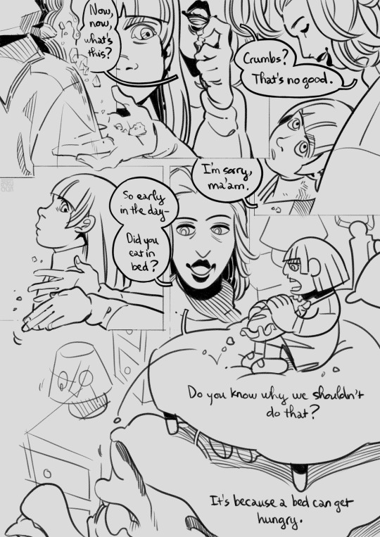
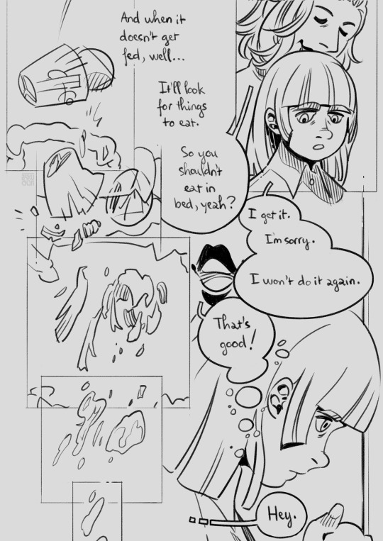
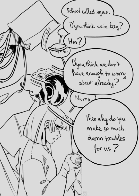


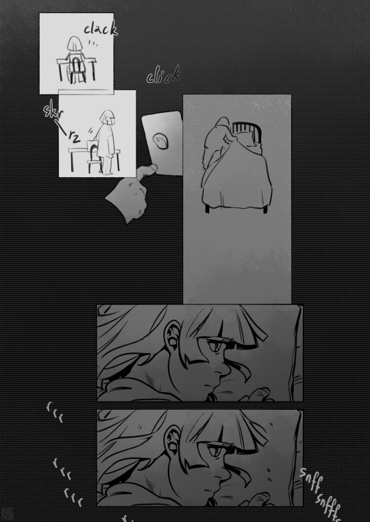

crumbs in your bed
transcript
#bakuspecial#comic#horror#cw: child abuse#cw: body horror#ask to tag#hi! hello. this is basically just a goosebump story I think. or a scary stories to tell in the dark entry#that's kinda what I aim for? along with the good ol vibe of fuan no tane#and also the like. Thing in east asian art where they make the main character a generic white person and then#every other thing about the setting is deeply recogniseably common asian shit lmao#that's entertainment for me. this came about extremely haphazardly... its why the first two pages look nothing like#the rest of it fsdjfhdsjhf. I slammed those out at a cafe like two days ago#went into this one no plan outside of a general sense of direction#I dont think Ive ever actually designed a single character in any of the short horror comics I did. like either its me or#I made someone up as I went. genuinely didnt know what the character'd look like until I sketched em#and then I kept referencing previous panels to draw em. dont know if I recommend this method#mmmm on reread not super sure if the sound effect of the bed leaving the room is clear enough... oh well there are other comics#been writing a lot about food and places recently Ive found out. oh yeah dyou know whats funny#I watched a wayner highlight vid of the kingdom heart charity stream today (I do not know anything about kingdom heart) and realized#how much of kingdom heart (at least the first one) is about like. places.#which is like. good job baku great deep read there isn't kingdom heart literally behind a door. arent there doors all over the place.#isnt the biggest symbol from that game taht EVERYONE knows about the KEYblade. for locks on door#fskdjfhdj but yeah its just. very cool to me that that game really does have iconic recogniseable sites. like the scenes are all tied to#where they happen at. and the climactic battle happens in a black void around a door. its good#good story about leaving ur home after ur friends aren't there anymore and being changed so much by what you go through that#you can no longer call where you started at home anymore. I am being conned by the music#anyways. yeah I go sleep now. powered thru the last 4 pages of this so its done and out there. hope my bed will not do this#have a good night lads! be careful of bugs
137 notes
·
View notes
Text
finally successfully figuring out an issue that needs to be solved with my art for me to improve and be happy wit it but not knowing how to solve it
#talkys#and also spiraling bc i look back at old art and like some of it but i really dont like the way i draw ykwim#i dont like that this is my style it doesnt make me happy. but i dont like anyone elses's style enough to emulate either. sucks#OH the issue is i have specific ways i like drawing heads/faces that cant comfortably go on a body#furs are easy bc you can draw huge necks short legs smaller bodies etc#if i had drawn a recent smunker with a human head the head would look too big ykwim#the way i like drawing heads means they have to go on a bigger longer more realistic body. and i dont like that/cant draw bodies easily tha#way. as it stands rn my heads either fit kinda big on a body‚ which is more in line with how humans actually are#which makes my work feel more rigid and like i have to align more with realism#or the heads are too small and make the bodies look even longer. and i dont like. long bodies. i cant figure it out. it just doesnt look#right. no human full body ive done ever looks right to me. like i cant hack it and make it stylized enough for me to not care abour#the Rules like i do with furs#idk if this makes sense. i keep seeing styles like urasawa with small facial features and i love that i wanna do that#but the proportions mean id have to draw a more realistic body....idk...!#and also theres 500 billion ways to draw a face. i cant draw the same body proportions for all of em.#this is why it feels like im drawing for the first time every time i draw a new character...!#cant draw heads first bc then the body looks bad...cant draw bodies first bc i cant attach the head...#cant thumbnail the whole silhouette bc then when i add details the head still looks too big or small compared to the body...#and simply scaling the size does not fix it...
35 notes
·
View notes
Note
You said don't get you started on Ice's helmet or you'll be mean... please be mean. Please be mean to him. What is so disastrous about his helmet design?
my time has come. i will be mean to him. (thank you for getting me started on this. it bothers me every time I watch top gun.) this is also gonna be so long. yippee!
stopthatfool's issues with Tom "Iceman" Kazansky's helmet! aka this bad boy right below. (I'm sorry if anyone loves Ice's helmet, it's just not for me)
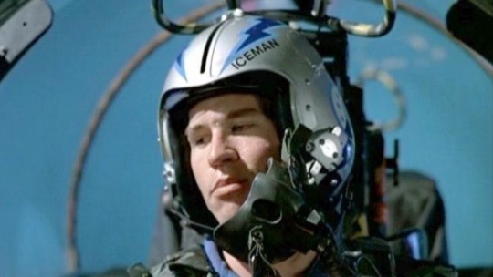
The placement of his name. WHY is it on the side? Both him and Slider have their names on the side. That makes me think it's a squadron thing? (the VF-213s) but regardless i don't care cuz i think it's stupid. (again sorry if someone thinks its genius. ok i'll stop apologizing)
My biggest issue with the fact it's on the side is that it creates this uneven weight distribution. The side with his name feels considerably "heavier" than the side without.
And the thing i don't understand is that Ice's name is evenly numbered!! He could fit 3 letters on either side of the line that comes down the helmet! the letters wouldn't be unevenly distributed, so I don't know why he felt the need to put it there!!
Here, I have "annotated" his helmet and provided other viewpoints of his helmet!

The font/typeface! Ice.. is that ARIAL?? and it's not even bolded??? so not only is his name to one side and weirdly small... it's skinny and unbolded. (like you're THE Iceman. Don't you want your name big and bolded? I shouldn't be searching for your name when you're Mr. Iceman!)
Looking at his helmet head-on, part of his name isn't even visible.. like ok ICEM!
And then! There's this weird switch up in the shapes and line types that he used-- the angular and sharp points of the lightning bolts and the half circles surrounding the squadron logo (is it a logo?? idk im gonna call it a logo)
What i think Ice is trying to do here is create a "connection" between the circular part of the logo and the lightning bolts as the bolts go all the way to the back of the helmet... but in my opinion... it's not working. like at all.
The comparison between the harsh lines of the bolts and then the curves is just kind of hard on the eyes (for me anyway). I just don't know where to look. Should i be following the leading lines of the lightning bolts? Or the curves of the half-circle things? Or should I be following the line of the lightning bolt in the logo?
And all throughout that... i barely end up seeing the name on the helmet.
Continuing off the logo... for Top Gun 1986, Ice and Slider are in the VF-213 squadron, but the movie switched the logo to the VFA-25s that looks like this on their flight suits-
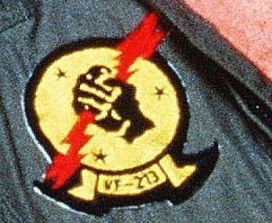
(yes that is the best quality image i could find from the movie my bad) So why does the logo on his helmet look like this???
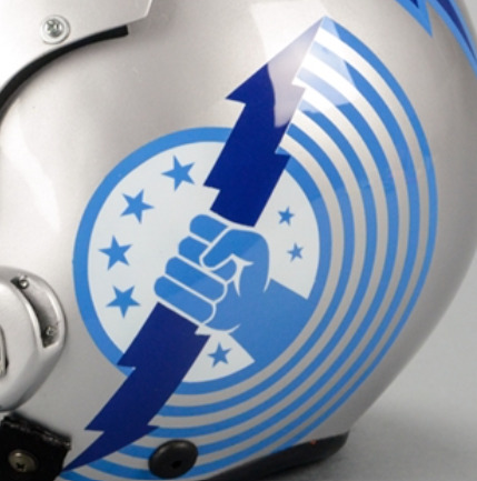
WHY do the fingers look like that. they look like hotdogs im so sorry. (logistically it was probably easier for the decals to be printed and then applied like this. but. we're not talking about technicalities here. right now i'm tearing apart the entire composition of Ice's helmet.)
I like version of the logo on their flight suits soooo much better! It's got more "rhythm" and flow to it that the lightning bolts lack! Plus no hotdog fingers.
Ok ok, now on the colour scheme. The harsh and bright blues I don't mind. Like yeah, you're The Iceman, punch me in the face with blue. I can forgive that. The thing that really bothers me.. is the silver/grey base of the helmet.
It's this really harsh grey that really doesn't help with the already harsh blues. I think he should've continued with the blue he has going. cuz this grey ain't working, king.
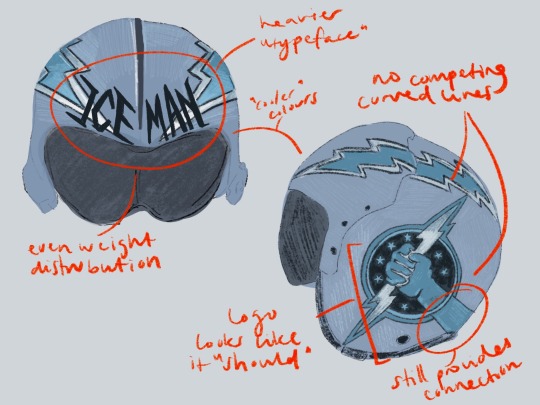
Ok, anyway. Since I should be studying, I'm obviously doing anything but studying. So i redesigned ice's helmet. ya idk.

it's kind of wonky.. but whatevs (ignore how the lightning bolt on the side view doesn't line up with the front view) (and ignore the inconsistences in the lettering. i was lazy and did it by hand)
I also didn't want to completely change/get rid of the aspects of Ice's helmet. So the changes aren't huge (except for maybe the name placement/"font")
ok I changed the background colour (finally, it's less all up in your face now) I continued with the blues and lessened the intensity just a little bit. I really wanted his name to be front and center!
Now the colour scheme is also consistent. No random black lettering (again, in arial???) there's now black in both his name, the outline of the lightning bolts and the logo!
Now his name is evenly distributed! See how it fits on either side of the line that comes down the center of the helmets from '86? See how you can actually see his whole name? See how it's heavier and fits the whole "iceman" theme better? (at least in my opinion)
Come on, Ice! You should've used the leading lines provided by the lightning bolts to guide people to your name! There's now a fun little overlapping moment!
(ignore how i forgot to dot one of the i's in distribution whoops)
No more weird half circle things! No more conflicting leading lines! But! I decided to extend the arm of the squadron logo to continue the line of the lightning bolt as it moves backward. I think this makes the circle of the logo fit better, while simultaneously creating that "connection" he was trying to get in his actual design.
The lack of half-circle things also allow for the logo and lightning bolts to just "be." There's no distraction. it's not overly "busy" anymore (like maverick's helmet). It's simple, but he's The Iceman! He doesn't need it to say/have more!
And the use of the "actual" logo seen on Slider and Ice's flight suits creates that sense of movement that was absent before! Plus no hotdog hands!
Is this new proposed design perfect? Absolutely not! The logo and the lightning bolts still create a weird point of almost intersection that still bothers me. But I think fundamentally, there's always going to be issues with these two components: the circle will never quite fit in, and the lightning bolt the hand is holding will always "cut" the whole thing in half, creating a weird separation in the helmet, that will always bother me.
Anyway, this was a lot of fun! (I love being mean to these guys. they need their egos brought down a couple pegs!)
#now if only i put this much effort into my actual assignments regarding composition breakdowns....#looking at it now. i think i just spelt distribution wrong. blegh. whatever.#ICEMAN! big bold letters! like oh yeah! that guy!#long story short! i hate his helmet!#i hate hate HATE your hair and makeup today#like that clip from rupauls drag race u know?#top gun#top gun 1986#iceman#tom iceman kazansky#stopthatfool goes crazy and explodes#stopthatfool draws
59 notes
·
View notes
Last Seen Blogs
indigostars
never tell me the odds

forexalgoai
Forex Algo AI EA
snovyda
непозбувна бентега

maydette
BARMAID;

northcountyshootingcenter
North County Shooting Center