illumax
Create Boldly
Illustrator. Designer. Letter-er. I do a bit of everything.
16 posts
Don't wanna be here? Send us removal request.
Last Seen Blogs


Photo

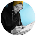
This is a flag I designed for my brother's home gym. The slogan plays on the famous Maxwell house coffee brand. Which color way is your favorite? Tools: Procreate app iPad pro 12.9" Illumax custom brushes Apple pencil 2.0 #flagdesign #homegym #gettinswole #design #handlettering #procreateapp #illumax https://www.instagram.com/p/CpSxjVaJUMW/?igshid=NGJjMDIxMWI=
6 notes
·
View notes
Text

So pleased to announce that my piece "The Bird Devoured" was accepted into Illustration West 61! Thank you to the jury, and a big thank you to the Society of Illustrators - Los Angeles for putting this on.
This piece was created after the Musk/Twitter takeover. The title is a play on his first tweet "The bird is freed." Musk has always looked a bit toad-like to me, so this was the perfect opportunity to explore that.
0 notes
Text
Wanted to share a demo I did for my students awhile back. This was done using ink and gouache.
0 notes
Text
Taking The Arrow - Process
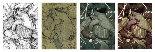
Breakdown of the painting process
“1308AD. France.The Templar Order has fallen. King Philip IV has a price on the heads of its remaining members and associates. Three Knights, Pierre, Jean, and Reynaud are on the run and head for the Order’s last bastion of safety: The island monastery and fortress, Mont-Saint Michel. There they are presented with an opportunity to fight the king using dark methods. Soon, they are met with an untamable evil that turns Mont-Saint Michel from haven to prison. They will discover that not only does evil lurk beyond the walls of the monastery, but the actions of the past torment them within the walls of their own minds.”
Over the last while, I have had the pleasure of illustrating a phenomenal book by Dalton James titled “The Night’s Many.” With his permission, I am going to share some sneak peeks of the finished illustration, as well as some insights into the process of making each one!
Our first image is titled Taking the Arrow. This scene is a flashback of one of the characters to his time during a war in England. During the battle, he is hit with an arrow (surprise) and is lost amid the chaos of bodies and presumed dead.
Now that we have a little background, let’s dig into the process.
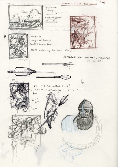
Thumbnails/ideation
Every illustration should start with thumbnails and ideation. Admittedly, I tend to work on loose leaf paper and sometimes misplace them. So this is the only one I could find.
This image provided a unique challenge as I wanted to somehow capture the chaos of the battle, and those few moments of calm that the character had before blacking out. A major theme of this flashback was being lost among the fallen soldiers and I had this image in my head of being tangled up and swallowed by a mass of bodies. This would create a sort of pocket of solitude despite being in the middle of the battle.
I also took this time to research some period style armor and weaponry just to get an idea of what I would be working with in the image. Taking some time do studies helps us better understand the shapes and forms in an object, so when we get to the final piece, we are more comfortable exaggerating or putting them in different positions.
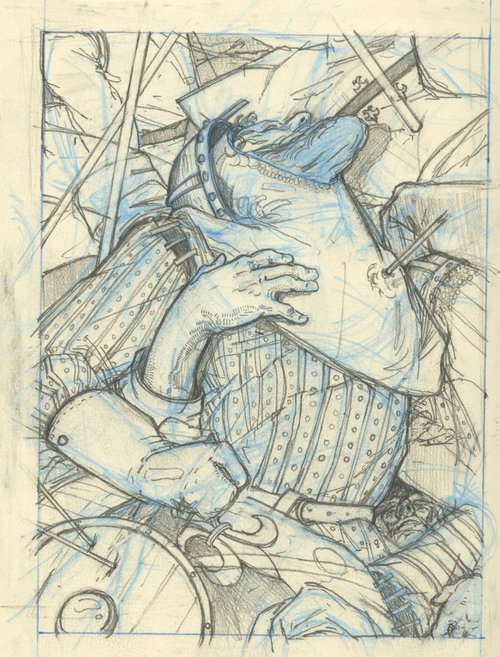
Preliminary Drawing - Blue Pencil and Graphite approx. 5”x8”
Once the concept was nailed down, it was time to move onto the preliminary drawing. This was done in a moleskine notebook using a non photo blue mechanical pencil and graphite.
A lot of my work tends to have a single figure or character in it, so this was really fun to try and fit as many bodies in as I could. Using things like the spears and arrows I created “blocks” for the viewer to keep them in the image. Everything swirls around the central figure and directs the eye back to his face and the arrow in his chest.

Final Drawing - 12”x16” Graphite on Toned Watercolor Board
After the composition was solved, I scanned, enlarged, printed, and transferred my sketch to a toned piece of watercolor board. (The tone was achieved through a wash of acrylic). During the transfer, I refined my drawing to really get the shapes I was after. Sidenote, that is one of my favorite hands I have ever drawn.
Now onto painting.
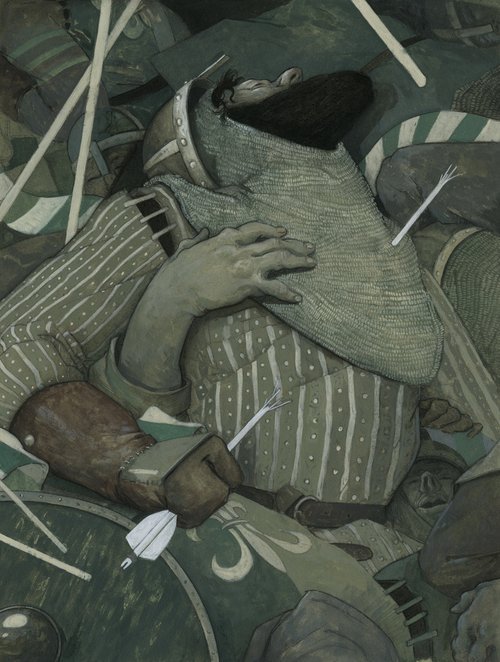
Final Painting - 12”x16” Acrylic and Charcoal on Watercolor Board
My Primary concern in the painting stage was to get the values established and have enough color in there to really manipulate digitally at the end. I used a very limited palette, and had fun figuring out the lighting and creating some texture.
I wanted there to be grit in the image so I was not overly concerned with making things look really neat and clean - it is a battle after all. I also played a lot with simplification, such as his chain mail. It really is just a shape with some tiled brush strokes in there to add texture.
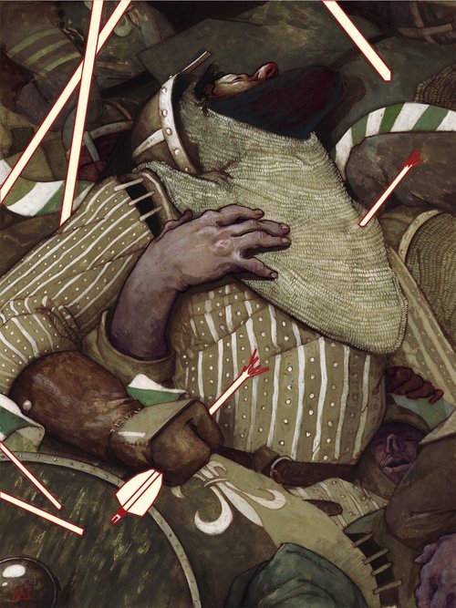
Final Illustration - 12”x16” Mixed Media with Digital
Once the painting was complete, I again scanned it and started my digital edits. This is one of my favorite parts of the process as I am totally free to experiment. Pushing and pulling colors, values, and textures. It is really easy to fall down the digital rabbit hole and end up over editing, so I have to be careful.
As you can see, I added more color to the image, particularly the skin tones. I also warmed everything up.
I have been experimenting with introducing some vector based elements in my work, and brought that in through the arrows and spears. This is a theme throughout the illustrations for the book. It is a way to create emphasis, and kind of tone down a little bit of the violence (I want to help the viewer see past the gory details and focus on the themes and messages in the story).
All in all, I am quite happy with how this turned out, and I am looking forward to sharing more images with you. There are about 24 paintings in total for this book, so it will be awhile before they are all finished, and even longer before we get through all of them!
I would love to hear your thoughts on the piece, and if you have any questions about the process drop them down in the comments!
Until the next time,
B.
#publishing illustration#That looks like it hurt#purple skin#illumax#how its made#process#mixed media#illustration education
1 note
·
View note
Text

Illustration for World Without End Portfolio by Jeffrey Jones (1980)
201 notes
·
View notes
Text

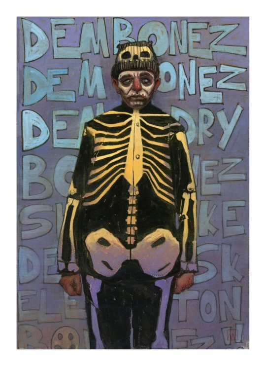
Bringing this illustration back since it is apparently relevant again. I did this back in 2019 at the height of the Orange's penchant for tweeting.
1 note
·
View note
Text
Do You Struggle Picking Color?
A super quick tip!
Color. One of the most intimidating things in picture making - and understandably so! The world of color is so incredibly vast it is easy to be intimidated. I mean, just think about all the aspects of color we have to keep in mind when painting: Hue, Saturation, Value, Temperature etc.
There are so many moving parts, not to mention the fact that all of those things can completely change simply based on which colors you put next to one another. Plus, when working digitally, we have billions of colors just a click away. That color wheel can be mighty seductive, but it proves to be a major pitfall for many students and professionals alike. With so many options at our fingertips, it is easy for our colors to get out of hand and lose their harmony.
It is easier to end up where we want to be if we start off with a solid foundation. Using color is no different! In order to help us end up with good color at the end, it is important to start off with a solid palette!
Here are two resources that will help you pick harmonious color palettes:
Paletton - This website allows you to pick different color schemes such as Monochromatic, Analogous, or complementary and breaks down all of your highlights and shadow versions of your selected colors.
Coolors - A much simpler palette generator, but a lot of fun to use and can help you explore new and exciting color combinations that you may not have thought of.
Play around with these tools and let me know what you think!
Do you have any helpful color tips? Throw them in the comments below.
#color palettes#illumax#get creative#live a creative life#art tips#quick tip tuesday on a monday cause i felt like it
4 notes
·
View notes
Text

"Ceci N'est Pas Magritte"
7"x10" Digital
This is a conceptual portrait of one of my favorite artists René Magritte. He is a huge influence on my ideation and compositions. I have had this image rattling around in my brain for a long time now, and since I couldn't sleep last night (yay for insomnia) I finally got around to painting it!
Who are your favorite artists?
1 note
·
View note
Text
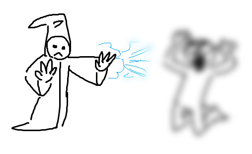
I laughed way too hard at this.
Oh shit I just realized I can post the "Gaussian Blur Wizard That Gaussian Blurs You" here
186K notes
·
View notes
Text
I 'm reblogging simply for that last line. A good rule for life really.
Okay, real advice for newcomers who to participate in the Tumblr social sphere?
Any time one of your posts begins to get even a tiny bit of traction, go through the notes and reblog the most entertaining response.
Don’t feel the need to remark on it; you can build on it if it’s the sort of thing that invites a back-and-forth exchange, but otherwise let it stand.
The key to meeting people and making friends on this site is the willingness to let other people be funnier than you on your own post.
14K notes
·
View notes
Text
I completely agree.
I suggest that we start using the term ‘creatives’ instead of ‘content creators’ for authors/artists/gifmakers/podficcers for a few reasons, and chief among them are these;
we can’t always be our most productive, but there’s a terrible trend of fandom folks feeling bad if they don’t have something new to post every few weeks
you’re still a creative person even if you aren’t creating something at a given time, for whatever reason
and something it’s taken me far too long to learn myself: making things is not the rent you pay to be part of a community
30K notes
·
View notes
Text
"Ceci N'est Pas Magritte"
7"x10" Digital
This is a conceptual portrait of one of my favorite artists René Magritte. He is a huge influence on my ideation and compositions. I have had this image rattling around in my brain for a long time now, and since I couldn't sleep last night (yay for insomnia) I finally got around to painting it!
Who are your favorite artists?
#rene magritte#surrealism#insomnia is the best#i wonder if he has to water it#illustration#conceptual portrait#inspiring artists#photoshop#a true gentleman's hat
1 note
·
View note
Text

Guess whattt?! We all have bad days. It's ok.
Go easy on yourself. Don't be a part of the negativity. Practice self-love. Give yourself grace and compassion. You are a child of the universe and you are so loved.
338 notes
·
View notes
Text


Alright, since I am completely new here I have a lot to learn about how to post haha these are the other colorways for my previously posted repeat pattern, "Bottom Dwellers"! Which is your favorite?
#surface design#Illustrator#support artists#pattern designer#designer#one day I will figure out how to post things properly online#new to tumblr#yall are the best#illumax#create boldly
1 note
·
View note
Text
Bringing this illustration back since it is apparently relevant again. I did this back in 2019 at the height of the Orange's penchant for tweeting.
#trump news#acrylic#illustration#editorialillustration#whothoughtthiswasagoodidea#elonistheworst#traditionalillustration#traditionalart#ragetweet#riptwitter#illumax
1 note
·
View note
Photo

This is a repeating pattern I designed awhile back! It's called "bottom dwellers." I really wanted all of the elements to flow into one another like ocean currents. Swipe to see the original tile and some different colors. Which is your favorite colorway? . . . . #patterns #patterndesign #surfacepatterndesign #surfacedesigner #bottomdwellers #procreatepattern #colorways #illumax #illustrationanddesign (at Salt Lake City, UT) https://www.instagram.com/p/ClmKCDtvvUR/?igshid=NGJjMDIxMWI=
#patterns#patterndesign#surfacepatterndesign#surfacedesigner#bottomdwellers#procreatepattern#colorways#illumax#illustrationanddesign
42 notes
·
View notes