ericchaseanderson
Eric Chase Anderson
Illustrator
106 posts
Don't wanna be here? Send us removal request.
Last Seen Blogs

ranger-crow
Ranger-Crow
village-witchh
who’s ready to golf, idiots??
the-bloody-sadist
TheBloodySadist - Emergency Comms Open!

megankesbai888
Megan Kesbai
septianinuraini-blog
Summer Strom
Photo
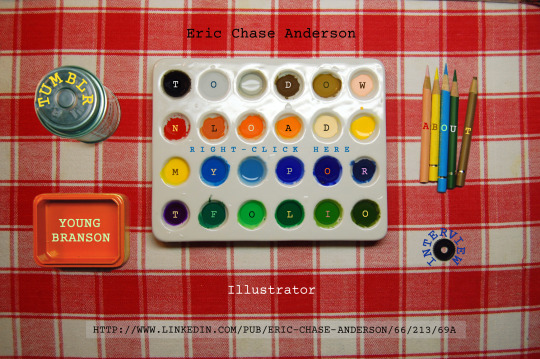
My Professional Webpage
Portfolio and Contact Information. [CLICK IMAGE!]
44 notes
·
View notes
Photo
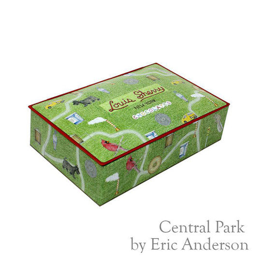

Chocolate Tin Available At Last!
This chocolate tin -- which, when I first described it, was still under wraps -- is now available. You can find it through this link from Louis Sherry Chocolates. Or you can click here:
Eric’s Chocolate Tin.
You’ll arrive on a page devoted to “Guest Designers.” There is a drop-down menu with a long list of 12-piece chocolate tins to choose from. At the bottom -- in fact, dead last -- you will find my contribution. I’m not sure why the decision to leave out my middle name was made. It’s not something I particularly care about. But it does seem to be a fact that “Eric Anderson” is the most common name in the universe. Because of that, I’ve used my middle name since the 1st grade. (I don’t know how anyone would be able to find this tin through normal search engine methods, but I’m eager to hear if it turned out well!)
Since I just discovered the tin is on sale, the one person I know who has seen it is my mother, who received one for Mother’s Day. Fingers crossed the interior art survived. That’s the second image included above: an excerpt of the magnificent restored mural -- originally painted on wooden boards, with tiny lights for the constellation stars -- on the main concourse ceiling of Grand Central Station.
(Also: the tin wasn’t supposed to represent “Central Park” but “New York City.” That’s why there are taxis, steam chimneys, manhole covers, coffee cups, water towers, and everything bagels -- what is, for me, the texture of New York.)
#Louis Sherry#Louis Sherry Chocolates#Eric Anderson Central Park#Eric Chase Anderson Louis Sherry#Grand Central Station Art#Chocolate Tins#Colored Pencil Art#New York City
101 notes
·
View notes
Photo
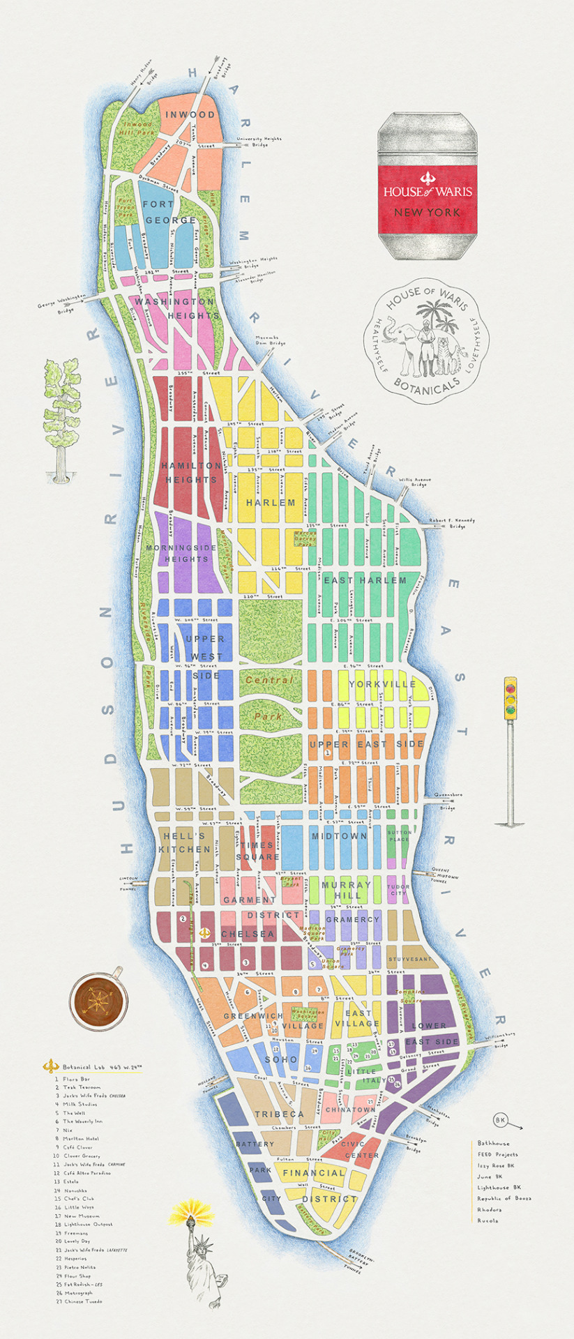
Q Days Project - Map of Manhattan
A highly detailed handmade map -- the “map for a friend” mentioned below -- of the island I called home for 13 years. My friend, who runs a tea business, will be selling prints when life returns to some semblance of normal, so at the moment I feel obliged to limit its exposure here to a single, low-resolution image. (The actual piece is over 2 feet tall.)
A mini-atlas of maps printed in 1964 inspired me to experiment with painting each neighborhood its own color. Like a collection of farms or tiny villages. The map is hand-lettered, right down to the street names, bridges, and tunnels.
(And, except for Battery Park City, it’s a reasonably accurate map.)
I will update a link to this post -- or create a new post with higher-res imagery and some close-up details -- when the prints become available. In the meantime, please enjoy this colorful view of the heart of a town which has, this year, been knocked down but remains far from out.
#Manhattan#New York#Maps#Map of New York#Handmade Maps#Pencil Art#New York Tough#I Heart NY#House of Waris#Gouache#Q Days Project#Self Quarantine#Eric Chase Anderson
20 notes
·
View notes
Photo


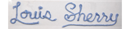

Q Days Project - NYC Celebration Tin
Today I received permission to share this. It’s the lid section of a chocolate tin to be produced by Louis Sherry chocolates, who have been famous for their distinctive tins for a hundred years.
My assignment was New York City. I wanted to avoid the most well-known sights, and instead focus on texture and how I felt about my adopted hometown.
(As an aside, I will mention that a wonderful author named Kate Simon expressed a similar motivation when writing my favorite guide to New York, Places and Pleasures, in 1959.)
The classic Sherry logo, it seemed to me, would look nice if the letters resembled yarn. A ball of blue Wool and the Gang was obtained from my go-to source, and a practical “yarnwriting” mock-up in cursive served as model.
What emerged at the end felt like the most cheerful image I’ve ever made.
(I will save the lid interior for a subsequent post.)
... As I typed those words, the street outside erupted in applause, and I realized that it was 7 o’clock. I’ll quietly add my own. Thank you, New York health workers and first responders.
EDIT: This tin is now available at the Louis Sherry site. Click the drop-down menu of “Designer 12-Piece Tins” until you get to the very last entry. Eric Anderson Central Park is its name.
#QDaysProject#Self Quarantine#New York City#NYC#I Heart NY#New York Tough#Louis Sherry#7 O'Clock Cheer#F. Scott Fitzgerald#Rosemary's Baby#Classic New York#Kate Simon#New York History#Colored Pencil Art#Gouache#Logos#Chocolate#Labels#Vintage
7 notes
·
View notes
Photo

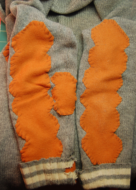

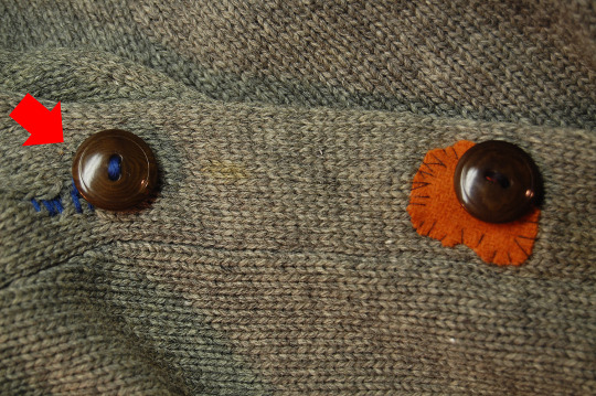
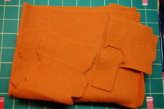

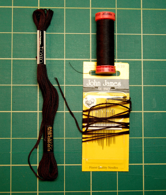
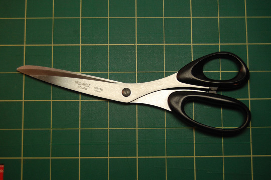
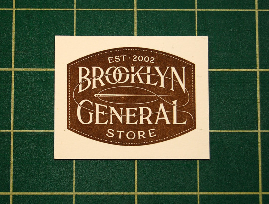

Q Days Project - Work Sweater Repair
Here is the sweater I wear when working. It’s been falling apart for years. I tried repairing it once before. But this time I took more care, using embroidery thread, which is like 5 threads intertwined, and bits of canvas for reinforcement.
Almost all the tools and materials came from Brooklyn General, whose staff was very enthusiastic and helpful.
The thinking behind the jagged-shaped felt patches was that, by disrupting the borders, we would avoid producing a bunch of lazy-looking ovals. Instead, we have patches that are bold and distinctive (in theory.)
Updated to add:
Apparently, there is a sort of movement arising from just this kind of thing. The handiwork produced by it looks much better than my own shaky efforts, though.
#QDays#QDaysProject#Needle Work#Sewing#Sweaters#Clothing Repair#DIY#Tailoring#Quarantine#Self Quarantine#Embroidery#Visible Mending#Brooklyn General#Yarn
22 notes
·
View notes
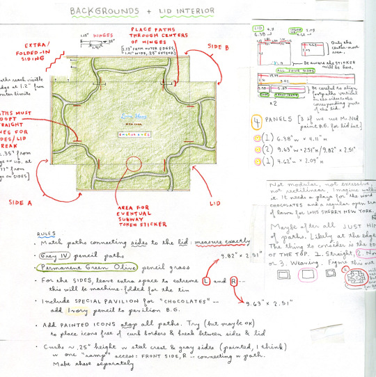
Photo
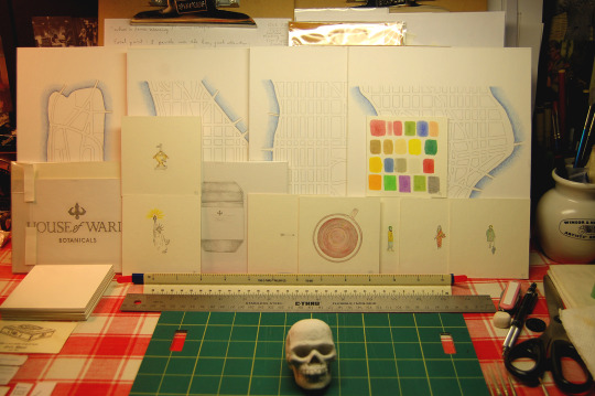
Map For a Friend
A large piece, currently underway, constructed in the strange way I’ve gotten used to: many pieces made individually which are then assembled on computer. Although not shown here, there are dozens of hand-lettered notations to be added. Hopefully the final result will pack enough oomph that I myself will be surprised.
And yes, that is certainly the island of Manhattan -- in sections!
#Maps#Handmade maps#New York City#New York maps#Gouache#Colored pencil#Faber-Castell#Winsor & Newton
10 notes
·
View notes
Photo
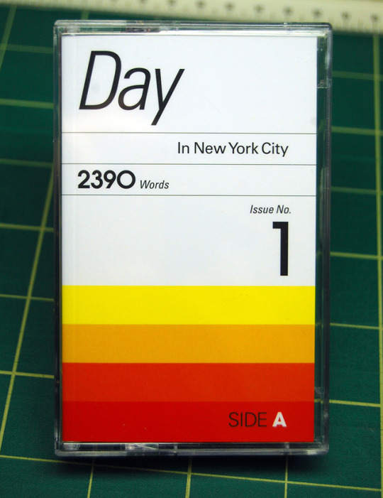


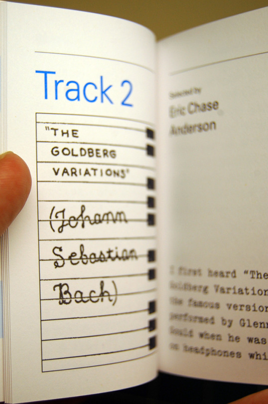
Day + Night in New York City
An idea from a designer friend of mine named Josef Reyes, whom I met when he was working for WIRED. The vanished tradition of the cassette mixtape. Only in this instance a (genuine) plastic cassette-case filled with written memories instead of musical sounds.
A history of this inspired project -- which, as the photos show, is a cassette-sized essay collection -- can be found here, at magCulture. There is a theme: New York City and music. Covering a whole day, from morning to night. (Mine was a morning memory because all the night slots were already spoken for.)
Josef’s idea sounded so cool, I was delighted to be asked to contribute. The end result is both beautiful and unexpectedly gratifying. Copies can be purchased (check Day + Night’s website for more info) only at Casa Magazines in the West Village.
#Mixtapes#Playlists#Day + Night#Josef Reyes#Design#Graphic Design#New York City#Print#Magazines#Day+Night#Cassette#Cassette Tapes
25 notes
·
View notes
Photo

Clipboards, Plural
A new method from this winter. Customarily, I fix an illustration to my clipboard with artist’s tape. I just had the one (clipboard.) But a new piece called for so many individual components, stockpiling clipboards became the obvious way to allow me to pencil all the elements in one pass; and then add color in the next.
During this, the boards were safe in mylar sleeves.
As the number of clipboards increased, my available deskspace decreased. At one point it started to seem ridiculous, so I took a picture. Several more are buried beneath what’s visible: seventeen or so clipboards, on-deck and awaiting the next burst of action.
#Illustration#Commercial illustration#Packaging design#Graphite#Drafting pencil#Gouache paint#Clipboards#Artist tape#Artists' desks#Studios
10 notes
·
View notes
Photo

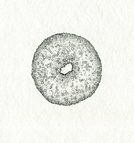
Although this fully-painted Everything Bagel seems exclusively brown, it was in fact made using 9 different colors.
#Drafting pencil#Gouache paint#Handmade#Illustration board#Illustrating#Bagels#Everything Bagel#Icon Art#Commercial art#Design
14 notes
·
View notes
Photo
Possibly the finest Everything Bagel I have ever pencilled.
25 notes
·
View notes
Photo
Props - A Series: Wildlife Suitcase Drawings
These drawings, in altered form, decorated the real-life prop luggage for The Darjeeling Limited.
In the story, the designer was known as “François Voltaire.” But in fact the various pieces were crafted by Marc Jacobs through Louis Vuitton (if my memory is correct.) Each of my stampeding animals/palm tree illustrations was converted first into solid area-color models whose tones were faithful to the original drawings. And after this, through a process that remains largely a mystery to me, templates were created, leather was dyed, pressed, and shaped by supremely gifted craftspeople who achieved an effect of practical beauty that I certainly could not.
#The Darjeeling Limited#Animal Luggage#Graphite Drawings#Gouache#The Criterion Collection#Louis Vuitton#Marc Jacobs#Movie Props#Wildlife Suitcases#François Voltaire
15 notes
·
View notes
Photo

13 notes
·
View notes
Photo

Businesspuffin
For a videoconference service known as FreeConference.com whose logo is a puffin -- part of something called Project Puffin -- a practical, no-nonsense, vaguely eccentric bird. His shoes took on a strange urgency for me: many names tested and discarded ... Waders ... Paddlers ... Goslings ... Puddlejumpers. Finally, inspired by the beautiful hand-sewn shoes from Church’s, I settled on: RUDDERS CUSTOM MADE.
A brief interview can be found here. Also, apart from his handsome, webbed foot-friendly shoes and my instinct to model his face on Eddie Munster, my bird’s sole nod to style was to match his striped socks with his striped beak.
#FreeConference#Project Puffin#Puffins#Pencil art#Bird characters#Wingtips#Colored pencil#Briefcases#Logos#Church's shoes#Faber-Castell Polychromos
21 notes
·
View notes
Photo


Props - A Series: Invented Library Book
One of the handful of stolen school library books from Moonrise Kingdom. As an illustrator, there was only a single bookcover’s art I actually made myself (the others are, in my opinion, better suited for a movie since they aren’t so cramped and detailed.) But I was asked to "design” them all: to create the physical props and make them seem genuine. To do this I used withdrawn-from-circulation library books from my own collection as dummy copies (real-life books masquerading underneath the invented bookjackets.) Then I added all kinds of tears and scuff-marks, labels, stickers, stains. Perhaps most valuable were the mylar protectors themselves. Some were 30 or 40 years old. A lifetime of grime and hard use viewed, correctly, as innately valuable.
#Movie props#Library books#Art direction#Production design#Pencil art#Colored pencils#Gouache#Moonrise Kingdom
90 notes
·
View notes
Photo
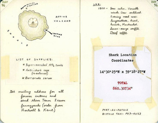
Props - A Series
Well, a potential series. This was commissioned for a single shot of The Life Aquatic, to add texture to the nautical adventure while guiding the viewer’s eyes to “Shark Location Coordinates” -- the essential information. (Strangely, I was told to multiply latitude and longitude and give the total below. Presumably, a pretext to use red type. In the weird practicality of moviemaking, it’s understood an image like this will be an impressionistic blur.) The “logbook” of Captain Zissou was an unlined pocket-journal with perforated tearaway corners, like day-planners used to have. This one didn’t have them: those are green colored-pencil dots.
#Movie Props#Pencil art#Colored pencil#Coffee stains#Production design#Art direction#Typewritten#Faber-Castell Polychromos#Gouache#Winsor and Newton#The Life Aquatic#Eric Chase Anderson
9 notes
·
View notes
Photo
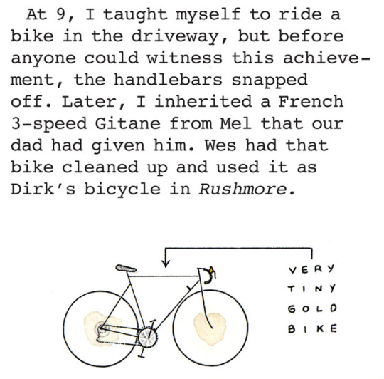
Another entry in my old memoir-with-maps for Texas Monthly. Its subject -- a small, European bicycle that used to elicit great curiosity in our neighborhood -- seemed particularly good for the piece because each of the 3 Anderson boys had his own, distinct history with it.
#Memoirs#Texas Monthly#Illustrated essay#Gitane Bicycles#Maps#India ink#Houston#Heirlooms#3-speed bicycles#Movie props#T.J. Tucker#Scott Dadich
8 notes
·
View notes
Photo
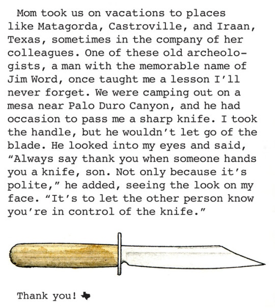
One part of an illustrated “memoir-with-maps” I made for Texas Monthly the summer my book came out. Just re-discovered it. If my memory is correct, Jim Word was a legendary self-taught Southwestern archeologist, anthropologist, conservationist, and historian. He was a leader in the Texas Archeological Society, which created an award in his name.
#Memoirs#Texas Monthly#Illustrated non-fiction#Texas Archeological Society#Jim Word#Matagorda#Iraan#Castroville#Palo Duro Canyon#Camping#Scouting#Childhood#Texas#T.J. Tucker#Scott Dadich#TAS Field School.
7 notes
·
View notes