charleedesigns-blog
Charlee Designs
Graphic Design Student - Third Year - Colchester School of Art
136 posts
Don't wanna be here? Send us removal request.
Last Seen Blogs

qimizfi
Untitled

marazhaibrainrot
marazhai brainrot hours

shady-tavern
Shady Tavern

musings-from-an-elder-goth
Musings-from-an-Elder-Goth

dan82l
Untitled
Text
Design Idea 1 - My mind never came home.
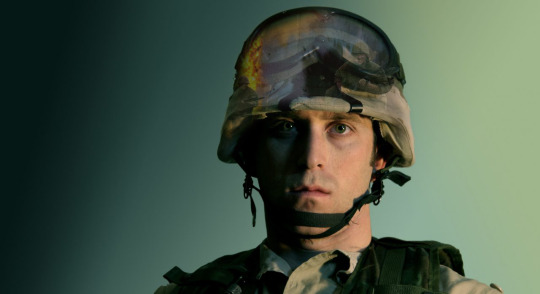
One of the design ideas I have been working on recently is thinking about the fact that just because your body is home from war, doesn’t mean your mind is. I have been playing around with how to show this in an image on the advertising campaigns, and have been thinking about having memories of war inside the soldiers helmet. I will be taking the images of the ‘soldiers’ myself, as I have models, and uniform that I am borrowing from the army, but before I took the photos I wanted to try out how my idea actually worked, using an image that I just found online. I used photoshop and layer masks to get this effect, which I think works pretty well, and has turned out relatively similar to what I had in my head when designing the idea. I will definitely be trying this again with my own images, once I have taken them which I am planning to do in the next week or so. I will be writing about this idea in more detail, once I have experimented how it works with my own images, but this is definitely something that I will be trying out.
#barrysbriefs#UniversityOfEssex#design ideas#graphic designer#design student#Combat PTSD#advertising campaign
0 notes
Text
PTSD Resolution
PTSD Resolution are a charity that helps Veterans, TA and Reservists who are struggling to reintegrate into a normal work & family life because of military trauma suffered during service in the armed forces. Throughout my research process I have spoken to many different sufferers of Combat PTSD and their loved ones, and many that I have spoken to have agreed that PTSD Resolution has been one of the best sources of help and support that they have received. Due to this, I decided to approach the charity, explaining who I am and what I’m doing, and also letting them know when my interview with BFBS would be airing, if they were interested in listening in. Shortly after my interview aired, I got a reply from the Chairman of the Charity, saying that he would definitely be interested in hearing about my campaign in more detail, so we arranged a phone call for today.
It was great being able to chat with Tony Gauvain (Chairman of PTSD Resolution) on the phone, and explain to him all my ideas and hopes for the project. He was impressed, and expressed great interest in PTSD Resolution backing and supporting the campaign in various different ways. He said that he was more than happy for PTSD Resolution to be the charity that the campaign is signposting people towards for support, and said that once the campaign is finished, they’d be very interested in sharing and running it through their website. This would be an amazing opportunity, as it would mean that my campaign is really getting out there to the people that need it most, and as PTSD Resolution is a fairly big and leading charity, it would mean that my work is reaching a much wider audience than if I was to just be sharing it myself online. Tony was extremely accommodating, and we discussed various other ways that PTSD Resolution could help and support me through the campaign, including speaking with one of the HGI Therapists based closest to me to see if there is anything we can arrange that would be beneficial for the project. He has also put me in touch with the person in charge of the website and social media pages, who I have contacted about sharing my story and research survey online, again as this will reach a much wider target audience. The more research I can get from, the more effective the campaign will be.
I am incredibly excited to have a leading charity like PTSD Resolution backing and supporting my campaign, and can’t wait to see what the future holds.
#PTSD Resolution#charity#advertising campaign#Combat PTSD#UniversityOfEssex#university centre colchester#colchester school of art#university#Degree Student#third year#graphic designer
1 note
·
View note
Text
BFBS Radio Interview

For my final project I am creating an advertising campaign to raise awareness of Combat PTSD, and to try and encourage sufferers to get help for it. The campaign will consist of posters with the target audience of soldiers and veterans, trying to make them feel like it’s okay to admit they need help. As well as the posters I will be creating a short video where I will be speaking to veterans, soldiers and their loved ones about how PTSD has effected them. The aim of this video will be to raise awareness of Combat PTSD. I will be sharing both the posters and the video through social media, and have been in touch with many different military and mental health charities keeping them up to date with the progress of the campaign, and many, including help for heros have said that they will be interested in seeing the final pieces once everything is complete. As part of the research process for the campaign I designed an anonymous survey which has been shared through social media, and also in some Combat PTSD support groups by a couple of military wives that are trying to raise awareness of their husbands PTSD. At the end of the survey, my idea for the video is explained and there is an option to leave your email address for me to get in touch if you are interested in getting involved with the video. I had a huge amount of people say they’d be up for it, but unfortunately very few of them live anywhere close enough for me to meet up with them to actually film. Due to this, I needed to find a way to find people closer to where I live that would be interested in taking part in the video. I decided to email BFBS colchester radio, to see if they would be happy to share my survey on their facebook page. To my delight they replied, not only saying they would share my survey but also saying they would be interested in having me come into the station to do an interview about the campaign. This was an amazing (and a little bit of a scary) experience. I have since been sent the sound file from the producer, and listening to it back was weird, because no-one likes the sound of their own voice!, but also made me feel incredibly proud. I’ve realised that this project has become so much more than just a university project. I’m so passionate about the subject, and the more research I’m doing, and the more people I am talking to about it, the more I care about the cause. I emailed some of the top Combat PTSD charities explaining who I am and what I’m doing, and let them know what time and station I’d be doing the interview on if they’d be interested in listening in. Since then, PTSD Resolution (one of the charities) has got back in touch with me, said they listened to my interview and have said that they’d be interested in backing the campaign, and having their logos used throughout as the charity that I am signposting people towards. I’m having a phone call with one of the directors of the charity tomorrow to discuss in more detail, so I will definitely document how this goes!
#BFBS#BFBS Colchester#Combat PTSD#PTSD Resolution#radio interview#UniversityOfEssex#graphic designer#graphic design student#advertising campaign#research process#finalmajorproject#third year
0 notes
Video
youtube
Soldier Suicides
Here is another video that I have watched during my research process for FMP. As well as looking into Combat PTSD, alongside this I have been looking into the suicide statistics of soldiers and veterans, and thinking about what can be done to decrease them. This video was very hard hitting, especially when Kamaia - the step daughter of the veteran that committed suicide, was talking about how her step dads condition and then ultimately his death has effected her life. Thinking about how Combat PTSD is effecting loved ones of the sufferers is another thing that I am really interested in looking into further, because throughout my research process so far I have realised that it’s effecting families an awful lot too. There is barely enough support out there for the sufferers themselves currently, so there definitely is not enough for the families and loved ones. Another reason that this video was interesting to document in my research is because this kind of thing is definitely the sort of thing I am planning on creating to go alongside my advertising campaign. I am planning to speak to veterans and their families about how the condition has effected them, and document it in a way much like they have here.
#barrysbriefs#combat ptsd#soldier suicides#sbs viceland#Veterans#combat stress#support network#video#UniversityOfEssex#GraphicDesignDegree#final major project#third year#graphic designer#design student
2 notes
·
View notes
Text
Simmons Printers Lecture
Today we had a lecture from Simmons Printers about everything we need to be aware of as graphic designers that relates to printing.
Building a Rapport with a Printer
The first thing that was discussed was why it is a good idea to build up a rapport with a printer. Being able to discuss a particular project with the printer is one of the positive reasons that was spoken about, it makes it a lot easier to talk things through with them and think of new ideas and how things will actually work when printed. Just because something looks good on screen, doesn’t necessarily mean it will look good any way you print it, so having a trusted printer to discuss your options with is always a good thing to have. Talking things through with a printer can push you away from or towards certain processes, as you can really find out how the professionals will think things will look printed. Simmons printers said that the most interesting projects tend to be the ones that require thought and discussion so discussing more interesting print alternatives with a printer can be something that’s really helpful to the standard of your final outcome. Print shouldn’t be something that’s just thought about at the end of a project, when all the designing has been done; it should be thought about from the start, and developed alongside the rest of the project. There is no point spending ages designing something that realistically, will never look good printed.
Even though it can sometimes save money to print online, the quality will almost never be as good as if you had talked it through with a printer. There is a certain acceptance that outcomes will never look as good if you've saved money by printing online, and you get them back thinking they aren’t exactly what you wanted, but you saved money. Should that really be what’s happening? If you’ve spent hours designing an amazing piece of print material, is it worth it not looking how you’d actually envisaged just to save a little bit of money? When you’ve built up a rapport with a printed, it will help everything to go as planned, as long as you keep them updated through the design process. You will normally be able to get free samples of materials and dummies to show clients if you’re conversing with a printer in person. This is great, as then the client knows exactly what they are getting, and there will be no surprises later on when they receive their products.
Print Specs
Print Specs were another thing that was spoken about. The main things that you need to include when writing a print spec are:
Paper Weight
Paper Type
Finish
Size
Colour (CMYK) - Full colour plus any specials (Eg Fluorescent/Foils)
Quantity
Number of Pages
Binding (Eg Perfect Bound)
Lithographic and Digital Printing
Next we talked about the differences between digital and lithographic printing, and the pro’s and con’s of each of the processes. Offset lithographic printing is the most common, high-volume, commercial print option. Using a laser, the image is burned onto a metal plate which is then loaded into the printing press. The image is then transferred onto a rubber blanket, and then onto the printing surface. Oil and water are used to make this process possible. The image that is getting printed gets ink from the rollers, while the areas that are not being printed get a thin layer of water on top; as oil and water don’t mix, these areas remain ink free. There are definite pro’s and cons of each process:
Lithographic Pros
High quality, consistent image
Suitable for a wide range of surfaces including paper, card and plastics
Unit cost decreases as the quantity increases
Able to cope with long runs with out losing quality
Special inks available – Pantone Spots and metallics
Lithographic Cons
Expensive set up on short runs
Longer turn around on jobs
No variable data option
Smaller colour gamut therefore colours can be less bright
Digital printing didn’t used to be great quality 10-15 years ago, but with technology it’s become an awful lot better, and now can be a cheaper alternative if you only want a short run. Now digital printing can be run in hours, where-as in the past it would of taken up to a week. The quality of lithographic and digital is now more or less the same. Digital printing can also be the better option if you want small details changed on each copy such as names, addresses etc, as it is easy to personalise whereas if the image is being burned onto a plate, this is clearly not as simple. With digital printing the ink sits on top of even the uncoated stock, giving the finish of a coated piece.
Digital Pros
Quick setup time leading to fast turn around of orders
Bright, vibrant images on a range of materials
Cheaper option for low volume printing
Personalisation using a database where text and graphics can be changed on each item without stopping or slowing down the press
Digital Cons
Expensive on longer runs
Less colour control
Not suitable for all printed surfaces
Quality can be inconsistent
Can be difficult to match pantone colours
Paper Types and Finishes
There are two types of paper that are used regularly, coated and uncoated. The most common types of coated are gloss and silk. When printing on coated stock, the ink sits on top meaning that it doesn’t run into the paper, sometimes producing a better quality image. When printing on uncoated stock, the ink sinks in and becomes a little darker as it spreads out into the paper. Although uncoated stock may feel nice to touch, it doesn’t always produce the best looking images when printed on, so this is something to consider. People often think a gloss finish will be more expensive than an uncoated stock, because of it’s ‘glossy’ finish, but it is often actually the cheaper option. Putting lamination or foils onto a product can be expensive, but can really add that look of ‘quality’ to a product. Soft touch is a common lamination and it does exactly what it says, gives the finish a soft touch. This can be particularly nice for business cards as again, it gives the feel of quality which is important when you’re essentially trying to sell your services. HD lamination is another common one, this is popular for brochures as it gives a finish that is harder to mark, especially on colours like black where scratches and finger prints are extremely visible. Foiling and embossing are other processes that can be done. The amount they cost goes on size, for example for an A5 sized area, the dye is around £70 to produce.
Simmons gave us a couple of other tips such as allowing yourself more time than you actually need for printing. Set earlier deadlines than you need, so if things go wrong it’s still okay. It can also be a good idea to set an even earlier deadline with the client, so if they run over slightly you’re still on track. It is important and reassuring to see proofs. When you’ve sent your file off to print, a proof will be produced (normally digital but can be requested to be printed) and you will need to check this through and sign it off for print. You can then sleep easy, knowing that there will be no nasty surprises when you get the material back. When the printer receives a file, it will be put through a RIP to be basically converted to a PDF. This is why it can be a lot quicker to supply the printers with print ready PDF files, as they go into the RIP and straight out again, where as source files will take a lot longer. When getting quotes for printing, it’s a good idea to get quotes from more than one company. Different companies have different equipment meaning that some will be able to do it cheaper than others. If you haven’t landed the job with a particular client yet, getting the best price for printing may mean they choose you over another designer as they are saving money. If you have built a rapport with a printer then there may be some wiggle room in there to bring the price down if you find out they are quoting more than elsewhere, as you are a loyal customer. Always mark up print estimates by 10-15% before giving them to client to account for print production (you), as you’ve probably spent a lot of time trying on this process and you deserve to be paid for your time.
Overall this lecture was probably one of the most useful ones I’ve ever had. Its taught me invaluable skills that will be necessary during the duration of my career.
Thank you Simmons!
#barrysbriefs#Simmonsprinters#graphic design#print design#printers#print company#design student#graphic designer#university centre colchester#colchester school of art#third year#final year#CMYK#lithographic print#digital print#print spec#proofs#uncoated stock#coated stock#lamination#foiling
0 notes
Text
Richard Smith Lecture
We have recently had a lecture from designer and business owner, Richard Smith. He is the co-owner of the design company ‘Jannuzi Smith’ a cross-media design consultancy based in London and Lugano. The theme of the lecture was ‘lures and hooks’ thinking about the idea of attracting peoples attention and them captivating them with your designs. Even though their eye has been caught initially based on the look of your design, it needs to have enough behind it to draw them in, and make them want to invest more time/money in whatever you are doing. His company do lot’s of moving images on screen, as well as posters, books etc. He spoke about the importance of setting out a theme in a brand, and then playing on it, making it fun. This is the important bit, as the thing that will excite people about your designs is often the playful-ness.
Jannuzi Smith are a cross media design agency. Most design companies in the industry specialise, whereas they do everything. Richard feels this is important because if different places do different things for a company it doesn’t always fit together properly, because although most designers can work to a certain style, it’s still not the same as the same designer doing it all, clearly that is going to work together the best.
Film Del Festival Locarno
Richard then went onto talk about a couple of different projects that Jannuzi Smith have been working on past and present. One of the big ones he spoke about was the work they have been doing for ‘Festival del film Locarno’, a film festival based in Switzerland. Even though Cannes is the big film festival, Locarno isn’t far behind. People who are more about art than films in general tend to go to Locarno, as it is more just about watching great movies. Another difference between the two festivals is that with Locarno, general people can get tickets to attend rather than the tickets only being available to people in the industry, like with Cannes. The festival takes over the whole city for it’s two week duration, and there is advertising for it everywhere. The city is a largely pedestrianised area, so most of the posters have been designed to be looked at by people walking past, rather than driving. The branding for the festival was created around the theme of a golden leopard, as the leopard is a symbolic animal in Locarno. They were given a pretty good budget for the branding, so were able to hire Tim Flack, arguably the best animal photographer in the world, to work with them on the project. The logo (shown below) really draws your focus to the colours of yellow and black, which have then been the theme for the rest of the festival (e.g. on the chairs, advertising, tickets etc.) The simple typography is easy to read from any distance, and stands out well against the black background. The photographs of the leopard were taken at a private zoo in Kent that rents out animals for films etc. The team went down and set up a studio there, where the images of the leopard were taken. In Richards presentation he showed a few images that had been taken of the leopard and Tim Flack at work, and it was amazing to see! It must have been a strange experience having a leopard in front of you, trying to get it to do the things you need it to do. In one of the images, the leopard was walking on a beam, but apparently he kept jumping off!

Festival del Film Locarno Logo

Main Entrance of Festival del Film Locarno

The Piazza
There are twenty different presentation spaces at the festival, throughout the small city. The main one being the piazza. The Piazza has the biggest screen in Europe, with 8 thousand people being able to view the film showing at the same time. The screen is comparable to the size of an iMax Screen. Being completely outside, the festival hopes for good weather, but people still turn up and have a good time no matter what. When a film is over, people applaud, much like at the theatre. This gives the festival a completely different vibe to the usual cinema experience.
One of the things that Jannuzi Smith were asked to design, was a signifier to show that a film was about to start. It needed to be open enough that it didn’t suggest the genre of the film as they only had enough money in the budget to create one, so it had to work for every style of film. Richard played the final version they’d done, and it was amazing. It was video footage taken when the photographs were taken of the leopard walking across the screen, with the sound being nothing but a huge roar. With this sound playing out throughout the festival, it would make it unmissable that a film is about to begin. The first time that the signifier was played, people applauded it.
The leopard theme was kept across all the advertising for the festival, with a series of posters being designed with leopard photography. Different posters were created for different genres of film, with different emotions being conveyed on the leopards face such as anger and peacefulness. The posters were placed all over the town with five or six different ones going around the city in different locations. After using the same posters for a couple of years, they felt that the theme needed freshening up a bit. They decided to go with ‘Beauty and the Beast’ as the classic was made the same year that Locarno was established and was shown at the opening festival. Still sticking with the theme of yellow and black and the leopard, new posters were created using lines. Although from straight on this series looks slightly unusual, they are actually a really clever design. People are always walking around the town, so will be seeing the posters from all different angles. Keeping this in mind, the series was designed so that from different angles, the images look different.

Beauty and the Beast themed poster
The most recent advertising series is ‘The Leopard in You’. People around the town had their photo taken for the opportunity to be featured on the next poster. The use of a special light when taking the images means that freckles and imperfections on peoples faces are shown up, making them have markings similar to a leopard. (example image below). Jannuzi Smith also designed an app that allowed people to take selfies of their own faces with the leopard effect.

The Leopard in You Poster series
When stars arrive at the event, the red carpet were the photographs get taken is placed in front of some form of advertising for the festival, usually the logo, which means that they are getting a huge amount of essentially free advertising from when the photographs of the stars are featured in the press, as the logo is being shown behind them.

Red Carpet with Advertising in Background
Prix Du Public UBS
Big bank, UBS, sponsor the public prize. All the people in the piazza get the chance to vote for their favourite film, this gives the public their chance to vote for a film they think deserves to win. Being the biggest sponsorship in the world, it’s important that people see that UBS are sponsoring them. Jannuzi Smith wanted to design a logo that is a cross between the bank and the festival to advertising the Prix Du Public. Before Jannuzi Smith started doing the festivals design work, public already had a chance to vote but nobody cared about it, because it wasn’t seen as being a big thing, and was a boring process that people couldn’t be bothered to do. UBS said that they were going to start taking away money from the sponsorship if they didn’t redesign how the voting worked, and encourage people to start voting more. One way that Jannuzi Smith did this was by creating a series of short videos that were played on screen at the festival, of past winners of the award thanking the pubic for voting for them. Each video was taken in a random setting (woods, field etc.) and each person was sat on either a yellow or black chair whist they were talking. At the end of the video the stars explain how you vote, and encourage people to do so. The soundtrack at the end of the video is the sound of people clapping. A card is put on each seat in the piazza, which you can vote from, but you also have the option to vote on your phone, but you will only be able to do so if you are inside the piazza; this stop outsiders from being able to vote when they haven’t seen the film. Voting from your phone is good as it allows the festival to gain data from people such as email addresses (if people decide to give them). On mobile voting, people are not able to vote before the film is over. If they decide to go onto the site before this, there is a quiz on there you can do while you’re waiting/ Jannuzi Smith designed poster series ‘You are The Jury’ to go around the town, making everyone aware that the public vote is now becoming a big, exciting thing. When voting, you decide how many stars to give the film, so all the advertising and promotional material has the theme of stars.
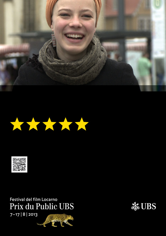
You Are The Jury - Prix Du Public UBS Poster
Proctor and Matthews Architects
Another company that Jannuzi Smith have recently been working for is Proctor and Matthews Architects. They are currently upper B level, and have realistic expectations of how to bring themselves up to that top A bracket, with the help of Jannuzi Smith. The Architects are currently winning lots of awards and contracts, but not any of the big ones. Richard and his team are trying to help the company get through the doors, with the use of design to boost their company. Richard noticed that in presentation, Proctor and Matthews talk a lot about journeys through architecture, but realised that they weren’t communicating this in any way through their design. Along with a rebrand, Jannuzi Smith put moving images onto their website to help to show ‘journeys through architecture’. One of the things that Richard feels is important in branding, is to keep it simple. Expression can be shown in the pieces created rather than in the branding itself. Its much better to have a really simple logo that is easily recognisable, on an exciting and expressive poster or advertising campaign. All moving images on the website were created without any audio, as the target audience is people in offices, who probably won’t want sound going off when they go onto the website. Audio actually cost a lot of money, so this was also a great way to save. The type that is featured in the videos and moving images on the site is actually completely separate and just placed on top, which means that it can be edited without having to edit the whole thing. If you like one of the moving images you can click on it to bring up more content about whatever it is. The pages have been designed to work on mobile format as well as on a laptop or computer, this is called responsive design. Jannuzi Smith have also created leaflets and business cards for the company, all replicating the style of the website so everything links together. Calvert font was used, and they designed an ampersand to use of the front which represents the corporate identity of the brand. Instead of creating booklets for brochures, broadsheets were designed, each one specialising in a different area. Richard spoke about how giving a business card is now much more of a formal ritual now, rather than just handing across a card with information on it. The business cards were produced in different colours for the different people that worked at the company. This didn’t end up costing much more because instead of using different ink to create the colours, they decided to print onto coloured card, using white foil text.
This lecture from Richard Smith was interesting, helpful and inspiring and i look forward to him coming in again in a couple of weeks to talk to us some more. His final words of wisdom were: get peoples attention, keep it consistent, and use playful games to hold attention.
#barrysbriefs#richard smith#jannuzi smith#university of essex#degree student#graphic design degree#graphic designer#design#festival del film locarno#proctor and matthews#architects
0 notes
Text
Art for Heroes: A Culture Show Special
Recently I have watched a documentary on how Art therapy can help with the recovery of ex-servicemen suffering with post traumatic stress disorder. Shadowing the work of the charity ‘Combat Stress’ BBC two have given us an insight into the lives of veterans of recent British conflicts in the Falklands, the Persian Gulf and Northern Ireland and how they are overcoming their struggles with PTSD using art as therapy.
Art therapy is something that interests me an awful lot, and I am considering doing a masters in this in the future, so straight away this programme caught my eye. My partner is from a military family, meaning that topics such as combat PTSD are something that I feel strongly about trying to raise awareness for, which was another reason that I decided to definitely go ahead and watch this documentary. I am so glad I did as it was incredibly eye opening and amazing listening to how much art has helped veterans begin to overcome, or at least support them with the ongoing struggles they are facing on a daily basis as a result of conflict.
The documentary talked about Adrian Hill, who is now referred to as ‘the god of art therapy’. Hill served in WW1 with the honourable artillery company, and was the first artist commissioned by the imperial war museum to document the conflict on the western front. After contracting TB in 1938 he drew whilst in hospital to lift his spirits. He realised how much art was helping him to express his emotions, and he was managing to leave them on the page, rather than keep them compressed inside himself. He decided to reach out to other patients to help them through art as well, and realised that he may be able to help soldiers that had trauma related to war through his art. Working alongside occupational therapy, he begun to practice art therapy with soldiers, and then later also civilians.
One of the veterans that the documentary focussed on was Steve Pratt, who joined the army at aged 14. After he left the SAS, he moved to Finland seeking solitude where he re-branded himself as an artist with his works drawing heavily from his military background. Something that Pratt spoke about was one of his colleagues being abducted, tortured and killed and never found. Pratt had to go out and collect information on this. Since this, he has suffered with PTSD. On his final medical before leaving the army, he was told ‘I’ll give you a year before you kill yourself’ which rang in his head for the next 19 years. After leaving the army he suffered with severe depression and was on medication. He later started a fine arts degree and began to feel those feelings start to disappear. His art has allowed him to be able to cope and begin to move on, and was the only was that he was able to find closure. He feels that art has enabled unconscious activity to come out onto the canvas which has allowed him to be able to look back and see how it ‘was’ instead of how it is ‘now’. He is now doing an art therapy masters.
Dr Lucas Kenopker, director of clinical neuroscience at one of Americas largest veteran hospitals, helps Vietnam veterans deal with PTSD. He is one of the few neurologists in the world that has done scientific research into the effects of art therapy and it’s impact on the brain. He believes that art therapy is essential for dealing with PTSD because it taps into the networks of the brain, and the brain function change through art therapy could be long lasting. Being able to alter brain function means that new pathways can be established. This allows the patient to begin to live a different life. Prolonged use of art therapy can lead to the brain being rewired.
Combat Stress has seen it’s case load go up 70% in the last 5 years. The charity helps 4.5 thousand veterans a year, but there’s still a massive waiting list. The Army says that more people have mental scars than any other injury and they have to be sympathetic and help them with it because they owe them that. Cuts are happening which means thousands of people are leaving the forces and they won’t get proper help with mental heath issues, an important issue when being discharged from the forces. The Army treats visible injuries of war, but not so much the invisible. It would be nice to have a service for veterans to help them with conditions such as PTSD, that doesn’t rely on charity.
The US has a very different approach to Veterans that the UK does. They have dedicated hospitals for treating ex-service people, and they are really seen as being ‘heroes’. In the national veterans art museum of Chicago, every piece has been done by someone who has experienced war. Although it was established by veterans from Vietnam, it has more recent pieces from American conflicts also. In the documentary, the veterans worked together to produce pieces of work to display in an exhibition, much like the Veterans art museum in Chicago. They tried to get as many former soldiers to do pieces as possible, whether they were artists or just enjoyed expressing their emotions on the page, but unfortunately they couldn’t gather very many together. They did display the pieces in the exhibition, but filled it out with some art work from American veterans. This just shows how open US veterans are about their experiences and emotions compared to veterans in the UK. Soldiers shouldn’t be ashamed to show their emotions, and admit that some of the things that have witnessed have effected the person they have become now. This really made me think about the effect this must be having on Veterans, trying to keep their emotions concealed and feeling too embarrassed to reach out for help, so this is something that I am considering looking into in my FMP.
Watching the documentary has made me feel so strongly about this issue, and also made me realise just how much of an issue it truly is. I have decided that for my final major project I am going to focus on raising awareness of Combat PTSD, and also trying to find a way to reduce the stigma associated with the condition.
#barrysbriefs#art for heroes#combat stress#charity#armed forces#art therapy#ptsd#ptsd recovery#combat ptsd#veterans#National Veterans Art Museum of Chicago#UniversityOfEssex#colchester school of art#graphic designer#design student
0 notes
Video
youtube
Movember Foundation: Suicide Notes talk too late.
#barrysbriefs#fmp#Final Major Project#mens mental health#suicide prevention#movember#movember foundation
1 note
·
View note
Text
Movember Foundation
MAN/ART/ACTION Tribute PoleThe Movember Foundation are the only charity that are tackling mens health issues specifically, all year round. They focus on issues such as mens mental health and suicide prevention, prostate and testicular cancer. In 13 years they have funded more than 1,200 mens health projects around the world. Because they are independent of government funding, they can invest quicker in what is working, which they are continuously researching what works best for men. By 2030, their aim is to reduce the amount of men dying prematurely by 25%.
I first heard of ‘Movember’ a couple of years ago when I realised that people were growing moustaches throughout November and being sponsered to raise money for charity. I didn’t know that ‘Movember’ was actually it’s own charity, I thought that people were raising money for different charities, supporting mens mental health. When I looked into it further, I’ve found out that the Movemeber Foundation are their own charity, focussing not just on mens mental health and suicide prevention, but on other key health issues that men are facing around the world.
I have been focussing on looking into the mens mental health and suicide prevention side of the charity. 3 out of 4 suicides are men, but by 2030 Movember are aiming to reduce that by 25%. Here is how they believe they are going to do this:
1. Education: Helping men and boys to stay mentally healthy, build strong social connections and take action early when times are tough.
2. Conversations that matter: Working toward a world where men and boys are comfortable having conversations about the big things in life.
3. Services that work for men: We know the needs of men, and we’re working to make sure that services are designed with those needs in mind.
4. Bright Minds, brought together: We’re funding the most innovative projects, and when we know something works, we share that knowledge globally.
5. Community first: Men need to be able to access support in their communities and where they’re comfortable. There’s no one-size-fits-all solution.
6. Advocating for all men: We’re forcing governments to understand the issues that men are facing, and we’re demanding action.
“We’re alarmed by the increasing number of men who take their own lives around the world. We are working to ensure all men and boys look after their mental health and are comfortable to reach out to others for support when they’re struggling.” - Paul Villanti, Executive Director, Programs.
Movember have funded a large number of mental health and suicide prevention projects such as:
New Access: a radical new trial in Australia designed to encourage men to take action early when it comes to their mental health by accessing NewAccess coaches who are available in their local communities.
Like Father like Son: As part of our Australian mental health initiative we have invested AUD 2.6 million towards Like Father Like Son: Fathers Against Violence and Aggression, a three-year project aiming to improve rates of father participation in parenting.
Farmstrong: Farmers put others first, at the risk of their own mental health. We’re tackling this head-on by providing them with information on their wellbeing and quality of life in a collaboration between the Mental Health Foundation of New Zealand and leading rural insurer FMG.
MAN/ART/ACTION Tribute Pole: This initiative supports Canadian military veterans and their battles with post-traumatic stress disorder. Veterans worked together to hand carve a tribute pole in memory of the 158 Canadians who lost their lives in the war in Afghanistan. This project is part of the Veterans Transition Network.
I am definitely interested in looking into the Movember Foundation further, as I had no idea how many projects they have funded over the world, working to help men of all ages.
#barrysbriefs#movember#movember foundation#mens mental health#mens health#prostate cancer#testicular cancer#suicide prevention#charity work#projects
0 notes
Text
Mens Mental Health - Reducing the stigma
For my FMP I have decided to look into finding a way to reduce the stigma surrounding mens mental health. For my dissertation I have been looking into how advertising and the media is effecting how men feel about their bodies, focussing on eating disorders and other mental health issues related to the topic. Throughout my research process, one of the main things I have learnt is that men do not like talking about their feelings. They don’t feel it’s okay to admit they’re not okay, and think of mental health issues as being seen as a feminine issue, which it definitely shouldn’t be. As i’ve written about in my dissertation, mental health is a human issue, and anyone can be affected. It’s one thing knowing this though, and another trying to somehow change the way that men are looking at mental health problems. This is a very current issue, and there are a couple of other campaigns that have been launched recently from people such as ‘mind’ and ‘buzzfeed’ which I will be looking into further during my research process. I want to possibly think of a way to focus on a specific target group rather than just mens mental health in general, because as I have realised there is already other places doing this. I want my campaign/material to be original and not just a copy of what other people are already doing. I definitely want to focus on mental health in some way though and reducing the stigma attached to it so that people don’t feel so ashamed, and that they have to suffer in silence. Invisible illnesses are something that I also feel strongly about raising awareness of, as this is something that is close to my heart due to myself and members of my family suffering with conditions such as epilepsy, IBS, mental health issues, PTSD and cancer. This could be something that I decide to look into further, and maybe even the direction I decide to take my FMP.
#barrysbriefs#yearthree#graphicdesigner#designstudent#colchester school of art#invisible illnesses#mental health issues#mens mental health#ptsd#awareness#cancer#epilepsyawareness#buzzfeed#mind#mindfullness#ESSEXUNI
0 notes
Text
What is Art Therapy?
Art therapy is a form of expressive therapy that uses the creative process of making art to improve a person’s physical, mental, and emotional well-being.
The creative process involved in expressing one’s self artistically can help people to resolve issues as well as develop and manage their behaviors and feelings, reduce stress, and improve self-esteem and awareness.
You don’t need to be talented or an artist to receive the benefits, and there are professionals that can work with you to dive into the underlying messages communicated through your art, which will aid in the healing process.
Art therapy can achieve different things for different people. It can be used for counseling by therapists, healing, treatment, rehabilitation, psychotherapy, and in the broad sense of the term, it can be used to massage one’s inner-self in a way that may provide the individual with a deeper understanding of him or herself.
0 notes
Text
Final Major Project
I can’t believe that it’s already time to start working on my last project at university. It definitely doesn’t feel like the degree is almost coming to an end, and definitely doesn’t feel like i’ve almost been on it for 3 years! When I look back though, thinking about my final pieces and just overall projects from first year, it makes me realise how far i’ve come. I’ve learnt so much stuff, from technical skills and various rules of design to research and development skills, how to write a dissertation and so much more. Even though there’s not much longer left of the course, these last 5 months or so are by far the most important. I need to make sure I stay focussed and really make the most of the time I’ve got left, to not only make my FMP as brilliant as I can, but to also make sure I cram in as much learning of new things as I can, taking advantage of still being surrounded by a group of like minded people who are always willing to critique and advise me on how to improve my work, and also of having tutors there who can give me the guidance and assistance that I need.
I’m currently not sure what exactly I want to do for FMP, but at this stage I don’t think that’s too important. I just need to start thinking about the things that interest me the most, and the skills that I want to refine and develop the most, to make sure that my final piece is as relevant as possible to the type of work I hope to go into in the future. After focussing on illustration in the last 2 briefs, I’ve re-discovered my love for it, and am hoping to be able to take this final project in a direction that means I can incorporate illustration within. I know that I need to do something that I am passionate about, because if not I will not want to put the same amount of work and time into it. After this degree, I am considering going on to do a masters in art therapy, so if possible I would love to include this field in some way, although at this stage i’m not sure how. I want to make sure that my final project stands out, and is about a current issue because this is what will interest people.
I am looking forward to starting my research and initial ideas for this project so that I can get a better idea of the direction that I want to take it in.
#final major project#Essex University#colchester school of art#third years#degree students#art student#art and design#graphic design#graphic communication
0 notes
Text
QR Codes
What are they?
I am considering using a QR code on the back of each of my BEAR cards, to enable children to be linked to a ‘mini game’ on the app. I will also include a password if I do decide to use a QR code, just incase people don’t know how to use the codes, or for some reason they can’t. I think it will be a good idea to have something that people can scan if they want, as it’s quick and easy, as well as being interesting and high tech. I also think that scanning the code is something that children would probably love to do, so that is an added bonus. Although I have used QR codes before, I am just having a further look into them before I use them for my project just to make sure that they will be suitable. I’m not sure if they have to be quite a big size, if this is the case then I may not use one, because I don’t want to take up too much space on the back of the cards. I have been researching online what QR codes are and how they work, this is what I have found:
What is a QR Code?
QR or Quick Response Codes are a type of two-dimensional barcode that can be read using smartphones and dedicated QR reading devices, that link directly to text, emails, websites, phone numbers and more!
How is a QR code different from a normal barcode?
Ordinarily we think of a barcode as a collection of vertical lines; 2D Barcodes or QR Codes are different in that the data is stored in both directions and can be scanned vertically OR horizontally.
Whilst a standard 1D Barcode (UPC/EAN) stores up to 30 numbers, a QR Barcode can store up to a massive 7,089! It is this massive amount of data that enables links to such things as videos, Facebook or Twitter pages or a plethora of other website pages.
How do you scan a QR code?
If you have a smartphone like an iPhone, Android or Blackberry then there a number of different barcode scanner applications such as Red Laser, Barcode Scanner and QR Scanner that can read and decode data from a QR code. The majority of these are completely FREE, and all you have to do once you install one is to use your phone's camera to scan the barcode, which will then automatically load the encoded data for you.
What size does a QR code have to be?
Generally speaking, the larger the QR Code, the easier it is for it to be scanned, however most QR reading devices are able to scan images that are small enough to fit on a business card for example. This of course assumes that the quality of image is good. Recommendation: A QR Code that encodes up to 72 characters (which is the length of a typical URL) should be printed in a size of 20×20 mm (0.79x0.79″) when scanned from a distance of 20cm (7.9″)
Consider the scanning distance:
Rule of the thumb: the ratio between scanning distance and the QR Code size is 10:1. So if you want to scan a QR Code from 10 meters (390″), the size of the QR Code should be 1 square meter (39″). Or if you print a QR Code on a post card, the user will scan the QR Code from a distance close to 15cm (5.9″). Applying the rule the QR Code may have a minimum size of 15mm (0.59″).
Quiet Zone around the QR Code:
If you print a QR Code always leave a quite zone (margin) around the QR Code. We recommend to have 4 units of white space arround your QR Code to ensure it can be read by any QR Code reader.
The QR code will have to be 2cmx2cm ideally, with a white space around the outside, I will have to have a look at my designs and see if I can make this work with the look, if not, I may just have a password they can type in.
0 notes
Text
Body Parts for BEAR Cards
Even though I am only designing 3 of the cards, I thought it would be a good idea to work out what body parts the other cards in the set would be for. This has been a good idea as it has allowed me to make sure that there are enough body parts that children would be interested enough in learning about.
Taste Buds
Lips
Nostrils
Finger
Thumb
Nail
Knuckle
Joints
Calf
Heel
Foot
Toe
Heart
Lungs
Veins
Blood
Liver
Kidneys
Throat
Brain
Stomach
Bones/Skeleton
Ribs
Skin
Hair
Teeth
Muscles
Salivary Glands
Glands
Oesophagus
Small Intestine
Large Intestine
Gallbladder
Pancreas
Larynx
Trachea
Bronchi
Lungs
Diaphragm
Bladder
Urethra
Pituitary Gland
Thyroid Gland
Adrenal Gland
Arteries
Capillaries
Lymph Node
Bone Marrow
Spleen
Tonsils
Spinal Cord
Nerves
Iris
Retina
Eardrum
Mammary Glands
Eyes
Nose
Mouth
Tongue
#barrysbriefs#humanbody#bearcards#yoyosnacks#yoyobear#childrens design#collectibles#collection#UniversityOfEssex#graphic design
0 notes
Text
What makes a good dissertation?
For the past couple of months I have been thinking about and doing some research into what makes a good/strong dissertation. I feel that it is definitely important to be clear on the kinds of things that are expected from a strong dissertation, so that I can keep these in mind while I am planning and writing it. I have looked at a variety of sources to gather this information together.
A good dissertation will:
have a clear objective, based on a well worked out thesis or central question.
be well planned and widely researched.
show that the student has a good grasp of relevant concepts and is able to apply these in their own work.
include analysis, critical evaluation and discussion, rather than simple description.
contain consistent and correct referencing.
be structured and expressed in an appropriate academic way.
show your tutors that you have learnt something on the course and have been able to use this to produce a well argued extended piece of academic work.
A mediocre dissertation will:
have a very general or unclear title.
be poorly planned, with a narrow field of research.
rely heavily on source material, with little or no attempt to apply this to the student’s aims.
be mostly descriptive.
contain little or no referencing, perhaps in an incorrect format.
be poorly structured, with possible plagiarism of source material.
not convince your tutors that you have learnt much.
0 notes
Text
Interesting Facts - Human Body
I have decided to make a collection of all the facts I am finding during my research process that I feel that kids of the target audience will find interesting. I then plan to go through and pick out the ones that I feel are the best, as well as keeping in mind the ones that I will best be able to illustrate in a creative and eye catching way.
Your feet have half a million sweat glands that produce over a pint of fluid everyday.
You are about 1 cm shorter at night because the cartilage between your bones is compressed throughout the day.
If you laid all of your blood vessels end to end they would stretch 60,000 miles, or around the world nearly two and a half times.
During your lifetime, you will produce enough saliva to fill two swimming pools.
After eating too much, your hearing is less sharp.
Babies can only see black and white when they are born.
You knew that 75% of your body is water, but did you know that 80% of your brain is water?
A full bladder is roughly the size of a softball.
Your teeth start growing 6 months before you are born.
Most babies are born with blue eyes. Exposure to ultraviolet light (the sun) and melanin are what eventually bring out their true colour.
Everyone has a unique smell, unique fingerprint and unique tongue print.
Your eyes remain the same size after birth but your nose and ears never stop growing.
Your skeleton keeps renewing itself every ten years which means that every ten years you get a new skeleton.
Sweat doesn’t smell bad. A stinky “body odour” is caused when the skin bacteria feed on sweat. Their waste products are what smell bad!
Just one drop of blood contains about 10,000 while blood cells and 250,000 platelets.
You’re used to seeing bugs in your garden, but how about on your plate? Nutritious, edible insects including grasshoppers, beetles, wasps, worms, cicadas, and caterpillars are paced with vitamins and minerals and are eaten by people around the globe! Visiting China or Thailand? Stop for a deep-fried cicada on a stick!
The Brain is a very wrinkly organ! If you spread it out, your brain would be about the size of a pillowcase. By the time you are six years old, your brain is already 90 percent of the size it will be when you are an adult.
Like dead skin cells, your hair and nails are made of keratin. Keratin forms tough body parts in other animals, too. It’s found in wool, fur, feathers, claws, beaks, hooves, horns, porcupine quills, and turtle shells.
About 10,000 human cells can fit on the head of a pin.
Your salivary glands produce two to six cups of (0.5-1.5 litres) of saliva a day.
On a rollercoaster, the funny feeling you get is your insides actually moving! When a coaster comes over its crest, slows for a second for added torture, and then plummets downward, the seat belt keeps your rear in place, but some loosely connected internal organs—like your stomach and intestines—get a little “air time.” You’re not damaging your innards by riding even the craziest of coasters (everything returns to its proper place), but your nerves detect the movement, which registers as though your stomach has jumped into your throat.
How come you can wake up in the night to wee but not poo? Your bladder can only stretch to a certain size before it has to go, where-as the muscles in your colon that push out waste are in rhythm with when you’re sleeping.
Why do we have fingerprints? having fingerprints helps to make our skin more stretchy, preventing cuts and blisters. Scientists have also said they can improve our sense of touch.
What makes my tummy rumble? It can be the sound of your digestive juices churning and stomach muscles contracting as they get prepped for food.
Why does armpit sweat smell worse than anywhere else? Your body has two kinds of sweat glands. Most of those on your arms and legs secrete a mix of water and salt. But the glands in your armpits (as well as your groin) release an oily substance, which bacteria love. It’s actually the bacteria eating the oil that releases the telltale stench.
Your pet isn't the only one in the house with a shedding problem. Humans shed about 600,000 particles of skin every hour. That works out to about 1.5 pounds each year, so the average person will lose around 105 pounds of skin by age 70.
Your nose is not as sensitive as a dog's, but it can remember 50,000 different scents.
An adult human being is made up of around 7,000,000,000,000,000,000,000,000,000 atoms.
Your body has enough iron in it to make a metal nail 3 inches long.
We all have tiny mites living in our eyelashes.
Similar to fingerprints, everyone also has a Unique Tongue Print.
When awake, the human brain produces enough electricity to power a small light bulb.
The human eye can distinguish about 10 million different colours.
The human body produces about a litre (0.26 gal) of mucus per day.
There're more bacteria in your mouth than there are people in the world.
Every day, your heart creates enough energy to drive a truck for 20 miles (32 km).
Most of the dust underneath your bed is actually your own dead skin.
In a lifetime, your brain's long-term memory can hold as many as 1 quadrillion (1 million billion) separate bits of information.
Your brain keeps developing until your late 40s.
When you take one step, you are using up to 200 muscles.
If your stomach acid got onto your skin it would burn a hole in it.
4 notes
·
View notes
Text
BEAR - yoyo cards story planning.
I’ve been thinking about ways to include a story behind the yoyo cards, and the idea I have settled on at the moment is BEAR using a specially invented pod to go into the body of one of his best human friends, to have a look around and explore. I was originally thinking about having one fact per card, but it may be better to have each card about a different part of the body e.g: brain, intestines, lungs, heart, and have a couple of really cool facts about each place on the cards. So that I have enough for the series, I may have to have more than one card for each of the area’s, so have a set of 5 or more cards for the brain etc, and just have them numbered so that children can collect the whole pack. I am thinking about linking this to an app (or an idea for an app) where children can visit and do quizzes on the human body, and play a couple of games, maybe including one where they can direct bear around the body in his pod themselves. I don’t know if this is something that I would actually be able to produce, but I could do all the planning for it all. I could maybe have bear going inside the bodies of people from different age groups, ranging from very young children to older people, as it may be interesting to relate facts to not only themselves, but to family like their parents and grandparents as well.
0 notes