
Last Seen Blogs

starsintheirmultitude
Start the Fire

akngela878-blog
Automatic gates

aboveweirdest
It's Nexa, Bitch

piensaenalgobueno
#ThinkingBueno

befree-8
Mehh
Text
I found that on one of my pdf's. That's why I summarized and putting here, I hope you will find it useful too.
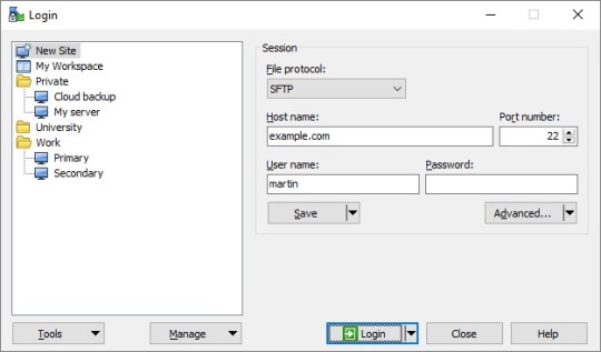
Connect to FTP server or SFTP server
1) need to know at least:
Host name1 of the server,2 such as ftp.example.com.
2) Protocol the server supports (FTP, SFTP, FTPS, etc.).
Account username.
Account password.3
3) Start WinSCP. Login Dialog will appear. On the dialog:
Select your File protocol. When you are about to use FTPS protocol, select FTP and then choose one of the FTPS invocation methods.
Enter your host name to Host name field, username to User name and password to Password
4) You may want to save your session details to a site so you do not need to type them in every time you want to connect. Press Save button and type site name.
Press Login to connect.
Example image:
12 notes
·
View notes
Text
This is a very helpful site for doing our next assignment. Please use it, read it and get a good mark in the end.
Child Themes
The reason to share this post is that a WordPress child theme is a WordPress theme that inherits its functionality from another WordPress theme, the parent theme. Child themes are often used when you want to customize or tweak an existing WordPress theme without losing the ability to upgrade that theme. In the past, there was no easy way of updating WordPress themes without losing all the custom styling and changes that you had made. This becomes chaos when all the sudden you find out a widely used script in popular themes has a major exploit, and you need to update your themes ASAP. It becomes a tough choice because on one hand, you would lose all the custom styles if you update. On the other hand, you risk your site getting hacked if you don’t update fast enough. The core team and the community decided to solve this problem by introducing the concept of parent theme and child theme. A child theme in WordPress would inherit all the functionality, features, and the code of the parent theme without making any changes to the parent theme itself. This allowed users to change the styling of the parent theme and add/modify features without losing the ability to update the parent theme. In theory, any WordPress theme can have child themes however not all WordPress themes are good parent themes. A parent theme with limited functionality and features is not exactly an ideal parent theme candidate in most cases. We will talk about the exceptions later on in the article.
5 notes
·
View notes
Text
instagram
It's over, this says it, without literally saying it.
2020 close tag
The reason to share this post is that in HTML5 it is not strictly necessary to close certain HTML tags. The tags that aren’t required to have specific closing tags are called “self closing” tags. What is a self closing tag? An example of a self closing tag is something like a line break (<br />) or the meta tag (<meta>). This means that the following are both acceptable:<meta charset="UTF-8">and<meta charset="UTF-8" />Some closing tags are optional, however. The tags are optional because it’s implied that a new tag would not be able to be started without closing it. These are the following:
html, head, body, p, dt, dd, li, option, thead, th, tbody, tr, td, tfoot, colgroup. There are also tags that are forbidden to be closed: img, input, br, hr, meta, etc.The question is: should tags that are optional be closed? Code with closing tags is much more readable and easy to follow. It is much easier to visually inspect a page with well laid out markup. Working with this markup is easier for developers.It makes little to no difference to a rendering engine in a browser that can parse markup written this way, so the tags can be considered redundant. For mobile users and browsers that can easily parse these pages, it is not necessary to close the tags.Not doing so can save on bandwidth as well. The problem arises when a browser is unable to parse markup written this way. The poor markup is still there.
2 notes
·
View notes
Text
It is a very nice website for learning tips and tricks on WordPress.
6 essential wordpress tips
The reason to share this post is that one of the questions that we often get asked is: Why should I use WordPress? Isn’t my old site good enough? Why do I need to switch to WordPress from another platform? If you’re asking these questions, then you’re at the right place. In this article, we will share 6 important reasons why you should use WordPress. We will also cover all the different type of websites you can create with WordPress as well as showcase popular sites that are using WordPress.WordPress is a free software. It means you are free to download, install, use and modify it to match your needs. You can use it to create any kind of website. A large portion of people using WordPress are neither web designers nor programmers. As a matter of fact, most folks start using WordPress without any prior knowledge of designing websites. WordPress is written using standard compliance high-quality code and produces semantic markup. In non-geek terms, this makes Google and other search engines love WordPress. WordPress comes with a built-in updates management system. This allows you to update your plugins and themes from within your WordPress admin dashboard.WordPress is developed with security in mind, and it is considered to be a very safe and secure platform to run a website. However, just like the real world, the internet can be an uncertain place. WordPress is not just limited to writing text. It comes with a built-in media uploader to handle images, audio, and video files.However, WordPress can be used in many different ways from simple website to e commerce marketplace and anything in between. Therefore, you will need many tips which make the thing easy for you.
2 notes
·
View notes
Text
instagram
A perfect summary.
Designer & client
The reason to share this post is that on one hand we have a designer with years of design knowledge and experience; on the other, a client who knows his audience and business objectives. In this stare-off, sooner or later, somebody has to blink. Either the client will end up with a design that he is unhappy with that fails to meet his objectives, or the web designer will give in and produce a design that she believes to be less than optimal.The problem with this confrontational approach is that it ignores the fact that design is a collaborative process.Fortunately, there’s no need for it to be like this. In my experience it truly is possible to work in partnership with your client. Doing so allows you to explain your design decisions and to better understand your client’s business and user objectives. The ideal relationship is about collaboration rather than confrontation.However, for this relationship to work, the designer needs to include the client in the development of a design. Unfortunately, many designers find this difficult – they prefer to avoid showing unfinished work. I’ve seen too many hours wasted by designers who want to make the design just right before showing it to the client, only to have it rejected as inappropriate.We usually see only the final product, but not the eternal battle that’s waged between the clients and the designers they hire. But thanks to these clever illustrations now we get to witness the daily struggle designers have to go through to please the clients while also producing the design they can be proud of.
2 notes
·
View notes
Text
instagram
I have come across this post while surfing on the Instagram.
Most useful css tips
The reason to share this post is that the importance of CSS really can't be understated. But what is CSS, what's it's meaning, and why is it so difficult to understand? Here, you'll get a thorough understanding of exactly what CSS is, the different types of CSS you can use, and how to put it all to use in your own web projects. Let's jump into it! CSS is important because it controls all design-related aspects of your website. Typography, colours, page layouts and any other visual aspects of your website are all controlled by CSS. What's more, CSS allows you to control and adjust the design and formatting of your entire website (no matter how big or small it is) from a single spot. This is done using what's called an external style sheet. Alongside HTML, CSS (which is short for Cascading Style Sheets) is foundational to all modern web design. Other technologies might be added to the web design mix -- JavaScript, PHP, and others -- but HTML and CSS are always used. Again, they're the foundation. HTML handles your web page's structure. HTML is comprised of elements (also sometimes called tags). There are HTML elements for all sorts of content that you'd have on a page -- headings, paragraphs, sections, tables...and many, many more. Think of these HTML elements as containers, or boxes, that hold your page's content. So if you want some content to be a heading, you'd put it in a heading container. Want other content to be a paragraph? Put it in a paragraph container. And often times, these containers can be placed inside one another to create a specific page structure.
1 note
·
View note
Text
Its a good site to figure out the difference
Client side vs server side
The reason to share this post is that many websites these days are built with JavaScript. While there’s nothing objectively wrong with JavaScript, the way we implement it can have pretty big consequences for both our user experience and how we rank in search results. Developers are having to consider how their JavaScript effect SEO, and SEOs and other digital marketers are now having to learn more about the technology their content and website experiences are powered by. If you’re in either boat, you’re in the right place. Continue reading to learn the difference between client-side rendering and server-side rendering, or jump to a specific section. Between the two options, server-side rendering is better for SEO than client-side rendering. This is because server-side rendering can speed up page load times, which not only improves the user experience, but can help your site rank better in Google search results. Server-side rendering is also better for SEO because it removes the burden of rendering JavaScript off of search engine bots, solving speed-related crawl budget issues and partial indexing. But what if you can’t afford to implement server-side rendering? Or you don’t have the technical resources to execute it? Thankfully, there’s a third option. The debate between client-side rendering, server-side rendering, or dynamic rendering is only relevant for websites that utilize JavaScript. If your website is purely HTML, there’s nothing that human users or search engine bots need to render. Full JavaScript websites built on libraries like React and Angular may be completely blank until they’re rendered, depending on how they’re coded.
5 notes
·
View notes
Text
In this site, flexbox subject is the cutest then ever!
Flexbox
The reason to share this post is that flexbox was introduced in 2009 as a new layout system, with the goal to help us build responsive web pages and organize our elements easily, and since then, it’s gained more and more attention. It turns out it’s now used as the main layout system for modern web pages.Flexbox is a one-dimensional layout system that we can use to create a row or a column axis layout. It makes our life easier to design and build responsive web pages without having to use tricky hacks and a lot of float and position properties in our CSS code.To start to use Flexbox, all you need to do is create a flex container using the display: flex property. After that, every element that you have inside that flex container turns into a flex item.The main direction that our flex items take in our flex container is a row.We can change the direction of our flex items in our flex container very easily to a column, by passing a flex-direction: column property to our flex container.Flexbox has a lot of other properties that we can use to create awesome things. We can order the elements the way we want, we can reverse the order of elements, we can determine if our elements should grow or shrink, etc.Now that we know that Flexbox is a one-dimensional layout system, let’s understand briefly how CSS grid works and differences between these layout systems.
1 note
·
View note
Text
Its so useful, please enjoy it.
Css grid layout
The reason to share this post is that as the range of screen sizes has proliferated, designers have faced a unique challenge: How do you design a layout that is creative but also effective at any resolution or screen size? Block-based designs, which are easily implemented across screens, have become a common solution. But while this approach solves the problem of designing for myriad screen sizes, it limits creativity, asking designers to create websites with template thinking, not design thinking. Thus, another challenge is born: How do you deliver a beautiful design customized to a client’s brand that is also capable of being implemented anytime, anywhere? Answer: CSS Grid layout (Grid), which offers a foundation for the future of designer-developer interactions. For a designer, CSS Grid is a tool for communicating the client’s message in an impactful way. For developers, who have to deal with things like infinite screen sizes, page loading speed, code reusability, and so on, the CSS Grid gives them a rule that the website operates on, alleviating the need for constant involvement from the developer.Let’s explore why the grid influences good art and design and how the CSS Grid layout can enable a better experience for designers, developers, and users. A grid is a network of lines that cross each other to form a series of squares or rectangles into columns. It has long been a tool of visual artists. In web design, the grid becomes a set of constraints that tie the elements together but also allow elements to dictate the grid. CSS Grid is an indispensable tool for web designers, as it helps them create genuinely responsive layouts.
0 notes
Text
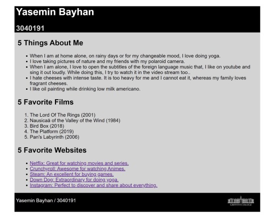
I really struggled with this side-by-side post and picture display on the site. I used a grid and flexbox while doing this. Later, when I got what I wanted, I realized that the grid and flexbox are easy. You just need to speed up.
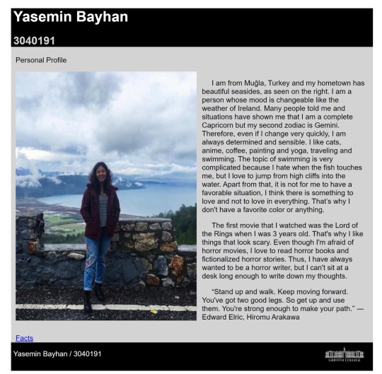
Yasemin bayhan personal website
The reason to share this post is that having a personal website for yourself, your services or company is the new resume/portfolio and also a subtle requirement for people to trust you, do business with you or hire you for a job in a global space. What makes having a personal website unique? I wrote on how to get a job and this post is an add up to it. Maybe you are pondering on this question “do I really need a website? ” Yes, you do and I will tell you why. I have read stories about Human Resource Managers searching on Google to know if they can find any useful information about potential employees. Also, if they happen to find any, they’ll will judge them by their online content.I read a story of a guy who saw an advert for a job with a celebrity, while others were busy sending their resumes, he created a website for himself with relevant content and sent the link via twitter to the celebrity. This made him to stand out amongst many. And of course, he got the job.What do people see when they search your name on Google? Are you producing online content in your area of expertise that will help people and promote your work?Having a personal website gives you leverage to promote your content thereby showcasing your work. Let’s say I have a business deal with some Americans and we haven’t met but online. They’ll like to know more about me and they’ll definitely search “labi francis” on Google to know what kind of person I am. If that happens, I am glad my personal website will pop up.
0 notes
Text
instagram
Also its me
from: https://dev.to/davidallen77/12-websites-every-developer-should-follow-4o37
1. StackExchange
https://stackexchange.com/
Everyone knows of StackOverflow.com and AskUbuntu which are part of StackExchange network. But there are dozens of other sites in the StackExchange network that are dedicated to programming. Some of my favorites are
Software Engineering
Code Review
Database Administrators
Why use StackExchange?
You want to improve your software engineering skills.
Help other developers by answering their questions.
Show off your skills by linking to your StackExchange account in your resume or website.
2. GitHub
https://github.com/
GitHub requires no introduction for software developers. It’s the place on the Internet where open source projects are built.
Why use GitHub?
Share your code with the rest of the world.
Contribute to open-source projects.
Build free websites using GitHub pages.
A good GitHub profile can unlock awesome job opportunities.
3. DevDocs.IO
https://devdocs.io/
DevDocs.IO is a single-page open source app that allows you to search documentation of all popular programming languages and frameworks.
Why?
Superfast way to search documentation.
Works offline.
One place to search all the docs
4. Hacker News
https://news.ycombinator.com/
Hacker News is a website where people submit links and have interesting discussions around them. Most of the submissions are related to Silicon Valley, Entrepreneurship, and Tech.
Why use Hacker News?
To keep updated with Silicon Valley and the US tech ecosystem.
A place for high-quality well-moderated discussions.
5. diff.blog
http://diff.blog/
diff.blog is an engineering blog aggregator. The website aggregates blog posts from 1000s of Engineering and developer blogs (including blogs on dev.to).
Why use diff.blog?
You want to follow the engineering blogs of tech companies and developers from all over the internet.
If you have a blog about software engineering, you can include it in diff.blog so that it reaches a bigger audience.
6. Udemy
https://www.udemy.com/
Udemy is one of the biggest video tutorial websites in the world. It has amazing tutorials on almost every tech-related topic. My favorite teacher on Udemy is Stephen Grider. You should check him out.
I think that issues like this should be taken seriously while programming. Because this is a newly learned and evolving language. That's why we, as writers, have to read and learn new things every moment.
7 notes
·
View notes
Text
instagram
When I have done my assignment in css.
What is “Float”?
Float is a CSS positioning property. To understand its purpose and origin, we can look to print design. In a print layout, images may be set into the page such that text wraps around them as needed. This is commonly and appropriately called “text wrap”. Here is an example of that.In page layout programs, the boxes that hold the text can be told to honor the text wrap, or to ignore it. Ignoring the text wrap will allow the words to flow right over the image like it wasn’t even there. This is the difference between that image being part of the flow of the page (or not). Web design is very similar.In web design, page elements with the CSS float property applied to them are just like the images in the print layout where the text flows around them. Floated elements remain a part of the flow of the web page. This is distinctly different than page elements that use absolute positioning. Absolutely positioned page elements are removed from the flow of the webpage, like when the text box in the print layout was told to ignore the page wrap. Absolutely positioned page elements will not affect the position of other elements and other elements will not affect them, whether they touch each other or not.There are four valid values for the float property. Left and Right float elements those directions respectively. None (the default) ensures the element will not float and Inherit which will assume the float value from that elements parent element.Clearing the Float
Float’s sister property is clear. An element that has the clear property set on it will not move up adjacent to the float like the float desires, but will move itself down past the float. Again an illustration probably does more good than words do.Clear has four valid values as well. Both is most commonly used, which clears floats coming from either direction. Left and Right can be used to only clear the float from one direction respectively. None is the default, which is typically unnecessary unless removing a clear value from a cascade. Inherit would be the fifth, but is strangely not supported in Internet Explorer. Clearing only the left or right float, while less commonly seen in the wild, definitely has its uses.
I think that issues like this should be taken seriously while programming. Because this is a newly learned and evolving language. That's why we, as writers, have to read and learn new things every moment.
8 notes
·
View notes
Text
This site is simply perfect. He explained complex facts very easily.
Cascading style sheets (CSS) are an elegantly designed extension to the Web and one of the greatest hopes for recapturing the Web's ideal of separation of presentation and content. The Web is the ultimate cross-platform system, and your content will be presented on such a huge variety of devices that pages should specify the meaning of the information and leave presentation details to a merger (or "cascade") of site-specified style sheets and the user's preferences. If the introduction of WebTV broke your pages, you will appreciate the ability to introduce new page designs by creating a single style sheet file rather than by modifying thousands of content pages.
Centralized Style
Use a single style sheet for all of the pages on your site (or possibly a few coordinated ones if you have pages with very different needs: for example technical documentation versus marketing pages). One of the main benefits of style sheets is to ensure visual continuity as the user navigates your site. Legacy publications have long known the value of basing print products on a single typeface: no matter where you turn in a magazine or a newspaper, the text and basic layout will look the same. Websites will gain the same brand cohesiveness if all the pages on a site link to the same style sheet.
Always use linked style sheets rather than embedded styles. Only by referencing an external file will you get the maintenance benefits of being able to update the look of your entire site with a single change. Also, by pulling style definitions out of your pages, you make them smaller and faster to download. If you use a single style sheet for your entire site, that file will be a single download once and for all.
For each site, all the style sheets should be designed by a single, central design group. Two reasons: First, centralized design is the only way to ensure a consistent style and reap one of the main benefits of style sheets. Second, the majority of Web content creators are not capable of designing and writing good style sheets. Experience with word processors that support style sheets indicates that most authors mangle their style sheets terribly. Understanding the effect of style is relatively easy in traditional desktop publishing because it is a WYSIWYG environment with a single, canonical output form. The Web is not WYSIWYG because of the variability in supported platforms. Furthermore, Web stylesheets are cascading, meaning that the site's style sheet is merged with the user's style sheet to create the ultimate presentation. These differences make it important that Web style sheets are designed by a specialist who understands the many ways in which the result may look different than what is on his or her own screen.
Fund an active evangelism program to teach your content creators how to use the centrally defined style sheet. Do not assume that people understand the concept of style and how to apply it, simply because they know a word processor with style sheets. Research shows that most users make horrible mistakes in using word processing style sheets: partly because the main word processors have particularly bad style sheet usability and partly because style is hard. Your style sheet should come with a small manual that explains the different styles and when and how to use them. Include plenty of examples, including both raw HTML code (cutting-and-pasting examples is the main way people use documentation) and screenshots of the appearance of correctly coded pages in several mainstream browsers on several different platforms. The screenshots should be made into clickable imagemaps, allowing users to click on an effect they want to achieve and get to the documentation for the appropriate styles. In particular, if multiple styles have similar appearance, many errors can be avoided by explaining the differences and when to use which style.
Despite my preference for linked style sheets and central design, individual page authors should be allowed to create additional embedded styles for their own pages when necessary. Authors should be encouraged to only do so when absolutely necessary, but there will always be cases where a certain style is needed that is not supplied in the central style sheet. If many pages need the same effect, it should be added to the site's global style sheet, but it would be bad to inflate the one linked style sheet with styles that are only needed once. Single-page styles should be embedded rather than linked: the page should continue to link in the global style sheet and then override it with local, embedded styles as necessary. Doing so has the benefit of allowing future changes to the central style sheet to propagate to the modified page to the greatest extent possible.
I think that issues like this should be taken seriously while programming. Because this is a newly learned and evolving language. That's why we, as writers, have to read and learn new things every moment.
3 notes
·
View notes
Text
In HTML, block and inline elements are the building blocks of web pages with each having a default display value.
A block element only appears within a <body> element and uses <div> as an HTML tag to define a section.They begin on new lines, take up the full width of the page, and may contain inline elements or sometimes other block level elements.
An inline element is a presentational characteristic that uses <span> as an HTML tag to define a section. They do not start on a new line, only occupy the space bounded by the tags defining the element, and may only contain other inline elements.
Now, please note that while understanding block and inline elements is still relevant, the distinctions between block and inline elements were used up through HTML 4.01. These two categories have since been replaced with a different set of content categories:
The block level category no longer has a directly corresponding content category.
The inline category now roughly corresponds to the “phrasing content” category which defines the text and mark-up it contains.
The block level and inline elements have combined together to correspond to the “flow content” category which typically contains text or embedded content.A perfect summary for Block and Inline Elements in HTML. I love this page.
All the HTML elements can be categorized into two categories (a) Block Level Elements (b)Inline Elements.
Block Elements
Block elements appear on the screen as if they have a line break before and after them. For example, the <p>, <h1>, <h2>, <h3>, <h4>, <h5>, <h6>, <ul>, <ol>, <dl>, <pre>, <hr />, <blockquote>, and <address> elements are all block level elements. They all start on their own new line, and anything that follows them appears on its own new line.
Inline Elements
Inline elements, on the other hand, can appear within sentences and do not have to appear on a new line of their own. The <b>, <i>, <u>, <em>, <strong>, <sup>, <sub>, <big>, <small>, <li>, <ins>, <del>, <code>, <cite>, <dfn>, <kbd>, and <var> elements are all inline elements.
Grouping HTML Elements
There are two important tags which we use very frequently to group various other HTML tags (i) <div> tag and (ii) <span> tag
The <div> tag
This is the very important block level tag which plays a big role in grouping various other HTML tags and applying CSS on group of elements. Even now <div> tag can be used to create webpage layout where we define different parts (Left, Right, Top etc.) of the page using <div> tag. This tag does not provide any visual change on the block but this has more meaning when it is used with CSS.The <span> tag
The HTML <span> is an inline element and it can be used to group inline-elements in an HTML document. This tag also does not provide any visual change on the block but has more meaning when it is used with CSS.
The difference between the <span> tag and the <div> tag is that the <span> tag is used with inline elements whereas the <div> tag is used with block-level elements.
I think that issues like this should be taken seriously while programming. Because this is a newly learned and evolving language. That's why we, as writers, have to read and learn new things every moment.
6 notes
·
View notes
Text
instagram
Today, me in the Web lab. 😅
What is a Back-End Developer?
What do you call the behind-the-scenes functionality, or brain of a site?
The 'back end' of a website is a combination of technology and programming that powers a website. It consists of three parts that a user never sees: a server, an application, and a database.
A back-end developer is someone who builds and maintains the technology needed to power the components which enable the user-facing side of the website to exist. Their back end code adds utility to everything the front-end developer creates.What does a Back-End Developer do?
The back end runs a website—the user doesn’t see it or interact with it, but it is always running in the background, delivering functionality and a desktop-like experience. Back-end developers play a critical role in web development teams, and make sure that data or services requested by the front end system or software are delivered. The back end is the combination of a database and software written in a server-side language, which is run on web servers, cloud-based servers, or a hybrid of both.
In order to make the server, application, and database communicate with each other, back-end developers use languages like PHP, Ruby, Python, Java, and .Net to build an application, and tools like MySQL, Oracle, and SQL Server to find, save, or change data and serve it to the user in front end code.
After communicating with a business owner and understanding what their needs and technical requirements are, back-end developers use the aforementioned tools to create web applications with clean, well-documented code.
They come up with the most effective and efficient solutions for engineering technology by converting and returning data into front end code a user can interact with, such as: filling out a form, creating a profile, shopping online, etc.
Responsibilities of a back-end developer can include working with:
- Database creation, integration, and management
- Back-end frameworks to build server-side software
- Web server technologies
- Cloud computing integration
- Server-side programming languages
- Operating systems
- Content management system development, deployment, and maintenance
- API integration
- Security settings and hack prevents
- Reporting—generating analytics and statistics
- Backup and restore technologies for a website’s files and DB
What is the workplace of a Back-End Developer like?
The life of a developer typically involves working long hours. Back-end developers can be found almost anywhere, working as full-time permanent employees in both large corporations and small or medium-sized companies.
These developers are responsible for creating, maintaining, testing, and debugging the entire back end. This includes the core application logic, databases, data and application integration, API and other back end processes.
I think that issues like this should be taken seriously while programming. Because this is a newly learned and evolving language. That's why we, as writers, have to read and learn new things every moment.
13 notes
·
View notes
Text
This site is definitely a life saver. I used it in my homework in class. I wasted hours before finding this but I found this site and tried it. And it worked instantly and got the exact result I wanted.In all of the excitement about CSS Grid Layout and Flexbox, another layout method is often overlooked. In this article I’m going to take a look at Multi-column Layout — often referred to as multicol or sometimes “CSS Columns”. You’ll find out which tasks it is suited for, and some of the things to watch out for when making columns.
What Is Multicol?
The basic idea of multicol, is that you can take a chunk of content and flow it into multiple columns, as in a newspaper. You do this by using one of two properties. The column-count property specifies the number of columns that you would like the content to break into. The column-width property specifies the ideal width, leaving the browser to figure out how many columns will fit.
It doesn’t matter which elements are inside the content that you turn into a multicol container, everything remains in normal flow, but broken into columns. This makes multicol unlike other layout methods that we have in browsers today. Flexbox and Grid for example, take the child elements of the container and those items then participate in a flex or grid layout. With multicol, you still have normal flow, except inside a column.
In the below example I am using column-width, to display columns of at least 14em. Multicol assigns as many 14em columns as will fit and then shares out the remaining space between the columns. Columns will be at least 14em, unless we can only display one column in which case it may be smaller. Multicol was the first time that we saw this kind of behavior in CSS, columns being created which were essentialy responsive by default. You do not need to add Media Queries and change the number of columns for various breakpoints, instead we specify an optimal width and the browser will work it out. Styling Columns
The column boxes created when you use one of the column properties can’t be targeted. You can’t address them with JavaScript, nor can you style an individual box to give it a background color or adjust the padding and margins. All of the column boxes will be the same size. The only thing you can do is add a rule between columns, using the column-rule property, which acts like border. You can also control the gap between columns using the column-gap property, which has a default value of 1em however you can change it to any valid length unit.
I think that issues like this should be taken seriously while programming. Because this is a newly learned and evolving language. That's why we, as writers, have to read and learn new things every moment.
0 notes
Text
instagram
When this term is over, I will be like.
The demand for computer scientists and software developers continues to grow. New people are entering the field, and developers around the world are being asked to reskill.
Careers in computer science require a solid grasp of the top programming languages. So, if you’re trying to reskill in your career, change careers, or even just learn something, a new programming language is a good place to start.
When choosing a language to learn, there are several factors to consider such as difficulty level, average salary for that language, and how that language is used in the industry. With these factors in mind, we have looked at the top tech trends and predictions of 2021 to outline which programming languages are the best to learn in 2021.
In this article, we will look at:
1. Python
2. Java
3. Kotlin
1. Python
Python is a language that every programmer should be able to use. Not only is Python’s syntax intuitive and easy-to-learn syntax, but it is used in fields that are predicted to rise in 2021, namely machine learning and artificial intelligence.
Python is the preferred language for machine learning and data science due to its popular ML libraries such as Pandas and Scikit-learn. Anyone interested in pursuing a career in data science must know Python.
Globally, machine learning jobs are projected to be worth $31 billion by 2024, with an annual growth rate of 40% over a six-year period. 2. Java
Java is an immensely popular programming language that has been around for a long time. It still remains one of the most in-demand, widely-used languages. Java is most common in web development, app development, and big data, but it can be used in just about everything (especially distributed systems).
Java is essential for enterprise-level web apps and microservices, which are on the rise in the next year. In 2021, Java will still dominate the banking sector and the Indian IT market.
Java is essential for Android development, as it offers strong memory allocation and high performance. It can also used on the backend as well for sites like Google, Twitter, Amazon, and YouTube.
Almost every large organization will expect Java skills, especially for mobile development. In 2021, investment in Java frameworks increased, such as Spring, Struts, and Hibernate. 3. Kotlin
Kotlin is a general-purpose programming language that is completely interoperable with Java and supports functional programming. Kotlin is used most commonly to develop Android apps, web applications, desktop applications, and server-side applications. It’s the ideal language for anyone interested in those careers.
Kotlin was designed to be a more user-friendly version of Java, and now, most Google applications use Kotlin. Other companies that uses Kotlin in 2020 were Pinterest and PostMates. Since Android is the highest-selling mobile operating system, Kotlin is a powerful language to learn in 2021.
I think that issues like this should be taken seriously while programming. Because this is a newly learned and evolving language. That's why we, as writers, have to read and learn new things every moment.
1 note
·
View note