tomscambler
TOM BANNER
Student at The University of Chester studying Graphic Design.
93 posts
Don't wanna be here? Send us removal request.
Last Seen Blogs
grimmgrinningghouls
As we dance to the Masochism Tango
mdawgswizzleinthehizzle
pepsipascal
ramp-it-up
Sweet Wild Onions
DJ

msintention911
Untitled


Photo

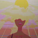
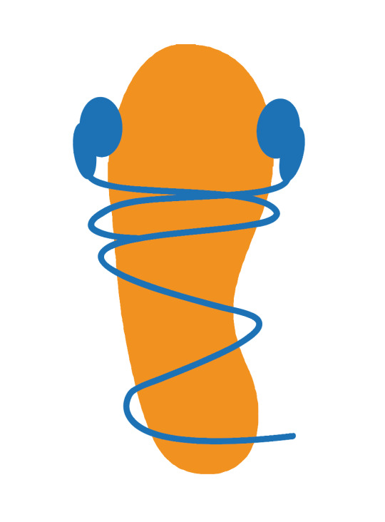
this was another connect I came up with when I started working digitally.
The idea was that the music symbols were a city skyline but I didn’t think it showed that it was a guided tour as well as a footprint does.
0 notes
Photo
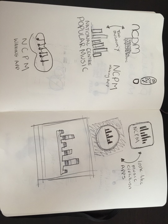
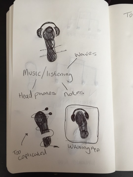
Initial concept sketches, I took various inspiration from my original post about research.
At first I thought the idea of a wave being a good idea but it started to look like a music editing software logo. So I tried to implement the waves levels to being a city sky line, which again didn’t work.
I eventual ended up coming up with an idea of using a foot and headphones as it was simple enough and visually looked good.
0 notes
Photo
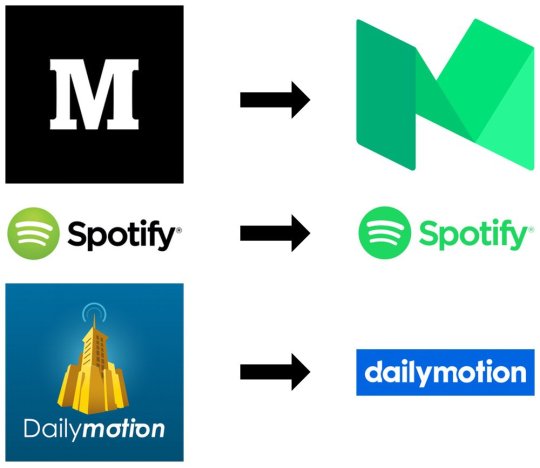
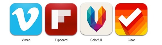
Some examples of current trend in logos.
The top image is of how current trends are causing companies to rebrand with this style. As you can see they’re a lot more flatter, more simple and are a lot more brighter. I believe this is to grab your attention.
The lower images are of app icon trends, again they’re also quite simple yet bright and eye catching
0 notes
Text
10 Logo Design Trends That Will Rule The Roost In 2016
10 Logo Design Trends That Will Rule The Roost In 2016
Are the curious kind who is always in a lookout for latest logo design trends? Wish to know what trends will become the talk of the town and which ones will die a fast death in the year ahead? If you’re nodding your head in a yes, then brace yourself: we’re going to reveal ten predictions for logo design trends this 2016!
Flat Design Keeps Trending. Flat logo design Source →
Flat design has…
View On WordPress
1 note
·
View note
Text
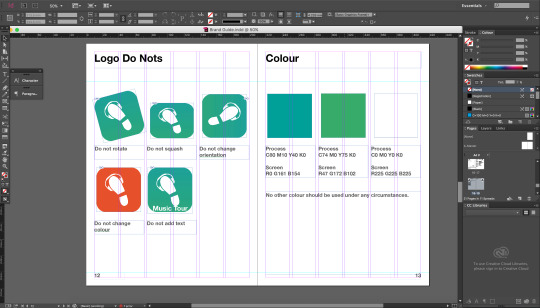
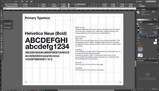
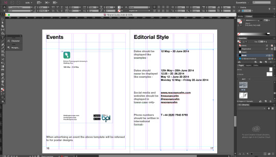
BPI: Phone Application Visual Development.
For the final part of my current project I’ll be further developing one of my concepts that I made in response to the failure of the National Centre of Popular Music.
For this I’ll be creating a Visual Brand Guide for a fictional Phone Application that would act as a “walking tour” where your phone emulates a guided tour. The tours would be based on musicians, taking you through areas of significance to said musicians including birth locations, inspirations, ect.
0 notes
Video
vimeo
Type Motion - 20 Second Sting
For the 20 second sting I decided to have the letters arranged so they would in a sequence spell out the words "Type Motion"
Yes again Vimeo only seems to let you upload 1 HD video a week without having to pay £50 a year so I’ll have to try uploading these via Youtube instead.
0 notes
Video
vimeo
Type Motion - 10 Second Sting.
This is much more like the 20 second sting, but compressed into a smaller amount of effects in which I picked out the ones that worked more visually appealing.
Vimeo only seems to let you upload 1 HD video a week without having to pay £50 a year so I'll have to try uploading these via Youtube instead.
1 note
·
View note
Video
vimeo
Type Motion - 5 Second Sting.
I've explored and experimented with so many effects and motions, although for the 5 second sting I decided to focus on one of my favourites, Liquid motion. I'd also spent the most time learning how to perfect it so it seemed like it was the best of the choices.
0 notes
Text
Approach To Research Publication Research
I thought seeing as my Essay was based on Science and Astronomy, I thought I'd research Science Fiction Magazines/Books and Science magazines.
Today I focused mainly on the cover, although it was hard to find some good examples of science book covers.
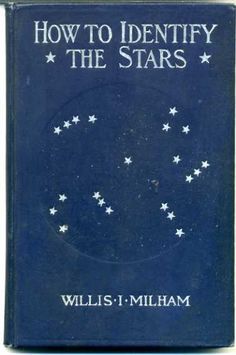
I really like the de-bosed planetary shape on the cover above, although I don't think it would work well for a 16 page publication.
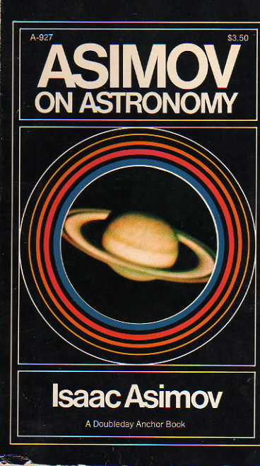
I couldn't not include Isaac Asimov in research on science fiction book covers, even if they aren't exactly great, they always have a 80's feel to them all, ever the more modern publications.
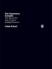
I really like the cover for Caleb Scharf's new edition of The Copernicus Complex. Its a lot better than his original, which used far too much cover space. The way the cover portrays how little we know and have explored of space is so well done. I think I'm swaying towards having a minimalistic cover to express how little we know of space.


Surprisingly 2001: a Space Odyssey has only just had its first edition in Brazil, although the films existed there for years.
Although their first edition is beautiful and so clever. When the sleeve is removed the book is revealed to represent an artefact from the film. Its a shame this edition has only and will only be released in Brazil.
0 notes
Video
I've decided to go for a "liquid motion" style for one of the Stings, so I spent this morning just playing around with different settings and trying to get an understanding of how to create this effect. It was surprisingly a lot more easier than i expected it to be.
0 notes
Video
vimeo
DMC Self Directed Research
The way the type is introduced into the scene and then disappears works so well, this is something I might try experimenting with this for the 5 second sting.
0 notes
Video
vimeo
Handdrawn Kinetic Typography Research
This is one of the best examples I've found so far of Handdrawn kinetic typography. This is the plan for the 10 second sting. I've also started to look into how to create something like this, and although it seems very time consuming the final outcome looks quite amazing and will definitely be worth it.
0 notes
Text
DMC Self-directed Project
So today I found out I'd read the brief wrong for the Motion Graphics Self Directed project, and started to make a title sequence for the film "The Conversation" Although today I also learnt what the word biopic mean.
Anyway now that I've read the brief correctly, I know I'm not going to look like an idiot handing in a final video with so relation what so ever to the brief.
So I started looking at examples of Typographic Motion Graphics as I'd decided on doing the set of short stings
So far my ideas are:
For the 10 second one I'm going to look at doing hand drawn typography and implement it in the same fashion as the first workshop we did.
For the longer 20 second sting I'm going to create a live action film using light manipulation.
And finally for the shorter 5 second sting, i'm thinking of creating a very basic piece inspired by how i think a typeface would move, maybe even how it would grow into its final form or even decay.
0 notes
Video
Voice's Mock-up Publication.
So far, so good! The idea is that all the work will be printed onto "postcards" separate from the actual book, but will all be contained together with a Kraft Card Sleeve.
My initial idea was to print the "postcards" onto 400gsm glossy card, but the printer won't take 400gsm, therefore I'm going to experiment with gluing 180gsm glossy paper onto 400gsm cards and leaving under a press until dry so it doesn't bubble or bend due to moisture.
0 notes