#translate and transform
Text
Translate and Transform
Evaluation
This week long project was a fun way to find inspiration. I like the ideas that I came up with, I think that these are a fun starting point that could turn into a fun project.
The art form of crochet is something that I really enjoy using and it was nice doing something that I was excited about doing.
Some of the "squares" I created worked better than others but I do like what I got so far. I really think this could be a fun start to a project.
0 notes
Text
Translate + Transform Final Outcome
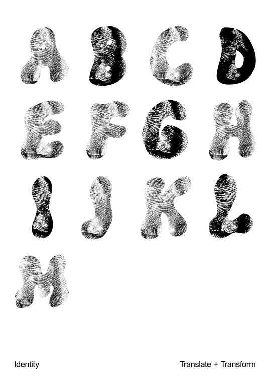
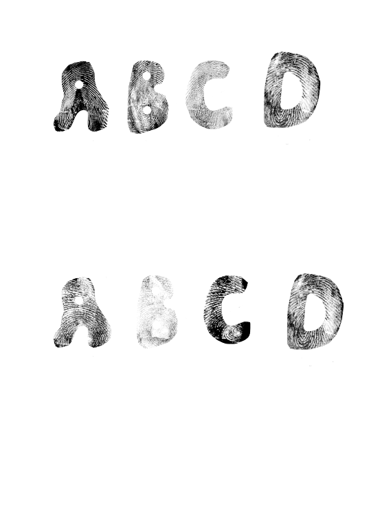
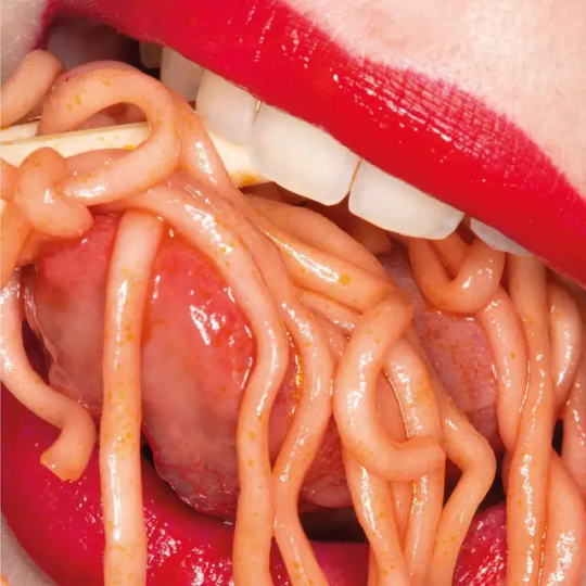
Here is a poster I made of Turki's fingerprints using the bubble font. I have selected the outline of the font and places the finger prints on top, then selecting inverse to delete the outside to make the prints catch the shape of the font. It's been a fun process of using ink as a way to gain information and analysing the lines of each finger prints that are all unique. From research gathered I have discovered that there has never been found two people to share the same finger prints which is why it's a form of identification when the police finds a body who can't be identified or a crime has been committed and finger prints are found on the scene. As humans we leave finger prints of anything we touch, even clothes and I find it fascinating that we have created a database where finger prints can identify a person.
For my poster I wanted to create the whole alphabet, but I ran out of time since we only had one week to complete this. I struggled finding my topic at the beginning and going forward from my initial idea of spiral line art. However, combining identity with type has been very interesting because it forms a special communication between the fact that type also holds personality. Which is why I wanted to embed the two together. I think more research into identity could have been useful to help me achieve more experiments and a deeper understanding of different systems we have to identify one another.
0 notes
Text
MP - Translate and Transform Presentation

Explanation
Goodday whoever is reading this,
I know this presentation looks disjointed but let me try and explain all my ideas (it's unfortunate we only had 3 minutes because I like to talk ALLLLOT)
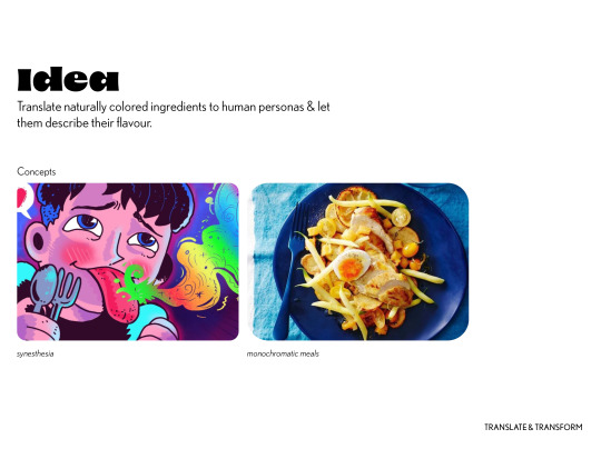
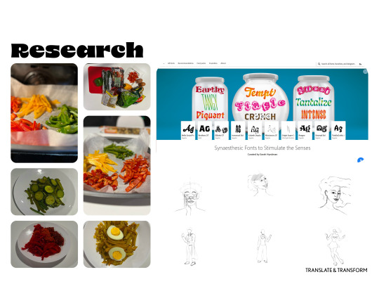
Initially, as displayed in my previous tumblr posts, I wanted to create a monochromatic color set of meals. I'd take pictures of these meals and create an editorial. My target audience for this was working or middle class food enthusiast interested in following trend of monochromatic meals.
I chose red, green and yellow as they are natural colors often seen in meals. Other meals with different colors use food coloring. The food will appear artificial and my goal is to be as natural as possible. The only time I changed the color of an ingredient was rice with tomato to create jellof rice (African delicacy). I planned to make the meals not only aesthetically pleasing but edible. What's the point of cooking food people can't taste?
Unfortunately, due to making it edible, I cooked with a lot of spices and fat (oil). This changed the color in some ways and struggled consuming the pasta (This is an experiment and not a reflect of my cooking skills).
If it was edible and appeared beautiful, I'd call in friends to be tasters. During the tutorial, Dot questioned me "I like the idea of synesthesia but it's not reflected in your final outcome. The illustration cards appear to be used in the case of Covid 19 to educate kids if they lost their taste. Have you spoken to anyone who has synesthesia? Did you consider using a blind taster (blind fold taster) and ask them what colors they think the peppers are? " Obviously, Rich added to that conversation too and in the same direction.
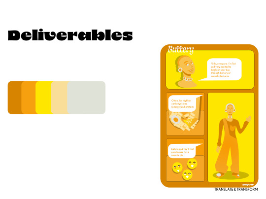
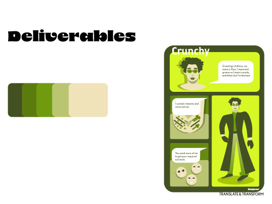
I was also questioned about my rationale. Due to things not working out, I made illustrations as I'm talented in that aspect. I created human persona illustrations because this translate and transform. Thus, I wanted my outcome to be metaphoric but can be understood easily. Finding a typeface for my illustration style was difficult and I envisioned it as a comic type. However, there's no way I'll use comic sans for this project, it didn't sit right with the illustrations and presentation of idea. Thus, I chose Nobel (a basic sans serif). To display taste of fonts (another difficult feat, I admire food brands now but that's why they probably use basic fonts at times), there was coincidently a font pack made by Sarah Hydman (Thank God!). This showed how the colors would taste. The other type, 8 is also an interesting typeface. The counters and eye of the eye is small and makes the type bold. This shows that the flavours are confident in themselves even if they are not the strongest or spicest. The typeface also has a lot of personality and works as a display font but is not legible as body copy unfortunately.
Now, the presentation was near so I didn't fully explore my idea and basically showed the characters educating people how they’ll feel rather than showing them how they’ll feel.
However, I’m proud of myself for doing something unique. Also, I wanted to have fun with it, this why red= spicy/fun, yellow = quirky/energetic, green = super serious but has a soft spot (can be seen in his full image where he is smiling). The correct term to giving human traits to this non-human objects is anthropomorphism.
Learning outcomes reached
Presentation of an idea (not cookie-cut but nonetheless) (LO3 & 4)
0 notes
Text
Would you take a tranny princess 🌹
That want his holes real field out🥵😘💲

#mtf trans#trans#trans beauty#gay#gay men#trans rights#transfem#trans woman#transformation#transformers#transgirl#transgurl#transisbeautiful#transgender#transmasc#transsexual#traditional art#transparent#trans pride#translation#trans man#trans artist#trans nsft#trans community#travel#television#typography#ana trigger#tattoos#artists on tumblr
5K notes
·
View notes
Text
Hey 😋
#trans nsft#transsexual#trans women are beautiful#curvy girls#daddy's good girl#translation#transgurl#trans artist#trans rights#trans beauty#trans man#mtf trans#trans pride#trans woman#trans community#transfem#transformation#transgender#transformers#transisbeautiful#transmasc#transgirl#transparent#trans
2K notes
·
View notes
Text

Optimus and his drunk wife 😋
#transformers#megop#megatron#optimus prime#actually it is a drawing of my fanfic#if I stop being lazy and translate it to English I will post it to Ao3 💀#my art
3K notes
·
View notes
Text

Say hi and reblog if I'm lovely ❤️
#transgender#trans nsft#transformers#transisbeautiful#transgirl#transgurl#trans guy#translation#trans love#trans mtf#mtf trans#mtf nsft#mtf girl#gay bulge#trans beauty#transsexual#trans#so hot 🔥🔥🔥
2K notes
·
View notes
Text
Do you think trans girls are cute? :P

#transgurl#translation#trans beauty#trans community#transsexual#transformation#trans pride#transparent#trans woman#trans is beautiful#mtf girl#mtf trans#trans is sexy#transgirl#transgender#loveislove#the beauty & the bulge#transisbeautiful#transisbetter#transgenresworld#lgbtq#pride
1K notes
·
View notes
Text
Translate and Transform
I started thinking about different ways I can combine two things to create something new.
I love music and crochet so I thought about how could I combine these two things.
I found inspiration when I was at my friends Acting performance.
They were playing Pentatonix songs between each performance, which was a bit odd for the whole thing. Like on stage they would be sobbing about drug addictions and then when they finished a pentatonix song starts playing it was just pretty jarring.
youtube
on to the inspiration.
They make some really interesting sounds with their voices and I thought that each sound sounded like it was a different shape.
This got me thinking, how can I use this to make something new.
I knew I wanted to crochet and I thought why don't I try to crochet the different "shape" of the sounds.
With this inspiration I remembered that on my Keyboard, there is a voice setting where each note is a different sound. I remember messing around with that voice in music class in year seven.
Hearing a man yell "DJ" every now and then while my teacher was talking, and my teacher getting more and more pissed off. Fun times.
Anyway, I went home and found the voice on my keyboard and I played twinkle twinkle little star with the voice.
I don't think I've ever played this song better in my humble opinion.
Sounds kinda mad right?
I then thought about how I can translate this into a physical crochet outcome.
I really love freeform crochet, which is a form of crochet that is literally just you take your yarn and hook and crochet how ever you want. there's no pattern, no rules and you can create really interesting things.
for example
In this TikTok artist Layla Knox uses different crochet granny squares to make a piece that looks really interesting, there's no set lines `nd its really just vibes honestly.
I took each of the different notes and I made a different representation of the note.
The first note C is a sound like a heart beat and I made this for it.
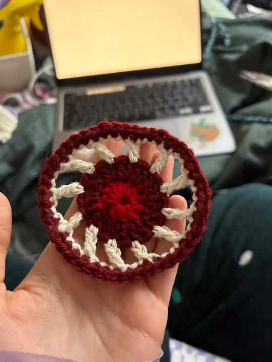
This one is the most literal of my crochets, I wanted to use the colours of a heart and arteries.
Next note G, is almost like a sneeze type sound, to me it felt pointy, I don't know how to describe that but that's how it feels.
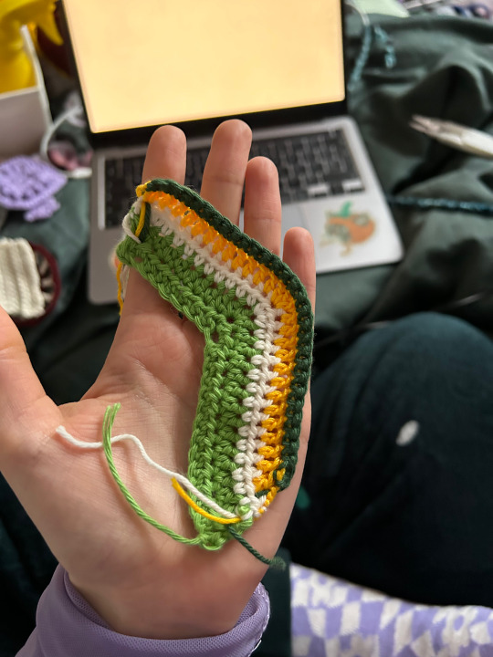
I used greens and different thickness of yarns, including embroidery thread to create this.
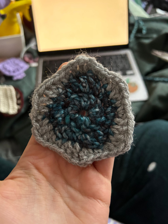
The nest note A sounds like a water fall and I made this to look like a puddle for, like water.
And then after a theres another G,
And then F, I thought F sounded like a camera click so I made this one.
She is inspired by a flower granny square and I think it shows the visual of the sound nicely.
Next is E
E sounds like a hand clap and it sounds smaller than the rest of them but in a way a similar shape to F.
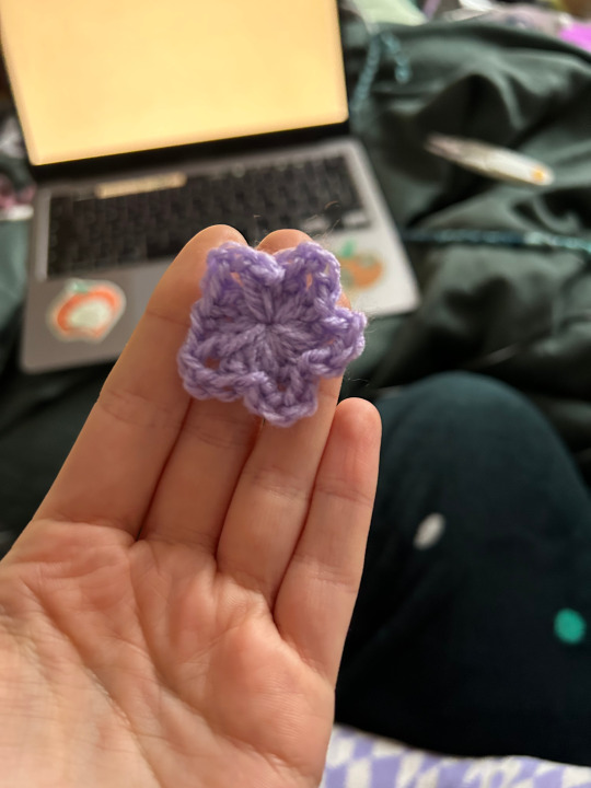
So I made this diddly little star that has the same shape as the camera click but a lot smaller.
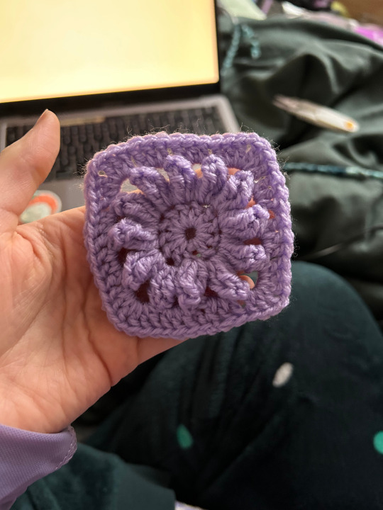
And for the final note it is D
The note D in this voice sounds like a Door, I wanted to make something that looks like a door.
This one is my least favourite of all of them.
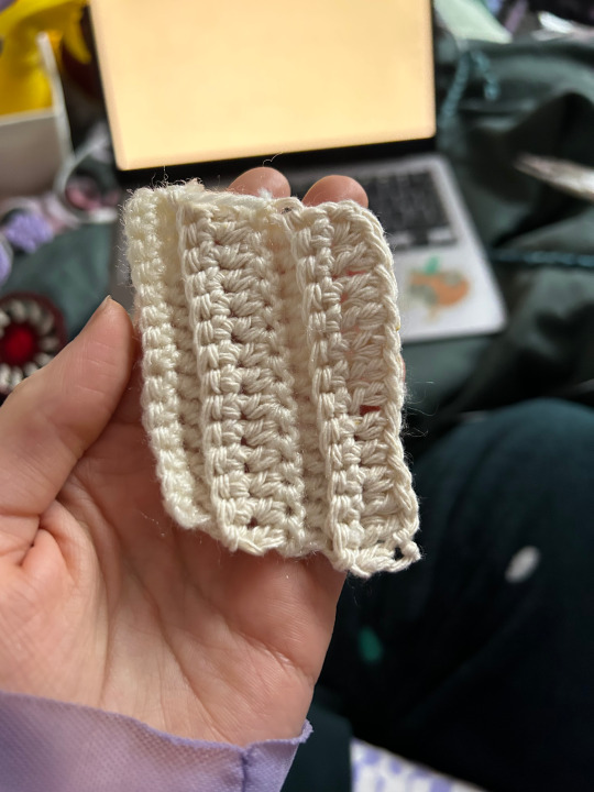
I was inspired by the wood panels on a door. I didn't have any colours that I thought could work best for a door, so I worked with what I got. I just am not sure that this one works.
0 notes
Text
Experimenting with Finger Prints
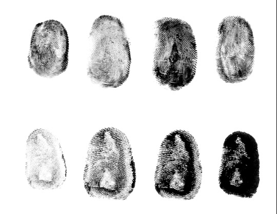
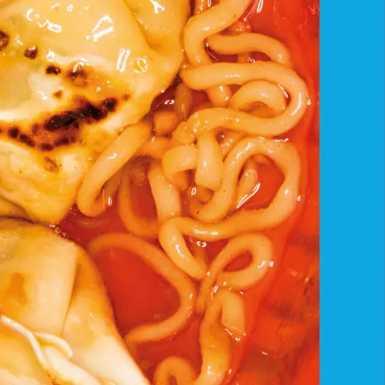
The finger prints above are mine and the bellow is my manager Turki's. I chose a double font because it has thick strokes and gives more space to present the finger prints in detailed compared to a font with this strokes. This is to compare side by side the differences within using the same font but with different people's finger prints. Expressing the identity of the person through type and making it personal to them. My finger prints are more oval than Turki's where as his are more round which is interesting. Some lines make look heavier in weight because of excess ink, but I enjoy it because it adds character and weight to the letters, especially seen in the 'C' and 'A'.
0 notes
Text
MP - Translate and Transform Conceptual research
Okay, this post will focus on articles I researched and how it answers some of the questions when I started this idea.
Question 1: Does color affect how we experience taste?
I was unable to allow anyone to taste my experimentations of monochromatic meals. Thus, to answer this question, I researched and looked at color theory for guidance.
I've typed out all the articles relating to this research. (summarising it won't give it the justice it deserves).
Note: Bold type is my opinion of the article.
First article
FOOD AS FANTASY IN ARTIST JEN MONROE’S MONOCHROMATIC MEAL SERIES
In 1997, performance artist Sophie Calle took up the challenge of creating single color meals every day for a week and then documenting it. The project, entitled “The Monochromatic Diet,” was inspired by a character named Maria (purportedly based on Calle), in Paul Auster’s The Leviathan (Interesting, I haven't read the book but I know Leviathan is a demonic sea creature created by God from reading the bible) , who takes on a similar color meal challenge.
Though unaware of Calle’s project before embarking on her own color meal, Jen Monroe has found herself creating art that focuses on a similar monochromatic rule. Initially learning about food through journalism and getting hands-on experience in various kitchens out of college, today Monroe is known by her friends and a niche section of the food world for her version of monochromatic edibles. The meals, which initially began as a casual thing to do with her sister for friends at their apartment, has since transformed into a ticketed event that has elevated the experience to an artful performance, inviting more strangers each time and collaborators eager to jump on board.

A salad of burgundy spinach, pickled chard, candied beets, nightshades and harissa for Jen Monroe’s “Red Meal.” Photo by Walter Wlodarczyk.
Her first attempt was “Black Meal,” (featuring caviar suspended in jelly) after she and her sister serendipitously both read J.K. Huyman’s À Rebours, first published in 1884, in which the main character creates a funeral banquet, using solely black foods. Since then, Monroe has taken on “Pink Meal” (Beet-pickled deviled egg, shrimp mousse), “Yellow Meal” (using pill trays to display saffron-rice, roe, and pickled ginger sushi), and “White Meal” (where she explored the use of white as a way of selling products like Apple through coded messages about purity).


An amuse bouche of tomato, cream, scallion and tobiko roe. Photos by Walter Wlodarczyk.
Mignardeise of strawberry cardamom hard candies in a jewel box for artist Jen Monroe’s “Red Meal.” Photo by Logan Jackson.
Working on each meal she tries, within the constraints of the color, to not only present idiosyncratic plating methods, but to create a balanced nutritional meal for attendees. During the process she scrambles around the city to places like the (now defunct) Manhattan Fruit Exchange or Indian speciality store Kalustyan’s, attempting to source obscure foods, like pink dragon fruits, instead of the more ubiquitous white version. Every detail of the meal drips the color in question, from the flowers to the wine, and, of course the guests’ and servers’ own attire.

Harpist Marilu Donovan for Jen Monroe’s “Red Meal.” Photo by Steven Acres.
Last month, her color meals project concluded with “Red Meal,” her most elaborate work yet. The menu for “Red Meal” included everything from a finger bowl with petals and rose water to steak, quail egg, lacryma vinegar, burgundy spinach, pickled chard, candied beets, nightshades, harissa, and strawberry cardamom candy served in little jewel boxes. The event was staged in the Bond Collective space in the Financial District (previous meals were held at Baby’s All Right) with an eclectic musical soundtrack; “Red Meal” featured surprise performances by harpist Marilu Donovan and the dreamy vocalist Aerial East sprinkled throughout the meal. Upon entrance, attendees were greeted with almost ambient wedding music by cellist Young Gun Lee. During GLASSER’s albanian folk song, the striking confrontational voice even prompted one guest to burst into tears at the table.
“I wanted the whole meal to feel like a painting, so I thought why not actually have someone paint him while he sits on a couch with velvet flowers,” Monroe shares. The model was Kenyan-born designer and movement artist Jerome AB who not only posed for the painting but also offered one of the most interesting performances of the night by slowly tying himself with elegant an red cord—using the ideas of bondage to explore the perimeters of movement.
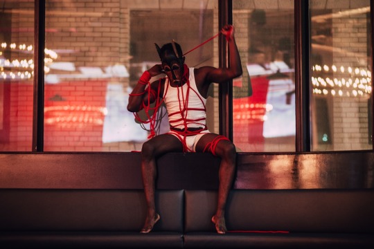
Photo by Steven Acres.
With each meal, Monroe thinks carefully about the emotional life of the colors she’s working with. There are certain colors that wouldn’t present Monroe with enough options to create a multi-course meal. While she’s still open to the challenge, she avoided a “blue meal,” (See, chefs constantly stay clear of blue meals but I wonder why?, is it because it'd look too artificial?) and others that were too close to colors she had already attempted. “I’m okay with red blending into orange. I think that’s what it means to work with and understand a color to its fullest…Leaning into the places where colors bleed, exploring where the color ventures out,” she says. Red comes with clear associations of passion, and, at its most extreme, death.

A chocolate box filled with edible red delights for Jen Monroe’s “Red Meal.” Photo by Rachel Fick.
“It’s a fascinating sex and death drive color,” (that's why I looked at color theory, it's important to understand the connotations as food with different colors don't taste different, spice them the same way and it tastes the same. However, psychologically, we associate these monochromatic meals with our ideas of colors before actually tasting it and that's when flavor comes in (experience of an edible that is associated beyond umami, sweet, sour, bitter and salty) she says. But more than that, it seems especially timely to be working with the color red. From iconic costumes featured in the 2017 adaptation of Margaret Atwood’s “The Handmaid’s Tale” to its political associations with conservatism, one might argue, that a shade of red should be Pantone’s Color of the Year.

Prep for artist Jen Monroe’s last color meal includes red roses, cherry tomatoes, blood oranges and soy sauce packets. Photo by Logan Jackson.
As for future meals? Jen Monroe is looking to work with the idea for different companies. And talks of revisiting the project for a rainbow meal is certainly not off the table.
Events — BAD TASTE - Link to the restaurant.
Second article
How Does Colour Affect The Way We Eat?
It's often said that "we eat with our eyes" and science shows this is true - colour plays an important role in how we perceive and experience foods. But how does this happen?
Colour and taste
All of us subconsciously associate certain colours with distinct tastes and flavours. For most people, red is associated with sweetness, yellow and green with sourness, white with salt, and brown and black with bitterness. “The research shows that even infants only a few months old are already starting to pick up these associations between colour and taste”, says Charles Spence, Professor of Experimental Psychology at Oxford University.1
Reardon, Patricia, and Emily W. Bushnell. Infants' sensitivity to arbitrary pairings of color and taste. Infant behavior & development (1988).
“I believe that we learn these associations from the statistics of our environment – we quickly learn that sweet foods are more often pink or red, for instance.' Interestingly, in 2009, Professor Spence tested a clear blue drink on participants from the UK and Taiwan. The Taiwanese thought that the drink would taste of mint, whilst the UK participants thought it would taste of raspberry - showing they had picked up different associations from their distinct food marketplaces.
Baby-led weaning is an approach to introduce babies to solid food. It is all about offering the baby a selection of foods and letting them pick up according to their stimuli, allowing them to play with colours, textures and tastes, and feed themselves.
Colour can override flavour
These strong colour cues can even override the actual flavour of the food. Studies on social drinkers, wine students and wine experts have found that adding an odourless, tasteless red dye to a white wine causes it to be described as a red wine.
Morrot G, Brochet F, Dubourdieu D. The color of odors. Brain Lang. 2001;79:309–20.,3Parr, W.V., Geoffrey White, K. and Heatherbell, D.A., 2003. The nose knows: Influence of colour on perception of wine aroma. Journal of Wine Research, 14(2-3), pp.79-101. And when our colour cues are completely mixed up or absent, this can throw us into confusion. For instance, limited edition white Skittles (which retained the different flavours despite each being coloured white) had consumers baffled. Meanwhile, modernist chefs are starting to mix up colours to create unusual dining experiences, such as chef Heston Blumenthal’s confusing orange and beetroot jellies.
Using completely unexpected food colours is a frequent marketing ploy to gain attention and boost sales. These efforts include Burger King Japan’s all-black burgers coloured with bamboo charcoal and squid ink and a green tomato ketchup launched by Heinz to promote the first Shrek film. “Blue-coloured food and drinks are becoming increasingly popular amongst Instagrammers, bloggers, and food marketers. Because very few foods are naturally blue, these unusual products stand out on the shelf and hence capture our attention – we notice it,” (stand out for the aesthetics) says Professor Spence.
Advertisements for the food industry rely on food stylists, a professional who specializes in arranging the food and context in such a way that projects the desired flavour picture in the audience’s minds, highlighting the various ingredients and flavours of the foods by use of colour.
Can colour impact how much we eat?
But why are we drawn to unusual colours in food? One of the leading theories is sensory-specific satiety: if our senses constantly receive the same stimulus, we simply get bored. “Even if you love banana milk, for example, as you keep drinking it, you will eventually no longer want any more, you have become satiated,” says Professor Spence. “We can become satiated to flavours, but also to textures and even colours. This is why candy-covered chocolates like Smarties come in an array of colours, to keep our interest.” Numerous studies back this up – we generally help ourselves to more of a food product if it comes in a more varied array of colours.
Kahn, Barbara E., and Brian Wansink. The influence of assortment structure on perceived variety and consumption quantities. Journal of consumer research 30.4 (2004): 519-533. Curiously, one study found that participants consumed more yoghurt when three types were offered compared with one – even when the colour varied but not the flavour. Rolls, Barbara J., E. A. Rowe, and E. T. Rolls. How flavour and appearance affect human feeding. Proceedings of the Nutrition Society 41.2 (1982): 109-117.
It appears we also tend to underestimate quantities when a variety of colours are present. In a study where participants were asked to try and pour out M&Ms until they reached a specified amount in a bowl, the participants poured 12% more into a bowl when the sweets were multicoloured rather than a single colour.
Redden, Joseph P., and Stephen J. Hoch. The presence of variety reduces perceived quantity. Journal of Consumer Research 36.3 (2009): 406-417. “We propose that a single colour makes the food appear like a single overall large mass whereas varied colours break up this large perceptual mass”, says Professor Joe Redden from the University of Minnesota, who led the study. “This suggests that people should be more vigilant when serving themselves varied mixes; more is there than they think.”
It doesn’t even have to be the food!
Various studies have shown that we even respond to colour cues in product packaging, plates and cutlery. In a study on popcorn, participants perceived a salty variety as tasting much sweeter when served out of a red bowl and a sweet variety as being saltier when served from a white bowl.
Harrar, Vanessa, Betina Piqueras-Fiszman, and Charles Spence. There's more to taste in a coloured bowl. Perception 40.7 (2011): 880-882. The colour of the surrounding environment can also have an effect: in one experiment, tourists were willing to pay more for a wine when they sampled it under blue or red light compared with green or white lighting. Oberfeld, Daniel, et al. Ambient lighting modifies the flavor of wine. Journal of Sensory Studies 24.6 (2009): 797-832.
Redware Dishes for Alzheimer's include bright red plates, cups and utensils because studies show Alzheimer patients increase food intake by 24% and liquid by 84% when using dinnerware with vivid colours.
Food and colour psychology - eating with colour can help dementia patients
Food and colour psychology are fascinating, but once we know about them, we can also find practical ways to benefit from them. One study found that patients with dementia were encouraged to eat more when their food was served from coloured plates.
Dunne, Tracy E., et al. Visual contrast enhances food and liquid intake in advanced Alzheimer's disease. Clinical Nutrition 23.4 (2004): 533-538. “Many people with Alzheimer's disease and other neurological conditions lose their sensitivity to contrast, so enhancing the contrast between the plate and their food and drink presumably meant they could see it better”, says Professor Alice Cronin-Golomb from Boston University, who helped lead the study. Perhaps we can all experiment with colour to make meals appear more appealing, particularly by emphasising the colours we associate with our favourite tastes.
Third article
TASTE-COLOR SYNESTHESIA
Taste-color synesthesia is a fascinating and unique condition that has long intrigued researchers and the general public alike. In this article, we will explore the world of taste-color synesthesia, its possible causes, and its effects on individuals who experience it.
What is Taste-Color Synesthesia?
Taste-color synesthesia is a type of synesthesia where individuals experience colors when they taste different foods or drinks. For example, someone with taste-color synesthesia might perceive the taste of a lemon as bright yellow or the taste of chocolate as dark brown. These associations are automatic and involuntary, meaning that the individual experiences them without conscious effort or intention.

Possible Causes of Taste-Color Synesthesia
The exact cause of taste-color synesthesia is not yet fully understood. However, some researchers believe that it may be due to cross-activation between the brain regions responsible for processing taste and color perception.
The taste buds on our tongue send signals to the gustatory cortex in our brain, which is responsible for processing taste information. Similarly, our eyes send signals to the visual cortex, which is responsible for processing visual information. It is possible that in individuals with taste-color synesthesia, there is an overlap or cross-activation between these brain regions, leading to the perception of colors when tasting different foods.
It is also possible that taste-color synesthesia is due to a heightened sensitivity to the emotional or cultural associations we have with different tastes. For example, the color yellow is often associated with happiness or brightness, so it is possible that someone with taste-color synesthesia may associate the taste of a lemon with the color yellow because of this cultural association.
Effects of Taste-Color Synesthesia
Taste-color synesthesia is a relatively rare condition, with only a small percentage of the population experiencing it. However, for those who do experience it, it can have a profound impact on their perception of the world around them.
One potential effect of taste-color synesthesia is an increased sensitivity to taste and flavor. People with this type of synesthesia may be able to detect subtle differences in taste that others may not notice. They may also be more discerning when it comes to their food choices, preferring certain flavors or combinations of flavors based on the colors they perceive.
Taste-color synesthesia can also affect an individual's memory and creativity. Because the associations between tastes and colors are automatic and involuntary, they may be more likely to remember specific tastes or food experiences based on the colors they perceive. This can also lead to increased creativity in cooking or food presentation, as individuals with this type of synesthesia may be more likely to experiment with color combinations in their dishes.
Challenges of Taste-Color Synesthesia
One of the most significant challenges of taste-color synesthesia is that it can be distracting and overwhelming. When someone with this type of synesthesia is eating a meal or drinking a beverage, the colors they experience can be so vivid and intense that it can make it difficult for them to focus on the taste and texture of the food. This can lead to a sense of sensory overload, making it hard to fully enjoy the experience of eating or drinking.
In some cases, taste-color synesthesia can also be a hindrance when it comes to social situations. For example, if someone with this condition is out at a restaurant with friends or family, they may find it challenging to engage in conversation or focus on the social interaction because they are so focused on the colors they are experiencing in response to the food they are eating. This can lead to feelings of isolation and frustration, as well as difficulty forming connections with others.
Another challenge of taste-color synesthesia is that it can be unpredictable. While some individuals may experience consistent colors in response to certain tastes or flavors, others may find that their synesthetic experiences change over time. For example, they may associate the taste of coffee with the color brown one day, but the color purple the next. This can make it difficult to navigate daily life, as someone with taste-color synesthesia may have to constantly adjust to new and changing synesthetic experiences.
Additionally, taste-color synesthesia can be a source of confusion or misunderstanding for those who don't have the condition. Because it is such a rare form of synesthesia, many people may not be familiar with it or understand what it entails. This can lead to feelings of isolation or judgment from others, as well as a lack of awareness and support for those who have the condition.
Despite these challenges, taste-color synesthesia can also have some positive aspects. Many individuals with this condition report that it enhances their enjoyment of food and can even make eating a more exciting and pleasurable experience. Some may even use their synesthetic experiences to create unique and creative food combinations, or to explore new flavors and tastes.
There is also a growing community of individuals with taste-color synesthesia who connect and share their experiences online. These communities can provide a sense of understanding, support, and validation for those with the condition, as well as a platform for creativity and self-expression.
Conclusion
The answer is no. Color doesn't affect the average human's tastes. This articles not only confirmed my suspicion but is definitive proof. I personally can't tell the difference between a red, green or yellow pepper when it's cooked. However, the concept of synesthesia explores how some people experience the world in a different way like actually tasting color. Thus, I should have found some-one with this condition to discover a world which lies beyond the one I live.
Question 2: Aside from a boring editorial and comic, did I have any other ideas to visually illustrate the relationship between color and flavors?
After much research, I've learnt the User Experience encompasses more than digital buttons. It also displays learning your target's audience and how they'd want to be related to. Make them feel something no-one else has.
This is why I once had the idea to display messy illustrations similar to the one for my presentation (refer to the MP presentation). Imagine a messy illustration of color gushing out. Obviously, it won't be the same thing. The reason for this idea is humans are conscious of how they eat in front of others (that's why I put my hand over my lips at times when I'm eating to avoid someone looking at my lips or my mouth is slightly ajar. Some people also hate low-chewing, oozing sauce from a burger or licking your hands right after that tasty meal). With an illustration of someone messily eating a monochromatic, it bridges the gap of believing that monochromatic meals belong to the upper class or is necessarily fine dining. Now, I know it appears that I'm encouraging bad habits but fast foods such as KFC and Pepsi China have done ads similar and it's to encourage people being THEMSELVES because everyone's too overly-cautious and we are not achieving the things we should be. Also, food is supposed to feel FUN to eat!
Below are ads displaying messy eating;
Ad 1:
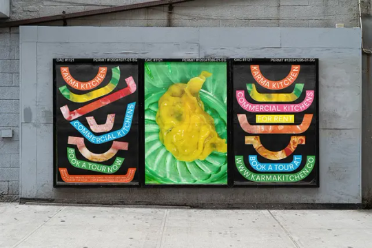
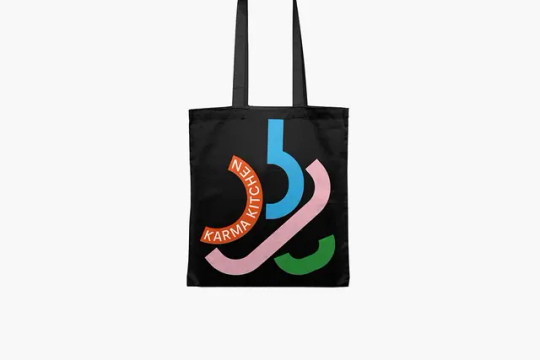
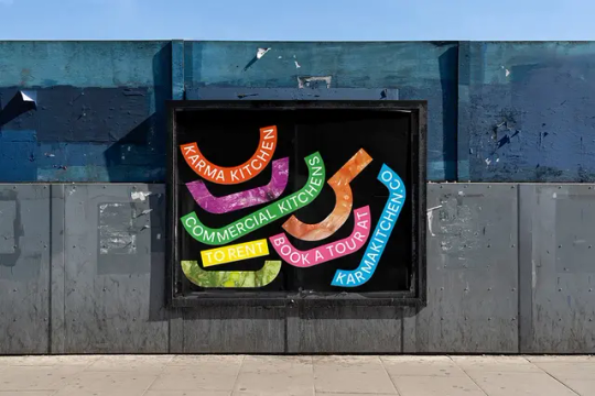
Droga5’s identity for Karma Kitchen conveys the “visceral, messy business of cooking and eating”
The London-based company aimed at the delivery-only food and drink market saw a surge in lockdown, and after a huge injection of funding, has rebranded and plans to expand.
Words Jenny Brewer—Date: 12 January 2021
Never has the phrase “right place, right time” rung so true as it does for Karma Kitchen. The catering start-up by sisters Gini and Eccie Newton launched in Hackney in 2019, aimed at meeting all the needs of delivery-only food and drink businesses – sourcing everything from staff to storage space and equipment. Then, of course, lockdown hit and virtually every food and drink business had to pivot to delivery-only. Pitching for funding to expand, the company hoped for £3 million and raised a smidgen more at £252 million. Now it has rebranded, courtesy of Droga5, with a vibrant new identity including “visceral” photography by Maisie Cousins, and hopes to branch out around the UK and Europe.
The identity itself aims at the restaurant owners and the like, tapping into the chaotic and fun energy behind the scenes. Branding centres on a set of vibrantly coloured graphic assets, which take the form of kitchen equipment – bowls, pots, pans and woks – in profile, creating long strips in various shapes. Some of these are emblazoned with simple, capitalised typography stating the name, tagline “commercial kitchens to rent” and website, plus other info. Others are filled with closely cropped and frankly slightly gross photos of food, taken by the brilliant Maisie Cousins, which “have nothing to do with overly styled food porn and everything to do with the visceral, messy business of cooking and eating,” says the agency in a statement. These can be seen in all their glory in other assets throughout the identity, as richly colourful as the graphic colour scheme they complement.
Chris Chapman, head of art at Droga5 London, says the identity “reflects not only the ingredients of a Karma Kitchen but also its communal start-up energy,” and aims to bring to life what it’s really like inside a commercial kitchen, in an exciting and diverse way. The identity is being rolled out across the brand’s marketing including out-of-home and digital campaigns, aiming to encourage awareness of the company and for potential clients to book tours.
GalleryDroga5: Karma Kitchen identity (Copyright © Karma Kitchen, 2021)


Ad 2:
The New Messy Burger from KFC (youtube.com)
Ad 3 :
Messy millennials in Pepsi APAC campaign | Advertising | Campaign Asia
Learning outcomes reached
Primary research in learning outcome achieved as I couldn't carry out useability testing. (A1, A4, LO1,LO2)
0 notes
Text

#transgender#transformers#transparent#trans beauty#transsexual#mtf trans#trans pride#trans#translation#trans artist#beautiful trans woman#trans community#trans main character#trans makeup#nsft trans#trans ns/fw#trans men#trans mtf#trans male#trans nonbinary#tranmasc#cute trans#latin transgender#transgurl#trans goddess#trans gay#trans joy#trans man#trans masc#transmasc
2K notes
·
View notes
Text
What do you think 😋😋😈😈😋😋
#curvy girls#daddy's good girl#mtf trans#trans artist#trans community#trans beauty#trans nsft#trans man#trans rights#trans pride#transformation#transgender#translation#transsexual#transformers#trans woman#transfem#trans women are beautiful#transgurl#transmasc#transparent#transisbeautiful#transgirl#tranagender
1K notes
·
View notes
Text
OTW is Recruiting for Policy & Abuse, Translation, & TWC
Would you like to assist AO3 users by resolving complaints? Do you have strong proofreading or editing skills? Are you fluent in a language other than English? OTW is recruiting volunteers!
We really need volunteers who speak Afrikaans, Arabic, Basque, Bengali, Bulgarian, Catalan, Danish, Dutch, Estonian, Filipino, Finnish, Greek, Hebrew, Hindi, Japanese, Latvian, Lithuanian, Macedonian, Malay, Marathi, Norwegian, Persian, Polish, Portuguese-PT, Romanian, Serbian, Slovak, Slovenian, Spanish, Thai, Turkish, Ukrainian, Vietnamese, and Welsh.
Help us signal boost or find out more at https://otw-news.org/53a6ncnr
#organization for transformative works#otw#volunteering#translation#transformative works and cultures#twc
723 notes
·
View notes
Text

I might be a little obsessed with pink atm, I don't know if you noticed at all?
#trans rights#translation#transgurl#trans beauty#trans community#transsexual#transformation#trans pride#transparent#trans woman#mtf trans#mtf girl#trans#transgender#the beauty & the bulge#trans is sexy#trans is beautiful#trans women are beautiful#pink#trans tattoo
1K notes
·
View notes
Text
I'm bored and horny ❄️🍆👅

#transgurl#translation#transformation#trans community#trans artist#transparent#trans rights#transsexual#trans beauty#trans man
597 notes
·
View notes
Last Seen Blogs


okami-zero
The Mind of an Okami(-Zero)

paddingtonbear
LOST & FOUND 🐾

bluebelledmoon
Bluebelledmoon's Art Blog

spidercookie18
Ari